 Mark Argetsinger, A Grammar of Typography: Classical Book Design in the Digital Age (Boston: David R. Godine, 2020). 528 pages; 8.5 x 12 inches; illustrated with over 425 images, many in full color.
The arrival of Mark Argetsinger’s new book, A Grammar of Typography, sent me running to a thesaurus in search of a word larger than comprehensive. Should we describe it as thorough? Inclusive? Far-reaching, in-depth, sweeping, or simply grand?
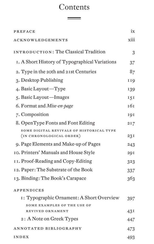
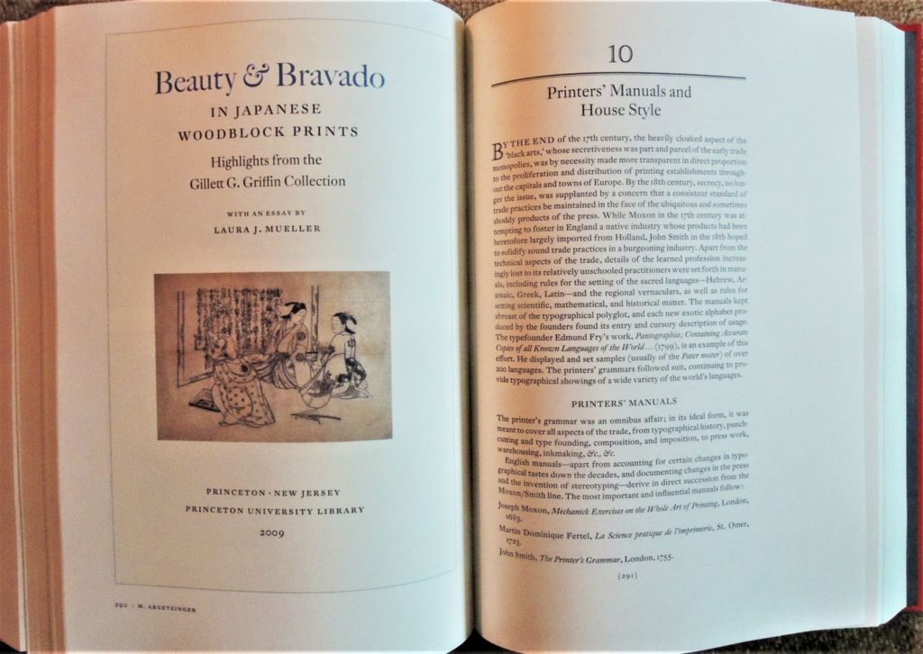
The publisher’s material begins: “A Grammar of Typography is a comprehensive guide to traditional book design that is both practical and historical. Interspersed with discussions of digital typesetting and page layout are broad historical views of the tradition of the book along with specific reference to the printer’s grammar or manual, the industry’s own codification of its usage, from Joseph Moxon in the seventeenth century through Theodore Low De Vinne in the nineteenth. In addition, there are chapters on house style, proof-reading, copy-editing, paper, binding, and appendices on typographical ornaments and Greek type. The book ends with an annotated bibliography and an index.”
How can you not love a book with an introduction titled “The Hidden Soul of Harmony: The Classical Tradition. A Practice in Search of a Theory”? Although Argetsinger claims “this is primarily a practical manual, not a scholarly treatise,” one would be hard-pressed to find a more philosophical look at “marks of quotation,” “font editing,” or “horizontal space.”
There is also biography and chronology. “In addition, Aldus was the first to cast in type the humanist’s running or cursive hand, known as the Italic. The busy work of the humanist, who daily, it seemed, uncovered new works of the Ancients, lying long neglected in the monastic or royal libraries of Europe, had required an efficient script to match the urgent copying of new texts.”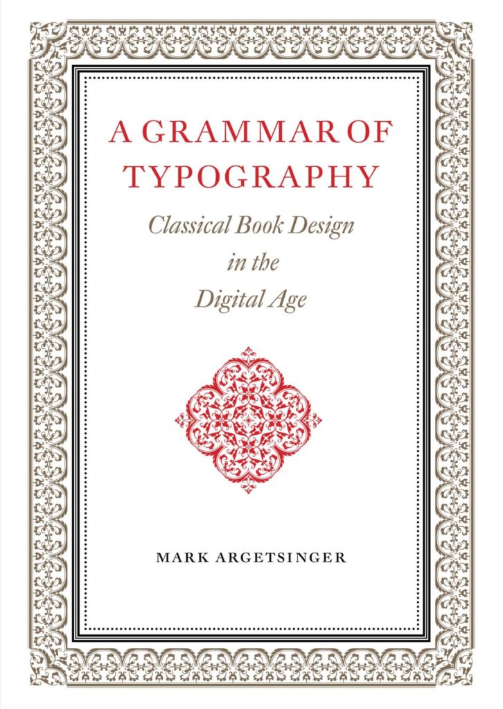
In his preface, Argetsinger writes, “This book intends to provide a historical context to the enterprise of book-making. The term grammar appears in its title both in reference to the historical phenomenon of ‘grammars’ of printing, regarding which much will be said along the way, as well as in reference to a certain graphical literacy that is requisite for the intelligent use of design and production tools in the digital age. Historical context is important both from the point of view of tracking evolving trends in the composition and display of printed matter, as well as from the point of view of preserving the traditions of its best practices.”
Open it anywhere and start reading.
“After the first necessities of life, nothing is more precious to us than books. The Art of Typography, which produces them, provides essential services to society and secures incalculable benefits. …Thus one could rightly call it par excellence the art of all arts and the science of all sciences.” –Pierre-Simon Fournier, le jeune, Manuel Typographique, Book 1 (1764).
A classical book designer, Argetsinger also embraces 21st-century technology, writing:
“There is something wonderful about working out the proportion of the page on screen, precisely mapping out its structure with the (by turns visible or invisible) grid and and page line; setting up one’s font with a complement of sorts so vast, even Christopher Plantin would feel a twinge of envy; readily changing size, font, color, position; and arraying, say, a two-volume, 800-page book heavy with illustrations and then placing its entire content on a digital thumb-drive….”
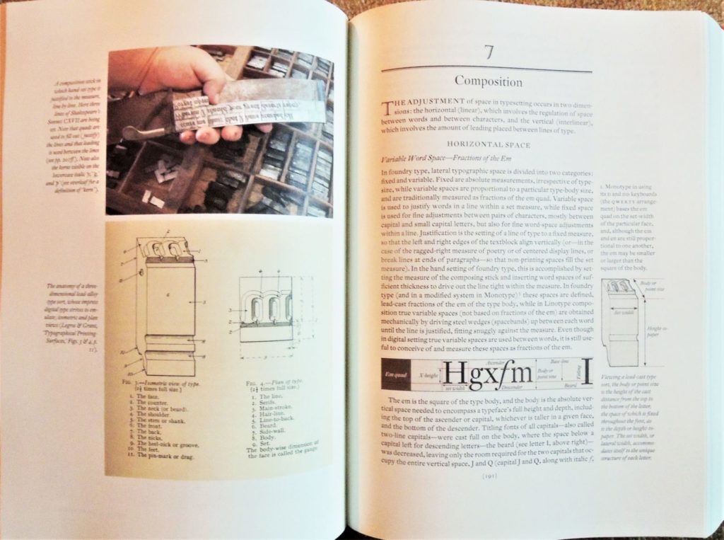
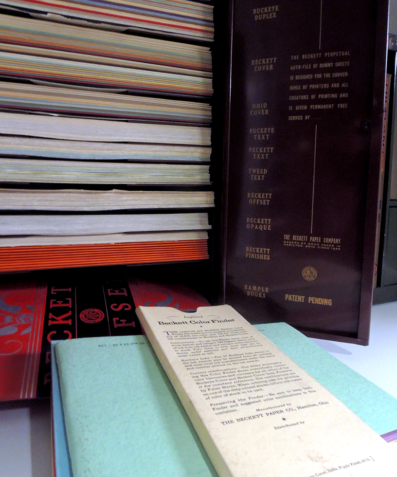
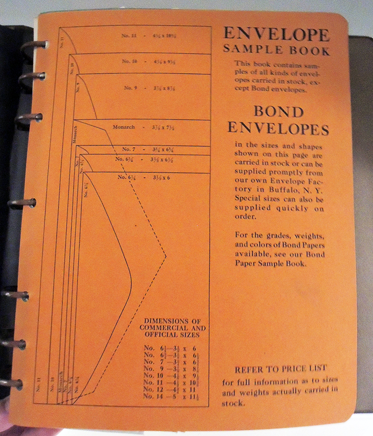
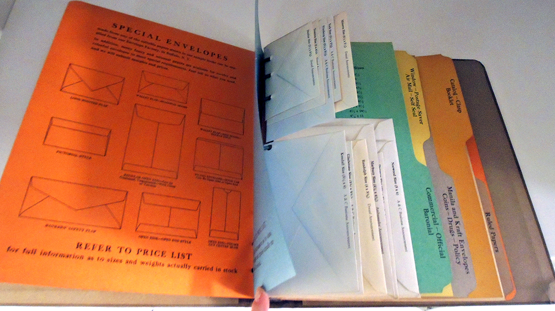
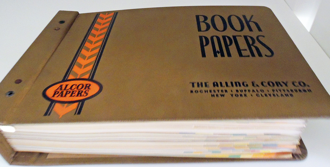
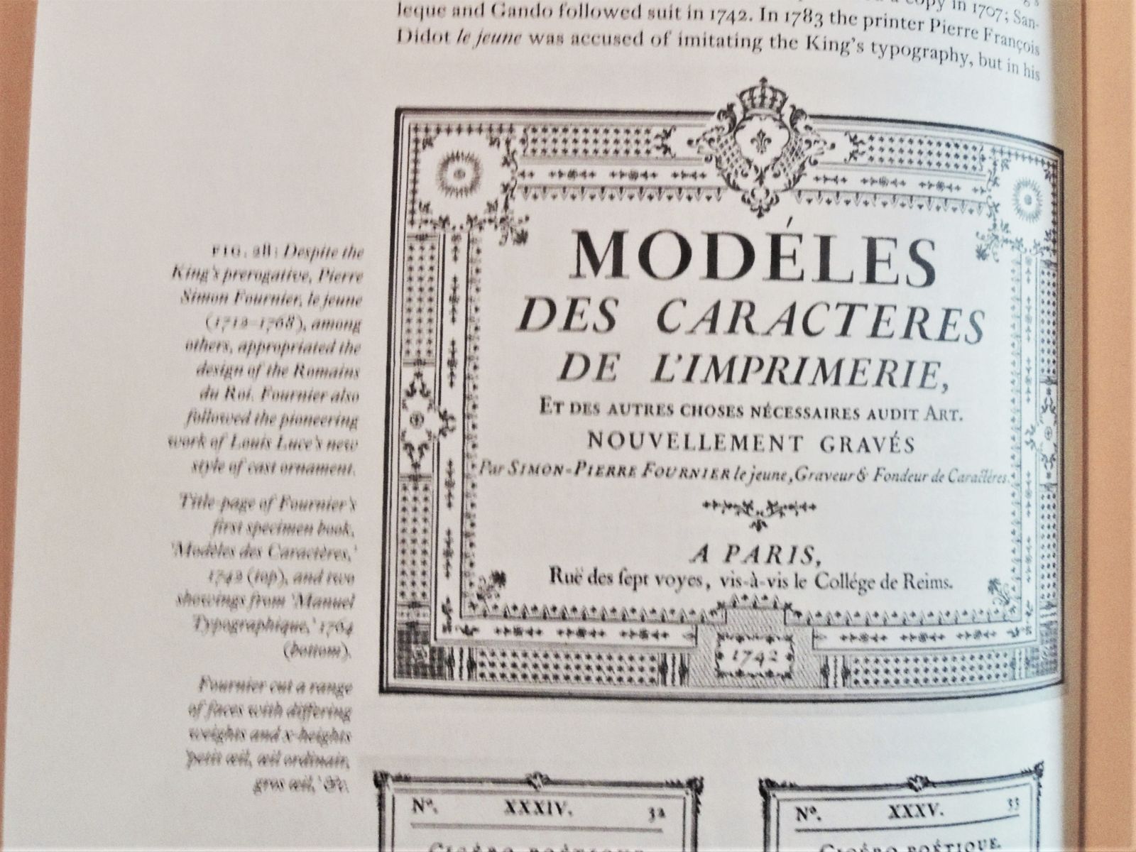
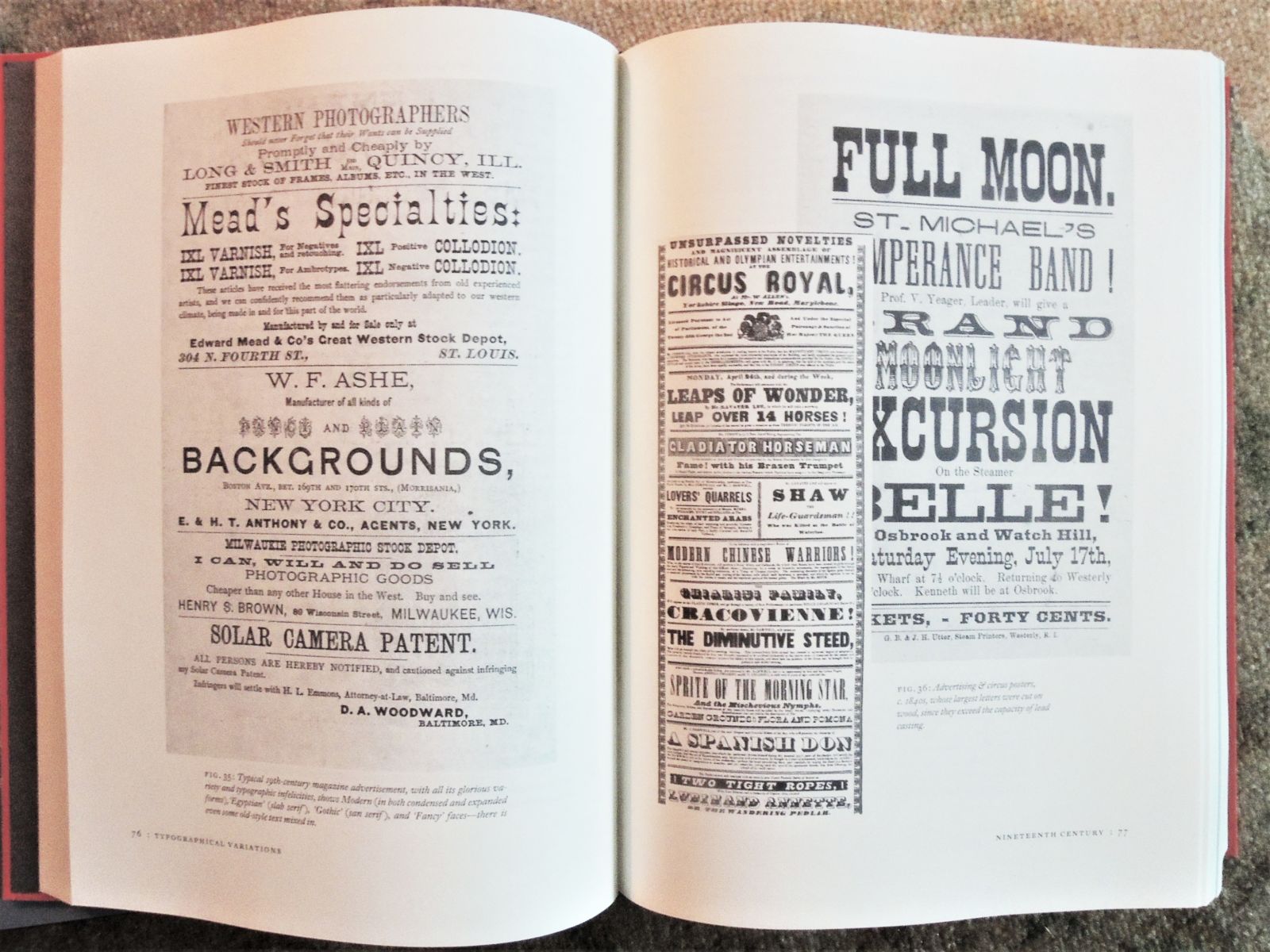
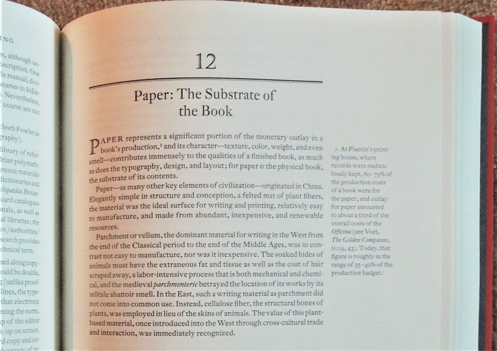
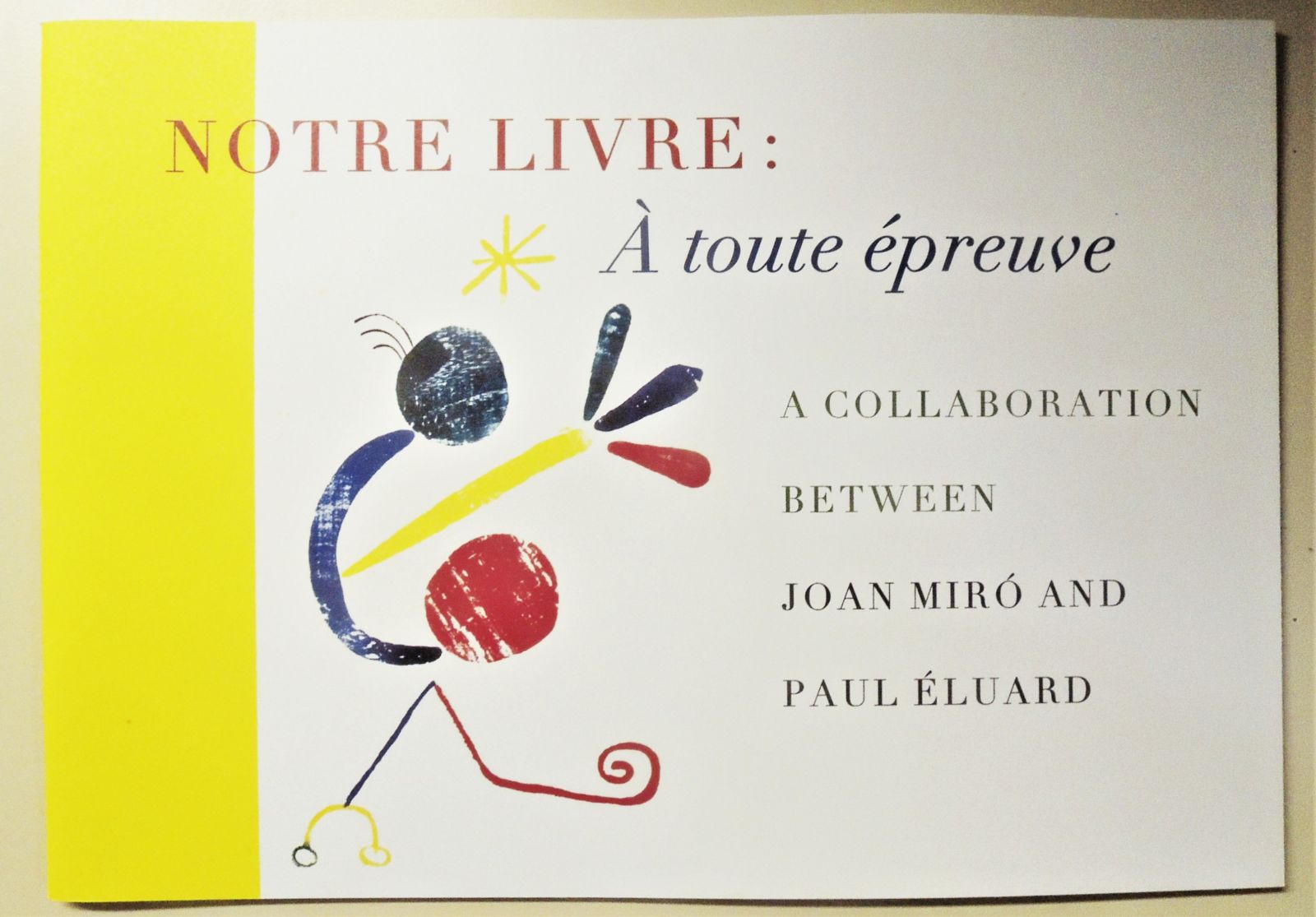
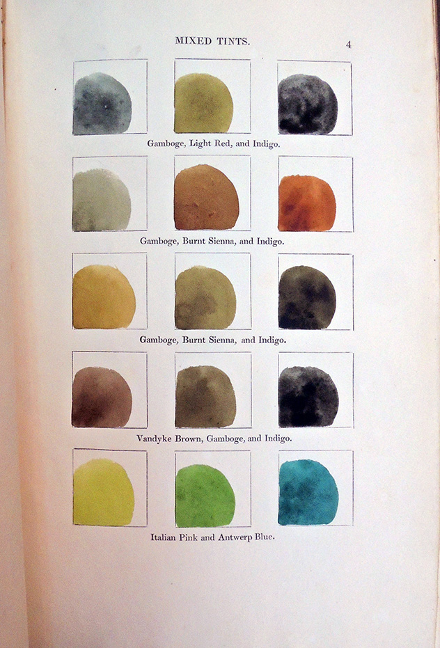
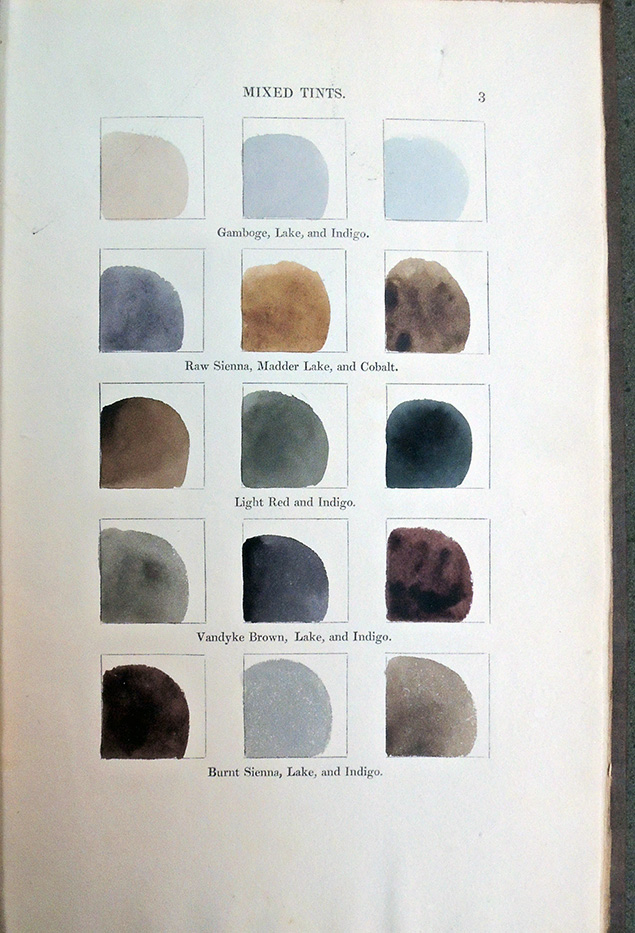
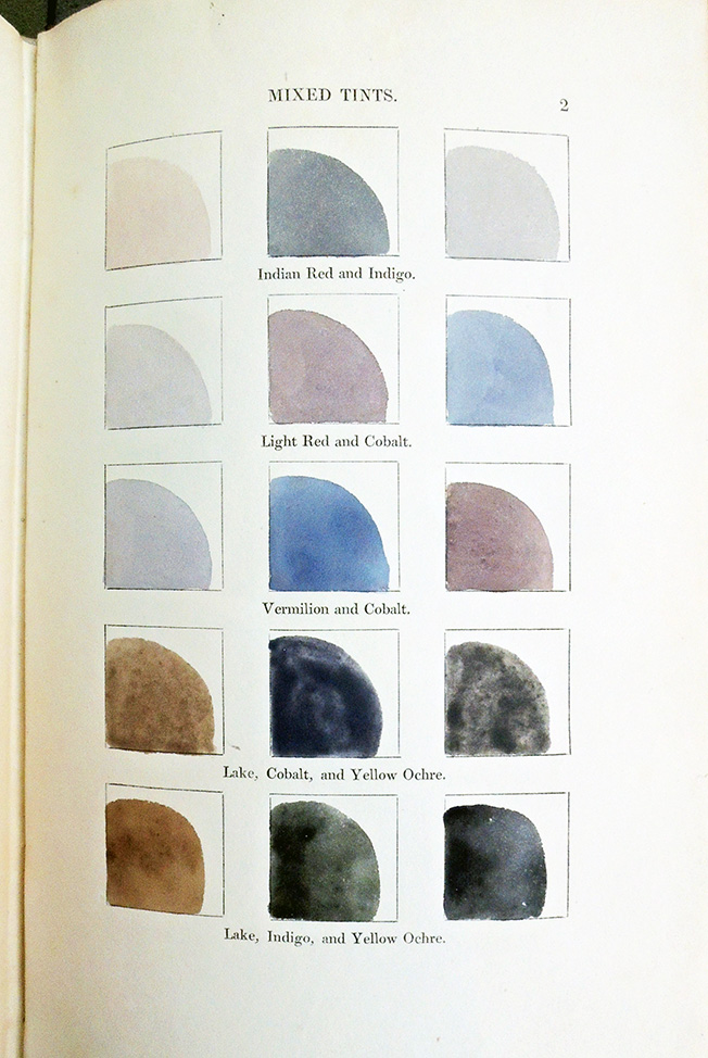
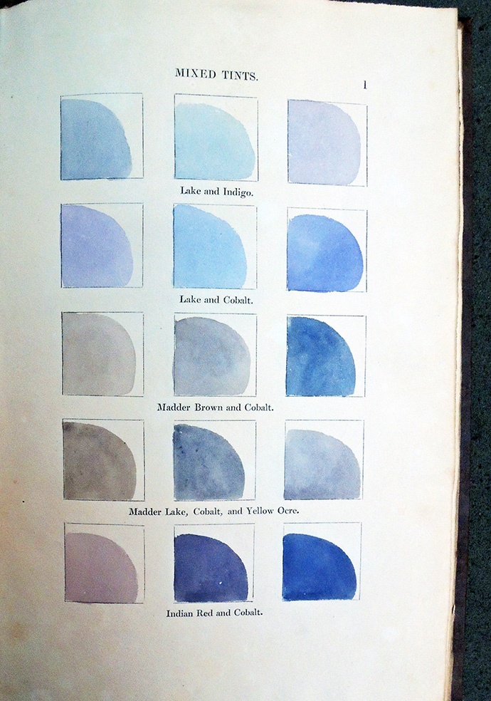
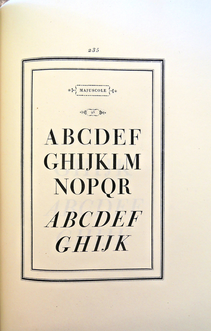
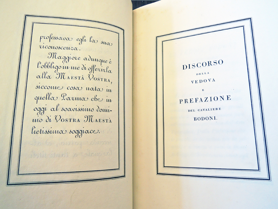
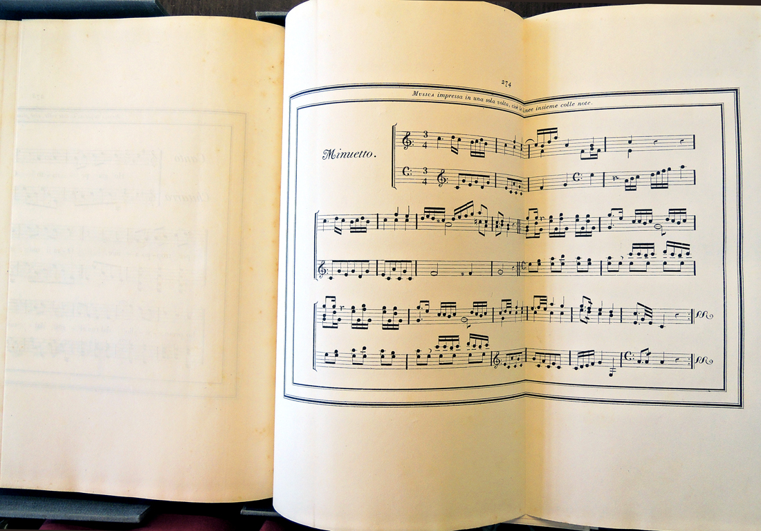
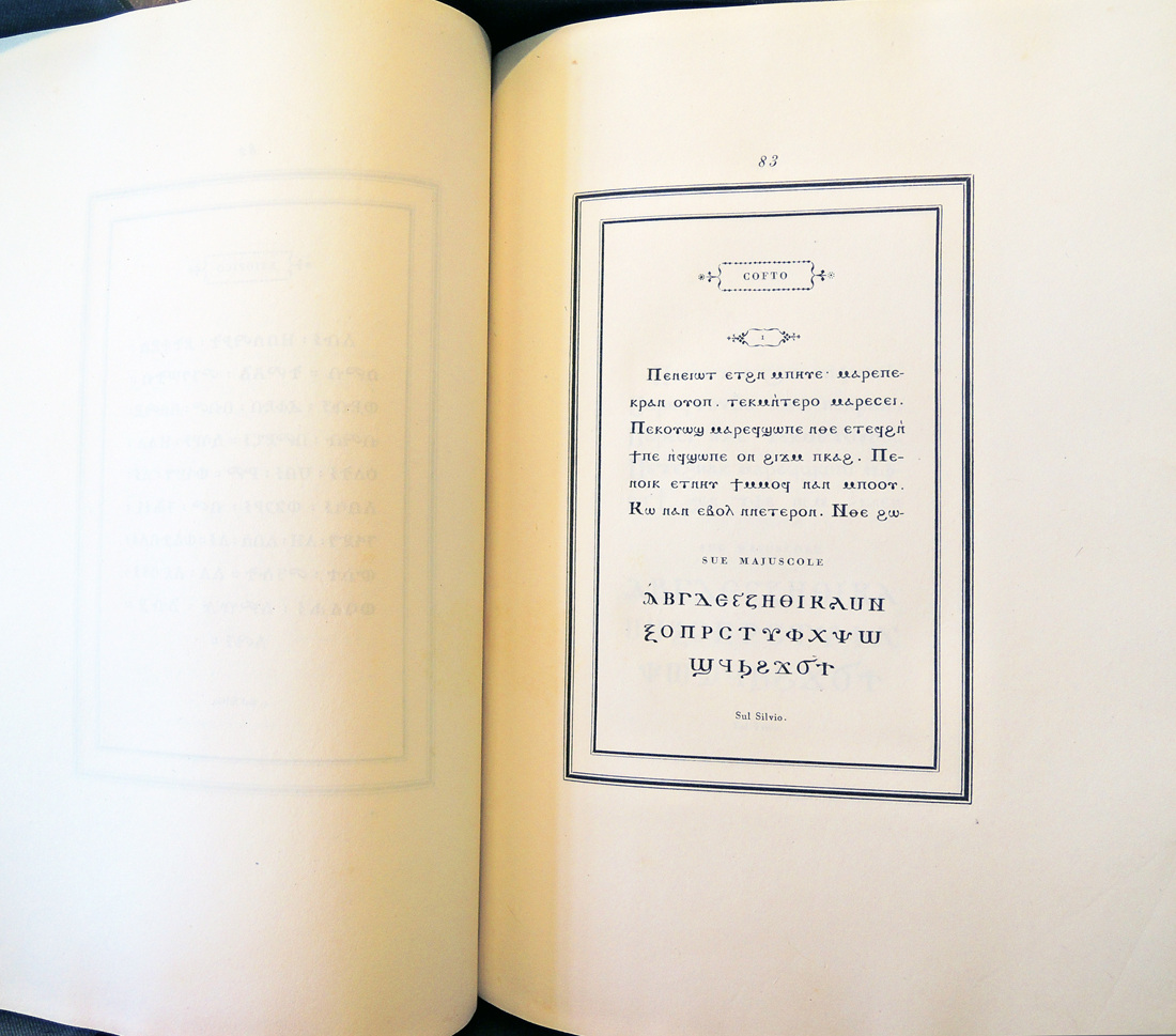
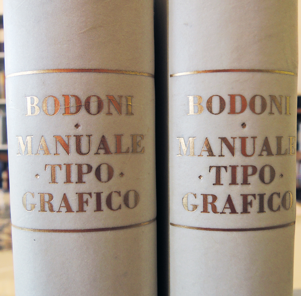
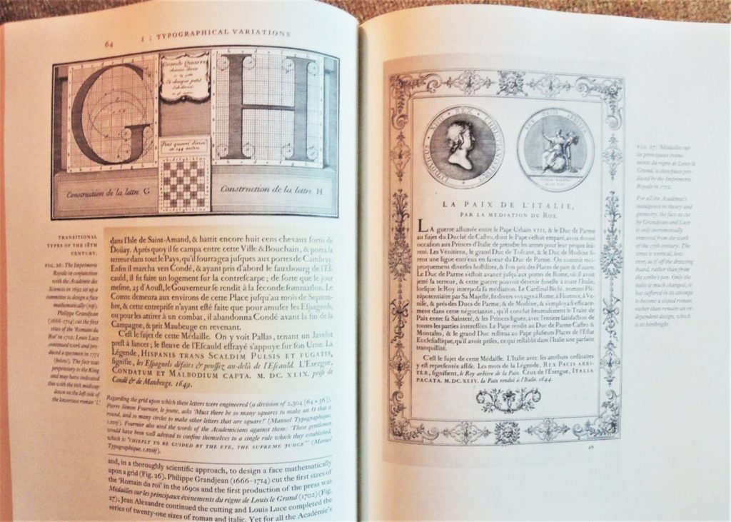
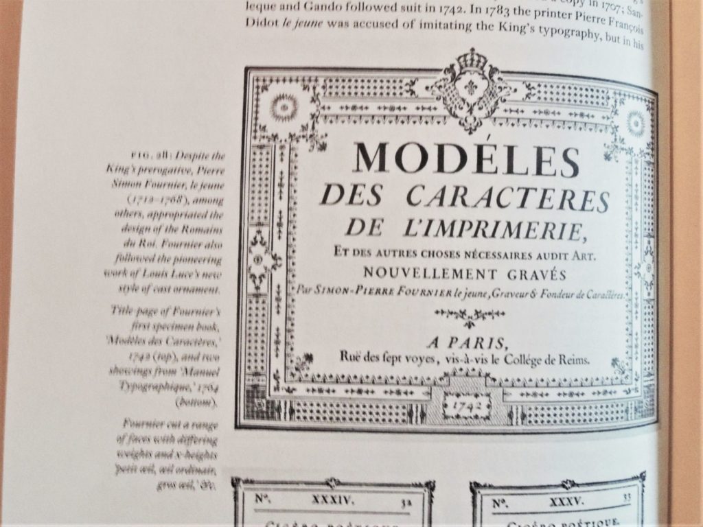
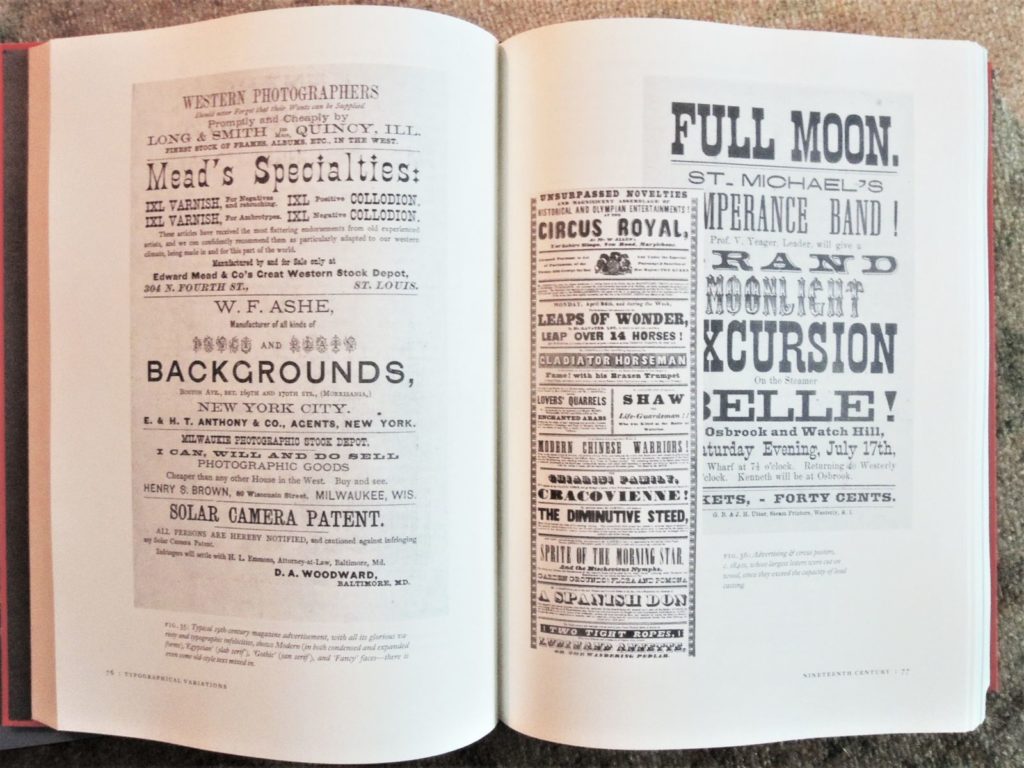
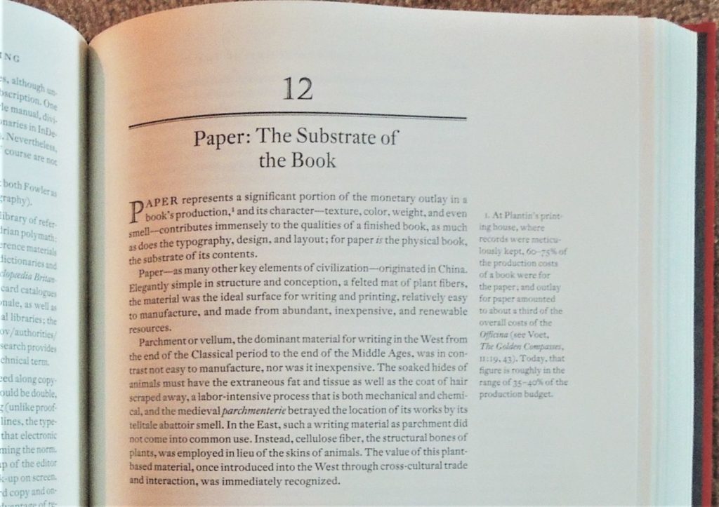
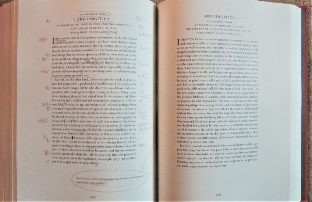
 [Forgive my poor photography, the book itself is perfect.]
Colophon: “A Grammar of Typography set in DTL’s Fleischmann and printed on 115 Gem Munken print cream. All printing and binding by PBtisk Printing Company in the Czech Republic. This first edition consists of 1,875 hardcover trade copies as well as a deluxe slipcased edition of 125 copies signed and numbered by the author and only available directly from the publisher. Designed and composed by Mark Argetsinger, Holyoke, Massachusetts.”
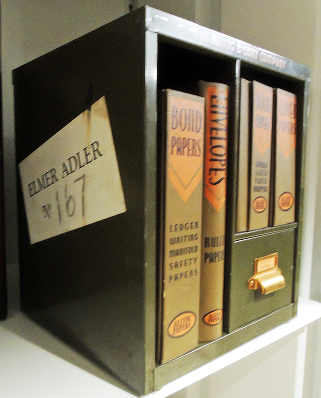
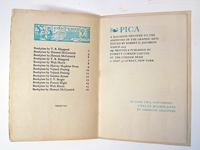
A PostScript: My favorite Argetsinger design, proof he can do it all.


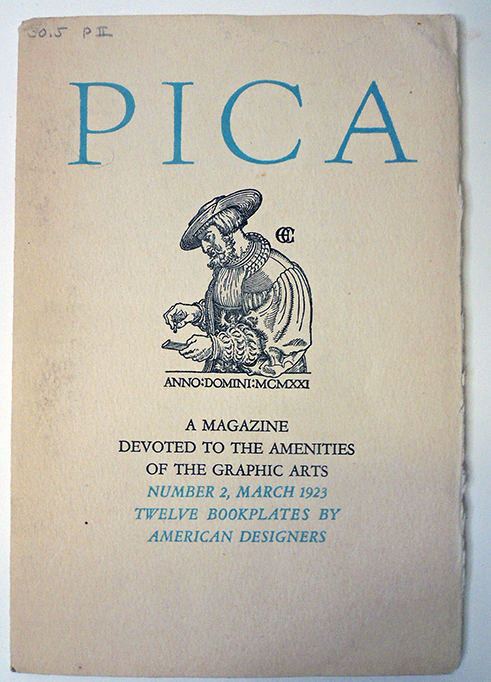
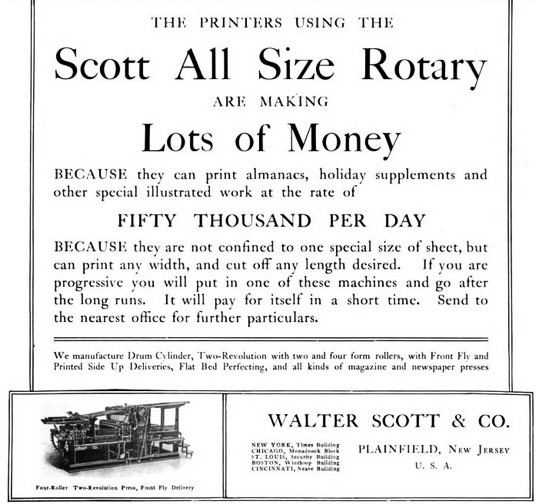
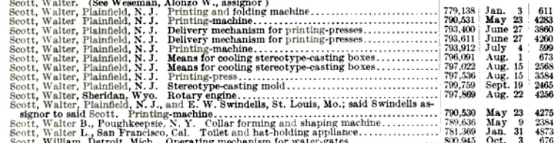
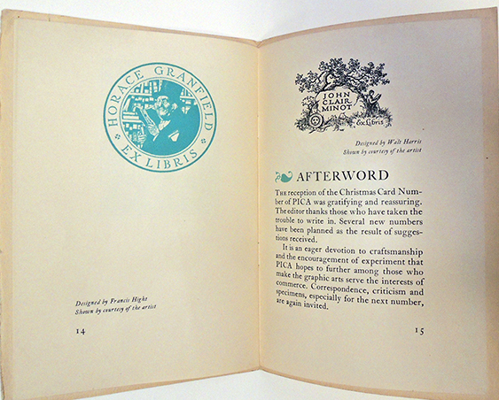
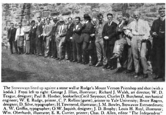 Printing Arts News September 20, 1921
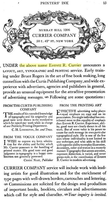
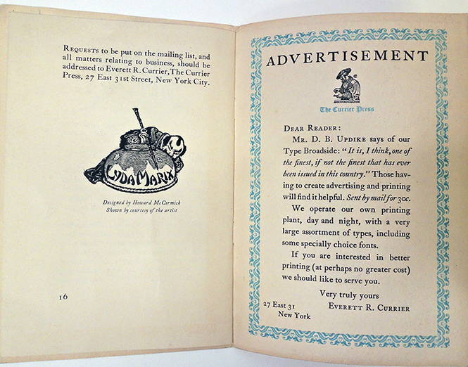
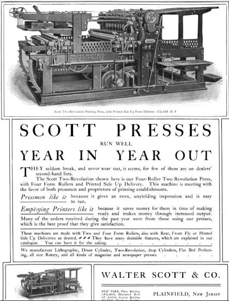
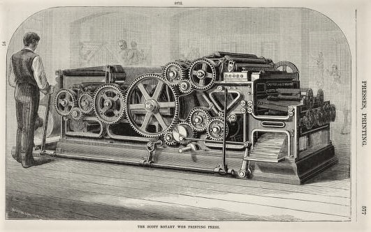
 American Printer and Lithographer, Volume 72 Moore Publishing Company, 1921
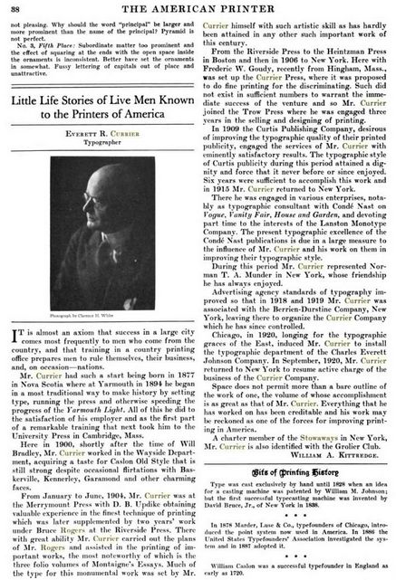
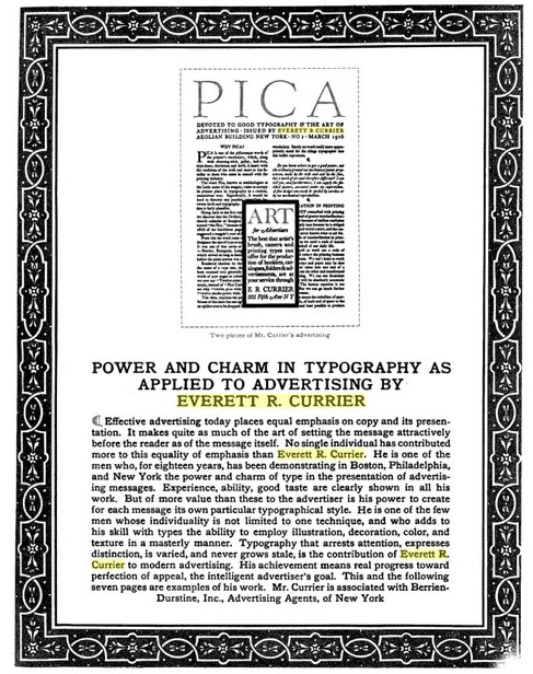 The Printing Art, Volume 41, 1923