Category Archives: Typography

How Many Female Type Designers Do You Know?

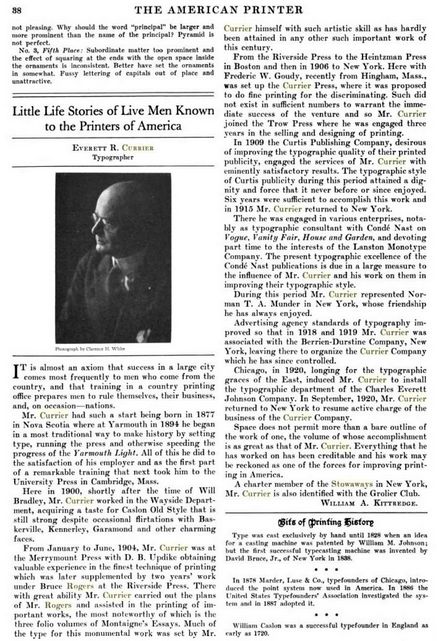
The following is a selected list of notable female type designers who might have been considered for the typographic exhibition at the Grolier Club, New York City. It has been compiled from many sources including:

https://www.printmag.com/post/10-wildly-talented-female-type-designers10 Brilliant Female Creatives …Women of Words by Rebecca Bedrossian

https://www.cphc.org.uk/the-typographic-hub-affiliate The Typographic Hub

https://femme-type.com Femmetype

https://www.printmag.com/post/10-wildly-talented-female-type-designers10 Women Type Designers by Shelley Gruendler

https://typequality.com/ A platform for discovering and sharing typefaces designed by women

https://fontsinuse.com/sets/5247/type-designs-by-women Type Designs by Women, created by “Fonts In Use” staff

https://eyeondesign.aiga.org/that-type-of-women/Eye on Design

https://www.ideo.org/perspective/9-typefaces-designed-by-womxn Nine typefaces designed by women

https://bookshop.org/books/how-many-female-type-designers-do-you-know-i-know-many-and-talked-to-some/9789493148321
How Many Female Type Designers Do You Know?: I Know Many and Talked to Some! by Yulia Popova (Author, Editor), Gayaneh Bagdasaryan (Author), Veronika Burian (Author), Maria Doreuli (Author), Louise Fili (Author), Martina Flor (Author), Loraine Furter (Author), Jenna Gesse (Author), Golnar Kat Rahmani (Author), Indra Kupferschmid (Author), Briar Levit (Author), Zuzana Licko (Author), Ana Regidor (Author), Fiona Ross (Author), Carol Wahler (Author). Onomatopee Projects, 2021

Get to know them:
Alice Savoie
Notable typefaces: Capucine, Fred Fredburger
Thanks to a teacher who passed on his love of letters, Lyon, France–based Alice Savoie found design at an early age. “There were very few institutions where you could learn typeface design back in the early 2000s,” recalls Savoie. Lucky for her, she picked up the basics of calligraphy and type design in a two-year course at École Estienne in Paris. “This experience comforted me,” Savoie says, “in the idea that typeface design might be the right path.” And like many designers, she then moved to the United Kingdom to study in the master’s type design program at the University of Reading. After graduating in 2006, Savoie joined Monotype, setting her career off to a solid start.

Jessica Hische
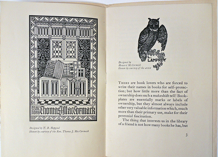
Notable typefaces: Tilda, Minot, Brioche, Snowflake, Buttermilk
Art meets type in the work of Jessica Hische. She wears many hats—letterer, typographer, illustrator—and her output reflects this. From stamps, movie titles and books to branding and packaging, Hische blends fresh elements of fun and grace in her illustrative work. While Hische is best-known for her elegant lettering, she has also adapted it into a number of beautiful typefaces.

Ksenya Samarskaya
Samarskaya learned type design while working at Hoefler & Frere-Jones. While she hadn’t expected to pursue type design, it fit well into her ideas regarding communication, culture, translation, and form. (Her typeface Wyeth is below.) Since starting her own studio, she has consulted with the world’s top foundries on multi-script typography.

Laura Meseguer
Notable typefaces: Multi, Lalola, Cortada Dos
Meseguer calls Barcelona, Spain, home, so it should come as no wonder that shapes and forms move her. She is surrounded by them—in nature, architecture, design, painting, lettering and calligraphy. The city touts not only Basque and Catalan influences, sitting between the Mediterranean and Europe, but the surreal architecture of Antoni Gaudí.

Laura Worthington
Notable typefaces: Adorn, Charcuterie, Mandevilla
Worthington lives in the Pacific Northwest, which makes one wonder if Seattle’s short, dark winter days account for her prolific output. She’s been on a roll since she released her first typeface in 2010. Worthington’s interest in calligraphy started early, while learning penmanship at age 9 in school. Like many of her peers, she found typography through design. “My father encouraged me to pursue graphic design, a career I engaged in from 1997 till late 2010. During that time, I kept looking for more opportunities.”

Liron Lavi Turkenich
Notable typefaces: Makeda, Aravrit, Lefty
“I get angry, I smile to myself, I get sad, I get energized,” says designer Liron Lavi Turkenich, referring to the multilingual signage in her native Israel. Every sign features three scripts—Hebrew, Arabic and English—some with typefaces chosen without care or respect; some with slightly different translations; others with too small or cramped scripts; while some are painted with a single brush for all scripts. Those signs are a huge source of inspiration and, she says, “such an important visual of our urban space. They say a lot about it.”

Luisa Baeta
Notable typefaces: Bligh, Arlecchino
Baeta has always been about evolution. After graduating with a degree in graphic design, she fell down the typographic rabbit hole. “I got this idea that if I learned to design type, I would gain a structural understanding of typography and would become a better graphic designer as a consequence,” she says. And so this Brazilian-born designer entered the University of Reading, which resulted in a master’s degree in type design. Upon completion, the perpetual student felt that there was still more to learn.

Lynne Yun
Notable typefaces: Constant, Ampersandist
Spend a little time with Lynne Yun, and you cannot help but be taken by her thoughtful, curious nature. “I often ponder the role of calligraphy in design, both in terms of its historical significance and its practical applications in modern-day design,” says Yun. “It used to be that calligraphy, lettering, type design and typography were practiced by a similar group of people. Somehow they split apart over the years, but the time is ripe for them to converge again. They are all branches of letterform design.”

Marina Chaccur
Chaccur earned a graphic design degree in Brazil, then moved to England for a master’s degree in the field. After working as a designer, design instructor, hand letterer, and letterpress printer, she realized that she wanted more and travelled to the Netherlands for the Type and Media MA at the Koninklijke Academie van Beeldende Kunsten (KABK).

Nadine Chahine
Notable typefaces: Frutiger Arabic, Neue Helvetica Arabic, Univers Next Arabic
Lebanese designer Dr. Nadine Chahine cites her studies with Samir Sayegh, a calligrapher teaching Arabic Typography at the American University of Beirut, as the catalyst for her interest in type design. “The beauty of the shapes, coupled with the desperate need for well-designed Arabic typefaces, got me hooked very quickly,” says Chahine.

Nicole Dotin
Dotin was a graphic designer before she transitioned into typography. Once she completed the Type Design Master’s program at the University of Reading, she became a type designer at Process Type Foundry. She says that the intrinsic nature of the method of type designing drew her to the profession; the independence afforded by type design is an added bonus.

Nina Stössinger
Notable typefaces: FF Ernestine, Nordvest, Sélavy
Swiss-born Nina Stössinger found type while studying graphic design in Germany. One thing led to another, and she enrolled in the postgraduate TypeMedia Program at the Royal Academy of Art in The Hague, Netherlands.

Sara Soskolne
Soskolne has one of the most coveted type design jobs in the world: Senior Type Designer at Hoefler & Co. She has collaborated on some of the most popular typefaces of the past decade, including Gotham, Tungsten, and Sentinel.

Pooja Saxena
Saxena created her early type designs while earning a Communication Design degree in Delhi, India. (She describes the work as naïve, but I find it energetic.) Because she knew she wanted more for her letterforms, she earned a Master’s Degree in Type Design at the University of Reading and followed it with a typographic internship at Apple, where she learned about large-scale projects as well as collaborative type design teams.

Veronika Burian
Notable typefaces: Abril, Adelle, Bree
Who would have thought that a Prague-born product designer living in Milan would fall hard for type? Well, that’s exactly what happened to Veronika Burian. And all it took was a fellow designer teaching her how to draw in FontLab. “It was like falling in love,” recalls Burian. “I was already disillusioned with product design, and I wanted to change careers. So I started looking into the possibility of doing a [master’s] in graphic design.” After a bit of research, she found the type design program at University of Reading, visited the campus, spoke to professor Gerry Leonidas, and had discovered her path.

Victoria Rushton
Rushton was an Illustration major in college until she took a graphic design class. There, she discovered that type design was the best direction for her. While in school, she began working on the typeface that would become Marcia. When she encounters Marcia now, she sees the bad ideas, redraws, and subsequent fixes along with the resulting learning, practice, and success.


Also:
Alessia Mazzarella
Alexandra Korolkova
Alice Tebaldi
Alisa Nowak
Amélie Bonet
Andrea Tinnes
Carol Twombly
Carolina Marando
Elena Albertoni
Elena Schneider
Erin McLaughlin
Francesca Bolognini,
Glenda de Guzman
Gudrun Zapf von Hesse
Jane Patterson
Joana Correia
Jungmyung Lee
Justyna Sokolowska
Karolina Lach
Kris Holmes
Liya Ophir
Martina Flor
Medeina Musteikyte
Milena Brandao
Nadia Knechtle
Nicole Dotin
Nicole Fally
Nicolien van der Keur
Pria Ravichandran
Sibylle Hagmann
Sofie Beier
Stefanie Preis
Susan Kare
Trine Rask
Vanessa Farano
Vera Evstafieva
Zuzana Licko

Simon Beattie adds the following: Margaret Calvert. She designed all the UK road signs, as well as the lettering for British Rail (which is also used on the UK Government website, gov.uk). Hers is surely among the most-seen lettering/design work in the country, and yet most people probably haven’t heard of her. https://en.wikipedia.org/wiki/Margaret_Calvert
https://designmuseum.org/exhibitions/margaret-calvert-woman-at-work​https://my.matterport.com/show/?ref=em&m=Lz47nCpTeLS
https://designmuseum.org/exhibitions/margaret-calvert-woman-at-work-the-virtual-experience

Everett Raymond Currier

One issue of a small printing magazine turned up recently from the Currier Press in New York City. Pica: a Magazine Devoted to the Amenities of the Graphic Arts (1922-1923) was the work of Canadian-born printer/publisher Everett Raymond Currier (1877-1954). Currier was one of a small band of white male typographers who formed the Stowaways, a private club of book and magazine designers that also included Elmer Adler (founder of the Princeton Graphic Arts Collection). See Currier below second from the right.

Printing Arts News September 20, 1921


Currier trained with Merrymount Press of D.B. Updike before working with Bruce Rogers at Riverside Press and Heintzman Press in Boston. In 1906, together with Frederic Goudy, Currier established the innovative Currier Press in New York City and later, set up companies in Chicago and Philadelphia. He wrote several manuals on type and color, advised the Conde Nast firm in the design of their periodicals, and composed religious music on the side.

Among his many publications are: Everett Raymond Currier and Bruce Rogers, Type Spacing (New York: J.M. Bowles, Norman T.A. Munder, 1910, 1912). Reprinted from the “Graphic Arts magazine of August, 1910 … and the edition is limited to three hundred copies”–Colophon.

Everett Raymond Currier, The story of Caslon Old Style (Philadelphia: Lanston Monotype Machine Co., 1915). Detached from Monotype, v. 3, no. 4, Nov.-Dec. 1915.

Mirabeau’s tribute to the memory of Benjamin Franklin : delivered at the opening of the National Assembly of France, June 11th, 1790. Printed by Everett Raymond Currier; Frederic W. Goudy, typographer, Bertha Goudy, compositor (New York: Currier Press, 1923) in American printer


American Printer and Lithographer, Volume 72 Moore Publishing Company, 1921


The Printing Art, Volume 41, 1923


Typographic necrology

Necrology Series (2017) by Ken Lum in “New Grit” at the Philadelphia Museum of Art, 2021.

Friday evening on April 14, 1865, at Ford’s Theatre in Washington D.C. President Abraham Lincoln was shot by John Wilkes Booth. He was carried to a boarding house across the street and died the next morning. News reached the Philadelphia Inquirer offices after midnight on April 15, when they printed a preliminary account of Lincoln’s death.

https://www-proquest-com.ezproxy.princeton.edu/pagelevelimagepdf/1825252346/pagelevelImagePDF/6CF198E61FB14B76PQ/1?accountid=13314&t:lb=t

(c) Ken Lum

Ken Lum on the steps of Weightman Hall at the University of Pennsylvania, September 2015. Photo: Stephanie Noritz.

Writing for Border Crossings Magazine, Lum comments:

In 2015, on the sesquicentennial of Abraham Lincoln’s death, the Philadelphia Inquirer reprinted its front page as it had appeared on April 15, 1865, a day after the American president’s assassination. I was struck by the appearance of the page, how differently it looked from today, with what seemed like illogical spacing, kerning, eclectic use of fonts, all encapsulated in a highly florid language. Running down the entirety of the left-hand column was a series of what appeared as mini-headlines, each announcing a significant moment in Lincoln’s life, from birth to death . . .

My series titled “Necrology” was impelled by the idea of text as an image machine . . . . In fact, the Lincoln page taught me that pictorialism begins with the unit of the alphabetic letter itself, well before its amalgamation into text. . . . Each work tells of a possible life lived . . . Each of the lives depicted in this series is neither fact nor fiction; they are amalgamations from various collected obituaries as well as personal recollections of dead relatives and friends.

[The] works chronicle lives of people such as an African-American woman of faith who led a decent lower-middle-class life as a keypunch operator; or a mysterious tattooed lady found dead and identified only by chance through Facebook; or Yasir Khorshed, who fought on behalf of garment workers’ rights only to die at an early age of benzene poisoning, at one time a not uncommon cause of death for garment workers.–https://bordercrossingsmag.com/article/necrology-series

“New Grit: Art & Philly Now” through August 22, 2021. https://philamuseum.org/calendar/exhibition/new-grit-art-philly-now

Goodbye Calibri

Back in 2016, the Metropolitan Museum of Art threw out the letter M, based on a woodcut by Fra Luca Pacioli, as their brand in favor of MET, using two fonts: The Met Sans and The Met Serif. https://www.metmuseum.org/blogs/now-at-the-met/2016/brand-identity


Two weeks ago, on April 28, 2021, the Microsoft Design Team announced they were no longer using Calibri as the default font for Microsoft products. https://www.microsoft.com/en-us/microsoft-365/blog/2021/04/28/beyond-calibri-finding-microsofts-next-default-font/

What is the new default? That is yet to be determined and they are asking us to help. You can vote for the new font from five commissioned fonts (Times Roman is not an option). The five options are: Tenorite, Bierstadt, Skeena, Seaford, and Grandview. All are sans-serif.

“All five families are now available via the cloud across your favorite Microsoft 365 apps and experiences. Go use the fonts starting today, and show us which you love best with feedback and comments on social.” Microsoft continues:

“Calibri has been the default font for all things Microsoft since 2007, when it stepped in to replace Times New Roman across Microsoft Office. It has served us all well, but we believe it’s time to evolve. To help us set a new direction, we’ve commissioned five original, custom fonts to eventually replace Calibri as the default. We’re excited to share these brand-new fonts with you today and would love your input. Head over to social and tell us your favorite. And don’t worry if the font you love best isn’t chosen as the next default; all of them will be available in the font menu, alongside Calibri and your other favorite fonts in your Office apps in Microsoft 365 and beyond.”

Speaking with Wired magazine, Lucas de Groot, the designer of Calibri, was not unhappy. “I designed it in quite a hurry. I had some sketches already, so I adapted those and added these rounded corners to get some design feeling in it.”

TENORITE by Erin McLaughlin and Wei Huang

“Tenorite has the overall look of a traditional workhorse sans serif (a font without a serif, or a stroke at the ends, like Times New Roman), but with a warmer, more friendly style. Elements such as large dots, accents, and punctuation make Tenorite comfortable to read at small sizes onscreen, and crisp-looking shapes and wide characters create a generally open feeling.”

BIERSTADT by Steve Matteson

“Bierstadt is a precise, contemporary sans serif typeface inspired by mid-20th-century Swiss typography. A versatile typeface that expresses simplicity and rationality in a highly readable form, Bierstadt is also notably clear-cut with stroke endings that emphasize order and restraint.”

SKEENA by John Hudson and Paul Hanslow

“Skeena is a “humanist” sans serif based on the shapes of traditional serif text typefaces. Its strokes are modulated, with a noticeable contrast between thick and thin and a distinctive slice applied to the ends of many of the strokes. Skeena is ideal for body text in long documents, as well as in shorter passages often found in presentations, brochures, tables, and reports.”

SEAFORD by Tobias Frere-Jones, Nina Stössinger, and Fred Shallcrass

“Seaford is a sans serif typeface that is rooted in the design of old-style serif text typefaces and evokes their comfortable familiarity. Its gently organic and asymmetric forms help reading by emphasizing the differences between letters, thus creating more recognizable word shapes.”

GRANDVIEW by Aaron Bell

“Grandview is a sans serif typeface derived from classic German road and railway signage, which was designed to be legible at a distance and under poor conditions. Grandview is designed for use in body text but retains the same qualities of high legibility, with subtle adjustments made for long-form reading.”


Remember you can override the default.

8 Souls in One Bomb, an Explosive Novel


Filippo Tommaso Marinetti (1876-1944), 8 Anime in Una Bomba. Romanzo esplosivo [=8 Souls in One Bomb. An Explosive Novel] (Milan: Edizioni Futuriste di “Poesia,” 1919). Graphic Arts Collection GAX 2021- in process


Beginning with F.T. Marinetti’s manifesto in 1909, the male artists and writers of the Italian Futurist movement are the ones who made it into the history books. Often forgotten is an important figure within Futurism in general, and Marinetti’s work in particular, the author Rosa Rosà (born Edyth von Haynau; 1884–1978). The two were introduced during World War I, at which time she changed her name “to express this dual identity and to play with Futurist ideas of movement, while simultaneously punning on the traditional female name, “Rose/Rosa.” During the war, Rosa began to write in Italian for the Futurist journal L’Italia Futurista, where she published a myriad of articles, black and white drawings, short poems, and poetry.” –Lucia Re, “Introduction to A Woman with Three Souls,” California Italian Studies.

In 1917, while recovering in a military hospital, Marinetti wrote an enormously popular and presumably humorous book Come si seducono le donne (How to Seduce Women). The assertive Rosa Rosà responded with a number of articles and then, a short novel, Una donna con tre anime (A Woman with Three Souls, 1918), which critics called a visionary “futurist-fantastic narrative with elements of both realism and science fiction” (re-publishd in 1981 by Edizioni delle donne). Within a matter of months, Marinetti published his own visual and textual presentation of souls entitled: 8 Anime in Una Bomba. Romanzo esplosivo (8 Souls in One Bomb. An Explosive Novel).


1st soul: The war piano
2nd soul: Letter from Bianca, plump virgin and professor of botany, to a futurist
Response of the futurist
3rd soul: The sick cow and the young heroes
4th soul: First quality of rubber: Elasticity-contradiction, Caporetto-Vittorio factory Veneto
Letter from the retreating 3rd Army
5th soul: Lust; Formulas; 4 floors of sensuality in an establishment of bathrooms
Nocturnal dialogue in the Observatory of 8th Bombarde Battery in Zagora
6th soul: The frightening tenderness
7th soul: Genius-revolution ; In prison for interventionism
8th soul: Purity
Mixture of 8 explosive souls
Chorus of the 8 explosive souls
Parable and explosion of the bomb

Each chapter of 8 Souls has different typography and layout, some with the visual poetry reminiscent of Zang Tumb Tumb and earlier futurist narratives. Other chapters are psychological, fictional descriptions of one of the eight identities. Over the years, various names have been given to each section–Heroism, seduction, creativity, aggression, and so on–although Marinetti keeps the titles ambiguous.

In the end, all eight souls unite in an explosive mixture of a 92 kg bomb, directed at “cholera lice moralistic priests spies professors and policemen…”. Although there is no correspondence to link them, at this same time James Joyce was publishing Ulysses in parts from March 1918 to December 1920. Joyce wrote 18 episodes, each chapter with a different literary structure or narrative format.


Universal Penman variations

“…hmmm. First edition, second issue…Second edition, first issue…”

George Bickham the Elder (1684-1758), The Universal Penman, or, The Art of Writing Made Useful to the Gentleman and Scholar, As Well As the Man of Business (London: Printed by and sold for the Author, 1741). Graphic Arts Collection GAX 2020- in process


A classic text in the history of writing and printing, the engraved copybook The Universal Penman by George Bickham the Elder is a must for any serious rare book collection. According to most sources, Bickham began collecting samples of English penmanship in 1733 from 25 London writing masters. A master engraver by trade, he then transferred the ink calligraphy to engraved copper plates and issued them in 52 parts between 1733 and 1741. The popular collection was reprinted and reissued continually, most recently by Gale in 2018.

Is there a definitive first edition?

Princeton University Library now holds three early collections of Bickham’s parts. Our most recent is complete with an engraved frontispiece by Hubert-François Bourguignon, commonly known as Gravelot (1699–1773), two engraved title pages, and 212 engraved plates of calligraphy. The table of contents matches one other volume but not the front matter, while the pages match a second volume but not the index. This post is not a solution but only the question, whether one set of parts is more correct than another.

Kim Sloan writes for the Dictionary of National Biography:

Bickham, George (1683/4–1758), engraver and writing-master, was born in London; he was said to have been seventy-four when he died in 1758. …Bickham was apprenticed to the writing-master and engraver John Sturt and quickly gained a good reputation among writing-masters as an engraver of calligraphy. Joseph Champion claimed Bickham surpassed his master by being the first to cut through wax on copper without tracing the design first, thus transmitting the master’s original more faithfully. …In his first surviving trade card, of 1705, Bickham advertised himself as a copperplate-engraver and teacher of drawing at Hoop Alley in Old Street, London.

…In 1723, while living in the parish of St Leonard, Shoreditch, in London, he was declared insolvent and imprisoned. Three years later he designed and engraved several plates in Thomas Weston’s Writing, drawing and ancient arithmetick for the use of the young gentlemen at the academy at Greenwich, a school at which his son George later taught drawing. Several combination drawing and writing copybooks were published by George Bickham in the 1720s and early 1730s, and it is impossible to say for certain whether father, son, or both were responsible for them, since by this date both taught drawing and both were skilled engravers.

Often—as in the case of The Drawing and Writing Tutor—the first edition is undated and later editions contain additional plates clearly engraved by the son. However, the invention of plates which cleverly combined simple drawing examples with calligraphic text can undoubtedly be attributed to the father.

In the 1730s the elder Bickham seems to have settled fairly permanently in the Clerkenwell district of London, where his Penmanship in its Utmost Beauty and Extent (1731) was sold from his premises in Warner Street. Two years later he embarked on his most important contribution to British engraving, The Universal Penman, a joint work with his son and John Bickham (fl. 1730–1750), his son or brother, which was sold from his house in James Street, Bunhill Fields. Issued in fifty-two parts from 1733 to 1741, it was the culmination of his work as an engraver of calligraphy: it contained examples by twenty-five contemporary writing-masters on 212 folio copperplates, many embellished with decorations engraved by his son, as the elder Bickham firmly believed that drawing was a necessary qualification for the man of business.

Or woman of business


“By the Arts of Reading and Writing we can sit at Home and acquaint our selves with what is done in all the distant Parts of the World, & find what our Fathers did long ago in the first Ages of Mankind.”


Tupigrafia. The history of typography in Brazil and elsewhere.

Tupigrafia (SP [i.e. São Paulo]: Editora Bookmakers, 2000- ). Graphic Arts Collection 2020- in process   https://www.tupigrafia.com.br/


Tupigrafia é uma revista editada desde 2000 que funciona como catalisadora do processo de recuperação da história da tipografia no Brasil, e também como estimulante na perda de pudor tipográfico, por desconhecimento de causa. A riqueza da cultura visual brasileira que gerou e continua gerando projetos tipográficos é enorme, deixando claro que existe muita coisa para ser vista e lida abaixo do Equador. Estamos vivendo a história e, portanto, fazendo História..!

Tupigrafia is a magazine published since 2000 that acts as a catalyst for the process of recovering the history of typography in Brazil, and also as a stimulant in the loss of typographic modesty, due to the lack of cause. The richness of the Brazilian visual culture that has generated and continues to generate typographic projects is enormous, making it clear that there is much to be seen and read below Ecuador. We are living history and, therefore, making History ..!


A produção tipográfica e caligráfica brasileira – e suas manifestações no design gráfico – são temas centrais da publicação, complementados por artigos ligados ao cenário tipográfico internacional.

Brazilian typographic and calligraphic production—and its manifestations in graphic design—are central themes of the publication, complemented by articles related to the international typographic scene.

Tupigrafia é referência em design editorial no Brasil e no exterior, por seu projeto inovador. Seus editores tem participado de eventos internacionais de tipografia desde 2005, como ATypI, Typecon, TypoBerlin e Biblioteca St. Bride. A revista foi exposta na Brazil Contemporary, do Museu de Fotografia de Roterdã, Holanda; na Magazine Library, em Tóquio e na exposição Design Brasileiro Hoje – Fronteiras no MAM, em São Paulo. Apareceu também nas páginas da revista alemã Novum, edição 08/2012.

Tupigrafia is a reference in editorial design in Brazil and abroad, for its innovative project. Its editors have participated in international typography events since 2005, such as ATypI, Typecon, TypoBerlin and St. Bride Library. The magazine was exhibited at Brazil Contemporary, of the Photography Museum of Rotterdam, Holland; at the Magazine Library, in Tokyo and at the exhibition Design Brasileiro Hoje – Fronteiras at MAM, in São Paulo. It also appeared on the pages of the German magazine Novum, issue 08/2012.


Tupigrafia is edited by Claudio Rocha and Tony de Marco. Both act as editors, diagrammers, art directors, type designers, graphic producers and distributors. Tupigrafia is published by OTSP – Oficina Tipográfica São Paulo, an NGO created to preserve graphic culture in Brazil, directed by Claudio Rocha and Marcos Mello. www.oficinatipografica.com.br


The First Alphabet

Premiering this Wednesday is a documentary on the history of writing that experts have been working on for sixteen years; twelve years to puzzle out a story and four to film and edit. The first of three episodes will be airing on NOVA/PBS Wednesday, 23 September 2020, 9:00 pm EST.
https://www.pbs.org/wgbh/nova/video/a-to-z-the-first-alphabet/

“Where would we be without the world’s alphabets? Writing has played a vital role in the expansion and domination of cultures throughout history. But researchers are only now uncovering the origin story to our own alphabet, which may have gotten its beginnings in a turquoise mine 4,000 years ago. From the shape of the letter A to the role of writing in trade and storytelling, discover how the written word shaped civilization itself.”

The second episode will air Wednesday, 30 September 2020, 9:00pm EST and the third will go online afterwards.

“Just as writing changed the course of human history, the evolution of paper and printing revolutionized the spread of information. The printing press kicked off the Industrial Revolution that fast-tracked us to the current digital age. But as the 4,000-year-old tradition of penmanship falls out of favor, should we consider what might be lost in this pursuit of ever more efficient communication?”

https://www.pbs.org/wgbh/nova/video/a-to-z-how-writing-changed-the-world/

“NOVA brings you stories from the frontlines of science and engineering, answering the big questions of today and tomorrow, from how our ancestors lived, to whether parallel universes exist, to how technology will transform our lives. Visit the official website to watch full-length documentaries, or explore our world through short-form video, on our digital publication NOVA Next.”

The Case of Lewis H. Douglass

The National Typographical Union was founded in 1852 and renamed the International Typographical Union (ITU) in 1869, the same year the first female printers were accepted as members.

Also in 1869, Lewis Henry Douglass (1840-1908), the oldest son of Frederick Douglass (1818-1895), joined the Government Printing Office in Washington D.C., as the government’s first African American typesetter. In keeping with current standards for professional workers, he sent in his application to join the local branch of the ITU. This was the beginning of a protracted battle with union members arguing about whether a “colored printer” should be allowed to join their union.

When it looked as though the Columbia chapter (Washington, D.C.) was going to accept Douglass’s application, a special national committee was appointed to study the “Negro question.” Only a few years after the Civil War, the topic was deemed too sensitive to resolve immediately and they left admittance of colored printers “to the discretion of Subordinate Unions.”

May 16, 1869, the question was finally raised at a meeting of the Washington D.C. chapter, the largest meeting ever convened, and there was massive confusion, both local and national disagreement voiced, proposals and then, counter proposals. Finally, the Union proceeded to vote on all the other candidates proposed for admission, leaving Douglass for last but just before that last name was proposed, a motion to adjourn was made and the meeting was over.

“It is said that Lewis H. Douglass, colored printer, was yesterday transferred from the case to a position as copy holder in the Government Printing Office. This action would seem to take the question of the admission of colored members to the Typographical union out of the control of such organizations, as copy holders are not required to be members of such Unions. But the issue having been raised, it will probably be pressed to a decision.”—Philadelphia Inquirer June 2, 1869


“The Negro Question and the Printers–The Case of Lewis H. Douglass” The Baltimore Sun, May 17 1869


Many letters were written to the President of the International Typographical Union, Douglass was called a ‘rat,’ someone who works outside the union, especially for lower wages. While still a teenager, he had apprenticed in Rochester, New York, as a typesetter for his father’s newspaper The North Star and after the Civil War, Lewis and his brother, Frederick Douglass, Jr. went to Denver where Henry O. Wagoner taught them all aspect of printing. Douglass never applied for union membership at either location and this was used against him, claiming he was trying to subvert the newly formed union.

“…acting in the interest of the minority, without any instructions from the Union—without the knowledge, advice, or consent of its membership—[someone] introduced a resolution, which was adopted by that body, censuring the Congressional Printer for employing L. H. Douglass, ‘an avowed rat’ calling upon Columbia Union to reject his application, and pledging the support of the National Union in such action.”

The Washington chapter wrote to leadership, calling this action “unjust, absurd, and unparalleled,”

The minority group that was against Black members threatened to eradicate the Columbia chapter and in response, the majority group that supported Douglass threatened to withdraw entirely, writing “If [the Union votes against Douglass] we shall … withdraw from the National Union and to organize a new National Typographical Society, which shall be founded on the principles of justice to all men, regardless of race or color.”

“That there are deep-seated prejudices against the colored race no one will deny; and these prejudices are so strong in many local unions that any attempt to disregard or override them will almost inevitably lead to anarchy and disintegration . . . and surely no one who has the welfare of the craft at heart will seriously contend that the union to thousands of white printers should be destroyed for the purpose of granting a barren honor of membership to a few Negroes.”–Printers’ Circular reprinted in Proceedings of the International Typographical Union of 1870 (Philadelphia, 1870), p. 140.

Two years went by and Douglass was still neither admitted to membership nor rejected. By this time, several other Black compositors had applied for union membership along with Douglass, including his brother Frederick Douglass Jr., William A. LaVelette, and Keith Smith. Eventually LaVelette withdrew his application. Keith Smith was admitted to the union in 1872(?), and Lewis Douglass is said to have been satisfied with another situation. No record of a vote on either Douglass men can be found. Lewis Douglass went on to help establish and publish The New National Era, a weekly newspaper aimed at Washington’s African American community.


Read more: Philip S. Foner and Ronald L. Lewis, editors. The Black Worker, Volume 1: The Black Worker to 1896. Temple University Press, 1978. JSTOR, www.jstor.org/stable/j.ctvn1tbr6. Accessed 17 July 2020.

See also: https://loc.gov/exhibits/civil-war-in-america/biographies/lewis-henry-douglass.html

In the Library Frederick Douglass Family Materials from the Walter O. Evans Collection April 22 – June 14, 2019 (National Gallery of Art, 2019)

African American Faces of the Civil War: An Album edited by Ronald S. Coddington (Johns Hopkins University Press, 2012).

Typography playing cards

Back in 2018, the Canadian designer Ben Barrett-Forrest ran a successful kickstarter campaign to produce The Font Deck, playing cards packed with information about typography so you can practice identifying fonts while playing solitaire. 720 backers pledged $ 26,626 to help bring this project to life. Can’t go to rare book school? Get out the cards and start shuffling. https://www.kickstarter.com/projects/benbf/the-design-deck-graphic-design-playing-cards

Thanks to a recent donor, the Graphic Arts Collection has a Font Deck ready, whenever the students return. Each of the 52 faces contains a mini-lesson, complete with a beautiful visual example. Old-timers will also enjoy the history, quotations, and other type minutia among the diamonds and clubs.


Barrett-Forrest is also the author of this history of typography video: