
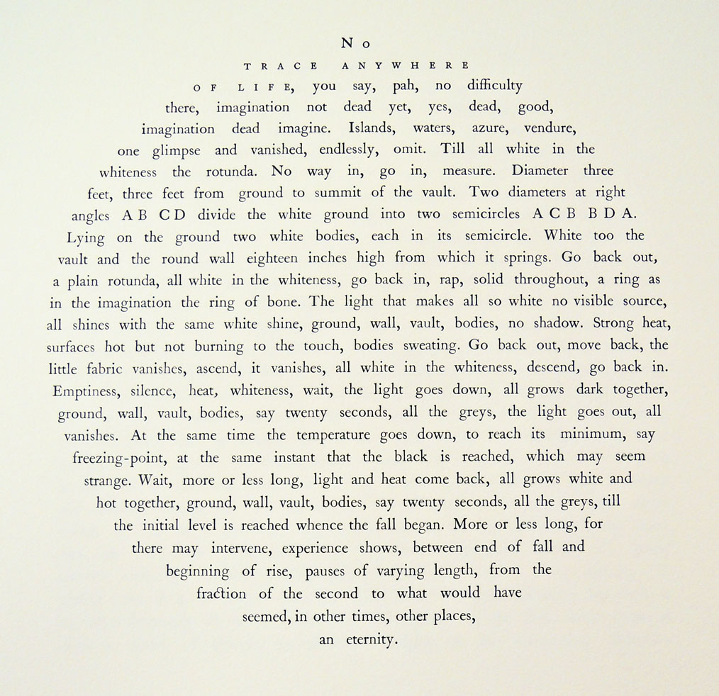
No trace anywhere of life, you say, pah, no difficulty there, imagination not dead yet, yes, dead, good, imagination dead imagine.
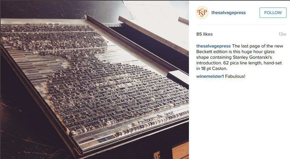
 Jamie Murphy at The Salvage Press in Dublin has published a new edition of Samuel Beckett’s Imagination Dead Imagine, to coincide with the 50th anniversary of its release in 1965. Beckett first wrote the prose fragment Imagination morte imaginez, in French and translated it himself to English. The new edition is a collaboration between typographic designer Jamie Murphy and the visual artist David O’Kane, with an essay by Stanley E. Gontarski, the Robert O. Lawton Distinguished Professor of English at Florida State University and a Beckett scholar who specializes in twentieth-century Irish Studies. https://instagram.com/thesalvagepress/
The Salvage Press is a new studio, devoted to preserving, promoting and pursuing excellence in design, typography & letterpress printing. You can follow them at: http://websta.me/n/thesalvagepress
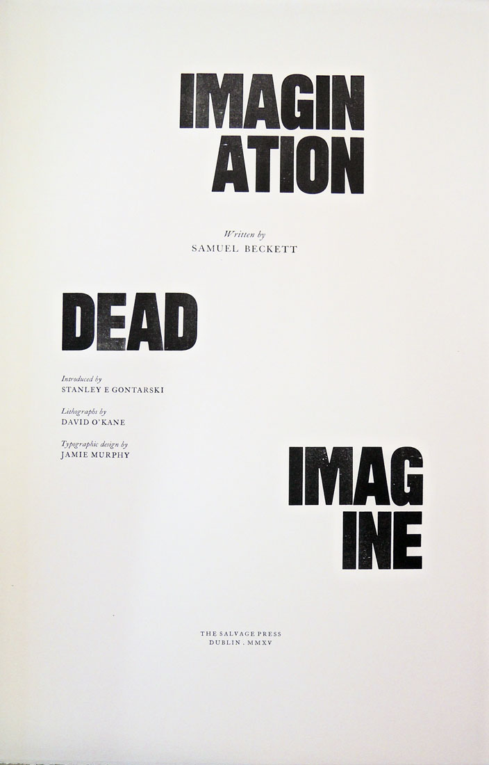

Samuel Beckett (1906-1989), Imagination Dead Imagine. A collaboration between typographic designer Jamie Murphy & visual artist David O’Kane. Essay by Stanley E. Gontarski. (Dublin: Savage Press, 2015). Copy 2 of 40. Graphic Arts Collection GA2015- in process.
Colophon:
This new edition of loose sheets celebrates the 50th anniversary of the original publishing in 1965. The project is a collaboration between typographic designer Jamie Murphy & visual artist David O’Kane. The work is introduced with an essay by renowned Beckett scholar Stanley E. Gontarski.
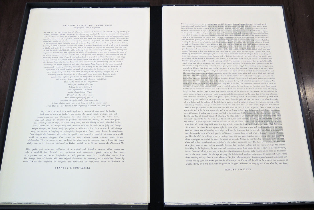
The text has been hand-set & letterpress printed by Jamie Murphy in 18 point Caslon Old Face, supported by a newly drawn ten line grotesque typeface by Bobby Tannam, cut from maple by Tom Mayo. David O’Kane has supplied two lithographs inspired by the text, editioned by Thomas Franke at Stein Werk Lithography studio in Leipzig. The sheets are printed on 250 gsm French made Venin Cuve BFK Rives mouldmade.
The edition is limited to 50 copies, 40 of which make up the standard format, ten accounting for the de luxe. The bindings were executed by Tom Duffy in Dublin. The standard is housed in a cloth covered portfolio, protected inside a slipcase. The de luxe is presented in a clam-shell box accompanied by a typographic triptych based on the text. The standard copies are numbered 11-50, the de-luxe are numbered 1-10. Each copy has been signed by the collaborators.
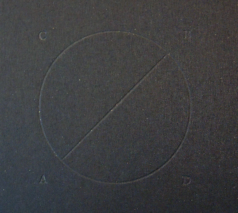
Notes on the images: The two images included in this edition were made using a lithography technique called Schablithografie. This lithography technique is highly labour intensive and involves scratching away at a surface of the blackened lithographic stone to form the image; literally scraping light forms out of darkness, reinforcing the constructed nature of the text, which Beckett goes to great lengths to emphasise.
The first image is a kind of schematic. It is not fully formed and harkens back to Greek and Roman style images, suggesting a metaphorical excavation. The letters and image turn it into a kind of logotype [literally word-imprint in Greek] or emblem and form a bridge between the text and the image.
The second image is larger. The unusual format of the image echoes the formatting of the prose text as it appears in this edition. There are noticeable discrepancies between what Beckett describes and what is depicted in the image. The image is in fact a failed attempt to portray what is fabricated in the story. What interested the artist in staging it is the fact that the positions and space Beckett describes are anatomically impossible without gross distortion of the human body. Beckett would have known this as he also sketched the space out in his notes. So he deliberately stresses the cramped nature of the scenario. The fact remains that in the artist’s mind’s eye the extreme positions were not exactly related to what is described in the story. The spatial discrepancies are only revealed completely when the space is mapped out point for point.
The finalised lithographs are a combination of the mental image conjured up during the initial reading of the text and the interpretation of the physical reenactment made in the artist’s studio.
Typoretum: A Letterpress Workshop from Jamie Murphy on Vimeo.