
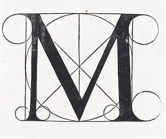
 Back in 2016, the Metropolitan Museum of Art threw out the letter M, based on a woodcut by Fra Luca Pacioli, as their brand in favor of MET, using two fonts: The Met Sans and The Met Serif. https://www.metmuseum.org/blogs/now-at-the-met/2016/brand-identity
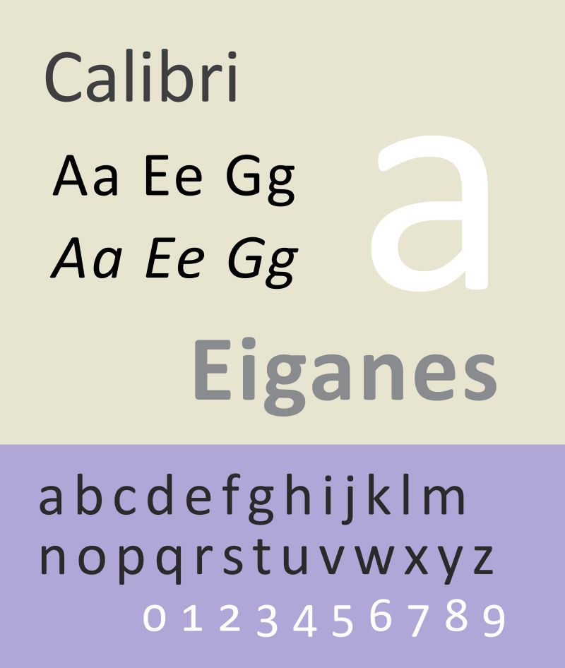
Two weeks ago, on April 28, 2021, the Microsoft Design Team announced they were no longer using Calibri as the default font for Microsoft products. https://www.microsoft.com/en-us/microsoft-365/blog/2021/04/28/beyond-calibri-finding-microsofts-next-default-font/
What is the new default? That is yet to be determined and they are asking us to help. You can vote for the new font from five commissioned fonts (Times Roman is not an option). The five options are: Tenorite, Bierstadt, Skeena, Seaford, and Grandview. All are sans-serif.
 “All five families are now available via the cloud across your favorite Microsoft 365 apps and experiences. Go use the fonts starting today, and show us which you love best with feedback and comments on social.” Microsoft continues:
“Calibri has been the default font for all things Microsoft since 2007, when it stepped in to replace Times New Roman across Microsoft Office. It has served us all well, but we believe it’s time to evolve. To help us set a new direction, we’ve commissioned five original, custom fonts to eventually replace Calibri as the default. We’re excited to share these brand-new fonts with you today and would love your input. Head over to social and tell us your favorite. And don’t worry if the font you love best isn’t chosen as the next default; all of them will be available in the font menu, alongside Calibri and your other favorite fonts in your Office apps in Microsoft 365 and beyond.”
Speaking with Wired magazine, Lucas de Groot, the designer of Calibri, was not unhappy. “I designed it in quite a hurry. I had some sketches already, so I adapted those and added these rounded corners to get some design feeling in it.”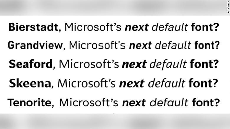
TENORITE by Erin McLaughlin and Wei Huang
“Tenorite has the overall look of a traditional workhorse sans serif (a font without a serif, or a stroke at the ends, like Times New Roman), but with a warmer, more friendly style. Elements such as large dots, accents, and punctuation make Tenorite comfortable to read at small sizes onscreen, and crisp-looking shapes and wide characters create a generally open feeling.”
BIERSTADT by Steve Matteson
“Bierstadt is a precise, contemporary sans serif typeface inspired by mid-20th-century Swiss typography. A versatile typeface that expresses simplicity and rationality in a highly readable form, Bierstadt is also notably clear-cut with stroke endings that emphasize order and restraint.”
SKEENA by John Hudson and Paul Hanslow
“Skeena is a “humanist” sans serif based on the shapes of traditional serif text typefaces. Its strokes are modulated, with a noticeable contrast between thick and thin and a distinctive slice applied to the ends of many of the strokes. Skeena is ideal for body text in long documents, as well as in shorter passages often found in presentations, brochures, tables, and reports.”
SEAFORD by Tobias Frere-Jones, Nina Stössinger, and Fred Shallcrass
“Seaford is a sans serif typeface that is rooted in the design of old-style serif text typefaces and evokes their comfortable familiarity. Its gently organic and asymmetric forms help reading by emphasizing the differences between letters, thus creating more recognizable word shapes.”
GRANDVIEW by Aaron Bell
“Grandview is a sans serif typeface derived from classic German road and railway signage, which was designed to be legible at a distance and under poor conditions. Grandview is designed for use in body text but retains the same qualities of high legibility, with subtle adjustments made for long-form reading.”
Remember you can override the default.