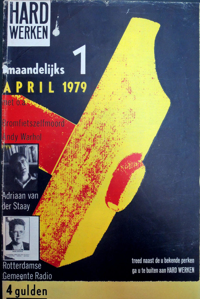
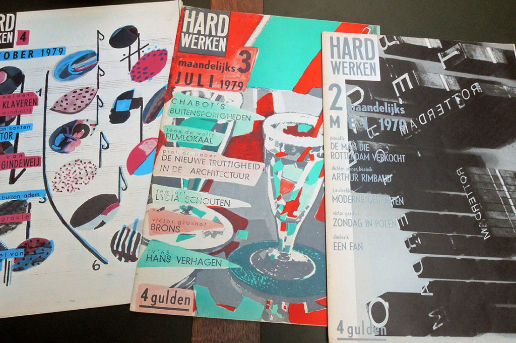
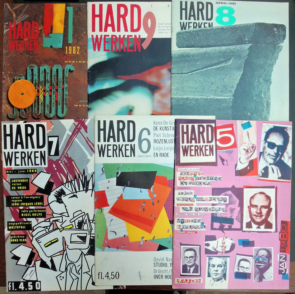
 Two years ago, an exhibition was mounted to celebrate the brief run of the visual art, music, and literature magazine Hard Werken, which made an impact on the typographic artists in The Netherlands and throughout Europe and the United States. The Graphic Arts Collection recently acquired a rare complete run of the title. Here is a statement from Rotterdam curators Reyn van der Lugt and Marjolein van de Ven:
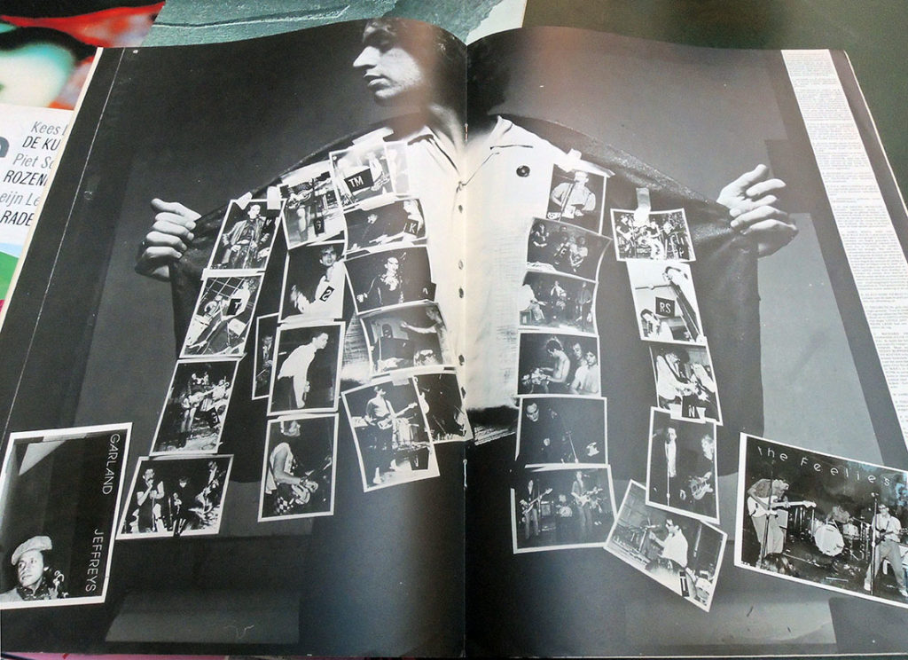
Between 1979 and 1982, only ten editions of this cultural magazine were published, yet it had a significant influence on a whole generation of graphic designers in the Netherlands and beyond. … The striking A3 format, its anarchic design contrary to typographic currents, the focus on photography, and its changing group of contributors for each edition–-mainly from the visual arts and literature–-immediately characterised this new initiative as a brash, elusive, and distinctly Rotterdam phenomenon.–https://www.tentrotterdam.nl/en/show/rotterdam-cultural-histories-8-hard-werken/
Hard Werken was founded by the Rotterdam designers Willem Kars, Gerard Hadders, Rick Vermeulen, Henk Elenga and Ton van der Haspel in 1979, who had all been students at the Rotterdam Academy of Arts. They met through the Graphic Workshop, an initiative of the Rotterdam art foundation and joined with the poet Jules Deelder, photographer Henk Tas, the music club Arena, and Uitgeverij 101 to publish a magazine that represented the new cultural scene of their time and place.
The magazine was characterized by experiments with typography, photography, and illustration inspired from contemporary films, music, theater and painting. Although each designer worked individually, by 1980 the artists decided to focus on design as a group, known as Hard Werken Design.
For the next dozen years, Vermeulen, Hadders, Van den Haspel and Kars accepted all types of graphic design jobs including advertising, packaging, and interior design as well as posters, magazines, and music covers. According to interviews, “everyone was free to accept assignments. In case Hard Werken was approached for an assignment, it was discussed who would do the assignment.”
 Although it is hard to see here, one of the interesting graphic features of Hard Werken was the integration of off-set printing with actual tipped in photographs and other hand-written elements. It was the extra-time and expense of this hand work that made the magazine unable to continue after ten issues.


