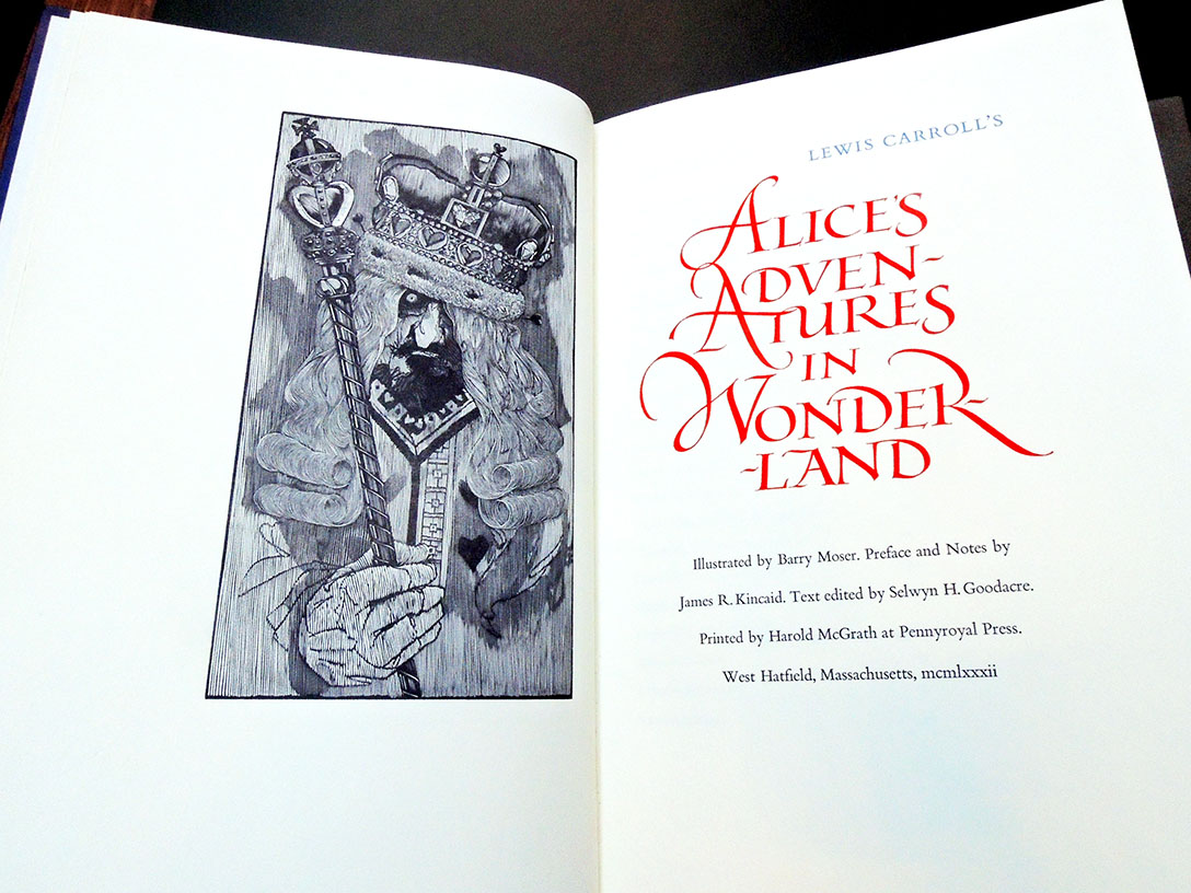
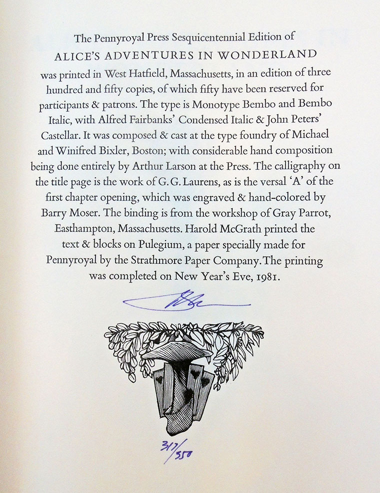
 Alice’s Adventures in Wonderland [by] Lewis Carroll; illustrated by Barry Moser; preface and notes by James R. Kincaid; text edited by Selwyn H. Goodacre; printed by Harold McGrath at Pennyroyal Press (West Hatfield, Mass.: Pennyroyal Press, 1982). Bound volume and additional portfolio of 68 black and white engravings, signed by Moser. “The Pennyroyal Press Sesquicentennial Edition of Alice’s Adventures in Wonderland was printed in an edition of three hundred and fifty copies, of which fifty have been reserved for participants & patrons” –Colophon. Copy 317 of 350. Graphic Arts Collection Oversize PR4611 .A7 1982bF
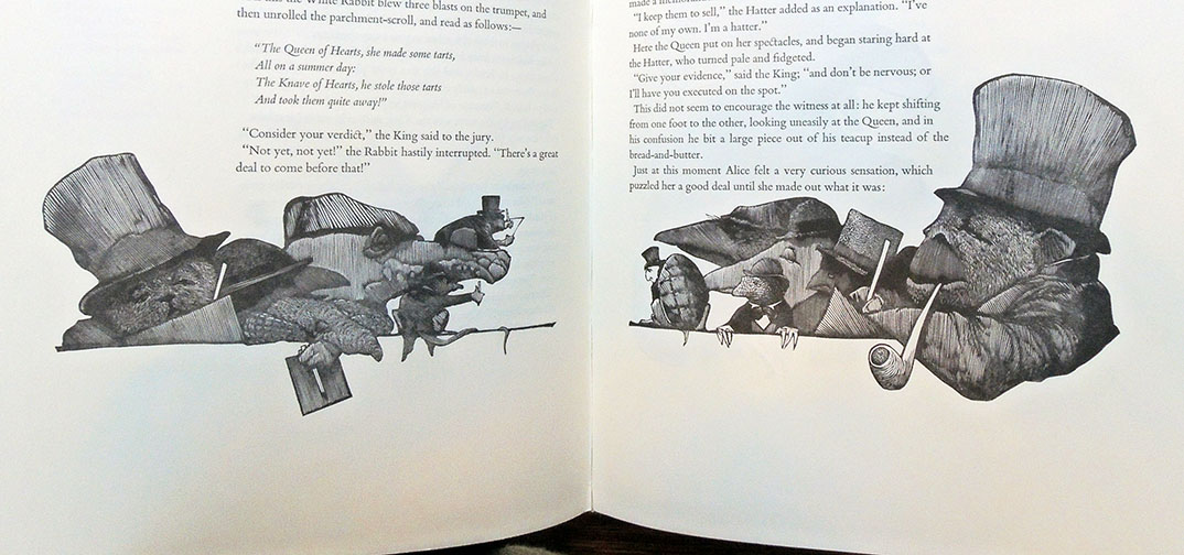
 Notes on the prints by Barry Moser (1981) “To illustrate Alice entails a certain indelicacy, for Alice is a story of loneliness. Its illustrators, beginning with Carroll himself and including Tenniel, Rackham, Steadman, Pogany, Furniss, and Dali, have intruded on the privacy of Alice’s adventure, standing apart and observing Alice in her dream. They have been voyeurs, and yet there can be no voyeurs to dreams. In The Pennyroyal Alice, the reader is a voyeur only when Alice is associated with her sister: first, on the bank; then, after awakening, running home for tea; and finally in her sister’s reverie. The images of Alice’s dream are always seen from Alice’s point of view, for after all, the dream is Alice’s dream.
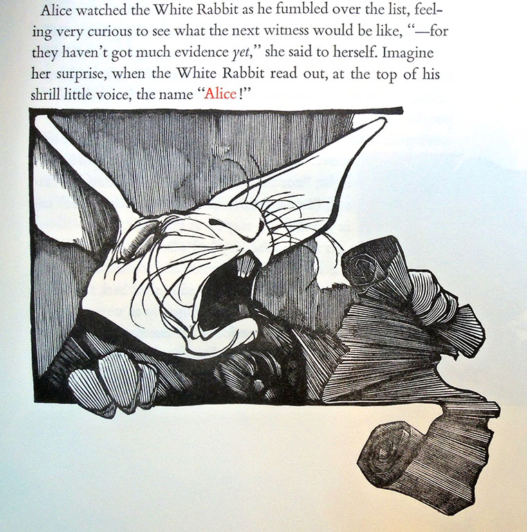
…Carroll’s thoughts on his own creation provided important keys which took The Pennyroyal Alice in interesting visual directions. For instance, Carroll commented to Alexander Macmillan in 1864, that the binding cloth for Alice should be bright red—not because it was the best, he said, but because it would be “the most attractive to the childish eyes.” I used that note as a displaced chromatic key: red for the shoulder commentary, and red for Alice’s name when it is shrieked by the White Rabbit in the trial scene. Similarly, Carroll’s habit of writing letters in purple ink suggested the use of violet leather for the binding. The blue that appears in the chapter heads and other titles is, of course, Oxford blue. Carroll’s (often meddlesome) letters to and about Tenniel, Arthur Hughes, and G.W. Taylor gave me insights into Carroll’s vision of Wonderland, a contradictory vision which embraced the “weird” and “grotesque” as enthusiastically as it embraced the “graceful and pretty.”…
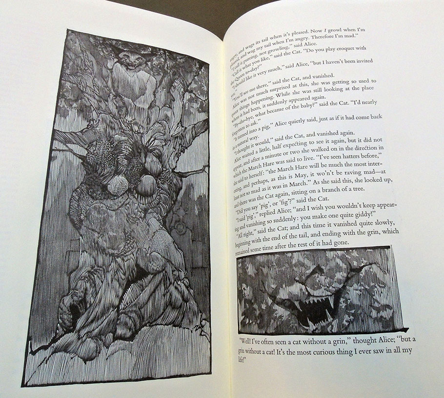
The Cheshire Cat is modeled after the hairless Sphinx, a ridiculously rare feline, which like a mule cannot reproduce itself.”
 “In 1977 Moser met Andrew Hoyem, who asked if Moser would be interested in illustrating Arion Press’s forthcoming Moby-Dick. He was, he did, and it was published to great fanfare. This had profound ramifications for Pennyroyal Press because, as Moser reasoned in retrospect, he could certainly design a book as well as Hoyem, and Harold McGrath, who was widely considered as the finest letterpress printer in America at the time, was certainly as good a pressman as any of Hoyem’s. And so Moser, McGrath, and Jeff Dwyer, their business manager and partner, determined to produce something that was much grander than any of the previous Pennyroyal books. In 1982 the Pennyroyal Press edition of Lewis Carroll’s Alice’s Adventures in Wonderland appeared and subsequently won the 1983 American Book Award for the trade edition published by the University of California Press in Berkeley, California.”–https://www.moser-pennyroyal.com/