
“The Petrarch Press edition of Shake-speare’s Sonnets has been the most significant project in our history,” writes William Bentley, “both for the end result and for the new skills and capabilities we developed along the way. The decision to print the original text was itself a journey of discovery, in which we abandoned our initial plan to issue (yet another) modernized edition of these timeless poems, and learned to appreciate the orthography of Shakespeare’s day.”
The Graphic Arts Collection recently acquired a copy of their Sonnets, for which they cast their own metal type and engraved the special characters needed to print a 17th-century text.
http://www.petrarchpress.com/shakespeare-sonnets/
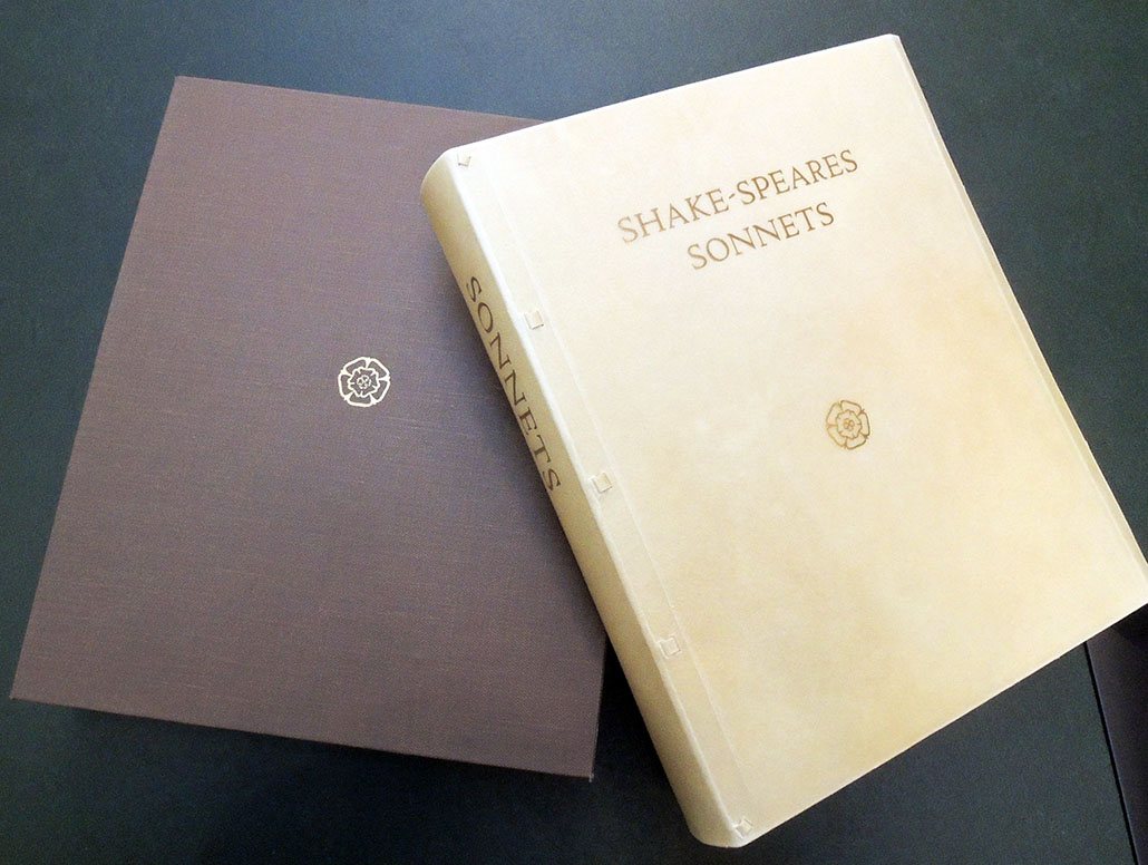
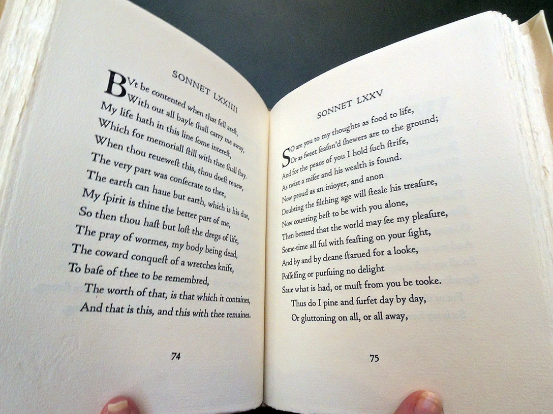
When we began to visualize our new edition of Shakespeare’s Sonnets, just a few ideas stood out. We wanted an intimate volume where each sonnet would be presented on its own page and where each verse would stand on one line, regardless of its length. Visually, we wanted our edition to resonate with the books produced by the early fine presses: Handmade paper with deckle edges, an authentic limp-vellum binding, and types that have their roots in classic early printing.
Our access to typecasting matrices for Cloister Old Style (designed in 1913 to resemble the Jenson-based types of the Kelmscott Press) made the choice of font easy. William had already begun casting our own metal type after we acquired our first Monotype Thompson casting machine (as told in Our New Typecasting Foundry). But preparing the type for Shakespeare’s Sonnets turned into an adventure on a different level.
http://www.petrarchpress.com/creating-new-types-for-shakespeare/
The Petrarch Press in Oregon House, California, is a revival and expansion of the late Peter Bishop’s own Petrarch Press, which produced a series of special, hand-printed, limited editions both in Northern California and in New York City from 1985 through 1996.
“The Petrarch Press now builds on the rich history of 110 years of fine-press printing, using our passion and standards of refinement to create lasting fine editions of great world literature with a focus on typography.”
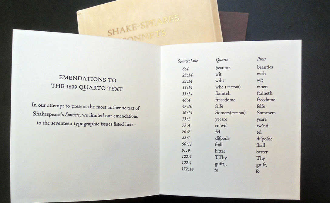
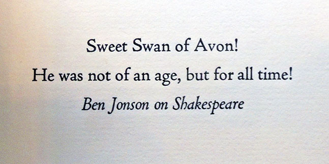
“This edition of Shakespeare’s sequence of sonnets honours the Quarto impression of 1609, perhaps the last publication of Shakespeare’s writings in his own lifetime. We have chosen to respect the arrangement, orthography, and punctuation of the original, with all its peculiarities, the only significant departure being to give each poem a page of its own. In all other ways we have tried to present the most authentic version of the Sonnets possible, in both typography and content, for our modern age.”
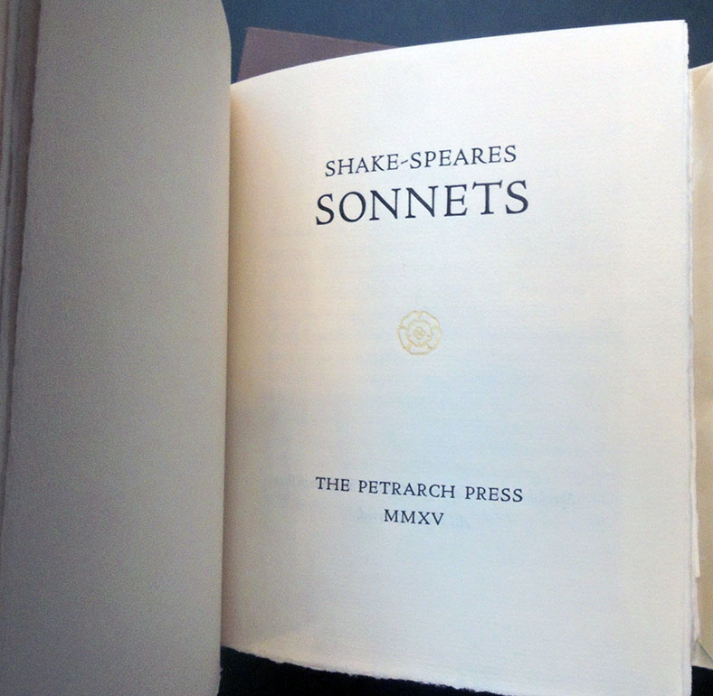
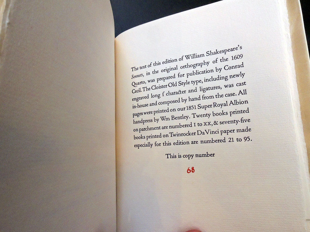 William Shakespeare (1564-1616), Shake-speare’s sonnets (Oregon House, CA: Petrarch Press, 2018). Copy 68 of 75 numbered copies on handmade Twin Rocker paper; bound in semi-limp calfskin vellum with slipcase. Graphic Arts Collection GAX 2018- in process
SONNET 29
When, in disgrace with fortune and men’s eyes,
I all alone beweep my outcast state,
And trouble deaf heaven with my bootless cries,
And look upon myself, and curse my fate,
Wishing me like to one more rich in hope,
Featur’d like him, like him with friends possess’d,
Desiring this man’s art and that man’s scope,
With what I most enjoy contented least;
Yet in these thoughts myself almost despising,
Haply I think on thee, and then my state,
Like to the lark at break of day arising
From sullen earth, sings hymns at heaven’s gate;
For thy sweet love remember’d such wealth brings
That then I scorn to change my state with kings.