Category Archives: Books

books

22 Kupferstiche

Born in 1943, the Germany printmaker Baldwin Zettl studied from 1964 to 1969 at the Hochschule für Grafik und Buchkunst Leipzig (The Academy of Fine Arts Leipzig), one of the oldest art colleges in Germany.

Zettl’s limited edition portfolio of engravings inspired by Richard Wagner’s Ring cycle was recently moved from the Mendel Music Library to the Graphic Arts Collection. This, as with most of Zettl’s work, is designed entirely in black and white.

Richard Wagner (1813-1883), Richard Wagner, Der Ring des Nibelungen: 22 Originalkupferstiche; mit einem Text des Künstlers und einem Geleitwort von Wolfgang Wagner (Leipzig: Sisyphos-Presse, 2001). Limited edition of 100 copies, printed at Elmar Faber’s Sisyphos Press in Leipzig. Graphic Arts Collection GAX 2017- in process


See Zettl’s work also in: Volker Braun (1939- ), Das Mittagsmahl; mit Kupferstichen von Baldwin Zettl (Frankfurt am Main: Insel Verlag, 2007). Firestone Library (F) PT2662.R34 .M58 2007

The Shakespeare that almost didn’t happen


The newspaper headline read: “Spruce Street fire, Monday night, set accidentally by a porter in the basement of the building owned by Newell and Company, were insured.”

In the fall of 1845, the wood engraver and manager of the printing office at Spruce Street Nathaniel Orr wrote to his fiancé, “Here I am, not dead but alive and kicking . . . I had a pretty narrow escape last night. But thanks to my “guardian angel” I made my exit from the burning [building] with scarcely a bruise. Just my luck. My loss will be but trifling. Though [Henry W.] Hewet paid me twenty dollars per week. I have already had offers equally as lucrative.”

“The Harpers tell me all will be right as soon as Hewet returns. I wrote to him last night and shall expect him tomorrow morning. When I found my passage completely cut off by the falling of the stairs I most assuredly thought my time had come. Oh, a thousand thoughts rushed upon my mind in a moment. I thought of you, of my bright hopes, of the horror of perishing in the flames. It was life or death, so I made the leap and here I am your own.”

A week later, Nathaniel wrote again to say that “Every article in our office was entirely destroyed and when I think of my own narrow escape I can but attribute it to a most merciful providence . . . I passed three windows (four stories from the ground) on the outside that I might get in a position for jumping on a small outhouse, two stories from the window. Had I [fallen] there I should not only have been killed but burned to ashes in the ruin. . . . The first John [Orr] knew of my adventures was on his way home, some four or five hours after I had astonished the natives, he met an acquaintance who inquired if I had been found! When he called on me I was asleep, preparing to repeat my leap to the tenor of the spectators.”


By mid-November, Nathaniel wrote to say “the cloud that hung over me for a few days after my late exit from the third story window . . . has entirely disappeared, and I now find myself most delightfully situated in splendid rooms at 289 Broadway under the patronage of Hewet, or more properly, Harper and Brothers, for they have concluded to have all the plates that were destroyed at the late fire reengraved forthwith. It will probably take us eighteen or twenty months to complete the work. So, you see, Phoenix-like I rise again . . . .”


William Shakespeare (1564-1616), Shakespeare’s Plays. With his life. Illustrated with many hundred wood-cuts, executed by H.W. Hewet, [and Nathaniel and John Orr], after designs by Kenny Meadows, Harvey, and others. Ed. by Gulian C. Verplanck, LL. D. (New York: Harper & brothers, 1847). RECAP 3925.1847

Letters by Nathaniel Orr in Orr Family Papers, Special and Area Studies Collections, George A. Smathers Libraries, University of Florida, Gainesville, Florida.


To Trenton, in search of the picturesque

As children, John William Orr (1815-1887, top right) and Nathaniel Orr (1822-1908, top left sitting upright) moved every few years from New York to Belfont, Pennsylvania; London Canada; Detroit, Michigan; and Perrysburg, Ohio. Their father died in Ohio and the family moved once more to live with relatives in Buffalo, New York. John was fourteen, Nathaniel was seven, and both dreamed of becoming artists.

To help support the family, John spent his teenage years working as a clerk in the Buffalo Post Office. This mundane work ended only a few days after his twenty-first birthday, when John left for New York City to study under the artist William C. Redfield, brother of the publisher Julius S. Redfield. At the end of the year, John returned to Buffalo and became a leading force in the local arts community, elected president of the Society of Fine Arts in 1839.

Meanwhile, his younger brother Nathaniel finished a Buffalo apprenticeship and was accepted as a student of John H. Hall, one of only five students of the earliest and best American engraver Alexander Anderson (1775-1870). Nathaniel moved to Albany where Hall lived and John soon followed.

Between 1838 and 1846, John Orr illustrated part or all of a series of guidebooks to Niagara Falls and upstate New York, including Settlement in the West: Sketches of Rochester (1838); The Falls of Niagara, or Tourist’s Guide to This Wonder of Nature (1839); The Travellers’ Own Book to Saratoga Springs, Niagara Falls and Canada (1842); Pictorial Guide to the Falls of Niagara (1842); The Picturesque Tourist: Being a Guide Through the Northern and Eastern States and Canada (1844); Peck’s Tourist’s Companion to Niagara Falls, Saratoga Springs, the Lakes, Canada, etc. (1845); A Picture of New-York in 1846 (1846); and Sketches of Niagara Falls and River (1846).

Little by little, Nathaniel took over the work being offered to J. H. Hall, including the wood engraving for J. A. Adams (1803-1880) and Harper’s Illuminated Bible (1846). Adams was impressed with Nathaniel’s work and encouraged the young artist to move to New York City, where he became the shop manager for Henry W. Hewet and his multi-volume edition of Shakespeare’s Plays (1847). Once again, John followed his younger brother, setting up a studio at 75 Nassau Street.

In 1851, Nathaniel received a commission to engrave the cuts for Nathaniel Parker Willis (1806-1867), Trenton Falls: Picturesque and Descriptive and became acquainted with the wilderness across the Hudson River in New Jersey. At the same time, John engraved the blocks for George William Curtis (1824-1892), Lotus-Eating…, with chapters on the Hudson and the Rhine; Catskill; Catskill Falls; Trenton; Niagara; Saratoga; Lake George; Nahant; and Newport (1852).

As time allowed, Nathaniel and John, both ardent hunters and fishermen, journeyed out of Manhattan to explore the neighboring state. Fellow Harper’s artist John R. Chapin (1827-1907) who lived in Rahway, must have accompanied the men, finally recording and publishing their adventures in Harper’s New Monthly Magazine as “Artist-Life in the Highlands,” in April 1860 and “Among the Nail-Makers,” in July 1860.

In Chapin’s stories, John is called Neutral Tint, “a tired artist in search of relaxation from a period of close application.” Nathaniel is called “Snell,” and described as a bit of an artist as well as a follower of Izaak Walton (author of The Compleat Angler). The stories are good but even better are the visual portraits drawn of the two brothers, giving us insight into their physical character and relationship.


Nathaniel Parker Willis (1806-1867), editor. Trenton Falls, picturesque and descriptive, The principal illustrations from original designs by Heine, Kummer and Müller. Engraved on wood by N. Orr (New York: G. P. Putnam, 1851). (F) F129.T7 W7 1851


Harper’s New Monthly Magazine (New York: Harper & Brothers, [1850-1900]). Recap 0901.H295


The Poet of the Future

This sheet of drawings by John McLenan (1827-1865) turns up in a scrapbook at the New York Public Library, with no explanation. Over the years, the central portrait has been assumed to be Walt Whitman (1819-1892).

McLenan’s final published prints were discovered recently in our set of the Harper’s New Monthly Magazine CXXI, no. 20 (June 1860), p.141-42. The central drawing is titled “The Poet of the Future.” Below is our death mask of Whitman so that you can decide for yourself whether or not the sketch is meant to be Whitman.

The Future President; Organ of Veneration; Gushing Poetess; The Great Artist [self-portrait of John McLenan].
Well-balanced Head; Benevolence; The Great Captain; The Poet of the Future; [Embryo] Financier.

“Gifted by nature this subject–with a head that’s swollen with Literary talent–is allow to go to grass…”

Death mask of Walt Whitman (1819-1892), 1892. Laurence Hutton Collection of Life and Death Masks.

A Practical Guide to the Varieties & Relative Values of Paper

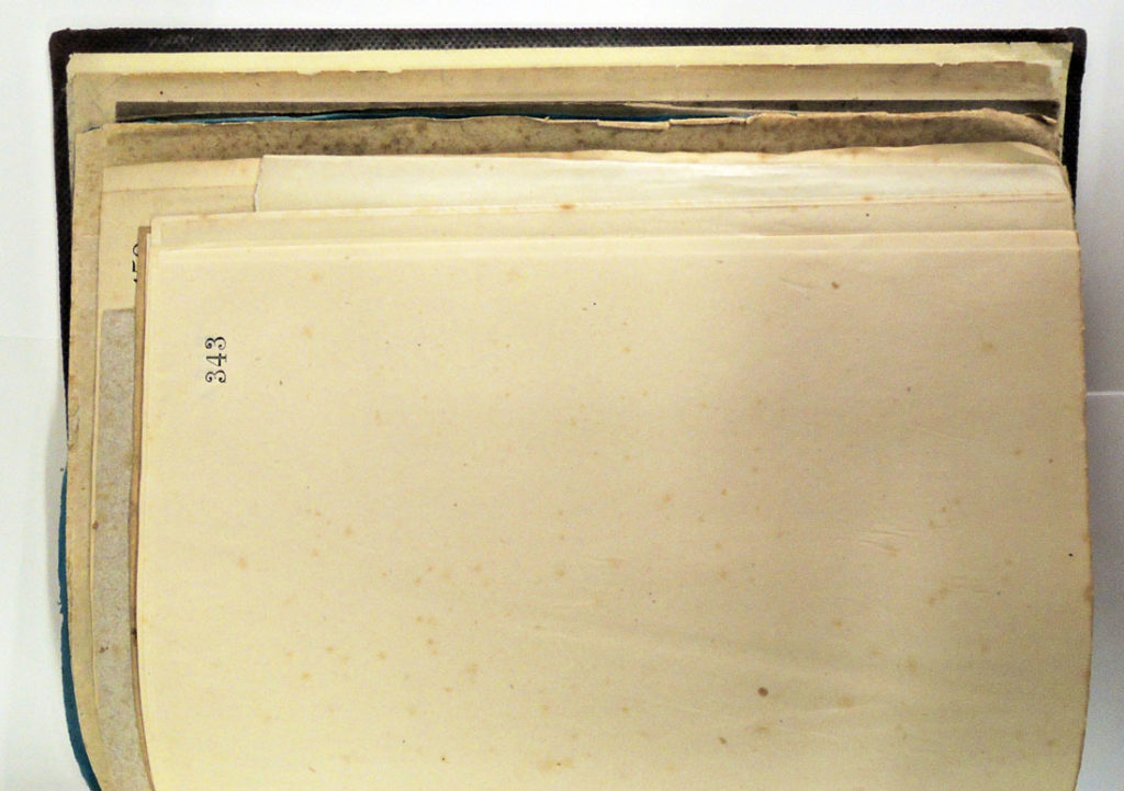
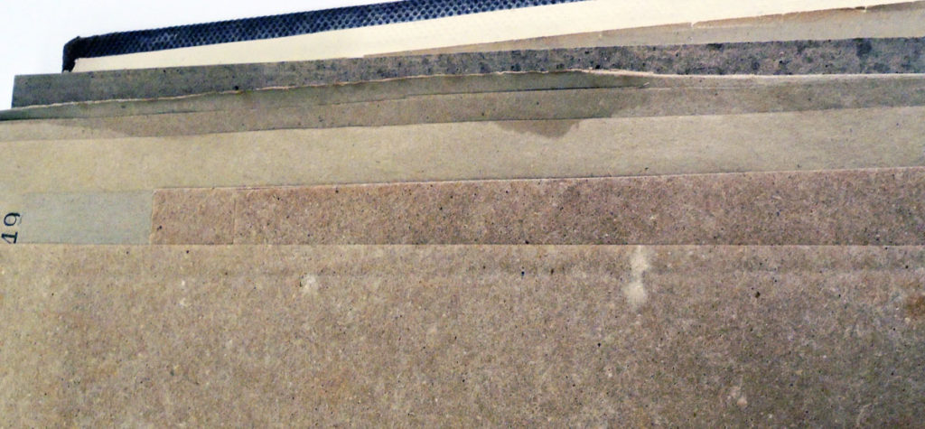
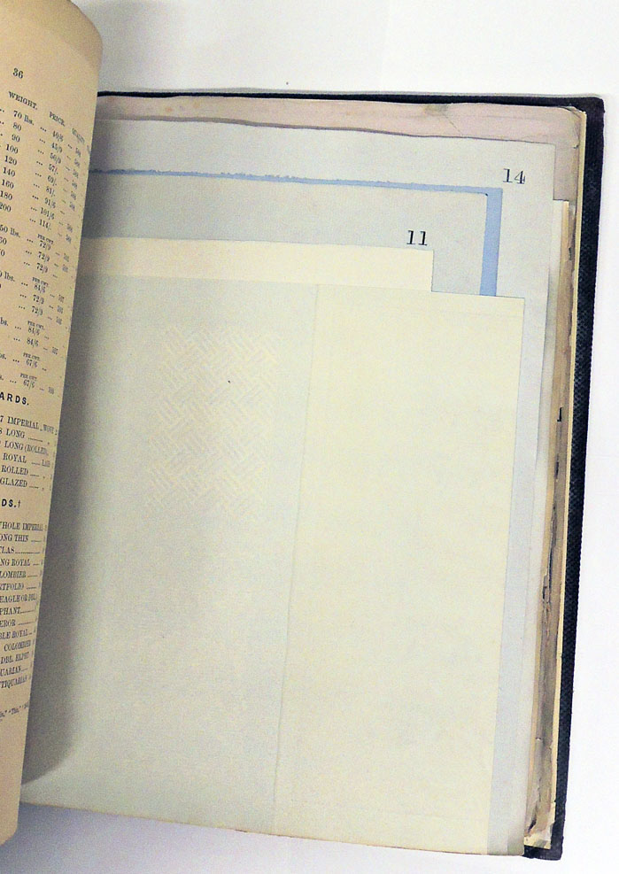
The study of paper is not virtual. You hold it in your hand and feel the weigh of the sheet. You bend it to see which direction the paper fibers are running. You place it over a light and search for a watermark, then shine the light at an angle to see the texture of the surface. Are there chain lines? How big was the sheet originally and how many times was it cut to make the present page?

It is an intimate investigation best learned with paper samples that have already been identified and documented and yet, finding such rare samples is, of course, difficult.


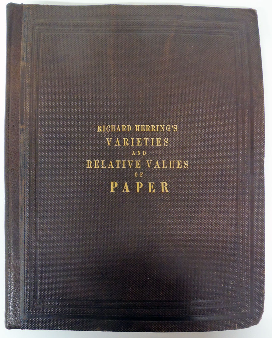
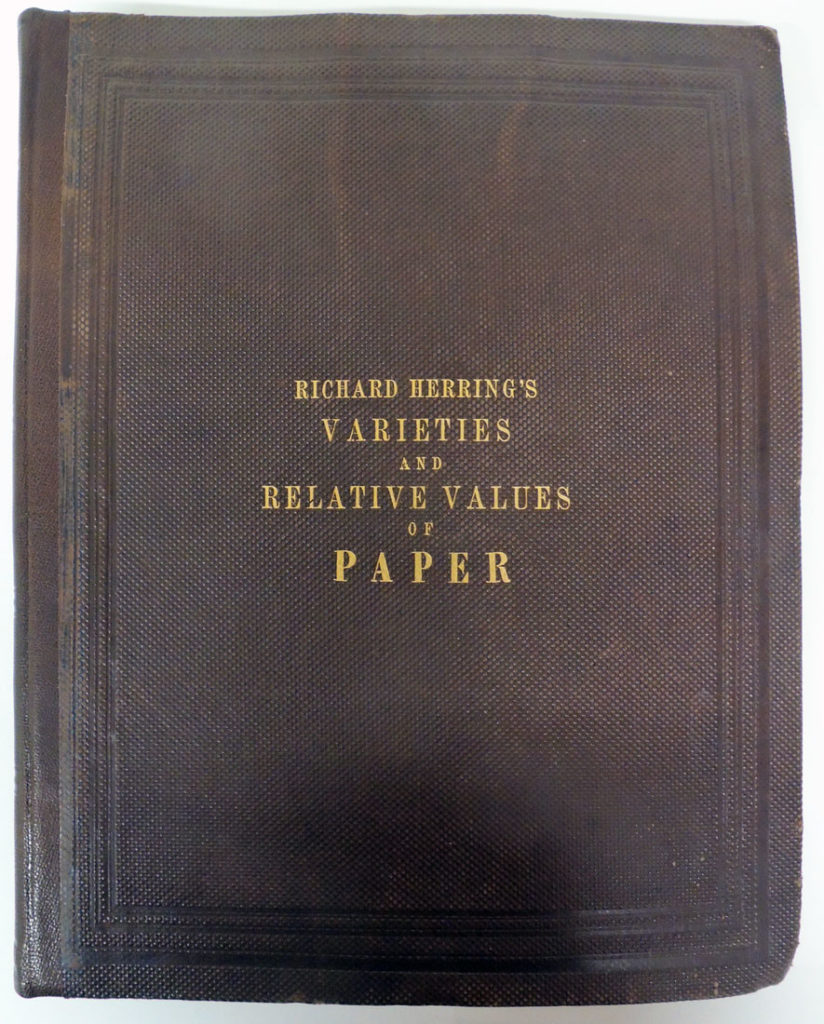
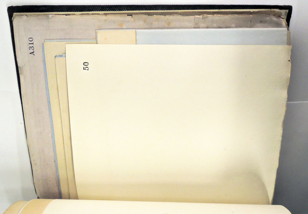
Among the earliest encyclopedic gatherings of different types of paper is Richard Herring’s A Practical Guide to the Varieties & Relative Values of Paper, first published in London in 1860. The Graphic Arts Collection now owns a copy of this very rare volume.

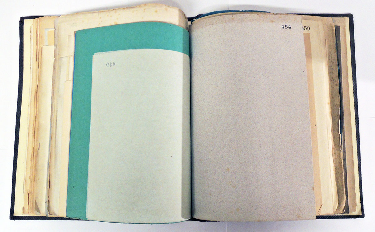
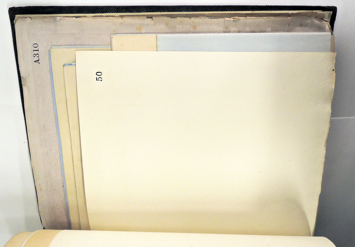
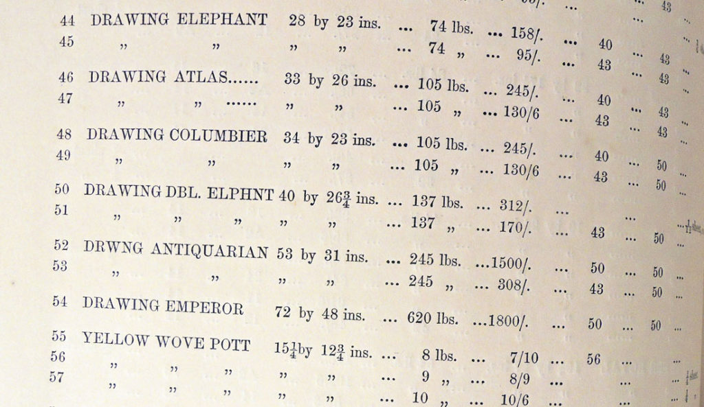
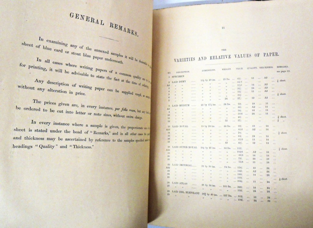
Herring’s Guide was and is the most comprehensive published paper specimen book issued in the nineteenth century up to 1860. Herring calls for 246 samples but the copy recently acquired by Princeton has 244. Copies in the British Library and St. Bride’s Library each have only 242 samples. Undoubtedly, these volumes were each unique, hand bound treasures.

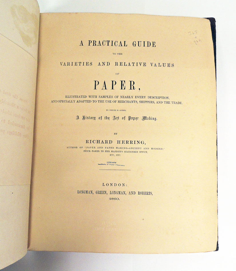
“The object of this work,” writes Herring, “is to furnish similar assistance to the stationer to that which afforded to the bookseller by the London catalogue. It is so arranged that by a very simple mode of reference to two hundred and forty-six samples of paper, which are appended to the work, no fewer than six hundred and eighty-one distinct kinds, with the relative prices of each affixed, are represented . . . Nearly every variety of paper, with its characteristic technicalities, dimensions, and weight, has been accurately given . . . .” –preface.

Antiquarian Charles Wood III writes, “The range and variety of papers is astonishing and endlessly fascinating; there are writing papers, printing papers, cartridge papers, wove papers, filtering paper, drawing papers, glazed boards, milled boards, etc. etc. The author was a in a unique position to produce this work; he was stock-taker to Her Majesty’s Stationery Office.”


Here is one of the original advertisements in Bookseller: The Organ of the Book Trade and Many Other Trade Publications, in which Herring wrote:

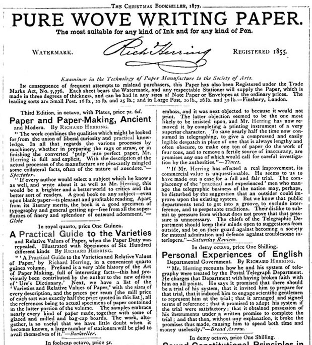
A Practical Guide to the Varieties and Relative Values of Paper by Richard Herring, in a convenient quarto Guinea volume. Prefixed is a very able history of the Art of Paper Making, full of interesting facts this had previously been contributed by the author to the new edition of Lire’s Dictionary. Next, we have a list of the Varieties and Relative Values of Paper with the sizes of every description and the prices per ream, all the references being to actual specimens of paper contained in the latter portion of the volume. The samples embrace nearly every kind of paper made, together with some of glazed and milled and bag-cap boards. The work, altogether, is so useful that we have little doubt a large number of Stationers will be glad to avail themselves of it.—Bookseller. [The Maker’s price for each sort, including the duty of three halfpence per pound, was exactly two-thirds of the price quoted in this list when the Paper Duty was repealed.—R.H.]


Richard Herring (born 1829), A Practical Guide to the Varieties and Relative Values of Paper: Illustrated with Samples of Nearly Every Description and Specially Adapted to the Use of Merchants, Shippers, and the Trade: To Which Is Added, a History of the Art of Paper Making (London: Longman, Green, Longman, and Roberts, 1860). Graphic Arts Collection GAX 2017- in process.

Thank you to everyone who helped make this acquisition possible.


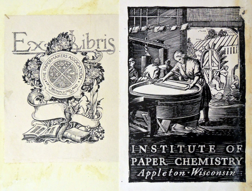
Bookplates inside front cover:


See also Herring’s earlier catalogue with only 25 samples, from the collection of Elmer Adler:
Richard Herring (1829-18 ), Paper & Paper Making, Ancient and Modern; with an Introduction by the Rev. George Croly (London: Longman, Brown, Green, and Longmans, 1855). xvi, 125, 24 p., [5], 25 leaves of plates (2 folded) : ill., 25 samples (some col.); 23 cm. “Founded upon lectures recently delivered at the London Institution”–Preface. Samples comprise 8 sheets with watermarks (3 line, 3 light and shade, 2 impressed), 5 of writing paper (2 laid, 3 wove), 4 of wrapping paper, 2 of paper made from 80% straw and 20% rope, 1 made almost entirely from wheat straw, 1 of printing paper and 1 sample each of water leaf, unsized, sized and glazed paper. Graphic Arts Collection (GAX) TS1090 .H477 1855
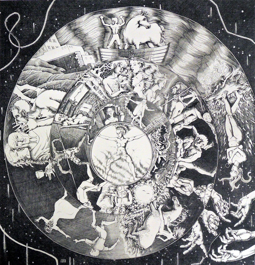
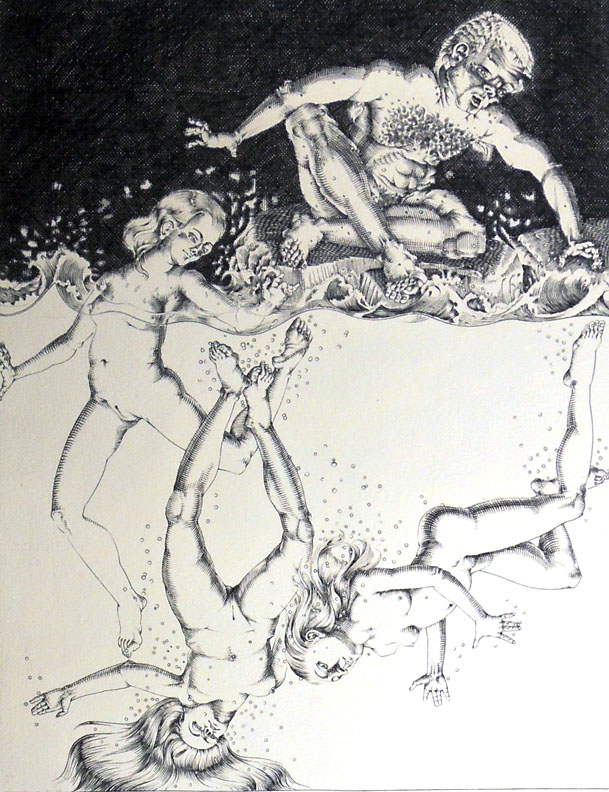
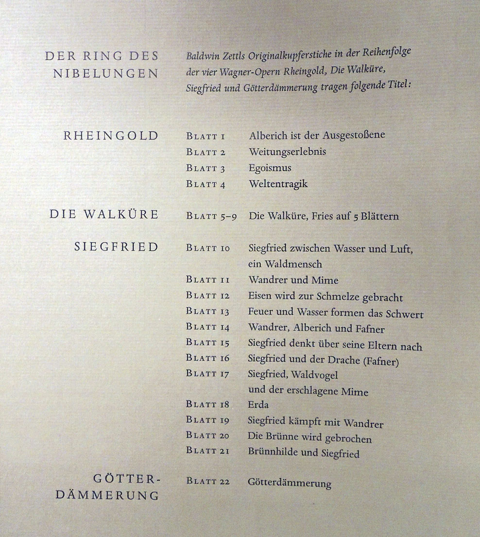
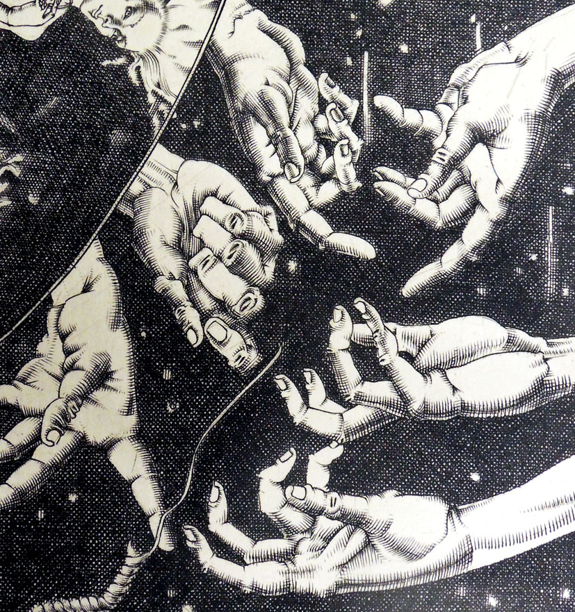
American Freemason Magazine

From November 1855 to April 1857, Robert Morris published a semi-monthly newspaper called the American Freemason out of Louisville, Kentucky. When he ran into financial difficulties his printer, Joseph Fletcher Brennan, took over the publication, switching to a monthly format with an emphasis on literature and poetry.

Working from Kentucky, Brennan commissioned his Masonic Brother Nathaniel Orr in New York City to redesign the periodical with a strong header and large wood engraving at the front of each issue. Various small cuts went inside as the stories required. Orr’s next door neighbor A.S. Barnes & Co., Wholesale Booksellers and Publishers, at 51 John Street was asked to help distribute.

Unfortunately, Brennan also had trouble funding the magazine. Writing to Orr from Louisville, October 15, 1857, Brennan explained that he still couldn’t pay the artist for his wood engravings. John Chapman is also doing a few designs for the magazine without receiving payment. “I will have also to arrange with him to wait until I can send him a check to pay both of you. I will be able to do this in the course of a month at farthest. . . . [Asking if Orr will continue his work] I think this would be the best way and I will pay you for it… Do so, if you please, and I will be grateful to you.“

Two weeks later Brennan wrote again, promising to pay Orr in a few weeks.  Chapman’s name does not appear in the magazine, refusing to work without pay while Orr, a devoted Freemason, continued to supply the publication with images. In the end, Brennan was unable to secure financial backing and the magazine only last for two years (although the title is revived again later by others).

The American Freemason’s New Monthly Magazine ([New York: J.F. Brennan, 1859- ). Recap HS351 .A512


New York’s historic Masonic Hall is located in the heart of the Chelsea, home to the headquarters of the Grand Lodge of Free and Accepted Masons of the State of New York, along with the Chancellor Robert R. Livingston Library and Museum. To get tour information or request a tour, e-mail TourGuides@nymasons.org. Free public tours of the Grand Lodge Building and Masonic Hall are conducted Monday through Saturday between the hours of 10:30 a.m. and 2:15 p.m.

Things Japanese, 1742

The Graphic Arts Collection holds a complete 10 volume set of the rare Illustrated Book of Comparable Things in Yamato (Japan), also called Illustrated Study of Things Japanese, written and published in 1742. Each book is bound in black paper with unique floral decoration painted in gold.

Nine of the ten volumes are filled with illustrations by Nishikawa Sukenobu (1671-1751) of Kyoto, compiled by Ban Yūsa of Naniwa of Osaka. The cutting of the blocks was done by Fujimura Zenyemon and Murakami Genyemon.

Each volume is dedicated to one genre or subject matter, including 1. Preface, landscapes, animals.–2. Historical figures of poets and painters.–3. Historical figures of women.–4. Historical subjects.–5, 6. Historical figures in literature.–7. Miscellaneous historical figures.–8. Historical figures in anecdotes.–9. Illustrations of poems.–10. Contents, text and notes.


Nishikawa Sukenobu (1671-1751), Ehon Yamato hiji / Naniwa Ban Yūsa sanshū · Heian Nishikawa Sukenobu gazu = 繪本和比事 / 浪華伴祐佐纂輯·平安西川祐信畫圖 = Illustrated Book of Comparable Things in Yamato (Japan) (Ōsaka: Kanseidō Kawauchiya Uhezō ban, Kanpō 2 [1742]) 10 volumes. Graphic Arts Collection 2017- in process

The Graphic Arts Collection also includes Nishikawa Sukenobu’s Ehon mitsuwagusa ([Japan]: [publisher not identified], [between 1750 and 1760]) and his Ehon fudetsubana [ge] (Kyōtō: Kikuya Kihē, Enkyō 4 [1747]).

Ancient Textile Patterns

Shinsen kodai moyō kagami. ten / Kodama Eisei hen = 新撰古代模様鑑. 天 / 児玉永成編 = Collection of Newly Selected Ancient Patterns, volume 1. (Tōkyō: Ōkura Magobe, Meiji 18 [1885]. 48 unnumbered pages. Graphic Arts Collection (GAX) 2017- in process

This is the first of a two-volume set of ancient textile patterns. Each small textile sample is labeled by its source. The preface was written in 1885 by classical scholar and member of the Meiji government’s office of Shinto worship, Fukuba Bisei (1831-1907). His seal is stamped near his signature. The editor provides introductory remarks. –research and cataloguing by Tara McGowan, PhD

“Fukuba Bisei was Under-Secretary in the Office of Rites in 1868, and instructor to the Meiji Emperor in matters of Shinto ceremonial. Along with Vice-Minister of Rites Kamei Koremi, he was among the chief officials responsible for the shinbutsu bunri (“separation of Buddhism and Shinto”) policies. He was an adherent of the kokugaku (Nativist) teachings of Okuni Takamasa.” –James Ketelaar, Of Heretics and Martyrs in Meiji Japan, Princeton University Press (1991)


Alcott to Billings: Oh, Please change em!

The Graphic Arts Collection holds a proof of a wood engraving after a drawing by Hammatt Billings (1818-1874), which Billings intended as the frontispiece to the Second Part of Little Women. As the collector Sinclair Hamilton notes, Louisa May Alcott (1832-1888) disliked it intensely, as is made evident by her letter to Elizabeth B. Greene:

“Oh, Betsy! Such trials as I have had with that Billings no mortal creter [sic] knows! He went & drew Amy a fat girl with a pug of hair, sitting among weedy shrubbery with a lighthouse under her nose, & a mile or two off a scrubby little boy on his stomach in the grass looking cross, towzly, & about 14 years old! It was a blow, for that picture was to be the gem of the lot. I bundled it right back & blew Niles [of Roberts Brothers] up to such an extent that I thought he’d never come down again. But he did, oh bless you, yes, as brisk & bland as ever, & set Billings to work again. You will shout when you see the new one for the man followed my directions & made (or tried to) Laurie ‘a mixture of Apollo, Byron, Tito & Will Green.’ Such a baa Lamb! Hair parted in the middle, big eyes, sweet nose, lovely mustache & cunning hands; straight out of a bandbox & no more like the real Teddy than Ben Franklin. I wailed but let go for the girls are clamoring & the book can’t be delayed. Amy is pretty & the scenery good but—my Teddy, oh my Teddy!”

At the top of the proof is a penciled note from the publishers: “If Miss A. will return this Friday A.M. Mr. Niles will be obliged.” Under this, in ink, in Miss Alcott’s handwriting is written “Oh, please change em!” and, on the sides of the engraving, also in her handwriting, are the words: “Amy too old & no curls. Amy is 17, slender & picturesque. Teddy much too young and no mustache. He is 21 in the story & very handsome.”

At the bottom of the engraving Miss Alcott has written “Lazy Laurence.”
Hamilton’s second attempt is the one found as the frontispiece to “Part Second” of Little Women.


Louisa May Alcott (1832-1888), Little Women, or, Meg, Jo, Beth, and Amy. Part second (Boston: Roberts Brothers, 1869). Graphic Arts Collection (GAX) Hamilton 206(2)


Thanks to Ananya A. Malhotra, Class of 2020, for her help in locating this on her last day in RBSC.

See also: https://books.google.com/books?id=3cyHQqYWsr0C&pg=PA44&lpg=PA44&dq=little+women+illustrations+billings+steel+engraving&source=bl&ots=P-VX8AKh_Z&sig=ACfU3U0cthpQsnXvHoJhZpcfOnlljm4_nA&hl=en&sa=X&ved=2ahUKEwiqmfOgzM7mAhUOpFkKHYroDBYQ6AEwC3oECAcQAQ#v=onepage&q=little%20women&f=false

Description of the Poets

Fabricious’s Description of the Poets. Vide:Gil Blas—“People think that we often dine with Democritus and there they are mistaken. There is not one of my fraternity, not even excepting the makers of Almanacs, who is not welcome to some good table. As for my own part, there are two families where I am received with pleasure. I have two covers laid for me every day, one at the house of a fat director of the farms, to whom I have dedicated a romance, and the other at the house of a rich citizen, who has the disease of being thought to entertain wits every day at his table; luckily he is not very delicate in his choice, and the city furnishes him with great plenty.” Print by Thomas Rowlandson, text from: Alain René Le Sage, The History and Adventures of Gil Blas of Santillane (London, 1716).

The Miseries of Human Life, written in 1806 by James Beresford, a Fellow at Merton College, Oxford, had extraordinary success and became a minor classic in the satirical literature of the day. Dozens of editions were published and printmakers rushed to illustrate their own versions of life’s miseries.

Thomas Rowlandson (1756/57–1827) began drawing scenes based on Beresford’s book as soon as it was published and after two years, the luxury print dealer Rudolph Ackermann selected fifty Miseries in hand colored etchings for a new edition of the Beresford work. Fabricious’s Description of the Poets (1807) is one of Rowlandson’s interpretations of the miseries of social life.

Thomas Rowlandson, Miseries of Human Life. Fifty etchings after James Beresford’s book of the same title. London: R. Ackermann, 1808.

The exhibition The Miseries of Human Life and other Amusements: Drawings by Thomas Rowlandson opens at the Princeton University Art Museum July 1, 2017.