Category Archives: Typography

Class of 1877 Plaque

class of 1877 plaque

class of 1877 plaque4
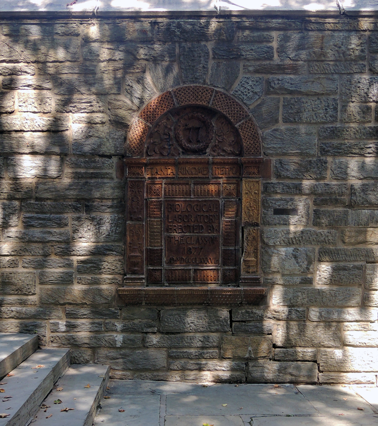
This site was occupied for sixty years by the class of 1877 Biological Laboratory. Here were nurtured generations of students in biology. The plaque at the left was situated above the entrance to the Laboratory.

class of 1877 plaque1

class of 1877 plaque3
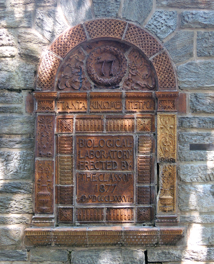
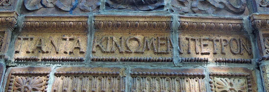
Princeton’s biology laboratory, donated by the Class of 1877 at its tenth reunion, was demolished in the summer of 1946. This terra cotta plaque from the second floor was saved and embedded in Firestone Library’s south wall. Harry Osborn is quoted in Fifty Years of Princeton ’77, describing the Greek quote on the plaque:

The motto of our Class was “Panta Kinomen Petron.” We have always laughed at that motto, and it has been paraphrased by such a learned and godless man as Billy Dunning. Some part of our success, the great keynote of movement in this world, is to turn over a stone and see what is under it — what we can do. In other words, education stands for a great many different things, but the keystone of education is construction, is to build up, is to build something new, and that has been the spirit of 1877. Construction is the idea — building up, not tearing down. That is the great secret of human progress. Our Class motto enjoins us to leave no stone unturned, but to build, in everything in which we are engaged — to build for truth, to build for science, to build in politics, to build in literature, to build in philosophy, and to build especially for old Princeton.

αφήνουν καμία πέτρα (leave no stone unturned)
πάντα κινηθεί πέτρες (always moving stones)

For more, see https://etcweb.princeton.edu/Campus/text_1877.html

The specimen book to end all specimen books

bodoni3
Giambattista Bodoni (1740-1813), Manuale tipografico del cavaliere Giambattista Bodoni (Parma: Presso la Vedova, 1818). 2 volumes, frontispiece portrait engraved by Francesco Rosaspina after a painting by Andrea Appiani; 33 cm. 250 type specimens designed and cut by Bodoni in Latin, Greek, German, Hebrew, Russian and numerous other languages. One of approximately 290 copies. Purchased with funds provided by the Friends of the Princeton University Library and the Graphic Arts Collection. GA 2016- in process

bodoni2

Thanks to the Friends of the Princeton University Library, we are the proud owner of the second and final edition of Giambattista Bodoni’s Manual tipografico. This much enlarged edition of his 1788 specimen book represents the culmination of more than four decades of work by one of Italy’s greatest typographers, type-designers, compositors, printers, and publishers. Universally celebrated as a “libro importantissimo” (Brooks), “ouvrage magnifique” (Graesse), “an imposing tour de force” (Updike), and “the specimen book to end all specimen books” (Lester), it was surprising to find this pivotal study had been missing from Princeton University Library.

bodoni5

David Pankow, for his introduction to the 1998 DVD, wrote, “The Manuale Tipografico of Giambattista Bodoni has been called the greatest type specimen book ever printed. Issued posthumously in 1818 at Parma by Bodoni’s devoted widow Margherita, the two-volume work contains a dazzling array of 142 roman alphabets with corresponding italics, . . . the culmination of more than forty years of assiduous devotion by Bodoni to the typographic arts, both in his capacity as printer to the Duke of Parma and as proprietor of his own private press and type foundry.”

bodoni4
bodoni8

No facsimile or DVD can truly replace the original printed pages of this typographic milestone and the acquisition of Bodoni’s 1818 Manuale closes a significant gap in our collection on the history of printing. Bodoni’s introduction of what were considered exotic typefaces—Hebrew, Greek, Russian, Arabic, Coptic, Armenian, Phoenician, and Tibetan alphabets—is essential to the study of European history and publishing.
bodoni7

“Bodoni’s Manuale is a crucial document,” writes Thomas Keenan, Slavic, East European and Eurasian Studies Librarian, “of the introduction to the West and the first attempts at standardization in the West of the non-Roman scripts of Russia, Eastern Europe and the territories of the present-day Former Soviet Republics, and most particularly of the Cyrillic alphabets used in Russian and other Slavic languages, and the Georgian and Armenian scripts.”


bodoni6

Association of European Printing Museums

aepmThe Graphic Arts Collection is proud to be a member of the Association of European Printing Museums (AEPM), an international printing heritage network. As their website states, “the aim of the AEPM is to encourage the sharing of knowledge, experience, initiatives, and resources in all fields of the graphic arts as they have been practised from the time of Gutenberg until the present day. Originally founded as an association of European printing museums, the AEPM has gradually enlarged its remit to include a broad range of organisations and individuals interested in printing heritage, both in Europe and beyond.” We encourage others to join as well. http://www.aepm.eu/

Along with other activities, the AEPM holds annual conferences and has recently placed a CFP for their upcoming gathering. The 2016 conference will be held at the Nederlands Steendrukmuseum (Dutch lithography Museum) in Valkenswaard (Netherlands) from 3-5 November 2016. It is being jointly organised with the IADM (Internationaler Arbeitskreis für Druck- und Mediengeschichte). The theme of the conference is:

From Stone to Chip. Lithography. Few people know what it is, and even fewer know how it works. Yet we are permanently surrounded by documents and objects printed by this long-established process. Introduced in the early years of the 19th century, lithography mutated in the early 20th century to become offset lithography which went on to replace letterpress as the principal industrial printing process. For more information, see their website.


steendrukmuseum-0872One of the many press rooms highlighted in the website’s gallery. This is the Nederlands Steendrukmuseum, Valkenswaard (Netherlands).

Luca Pacioli Discarded

Luca_Pacioli,_De_divina_proportione,_Letter_M

It is being reported that Thomas P. Campbell, director of the Metropolitan Museum of Art, has dropped the museum’s old logo based on a woodcut by Fra Luca Pacioli for a new logo designed by the firm Wolff Olins (http://www.nytimes.com/2016/02/19/arts/the-met-and-a-new-logo.html)

Fra Luca Pacioli (approximately 1445-1517). Divina proportione: opera a tutti glingegni perspicaci e curiosi necessaria oue ciascun studioso di philosophia, prospectiua, pictura, sculptura, architectura, musica, e altre mathematice, suauissima, sottile, e admirabile doctrina consequira ... / m. Antonio Capella eruditiss. recensente. [Venice]: A. Paganius Paganinus … imprimebat, [1 June 1509]. After designs by Leonardo, da Vinci (1452-1519). Graphic Arts Collection (GAX) Oversize 2004-1250Q

met2met

The Ancients, having taken into consideration the rigorous construction of the human body, elaborated all their works, as especially their holy temples, according to these proportions; for they found here the two principal figures without which no project is possible: the perfection of the circle, the principle of all regular bodies, and the equilateral square.–Luca Pacioli