Fire Safety 1828


Giovanni Aldini (1762-1834), Habillement du pompier pour le préserver de l’action de la flamme. Par le Chev. Jean Aldini. Et instruments mis à l’exposition publique honorés d’une médaille en or par le Gouvernement L. et R. de Milan, le 4 Octobre 1828 (Milan de l’Imprimerie Impériale et Royale, [1828]). Hand colored engraved frontispiece. Graphic Arts Collection GAX N-001774

The Italian physicist Giovanni Aldini (1762-1834) is perhaps best-known for his experiments in galvanism and in lighthouse engineering. With this small pamphlet dated 1828, he introduced a protective suit for firemen lined with cloth soaked in alum for the body and asbestos cloth for the face and hands. The outer layer is made of copper wire gauze. A demonstration of the suit’s effectiveness is captured in this hand colored frontispiece, in which a fireman plunges his body into an open flame. In another print, not in this pamphlet, a firemen conducts a mock rescue using the clothing: https://pictures.royalsociety.org/image-rs-11242

The artist of these scenes has been attributed by one source to the French artist Victor-Philippe-Francois Lemoine-Benoit (1800s): https://www.cambridge.org/core/services/aop-cambridge-core/content/view/S0317167100003851

This short tract is, as Aldini states on p. 15, a forerunner to a larger work which he proposes to publish the following year. This intended work Essai expérimental sur l’art de traverser les flammes et de sauver des personnes et des objets préc ieux dans les maisons incendiées was published in 1830 as Art de se préserver de l’action de flamme, with five additional engravings, unfortunately only digitized in black and white: https://babel.hathitrust.org/cgi/pt?id=mdp.39015067197437;view=thumb;seq=1OCLC: 1734256

Giovanni dall’Armi, first lithographic printer in Rome

Alessandro Lante and Nicola Maria Nicolaj. Notificazione sulla facolta privativa di esercitare la nuova arte detta litografia [Notification on the private faculty to practice the new art called lithography]. In Roma, presso Lazarini, stampatore delle rev. Camera Apostolica 1808. Folio (405 x 290 mm) broadside. Graphic Arts Collection GAX 2019- in process

The Graphic Arts Collection recently acquired this rare broadside published by the authorities of the Vatican State granting a one year privilege to the publisher Giovanni dall’Armi (died 1829) on the exclusive use of lithography as a printing technique on the territory of the Vatican State. This is followed by a concise description of its specification:

La nuova arte detta litografia, (…) consiste in riportare moltiplicate volte dalla pierra o composizione lapidiforme sulla carta ognie specie di segni o immagini, che su quella sieno stati fatti al rovescio con particolari materie, e preparazioni, ed indiricevuta la tinta vengono sottoposti insieme colle carte destinate a rice verli, all’azione della machine di pressione, come distesamente risulta dal Chirografo Pontificio segnato il di 14. Decembre del prossimo passato anno 1807.

This ephemeral document was printed twelve years before the first Italian manual on lithography was published in Florence: Cosimo Ridolfi (1794-1865) and Ferdinando Tartini, Memoria sulla litografia di C. Ridolfi, e F. Tartini (Firenze: Presso Gaspero Ricci, 1819).

In 1905, Giuseppe Fumagalli wrote in Lexicon typographicum Italiae:

Les origines de la lithographie à Rome qui étaient fort obscures, ont été éclaircies par les heureuses trouvailles de mon ami, le Dr. A. Bertarelli, bibliophile aussi savant qu’infatigable dans la chasse aux vieux bouquins, aux anciennes paperasses. Dans la préface du Trattato di lilografia, traduit du français et publié à Milan en 1828, il est dit que la lithographie existait à Rome dès 1807; mais il y a là une erreur grossière. L’introduction à Rome de cet art nouveau est due à Jean Dall’armi, que quelques-uns considèrent à tort comme l’introducteur de la lithographie aussi à Milan et à Venise où, probablement, il n’a jamais été ; et malgré son nom italien, les uns affirment qu’il était de Munich, les autres le croient français: il est probable qu’il était tout simplement italien. Les journaux romains de l’époque nous apprennent seulement qu’il est mort à Rome le 15 décembre 1829, et ces mêmes journaux, en donnant l’annonce de sa mort, confirment qu’il a été le premier fondateur à Rome d’une imprimerie lithographique.

Loosely translated:

The origins of lithography in Rome, which were very obscure, were cleared up by the happy discoveries of my friend, Dr. A. Bertarelli, bibliophile as learned as tireless in the hunt for old books, old paperwork. In the preface to Trattato di lilografia, translated from French and published in Milan in 1828, it is said that lithography existed in Rome as early as 1807; but there is a gross error. The introduction to Rome of this new art is due to Jean Dall’armi, whom some mistakenly consider as the introducer of lithography also in Milan and Venice, where, probably, he has never been; and despite his Italian name, some say he was from Munich, the others think he’s French: he’s probably just Italian. The Roman newspapers of the time only teach us that he died in Rome on December 15, 1829, and these same newspapers, in announcing his death, confirm that he was the first founder in Rome of lithographic printing.

Pank-a-Squith


From 1903 to 1917, the Women’s Social and Political Union (WSPU) served as the leading militant organization campaigning for women’s rights in London. Run exclusively by women, the WSPU was dedicated to political action and civil disobedience led by Emmeline Pankhurst (1858-1928) and her daughters Christabel and Sylvia.

The game’s title, “Pank-a-Squith,” comes from a combination of the names Emmeline Pankhurst and Prime Minister H.H. Asquith, the two major players in the struggle.

Fighting for women’s suffrage, members became known as the suffragettes, represented here in the six figures making their way around this 1909 board game sold to help raise money for the WSPU. Each of the women carries a rolled petition, traveling from the first square representing home and family to the winning square of the Houses of Parliament.

Along the way, there are arrests, hunger strikers, and many other setbacks. This game, recently acquired by the Graphic Arts Collection with the help of Sara Howard, the Program in Gender & Sexuality Studies librarian, also includes the rare instruction sheet outlining the consequences of landing on each square.

Pank-a-Squith [board game.] (Germany: [Women’s Social and Political Union, 1909]) Graphic Arts Collection GAX 2019- in process.


See also: Elizabeth Crawford, The women’s suffrage movement: a reference guide, 1866-1928 (New York: Routledge, 2001). Firestone JN979 .C73 2001


Contemporary Subscription Libraries


One of the last remaining subscription libraries in New York City, along with the Library of the General Society of Mechanics and Tradesmen (GSMT) and the New York Society Library, is the Center for Fiction (formerly known as the Mercantile Library). Memberships for the GSMT Library begin at $50; for the Society Library $270; and for the new Center for Fiction $150.

The Center’s new home at 15 Lafayette Avenue, Brooklyn, is now open to the public on the first floor and to members on the upper floors.

For members, the Center for Fiction’s library includes a circulating collection of 70,000+ classic and contemporary fiction titles. Approximately 3,000 books from its antiquarian book collection are currently on display on the ground floor, clearly marked “do not touch”. Their website notes:

“The 19th Century collection is comprised of volumes from both the Mercantile Library’s own collection and volumes donated to the Center by the Philadelphia Athenaeum. Contained in this collection are works by well-known authors, hand-pressed books from the 18th and early 19th centuries, and books with especially attractive designs and bindings.”


The Mercantile Association has had many homes in Manhattan, beginning with rented rooms in 1821 at 49 Fulton Street in lower Manhattan and ending with its 1932 building at 17 East 47th Street in midtown. http://www.centerforfiction.org/about/history/

In 2005, with the advent of a new director, the Library moved to strengthen its new focus on fiction by renaming itself the Mercantile Library Center for Fiction.

In February 2019, the Center opened a 18,000 square foot space across from the Brooklyn Academy of Music. The first floor offers a bookshop, cafe, and a 160-seat state-of-the-art auditorium. The second floor has a reading room and terrace; classroom space for discussion groups, seminars, and writing workshops; and a new Writers’ Studio with floor to ceiling windows.

http://www.centerforfiction.org/

15 Lafayette Avenue
Brooklyn, NY 11217
Email: info@centerforfiction.org

Not just a book, but The Book

The French poet Stéphane Mallarmé spent more than 30 years on a project he called Le Livre. This legendary, unfinished project, published posthumously in French, has now been translated into English for the first time. Below is a segment from the review, “Stéphane Mallarmé’s The Book and Un Coup de dés jamais n’abolira le Hasard,” by Mary Ann Caws in The Brooklyn Rail.
https://brooklynrail.org/2019/02/art_books/Stphane-MallarmsThe-BookandUn-Coup-de-ds-jamais-nabolira-le-Hasard

To take just the 72 pages of Stéphane Mallarmé’s Le Livre (originally posthumously published in French in 1957), at once fragmentary and yet feeling so completely itself, every time we encounter it, it seems a more astonishing piece of work. I always loved the way it was so majestically presented, collecting notes and drafts along with typeset pages, the poet dressed as scribe or priest of poetry, leaving the assembled audience every fifteen minutes of reciting in order to reshuffle the remaining pages, so that CHANCE would enter each time he re-appeared on the stage. For this was not just a book, but The Book.

What it means for us now, in this present rendering, is a lively reading of life as art—conceived of in the most simple and elementary terms, whose juncture we have to determine and carry out ourselves in each of our individual readings, private or collective and public. That was Mallarmé’s magic, the private as shared, the non-journalistic as both poetic and unboring, so he crossed out almost every other word to make the text less immediately graspable.

Here is the thing: Mallarmé is always the most modern—the most complicatedly modern—no matter what. As for Le Livre, or The Book, Sylvia Gorelick’s newly translated rendering (after the Scherer and the Marchal editions, to which I was bravely clinging), is deeply intelligent. After perusing her introduction to find the (absolutely) confessional mode of Mallarmé:

I am me—faithful to the
book

It just gets me. Of course he was, and of course we all remember his saying as he gasped, dying “Destroy it – / It would have been beautiful” about his Hérodiade—and how glad we are it did not meet that fate.

Here are a few sample pages.


Stéphane Mallarmé, Le “Livre” de Mallarmé; premières recherches sur des documents inédits [par] Jacques Schérer. Préf. de Henri Mondor (Paris: Gallimard [1957]). Firestone PQ2344 .L587 1957

Stéphane Mallarmé, The Book; translated and with an introduction by Sylvia Gorelick (Cambridge, Massachusetts : Exact Change, 2018). Firestone PQ2344 .A2 2018

Here is section 6 “Le Livre, Instrument Spirituel” published by Mallarmé in Revue Blanche, July 1895 (Firestone Recap 0904.749):


Installing Las Antillas Letradas

Antonio Martorell, Las Antillas Letradas, 2014. Multi-media prints in portfolio. Available Online Digital. Graphic Arts Collection Oversize 2014-0031E

One piece in the upcoming Firestone Library exhibition, Welcome Additions, is this map of the Caribbean, divided into 27 letters of the alphabet, which feature 27 portraits of leading literary figures with selected texts in their original languages of Spanish, English and French. Printing began in 2014 on Okawara paper in a Hewlett-Packard printer at El Taller de la Playa, Ponce, Puerto Rico with the help of Milton Ramírez. The edition consists of 100 copies signed and numbered by Antonio Martorell. Princeton is proud to hold copy 1 of 100, purchased together with PLAS, the Program of Latin American Studies.

Here is a look at the complex installation.

Portraits of Aimé Césaire; Julia de Burgos; Alejo Carpentier; Juan Pablo Duarte; Leonardo Padura Fuentes; Frantz Fanon; José Luis González; Eugenio María de Hostos; Pedro Mir; Juan Antonio Corretjer; Jamaica Kincaid; José Lezama Lima; José Martí; V.S. Naipaul; Arcadio Díaz Quiñones; Rosario Ferré; Luis Palés Matos; René Marqués; Magali García Ramis; Luis Rafael Sánchez; Marie Vieux Chauvet; Pedro Henríquez Ureña; Ana Lydia Vega; Kamau Brathwaite; Derek Walcott; Mayra Montero; and Juan López Bauzá.

.

John-a-Dreams


On December 8, 1896, The Daily Princetonian published a short note:

A new magazine which is creating quite a stir among the lovers of current literature is a monthly periodical called John-A-Dreams. This little and attractive magazine was started last June and has been issued monthly since then and its final success is assured by the large sale which it has attained. Its form is novel which adds much to its popularity.

It generally contains several short stories which are marvels for their freshness and simplicity as well as for the pleasing manner in which they are told. Besides this there are in each number several poems which compare favorably with the present day verse. The two departments “The Artistic Standpoint” and “By The Fireside are of especial interest. The former is a series of criticisms which show a keen grasp of the subject at hand. This magazine is edited and published by Robert Sloss of the class of ’93. The cover design, as well as all parts of the magazine, is very artistic. —Daily Princetonian 21, No. 109 (8 December 1896).

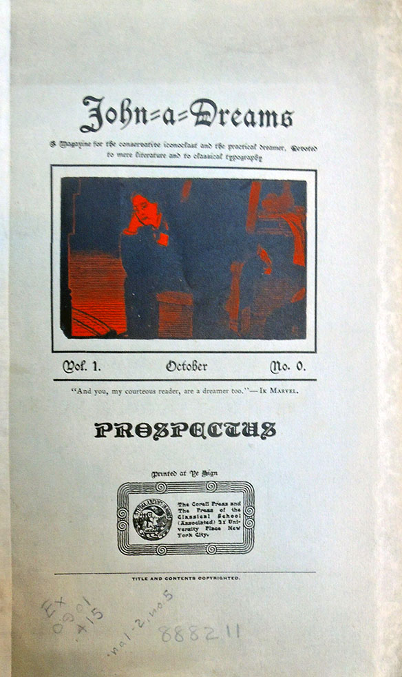
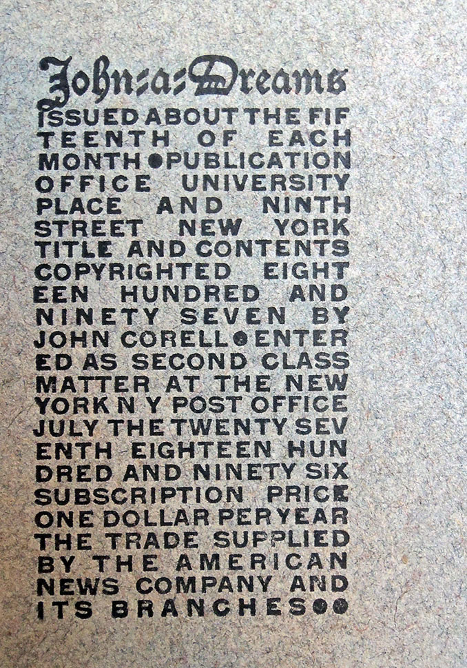
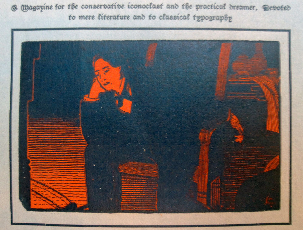
John-a-Dreams: A Magazine for the Conservative Iconoclast and the Practical Dreamer, Devoted to Mere Literature and to Classical Typography.

After graduation, Robert T. Sloss (1872-1920, Princeton Class of 1893) moved to Greenwich Village where he formed a partnership with John J. Corell (1873-1954) to found the Corell Press and the monthly magazine John-a-Dreams. Their staff artist and poet was Sloss’ classmate Booth Tarkington (1869-1946, Princeton class of 1893) and the cover image of a dreaming man was drawn by the artist John Sloan (1871-1951), still living in Philadelphia but already a well-known illustrator. At the time, Sloan had left The Philadelphia Inquirer to join the art department of The Philadelphia Press, where he only worked afternoons and evenings, leaving his mornings free to paint and take on other commissions.

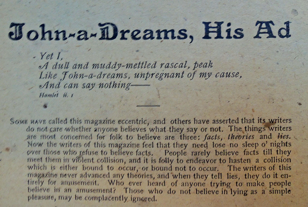
While Tarkington was writing one-act plays, his college classmate Robert Sloss launched in Greenwich Village a “little” magazine called John-a-Dreams. The publication appeared only seven times between August, 1896, and May, 1897, but during its short life Tarkington, the unpaid staff artist, contributed prose, poetry, and drawings “The Kisses of Marjorie,” for instance, first appearing there.
…Most of Tarkington’s contributions to John-a-Dreams are unimportant, though they illustrate a poetic preoccupation that began at the age of thirteen and lasted till he was thirty. Throughout the Nineties he composed poems, and only after his first novel was published did he foreswear verse.
…Then he abandoned poetry completely, except when his fictional characters occasionally were moved to lyric expression. Before 1899, however, about two dozen of his poems appeared in print, many in Princeton publications, a handful in the Indianapolis Journal, and three in Sloss’ magazine.

–James Leslie Woodress, Booth Tarkington: Gentleman from Indiana (Philadelphia; New York: Lippincott, 1955).

For more information, the archive of Corell Press is held by Wichita State University: MS 89-20, where they note:

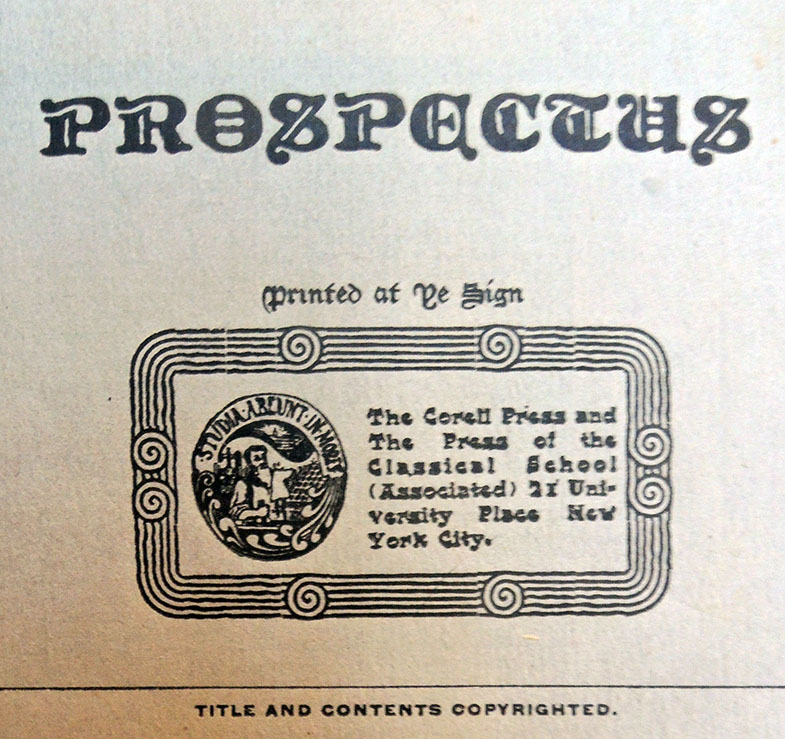
The collection consists of selected material of Sloss (Princeton Class of 1893): correspondence, printed copies of two of his articles, and newspaper clippings. Correspondence includes letters of recommendation for Sloss from Princeton faculty (1891-1893) and other letters from such notables as Edmund Gosse and Theodore Roosevelt, written to Sloss in London when he was a journalist there during World War I. …Most of the correspondence and literary works are attributed to Booth Tarkington; however, some also concern Corell’s magazine, John-a-Dreams. Correspondents include Edward W. Bryant, Robert T. Sloss, Carolyn Wells, Kenneth Brown, St. George Best, and Barton Currie. The collection also contains copies of the little magazine, John-a-Dreams, including its prospectus and inaugural issues.

http://specialcollections.wichita.edu/collections/ms/89-20/89-20-A.HTML

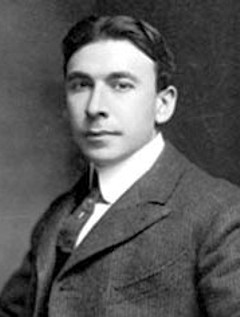
Booth Tarkington, Tantor Media

John-a-Dreams (New York: Corell Press and the Press of the Classical School (Associated), 1896-1897). Vol. 1. no. 1 (July 1896)- v. 2, no. 6 (June 1897). Rare Books 0901.415 v.1-2, no.5

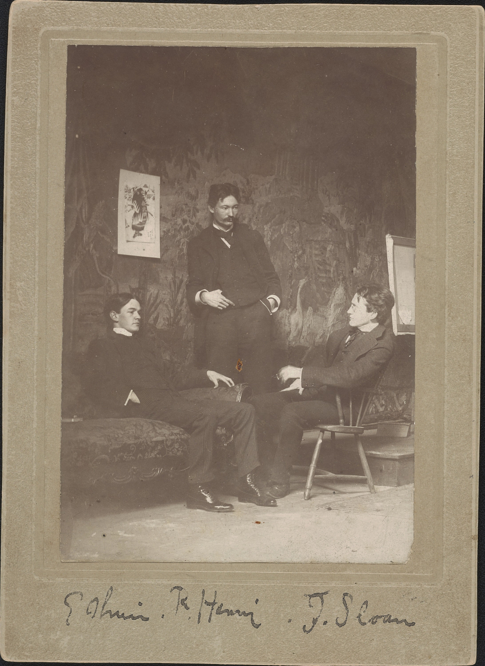
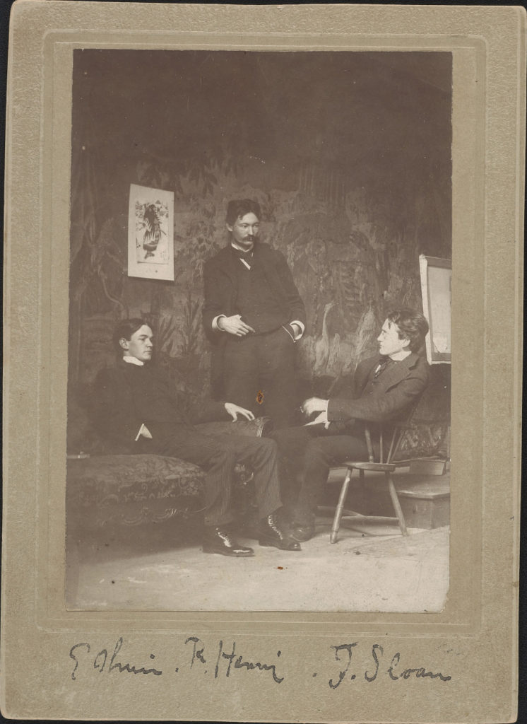
Everett Shinn, Robert Henri and John Sloan, ca. 1896. Photograph shows the three men in Henri’s Philadelphia studio; a few years later all three had moved to New York. Published in: Archives of American Art Journal v. 19, no. 2, p. 3; v. 35, no. 1-4, p. 99

Before you build a wall, remove the art

As Firestone Library comes to the end of a ten year (or so) renovation, we are still finding collections in unexpected places. This morning, a six-foot framed canvas was uncovered behind a storage closet for emergency preparedness supplies. Happily, the canvas and the frame have been retrieved thanks to our wonderful security and maintenance staff.

Fritz Eichenberg


When Robert Brown asked Fritz Eichenberg (1901-1990) [left] about his dramatic book illustration, the artist answered,

“Well, it solves, also, my own problems. Some people have to take it to a psychiatrist or a psychoanalyst. I was able to use art as a kind of purifier, or as a kind of a safety valve for my own problems. Because to leave your so-called “native country” and come into a completely new civilization and adjust yourself to it – raise children here – presents a problem which is not insurmountable. But it’s psychologically difficult. You don’t want to be a rebel in your new country. You want to show your gratitude, in a way. You also try to do your share to improve conditions wherever they can be improved by your knowledge, or by your work, or by your contribution to society. And, I think, through my work, I could reach people, which has always been very important to me. …

…Man is a very fragile being. He does his best to corrupt the environment in which he lives. We have now the problems of pollution and nuclear energy and we have gone through a disastrous war. We lost more than the war. We lost our integrity and our standing in the world to a large degree. Whatever I could do as a kind of conciliator coming from the other side I tried to do.

…And since I have been lucky enough to be commissioned to do the imagery accompanying the works of great writers, it makes me a kind of a mediator – a kind of interpreter – a visual interpreter – and has helped many people to read Dostoyevsky who’ve never read Dostoyevsky before. Or the Brontes. Jane Eyre and Wuthering Heights are probably the most popular books I have done.

–Smithsonian Archives of American Art Oral history interview with Fritz Eichenberg, 1979 May 14-December 7. https://www.aaa.si.edu/collections/interviews/oral-history-interview-fritz-eichenberg-12736#overview

St. Toirdealbhach’s Tale (from The Once and Future King)

Thanks to the friendship between former Graphic Arts Curator Dale Roylance and Eichenberg, Princeton holds complete proof sets for most of the wood engravings Eichenberg printed as book illustrations. This includes the unpublished illustrations planned for an edition of T.H. White (1906-1964), The Once and Future King (New York: Collins, 1939)

The Maid and the Unicorn (from The Once and Future King)

Merlyn and Archimedes (from The Once and Future King)

The Boar Hunt (from The Once and Future King)

The Wart and the Hawks (from The Once and Future King)


Sleeping Cupid

Detail from Mauro Gandolfi (1764-1834), Non ti fidar che mai non dorme amore: ei chiude gli occhi allor che insidia un core = Do not trust that Love never sleeps or closes his eyes to what threatens the heart, ca. 1824. Engraving. Dedicated: Alla Signora Duchessa Litta di Belgiojoso, by Bettalli Fratelli. Graphic Arts Collection


The sleeping cupid, a symbol of chastity, has been a popular topic in art since the Renaissance, if not before. Michelangelo, Caravaggio, and Robert Mapplethorpe are only a few of the many artists who used the figure of a young boy sleeping in their painting, sculpture, prints, and photographs.

The Graphic Arts Collection holds a lesser known print of a sleeping cupid by the Bolognese artist Mauro Gandolfi. Around the time he made this engraving, Gandolfi traveled to the United States and wrote a vivid account of his journey. Happily, a new edition was published in 2003 by Mimi Cazort, transcribing and translating into English Gandolfi’s description of the odd people he encountered in New York and along the East Coast.

Mauro Gandolfi (1764-1834) and Mimi Cazort, Mauro in America: an Italian artist visits the new world (New Haven: Yale University Press, 2003). Marquand ND 623.G271 C396 2003

Caravaggio, Sleeping Cupid, 1608. Oil on canvas, 72 × 105 cm. Florence: Pitti Palace. Photo: Scala, Florence. https://onlinelibrary.wiley.com/doi/full/10.1111/1467-8365.12345


Detail