Category Archives: Books

books

How Big is a Limited Edition?

Beginning today the New York Public Library is offering a Special Limited Edition library card that reads: Knowledge Is Power, available only for a limited time (or while supplies last). The edition is 70,000. 
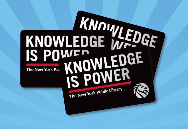
“Apply in person at your local NYPL branch, or sign up online and visit your local branch quickly to validate and pick up your Special Edition card before they run out. Knowledge Is Power cards are free for new cardholders. Library card applicants must show proof that you live, work, attend school, or pay property taxes in New York State.”


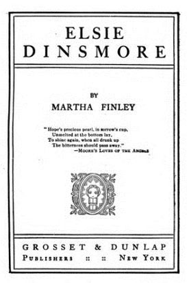
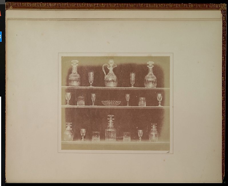
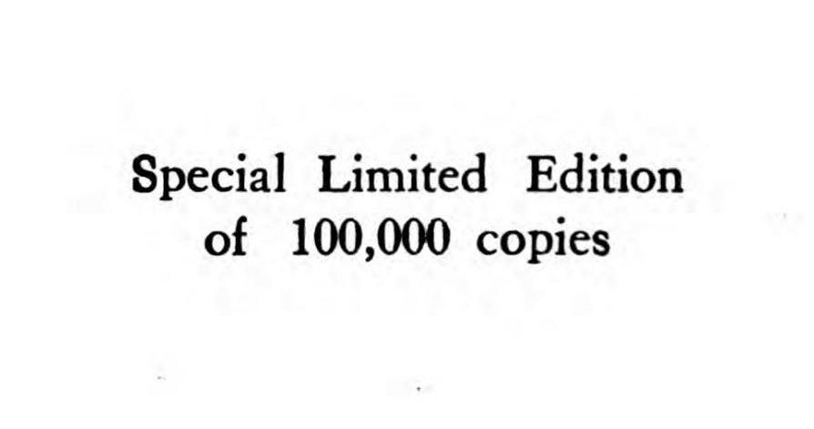
This led to the question of just how big an edition can be and still be defined as a special limited edition? In 1896, Martha Finley’s Elsie Dinsmore was published by Grosset & Dunlap in New York, in a special limited edition of 100,000 copies. Today, it is also possible to read it online, with unlimited access to the special limited edition.

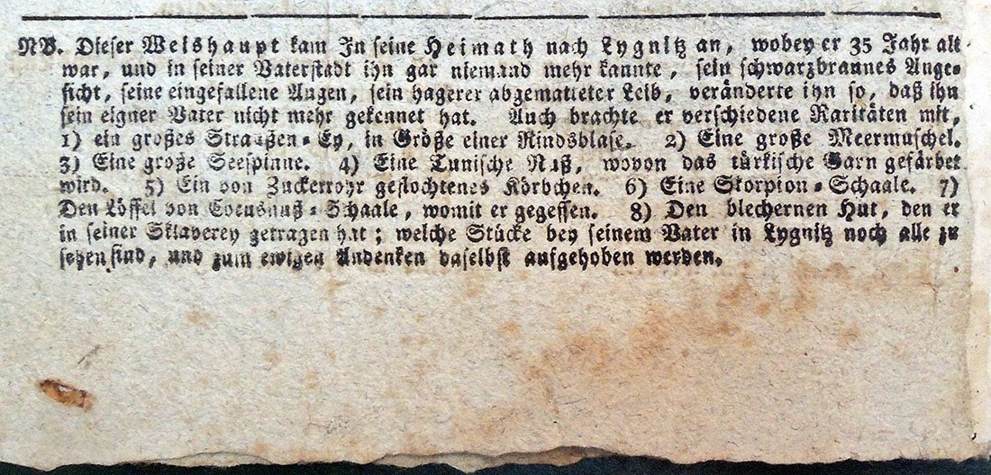
According to library records Monbusho’s Kankyo shogaku tokuhon maki 1 (Primary reader, vol. 1) was published in 1873 in an edition “Limited to 5,000,000 copies.” (Cotsen Children’s Library Pams / NR / Japanese / Box 135 65143). This is not a typo.

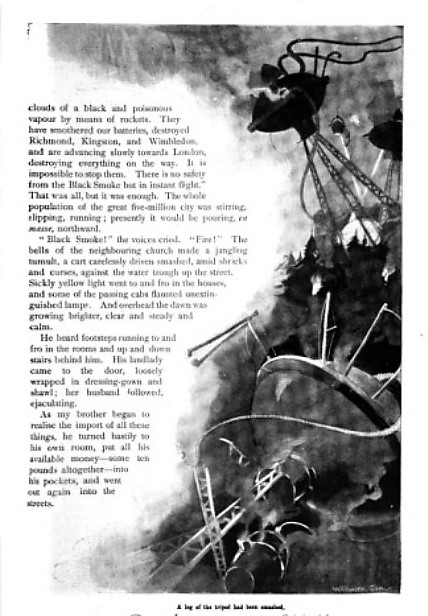
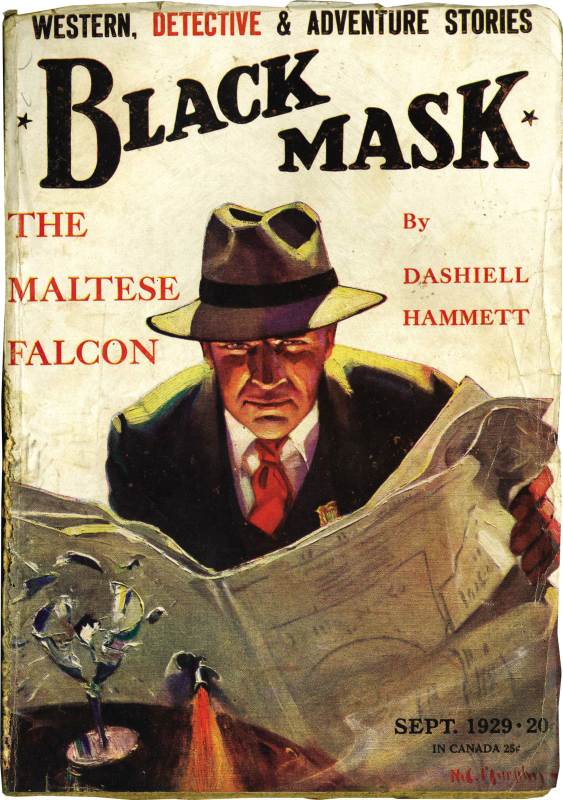
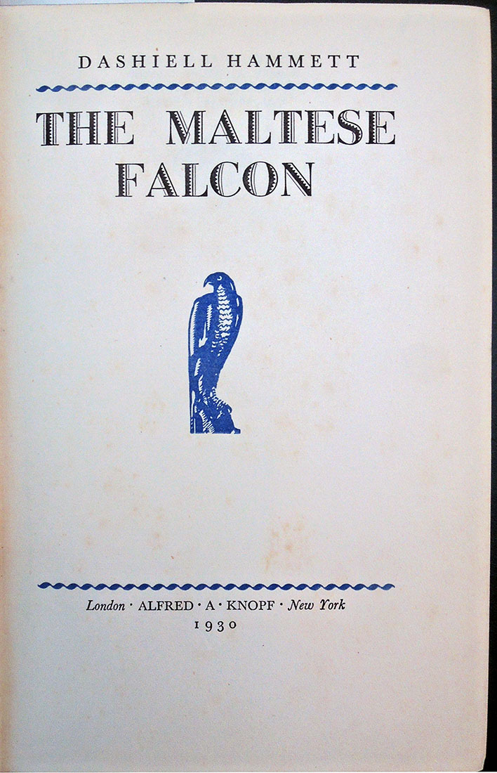
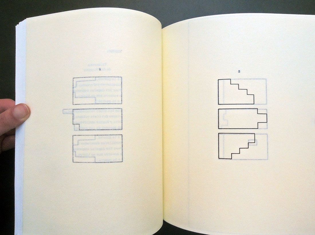
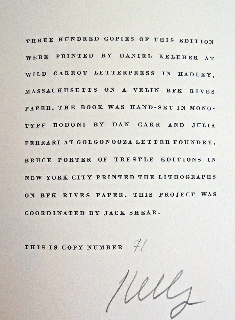
Ed Templeton and Deanna Templeton’s modern photobook Contemporary Suburbium (2017) was released in a “Limited edition of 2,000 copies” (Marquand Library N7433.4.T47 C68 2017). Alfredo Jaar’s homage to John Cage on the occasion of the Cage centennial, entitled Otros piensan = outros pensam, was limited to 1,000 copies, as was Victor Hugo’s Poems (New York: F. DeFau & Co., 1888), available on open shelves or through interlibrary loan. Charles Kingsley’s Alton Locke, Tailor and Poet (New York, J. F. Taylor and Company, 1899) was a “Limited edition of 1,000 copies” although dozens of other editions were also available at the time (PR4842 .xA4 1899). You can undoubtedly think of many other examples.

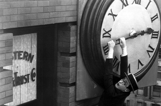
Christian Marclay’s film The Clock was produced in a limited edition of six copies and two artist’s proofs. Five are in public institutions although it can only be played at one location at a time. “When I first started on this project, I thought it would become a public art piece,” Marclay told a New Yorker writer. “I thought, What a great thing, to be in a train station waiting for a train and being able to watch a movie. It would inform you what time it was, and at the same time entertain you. But I realized it was impossible—there’s lighting issues, sound issues, you have to hear the public-address system.”

Very few rare book glossaries include a mention of  “Limited edition.” The International League of Antiquarian Booksellers notes:

“Book intended to have a finite number of copies, usually intended as a collectible or artificial “rarity.” Often each volume in the edition is supplied with a specific number, and can be signed by the author, artist, binder, etc. Most limited editions have a limitation statement that elaborates on the wonderment of the volume in question. Some less than scrupulous publisher’s will issue editions limited to the number of copies that they can sell, with the limitation proclaimed, but the number not specified.

America is not alone. See also:

French: Tirage limité
German: Limitierte Ausgabe
Dutch: Beperkte oplage
Danish: Begrænset oplag
Italian: Tiratura limitata
Spanish: Tiraje limitado
Swedish: Begränsad upplaga

https://www.nypl.org/blog/2018/10/29/knowledgeispower-library-card

The War of the Worlds

In 1904, Henrique Alvim Corrêa (1876-1910), a relatively unknown Brazilian artist living and working in Belgium, took a group of drawings to London and showed them to H.G. Wells (1866-1900). Alvim Corrêa’s work was inspired by the author’s 1897 story entitled “The War of the Worlds” and with no further information or persuasion, Wells commissioned him to illustrate a deluxe, limited edition of the novel. Over the next two years, Alvim Corrêa completed 32 drawing for the book published in 1906. The Graphic Arts Collection recently acquired one of the 500 rare copies of this illustrated book.

“The War of the Worlds” first appeared in Pearson’s Magazine [seen above] serialized from April to December 1897, together with illustrations by Warwick Goble (1862-1943), best known today for his fairy tales and other children’s books. The two versions are quite similar.


Eighty years ago, Orson Welles and the Mercury Theatre radio hour performed a Halloween adaptation of H. G. Wells’ The War of the Worlds, which many listeners took as fact and panicked. A reporter (Orson Welles) told the audience that something had fallen or landed in Grover’s Mill (just east of the Princeton Junction train station) and over the next hour it was discovered that giant Martian war machines were attacking the United States. Today, a carved stone marks the site of the fictional landing.

H. G. Wells (1866-1946), La guerre des mondes. Traduit de l’anglais par Henry-D. Davray. édition illustreé par Alvim-Corrêa (Bruxelles: Vandamme & Co., 1906). Graphic Arts Collection GAX 2018- in process


Nationally loved writer tossed out by Princeton residents

Late in the fall of 1936, the celebrated author Dashiell Hammett (1894-1961) moved to Princeton, New Jersey, where he rented a mansion [his word] at 90 Cleveland Lane from James Renwick Sloane (1881-1955). He moved in with his Black chauffeur/valet and two dogs named Baby and Pal (sadly Baby died while in Princeton).

Hammett was immediately invited to address the local elite at the Nassau Club but rather than write a talk, he simply answered questions concerning everything from “Shakespeare to his experiences in Hollywood.” On Christmas day, the sequel After the Thin Man was released to popular acclaim and Hammett was called America’s best-loved writer. Not wanting to continue with the series, in February 1937 Hammett sold M-G-M all rights to The Thin Man title and characters for $40,000.

Later that month he agreed to act as a judge for the Princeton Community Players playwriting contest but on the day the entries were due, Hammett left town. According to his biographer, Richard Layman, he was asked to leave Princeton by his neighbors due to his loud parties, overnight female guests, and drunken students (his recent membership in the Communist Party was not mentioned). Renwick Sloane sued Hammett for damages made to the house, which was soon after torn down and replaced with a new nine-bedroom home in 1940.

In the November 11, 1936, issue of the Daily Princetonian, Henry Dan Piper, class of 1939, wrote an article titled “Dashiell Hammett Flees Night Club Round Succumbing to Rustication in New Jersey”:

Wearied of New York’s sophisticated clatter, the tall, prematurely greying Dashiell Hammett, author of “The Thin Man” and “The Glass Key,” has escaped to the privacy of a rambling, white clapboard farmhouse perched on a hillside outside of Princeton. “This is the life” he sighed, seated in his armchair before a roaring fire, and succumbing to the inquisition of a Princetonian interviewer. “You can get fed plenty cooped up in a three room apartment, making the same rounds every night—Stork Club, 21, Dempsey’s—seeing the same old faces and hearing the same damned chatter. Nuts.” “There isn’t much to tell about me,” he said. “Baltimore as a kid. . . school for a coupla years. . . stevedore . . . newsboy. . . Golly, I’ve seen lots of things, but I never seemed to stick long at ’em. When the Armistice came along, all I could boast was a pair of weak lungs contracted in the Ambulance Corps.”

“I did some private detective work for Pinkerton’s, but all the time I was getting sicker, and found myself shortly in a California hospital. Then it was a case of turning to something to keep the butcher away from the door while I tried to bluff along the baker. So I rented a second-hand typewriter and pounded out my first novel. It was just a case of lucky breaks after that. Yes, I’m working on a book here, but it’s not a mystery, and it’s not about Princeton. I really don’t like detective stories, anyway. I get too tangled up in the plots. This one is just about a family of a dozen children out on an island. You see, all I do in a story is just get some characters together, and then let them get in each other’s way. And let me tell you, 12 kids can sure get in each other’s way!”

Asked if he were indulging in any more stories about the liquor-swilling, sophisticated pent house dwellers of “The Thin Man,” Hammett wrinkled his brow and exclaimed, “I can’t understand why people get the idea all I ever write is artificial, with tinseled-and-ginned up characters. They’re just like lots of people I know neurotics and what have you. “You know, ideas float around that New York and Hollywood people are all nuts. I’ve just come back from working on a new Powell-Loy film and I admit lots of those guys out there are screwy. But, hell, they’ve got tons of money to be screwy with. And anyhow, they’re no more bats than a lot of over-stuffed” executives I’ve had the misfortune to meet. “Yes, it’s going to be like the others,” he said, returning to the new movie. “They say they’re going to call it ‘After the Thin Man.’ Heaven only knows why. Before Hollywood started monkeying with the plot it was something like ‘The Thin Man,’ but its own mother wouldn’t recognize it now.”


In 1983 Arion Press published a limited-edition Maltese Falcon, illustrated with 46 period photographs of sites in the novel, along with contemporary views by Edmund Shea. The photographs were found mainly in old newspaper morgues and library archives, taken in the late 1920s, of the actual streets and buildings where Sam Spade solved the mystery. The Graphic Arts Collection holds only the trade edition, published by North Point Press the following year.

See: Dashiell Hammett, “From the Memoirs of a Private Detective,” Smart Set March 1923, p. 88.
https://babel.hathitrust.org/cgi/pt?q1=%22dashiell%20hammett%22;id=uc1.b3874453;view=image;seq=444;start=1;sz=10;page=search

Dashiell Hammett (1894-1961), The Maltese Falcon (San Francisco: North Point Press, 1984). “This edition … is reproduced from the limited edition of 400 copies printed and published by the Arion Press, San Francisco, in 1983”–Colophon. Graphic Arts Collection PS3515.A4347 M3x 1984

Dashiell Hammett (1894-1961), The Maltese Falcon (New York: A.A. Knopf, [c1930]). Rare Books 3769.56.359 1930


Ulises Carrión’s Early Books


Guest post by Sarah Hamerman, Poetry Cataloging Specialist

Mexican-born, Amsterdam-based artist, writer and cultural organizer Ulises Carrión (1941-1989) was a key figure in the broadly intercultural development of artists’ books and concrete poetry in the 1970s. Though Carrión achieved early success as a short fiction writer in Mexico, he soon moved away from narrative writing; upon his move to Amsterdam, he adopted a structuralist-inflected interest in linguistic systems and the materiality of the page. The artists’ book would prove an ideal medium for these ideas: in his influential 1975 essay The New Art of Making Books, Carrión champions the book as a “space-time sequence,” rather than a mere container of literary text.


Carrión’s earliest artists’ books, or “bookworks,” explore these ideas by playfully questioning the underlying structures of poetry. His first published artists’ book, Sonnets, consists of 44 variations of an appropriated sonnet by Dante Gabriel Rossetti. Carrión’s often-subtle rewritings of the poem—indicated by titles such as Capital Sonnet, Parenthetic Sonnet, and Echoed Sonnet, highlight the rigorous rhyme scheme and structure dictated by the sonnet form. Self-published on his own mimeograph machine, Sonnets also demonstrates that Carrión’s interest in “making books” was a practical as well as an aesthetic matter.

The approach of Sonnets is further developed in Poesías, an unpublished 1972 typescript which was made available for the first time in a fine 2007 edition by Mexico-based Taller Ditoria. In one poem, Ritmos, Carrión explores rhythm and meter through the repetition of a single syllable, “ta,” and the use of space. This tactic reveals the influence of concrete and sound poetry’s concept of “verbi-voco-visual” expression on Carrión’s work. In another section, Graficas, the stanzas of a poem are conveyed by a graphic representation of their outlines. The author prints five variations of this technique on translucent paper stock, allowing the shapes to overlay and the reader to consider the entire sequence together. While these works adopt a kind of reduced and minimal language, they offer a rich and fascinating approach to the forms through which literature conveys meaning.

Ulises Carrión (1941-1989), Poesías (Ciudad de México: Taller Ditoria, 2007). Graphic Arts RCPXG-5902412

Ulises Carrión (1941-1989), Sonnet(s) (Amsterdam: In-Out Productions, 1972). Carrión’s first artist’s book, dedicated to Raúl Marroquín. Printed in black and white and stapled between clear plastic wraps. Marquand Library PQ7298.13.A73 S65 1972q Oversize

Ellsworth Kelly’s Un Coup de dés


When publisher Sidney Shiff commissioned Ellsworth Kelly to select a text and create prints for a Limited Editions Club book, Kelly chose to match his black and white lithographs with Un coup de dés by Stéphane Mallarmé, one of the most famous poems of the 19th century. In its 63rd year, the Club was publishing only three or four titles each year in editions of 300, unlike the earlier runs of 2,000 under George Macy. This allowed Shiff to work with outstanding artists and create some of the most beautiful books of the late 20th and early 21st century.

Published in the original French and the original page design, Kelly integrated his eleven lithographs with the text, accentuating the open white space of both text and images. A separate booklet with Daisy Aldan’s English language translation is included: mallarme

“A throw of the dice never even when cast in eternal circumstances at the heart of a shipwreck let it be that the Abyss whitened slack raging under an incline desperately soars by its own wing…”


Stéphane Mallarmé (1842-1898) and Ellsworth Kelly (1923-2015), Un coup de dés jamais n’abolira le hasard ([New York]: Limited Editions Club, 1992). Text printed at Wild Carrot Letterpress and lithographs printed at Trestle Editions. Copy 71 of 300. Original black goatskin, in black solander box. Graphic Arts Collection GAX 2018- in process.

The Dark Plates of Phiz

Preparing for a visit from ART 561/ENG 549/FRE 561 “Painting and Literature in Nineteenth-Century France and England,” the prints of Hablot Knight Browne (Phiz) for Charles Dickens’ Bleak House have been pulled. Phiz completed forty plates, etched on steel, for Dickens’ ninth novel published in monthly parts from March 1852 to September 1853.


Both for the added mystery and to thwart the lithographers who made copies of Browne’s superb etchings, the artist developed a technique for what we refer to as the ‘dark plates.’

In ten of the forty illustrations, Browne merged the meticulous engraved lines made by an engraving- or ruling-machine with the hand drawn lines of his etching needle to create the look of a mezzotint with the detail and freedom of a drypoint.
Engraving on steel had only recently been perfected. In 1895, C. W. Dickinson wrote an easy to understand description of “Copper, steel and bank-note engraving,” quoted here:

“Previous to the year 1830 only copper plate was used by engravers, because up to that time it was not thought possible to make steel soft enough to cut easily and smoothly. The first plate produced—that could be used—was called “silver steel.” Later there was manufactured the “Prussian steel” plate, which was a slight improvement in fineness of grain. Other and greater improvements followed, until now steel has almost entirely superseded copper.

Decarbonated cast steel is used for general engraving purposes and must be of very fine grain, and very soft as compared with natural cast steel. The plates are rolled out from bars of steel in its natural state, then decarbonated and cut to about the size desired, leaving enough margin to square the edges, which are finished with a wide bevel. After the plate has been cut to size, it is flattened by laying it upon a copper anvil and hammering with a wooden mallet until it is as flat as is possible to get it by that process. A uniform thickness and perfectly flat surface are then given to the plate by grinding—sometimes by hand, usually by machine—the latter process being the better, as it is the more perfect in its results.”
https://en.wikisource.org/wiki/Popular_Science_Monthly/Volume_46/March_1895/Copper,_Steel,_and_Bank-Note_Engraving

Also in the early 19th-century ruling machines for engravers were being up-graded, in particular to accommodate  enormous publishing project such as Napoleon’s Description de l’Égypte. As improved and enhanced by Nicolas Conté, the French engraving machine was invaluable for the thousands of lines incorporated into the skies and landscapes within his designs. Here’s an image: https://napoleon.lindahall.org/engraving.shtml

A diamond was often used as the stylist on the engraving machines, hard enough to cut but thin enough to draw the slender marks that left the impression of a tint or tone rather than line. Here are a few close ups that make it easier to see the hundreds of tiny straight lines behind Browne’s linear picture.


The Pencil of Nature

Princeton has just added our superb copy of William Henry Fox Talbot’s The Pencil of Nature, a gift of David H. McAlpin, class of 1920, to our other Talbot prints included in the William Henry Fox Talbot Catalogue Raisonné, begun by Larry Schaaf and now based at Oxford’s Bodleian Libraries. The entire volume, https://catalog.princeton.edu/catalog/3696558#view, can be viewed and downloaded for study around the world. This copy has the bookplate of William Twopeny, and the property stamp of the New York City Camera Club Library (catalogued & indexed 1930 by Hal. D. Bernstein, librarian), which was purchased and given to Princeton University by McAlpin.

William Twopeny (printmaker; painter/draughtsman; British; Male; 1797-1873). Twopeny, not Twopenny. Lawyer; amateur antiquarian draughtsman and printmaker, specialising in architectural subjects. A very large collection of his drawings was given to the BM in 1874 by Edward Twopeny, his son: see 1874,0214.104 to 1937 and Binyon IV pp.214-43. For Twopeny’s own catalogue see two volumes in the P&D library. See also a letter dated March 10th 1845 from Albert Way (q.v.) in which he refers to Mr Twopenny of [Lambs] building living at Inner Temple (archives of Department of Britain, Europe and Prehistory)–British Museum

What the Moon Let Me See


Peter Lyssiotis, What The Moon Let Me See (Melbourne: Masterthief, 2017). Copy 3 of 10. Graphic Arts Collection GAX 2018- in process

Colophon: “What the Moon Let Me See has been made from what I recall of my father, my love affair with Federico Garcia Lorca, and a recollection of hearing for the first time, the Neville Brothers singing ‘Yellow Moon’. The book was commissioned by Deakin University and completed in 2017. My original photomontages were adapted by Doug Spowart and Victoria Cooper using a pin hole camera. Rod Davies did the pre press work and contributed to the layout of the book. The book has been printed by Momento Pro on Cotton Rag paper. The binding in quarter leather is by SB Libris.”


“The image of the author, on the way home, aged 70 five years after first being posted as the inaugural ‘Sold the Dummy’ visual essay. The images and text are intended to sway the mind of visitors. The following images were processed with a pin hole camera, the most primitive, analogue form of technological imagery. Photographic paper sits at the back of a black box. Light pierces the pinhole. The image reproduced appears upside down. The edges blur easily. The promise often lies in the visitor refocusing …

When the first cherries appear make sure you pop one into the mouth, then close your eyes. This is how to best understand the taste of the cherry. It seems odd. Only when we close the eyes can we begin to understand more. And as the the moon begins to shift towards its next phase it burns a shape onto the ground in front of the visitor, leaving a massive impression on the rocky ground.”–Peter Lyssiotis http://www.soldthedummy.com/aquapolis/what-the-moon-let-me-see/

Johann Ehrenfried Weishaupt, ten years a slave in Tunisia

On the title page of this 1812 ballad is a woodcut depicting six Germans pulling a plough while turbaned slave owners harass them. In the top right, a nobleman pays for their release, including Johann Ehrenfried Weishaupt who might be the one slave with a different hat.

Beschreibung der sechs deutschen Sklaven oder Handwerksburschen welche in der Tunischen Sklaverey über 10 Jahr am Pfluge haben ziehen muessen, worunter auch Johann Ehrenfried Weishaupt ein Schornsteingfegers-Gesell aus Lygnitz, dessen ganzer Lebenlauf allhier in einem Lied von 25 Versen … [The Description of Six German Slaves or Craftsmen Who Had to Pull on the Plow in Tunisian Slavery For Over 10 Years, Among Them Johann Ehrenfried Weishaupt a [?Schornsteingfegers-Gesell] from Lygnitz, Whose Whole Life Is Told Here in a Song With 25 Verses …] Reutlingen, bey Christoph Philipp Fischer, 1812. Graphic Arts Collection GAX 2018- in process

The Graphic Arts Collection recently acquired a very rare first edition of this ballad, which we are told was performed at fairs singing to the tune of Als einstens Herr Merkurius. The anonymous author used as his source text the self-published story of the apprentice chimney sweep Johann Ehrenfried Weishaupt who was abducted and spent ten years as a slave in Tunisia before being freed by a Maltese nobleman, returning to his native village in Silesia. The source text is also very rare: Beweinungswürdige Schicksale Johann Ehrenfried Weishaupt aus Liegnitz in Schlesien. Von ihm selbst aufgesetzt, first published 1789, with a second edition in 1795. No copies can be found in the United States.

Th printed ballad is also a type of acrostic, with the first letter of each of the 25 verses spelling out Johann Ehrenfried Weishaupt’s name, the subject of the narrative.


The pamphlet has a long printed note at end, which tells the reader that when he returned, Weishaupt set up a small cabinet in his father’s house with the curiosities from his time in the Middle East: an ostrich egg; a large sea shell; a large spider crab; a ‘Tunisian’ nut from which the Turks derive color; a basket woven from sugar cane; the shell of a large scorpion; the curiously shaped spoon from which he ate while in captivity; and the curiously shaped metal hat he was forced to wear. I’m told the curiosity cabinet can still be inspected but I haven’t been able to find a reference online.

Clavé’s Gargantua

François Rabelais (approximately 1490-1553), Gargantua. Illustrated by Antoni Clavé ([Marseille]: Les Bibliophiles de Provence, 1955). No. 33 of 220 copies printed by Priester freres in Paris. 61 original color lithographs (including 4 double-page and 15 single-page, all hors-texte) + 61 original color woodcuts for lettrines and cul-de-lampe. Graphic Arts Collection GAX 2018-in process

”… Gargantua (Rabelais), a work to which Clavé brought all his inventiveness of design. Apart from the brilliant color combinations (some involving five to eight separate stones)… Clavé devised a large number of initial letters… Certainly this book lives up to Rabelais’s exhortation ”Vivez joyeux”; it is also Gargantuan in scale with its format”.  [Strachan goes on declaring this work as sequel to Derain’s Pantagruel]. Strachan The Artist & The Book in France, pp. 146 & 329.


The artist is not well known and so, here is an extended biography, https://www.antoni-clave.org/en/biography/

Antoni Clavé was born in Barcelona in 1913. At 13 years of age, and seeking employment, he is hired as an assistant in a textile shop for girdles and corsets. At the same time, he signs up for evening classes at the annex to the Escuela de Artes y Oficios Artísticos y Bellas Artes. As an apprentice house painter with Tolosa, he is attracted by the manual aspect of the work (distemper, primer, glues, and later the mixing of colors). …In April 1940, there is an exhibition at the « Au Sans Pareil » bookstore which is not very successful. In June, the Germans are at Paris’ gates. Clavé intends to leave Paris to make his way to Venezuela but the German tanks have already cut off the roadways and he is obliged to turn back. In 1941, Clavé moves into his first atelier at number 45, rue Boissonnade. His son Jacques is born in 1942 and his own mother moves to Paris. This is an intimate and introspective period for his work where he is influenced by Bonnard and Vuillard. The following year he produces the lithographs as illustrations for Lettres d’Espagne by Prosper Mérimée. In 1944 Clavé meets Picasso, and this encounter will have profound repercussions that will be decisive for the future of his art. His work is exhibited at the Galerie Henri Joly.

In 1946, he travels to Czechoslovakia for an exhibition of Spanish painters in Paris, among whom are Picasso, Borès, Dominquez, Florès, Lobo and Fenosa. He begins work on major set decoration and costumes for the ballet: Los Caprichos for the Ballets des Champs-Elysées (Paris, 1946), Carmen for the Ballets de Paris Roland Petit (Paris, 1949) and Ballabile for Sadler’s Welles Ballet (Covent Garden, London, 1950). His work is also to be found in many illustrated books: La Dame de Pique by Pouchkine and Carmen by Prosper Mérimée in 1946; Voltaire’s Candide in 1948; Gargantua by Rabelais in 1950. This work inspires new subjects and series: The King of Cards, Figures of the Middle Ages and Warriors. Many exhibitions follow: at the Galerie Delpierre in Paris in 1946, at the Anglo-French Art Centre of London in 1947, in 1948 at the Galerie Robert Martin in Oran, Algeria, at Malmö in 1949 and Göteborg, Sweden in 1950.

In 1951, he exhibits at the Galerie Witcomb in Buenos Aires, and in Rome at the Galleria dell’Obelisco, followed by the Galerie Drouant-David in Paris in 1953, at the Galleria del Sole in Milan in 1954 and in London at the Tooth Gallery in 1955. His creations for the theatre are an essential part of his work at this time: La maison de Bernarda Alba by Federico Garcia Lorca, Festival de Biarritz and the Théâtre de l’Œuvre, Paris, 1951; Revanche, Ballet by Ruth Page, Chicago Opera Ballet, 1951; Don Perlimplin, by Federico García Lorca, Festival du XXe siècle, Paris, 1952 ; Les Noces de Figaro, by Mozart, Festival d’Aix-en-Provence, 1952 ; Deuil en 24 heures, Ballets de Roland Petit, Paris, 1953. In 1954, Clavé decides to abandon theatre design in order to devote himself to his painting. His final decorative work will be for the set and costumes for La Peur, a ballet by Roland Petit.

See also: https://www.princeton.edu/~graphicarts/2011/08/pantagruel.html