 [Above] Ruth and James McCrea, Cover design for Men Without Women by Ernest Hemingway (New York: Charles Scribner’s Sons, 1970). Oil paint on board. Graphic Arts Collection. Gift of Charles Scribner III, Class of 1973.
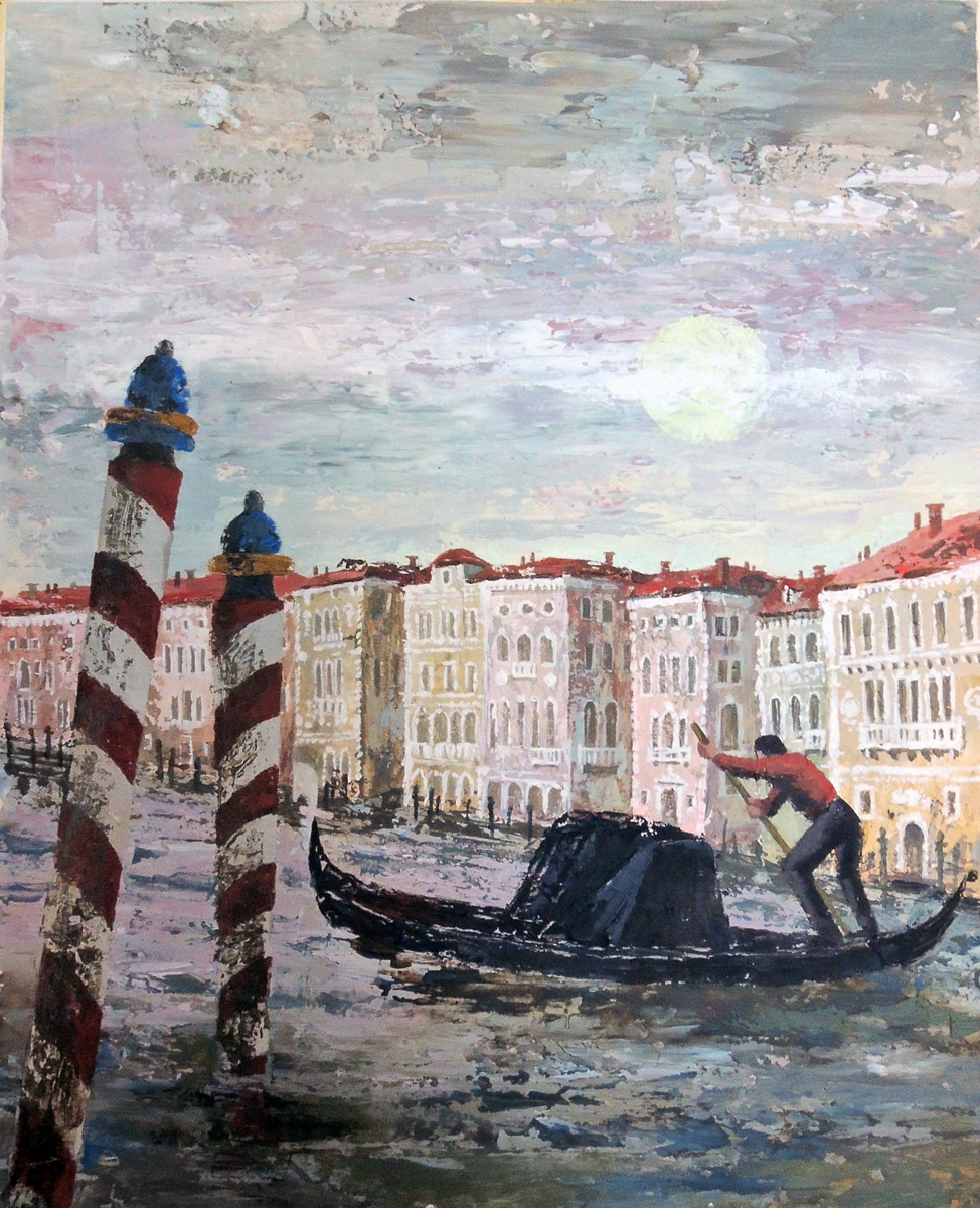
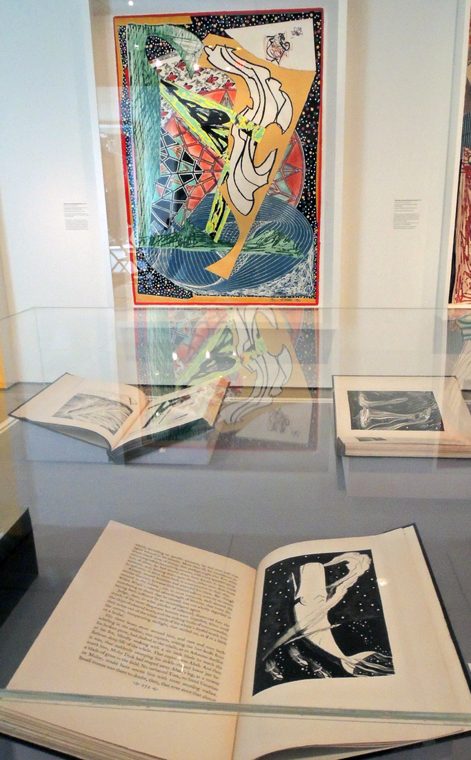
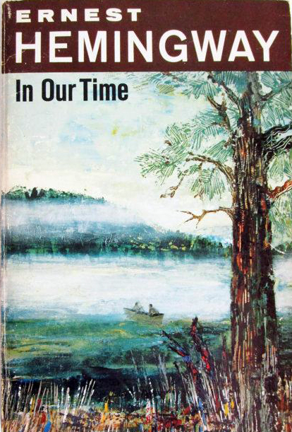
 Ruth and James McCrea, Cover design for In Our Time by Ernest Hemingway (New York: Charles Scribner’s Sons, 1970). Oil paint on board. Graphic Arts Collection. Gift of Charles Scribner III, Class of 1973.
 In 1960, the first 21 titles in the Scribner Library (paperback) series were published, beginning with F. Scott Fitzgerald’s The Great Gatsby. One artist was assigned to each author, so that writer’s books would have a distinct and yet, uniformed appearance.
This plan was interrupted only once, with the cover designs for the novels of Ernest Hemingway, which were painted by the husband and wife team of James C. McCrea (1920-2013) and Ruth McCrea (1921-2016).
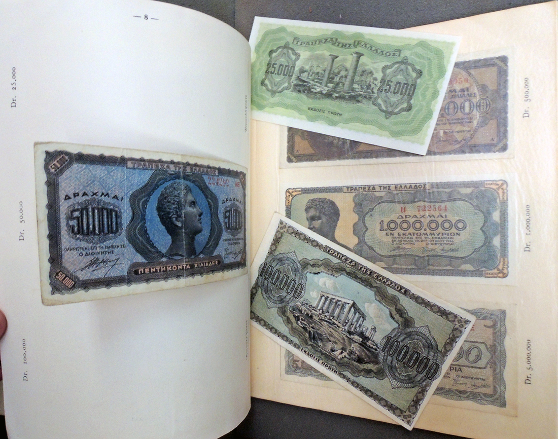
Thanks to the gift of Charles Scribner III, Class of 1973, we are fortunate to have all 11 paintings by the McCreas for the covers of Hemingway’s novels, including Across the River and into the Trees; A Farewell To Arms; For Whom The Bell Tolls; In Our Time; Men Without Women; The Green Hills of Africa; The Old Man and the Sea; The Snows of Kilimanjaro; The Sun Also Rises; To Have and Have Not; and Winner Take Nothing. None of the paintings for Scribner’s are signed by either artist.
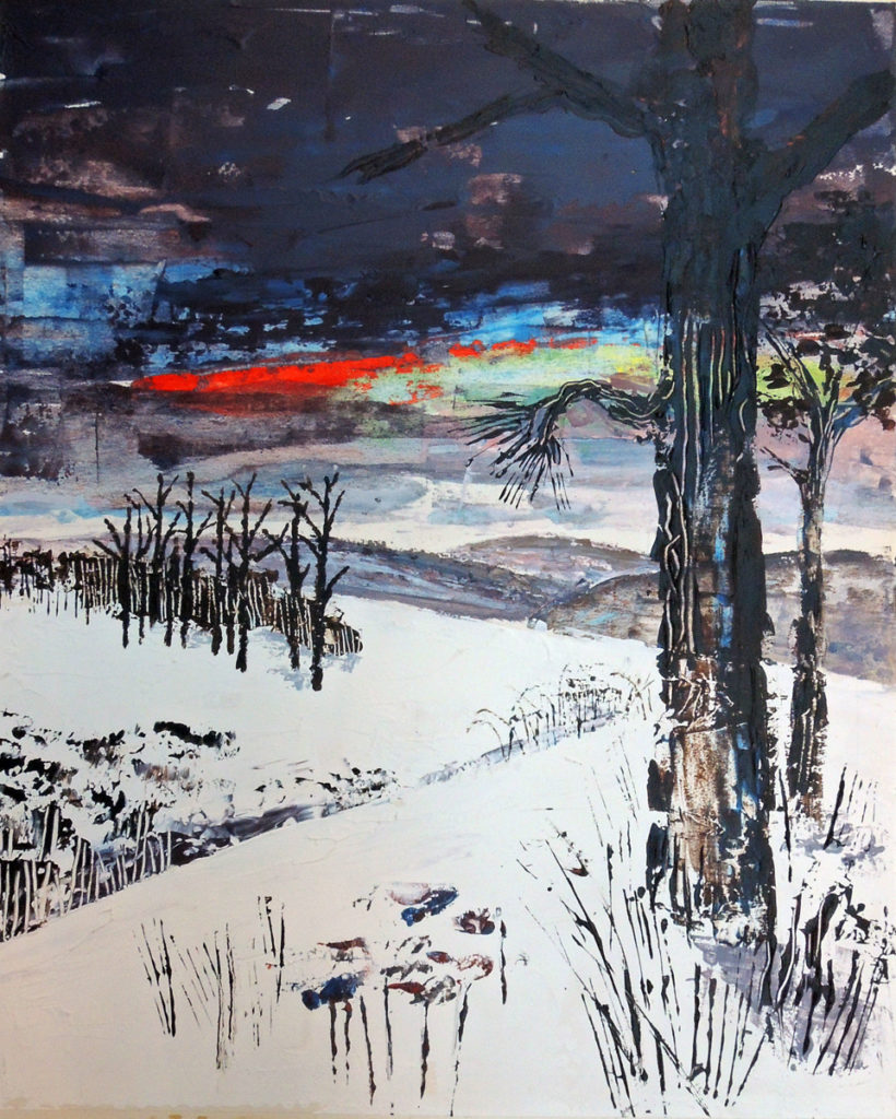 Ruth and James McCrea, Cover design for For Whom The Bell Tolls by Ernest Hemingway (New York: Charles Scribner’s Sons, 1970). Oil paint on board. Graphic Arts Collection. Gift of Charles Scribner III, Class of 1973.
James McCrea was born in Peoria, IL; attended the University of the South in Sewanee, Tennessee; and served in the Merchant Marine in World War II. Ruth McCrea was born in Jersey City, NJ, and attended school first in Brooklyn Heights, then Sarasota, Florida.
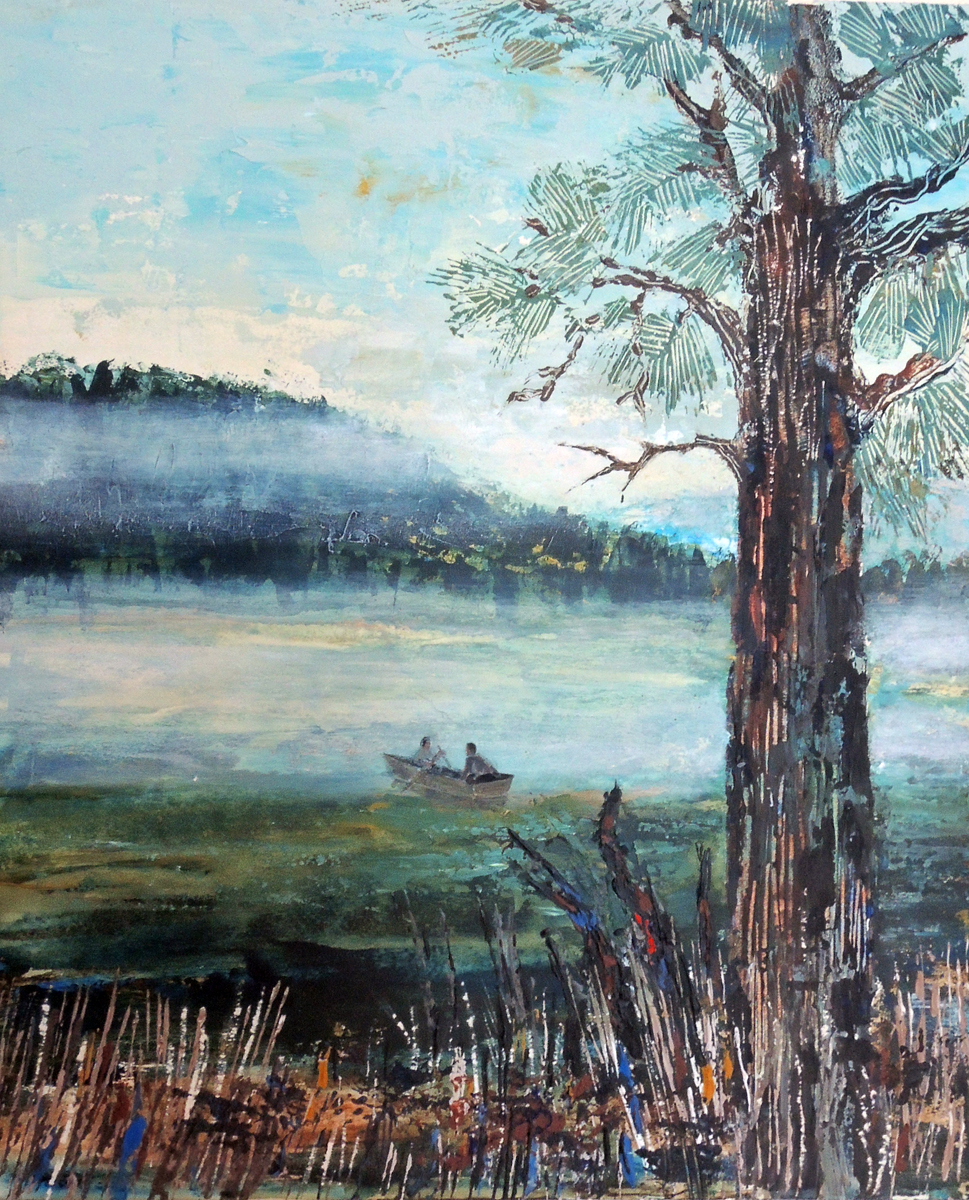
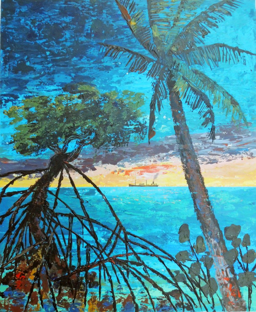
It was at the Ringling School of Art that she met James, marrying him on the 4th of July 1943. While he served in the Marines, Ruth sold her watercolor landscapes (beach scenes clearly still in evidence on Hemingway’s covers).
The McCreas both worked as freelance designers and illustrators commuting from Bayport, NY on the south shore of Long Island and much of this information comes from Ruth’s obituary written by Carissa Katz for the East Hampton Star newspaper.
While the two worked closely on many projects, Ruth illustrated a series of cookbooks on her own while James taught typography at The Cooper Union. A search of the two names brings 91 books with designs credited to Ruth McCrea and only 60 for James McCrea.
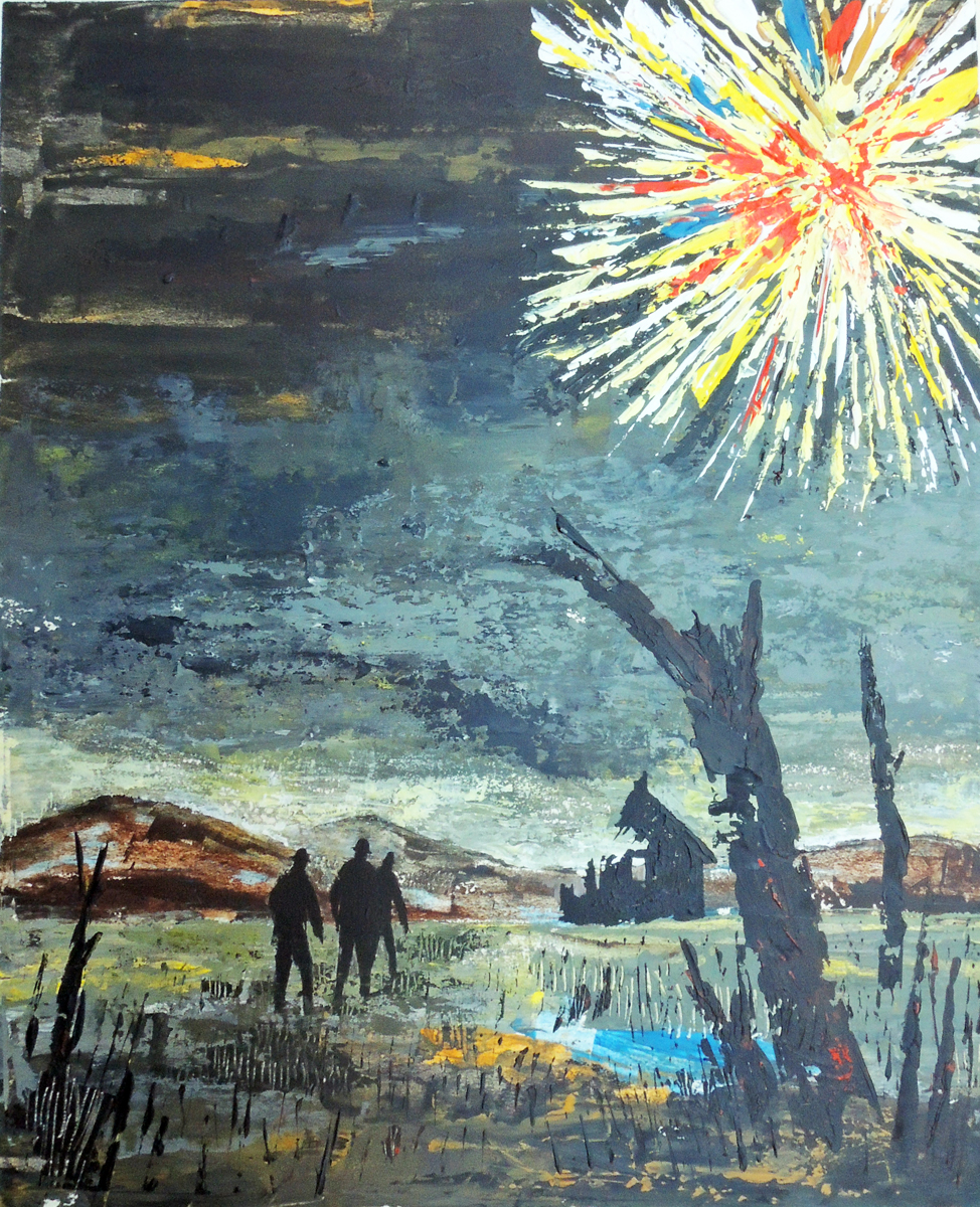
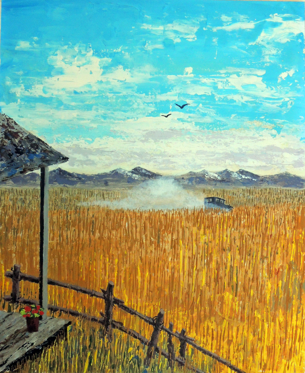
Here are a few more of their paintings for Hemingway’s books.
 Ruth and James McCrea, Cover design for Across the River and into the Trees by Ernest Hemingway (New York: Charles Scribner’s Sons, 1970). Oil paint on board. Graphic Arts Collection. Gift of Charles Scribner III, Class of 1973.


Ruth and James McCrea, Cover design for A Farewell To Arms by Ernest Hemingway (New York: Charles Scribner’s Sons, 1970). Oil paint on board. Graphic Arts Collection. Gift of Charles Scribner III, Class of 1973.

[above] Ruth and James McCrea, Cover design for Winner Take Nothing by Ernest Hemingway (New York: Charles Scribner’s Sons, 1970). Oil paint on board. Graphic Arts Collection. Gift of Charles Scribner III, Class of 1973.
[below] Ruth and James McCrea, Cover design for To Have and Have Not by Ernest Hemingway (New York: Charles Scribner’s Sons, 1970). Oil paint on board. Graphic Arts Collection. Gift of Charles Scribner III, Class of 1973.
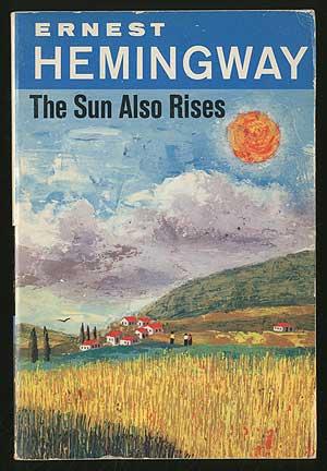
 Ruth and James McCrea, Cover design for The Sun Also Rises by Ernest Hemingway (New York: Charles Scribner’s Sons, 1970). Oil paint on board. Graphic Arts Collection. Gift of Charles Scribner III, Class of 1973.
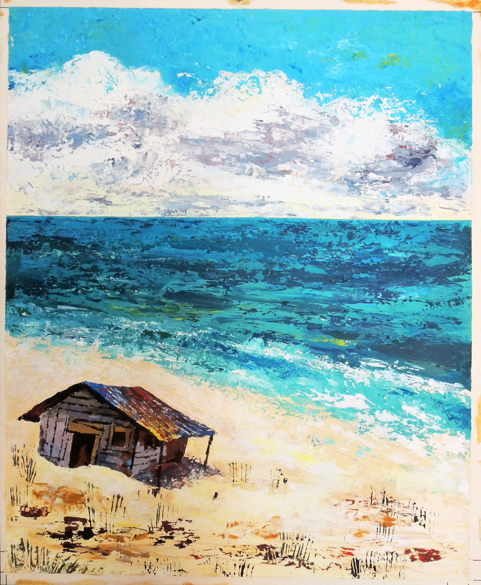
 Ruth and James McCrea, Cover design for The Old Man and the Sea by Ernest Hemingway (New York: Charles Scribner’s Sons, 1970). Oil paint on board. Graphic Arts Collection. Gift of Charles Scribner III, Class of 1973.

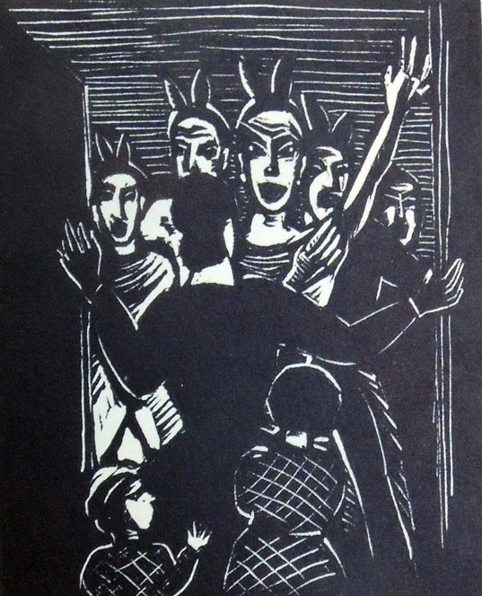
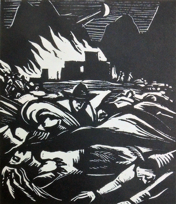
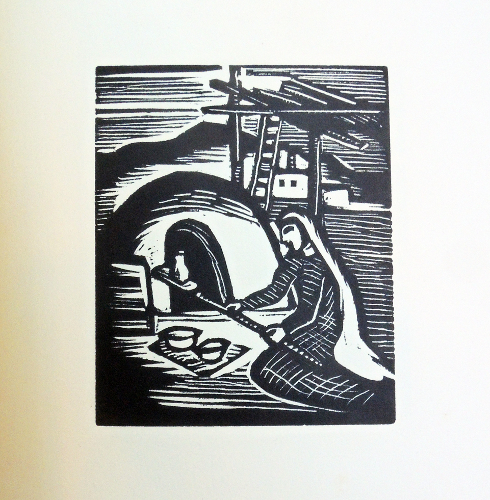
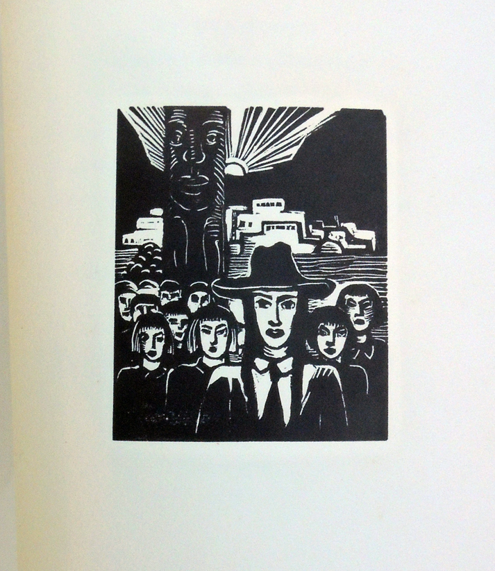
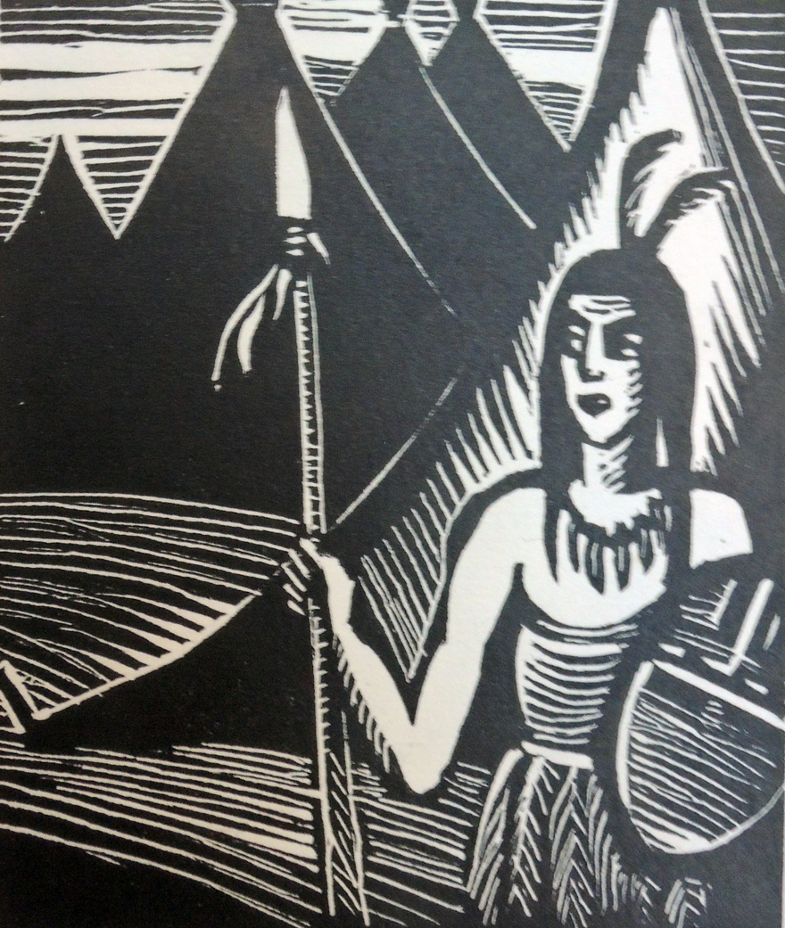 Written and illustrated by Czech graphic artist Helena Bochořáková-Dittrichová (1894-1980), this mostly wordless novel tells its story in 52 black and white woodcuts and 7 pages of text (also by the artist).
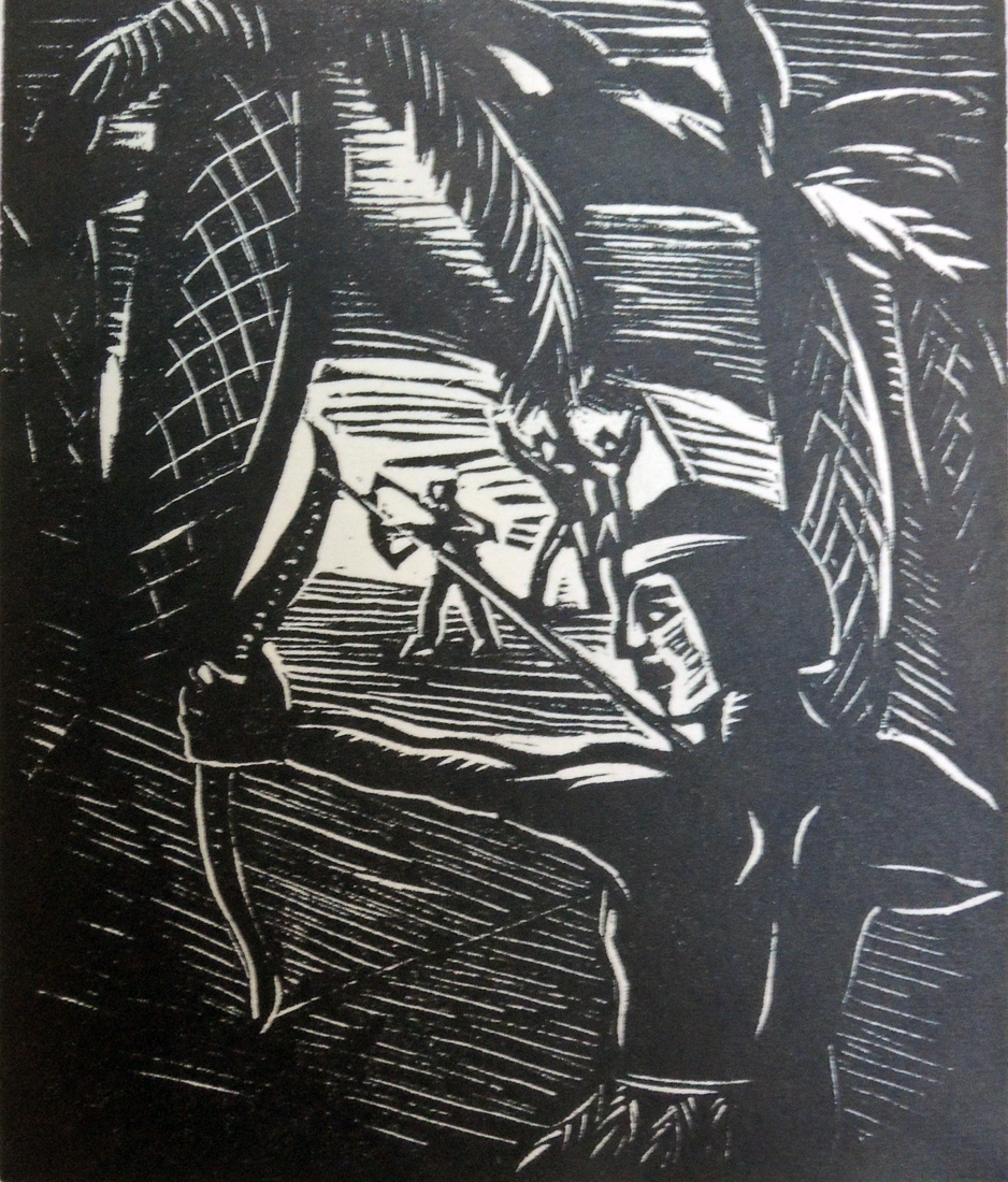
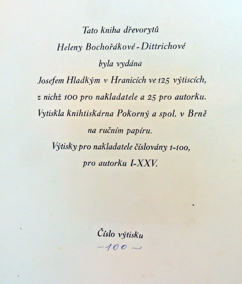
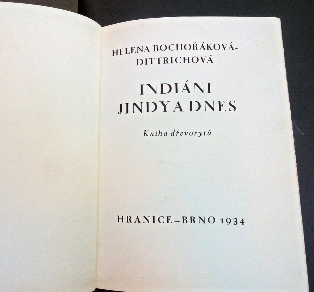
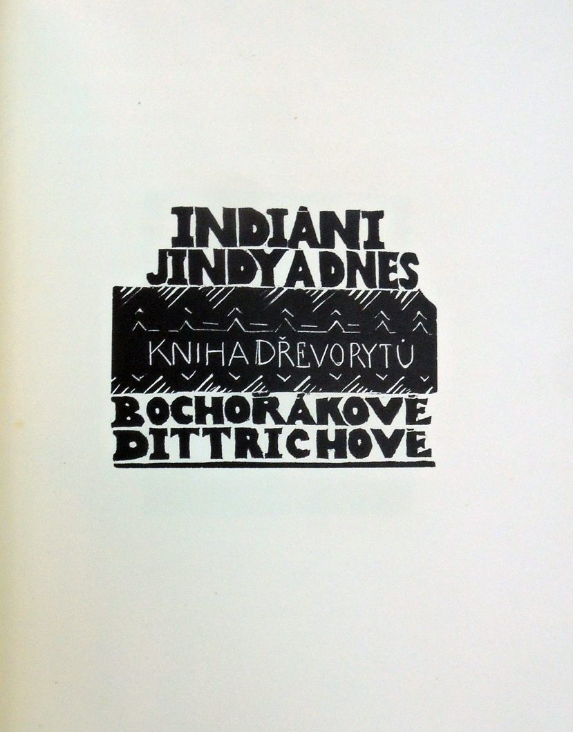
 Helena Bochořáková-Dittrichová (1894-1980), Indiáni jindy a dnes: kniha dřevorytů =