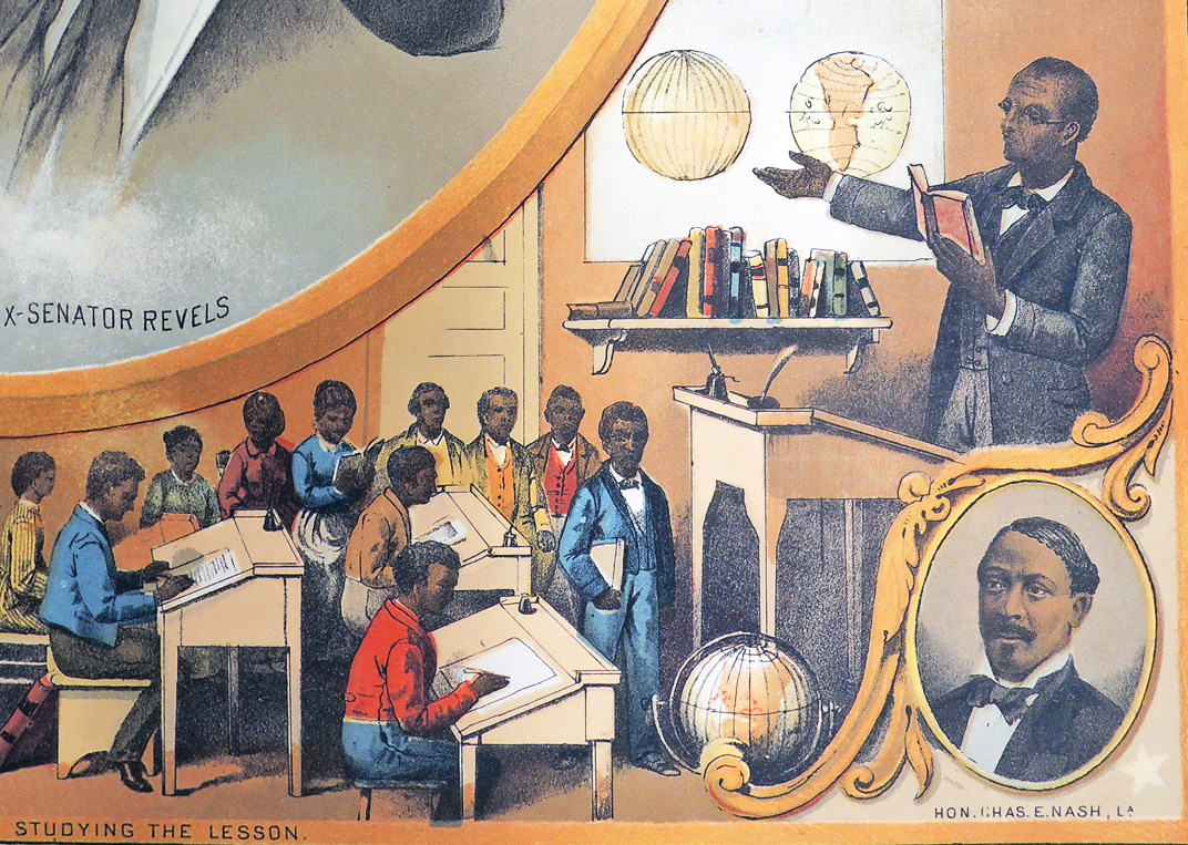
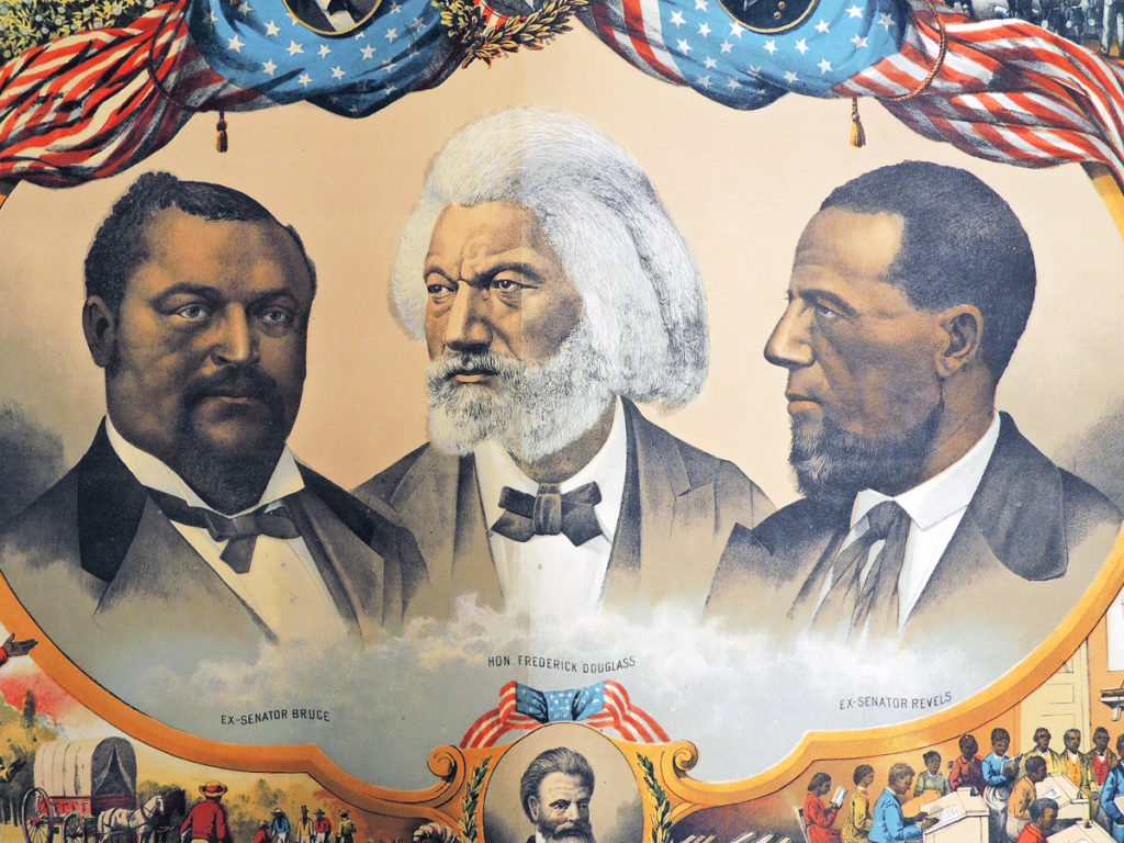
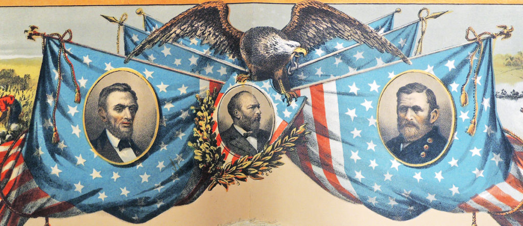
 Heroes of the Colored Race. Chromolithograph. Philadelphia: Published by J. Hoover, 628 Arch St., 1881. Graphic Arts Collection GAX 2017- in process. Purchased with funds from the Hurlbut Barnes Cutting Memorial Fund.
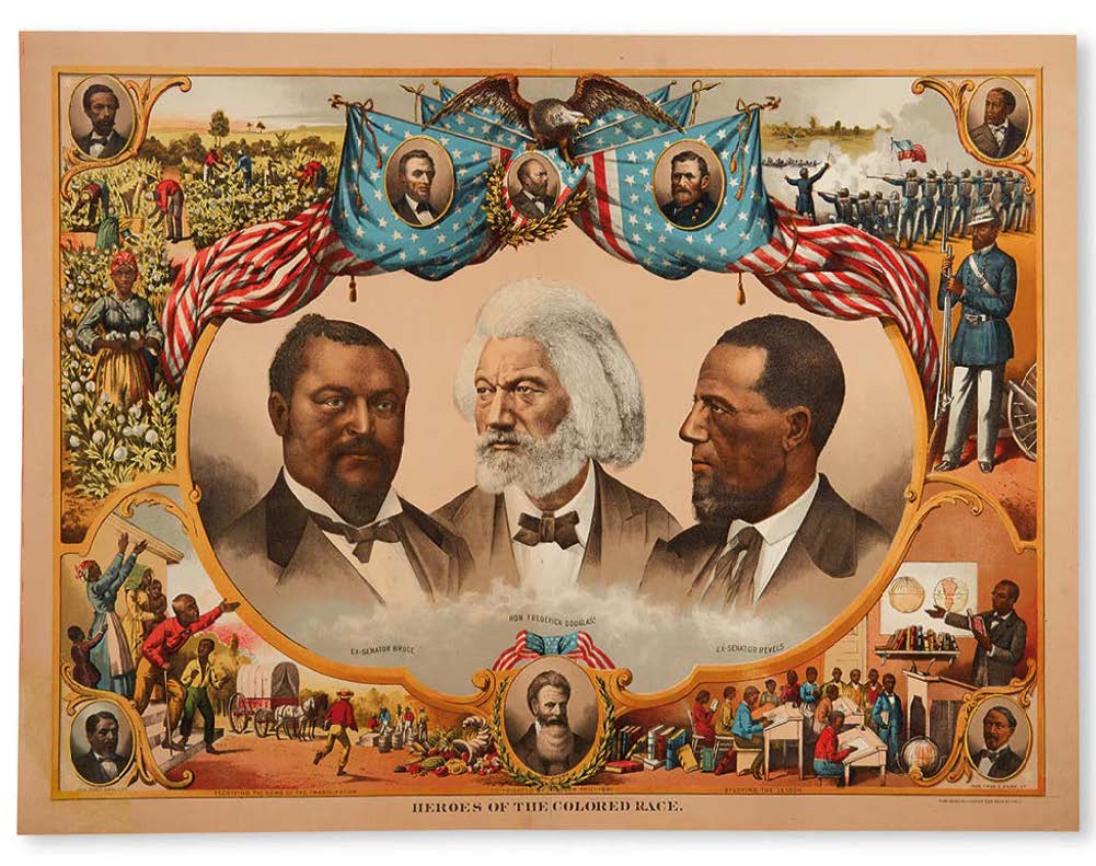
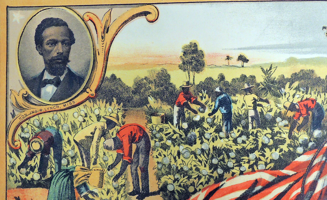
Thanks to Steven Knowlton, Librarian for History and African American Studies and funds from the Hurlbut Barnes Cutting Memorial Fund, the Graphic Arts Collection is the fortunate new owner of a rare, 19th-century chromolithograph entitled Heroes of the Colored Race.
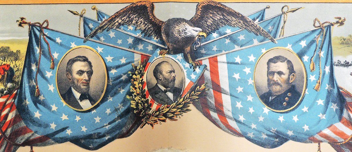
The print commemorates men prominent in and representative of the advancement of African American civil rights, including Blanche Kelso Bruce, 1841-1898; Frederick Douglass, 1818-1895; Hiram Rhodes Revels, 1827?-1901; John Roy Lynch, 1847-1939; Abraham Lincoln, 1809-1865; James Abram Garfield, 1831-1881; Ulysses Simpson Grant, 1822-1885; Joseph Hayne Rainey, 1832-1887; Robert Smalls, 1839-1915; John Brown, 1800-1859; and Charles Edmund Nash, 1844-1913.
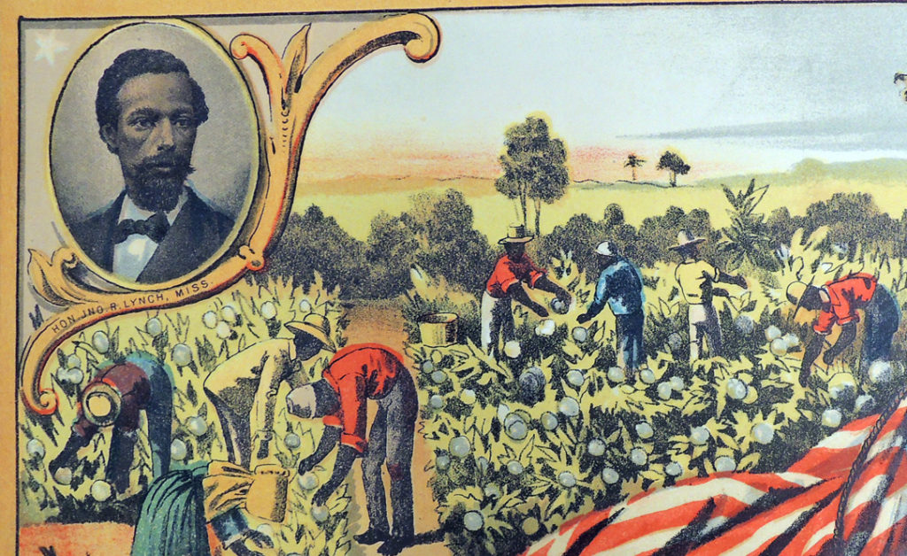
The central vignette highlights portraits of ex-United States Senator Blanche Kelso Bruce of Mississippi, abolitionist, federal administrator, and diplomat Frederick Douglass, and ex-United States Senator Hiram Revels of Mississippi.
The four corners are filled with scenes showing the contributions of African Americans to the prosperity of the United States through their labor, studies, and participation in civic life, and the preservation of the Union through service in the United States Colored Troops. Also featured are portraits of African American members of the United States House of Representatives John R. Lynch of Mississippi, Joseph H. Rainey of South Carolina, Robert Smalls of South Carolina, and Charles E. Nash of Louisiana.
Bruce, Douglass, Lynch, Rainey, and Smalls were all enslaved for some portions of their lives.
 The printer/publisher was Joseph Hoover, born of Swiss-German heritage in Baltimore on December 29, 1830. The Library Company of Philadelphia’s biographical database on local printers states that by 1893, Hoover was noted as “probably the largest publisher of pictures,” distributing internationally 600,000 to 700,000 prints a year with his son, Henry L. Hoover. The listing continues:
“Hoover settled in Philadelphia in 1856. He opened a wood turning and framing establishment on the 1400 block of Hamilton Street, and about 1858, married his first wife Roseanna (b. ca. 1833). …In the spring of 1868 the “chromo and print publisher” advertised his removal to 804 Market Street, from where he oversaw the work of Duval & Hunter and James Queen and issued his well-advertised and acclaimed “The Changed Cross” in 1870. . . . During the 1870s and 1880s, Hoover’s business continued to grow (estimated worth of $30,000-$40,000) and he established printing plants at 450-452 North Thirteenth Street and [numerous other locations]. With this financial success also came professional acknowledgment and Hoover was one of only three chromolithographers to be honored at the Centennial Exhibition of 1876.”


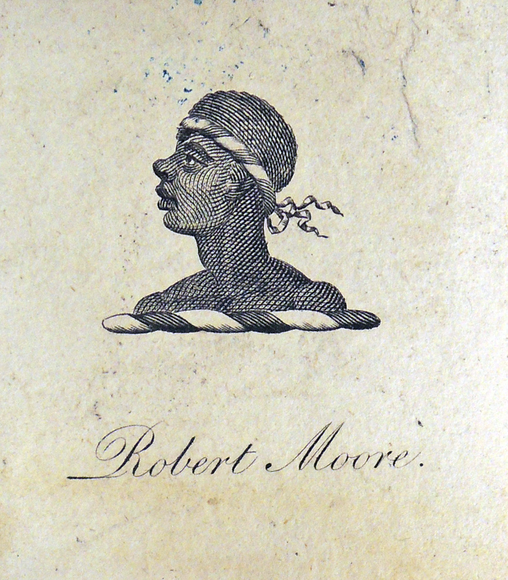
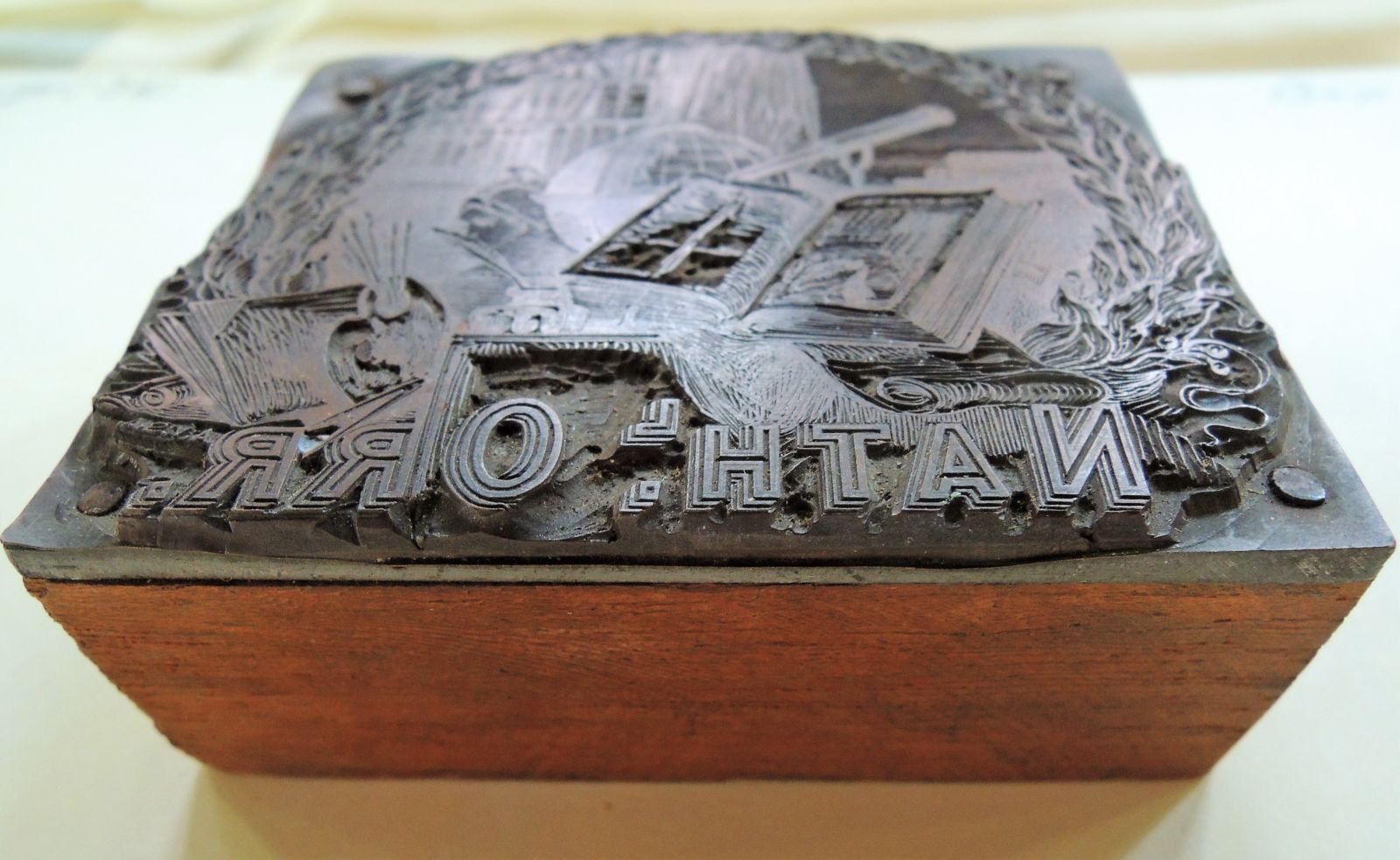
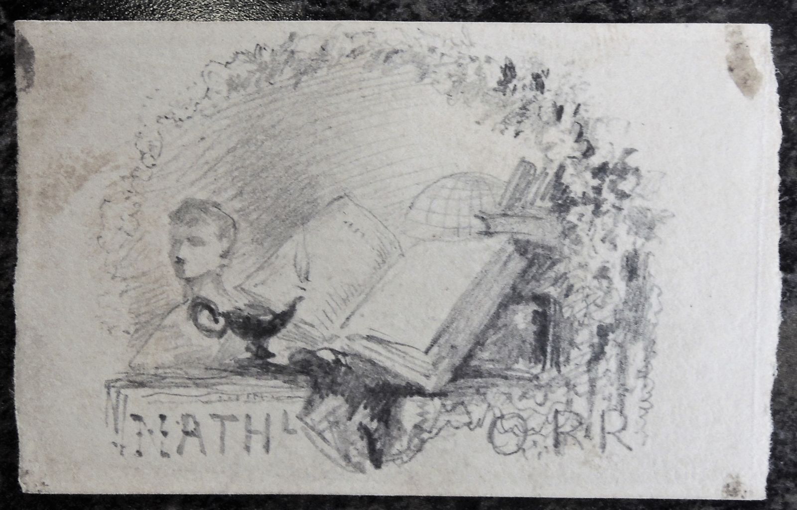
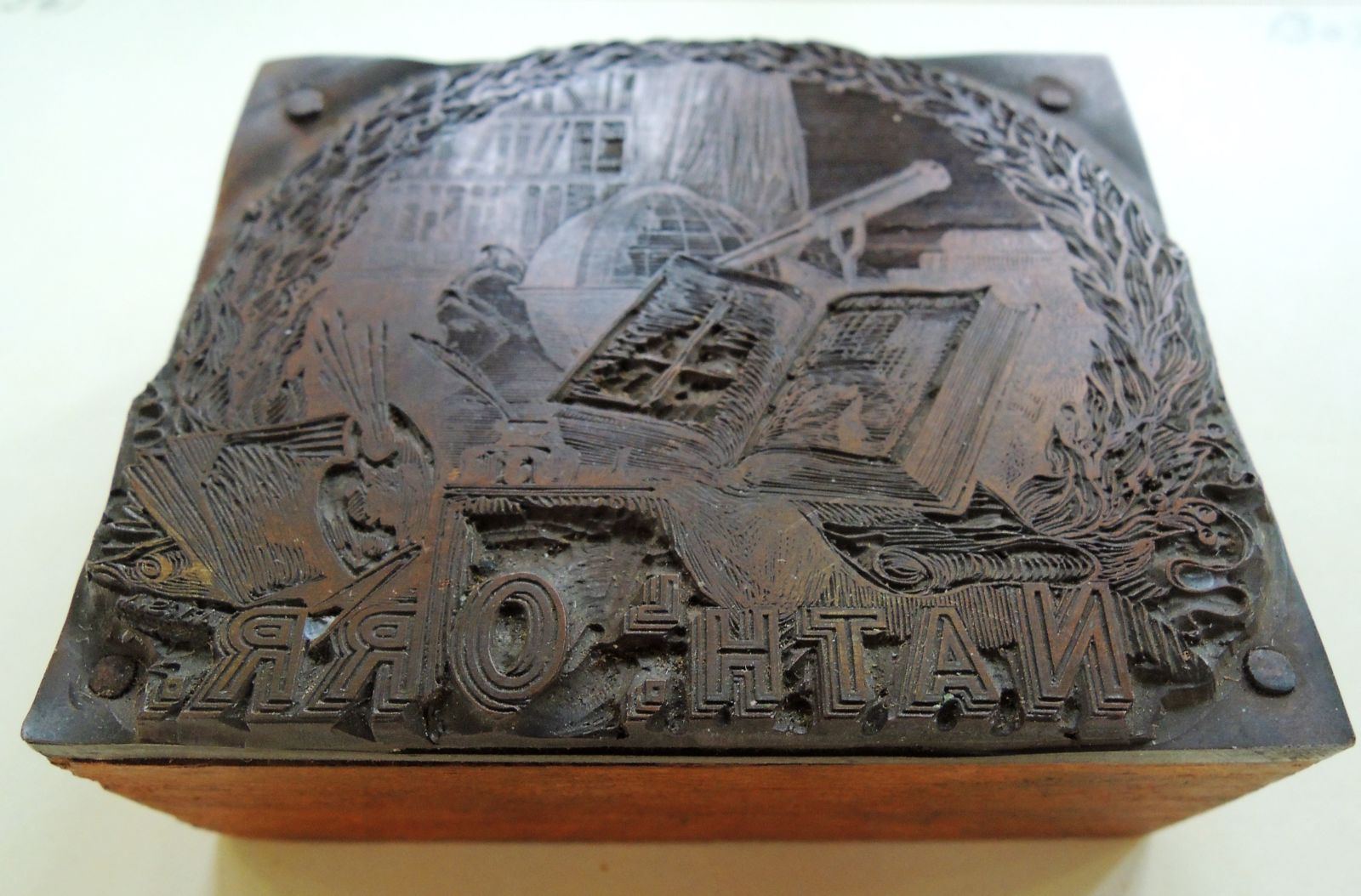
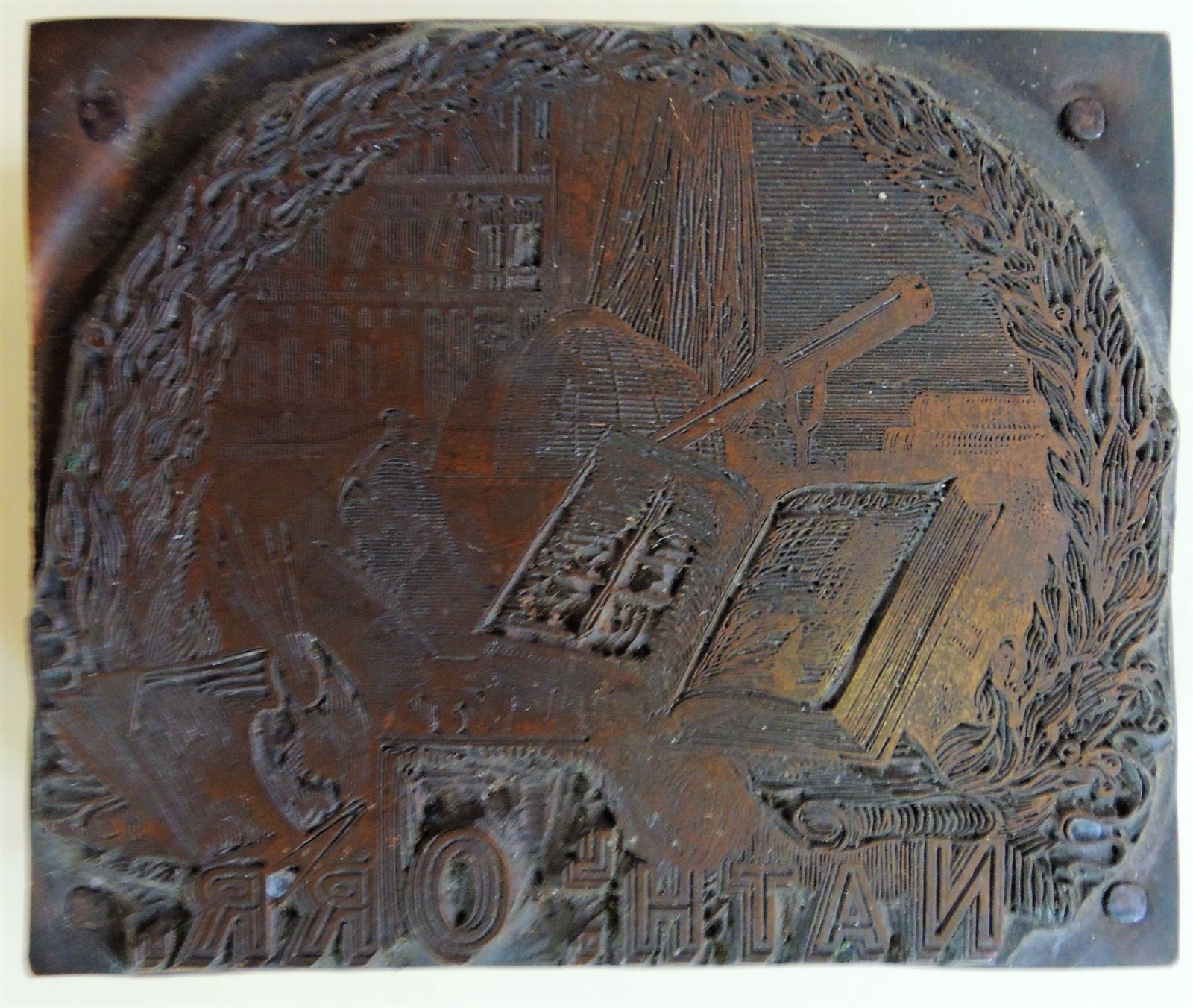
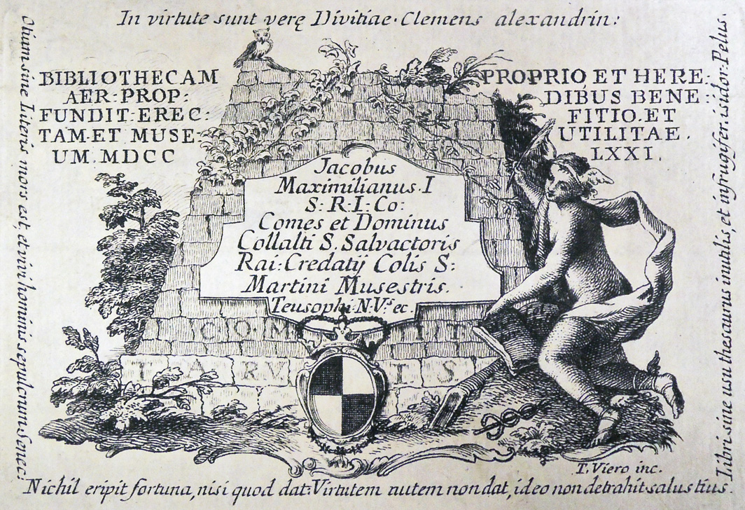 Bookplate for Jacobus Maximilianus, count of Collalto and San Salvatore and count of the Holy Roman Empire, engraved in 1771 by Teodoro Viero (Italian, 1740–1819)
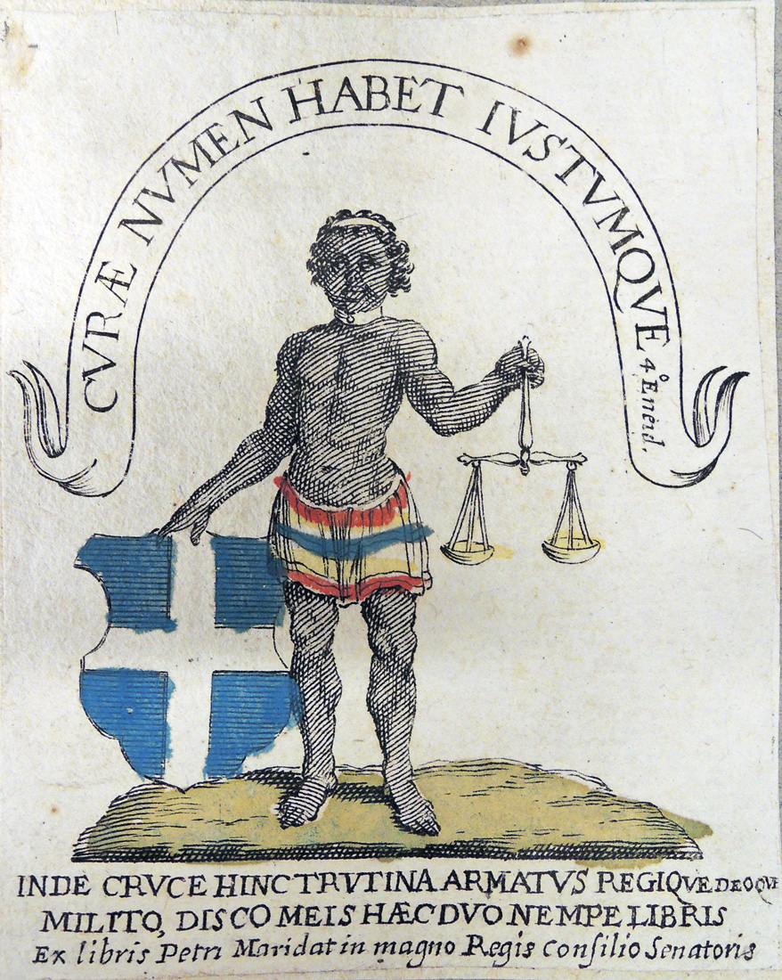 Hand colored bookplate of the French politician Pierre de Maridat (1613-1689), Councillor at the Grand Conseil (1640), inscribed “Curae numen habet justu move 40 Eneid. / Inde cruce hinc trutina armatus regique deoque milito disco meis hcec duo nempe libris / ex libris Petri Maridat in magno Regis consilio Senatoris.”
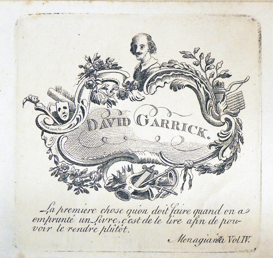 Bookplate for David Garrick (1717-1779), engraved around 1755. Above is a bust of Shakespeare and below the inscription “La premiere chose qu’on doit faire quand on a emprunte un Livre, c’est de la lire afin de pouvoir le rendre plutot. Menagiana. Vol. IV.” = “The first thing one must do when one borrows a book is to read it in order to be able to give it back. Menagiana. Vol. 4.”
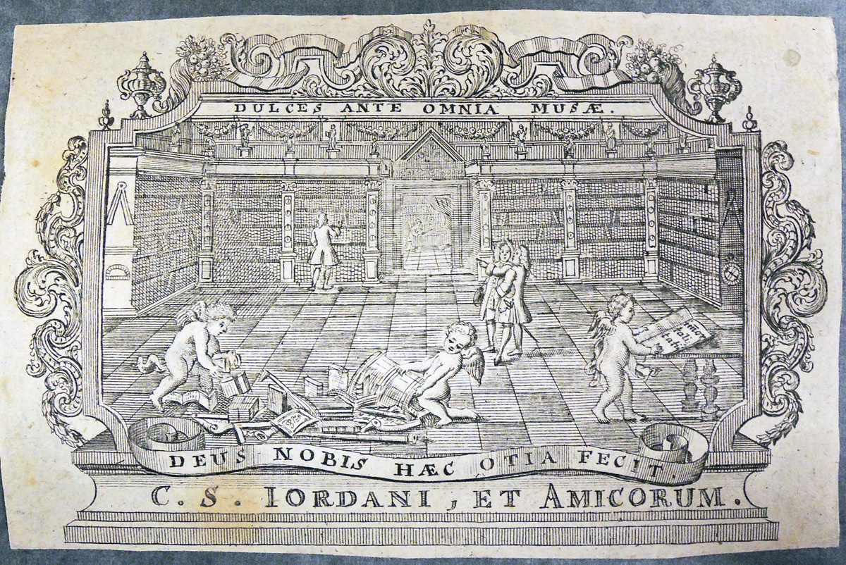 Bookplate of the booksellers C.S. Jordani and Associates, with their motto “Dulces ante omnia musae” (Sweet before all muses) at the top and below “Deus nobis haec otia fecit” (God has given us this tranquility, Virgil, Eclogues I, l.6).
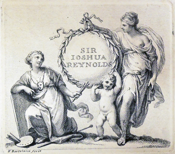 Sir Joshua Reynolds (1723-1792) bookplate engraved by Francesco Bartolozzi (1727-1815).