Category Archives: Acquisitions

new acquisitions

Gerstner’s Vienna

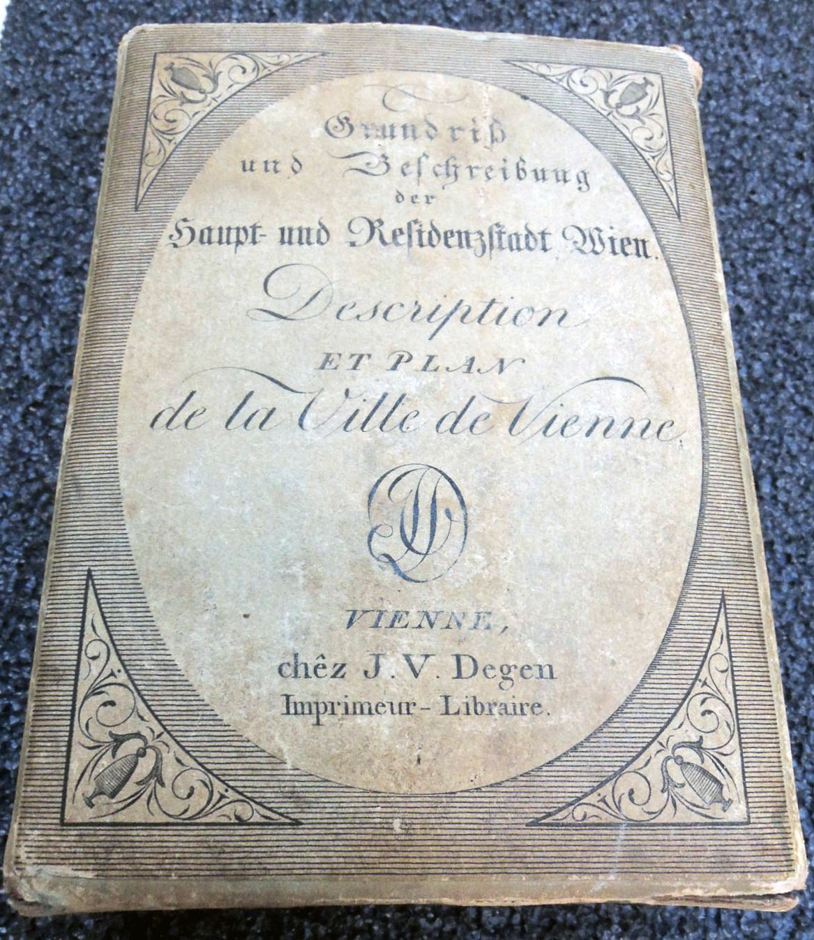
Joseph Vincenz Degen [Johann Pezzl], Grundriss und Beschreibung der Haupt- und Residenzstadt Wien. [Floor plan and description of the capital and residence city of Vienna] = Description et plan de la Ville de Vienne [Description and plan of the City of Vienna] (Vienna: bey J.V. Degen, 1802). Map, guidebook, and slipcase. Graphic Arts Collection GAX 2018- in process


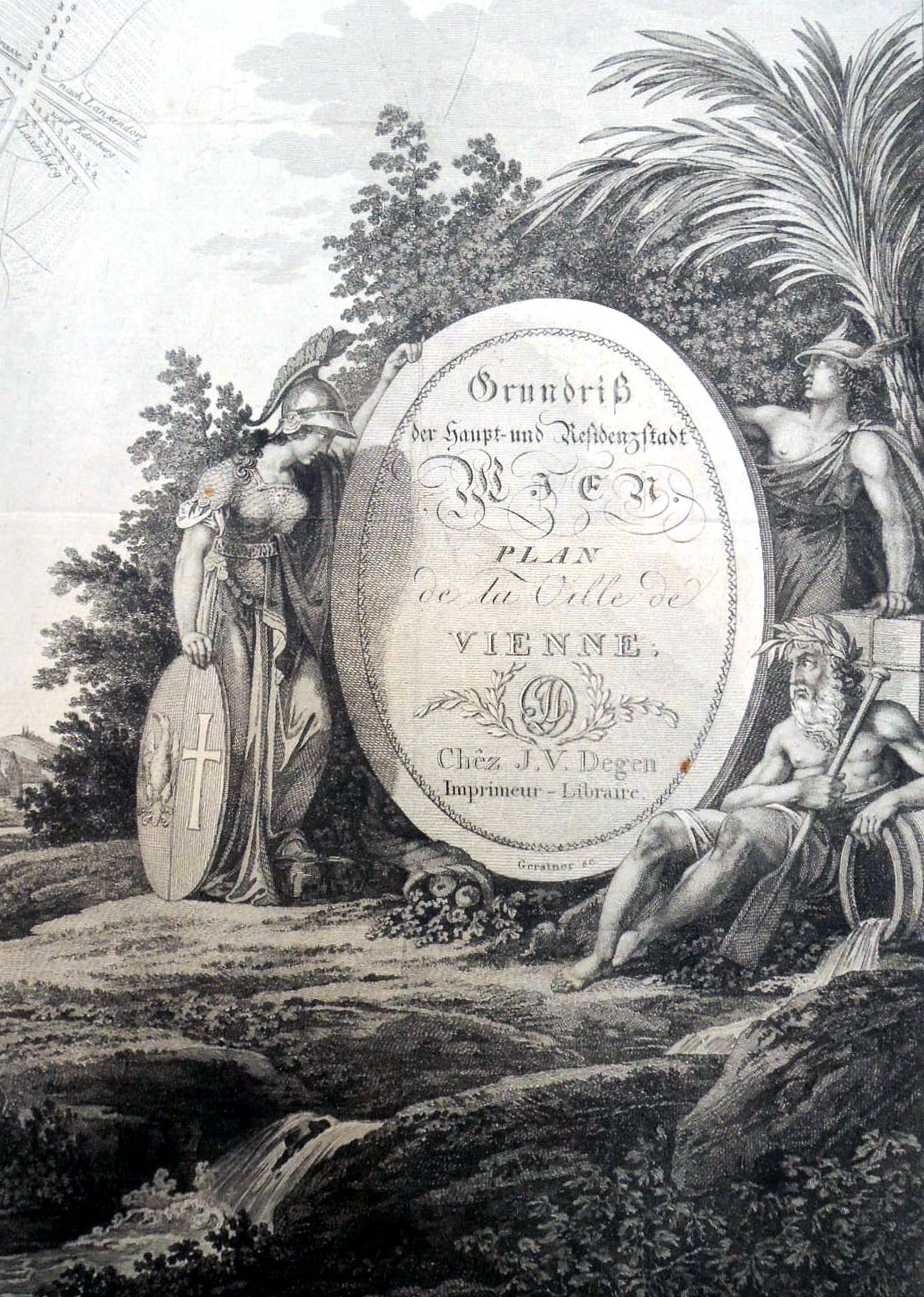
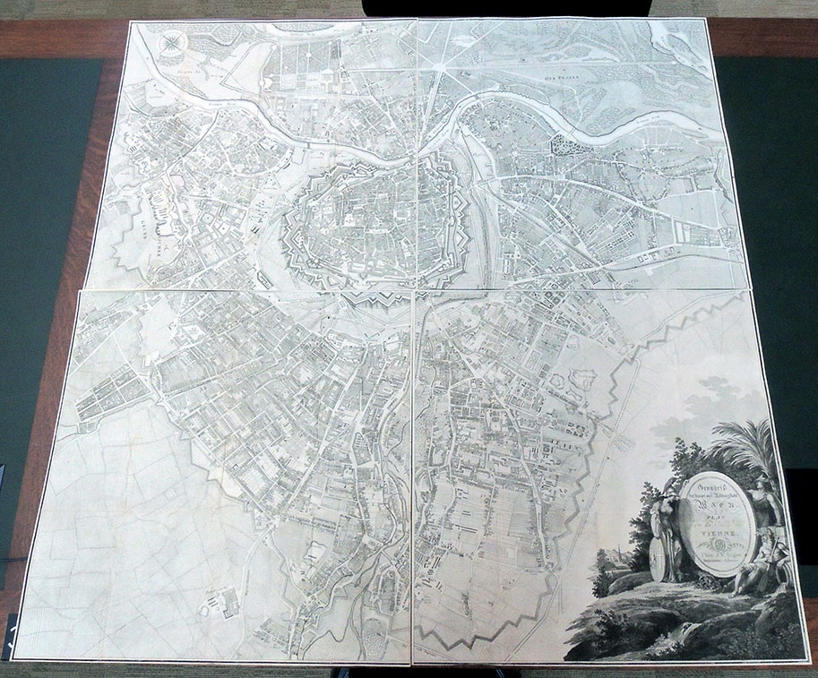
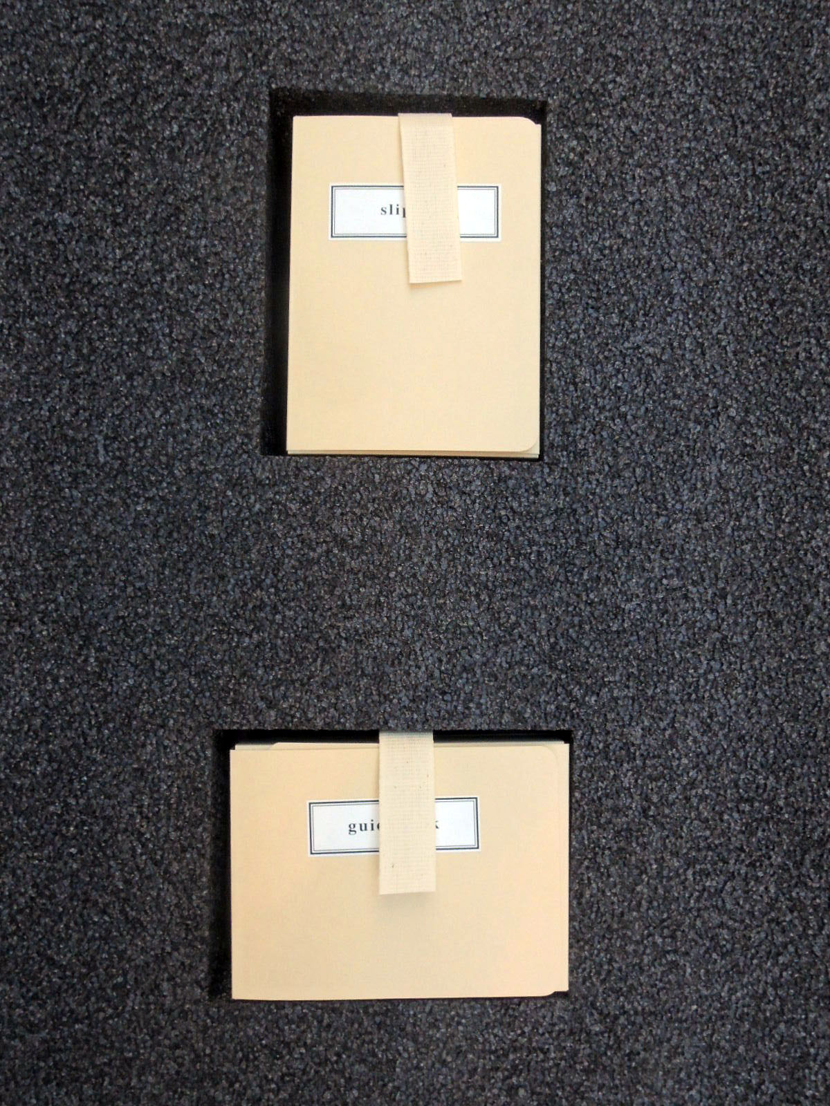
When we first received this enormous four-part map of Vienna, engraved by Joseph Gerstner (1768-1813), it was folded into tiny chunks and stuffed inside the original paper slipcase (120 x 85 x 40 mm), together with the palm-size guidebook. Once its various parts were separated, rare book conservator Mick LeTourneaux decided not to return them to the original format but flatten the maps and conserve the slipcase individually.

A foam insert was prepared for the book and slipcase, exactly the size of the maps so that the whole object could be housed together in a light-weight four-flap folder. In this way, the material is protected but also available to researchers for daily use.


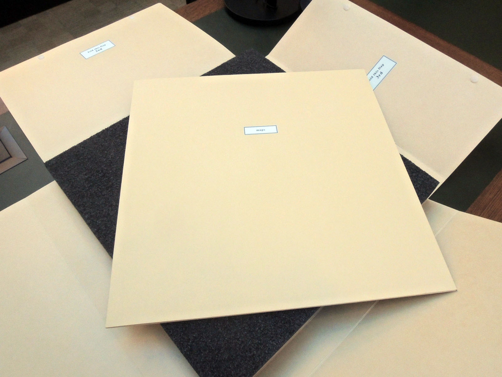
The four sheets of Gerstner’s plan of Vienna fit together to form a map approximately three feet square. His detailed plan was based upon Maximilian von Grimm’s monumental map to the Greater Vienna and the first scientific survey of the city, published in 1799. Gerstner includes the old city ‘Innere Stadt’ within the castellated medieval walls and the fast-growing suburbs that surrounded the center in all directions. Every street is precisely delineated and labeled.

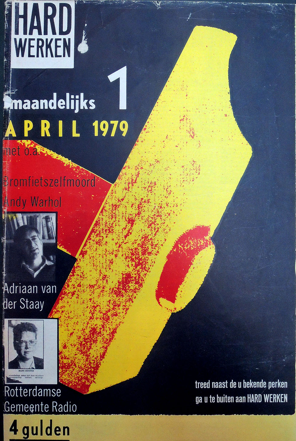
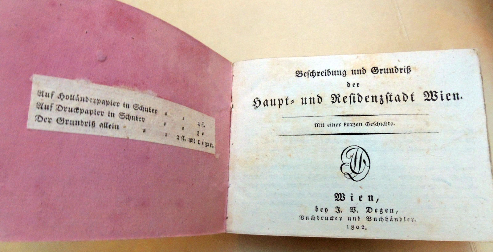
The text for this first edition was written by Johann Pezzl (1756-1823), who frequented the Greinerschen Salon, in the circle around Caroline Pichler.  The guidebook became so popular that it was re-issued many times up until 1809. After this date, the elaborate parts of this publication were discontinued and only the plan was published.

Maurice-Georges-Elie Lalau


Maurice-Georges-Elie Lalau (1881-1961), Les quinze joyes de mariage … Edition conforme au manuscript de la Bibliothèque de Rouen avec un glossaire publié par Jules Meynial… (Paris, 1928). Copy 45 of 150. Graphic Arts Collection GAX 2018- in process

       
[left] Antoine de La Sale (born 1388?), The Fyftene Joyes of Maryage [Quinze joyes de mariage] ([London: Wynkyn de Worde, 1509]). [right] Les quinze joyes de mariage: ouvrage tres̀ ancien, auquel on a joint le Blason des fausses amours, le Loyer des folles amours, & le Triomphe des muses contre amour. Le tout enrichi de remarques & de diverses leçons (A La Haye: Chez A. De Rogissart, 1726). Rare Books 2004-0836N

In 1926, Maurice Lalau and the bibliophile/publisher Jules Meynial formed a partnership to create a deluxe edition using innovative printing techniques. For their text, they chose Les quinze joyes, a Medieval satire on the tricks wives play on their husbands, sexual and otherwise.

A 1726 edition [above] has notes by le Duchat, who describes it as a favorite of ‘jeunes Courtisans François’ of the mid-fifteenth century. The work has been attributed to Antoine de la Sale and various dates have been suggested for its composition; le Duchat comes down in favor of the late fourteenth century. Wynkyn de Worde published a translation in English verse, The Fyftene Joyes of Maryage, at least as early as 1507, a fragment of that survives and a single complete copy of a 1509 reprint. STC 15257.5-15258

Lalau called his printing process, first seen with this volume, Graphichromie: “un moyen nouveau d’impression des illustrations en couleurs.” He designed and printed the edition of 150 copies, each with 37 plates, which means hand-printing 5,550 multi-color plates. The project took Lalau two years to complete. In addition, this copy has 37 single leaves, reproducing the illustrations in grey ink only (the initial color in the process).


Their book was the subject of an article in the January 1929 issue of Le Gaulois artistique, [above and left] in which the author laments the suppression of traditional illustration processes in favor of newer mechanical techniques:

“L’emploi de découvertes techniques, améliorées et perfectionées sans cesse, ont éliminé presque définitivement ces traducteurs. La photographie, la photogravure, la similigravure, l’héliogravure, la phototype et, plus récemment, la rotogravure, sont cause de la suppression, dans la domaine du livre, des graveurs au burin, des aquafortistes, des xylographes et des lithographes.

Néanmoins, ces applications mécaniques de la reproduction, excellentes pour les publications à grand tirage, resente insuffisantes, quelque soin que l’on puisse apporter à leur execution, quand il s’agit du livre du luxe.”

Although the author disdains mechanical processes, in general, he praises Lalau’s technique for its insistence on intimacy between artist and workman:
“Il n’est plus question d’interprétation indirecte à laquelle l’artiste ne peut prendre part, mais au contraire d’une union constante entre lui et l’ouvrier chargé du tirage de ses planches.”

In addition, he compliments Lalau’s ability to convey the spirit of the Middle Ages through modern mechanical means: “Elle fait le plus grand honneur à l’artiste qui en est l’inventeur et à l’éditeur qui a réalisé le difficile problème de conserver son caractère à un ouvrage du moyen âge, en employant pour l’éditer des proceeds modernes.”


The War of the Worlds

In 1904, Henrique Alvim Corrêa (1876-1910), a relatively unknown Brazilian artist living and working in Belgium, took a group of drawings to London and showed them to H.G. Wells (1866-1900). Alvim Corrêa’s work was inspired by the author’s 1897 story entitled “The War of the Worlds” and with no further information or persuasion, Wells commissioned him to illustrate a deluxe, limited edition of the novel. Over the next two years, Alvim Corrêa completed 32 drawing for the book published in 1906. The Graphic Arts Collection recently acquired one of the 500 rare copies of this illustrated book.

“The War of the Worlds” first appeared in Pearson’s Magazine [seen above] serialized from April to December 1897, together with illustrations by Warwick Goble (1862-1943), best known today for his fairy tales and other children’s books. The two versions are quite similar.


Eighty years ago, Orson Welles and the Mercury Theatre radio hour performed a Halloween adaptation of H. G. Wells’ The War of the Worlds, which many listeners took as fact and panicked. A reporter (Orson Welles) told the audience that something had fallen or landed in Grover’s Mill (just east of the Princeton Junction train station) and over the next hour it was discovered that giant Martian war machines were attacking the United States. Today, a carved stone marks the site of the fictional landing.

H. G. Wells (1866-1946), La guerre des mondes. Traduit de l’anglais par Henry-D. Davray. édition illustreé par Alvim-Corrêa (Bruxelles: Vandamme & Co., 1906). Graphic Arts Collection GAX 2018- in process


Peter Coffin’s Spiral Rainbow


The spiral as a conceptual archetype is a recurring theme in the work of the American artist Peter Coffin, such as in his 2006 commission for Peter Norton’s annual Christmas gifts. Taking the format of a common photograph album, Coffin organized a series of postcards depicting rainbows into a three-dimensional spiral forming one enormous rainbow. As you open this volume, the constellation of cards expands in an upward swirl of color and form.

The artist commented, “There is a tendency to clutter things up, to try and make sure people know something is art, when all that’s necessary is to present it, to leave it alone. I think the hardest thing to do is to present an idea in the most straightforward way. I think it was Jasper Johns who said that, “[It’s] sometimes necessary to state the obvious.” Still, how to proceed is always the mystery. I remember at one point thinking that someday I would figure out how to do this, how you do art — like “What’s the procedure here, folks?” — and then it wouldn’t be such a struggle anymore. Later I realized I would never have a specific process; I would have to re-invent it, over and over again.”

The Coffin project is the gift of James Welling, Lecturer with the rank of Professor in the Visual Arts program in the Lewis Center for the Arts at Princeton University. In turn, it was the gift of the Peter Norton Family, who each year commission a work of art to celebrate the holiday season.

Peter Coffin (born 1972), Norton Family Christmas Project ([Santa Monica, Calif.]: [Peter Norton Family], [2006]). 1 photograph album. Gift of James Welling. Graphic Arts Collection in process.

Ellsworth Kelly’s Un Coup de dés


When publisher Sidney Shiff commissioned Ellsworth Kelly to select a text and create prints for a Limited Editions Club book, Kelly chose to match his black and white lithographs with Un coup de dés by Stéphane Mallarmé, one of the most famous poems of the 19th century. In its 63rd year, the Club was publishing only three or four titles each year in editions of 300, unlike the earlier runs of 2,000 under George Macy. This allowed Shiff to work with outstanding artists and create some of the most beautiful books of the late 20th and early 21st century.

Published in the original French and the original page design, Kelly integrated his eleven lithographs with the text, accentuating the open white space of both text and images. A separate booklet with Daisy Aldan’s English language translation is included: mallarme

“A throw of the dice never even when cast in eternal circumstances at the heart of a shipwreck let it be that the Abyss whitened slack raging under an incline desperately soars by its own wing…”


Stéphane Mallarmé (1842-1898) and Ellsworth Kelly (1923-2015), Un coup de dés jamais n’abolira le hasard ([New York]: Limited Editions Club, 1992). Text printed at Wild Carrot Letterpress and lithographs printed at Trestle Editions. Copy 71 of 300. Original black goatskin, in black solander box. Graphic Arts Collection GAX 2018- in process.

Hard Werken

Two years ago, an exhibition was mounted to celebrate the brief run of the visual art, music, and literature magazine Hard Werken, which made an impact on the typographic artists in The Netherlands and throughout Europe and the United States. The Graphic Arts Collection recently acquired a rare complete run of the title. Here is a statement from Rotterdam curators Reyn van der Lugt and Marjolein van de Ven:

Between 1979 and 1982, only ten editions of this cultural magazine were published, yet it had a significant influence on a whole generation of graphic designers in the Netherlands and beyond. … The striking A3 format, its anarchic design contrary to typographic currents, the focus on photography, and its changing group of contributors for each edition–-mainly from the visual arts and literature–-immediately characterised this new initiative as a brash, elusive, and distinctly Rotterdam phenomenon.–https://www.tentrotterdam.nl/en/show/rotterdam-cultural-histories-8-hard-werken/

Hard Werken was founded by the Rotterdam designers Willem Kars, Gerard Hadders, Rick Vermeulen, Henk Elenga and Ton van der Haspel in 1979, who had all been students at the Rotterdam Academy of Arts. They met through the Graphic Workshop, an initiative of the Rotterdam art foundation and joined with the poet Jules Deelder, photographer Henk Tas, the music club Arena, and Uitgeverij 101 to publish a magazine that represented the new cultural scene of their time and place.

The magazine was characterized by experiments with typography, photography, and illustration inspired from contemporary films, music, theater and painting. Although each designer worked individually, by 1980 the artists decided to focus on design as a group, known as Hard Werken Design.

For the next dozen years, Vermeulen, Hadders, Van den Haspel and Kars accepted all types of graphic design jobs including advertising, packaging, and interior design as well as posters, magazines, and music covers. According to interviews, “everyone was free to accept assignments. In case Hard Werken was approached for an assignment, it was discussed who would do the assignment.”

Although it is hard to see here, one of the interesting graphic features of Hard Werken was the integration of off-set printing with actual tipped in photographs and other hand-written elements. It was the extra-time and expense of this hand work that made the magazine unable to continue after ten issues.

Britannia Set Me Free


Thanks to Steven Knowlton, Librarian for History and African American Studies, the Graphic Arts Collection recently acquired this oval framed plaque with a wax figure of a crouching slave in chains appealing to the representation of Britannia, with “Britannia set me free” lettered above the slave and a ship in background. The interior measures 90 by 90 mm, painted on ceramic or ivory with gilt mount, all in a contemporary turned wooden frame. [Great Britain, ca. 1830].

Quote taken from the dealer’s catalogue:

The image adapts the iconic design of the crouching figure with the motto “Am I not a man and a brother” first produced as a jasperware medallion by Wedgwood in 1787-88. The formation of Thomas Clarkson’s Committee for Effecting the Abolition of the Slave Trade in 1787, “marked the transition of what had hitherto been the Quaker cause of abolition into a national, even an international movement. The emblem of the campaign–designed by the master potter Josiah Wedgwood, a committed supporter–was an inspired piece of propaganda, worthy of the Roman Church, or of a modern political party” (Thomas). The image had an immediate impact–women wore the medallions as necklaces or transformed them into bracelets, pins, or brooches to identify themselves with the abolitionist cause.

The image also appeared on the title-page of works written in support of the abolitionist cause. After Wilberforce’s Bill to abolish the slave trade finally passed in 1807, activists turned their attention to the abolition of slavery and the image of the of the enchained, crouching slave was adapted for a new use. Now the image came to symbolize slavery generally and in the framed plaque, the crouching slave implores Britannia, a personification of the British nation, to set him free. The ship in the background may be a slave ship, and if so would allude to the earlier triumph of the campaign to abolish the slave trade and hint that a similar result awaits the anti-slavery campaign.

In the sky between the motto “BRITANNIA SET ME FREE” and standing Britannia, is the ever-open-eye, which symbolises the omniscience of God. The symbol reminds the viewer that God knows of all the injustices perpetrated by man and subtly suggests that the viewer is complicit in the injustice if he or she doesn’t act against it. There are a number of different versions of this wall plaquette. In one the frame is alabaster rather than wood–see the example residing at the Hull Museum [accession number KINCM: 2006.3747]. In others the visual layout of the scene is slightly different i.e. in one the figure has a white loincloth and the motto is more circular. The wall plaques were produced up until parliament passed the Abolition of Slavery Act in 1833.

See also: Hugh Thomas, The Slave Trade, London, 2006, p.492.

What the Moon Let Me See


Peter Lyssiotis, What The Moon Let Me See (Melbourne: Masterthief, 2017). Copy 3 of 10. Graphic Arts Collection GAX 2018- in process

Colophon: “What the Moon Let Me See has been made from what I recall of my father, my love affair with Federico Garcia Lorca, and a recollection of hearing for the first time, the Neville Brothers singing ‘Yellow Moon’. The book was commissioned by Deakin University and completed in 2017. My original photomontages were adapted by Doug Spowart and Victoria Cooper using a pin hole camera. Rod Davies did the pre press work and contributed to the layout of the book. The book has been printed by Momento Pro on Cotton Rag paper. The binding in quarter leather is by SB Libris.”


“The image of the author, on the way home, aged 70 five years after first being posted as the inaugural ‘Sold the Dummy’ visual essay. The images and text are intended to sway the mind of visitors. The following images were processed with a pin hole camera, the most primitive, analogue form of technological imagery. Photographic paper sits at the back of a black box. Light pierces the pinhole. The image reproduced appears upside down. The edges blur easily. The promise often lies in the visitor refocusing …

When the first cherries appear make sure you pop one into the mouth, then close your eyes. This is how to best understand the taste of the cherry. It seems odd. Only when we close the eyes can we begin to understand more. And as the the moon begins to shift towards its next phase it burns a shape onto the ground in front of the visitor, leaving a massive impression on the rocky ground.”–Peter Lyssiotis http://www.soldthedummy.com/aquapolis/what-the-moon-let-me-see/

Johann Ehrenfried Weishaupt, ten years a slave in Tunisia

On the title page of this 1812 ballad is a woodcut depicting six Germans pulling a plough while turbaned slave owners harass them. In the top right, a nobleman pays for their release, including Johann Ehrenfried Weishaupt who might be the one slave with a different hat.

Beschreibung der sechs deutschen Sklaven oder Handwerksburschen welche in der Tunischen Sklaverey über 10 Jahr am Pfluge haben ziehen muessen, worunter auch Johann Ehrenfried Weishaupt ein Schornsteingfegers-Gesell aus Lygnitz, dessen ganzer Lebenlauf allhier in einem Lied von 25 Versen … [The Description of Six German Slaves or Craftsmen Who Had to Pull on the Plow in Tunisian Slavery For Over 10 Years, Among Them Johann Ehrenfried Weishaupt a [?Schornsteingfegers-Gesell] from Lygnitz, Whose Whole Life Is Told Here in a Song With 25 Verses …] Reutlingen, bey Christoph Philipp Fischer, 1812. Graphic Arts Collection GAX 2018- in process

The Graphic Arts Collection recently acquired a very rare first edition of this ballad, which we are told was performed at fairs singing to the tune of Als einstens Herr Merkurius. The anonymous author used as his source text the self-published story of the apprentice chimney sweep Johann Ehrenfried Weishaupt who was abducted and spent ten years as a slave in Tunisia before being freed by a Maltese nobleman, returning to his native village in Silesia. The source text is also very rare: Beweinungswürdige Schicksale Johann Ehrenfried Weishaupt aus Liegnitz in Schlesien. Von ihm selbst aufgesetzt, first published 1789, with a second edition in 1795. No copies can be found in the United States.

Th printed ballad is also a type of acrostic, with the first letter of each of the 25 verses spelling out Johann Ehrenfried Weishaupt’s name, the subject of the narrative.


The pamphlet has a long printed note at end, which tells the reader that when he returned, Weishaupt set up a small cabinet in his father’s house with the curiosities from his time in the Middle East: an ostrich egg; a large sea shell; a large spider crab; a ‘Tunisian’ nut from which the Turks derive color; a basket woven from sugar cane; the shell of a large scorpion; the curiously shaped spoon from which he ate while in captivity; and the curiously shaped metal hat he was forced to wear. I’m told the curiosity cabinet can still be inspected but I haven’t been able to find a reference online.

Stories in stereo


Unidentified photographer, The Ghost in the Stereoscope, ca. 1865. Published by the London Stereoscope and Photographic Company after a suggestion by Sir David Brewster. Two albumen prints in stereo-format, hand-tinted. Title: “Kindly suggested by Sir David Brewster, K. H. [entered at Stationers’ Hall” on verso. A dramatic view of the late Mr Stubbs haunting the new occupant of his house. The graffiti on the walls reads: “Mr Stubbs his cottage his picter” and “Mr Stubbs erd.” Graphic Arts Collection GAX in process


The Graphic Arts Collection has acquired several British stereoviews, each providing a narrative through a single 3D image. Some relate to major literary sources and others minor stories. Here are some examples:


[below] Unidentified photographer, Gambler’s Ghost, ca. 1865. Published by the London Stereoscope and Photographic Company. Two albumen prints in stereo-format, hand-tinted. Graphic Arts Collection GAX in process

[Above] Alfred Silvester, Little Nell. Vide – ‘Old Curiosity Shop’ by Charles Dickens, 1870s-1880s. Two albumen prints in stereo-format. Graphic Arts Collection GAX in process


[Below] Unidentified photographer, Haidee and Juan, Canto 2nd, 1870s-1880s. Two albumen prints in stereo-format, hand-tinted. Titled on small printed label pasted to verso with copyright note:  A passionate moment between Juan and the pirate’s daughter Haidée, before she dies of a broken heart and Don Juan is sold into slavery. Graphic Arts Collection GAX in process

Daniel Defoe (1661?-1731), The Life and Strange Adventures of Robinson Crusoe of York, Mariner: Who Lived Eight and Twenty Years Alone in an Uninhated [Sic] Island On the Coast of America, Near the Mouth of the Great River Oroonoque: Having Been Cast on Shore by Shipwreck, Wherein All the Men Perished But Himself: With an Account How He Was At Last Strangely Delivered By Pyrates Written By Himself ([London: s.n.], 1719-[1720]). RHT Oversize 18th-955

Lake Price, Robinson Crusoe and Friday, 1870s-1880s Two albumen prints, hand-tinted, in stereo-format. Title and credit on printed label pasted to verso, with Dublin art shop ‘Lesage’ label on verso. Graphic Arts Collection GAX in process


Sir John Everett Millais Bt PRA (1829-96), My Second Sermon, 1864. Oil on canvas. Guildhall Art Gallery, London.


[below] After Sir John Everett Millais (1829-1896), Unidentified photographer. First time at Church. The Litany, no date [after 1864]. Two albumen prints in stereo-format, hand-tinted. Graphic Arts Collection GAX in process


[Above] Unidentified photographer, Cinderella and her Godmother, 1870s-1880s Two albumen prints in stereo-format, hand-tinted. Graphic Arts Collection GAX in process