Fugaku hyakkei

fugaku hyakkei7

Katsushika Hokusai (1760-1849) painted his famous series Fugaku sanjurokkei (Thirty-six Views of Mount Fuji) around 1931, which was then carved in wood and printed. He followed this in the next few years with the spectacular Fugaku hyakkei (100 Views of Mount Fuji).
fugaku hyakkei6

Princeton’s Marquand library holds a complete set of the Fugaku hyakkei. The Graphic Arts Collection holds only the first volume. Unlike Marquand’s rare falcon feathers edition, our yellow cover indicates a Meiji-era reprint of this Edo-period book, printed between 1868 and 1912. Even so, the prints are splendid and the landscapes inspiring. See images from Marquand’s volume: http://arks.princeton.edu/ark:/88435/ft848r370

fugaku hyakkei3

Goddess Konohana Sakuyahime

fugaku hyakkei4

En no Gyoja opens Mount Fuji

fugaku hyakkei5

Katsushika Hokusai (1760-1849), 富嶽百景 = Fugaku hyakkei = One Hundred Views of Mount Fuji (Tamaya-chō [Nagoya]: Katano Tōshirō, 1875. vol. 1 of 3. Woodblock prints. Graphic Arts Collection in process

fugaku hyakkei2

Version F advertising

fugaku hyakkei1

The Mustard Seed Garden Painting Manual

mustard seed2芥子園畫傳 : Jieziyuan Huazhuan : The Mustard Seed Garden Painting Manual. Part one 1679, part two and three 1701. Woodblock prints in five colors. Graphic Arts Collection in process.

The Graphic Arts Collection holds a beautifully preserved copy of The Mustard Seed Garden Painting Manual, including all five books of part one and four books of parts two and three. It was purchased in 1958 by Gillette G. Griffin, curator of graphic arts.

The title comes from the mansion known as Jieziyuan or the Mustard Seed Garden owned by the novelist and connoisseur Li Yu (1611-ca.1688). His son-in-law Shen Xinyou collected the teaching materials of the Chinese painter Li Liufang (1575-1629) and commissioned Wang Gai (1645-1707) to design a painting manual around these instructions, with a preface by Li Yu.

mustard seed8
It’s hard to overestimate the importance of these volumes, which were reprinted over and over in China and Japan. We are currently examining the plates and seals to identify which printing we hold and believe the first two parts are early, if not first, printings. The third part is clearly a much later edition.

Here are a few 17th-century pages from the first part.
mustard seed7
mustard seed6
mustard seed5
mustard seed4

Histoire de l’imprimerie

histoire de l'impri4
Jean de La Caille (1645-1723), Histoire de l’imprimerie et de la librairie, où l’on voit son origine & son progrés, jusqu’en 1689. Divse’e en deux livres [History of Printing and Bookselling, as seen from its origin and its progress until 1689. Divided into two books] (Paris: Chez J. de La Caille, 1689). Graphic Arts Collection (GAX) 2004-4184N. Gift of Junius S. Morgan, Class of 1888.

histoire de l'impri2Like his father, Jean de La Caille was a Paris bookseller with a shop on Rue Jacob in fashionable St. Germain des Pres. In 1689, he wrote a history of printing and publishing, which included a biographical dictionary of all the Parisian printers and booksellers from 1469 to his own time.

In his preface, La Caille wrote,

“I know that the enterprise is beyond my power, but the zeal with which I am going to portray to posterity the great men to whom we owe the discovery and the progress of this beautiful art cannot be turned aside by fear of the criticism this history may receive…. If the ignorant regard printing without admiring it, this is because they see it without understanding it. …the human mind has never invented anything more blessed nor more useful. This truth is so universally recognized that there is no need of proof. Everyone knows that without this marvelous art the researches and works of the great men would have been useless to posterity.”

–Translation by Henry Lewis Bullen in Inland Printer/American Lithographer 62 (November 1918): 194.histoire de l'impri3

histoire de l'impri5

Princeton’s copy was given by Junius Spencer Morgan, class of 1888 (1867–1932), nephew of J.P. Morgan. We know the young bibliophile donated the volume while still in his twenties, before 1896 when the name of the College of New Jersey was officially changed to Princeton University. The book was later rebound by Jamie Kamph at her Stonehouse Bindery in Lambertville, New Jersey.

histoire de l'impri7
histoire de l'impri6

The Cries of Hamburg

der ausruf2der ausruf7Street vendors, both past and present, are known for their cries or patter, which lets the customer know what they are selling. Sets of prints depicting these vendors and their merchandise, informally known as Cries, are often distinguished by the city in which they work, such Cries of London or Cries of Paris.

Christoffer Suhr’s 1808 Cries of Hamburg presents 120 street vendors in fully rendered plates, with a surprising variety of food, crafts, and other goods for sale. Der Ausruf in Hamburg was originally issued in 10 parts from 1806 to 1808 and then, bound together into a single volume.

The three Suhr brothers in this family were all artists. Christoffer Suhr (1771-1842) was the oldest, a trained portrait painter and “Professor Extraordinarius” at the Berlin Academy before returning to Hamburg. Cornelius Suhr (1781-1857) was primarily an engraver and Peter Suhr (1788-1857) ran a lithographic press. Together the Brothers Suhr produced a number of prints, illustrated books, maps, and other Hamburgensie (Hamburg memorabilia).

This slideshow requires JavaScript.


Christoffer Suhr (1771-1842), Der Ausruf in Hamburg: vorgestellt in ein hundert und zwanzig colorirten Blättern [Hamburg Cries: Presented in 120 Colored Plates] (Hamburg: [Conrad Müller], 1808. Preface by Karl Johann Heinrich Hübbe (1764-1830). Purchased with funds provided by the Rare Book Division and the Graphic Arts Collection, GAX 2013- in process

See more: Katalog der Freiherrlich von Lipperheide’schen Kostümbibliothek (1963). Marquand Library (SA) Z5691 .B45 1963; 807.

Katagami

japanese stencils5
The Graphic Arts Collection holds a large collection of Katagami or Japanese cut-paper stencils. These are working tools and so none of the artists who made them are unidentified. This is too bad since these artisans have been designated as Important Intangible Cultural Properties of Japan.

Unlike American stencils used to paint directly onto the paper or fabric, the Japanese technique of Katazome uses the stencil to apply a resist or rice paste through the intricate cut paper design. Once the paste has dried, the stencil is removed and the fabric is dyed, creating a pattern only where the paper stencil covered the cloth. Each stencil is meant to be repeated over a large cloth.

Most of our stencils are housed in thin Mylar sleeves to preserve the fragile silk cross-hairs holding the designs in place. Made from several layers of washi paper, they are surprisingly flexible and show little sign of wear. Most of our designs include recognizable objects from nature: flowers or birds or small animals. We do not use them anymore for making Katazome, but enjoy the stencils for their beautiful designs and intricate cutting. Here are a few examples.
japanese stencils4
japanese stencils3
japanese stencils2
japanese stencils1

For more information see: Susanna Kuo, Carved paper: the art of the Japanese stencil (Santa Barbara, Calif.: Santa Barbara Museum of Art; New York: Weatherhill, 1998) Graphic Arts (GARF) Oversize NK8665.J3 K86 1998q

Jean Dieu de Saint-Jean (1654-1695)

costume french5 costume french4

costume french9  costume french8

costume french3Long before the fashionable photographs of Cecil Beaton (1904-1980) or the posh pochoir plates of George Barbier (1882–1932), there were the costume studies of Jean Dieu de Saint-Jean (1654-1695). Far too little is known or recorded of the French painter and engraver known as Saint-Jean (not to be confused with the sculptor Jean de Dieu). According to Benezit’s Dictionary of Artists, “he was accepted by the Académie de Paris on 25 April 1671 but was struck off on 2 March 1709 for not having come up with his acceptance piece. He engraved fashion figurines.”

The prints in this bound collection were all designed by Saint-Jean, as noted in the plate, but engraved by other artists. The only engravers identified in the plate are Gérard Scotin (1643-1715) and Franz Ertinger (1640-ca.1710). The prints represent Louis XIV (1638-1715), King of France, along with members of his family and court. However, they should not be taken as likenesses of the individuals, who did not sit for their portraits, but merely costume studies placed inside generic backdrops.

Jean Dieu de Saint-Jean (1654-1695), [Collection of the Costumes of France] (Paris, 1678-1698). Spine title: Mode de France. All engraved. Graphic Arts Collection, GAX 2013- in process.
costume french6
costume french2
costume french7

costume french1

Posture Master Alphabet

alphabet5

alphabet6

Attributed to Lampridio Giovanardi (1811-1878), Anthropomorphic or Posture Master Alphabet ([Emilia Romagna, ca. 1860]). 23 x 31 cm. Graphic Arts Collection GAX 2013- in process


alphabet4

alphabet3

alphabet2

alphabet1

Graphic Arts Collection featured in Madrid

The Graphic Arts Collection of portrait engravings by Robert Nanteuil (1623-1678), gift of John Douglas Gordon, class of 1905, was recently highlighted by Fundaçion Juan March in Madrid. Focusing in particular on a portrait of Louis XIV, art historian Javier Blas Benito examines the innovative techniques used by Nanteuil to create depth and dimension in a two-dimensional print. Here is a PDF of their bulletin:

http://www.march.es/recursos_web/prensa/estampas/Julio-Septiembre2013.pdf

louis xiv nanteuil

Robert Nanteuil, (1623-1678), Louis XIV, 1663. Engraving. Inscription: Ludovicus XIIII Dei Gratia Franciae Et Navarrae Rex.’ Graphic Arts collection GA 2005.01126. Gift of John Douglas Gordon, Class of 1905.

A local Princetonian, Gordon’s home was only a few blocks from campus. I still hear stories about how he would welcome students inside and then, rush to get them chairs when they became overwhelmed by the sheer number of spectacular engravings that covered the walls of every room. In 1966, Gordon donated the entire collection of 134 seventeenth-century prints to the Graphic Arts Collection in memory of his wife, Janet Munday Gordon. He would be pleased to know how far his collection has reached and how many people it continues to inspire.


Current Conditions 10 December 2013

snow2013e
snow2013g
snow2013
snow2013c
snow2013d

Moxon’s Rules of the Three Orders of Print Letters

moxon11     moxon9

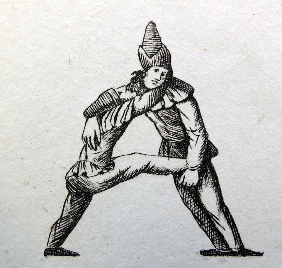
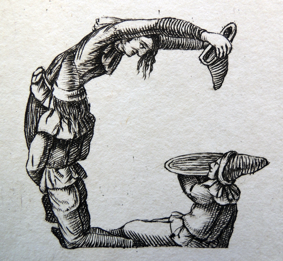
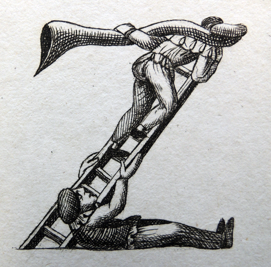
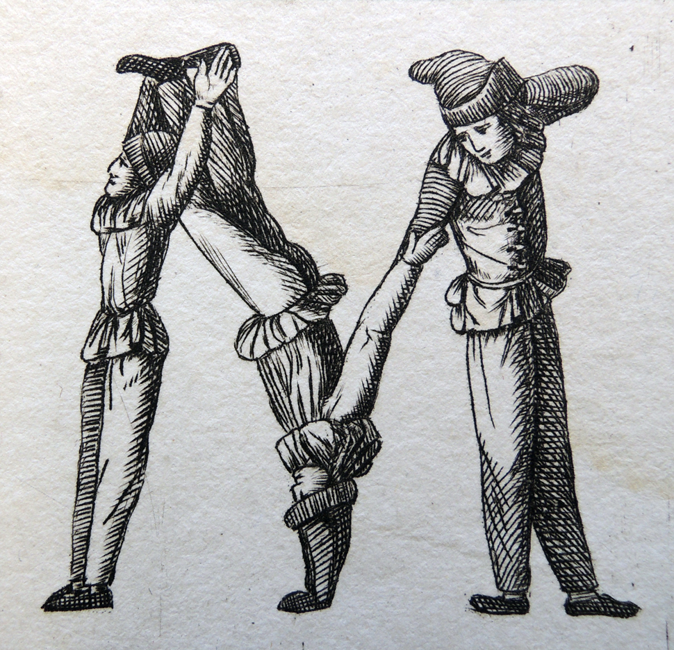
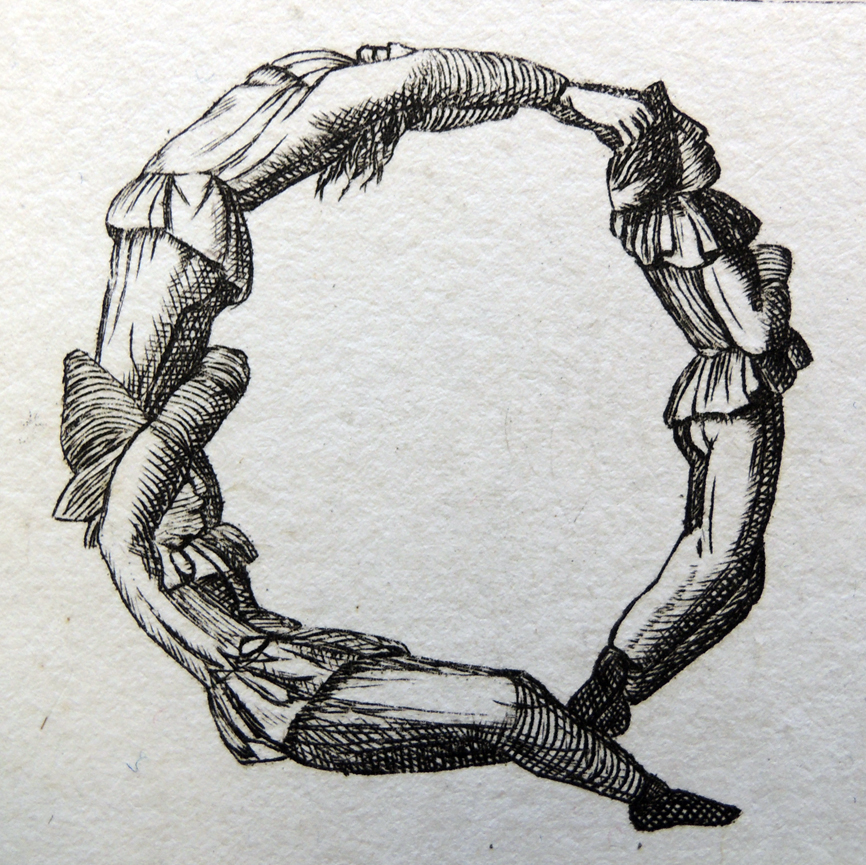
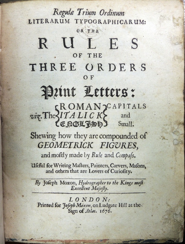
Before Joseph Moxon (1627-1691) published Mechanick Exercises, the first comprehensive manual on printing, he published a set of rules on forming letters that would be “useful for writing masters, painters, carvers, masons, and others that are lovers of curiosity.” He dedicated the book to Sir Christopher Wren and called it Regula Trium Ordinum Literarum Typographicarum, or the Rules of the Three Orders of Print Letters (1676). Princeton recently acquired a copy.

moxon6
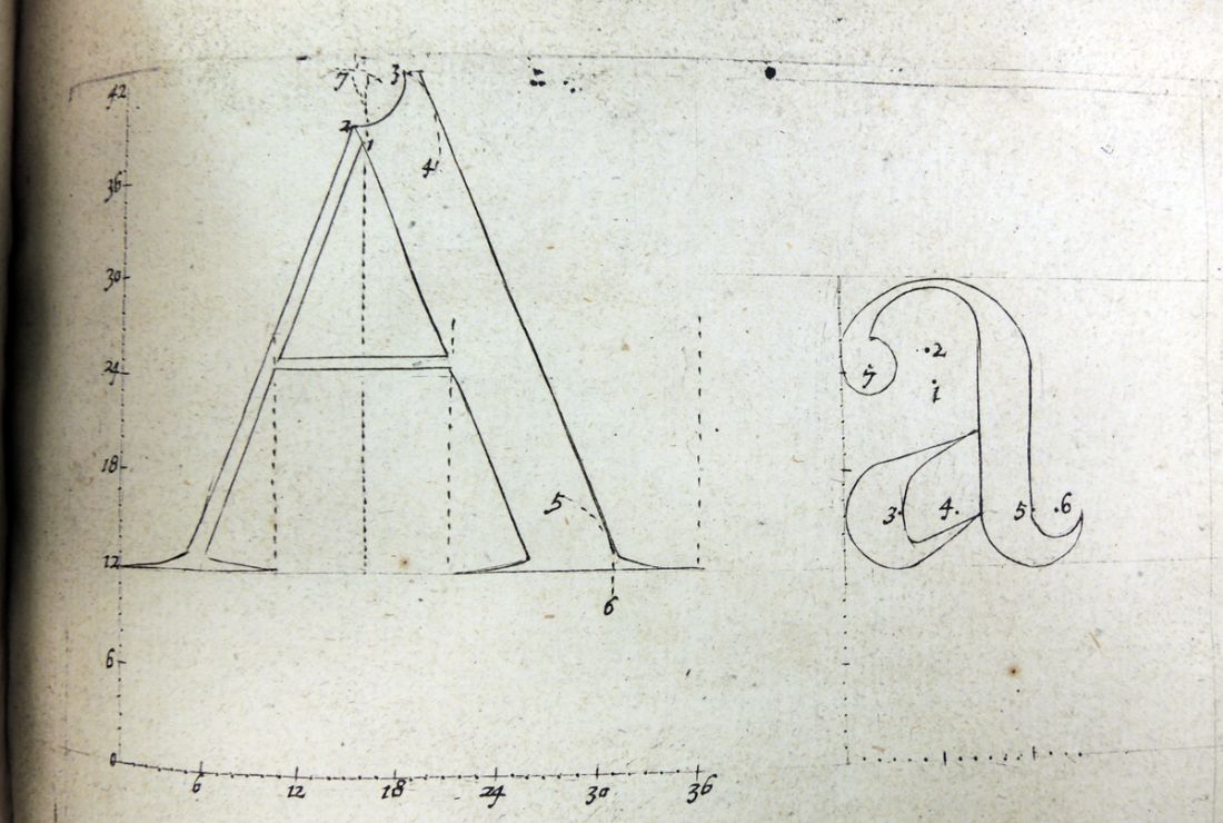
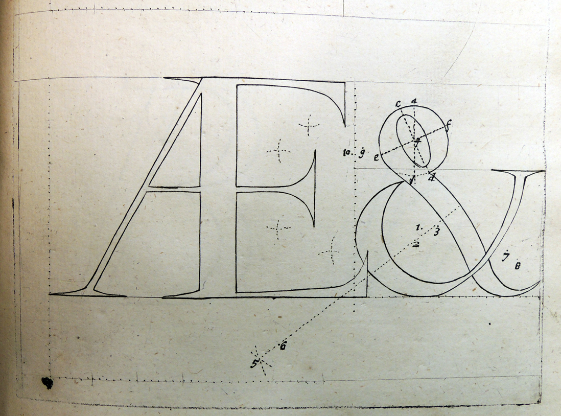
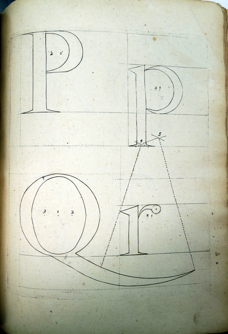
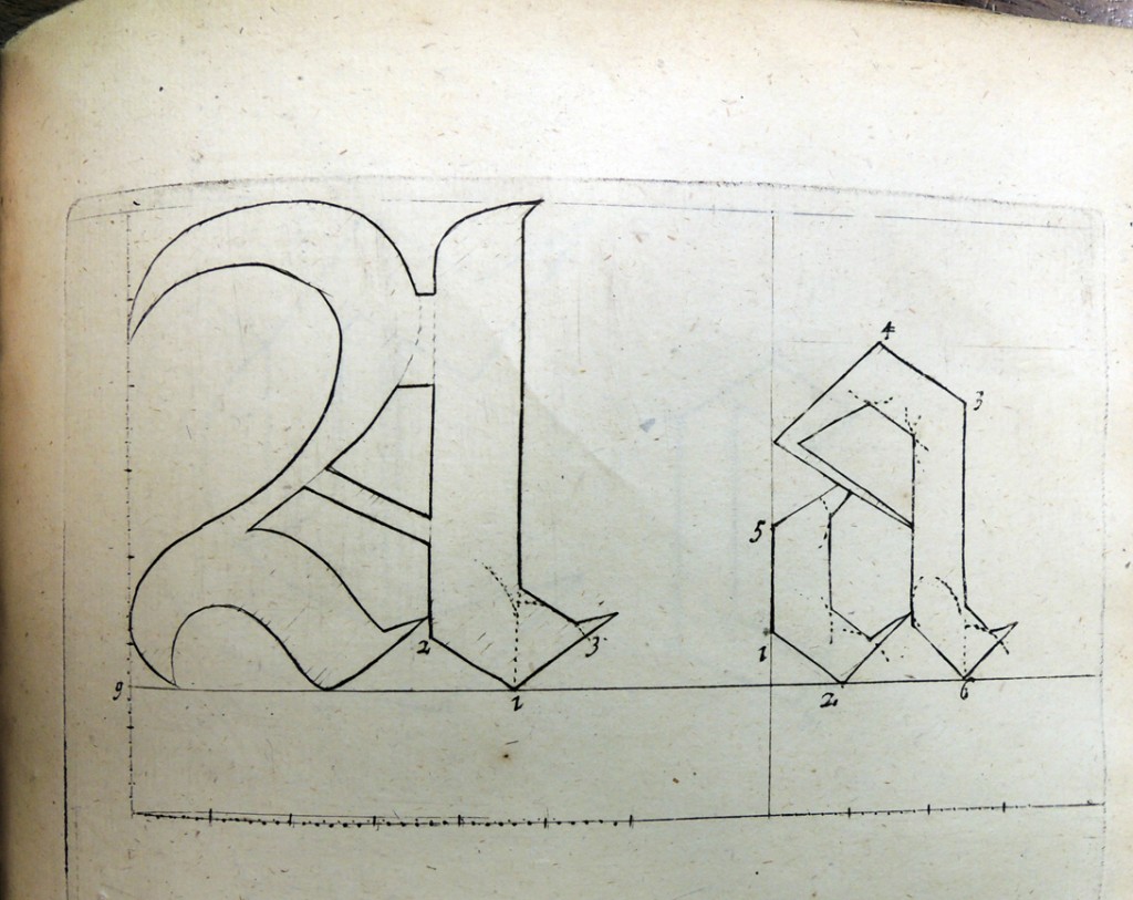
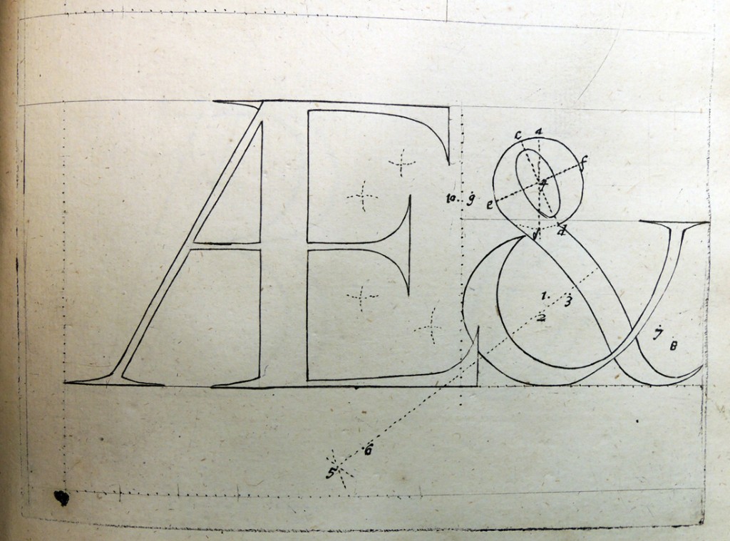
Moxon’s letterforms are adapted from Dutch originals. He includes both Roman and Italic, upper and lower cases, and pays special attention to the ampersand. Moxon writes, “Among the many curious Inventions of Humane Wit, the communicating Conceptions by the Complication of Characters is worthily accounted the most Ingenious, most Necessary, and most Admirable, that an High-flown Fancy in its greatest Sublimity could have produced into the World.

Joseph Moxon (1627-1691), Regulae Trium Ordinum Literarum Typographicarum, or, The Rules of the Three Orders of Print Letters: viz. the Roman, Italick, English, Capitals and Small: Shewing How They are Compounded of Geometrick Figures, and Mostly Made by Rule and Compass. Useful for Writing Masters, Painters, Carvers, Masons, and Others that are Lovers of Curiosity (London: printed for James Moxon, on Ludgate Hill at the Sign of Atlas, 1676). Graphic Arts Collection GAX 2013- in process.

moxon4moxon5
moxen2

Moxon was a hydrographer and printer but also accomplished in other specialties. He described himself as “conversant in . . . smithing, founding, drawing, joynery, turning, engraving, printing books and pictures, globe and map making, mathematical instruments, &c.”

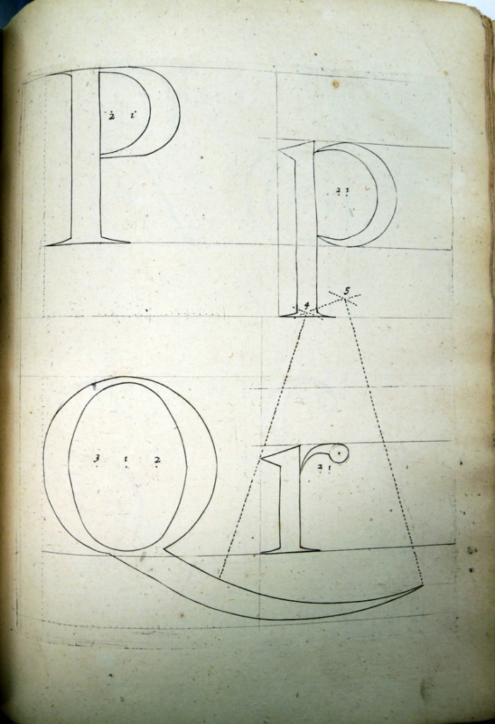
His Rules of the Three Orders was meant to be concise and easy to use. For instance, he saw no reason to repeat rules for ligatures or double letters, but wrote, “I need not discourse on [them], because by these paterns [sic] you may see how they are joyned [sic] together. Having given you such full instructions upon the Roman Capitals and Small Letters, I think it needless to give you copious rules upon the Italick or English Letter, the Paterns being so large that every Member in them are distinct and intelligent, and the Manual Operations so much the same in all, that the Scales down the side and in the Bottom-line serve for an ample Discourse upon every one of them.”

moxon12