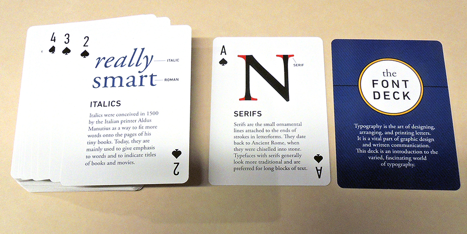
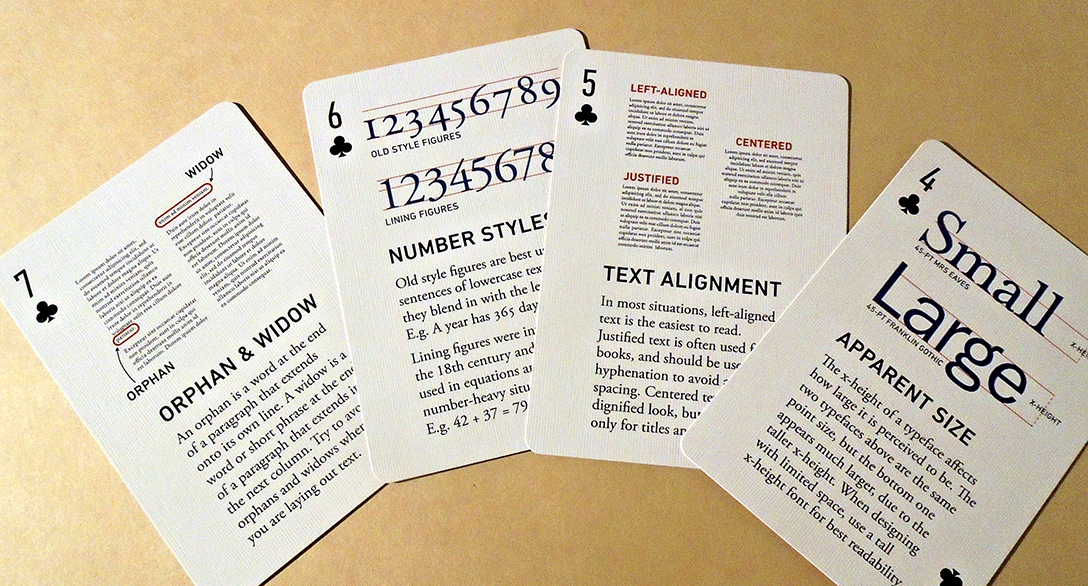
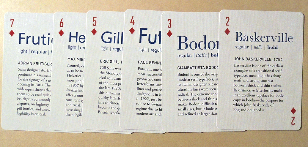
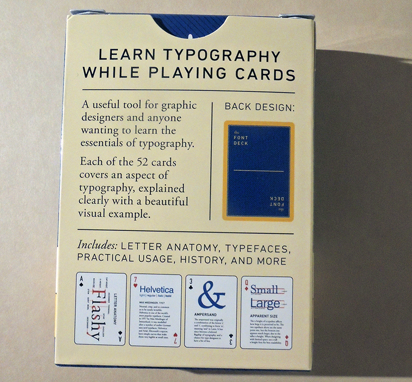
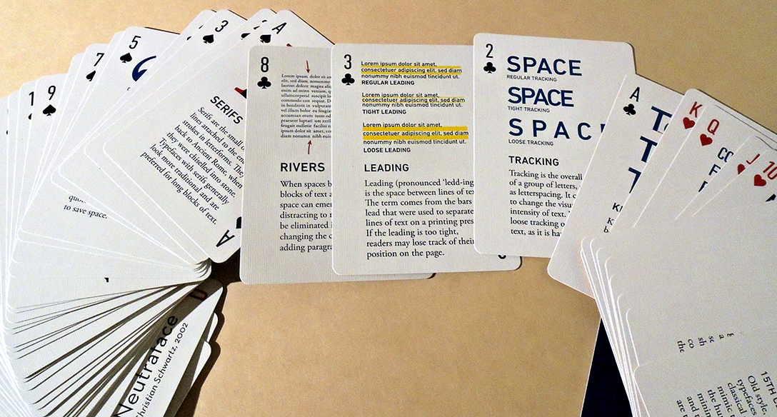
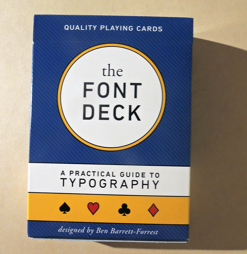
Back in 2018, the Canadian designer Ben Barrett-Forrest ran a successful kickstarter campaign to produce The Font Deck, playing cards packed with information about typography so you can practice identifying fonts while playing solitaire. 720 backers pledged $ 26,626 to help bring this project to life. Can’t go to rare book school? Get out the cards and start shuffling. https://www.kickstarter.com/projects/benbf/the-design-deck-graphic-design-playing-cards
Thanks to a recent donor, the Graphic Arts Collection has a Font Deck ready, whenever the students return. Each of the 52 faces contains a mini-lesson, complete with a beautiful visual example. Old-timers will also enjoy the history, quotations, and other type minutia among the diamonds and clubs.
Barrett-Forrest is also the author of this history of typography video:
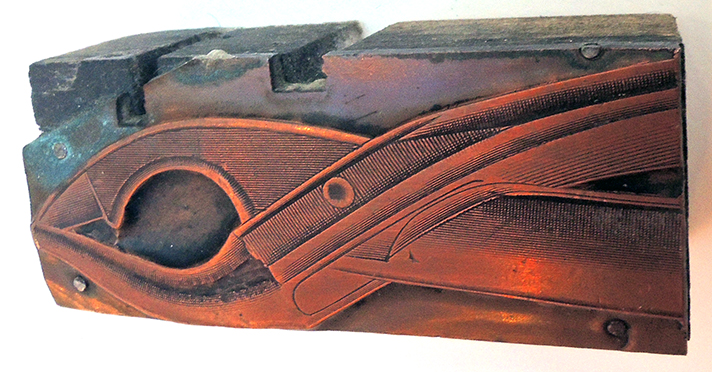
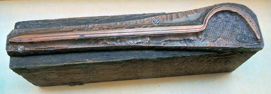
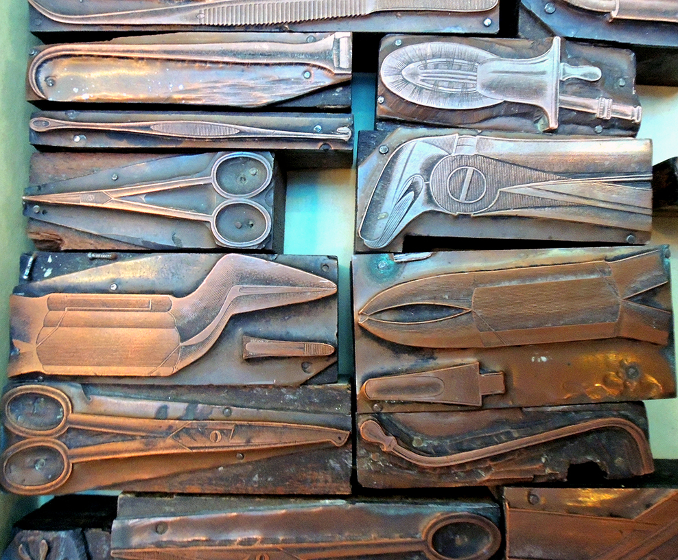
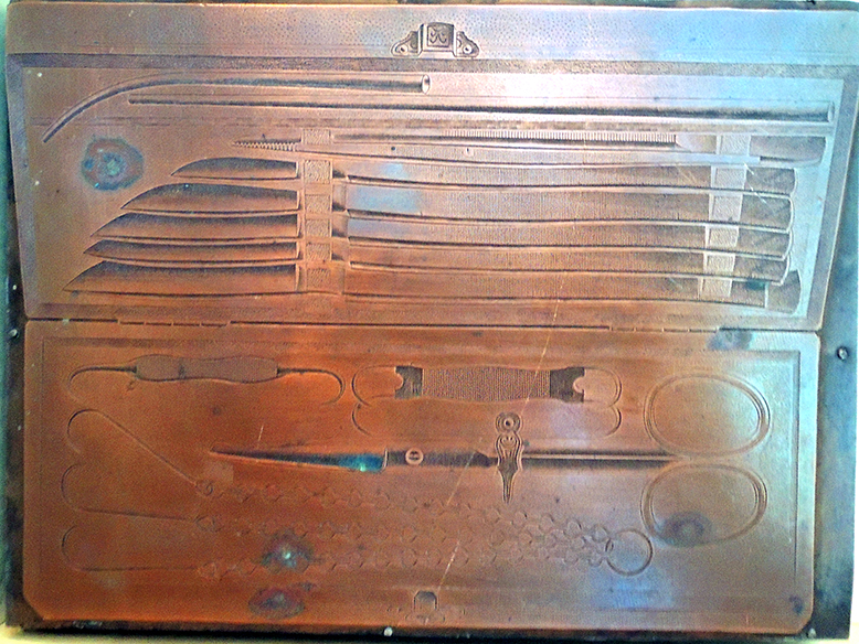
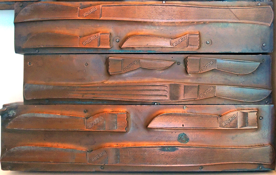
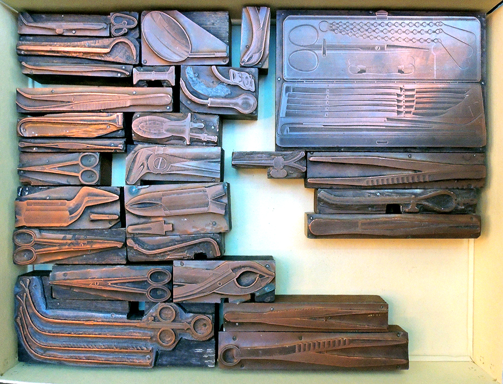
41 electroplated printing blocks ([Solingen, Germany?: n.p., ca.1920s]). Graphic Arts Collection GAX 2020-in process
Graphic Arts acquired a small collection of 41 electroplated printing blocks depicting dental and surgical instruments presumably for a trade catalogue, ca. 1920?. Some of the blocks present sets of tools and some represent individual knives, scalpels, or scissors. These are not fresh samples, all the blocks have been inked and used. All have the remains of glue and paper on the underside of the block, indicative of patching or ‘bringing up’ the block to sit level inside the chase, reading for printing.
The dealer found a faint stamp on the side of the wood, which was read as Lauterjung & Hautzel … fabrik u. galvanoplastik, Solingen. Known as “the city of blades,” Solingen is located in the North Rhine-Westphalia, Germany.
“For many centuries the name Solingen was [the] embodiment of high quality knives, cutlery and more. It is not surprising, that many companies try to make use of this name by selling their goods as “Made in Solingen”, although they have not been produced in this city. In order to fight this fraud, Solingen became the only city in the world whose name is a registered trademark. The so called “Solingenverordnung” regulates the use of the brand “Solingen” since 1938.”
The archive of Nordrhein-Westphal makes reference to a Lauterjung & Hautzel of Solingen in 1926, describing them as ‘Lieferant von Holzschnitten und Galvanos’ (suppliers of woodcuts and electroplating), suggesting that they were responsible for producing the blocks. In 1941, to celebrate the 50 anniversary of S. Lauterjung Söhne, Metallwarenfabrik [metal goods factory] in Solingen, a catalogue was prepared by Kurt Hartwig, which may have some relationship to our blocks.
One other possible connection to the blocks might be Carl Martin GMBH, also founded in Solingen in 1916. “Carl Martin have concentrated on manufacturing and distributing high-grade instruments for dentistry. Our more than 95 years of experience in raw materials, development processing and the requirements for daily use in hospitals, practices and laboratories have made us one of the world´s leading manufacturers of dental instruments.”
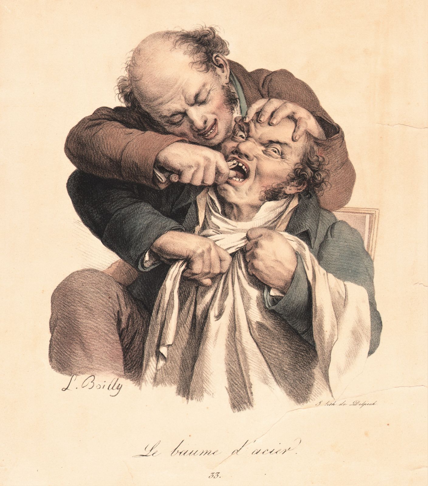
Louis Léopold Boilly (1761–1845), Le Baume d’Acier [The Balm of Steel], in Recueil de Grimaces, 1823. Lithograph. Graphic Arts Collection
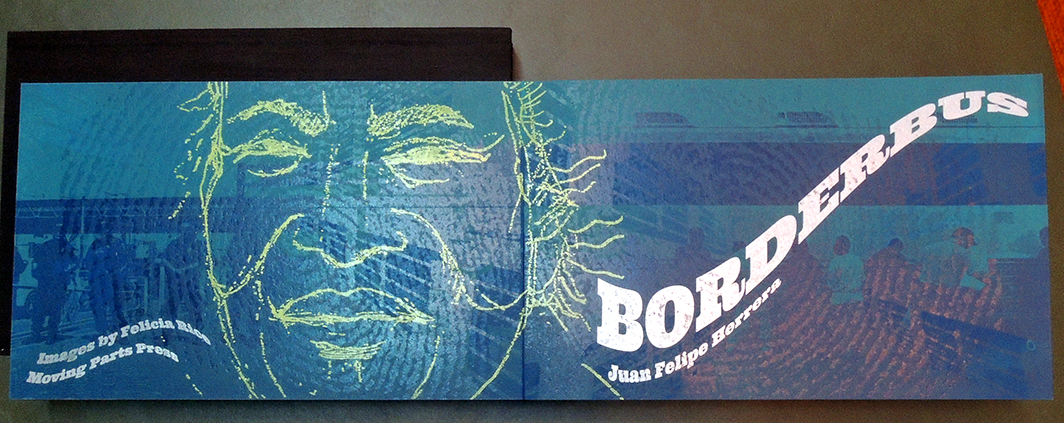
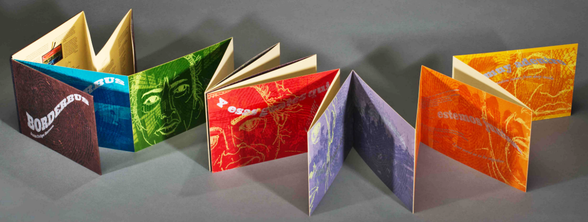
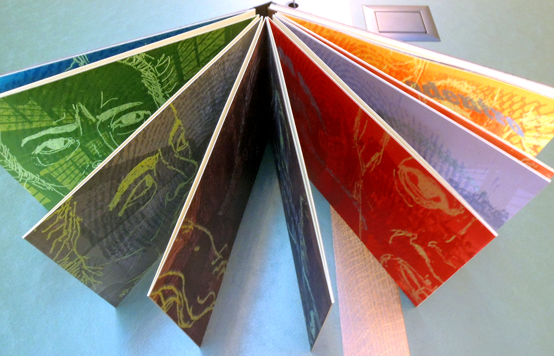
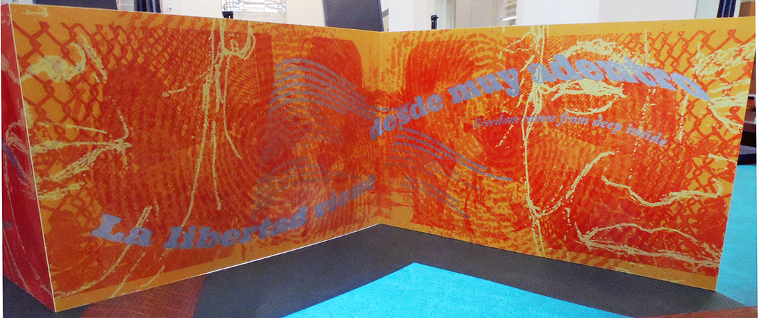
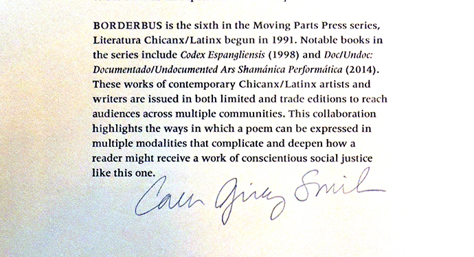
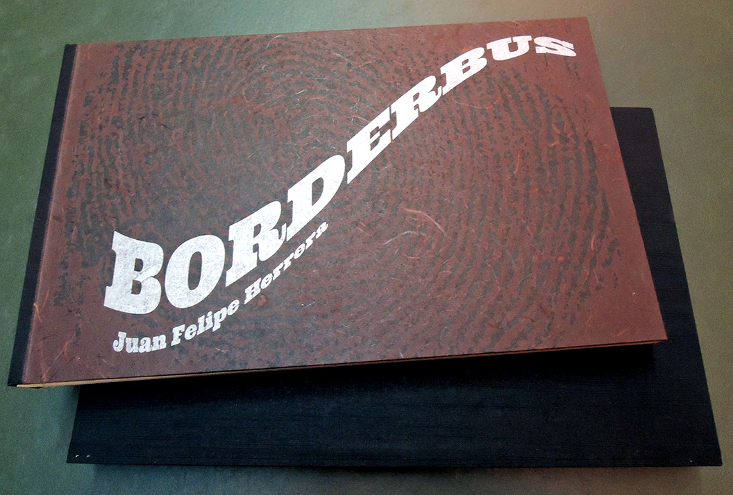
Borderbus. Poem by Juan Felipe Herrera. Prints by Felicia Rice. Introduction by Carmen Giménez Smith (Santa Cruz, CA: Moving Parts Press, 2019). Letterpress printed using Garamond, Meridien, and Ultra types from photopolymer plates on Rives BFK paper. Binding by Craig Jensen of BookLab II. 8 x 13 inches (extends to 17 feet). Graphic Arts Collection GAX 2020- in process
Thanks to the assistance of our colleagues in Latin American Studies, the Graphic Arts Collection is proud to acquire a limited edition artists’ book by Juan Felipe Herrera and Felicia Rice.
Borderbus is a rendering of one long poem by Juan Felipe Herrera. The poem takes place on a U.S. Department of Homeland Security Immigration and Customs Enforcement (ICE) bus. Two women have been detained while trying to cross the U.S.-Mexico border, and are being transported to a detention center. They speak in English and Spanish, whispering to avoid the attention of the guard. The text is embedded in prints by the artist/publisher and interpreted in audio recordings of the poem.
One interesting element with the volume is a usb drive included with Borderbus contains two audio versions of the poem, Borderbus. The first is a moving reading of the poem in two voices, by Marisol Baca and Gabriela D. Encinas, directed by Juan Felipe Herrera and recorded by Curtis Messer. The second is a recording of Herrera reading the poem.
Felicia Rice is a book and performance artist, typographer and letterpress printer, printmaker, publisher, and educator. A student of the history of the book and printing, she also utilizes digital technology to produce limited edition artists books. Rice has collaborated with visual artists, performance artists, and writers under the Moving Parts Press imprint since 1977. Work from the Press has been included in exhibitions from New York to Mexico DF to Japan. Her books are held in library and museum collections worldwide and she has been the recipient of many awards and grants, from the NEA to the French Ministry of Culture.
Critic Stephen Burt praised Herrera in the New York Times as one of the first poets to successfully create “a new hybrid art, part oral, part written, part English, part something else: an art grounded in ethnic identity, fueled by collective pride, yet irreducibly individual too.”
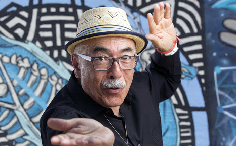
In 2012, Herrera was named California’s poet laureate, and the U.S. poet laureate in 2015. He has won the Hungry Mind Award of Distinction, the Focal Award, two Latino Hall of Fame Poetry Awards, and a PEN West Poetry Award. His honors include the UC Berkeley Regent’s Fellowship as well as fellowships from the National Endowment for the Arts, the Bread Loaf Writers’ Conference, and the Stanford Chicano Fellows. He has also received several grants from the California Arts Council.
“In a 2004 interview at CSU-Fresno, Herrera noted the influences of three distinct Californias—the small agricultural towns of the San Joaquin Valley he knew as a child, San Diego’s Logan Heights, and San Francisco’s Mission District—on his work: “all these landscapes became stories, and all those languages became voices in my writing, all those visuals became colors and shapes, which made me more human and gave me a wide panorama to work from.” Influenced by Allen Ginsberg, Herrera’s poetry brims with simultaneity and exuberance, and often takes shape in mural-like, rather than narrative, frames.”
Borderbus [selection] by Juan Felipe Herrera
A dónde vamos where are we going
Speak in English or the guard is going to come
A dónde vamos where are we going
Speak in English or the guard is gonna get us hermana
Pero qué hicimos but what did we do
Speak in English come on
Nomás sé unas pocas palabras I just know a few words
You better figure it out hermana the guard is right there
See the bus driver
Tantos días y ni sabíamos para donde íbamos
So many days and we didn’t even know where we were headed
I know where we’re going
Where we always go
To some detention center to some fingerprinting hall or cube
Some warehouse warehouse after warehouse
Pero ya nos investigaron ya cruzamos ya nos cacharon
Los federales del bordo qué más quieren
But they already questioned us we already crossed over they
already grabbed us the Border Patrol what more do they want
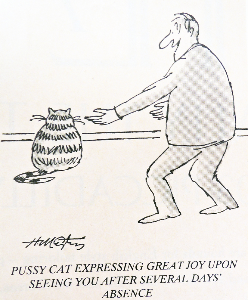
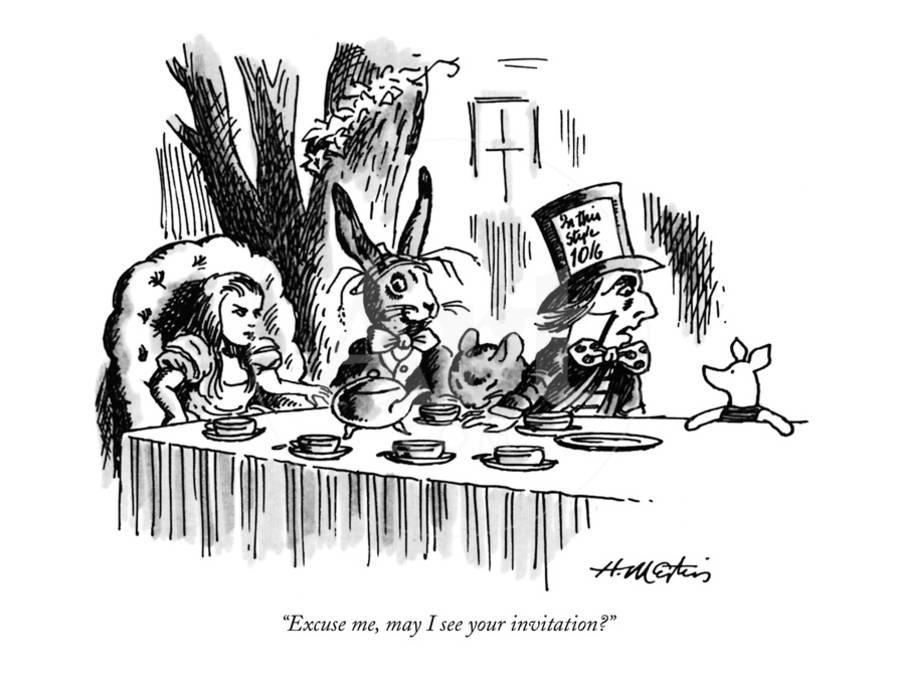
Henry Martin ’48, Sneaking in to say ‘thanks’…, no date. Pen and marker drawing. Henry Martin Cartoon Collection GAX2011.00353. Gift of David K. Reeves ’48.
Philadelphia Inquirer, March 4, 1979
Just 15 days shy of his 95th birthday, New Yorker cartoonist Henry Martin ’48 quietly passed away on Monday evening. An artist of gentle humor and keen insight, Martin also curated the first online exhibition for the Princeton University Library in 1996, proving a talent for many generations. https://lib-dbserver.princeton.edu/visual_materials/gallery/index.html. For that show, he wrote:
…Two of America’s most articulate humorists were E. B. White and James Thurber, who were friends and colleagues at The New Yorker magazine, where they shared an office. “Humor,” remarked Thurber, “is emotional chaos remembered in tranquility,” and E. B. White observed, “Humor can be dissected, as a frog can, but the thing died in the process and the innards are discouraging to any but the pure scientific mind.” I often think of these two when I am studying cartoons and have come to appreciate their sound advice. So, I will not perform any dissections here, but will present a sampling of comic art along with my views on its methods and its mission.
Born in Louisville, Kentucky, Martin traveled north to Princeton University where he lived in Witherspoon, Pyne, and Patton while studying art history and writing a senior thesis entitled “A Study of Humorous Art” (http://arks.princeton.edu/ark:/88435/dsp01pn89d693b)
After college Martin spent two years at the American Academy of Art in Chicago. It was there he began sending “spot” drawings to The New Yorker, mailing ten a week for nine months before finally selling one. By the second year, he was supporting himself with his art.
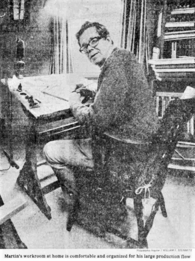
Returning to Princeton, the small stucco house on William and Charlton Streets was a perfect fit for his drawing table and tea kettle, so that became his studio. Not content with only drawing spots, in 1961 Martin began also submitting approximately 20 cartoons each week. This had to be done in person so each Wednesday he would get on the bus at Palmer Square and ride into Manhattan, walking the few blocks to The New Yorker’s office at 25 West Forty-third Street. You could either drop them off, returning later to pick up the rejections or if you were brave, you could stay with the work while the editor considered them. Martin usually stayed.
Today there’s a “Literary Landmark” plaque in front of the building with Martin’s name alongside the other cartoonists.
“That’s Harry Phillipaton and his wild imaginings.”
Late in 1964 he sold his first cartoon and in 1965 two more. Martin became one of the regulars, producing 20 cartoons each week to which The New Yorker had first refusal. Second refusal went to the Chicago Tribune-New York Daily News syndicate, followed by Punch, Ladies Home Journal, Saturday Evening Post, and others.
Martin’s first book Good News/Bad News was published in 1977 by Charles Scribner without a meeting or a sales pitch. The artist simply left an envelope with the building’s doorman containing a book he mocked up with cartoons pasted to each page. Scribner called him personally and by the end of the call, a two book contract was assured.
The Graphic Arts Collection is proud to hold over 500 original cartoon drawings by Martin, along with 670 pen and ink drawings for the spots, a complete set of his illustrated books, scrapbooks, tear sheets, and other archives. An oral history and his senior paper can be found in Mudd Library. https://findingaids.princeton.edu/collections/AC259/c028
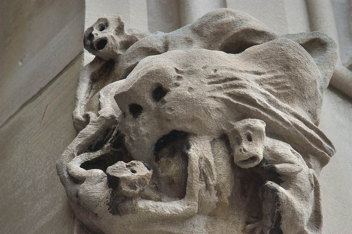
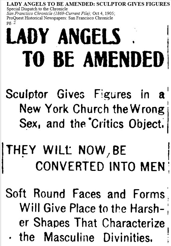
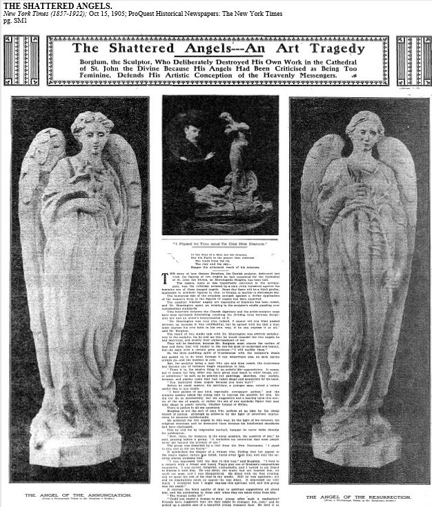
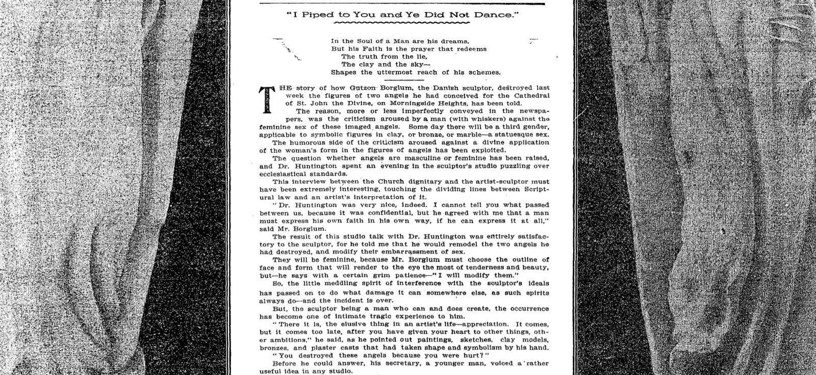
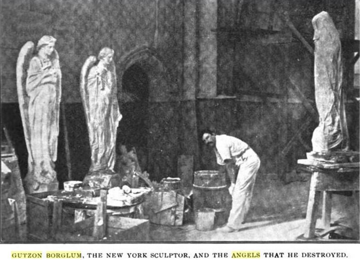
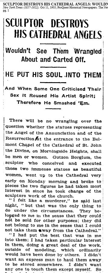
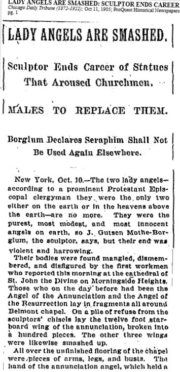
Not long after John Gutzon de la Mothe Borglum (1867-1941, famous for carving Mount Rushmore) finished sculpting dozens of gargoyles for Princeton University’s Class of 1879 Hall at the request of his friend Woodrow Wilson, Borglum was commissioned to sculpt a series of angels for the Cathedral of St. John the Divine. As the project neared completion, Catholic officials were surprised to find many of his angels were female. This led to a heated public debate over the gender of angels, repeated in newspaper across the country.
Borglum was told to replace the female angels. An impassioned dialogue followed, ending with the artist smashing the molds for several of the figures. “I felt like a murderer,” he confessed afterward, “but that was the only thing to do under the circumstances.” –“The Sex of Angels,” Current Opinion, Volume 39 (1905). Eventually Borglum sculpted new molds and then, publicly declared they were poorly cast and did not want his name connected with them.
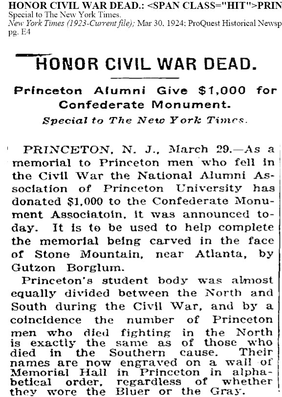
The controversy led to enormous publicity, national fame for the sculptor, and in 1910, Woodrow Wilson presented Borglum with an honorary master’s degree for service to the University. His next major commission was to carve relief statues of Robert E. Lee, Stonewall Jackson, and Jefferson Davis on the Stone Mountain, hired by the United Daughters of the Confederacy. Originally the frieze was to include an altar to the Ku Klux Klan but this plan was later dropped (See the Stone Mountain Sculpture and Memorial Hall as originally projected on the left).
In 1925, when a dispute arose between Borglum and the managing association. the sculptor once again smashed the models he had completed. He quickly moved on to begin the carving of the famous Mount Rushmore quartet.
For more, read: “The Sordid History of Mount Rushmore: The sculptor behind the American landmark had some unseemly ties to white supremacy groups” by Matthew Shaer in Smithsonian Magazine October 2016. Also recommended: Debra McKinney, “Stone Mountain: A Monumental Dilemma: Some see the monument as “the largest shrine to white supremacy in the history of the world.” Intelligence Report, Southern Poverty Law Center, Spring 2018. https://www.splcenter.org/fighting-hate/intelligence-report/2018/stone-mountain-monumental-dilemma
In 1924, the National Alumni Committee of Princeton donated $1,000 to support the project.
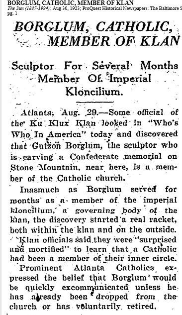
“In the early going,” writes John Taliaferro, “the Klan contributed money directly to the Stone Mountain Confederate Monumental Association, a number of whose members were active Klansmen. While there seems to be no extant proof that Borglum officially joined the Klan himself—that he took the secret oath or donned a hooded robe—he nonetheless became deeply involved in Klan politics, as they related to Stone Mountain and on a national scale as well. He attended Klan rallies, served on Klan committees, and endeavored to play peacemaker in several Klan leadership disputes (with mixed results).
… The Kloran, the Klan’s book of rules, demanded that members be native born, white, male, and Gentile. And after World War I, the Klan’s Kreed became increasingly white supremacist, anti-Catholic, anti-Semitic, anti-labor, anti-alien.” — John Taliaferro, Great White Fathers: The Story of the Obsessive Quest to Create Mount Rushmore (2007).
It is perhaps ironic that a scandal emerged within the Klan leadership when they found out Borglum was a Catholic.
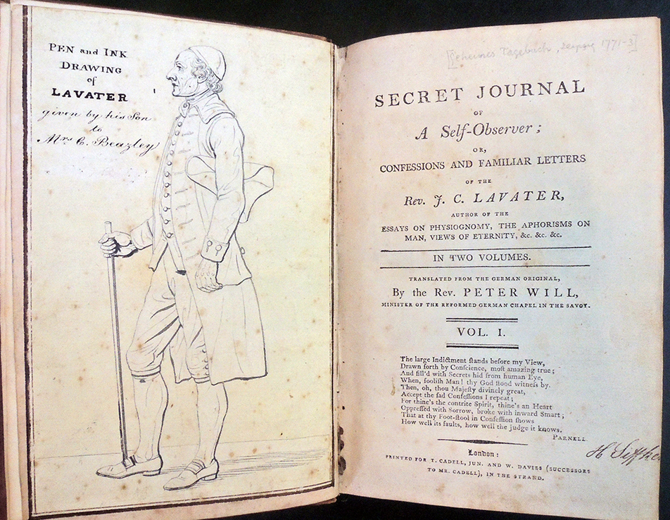
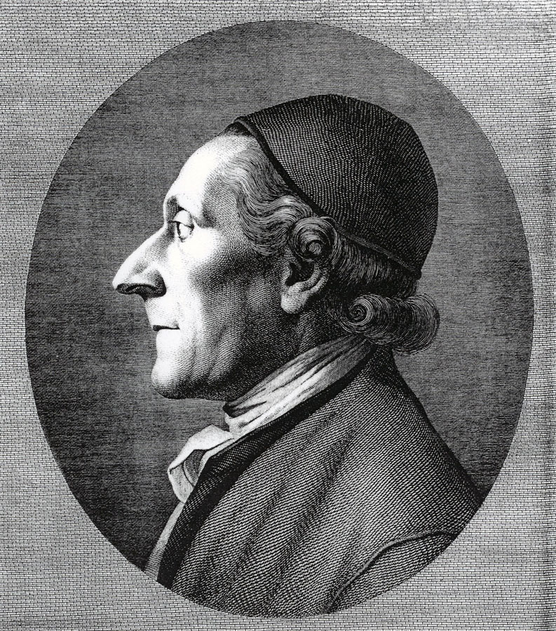
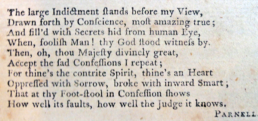
Johann Caspar Lavater (1741-1801), Secret Journal of a Self-Observer;or, Confessions and familiar Letters of the Rev. J. C. Lavater… Translated from the German Original, by the Rev. Peter Will, Minister of the Reformed German Chapel in the Savoy… (London: Printed for T. Cadell, Jun. andW. Davies (Successors to Mr. Cadell)… [1795]). Early ownership inscriptions, in ink and pencil, of Henrietta Siffken and with pencil notes throughout; with an original pen-and-ink drawing of Lavater bound in as a frontispiece, “given by his Son to Mrs C. Beazley.” Graphic Arts Collection GAX 2020- in process.
The first English translation of: Johann Caspar Lavater (1741-1801), Geheimes tagebuch von einem beobachter seiner selbst (Leipzig: Weidmanns erben und Reich, 1771-73) is notable for the pen and ink drawing on the frontispiece attributed to Johan Heinrich Lips (1758-1817) as well as for the text never meant to be widely circulated.
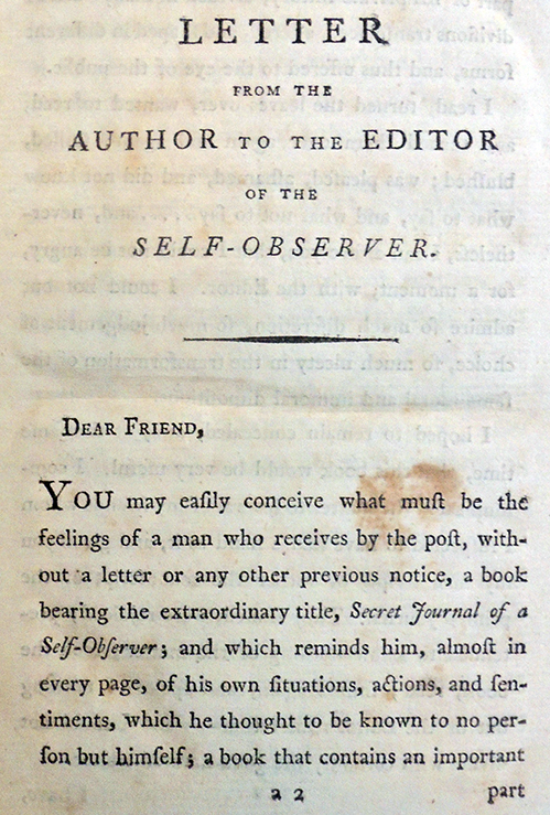
Preface of the translator:
“The present Translation, which originally was intended to be circulated only in manuscript, among some admirers of Mr. Lavater, would certainly never have been intruded on the Public, if the Translator were not fully persuaded, that its great utility will overbalance its many defects, and contribute to propagate piety and Religious prudence, for which purpose he recommends the perusal of it particularly to his congregation, who always have displayed the most laudable desire to improve in Christian knowledge and virtue. . .”
“…Mr. Lavater’s manner of expressing his ideas, being as extraordinary as his manner of thinking, those who are not intimately acquainted with the writings of this eccentric, but truly venerable man, will easily be induced to mistake for a foreign idiom what, in reality, is an idiom of the Author, and could not be exchanged for a genuine English one, as it is the peculiar characteristic which distinguishes his way of thinking.”
The Swiss minister Johann Caspar Lavater (1741-1801) was convinced that the science of physiognomy made it possible to know about a person’s interior self from their exterior body. This included both the physical skull itself and the visual representation of it. He published his beliefs in three major editions, Physiognomische fragmente (1775-78) RBSC Oversize 6453.568.15q, Essai sur la Physiognomonie (1781-1803), and Essays on Physiognomy (1788-99) GAX Oversize 2007-0002Q. Johan Heinrich Lips (1758-1817) was the principal engraver of the plates, working from his own drawings and after drawings by Georg Friedrich Schmoll. Lavater’s close friend Henry Fuseli (1741-1825) added a few illustrations and brought in the young William Blake (1757-1827) to complete a few additional plates.
William Blake, Johann Caspar Lavater, 1800. Engraving and etching. Graphic Arts Collection
Within a day a cheerful email appeared that began,
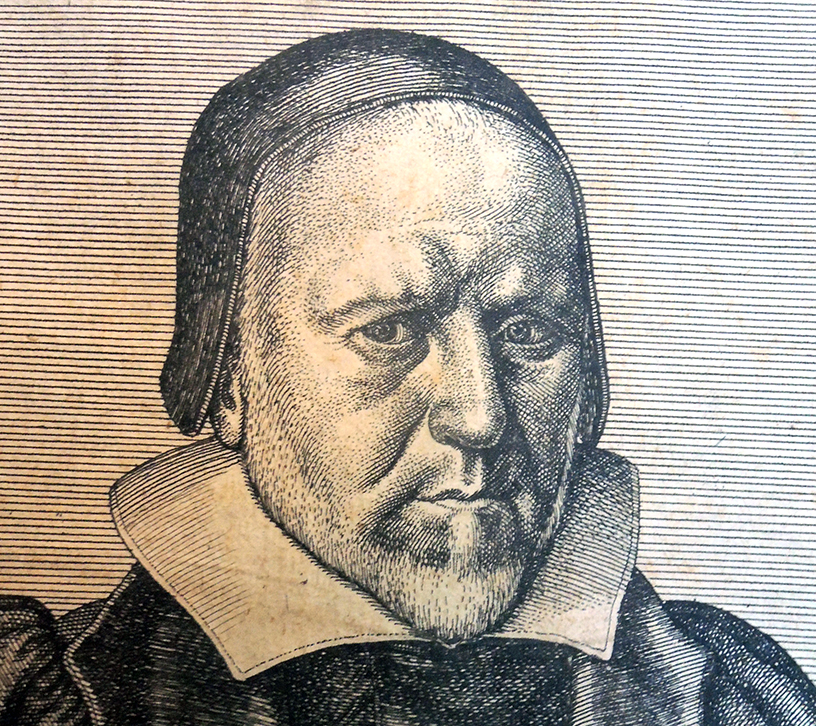
“Yesterday’s post about Richard Bernard with his portrait by W. Hollar especially caught my eye, as we have the etching, purchased at Walter Schatzki’s on 57th St. in October 1967 when I was a graduate student. We bought several prints from Schatzki around that time. Professor Koch had recommended him and his wonderful shop as a place for undergraduates to buy inexpensive but interesting works. We paid $6.67 for the print (the sheet of paper is 20.3 cm. high by 13.8 cm. wide), on sale for 1/3 off. Beyond my liking of the print as a work of art, I suppose I have thought Bernard might have resembled New England Puritans.”
With sincere thanks to William and Sally Rhoads (and to Walter Schatzki), that $6.67 etching is now in the Graphic Arts Collection, where it will certainly be used by a new generation of students and faculty.
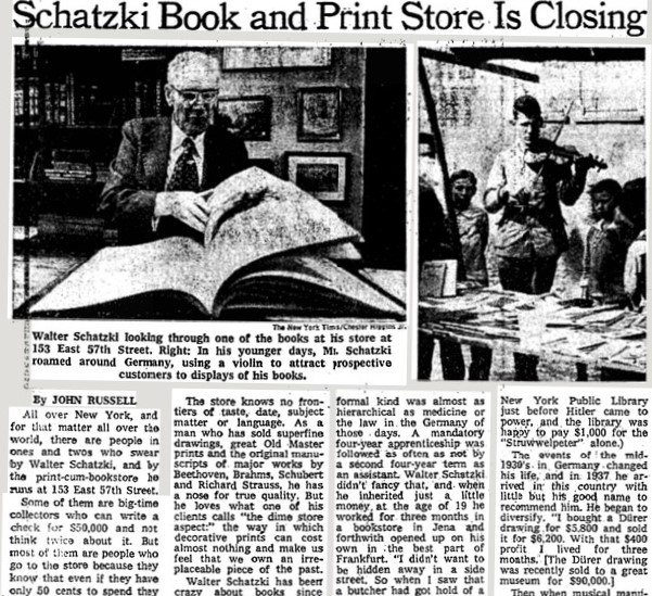
When Walter Schatzki’s Book and Print Shop closed in 1976, John Russell wrote a long article in the New York Times praising the dealer:
All over New York, and for that matter all over the world, there are people in ones and twos who swear by Walter Schatzki, and by the print‐cum‐bookstore he runs at 153 East 57th Street. Some of them are big‐time collectors who can write a check for 550,000 and not think twice about it. But most of them are people who go to the store because they know that even if they have only 50 cents to spend they can come away with something they like and be treated exactly as if they were Paul Mellon himself. All these enthusiasts—the experts and the beginners, the rich and the not so rich —have had bad news. On July 1 Mr. Schatzki is closing his store. “My lease is up,” he said the other day. ‘My rent would be almost tripled. I don’t feel like moving.
. . . Walter Schatzki has been crazy about books since 1910, when he hung around the bookstore in the town of Siegen, not far from Cologne, where he was born. And he has been in the business since 1919, when as a tall and very young man, already bespectacled, he went from village to isolated village in his native Germany with a violin in one hand, and a pack full of cheap good books on his back. “I went from fair to fair, and I would play my violin. People gathered round, and sometimes they sang a song or two, and then I opened my pack of books, and people would buy a book who had never seen a bookstore, let alone walked into.
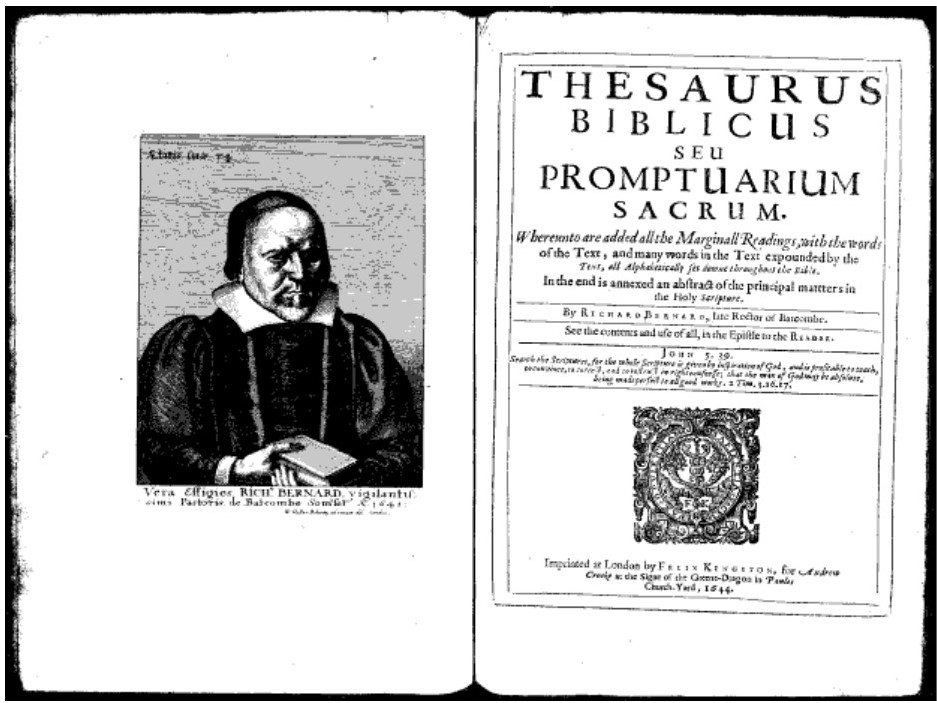
Wenceslaus Hollar (1607-1677), Vera Effigies, Rich. Bernard [Richard Bernard, 1568-1641], 1641. Etching. Inscribed in the design, u.l., ‘Ætatis suæ 74’. Inscribed in the plate, l.l. to l.r., ‘Vera Effigies RICH. BERNARD vigilantis/ simi Pastoris de Batcombe Somrset: Ao; 1641’; l.c. to l.r., ‘W:Hollar. Bohem, ad viuum del: Londini:’ Gift of William and Sally Rhoads. Graphic Arts Collection GAX 2020- in process
Hollar’s 1641 print appears as a frontispiece in the subject’s 1644 book (and perhaps others):
Richard Bernard (1568-1641), Thesaurus Biblicus seu promptuarium sacrum, whereunto are added all the marginall readings, with the words of the text, and many words in the text expounded by the text, all alphabetically set downe throughout the Bible. In the end is annexed an abstract of the principal matters in the Holy Scripture (London: Imprinted by F. Kingston, 1644).
See:
Richard Pennington A Descriptive Catalogue of the Etched Work of Wenceslaus Hollar, 1607-1677. Cambridge University Press, Cambridge, 1982, cat. no. 1363 only state.
Simon Turner Wenceslaus Hollar: New Hollstein German engravings, etchings and woodcuts, 1400-1700. Giulia Bartrum, vols. 1-9, 2009–2012, cat. no. 337 only state.
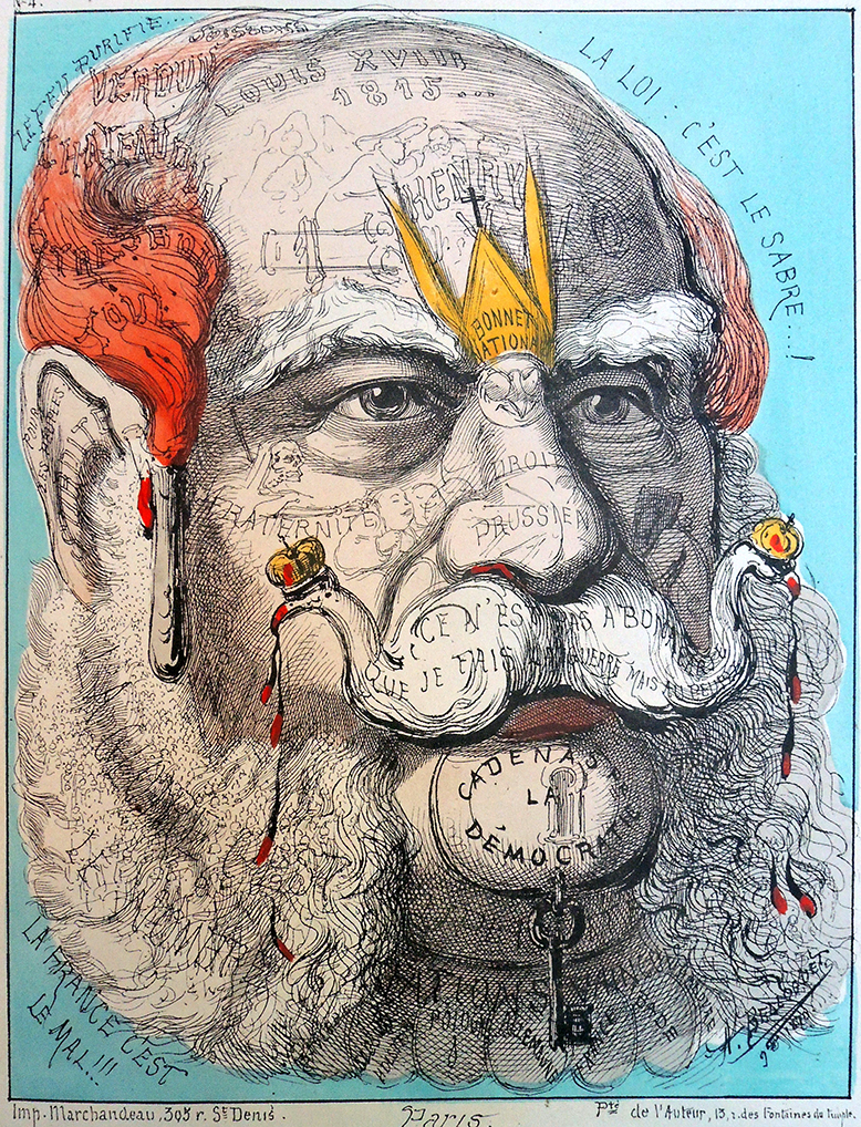
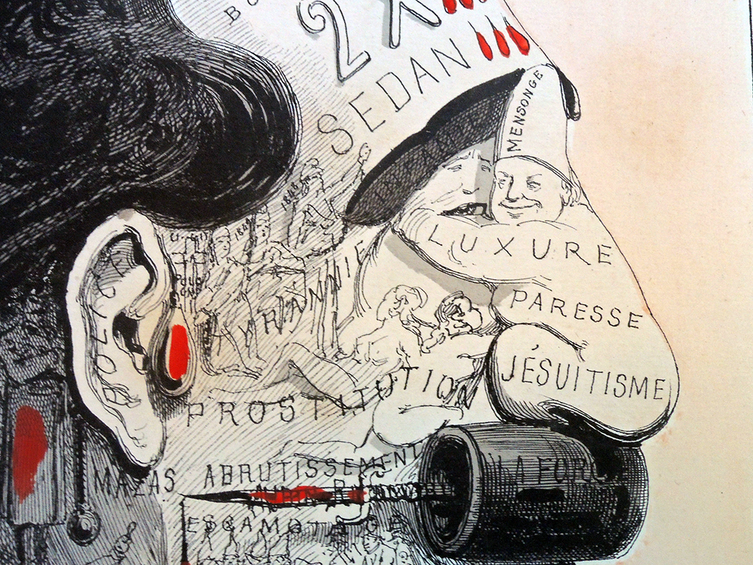
Guillaume-le-Boucher = Wilhelm the Butcher is a French caricature of Prussian King Wilhelm I. The verse below the image mentions the dream of a “United States of Europe” (this is a detail, the whole sheet is below).
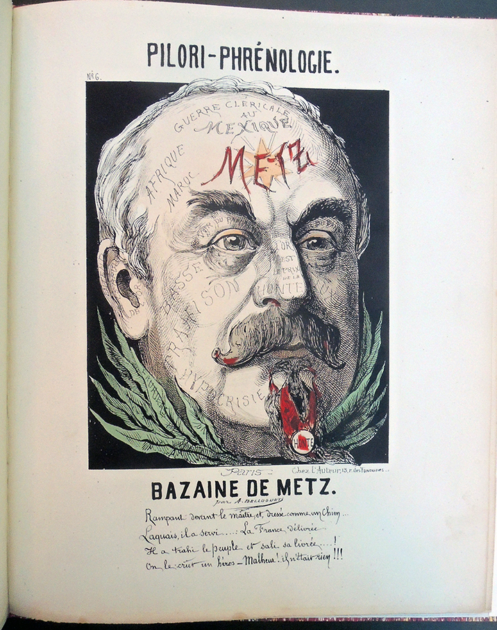
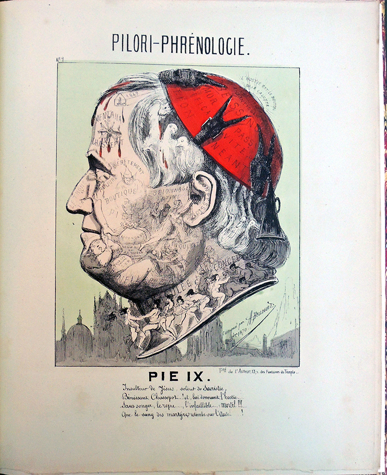
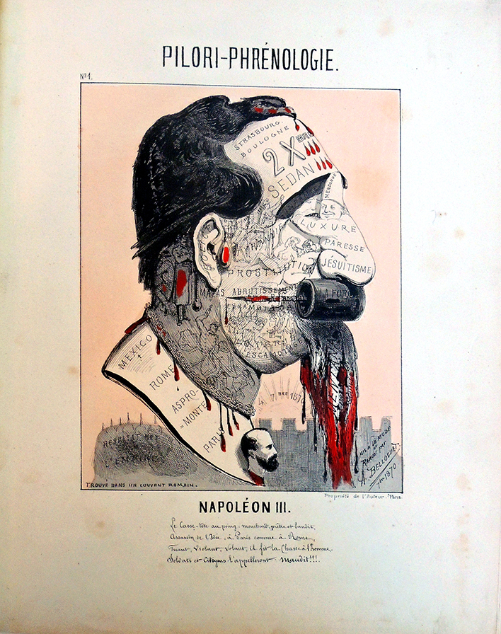
[Above] André Belloguet (1830-1873), Pilori-Phrénologie ([Paris: variously signed Imprimerie Marchandeau and Lith. Fraillery r. Fontaines 9, Propriéte de l’Auteur]. 1870). Provenance: Collection de Louis Bretonnière. Graphic Arts Collection GAX 2020- in process
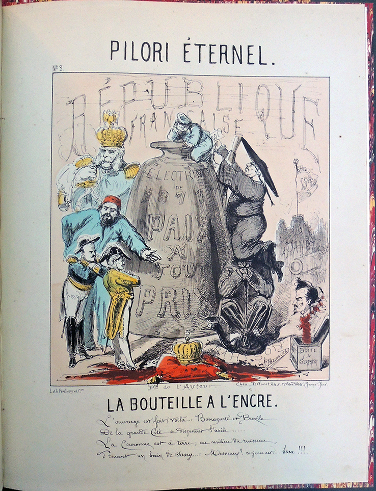
[ Left] André Belloguet (1830-1873), Pilori-Eternel (Paris, [variously signed Imp. Grognet, Lith. Fraillery et Cie Pte de l’Auteur].1871). 3 color lithographs. Provenance: Collection de Louis Bretonnière. Graphic Arts Collection GAX 2020- in process
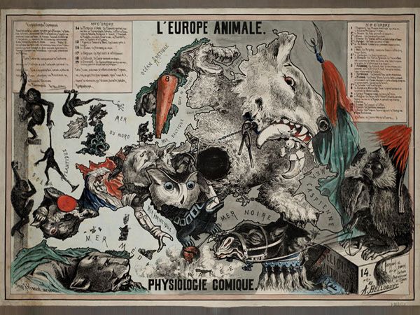
Best known for his anthropomorphic maps (not owned by Princeton), André Belloguet also produced a rare series of satirical caricatures morphing various words, figures, and objects into celebrated faces, creating phrenology pillory or facial embarrassment. The Graphic Arts Collection recently acquired two volumes from the collection of Louis Bretonnière. Bound in two volumes, the first with 13 lithographs, all but one colored, and the second with 3 lithographs. Each portrait includes four lines of satirical verse written below, presumably also by Belloguet.
The first volume includes: 1. Napoléon III; 2. Pie IX; 3. Olivier Iscariote; 4. SS. Guillaume le Boucher; 5. Bismarkoff Ier; 6. Bazaine de Metz; 7. Rouher le Mignon; 8. Pierre l’Assassin; 9. Bonaparte le Corse; 10. Trochu de Paris; 11. Thiers l’Ancien; Pl. 12. Le Bœuf; 13. Favre dit le Grand Jules (the only plate uncoloured).
The next series, Pilori-Éternelis includes: 1. Qui… ???; 2. La Bouteille à l’encre; and 3. Le Prussien de l’intérieur.
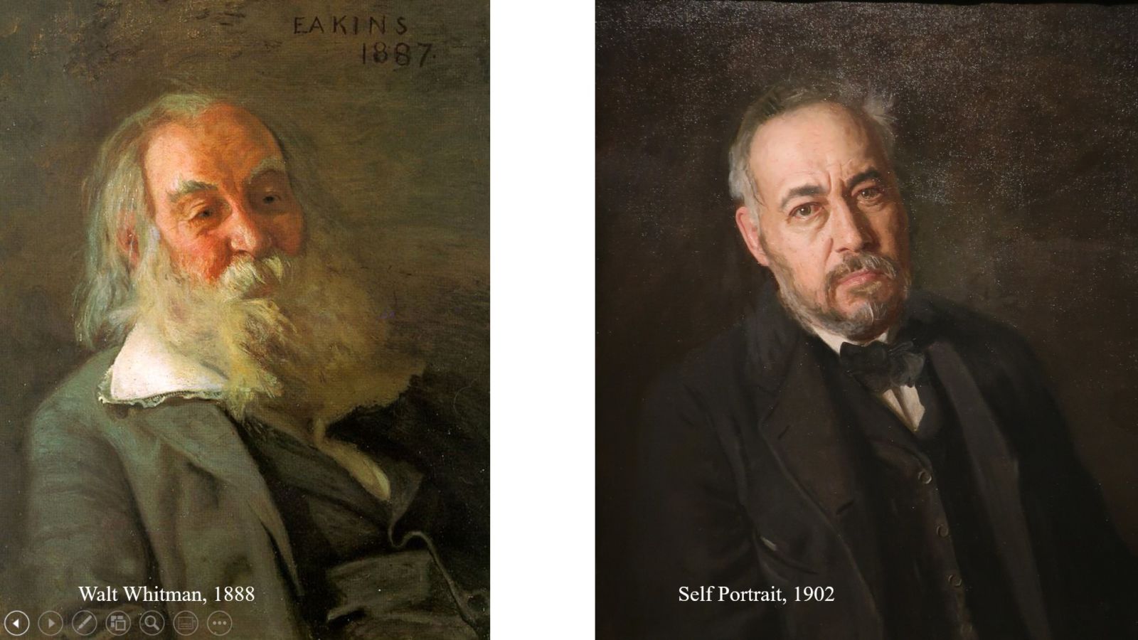
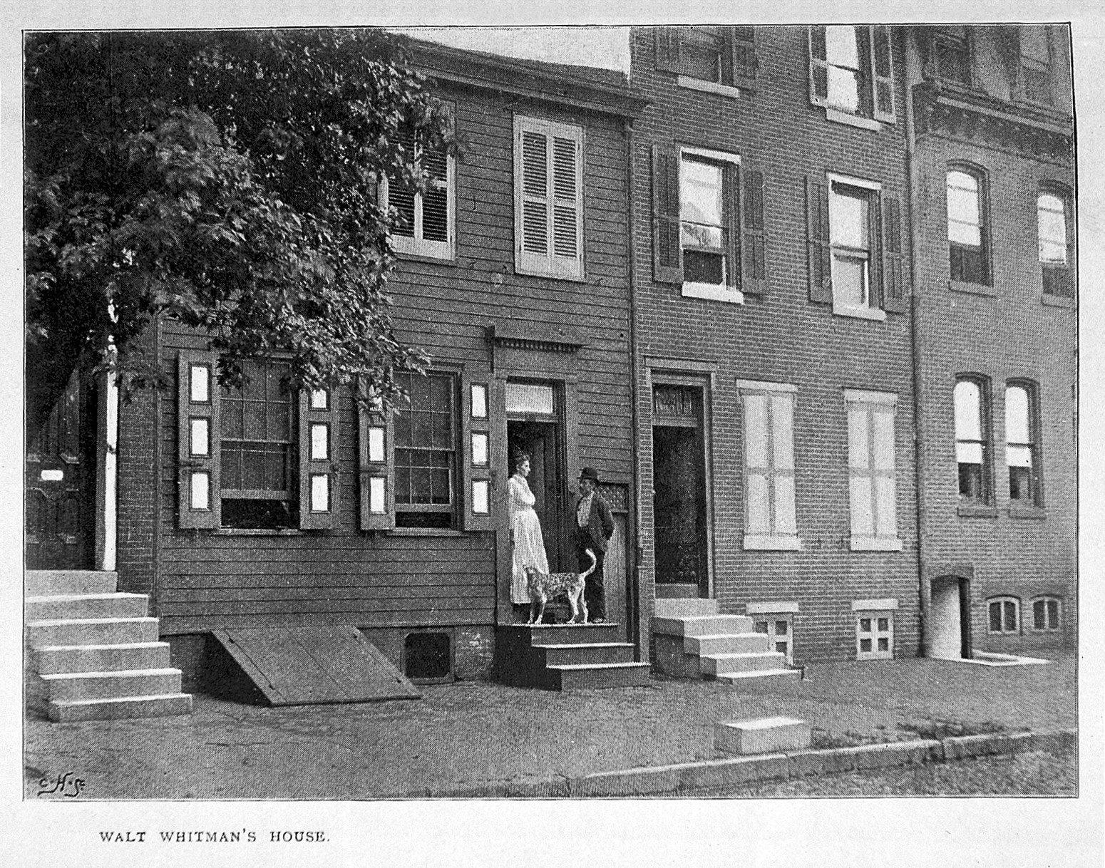
At 2:00 p.m. on Friday, June 26, 2020, you are invited to join the second live webinar highlighting Special Collections at Firestone Library, Princeton University. Register here. The topic, “Thomas Eakins and the Making of Walt Whitman’s Death Mask,” was chosen specifically for June, LGBTQ pride month and this year, the 50 anniversary of the first march. Both Walt Whitman (1819-1892) and Thomas Eakins (1844-1916), in their own way, broke down barriers around sex, sexuality, and the celebration of the human body, working in staunch opposition to the genteel status quo of the 19th century. Their friendship did not begin until the last five years of Whitman’s life but once they met, Eakins became a frequent guest at the poet’s Camden, New Jersey, home where Whitman was chiefly confined.
Their lives were punctuated by scandal and national disgrace, followed by even worse, periods of neglect. Just as Whitman faced rejection by publishers and critics, Eakins endured equal censure from curators and collectors. Yet each found a way to work independent of institutional patronage and pursue their own search for truth. Whitman wrote, “I never knew of but one artist, and that’s Tom Eakins, who could resist the temptation to see what they think ought to be rather than what is.”
For his part, Eakins painted a self-portrait that echoes the pose, the hue, and the sentiment in the portrait he painted of Whitman, visually coupling their images for eternity.
. . . Several months before Whitman’s death, Eakins and his partner went to Camden to practice on Whitman himself, casting his right hand in plaster. They probably left supplies in his home, anticipating what would soon be necessary. On March 26, 1892, Eakins and Sam Murray were notified of the poet’s death and early the next morning crossed the Delaware River to his house.
Working slowly and carefully over three hours, they gently oiled Whitman’s face and body, thickly coating his beard and eyebrows so they wouldn’t stick to the plaster. His ears, brows, and other features would be sculpted later and added to various plaster casts. Molds were made of the front and back of the head along with Whitman’s shoulders so a complete bust could be formed.
There is more to the story. Please join us. For a zoom address, just register here. We are holding this early in the afternoon so as not to distract from protests or demonstrations later in the day. Thanks.
Here are three videos that take you through several relief carving techniques, including the transfer of the design to the block, the tools used in cutting, various ways of inking, proofing, and the transfer of the image onto paper. None of the videos are new but worth a reminder they are available. See especially the third, showing the difference between printed color, painted color, and transfer color.
“There’s something magical about the centuries-old art of wood engraving, in which an artist uses the same tools used to engrave jewellery to create extraordinarily detailed prints. Anne Desmet RA is one of only three wood engravers to be elected as Academicians in the Royal Academy’s nearly 250-year history. Here, she takes us through each step in creating a wood engraving, from tracing the original drawing through to printing a first proof.”
“In this video, Rebecca Salter RA explains the traditional tools and techniques used by the Sato Woodblock Workshop in Kyoto when creating her print for the Summer Exhibition 2016. Salter RA studied Japanese woodblock printmaking during the six years she spent living in Japan. A passionate advocate of this traditional craft, she commissioned the Sato Woodblock Workshop in Kyoto to produce her limited-edition print Tessella 1 and 2 for the Summer Exhibition 2016. In the video below, she gives a step-by-step introduction to the art of Japanese woodblock printing.”
“This video from the exhibition “Gauguin: Artist as Alchemist” breaks down Gauguin’s process for making wood-block prints step by step. Follow along to discover how the artist carved and printed blocks to make works like those in the Noa Noa Suite. To delve deeper into Gauguin’s processes, visit the online publication Gauguin: Paintings, Sculpture, and Graphic Works at the Art Institute of Chicago, available at www.artic.edu/digitalgauguin.”

 Back in 2018, the Canadian designer Ben Barrett-Forrest ran a successful kickstarter campaign to produce The Font Deck, playing cards packed with information about typography so you can practice identifying fonts while playing solitaire. 720 backers pledged $ 26,626 to help bring this project to life. Can’t go to rare book school? Get out the cards and start shuffling. https://www.kickstarter.com/projects/benbf/the-design-deck-graphic-design-playing-cards