As Firestone Library comes to the end of a ten year (or so) renovation, we are still finding collections in unexpected places. This morning, a six-foot framed canvas was uncovered behind a storage closet for emergency preparedness supplies. Happily, the canvas and the frame have been retrieved thanks to our wonderful security and maintenance staff.
Author Archives: Julie Mellby
Fritz Eichenberg
When Robert Brown asked Fritz Eichenberg (1901-1990) [left] about his dramatic book illustration, the artist answered,
“Well, it solves, also, my own problems. Some people have to take it to a psychiatrist or a psychoanalyst. I was able to use art as a kind of purifier, or as a kind of a safety valve for my own problems. Because to leave your so-called “native country” and come into a completely new civilization and adjust yourself to it – raise children here – presents a problem which is not insurmountable. But it’s psychologically difficult. You don’t want to be a rebel in your new country. You want to show your gratitude, in a way. You also try to do your share to improve conditions wherever they can be improved by your knowledge, or by your work, or by your contribution to society. And, I think, through my work, I could reach people, which has always been very important to me. …
…Man is a very fragile being. He does his best to corrupt the environment in which he lives. We have now the problems of pollution and nuclear energy and we have gone through a disastrous war. We lost more than the war. We lost our integrity and our standing in the world to a large degree. Whatever I could do as a kind of conciliator coming from the other side I tried to do.
…And since I have been lucky enough to be commissioned to do the imagery accompanying the works of great writers, it makes me a kind of a mediator – a kind of interpreter – a visual interpreter – and has helped many people to read Dostoyevsky who’ve never read Dostoyevsky before. Or the Brontes. Jane Eyre and Wuthering Heights are probably the most popular books I have done.
–Smithsonian Archives of American Art Oral history interview with Fritz Eichenberg, 1979 May 14-December 7. https://www.aaa.si.edu/collections/interviews/oral-history-interview-fritz-eichenberg-12736#overview
St. Toirdealbhach’s Tale (from The Once and Future King)
Thanks to the friendship between former Graphic Arts Curator Dale Roylance and Eichenberg, Princeton holds complete proof sets for most of the wood engravings Eichenberg printed as book illustrations. This includes the unpublished illustrations planned for an edition of T.H. White (1906-1964), The Once and Future King (New York: Collins, 1939)
The Maid and the Unicorn (from The Once and Future King)
Merlyn and Archimedes (from The Once and Future King)
The Boar Hunt (from The Once and Future King)
The Wart and the Hawks (from The Once and Future King)
Sleeping Cupid
Detail from Mauro Gandolfi (1764-1834), Non ti fidar che mai non dorme amore: ei chiude gli occhi allor che insidia un core = Do not trust that Love never sleeps or closes his eyes to what threatens the heart, ca. 1824. Engraving. Dedicated: Alla Signora Duchessa Litta di Belgiojoso, by Bettalli Fratelli. Graphic Arts Collection
The sleeping cupid, a symbol of chastity, has been a popular topic in art since the Renaissance, if not before. Michelangelo, Caravaggio, and Robert Mapplethorpe are only a few of the many artists who used the figure of a young boy sleeping in their painting, sculpture, prints, and photographs.
The Graphic Arts Collection holds a lesser known print of a sleeping cupid by the Bolognese artist Mauro Gandolfi. Around the time he made this engraving, Gandolfi traveled to the United States and wrote a vivid account of his journey. Happily, a new edition was published in 2003 by Mimi Cazort, transcribing and translating into English Gandolfi’s description of the odd people he encountered in New York and along the East Coast.
Mauro Gandolfi (1764-1834) and Mimi Cazort, Mauro in America: an Italian artist visits the new world (New Haven: Yale University Press, 2003). Marquand ND 623.G271 C396 2003
Caravaggio, Sleeping Cupid, 1608. Oil on canvas, 72 × 105 cm. Florence: Pitti Palace. Photo: Scala, Florence. https://onlinelibrary.wiley.com/doi/full/10.1111/1467-8365.12345
Pre-cinema optical devices
Earlier this week, we welcomed the Columbia University students in VIAR Un3413, Ben Hagari’s printmaking class “Print into Motion” to the Graphic Arts Collection. According to the syllabus, the objective of this course “is to navigate through the intersection of time with print as well as the relationship between a still and a moving image. Students will explore elements of duration, seriality, sequentiality, and storytelling.”
Here are a few moments of discovery with our collection of optical devices. Above is a Polyorama Panoptique next to a magician’s blow book.
Here the students recognize an anamorphic portrait of Jules Verne embedded in this print by István Orosz. When a cylindrical mirror is placed on the moon, shining above a fantastic landscape called Mysterious Island, the image comes together to form a realistic face.
The invention of the thaumatrope [seen above and below] is usually credited to British physician John Ayrton Paris, who used one to demonstrate persistence of vision to the Royal College of Physicians in 1824. Paris also described the device in his 1827 educational book Philosophy in Sport Made Science in Earnest, with an illustration by George Cruikshank (Graphic Arts Collection Cruik 1827.5).
A chromotrope slide for a magic lantern [animated below].
The most famous owner and operator of a camera lucida [above] was William Henry Fox Talbot (1800–1877), who later copyrighted paper photography. With the camera lucida and a camera obscura, he recalled with pleasure “the inimitable beauty of the pictures of nature’s painting which the glass lens of the Camera throws upon the paper in its focus—fairy pictures, creations of a moment, and destined as rapidly to fade away.” These thoughts in turn prompted Talbot to muse “how charming it would be if it were possible to cause these natural images to imprint themselves durably, and remain fixed upon the paper.” “And why should it not be possible?” —https://www.metmuseum.org/toah/hd/tlbt/hd_tlbt.htm
Drawn with Craniological Inspection by George Cruikshank
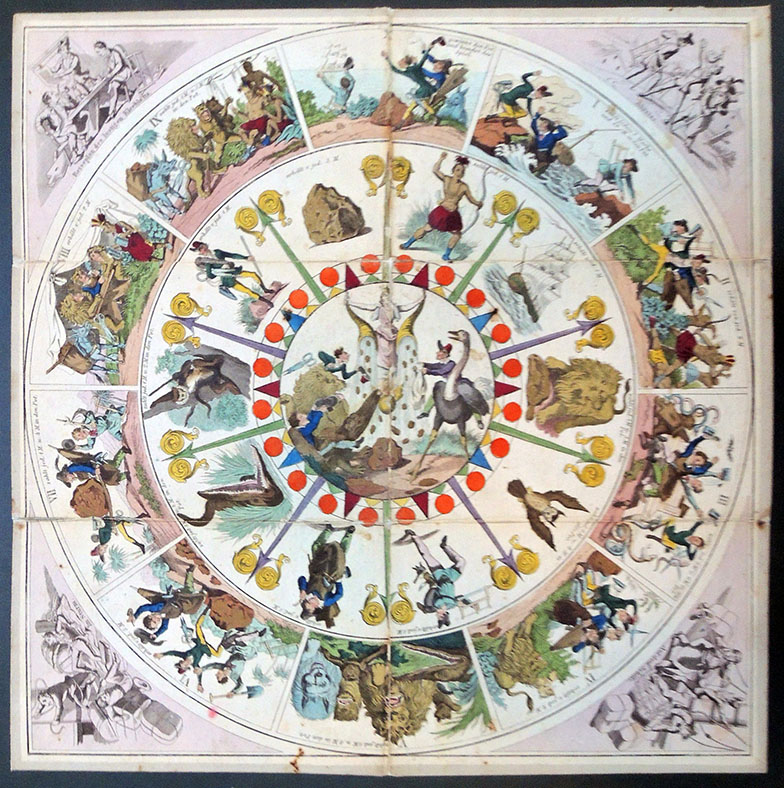
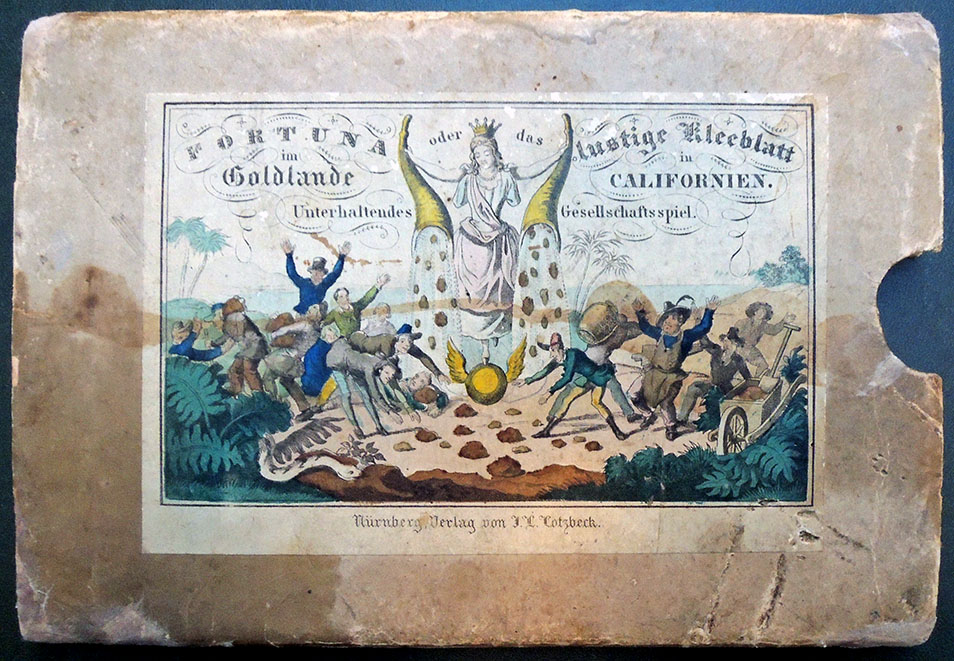
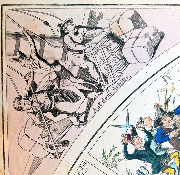
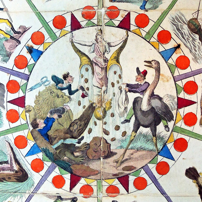
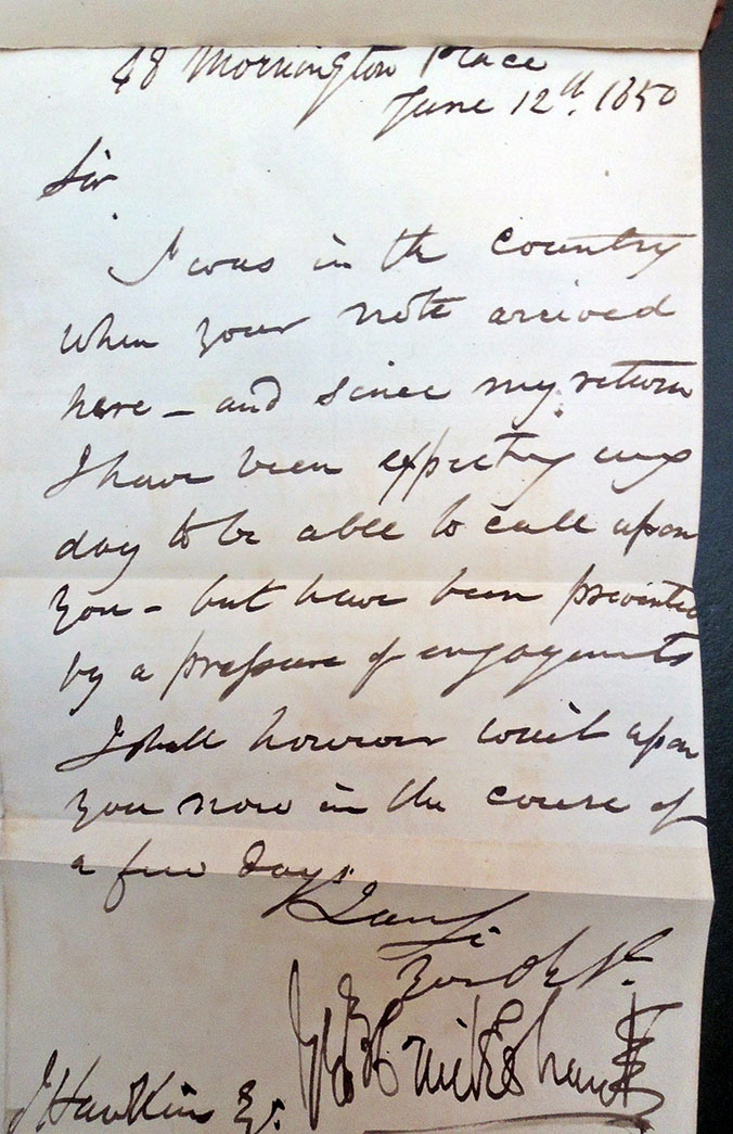
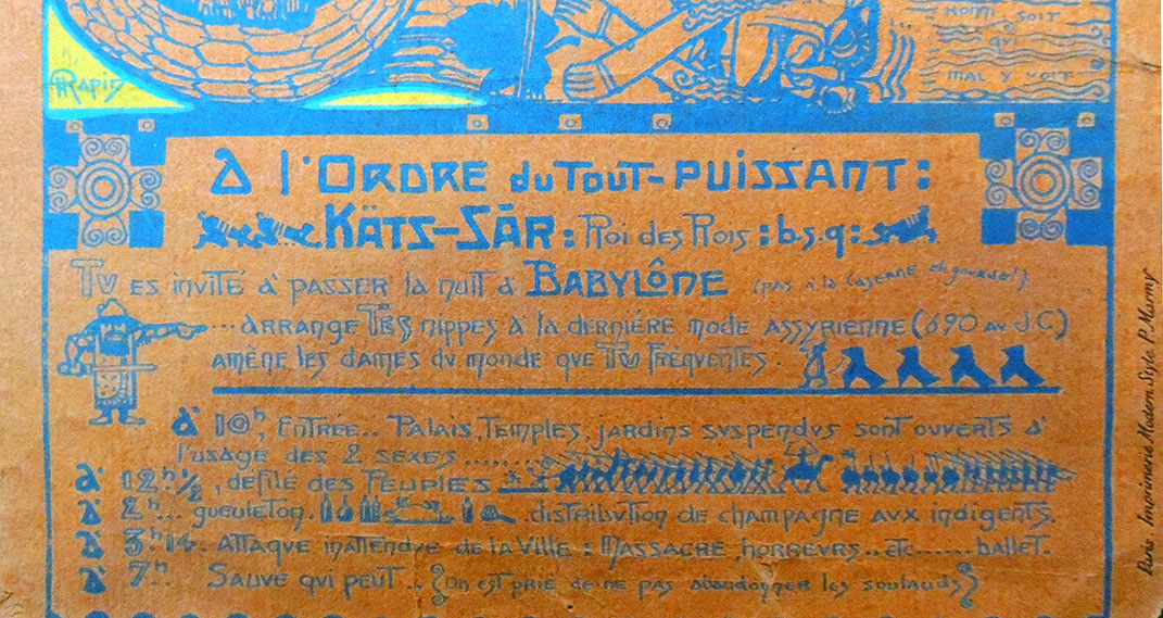
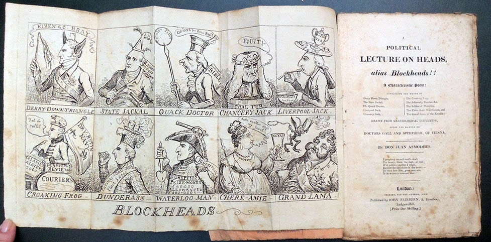
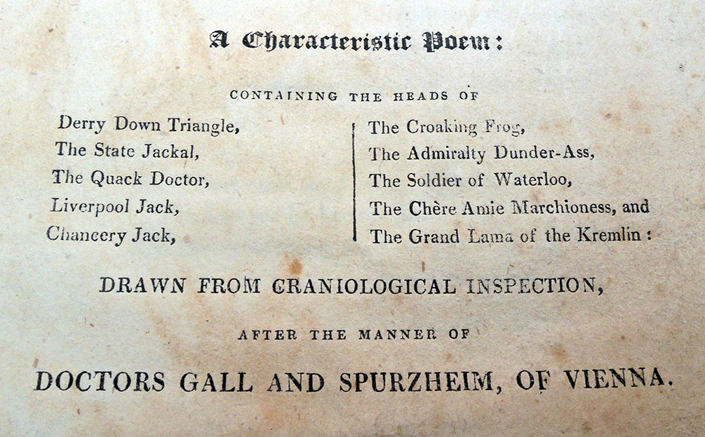
Don Juan Asmodeus, A Political Lecture on Heads, alias Blockheads!! A Characteristic Poem: Containing the Heads of Derry Down Triangle, the State Jackal … [etc.] Drawn from Craniological Inspection, after the Manner of Doctors Gall and Spurzheim, of Vienna (London: J. Fairburn [1818?]). Graphic Arts Collection Cruik 1815.5. Frontispiece fold out by George Cruikshank.
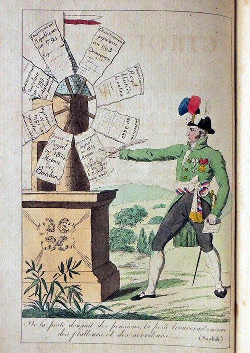
The anonymous author of this small book [King of the Demons] states his purpose on the title page:
I prophesy on each man’s skull
The heavy, thick, the dark, or dull;
O’ver politics supreme I reign,
Explore the labyrinths of the brain:–
To show how little, great men are
Is Asmodeus constant care!
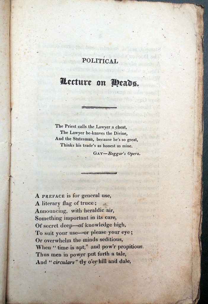
John Gay (1685–1732). The Beggar’s Opera. 1922.
Act I
Scene 1.
Scene, Peachum’s House.
PEACHUM sitting at a Table with a large Book of Accounts before him.
AIR I.—An old Woman clothed in Gray, &c.
Through all the Employments of Life
Each Neighbour abuses his Brother;
Whore and Rogue they call Husband and Wife:
All Professions be-rogue one another:
The Priest calls the Lawyer a Cheat,
The Lawyer be-knaves the Divine:
And the Statesman, because he’s so great,
Thinks his Trade as honest as mine.
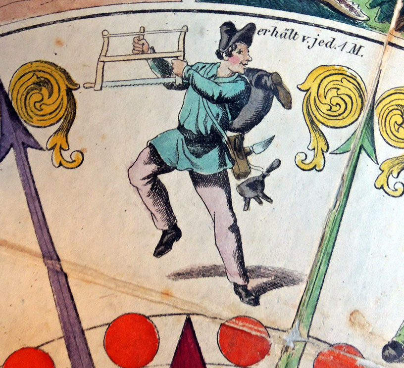
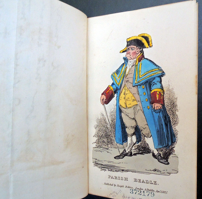
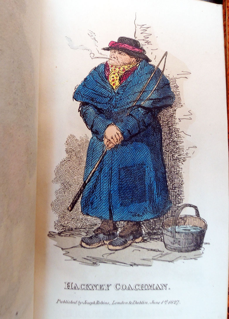
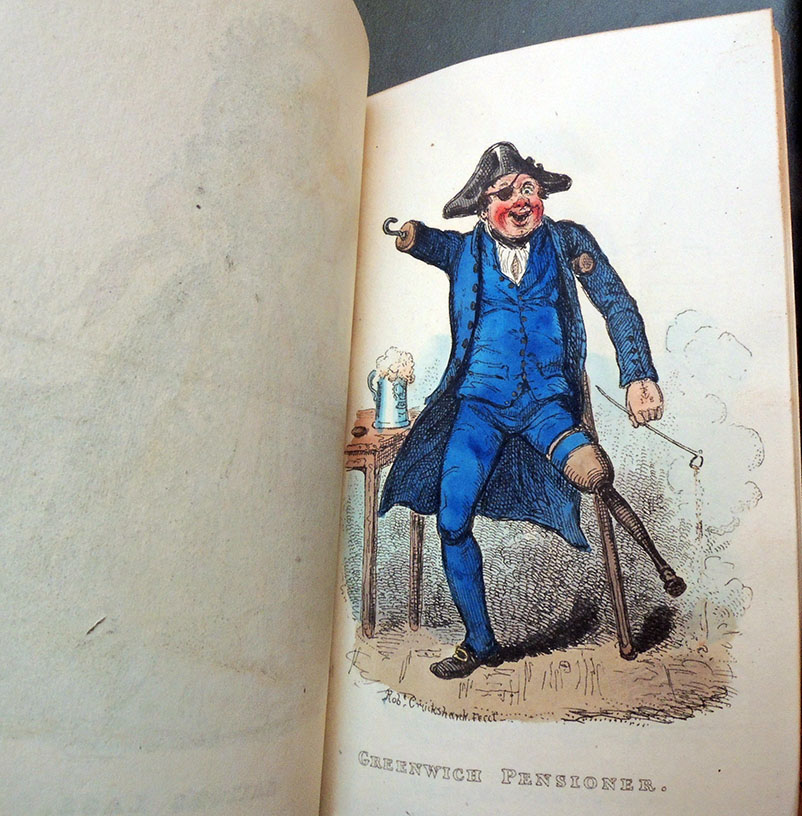
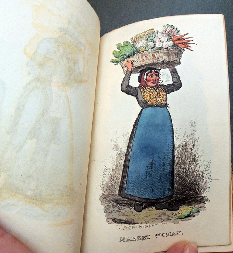
Here are a few of the ten blockheads.
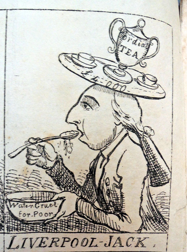
Identified by Dorothy George as Robert Banks Jenkinson, 2nd Earl of Liverpool (1770-1828), Prime minister 1812 to 1827. Also known as Liverpool. His verse reads in part:
Jack Jenkinson, secure as fate,
A stupid pillar of the State;
Whose father, o’ve the Atlantic wave,
In days of yore both got and gave,
Got places, money, meat, and fuel,
And fed the poor with water gruel;
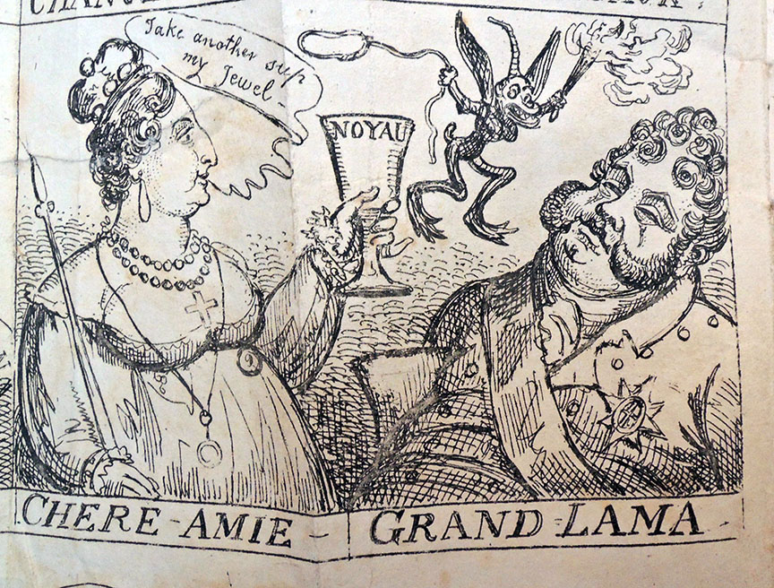
Isabella Anne Ingram Shepherd, 2nd Marchioness of Hertford (1760-1834), married Francis Ingram Seymour, Viscount Beauchamp, later 2nd Marquess of Hertford.
The lecture goes:
Her sparkling eyes, where Cupids muster,
Outshine the ruby’s polish’d lustre.
Yet crows’ feet, underneath her lashes,
Have mark’d her jolly cheeks with gashes;
And spite of dress, of airs, and pride,
Proclaim the age she fain would hide.
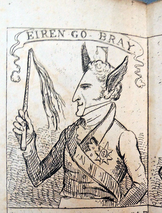
Robert Stewart, Viscount Castlereagh and 2nd Marquess of Londonderry (1769-1822). Better known as Viscount Castlereagh. As Chief Secretary for Ireland (1798-1801) was instrumental in the passage of the Act of Union in 1800, but his attempt to achieve subsequent political emancipation of Roman Catholics was unsuccessful. Pictured with ass’s ears and the motto Eiren-go-bray [Ireland Forever].
His lecture ends:
That head joust now consumed in smoke,
Around our necks has placed a yoke,
Which many a painful year ‘twill take
Either to lighten or to break;
And ages yet unknown to fame,
Shall curse the Irish Statesman’s name.
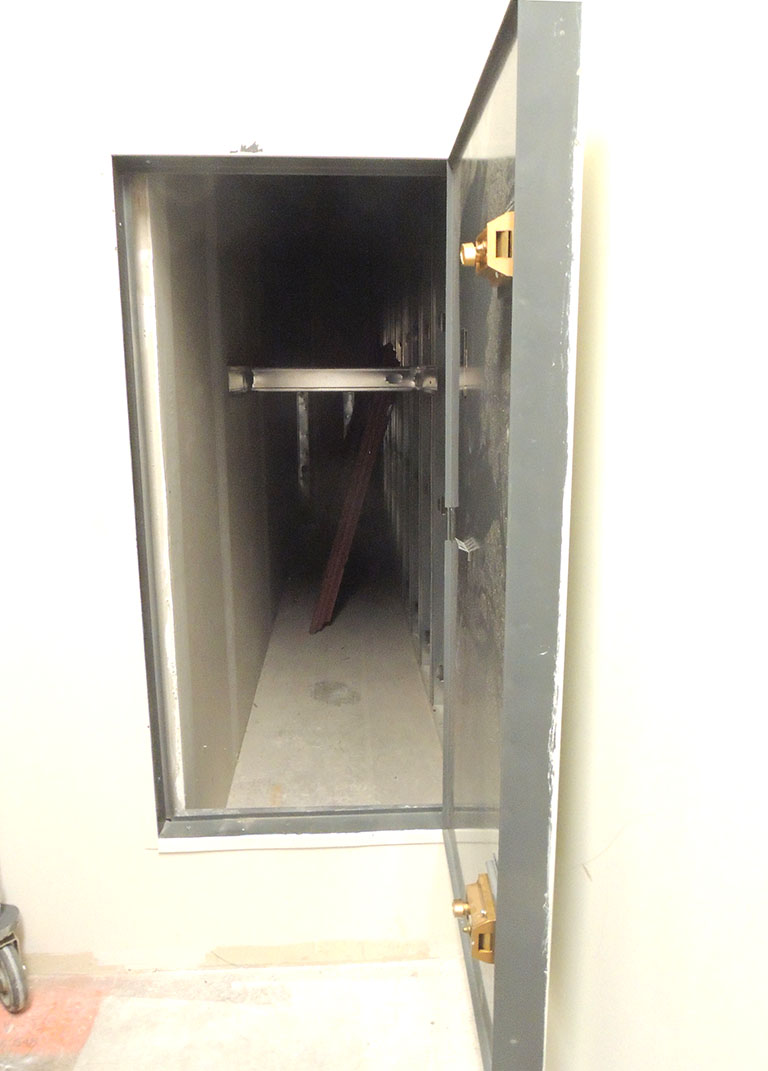
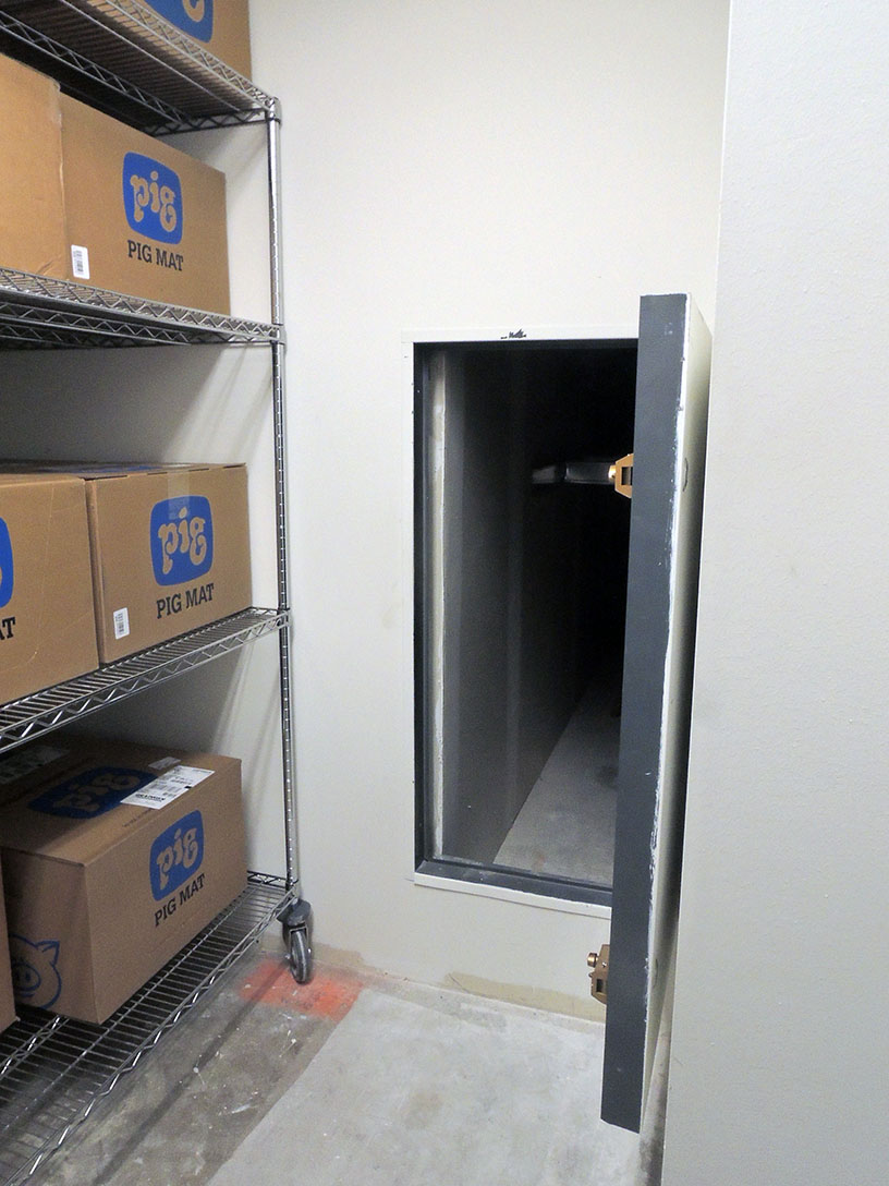
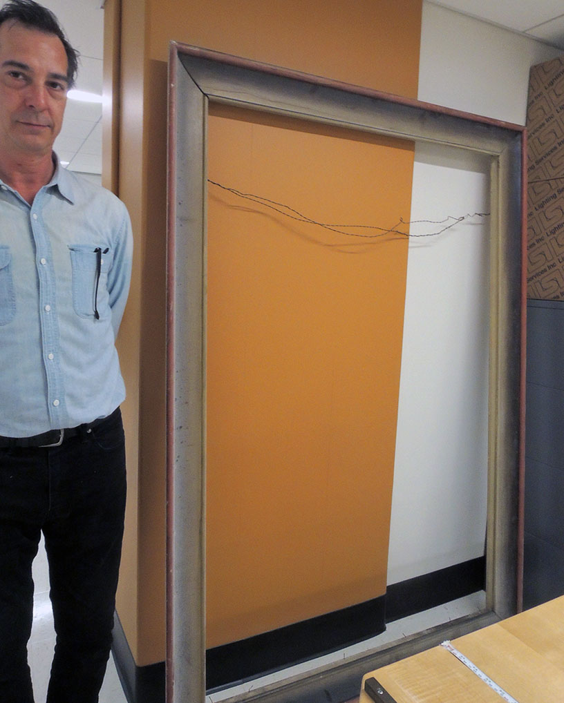
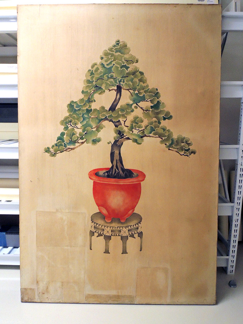
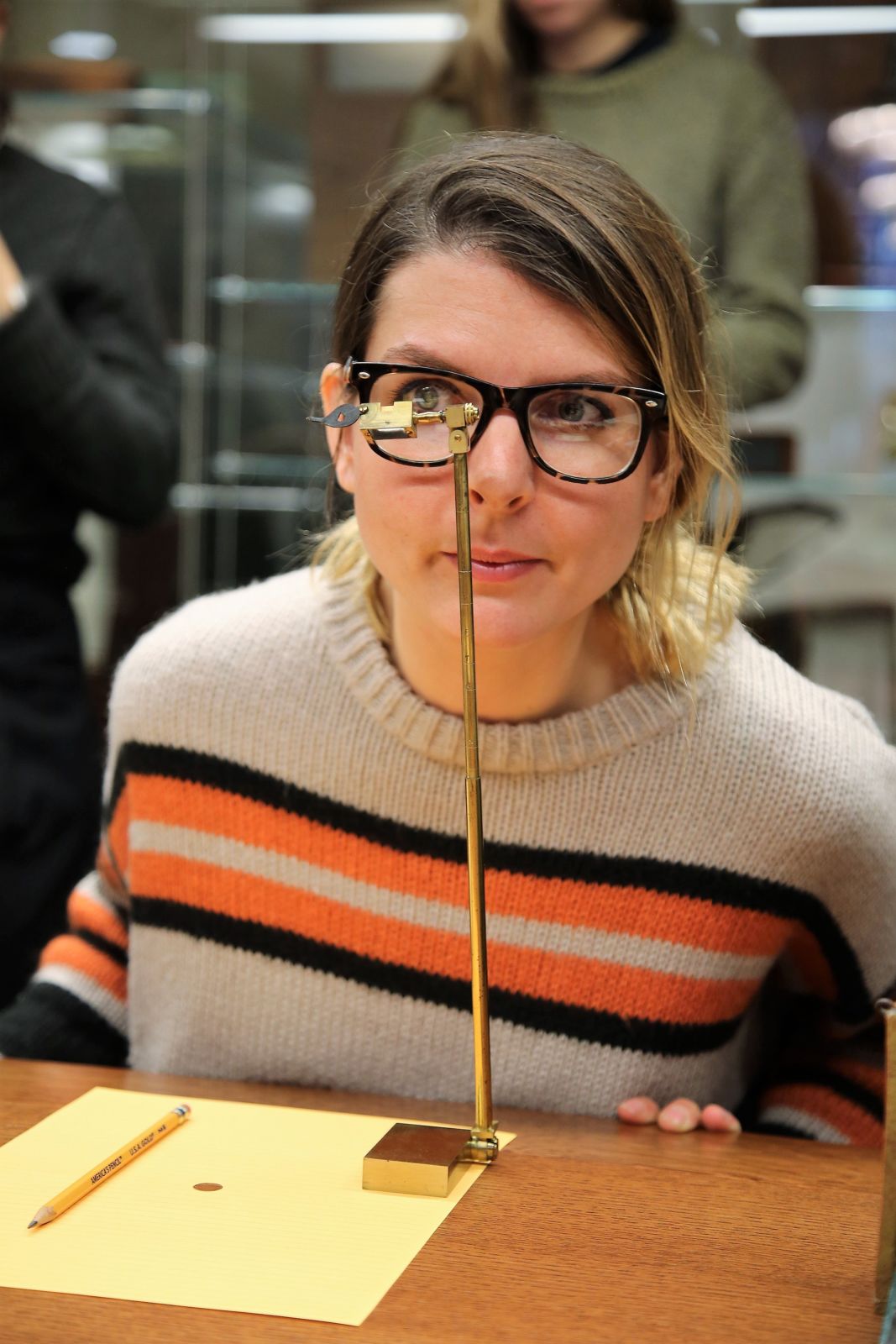
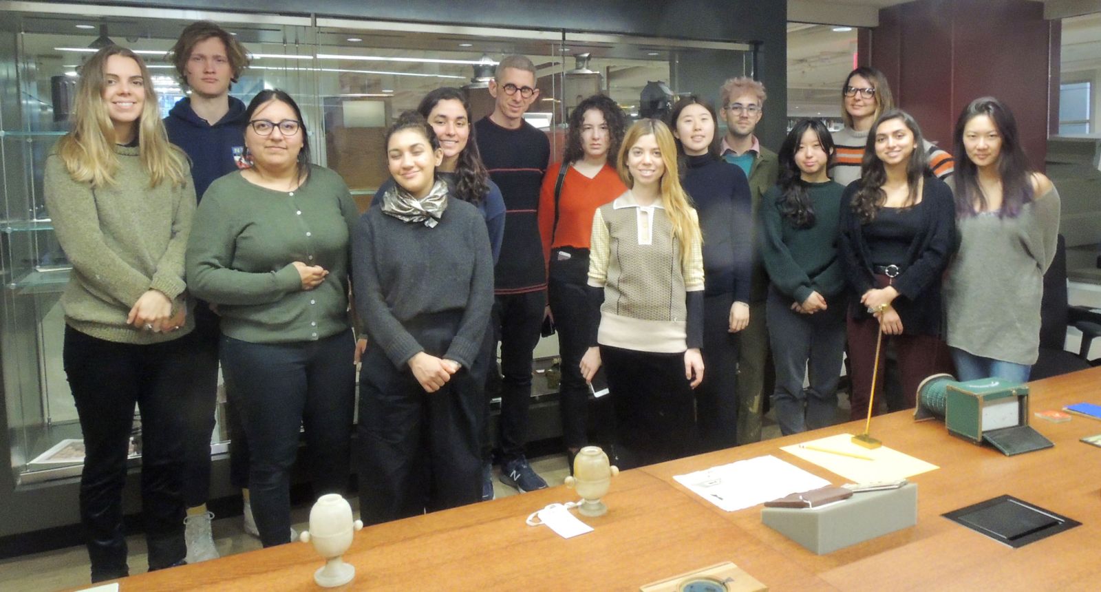
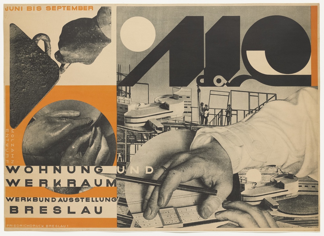
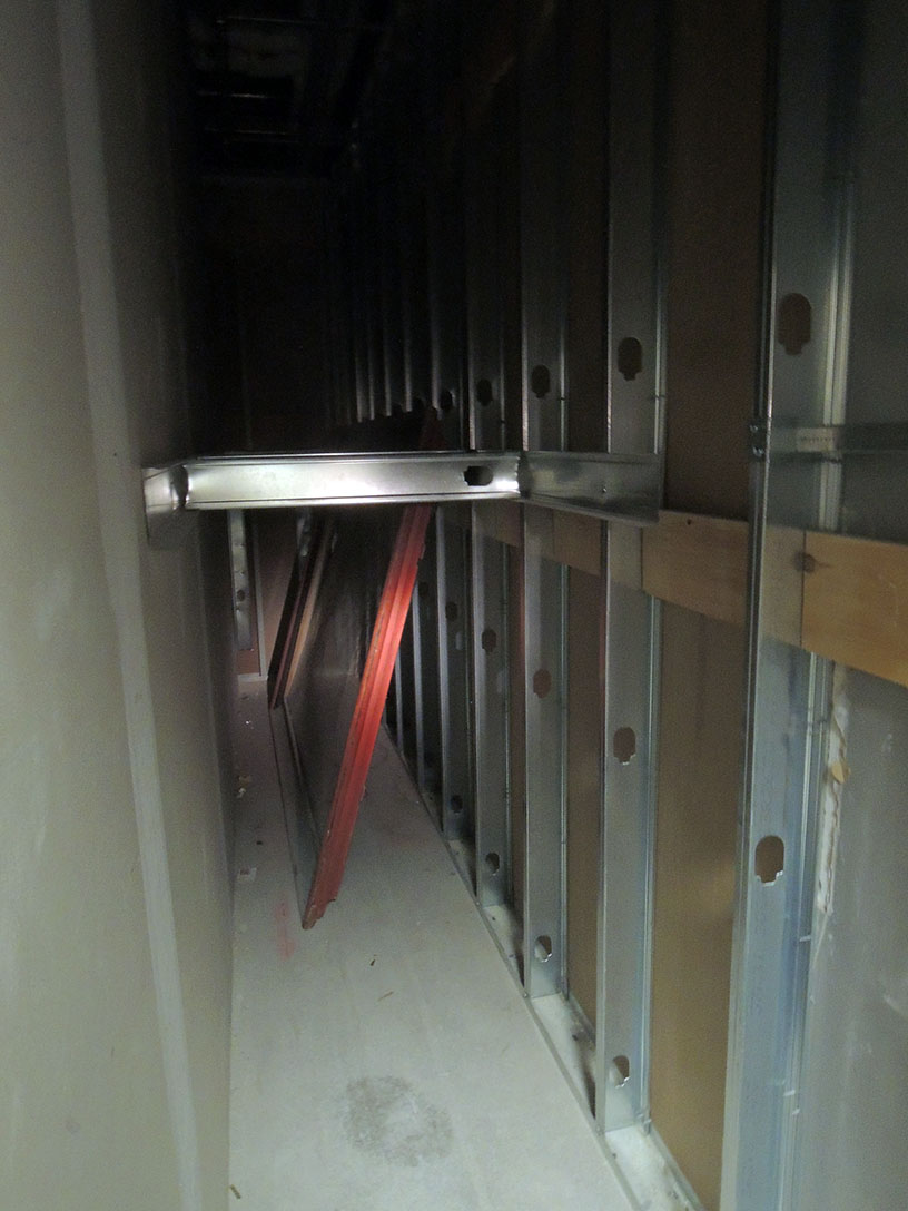
German Prospectors in California
Fortuna im Goldlande oder das Lustige Kleeblatt in Californien. Unterhaltendes Gesells chaftsspiel. Nürnberg: Verlag von J.L. Lotzbeck, [n.d., c. 1855]. Hand-colored lithograph and illustrated board, folding down into the original card slipcase with a hand colored label. Graphic Arts Collection 2019- in process
On the morning of January 24, 1848, James Wilson Marshall discovered gold on John Sutter’s property in California and the American Gold Rush began. Within a year, the ’49ers flooded the area in search of their fortune, traveling from across the United States and as far as Europe. Few men and women were successful, but a game was produced around 1855 to allow the German public to join with these optimistic prospectors.
Fortuna im Goldlande oder das Lustige Kleeblatt in Californien = Fortune in the Gold Land or the funny shamrock in California was first published by the Nuremberg publisher Johann Ludwig Lotzbeck (1816-1886) and very successful, given advertisements in local newspapers. The game takes you along with four German friends, who are traveling to California in search of gold. Along the way, they (you) encounter Native Americans and various wild animals (lions, crocodiles, bears, etc.), eventually digging for gold with unusual tools. If you make it to the center point, riding an ostrich or a lion, the goddess of fortune will pour your gold out of two cornucopias.
For more information, see Norbert Finzsch and Michaela Hampf: “’Fortuna in the Gold Land: or the funny shamrock in California.’ Rhenish emigrants in California, 1830 to 1900,” Schöne Neue Welt, 2001, pp. 237-57.
Cruikshank letter
George Cruikshank (1792-1878), [Cries of London] ([London, Dublin; J. Robins, 1827-29?]). Graphic Arts Collection Cruik 1827.4 (9 pl. by R. Cruikshank, and the remainder by G. Cruikshank). Autograph letter written and signed by G. Cruikshank, to J. Hawkins, esq. June 1850, inserted at beginning. Gift of Richard Waln Meirs, class of 1888
This small volume of Cries of London by Robert and George Cruikshank has no title page. In its place is pasted a letter from George to J. Hawkins:
[George Cruikshank] 48 Mornington Place. June 12th, 1850
Sir. I was in the country when your note arrived here – and since my return I have been expecting any day to be able to call upon you – but have been prevented by a [?pressure] of enjoyments. Shall however visit upon you now in the course of a few days,
Might this be a note to the print collector mentioned in the British Museum database:
John Heywood Hawkins (1802/3-1877). Major British print collector and member of Parliament; of Bignor Park, Sussex. Gave some prints in 1849. Part of collection in sale of prints and drawings, Sotheby’s, 29.iv. -8.v.1850. Hawkins retained many of the rest. In 1854/5 he sold his Netherlandish prints to Colnaghi’s who gave the first refusal to the BM (see 1855,0114.206 to 229, and 1855,0414.231 to 280, purchased for £508 1s). In 1857 he sold his early Italian prints to Colnaghi, who again gave the first refusal to the BM. Carpenter successfully asked the Trustees to purchase 58 for £450 (1858,0417.1571 to 1628). Hawkins sold a number of drawings directly to Sotheby’s in 1861, whence the BM purchased 31. Others of his prints and drawings came to the BM later via other routes.
Typography
Two exhibitions are in New York City this spring featuring masters of typography. Already open is a show at the Bard Graduate Center Gallery titled, Jan Tschichold and the New Typography, which examines the role of graphic design in the broader context of Weimar culture (1919-1933). Here is the press release:
https://www.bgc.bard.edu/files/Tschichold_PressBrochure_Final.pdf
They write,
“Tracing the revolution in graphic design in the 1920s, this exhibition displays materials assembled by typographer and designer Jan Tschichold (1902–1974) in Weimar Germany. Published in Berlin in 1928, Tschichold’s book Die Neue Typographie was one of the key texts of modern design, partly due to its grasp of Constructivist ideas and new print technology, but equally, because it was a manual for practicing designers. In the years leading up to its publication, Tschichold struck up a correspondence with many European artist-designers, including Kurt Schwitters, El Lissitzky, László Moholy-Nagy, Herbert Bayer, Piet Zwart, and Ladislav Sutnar, among others. In the course of this, Tschichold exchanged and acquired many examples of their design work, some pieces now quite famous (such as El Lissitzky’s Pro dva kvadrata [The Story of Two Squares], 1920) while other items are modest and ephemeral, such as tourist brochures, handbills, headed notepaper, product catalogues, and magazine advertisements.
In conjunction with the exhibition is a symposium, The New Typography: Graphic Design in Weimar Germany 1919–1933 at Bard on Friday, March 22, 2019 from 1:00 to 5:30. Admission is free but you must register. They promise to address the broader history of design, technology, economics, and aesthetics that played a similarly decisive role in the formation of modernist graphic design.
From February 20 to April 27, 2019, the exhibition Alphabet Magic: Gudrun & Hermann Zapf and the World They Designed will be on view at the Grolier Club on East 60th Street.
2018 marked the 100th anniversary of the birth of both Hermann Zapf and Gudrun Zapf von Hesse, and the show, Alphabet Magic will chronicle the extraordinary artistic achievements of both with the most comprehensive display of their work to date.
The curators write, “Zapf’s typefaces Palatino, Optima, and Zapfino (to name a few) are a part of our everyday lives in the United States and Europe, as well as around the world. He was also at the forefront of type technology. Zapf’s Marconi alphabet design was the first typeface ever created specifically for digital typography. Gudrun Zapf Von Hesse secured her own design legacy through typefaces such as Diotima, Carmina, and Shakespeare Roman.”
The show draws mainly on two collections: The Melbert B. Cary Jr. Graphic Arts Collection at the Rochester Institute of Technology, where Dr. Steven K. Galbraith is curator and the private collection of Jerry Kelly, a leading calligrapher, book designer, type designer and typographer, who has co-curated the show with Dr. Galbraith.
In conjunction with the exhibit, the Club will host the New York premier of the film: Alphabet Magic, by Alexandra Albrand, on Thursday, February 27, beginning at 6:00 p.m. Then, on Wednesday, March 20, there will be a panel discussion with author Robert Bringhurst (Canada), type historian Ferdinand Ulrich (Germany), calligrapher Julian Waters, and moderator David Pankow (USA). As far as I know, these events are open to the public.
An invitation to the ball
From 1892 to 1966, current and former students of the École nationale supérieure des Beaux-Arts (ENSBA) held an annual, elaborately costumed ball, many at the Moulin Rouge, the Salle Wagram, or the Parc des Expositions Porte de Versailles.
Beginning in 1900 each ball had a specific historic theme, often derived from an ancient text or inspired by an exotic foreign culture. This invitation [above and below] lists some of the themes.
The invitations posted here are some of the more modest, with the risqué examples held back. The balls themselves became notorious for nudity and debaucherous activities, the students trying to out-do themselves with each year. We are told the event ended the next morning with “a procession through the Latin Quarter, a romp around the Louvre, and a march over the Pont du Carrousel to the Théâtre de l’Odéon, where the party goers would disband.”
Costumes and masks were absolutely required however, “the soldier—the dress suit, black or in color— the monk—the blouse—the domino—kitchen boy—loafer—bicyclist, and other nauseous types” were prohibited.
The Graphic Arts Collection recently acquired invitations for the Bal des Quat’Z’Arts from the following years: 1912, 1917, 1923, 1925, 1926, 1928, 1930, 1931, 1932, 1933, 1934, 1946, 1947, 1949, 1950, 1951, 1952, 1953, 1954, 1955, and 1956.
Happily, a website has been established to bring together the history of these mad balls, located at: http://www.4zarts.org/
A collection of 27 invitations to the Bal des Quat’Z’Arts, 1912-1956. Graphic Arts Collection GAX 2019- in process
Ce n’est pas la girouette qui tourne, c’est le vent
Edgar Faure (1908-1988) wrote “Ce n’est pas la girouette qui tourne, c’est le vent” = “It’s not the weathervane that turns, it’s the wind”
The comment might fit this nineteenth-century satirical dictionary, published by the bookseller Alexis Eymery under the anonymous “Society of Weathervanes.” Contributors are said to include the singer and poet Pierre-Joseph Charrin, the printer Joseph Tastu, the writer René Perin, and the Count César Proisy of Eppe. The book has been described as “stigmatizing the flip-flops and successive loyalties of personalities under the different regimes of the Revolution to the Hundred Days.” At the front is a wonderful allegorical plate, in which a colorful gentleman signs any and all proclamations, from the constitutional monarchy to the second return of King Louis XVIII. Note the blade with a declaration from the government of the year 2440, waiting to be signed.
“Only a few weeks after the publication of the Dictionary, an essay is published under the title of Censeur des girouettes, ou les honnêtes gens vengés. The author tries to justify the opportunism of this period by the higher interest of the fatherland and thinks to see in the Dictionnaire des girouettes a threat against the civil peace and the necessary reconciliation between all the French people:
“Si ces auteurs, étrangers au bonheur de leur patrie, n’ont pas réfléchi aux dangers de leur compilation dans un moment de tout ce qui existe en France a besoin de tout oublier ; s’ils n’ont point calculé que la haine de tel individu n’attend souvent qu’un léger signal pour se venger d’une injure personnelle ; ces auteurs dis-je d’imprudens Français que seule l’ineptie de leur ouvrage peut seule excuser. » Cette contre-attaque se révèle totalement inefficace ; au contraire, des livres inspirés du dictionnaire des girouettes sont édités, tel le Dictionnaire des immobiles, par un homme qui jusqu’à présent n’a rien juré et n’ose jurer de rien, par Adrien Beuchot. https://www.dicopathe.com/livre/dictionnaires-des-girouettes/
A. Carrière-Doisin, Le censeur du Dictionnaire des girouettes, ou, Les honnêtes gens vengés (Paris: Chez Germain Mathiot, 1815). Recap DC145 .E964 1815
Alexis Eymery (1774-1854), Dictionnaire des girouettes, ou Nos contemporains peints d’après euxmêmes; ouvrage dans lequel sont rapportés les discours, proclamations, chansons, extraits d’ouvrages écrits sous les gouvernemens qui ont eu lieu en France depuis vingt-cinq ans; et les places, …. par un Société de girouettes. 3. éd., rev., cor., et considérablement augm.; ornée d’une gravure allégorique (Paris: A. Eymery [etc.] 1815). Recap DC145 .E964 1815