Category Archives: Acquisitions

new acquisitions

Le Grand Écart

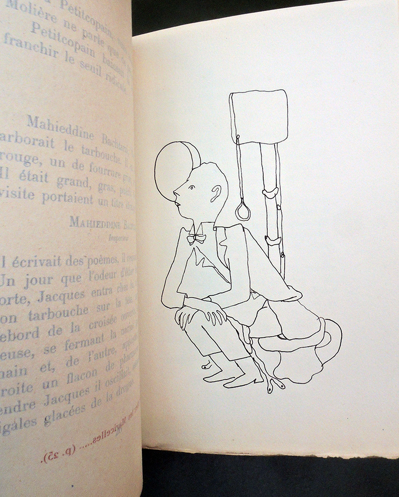
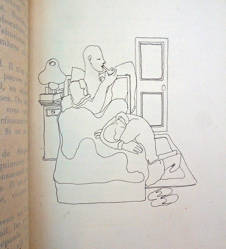
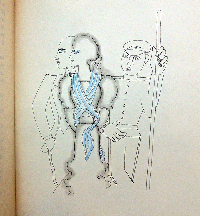
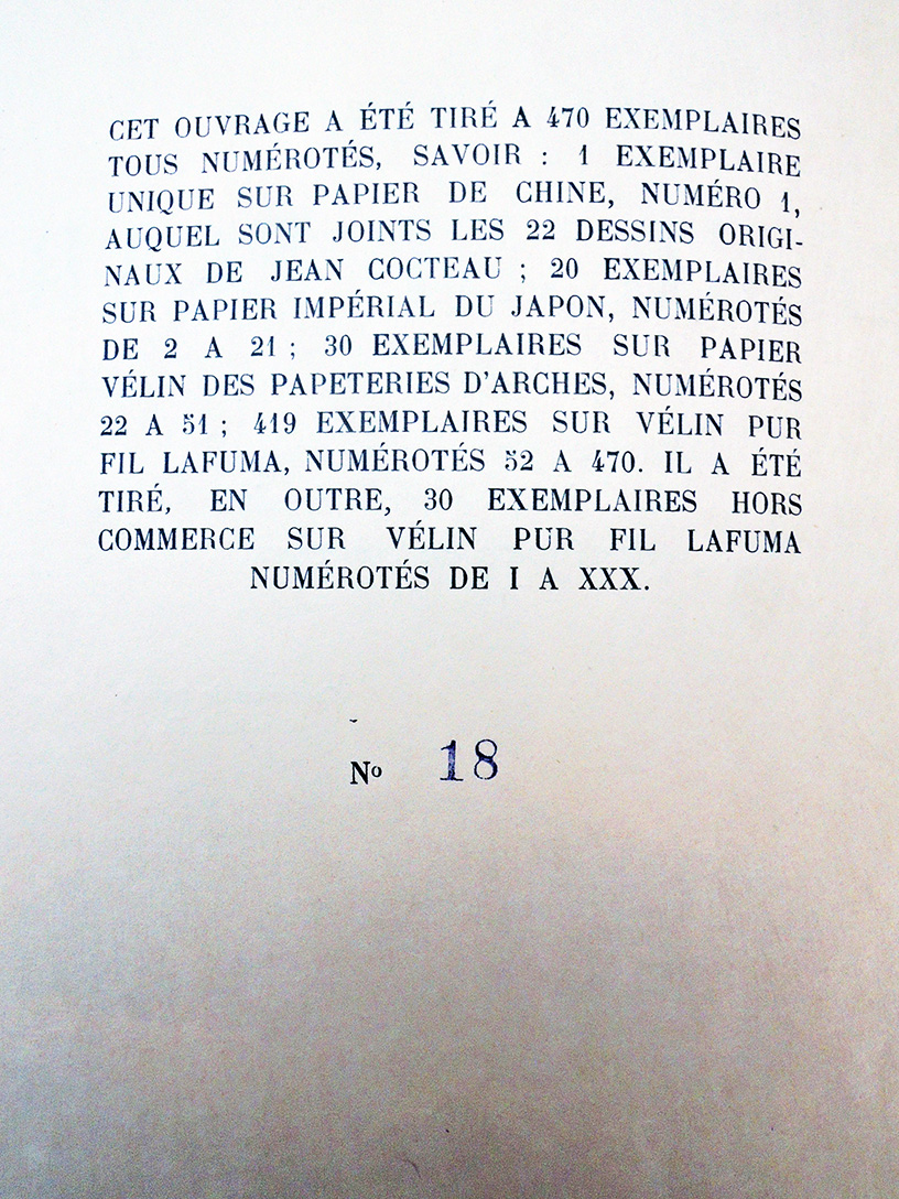
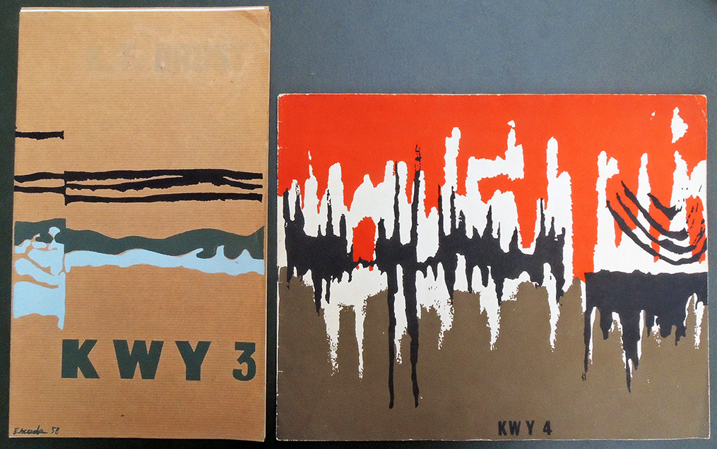
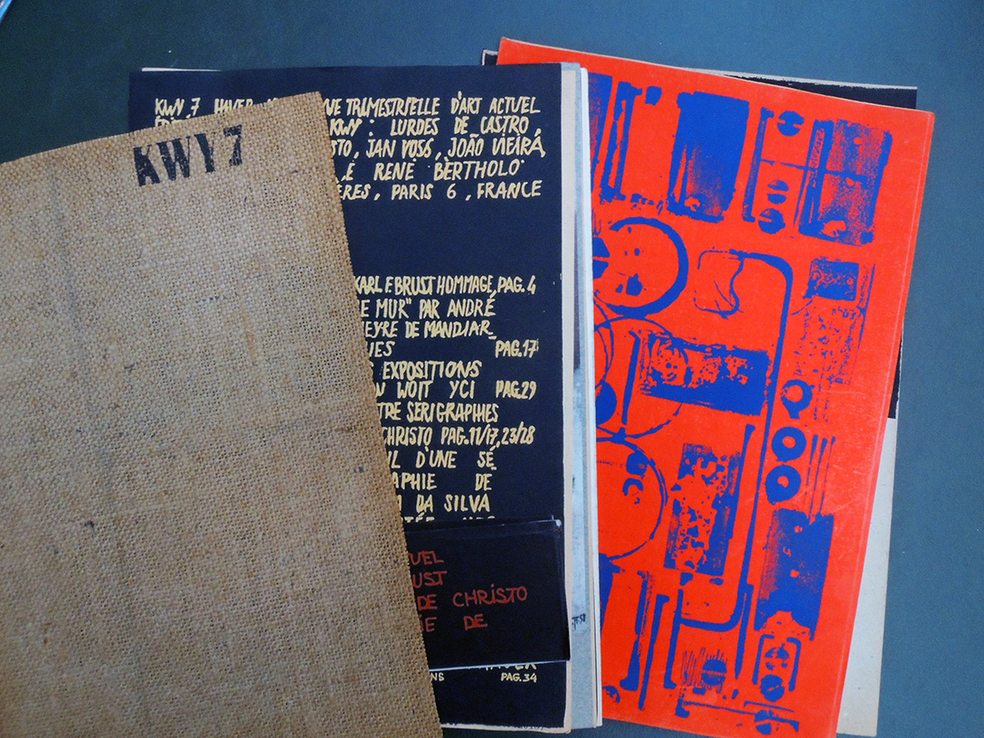
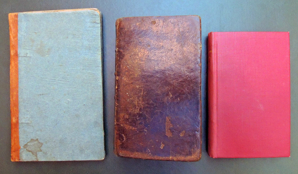
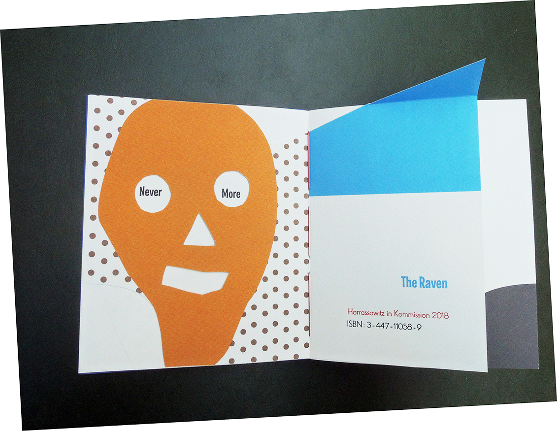
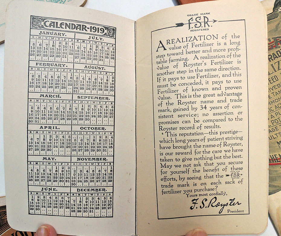
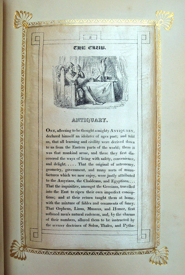
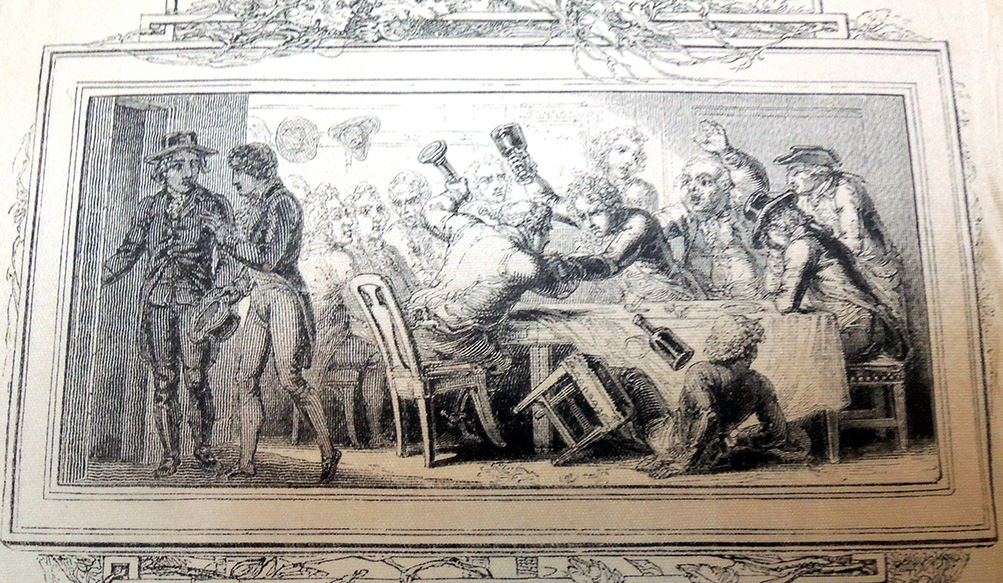
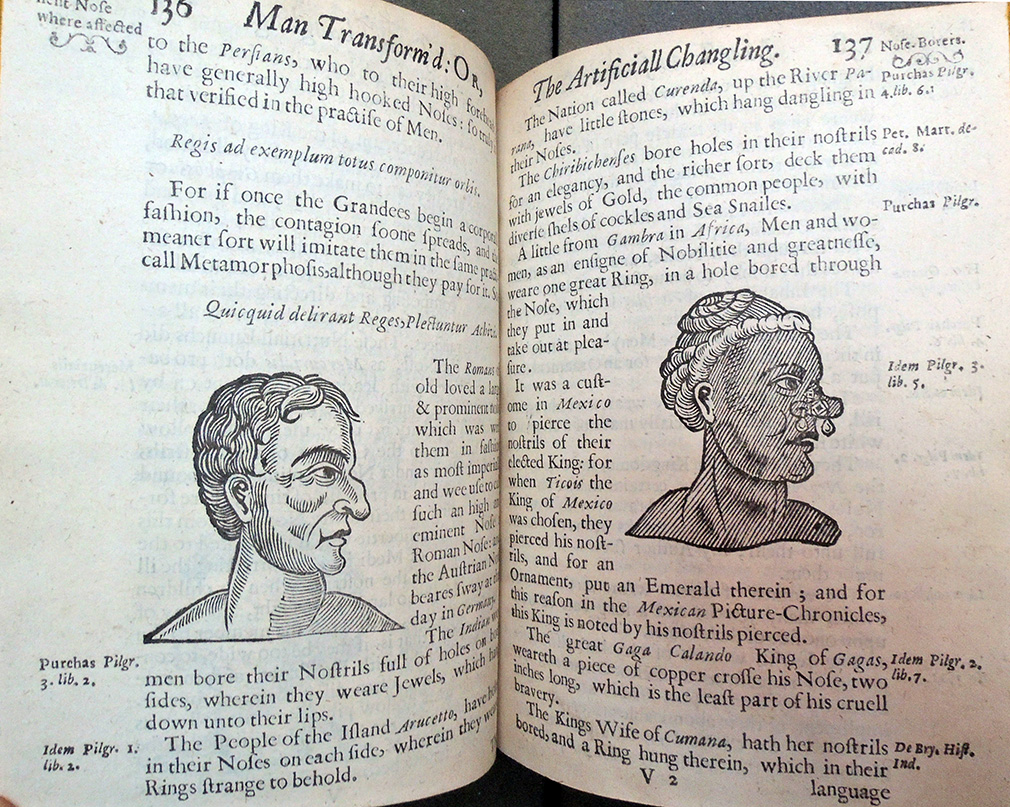
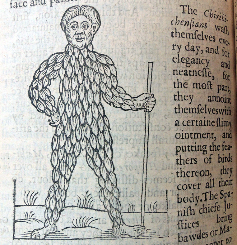
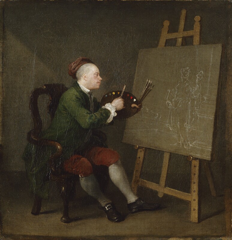
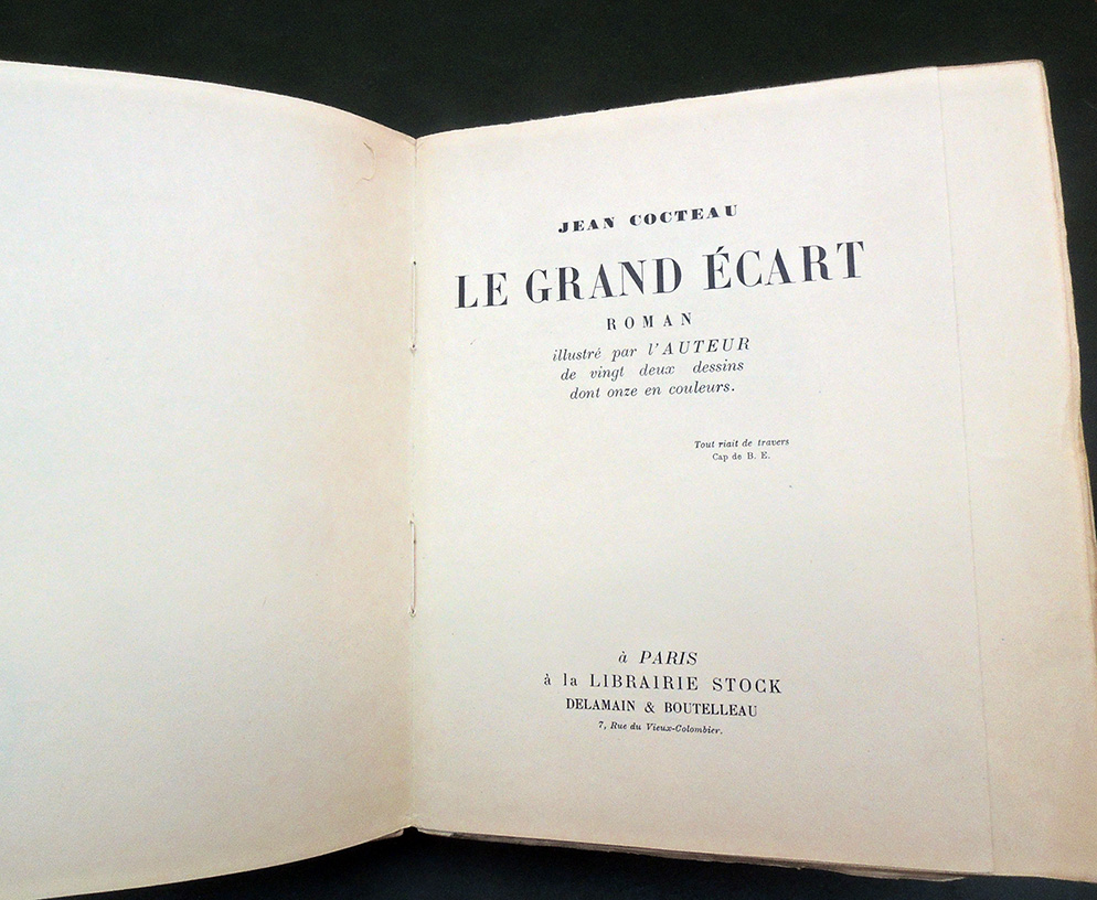
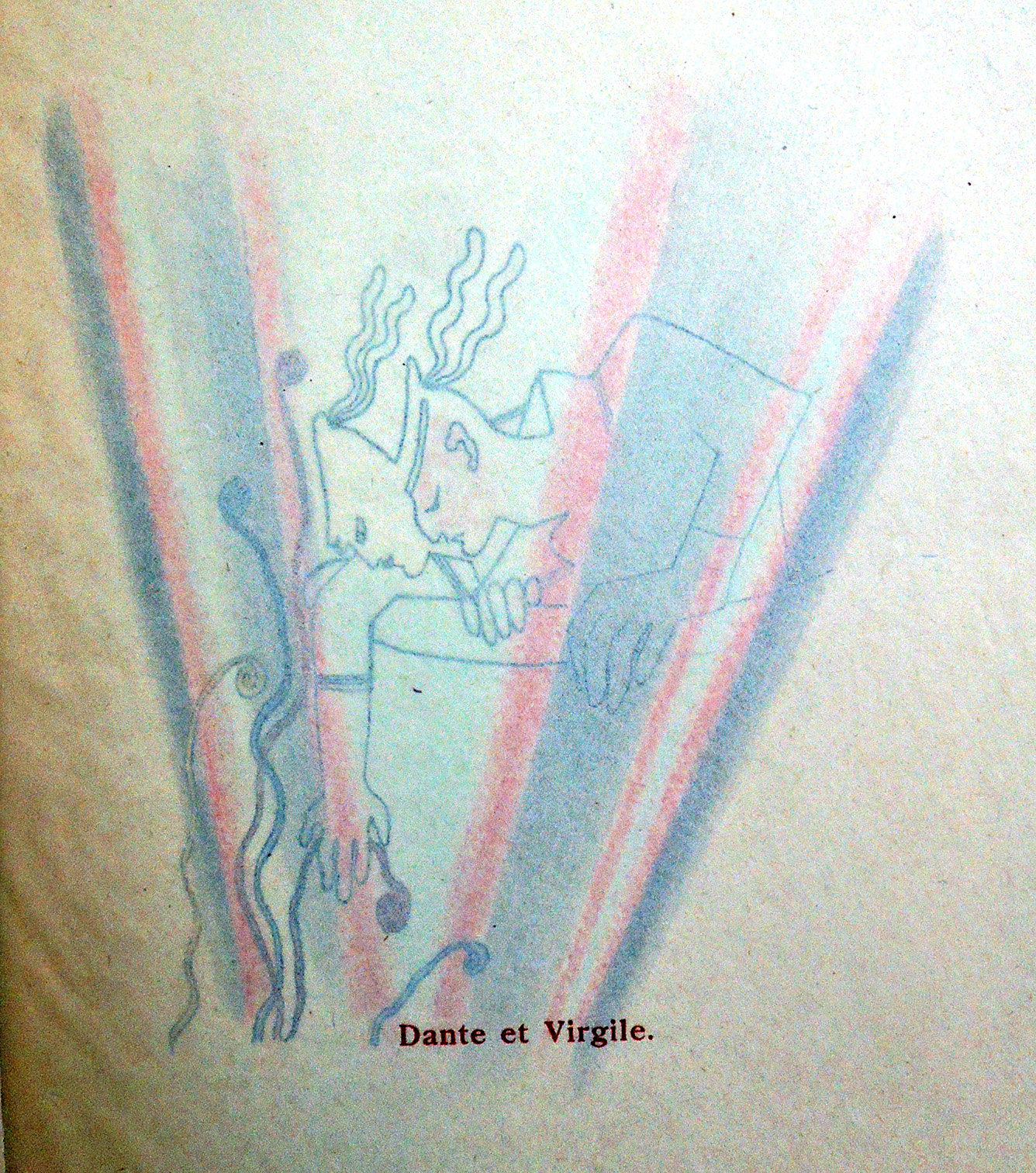
Jean Cocteau (1889-1963). Le Grand Ecart. Roman illustré par l’auteur de vingt deux dessins dont onze en couleurs (Paris: Librairie Stock, 1926). First illustrated edition, with reproductions of 22 drawings by Cocteau, 11 in color. Copy 18 of 20 on imperial Japan paper. A fine inscribed copy with a large original drawing by Jean Cocteau (profile of a male head): “à Parisot Souvenir très amical de Jean Cocteau.” Graphic Arts Collection GAX 2019- in process


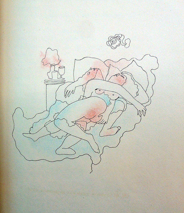
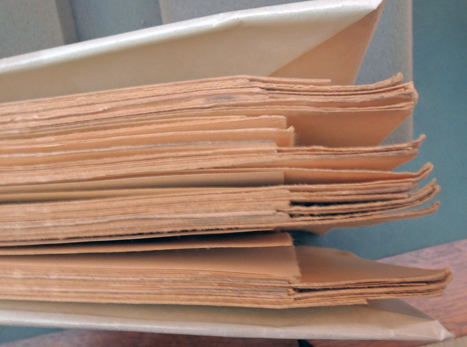
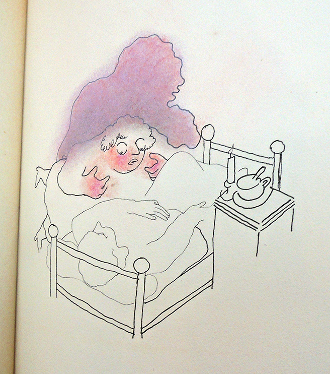
This novel has a small album of drawings bound inside between chapters. Cocteau wrote:

Ce petit roman est composé comme un album de dessins. C’est ce que nous invite à penser une lettre de Cocteau à sa mère le 19 juillet 1922 : « Tout est écrit. Il faut maintenant dessiner chaque page. La reprendre jusqu’à ce qu’elle soit ressemblante comme je fais pour mes portraits ou mes caricatures. » En réalité, à cette date rien n’est vraiment écrit : Cocteau a juste commencé, il a surtout le plan en tête (sauf l’épilogue, trouvé en octobre seulement). Et, comme l’album graphique qu’il compose en même temps (Dessins, publié en 1923), le roman se présente dans son esprit comme une suite de planches à composer l’une après l’autre. Dans ses entretiens à la radio avec André Fraigneau en 1951, Cocteau dira qu’il a composé Le Grand Écart « par petits blocs ».

This little novel is composed as an album of drawings. This is what invites us to think of a letter from Cocteau to his mother on July 19, 1922: “Everything is written. We must now draw each page. Repeat it until it looks like I do for my portraits or caricatures. In reality, at this date nothing is really written: Cocteau has just started, he has the plan especially in mind (except the epilogue, found in October only). And, like the graphic album he composes at the same time (Drawings, published in 1923), the novel appears in his mind as a series of plates to compose one after the other. In his radio interviews with André Fraigneau in 1951, Cocteau said that he composed Le Grand Écart “in small blocks”.–https://cocteau.biu-montpellier.fr/index.php?id=103


Cocteau wrote six novels: 1919: Le Potomak; 1923: Le Grand Écart; 1923: Thomas l’Imposteur; 1928: Le Livre blanc; 1929: Les Enfants terribles; and 1940: La Fin du Potomak.

During the 1920s Cocteau also devoted his time to writing several novels, a new genre for him. These novels are usually concerned with protagonists who cannot leave their childhoods behind them. In Le Grand Ecart, for example, Jacques Forestier finds that beauty always brings him pain, a pattern established when he was a child.

As a young man, the pattern continues when he loses his first love to another man, leading Jacques to attempt suicide. Germaine Bree and Margaret Guiton note in The French Novel from Gide to Camus that Jacques is “the most directly autobiographical of Cocteau’s fictional characters.” In addition, as McNab pointed out, the novel anticipates Cocteau’s later obsession with childhood. — https://www.poetryfoundation.org/poets/jean-cocteau


KWY

KWY: Revista trimestrial d’arte actual (Paris, [publisher not identified], [1958-1963]. No 1-12. French, English, and Portuguese. Graphic Arts Collection GAX 2019 in process.

The Graphic Arts Collection, along with our colleagues in Art history and French literature, recently acquired a complete run of the rare serial KWY. Each issue was editioned differently: no. 2 is a limited edition of 50 copies; no. 3 a limited edition of 85 copies; no. 4 a limited edition of 100 copies; no. 5 signed in pencil on back cover: 73/134; no. 6 a limited edition of 500 copies; no. 7-12 each a limited edition of 300 copies. Our no.1 is a facsimile while all the rest are original as issued.

A truly international publication, KWY was produced mainly with serigraphs and letterpress by Portuguese artists Lourdes Castro, René Bertholo, Antonio Costa Pinheiro, João Vieira, José Escada and Gonçalo Duarte and by Bulgarian Christo and the German Jan Voss. These artists gathered in Paris under the title “Le groupe KWY” focusing primarily on the production of the magazine from 1958 and 1964.

According to one source, the name KWY was chosen because these are the three letters that rarely appear in Portuguese words.

Various movements have been connected with this group, including Portuguese figuration and New Realism, the Fluxus spirit, the Spanish group El Paso and the lyricists and the experiences of the sound poetry. Issues also include work by António Areal, François Dufrêne, Raymond Hains, Bernard Heidsieck, Yves Klein, and Jorge Martins, among others.


Happy and sad, is one pirated?

This early book on obstetrics and human reproduction has many editions. Our earliest is the 21st edition published in 1738. Our most recent, just arrived, is from 1802 or 1808, London or Boston.

It is believed to be an unrecorded early American pirated edition with a false imprint bound in contemporary calf-backed paper covered boards with wastepaper endpapers and pastedowns from a Boston 1808 almanac published by Manning and Loring. Taken from the London 1802 edition, the text has been completely reset, with new (variant) woodcuts. What do you think?

Aristotle’s compleat master-piece: in three parts; Displaying the secrets of nature in the generation of man. Regularly digested into chapters and in sections, rendering it far more useful and easy than any yet extant. To which is added, a treasure of health; or, the family physician, being choice and approved remedies for all the several distempers incident to the human bodies. 31 ed. (London: Printed and sold by the booksellers, 1776). Rare Books 2007-2533N

Aristotle’s complete master-piece: in three parts: displaying the secrets of nature in the generation of man: regularly digested into chapters and sections, rendering it far more useful and easy than any yet extant: to which is added, A treasure of health, or, The family physician: being choice and approved remedies for all the several distempers incident to human bodies. The thirtieth edition ([New York?]: Printed and sold by the book-sellers, 1796. Graphic Arts Collection Hamilton 167s. [Place of publication suggested by Bristol.]

Aristotle’s complete master-piece: displaying the secrets of nature in the generation of man: to which is added The family physician; being approved remedies for all the several distempers incident to human bodies. A new edition (London [i.e., Boston]: Printed for the booksellers [i.e.Manning and Loring]., 1802 [ca. 1808]). Graphic Arts Collection 2019 in process


Furtwängler’s The Raven


Felix Martin Furtwängler and Edgar Allan Poe, The Raven. Pictopoesien Supplement: Peter Jelavich, Terror of the Soul ([Wiesbaden]: Harrasowitz in Kommission, 2018 (Berlin: Privat Presse)). Artist’s book, one-time edition, 99 numbered and signed copies, with an enclosed essay by Peter Jelavich, Terror of the Soul (primary publication). Graphic Arts collection GAX N-001958

Since 1975, Felix Martin Furtwängler has been publishing hand-printed copies, artist’s books, and book objects. “Inspiration and basis for his pictures, graphics and colored figures-and-letters collages are his own and literary texts, with texts and pictures forming a symbiosis. He works with different graphic techniques such as woodcut and linocut as well as etching, combining them and experimenting with painting over them. With his painting books and graphic works, Felix Martin Furtwängler is present in far more than one hundred collections worldwide.”

Based on Edgar Allan Poe’s narrative poem “The Raven,” Furtwängler designed and created this folding and folding book of a special kind. The prospectus notes,”Graphic illustrations by the author accompany the text, paper cuts and pop-up forms lend a three-dimensional shape and vivacity to the words. …The work was printed on a Roland 700, using the offset printing process. It was typeset manually, using the scripts Schwabach Due Mille, Las Vegas medium, Futura medium, Futura bold, Lucida Blackletter regular, Neue Helvetica medium and Special Elite regular, while each of the 14 Pantone colors on the machine was individually modulated and mixed by the artist. The paper Furtwängler chose is 200 g/qm Tintoretto Gesso wood-free white felt-marked, with a classical hand-made paper structure by Fedrigoni.”

“Thereafter, the artist cut each single leaf by hand, grooved and folded them. The folded single leaves were collected into sewing layers by hand, sewn with open thread-stitching with triple cross-stitch and fitted between two book covers made of 2.2 mm thick book binding board, covered by blue Hansa linen and embossed with white hot-foil embossing on the front cover and a printed ending paper made of 200 g/qm Tintoretto Gesso.”


See also the exhibition catalogue:
Felix Martin Furtwängler: printing into thinking: Folgen, Suiten, Zyklen / [Redaktion, Walter Kurz … [et al.] ; Kataloggestaltung, Felix Martin Furtwängler] (Wiesbaden: Harrassowitz, in Kommission; Wolfenbüttel: Herzog August Bibliothek; Mainz: Gutenbergmuseum, [2009]). Marquand Library Oversize NE654.F84 A4 2009q. Catalog of an exhibition held at the Kunsthalle Erfurt, Aug. 16-Sept. 27, 2009. “Eine Auswahl der Radierungen aus dem Archiv des Künstlers ergänzt durch Werke aus privater Hand und einer öffentlichen Sammlung “

Fertilizer

Graphic Arts holds a small collection of blank notebooks (also called pocket memorandums) produced and distributed as advertising for various fertilizer companies in the early twentieth century. Some include calendars or almanac listings but mainly they have brief ads at the top of each empty page. The majority of our collection comes from the Baltimore area, home of the Miller Chemical & Fertilizer Corporation, the Hubbard Fertilizer Company, and a dozen more.

“If it’s worth while to use fertilizer, it is worth while to use the best.”


George the Third

What does it say about us that we have eight boxes of George Washington portrait engravings and only a handful of George III caricatures? This is now slightly improved with the acquisition of two formal full-length mezzotint portraits of King George III (1738-1820, Reigned 1760-1820).

[top] Gainsborough Dupont (1754-1797), after Thomas Gainsborough (1727-1788), George the Third, King of Great Britain &c. &c. &c., [Published December 30 1790 by Gainsborough Dupont No 87 Pall Mall]. Mezzotint, proof before all letters. The original painting, completed 1781, is in the Royal Collection, Hampton Court. Graphic Arts Collection 2019-in process

Gainsborough Dupont was the eldest son of Thomas Gainsborough’s sister, Sarah and Philip Dupont. He apprenticed to his uncle 1772-79; entered RA Schools 1775; remained in Gainsborough’s studio, producing studio replicas, mezzotints and oil copies, until his uncle’s death in 1788 when he inherited studio properties.

[below] James Ward (1769-1859) after painting by Sir William Beechey (1753-1839), His most Gracious Majesty George III, on his Favourite Charger Adonis. Dedicated to the Queen’s most excellent Majesty; By Her faithful and devoted Servant, John P. Thompson. London, Re Published Feb.y 6th 1811 by J.P. Thompson, G.t Newport Street, Printseller to his Majesty and the Duke & Duchess of York. Mezzotint with separately-printed title. Graphic Arts Collection 2019-in process.

There are several variations on this mezzotint, George III alone; George III with Adonis; George, Adonis and others; Adonis alone, etc.

Adonis

[left] Charles Willson Peale (1741–1827), George Washington after the Battle of Princeton, 1779–82. Oil on canvas. Princeton University, bequest of Charles A. Munn, Class of 1881. The 1784 companion to this hangs on the southern wall of the Faculty Room in Nassau Hall, George Washington at the Battle of Princeton also painted by Charles Willson Peale. Popular legend maintains that the gilded frame holding this portrait once contained a painting of King George II before a cannonball fired from Alexander Hamilton’s battery during the Battle of Princeton decapitated the King as it crashed through one of the windows of Nassau Hall.

Puckle’s Club in Satin

“In Wine [there is] Truth”
James Puckle (1667?-1724), The Club; in a Dialogue between Father and Son. Edited by Edward Walmsley ([London, Imprinted by J. Johnson, St. James Street, Clerkenwell] 1817). One of seven copies. Imperial paper watermarked “J Whatman 1817.” Graphic Arts Collection GAX 2019- in process

This edition includes a frontispiece portrait of Puckle engraved by T. Bragg (active early 19th century) after an engraving by George Vertue (1684–1756) after a painting by John Baptist Closterman (ca. 1656–ca. 1713).

To pair with Princeton’s 1817 paper edition of The Club, the Graphic Arts Collection has acquired one of seven copies printed on satin and mounted within gold borders on rectos of Imperial paper watermarked “J Whatman 1817. The satin is pasted on the inside of the regular border, the joint being hidden by a broad gold line. It is bound in 19th century full red morocco, elaborately gilt, by Wilson, 19 Foley Place [Mary-le-bone, London], gilt spine in 6 compartments, wide inner gilt dentelles (probably John Wilson. See Charles Ramsden, London book binders 1780-1840 (London 1956), p. 151).

The illustrations by John Thurston (1774–1822) are wood engraved by Robert Branston (1778–1827), John Thompson (1785–1866), Henry White (ca. 1790–1861), William Hughes (1793–1825), Charlton Nesbit (1775–1838), Mary Byfield (baptized 1795–1871), G. Thurston, Jun. (active early 19th century), and William Harvey (1796–1866).

Inventory, lawyer, and author James Puckle (1667?–1724), wrote these dialogues between a father and son in 1711 (Gentleman’s Magazine, 1822, pt. i. p. 204). The son tells his dad about two dozen or so club members he met, each one described as a character type: antiquarian, buffoon, critic, rake, etc.  The father gives his son advice about each, adding a moral to every chapter.

It is, perhaps, surprising to see such a luxury edition of this work but the Puckle morals were extremely popular and the various editions widely distributed, this one printed by John Johnson and sold by Longman, Hurst, Rees, Orme and Brown; J. Major; John and Arthur Arch; and Robert Triphook (active 1814–23).


“When did people start coloring their nails and making other body transformations?” Answered in 1650

1650

1653

J.B. (John Bulwer, 1606-1656), Anthropometamorphosis: Man Transform’d; or, the artificial changeling : Historically presented, in the mad and cruel gallantry, foolish bravery, ridiculous beauty, filthy finenesse, and loathsome lovelinesse of the most nations, fashioning & altering their bodies from the mould intended by nature. With a vindication of the regular beauty and honesty of nature. And an appendix of the pedigree of the English gallant (London: J. Hardesty, 1650). Rare Books 2011-0065N [right]

J.B. (John Bulwer, 1606-1656), Anthropometamorphosis: Man Transform’d, or, The artificiall changling historically presented, in the mad and cruell gallantry, foolish bravery, ridiculous beauty, filthy finenesse, and loathsome loveliness of most nations, fashioning and altering their bodies from the mold intended by nature : with figures of those transfigurations. To which artificiall and affected deformations are added, all the native and nationall monstrosities that have appeared to disfigure the humane fabrick. With a vindication of the regular beauty and honesty of nature. And an appendix of the pedigree of the English gallant (London: Printed by William Hunt, 2653 (i.e. 1653)). Graphic Arts Collection GAX 2019- in process. [left]


The Graphic Arts Collection recently acquired the second edition of Man Transform’d, greatly enlarged and illustrated with numerous woodcuts along with an elaborate allegorical engraved half-title by Thomas Cross (active 1632-1682) and engraved frontispiece portrait of the author by William Faithorne (1616-1691). This complements the first edition in Rare Books with an elaborate title page designed by Cross but no other illustrations.


“Where it is the fashion to make the Nailes of their hands red, and to paint them of several colours, or to gild them, this being the beauty of the country.”


“God makes, and the Tailor Shapes”


“The frontispiece of this book, which faces a portrait, engraved by Faithorne, of the author (Bulwer), comprises a representation of Nature, with many breasts, like the Diana of Ephesus, seated upon a throne, which is formed of the back of two sejant monsters, crowned, holding an orb of sovereignty (without the cross) in her left hand and a sceptre in her right hand: her feet rest on celestial and terrestrial globes. Behind Nature rise, over the back of her seat, emblems of the sun and moon; on her right and left sit Adam and Eve, naked. These are under a pavilion, on the front of which is the title of the book “Anthropometamorphosis.”

Above, two hands appear, of which the right holds a sceptre with a crown upon it; near these is “Per Leges Natura.” The left hand holds a paper sealed with the sun, and inscribed, “Magna Charta Natura.” The hands issue from a cloud, from which a ray likewise proceeds, and is inscribed, “Non noui illos nec sunt opera manuum mearum.” On our left an angel approaches, saying, “Deus fecit hominem rectum”; on our right a devil goes away, saying, “Ha ha, he ad imaginem.”

Below the angel are an ape, leopard, dog and ass, the last saying, “Ecce homo quasi unus er nohis;” below the devil are, “Testes jurati,” several men in foreign costumes adapted to their climates. Below the animals, an open book bears “De usu partium”; below the men, “De Abusu partium.” Before the last, as if approaching the throne of Nature, appears a man in a lawyer’s costume (? the author), bearing a paper inscribed “Defatio abusu partium.” Behind him a bearded personage says, “Quid de abusu partium.” To the opposite side of the throne approach “Juratores,” whose foreman presents “Billa rera.”

Before a bar which is placed in front of the pavilion appear many persons who have more or less deformed their shapes by artificial means: one wears a mask, another a crown of feathers, the skull of a third has been pressed backwards; a woman wears patches cut like the moon and stars, and a farthingale; one man has painted his skin with flowers and birds, the next shows a striped skin; after this stands a woman in the then correct costume and a “salvage man,” an Indian with suns and moons painted on his skin, others who have deformed their ears, mouths and noses.”–Catalogue of Prints and Drawings in the British Museum, Volume 1 (1870)


Alan James Robinson

Mark Twain, The Jumping Frog. Wood engravings by Alan James Robinson (Easthampton, MA: Cheloniidae Press, 1985). Copy 10 of 15 state proof copies, with one extra signed suite of the 15 wood engravings plus the triple page fold out of the jumping front, plus working proofs of the wood engravings, plus state proofs of etching, signed and numbered by the artist. Graphic Arts Collection GAX 2019- in process


This Cheloniidae edition of the Jumping Frog from Mark Twain’s Sketches, New and Old (1875) contains three versions of this notorious and celebrated tale: the original, the version translated into French (inadequately so, according to Twain), and the version “restored to the English after martyrdom in the French” by Twain. The afterword, “The Private Printing of the ‘Jumping Frog’ Story” by Samuel Clemens, first appeared in the North American Review (1894).

The regular edition was limited to 250 copies and is bound in green paper wrappers, while all editions are printed on Saunders paper in Centaur and Arrighi types at Wild Carrot Letterpress with the assistance of Harold Patrick McGrath and Arthur Larson.

The 15 wood engravings are printed by Harold Patrick McGrath and bound by Daniel Kelm (the design of Alan Robinson) full undyed Oasis with onlays of the frog in repose — before the jump on the front panel and after the jump on the back panel, with doublures showing the frog in mid-jump. Onlays in green oasis of the frog jumping are on the front and back pastedowns.

Pug the Painter, satire of Hogarth

Pug the Painter Following the Example of Messrs Scumble Asphaltum & Varnish. … [at foot]: To the Despisers of all pretended Connoisseurs & all Imitators (but those of Nature) this plate is most humbly dedicated … [London], [ca. 1754-1757]. Etching and dry point (289 x 214 mm). Graphic Arts Collection GAX 2019- in process.

The Graphic Arts Collection recently acquired this rare print, designed after William Hogarth’s self-portrait, ca. 1757 [left] and originally sold in a portfolio under the title “The Caricatures on Hogarth by Paul Sandby,” further labelled “Retrospective Art, from the Collection of the late Paul Sandby, Esq. R.A.,” priced M. 6s (note, on this sheet the 1s/price partly erased). While no longer attributed to Sandby, the print makes a fascinating and complex satirical attack on Hogarth. Frederic Stephens’s 1877 Catalogue of Prints and Drawings in the British Museum explains:

“3277. “Pug the Painter following the example of Mess” Scumble Asphaltum & Warnish.” “O imitatores servum pecus * [By Paul Sandby.] Publish’d according to Act of Parliament … [1754]. An etching; on a pedestal which is decorated with a wigged and spectacled head of “Ignorance & self conceit”, and inscribed “THE IDEA Box of A coxoissevil”, is seated an ape, painting “Moses striking the Rock”, a picture in the manner of Rembrandt. He is exclaiming, “A marrellous effect by G—d”.

Behind him is a book inscribed, “A Journal of my trarels from Rome to Rotterdam I had the supreme happiness of touching Raphael scu LL that dirine scroll”.

… On a table are the “100 Gilder print” rolled up, and an open book, named “Shakespear alter’d by T. Tasteless FRS thou Nature art NoT my Goddess”.

Stephens makes the suggestion that Philip Dawe or Dawes (died 1832) was responsible for this print. Dawe was a British printmaker who lived at the same time as Hogarth, known for his mezzotints and political caricature but the suggestion has not been accepted by others.

The text refers to quotations from Horace: “O imitators, servum pecus” (Imitators, a servile herd) and the opening words of the aphorism “Naturam expellas furca, tamen usque revenit” (Though you may drive out nature with a pitchfork, she will nonetheless return).

Hogarth’s attacks on amateur gentleman connoisseurs and his frustration at the privileging of Old Masters are alluded to by placing the central figure on a plinth with the motto “The Idea Box of a Connoisseur.” Beneath the design is engraved: “To the Despisers of all pretended Connoisseurs & all Imitators (but those of Nature) this plate is most humbly dedicated.”

This animosity towards amateurs is mocked by representing Hogarth as an amateur himself, referring to his rejection of the ‘Raphaelite’ style and implying that this results from Hogarth’s own lack of taste.

An owl, labelled A Compleat Connoisseur, sits on a volume titled Odes to Dullness and  speaks to the painter, “I think Mr Pug, you may keep down your Sky a little more.” One claw holds a note that reads “A Catalogue of some Capital pictures lately consigned from abroad.” Bags of money sit below.


The print comes with with a statement by the dealer, “Pug the Painter attempts to construct an artistic identity for Hogarth based upon notions of incompetence, hypocrisy and artifice. It takes the painter’s objections to academic painting, and inverts this to cast Hogarth as a bad painter, incapable of achieving the visual perfection of nature.”

At the same time, Graphic Arts acquired this early broadside catalogue of Hogarth prints.


Jane Hogarth (1711-1789), A Catalogue of Hogarth’s Original Works. To be had of Mrs. Hogarth, at her house, at the Golden Head, Leicester Fields. London, 1784. Handbill (335 x 207 mm). Graphic Arts Collection GAX 2019- in process

In 1767 William Hogarth’s widow Jane Hogarth, who owned his copper plates, was granted a further twenty years of copyright by Parliament. In January 1783 Jane Hogarth announced in the Daily Advertiser that the plates she was reprinting had not been retouched since her husband’s death (Paulson, Hogarth Graphic Works, pp. 19-20).

This broadside catalogue of prints available from Jane not only lists the prints and the series, sizes, and prices, but several measurements are corrected by a contemporary hand. A folio of all prints is also offered, “By Purchasing the Whole together they will be delivered for Thirteen Guineas,” as is the book, Analysis of Beauty. Only the British Library and Yale University hold other copies of the sheet.

“The following extract is from John Rocque’s map of 1746, three years before Hogarth purchased the house. The map shows the house to the northwest of the village of Chiswick, the last in the lane approaching Chiswick Common Field. I have circled the house in red.”–https://alondoninheritance.com/london-characters/hogarths-house/