Category Archives: fine press editions

fine press editions

Effigies

auster-effigies3 
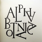
Paul Auster and Sarah Horowitz, Effigies ([Portland, Or.]: Wiesedruck, 2012). Copy 14 of 20.
Graphic Arts Collection GAX 2013- in process. auster-effigies1

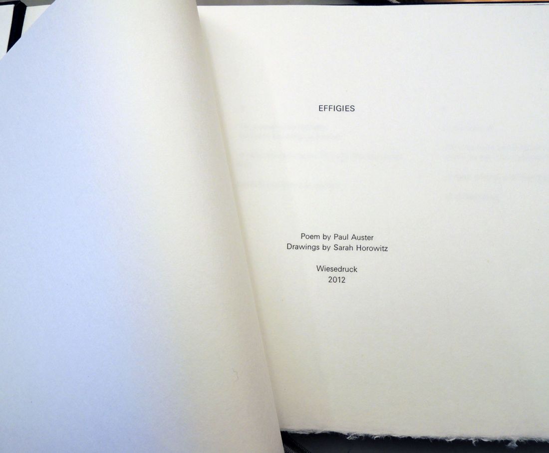
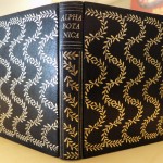
“For the creation of this book handmade kozo paper was dyed in an indigo vat, hung on laundry lines in the sun, gelatin sized, and pressed flat over the course of a year. … the printing and drawing commenced in early 2012. Each image was re-drawn by hand for the edition with sumi ink … Art Larson of Horton Tank Graphics in Hadley, Massachusetts printed the letterpress on un-dyed sheets of kozo. Claudia Cohen bound the edition in indigo-dyed flax paper made by Cave Paper.”–Colophon.
auster-effigies4

auster-effigies2
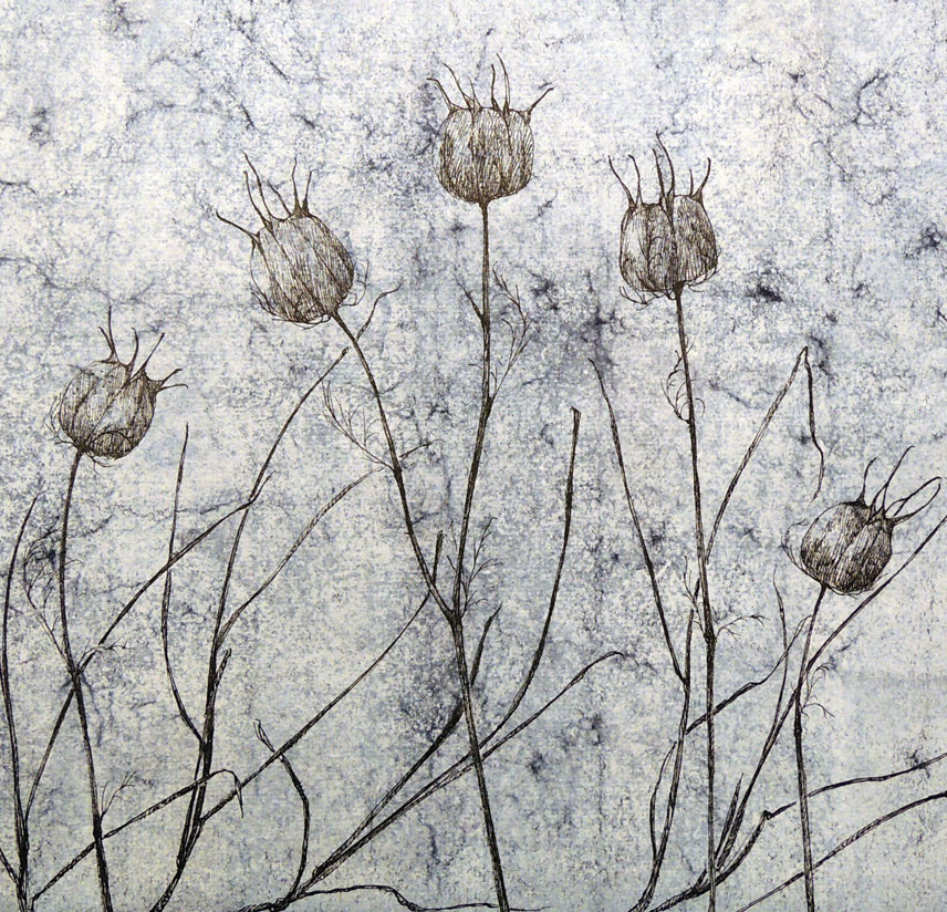
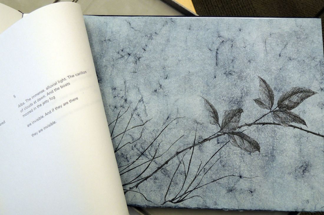
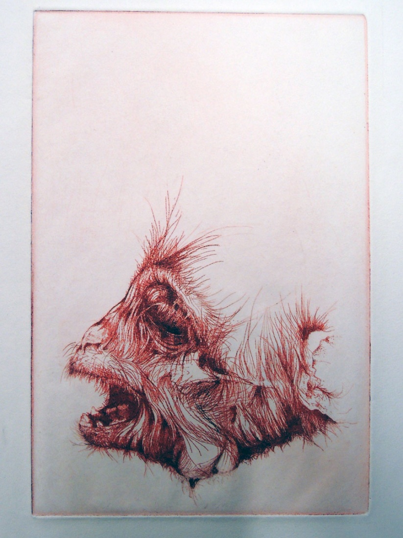
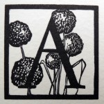
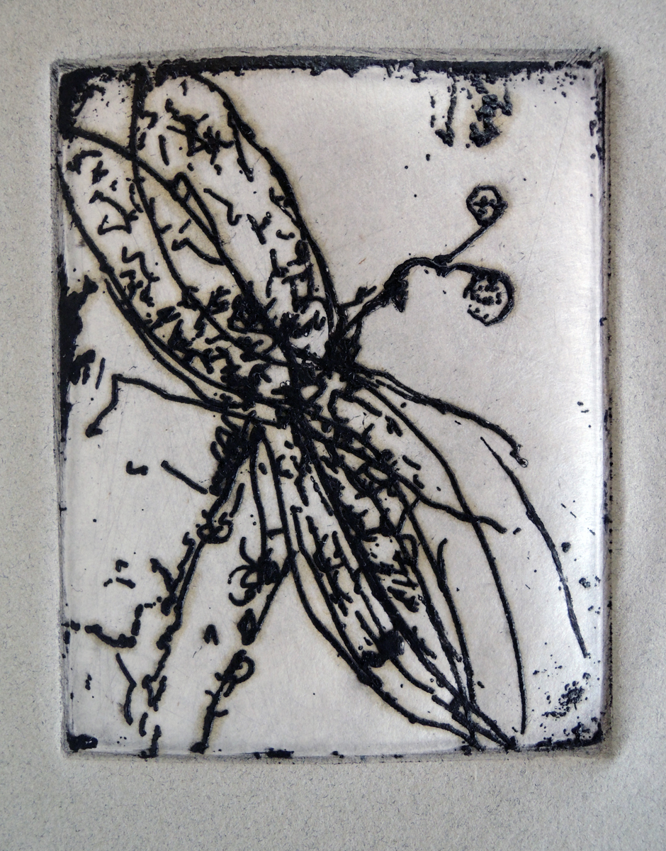
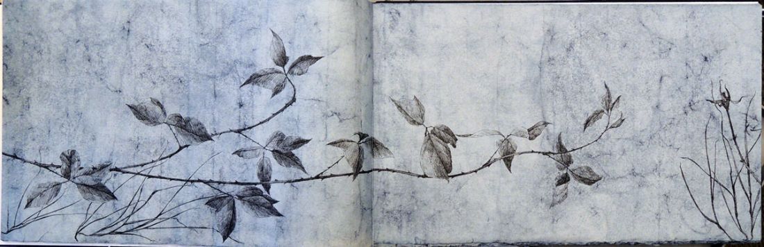
Artist Sarah Horowitz writes, “Effigies is a hand-drawn limited edition artist book featuring Paul Auster’s namesake poem from 1976. My design for the book centers around a long sumi ink drawing of a bramble fence that extends over several indigo-dyed pages. For each of the 20 books in the edition, I re-drew the image by hand, resulting in 20 unique pieces. Meaning a likeness or resemblance of, effigies straddle the threshold of existence, that which is illusory or real, forgotten or remembered. The ink-drawn weeds and brambles that cross the landscape pages are part of the edges of fields, the forgotten spaces between tilled lands that grow tangled with rusting fencing. I could not be more pleased that Mr. Auster has signed the colophon!
dyeing

As a book artist, I am continually creating a dialog between language and image. As a Jew—the people of the book—I have learned that my ancestors’ story is my story and its documentation is my cultural imperative. With this new book, the thorny fence represents the line on the edge of reality and forgetting. Remembering history is critical to finding balance in the world.”

Former Princeton Instructor Thomas B. Cornell, 1937-2012


cornell                                                       cornell

Thomas Browne Cornell, the Richard E. Steele Artist-in-Residence Emeritus at Bowdoin College and former Princeton Instructor, passed away on December 7, 2012. We hold a number of books with original prints by the artist, as well as a dozen proofs for The Monkey (Northampton, Mass.: Apiary Press, 1959). Graphic Arts Collection Oversize NE 2210.C6 M6 1959Q.

cornell monkey6

From 1969 to 1971, Cornell taught in the Visual Arts Program at Princeton University and then, transferred to Bowdoin where he established their studio arts program. While at Princeton, Cornell was one of the first instructors to teach from the newly established classrooms at 185 Nassau.

cornellIn the Daily Princetonian Special Class of 1974 Issue, (20 June 1970), Andrew Wilson noted that, “Princeton’s Creative Arts Program is in the ascending mode, both in terms of student interest and instruction offered. Created in 1939, the Program has only come into its own in the last few years. Now, it has its own building — 185 Nassau Street, a converted elementary school — a full range of courses, and cooperative programs with the English and Art and Archaeology departments.”

“The Program is graced with an outstanding staff; writers-in-residence of recent years have been Phillip Portnoy’s Complaint Roth, Elizabeth Bowen, and National Book Award winner Jerzy Kosinski. This year’s writers include: one of England’s most noted men of letters, Anthony Burgess, author of The Long Day Wanes, A Clockwork Orange, and many more novels and critical works; …The Program’s staff in other fields is equally impressive. It includes artists Esteban Vicente, Lennart Anderson and Thomas Cornell.”

cornell monkey5
Although he later focused on painting, Cornell’s early work was in printmaking. According to the Bowdoin obituary, “his  first publication, The Monkey, examined the process of evolution.  His next publication by the Gehenna Press was The Defense of Gracchus Babeuf, including twenty-one portraits of French revolutionary figures.  In the 1960’s, he established the Tragos Press, and the first editions focused on Frederick Douglass and Bayard Rustin. Responding to the Vietnam War, Cornell painted a triptych, The Dance of Death, in 1969.  In the 1970s, he returned to the exploration of images of nature, using them to address modern social and environmental ethical concerns.”

cornell-monkey7Printer’s proof

Alpha Botanica

According to Sarah Horowitz, Alpha Botanica “began in the fall of 2004 with a few trial capitals and many sketches to ascertain the viability of a Yiddish-English book of poems illustrated with engraved images and capitals. From this grew designs for two sets of botanical alphabets, one Roman and one Hebrew.”

The printing of the first half was accomplished in 2006 by Chris Stern of Stern & Faye Printers, who unfortunately passed away before it could be completed. Arthur Larson of Horton Tank Graphics finished the book and Claudia Cohen bound the edition of 45 copies. Depicted behind each letter is a plant whose name begins with that letter. The list of plants and the colophon are found in the center of the volume.

Alpha Botanica, engravings by Sarah Horowitz ([Portland]: Wiesedruck, 2007). Copy 32 of 45. Graphic Arts Collection GAX 2013- in process

http://wiesedruck.com/about/

Figures Made Visible in the Sadness of Time

everwine coverFigures Made Visible in the Sadness of Time. Designed by Michele Burgess, poetry by Peter Everwine, etching by Bill Kelly (San Diego: Brighton Press, 2003). Copy 8 of 40. Graphic Arts Collection GAX Oversize 2004-0236Q

“This book was designed by the artists in close collaboration with the poet and Michele Burgess. The poems were printed letterpress by Nelle Martin and the etchings were hand wiped by the artists and printed with the assistance of Alvin Buenaventura. The tea-dyed linen cover bears a stencil that was hand cut by the artists and hand stamped through twelve templates by Sonja Jones. An original pochoir appears on the title page.” –Colophon


“Kelly has everwine4collaborated with the poetry of Peter Everwine to illustrate “Figures Made Visible in the Sadness of Time,” writes Marcia Manna. “The shape of a dragonfly is embedded as an etching on one page and also displayed on a long scroll, embellished with sparkles and vibrant shades of blue. Kelly said the image represents the fleeting moments when something is recognized and then disappears. ‘To be very literal about something means you are just seeing, and Peter operates in a world of transcendent beauty,’ Kelly said. ‘He’s one of the few poets I’ve worked with who understands art in a deep physical sort of way. The great thing about these books and art is that one doesn’t illustrate the other. One broadens the view of the other and it becomes something bigger.’”– “These books are also works of art,” by Marcia Manna (2004)

There is in me, always,
you and the absence of you.

There is in me, always,
that road that leads to a fieldeverwine 3
of flowers we once knew

in that place where you were young,
there, where Memory keeps a life
of its own in the dark,

like a plant that waits patiently
year after year, asleep and folded inward
until the appointed night arrives

when it stirs and wakes
and opens out—Oh dream flowering!
Darkness flowering into darkness!—

forms, figures made visible
in the sadness of Time.

everwine 1