Category Archives: Illustrated books

illustrated books

Coming Soon…

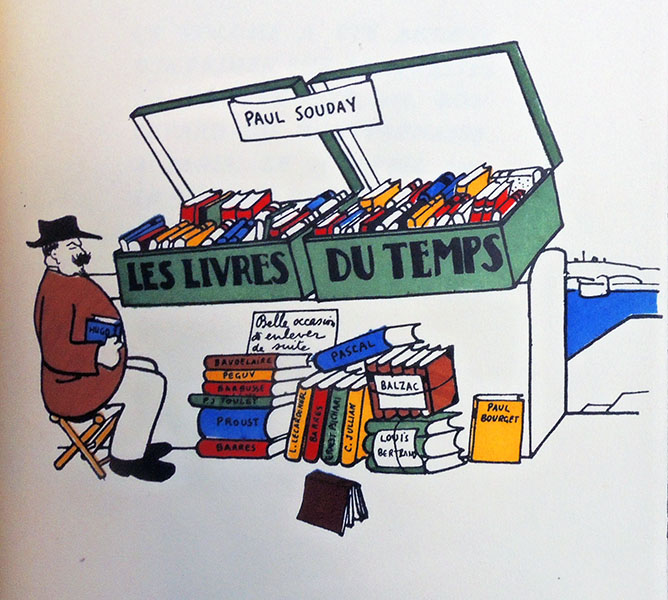
Paul Souday (1869-1929), Les livres du temps (Paris: Émile-Paul Frères, 1913). ReCAP PQ281 .S71 1913

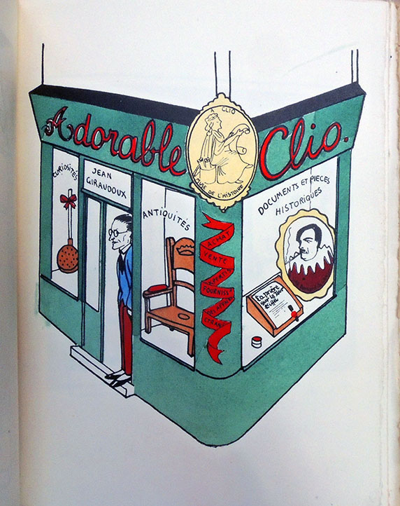
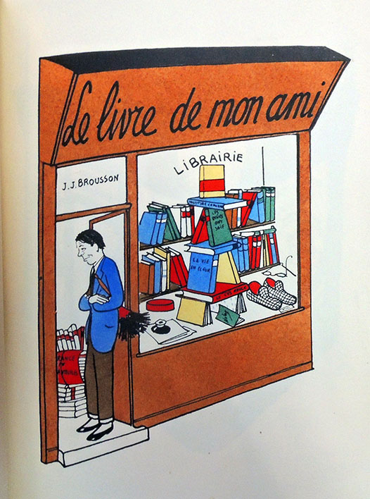
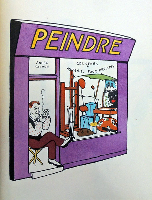
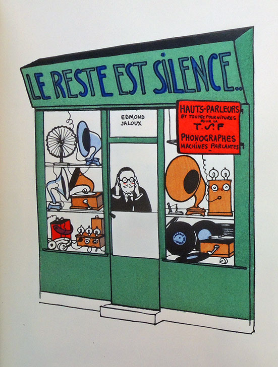
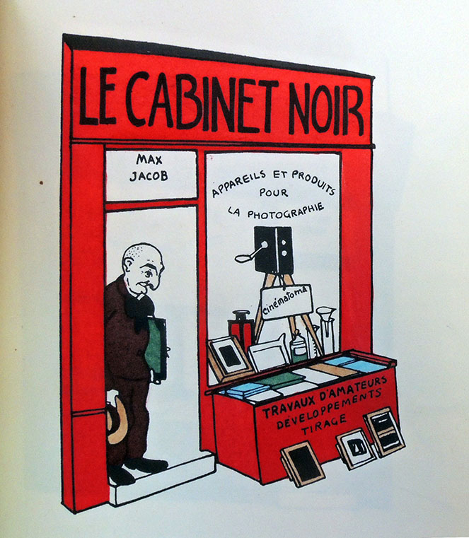
If Colette, author of La vagabonde, opened a store, would it be a travel shop? Wouldn’t Max Jacob, author of Le Cabinet noir, open a photography store? What about others?

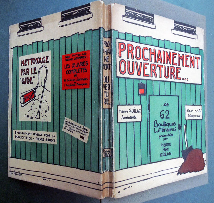
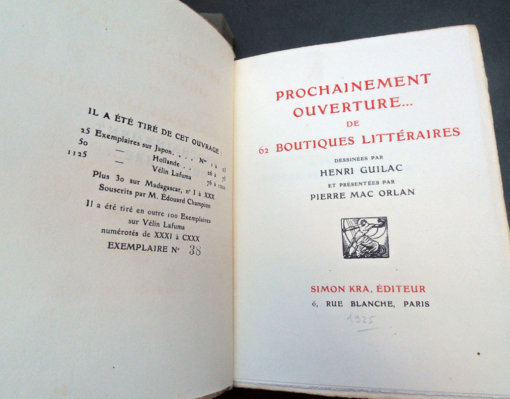
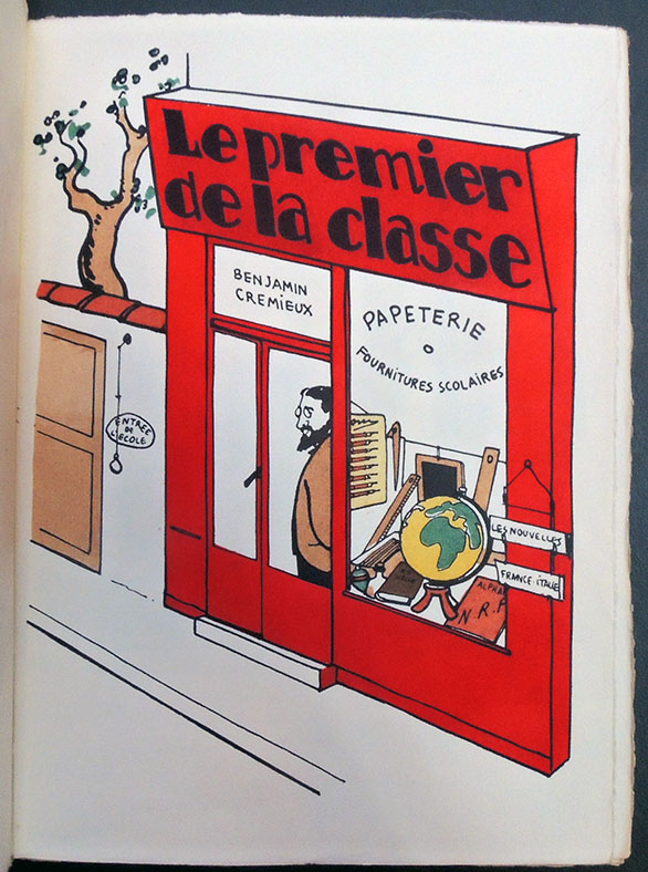
This is the brilliant literary jeu d’esprit attempted by Pierre Henri Mac Orlan (Pierre Dumarchey, 1882-1970) in conjunction with the artist Henri Guilac (1888-1953) and Daniel-Henry Kahnweiler (1884–1979) who was publishing under the name Simon Kra. It’s easy to imagine them sitting at a sidewalk cafe late one night devising the scenarios, and then preparing a limited edition with pochoir plates under the title Coming Soon. 62 Literary Shops. Here are a few.


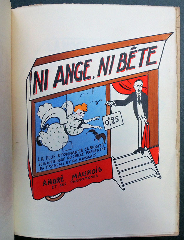
André Maurois (1885-1967), Ni ange, ni bête (Paris: B. Grasset, 1927, c1919). ReCAP 3269.34.367

Jean Giraudoux (1882-1944), Adorable Clio (Paris: Emile-Paul, 1920). ReCAP *Z-4838

Anatole France (1844-1924), Le livre de mon ami (Paris, Calmann-Lévy [189-?]). First edition published in 1885. ReCAP PQ2254 .L587 1890z

André Salmon, Peindre (Edité par Paris Ed La Sirène, 1921)

Edmond Jaloux (1878-1949), Le Reste est silence (Paris: P.-V. Stock, 1909). ReCAP 3260.26.376.11

Max Jacob (1876-19 ), Le Cabinet noir, lettres avec commentaires ([Paris] Gallimard, 1968). ReCAP 3260.24.323

Benjamin Crémieux (1888-1944), Le premier de la classe (Paris: B. Grasset, 1921). ReCAP PQ2605.R4 P7 1921

Pierre Mac Orlan and Henri Guilac, Prochainement Ouverture … de 62 boutiques littéraires (Paris: Simon Kra, [1925]). 62 pochoir plates. Graphic Arts Collection GAX 2018- in process.

“Destined for an audience of connoisseurs”

If you are a Friend of the Princeton University Library, you should be patting yourself on the back for your connoisseurship and good judgement in providing the funds for the purchase of this amazing new volume of satirical engravings. Congratulations.
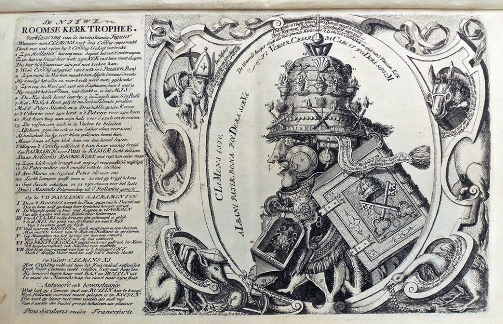
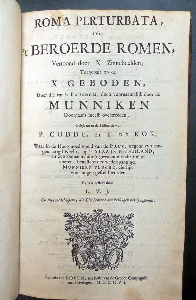
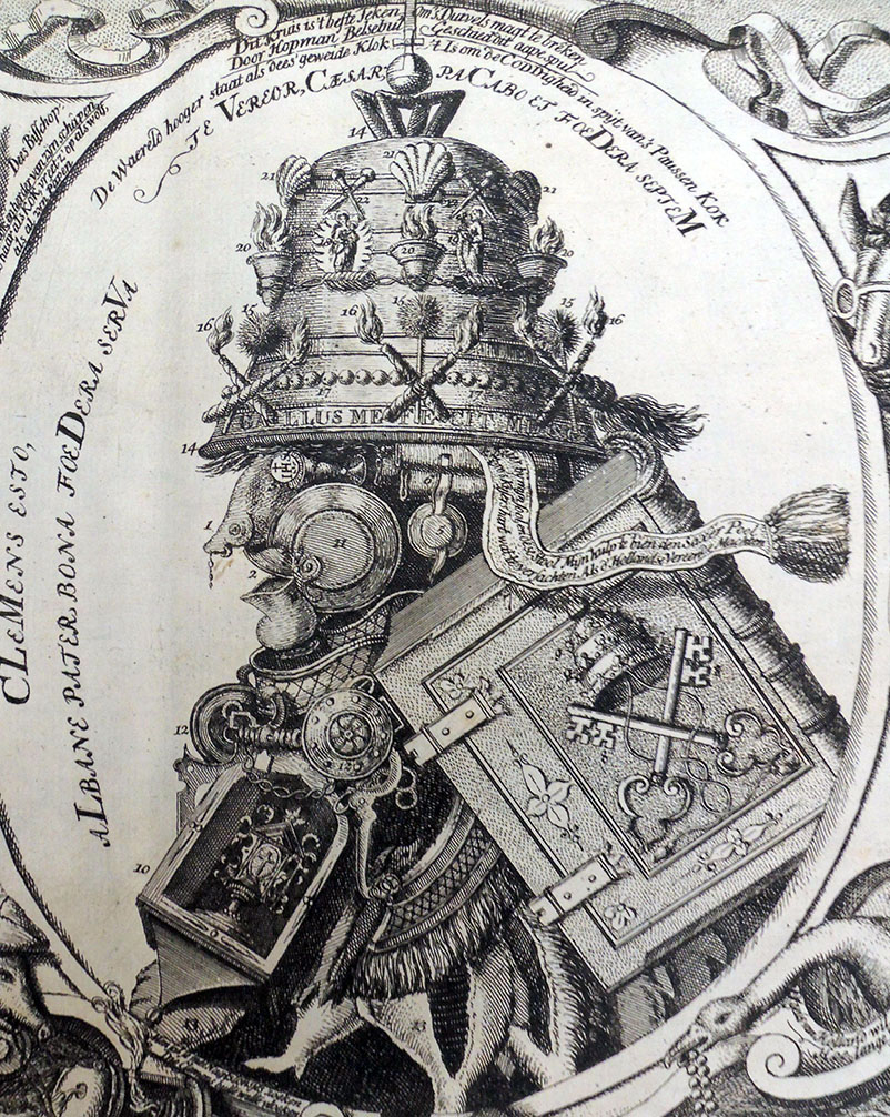
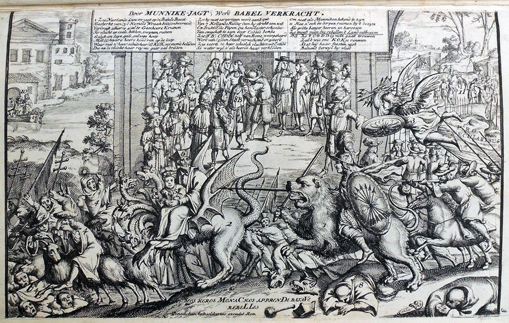
Thanks to the generosity of the Friends, the Graphic Arts Collection has acquired a rare set of Dutch satirical engravings under the title (in English): Rome Perturbed or the Catholic Church in an uproar, presented in ten emblems showing how the papacy, but especially the monks, trespass against the Ten commandments… The volume holds eleven engravings with accompanying verses in Dutch. The imprint is false, ascribed tentatively to the publisher Carel Allard, Amsterdam. The author is identified on the title page by initials only “L.V.J.” for Liefhebber van Jansenius (an anonymous friend of Jansenius).
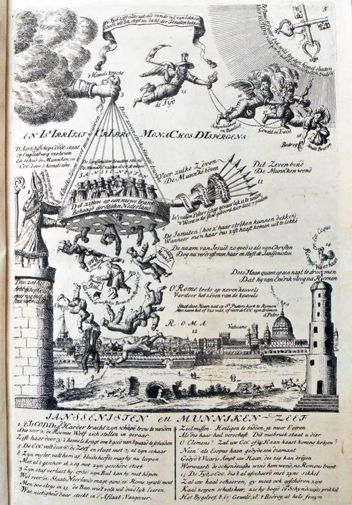

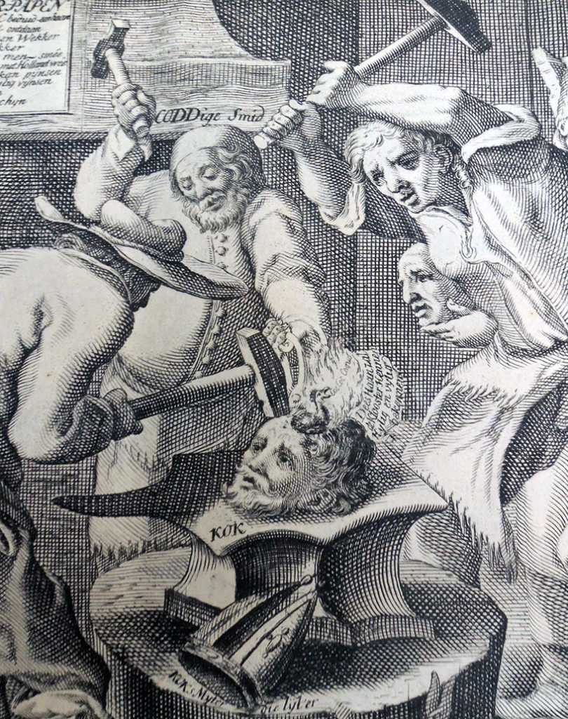
In his study Graphic Satire and Religious Change: The Dutch Republic, 1676-1707, Joke Spaans notes that Roma Perturbata was part of a media offensive against the Catholic Church, culminating in the schism between the Curia and the Dutch diocese in 1723. Apparently the book became something of a bestseller although copies are now extremely rare. This group of elaborate satirical prints focuses on Clement XI’s response to Jansenism in the Netherlands, with particular attention to Pieter Codde and his replacement Theodore de Coc.

The collected engravings went through two editions, one in 1706 consisting of eleven plates [now at Princeton], and an expanded edition with thirteen plates in 1707. Spaans writes

These ‘editions’ are not the fixed entities suggested by this term: the individual plates exist in several versions and the extant copies of the series show some variation in composition. This means that individual plates circulated independently before the series was conceived. The Allard firm collected these prints, altered them as and where they saw fit, and fleshed out the collection with other suitable material they had at hand.

They added a title page, on the reverse side of which they printed ten four-line stanzas that provide the reader with what amounts to a reasoned table of contents. This rhymed table interprets each of the emblems in turn within the wider context of the justification of Codde, the praise of the States of Holland for their support of the Clergy, and the vilification of DeCock, the Jesuits and the Pope and loosely connects them with the Ten Commandments, as referred to in the title of the series.

Spaans also notes that while there were many satirical pamphlets and broadside at this time of dubious quality, “all those in Roma Perturbata were intelligently made, and seem to have been destined for an audience of connoisseurs.”
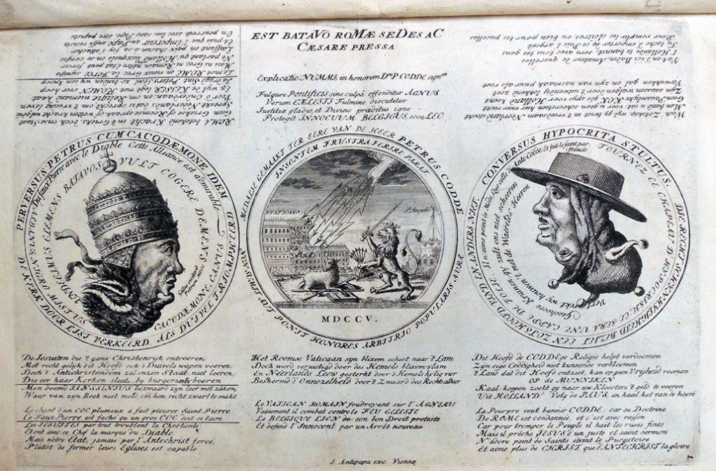
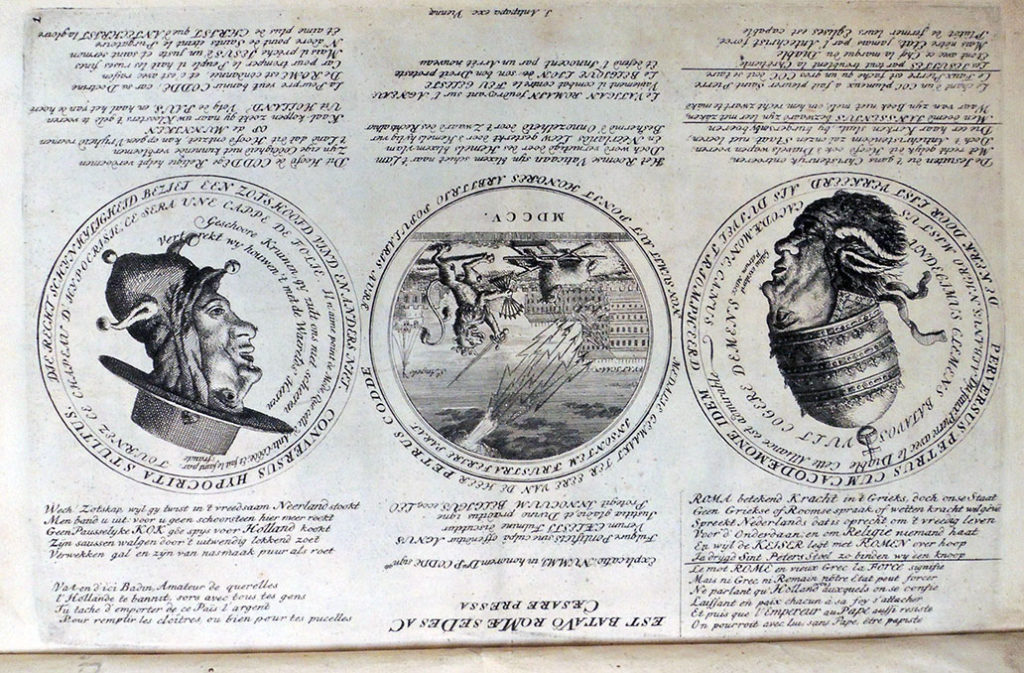


Roma perturbata, ofte ‘t Beroerde Romen, vertoond door x zinnebeelden, toegepast op de x Geboden, door die van ‘t Pausdom … doorgaans meest overtreeden, gelijk nu in de historien van P. Codde, en T. de Kok; waar in de hoogmoedigheid van de Paus … en zyn onmacht om ‘t gewaande recht uit te voeren … voor oogen gesteld worden. By een gesteld door L.V.J. en zijn medehelpers, etc. (Loven [Amsterdam?]: gedrukt ten koste van de Groote Compagnie [Carel Allard?], 1706).

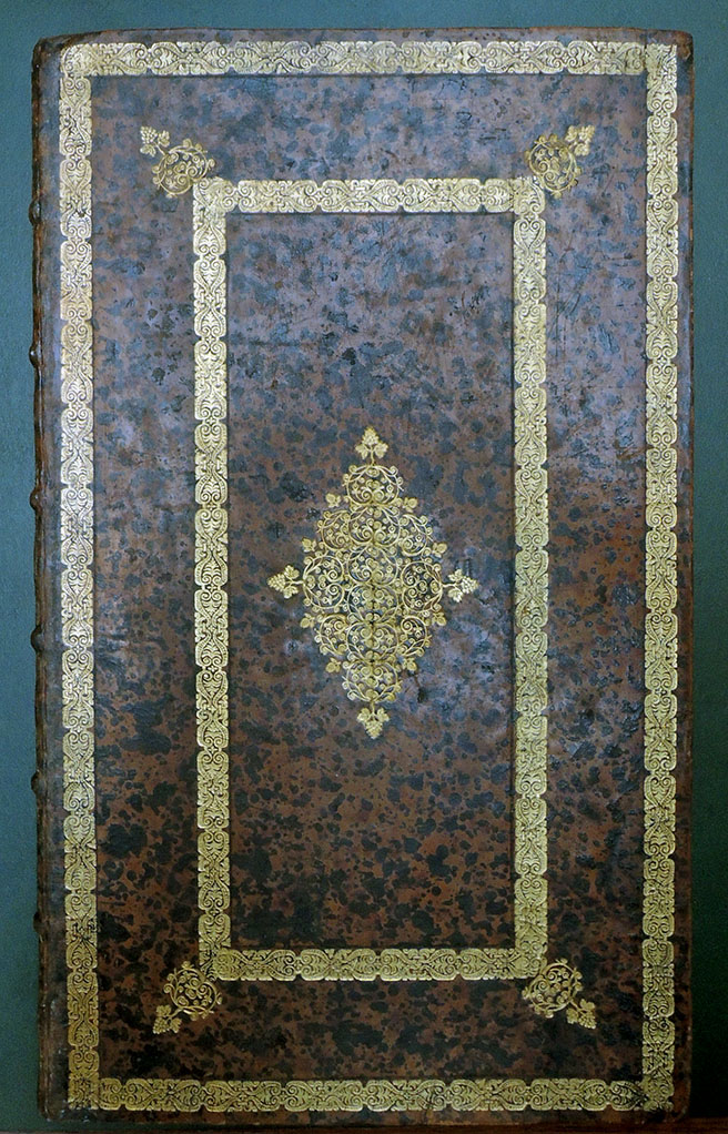
Small folio, 314 x 185 mm, bound in contemporary Dutch speckled calf. Provenance: Bibliotheca Abbatiae Vallis-Dei (Abbot of Gottesthal?), with their ex-libris on front pastedown and stamp of same on front and rear endpaper verso. Purchased with funds donated by the Friends of the Princeton University Library. Graphic Arts Collection GAX 2018- in process
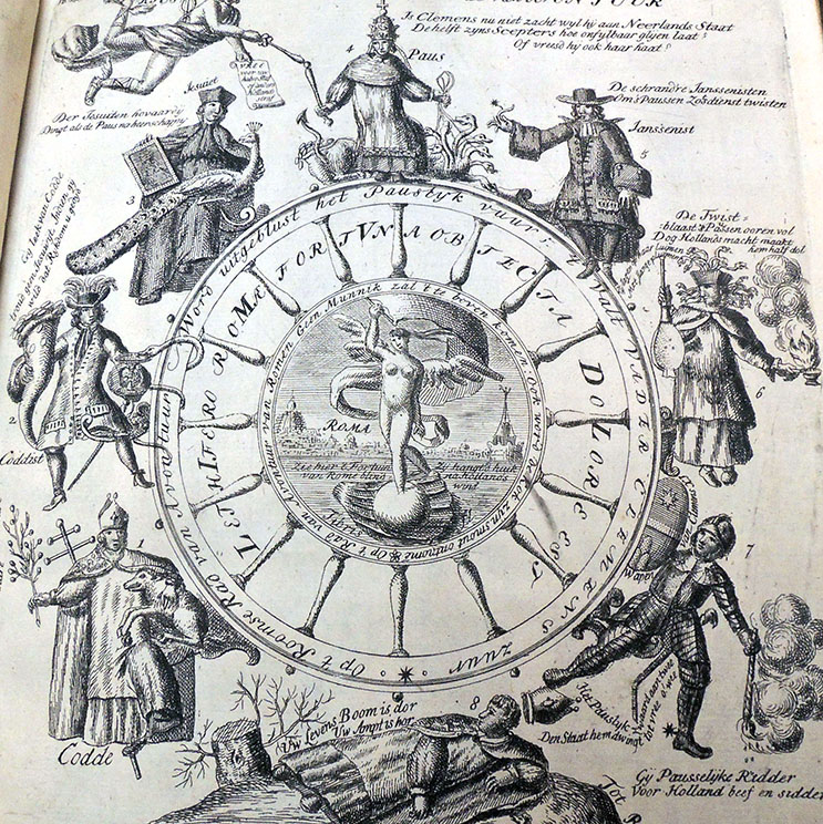
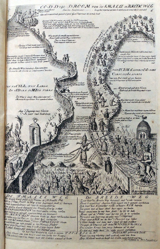


Given the rarity and uniqueness of each copy, the potential for new research is enormous. OCLC lists only six complete paper copies of the 1706 Roma Perturbata in public collections and none in North America. With current online records and limited published research, it is impossible to know which copies differ and to what extent. Since many of these prints are altered from the original, if in fact an original is known, the study of each impression is not only valuable but essential.

In his catalogue raisonné, Frederik Muller lists the plates of the 1707 publication under numbers 3410 a and b, 1-13, as follows:
Title page: letterpress, kept with the present print
Plate 1: Three medallions, Chronogram 1705
Plate 2: “De niewe Roomse kerktrophee”, Chronogram 1705
Plate 3: “Door Munneke jagt, wordt Babel verkracht”, Chronogram 1705
Plate 4: “Zinnebeeldig pourtret v.d. Ew.Hr. Theodorus de Coc”, Chronogram 1705
Plate 5: “Jansenisten en Munneken zeef”, Chronogram 1705
Plate 6: “Coddige droom van de smalle en brede weg”, Chronogram 1705
Plate 7: “Een Jansenist smeedt met zijn knapen…”, Chronogram 1705
Plate 8: “‘t Rooms Hollands Recht”, Chronogram 1705
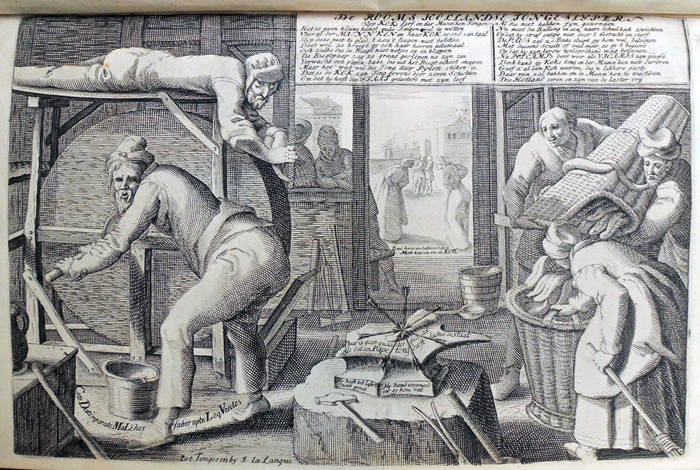
Plate 9: “De Rooms Hollandse Tongeslijper”, Chronogram 1705
Plate 10: “‘t Roomse Rad van Avontuur”, Chronogram 1706
Plate 11: “Coddig nachtgezicht”
Plate 12: “De Roomse Kerken-Visiteerder of de Ridder…” Chronogram 1706
Plate 13: “Sic itur ad astra scilicet”; “Rooms Cocceaans Munnike…”

However, these titles vary from the collection catalogue of the British Museum, which also gives lengthy visual descriptions of each plate, suggesting earlier versions and or variations on each theme. Until a compendium of all the extent copies can be attempted, each rare copy of Roma Perturbata in a public collection adds to the scholarship not only of the individual engravings but also to the publication history of the set.


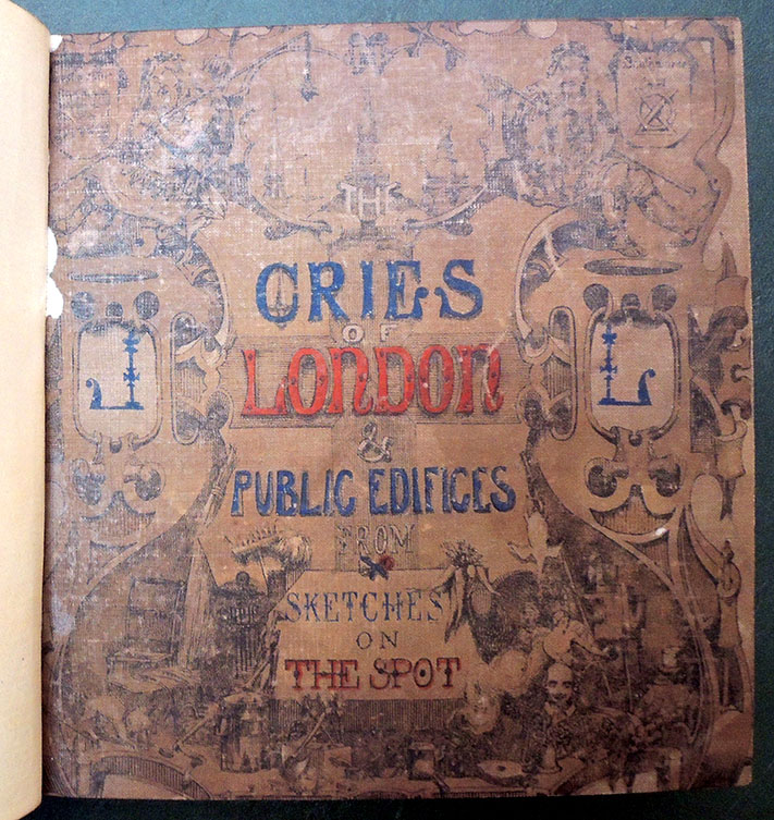
Rare London Cries

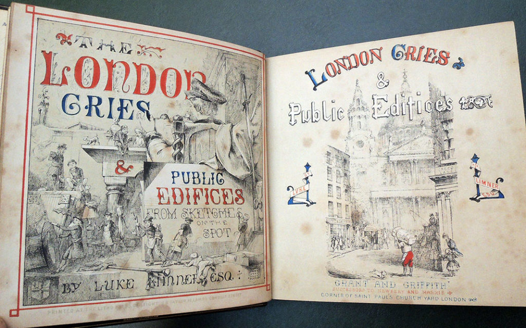
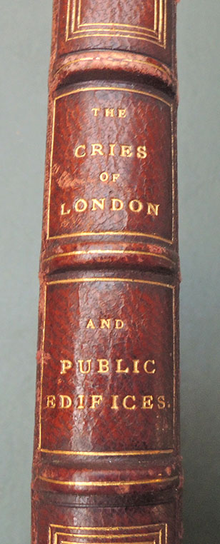
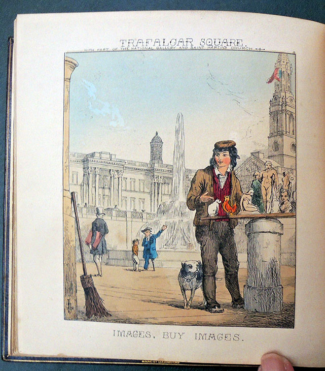
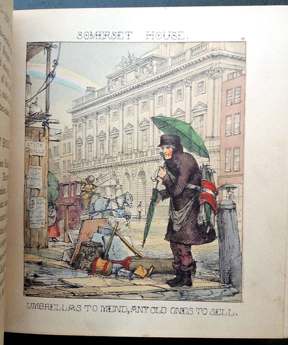
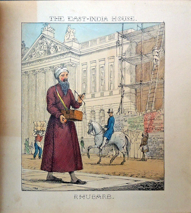
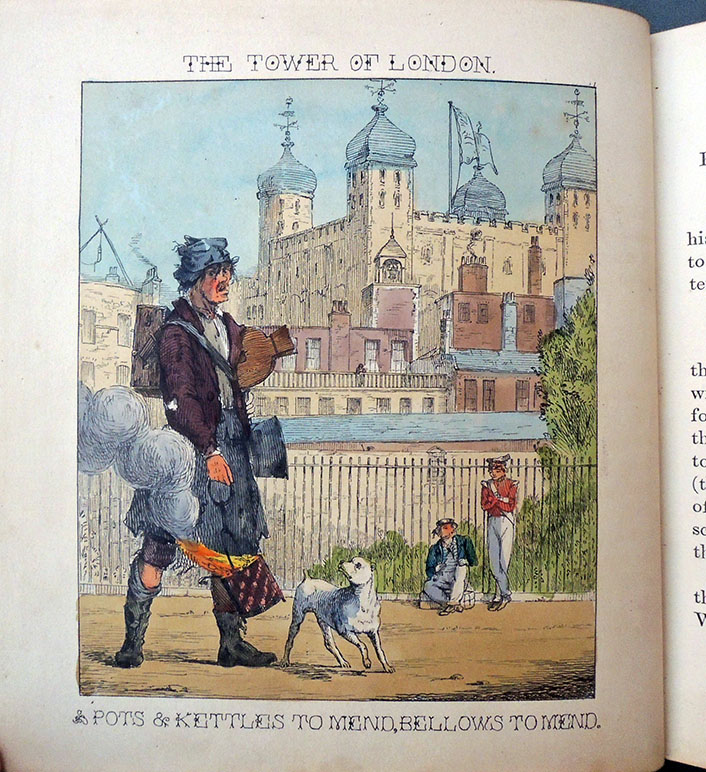
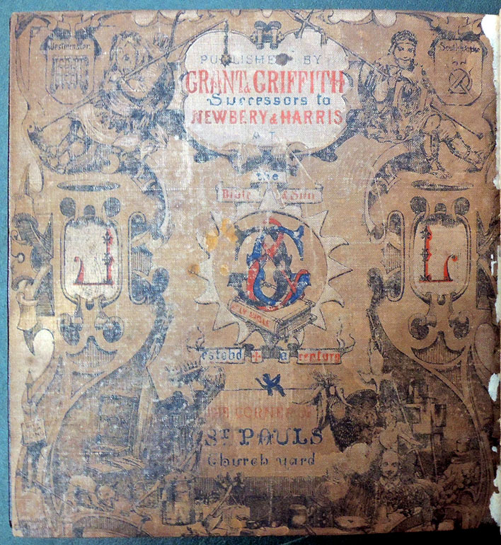
John Leighton [pseudonym Luke Limner] (1822–1912), London Cries & Public Edifices (London: Grant and Griffith, successors to Newberry and Marris, [1847]). Graphic Arts Collection GAX 2018- in process
Writing for the DNB, Edmund M. B. King notes “Leighton created over 400 cover designs in the 1850s and 1860s, some of which were for serial publications, though the majority of his work was for monographs. For The Keepsake his cover design was first used in 1849. It was repeated each year until 1857. He made different upper cover vignettes for each year of the Court Album from 1850 to 1855.

He carried out much work for two publishers in these years: for Griffith and Farran he made over forty designs; for Routledge he created over eighty. The series Routledge’s British Poets provides an early example of the reuse of vignette design by Leighton for many of the individual volumes published in the 1850s.

…Distinguishable by his sheer proficiency as well as by his artistic talent, Leighton’s work as a book illustrator also showed him capable of providing a rich vein of comic art in the 1840s and 1850s. He also created more studied work in the 1850s and 1860s, often within the prevailing fashion for gothic design and motifs. He designed covers for a wide range of subject material, including religion, engineering, history, natural history, and particularly imaginative literature. His commissions from a few publishers spanned many years. His cover and spine designs are frequently a marvel of intricate line within a confined space. Above all, Leighton provided designs that the publishers wanted, often incorporating deft touches of humour with a flourish.”

First published at the end of 1847, Leighton’s Cries was issued in three different formats, plain at 2s 6d; tinted at 5s; and hand colored at 7s 6d, which is the format the Graphic Arts Collection recently acquired. Beall E51; Hiler p. 536; Gumuchian 3700; and Lipperheide Gcb 19.

The Cries of London and Public Edifices [lithographic plate list]
The Tinker and the Tower of London
The East India House and Rhubarb
The Bank of England and Matches
The Royal Exchange and Oranges, Sweet St. Michael Oranges
The Mansion House and Buy a Cage . . .
Old College of Physicians and Old chairs to Mend . . .
Smithfield & Cat’s Meat! — Dog’s Meat!
St. Johns Gate, Clerkenwell, and Dust Oh!
Temple Bar & Pity the Poor Blind!
Somerset House & Umbrellas to Mend!
Covent Garden Theatre and the Costard-Monger
Trafalgar Square — Images! Buy Images
Charing Cross — Baked Potatoes, All Hot!
White Hall — Bow Pots!
Burlington House — Wild Duck, Rabbit, or Fowl!
St. George’s, Hanover Square — New Mackarel!
St. James’ Palace — Old Clothes!
Westminster Abbey — Milk Below!
Lambeth Palace — Water Cresses
New Hall, Lincolns Inn — Knifes and Scissors to Grind!
The Foundling Hospital — Sweep! — Soot Oh!
The North-Western Railway — Muffins! — Crumpets!
The Coliseum — Buy a Broom!


Maurice-Georges-Elie Lalau


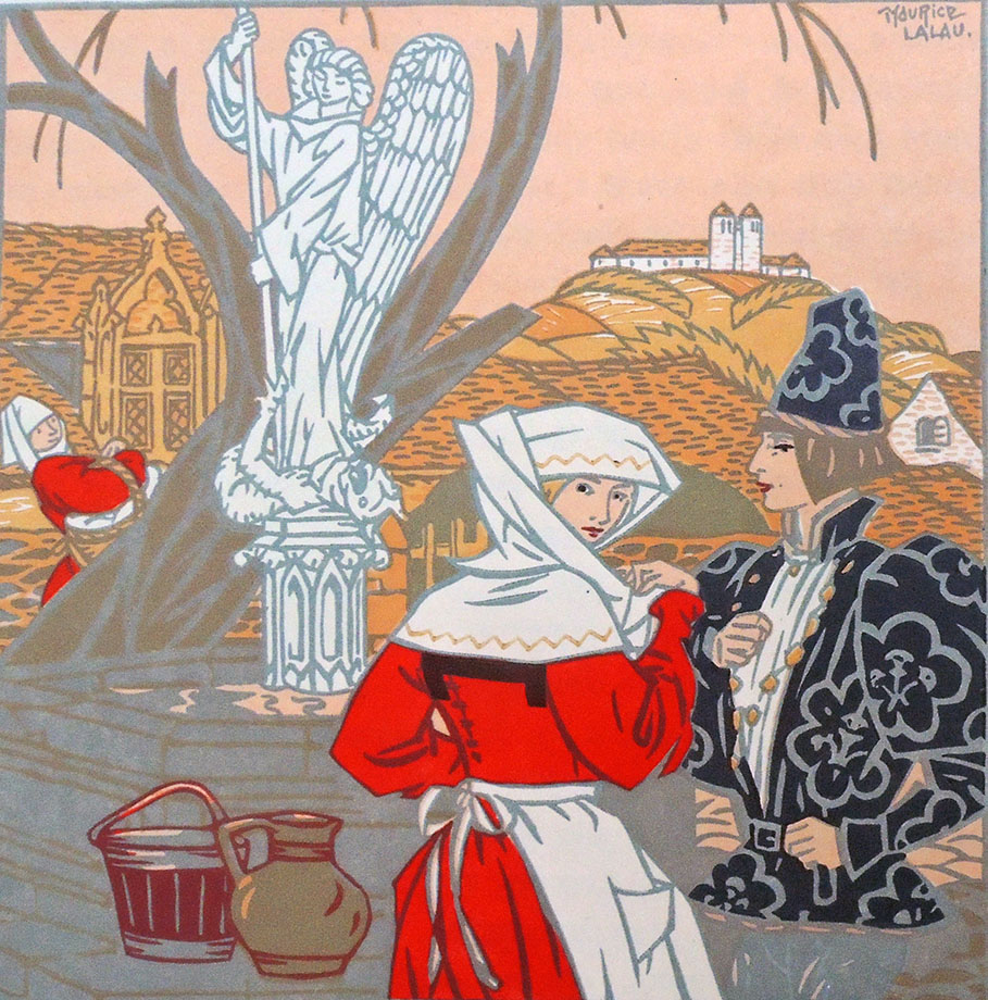
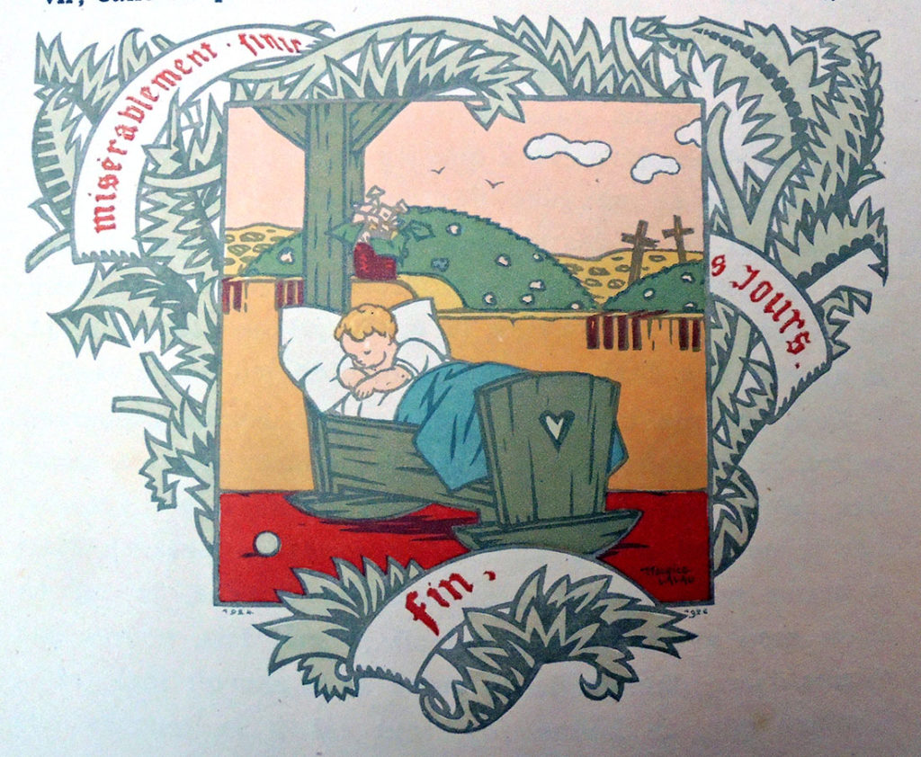
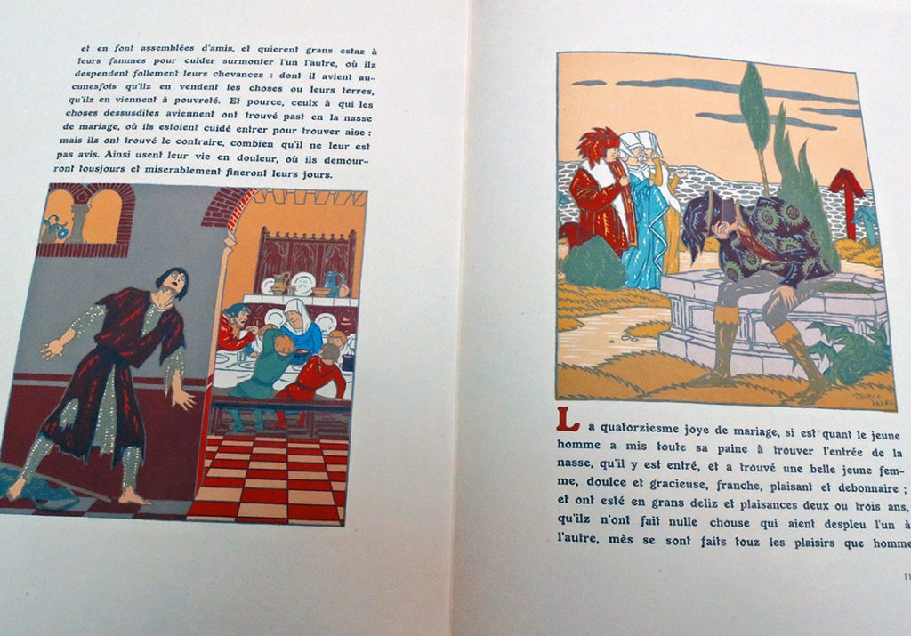
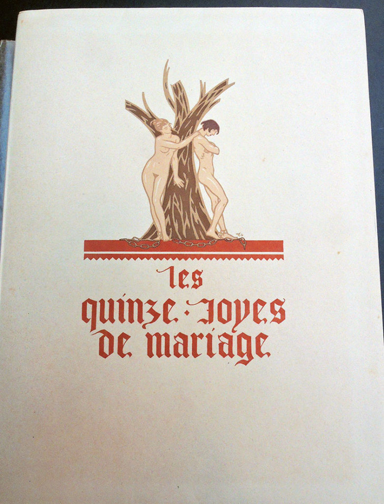
Maurice-Georges-Elie Lalau (1881-1961), Les quinze joyes de mariage … Edition conforme au manuscript de la Bibliothèque de Rouen avec un glossaire publié par Jules Meynial… (Paris, 1928). Copy 45 of 150. Graphic Arts Collection GAX 2018- in process

       
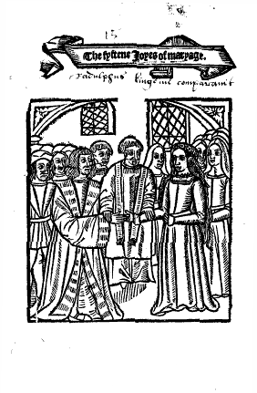
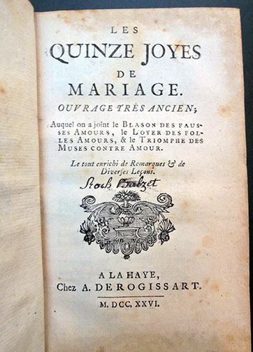
[left] Antoine de La Sale (born 1388?), The Fyftene Joyes of Maryage [Quinze joyes de mariage] ([London: Wynkyn de Worde, 1509]). [right] Les quinze joyes de mariage: ouvrage tres̀ ancien, auquel on a joint le Blason des fausses amours, le Loyer des folles amours, & le Triomphe des muses contre amour. Le tout enrichi de remarques & de diverses leçons (A La Haye: Chez A. De Rogissart, 1726). Rare Books 2004-0836N

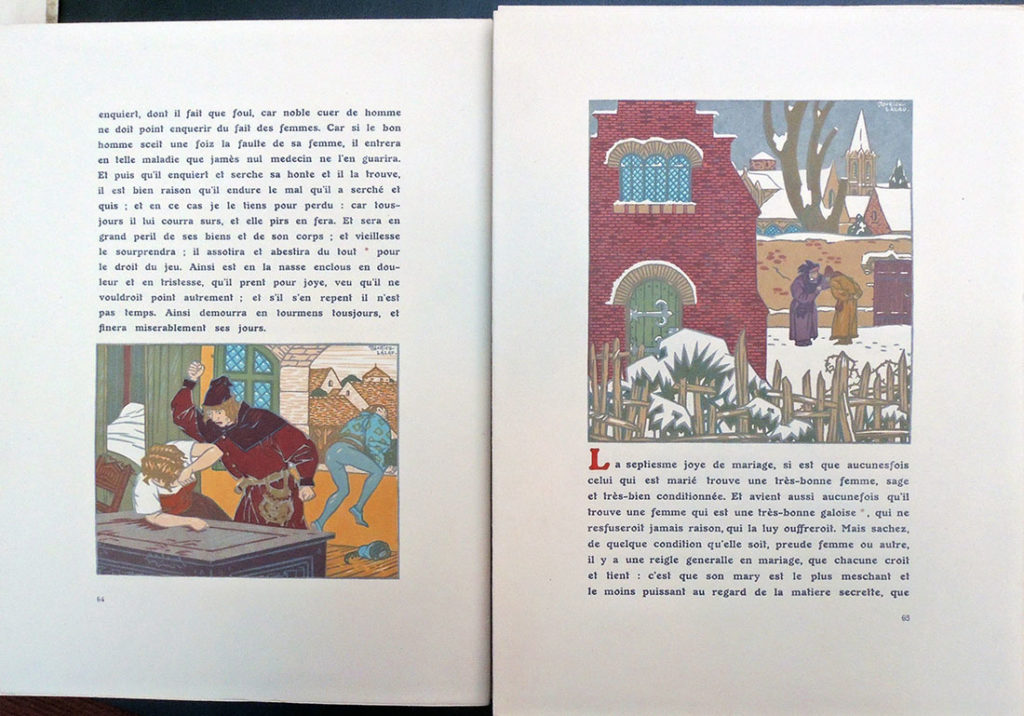
In 1926, Maurice Lalau and the bibliophile/publisher Jules Meynial formed a partnership to create a deluxe edition using innovative printing techniques. For their text, they chose Les quinze joyes, a Medieval satire on the tricks wives play on their husbands, sexual and otherwise.

A 1726 edition [above] has notes by le Duchat, who describes it as a favorite of ‘jeunes Courtisans François’ of the mid-fifteenth century. The work has been attributed to Antoine de la Sale and various dates have been suggested for its composition; le Duchat comes down in favor of the late fourteenth century. Wynkyn de Worde published a translation in English verse, The Fyftene Joyes of Maryage, at least as early as 1507, a fragment of that survives and a single complete copy of a 1509 reprint. STC 15257.5-15258

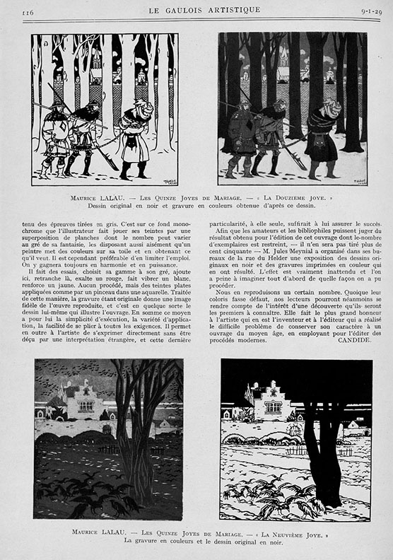
Lalau called his printing process, first seen with this volume, Graphichromie: “un moyen nouveau d’impression des illustrations en couleurs.” He designed and printed the edition of 150 copies, each with 37 plates, which means hand-printing 5,550 multi-color plates. The project took Lalau two years to complete. In addition, this copy has 37 single leaves, reproducing the illustrations in grey ink only (the initial color in the process).


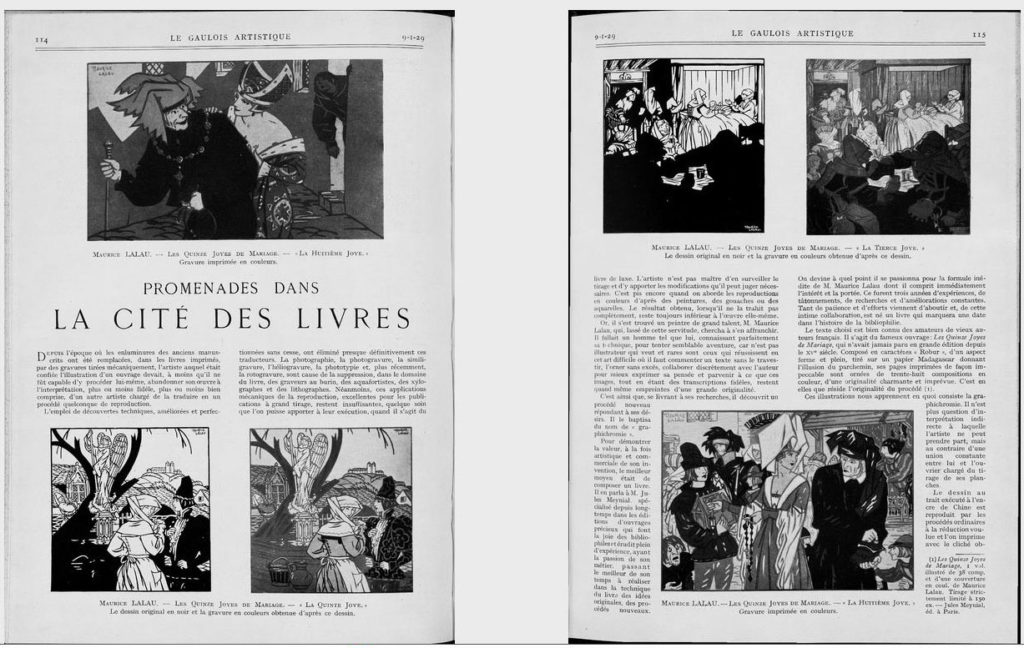
Their book was the subject of an article in the January 1929 issue of Le Gaulois artistique, [above and left] in which the author laments the suppression of traditional illustration processes in favor of newer mechanical techniques:

“L’emploi de découvertes techniques, améliorées et perfectionées sans cesse, ont éliminé presque définitivement ces traducteurs. La photographie, la photogravure, la similigravure, l’héliogravure, la phototype et, plus récemment, la rotogravure, sont cause de la suppression, dans la domaine du livre, des graveurs au burin, des aquafortistes, des xylographes et des lithographes.

Néanmoins, ces applications mécaniques de la reproduction, excellentes pour les publications à grand tirage, resente insuffisantes, quelque soin que l’on puisse apporter à leur execution, quand il s’agit du livre du luxe.”

Although the author disdains mechanical processes, in general, he praises Lalau’s technique for its insistence on intimacy between artist and workman:
“Il n’est plus question d’interprétation indirecte à laquelle l’artiste ne peut prendre part, mais au contraire d’une union constante entre lui et l’ouvrier chargé du tirage de ses planches.”

In addition, he compliments Lalau’s ability to convey the spirit of the Middle Ages through modern mechanical means: “Elle fait le plus grand honneur à l’artiste qui en est l’inventeur et à l’éditeur qui a réalisé le difficile problème de conserver son caractère à un ouvrage du moyen âge, en employant pour l’éditer des proceeds modernes.”


The War of the Worlds

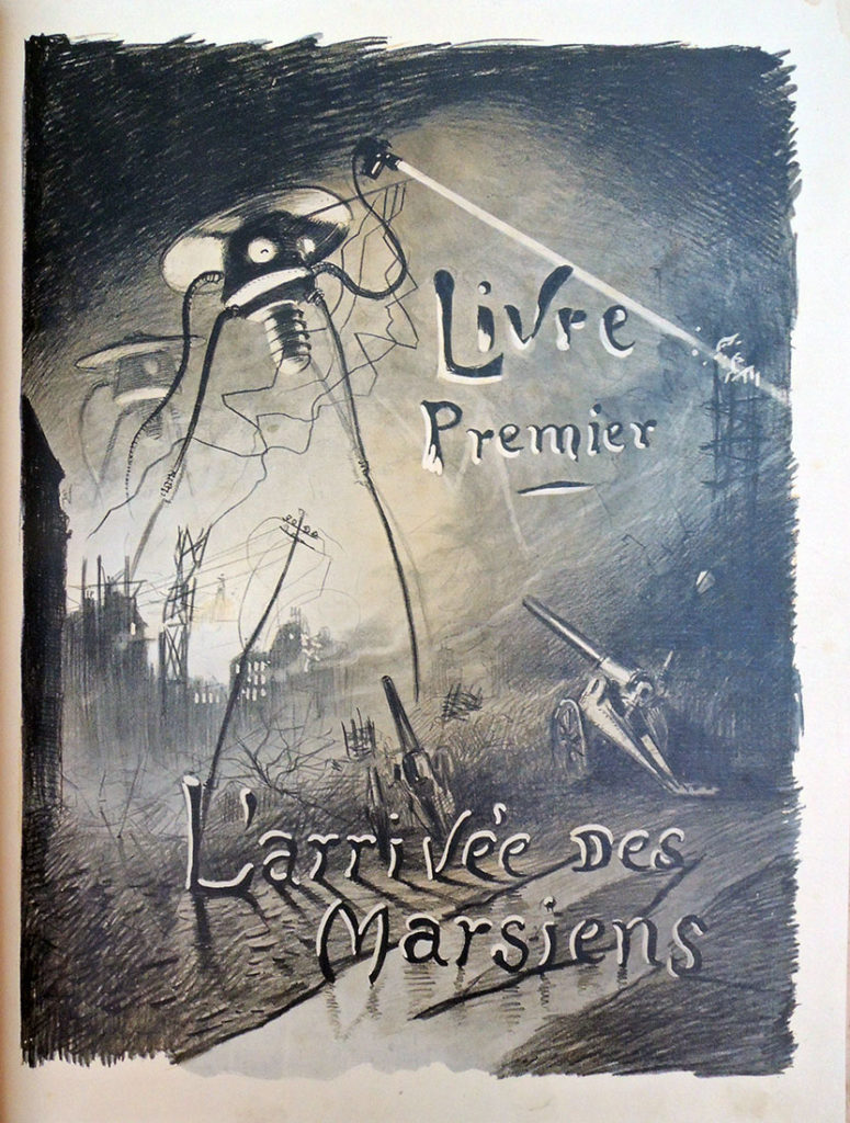
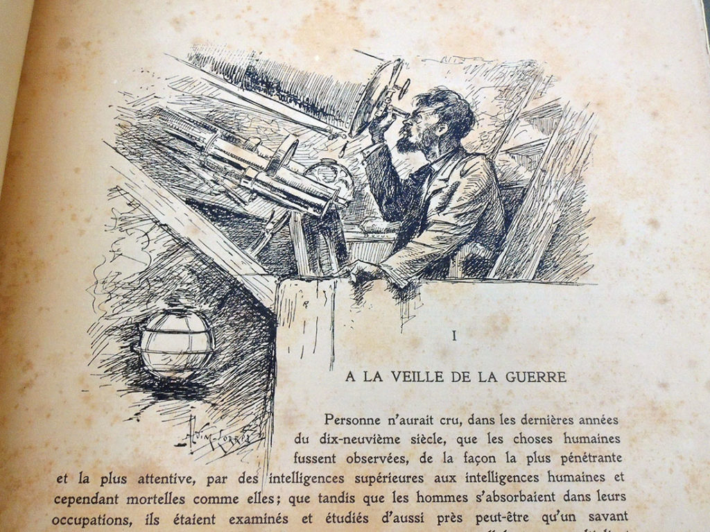
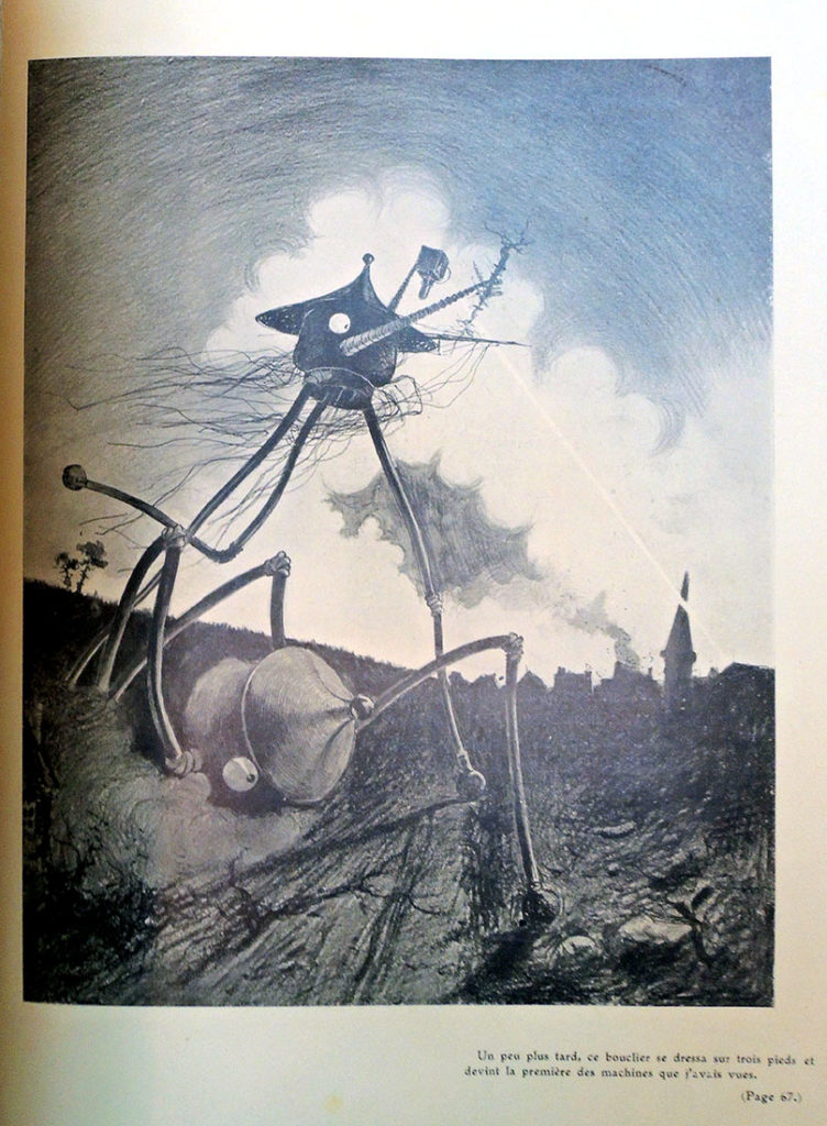
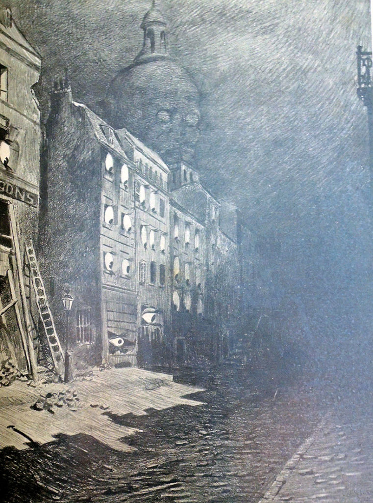
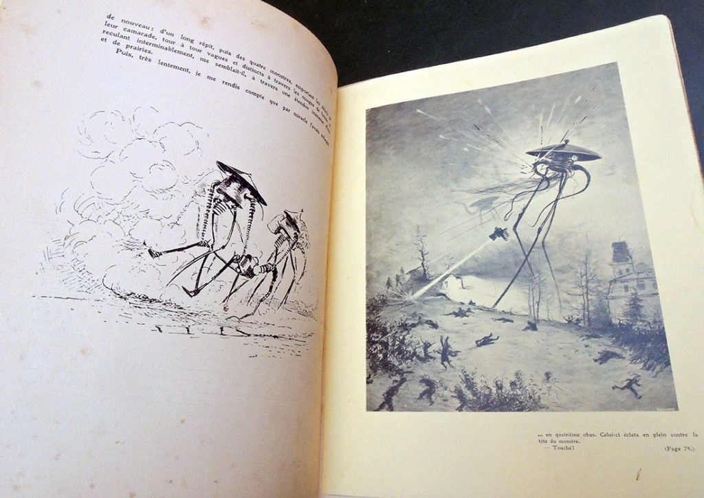
In 1904, Henrique Alvim Corrêa (1876-1910), a relatively unknown Brazilian artist living and working in Belgium, took a group of drawings to London and showed them to H.G. Wells (1866-1900). Alvim Corrêa’s work was inspired by the author’s 1897 story entitled “The War of the Worlds” and with no further information or persuasion, Wells commissioned him to illustrate a deluxe, limited edition of the novel. Over the next two years, Alvim Corrêa completed 32 drawing for the book published in 1906. The Graphic Arts Collection recently acquired one of the 500 rare copies of this illustrated book.

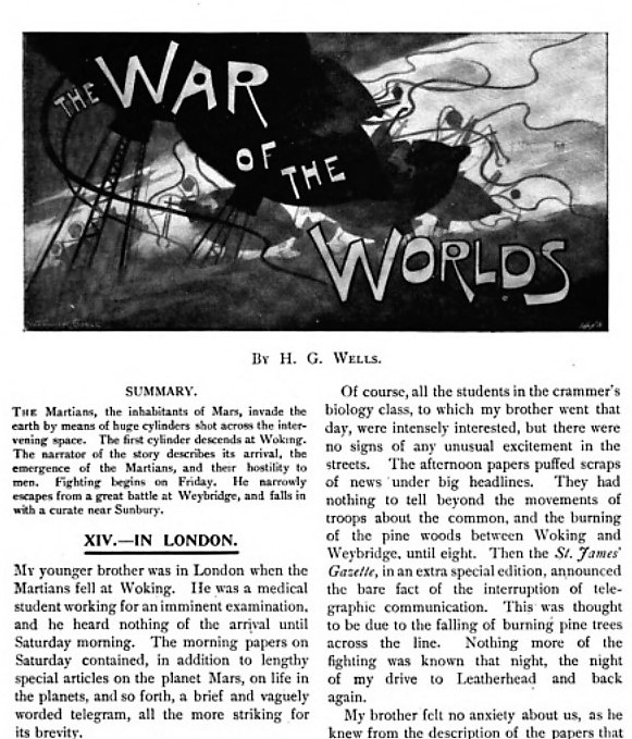
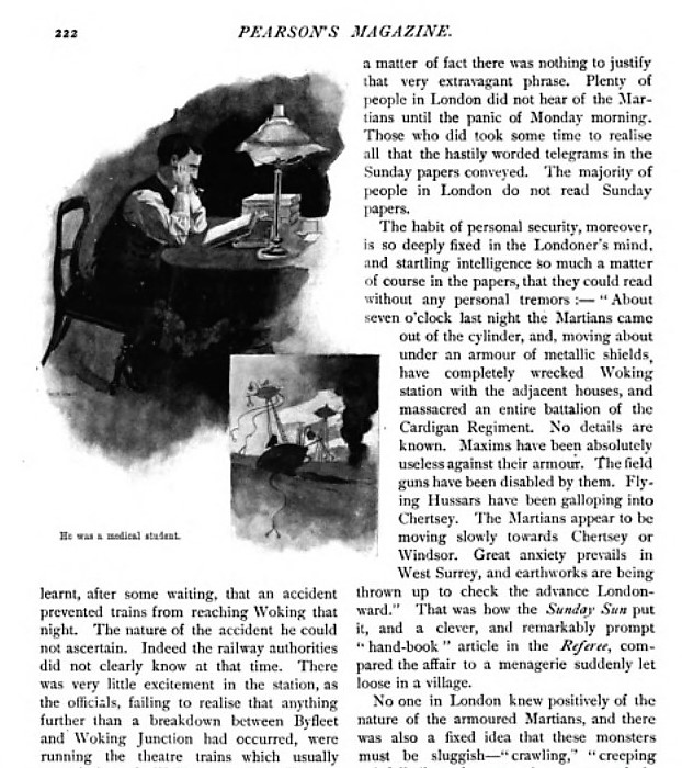
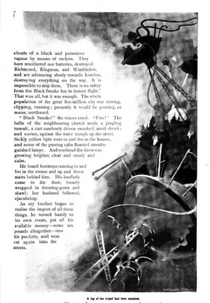
“The War of the Worlds” first appeared in Pearson’s Magazine [seen above] serialized from April to December 1897, together with illustrations by Warwick Goble (1862-1943), best known today for his fairy tales and other children’s books. The two versions are quite similar.


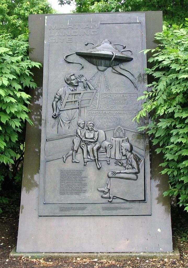
Eighty years ago, Orson Welles and the Mercury Theatre radio hour performed a Halloween adaptation of H. G. Wells’ The War of the Worlds, which many listeners took as fact and panicked. A reporter (Orson Welles) told the audience that something had fallen or landed in Grover’s Mill (just east of the Princeton Junction train station) and over the next hour it was discovered that giant Martian war machines were attacking the United States. Today, a carved stone marks the site of the fictional landing.

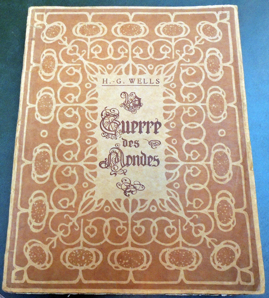
H. G. Wells (1866-1946), La guerre des mondes. Traduit de l’anglais par Henry-D. Davray. édition illustreé par Alvim-Corrêa (Bruxelles: Vandamme & Co., 1906). Graphic Arts Collection GAX 2018- in process


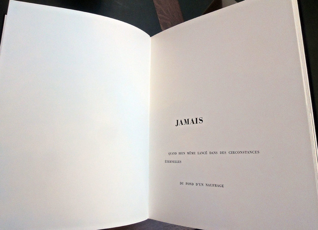
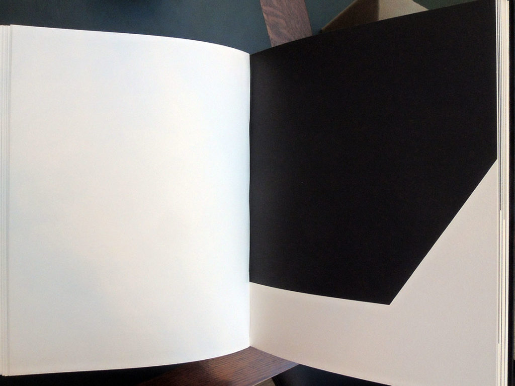
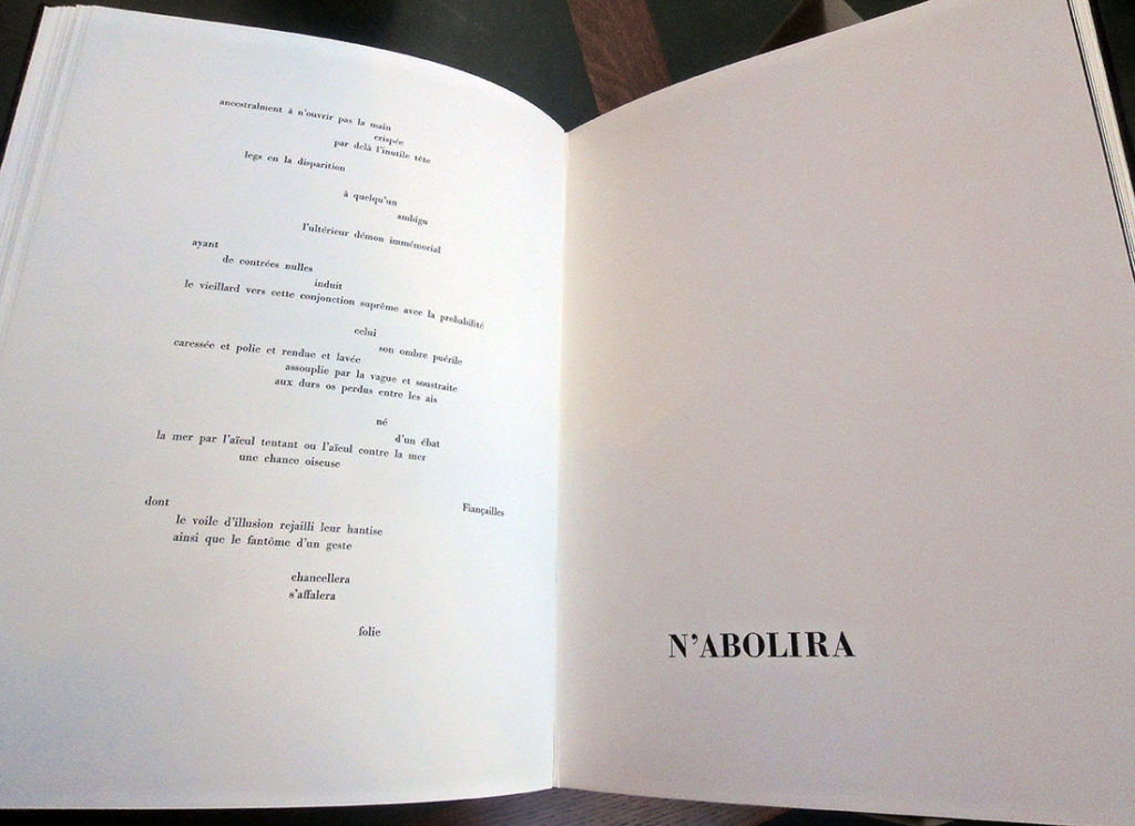
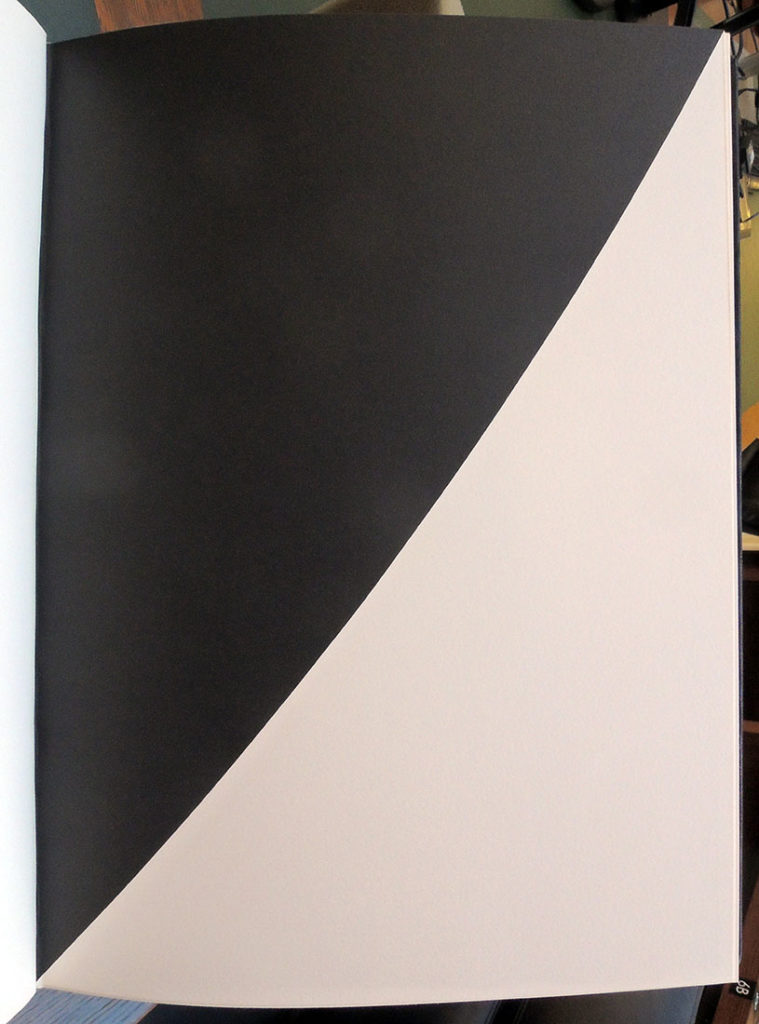
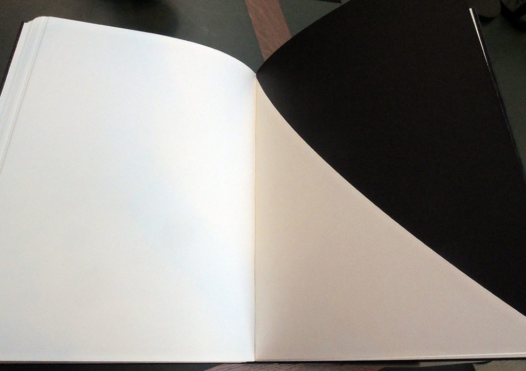
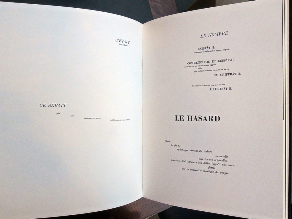
Ellsworth Kelly’s Un Coup de dés


When publisher Sidney Shiff commissioned Ellsworth Kelly to select a text and create prints for a Limited Editions Club book, Kelly chose to match his black and white lithographs with Un coup de dés by Stéphane Mallarmé, one of the most famous poems of the 19th century. In its 63rd year, the Club was publishing only three or four titles each year in editions of 300, unlike the earlier runs of 2,000 under George Macy. This allowed Shiff to work with outstanding artists and create some of the most beautiful books of the late 20th and early 21st century.

Published in the original French and the original page design, Kelly integrated his eleven lithographs with the text, accentuating the open white space of both text and images. A separate booklet with Daisy Aldan’s English language translation is included: mallarme

“A throw of the dice never even when cast in eternal circumstances at the heart of a shipwreck let it be that the Abyss whitened slack raging under an incline desperately soars by its own wing…”


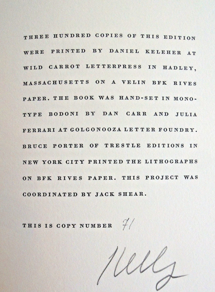
Stéphane Mallarmé (1842-1898) and Ellsworth Kelly (1923-2015), Un coup de dés jamais n’abolira le hasard ([New York]: Limited Editions Club, 1992). Text printed at Wild Carrot Letterpress and lithographs printed at Trestle Editions. Copy 71 of 300. Original black goatskin, in black solander box. Graphic Arts Collection GAX 2018- in process.
The Dark Plates of Phiz

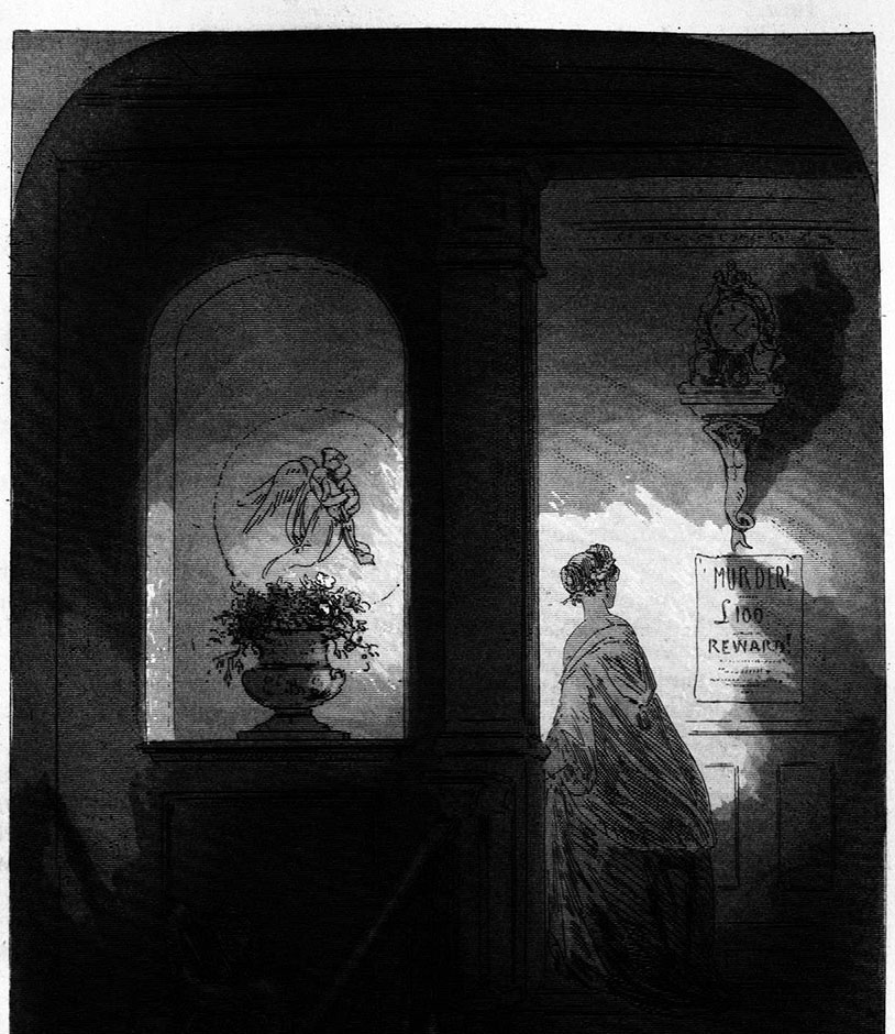
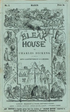
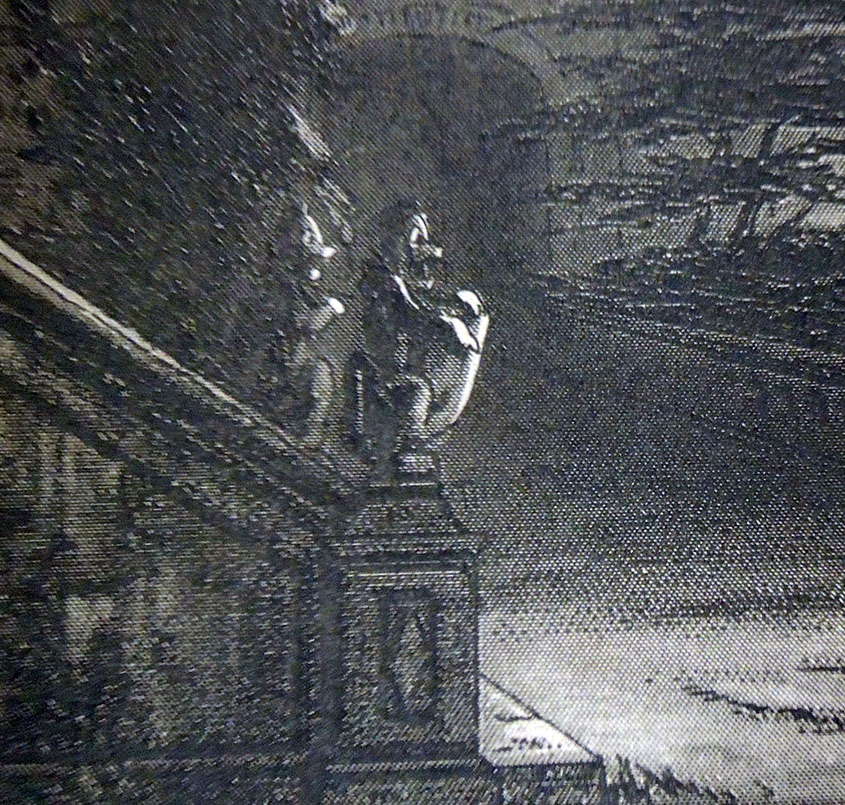
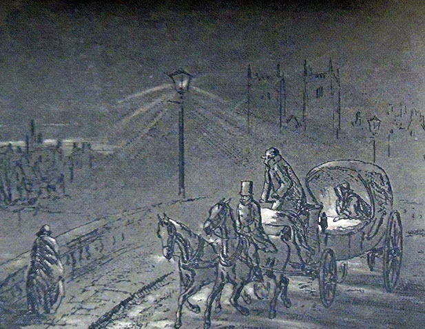
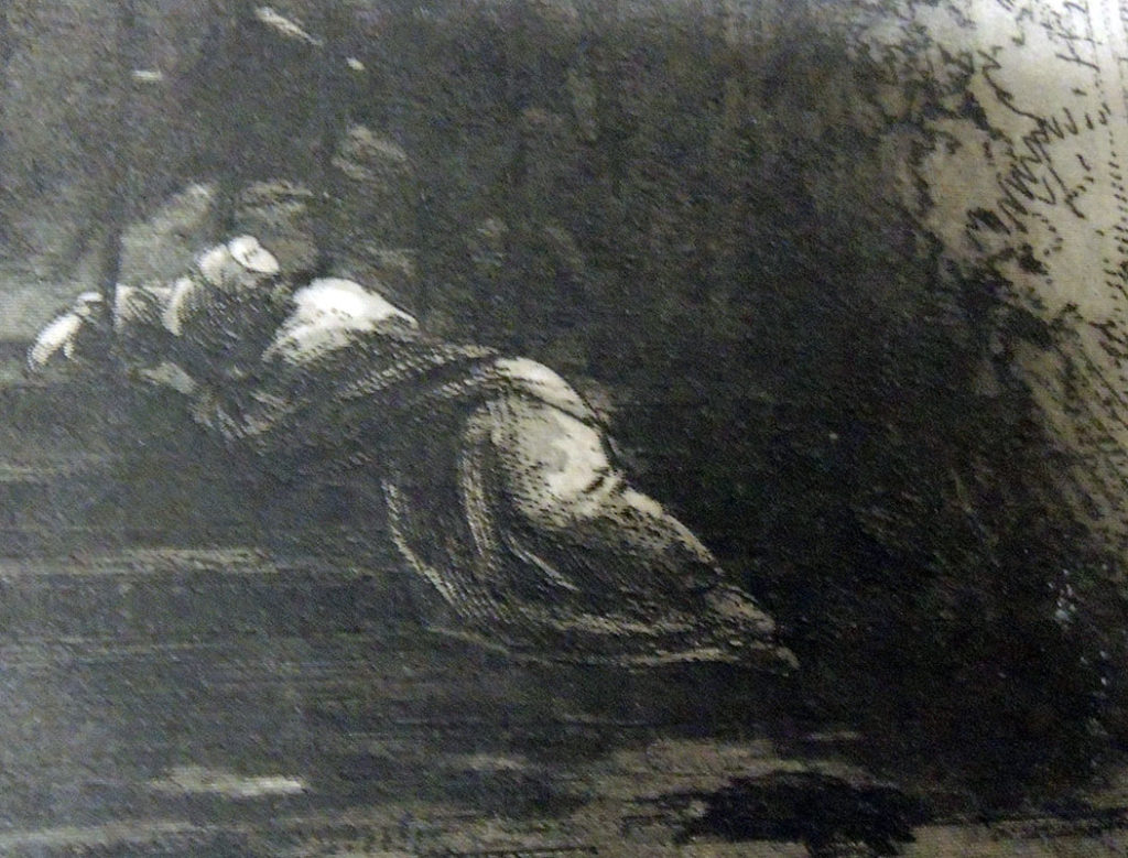
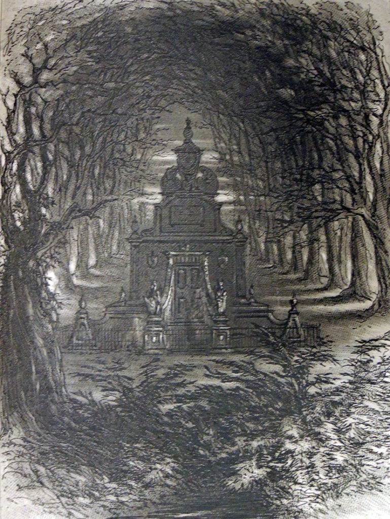
Preparing for a visit from ART 561/ENG 549/FRE 561 “Painting and Literature in Nineteenth-Century France and England,” the prints of Hablot Knight Browne (Phiz) for Charles Dickens’ Bleak House have been pulled. Phiz completed forty plates, etched on steel, for Dickens’ ninth novel published in monthly parts from March 1852 to September 1853.


Both for the added mystery and to thwart the lithographers who made copies of Browne’s superb etchings, the artist developed a technique for what we refer to as the ‘dark plates.’

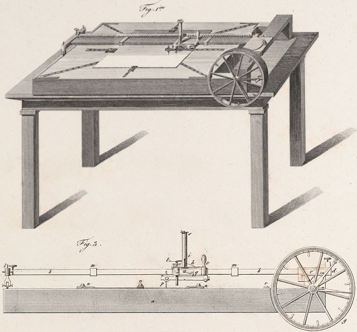
In ten of the forty illustrations, Browne merged the meticulous engraved lines made by an engraving- or ruling-machine with the hand drawn lines of his etching needle to create the look of a mezzotint with the detail and freedom of a drypoint.
Engraving on steel had only recently been perfected. In 1895, C. W. Dickinson wrote an easy to understand description of “Copper, steel and bank-note engraving,” quoted here:

“Previous to the year 1830 only copper plate was used by engravers, because up to that time it was not thought possible to make steel soft enough to cut easily and smoothly. The first plate produced—that could be used—was called “silver steel.” Later there was manufactured the “Prussian steel” plate, which was a slight improvement in fineness of grain. Other and greater improvements followed, until now steel has almost entirely superseded copper.

Decarbonated cast steel is used for general engraving purposes and must be of very fine grain, and very soft as compared with natural cast steel. The plates are rolled out from bars of steel in its natural state, then decarbonated and cut to about the size desired, leaving enough margin to square the edges, which are finished with a wide bevel. After the plate has been cut to size, it is flattened by laying it upon a copper anvil and hammering with a wooden mallet until it is as flat as is possible to get it by that process. A uniform thickness and perfectly flat surface are then given to the plate by grinding—sometimes by hand, usually by machine—the latter process being the better, as it is the more perfect in its results.”
https://en.wikisource.org/wiki/Popular_Science_Monthly/Volume_46/March_1895/Copper,_Steel,_and_Bank-Note_Engraving

Also in the early 19th-century ruling machines for engravers were being up-graded, in particular to accommodate  enormous publishing project such as Napoleon’s Description de l’Égypte. As improved and enhanced by Nicolas Conté, the French engraving machine was invaluable for the thousands of lines incorporated into the skies and landscapes within his designs. Here’s an image: https://napoleon.lindahall.org/engraving.shtml

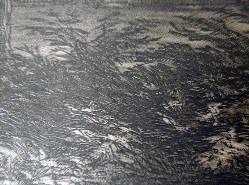
A diamond was often used as the stylist on the engraving machines, hard enough to cut but thin enough to draw the slender marks that left the impression of a tint or tone rather than line. Here are a few close ups that make it easier to see the hundreds of tiny straight lines behind Browne’s linear picture.


The Pencil of Nature

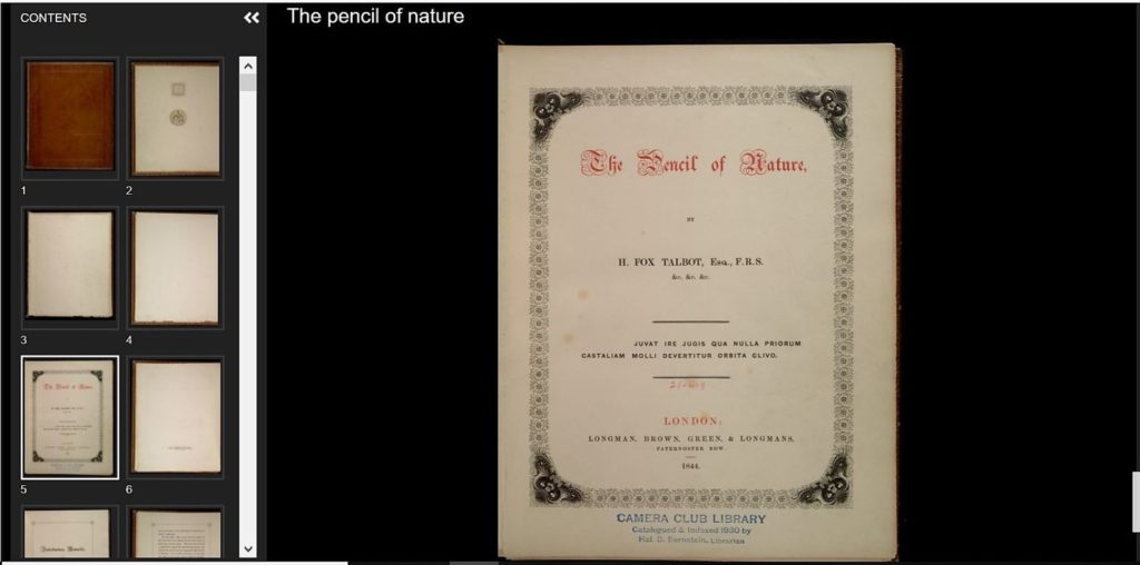
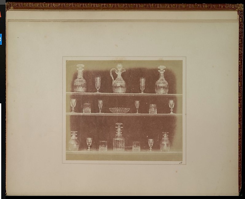
Princeton has just added our superb copy of William Henry Fox Talbot’s The Pencil of Nature, a gift of David H. McAlpin, class of 1920, to our other Talbot prints included in the William Henry Fox Talbot Catalogue Raisonné, begun by Larry Schaaf and now based at Oxford’s Bodleian Libraries. The entire volume, https://catalog.princeton.edu/catalog/3696558#view, can be viewed and downloaded for study around the world. This copy has the bookplate of William Twopeny, and the property stamp of the New York City Camera Club Library (catalogued & indexed 1930 by Hal. D. Bernstein, librarian), which was purchased and given to Princeton University by McAlpin.

William Twopeny (printmaker; painter/draughtsman; British; Male; 1797-1873). Twopeny, not Twopenny. Lawyer; amateur antiquarian draughtsman and printmaker, specialising in architectural subjects. A very large collection of his drawings was given to the BM in 1874 by Edward Twopeny, his son: see 1874,0214.104 to 1937 and Binyon IV pp.214-43. For Twopeny’s own catalogue see two volumes in the P&D library. See also a letter dated March 10th 1845 from Albert Way (q.v.) in which he refers to Mr Twopenny of [Lambs] building living at Inner Temple (archives of Department of Britain, Europe and Prehistory)–British Museum

Johann Ehrenfried Weishaupt, ten years a slave in Tunisia

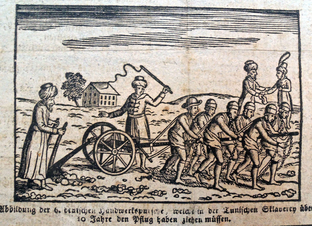
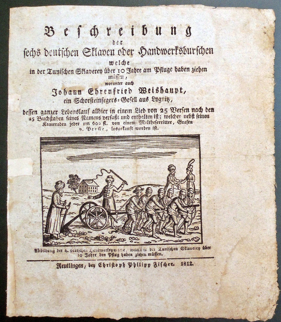
On the title page of this 1812 ballad is a woodcut depicting six Germans pulling a plough while turbaned slave owners harass them. In the top right, a nobleman pays for their release, including Johann Ehrenfried Weishaupt who might be the one slave with a different hat.

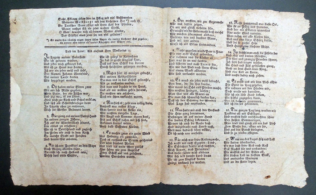
Beschreibung der sechs deutschen Sklaven oder Handwerksburschen welche in der Tunischen Sklaverey über 10 Jahr am Pfluge haben ziehen muessen, worunter auch Johann Ehrenfried Weishaupt ein Schornsteingfegers-Gesell aus Lygnitz, dessen ganzer Lebenlauf allhier in einem Lied von 25 Versen … [The Description of Six German Slaves or Craftsmen Who Had to Pull on the Plow in Tunisian Slavery For Over 10 Years, Among Them Johann Ehrenfried Weishaupt a [?Schornsteingfegers-Gesell] from Lygnitz, Whose Whole Life Is Told Here in a Song With 25 Verses …] Reutlingen, bey Christoph Philipp Fischer, 1812. Graphic Arts Collection GAX 2018- in process

The Graphic Arts Collection recently acquired a very rare first edition of this ballad, which we are told was performed at fairs singing to the tune of Als einstens Herr Merkurius. The anonymous author used as his source text the self-published story of the apprentice chimney sweep Johann Ehrenfried Weishaupt who was abducted and spent ten years as a slave in Tunisia before being freed by a Maltese nobleman, returning to his native village in Silesia. The source text is also very rare: Beweinungswürdige Schicksale Johann Ehrenfried Weishaupt aus Liegnitz in Schlesien. Von ihm selbst aufgesetzt, first published 1789, with a second edition in 1795. No copies can be found in the United States.

Th printed ballad is also a type of acrostic, with the first letter of each of the 25 verses spelling out Johann Ehrenfried Weishaupt’s name, the subject of the narrative.


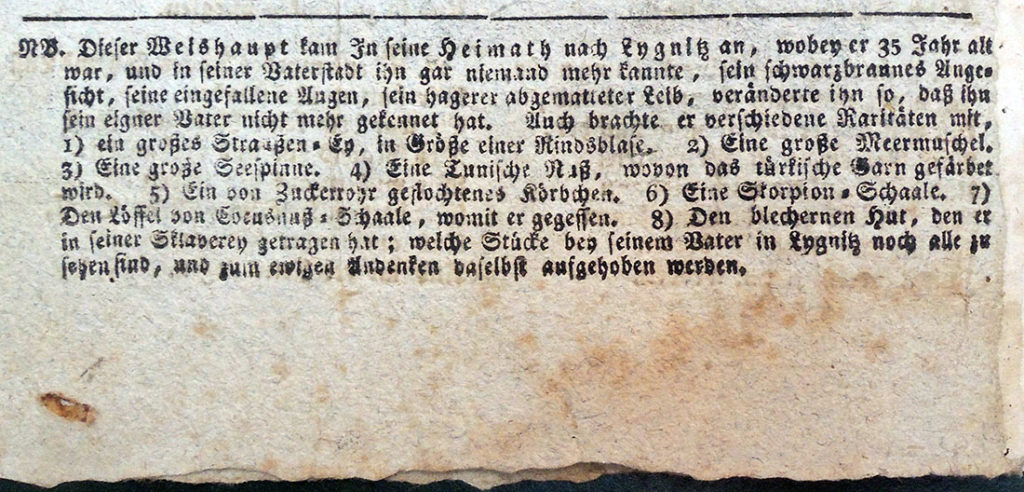
The pamphlet has a long printed note at end, which tells the reader that when he returned, Weishaupt set up a small cabinet in his father’s house with the curiosities from his time in the Middle East: an ostrich egg; a large sea shell; a large spider crab; a ‘Tunisian’ nut from which the Turks derive color; a basket woven from sugar cane; the shell of a large scorpion; the curiously shaped spoon from which he ate while in captivity; and the curiously shaped metal hat he was forced to wear. I’m told the curiosity cabinet can still be inspected but I haven’t been able to find a reference online.

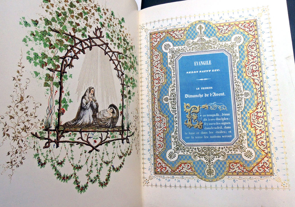
Gospels for Sundays and Saints Days

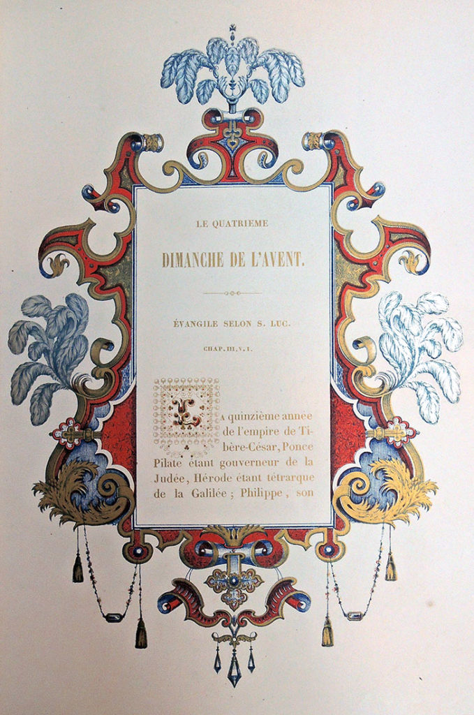
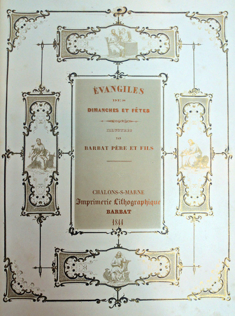
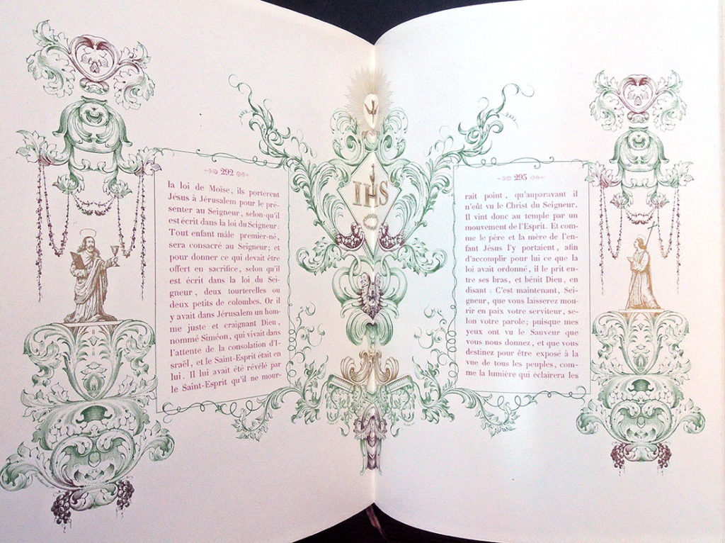
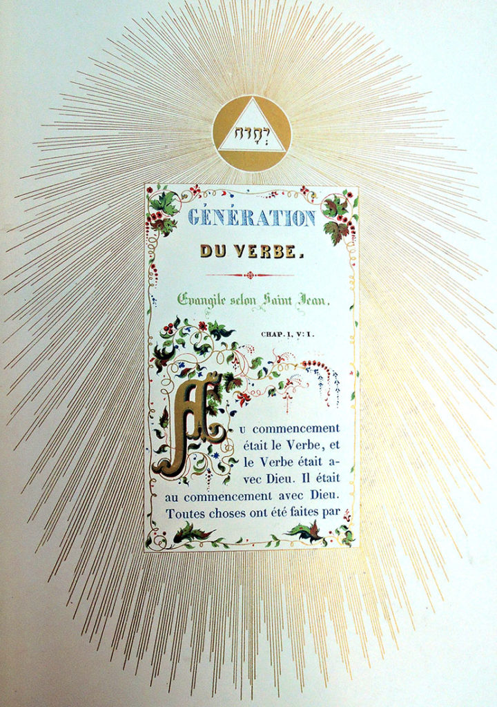
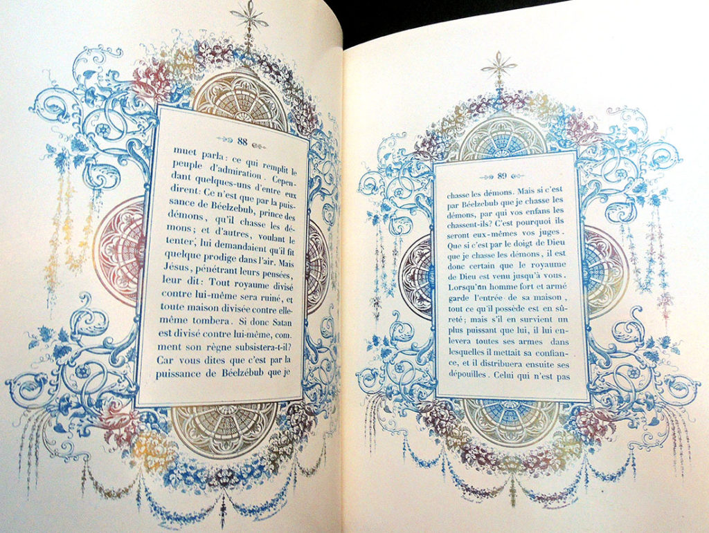
Louis Barbat ( 1795-1870), Évangiles de Dimanches et fêtes. Illustrés par Barbat père et fils (Chalons-S-Marne: Imprimerie Lithographique Barbat, 1844). Graphic Arts Collection GAX 2018- in process


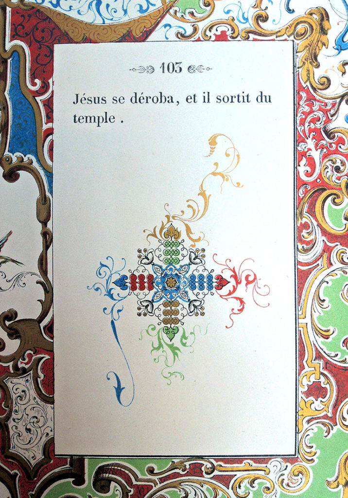
OCLC lists fewer than a dozen copies of Barbat’s masterpiece of early lithographic printing in libraries worldwide and so, it is a treat to have acquired a copy for the Graphic Arts Collection. In his discussion of 19th-century printing on coated or enameled papers, Michael Twyman mentions two reasons for using “carton porcelaine” as Barbat does with this volume: First because when powdered colors were used, its smooth surface made it easier to brush away the powder from unwanted areas and second, because the coating limited the amount of water that was absorbed in the course of printing. The two notable publications he sites that made use of such paper are Midolle’s Recueil, ou, alphabet de lettres initials historiques (1846) and Barbat’s Évangiles seen here.


Louis Barbat and his son Pierre-Michael opened their shop in 1833 after several years experimenting with lithography. On January 3, 1834, they received a patent to adapt a printing press to print several colors simultaneously. Barbat’s entry for the 1839 Paris exposition, which included some of the title pages for the Évangiles, was praised for his color printing and at the 1844 Paris exposition the completed Évangiles was awarded a silver medal.

Twyman notes that Évangiles “was very much a family undertaking and, in addition to a prominent reference to the Barbat name on both the imprint page and title-page, Barbat, P. Barbat, and Barbat fils are acknowledged as designers at the foot of many borders. This suggests that, like many other lithographic establishments of the day, the ‘Imprimerie lithographique Barbat’ was very much artist-driven.” Interesting to note this on the eve of the artist’s book fair where the artists’ book are frequently defined as beginning in 1965.

Although our collection holds a number of printed labels and Belgian “carton porcelaine” trade cards, we do not have any of Barbat’s metallic wine labels for the Champagne merchants. This would be a wonderful addition, if anyone has any left-over bottles.


See also:

Michael Twyman, A History of Chromolithography, Graphic Arts: Reference Collection Oversize NE2500.T8 2013, pp. 166, 180-81, 191, 275-77, 432, 521; plates 136 & 355.

Sorbonne on-line Dictionnaire des Imprimeurs-lithographes du XIXe siècle. http://elec.enc.sorbonne.fr/imprimeurs/node/25137