Category Archives: Illustrated books

illustrated books

The Awful German Language


In 1880, Mark Twain (1835-1910) published A Tramp Abroad, about a trip through Central and Southern Europe. The first half covers South-Western Germany, where Twain had issues with the language. A commentary expressing his opinions on German was added as Appendix D: “The Awful German Language.”

Twain expanded on this with an essay that became a wonderful lecture titled Die Schrecken der deutschen Sprache (The Horrors of the German Language), which Twain was often called on to repeat.

German artist and printer Eckhard Froeschlin, who runs Edition Schwarze Seite, was inspired by Twain to create a contemporary fine press edition entitled An Awful German Language (2018), recently acquired by the Graphic Arts Collection. http://www.froeschlin-edition.de/seiten/ed_buecher/2018_TWAIN.pdf

“I heard a Californian student in Heidelberg,” writes Frieschlin, “say, in one of his calmest moods, that he would rather decline two drinks than one German adjective.“ Twain’s text appears in excerpts, accompanied by mezzotint etchings, which Froeschlin created while traveling in California and New England. Bet his English was perfect.


Electroblock printing, with no electricity

John Leech (1817-1864), Contemplating a Day’s Fishing, Mr. Briggs Gets His Tackle in Order, and Trys the Management of His Running Line, ca. 1860. Watercolor. Graphic Arts Collection GA 2006.02345. sheet: 25 x 27.8 cm.

John Leech (1817-1864), Mr. Briggs & His Doings. Fishing (London, Bradbury & Evans [1860]). Electroblock print. Otto von Kienbusch Angling Collection Oversize 2003-0004F. sheet: 33 x 47 cm.

In the summer of 1862, an exhibition entitled “Sketches in Oil” was held at The Egyptian Hall on Piccadilly in London. Although the designs by John Leech (1817-1864) were fun to see (primarily cartoons for Punch), it was the reproduction process that drew insiders to the show.

The process, Electroblock Printing, had been developed to ingeniously enlarge and transfer images to canvas or lithographic stones or other mediums. Despite the name, the technique required no electricity. An impression was taken from the original wood blocks or other medium onto rubber (or a sheet of caoutchouc), which was then stretched to a larger size and re-transferred to another surface. If a smaller design is needed, the process can be reversed by stretching the rubber before the design is transferred and then, releasing it back to its former size. The hard part was, of course, keeping all sides in proportion.

Leech was quite taken by the process and used it for several books and exhibitions, hand painting the black outline once it had been transferred.

John Leech (1817-1864), Mr. Briggs & his doings. Fishing. by John Leech (London, Bradbury & Evans [1860]). Otto von Kienbusch Angling Collection Oversize 2003-0004F 33 x 47 cm.

John Leech (1817-1864), Mr. Briggs contemplates a day’s fishing and practises with his running tackle, 1860. Electroblock print. Gift of Carl Otto Kretzschmar von Kienbusch, Princeton University Class of 1906. Graphic Arts Collection GC164

John Leech (1817-1864), Contemplating a day’s fishing, Mr. Briggs gets his tackle in order, and trys the management of his running line, ca. 1860. Watercolor. Graphic Arts Collection GA 2006.02345 sheet 25 x 27.8 cm.

The Ariel Poems

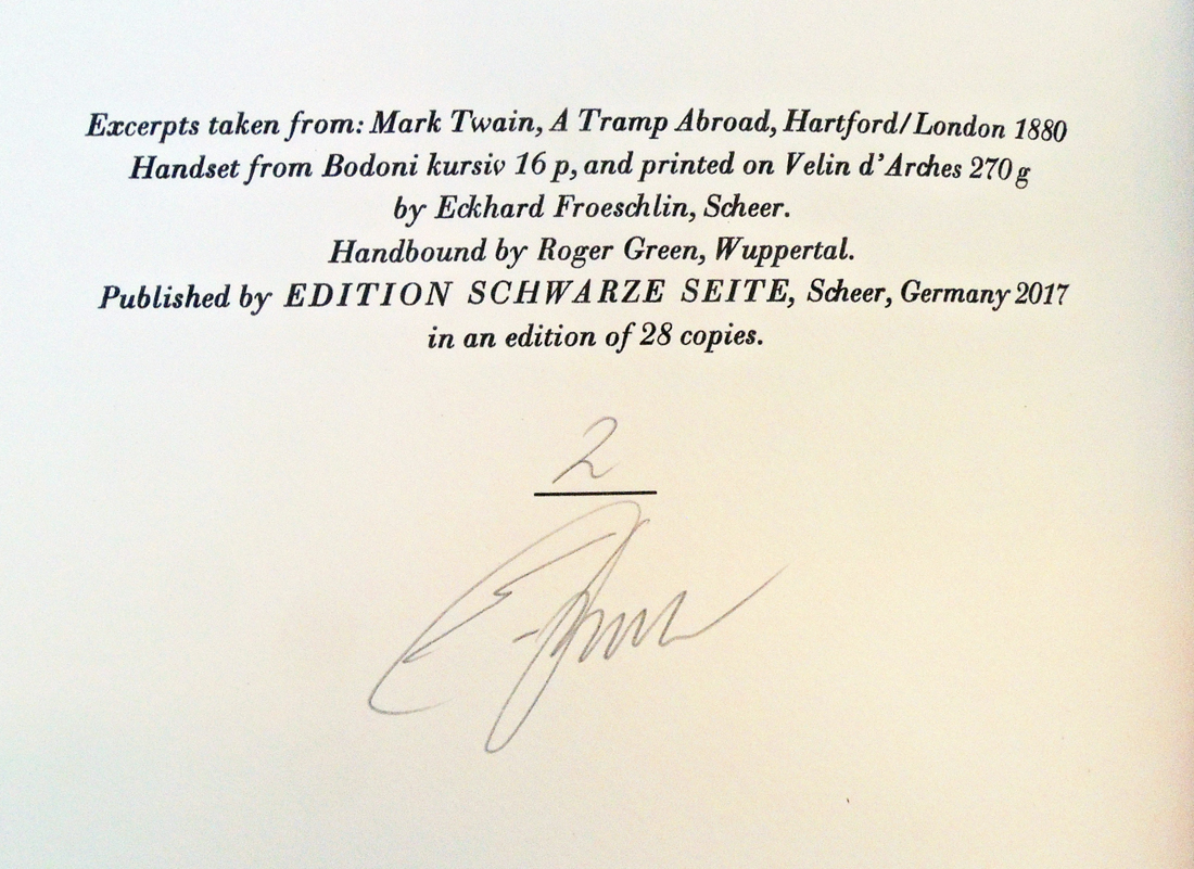
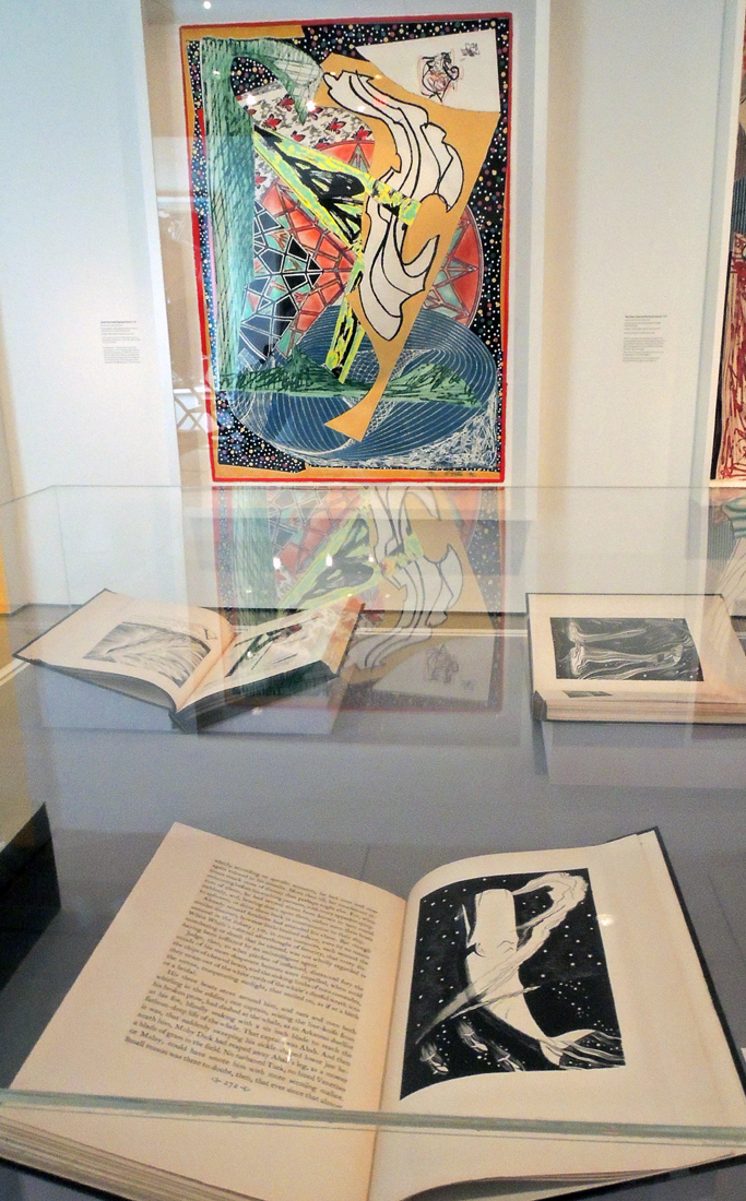
In 1927, the Curwen Press, Plaistow, partnered with Faber & Gwyer in London to publish a series called The Ariel Poems. Most are four pages with a previously unpublished poem and new printed image from a contemporary artist. No author was involved in the selection of the art and the final booklet (or keepsake) sold for one shilling.

“In his attempt to persuade eminent poets to contribute an Ariel poem, Richard de la Mare was not shy at telling poets that his father, Walter, had agreed to participate. In any case, he had come to know the older poets concerned through his father: in the displayed draft of a letter to Sir Henry Newbolt, for example, he writes that ‘Daddy has promised to let me have a new poem and so has T. S. Eliot’. In 1927, moreover, several of the writers when replying make polite enquiries about how his father was recovering from a recent illness. Rudyard Kipling was not able to help, but ‘A. E’ and W. B. Yeats were, and many other important literary figures came up with short poems for the sequence.”– https://www.faber.co.uk/blog/the-ariel-poems-numbers-1-8/

“Artists enjoyed the opportunity to work for the Curwen Press, not only for fees paid but because of the care taken reproducing their work. This was particularly true of illustrations reproduced by the pochoir (stencil) process, set up by Harold Curwen in 1925 and continued until 1932. The process was exploited with great skill by E. McKnight Kauffer, but even he acknowledged how much his book illustrations reproduced by pochoir owed their quality to Harold Curwen’s skill in running a department for which he trained the staff so well.” —http://whittingtonpressshop.com/the-curwen-press-collection-in-cambridge-university-library/

Between 1927 and 1931 Faber published thirty-eight poems in the Ariel series and then, in the early 1950s, after a gap of twenty years, it was decided to revive the series. Princeton University Library has a number of these, although not a complete set, spread out between a number of collections.

1. Yuletide in a younger world by Thomas Hardy, drawings by Albert Rutherston (London: Faber & Gwyer, 1927).

2. The linnet’s nest by Henry John Newbolt, drawings by Ralph Keene (London: Faber & Gwyer, 1927).

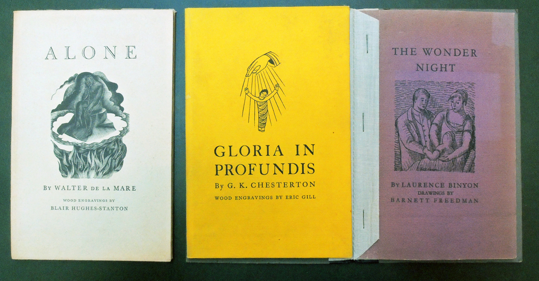
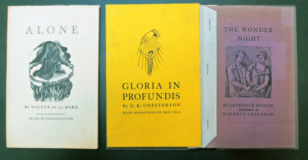
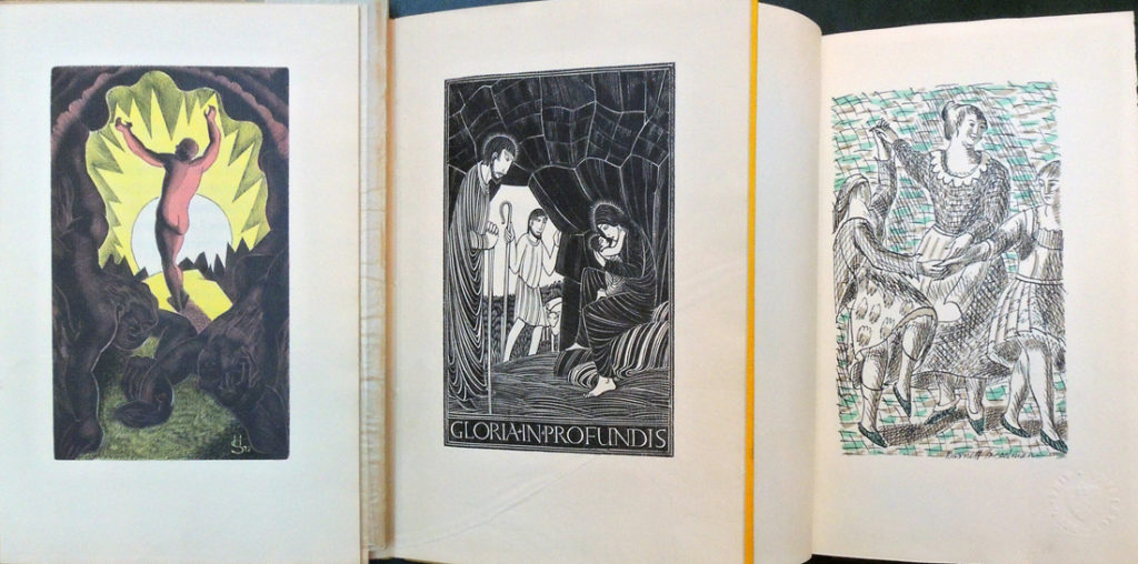
3.The wonder night by Laurence Binyon; drawings by Barnett Freedman (London: Faber & Gwyer, [1927]). 350 copies. ReCAP 3628.5.398

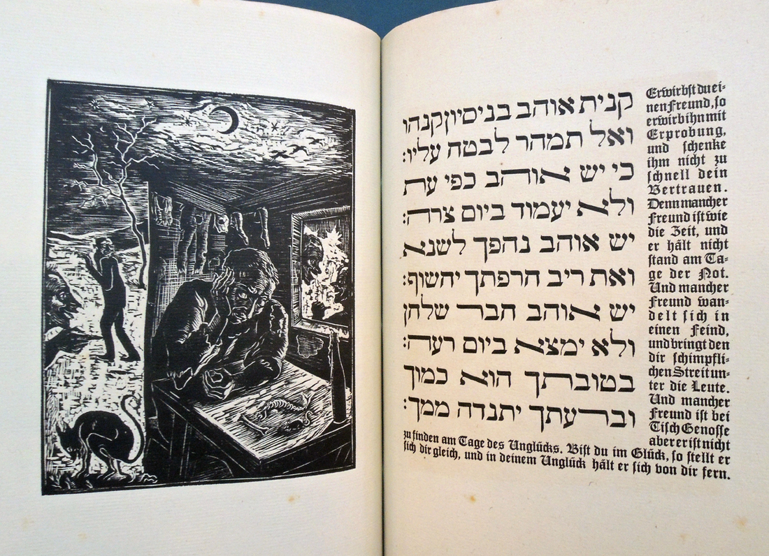
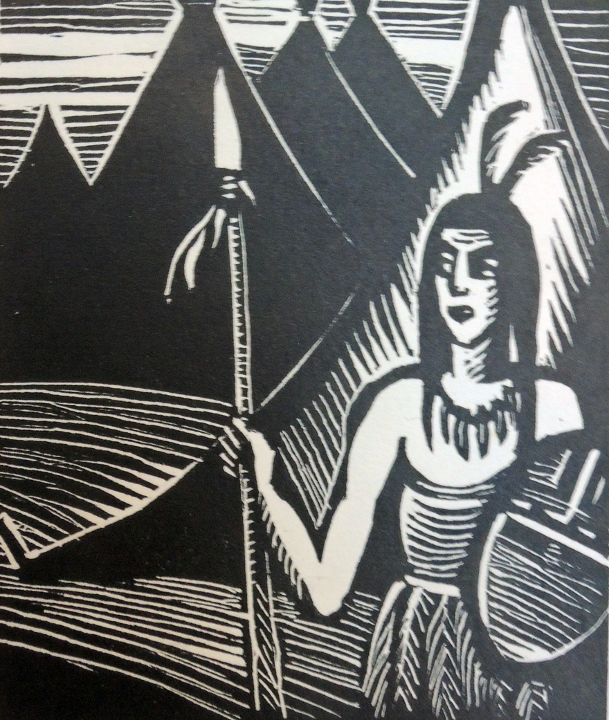
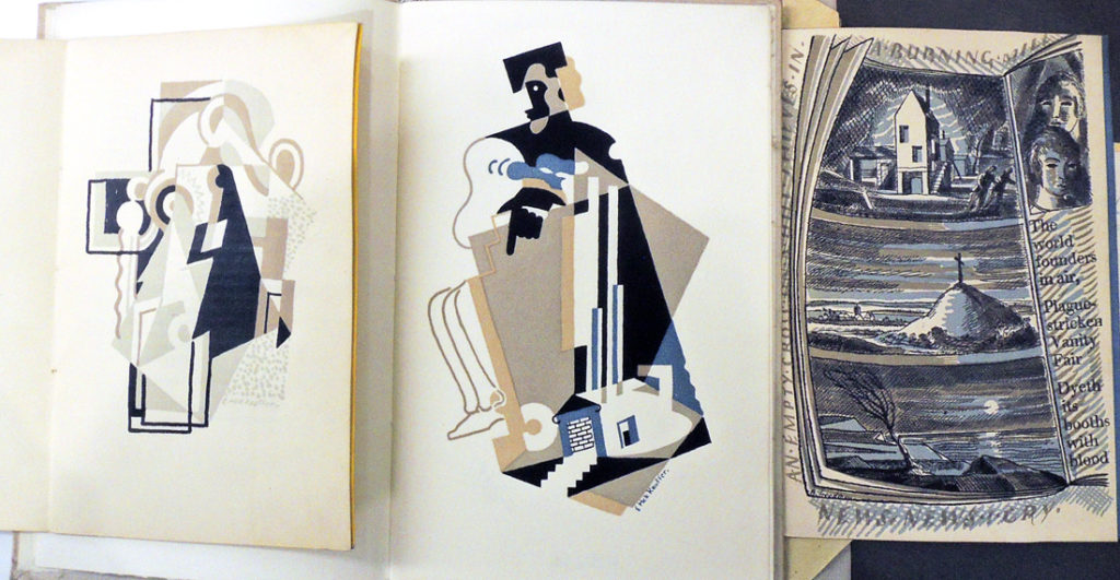
4.Alone by Walter de la Mare; wood engravings by Blair Hughes-Stanton (London: Faber & Gwyer, [19–?]). No. 68 of 350. Rare Books PR6007.E3 Z99046

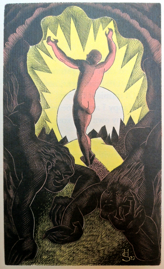
5.Gloria in profundis by G. K. Chesterton; wood engravings by Eric Gill ([London, Faber & Gwyer, 1927]). No. 185 of 350. Rare Books 3675.85.339

6.The early whistler by Wilfrid Wilson Gibson; drawings by John Nash ([London: Faber & Gwyer, 1927]). ReCAP 3752.3.331

7.Nativity by Siegfried Sassoon; designs by Paul Nash ([London: Faber & Gwyer, 1927]. No. 18 of 350. ReCAP 3917.75.367

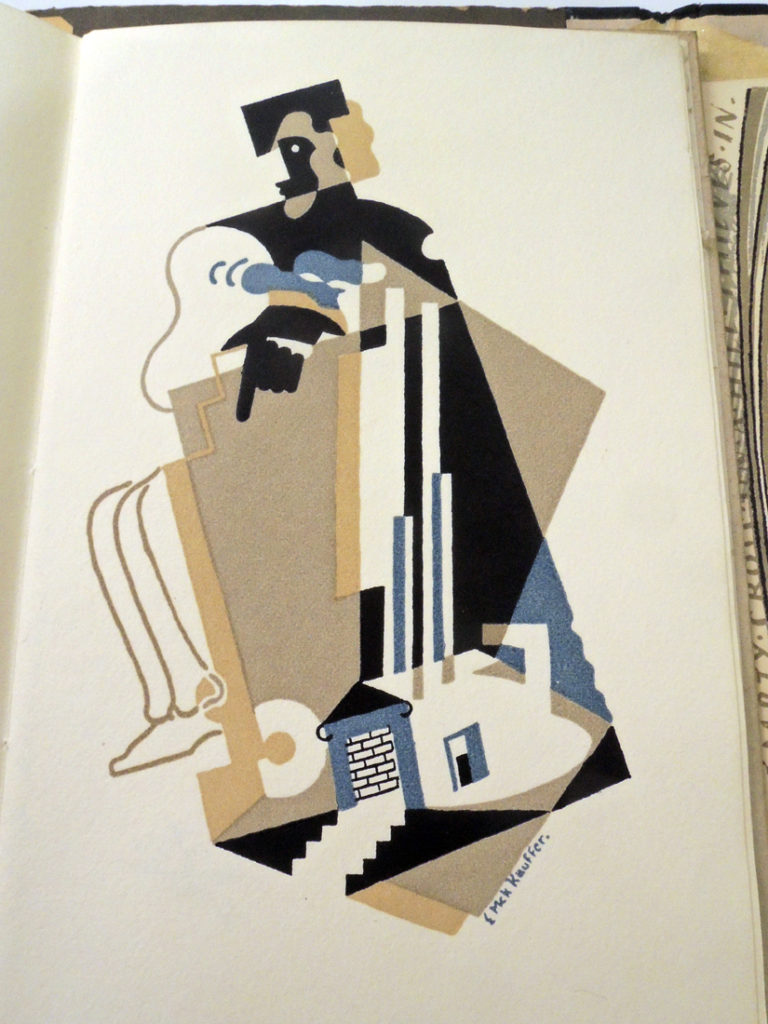
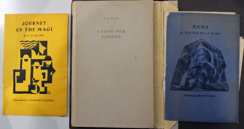
8.Journey of the magi by T.S. Eliot; drawings by E. McKnight Kauffer ([London; Faber & Gwyer, Limited, 1927]). Graphic Arts Collection 2004-4195N

9. The chanty of the Nona by Hilaire Belloc, drawings by Hilaire Belloc (London: Faber & Gwyer,
1928).

11.Self to self by Walter De la Mare, drawings by Blair Hughes-Stanton (London: Faber & Gwyer, Curwen Press, 1928).

12. Troy by Humbert Wolfe ; drawings by C. Ricketts (London : Faber & Gwyer, [1928]). ReCAP 3995.18.391

13. The winter solstice, by Harold Monro; drawings by David Jones (London, Faber & Gwyer, 1928?). Rare Books 3862.62.397

14. To my mother by Siegfried Sassoon, drawings by Stephen Tennant (London: Faber & Faber, 1928). Rare Books 3917.75.349.1928

15.Popular song by Edith Sitwell, drawings by Edward Bawden (London: Faber and Faber, 1928). Rare Books 3933.05.373

16.A song for Simeon by T.S. Eliot; drawing by E. McKnight Kauffer (London: Faber & Gwyer, 1928). Graphic Arts Collection 2004-4218N

18. Three things, by W.B. Yeats; drawings by Gilbert Spencer ([London, Faber & Faber limited, 1929]). Rare Books 3999.4.3895.11

20.A snowdrop by Walter De la Mare; drawings by Claudia Guercio (London: Faber & Faber,
192?). Rare Books PR6007.E3 Z99047

22. The outcast by James Stephens; drawings by Althea Willoughby ([London : Faber & Faber, 1929 ). Rare Books 3943.35.369

24. Inscription on a fountain-head by Peter Quennell ; drawings by Albert Rutherston (London : Faber & Faber, [1929]). Rare Books 3902.17.349

26. Elm angel by Harold Monro,. Wood engravings by Eric Ravilious (London, Faber & Faber, 1930). Rare Books 3862.62.332

27.In Sicily by Siegfried, drawings by Stephen Tennant ([London] : [Faber & Faber], 1927). ReCAP PR6037.A86 I575 1930

29.Marina by T.S. Eliot; drawings by E. McKnight Kauffer (London: Faber & Faber, 192?). RHT 20th-125

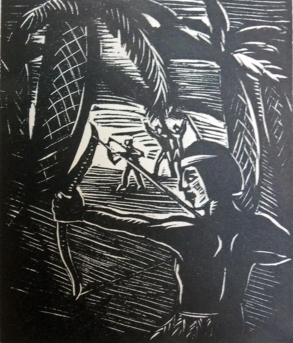
30.The gum trees by Roy Campbell ; drawings by David Jones (London : Faber & Faber, 1930). Rare Books 3664.55.341

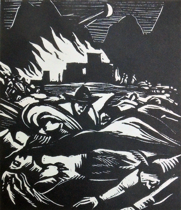
31.News by Walter de la Mare ; drawings by Barnett Freedman (London: Faber & Faber, 1930).
Firestone Library PR6007.E3 N497 1930

33. To Lucy by Walter de la Mare ; drawings by Albert Rutherston (London : Faber & Faber, [19–?]). Rare Books PR6007.E3 Z99059

34. To the red rose by Siegfried Sassoon ; illustration by Stephen Tennant (London : Faber & Faber, [1931?]). Rare Books 3917.75.391

35. Triumphal march by T.S. Eliot ; drawings by E. McKnight Kauffer ([London : Faber & Faber, 1931]). RHT 20th-132

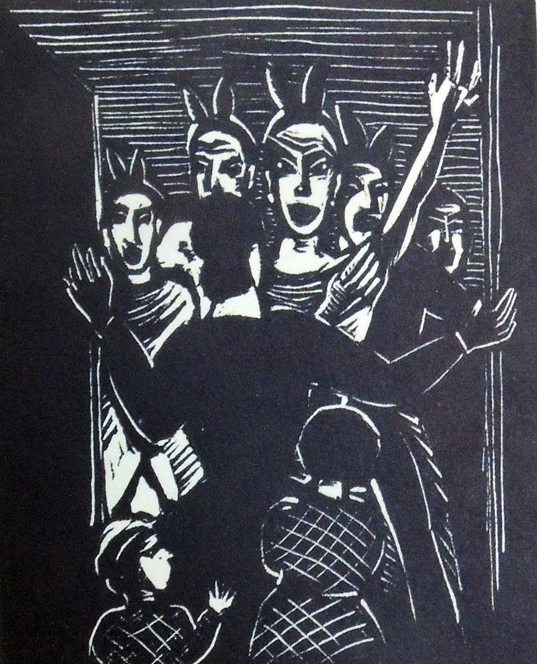
36. Jane Barston, 1719-1746 by Edith Sitwell ; drawings by R. A. Davies (London : Faber & Faber, [1931]). Rare Books PR6037.I8 J36 1931

38. Choosing a mast / by Roy Campbell ; drawings by Barnett Freedman (London : Faber & Faber, 1931). Rare Books 3664.55.325

Jakob Steinhardt (Hebrew: יעקב שטיינהרדט‬)

Born in Zerków, Germany (what is now Poznań, Poland), Jakob Steinhardt (Hebrew: יעקב שטיינהרדט‬) fled Nazi persecution in 1933 and made his home in Jerusalem for the last 30 years of his life. This is one of the last books he produced in Berlin, where he co-founded Die Pathetiker group together with Ludwig Meidner and the German painter Richard Janthur.

Here is a portion of the entry in the Grove Dictionary of Art:

“While serving in the German army in World War I Steinhardt successfully exhibited 50 drawings at the Berlin Secession in 1917. In 1919 J. B. Neuman began to publish Steinhardt’s etchings and also arranged his first one-man exhibition that year. During this productive period he received many commissions for book illustration, such as those for the Haggadah (Berlin, 1920–21). He visited Palestine in 1925 and fled there from Nazi persecution in 1933, settling first in Tel Aviv and then in Jerusalem. There he concentrated on woodcuts, producing such Expressionist works as The Butcher (1934; see 1987 exh. cat., p. 32). He ran an art school in Jerusalem from 1934 to 1949, when he took over the Directorship of the Belazel School of Arts and Crafts. Throughout his career his style was Expressionist and though predominantly a printmaker he also painted in oils. He produced a number of illustrations for the Bible, such as Isaiah the Prophet (1954; Los Angeles, CA, Co. Mus. A.).”


Special thanks to James Weinberger, Curator, Near East Collection, for helping with this acquisition.

Jacob Steinhardt (1887-1968), Neun Holzschnitte zu ausgewählten Versen aus dem Buche Jeschu ben Elieser ben Sirah; mit einer Einleitung von Arnold Zweig [Nine Woodcuts and Selected Verses from the Book of Ben Sirah–Soncino] (Berlin: Aldus Druck, 1929). Ninth Publication of the Soncino Society of Friends of the Jewish Book. Graphic Arts Collection GAX 2018- in process

DotDotDot

Sometimes contemporary material can be just as difficult to collect as that from hundreds of years ago. It has taken much effort and the help of an international group of colleagues to acquire a complete run of the typography journal DotDotDot (2000-2010).

First established in a basement room on the lower east side of Manhattan, this non-profit organization and publication evolved in 2010, ending the DotDotDot paper journal. http://www.dot-dot-dot.us/index.html

Today Stuart Bailey, Angie Keefer, and David Reinfurt, are based in Liverpool where The Serving Library has a publishing platform, a seminar room, a collection of framed objects, and an event space. The Serving Library currently resides at Exhibition Research Lab in the School of Art & Design, Liverpool John Moores University, which has been home to a regular program of free public talks since spring 2017.

http://www.servinglibrary.org/

Helena Bochořáková-Dittrichová

Written and illustrated by Czech graphic artist Helena Bochořáková-Dittrichová (1894-1980), this mostly wordless novel tells its story in 52 black and white woodcuts and 7 pages of text (also by the artist).

The book describes the struggles of the American Indians in the Midwest and Southwest, beginning with Ottawa war chief Pontiac’s battles against the British military occupation in 1763, followed by descriptions of Arizona and New Mexico American Indians.

Recognized as the first (or one of the first) woman graphic novelist, Bochořáková-Dittrichová began publishing woodcut narratives with Z mého dětství (From My Childhood) in 1929 and is credited with 15 graphic novels, the last published in 1969. Princeton University Library has only one other example of her work: Childhood: a Cycle of Woodcuts. Edition 300. Cotsen Children’s Library Eng 20 18173.

Considered extremely rare and yet, seminal to her oeuvre, Bochořáková-Dittrichová printed only 125 copies of Indians Then and Now with Josefem Hladkým. The only other holdings I see listed in the United States are at Columbia University and the National Museum of Women in the Arts, Washington D.C. Happily, if you can’t come to Princeton, the entire volume has been digitized here: http://sbirky.moravska-galerie.cz/dielo/CZE:MG.BF_456

Helena Bochořáková-Dittrichová (1894-1980), Indiáni jindy a dnes: kniha dřevorytů =
Indians Then and Now: a Book of Woodcutters. Copy 100 of 125. (Jozef Hladký, 1934). Graphic Arts Collection GAX 2018- in process


The Pène du Bois family

Three generations of the Pène du Bois family led book-filled lives.

“Gilles Menage somewhere wrote over two hundred years ago: ‘Les livres ont toujours ete la passion des honnêtes gens.’ [Books have always been the passion of honest people]. And that is the reason, I suppose, why Mr. Henry De Pene Du Bois is so popular in New York as a Bibliophile and Grolierite. I presume further, that it is also the reason why he gave to literature his interesting volume on the Art of Bookbinding, is why he has been chosen as the American correspondent of that fascinating Parisian magazine, Le Livre, whose destinies are superintended by Octave Uzanne . . . and is why Mr. Pene Du Bois has been engaged for so long a time on the compilation of his volume on American book-collectors entitled New York Bibliophile, and which will be shortly issued from the Paris press. The Library and Art Collection of Mr. Pene Du Bois has been his sole hobby during many years, and he daily could truly repeat the words penned by old Pynson in the sixteenth century:

Styll am I besy bookes assemblynge,
For to have plenty it is a pleasaunt thynge.

It is a good thing to read books, and it need not be a bad thing to write them; but it is a pious thing to preserve those that have been sometime written; the collecting, and mending, and binding, and cataloguing of books are all means to such an end.”

First in Brooklyn and then, Staten Island, the only language spoken in the Pène du Bois home was French. Patriarch Henri Pène du Bois (born Henry Dubois 1858-1906) required his son Guy speak only the language of their family friend and his namesake Guy de Maupassant.

Largely self-educated, both father and son aspired to artistic careers but supported their families mainly through writing. Guy left school at 16 years old to study painting. Henri paid his bills working as a reporter for the New York American and when he died, Guy took a job at his dad’s paper.

Guy Pène du Bois (1884-1958) was assigned first to the police beat, then became the opera critic (although he had never been) and finally took his father’s position as art critic. This was a perfect opportunity for Guy to review his friends from the Robert Henri School of Art; they got the publicity and he filed a story. In fact, Guy was the only artist to not only exhibit at the 1913 Armory Show but also review it. He went on to write the first biographies on the early American modernists, funded by Gertrude Vanderbilt Whitney.


In 1914, Guy moved his family to no. 16 in The Enclosure, an artists’ colony in Nutley, New Jersey, commuting daily into New York City on the newly opened railroad.

“Around the turn of the 20th century there were more noted artists and writers in Nutley than in any other community in New Jersey, with the possible exception of Montclair. Many of the artists clustered around an area in Nutley called The Enclosure. James R. Hay, who lived in the John Mason House in Calico Lane, probably can be credited with convincing creative individuals to settle in The Enclosure. Hay dealt with real estate in New York City and was able to tap the enormous resources of the city, including the influx of artistic talent. It was probably not terribly difficult to convince people to reside or work in the area. The rustic beauty and the quiet setting of The Enclosure was certainly ideal for concentrating artists.”
http://www.nutleyhistoricalsociety.org/Enclosure-Artists-Colony-Nutley-NJ.html

William Sherman “Billy” Pène du Bois (1916-1993) was born at The Enclosure in Nutley and followed in the family footsteps, becoming a writer and illustrator. Like his father and grandfather, William was well-read, well-traveled, and fluent in French. He is best known for The Twenty-One Balloons, published in April 1947 by Viking Press, for which he won the 1948 Newbery Medal. From 1953 to 1960, William was the first art editor of The Paris Review, working alongside founder and editor George Plimpton. It’s William’s design of the Place de la Concorde that has become synonymous with the journal.


William Pène du Bois (1916-1993), The Three Policemen, or, Young Bottsford of Farbe Island
(New York : Viking Press, 1966). Cotsen Children’s Library Eng 20 152224


Planning Ahead: The College Freshman’s Don’t Book

G.F.E. (George Fullerton Evans), The College Freshman’s Don’t Book: In The Interest Of Freshmen At Large, Especially Those Whose Remaining At Large Uninstructed & Unguided Appears A Worry And A Menace To College & University Society, These Remarks And Hints Are Set Forth By G.F.E. (A.B.) A Sympathizer; The Illustrations By Charles Frank Ingerson; The Decorations & Initials By Raymond Carter (San Francisco: Paul Elder and Co., 1910). PN6231.C6 G44 1910

San Francisco publisher Paul Elder Sr. (1872-1948) leased the entire building at 239 Grant Street in 1909 and opened the Arts and Crafts Bookshop (his second shop). John Henry Nash (1871-1947) of The Tomoyé Press worked on the third floor, overseeing typography and design.

The Holiday Books listing in the December 16, 1910 issue of The Dial noted “The San Francisco publishing house of Messrs. Paul Elder & Co. maintains its enviable reputation as publishers of artistic and original holiday volumes. Their most attractive publication for this season is a limited edition of Mrs. Browning’s Sonnets from the Portuguese, printed in italic type on handmade paper, and tastefully bound in boards, with decorated title label. A photogravure portrait and especially designed initial decorations comprise the decorative features. . . The College Freshman’s Don’t Book, by G. F. E. covers a multitude of college subjects from dress and dining to “things in general.” Most of the advice is humorous and all of it is good.— “


Ruth and James McCrea

[Above] Ruth and James McCrea, Cover design for Men Without Women by Ernest Hemingway (New York: Charles Scribner’s Sons, 1970). Oil paint on board. Graphic Arts Collection. Gift of Charles Scribner III, Class of 1973.


Ruth and James McCrea, Cover design for In Our Time by Ernest Hemingway (New York: Charles Scribner’s Sons, 1970). Oil paint on board. Graphic Arts Collection. Gift of Charles Scribner III, Class of 1973.


In 1960, the first 21 titles in the Scribner Library (paperback) series were published, beginning with F. Scott Fitzgerald’s The Great Gatsby.  One artist was assigned to each author, so that writer’s books would have a distinct and yet, uniformed appearance.

This plan was interrupted only once, with the cover designs for the novels of Ernest Hemingway, which were painted by the husband and wife team of James C. McCrea (1920-2013) and Ruth McCrea (1921-2016).

Thanks to the gift of Charles Scribner III, Class of 1973, we are fortunate to have all 11 paintings by the McCreas for the covers of Hemingway’s novels, including Across the River and into the Trees; A Farewell To Arms; For Whom The Bell Tolls; In Our Time; Men Without Women; The Green Hills of Africa; The Old Man and the Sea; The Snows of Kilimanjaro; The Sun Also Rises; To Have and Have Not; and Winner Take Nothing. None of the paintings for Scribner’s are signed by either artist.


Ruth and James McCrea, Cover design for For Whom The Bell Tolls by Ernest Hemingway (New York: Charles Scribner’s Sons, 1970). Oil paint on board. Graphic Arts Collection. Gift of Charles Scribner III, Class of 1973.


James McCrea was born in Peoria, IL; attended the University of the South in Sewanee, Tennessee; and served in the Merchant Marine in World War II. Ruth McCrea was born in Jersey City, NJ, and attended school first in Brooklyn Heights, then Sarasota, Florida.

It was at the Ringling School of Art that she met James, marrying him on the 4th of July 1943. While he served in the Marines, Ruth sold her watercolor landscapes (beach scenes clearly still in evidence on Hemingway’s covers).

The McCreas both worked as freelance designers and illustrators commuting from Bayport, NY on the south shore of Long Island and much of this information comes from Ruth’s obituary written by Carissa Katz for the East Hampton Star newspaper.

While the two worked closely on many projects, Ruth illustrated a series of cookbooks on her own while James taught typography at The Cooper Union. A search of the two names brings 91 books with designs credited to Ruth McCrea and only 60 for James McCrea.

Here are a few more of their paintings for Hemingway’s books.

Ruth and James McCrea, Cover design for Across the River and into the Trees by Ernest Hemingway (New York: Charles Scribner’s Sons, 1970). Oil paint on board. Graphic Arts Collection. Gift of Charles Scribner III, Class of 1973.


Ruth and James McCrea, Cover design for A Farewell To Arms by Ernest Hemingway (New York: Charles Scribner’s Sons, 1970). Oil paint on board. Graphic Arts Collection. Gift of Charles Scribner III, Class of 1973.

[above] Ruth and James McCrea, Cover design for Winner Take Nothing by Ernest Hemingway (New York: Charles Scribner’s Sons, 1970). Oil paint on board. Graphic Arts Collection. Gift of Charles Scribner III, Class of 1973.

[below] Ruth and James McCrea, Cover design for To Have and Have Not by Ernest Hemingway (New York: Charles Scribner’s Sons, 1970). Oil paint on board. Graphic Arts Collection. Gift of Charles Scribner III, Class of 1973.

Ruth and James McCrea, Cover design for The Sun Also Rises by Ernest Hemingway (New York: Charles Scribner’s Sons, 1970). Oil paint on board. Graphic Arts Collection. Gift of Charles Scribner III, Class of 1973.


Ruth and James McCrea, Cover design for The Old Man and the Sea by Ernest Hemingway (New York: Charles Scribner’s Sons, 1970). Oil paint on board. Graphic Arts Collection. Gift of Charles Scribner III, Class of 1973.


Moby Dick crosses over


Congratulations to our colleagues at the Princeton University Art Museum, where the exhibition Frank Stella Unbound: Literature and Printmaking opened this weekend and can be seen through Sunday, September 23, 2018. The show features a number of books from our collections and highlights Stella’s inspiration from literature. Organized in conjunction with the 60th anniversary of the artist’s graduation as a member of the Class of 1958, the exhibition will travel to the Museum of Contemporary Art Jacksonville.

See above our three volume Moby Dick, with prints by Rockwell Kent, installed so you can see Stella’s responding print on the wall. Label copy gives the viewer a quote from the book’s text, rather than an art historical commentary.

“Frank Stella Unbound: Literature and Printmaking focuses on a revolutionary period in the artist’s printmaking career, between 1984 and 1999, when Stella executed four ambitious print series, each of which was named after a distinct literary work: the Passover song Had Gadya, a compilation of Italian folktales, the epic American novel Moby-Dick, and the illustrated The Dictionary of Imaginary Places. In the four series titled after these sources, Stella created prints of unprecedented scale and complexity, transforming his own visual language—as well as his working process in all media—and reaching a technical and expressive milestone in printmaking.”—PUAM press release.

See more: http://artmuseum.princeton.edu/art/exhibitions/3331