Category Archives: Illustrated books

illustrated books

More Books with Money

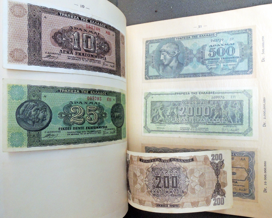
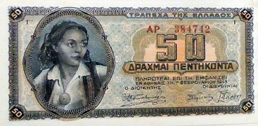
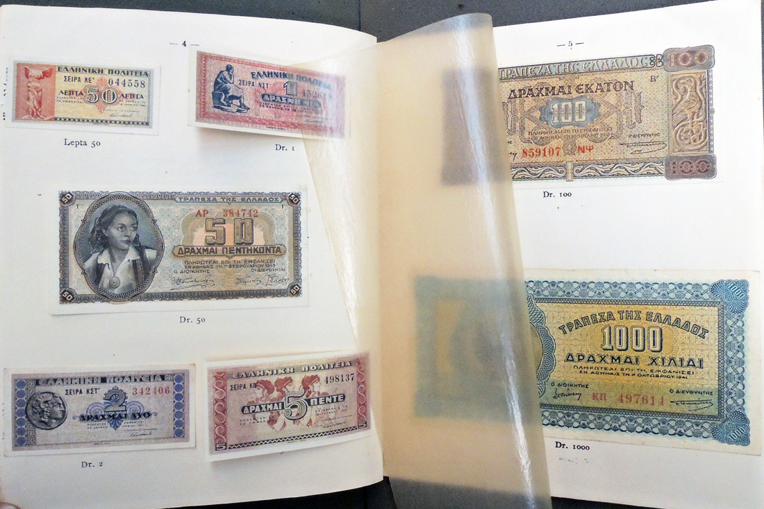
Thanks to those who responded with suggestions about where to find money in books. Dimitri Gondicas, Stanley J. Seeger Director of the Center for Hellenic Studies, The Council of the Humanities, and Lecturer in Classics at Princeton University pointed to this volume with 24 banknotes mounted on 9 pages. “The banknotes inside,” he writes, “are testimony of the rampant inflation during the WWII German Occupation of Greece.”

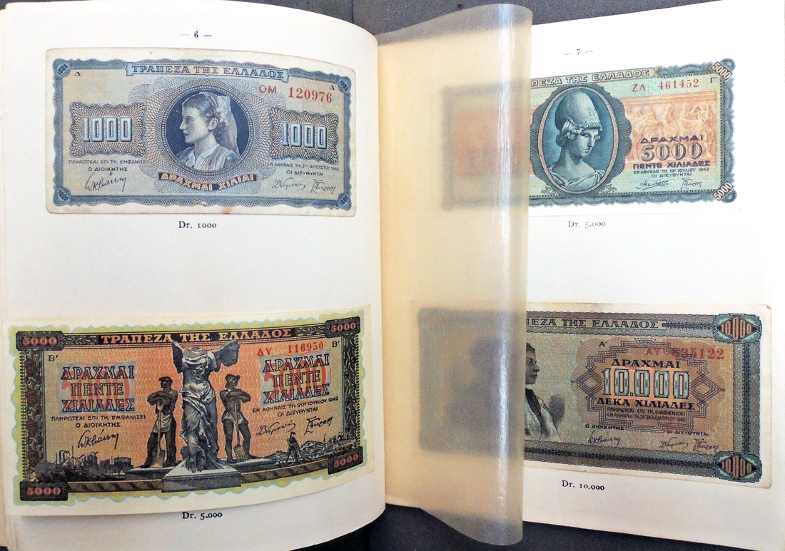
The anonymous author writes: “For us Greeks and the future generations the collection of bank notes and paper money put into circulation by the Italians and Germans will be a horrible nightmare and an uncontradicted proof of the hardships that our cruelly tried country has gone through. The Institute of Mining Credit worked out this collection as a symbol for one of Greece’s most heroic eras, which rivals its previous ones in magnitude. This collection represents one of the most important financial events of the most devastating war the world has ever gone through.”

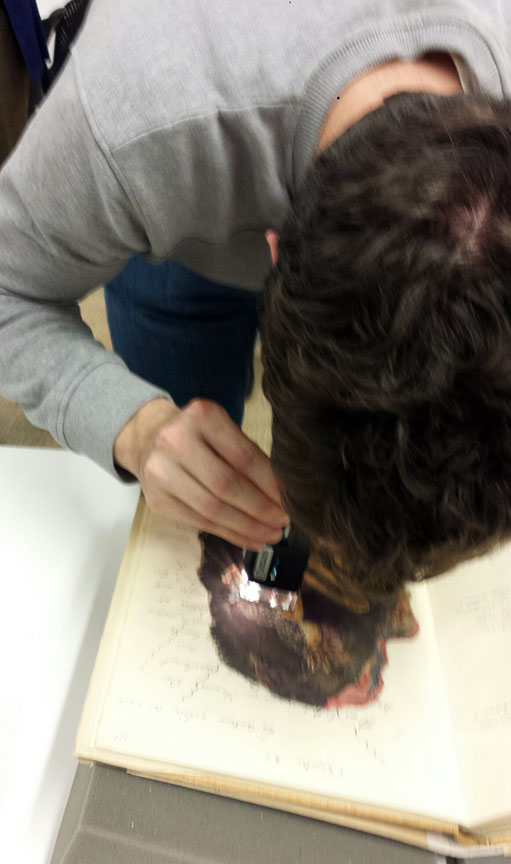
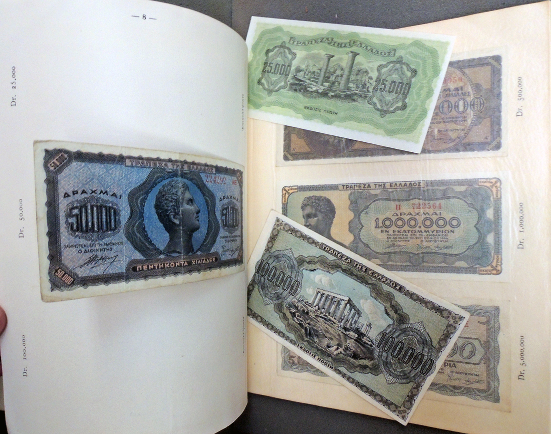
Unfortunately, the bank notes are so gently tipped into the volume, many are already beginning to separate from the page. All except the final example are legitimate and rare.


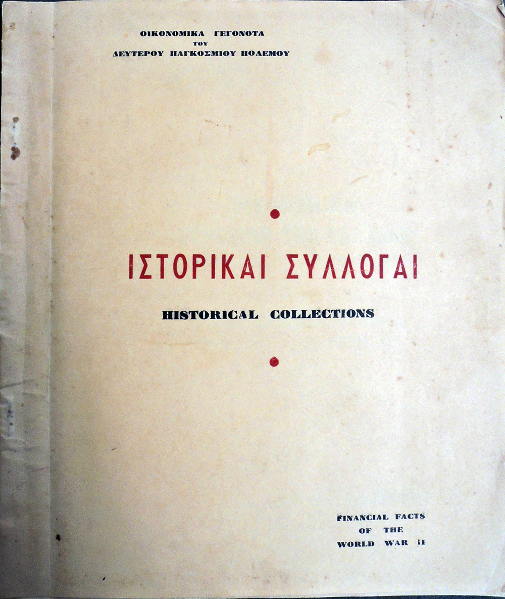
Oikonomikē syntrivē tēs Hellados, Aprilios 1941-Noemvrios 1944 = Financial Breakdown of Greece, April 1941-November 1944 (Athens, Greece: The Establishment of Mining Credit Corporation, Scientific Section–Historical Collections, [1945?]). 2nd ed. At head of title: Hotan hoi Nazi kataktoun = When the Nazis conquer. On cover: Oikonomika gegonota tou deuterou Pankosmiou Polemou = Financial Facts of the World War II. Ex 2014-0277Q

What about the author who doesn’t want to be illustrated?


At the beginning of Balthasar Anton Dunker’s 1787 collection of etchings designed to “serve the different editions” of Louis-Sébastien Mercier’s Panorama of Paris, there is a notice to the public stating (roughly translated): “The Publishers of this series of little sketches for the Panorama of Paris, have thought it would be very agreeable to the public to see beside the most interesting Chapters of this book, figures which represented to the eyes what Mr. Mercier said with so much elegance & precision.”

The name of the publisher who wrote this note is conveniently omitted since Mercier was explicit in his disdain of painters, sculptors, engravers, and the other visual artists of the day. All eight volumes of Mercier’s book were specifically published without illustrations or decoration of any kind.

In The Unfinished Enlightenment [Firestone PQ265 .S72 2010], historian Joanna Stalnaker notes:

“Tableau de Paris [is] peppered with venomous condemnations of painting and painters. Painting, the ‘idiot sister’ of poetry, is ‘a childish production [un enfantillage] of the human mind, a continually impotent enterprise that is in most cases laughably intrepid.’ And painters are ‘the most useless men in the world, charging exorbitant prices for an art that in no way interests the happiness, tranquility, or even the pleasures [les jouissances] of civil society; a cold and false art of which any true philosopher will sense the inanity.” .

On the other hand, Mercier often equates his writing with painting, stating “I held nothing but the brush of the painter in this work” and referring to his text as “mots-couleurs” or word colors. Dunker must have noticed this and for the frontispiece to his accompanying etchings, the artist begins with a personification of Paris turning away from a physical painting labeled “Tableau of Paris.” The caption: “Let’s put our brushes together! Let’s see black!”

The chapters from Mercier’s book chosen to be illustrated by Dunker are predominantly those dealing with the arts, leading readers to wonder whether the artist is having fun at the author’s expense, rather than simply illustrating him. Perhaps Dunker is the satyr on the frontispiece, peering out at Mercier from behind his canvas.


Balthasar Anton Dunker (1746-1807), Tableau de Paris, ou explication de différentes figures, gravées à l’eauforte, pour servir aux différentes éditions du Tableau de Paris (Yverdon: [publisher not identified], 1787). SAX DC729. D765 1787

Louis-Sébastien Mercier (1740-1814), Tableau de Paris (Amsterdam: [s.n.], 1782-1783). ReCAP Ex 1514.635.1782 v.1-8


Can anyone make out the Latin below?

What Parallèlement Might Have Been

Pierre Bonnard (1867-1947) and Paul Verlaine (1844-1896), Parallèlement. Lithographies originales de Pierre Bonnard (Paris: A. Vollard, 1900). “Deux cents exemplaires numérotés. Nos. 1 à 10 sur chine chine, avec une suite de toutes les planches sans le texte. Nos. 11 à 30 sur chine chine. Nos. 31 à 200 sur vélin de Hollande.” Copy 67.  Graphic Arts Collection 2011-0160Q. Title page with and without the symbol of the Republic, the privilege from the “garde des Sceaux” at the presses of the Imprimerie Nationale, which was withdrawn.


Paul Verlaine (1844-1896), Parallèlement (Paris: L. Vanier, 1889). Ex copy. Presentation copy to Edmund Gosse with inscription by the author. Rare Books PQ2463 .xP3 1899


In 1896, the year of Paul Verlaine’s death,  Parisian publisher Ambroise Vollard (1867‐1939) was one of three thousand people who attended the poet’s funeral. Wanting to do something in honor of Verlaine, Vollard contacted his friend Lucien Pissarro (1863-1944, son of Camille Pissarro) and proposed a deluxe livre de peintre with Pissarro’s woodcuts and Verlaine’s poem Parallèlement.

It is thought that Pissarro’s father dissuaded the young artist from working with such controversial subject matter — a series of erotic and religious poems, some involving a love affair between two women — but for whatever reason, Pissarro turned Vollard down.

Pissarro went on to completed woodcuts for a fine press edition of La belle au bois dormant with Charles Ricketts (1866-1931) under his own imprint Eragny Press (among many other projects). Heavily influenced by William Morris, this is probably the style he would have used for Vollard’s edition of Parallèlement, had it been completed.


Lucien Pissarro (1863-1944) and Charles Perrault (1628-1703), La belle au bois dormant; &, Le petit Chaperon rouge: deux contes de ma Mère l’Oye par C. Perrault de l’Académie française ([London: Hacon & Ricketts], 1899 ([London: Eragny Press]). Graphic Arts Collection Z269.P95 P47 1899


Vollard turned to Pierre Bonnard (1867-1947) and proposed the same project but this time with lithographs, Bonnard’s preferred medium. The artist was given proof sheets of the letterpress text and experimented with designs across the double page spread before drawing on the lithographic stones. Space had been left for a traditional illuminated letter at the beginning of each section (similar to those seen above) but these were thankfully omitted.

Both volumes were pulled and compared today by the students, demonstrating the radical innovations of Bonnard’s designs and the reason we call Parallèlement the beginning of the modern artist’s book.

Henrietta Maria Moriarty, artist and novelist

Henrietta Maria Moriarty (1781-1842), Viridarium: Coloured Plates of Greenhouse Plants, with Linnean Names, and with Concise Rules for Their Culture (London: Printed by Dewick & Clarke, Aldergate-Street, for the Author; and sold by William Earl, No. 47, Albemarle-Street, Piccadilly. 1806). First edition. 50 handcolored aquatint plates, each accompanied with a corresponding leaf of descriptive text. Graphic Arts Collection GAX 2018- in process.

In his post Avoiding sex with Mrs Moriarty, garden historian Dr. David Marsh writes that facts concerning Moriarty’s life have been elusive. She traveled in high class circles: the book’s subscription list is headed by Prince Augustus, the Duke of Sussex and the younger brother of George IV and William IV.  The work is dedicated to Lady de Clifford, who also bought five copies.

The plates are mainly copied from Curtis’s Botanical Magazine so it leaves open the question of why this work came to press. Thanks to research by our friends at Marlborough Books, we now have answers about who Moriarty really was. They found a novel by Moriarty, published in 1811 under the title Brighton in an Uproar, and writes:

“This is very clearly an autobiographical work in which she uses the nom de plume of ‘Mrs Mortimer.’ Unfortunately this ‘novel’ also seems to have caused her downfall and imprisonment for slander. This connection has apparently eluded research so in case anyone wants to delve further into the mystery of Mrs Moriarty we thought to give at least an outline of her life.”

In Brighton in an Uproar, Moriarty relates why Viridarium came to be written.

Mrs. Mortimer advertised for two or three ladies to board with her: she succeeded in procuring one; and the aunt of one of the officers belonging to the corps in which her husband had served also came to reside with her. Mrs. Forth was a lady of great accomplishments, aid most pleasing manners: her behaviour to Hubertine and her children was such as rendered her an invaluable friend, and meeting with such an inmate was a great blessing to Mrs. Mortimer in her present distressed situation.

. . . Drawing had always been a favourite occupation with her; and she was advised to publish a botanical work by subscription. She was averse to this as she knew her abilities were not equal to such a task; but as it was expected of her, she immediately set about it . . . Another strong inducement to publish by subscription was the ardent desire which she had to liquidate her late husband’s debts; and in this she succeeded as from her exertion’s she paid them all within two year’s amounting to the sum of four hundred and eighty pounds.

Marlborough’s research continues,

“Henrietta Maria was christened on the 22 February 1781 at Romsey in Hampshire. She was the daughter of Major Benjamin Godfrey of the Inniskilling Dragoons and his wife Henrietta. On the 9th July 1796 she married Matthew Moriarty, Esq., of Chatham in Kent and then a Major in the Marines, she would have been barely 15 at the time of her marriage and presumably this was through the consent of her now widowed mother. Unfortunately he was not a good husband, he left a trail of debt and died somewhat dissolute, and worse leaving his widow and children unprovided for.

In order to clear the debts she wrote Viridarium and later also two novels. . . As a widow Henrietta was not reconciled to her Irish relatives and despite trying to make ends meet by writing she was clearly in financial trouble, worse she seems to have slandered someone and was committed to the King’s Bench prison in December 1813. Her occupation as a boarding house keeper, seems slightly desperate and maybe it is not surprising that she is not acknowledged in print from this time forth except the sad record contained in the 1841 census that she was a ward of the Kensington Union Workhouse followed by her death a year later.”

Noa Noa

We pulled the collotype facsimile of Paul Gauguin’s Noa Noa yesterday for the students to study.

Paul Gauguin (1848-1903) began writing his travel journal Noa Noa [Fragrance] after returning to Paris from Tahiti in 1893. The text manuscript was given to the poet Charles Morice (1860-1919) while Gauguin kept his original pages with prints, drawings, and other visual material pasted in.

In 1926, a facsimile of Gauguin’s manuscript, now in the Louvre, was created by the German art historian Julius Meier-Graefe and published in collaboration with R. Piper & Co in an edition of 400. It reproduces Gauguin’s handwritten text and all the pasted in prints and drawings in collotype.

Through his many German connections, former curator of Graphic Arts Elmer Adler was fortunate to acquired copy no. 34. Inside the front cover (now moved to Adler Papers CO262), he kept a letter from John Rewald with a brief explanation of the book’s publishing history. It reads in part:

“New York, April 7th ’43. Dear Mr. Adler, Many thanks for your letter. The story of Noa-Noa is at least as complicated as the one of Avant et après. It was written in France, the idea being conceived by Gauguin and his friend Charles Morice. The original edition contains poems by Morice succeeding each chapter by Gauguin, and no illustrations. It was published after the painter’s return to Tahiti and finally almost caused a complete break between Gauguin and Morice in connection with the royalties etc. The original manuscript with the drawings, watercolors, and photographs pasted in was given by Gauguin to [Georges-]Daniel de Monfreid. When Gauguin’s widow succeeded in extorting the Avant et après manuscript from [André] Fontainas, Monfried feared that he, too, would be unable to resist her tears; he hurried immediately to the Louvre and offered Noa-Noa as a gift.

Noa-Noa still belongs to the Louvre-Museum. The Avant et après manuscript was sold by the German publisher, Kurt Wolf (he is now in this country) who had it acquired legally from Gauguin’s widow and ignored that it actually belonged to Fontainas. I have just been informed by the last owners that it has been definitely lost in the way from England to America, thanks to Hitler’s submarines.”

Various facsimiles have been published over the years, several are digitized but not Gauguin’s original pages: http://onlinebooks.library.upenn.edu/webbin/book/lookupname?key=Gauguin%2C%20Paul%2C%201848%2D1903. Hopefully our friends at the Louvre will digitize it one day.

Paul Gauguin (1848-1903), Noa Noa ([München: Marées Gesellschaft: R. Piper, 1926]). Copy 34 of 400, one of 320 copies bound in woven straw cloth. Letter from John Rewald to Elmer Adler, April 7, 1943, about Noa Noa and Avant et après, in Adler correspondence. Graphic Arts Collection Oversize 2007-0082Q


See also:
Paul Gauguin (1848-1903), Noa Noa [Première éd. du texte authentique de Gauguin, établi sur le manuscrtit initial retrouvé. Préf., étude, vie de l’artiste, notes et bibliographie de Jean Loize ([Paris] A. Balland [1966]. ND553.G27 A3 1966

Paul Gauguin (1848-1903), Noa Noa (Paris: Sagot-Le Garrec, 1954). Facsimiles of a manuscript in the possession of Berthe Le Garrec, and a letter from Charles Morice to Edmund Sagot (laid in). Marquand Library Oversize ND553.G2 A35 1954f

Paul Gauguin (1848-1903), Avant et après, avec les vingt-sept dessins du manuscrit original (Paris, G. Crès et cie, 1923). Marquand Library ND553.G2 A33 1923

Down By The Riverside

Richard Wright (1908-1960) and John Wilson (1922-2015), Down by the Riverside, with four etchings by John Wilson (New York: The Limited Editions Club, [2001]). “The etchings have been editioned at the Center Street Studio by James Stroud.”–Colophon. Copy 88 of 300. Graphic Arts Collection GAX 2018- in process

[left] Richard Wright (1909-1960), Uncle Tom’s Children, Four Novellas (New York, London: Harper & Brothers, 1938). PS3545.R815 U535 1938


Roxbury-born artist John Wilson (1922-2015) first read Richard Wright in 1945, responding to his words with a lithograph entitled “Native Son.” When the Limited Editions Club commissioned a suite of prints inspired by Wright’s short story Down by the Riverside, Wilson not only produced the prints but wrote the afterword for the volume.

“Growing up in Boston during the late 1920’s and 30’s,” he notes, “I saw gruesome pictures of southern lynchings in the black press. I understood that simply being black was the most important reality affecting my entire life. In New England the attitude was that this was a southern thing because there was no legal discrimination ‘up north.’ Of course everyone in my community understood the difference between rhetoric and reality.”

“In the early forties, I read Richard Wright’s Uncle Tom’s Children. Those powerful, trenchant short stories put me in the middle of ‘that southern thing,’ I felt a strong sense of brotherhood, identifying with his characters struggling to survive with dignity. I understood more clearly the role of terror and uncompromising violence.”

“. . . I chose to illustrate this story because of Wright’s vivid dramatic setting. Etching techniques like aquatint and spit biting were ideal to interpret the dark brooding, murky atmosphere. Above all, the river with its powerful currents and its violent energy . . . seemed to symbolize basic forces of nature. I wanted the blue translucent shapes and flowing rhythms of the water to carry the figures from one episode to the next.”–John Wilson, 2001.

“Down by the Riverside” (previously unpublished), the second short story in the 1938 and 1940 editions of Uncle Tom’s Children, dramatizes the tragic death of a black man, Brother Mann, who uses a stolen boat during a Mississippi flood to take his pregnant wife to a hospital for the child’s delivery. On the way to the hospital, Mann is discovered by the owner of the boat, a white man, who tries to shoot him, but Mann, in self-defense, kills the owner. When Mann reaches the hospital, he finds his wife dead. Later he is drafted by the military men in charge of rescuing flood victims.

The first house to which he is sent, with a black companion, both of them on another boat, happens to be that of the owner of the stolen boat, whose family recognizes Mann. Although he considers killing them, their house suddenly tilts, the axe in his hand does not fall over their heads, and he ends up rescuing them. Once the boat safely reaches the hill, they tell the authorities that Mann is a murderer. As he flees down the riverside, he is shot to death.”–The Mississippi Quarterly, Spring 1993, by Yoshinobu Hakutani


Gustave Doré’s Raven


Edgar Allan Poe (1809-1849), The Raven (New York: Harper & Brothers, 1884). Steel engraving after drawings by Gustave Doré (1832-1883). Graphic Arts Collection Oversize 2004-0014F and Oversize 2004-0015F

I was asked today what the original cost was for Gustave Doré’s The Raven, poem by Edgar Allen Poe. The volume is being studied by ART 564 “Seminar in 19th-Century Art–Word and Image.”

This was Doré’s last project, completed weeks before his death on January 23, 1883. His drawings were turned over to Harper & Brothers in New York City, where fourteen master engravers were hired to rush the volume to press. Few of the artists are known today except by last names: H. Claudius; R. A. Muller; W. Zimmerman; Frederick Juengling; G. F. Buechner; R. G. Tietze; F. S. King; T. Johnson; R. Standenbaur; Frank French; R. Schelling; George Kruell; Victor Bernstrom; and Robert Hoskin.

The plates had to be cut in steel rather than copper because of the size of the edition: 10,000 copies with 26 engravings each, requiring at least 260,000 full-page sheets to be printed, collated, and bound.

First mentions of a Doré Raven began appearing almost immediately, such as the “Literary Note” in the Detroit Free Press February 4, 1883, that read,

“A few months before his death, Gustave Dore completed a series of illustrations to Edgar Allan Poe’s ‘The Raven.’ The sketches–between twenty and thirty in number–are now the property of Messrs. Harper & Brothers. They will be engraved in this country and published with the text of ‘The Raven,’ as a companion volume to Messrs. Harper & Brothers’ sumptuous edition of ‘The Ancient Mariner,’ illustrated by Dore.”

By October, the title was advertised as one of Harper & Brothers Christmas gift books at a cost of $10 (equivalent to $244 today). Sales were heavy and Doré’s work received critical praise, unlike the poor reception Édouard Manet’s lithographs for The Raven (Le Corbeau) received in 1875.

The quality of the plates varies widely, according to the skill of the individual engraver. The steel plate added coldness and flatness of the images. However, when they succeed, the result is striking.

Ah, distinctly I remember it was in the bleak December;
And each separate dying ember wrought its ghost upon the floor.
Eagerly I wished the morrow;—vainly I had sought to borrow
From my books surcease of sorrow—sorrow for the lost Lenore—
For the rare and radiant maiden whom the angels name Lenore—
Nameless here for evermore.


The Black Panther, not the movie

“The initial idea behind the paper was to inform and to enlighten and to educate people about the basic issues in the community and to tell our story from our own perspective. We had an X-acto blade, some white sheets of paper, and we would typeset [the pages] on the typewriter with the ball. We couldn’t hardly afford but one color ink and so it was black with one other color. . . To get that bold, broad look, I began to mimic woodcuts with markers and pens, playing with shadows . . . We were creating a culture, a culture of resistance … [and] I became the minister of culture.”–Emory Douglas.


A request came recently to see what graphics we had by Emory Douglas (born 1943), minister of culture for the Black Panther Party from 1967 to 1980. The Princeton University Library holds an incomplete run of The Black Panther newspaper, founded by Huey P. Newton (1942-1989) and Bobby Seale (born 1936) in 1967.

Happily, the issues are not faded or damaged, but filled with bold graphics designed by Douglas, many reproduced as posters and fliers after they appeared in the paper.

Printed by Howard Quinn Printers in San Francisco, The Black Panther Intercommunal News Service came out on Wednesday evening and at its height, 100,000 copies were sold weekly in 30 cities across the country [subscription numbers vary widely]. During the 1970s, one issue cost 25 cents.

Jonina Abron, who served as the editor of the paper from 1978 until September 1980 when it closed, stated that “the newspaper staff met weekly to discuss the content of the paper and sought to communicate visually the message contained in the printed articles.”


In 2015, Douglas was recognized with the American Institute of Graphic Arts Medal “for his fearless and powerful use of graphic design in the Black Panther party’s struggle for civil rights and against racism, oppression, and social injustice.”  To read more about this event, see: https://www.aiga.org/medalist-emory-douglas-2015.

Retrospective exhibitions of Douglas’s graphic art were held at the Museum of Contemporary Art, Los Angeles from 2007 to 2008 and a second at the New Museum in New York the following year.


Black Panther Party. Ministry of Information, The Black Panther (Oakland, Calif.: Black Panther Party for Self Defense San Francisco, CA : The Black Panther Party, Ministry of Information, 1967-1980). Began with volume 1, number 1 (April 25, 1967); ceased with v. 20, no. 9 (Sept. 1980). Annex A 0921.183F


New Compositions in Human Beauty


Nakagawa Shūzō, 人体美の新構成 [Jintaibi no shin kōsei = New Compositions in Human Beauty] (東京 : 太陽社, [1932]). 12 unbound folded sheets with 12 photographs tipped onto the page opposite text. Graphic Arts Collection GAX 2018- in process.

Almost nothing is written, English or Japanese, about this book or the photographer/designer Nakagawa Shūzō, except for entry no. 53 in The Japanese Photobook 1912-1990 ([Göttingen: Steidl, 2017]). Marquand Oversize TR105 .J365 2017q.

If you can tell us more, please write.


La Comédie française 1680-1880

Arsène Houssaye (1815-1896), La Comédie française 1680-1880 ([Paris: L. Baschet, 1880]). 38 portraits, engraved and photogravure. One of 400 copies. ReCAP Oversize 32261.479.3f


Henri Rousselon (1822-1902) joined the Parisian art publishers Goupil & Cie. in 1860 as director of the photographic division, operating from their print “factory” in Asnieres. At first, the company specialized in albumen silver prints, then Woodburytypes, and finally, Rousselon perfected his own unique technique of photogravure, presented to the Société française de photographie in 1872. Within a year, his Goupil-gravures gained international acclaim as the most luxurious of all photomechanical prints, superbly printed in deep, rich blacks with remarkable detail.


The Goupil Company marked the 200th anniversary of the Comédie française with a luxurious volume of full-length portraits, some actors posing in character (deceased members represented from paintings and prints), along with a text written by the theater’s former director Arsène Houssaye (1814-1896).

Included are Molière, Samson, Geffroy, Regnier, Aug. Brohan, Bressant, Talbot, Got, Delaunay, Maubant, Max. Brohan, Marie Favart, Jouassain, Coquelin, Edile Riquier Febvre, Provost-Ponsin, Dinah Félix, Thiron, Reichenberg, Croizette, Mounet-Sully, Laroche, S. Bernhardt, Barré, Barette, Broizat, Worms, Coquelin cadet, Sarnary, Baron, Mlle Clairon, Préville, Mlle David, Mlle Mars, and two company portraits from 1841 and 1863.

To create the photogravures for this compilation, Rousselon used the negatives by five contemporary photographers, the majority of which are by Count Stanislaw Julian Ostrorog (1830-1890) who went by the moniker Walery (also used by his son). A naturalized British citizen, Walery ran a successful portrait business in Paris until 1878, when he returned to work in London. Although his primary studio was on Regents Street as this project was underway, he undoubtedly traveled as demand for his work required.

Only a few portraits in the volume are by the gregarious Étienne Carjat (1828-1906), who learned to use a camera in 1855 and used it to captured hundreds of award-winning portraits of the leading actors, writers, and artists of Paris (all of whom he called his friends). Carjat shot with various size cameras, including large format glass negatives, which were then used to print both Woodburytypes and photogravures, sometimes many years after the initial capture.

Carjat’s friend Paul Nadar (1856-1939) is also represented with a few portraits, as are Ferdinand Mulnier (1817-1891) and the little-known Charles Klary (born 1837).