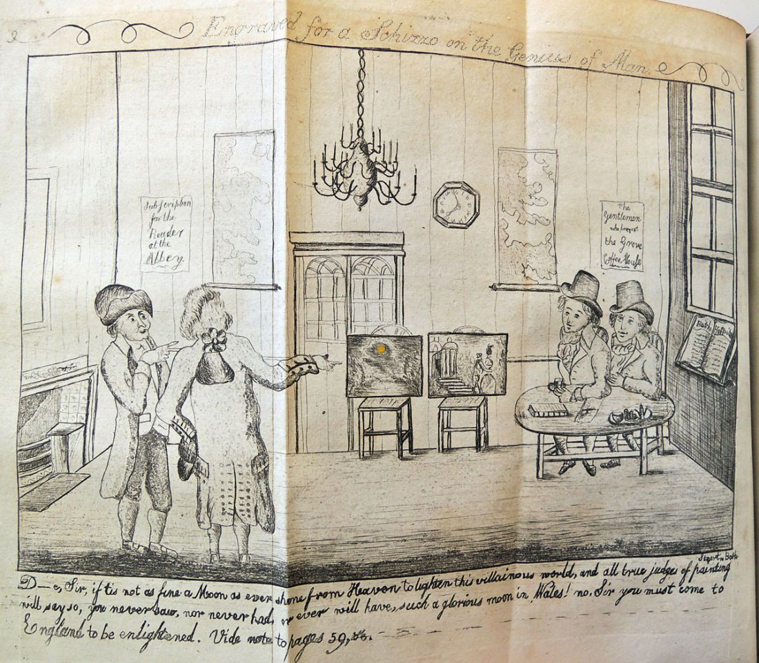
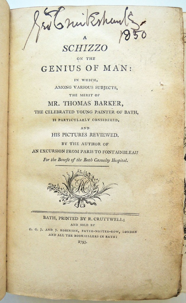
 Edward Harington (1754-1807), A Schizzo on the Genius of Man: In which, among various Subjects, the Merits of Mr. Thomas Barker, the Celebrated Young Painter of Bath, is particularly Considered, and his Pictures Reviewed, by the Author of An Excursion from Paris to Fontainbleau. For the Benefit of the Bath Casualty Hospital. Two etched plates by G. Steart. First Edition. Bath: printed by R. Cruttwell; and sold by G.G.J. and J. Robinson, London, and all the Booksellers in Bath, 1793. Graphic Arts Collection GAX 2015- in process
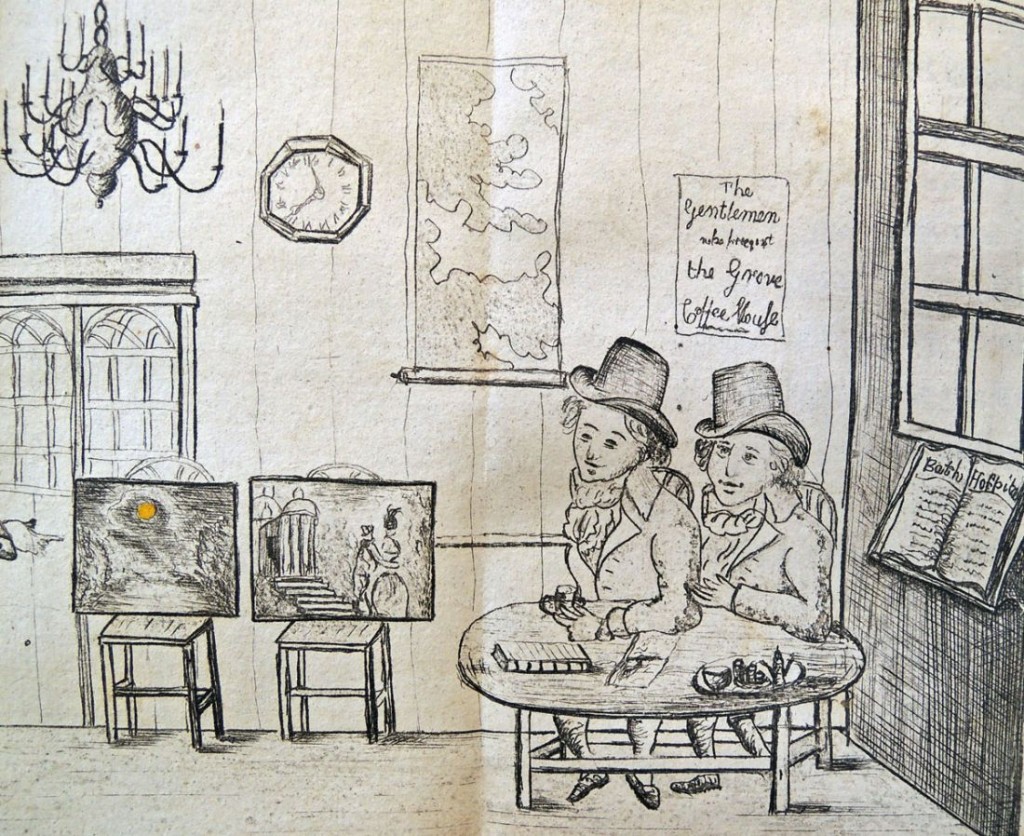
 “D—e, Sir, if tis not as fine a Moon as ever shone from Heaven to lighten this villainous world, and all true judges of Painting will say so, you never saw, nor never had, or ever will have, such a glorious moon in Wales! No, Sir, you must come to England to be enlightened. Vide note to pages 59, &e.”
 Edward Harington (1754-1807) of Harington-Place, Bath, was the son of Dr. Henry Harington, noted musician, physician to the Mineral Water Hospital, and Mayor of Bath.
An Excursion from Paris to Fontainbleau was published in 1786 and Harington was fearful of the French Revolution along with the “rude, ragged rabble.” A Schizzo on the Genius of Man was intended to prove that genius is conferred not by nurture but by nature, not by a process of evolution but through the agency of divine providence.
Harington took the Bath artist Thomas Barker (1769-1847) [see yesterday’s post] as an example of an individual whose talents were born within him, not acquired. Unlike some painters “who basely prostitute their talents to despicable face-painting,” Barker had “a too generous disdain for the love of money to pervert the talents which Heaven had given him.” Even Gainsborough, he averred, “never possessed a genius so strong and so universal.”
 The Graphic Arts Collection has acquired George Cruikshank’s copy of this book with his bold signature and the date 1850 at the head of the title. Cruikshank also added a manuscript note, in ink, in the margin of p. 225.
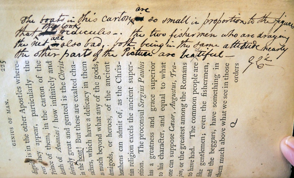
Discussing Raphael’s cartoon of the The Miraculous Draught of Fishes, he writes: “The boats in the carton [sic] are so small in proportion to the figures that they look ridiculous. The two fishermen who are draging [sic] the net are also bad, both being in the same attitude nearly. The other parts of the picture are beautiful – G.C.”
1850 was a pivotal year in the life of George Cruikshank (1792-1878). His first wife, Mary Anne, died in May 1849 and he collapsed, both emotionally and financially. In March 1850 he married Eliza Widdison, and they moved to 48 Mornington Place.
Cruikshank slowly returned to his art, and turned to oil-paintings, though without the success of his smaller-scale etchings. His studio also became home to his maid, Adelaide Attree, who bore him 11 children between 1854 and 1875. His other passion was temperance and he came to be regarded as “the St. George of water drinkers”.
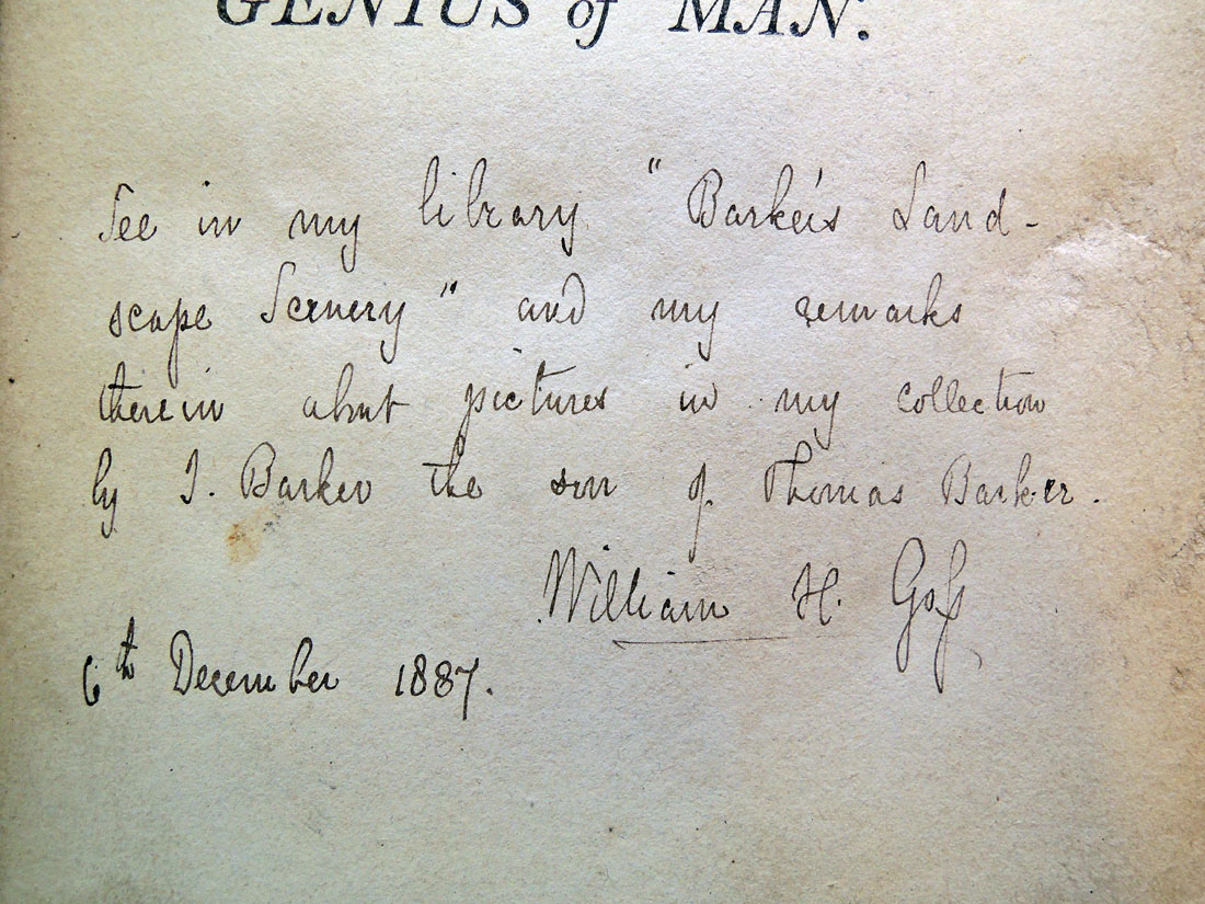
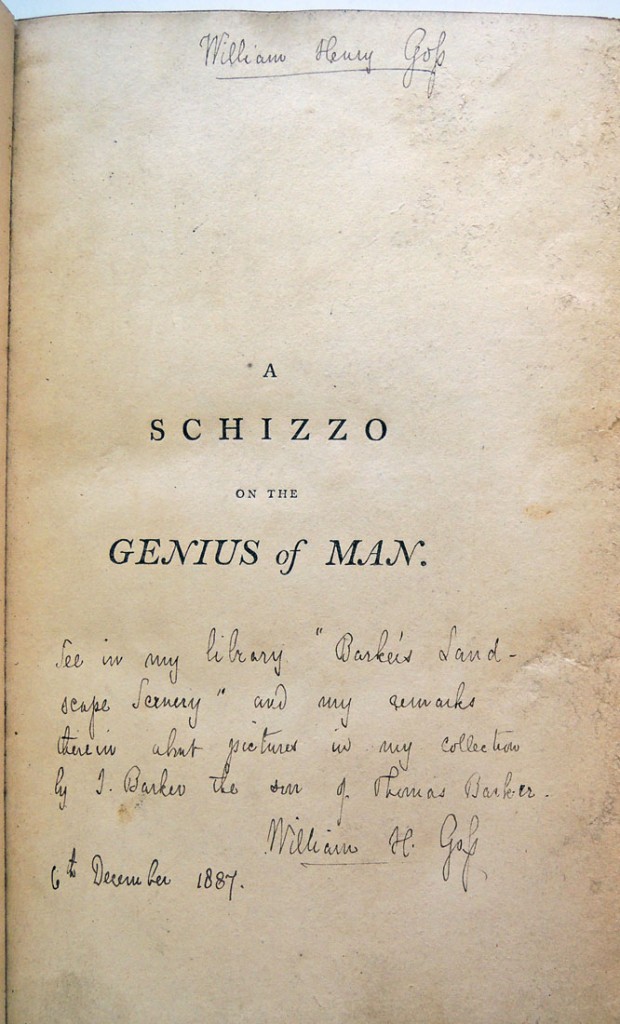
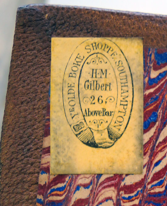
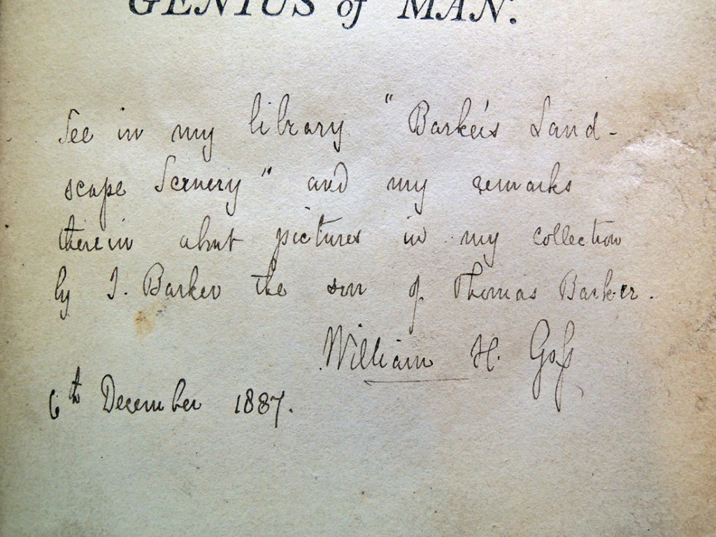
Bookseller’s label of H. M. Gilbert of Southampton (established 1859). The half-title has the ink signature of the potter William Henry Goss (1833-1906), and a note “See in my library “Barker’s Landscape Scenery” and my remarks therein about pictures in my collection by J. Barker the son of Thomas Barker” with his signature and date 6th December 1887.

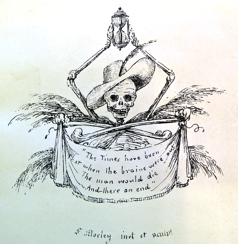 The Times have been
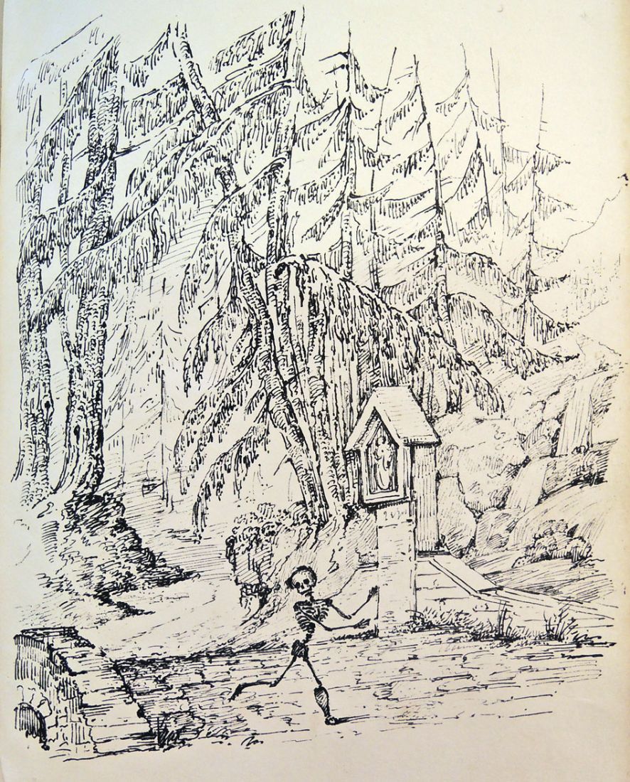
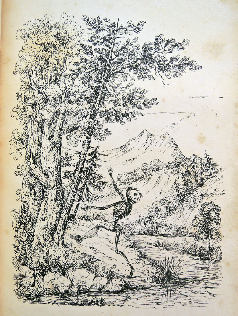
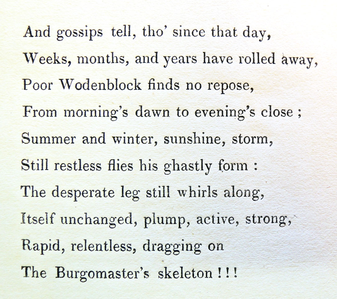
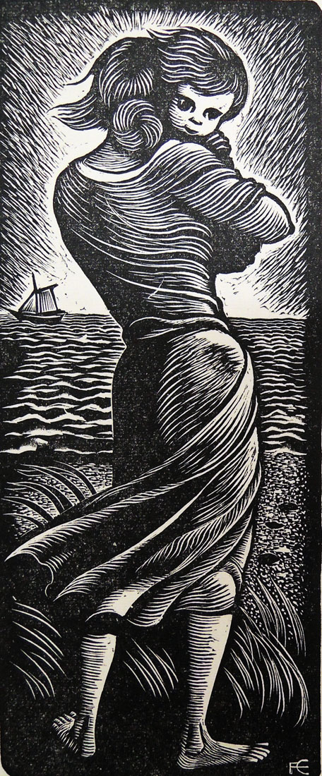
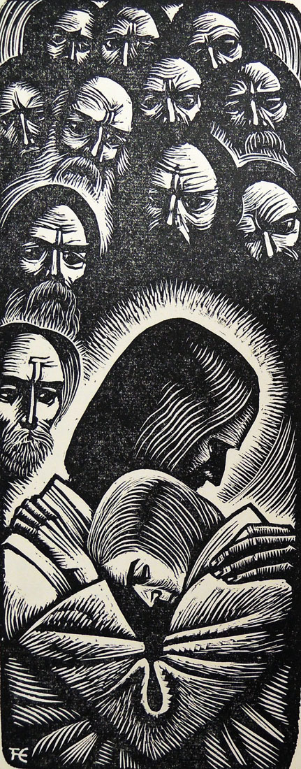
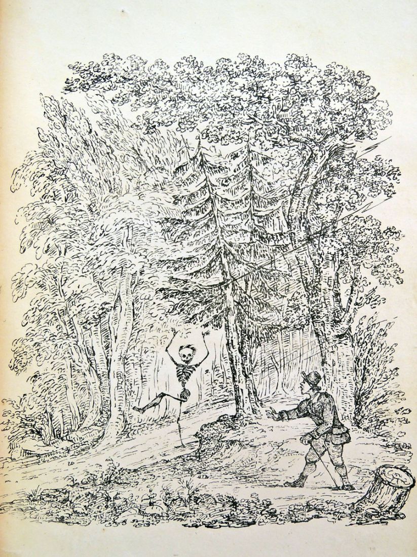 Note, an unillustrated prose version of this story turns up in Henry Glassford Bell, My old portfolio: or, tales and sketches (London: Smith, Elder, and Co., 1832). Hard to know which came first.