Category Archives: prints and drawings

prints and drawings

Le Pavillon de l’Aurore and Colbert’s Chapel

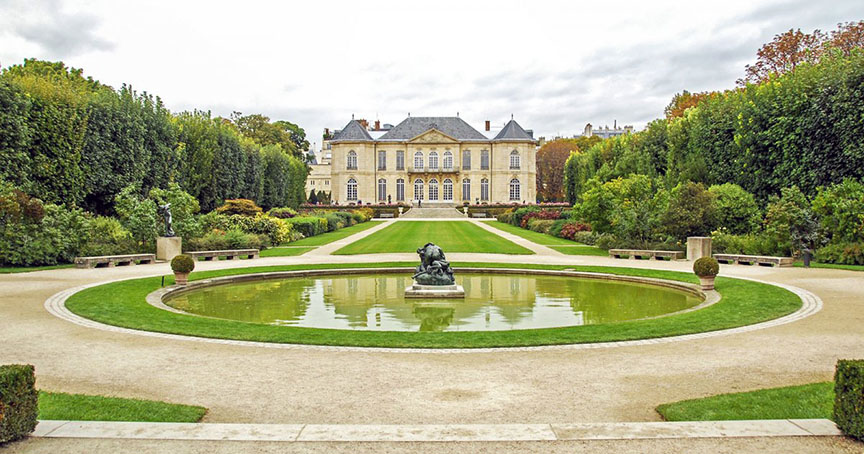
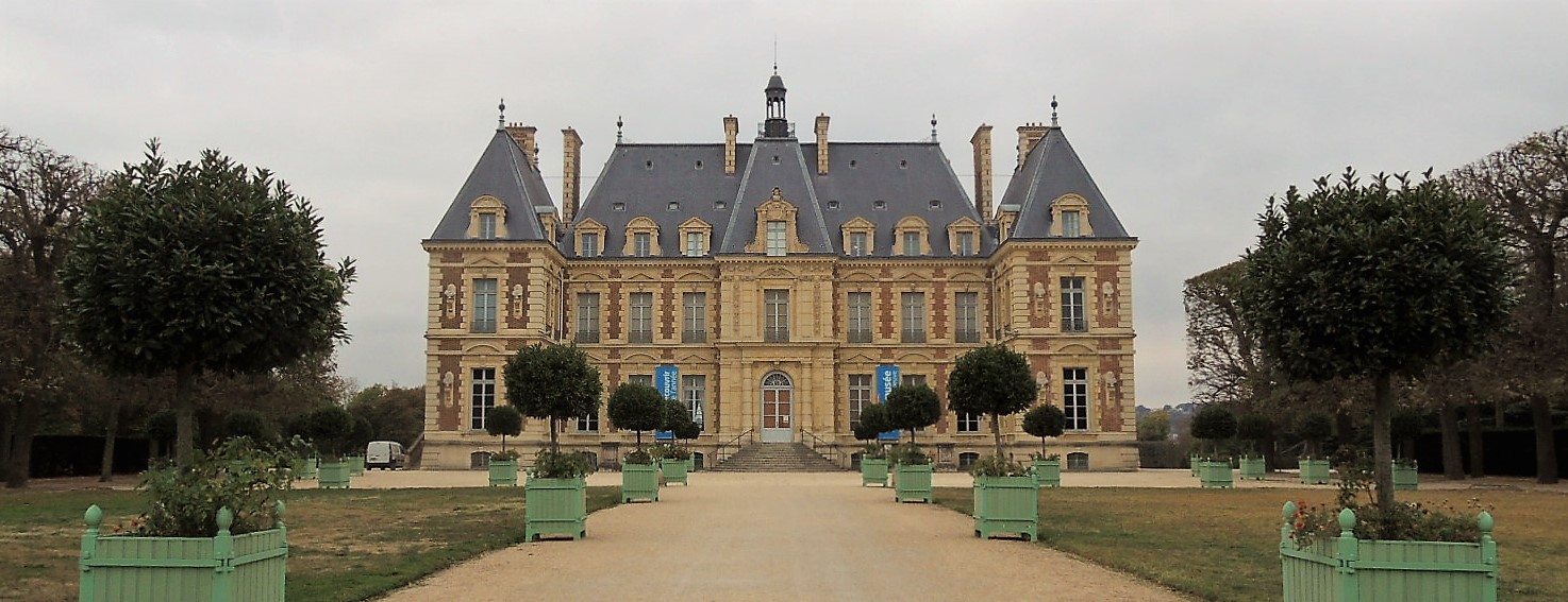
A trip to Jean Baptiste Colbert’s estate at Sceaux, south of Paris, helped to clarify the two illusionistic ceiling designs created in 1674 by Charles Le Brun for Colbert. One fresco was completed for the dome of Colbert’s chapel and a second was painted on the ceiling of the Pavilion of the Dawn (Pavillon de l’Aurore). While we can visit the Pavilion today [seen above] and appreciate Le Brun’s amazing design, the original castle and chapel were destroyed in 1803 along with that second work by Le Brun.

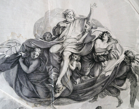
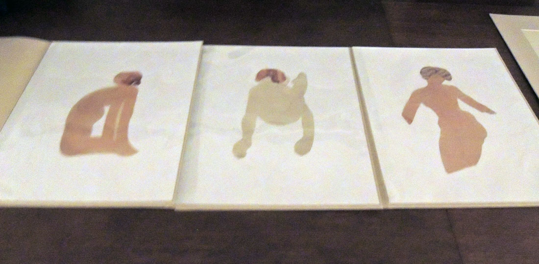
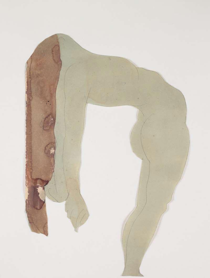
Happily, the chapel design, known as the Triumph of the New Testament, may be studied thanks to a painted copy by Le Brun’s assistant François Verdier [below], as well as the set of five engravings by Gérard Audran, held in the Graphic Arts Collection.

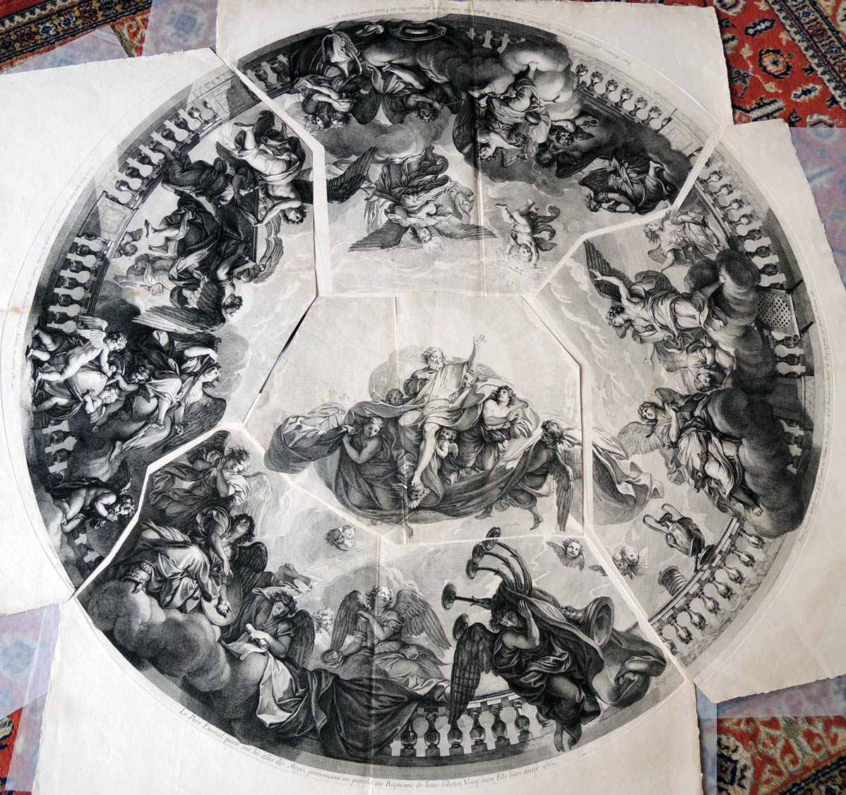
Gérard Audran (1640-1703) after Charles Le Brun (1619-1690), [Set of five plates, known as Triumph of the New Testament over the Old Testament], 1681. Etching and engraving. GA 2012.01256-01260.
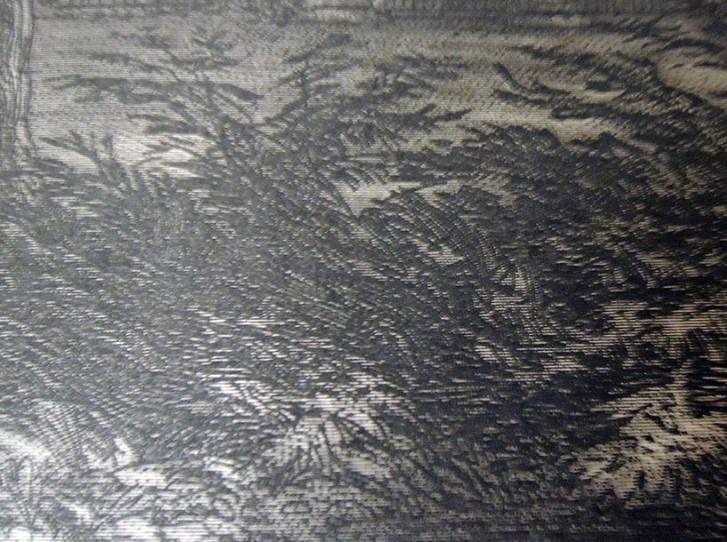
1. “Car. Le Brun Regis Pictor primarius, udo tectorio pinxit in Capella Castelli vulgo de Seaux, Girardus Audran aeri incidit, 1681.” Depicts angels bearing the Ark of the Covenant.
2. “Le Pere Eternel porte sur les ailes des Anges, prononeant ces paroles au baptesme de Iesus Christ, voicy mon fils bien aime &c.” Depicts God the Father on the wings of angels.
3. “Peint a fraisque dans la voute de la Chapelle du Chasteaux de Sceaux.” Depicts the adoring angels.
4. “Pater Aeternus sedens super pennas Angelorum, haec verba in Baptismate Iesu Christi proferens, Hic est Filius meus dilectus &c.” Depicts the baptism of Jesus Christ.
5. Untitled [center section was perhaps not meant to be cut apart]


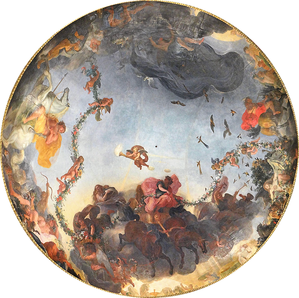
Above is the fresco in the Pavilion of the Dawn, described below in the estate’s official website:

“The Pavillon de l’Aurore houses one of the most remarkable compositions by Charles Le Brun, after Vaux-le-Vicomte and before the great sets of Versailles. Jean-Baptiste Colbert, Baron of Sceaux, Superintendent of Buildings, Arts and Manufactures, in 1664, built in the early 1670s, this elegant garden pavilion, an expression of his taste for an architecture called classical. It was the setting for a remarkable pictorial composition on the theme of Dawn, preceding the sunrise, work of Charles Le Brun, first painter of King Louis XIV.

This famous cupola, elaborated before the large sets of Versailles, dominates a living room rotunda framed by two quadrangular cabinets. In 1677, before the members of the French Academy, Colbert read a long description in verse, composed by Philippe Quinault, commenting on the decor of this “Cabinet of Dawn”. Later, the sovereign and the court admired the building at a big party ordered by Jean-Baptiste Colbert, Marquis of Seignelay, son of the previous, in 1685.

In the years 1714 and 1715, Louise-Bénédicte de Bourbon, duchess Maine chooses this graceful building for the scenography of its festivals, “The Great Nights of Seals”. The west facade of the Pavillon de l’Aurore presents a balanced game of lines and an elegant harmony of curves formed by the basin and the fountain, a kind of water buffet, the two steps of access to the perron, the front-body , the dome and the balustrades. A restoration of architecture and interior decoration was carried out in the last two decades of the twentieth century.”


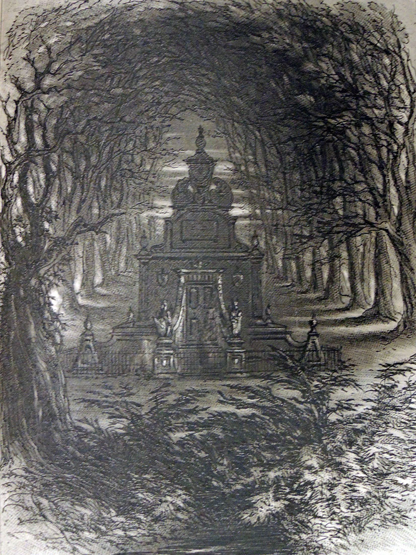
Emile de La Bédollière (1812-1883), Histoire des environs du nouveau Paris; illustrations de Gustave Doré; cartes topographiques dessinées et gravées par Ehrard (Paris: G. Barba, 8, rue Cassette, 8, [1861?]) ReCAP – Rare Books 1514.552


http://domaine-de-sceaux.hauts-de-seine.fr/ledomaine/le-pavillon-de-laurore/

“I have a great weakness for these little sheets of paper” -Rodin

(grainy image due to low light during hanging)

It is a great privilege to have work from the Graphic Arts Collection included in an exhibition at the Musée Rodin in Paris. Opening November 6, 2018, and running through February 24, 2019, the show entitled Rodin, Dessiner, Découper, includes nearly 250 drawings by Auguste Rodin (1840-1917), of which 90 are his rare and often surprising cut and assembled figures, 6 loaned by Princeton University’s Graphic Arts Collection. “Jouant de la mise en espace de ces corps,” writes curator Sophie Biass-Fabiani, “ce procédé révèle des silhouettes découpées audacieuses et un dynamisme d’une grande modernité. Cette exposition annonce un des modes d’expression novateurs du XXe siècle.”

http://musee-rodin.fr/fr/exposition/rodin-dessiner-decouper

The museum’s site goes on to quote Rodin, who said,

“‘I have a great weakness for these little sheets of paper.’ This is how Rodin showed his attachment to his drawn work. From his beginnings, Rodin realized–independently of his sculptures–drawings that he executed according to the living model. He presents his drawings in all exhibitions devoted to him, first in Brussels, Amsterdam, Rotterdam, The Hague in 1899, then Paris in 1900, Prague in 1902 or Düsseldorf in 1904. The museum retains most of this drawn work, about 7500 leaves.

An unprecedented mode of operation: drawing, cutting. Rodin submits his drawings made from a first throw to various metamorphoses. He decodes his drawings, identifies the line that suits him, sets the color using watercolor, cuts out his figures, puts them back, assembles them to other figures and gradually builds an unexpected device. In his early years, Rodin cut drawings and sketches that he pasted into albums. Between 1900 and 1910, he cut a hundred drawings of watercolor nudes which are the heart of this exhibition. By cutting them out, Rodin likes to manipulate them, to situate them in space in multiple ways, to cut them off voluntarily.”

(c) Musée Rodin

More information on how Rodin’s work made it to Princeton can be found here: https://graphicarts.princeton.edu/2018/03/10/auguste-rodin-cutouts/. Hanging and lighting will be completed this week and their beautiful exhibition catalogue with full color images will be available at Princeton next Monday.

“He plays with the small figures of paper which are the equivalent of his plaster figures. By relating these carvings to the three-dimensional character of the sculpture, the carved figures appear as a new “object” between the two-dimensional design and the sculpture. In another series, Rodin executes from his cut-out figures real assemblages that he fixes himself on a new support, interweaving the bodies in a new composition. Drawn and cut, these drawings are not mere technical accessories: they have conquered their status as full-fledged works. The dynamism of the silhouettes announces the modernity of Matisse.” –Sophie Biass-Fabiani, curator

http://www.musee-rodin.fr/fr/visiter/informations-pratiques-paris


What are “Mems”?

This post was directed to our friends in Great Britain who were asked to answer the question: “What are mems?” Happily, the answer came in minutes from Simon Beattie, citing the OED:
mem, v.
Pronunciation:
Brit. /mɛm/
U.S. /mɛm/
Frequency (in current use):
Origin: Formed within English, by conversion. Etymon: mem. n.1
Etymology: < mem. n.1
nonce-word.
transitive. To note or write down as a memorandum.
1915 W. J. Locke Jaffery v. 61 Once having ‘mem-ed’ an unpleasant thing in my diary, the matter is over.

The term appears in such book titles as:
A Paper, of Tobacco: Treating of The Rise, Progress, Pleasures, and Advantages of Smoking: With Anecdotes of Distinguished Smokers, Mems on Pipes and Tobacco-Boxes, and a Tritical Essay on Snuff (London 1839)

Pickwick In America! . . . : and the Sayings, Doings, and Mems of the Facetious Sam Weller (London 1839)

Mems of America, and Reminiscences At Home and Abroad (London 1839)

This advertisement [above] in Willings Press Guide includes Theatrical mems, as does the print at the top from The Illustrated Sporting and Dramatic News, April 6, 1878.

Harry Furniss (1854-1925) was an artist, whose first job as an illustrator was for the Illustrated Sporting and Dramatic News, and later for The Illustrated London News and The Graphic. His most famous humorous drawings were published in Punch, for which he started working in 1880.

Furniss moved to New Jersey where he worked for Thomas Edison making animated cartoons.


Interesting but no mention of mems:
Harry Furniss (1854-1925), My Bohemian Days, with illustrations by the author (New York: Stokes, [1919]). ReCAP 30104.372

Harry Furniss (1854-1925), Harry Furniss At Home (London: T. F. Unwin, 1904). Forrestal Annex NC1320 .F98

Harry Furniss (1854-1925), The Confessions of a Caricaturist (New York: Harper and brothers, 1902). Graphic Arts Off-Site Storage RCPXG-6703038

A Nincompoop and Other Prints


Princeton University class “Caricature and Modernity: 1776-1914” (ART 453/ECS 453) visited the Graphic Arts Collection this week to view prints and watercolors by James Gillray, Thomas Rowlandson, and other British caricaturists.

With frequent bursts of laughter, the class looked primarily at the collection of Dickson Q. Brown, Class of 1895, who donated several thousand prints, drawings, and illustrated books to the Princeton University Library.

“Caricature, based on the distortion of the human face for comic effect, challenged the ideally beautiful,” reads the class description, “and the academic art training that developed in Western Europe after the Renaissance. This course will examine the explosion of caricatural prints and comic illustrated books in France, Great Britain, and the United States from the revolutions of 1776 and 1789 to World War I. Topics will include the political role of satire in the newly defined public sphere; the influence of physiognomy and racial theories on caricatural depictions; the invention of the comic strip; and the origins of Dada and Cubism in comic illustration.”

The invention of laughing gas is celebrated below:

Reports were prepared on Gillray’s Tom Paine’s Nightly Pest (1792); King of Brobdingnag and Gulliver (1803); Matrimonial Harmonics (1805); and Advantages of Wearing Muslin Dresses! (1818). In addition, they studied Rowlandson’s Drawing from Life at the Royal Academy, Somerset House (1808); A Nincompoop or Henpecked Husband (1807); The Anatomist (1811); and Breaking up the Bluestocking Club (1815), among many others.

Next week they move on to Paris and Charles Philipon’s La Caricature with Daumier, Grandville, and other French caricaturists.

Attributed to Henry William Bunbury (1750–1811), The Long Minuet as Danced at Bath (after 1787).


Ellsworth Kelly’s Un Coup de dés


When publisher Sidney Shiff commissioned Ellsworth Kelly to select a text and create prints for a Limited Editions Club book, Kelly chose to match his black and white lithographs with Un coup de dés by Stéphane Mallarmé, one of the most famous poems of the 19th century. In its 63rd year, the Club was publishing only three or four titles each year in editions of 300, unlike the earlier runs of 2,000 under George Macy. This allowed Shiff to work with outstanding artists and create some of the most beautiful books of the late 20th and early 21st century.

Published in the original French and the original page design, Kelly integrated his eleven lithographs with the text, accentuating the open white space of both text and images. A separate booklet with Daisy Aldan’s English language translation is included: mallarme

“A throw of the dice never even when cast in eternal circumstances at the heart of a shipwreck let it be that the Abyss whitened slack raging under an incline desperately soars by its own wing…”


Stéphane Mallarmé (1842-1898) and Ellsworth Kelly (1923-2015), Un coup de dés jamais n’abolira le hasard ([New York]: Limited Editions Club, 1992). Text printed at Wild Carrot Letterpress and lithographs printed at Trestle Editions. Copy 71 of 300. Original black goatskin, in black solander box. Graphic Arts Collection GAX 2018- in process.

The Dark Plates of Phiz

Preparing for a visit from ART 561/ENG 549/FRE 561 “Painting and Literature in Nineteenth-Century France and England,” the prints of Hablot Knight Browne (Phiz) for Charles Dickens’ Bleak House have been pulled. Phiz completed forty plates, etched on steel, for Dickens’ ninth novel published in monthly parts from March 1852 to September 1853.


Both for the added mystery and to thwart the lithographers who made copies of Browne’s superb etchings, the artist developed a technique for what we refer to as the ‘dark plates.’

In ten of the forty illustrations, Browne merged the meticulous engraved lines made by an engraving- or ruling-machine with the hand drawn lines of his etching needle to create the look of a mezzotint with the detail and freedom of a drypoint.
Engraving on steel had only recently been perfected. In 1895, C. W. Dickinson wrote an easy to understand description of “Copper, steel and bank-note engraving,” quoted here:

“Previous to the year 1830 only copper plate was used by engravers, because up to that time it was not thought possible to make steel soft enough to cut easily and smoothly. The first plate produced—that could be used—was called “silver steel.” Later there was manufactured the “Prussian steel” plate, which was a slight improvement in fineness of grain. Other and greater improvements followed, until now steel has almost entirely superseded copper.

Decarbonated cast steel is used for general engraving purposes and must be of very fine grain, and very soft as compared with natural cast steel. The plates are rolled out from bars of steel in its natural state, then decarbonated and cut to about the size desired, leaving enough margin to square the edges, which are finished with a wide bevel. After the plate has been cut to size, it is flattened by laying it upon a copper anvil and hammering with a wooden mallet until it is as flat as is possible to get it by that process. A uniform thickness and perfectly flat surface are then given to the plate by grinding—sometimes by hand, usually by machine—the latter process being the better, as it is the more perfect in its results.”
https://en.wikisource.org/wiki/Popular_Science_Monthly/Volume_46/March_1895/Copper,_Steel,_and_Bank-Note_Engraving

Also in the early 19th-century ruling machines for engravers were being up-graded, in particular to accommodate  enormous publishing project such as Napoleon’s Description de l’Égypte. As improved and enhanced by Nicolas Conté, the French engraving machine was invaluable for the thousands of lines incorporated into the skies and landscapes within his designs. Here’s an image: https://napoleon.lindahall.org/engraving.shtml

A diamond was often used as the stylist on the engraving machines, hard enough to cut but thin enough to draw the slender marks that left the impression of a tint or tone rather than line. Here are a few close ups that make it easier to see the hundreds of tiny straight lines behind Browne’s linear picture.


Many are ruined by buying bargains

According to OCLC, there are less than a dozen copies of this Benjamin Franklin broadside in the United States and three of them are at Princeton. Folded into a stamped binding (see below), the undated broadside was published after 1790 (Franklin’s death) at the shop of Carington Bowles (1724-1793). Its twenty-five engraved oval vignettes (including a central Franklin portrait) were designed by Robert Dighton (1752-1814) to illustrate Franklin’s maxims.


Benjamin Franklin (1706-1790), Bowles’s Moral Pictures, or, Poor Richard illustrated: Being Lessons for the Young and the Old on Industry, Temperance, Frugality &c. By the Late Dr. Benj. Franklin (Manchester (Exchange St. and St. Anns Square): Bancks & Co., [between 1819 and 1839]). Graphic Arts Collection 2007-0083N


The biography for Robert Dighton (1752-1814) posted by the British Museum lists his shop at 12 Charing Cross; 6 Charing Cross; and 4 Spring Gardens Charing Cross, London. “A singer and draughtsman, especially known for designs for satirical prints, which he initially supplied to Carington Bowles and Haines. Later plates he etched, published and sold himself. Stole prints from the British Museum (see A. Griffiths, ‘Landmarks in Print Collecting’, BM 1996, pp. 10, 49-50, 60, 276-83). Son of the art dealer, John Dighton (q.v.). Father of three artists, Robert junior, Denis and Richard (q.v.), who seem to have worked together as a family business, with a common stock of plates.”–Britishmuseum.org

This broadside evolved through a long series of publications. Here at Princeton, we hold:
1747
Benjamin Franklin (1706-1790), Poor Richard improved: being an almanack and ephemeris … for the bissextile year, 1748. : … Fitted to the latitude of forty degrees, and a meridian of near five hours from London; but may, without sensible error, serve all the northern colonies by Richard Saunders, philom (Philadelphia: printed and sold by B. Franklin, [1747]). “Richard Saunders” is a pseudonym. Probably calculated by Theophilus Grew. An advertisement for his school of mathematics appears on p. [30]. William H. Scheide Library 102.48

1748
Benjamin Franklin (1706-1790), Poor Richard improved: being an almanack and ephemeris … for the year of our Lord 1749: … Fitted to the latitude of forty degrees, and a meridian of near five hours west from London : but may, without sensible error, serve all the northern colonies by Richard Saunders, philom. (Philadelphia: Printed and sold by B. Franklin, and D. Hall, [1748]). “This is the first Poor Richard almanac to contain the woodcuts showing the occupations of the months,” Cf. Hamilton. Sinclair Hamilton Collection Hamilton 27

1757
Benjamin Franklin (1706-1790), Poor Richard improved; being an almanack and ephemeris … for the year of our Lord 1758 … by Richard Saunders, philom. (Philadelphia: Franklin and Hall, 1757). This number contains collection of proverbs which were reprinted in England as the Way to wealth. “This is most rare and valuable of the series.” Sabin. According to Ford and Evans this is the last number edited by Franklin. Rare Books (RB) RHT American-81

1779
Benjamin Franklin (1706-1790), The Way to Wealth: as clearly shewn in the preface of an old Pensylvanian [sic] almanack, intitled, Poor Richard, improved. Written by Dr. Benjamin Franklin. Extracted from the Doctor’s political works ([London: printed for J. Johnson, 1779]). Broadside. 31 x 39.5 cm. Rare Books Oversize 3744.91.395f

1795
Benjamin Franklin (1706-1790), The Way to Wealth, or, Poor Richard improved, by Benj. Franklin (Paris: Printed for Ant. Aug. Renouard, 1795). The Way to Wealth was first published in Poor Richard’s almanac for 1758 and separately issued in 1760 under title: Father Abraham’s speech. The present edition includes the French translation of Quétant and L’Écuy, with special t.-p.: La science du Bonhomme Richard, ou Moyen facile de payer les impôts. Par Benj. Franklin. Paris, Ant. Aug. Renourd, 1795. ExKa copy has bookplate of Grenville Kane. Rare Books 3744.91.395.11

Ford, Franklin Bibliography, p. 69, no. 137.

The Battle of Princeton and the [later] Death of Mercer

One of the rare items pulled for the Princeton University class “Battle Lab” (HUM 350/ART 302/AMS 352) was a series of preparatory sketches by John Trumbull (1756–1843) for his painting, The Death of General Mercer at the Battle of Princeton, January 3, 1777.

The students were asked where and when did Brigadier General Hugh Mercer (1726-1777) actually die? Answer: Mercer died in the Thomas Clarke House on the eastern end of the battlefield, nine days after the battle ended.

The students examined a cannon ball found in April 1896 near Princeton Battlefield and grapeshot found November 1941 by Dr. Henry E. Hale, one yard northerly from north west corner of the Thomas Clarke House in which Gen. Mercer died 12 Jan. 1777, found under the room in which he died (Gift of Cora A. Margenem).


This framed section of The Apotheosis of George Washington uses an image taken from a 1781 print by Valentine Green after a painting by John Trumbull, and printed on fabric by an English textile designer. Here Washington is driving a chariot drawn by leopards, accompanied by the figure of America in a plumed headdress. This is one part of a larger design that originally also included The Apotheosis of Benjamin Franklin and was used as wall paper, bed linen, and other decorative fabrics.

Students were also shown two swords, one which appears in the Washington textile and the other similar to one in Trumbull’s battle scene.

Among the seminal American documents shown was a first printing of the Declaration of Independence, printed by John Dunlap (1747-1812) and “signed by order and in behalf of the Congress, John Hancock, president. Attest. Charles Thomson, secretary.” Acquired December, 1940, William H. Scheide Library.

There are two states noted by Frederick Goff, differing in the placement of the imprint. In the earlier state, the P of Philadelphia is located directly beneath the comma following Thomson’s name. In the later state the P is located directly beneath the n of Thomson’s name. Goff notes also a proof copy (imperfect), held by the Historical Society of Pennsylvania, exhibiting differences in punctuation and in the insertion in line 13 of the word ‘a’ before the word ‘new.’ Cf. Goff, F.R. The John Dunlop broadside: the first printing of the Declaration of Independence, 1976. See also Walsh, M.J. “Contemporary Broadside editions of the Declaration of Independence.” Harvard Library Bulletin 3 (1949): 31-43, 1.

(left) Thomas Paine (1737-1809); (center) George Washington (1732-1799); (right) Benjamin Franklin (1706-1790) from the Laurence Hutton Collection of Life and Death Masks http://library.princeton.edu/libraries/firestone/rbsc/aids/C0770/. Note the sunken faces of Paine and Franklin, whose false teeth had been removed before the mold was taken.


Thanks to the donation of Malcolm S. Forbes, Class of 1941, we have a collection of American Revolutionary War soldiers in the Battles of Trenton and Princeton. The group consists of no.158 of a limited set of models of the officers and men of American, British, and Hessian regiments that fought in the battles of Trenton (December 26, 1776) and Princeton (January 2-3, 1777). These 39 models were made to order for the Princeton Battlefield Area Preservation Society by Blenheim Military Models, Glamorgan, Wales.

A variety of other reliquaries, maps, and engravings were also included in the exciting class.

Clavé’s Gargantua

François Rabelais (approximately 1490-1553), Gargantua. Illustrated by Antoni Clavé ([Marseille]: Les Bibliophiles de Provence, 1955). No. 33 of 220 copies printed by Priester freres in Paris. 61 original color lithographs (including 4 double-page and 15 single-page, all hors-texte) + 61 original color woodcuts for lettrines and cul-de-lampe. Graphic Arts Collection GAX 2018-in process

”… Gargantua (Rabelais), a work to which Clavé brought all his inventiveness of design. Apart from the brilliant color combinations (some involving five to eight separate stones)… Clavé devised a large number of initial letters… Certainly this book lives up to Rabelais’s exhortation ”Vivez joyeux”; it is also Gargantuan in scale with its format”.  [Strachan goes on declaring this work as sequel to Derain’s Pantagruel]. Strachan The Artist & The Book in France, pp. 146 & 329.


The artist is not well known and so, here is an extended biography, https://www.antoni-clave.org/en/biography/

Antoni Clavé was born in Barcelona in 1913. At 13 years of age, and seeking employment, he is hired as an assistant in a textile shop for girdles and corsets. At the same time, he signs up for evening classes at the annex to the Escuela de Artes y Oficios Artísticos y Bellas Artes. As an apprentice house painter with Tolosa, he is attracted by the manual aspect of the work (distemper, primer, glues, and later the mixing of colors). …In April 1940, there is an exhibition at the « Au Sans Pareil » bookstore which is not very successful. In June, the Germans are at Paris’ gates. Clavé intends to leave Paris to make his way to Venezuela but the German tanks have already cut off the roadways and he is obliged to turn back. In 1941, Clavé moves into his first atelier at number 45, rue Boissonnade. His son Jacques is born in 1942 and his own mother moves to Paris. This is an intimate and introspective period for his work where he is influenced by Bonnard and Vuillard. The following year he produces the lithographs as illustrations for Lettres d’Espagne by Prosper Mérimée. In 1944 Clavé meets Picasso, and this encounter will have profound repercussions that will be decisive for the future of his art. His work is exhibited at the Galerie Henri Joly.

In 1946, he travels to Czechoslovakia for an exhibition of Spanish painters in Paris, among whom are Picasso, Borès, Dominquez, Florès, Lobo and Fenosa. He begins work on major set decoration and costumes for the ballet: Los Caprichos for the Ballets des Champs-Elysées (Paris, 1946), Carmen for the Ballets de Paris Roland Petit (Paris, 1949) and Ballabile for Sadler’s Welles Ballet (Covent Garden, London, 1950). His work is also to be found in many illustrated books: La Dame de Pique by Pouchkine and Carmen by Prosper Mérimée in 1946; Voltaire’s Candide in 1948; Gargantua by Rabelais in 1950. This work inspires new subjects and series: The King of Cards, Figures of the Middle Ages and Warriors. Many exhibitions follow: at the Galerie Delpierre in Paris in 1946, at the Anglo-French Art Centre of London in 1947, in 1948 at the Galerie Robert Martin in Oran, Algeria, at Malmö in 1949 and Göteborg, Sweden in 1950.

In 1951, he exhibits at the Galerie Witcomb in Buenos Aires, and in Rome at the Galleria dell’Obelisco, followed by the Galerie Drouant-David in Paris in 1953, at the Galleria del Sole in Milan in 1954 and in London at the Tooth Gallery in 1955. His creations for the theatre are an essential part of his work at this time: La maison de Bernarda Alba by Federico Garcia Lorca, Festival de Biarritz and the Théâtre de l’Œuvre, Paris, 1951; Revanche, Ballet by Ruth Page, Chicago Opera Ballet, 1951; Don Perlimplin, by Federico García Lorca, Festival du XXe siècle, Paris, 1952 ; Les Noces de Figaro, by Mozart, Festival d’Aix-en-Provence, 1952 ; Deuil en 24 heures, Ballets de Roland Petit, Paris, 1953. In 1954, Clavé decides to abandon theatre design in order to devote himself to his painting. His final decorative work will be for the set and costumes for La Peur, a ballet by Roland Petit.

See also: https://www.princeton.edu/~graphicarts/2011/08/pantagruel.html

Photography albums and scrapbooks of Mexico

https://catalog.princeton.edu/catalog/5731327
https://findingaids.princeton.edu/collections/RCPXG-5830371.2
Twenty-five boxes of Mexican ephemera were acquired several years ago with a wide variety of materials included. A recent request for the photography albums and scrapbooks has led to the individual cataloguing of these unique, unpublished items (in process). The images include such diversity of commercial and personal photography, along with stamps, labels, souvenirs, brochures, and other ephemeral material, many with handwritten captions, that a few quick images were captured here.