The Printers’ International Specimen Exchange

specimen exchange6

The Printers’ International Specimen Exchange (London: Office of the Paper and printing trades journal, 1880-1898). Graphic Arts Collection, vol. 5 (1884), 7 (1886), and 8 (1887).

Thanks to Matthew Young’s recent study, we now know that the Printers’ International Specimen Exchange was founded in 1880, first and foremost as a means to encourage British printers to improve their technical and artistic skills, seen as lagging behind their American and European counterparts. It came to be a far more international  than its originators imagined, encompassing 16 volumes with the work of more than 1,000 printing establishments from 28 different countries.

specimen exchange1

The Graphic Arts Collection recently acquired three of these rare annuals, published in editions of only a few hundred copies and meant expressly for members of the exchange. The volumes document some of the most elaborate printing from the end of the nineteenth century.

specimen exchange3                      specimen exchange2

specimen exchange4

The over-the-top decoration of these printers had both supporters and detractors. The first editor of the exchange, Andrew Tuer (1838-1900) published a letter of support from John Ruskin (1819-1900) in the first volume, “It seems to me…that a lovely field of design is open in the treatment of decorative type…not in the mere big initials in which one cannot find the letters but in the delicate and variably fantastic ornamentation of capitals and filling of blank spaces or musically-divided periods of sentences and breadths of margin.”

Theodore Low DeVinne (1828-1914), on the other hand, spoke sarcastically about these printers, noting, “what advances have we made in rule-twisting! What unknown possibilities in typography have been developed by our new race of compositors! …How it does delight us to employ a typographical gymnast who tortures brass rules and spends hours and days in experiments with borders, fancy job types, tint grounds, and flourishes!” (Historic Printing Types, a Lecture Read before the Grolier Club, Ex 0220.296.2).

Happily, we can now judge for ourselves with the acquisition of these new volumes.

specimen exchange7

See also, Matthew Young, The Rise and Fall of the Printers’ International Specimen Exchange (New Castle, DE: Oak Knoll Press, 2012). Graphic Arts RCPXG-7033164.


On Such a Full Sea

lee on such 3 lee on such 2

Chang-rae Lee, On Such a Full Sea (New York: Riverhead Books, 2014). Copy 471 of 500. Graphic Arts Collection 2014- in process.

When Princeton University Professor of Creative Writing Chang-rae Lee was ready to publish his fifth novel, On Such a Full Sea, a decision was made to produce a special, limited edition book in addition to the trade volume. His publisher Riverhead Books teamed up with MakerBot to create 500 copies with a 3D printed slipcase designed by  art director Helen Yentus. Fabricated on the MakerBot® Replicator® 2 Desktop 3D Printer, the extended typography was then repeated on the cloth cover and each book signed by Lee.

lee on such 4

To watch a video of Helen Yentus, the art director of Riverhead Books, talking about the design and construction of the 3D printed slipcase for Lee’s novel, click here: http://youtu.be/vfr2ARWWKHs

Lee on such1

Chang-rae Lee is the author of five novels:  Native Speaker (1995); A Gesture Life (1999); Aloft (2004); The Surrendered, which was a Finalist for the Pulitzer Prize; and On Such a Full Sea (2014). His novels have won numerous awards and citations, including the Hemingway Foundation/PEN Award, the American Book Award, the Barnes & Noble Discover Award, ALA Notable Book of the Year Award, the Anisfield-Wolf Literary Award, the Gustavus Myers Outstanding Book Award, and the NAIBA Book Award for Fiction. He has also written stories and articles for The New Yorker, The New York Times, Time (Asia), Granta, Conde Nast Traveler, Food & Wine, and many other publications.


Lucas Cranach’s Borders for Maximilian’s Prayer Book

des aelteren lucas 5

Johann Georg Zeller, editor. Des älteren Lucas Müllers genannt Cranach Handzeichnungen. Ein Nachtrag zu Albrecht Dürers christlich mythologischen Handzeichnungen (München: Zeller’schen Kunst-Magazin, 1818). Color lithographs. Graphic Arts collection GAX 2014- in process

There are many 21st-century digital and 20th-century off-set reproductions of the the Book of Hours of the Emperor Maximilian the First, decorated by Albrecht Dürer (1471-1528), Lucas Cranach (1472-1553), and other artists, which was printed in 1513 by Johannes Schoensperger at Augsburg.

Early attempts at reproducing this exquisite work were rare, even at the time they were published. The Graphic Arts Collection just acquired the first and only edition of the reproductions–in the newly invented medium of lithography–of the marginal drawings by Lucas Cranach in Maximilian’s Prayer Book. Note in particular the very early use of multi-color lithographic printing.

des aelteren lucas 1
des aelteren lucas 2
des aelteren lucas 4

Graphic Arts also holds a copy of the 1808, Albrecht Dürers christlich-mythologische Handzeichnungen (GAX Oversize 2007-0749Q), and Rudolph Ackermann’s 1817 Albert Durers Designs of the Prayer Book (Oversize 2007-0027F).
des aelteren lucas 3

Paper Icons Made for the Monastery of Saint Catherine, Sinai

stamp of the monastery of saint Catherine

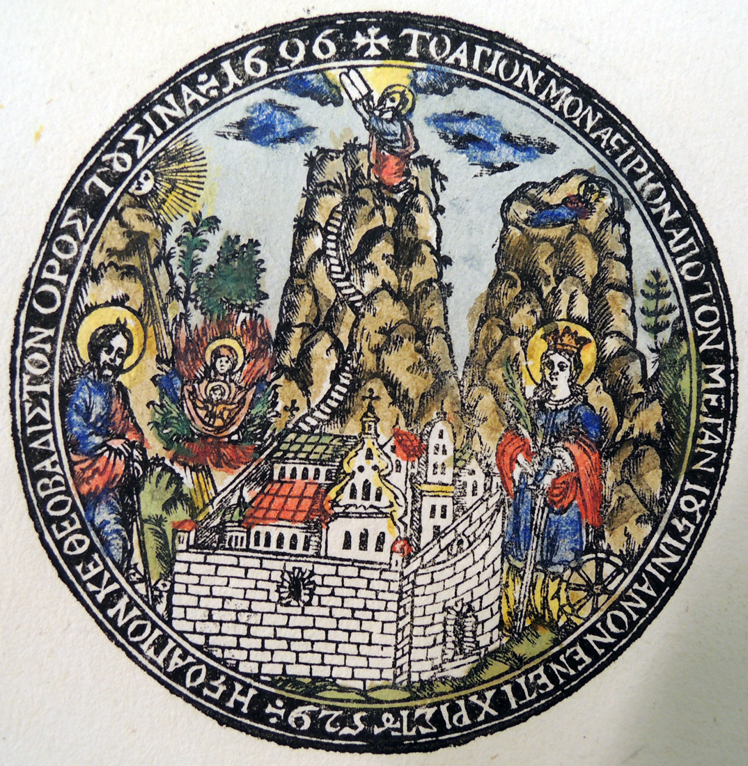
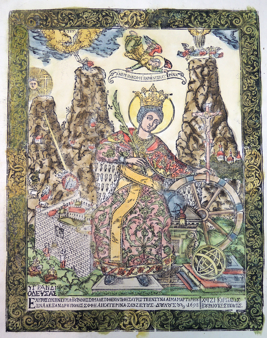
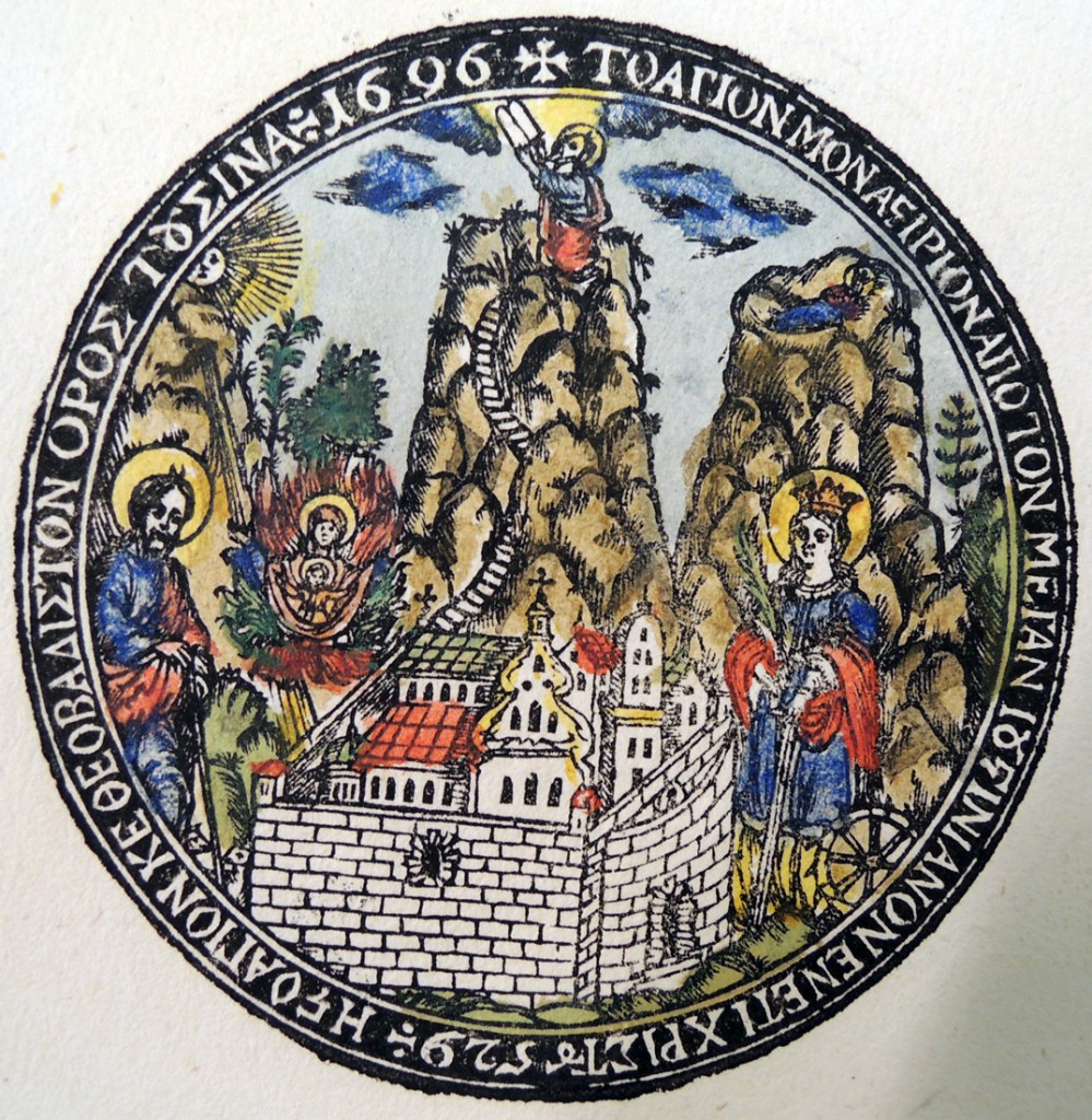
Nikodimos, The Stamp of the Monastery of Saint Catherine, 1696. Woodcut with hand coloring. Graphic Arts Collection GAX 2014- in process. Acquired with matching funds provided by the Program in Hellenic Studies with the support of the Stanley J. Seeger Hellenic Fund.matching funds provided by the Program in Hellenic Studies, and the Valerie Brackett and Nikolaos Monoyios Charitable Fund, in memory of Dimitrios and Kalliopi Monoyios.

“Greek scholars agree in emphasizing the role played by engravers active in [Lwow] in the late seventeenth century,” writes Waldemar Deluga. “Their work had a tremendous impact on changes in the Orthodox religious iconography of later centuries. It was in one of the biggest towns of the old Polish Lithuanian Commonwealth that engravings were being made for the Greek market.”

This slideshow requires JavaScript.

“The artists working on commissions from the stauropegion brethren and from Hatzikyriakis Vourliotis [Chatzēkyriakēs], envoy of the St Catherine monastery in the Sinai, included Nikodém Zubrzycki and Dionizy Sinkiewicz. Their views of the monasteries and images of St Catherine of Alexandria, Moses and Aaron were copied frequently by Greek printmakers. In 1706, the hieromonk Matthaios from Sinai executed a woodcut copy of a view of the Sinai, presumably in a workshop in Crete.” –Waldemar Deluga and Iwona Zych, “Greek Church Prints,” Print Quarterly 19, no. 2 (June 2002): 123-35.

general view of mount sinai detail

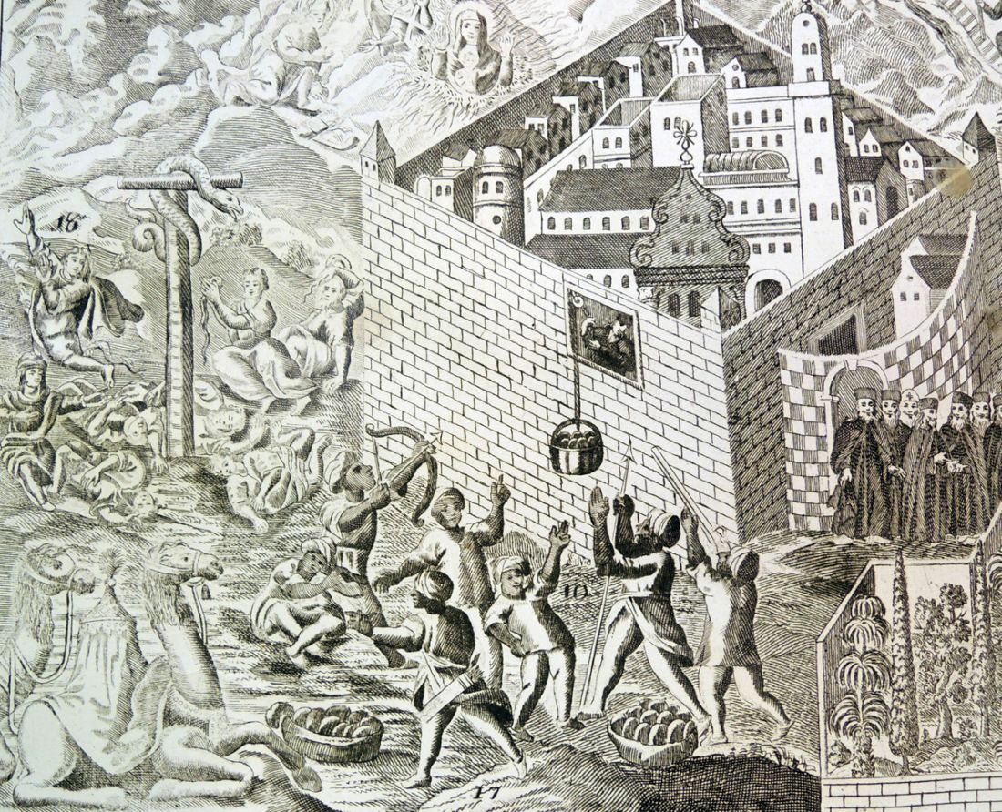
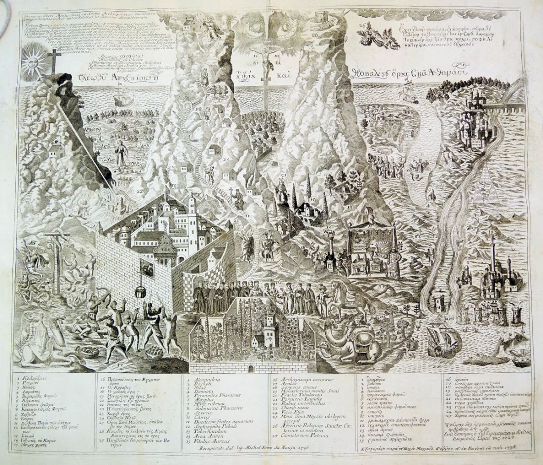
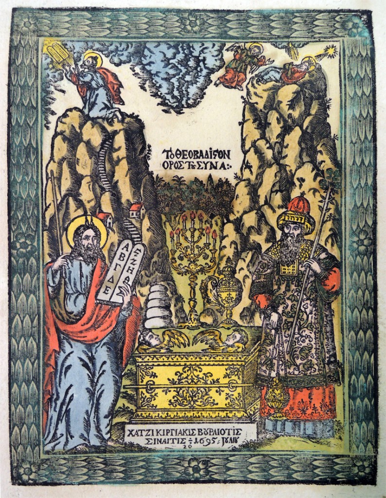
Detail from General View of Mount Sinai, 1727-36. Engraving. Graphic Arts Collection 2014- in process. Acquired with matching funds provided by the Program in Hellenic Studies with the support of the Stanley J. Seeger Hellenic Fund.

Thanks to the hard work of Dimitri H. Gondicas, Director, Stanley. J. Seeger ’52  Center for Hellenic Studies, and to matching funds provided by the Program in Hellenic Studies with the support of the Stanley J. Seeger Hellenic Fund, and the Valerie Brackett and Nikolaos Monoyios Charitable Fund, in memory of Dimitrios and Kalliopi Monoyios, the graphic arts collection has acquired sixteen early religious woodcuts and engravings made for the Monastery of Saint Catherine, Sinai. The prints, which have been dated from 1688 to the early 18th century, are among the earliest known religious prints produced for circulation in the Orthodox East.

The woodcuts were printed mainly in Lwow, Poland, under the patronage and at the expense of the Greek trader Hatzikyriakis Vourliotis. This collection is unique in many ways, not the least of which is the very presence of such early prints from wood, a technique abandoned in the early 18th century and replaced by copper engraving.  As Deluga notes, “Few have survived to our day, and they are generally considered a rarity; many are known in a unique impression.”

general view of mount sinai

Unidentified artist, General View of Mount Sinai, 1727-36. Engraving. Graphic Arts collection 2014- in process. Acquired with matching funds provided by the Program in Hellenic Studies with the support of the Stanley J. Seeger Hellenic Fund.

“The Monastery of St. Catherine at Mount Sinai is one of the best-known early monastic establishments. Situated in the barren wilderness of the Sinai Peninsula, the monastery is dominated by the mighty massif of Mt. Sinai (Jebel Musa) where, according to the Biblical tradition, Moses received the Tablets of the Law from God.”

This text was written in the spring of 2006, for an exhibition conceived in conjunction with a graduate seminar entitled “Juncture of Heaven and Earth: The Monastery of St. Catherine on Mount Sinai” taught by Slobodan Ćurčić. To see more: http://web.princeton.edu/sites/Archaeology/rp/sinaiexhibit/

The exhibition commemorated Kurt Weitzmann (1904-93) and the Princeton-Michigan expedition to Mt. Sinai. Weitzmann, professor of art and archaeology at Princeton (1945-72) and his colleague George Forsyth, then professor at the University of Michigan (Ann Arbor), organized a series of expeditions (1956-65) to Mount Sinai, with the aim of studying the Monastery of St. Catherine and its treasures.

saint catherine colored

Nikodimos, Saint Catherine, 1698. Woodcut with hand coloring. Graphic Arts Collection gax 2014- in process. Acquired with matching funds provided by the Program in Hellenic Studies with the support of the Stanley J. Seeger Hellenic Fund.
This is the earliest known ‘paper icon’ of Saint Catherine.

Beside the article in Print Quarterly, one of the best sources of information on these prints, and topic in general, is: Dore Papastratou, Paper Icons: Greek Orthodox Religious Engravings, 1665-1899 (Athens: Papastratos; Recklinghausen: A. Bongers, 1990). Marquand Library (SA) Oversize NE655.2 .P3713 1990q

Mount Sinai and the Monastery of St. Catherine; an exhibition based on the expedition sponsored by the University of Michigan, Princeton University, and the University of Alexandria (Princeton, N.J.: Princeton University Library, 1960). Marquand Library (SA) BX387 .M68
seven branched lamp moses and aaron

Please note that since this post was written, we have made a correction. We had attributed some works to a certain monk Nikodimos Rokou. This is a mistake, due to a misunderstanding of an inscription that interpreted the polish word Rokou or better Roku as the painter’s last name, whereas in fact the word “roku” in Polish language stands for “during” and usually accompanies a date. Thus the inscription reads: IER[O]DIAKON NIKODIM / ROKU 1688 etc. which means “[made by] priest Nikodim, during the year 1688”. In light of this evidence, the catalogue entry has be updated and the painter’s name be changed from Nikodimos Rokou to plain Nikodimos (ιεροδιάκονος Νικόδημος). Thanks to Dr. Margarita Voulgaropoulou for her help in this attribution.

Need a tiger? Try no. 986.

davison new specimen8

davison new specimen5The Alnwick pharmacist and printer/publisher William Davison (1781–1858) was fortunate to have the experienced printmaker Thomas Bewick (1753-1828) producing illustrations for his books. At some point, he purchased a large collection of the woodblocks engraved by Bewick and issued a book of specimens of these and others available for printing at the Davison shop.

This specimen book is not dated but was issued around 1837 and offers 1,081 impressions from wood-engraved and cast metal ornaments. Over 50 cuts illustrate literary works by Robert Burns, Beattie, Blair and Fergusson. In addition, there are birds, fish, insects, and of course, tigers.

davison new specimen4
davison new specimen2

davison new specimen7

William Davison (1781-1858), New Specimen of Cast-Metal Ornaments and Wood Types Sold by W.Davison (Alnwick: Davison, ca. 1837). Graphic Arts Collection GAX 2014-in process

davison new specimen3
davison new specimen6

Julio Cortázar and Julio Silva

silva discours photo2

Photograph by Laure Vasconi at Silva’s workshop (Paris, 1992).

In trying to understand contemporary artists’ books, we often ask which came first, the text or the images? For one of Latin America’s most acclaimed 20th -century writers Julio Cortázar (1914-1984) and his fellow Argentine Julio Silva (born 1930), that process evolved over time.

silva discours du pince gueule4

Print on Japan paper accompanying artist’s proofs of Discours du Pince-Gueule.

Chronologically, the first book that brings them together is Les Discours du Pince-Gueule, as Peter Standish notes in his book Understanding Julio Cortázar, “Not only was this the first such combination essayed by Cortázar, it was also the first of what would become many collaborative ventures with his friend….” [Peter Standish, Understanding Julio Cortázar (Univ of South Carolina Press, 2001)].  Published in Paris in 1966, the first edition of their book had a limited run of only 100 copies. This has become a very rare volume, with most libraries only collecting the 2002 edition.

It may not be obvious to those who are not fluent in French that the title is a neologism. Standish points out that Cortázar “made the Pince-nez flip down from the nose to the mouth (for which gueule is a vulgar slang word) and no doubt he also had in the back of his mind the term pince-san-rire, meaning a person with a dry humor.”

silva discours photo3

Detail of a photograph by Colette Portal (Saignon, 1979)

silva discours photo4

Portrait of Julio Silva by Julio Cortázar at the Place du Général Beuret house (Paris, 1965).

  In the case of this first collaboration, Silva provided lithographs to complement text that Cortázar had already written for Les Discours du Pince-Gueule (1966). This later changed when Silva’s designs came first with the two collage books, La vuelta al día en ochenta mundos (1967) and Último round (1969) and then Territorios (1978). With Silva and other collaborators, Cortázar preferred to let them take the lead, writing that he had “a wish to walk alongside friends who are painters, creators of images, and photographers” (Territorios, 107). According to Standish, “by the seventies he was saying that he was writing because of the existence of their art, and pointing out that critics had paid a great deal of attention to literary influences upon him but not enough to a long list of artistic and musical ones.”


silva 3

Opening from Discours du Pince-Gueule.

BIO 219_ JULIO ET JULIO  SAIGNON PRES DE APT  1971

Photograph by Colette Portal (Saignon, 1979).

We are fortunate to have acquired not only the 1966 limited edition artists’ book but also many drawings and proofs that led to the first edition. We also acquired several albums of personal photographs from Silva and Cortázar, providing views of their friends and collaborations. The photographers include Pierre Boulat; Colette Portal; Yan Voss; and Cortázar himself. We are extremely grateful to Julio Silva for making this acquisition possible, which will undoubtedly inspire and inform generations of researchers.

silva discours photo6

Photograph by Pierre Boulat at Julio Silva’s home at the Rue de Beaune, Paris with Julio Cortázar and Olivier Silva (Paris, 1969).

silva discours du pince gueule2

Julio Cortázar, Les Discours du Pince-gueule. Illustrations by Julio H. Silva (Paris: M. Cassé, 1966). Edition of 100. Graphic Arts Collection. Purchased with the generous support of Stanley J. Stein, the Walter Samuel Carpenter III Professor in Spanish Civilization and Culture, Emeritus, in honor of Barbara H. Stein, Princeton University’s first bibliographer for Latin America, Spain and Portugal.


Tolstoy

tolstoy3

tolstoy2

The Russian sculptor Sergei Dmitrievich Merkurov (1881-1952) was one of the most celebrated creators of death masks in the twentieth century, known for his busts of Joseph Stalin, Vladimir Lenin, Vladimir Mayakovski, Maxim Gorky, and many others.

Merkurov studied in Germany and then, with Auguste Rodin (1840-1914) in Paris before returning to Russia in 1907. When Leo Tolstoy (1828-1910) died on November 20, 1910, Merkurov was called to immortalize the author’s final image.

There are several variations of Leo Tolstoy’s death mask. Princeton’s copy is taken from a cast that includes a sculpted beard and pillow, added to the face by Merkurov. The first impression is probably the one in the Tolstoy Museum in Leningrad and Princeton’s made some time later.

img_0522
Tolstoy’s death mask was add to our collection after the death of the original collector, Laurence Hutton (1843–1904).

tolstoy1

Sergei Dmitrievich Merkurov (1881-1952), Leo Tolstoy, 1910. Plaster cast. Laurence Hutton Death Mask Collection.


Historic Designs and Patterns in Color from Arabic and Italian Sources

arabische und alt 7

Friedrich Maximilian Hessemer (1800-1860), Arabische und Alt-Italienische Bau-Verzierungen (Berlin: G. Reimer, 1842). 120 chromolithographic plates. Graphic Arts Collection GA 2014- in process

arabische und alt 6

The German architect Friedrich Maximilian Hessemer spent two years traveling and studying the architecture of Switzerland, Italy, Malta, and Egypt. Thanks to the collection of letters he wrote (available in Johns Hopkins University), we know that he made at least 450 pencil sketches and color drawings of what he saw.

120 chromolithographic plates were created from these designs and issued with descriptions in parts between 1836 and 1841. The combined set has been translated and the plates reproduced as Historic Designs and Patterns in Color from Arabic and Italian Sources. Princeton is fortunate to have acquired a rare copy of Arabische und Alt-Italienische Bau-Verzierungen, with the original chromolithographic plates.

arabische und alt 5

arabische und alt 4

arabische und alt 2   arabische und alt 1

arabische und alt 3

The New York Public Library has digitized the entire book, which can be viewed here: http://digitalcollections.nypl.org/items/510d47d9-690e-a3d9-e040-e00a18064a99

Brass Dies from Harcourt Bindery

harcourt bindery1
harcourt bindery5Once a book is bound, the spine and covers are often decorated with stamped patterns using hand tools and brass dies. This is called tooling or finishing. To save the cost of making new dies for every book, generic dies with lines, curves, and patterns are combined to form an endless variety of designs. Firestone Library was fortunate to have acquired a collection of these brass dies in the 1980s from the Harcourt Bindery of Boston, Massachusetts. Below is an example of blind stamping, using the  brass dies without color to leave an embossed pattern.

harcourt bindery6
harcourt bindery7Samuel B. Ellenport, An Essay on the Development & Usage of Brass Plate dies: including a catalogue raisonné from the collection of the Harcourt Bindery (Boston, Mass.: Harcourt Bindery, 1980). “Five hundred copies … printed on Mohawk Superfine by The Heron Press … Numbers 1-10 are signed by the author and bound in full morocco; 11-35 are signed by the author and bound in half-morocco; remaining numbered copies are bound in linen over boards … “—Colophon. Graphic Arts copy is no. 161. Graphic Arts: Reference Collection (GARF) Oversize Z272 .E45 1980q

harcourt bindery3
harcourt bindery2
harcourt binding1

harcourt bindery4

Henry James

james 1

Alvin Langdon Coburn (1882-1866), Henry James, ca.1905. Gelatin silver print. Graphic Arts Collection GA 2014- in process

When Henry James (1843-1916) returned to New York City in 1905 after living in Europe for twenty years, Century Magazine sent a photographer to document the occasion. The artist they sent was twenty-three year old Alvin Langdon Coburn (1882-1866).

Although Century never ran a story or published the portrait, James was so pleased with the result that “their chance acquaintance would eventually produce twenty-four frontispieces that were not only a desirable but a salient feature of the New York Edition.” –Charles Higgins, “Coburn’s Frontispieces to James’s New York Edition” in American Literature (1982)

According to Higgins, “James was photographed in the same month by Alice Boughton who captured the author in a classic Daumier pose. Early in May, James also sat for Katherine Elizabeth McClellan, the Smith College photographer.” Although he had many options, he was charmed by Coburn and the following year, invited him to England where the author was photographed once again.

If the signature on this mount is read as 1905, the print would be from the first New York City photo-shoot and not the more often attributed sitting in 1906. The inscription may be directed to Florence Ethel Mills Young, who was on a book tour with The War of the Sexes, released in 1905.
james 2