Ines von Ketelhodt, Alpha Beta. Text by Michel Butor (Flörsheim am Main: I. v. Ketelhodt, 2017). Two volumes, in French and German. Graphic Arts Collection (GAX) 2017- in process
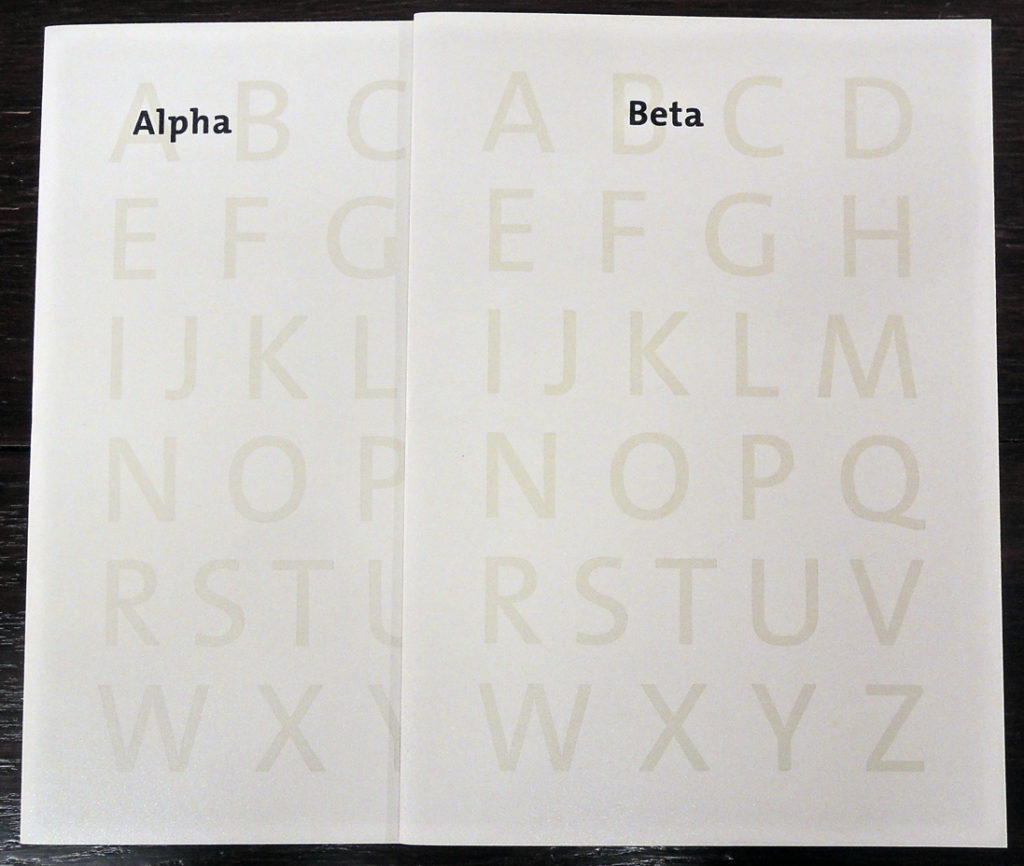
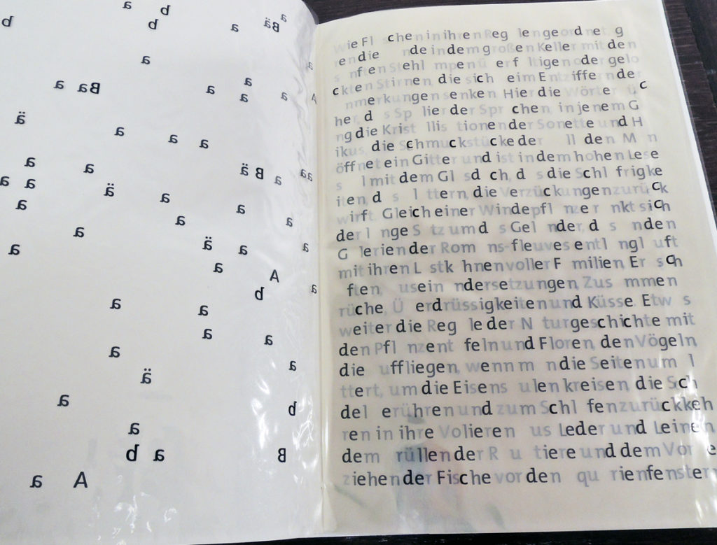
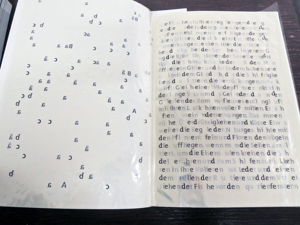
Investigating the visual and conceptual structure of the printed page, Alpha Beta is designed, printed, and bound by the German artist Ines von Ketelhodt. Her matrix is the writing of Michel Butor (1926-2016), a French novelist whose experiments with narrative and structure put him at the forefront of the literary trend known as le nouveau roman (the new novel).
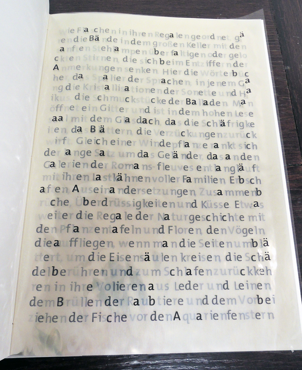
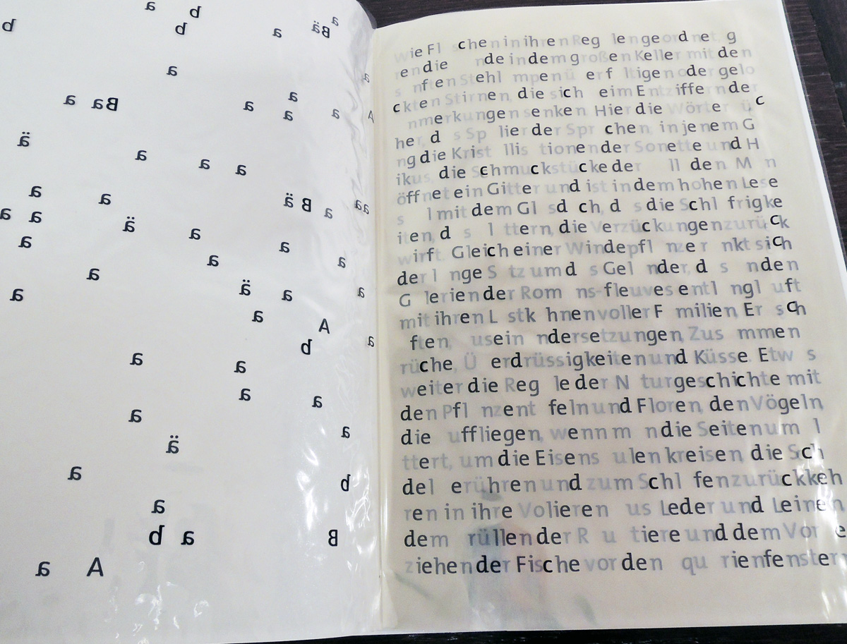
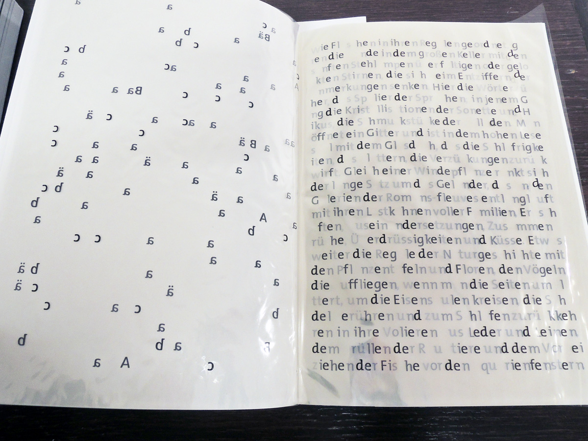
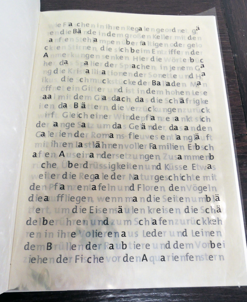
Von Ketelhodt has letterpress printed a passage in which Butor offered a portrait of a universal library: Itinéraire: les bibliothèques. In the first volume, it is in Butor’s original French and in the second volume, it has been translated into German. Each letter of the alphabet is confined to one transparent page so that, as the pages are turned, a single letter disappears throughout. By the end, only the punctuation remains on the right, with Butor’s text in reverse on the left.
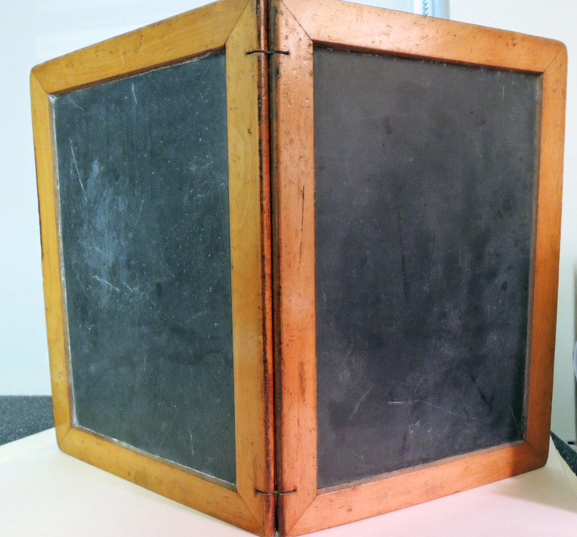
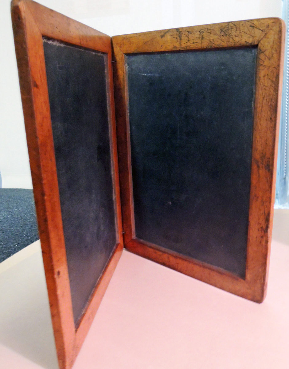
 Transparency is at the core of this volume, printed from polymer plates on to cellophane sheets and housed in a plexiglass slipcase. The text is fluid, both in its narrative and here, even in its physical format. Here is the French text:
Rangés dans leurs casiers comme des bouteilles les volumes fermentent à l’intérieur de la grande cave aux lampadaires doux sur les fronts ridés ou bouclés qui se penchent dans le déchiffrement de leurs annotations. Par ici les dictionnaires, l’espalier des langues; dans cette galerie les cristallisations des sonnets et des haïku, la joaillerie des ballades. On ouvre une grille et c’est la haute salle de lecture avec ses verrières qui répercutent les somnolences, les feuillettements, les émerveillements. Comme une vrille de volubilis la longue phrase s’entortille autour de la rambarde qui longe les balcons des romans-fleuves avec leurs péniches de familles, d’héritages, d’affrontements, d’effondrements, d’écoeurements et de baisers. Plus loin les rayons de l’Histoire Naturelle avec les herbiers et les flores; les oiseaux, s’envolant quand on tourne les pages, virent autour des colonnes de fer, effleurent les crânes et reviennent dormir dans leur volière de cuir ou de toile; les rugissements des fauves et le passage des poissons devant ces fenêtres d’aquarium.
 Here are two possible English translations I have found for this complex text:
Placed in their lockers like bottles, the volumes ferment inside the large cellar with soft lamps on the wrinkled or curled fronts that lean in the decipherment of their annotations. Here the dictionaries, the espalier of languages; In this gallery the crystallizations of sonnets and haiku, the jewelry of ballads. It opens a grid and it is the high reading room with its stained glass that reverberates drowsiness, leaflets, wonders. Like a twist of volubilis the long sentence is wrapped around the railing that runs alongside the balconies of the novels-rivers with their barges of families, inheritances, confrontations, collapses, disgustings and kisses. Further on are the rays of Natural History, with herbals and floras; The birds fly away when they turn the pages, look round the iron columns, brush their skulls and come back to sleep in their leather or canvas aviaries; The roar of the wild beasts and the passage of fish in front of these aquarium windows.
Arranged like bottles on their shelves, the volumes age in the large cellar, soft lamps hovering over creased or ringleted foreheads lowered in their attempts to decipher the comments. Here are the dictionaries, the espaliers of languages; in that aisle over there, the crystalline sonnets and haikus, the gemlike ballads. Opening a grating, you find yourself in a lofty reading room with a glass ceiling that reflects back the drowsiness, the leafing, the ecstasies. Like a climbing plant, the long sentence twines around the railing that runs along the galleries of the Romans-fleuves with their barges full of families, inheritances, conflicts, collapses, wearinesses and kisses. A bit farther on: the natural history shelves with their plant posters and flora; the birds that fly upward when you turn the pages and circle around the iron columns, touch their skulls and then return to their leather and linen aviaries to sleep; the beasts of prey roaring and the fish gliding by the aquarium windows.
See also Vieira da Silva (1908-1992), Vieira da Silva: peintures. Includes Butor’s Itineraire (p. 7-19) (Paris: L’Autre musée, 1983).

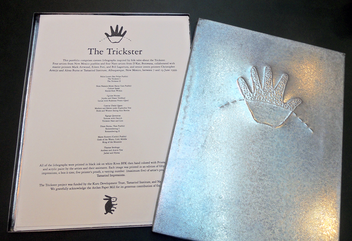 Trickster Suite (Albuquerque, NM: Tamarind Institute, 1999). 16 lithographs designed and printed with master lithographers Bill Lagattuta, Alexa Burns, and Chris Armijo. Graphic Arts Collection GAX 2017- in process
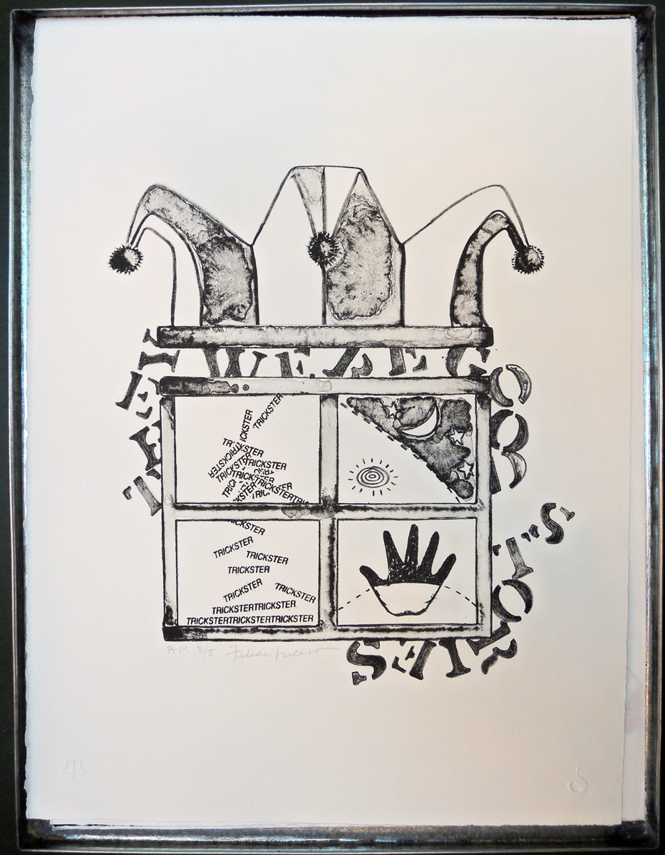
 For more information, see: http://tamarind.unm.edu/suites/view/10-trickster-suite/