Category Archives: Acquisitions

new acquisitions

Fritz Eichenberg

eichenberg3
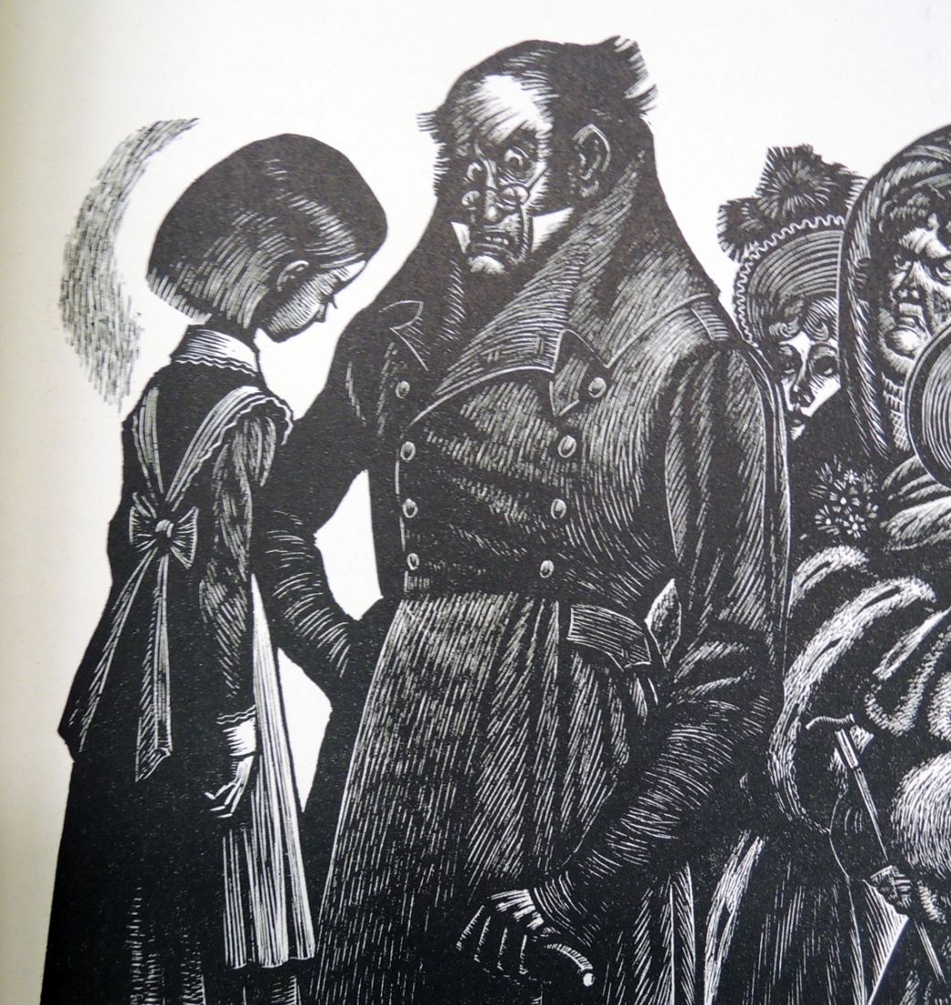
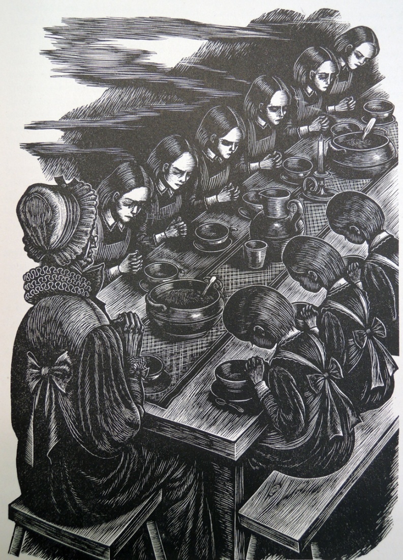
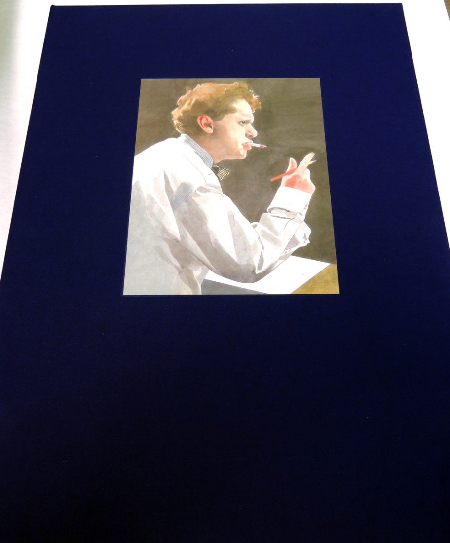
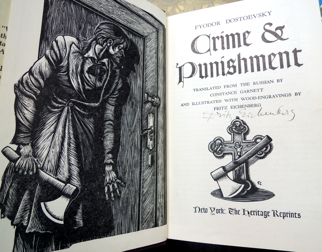
The Graphic Arts Collection is fortunate to have an extensive collection of prints by the artist and illustrator Fritz Eichenberg (1901-1990). Thanks to a gift of Charles A. Perera, class of 1926, we also have a number of the published books illustrated by Eichenberg. In a 1964 interview, conducted by Harlan Phillips for the Archives of American Art, the artist remembered how he began illustrating books.

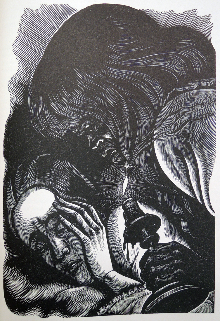
 “Well, I picked my teachers. I worked as an advertising artist in my early youth. I was eighteen or nineteen when I left Cologne, and I worked in a department store as a guy for everything – you know; I did posters and advertising. I was an apprentice in a lithographic print shop before I took on my first job. … I [studied] with Hugo Steinerpark who was a well known illustrator and perhaps overrated, if you think of him now. At the time he gave me a feeling that this was the right man for me. He was not only interested in the illustration, but in the book as a whole – the design, the binding, the type – the illustrations were just a part of his work. He was the head designer for Ulstein Books, which are still beautiful. He did most of the bindings, and they were just marvelous. I studied under him and became almost immediately one of his master students; that meant that I had the privilege of having a studio by myself under the roof of the academy.  … Leipzig was the center of the book publishing world really at the time, which it isn’t any more. I had a marvelous time working more or less by myself for myself. I began to illustrate books right away. I did Gulliver’s Travels and Dostoevski, whom I always adored as an author. The first book was Crime and Punishment, and I did it while I was a student.”

eichenberg1
eichenberg5
eichenberg4
eichenberg6
eichenberg7                    eichenberg2
A collection of books illustrated by Fritz Eichenberg, 1901-1990, Gift of Charles A. Perera (Class of 1926).
Stephen Vincent Benét (1898-1943), The Devil & Daniel Webster. Now printed with an appreciation by Henry Seidel Canby and wood-engravings by Fritz Eichenberg. (Kingsport, Tenn.: Kingsport press [c1945]).
Charlotte Brontë (1816-1855), Jane Eyre, with wood engravings by Fritz Eichenberg (New York: Randon House, 1943). This edition was planned by Richard Ellis and produced under his direction. The illustrations by Fritz Eichenberg were printed letter press form electrotypes of the original wood engravings. The text was composed in monotype Bodoni with long descenders. The composition, electrotyping, printing and binding were by Kingsport Press at Kingsport, Tenn.
Emily Brontë (1818-1848), Wuthering Heights; illustrated with wood engravings by Fritz Eichenberg (New York: Random House, 1943). “This edition was planned by Richard Ellis and produced under his direction. … Printing and binding were by Kingsport Press at Kingsport, Tennessee”–T.p. verso.
Mark Van Doren (1894-1972), The Witch of Ramoth, and other tales. Illustrated by Fritz Eichenberg (York, Pa.: Maple Press Co., 1950). Keepsake series, v.8  “This edition consists of seventeen hundred numbered copies”–Colophon.
Fyodor Dostoyevsky (1821-1881), Crime & Punishment. Translation by Constance Garnett (New York: Heritage Club 1938).
Fyodor Dostoyevsky (1821-1881), The Brothers Karamazov : a novel in 4 parts & epilog, translation by Constance Garnett (New York: Heritage Press, 1949, 1933).
Fyodor Dostoyevsky (1821-1881), The Grand Inquisitor, reflections on the story by William Hubben. Illustrations by Fritz Eichenberg ([New York?]: Woman’s Press, 1948).
Fritz Eichenberg (1901-1990), Ape in a Cape: an Alphabet of Odd Animals (New York: Harcourt Brace & Company, 1952).
Fritz Eichenberg (1901-1990), Art and Faith (Wallingford, Pa.: Pendle Hill, 1962).
Jonathan Swift (1667-1745), Gulliver’s Travels; an account of the four voyages into several remote nations of the world, illustrated with engravings on wood by Fritz Eichenberg (New York: Heritage press, 1940).
Terence Hanbury White (1906-1964), Mistress Masham’s Repose. Illustrations by Fritz Eichenberg (New York: G. P. Putnam’s sons, [1946]). Endpapers by Raymond Grath.

Unica T

utica t 1
Once a month during the academic year 1986-1987, the book arts collective Unica T published a typographic portfolio for the Deutsche Akademie für Sprache und Dichtung (The German Academy for Language and Literature) in an edition of 70 copies. Each was an interpretation of the author read at the month’s meeting. The Graphic Arts Collection has acquired the set of nine portfolios, which feature the writing of Paul Verlaine, Ludwig Harig, and others.

utica t 4

Utica T (a fictitious person making real books) was a collaborative of five women, led by Ulrike Stoltz and Uta Schneider. When the group disbanded in 2001, the two artists continue to collaborate under the name ‹usus›. Schneider also works as a free lance designer in book design and typography, after twelve years as executive manager for the Stiftung Buchkunst (Book Art Foundation). Stoltz is professor for typography at Hochschule für Bildende Künste Braunschweig.

utica t 2


utica t 3

Unica T, Erster Jahrgang. Veranstaltet die Deutshe Akademie Fur Sprache und Dichtung (Darmstadt: Unica T, 1986-87). 9 portfolios. Graphic Arts Collection GAX 2014- in process.


Happenings Here and There Along the Trail

bradley3

bradley1

Will Bradley (1868-1962), Happenings Here and There Along the Trail, or, The World Went Very Well Then: a Victorian Tale Gleaned from Memories and Told for the Edification of the Fellow Typophiles (Pasadena: Castle Press, 1949). One of 300 copies printed for the Typophiles by Grant Dahlstrom at the Castle Press. Graphic Arts Collection GAX 2014- in process.

At the age of 81, the American graphic designer William H. Bradley wrote a casual memoir for his fellow members of the Typophiles, a social club for men in the printing industry. Written in the second person, Bradley covers his early years learning to set type and then, design posters.

“The Iron Ore print shop is on the ground floor. The editor’s sanctum is at the front. His desk is at the big window. It is nearly nine o’clock on a Friday night—”makeup” time. Mr. Newett has written his last sheets of copy and is reading proof. At the corner of Main and Division, diagonally across from the office, a fakir is selling soap. In one wrapper he pretends to place a five dollar bill—a version of the “old army game.”

bradley4He is standing in a market wagon and has a companion who strums a guitar and sings. Attached to an upright and above his head is a kerosene flare. Mr. Newett walks leisurely to where there are several guns and fishing rods in a corner. He is an inveterate sportsman in a land where game, deer and fish, is plentiful. Selecting a rifle he walks to the door and casually puts a bullet through the kerosene tank, then returns to his proof reading. Thoroughly-likeable, this pioneer editor—a fine boss, a true friend!

You and a compositor now have control of the town bill posting. When there is no theatre paper or patent medicine ads to put up you cover the boards with blank newsprint and letter and picture advertisements for the stores, or what you will.

You are sixteen, almost seventeen. A sheet of newsprint is tacked on the printing-office wall and, using marking ink and a brush, you are picturing and lettering a masquerade poster for the roller rink.”
bradley2

bradley5 A brief supplement offers additional details of Bradley’s work chronology, including his time in Hollywood.


Peter Blake’s Under Milk Wood

thomas under milk wood8

The Graphic Arts Collection recently acquired a deluxe edition of Dylan Thomas’s 1954 ‘play for voices,’ Under Milk Wood, with images by Sir Peter Blake. Published by Enitharmon Editions to mark the 2013 centenary of Thomas’s birth, this publication was designed by Libanus Press and bound by Shepherds, Sangorski & Sutcliffe, accompanied by a signed stochastic aqueous pigment print editioned by Chaudigital.

thomas under milk wood7

The work took Blake over 28 years to complete and includes illustrations using pencil, watercolor, and collage, which detail every aspect of Thomas’s fictional seaside village Llareggub. An exhibition of Blake’s art launched the Dylan Thomas 100 Festival, a celebration to mark 100 years since Wales’ best-known poet’s birth in Swansea.

thomas under milk wood3

“It could have gone on forever,” admitted Blake. “But the festival was as good a place as any to stop. I am thrilled that it ties in with Dylan Thomas 100. It’s perfect really.” Blake said the original plan back in 1985 had been to create a series of wood engravings to illustrate Under Milk Wood in a limited edition book, never produced.

In an interview with the BBC, Blake continued, “I never met him no, but I started at the Royal College in October in October 1953 and he would have been in Soho. We may well have been in the same pubs. If we met now, I think we would have something to talk about, a common interest in Under Milk Wood.”

A BBC Wales programme Under Milk Wood in Pictures showing Sir Peter Blake at work on Llareggub was screened on BBC One Wales on Monday, 25 November 2013.

thomas under milk wood4

thomas under milk wood5

thomas under milk wood6

thomas under milk wood1
A review in The Guardian of what must be a spectacular exhibition can be read at: http://www.theguardian.com/artanddesign/2013/nov/22/peter-blake-under-milk-wood. If you only buy one book this year, this is the one to get.

thomas under milk wood9

Sean Scully

conrad heart of darkness1Joseph Conrad (1857-1924). Heart of Darkness, etchings by Sean Scully. [New York]: Limited Editions Club, 1992. Copy 169 of 300. Graphic Arts Collection GAX 2013- in process

In 1982, the Dublin-born artist Sean Scully painted three joined canvases called Heart of Darkness, after the 1902 novel by Joseph Conrad (1857-1924). Today, the painting hangs in the Art Institute of Chicago. It was also the last year he spent teaching at Princeton University, traveling down from New York on the bus each Tuesday and returning after class on Wednesday. A Guggenheim Fellowship in 1983 allowed the artist to stop teaching and work on his painting full-time.

conrad heart of darkness2

“When I was making the painting Heart of Darkness, I was reading the book by Joseph Conrad,” said Scully. “It was not the structure of the book but there was an atmosphere that was perhaps influencing the painting. There are certain images of dark rooms, dark spaces, primal forms and quite primitive forms that were influencing the painting.”

Ten years later, Scully reread Heart of Darkness and created a portfolio of 8 prints. Four full-page and four half-page etchings were bound into a new letterpress edition of Conrad’s novel, published in an edition of 300 copies for The Limited Editions Club. The volume was bound in Nigerian goatskin and its clamshell box is covered in black Italian cotton.

We are fortunate to have finally acquired a copy for Princeton.

conrad heart of darkness5
conrad heart of darkness4
conrad heart of darkness3

conrad heart of darkness6

London Almanack for the Year 1816

london almanack1

London Almanack for the Year of Christ 1816. [London]: Printed for the Company of Stationers, [1815] . Miniature with original decorated red morocco binding, gilt, onlays in buff, blue and green and a central hot-air balloon. Matching slipcase. Graphic Arts Collection 2014- in process

The Stationers’ Company (British publishing guild) issued a series of miniature almanacs. The earliest in OCLC is 1748 and the most recent 1852, all approximately 55 mm. Many feature an engraving at the front depicting a British landmark significant to that year. The almanac recently acquired by the Graphic Arts Collection has a panoramic view of the New Bethlehem Hospital, folded and bound as p. [2-5].

Property was purchased in 1810 at St. George’s Fields in Southwark for the building of a new Bethlehem Hospital. James Lewis’ design took three years to build, finally opening to patients in 1815 with an additional wing completed in 1816.

london almanack3

london almanack5
london almanack4


london almanack2

Traité théorique et pratique de lithographie

f9.highres
engelmann-traite3The nineteenth-century French artist and printer Godefroy Engelmann (1788-1839) founded the Industrial Society of Mulhouse (SIM) with his son Engelmann II after studying lithography with Aloys Senefelder in Munich.

Twenty years later, having establishing companies in Paris and London, Engelmann then returned to Mulhouse to focus on the new process of chromolithography, awarded a patent on July 1837.

His final treatise, A Discussion on Theoretical and Practical Lithography was published posthumously. Surprising to a twenty-first century audience, there are no illustrations in his manual beyond the decorative title pages.

Happily, we also recently acquired Michael Twyman’s monumental A History of Chromolithography: Printed Colour for All, which offers 850 color illustrations along with detailed descriptions of all variations of planographic color printing.
Jacket.aspx

Twyman’s book is the first since the process was in its heyday to offer a detailed account of how chromolithographs were made, tracing the evolution of this hand-drawn color-printing process from its tentative beginnings in Germany in the early nineteenth century to its spread from Europe to the United States and beyond.

Michael Twyman is Emeritus Professor of Typography & Graphic Communication at the University of Reading, and has played an active role in several societies concerned with printing, particularly the Printing Historical Society and the Ephemera Society.

His publications include many articles and book chapters, in addition to over a dozen books, among them: Printing 1770-1970 (1970; 1998), Lithography 1800-1850 (1970), Early lithographed books (1990), Early lithographed music (1996), The British Library guide to printing (1998), Breaking the mould: the first hundred years of lithography (2001), and Images en couleur (2007).
engelmann-traite2


Godefroy Engelmann (1788-1839), Traité théorique et pratique de lithographie (Mulhouse, Haut-Rhin: Engelmann père et fils, 1839, 1840. Graphic Arts collection GAX Oversize 2013-0078Q


Michael Twyman, A History of Chromolithography: Printed Colour for All (London: British Library; New Castle, DE: Oak Knoll Press, 2013). GARF 2013- in process


engelmann-traite4

Advertise. How? When? Where?

advertiser2 advertiser1William Smith (1833/34-1867), Advertise. How? When? Where? With illustrations by William McConnell (1833-1867) and Joseph Swann (London: Routledge, Warne, and Routledge, 1863). Graphic Arts Collection GAX 2013- in process

advertiser7
Historian Thomas Richards calls William Smith, author of Advertise. How? When? Where? a “prophet of modern advertising.” He notes that after the Great Exhibition of 1851 traditional methods of advertising changed radically and that Smith asserted that advertisers ought to exploit these new technologies so as to monopolize all attention. (The Commodity Culture of Victorian England: Advertising and Spectacle, 1851-1914, Stanford University Press, 1991).

I like the fact that he could tell you how many fliers to print if you wanted to paper Covent Garden on a Friday night.

advertiser5
Thomas argued, “Spectacle has become paramount. The commodities in the Crystal Palace are no longer the trivial things that Marx had once said they could be mistaken for; they are a sensual feast for the eye of the spectator, and they have taken on the ceremonial trappings of the dominate institutions and vested interests of mid-Victorian England. In his little book, which later went through twenty-three editions, Smith was one of the first in advertising to acknowledge the power of spectacle in organizing and channeling signification around and through manufactured objects.”
advertiser4
advertiser3

3D pen

DSCN4528
3doodler-boxed


The Graphic Arts Collection recently acquired a 3Doodler or pen that writes in three dimensions. It’s not as easy as you might think but we tried it.

Here is their blog where others artists are better at it than we are: http://www.the3doodler.com/blog/

Can you tell this is Princeton tiger?


DSCN4532         DSCN4519
DSCN4529


Le Praxinopose

praxinoposepraxinopose2

Georges Brunel (1856-1900), Le Praxinopose (Bordeaux?, ca. 1890). (2) pp. folder with the text page mounted to the verso of the cover. Graphic Arts Collection GAX 2013- in process.

The praxinopose is a metering apparatus for photographers, designed by the French mathematician Georges Brunel (1856-1900). It was used to determine the shutter speed for obtaining a clear image of moving objects, such as a bicycle or a train. Our praxinopose includes a series of four concentric moveable disks mounted inside a leather binding, along with instructions for use in French.

Early practitioners of high-speed photography include Eadweard Muybridge’s 1878 images of horses in motion; Peter Salcher’s 1886 photography of a bullet; and Ernst Mach’s capture of the shadows of supersonic shockwaves. The praxinopose was meant simplify the guesswork.