Category Archives: Artists’ books

Artists’ books

Rock and Paper. Revisiting Michael Heizer

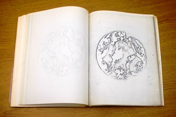
1800202Michael Heizer, Tom Slaughter, Ray Charles White, Scott Kilgour, John Giorno, Robert Harms, Daniel Villeneuve, Beatriz Milhazes (Durham, Pa.: Durham Press, 1996). Graphic Arts Collection (GAX) Oversize 2006-0386Q

“The son of an anthropologist, Heizer acknowledges numerous ancient sources for some of his forms but sees the comparison as more apt in the realm of effect than of specific reference: ‘It is interesting to build a sculpture that attempts to create an atmosphere of awe. Small works are said to do this but it is not my experience. Immense, architecturally sized sculpture creates both the object and the atmosphere. Awe is a state of mind equivalent to religious experience, I think if people feel commitment they feel something has been transcended.’”

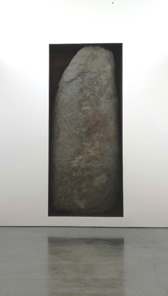
heizer 7Michael Heizer, Negative Megalith 5, 1998. Dia Art Foundation ©Michael Heizer

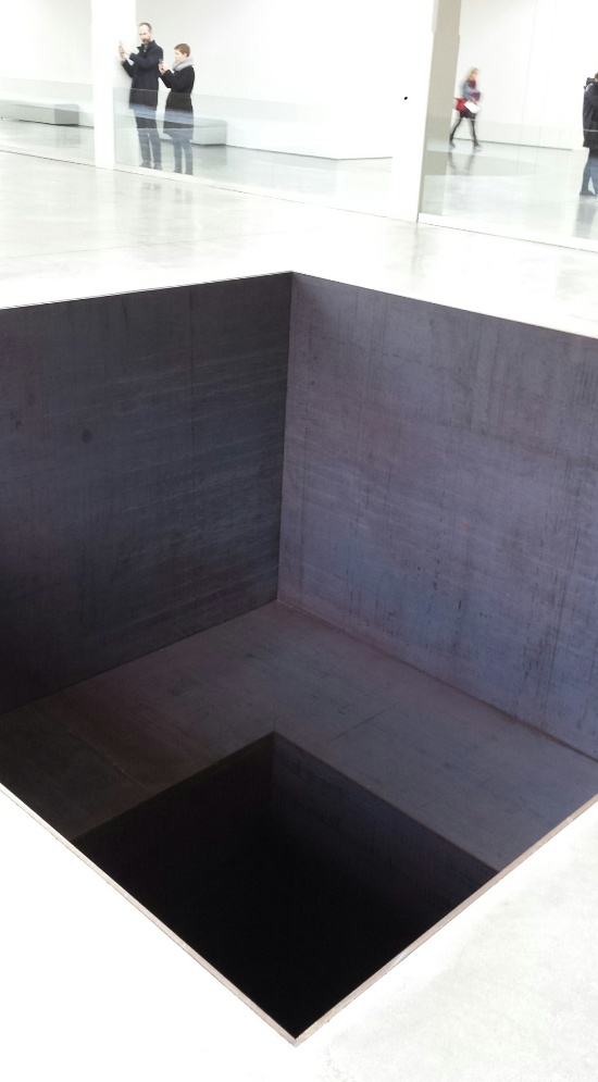
“The simplified geometric forms of North, East, South, West [below] suggest the underlying Euclidean lexicon of basic three-dimensional forms—box, cone, and wedge—essential for all sculpture, ancient and modern. The architectural scale and construction of Heizer’s work call forth comparisons to the megalithic monuments of ancient cultures—a comparison that is explicitly addressed in his Negative Megalith #5 (1998, above), a natural, menhir-like stone inscribed in a rectangular niche, installed in a neighboring gallery.”–Dia Art Foundation


heizer 5Above and below: Michael Heizer, North, East, South, West, 1967/2002. Dia Art Foundation ©Michael Heizer

heizer 6

See also: Michael Heizer—Dragged mass geometric (New York, N.Y.: Whitney Museum of American Art, 1985). Marquand Library NB237.H44 W48

Unspecific Object

madsen2

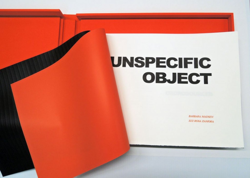
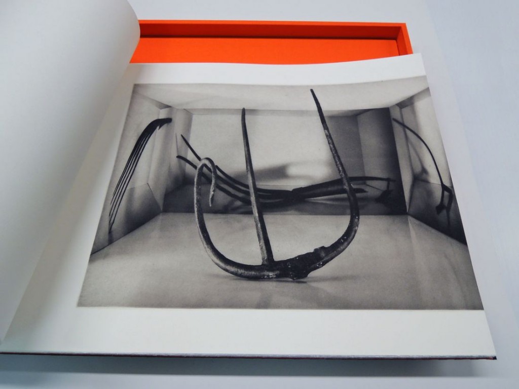
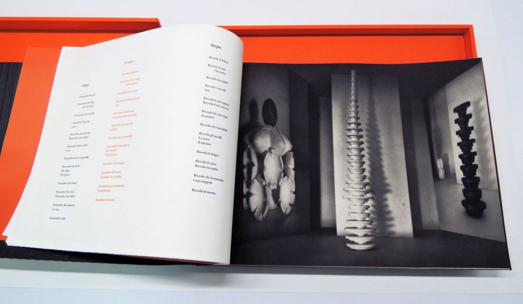
The genesis of the project Unspecific Object was an open call for objects, which artist Barbara Madsen placed on social media networks and posted at www.unspecificobject.tumblr.com. People were encouraged to submit images of objects they consume past and present. They could be banal, meaningful or significant objects, stored, ignored, or hoarded.

The winners were juried by Jared Ash, Assistant Museum Librarian at the Metropolitan Museum of Art and Arezzoo Moseni, Senior Art Librarian at the New York Public Library. The physical objects were sent through snail mail to Madsen, who built the spaces for the objects, photographed them, and generated photogravures for the book. The Venezuelan poet, Ely Rosa Zamora created her interpretation of the images in verse.

madsen3

An interview with the artist discussing the project can be found here: http://www.artcritical.com/2015/06/13/eric-sutphin-madsen-moseni/
madsen4

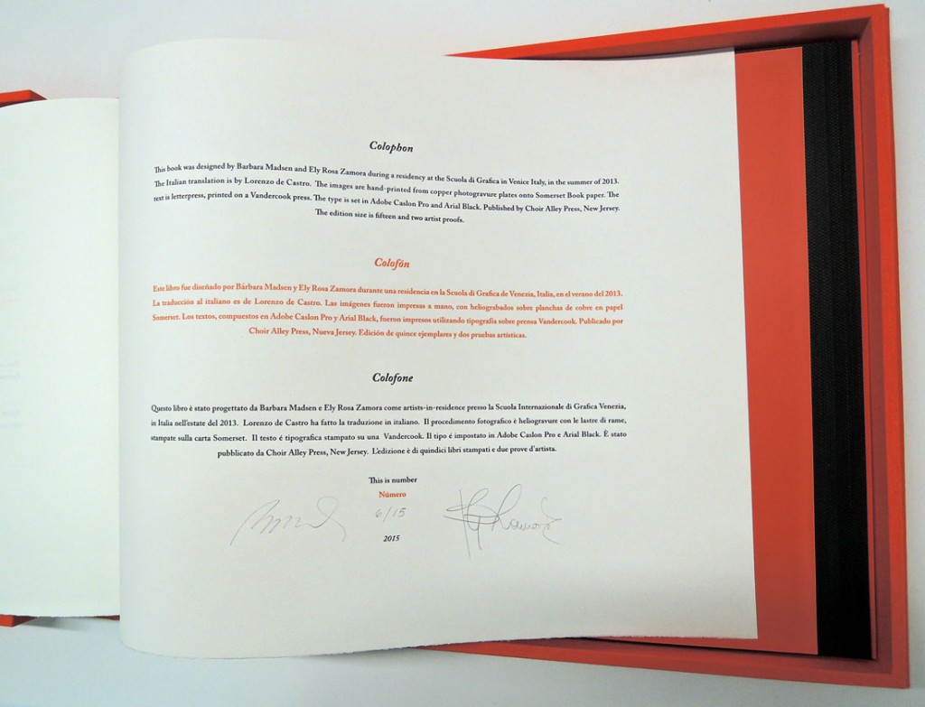
Each book includes 14 photogravures by Madsen and letterpress poetry by Zamora, both printed by the artist and published by Choir Alley Press, New Jersey, in an edition of 15. The Graphic Arts Collection is fortunately to have acquired copy 6.

madsen7
madsen1
Barbara Madsen and Ely Rosa Zamora, Unspecific Object (New Jersey: Choir Alley Press, 2015). Letterpress and photogravures. Copy 6 of 15. Graphic Arts Collection GAX 2015- in process

Thereafter

thereafter5

thereafter4

thereafter7

thereafter6

thereafter2

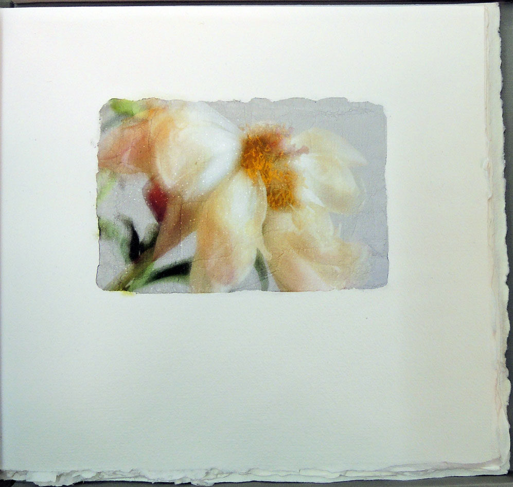
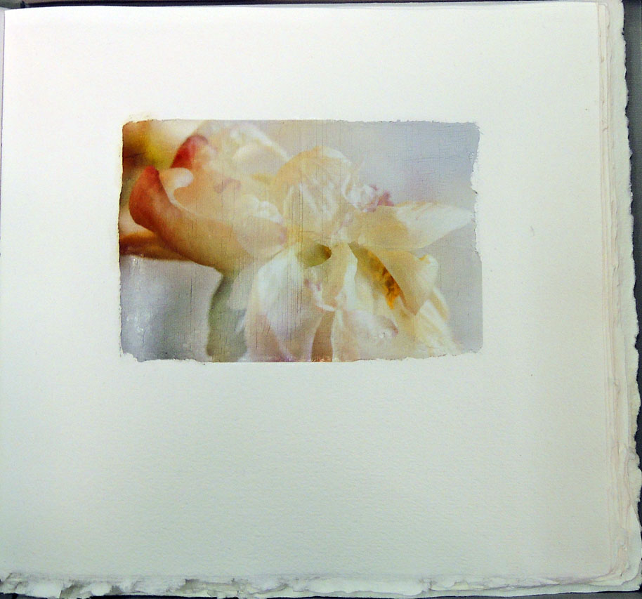
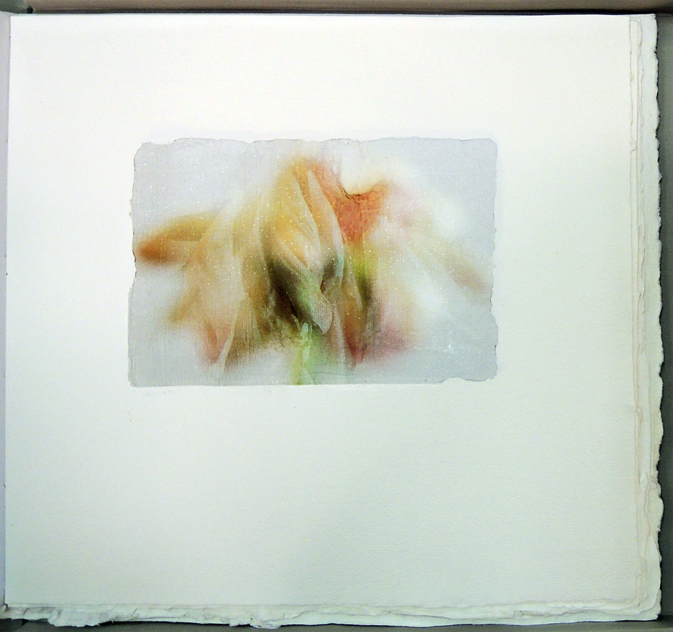
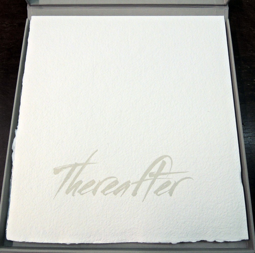
thereafterMaro Vandorou, Thereafter ([Dublin, CA]: Maro Vandorou; printed and bound by Sandy Tilcock, 2015). 20 unnumbered leaves. Graphic Arts Collection GA 2015- in process

“Thereafter is a limited edition handmade book of original images and writings. The conceptual focus is on capturing, depicting and interpreting the enigmatic behavior of a coral paeonia. In the course of 7 days the flower undergoes an almost mystical transformation with a profound healing effect.”


A Speech Introducing Albert Einstein

shaw einstein2

shaw einstein

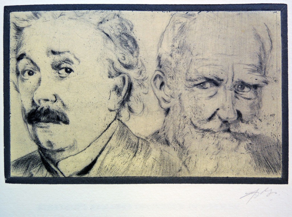
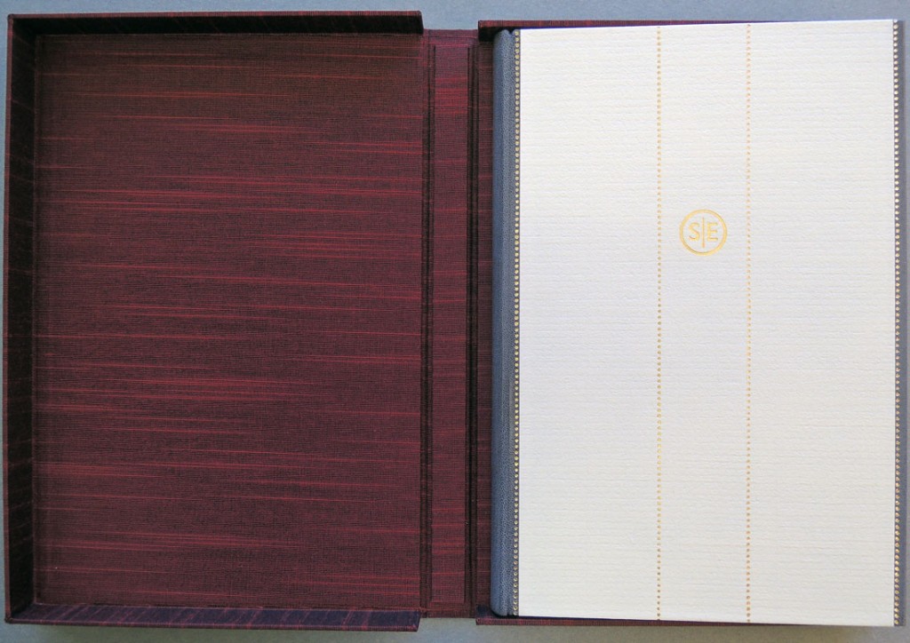
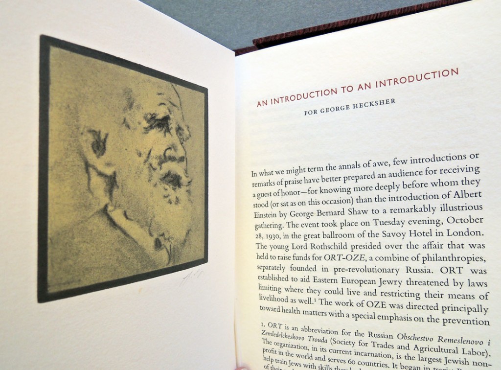
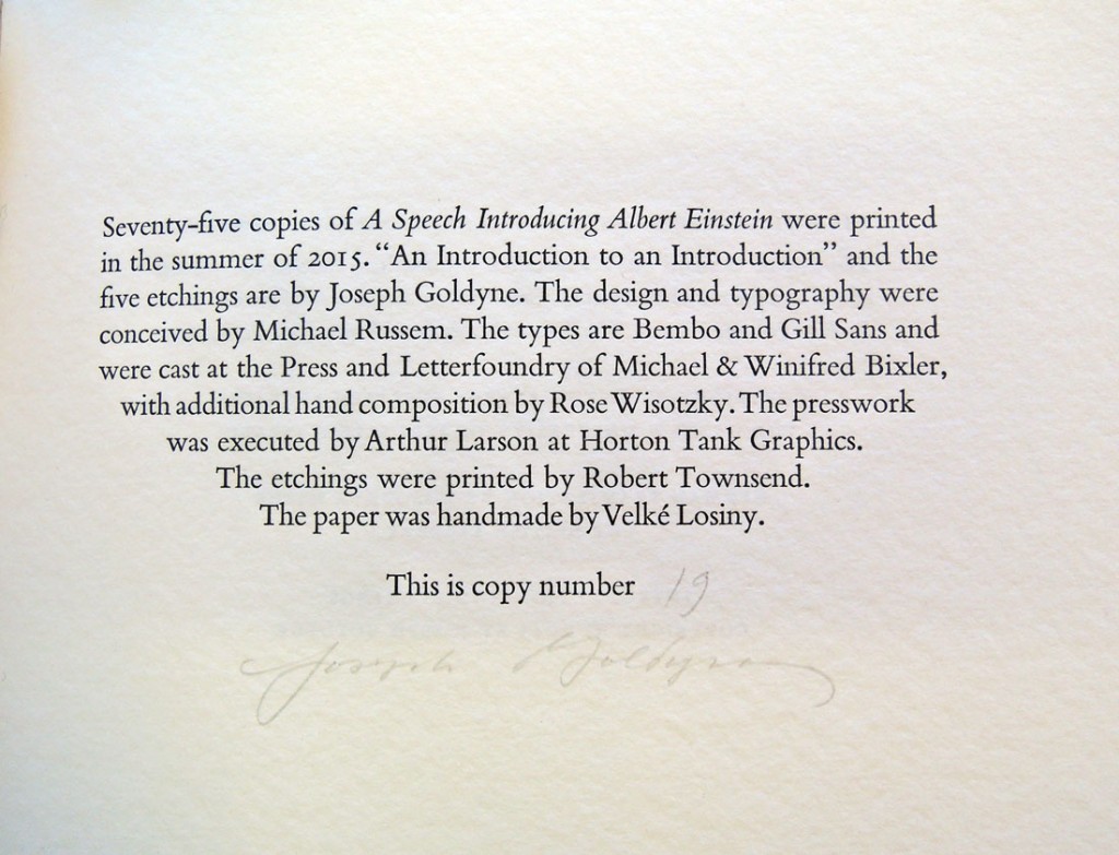
George Bernard Shaw (1856-1950), A Speech Introducing Albert Einstein. Introduction and etching by Joseph R. Goldyne (Rockport, Maine: Two Ponds Press, 2015). Copy 19 of 75. Graphic Arts Collection GA 2015- in process

“Professor Albert Einstein heard himself acclaimed by George Bernard Shaw tonight as one of the handful of men in all human history who have “Created Universes.” Before a thousand guests at a dinner here Professor Einstein listened while Mr. Shaw placed him on a pedestal with the greatest thinkers of mankind. Only seven men in the history of 2,500 years, said Mr. Shaw, could share with Professor Einstein his place as a destroyer of the old absolutism and builder of the new world. The list began with Pythagoras and included Ptolemy, Aristotle, Copernicus, Kepler, Galileo, Newton, and finally Einstein, “the greatest of our contemporaries.” –Anonymous, “Shaw Calls Einstein Universe Creator. Acclaims Scientist, the Guest at Dinner in London, as One of History’s Eight Greatest.” Special cable to the New York Times, October 29, 1930.
shaw einstein3

Shaw’s speech was delivered at a formal high-profile fund-raising dinner for ORT (Obschestvo Remeslenovo i. Zemledelcheskovo Trouda), an organization dedicated to the support of Eastern European Jewry. The setting was the ballroom of London’s Savoy Hotel in 1930.

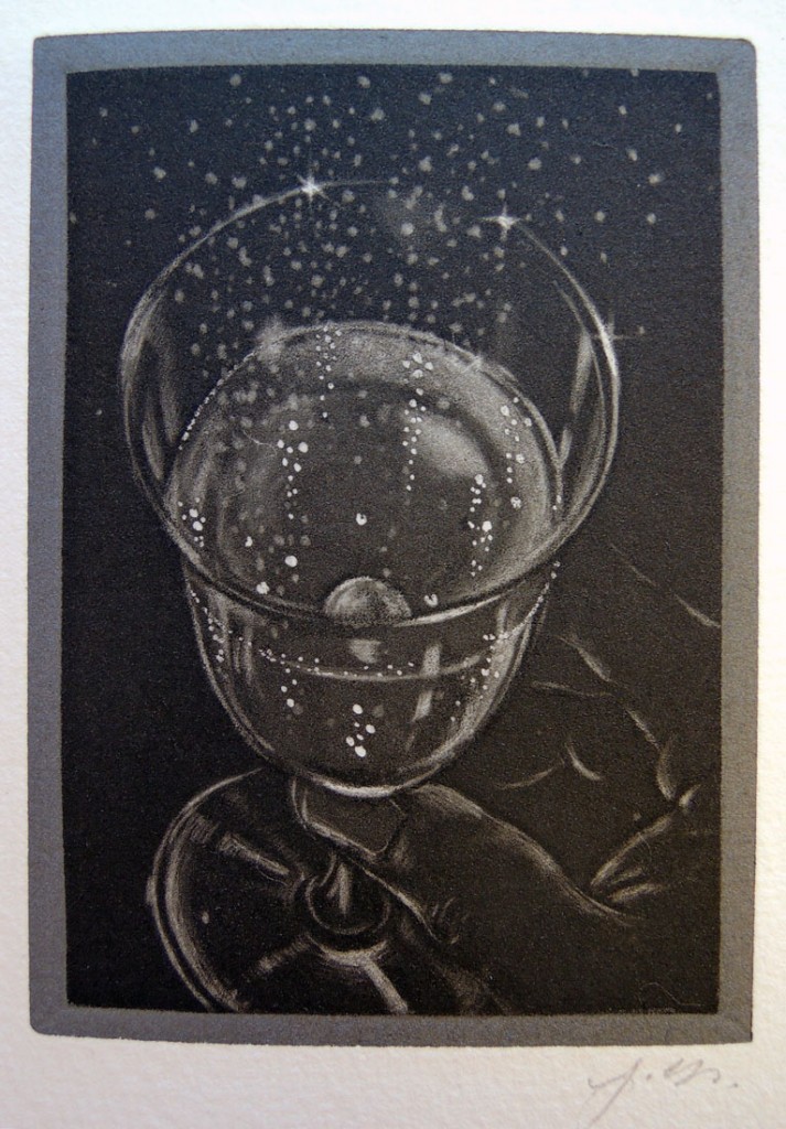
In this newly acquired fine press edition, the full text of Shaw’s speech is reprinted, together with Albert Einstein’s response, originally delivered in German and printed here in English translation. Joesph Goldyne illustrated the volume with five etchings created especially for this publication. The drypoints, etchings, and burnished aquatints, executed with the artist’s unique graphic signature, pay tribute to the featured speakers as well as to the sense of the event.

shaw einstein4

shaw einstein6
.
.
.
.

A portion of the actual speech has been posted here. Nice to include the laughter and the applause:

A Man in Bogotá

man from bogota2
man from bogota

man from bogota3

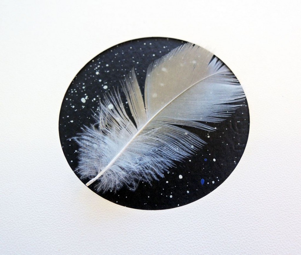
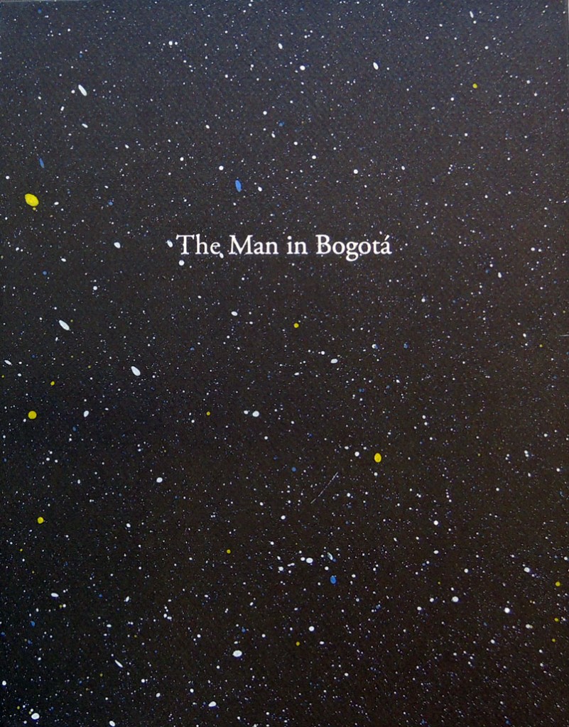
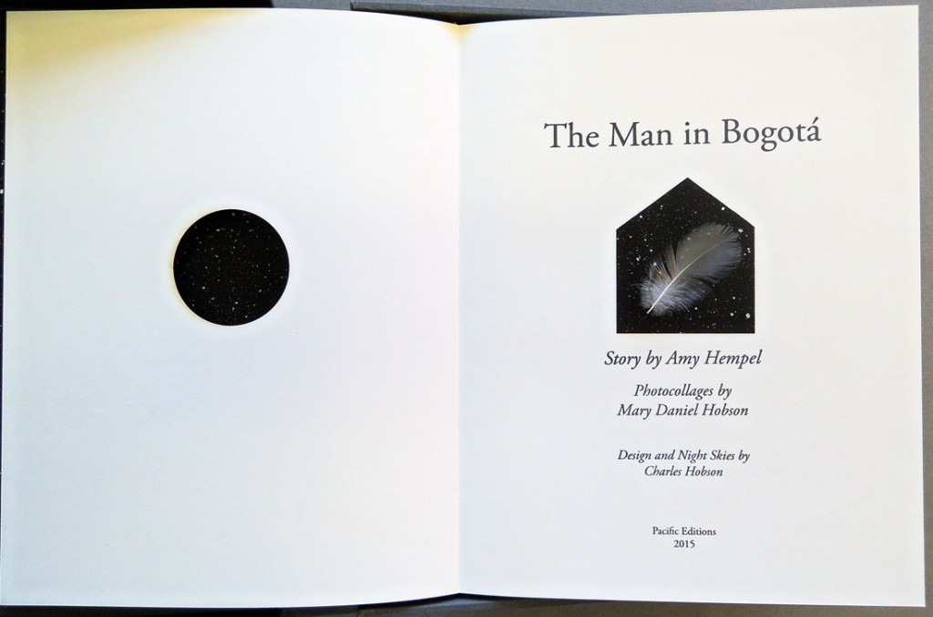
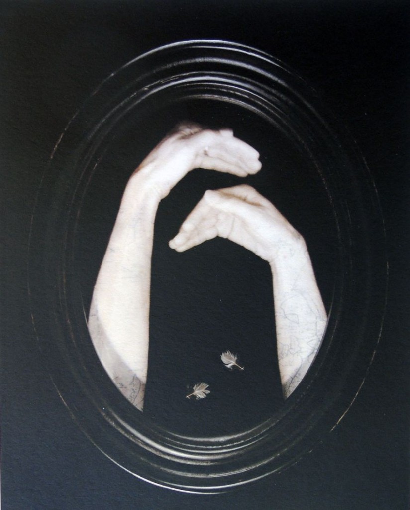
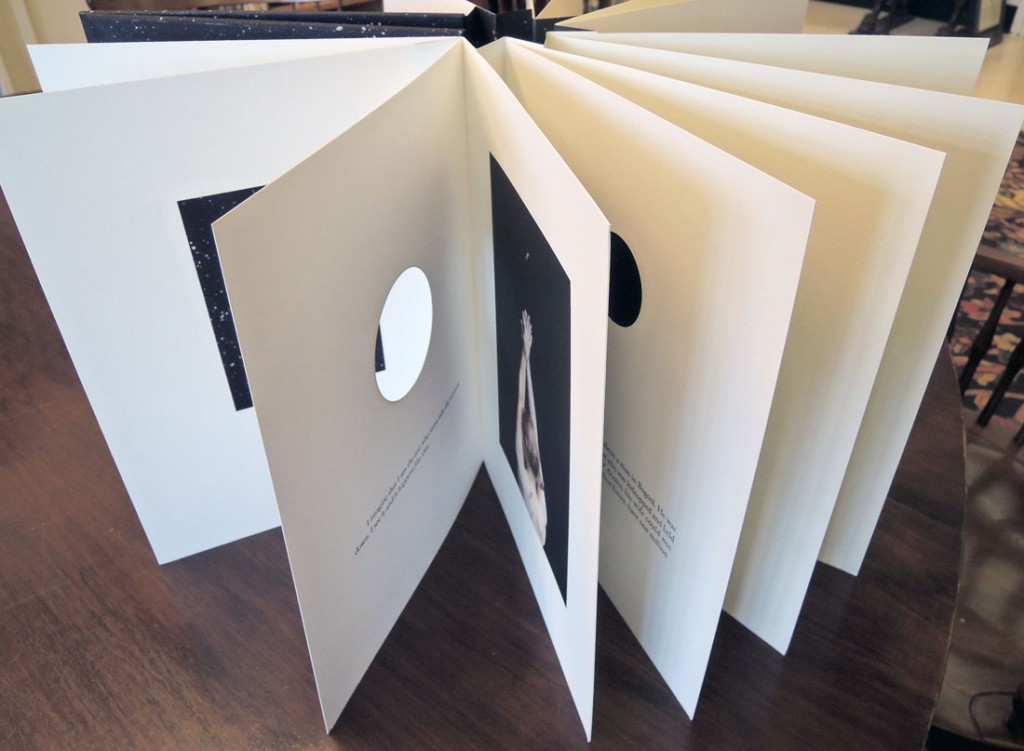
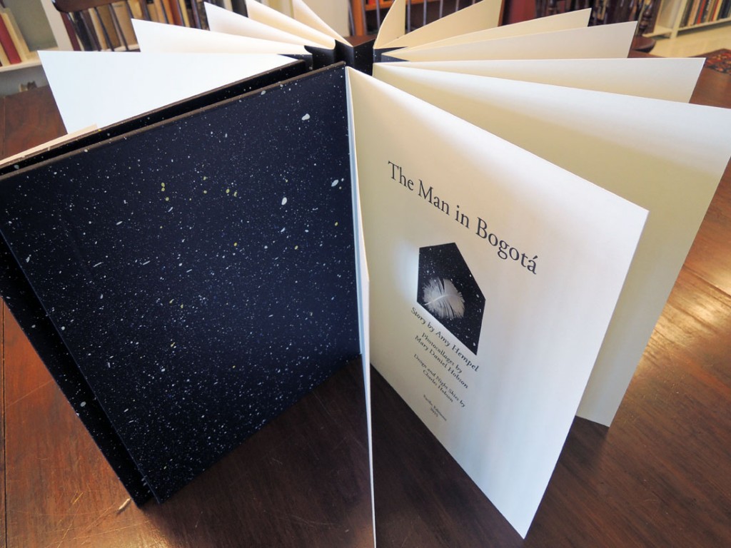
The Man in Bogotá. Story by Amy Hempel, Photocollages by Mary Daniel Hobson, Design and Night Skies by Charles Hobson ([San Francisco]: Pacific Editions, 2015). Copy 17 of 40. Graphic Arts Collection GAX 2015- in process.


man from bogota4
“Mary Daniel Hobson’s photocollages were created by layering photographic transparencies, stitched tissue paper, old maps, handwriting and real bird feathers. They have been reproduced here as archival pigment prints on Entrada 300 rag paper by Rhiannon Alpers at the San Francisco Art Institute. Rhiannon Alpers also printed the text in Adobe Garamond by letterpress on Coronado SST paper.”

“The circular holes in the pages were laser cut at Magnolia Editions in Oakland, California, and the covers and clamshell boxes have been made at the studio of John DeMerritt, Emeryville, California.”

“Charles Hobson designed the edition and painted the night sky individually for each set of covers and for the insets with acrylic paint on Canson Mi-Tientes paper. He also assembled and bound the edition with the assistance of Alice Shaw.”–Colophon.

“The book contains five photocollages bound into a concertina spine. A sixth image is presented as a separate print signed by the artist in a folder on the inside of the back cover.”–Prospectus.
man from bogota6
man from bogota5


An interview with the author Amy Hempel: http://bombmagazine.org/article/2058/amy-hempel


The Lulu Plays by Frank Wedekind and William Kentridge

kentridge1Timing is everything.

On the very day that we are fortunate to have the South African multimedia artist William Kentridge visiting Princeton University as our 2015-16 Belknap Visitor in the Humanities, we also received our copy of his new artist’s book The Lulu Plays.

kentridge3

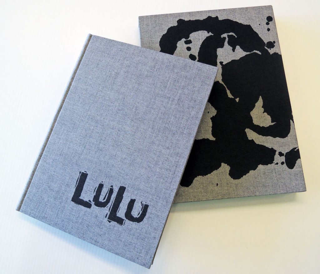
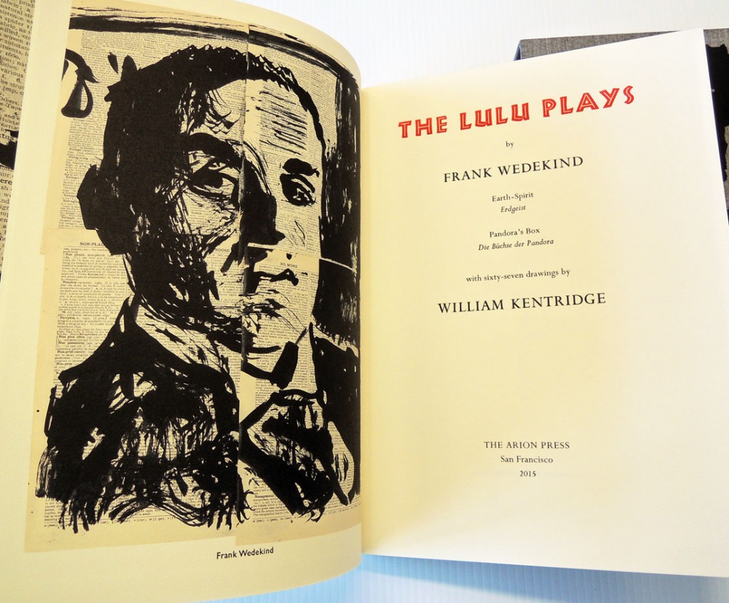
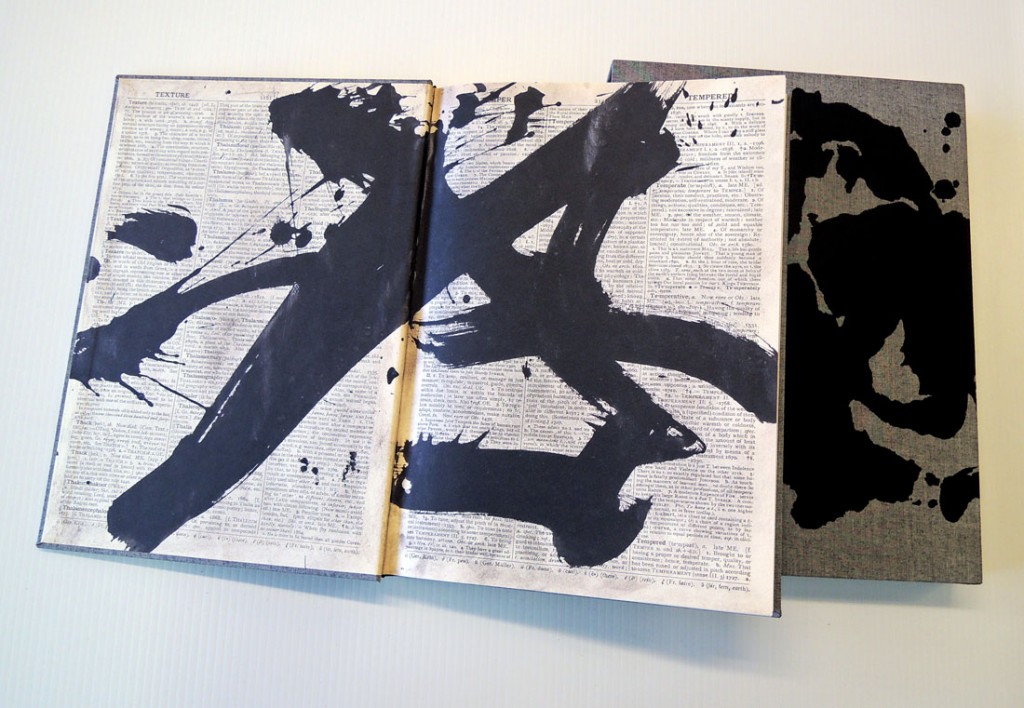
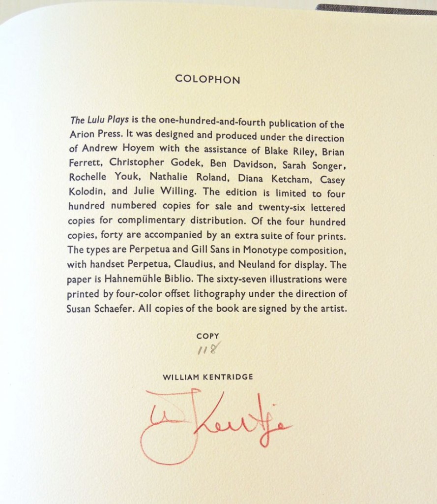
Frank Wedekind (1864-1918), The Lulu Plays,
with sixty-seven drawings by William Kentridge (San Francisco: Arion Press, 2015).
Copy 118 of 400. Graphic Arts Collection GAX 2015- in process

kentridge5


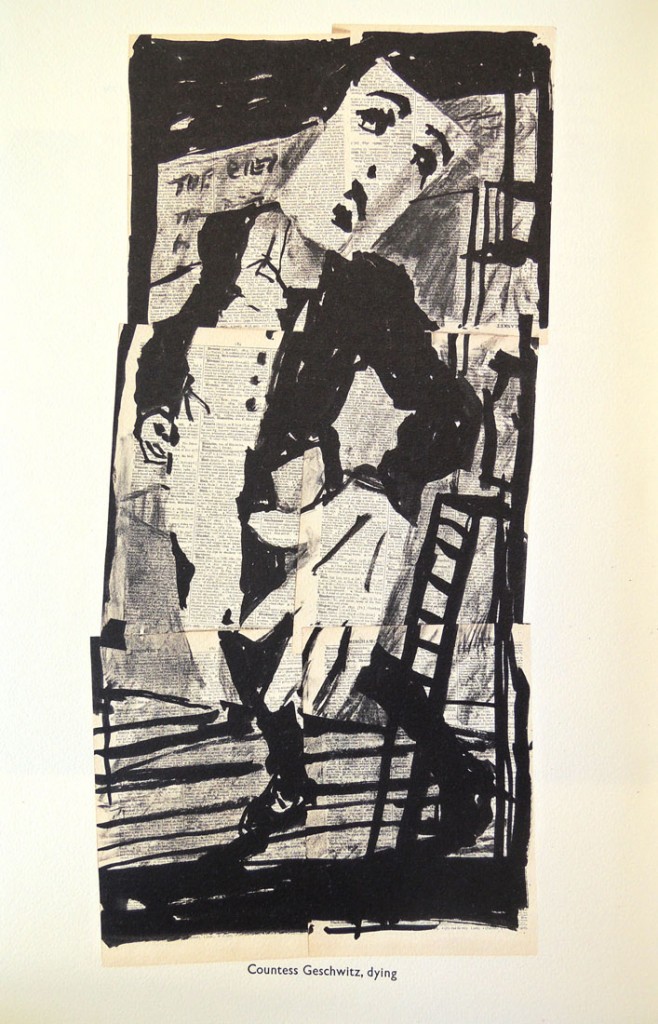
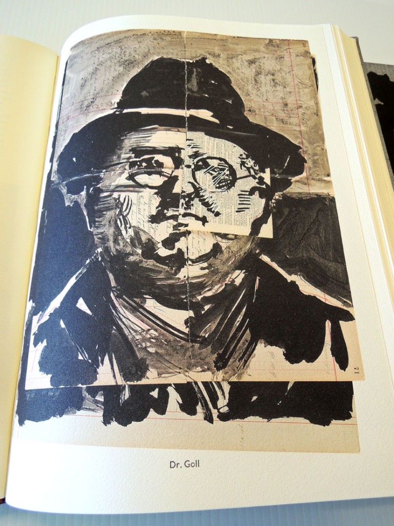
Described in the prospectus as “one of Arion’s most ambitious artist books, this limited edition contains 67 drawings by William Kentridge bound into the book.

The text is the original telling of the Lulu story by playwright Frank Wedekind, which inspired the silent cinema classic Pandora’s Box and the Alban Berg opera Lulu.”

The images are derived from brush and ink drawings for projections created for Kentridge’s 2015 production of Alban Berg’s opera Lulu, which was based on the two Wedekind plays from the turn of the century, Earth Spirit and Pandora’s Box.

The artist drew with brush and ink directly onto dictionary pages. The definitions are in the background but the opening and closing words, in larger type, can be read.

kentridge6

Often, after drawing, Kentridge moves the sheets, rearranging elements of the drawings so that they become collages and can resemble moving pictures. The appearance of the drawings on pages of the book is very different from the much larger versions in the opera set, where sometimes only a detail is used and images can be altered by the surfaces on which they are projected, as well as fractured or distorted by the planes and interfering elements of the scenery.


kentridge2
The public is invited to Kentridge’s lecture today, October 14, “O Sentimental Machine,” which will take place at 5:00 p.m. in McCosh 10. http://humanities.princeton.edu/events/belknap-visitors. He will be introduced by Susan Stewart, Avalon Foundation University Professor in the Humanities, who has written a monograph on Kentridge’s works. A reception will follow at Princeton University Art Museum and is open to the public.


kentridge4

Portmeirion

portmeirian4

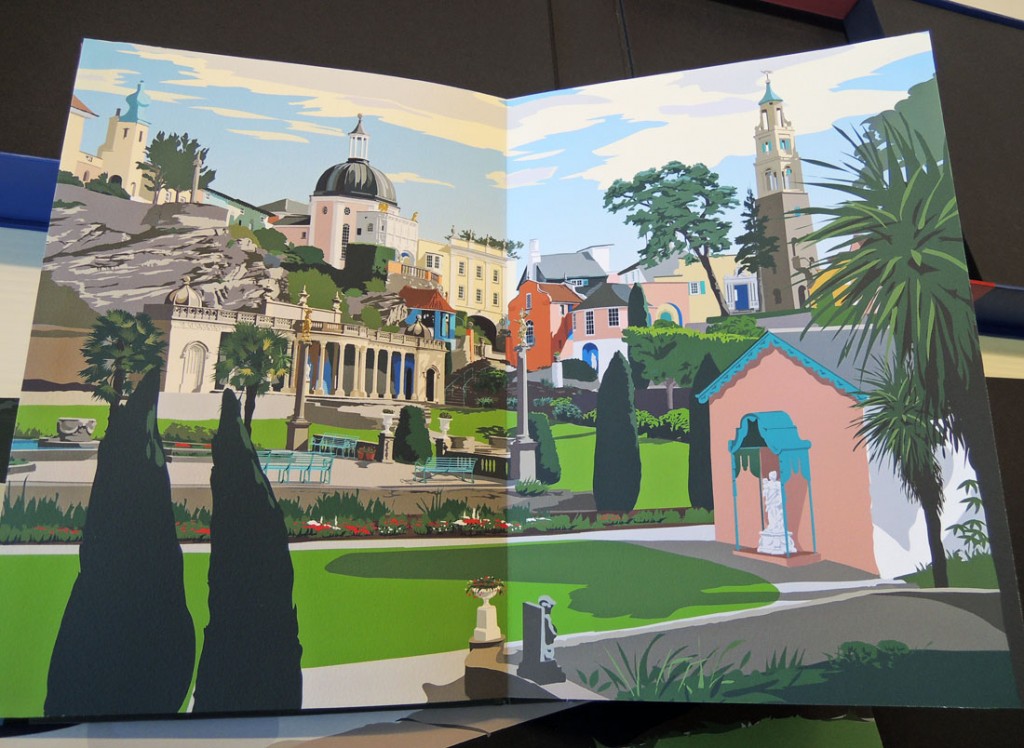
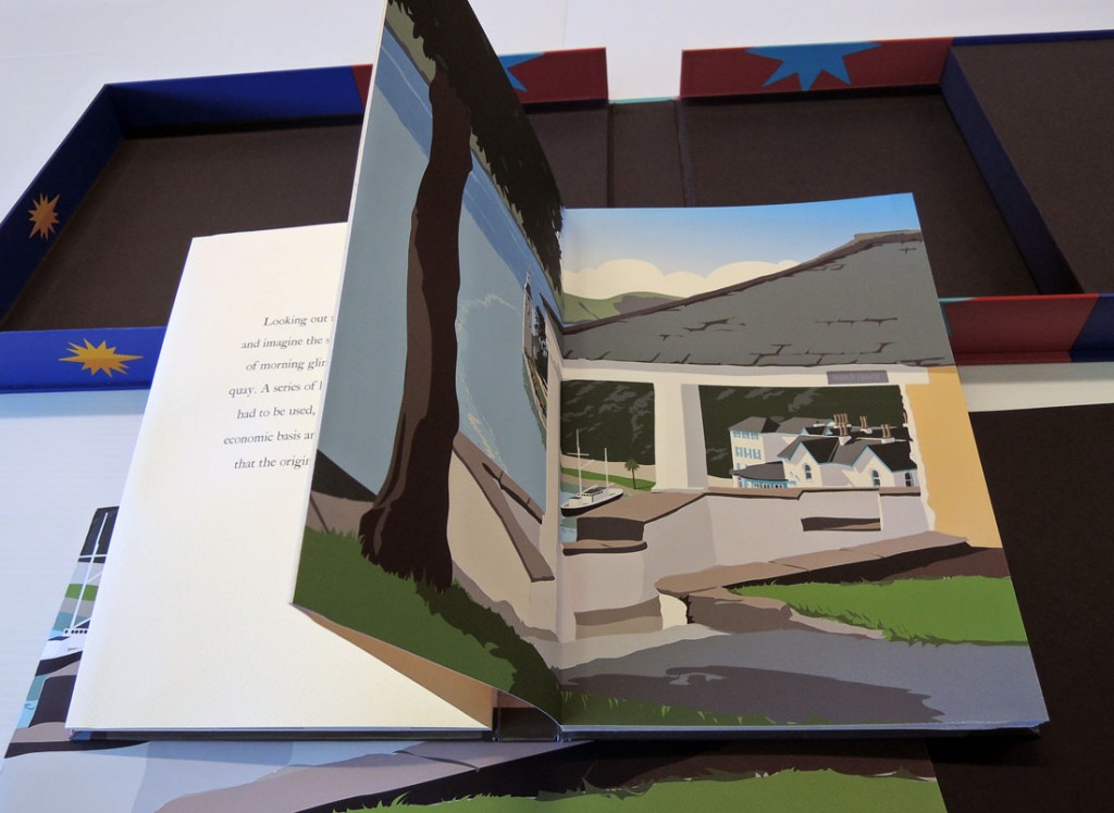
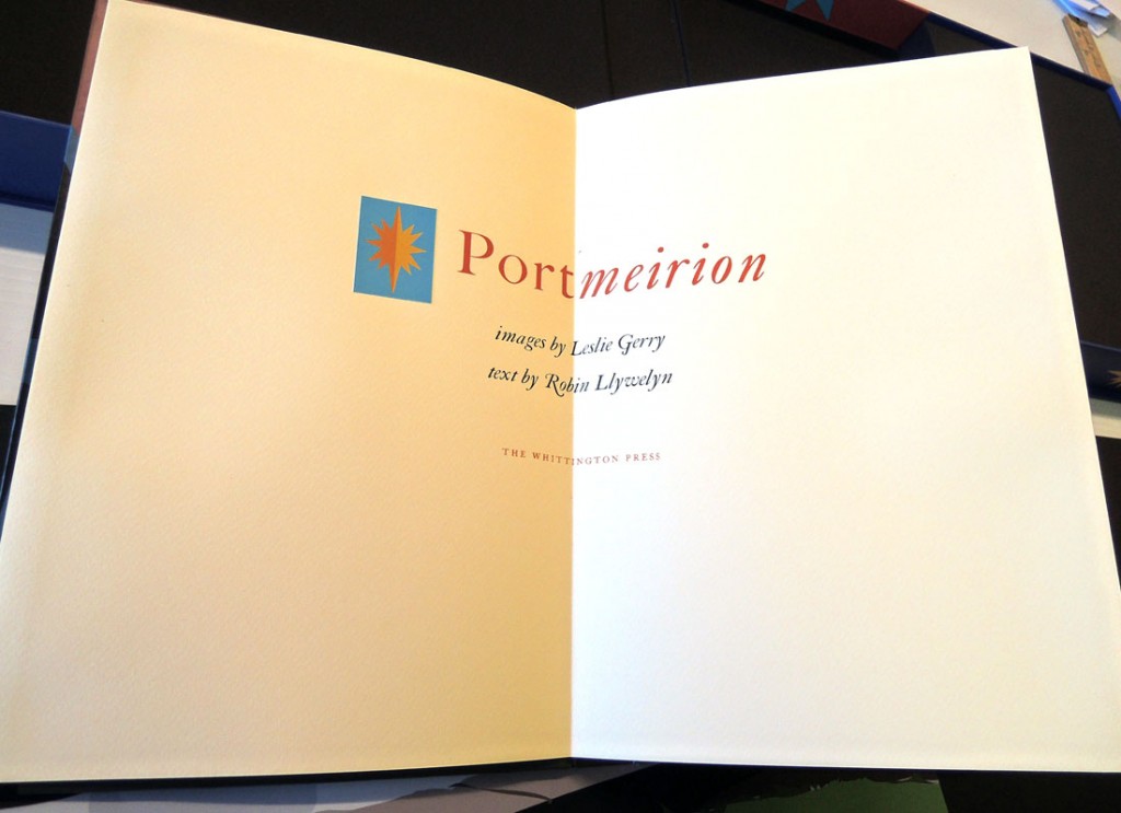
Leslie Gerry and Robin Llywelyn, Portmeirion (Risbury: Whittington Press, 2008). Copy 116 of 225. Graphic Arts Collection RECAP-91157790

portmeirian3
portmeirian2

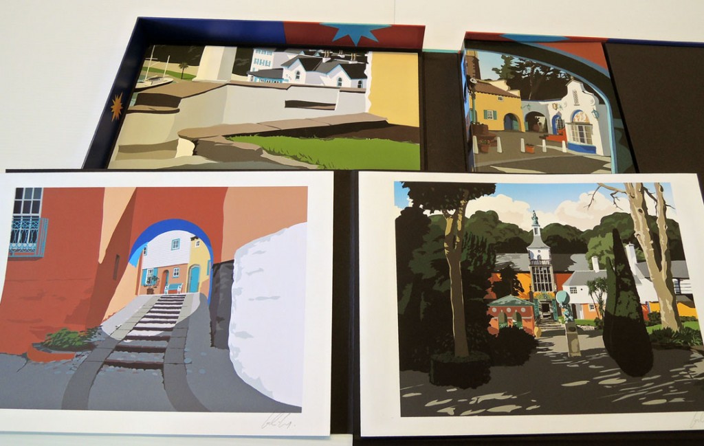
Since 1971, The Whittington Press has been printing and publishing limited edition, letterpress books. In 2008, they broke with tradition to work with artist Leslie Gerry who designed the plates for Portmeirion on his iPad. The flat layers of digital color give the surprising effect of screen prints.

Portmeirion, the extraordinary Italianate village built by the eccentric architect Clough Williams-Ellis on a remote peninsula in North Wales. Clough’s grandson, Robin Llywelyn, who spent much of his childhood with his grandparents at Portmeirion, has written short but evocative texts about each of Leslie Gerry’s seven images of the village.”–prospectus.
portmeirian
portmeirian5Princeton University library holds 49 limited edition books from the Whittington Press along with a complete run of their fine-press journal Matrix: A Review for Printers & Bibliophiles. Issued annually since 1981, Matrix has made distinguished contributions to the study, recording, preservation, and dissemination of printing history, and has done so utilizing a remarkable combination of authoritative scholarship and fine printing.


50th anniversary of Beckett’s Imagination Dead Imagine

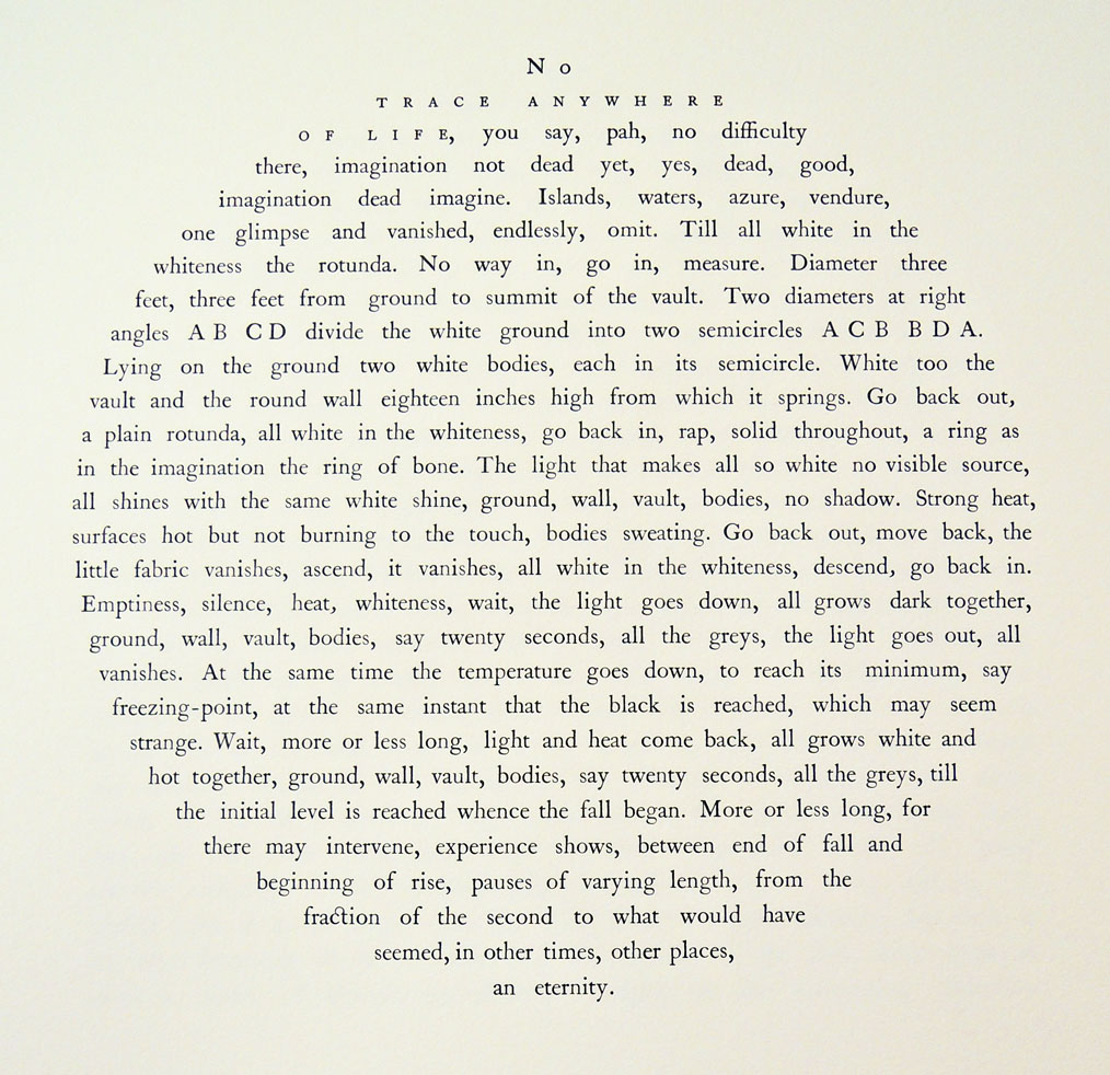
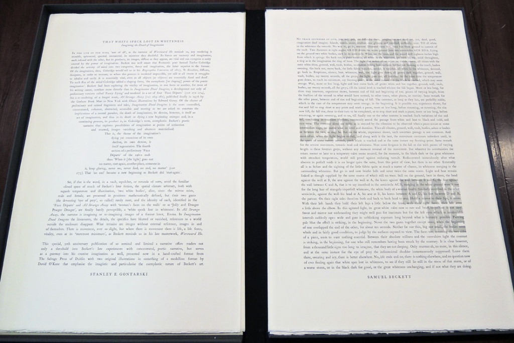
No trace anywhere of life, you say, pah, no difficulty there, imagination not dead yet, yes, dead, good, imagination dead imagine.
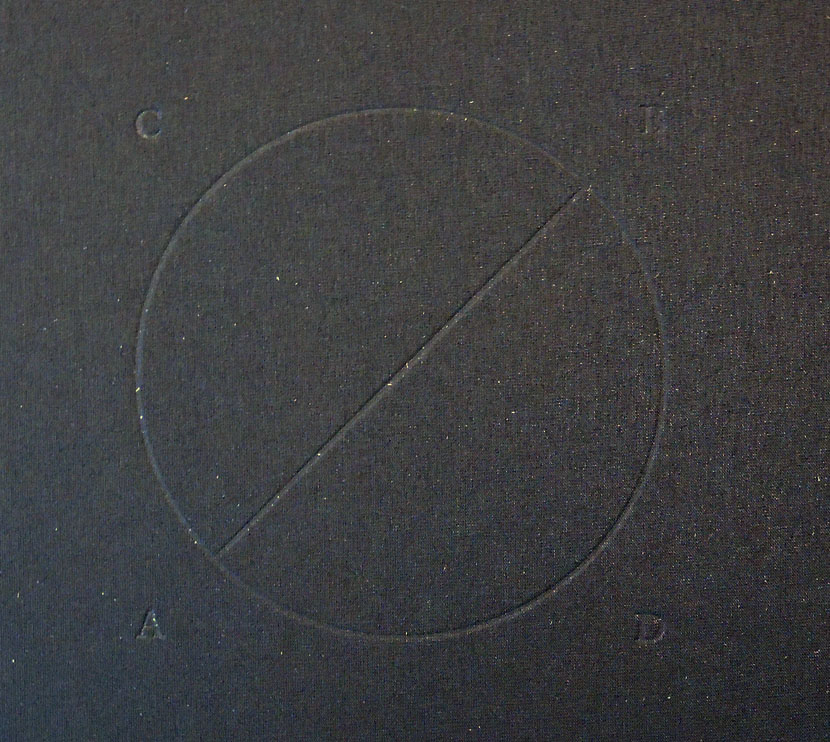
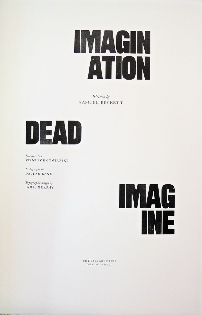
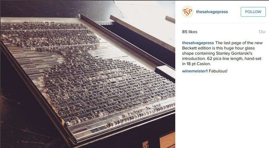
the dead5Jamie Murphy at The Salvage Press in Dublin has published a new edition of Samuel Beckett’s Imagination Dead Imagine, to coincide with the 50th anniversary of its release in 1965. Beckett first wrote the prose fragment Imagination morte imaginez, in French and translated it himself to English. The new edition is a collaboration between typographic designer Jamie Murphy and the visual artist David O’Kane, with an essay by Stanley E. Gontarski, the Robert O. Lawton Distinguished Professor of English at Florida State University and a Beckett scholar who specializes in twentieth-century Irish Studies. https://instagram.com/thesalvagepress/

The Salvage Press is a new studio, devoted to preserving, promoting and pursuing excellence in design, typography & letterpress printing. You can follow them at: http://websta.me/n/thesalvagepress
the dead4
the dead    the dead3

Samuel Beckett (1906-1989), Imagination Dead Imagine. A collaboration between typographic designer Jamie Murphy & visual artist David O’Kane. Essay by Stanley E. Gontarski. (Dublin: Savage Press, 2015). Copy 2 of 40. Graphic Arts Collection GA2015- in process.
the dead2savage

Colophon:

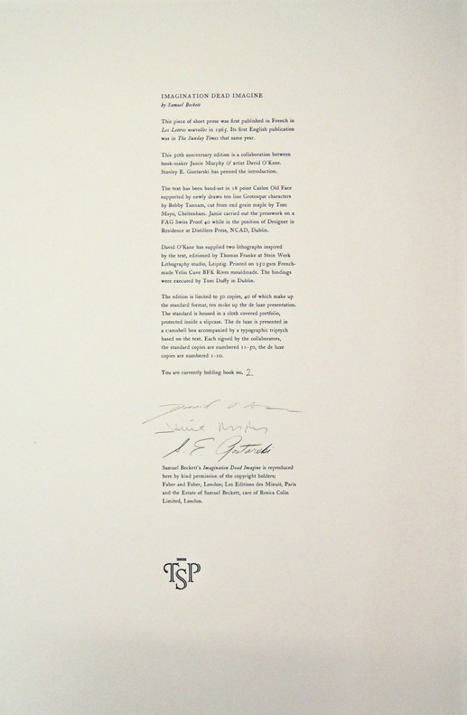
This new edition of loose sheets celebrates the 50th anniversary of the original publishing in 1965. The project is a collaboration between typographic designer Jamie Murphy & visual artist David O’Kane. The work is introduced with an essay by renowned Beckett scholar Stanley E. Gontarski.

The text has been hand-set & letterpress printed by Jamie Murphy in 18 point Caslon Old Face, supported by a newly drawn ten line grotesque typeface by Bobby Tannam, cut from maple by Tom Mayo. David O’Kane has supplied two lithographs inspired by the text, editioned by Thomas Franke at Stein Werk Lithography studio in Leipzig. The sheets are printed on 250 gsm French made Venin Cuve BFK Rives mouldmade.

The edition is limited to 50 copies, 40 of which make up the standard format, ten accounting for the de luxe. The bindings were executed by Tom Duffy in Dublin. The standard is housed in a cloth covered portfolio, protected inside a slipcase. The de luxe is presented in a clam-shell box accompanied by a typographic triptych based on the text. The standard copies are numbered 11-50, the de-luxe are numbered 1-10. Each copy has been signed by the collaborators.

Notes on the images: The two images included in this edition were made using a lithography technique called Schablithografie. This lithography technique is highly labour intensive and involves scratching away at a surface of the blackened lithographic stone to form the image; literally scraping light forms out of darkness, reinforcing the constructed nature of the text, which Beckett goes to great lengths to emphasise.

The first image is a kind of schematic. It is not fully formed and harkens back to Greek and Roman style images, suggesting a metaphorical excavation. The letters and image turn it into a kind of logotype [literally word-imprint in Greek] or emblem and form a bridge between the text and the image.

The second image is larger. The unusual format of the image echoes the formatting of the prose text as it appears in this edition. There are noticeable discrepancies between what Beckett describes and what is depicted in the image. The image is in fact a failed attempt to portray what is fabricated in the story. What interested the artist in staging it is the fact that the positions and space Beckett describes are anatomically impossible without gross distortion of the human body. Beckett would have known this as he also sketched the space out in his notes. So he deliberately stresses the cramped nature of the scenario. The fact remains that in the artist’s mind’s eye the extreme positions were not exactly related to what is described in the story. The spatial discrepancies are only revealed completely when the space is mapped out point for point.

The finalised lithographs are a combination of the mental image conjured up during the initial reading of the text and the interpretation of the physical reenactment made in the artist’s studio.

Typoretum: A Letterpress Workshop from Jamie Murphy on Vimeo.
The Xerox Book

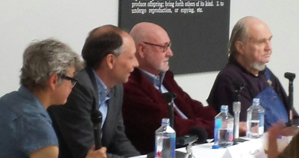
andre7Jo Melvin, Christophe Cherix, Jack Wendler, Carl Andre

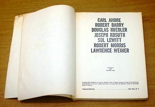
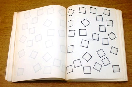
andre1Carl Andre, Robert Barry, Douglas Huebler, Joseph Kosuth, Sol Lewitt, Robert Morris, Lawrence Weiner (New York: Seth Siegelaub and John W. Wendler, 1968). Graphic Arts Collection Oversize GAX 2006-0071Q
andre8
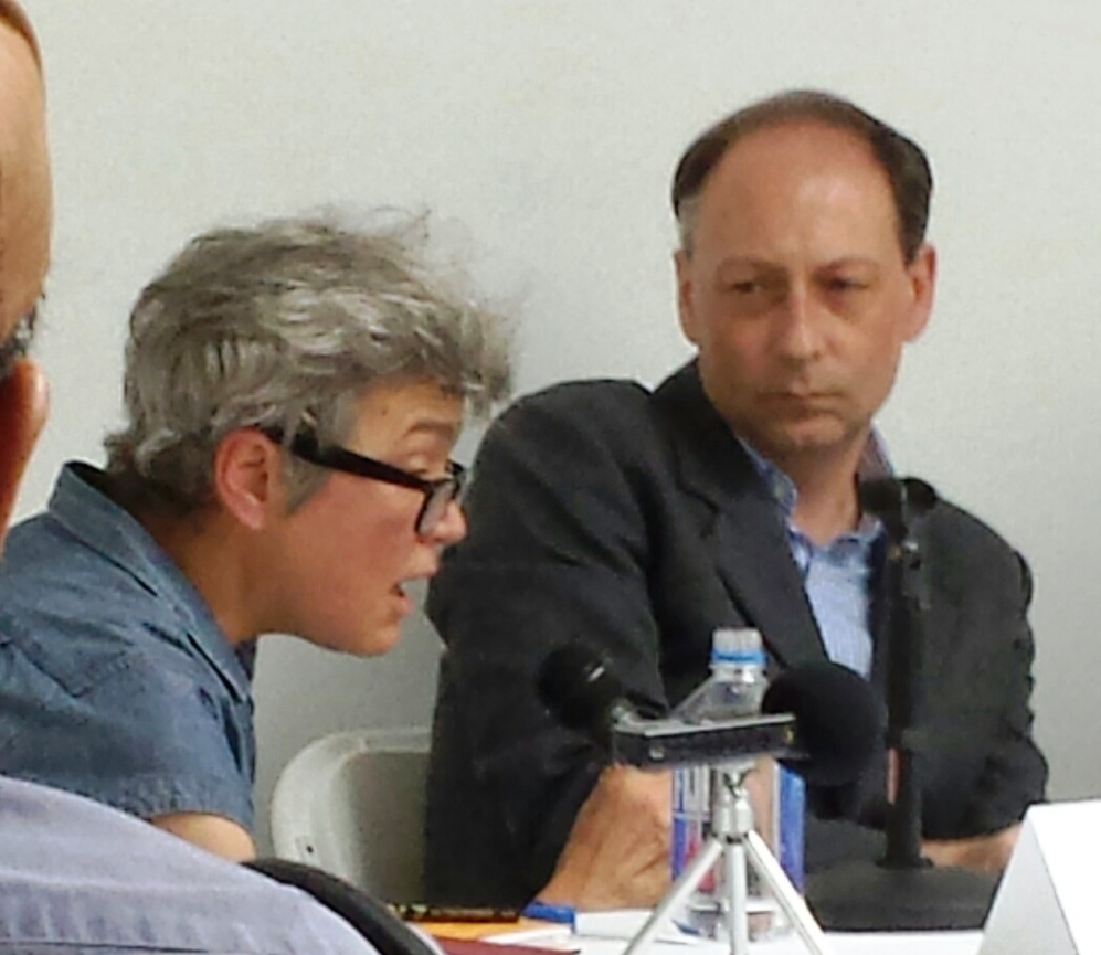
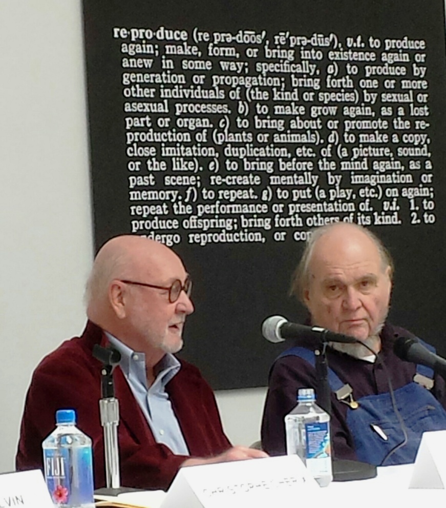
On Sunday afternoon, September 13, 2015, a panel discussion was held to the Paula Cooper Gallery, organized around the 1968 publication known informally as The Xerox Book. Included on the panel were the minimalist artist Carl Andre; MoMA curator Christophe Cherix; co-publisher of the Xerox Book Jack Wendler; and art historian Jo Melvin (seen behind the panelists is an early definition piece by Joseph Kosuth).

andre5

The project, as conceived by Seth Siegelaub and Jack Wendler, was intended to be a group exhibition in the form of a 64-page printed book. A small group of contemporary artists were each invited to fill 25 pages in any way they desired, with the understanding that the book was to be reproduced by Xerox. In the end, Xeroxing proved too expensive and the first edition of 1,000 copies was printed offset. The copy in our Graphic Arts Collection is from this first edition.

The seven artists who accepted the unpaid commission were Carl Andre, Robert Barry, Douglas Huebler, Joseph Kosuth, Sol LeWitt, Robert Morris, and Lawrence Weiner. During the discussion, we were reminded that the artists were supposed to receive 50 cents for each copy that was sold (up to a total of $400) but Andre confirmed that no money ever exchanged hands.

There continues to be disagreement around the purpose and the continued importance of The Xerox Book, as was obvious on Sunday. Andre stated, “The artist makes the art, the critic makes the culture.”

andre3

andre2For more information, see www.paulacoopergallery.com

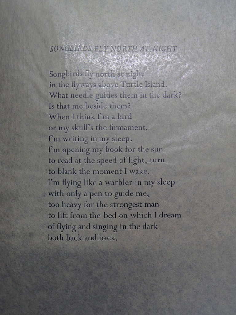
Book of Darkness

book of darkness2

book of darkness

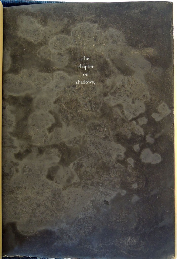
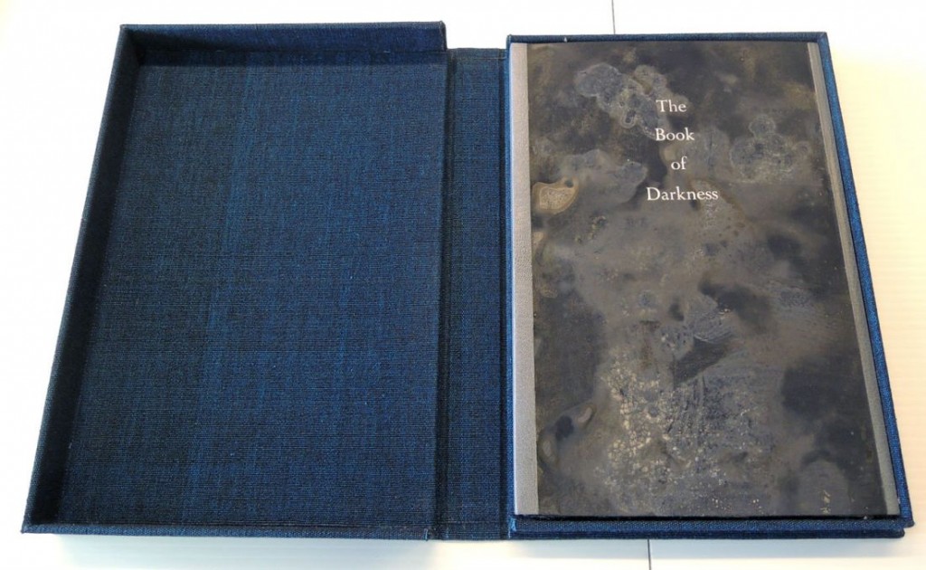
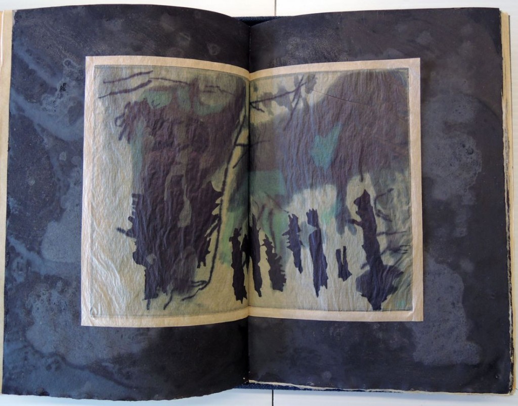
The Book of Darkness. Eleven poems by Chard deNiord; eleven etchings and paintings by Michele Burgess (San Diego: Brighton Press, 2015). Copy 27 of 30. Graphic Arts collection GAX 2015- in process. Text hand set in Perpetua and printed letterpress on Gampi paper. Etchings printed on Gampi. Paintings in gouache on Twinrocker paper. Housed in a clamshell box covered in hand woven cotton from Guatemala.

Michele Burgess, of Brighton Press, writes: “I asked Chard [deNiord] how he felt about the idea of ‘night’ as an archive of thought. He sent me these poems. After reading them I thought about and drew shafts of moonlight and sunlight in the woods of Vermont.

Chard had recently and reluctantly cut down 100 trees to protect his house from falling limbs and to create a meadow on his property. This seemed a very dramatic event to me, as a woman from the arid southwest, and I was captured by the duality expressed in it.

I used those trees as metaphors for his poems to explore the way darkness orients and reorients itself in nature and in the human imagination. The paintings felt necessary to add physicality to the blackness and to enclose the etchings.”

book of darkness4

This fall, Chard deNiord will be named Vermont’s eighth Poet Laureate. A cofounder of the New England College MFA program in poetry, he is the author of Asleep in the Fire (1990), Sharp Golden Thorn (2003), Night Mowing (2005), and The Double Truth (2011). His latest poetry collection, Interstate, is due out next month.

DeNiord joins an exclusive club of official Green Mountain bards. Vermont’s first poet laureate, Robert Frost, was appointed in 1961 and served until 1963. He was followed many years later by Kinnell (1989-93), Louise Glück (1994-98), Ellen Bryant Voigt (1999-2002) Grace Paley (2003-07), Ruth Stone (2007-11) and Lea (2011-15). –this is taken in part from “Chard deNiord Appointed Next Vermont Poet Laureate,” Posted by Ken Picard on Mon, Aug 24, 2015.
book of darkness3

Michele Burgess is the Director of Brighton Press and a prolific artist. For more information, see:
http://www.ebrightonarts.com/public/index/index.php