Category Archives: Artists’ books

Artists’ books

Tamayo’s Apocalypse de Saint Jean

tamayo7

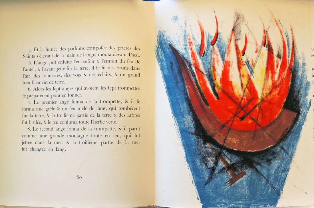
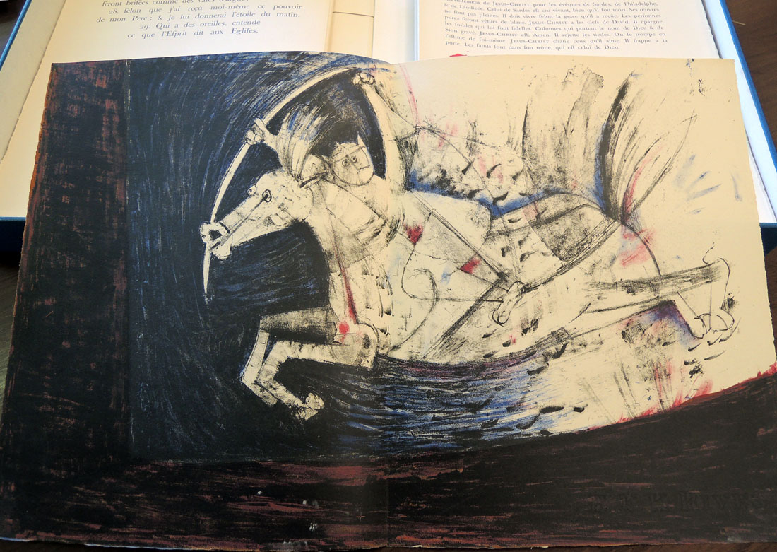
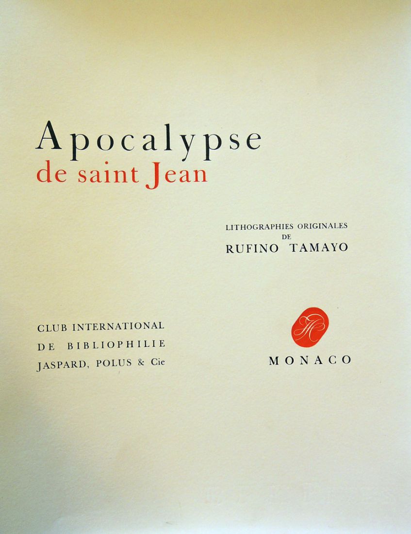
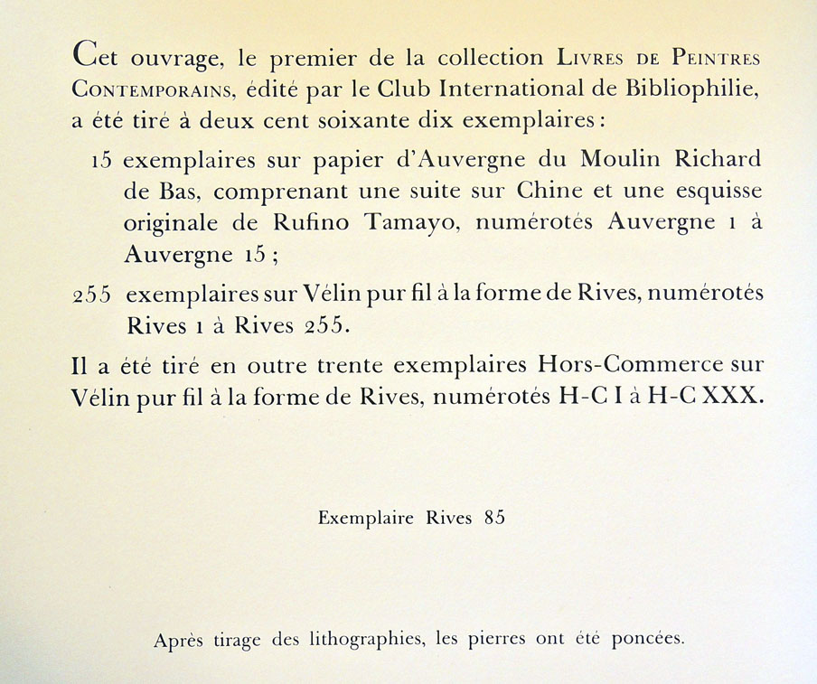
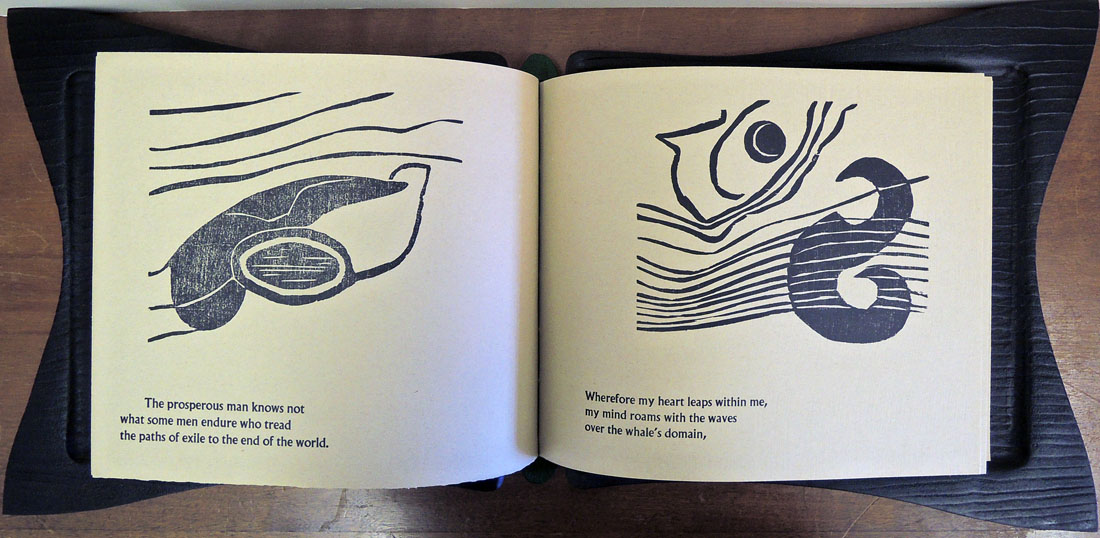
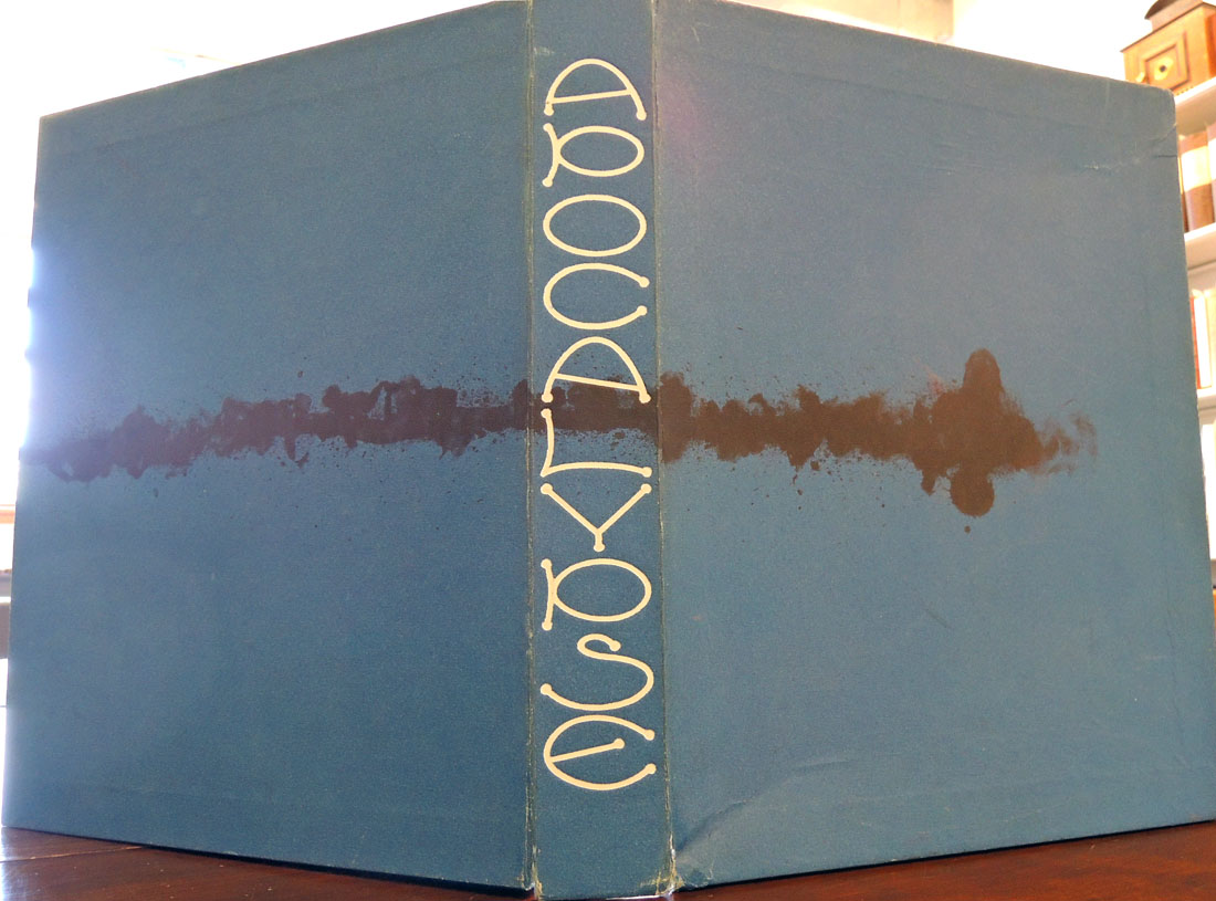
Rufino Tamayo (1899-1991), written by Issac-Louis Lemaistre De Sacy (1612-1684), Apocalypse de Saint Jean (Monaco: Club international de bibliophile: Jaspard, Polus & cie, 1959). Printed by Jean Paul Vibert, Grosrouvre, and Lucien Détruit, Paris. “Le texte de la présente édition reproduit integralement la version de Lemaistre de Sacy, publiée pour la première fois à Paris, en 1672”–Title page verso. Graphic Arts Collection GAX 2015-in process

tamayo9

tamayo2

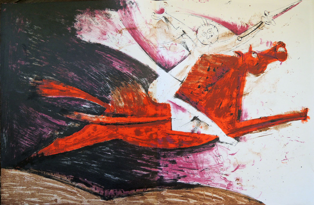
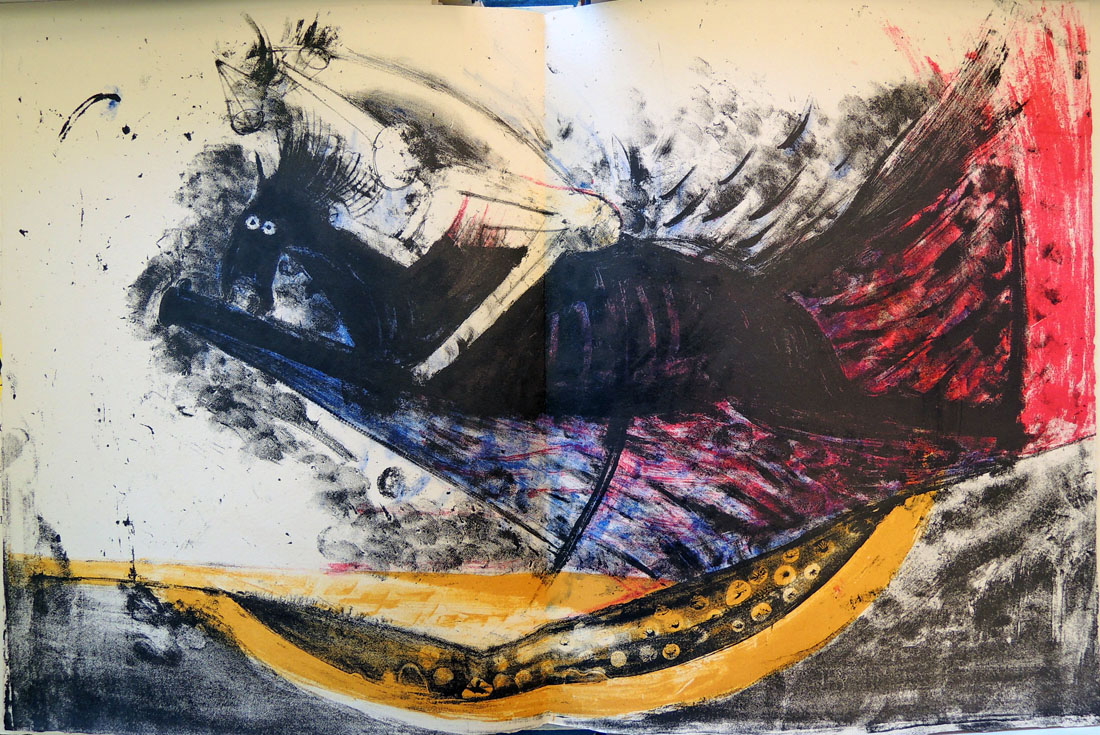
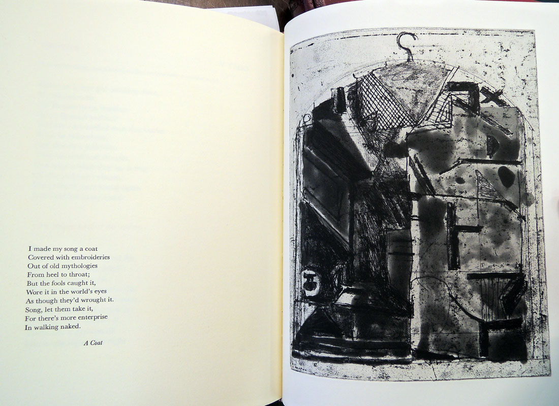
When the Mexican artist Rufino Tamayo died in 1991 at the age of 91, Michael Brenson wrote an extended obituary for the New York Times. He called Tamayo “a force in Mexican art for more than 60 years and one of the leaders of the Mexican Renaissance.” He continued “Mr. Tamayo was prolific. Although he is best known for his painting, he was an influential printmaker who liked being involved in every step of the process, including making his paper by hand.”

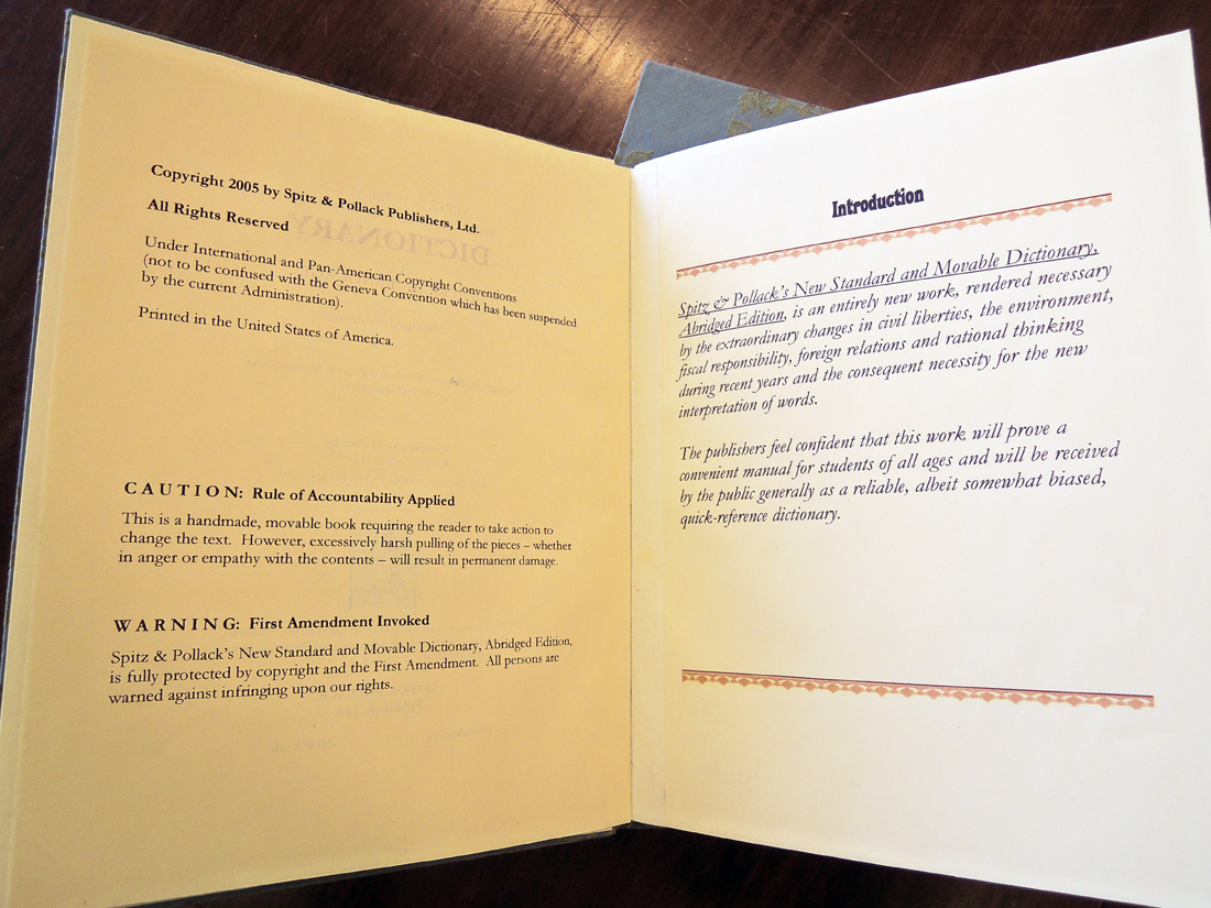
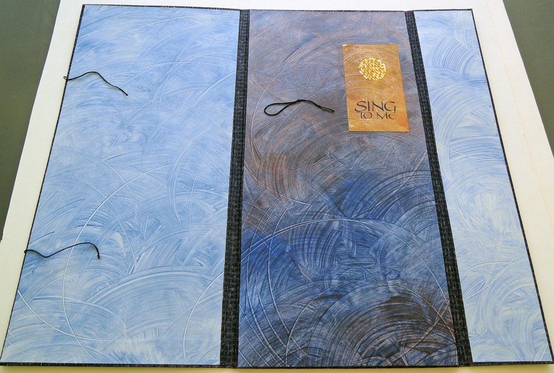
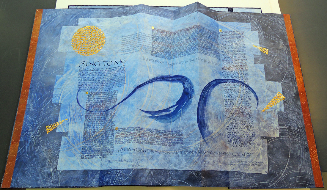
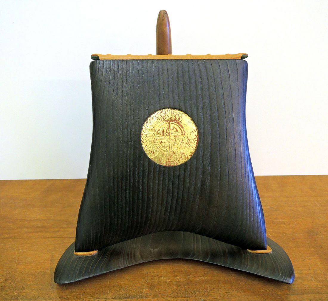
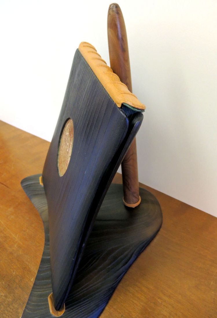
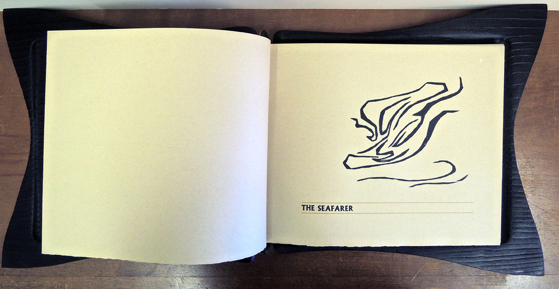
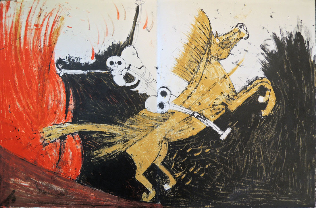
The Graphic Arts Collection is fortunate to have acquired the most beautiful livre d’artiste by Tamayo, Apocalypse of St. John (Apocalypse de Saint Jean), which he completed in 1959. The cardboard clamshell box with Tamayo’s design across the front and back, is in surprisingly good condition after almost 60 years. The color of his lithographs is fresh and pure. It is Tamayo’s color that many of us loved the best.

“If I could express with a single word what it is that distinguishes Tamayo from other painters of our age,” commented Octavio Paz, the Mexican poet and Nobel laureate, “I would say, without a moment’s hesitation: sun. For the sun is in all his pictures, whether we see it or not; night itself is for Tamayo simply the sun carbonized.”

tamayo6
tamayo5
tamayo4
tamayo3
tamayo1

tamayo8

Artists’ Books

abSarah Bodman, Senior Research Fellow for Artists’ Books/Programme Leader MA Multidisciplinary Printmaking at the Centre for Fine Print Research in Bristol publishes The Book Arts Newsletter every two months. The most recent, no. 98 (July/August 2015), is now ready for download at:
http://www.bookarts.uwe.ac.uk/banlists.htm
It you don’t already subscribe, you might want to sign up to receive an alert when the next one is published.

The cover of this issue is by the artist Hilke Kurzke and the content includes information on national and international exhibitions; courses, conferences, lectures & workshops; book fairs and much more. If you want to submit your own information, the next deadline for copy will be August 13 for the September/October newsletter.

Please note: Their website will be closed for maintenance from 4pm on Friday 3rd July until 8.30am on Monday 6th July, so please download before or after. For more information, see: www.bookarts.uwe.ac.uk

A book about Cook in a bottle

harvey any number2

Rebecca Harvey, Any number of things : being the story of events leading to the untimely death of Captain James Cook ([Columbus, Ohio] : Logan Elm Press, 2013). Includes paper scroll measuring 27 x 288 cm, glass bottle measuring 44 cm high, and ceramic saucer measuring 19 cm in diameter. Copy 10 of 100. Graphic Arts Collection GAX 2015- in process

harvey any number
harvey any number4
“Any Number of Things was written, designed, & illustrated by Rebecca Harvey & was printed on her own handmade Kozo and Gampi fiber paper at The Ohio State University Libraries’ Center for Book Arts & Logan Elm Press, 2013.

Each copy is enclosed in its own handblown glass bottle resting on a ceramic saucer made by the artist for this book with a calligraphic portrait of Captain Cook drawn by Ann Alaïa Woods. Grateful acknowledgement is made to Jeff Bussone, Sara Galluzzo, David King and the team at the OSU hot shop, Helen Liebman, Bob Tauber, Kelly Watson and The Ohio State University College of Arts and Sciences for their assistance in the making of this book.”–Colophon.
harvey any number6
harvey any number5
harvey any number3

Not Your Standard American Dictionary

spitz dictionary2

Laurie Spitz and Amee J. Pollack, Spitz & Pollack’s New Standard and Movable Dictionary of the American Language: Comparing Selected Words and Phrases, Re-Interpreted with Full Definitions Abridged ed. (New York: Spitz & Pollack Publishers, 2005). One of 35 copies. Gift of the artists. Graphic Arts Collection GAX 2015- in process.

spitz dictionary3It isn’t often we get a book with a warning. This one comes with two. The first reads: Caution: Rule of Accountability Applied. This is a handmade, movable book requiring the readers to take action to change the text. However, excessively harsh pulling of the pieces–whether in anger or empathy with the contents–will result in permanent damage.

The second: Warning: First Amendment Invoked. Spitz & Pollack’s New Standard and Movable Dictionary, Abridged Edition, is fully protected by copyright and the First Amendment. All persons are warned against infringing on our rights.
spitz dictionary8The Graphic Arts Collection is very lucky to add one of the last copies of this limited edition artists’ book to our library. The offset and digitally printed volume includes eight movables, including wheels, slides, dissolves, and spinners.

spitz dictionary6                  spitz dictionary5

spitz dictionary4Amee J. Pollack and Laurie Spitz have collaborated on many projects but Pollack singled out this dictionary, completed in 2005, as one of her favorites. “Bush was re-elected, and it was quite upsetting to Laurie and me,” she said. “So we created a dictionary with movables and it was a reinterpretation of words for our times.” Manipulate the circle and the word oil becomes spoil; reason becomes treason; and so on.
spitz dictionary7

Sing to Me

owen sing to me4
owen sing to me1Jan Owen, Sing to Me. Text from the Odyssey by Homer, translated into English by Robert Fagles. [Bangor, Me.: Jan Owen], 1997. 1 volume ([1] folded leaf); 63.5 cm. Gift of Lynne Fagles. Graphic Arts Collection GAX 2015- in process

In 1997, Maine artist Jan Owen created a calligraphic artists’ book from a single sheet of folded paper. The text she chose was from Homer’s Odyssey, translated by Robert Fagles (1933-2008), former Arthur Marks ’19 Professor of Comparative Literature Emeritus at Princeton University and renowned translator of Greek classics. By 2003, Ms. Owen had created several others to form a set of three calligraphic foldouts using the words of Homer.

Thanks to the generous gift of Lynne Fagles, the Graphic Arts Collection now holds the first of these unique creations. The book is designed to double as a hanging sculptural, with lettering in gouache on decorated paste papers, painted additions, and gold leaf. Cloth covered portfolio case houses the folded leaf, which is topped with a gold and yellow woven Tyvek circle to complete the design.

owen sing to me2

owen sing to me3

owen sing to me5 The artist writes, “Our age of computer technology is as exciting as when Gutenberg developed the printing press. While digitized information soars through space, I write with pens and brushes. Independent of technology, the power and beauty of words are constant; the depth of thought and leap of metaphor are vital. The complex rhythm of our bodies; our breath and our gestures found in handwritten letters still captivates me.

Hand lettering is the craft of gestural, abstract line becoming letter. The letters combine to make words and a visual conversation begins between writer and reader. I select words that have rhythm and meaning, then letter them into artist books and panels. I want to call attention to words through design and form in an object of beauty.”

Letters to Anna

letters to anna6

Brody Neuenschwander, Letters to Anna. Photos by John Decoene and drawings by Peter Jonckheere (Belgium: Neuenschwander, 2014). Graphic Arts Collection GAX 2015- in process. Gift of Alfred Bush.

letters to anna5
“The freedom of the book format is astonishing,” writes Brody Neuenschwander, Class of 1981. “The order of the pages continues to change, bringing new combinations into being. Of course, you have to settle on a final order at some point. Or perhaps not. Books do not have to be bound…”

Neuenschwander’s new book Letters to Anna is a good example of a successful unbound book. Together with photos by John Decoene and drawings by Peter Jonckheere, the 120 pages can be rearranged to produce new texts.

Completed in 2014, Neuenschwander’s artists’ book is sold to raise money for children at risk, through a program run by the King Boudewijn Foundation in Belgium. Special thanks go to Alfred Bush for his generous gift to the Graphic Arts Collection.

letters to anna4
letters to anna3

letters to anna2

letters to anna1

Tom Tit Tot

howe, susan tot8 In 2013, the poet Susan Howe came down to Princeton University to perform W O O D S L I P P E R C O U N T E R C L AT T E R , a collaborative performance with the composer David Grubbs. http://www.nassauweekly.com/susan-howe-in-middle-air/.  Some of the poems heard at that event are now included in a new volume entitled, Tom Tit Tot, for which Howe collaborated with her daughter, R. H. Quaytman.

Published by the Library Council of The Museum of Modern Art, the limited edition book brings together sixty-seven poems by Howe created with “slivers of typeset text extracted from her readings in American, British, and Irish folklore, poetry, philosophy, art criticism, and history. Beginning with copies of the source material, and including excerpts from the texts themselves and from surrounding footnotes, tables of contents, and marginalia, Howe cut out words and sentence fragments, then spliced and taped them together while retaining their typefaces, spacing, and rhythms. These re-collected images, formed into arrangements shaped both by control and by chance, were then transferred into letterpress prints.” (prospectus)howe, susan tot2
howe, susan tot6


Quaytman’s design for the book is inspired partly by the geographical atlases and histories of Emma Hart Willard (1787–1870), an American author, educator, and civil and women’s rights activist. For the frontispiece Quaytman created an artwork based on two of Willard’s visualizations of geography and history, Picture of Nations and Temple of Time. Quaytman’s frontispiece, also titled Temple of Time, was printed as a six-color silkscreen at Axelle Editions, Brooklyn; digitally at the Lower East Side Printshop, New York; and by letterpress at The Grenfell Press.
howe, susan tot5

Three more of Quaytman’s images, printed by letterpress at The Grenfell Press, are bound into the volume. One shows an unraveled knitted baby’s sock, and derives from a photoengraving in Thérèse de Dillmont’s Encyclopedia of Needlework, first published in 1886; the second shows a thumbprint on black paper; and the third is an abstract image taken from the artist’s frontispiece.

howe, susan tot1

Susan Howe and R. H. Quaytman, Tom Tit Tot (New York: Library Council of The Museum of Modern Art, 2014). Copy 10 of 95. Graphic Arts Collection.

howe, susan tot3
For more on Willard, see Steve Ferguson’s post https://blogs.princeton.edu/rarebooks/2008/12/standing_within_the_temple_of.html.  Emma Willard (1787-1870), Willard’s Map of Time: a Companion to the Historic Guide (New-York: A.S. Barnes & Co., [1846]). Rare Books (Ex) Oversize Item 5146637q

howe, susan tot9

Is it a book or is it a boat?

seafarer habib dingle1

Inger Lawrance, Kevin Crossley-Holland, and Nicolas McDowall, The Seafarer (Llandogo, Monmouthshire: Old Stile Press, 1988). Binding by Habib Dingle. Graphic Arts Collection GAX 2014- in process

seafarer habib dingle2

This modern translation of The Seafarer was created and published in an edition of 240 copies. Inger Lawrance cut all 43 images on wood; Kevin Crossley-Holland prepared the text from the Anglo-Saxon; and Nicolas McDowall hand-set the Albertus types, completing the printing of the book in June 1988 at the Old Stile Press.

“Ever since the tenth century, versions of The Seafarer have been committed to books, though it was no doubt part of the tradition of poems recited aloud and learned by heart. Here, Kevin Crossley-Holland has written the poem in modern English verse which retains all the Anglo-Saxon poet’s passionate love for the sea while recognising its hardships and dangers.

Inger Lawrance is Danish but now lives near the stormy Northumberland coast, so the sea features prominently in much of her painting and printmaking. Her woodcutting technique was learned partly in Japan and her imagery is very spare, almost calligraphic. The book itself is somewhat delicately bound in the Japanese style but is enclosed, almost wrapped, in a portfolio of rough linen and blue buckram – as though it had survived a turbulent time at sea and is now rescued especially for the reader.”—prospectus
seafarer habib dingle3
From the limited edition, ten copies were reserved for the special binding by Habib Dingle, one of which is now in the Graphic Arts Collection at the Princeton University Library. Dingle wrote in the prospectus:

“After necessary consideration of the structure and function, the design was allowed, or took, full rein to express itself in organic form…. Although the sea and seafaring are the more obvious subjects, my own reading of the poem gave me a greater sense of the mystic – to this end the circular motif, mandala like, is focal to the design – it consists of burnished and distressed gold laid on gesso raised so as to give the impression of an Anglo-Saxon emblem in the centre of the image of the sun.”

The Cedar of Lebanon boards were initially roughed out with a radial saw followed by an overhead router and finally a spoke- shave. The boards were then fired using a blow-lamp and the charred wood worked out with wire-wool, before waxing. It has retained its distinctive cedar smell.

seafarer habib dingle6

seafarer habib dingle5

seafarer habib dingle4

Graphic Arts acquires The Torture Garden

rodin vollard1

Auguste Rodin (1840-1917) and Octave Mirbeau (1848-1917), Le Jardin des supplices [The Torture Garden] (Paris: Ambroise Vollard, 1902). One of 155 copies on velin from a total edition of 200. Graphic Arts Collection 2014- in process

rodin vollard10 rodin vollard2

Friends and collaborators, Auguste Rodin and Octave Mirbeau published a modest illustrated edition of The Torture Garden in 1899, to limited success. When they heard that art dealer Ambroise Vollard (1866–1939) was preparing a deluxe edition of Paul Verlaine’s erotic poem Parallèlement with lithographs by Pierre Bonnard, they approached Vollard about also publishing their book as a deluxe edition.

“Less than two weeks after they had signed a contract with Vollard on February 10, 1899, the master printer Auguste Clot received ten of Rodin’s designs for reproduction as lithographs. When Vollard’s edition appeared in 1902, the subject and illustrations proved too challenging for some clients, who returned copies they had preordered, creating significant cash flow problems for Vollard.”–Cézanne to Picasso: Ambroise Vollard, Patron of the Avant-garde by Rebecca A. Rabinow (2006)

Clot printed 18 color and 2 black and white lithographs, with Rodin by his side supervising. In the final bound volume, these plates are interspersed throughout Mirbeau’s text, protected with a tissue printed with a linear reproduction of Rodin’s nude underneath. Today, this book is recognized as one of the rarest and most important livre d’artiste ever produced.

rodin vollard8     rodin vollard7  rodin vollard5

“Novels that produce a physical effect upon their reader,” writes Tom McCarthy, “sending jolts outwards from the spine to the remotest nerve-ends, tightening the throat and burning the ears, must number very few; and The Torture Garden must stand near the top of any list of these. Yet not only is it—in its extremity, its viscerality and violence—an uncommon or ‘exceptional’ work of fiction; it also sits neatly in the middle of what, when the dust of time has cleared and the staid realist novels of the early twentieth century have been forgotten, will be seen as a canonical mainline running between the counter-enlightenment visions of Sade and the post-industrial ones of Burroughs and Ballard.”

rodin vollard4   rodin vollard3

Diebenkorn and Yeats

yeats diebenkorn7

Richard Diebenkorn, Poems of W.B. Yeats, selected and introduced by Helen Vendler (San Francisco: Arion Press, 1990). Edition: 426 copies. Graphic Arts Collection 2014- in process

yeats diebenkorn1When a man grows old his joy
Grows more deep day after day,
His empty heart is full at length,
But he has need of all that strength
Because of the increasing Night
That opens her mystery and fright.
Fifteen apparitions have I seen;
The worst a coat upon a coat-hanger.

–verse from The Apparitions by W.B. Yeats


Yeats wrote this poem in March/April 1938 and published it before the end of that year. The 73 year-old poet had not been well and knew he was coming to the end of his life. Similarly, Richard Diebenkorn was in his last years in 1990 when he received a commission to create work for Arion Press. The artist agreed and chose to visualize Yeats’s late poems.

“The poetry of William Butler Yeats (1865-1939) burst the boundaries of its native Ireland to become part of world culture. Helen Vendler, one of the foremost authorities on modern poetry and a University Professor at Harvard, selected for the Arion Press 145 poems and provided an introductory essay for the book. Richard Diebenkorn (1922-1993), internationally recognized as one of America’s leading artists, took the Yeatsian theme of an empty coat on a hanger to produce a series of prints transforming the garment from a representational frock-coat into an abstracted suit-bag. The sixth etching is a double map of Ireland, indicative of that divided country.”–prospectus

It is, perhaps, surprising that the Graphic Arts Collection did not already own a copy of this fine press edition but the gap has now been filled.
yeats diebenkorn5
yeats diebenkorn4
yeats diebenkorn3