Category Archives: Artists’ books

Artists’ books

Water Yam

https://music.princeton.edu/events/tim-ruszala-fluxus

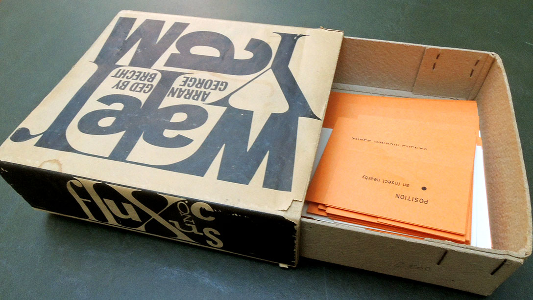
It isn’t often that our artists’ books get a performance, but that is the case with the new acquisition of George Brecht’s Water Yam (Fluxus no. C, 1963). At 4:30 on Friday, November 16, 2018, music major Tim Ruszala will present a Junior Paper recital about Fluxus, a radical avant-garde interdisciplinary art movement of the early 1960s.

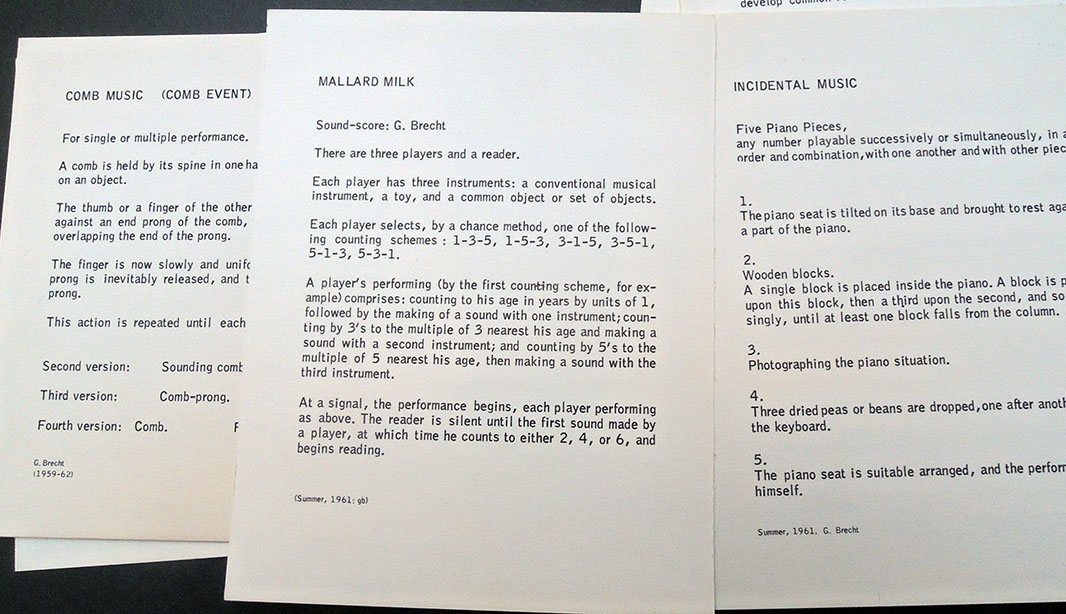
He writes, “A large part of their corpus consisted of written instructions or short phrases, intended for performance / reflection, and the pieces were often framed in musical terms or had to do with questioning art production and conventions of consumption.” Tim will hold a recital in Theatre Intime of a selection of interesting pieces that he found in this process, including Brecht’s Water Yam.

When the BBC described Water Yam, they noted:

In a series of classes given at the New School for Social Research between 1956 and 1960, John Cage influenced a generation of artists who would develop the performance script into an art form, and lay the ground for Happenings and Fluxus. Having earlier embraced chance compositional procedures as a means of effacing his own likes and dislikes (and, as he put it, ” imitating nature in her manner of operation”), Cage encouraged students who already were using chance in their work – such as George Brecht and Jackson Mac Low – and prompted others – such as Allan Karpow, Dick Higgins and Al Hanson – to do so. And his classroom assignments led to instructions for events and performances that yielded some of the most important intermedia activity of the late 1950s and early 1960s.

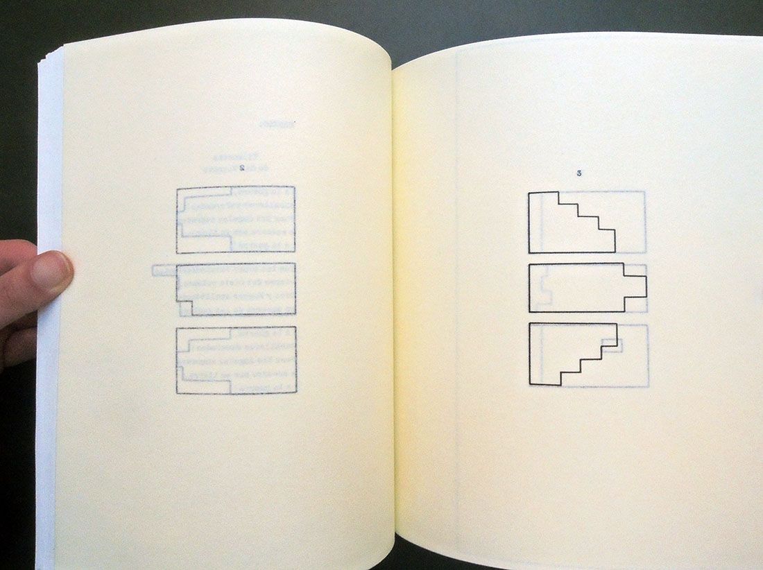
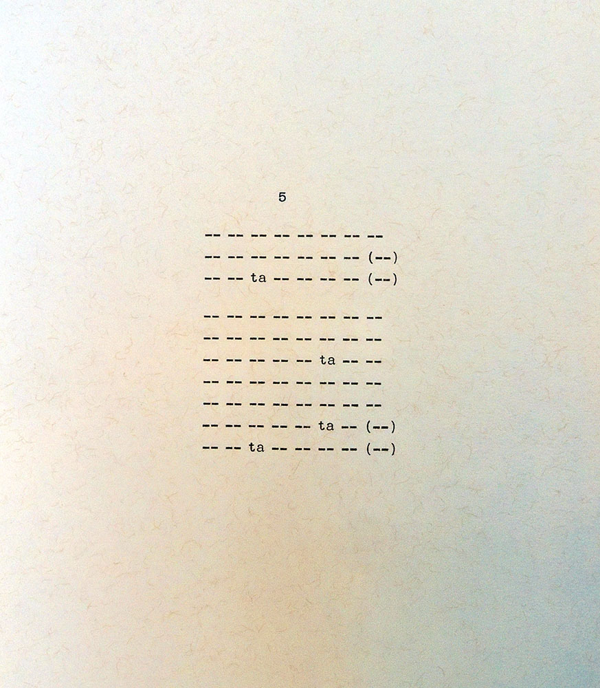
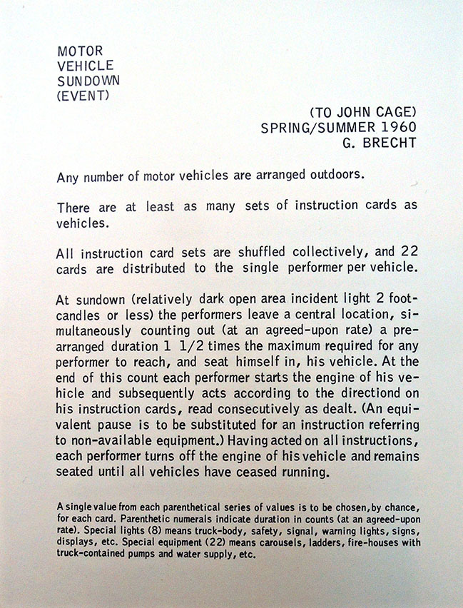
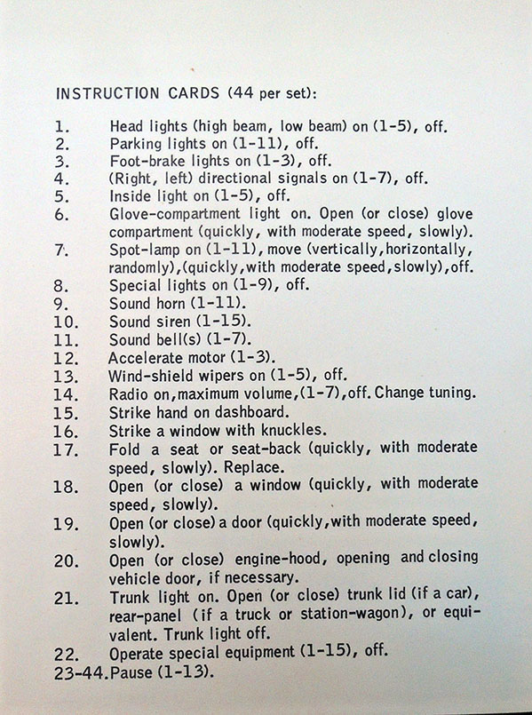
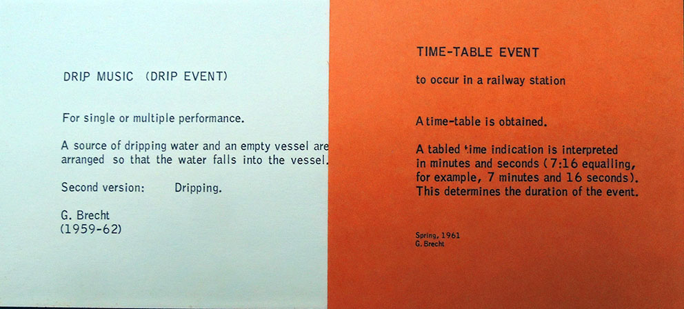
Out of the Cage class came the kind of event cards for which Fluxus would become well-known, an evocative form whose power is best appreciated in the 1959-66 works of George Brecht published by the movement’s impresario George Maciunas in a box called Water Yam. While most Fluxus event cards are performance scripts, Water Yam also includes instructions for the creation of objects or tableaux–obscure directions whose realization left almost everything to the realizer. In such works as Six Exhibits (“ceiling, first wall, second wall, third wall, fourth wall, floor”) and Egg (“at least one egg”), Brecht applied to objects and physical situations the freedom of execution and openness to serendipity that is the hallmark of a Fluxus performance.

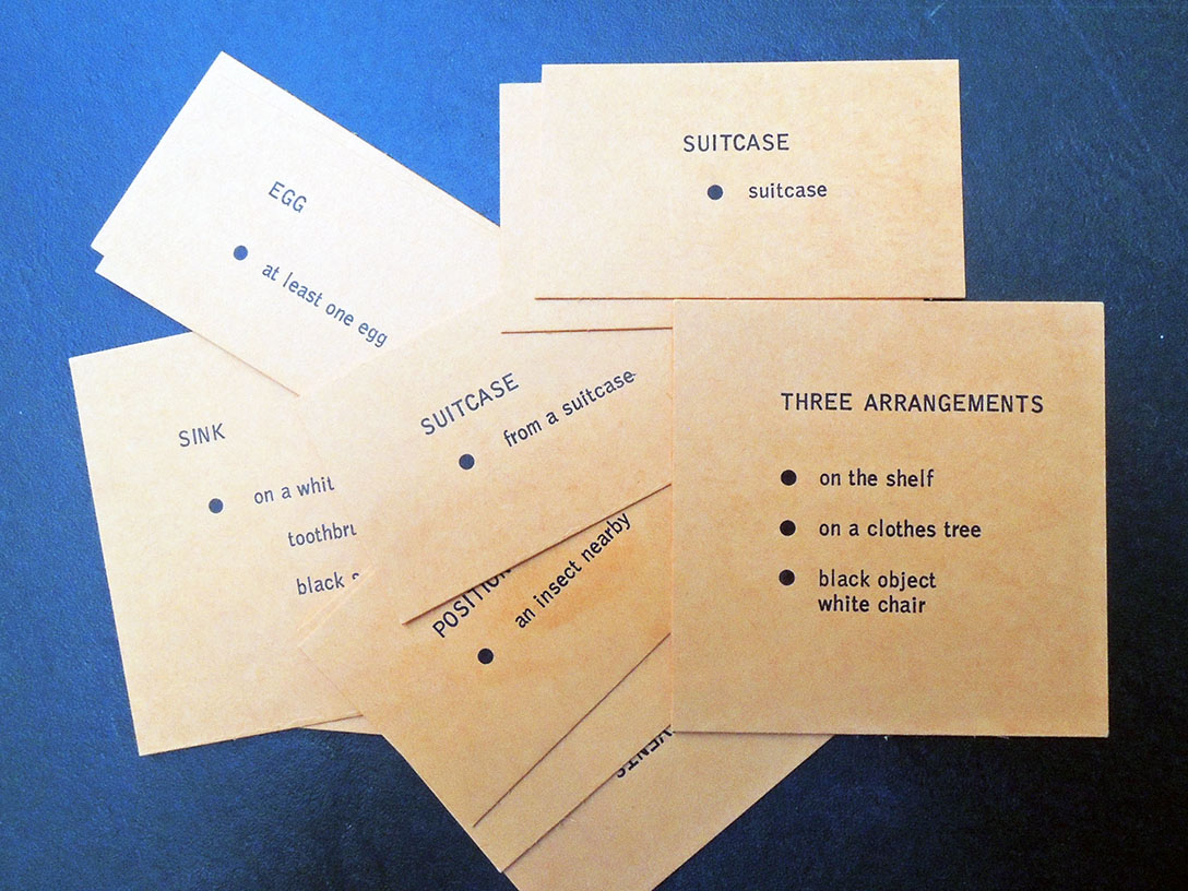
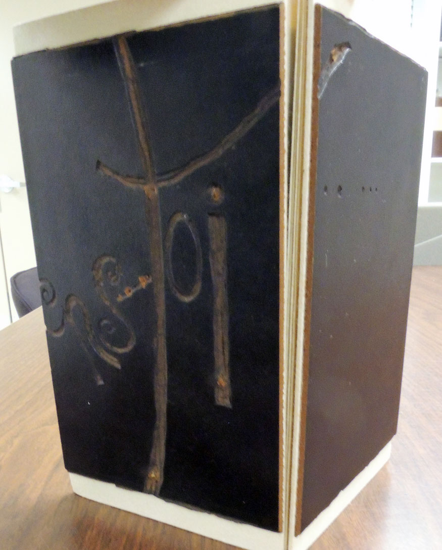
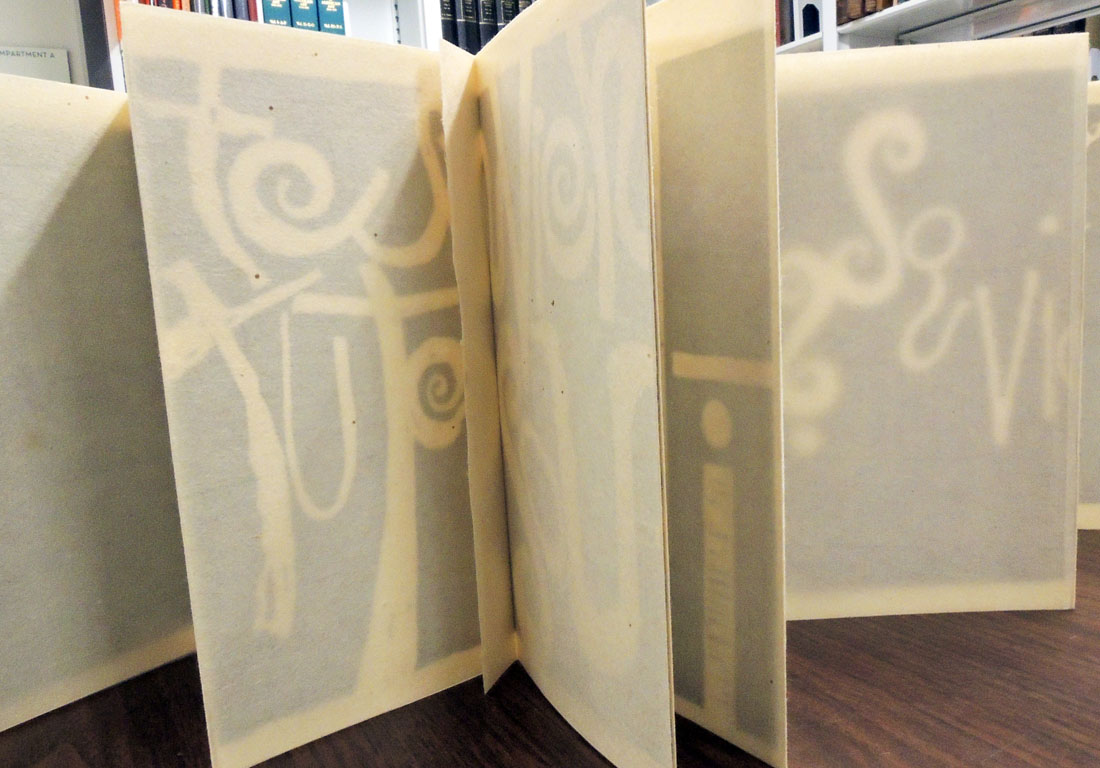
Water Yam, arranged by George Brecht ([New York]: Fluxus, [1963?]). 1 cardboard box with 76 cards. Fluxus ; no. C. Graphic Arts Collection GAX 2018- in process

Ulises Carrión’s Early Books


Guest post by Sarah Hamerman, Poetry Cataloging Specialist

Mexican-born, Amsterdam-based artist, writer and cultural organizer Ulises Carrión (1941-1989) was a key figure in the broadly intercultural development of artists’ books and concrete poetry in the 1970s. Though Carrión achieved early success as a short fiction writer in Mexico, he soon moved away from narrative writing; upon his move to Amsterdam, he adopted a structuralist-inflected interest in linguistic systems and the materiality of the page. The artists’ book would prove an ideal medium for these ideas: in his influential 1975 essay The New Art of Making Books, Carrión champions the book as a “space-time sequence,” rather than a mere container of literary text.


Carrión’s earliest artists’ books, or “bookworks,” explore these ideas by playfully questioning the underlying structures of poetry. His first published artists’ book, Sonnets, consists of 44 variations of an appropriated sonnet by Dante Gabriel Rossetti. Carrión’s often-subtle rewritings of the poem—indicated by titles such as Capital Sonnet, Parenthetic Sonnet, and Echoed Sonnet, highlight the rigorous rhyme scheme and structure dictated by the sonnet form. Self-published on his own mimeograph machine, Sonnets also demonstrates that Carrión’s interest in “making books” was a practical as well as an aesthetic matter.

The approach of Sonnets is further developed in Poesías, an unpublished 1972 typescript which was made available for the first time in a fine 2007 edition by Mexico-based Taller Ditoria. In one poem, Ritmos, Carrión explores rhythm and meter through the repetition of a single syllable, “ta,” and the use of space. This tactic reveals the influence of concrete and sound poetry’s concept of “verbi-voco-visual” expression on Carrión’s work. In another section, Graficas, the stanzas of a poem are conveyed by a graphic representation of their outlines. The author prints five variations of this technique on translucent paper stock, allowing the shapes to overlay and the reader to consider the entire sequence together. While these works adopt a kind of reduced and minimal language, they offer a rich and fascinating approach to the forms through which literature conveys meaning.

Ulises Carrión (1941-1989), Poesías (Ciudad de México: Taller Ditoria, 2007). Graphic Arts RCPXG-5902412

Ulises Carrión (1941-1989), Sonnet(s) (Amsterdam: In-Out Productions, 1972). Carrión’s first artist’s book, dedicated to Raúl Marroquín. Printed in black and white and stapled between clear plastic wraps. Marquand Library PQ7298.13.A73 S65 1972q Oversize

Clavé’s Gargantua

François Rabelais (approximately 1490-1553), Gargantua. Illustrated by Antoni Clavé ([Marseille]: Les Bibliophiles de Provence, 1955). No. 33 of 220 copies printed by Priester freres in Paris. 61 original color lithographs (including 4 double-page and 15 single-page, all hors-texte) + 61 original color woodcuts for lettrines and cul-de-lampe. Graphic Arts Collection GAX 2018-in process

”… Gargantua (Rabelais), a work to which Clavé brought all his inventiveness of design. Apart from the brilliant color combinations (some involving five to eight separate stones)… Clavé devised a large number of initial letters… Certainly this book lives up to Rabelais’s exhortation ”Vivez joyeux”; it is also Gargantuan in scale with its format”.  [Strachan goes on declaring this work as sequel to Derain’s Pantagruel]. Strachan The Artist & The Book in France, pp. 146 & 329.


The artist is not well known and so, here is an extended biography, https://www.antoni-clave.org/en/biography/

Antoni Clavé was born in Barcelona in 1913. At 13 years of age, and seeking employment, he is hired as an assistant in a textile shop for girdles and corsets. At the same time, he signs up for evening classes at the annex to the Escuela de Artes y Oficios Artísticos y Bellas Artes. As an apprentice house painter with Tolosa, he is attracted by the manual aspect of the work (distemper, primer, glues, and later the mixing of colors). …In April 1940, there is an exhibition at the « Au Sans Pareil » bookstore which is not very successful. In June, the Germans are at Paris’ gates. Clavé intends to leave Paris to make his way to Venezuela but the German tanks have already cut off the roadways and he is obliged to turn back. In 1941, Clavé moves into his first atelier at number 45, rue Boissonnade. His son Jacques is born in 1942 and his own mother moves to Paris. This is an intimate and introspective period for his work where he is influenced by Bonnard and Vuillard. The following year he produces the lithographs as illustrations for Lettres d’Espagne by Prosper Mérimée. In 1944 Clavé meets Picasso, and this encounter will have profound repercussions that will be decisive for the future of his art. His work is exhibited at the Galerie Henri Joly.

In 1946, he travels to Czechoslovakia for an exhibition of Spanish painters in Paris, among whom are Picasso, Borès, Dominquez, Florès, Lobo and Fenosa. He begins work on major set decoration and costumes for the ballet: Los Caprichos for the Ballets des Champs-Elysées (Paris, 1946), Carmen for the Ballets de Paris Roland Petit (Paris, 1949) and Ballabile for Sadler’s Welles Ballet (Covent Garden, London, 1950). His work is also to be found in many illustrated books: La Dame de Pique by Pouchkine and Carmen by Prosper Mérimée in 1946; Voltaire’s Candide in 1948; Gargantua by Rabelais in 1950. This work inspires new subjects and series: The King of Cards, Figures of the Middle Ages and Warriors. Many exhibitions follow: at the Galerie Delpierre in Paris in 1946, at the Anglo-French Art Centre of London in 1947, in 1948 at the Galerie Robert Martin in Oran, Algeria, at Malmö in 1949 and Göteborg, Sweden in 1950.

In 1951, he exhibits at the Galerie Witcomb in Buenos Aires, and in Rome at the Galleria dell’Obelisco, followed by the Galerie Drouant-David in Paris in 1953, at the Galleria del Sole in Milan in 1954 and in London at the Tooth Gallery in 1955. His creations for the theatre are an essential part of his work at this time: La maison de Bernarda Alba by Federico Garcia Lorca, Festival de Biarritz and the Théâtre de l’Œuvre, Paris, 1951; Revanche, Ballet by Ruth Page, Chicago Opera Ballet, 1951; Don Perlimplin, by Federico García Lorca, Festival du XXe siècle, Paris, 1952 ; Les Noces de Figaro, by Mozart, Festival d’Aix-en-Provence, 1952 ; Deuil en 24 heures, Ballets de Roland Petit, Paris, 1953. In 1954, Clavé decides to abandon theatre design in order to devote himself to his painting. His final decorative work will be for the set and costumes for La Peur, a ballet by Roland Petit.

See also: https://www.princeton.edu/~graphicarts/2011/08/pantagruel.html

Nattini bindings

Volume 3 front cover
The question yesterday was, What is on the back of the Nattini binding?

As first posted in 2011, the Graphic Arts Collection is fortunate to hold one complete bound set of Dante’s Divine Comedy imagined by the artist Amos Nattini (1892-1985), along with one partially unbound set. At 82 cm long and perhaps 20 pound each, these do not move from the shelf often.

Dante Alighieri (1265-1321), La Divina Commedia, Imagini di Amos Nattini (Milano: Istituto nazionale dantesco, [1923-1941]). GAX Oversize PQ4302 .F23e. Three volumes; 82 cm. each. 100 color lithographs by Amos Nattini (1892-1985). https://www.princeton.edu/~graphicarts/2011/07/amos_nattini.html

In 1921, on the occasion of the 600th anniversary of Dante Alighieri’s death, the Istituto nazionale dantesco in Milan commissioned a new, illustrated edition of the poet’s Divine Comedy. The artist chosen for the project was Amos Nattini, who was charged with creating one plate for each canto. For the next twenty years, Nattini worked on his Dante, releasing each of the three volumes are they were completed in 1928, 1936, and finally 1941.

Perhaps because of the length of time between volumes, the first and second are bound with similar designs while the third volume has its own design. Here are the front and back, along with this lovely design for the screws. The books are now heading to conservation for a good cleaning.

Detail of volume 3 back cover.

Volume 3

We are extra fortunate in Princeton, since both the Princeton Theological Seminary and the Institute for Advanced Study Library are listed as also having sets of Nattini’s Dante. This has not been confirmed in person.

Detail of volume 1 back cover.

Volume 1 back cover

Volume 1 front cover


Special thanks go to Mike Siravo who helped to lift volumes.

Books with money


When the British artist Damien Hirst began planning a work of art “with a story running through it” (think artists’ book), his first stop was the United States Treasury. One thousand $100 bills were obtained so the final three digits would correspond to the edition numbers: 000 to 999.

Each bill was rolled and hidden inside Robert Sabbag’s 1976 cult classic Snowblind, a story about the cocaine trade at that time. Hirst bound the books in mirrored boards and added an American Express credit card bookmark. The card is a facsimile, the bill is real.

How many other books come with money? How many libraries leave the money in place?


The Graphic Arts Collection recently acquired Gertrude Stein’s Money (Los Angeles: Black Sparrow Press, 1973), which comes with a real dollar bill on the cover [above]. The boxed zine North Drive Press #3 (2006) co-edited by Sara Greenberger and Matt Keegan came soon after this, with a dollar bill among the 37 contributions [below].

Can you think of other books with money?

Please send your suggestions to jmellby@princeton.edu.

North Drive Press

Founded by Matt Keegan and Lizzy Lee in 2003, the North Drive Press published its 5th and final issue in 2010. All except one of the annual publications are out-of-print and so, it was a wonderful surprise when #3 and #5 were donated to the Graphic Arts Collection by James Welling. Both issues include work by current and former Princeton University instructors.

The first issue was distributed in a brown vinyl sleeve but when Susan Barber joined the team, the container was switched to a cardboard box. Many texts are now also available online at: http://www.northdrivepress.com/home.html

“…North Drive Press has provided hundreds of artists and arts practitioners with the opportunity to produce and cheaply distribute new works in multiple form. The annual publication has included 7″ records, posters, books, ready-mades, soap, temporary tattoos, photographs, perfume, and more. Interviews and texts—a core part of the project—are conversational, experimental, and available on our website for free download.

For NDP#3 and NDP#4, Sara Greenberger Rafferty, another artist committed to collaboration and artist-produced publications, joined North Drive Press as co-editor. Sara and Matt expanded North Drive Press to include exhibition and print publishing programs—separate from but complementary to the annual NDP publication.

They organized an evening at New York’s performance venue The Kitchen, published a suite of Exquisite Corpse prints, and exhibited at NADA and various other venues.

NDP #5 is a great note to end on: we’ve helped produce a dynamic assortment of artists’ multiples, from temporary tatoos to custom-made soap; and published a varied and compelling collection of interviews, panel discussions, and texts. We hope North Drive Press has added to the long, rich history of innovative, artist-made publications, and we hope our readers will be inspired to continue to investigate the exciting possibilities that non-traditional formats have to offer.”

North Drive Press #3. Work by Matt Keegan; Sara Greenberger Rafferty; Su Barber; Domenick Ammirati; Leslie Hewitt; Fia Backström; Kelley Walker; Frank Benson; Matt Johnson; Walead Beshty; James Welling; AA Bronson; Paul O’Neill; Pablo Bronstein; Anna Craycroft; Champion Fine Art; Lauren Cornell; Lillian Schwartz; Sarah Crowner; Paulina Olowska; Shannon Ebner; Arthur Ou; Lia Gangitano; Lisa Kirk; Sabrina Gschwandtner; Dara Birnbaum; Rebecca Cleman; Ed Halter ([Brooklyn]: North Drive Press, 2006). Gift of James Welling. Graphic Arts Collection GAX 2018-in process

North Drive Press #5. Work by B’L’ing; Kenneth Goldsmith; Fia Backström; Joseph Logan; Kathrin Meyer; Andreas Bunte; Ann Craven; Amy Granat; Trinie Dalton; Francine Spiegel; Roe Ethridge; Eve Fowler; A.L. Steiner; Luke Fowler; Matt Wolf; Martha Friedman; Heather Rowe; Georg Gatsas; Norbert Möslang; Sam Gordon; B. Wurtz; Matt Hoyt; Jay Sanders; Melissa Ip; Cary Kwok; Matt Kegan; Su Barber ([Brooklyn}; North Drive Press, 2010). Gift of James Welling. Graphic Arts Collection GAX 2018- in process

Espaces aveugles

The Graphic Arts Collection recently acquired one of the seventeen copies of Espaces aveugles (Blind Spaces) editioned by the filmmaker and visual artist Charles Billot. Best viewed in a dark room, the reflections from each location also add to the visual narrative.


Espaces aveugles is a book with no binding or spine, no introduction or index, no gutter or endsheet. The pages of Billot’s book are comprised of a series of photographs (inkjet on velum paper) to be viewed on a light box, which constitutes the book block. Readers are given the freedom to create their own unique narrative every time they page through the book. “Charles processes his film in complete darkness before exposing it to light. The edition, both a book and a work of art in itself, is a reflection of the artistic process behind the images it brings together.” https://www.instagram.com/storm_editions/


The book is published by the Brooklyn-based studio Storm Editions, which states “We create beautiful objects that are books.” According to their website “Storm Editions is born from love for books. And a need of new ways of interacting with art books. Founded by Nour Sabbagh Chahal, Storm Editions focuses on collaborations between multidisciplinary artists. We are an independent edition house.”

The prototype of Espaces Aveugles is dated 2016 but in truth, the edition was only recently finished and shipped. Special thanks to Nathaniel Wojtalic, who worked with Storm Editions to design and manufacture the light boxes.

Charles Billot, Espaces Aveugles (Brooklyn, NY: Storm Editions, 2017). Copy 11 of 17, numbered and signed. Graphic Arts collection GAX 2017- in process

Re-creating Delaunay’s “La Prose du Transsibérien”

In 2008, the Beinecke Rare Book and Manuscript Library published a facsimile of La Prose du Transsibérien (Prose on the Trans-Siberian Railway) by Blaise Cendrars and Sonia Delaunay. The full-size color reproduction was even folded like the original. The only problem was it couldn’t represent the pochoir (stencil) printing of the original.

Now, Kitty Maryatt, Director Emerita of the Scripps College Press, has re-created La Prose in the same size, same color, same folding, but this time with the original letterpress text and hand-painted pochoir color.

Maryatt and her assistant Chris Yuengling-Niles finished the first copies in France, where they spent almost two months working daily with Christine Menguy at Atelier Coloris to fine-tuned their skills in the pochoir process. The edition of 150 copies is published by Two Hands Press and the Graphic Arts Collection recently acquired a copy.

All the specifications can be found at http://laprosepochoir.blogspot.com but here are some details.

The type for the book was printed in June of 2017 by printer Richard Siebert in San Francisco. Two Hands Press licensed a high-resolution scan of La Prose from The Palace of the Legion of Honor in San Francisco. Richard removed the surrounding pochoir colors from the Blaise Cendrars poem and then went through the whole text for weeks, cleaning up nearly every letter. Sixteen photo-polymer plates were needed to print the four 16 x 23 inch pages, with each one printed in four colors: orange, ruby red, green and blue. Each of the 1000 sheets was printed four times on his Heidelberg letterpress.

The gouache color for Delaunay’s imagery is hand-applied using thin metal stencils. There are about 25 aluminum stencils for each of the four sheets, totaling 100 in all. The 50 or so colors have been selected with great care to match the originals.

La Prose was first produced in Paris in 1913 and published by Cendrars’s own self-financed publishing house, Éditions des Hommes Nouveaux (New Man Publishing). The text and artwork were printed onto the same sheet, which was folded accordion-style to form the twenty-two panels. Unfolded the book is approximately 199 x 36 cm.

Listen to an audio recording of the text approved by Blaise Cendrars, read by Jacques-Henry Levesque with score by Frederic Ramsey Jr. (Folkways Records, 1967) thanks to the Museum of Modern Art’s Inventing Abstraction website: https://www.moma.org/explore/multimedia/audios/341/4333

Cendrars’s story describes a railway trip taken by a poet and a young girl named after Joan of Arc, from Moscow to Paris, via China and the North Pole.

Flight: Tales of the Urge to Fly from Daedalus to Lilienthal

Charles Hobson, Flight: Tales of the Urge to Fly from Daedalus to Lilienthal (San Francisco: Pacific Editions, 2017). Contents: Daedalus’s Golden Eagle — Leonardo’s Bat — Cayley’s Red Kite — Le Bris’s Albatross — Lilienthal’s Stork. Copy 21 of 30. Graphic Arts collection GAX 2017- in process.

“FLIGHT has been made as a limited edition of 30 copies, completed in the fall of 2017. Charles Hobson wrote the text and created pastel monotypes for the edition which have been reproduced as high-resolution digital prints. The typeface is Adobe Garamond and the text has been printed on stained paper created with an acrylic wash. Each book contains five folded paper airplanes fitted into pop-up tabs. The tabs have been reinforced with Tyvek and the planes are printed on Hammermill 20 lb Great White 30 acid free paper. The facing pages of the accordion are printed on Coronado SST 80 lb Stipple paper and the backing pages are Greystone Classic Linen. Charles Hobson designed the edition and John Dermerritt editioned the binding. The accordion has been assembled by Charles Hobson with the assistance of Alice Shaw and the 150 paper airplanes have been folded with the assistance of Anna Raugh.”–Colophon.

Five fictional messages are found inside the paper airplanes, including one each from Daedalus, Leonardo da Vinci (1452-1519), George Cayley (1773-1857), Jean-Marie Le Bris (1817-1872), and Otto Lilienthal (1848-1896).


“What bird did they watch? As would be expected each aspiring aviator was transfixed by the flight of a bird. The bird in each case, was different. In the following pages the bird that captivated the man is pictured and the details about its species have been described.”–Page [1] of the facing pages of the accordion.


Te souviens-tu

Warja Lavater (1913-2007), Te souviens-tu? [Do You Remember?] (Amsterdam: Da Costa, 1984). 16 panel leporello. Oblong folio, 22.5 x 12.5 cm, mounted between one split linocut block. Copy 11 of 20. Graphic Arts Collection GAX 2017- in process


The Swiss artist Warja Lavater was in her 70s when she partnered with the Galerie da Costa in Amsterdam to publish two leporellos, beginning with Te souviens-tu? and a year later Roman (Novel). The first is a rare project in which Lavater departs from her use of “visual codes” to re-interpret well-known narratives and uses instead visual text to interpret a song.

The title references (among other things) to the nineteenth-century popular song “Do you remember?” and the printed words can only be read through the veiled verso of the folded sheets; just as our memories often seem hidden behind a veil. Each copy of the book was mounted between one of the linoleum blocks used to print the text.


The Graphic Arts Collection is fortunate to acquire this rare book, only the second in an American public collection. We have one other book published by Da Costa, titled Identikit 32 by Manuel S. Menán (1946-1994).


Verso