Category Archives: Artists’ books

Artists’ books

Manganelli’s ouroboric mini novel

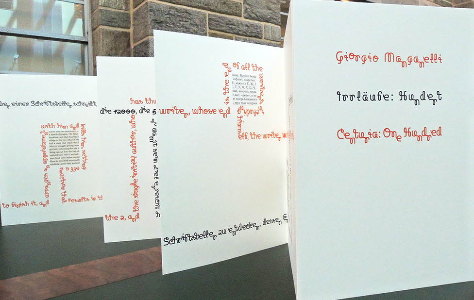
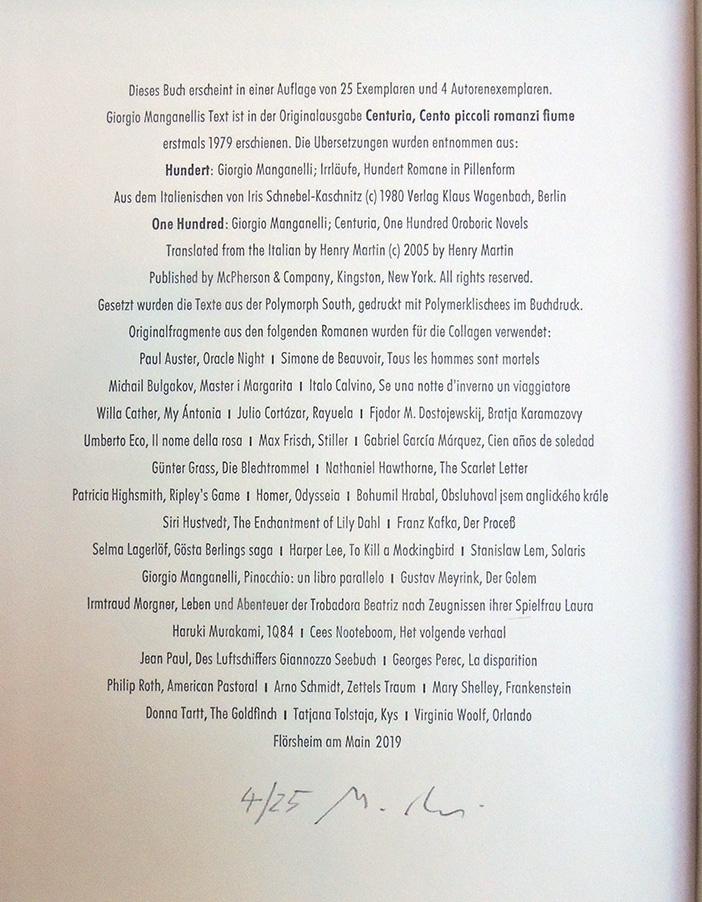
Paul Malutzki, Irrläufe: Hundert = Centuria: One Hundred by Giorgio Manganelli (Flörscheim, Germany: Malutzki, 2019). Copy 4 of 25. Graphic Arts Collection GAX 2019- in process


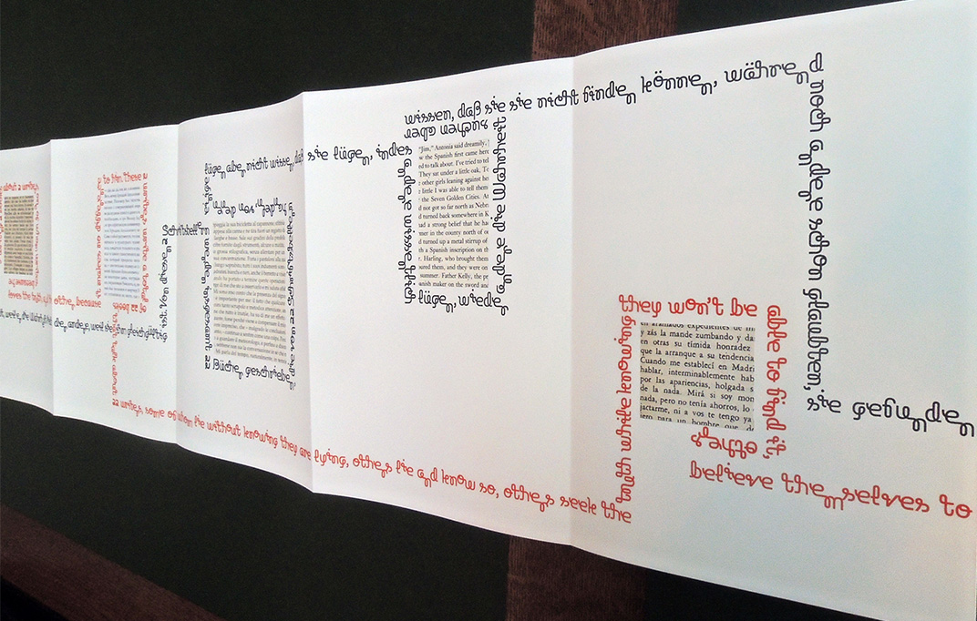
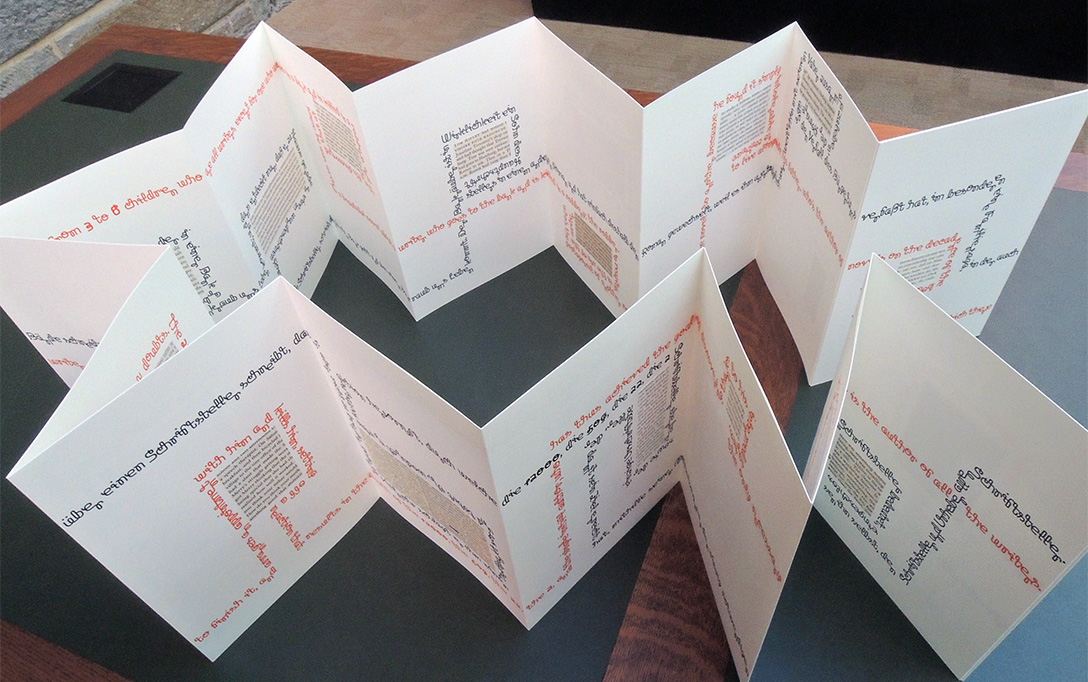
“A writer is writing a book about a writer who is writing 2 books about 2 writers, one of whom writes because he loves the truth, and the other because it makes no difference to him. These 2 writers write a total of 22 books that talk about 22 writers, some of whom lie without knowing they are lying, others lie and know so, others seek the truth while knowing they won’t be able to find it, others believe themselves to have found it, still others believed themselves to have found it but have started to have doubts…” –Paul Malutzki

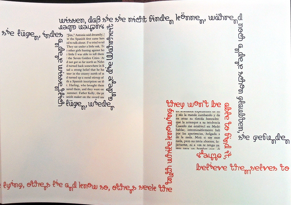
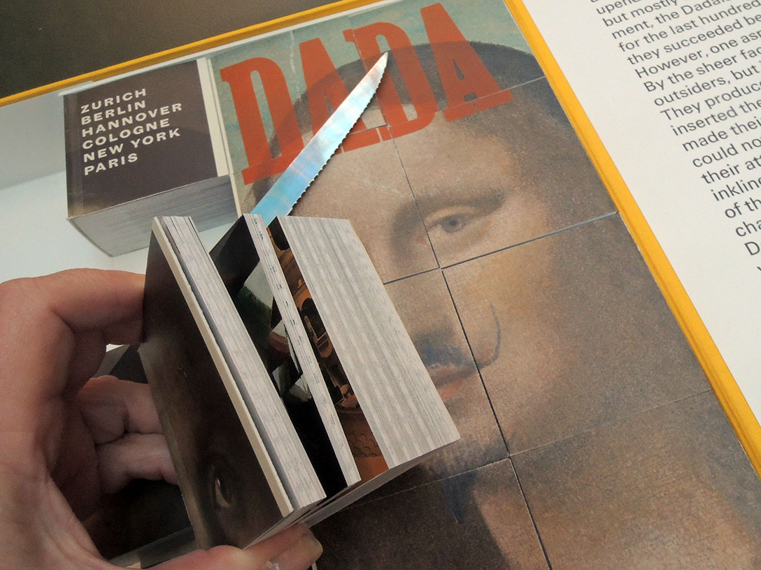
Manganelli’s ouroboric mini novel (No. 100 of a collection of 100) is used bilingual in German and English translations. The two texts run through the accordion book as unbroken lines. The binding structure of the book (printed on both sides) allows to reconnect the text ends to the text beginnings, thus associating an endless (ouroboric) reading.

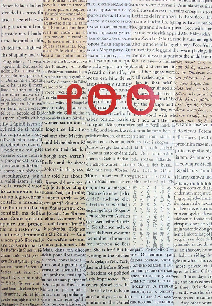
After setting the texts on computer with 30 point “Polymorph South” they were printed letter press, using polymer plates. On their meandering path through the book they circumscribe glued-in text fragments from novels by Paul Auster, Simone de Beauvoir, Michail Bulgakov, Italo Calvino… and Virginia Woolf.

Since the novel fragments are taken from real books, each copy of the edition contains its own little extracts from the respective novels. Each copy is, in terms of the novel fragments, one-of-a-king. – Paul Malutzki


Giorgio Manganelli (1922-1990) was an Italian journalist, avant-garde writer, translator and literary critic. Centuria, which won the Viareggio Prize, is probably his most approachable [book]; translated into English in 2005 by Henry Martin. Italo Calvino called him “a writer unlike any other, an inexhaustible and irresistible inventor in the game of language and ideas.”


Calvino also once remarked that in Manganelli:

“Italian literature has a writer who resembles no one else, unmistakable in each of his phrases, an inventor who is irresistible and inexhaustible in his games with language and ideas.” Nowhere is this more true than in this Decameron of fictions, each composed on a single folio sheet of typing paper.

Yet, what are they? Miniature psychodramas, prose poems, tall tales, sudden illuminations, malevolent sophistries, fabliaux, paranoiac excursions, existential oxymorons, or wondrous, baleful absurdities?

Always provocative, insolent, sinister, and quite often funny, these 100 comic novels are populated by decidedly ordinary lovers, martyrs, killers, thieves, maniacs, emperors, bandits, sleepers, architects, hunters, prisoners, writers, hallucinations, ghosts, spheres, dragons, Doppelgängers, knights, fairies, angels, animal incarnations, and Dreamstuff. Each ‘novel’ construes itself into a kind of Möbius strip, in which, as one critic has noted, ”time turns in a circle and bites its tail” like the Ouroborous.

In any event, Centuria provides 100 uncategorizable reasons to experience and celebrate an immeasurably wonderful writer. Brilliantly translated from the Italian by Henry Martin.”

Cut Dada


Werner Pfeiffer, Hocus Pocus (Red Hook, N.Y.: Pear Whistle Press, 2012). Altered book. One of 50 copies. Graphic Arts Collection GAX 2019- in process

In 2005, curator Leah Dickerman and an extended group of authors published Dada: Zurich, Berlin, Hanover, Cologne, New York, Paris; the catalogue for an exhibition held at the Centre Georges Pompidou, Paris; the National Gallery of Art, Washington D.C.; and the Museum of Modern Art, New York. A survey of perhaps the most influential modern art movement as it developed in six crucial cities during the period 1916 to 1926, the book quickly became a canonical text in the study of modern art.


As an homage to the movement and the publication, Werner Pfeiffer created what he calls a book object titled Hocus Pocus that cuts and rebinds the catalogue into 12 individual books, each one telling a modified narrative.


Appropriation of existing art or text has a long tradition within modern art and within the contemporary artists’ book genre is a sub-division known as ‘altered books’. Another good example of an altered book artist is John Latham, whose copy of Art and Culture by Clement Greenberg is now accessioned into the Museum of Modern Art in liquid form: https://www.moma.org/collection/works/81529. Pfeiffer’s Hocus Pocus has been accessioned into several art museum collections including the Museum of Fine Art, Boston.


See also our copy of John Latham (1921-2006), The Mechanical Bride by Marshall McLuhan, ca. 1969. Altered book. Gift of William Howard Adams. Graphic Arts GAX Oversize 2006-0384Q: https://www.princeton.edu/~graphicarts/2009/03/the_man_who_ate_art_and_cultur.html

Internationale situationniste

Guy Debord and Asger Jorn, Mémoires (Paris: Internationale situationniste; [Copenhaguen, Permild & Rosengreen Press], 1959). Graphic Arts Collection GAX 2019- in process


Printed in 1959, Mémoires (Memories) is the result of the second collaboration between the Danish artist Asger Jorn (1914-1973) and the French artist and theorist Guy Debord (1931-1994). Published by Éditions Situationist International (founded by Debord and Jorn), the book has been reprinted several times given its importance to the movement, first by Jean-Jacques Pauvert aux Belles Lettres in 1993 and then by Éditions Allia in 2004.

Mémoires is perhaps most famous for its cover made of heavy-grade sandpaper. Usually credited to Debord, the sleeve was actually conceived in a conversation between Jorn and the printer, V.O. Permild:

[Jorn] asked me, if I couldn’t find an unconventional material for the book cover. Preferably some sticky asphalt or perhaps glass wool. Kiddingly, he wanted, that by looking at people, you should be able to tell whether or not they had had the book in their hands. He acquiesced by my final suggestion: sandpaper (flint) nr. 2: ‘Fine. Can you imagine the result when the book lies on a blank polished mahogany table, or when it’s inserted or taken out of the bookshelf. It planes shavings off the neighbour’s desert goat. – “Memories on Asger Jorn” by Troels Andersen, quoted online in Christian Nolle, Books of Warfare, The Collaboration between Guy Debord & Asger Jorn from 1957-1959, http://virose.pt/vector/b_13/nolle.html


Although few people own copies of these rare publications, both the first collaboration Fin de Copenhague and Mémoires are embedded in art historical literature of the period, such as a review in Architectural Review, October 1957, calling Fin de Copenhague a “remarkable piece of improvisation among the techniques of graphic reproduction.” The startling layouts in both volumes “anticipate, by 30 or more years, the typographic and textual fragmentation of Cranbrook, CalArts and Ray Gun magazine, which became a global design phenomenon.”

One of many descriptions of the making of these books, both publishing and performance, recounts:

Having just arrived in Copenhagen, Jorn and Debord rushed into a newsagents, stole a huge amount of magazines and newspapers, and spent a drunken afternoon collaging elements together. The next day they arrived at the printers with 32 collages, which were transferred to lithographic plates. Jorn then sat at the top of a ladder over the zinc plates, dropping cup after cup of Indian ink onto them. The plates were then etched and printed over the black texts and images.


State of the Union

Werner Pfeiffer, State of the Union: a Snapshot of Our Political and Social Conundrum ([Red Hook, N.Y.] : Pear Whistle Press, 2012). Graphic Arts Collection.

A representation of the flag of the United States divided into 8 rectangular sections, each holding accordion folded reproductions of articles from periodicals on one side, the other containing images of fanciful 19th-century mechanical instruments surrounded by political quotations.


“Werner Pfeiffer was born in 1937 in Stuttgart in the southwestern part of Germany. He studied at the Akademie der Bildenden Künste in his home town. In 1961 he emigrated to the United States. Initially, he was active as a designer and art director on a variety of projects. In this capacity he received many citations and awards from the New York Art Directors Club, the New York Type Directors Club, the New York Society of Illustrators, and the American Institute of Graphic Arts. His design work has been widely published in the international design literature in magazines such as Graphis, Gebrauchsgrafik, Print, Modern Publicity and Art Direction.

In 1969 he was appointed Professor of Art at Pratt Institute in New York. At the same time he assumed the position of director of the Pratt Adlib Press, a publishing venture of the Department of Graphic Art at Pratt.”

Les Réverbères

Early in his career, the influential French painter and critic Michel Tapié (1909-1987), editor of Francis Picabia’s 1949 catalog 491 and author of the pivotal study Un art autre (Art of Another Kind, 1952), joined forces with the artist Aline Gagnaire (1911-1997) to produce three issues of a spectacular magazine, under a collective they called “Les Réverbères.”

Printed by hand from woodblocks, the editions are believed to have been around 31 signed copies, although the magazine is so rare it is difficult to verify. The Graphic Arts Collection recently acquired two of the three issues produced in 1940 wartime Paris. Each issue has it’s own title, here showing Le Cheval de 4, the first issue, and Dédal-e, the second.

Front covers

Michel Tapié (1909-1987); Aline Gagnaire (1911-1997); Jean Jausion; Henri Bernard (1868-1941); Noël Arnaud; Simone Bry; and Adrienne Peyrot, Le cheval de 4 and Dédal-e (S.n. [Paris]: s.l., 1940). Graphic Arts Collection GAX 2019- in process.

Back covers


According to the Historical Dictionary of Surrealism by Keith Aspley, the “Réverbères” club was founded in 1938 in the painter Jean Marembert’s workshop by Tapié, together with other neo-dadaist writers Jacques Bureau, Pierre Minne and Henri Bernard, who campaigned for the rehabilitation of Dada at impromptu evening parties in the Montparnasse district. With the same objective, they published this typically Dada journal, designed and produced on a small scale.

The pages of each issue are typographical masterpieces, combining literary texts using humor and vibrant color woodcuts. There are magnificent puns and spoonerisms, recapturing the extravagant spirit of the Dada pioneers Tristan Tzara or Marcel Duchamp.

This journal of exceptional visual and literary quality marks one of the last productions of the French artistic avant-garde before the start of the German oppression.


Not just a book, but The Book

The French poet Stéphane Mallarmé spent more than 30 years on a project he called Le Livre. This legendary, unfinished project, published posthumously in French, has now been translated into English for the first time. Below is a segment from the review, “Stéphane Mallarmé’s The Book and Un Coup de dés jamais n’abolira le Hasard,” by Mary Ann Caws in The Brooklyn Rail.
https://brooklynrail.org/2019/02/art_books/Stphane-MallarmsThe-BookandUn-Coup-de-ds-jamais-nabolira-le-Hasard

To take just the 72 pages of Stéphane Mallarmé’s Le Livre (originally posthumously published in French in 1957), at once fragmentary and yet feeling so completely itself, every time we encounter it, it seems a more astonishing piece of work. I always loved the way it was so majestically presented, collecting notes and drafts along with typeset pages, the poet dressed as scribe or priest of poetry, leaving the assembled audience every fifteen minutes of reciting in order to reshuffle the remaining pages, so that CHANCE would enter each time he re-appeared on the stage. For this was not just a book, but The Book.

What it means for us now, in this present rendering, is a lively reading of life as art—conceived of in the most simple and elementary terms, whose juncture we have to determine and carry out ourselves in each of our individual readings, private or collective and public. That was Mallarmé’s magic, the private as shared, the non-journalistic as both poetic and unboring, so he crossed out almost every other word to make the text less immediately graspable.

Here is the thing: Mallarmé is always the most modern—the most complicatedly modern—no matter what. As for Le Livre, or The Book, Sylvia Gorelick’s newly translated rendering (after the Scherer and the Marchal editions, to which I was bravely clinging), is deeply intelligent. After perusing her introduction to find the (absolutely) confessional mode of Mallarmé:

I am me—faithful to the
book

It just gets me. Of course he was, and of course we all remember his saying as he gasped, dying “Destroy it – / It would have been beautiful” about his Hérodiade—and how glad we are it did not meet that fate.

Here are a few sample pages.


Stéphane Mallarmé, Le “Livre” de Mallarmé; premières recherches sur des documents inédits [par] Jacques Schérer. Préf. de Henri Mondor (Paris: Gallimard [1957]). Firestone PQ2344 .L587 1957

Stéphane Mallarmé, The Book; translated and with an introduction by Sylvia Gorelick (Cambridge, Massachusetts : Exact Change, 2018). Firestone PQ2344 .A2 2018

Here is section 6 “Le Livre, Instrument Spirituel” published by Mallarmé in Revue Blanche, July 1895 (Firestone Recap 0904.749):


Elena Jordana and Ediciones el Mendrugo

A precursor to the better-known 21st century cartoneras (inexpensive books with cardboard covers, originally from Argentina), the Ediciones el Mendrugo also published poetry with handmade images in a modest format from found or recycled materials. Three examples recently came into the Graphic Arts Collection.

[loosely translated from the Living Books site] “…it is worth mentioning a previous history in the publishing world, curiously ignored by those who investigated this popular phenomenon, Ediciones El Mendrugo, by the Argentine poet Elena Jordana, who in the early 70s published books bound with corrugated cardboard, printed on kraft paper (or estraza) and tied with sisal thread, with typography of rubber stamps, where it was necessary to count on heavy typewriters capable of perforating on the stencil (artistic decoration technique), in order to consign the data of title and authorship on the covers, in the aesthetic way of the university flyers.

Each issue was personally distributed by the author herself, on her trips to Mexico, the United States and Argentina. Among the published authors are Nicanor Parra, Ernesto Sábato (who gave up his publication rights so that the text “Letter to a young writer”, with support from the Argentine Society of Writers (SADE), was presented at the 1974 Book Fair), Octavio Paz, Enrique Fierro, Juan de la Cabada, Guillermo Samperio, José Joaquín Blanco and Alejandro Sandoval among thirty writers. As it appears in the journalistic chronicle, each book was made individually among friends, with jugs of wine and songs (Elena herself studied folksong in its beginnings), even some books were accompanied by a jute backpack so readers could wear it more comfortably.”–http://librosvivientes.blogspot.com/2015/11/ediciones-el-mendrugo-precursora-de-las.html

Princeton University Library holds nearly 400 cantoneras, most from the 21st century and so, the addition of these earlier examples of the genre are most welcome. While there are many groups or presses making these books, the majority of our current holdings are from the Eloísa Cartonera.

A history of the movement has been published, which will be helpful in sorting out the participants: Akademia cartonera: a primer of Latin American cartonera publishers = un abc de las editoriales cartoneras en América Latina edited by Ksenija Bilbija, Paloma Celis Carbajal; editorial assistance by Lauren Pagel and Djurdja Trajković (Madison, Wis.: Parallel Press, University of Wisconsin-Madison Libraries, 2009). Firestone Z490 .A37 2009.

Maka C. Dorantes (Maka), Espacio del Espacio (Mexico City, D. F.: Ediciones el Mendrugo/Elena Jordana, n. d. 197?). First Edition. Unpageated (ca. 30 pp.) Graphic Arts Collection in process

MarcoAntonio Montes de Oca, Astillas (Mexico City, D. F.: Ediciones el Mendrugo/Elena Jordana, n. d. 197?). First Edition. Graphic Arts Collection in process

Maka C. Dorantes (Maka), Velamen (Mexico City, D. F.: Ediciones el Mendrugo/Elena Jordana, n. d. 197?). First Edition. Graphic Arts Collection in process

Cassandra


Mary Heebner, Cassandra, a poem by Stephen Kessler; images by Mary Heebner ([Santa Barbara, Calif.]: Simplemente Maria Press, MMXIX [2019]). 1 folded sheet (20 panels); approximately 26 x 500 cm folded to 26 x 26 cm + 1 booklet. Copy 10 of 25. Acquired with matching funds provided by the Program in Hellenic Studies with the support of the Stanley J. Seeger Hellenic Fund. Graphic Arts Collection GAX 2019 in process

http://www.maryheebner.com/thework/artistsbooks/cassandra/

The illustrations are adapted from the collage series Veiled/Unveiled (2018). The poem is from “Garage Elegies”, Black Widow Press, 2018.

“Design by Simplemente Maria Press. All text is printed letterpress from polymer plates, typeset in Spectrum MT, by John Balkwill, The Lumino Press, Santa Barbara, California. The images are printed digitally, with some debossing on Legacy Etching cotton rag paper. Individual collage and hand-painting is added to each page by the artist.

The booklet containing the poem, colophon and notes on the mythological Cassandra is handsewn with a Legacy etching cover over Saint-Armand handmade cotton paper.

The accordion structure which opens out over 75 inches, and the booklet rest in a zinc box, made by David Shelton Studios, Santa Barbara, California, with a drawing etched on the lid of the powder-coated box by Joel Sherman, at M Studio, University of California, Santa Barbara.”–Colophon.


 Cassandra
With your swampy voice, your electric hair,
rhythm of reeds tideswayed in the rivershallows,
sinuous strings, sidemen on the bank keeping the beat,
you sing bad news with a sound of sweet illusions, of doom
that is not a disaster but merely inevitable, what anyone would expect
if they took a deep look at the evidence everywhere, beauty and truth
entwined with death, cruelty on the loose, tenderness barely enduring
under the lash of chaos muted by coercion—those rules
even the stupid can understand—and out of such murky depths
some lovely myth may rise in song to beggar disbelief.
[selection of text]

Interview with Mary Heebner from Atelier Visit on Vimeo.

Louche binding

This book was purchased by the Graphic Arts Collection in small part because the binding was listed as “louche.” Louche is an adjective that describes something of questionable taste or morality while at the same time kind of attractive—ugly/beautiful–; one definition reads “the louche world of the theater.”

It seems apropos of Jim Dine’s consciously informal facsimile of the annotated script and his sketches for a never realized production of Oscar Wilde’s The Picture of Dorian Gray. This is perhaps his most well-known artists’ book and the first of many celebrated volumes from Petersburg Press. Later projects include Foirades by Samuel Beckett and Jasper Johns (1976); The Departure of the Argonaut by Alberto Savinio and Francesco Clemente (1986); Notes in Hand by Claes Oldenburg (1971); Shards by Richard Meier and Frank Stella (1983) and dozens of others.

The Petersburg Press had two incarnations, first in London in 1968 and again in New York in 1972, publishing limited edition prints, livres d’artistes, and artists’ books in collaboration with a list of noted contemporary artists that few presses could rival. https://www.theguardian.com/books/2018/jun/06/paul-cornwall-jones-obituary Here is the Guardian’s obituary for its founder Paul Cornwall-Jones.

Jim Dine, Picture of Dorian Gray: a working script for the stage from the novel by Oscar Wilde (London: Petersburg Press. 1968). Limited edition, 125/200 signed by Jim Dine. Bound in emerald green velvet over boards with the title blocked in silver on the upper cover. This is edition B of Dine’s three editions of Dorian Gray. The original colour lithographs, etchings and text pages were prepared on zinc and aluminium plates by Jim Dine in February 1968 and subsequently printed on Velin Arches at the Atelier Desjobert and Atelier Leblanc in Paris. It contains twelve lithographs six of which are the signed set issued loose in Editions A and C. This copy lacks the four signed etchings which are called for in the publisher’s notes. Graphic Arts Collection GAX 2019- in process

Endpapers

Playing the weather


Artist Sara Bouchard writes, “Weather Box is a hand-cranked music box, housed in scavenged cardboard and accompanied by 12 punch card scores derived from actual weather data. I obtained hourly reports from the National Climatic DataCenter then graphed changes in temperature, wind and precipitation onto a timeline, which became the foundation for each punch card score. Each score represents one month of weather observations as recorded by NOAA, the National Oceanic and Atmospheric Administration, at the Belvedere Castle weather station in Central Park, NYC.”

Weather Box: March 2014 from Sara Bouchard on Vimeo.

When introduced to Professor Beatrice Kitzinger’s class “Arts of the Medieval Book,” who were comparing contemporary artists’ books with traditional codex structures, the students made comparisons to a Medieval book of hours that holds the offices of the canonical hours of the day. In Bouchard’s work, each page or strip activates the various senses in a small, personal reverie: it can be read with its graphic symbols; seen through its visual aesthetics; and heard as a sensory experience.

Sara Bouchard is a “multi-disciplinary artist and songwriter with a strong foothold in American roots. As an artist, I investigate ways to interact with and represent the American landscape through song. As a musician, I perform original and traditional tunes – drawn from bluegrass, old-time, jazz, country and blues – with my band Salt Parade.”– https://sarabouchard.com/