Category Archives: Artists’ books

Artists’ books

COOP

fia6
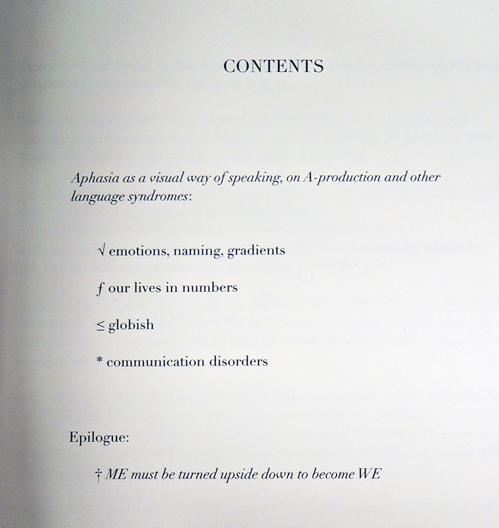
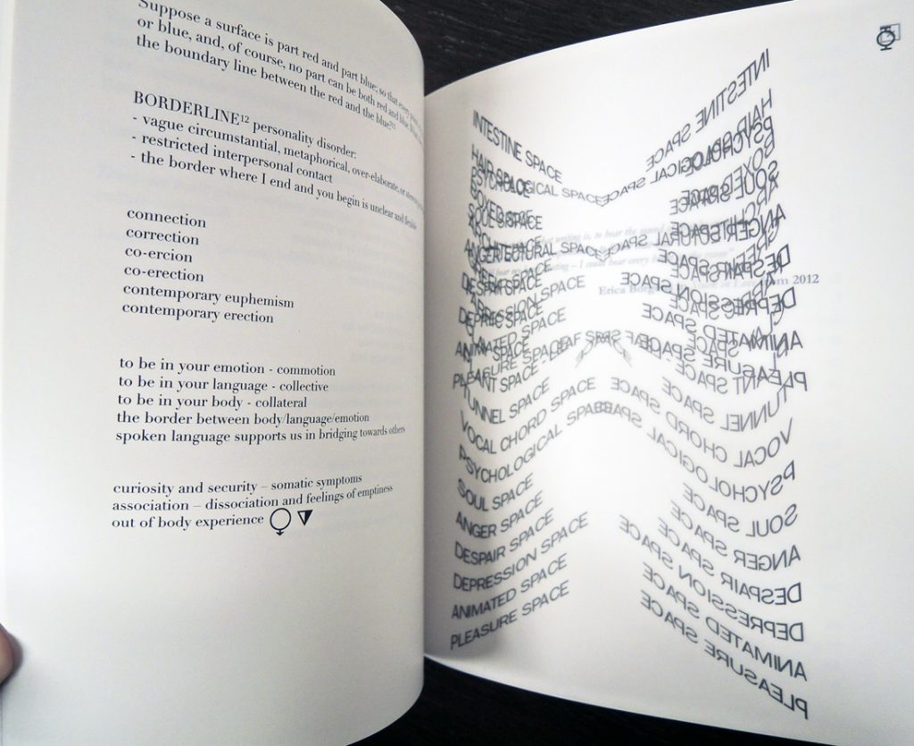
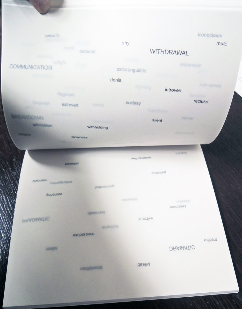
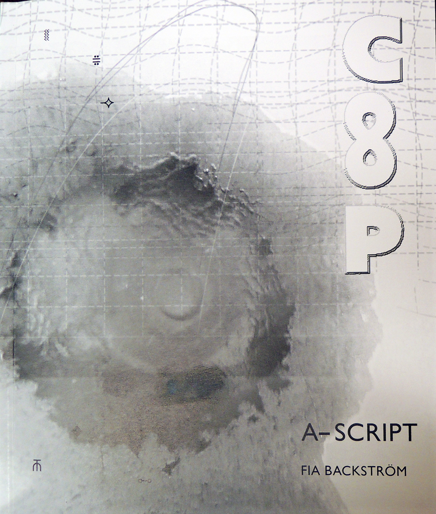
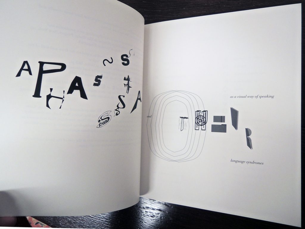
We are pleased to have acquired Princeton Lecturer in Visual Arts Fia Backström’s newest book COOP, which documents the Swedish artist’s performances of two recent scripts, continuing her exploration of language, marketing, disorders and performance.

“Backström’s work focuses on the fabric of our co-existence with and construction of subjectivity through the social life of images. Backström works with structures of political address, corporate logic, and pedagogical methods , destabilizing authorship and the semiotics of images. She uses exhibition as a format for these structures, while turning social situations into operative displays where methods and media are chosen according to the situation and theme. Her work unfolds via a wide range of media including language, marketing, propaganda, typography, broadsides, objects, and performance. Her environments, live events and projects challenge our habitual notions of what constitutes an exhibition – its institutional context, its dialogue with the audience, and even the works of art that are presented. Frequently works by other artists are incorporated, as well as peers, visitors and institutional staff alike, while she fluidly reworks the terms of engagement.”–Lewis Center for the Arts, Princeton University

fia5

Backström came to Princeton in the spring semester of 2010. Apart form teaching at Princeton, Backström also teaches at the Columbia University MFA Graduate Department since 2008, and co-chairs the Milton Avery Bard MFA photography department. She has lectured widely on her work and been a visiting artist in schools such as NYU, Yale University, Rhode Island School of Design, PennU and MICA.

fia4

fia3

fia2

Congratulations on the 50th Anniversary of “A Humument”


humument6

humument5

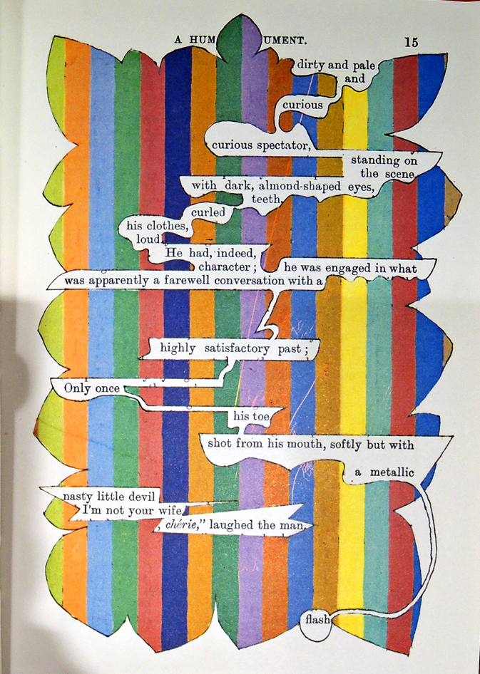
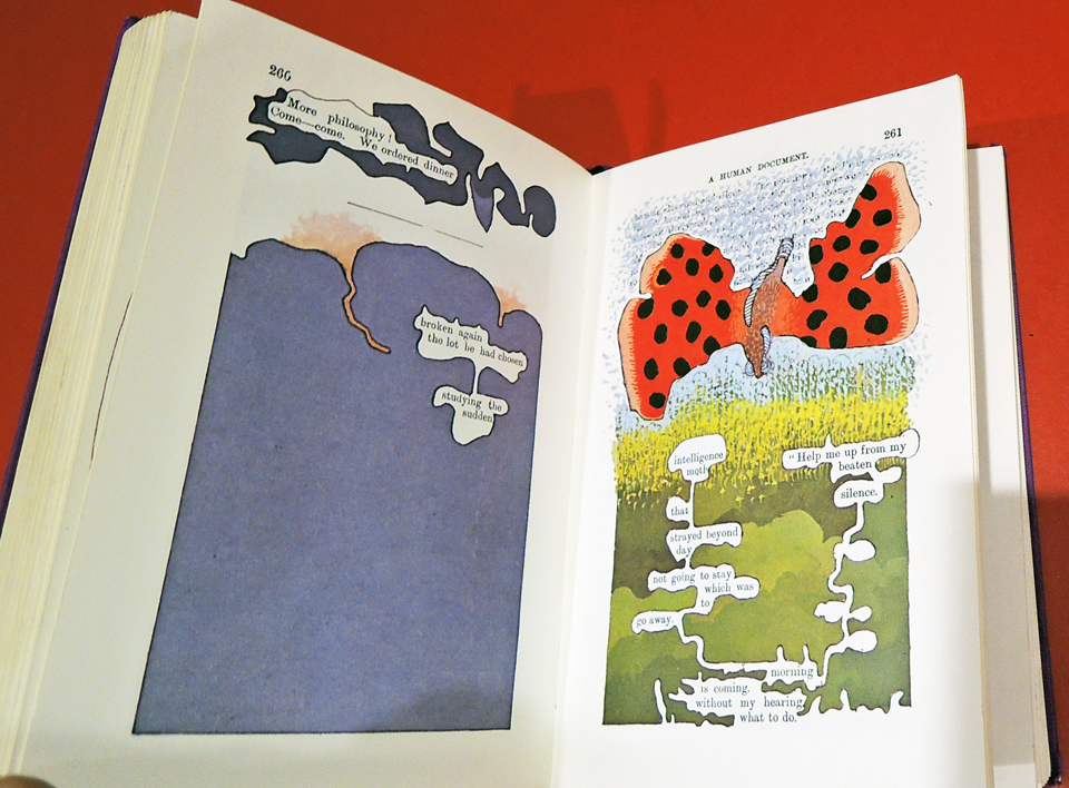
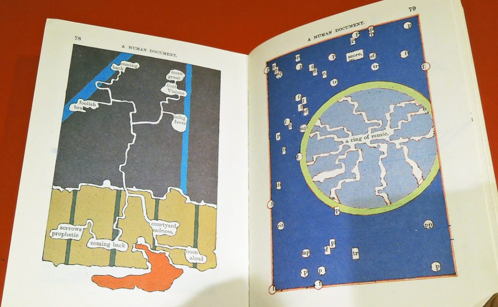
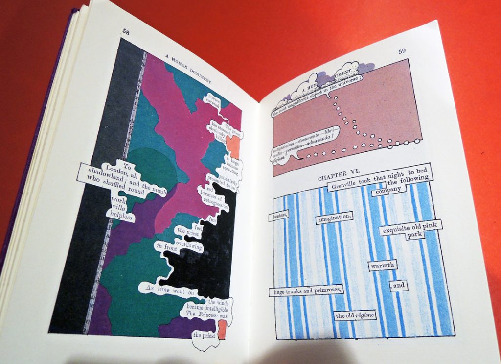
humument4It is fifty years since Tom Phillips began work on A Humument. This fall Phillips, who was a Director’s Visitor to the Institute for Advanced Study from 2005 to 2011, will launch the final edition of the book, bringing the work to its completion.

http://us2.campaign-archive2.com/?u=0c0adc07d2f9eddc1cbbe35e2&id=295dc79bf6&e=07fe99d309

Published today, 27th October, 2016, the final installment of A Humument will appear in three formats: paperback, hardback, and a limited special edition of 100 numbered copies presented in a clamshell box with a signed and editioned print.

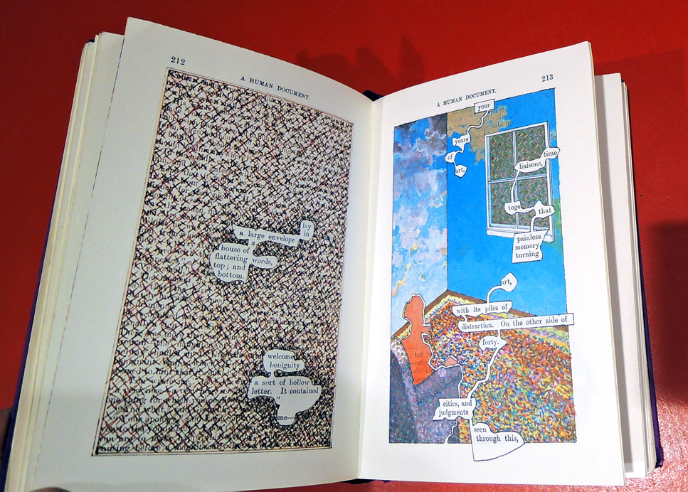
Phillips remembers, “A Humument started life around noon on the 5th of November 1966 at a propitious place. Austin’s Furniture Repository stood on Peckham Rye, where William Blake saw his first angels and which Van Gogh must have passed once or twice on his way to Lewisham. As usual on a Saturday morning Ron Kitaj and I were prowling the huge warehouse in search of bargains. When we arrived at the racks of cheap and dusty books left over from house clearances I boasted to Ron that if I took the first one that cost threepence I could make it serve a serious long-term project. My eye quickly chanced on a yellow book with the tempting title A Human Document. Looking inside we found it had the fateful price. ‘If it’s a dime,’ said Ron ‘then that’s your book: and I’m your witness.’”

humument3

humument2

humument

 “Neither a novel, a poem, an artist’s book, or a graphic novel,” wrote Sebastian Smee, “Tom Phillips’s ‘A Humument,’ on show at the Massachusetts Museum of Contemporary Art, is a little bit of all these things and one thing incontrovertibly: a masterpiece. It’s also, uncomfortably, a parasite. Sucking steadily at the life juices of an earlier attempt at art, a late-19th-century novel called ‘A Human Document’ by W.H. Mallock, it has transformed its forgotten host page by page, edition by edition, into something far more imaginative and lasting. And while — like a charming houseguest grown fond of the husband he cuckolds — Phillips is unfailingly well-mannered toward Mallock’s book, he has nonetheless thoroughly bested it.” – Smee, “Tom Phillips’s brilliance on every page,” (Boston Globe July 04, 2013)

Walt Whitman and Aaron Siskind

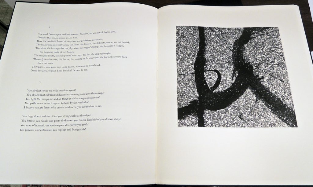
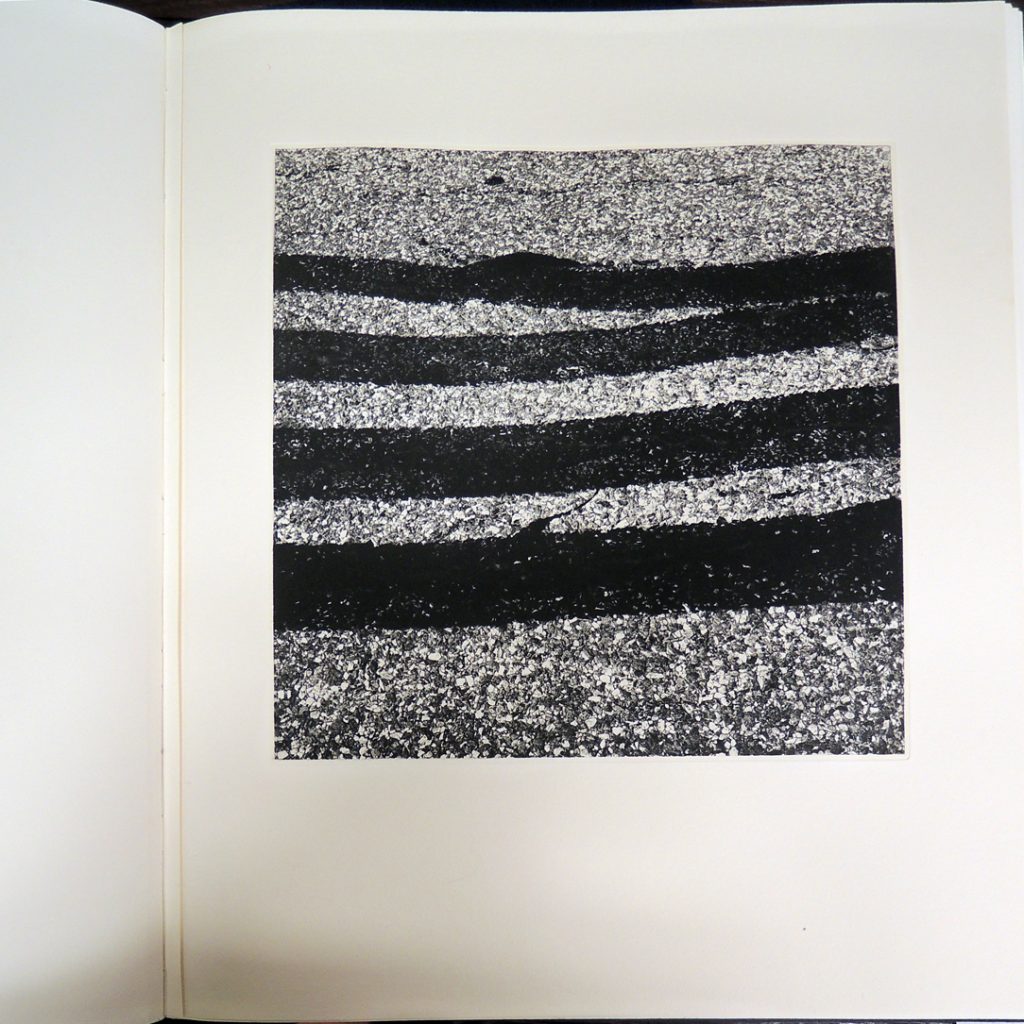
“You objects that call from diffusion my meanings and give them shape! . . . you are dear to me.”—Walt Whitman

siskind1

Sidney Shiff (1924-2010) acquired the Limited Editions Club (LEC) from Cardavon Press in 1978. He soon became known for the prominent artists he convinced to work on his books, including Jacob Lawrence, Henri Cartier-Bresson, Elizabeth Catlett, Francesco Clemente, Ellsworth Kelly, Sean Scully, and in 1990, Aaron Siskind.

Siskind was 86 years old when he agreed to collaborate on a LEC volume with Shiff. Having once aspired to be a poet himself, Siskind chose Whitman from Shiff’s list suggested authors, just as Edward Weston did for his LEC volume in 1942.

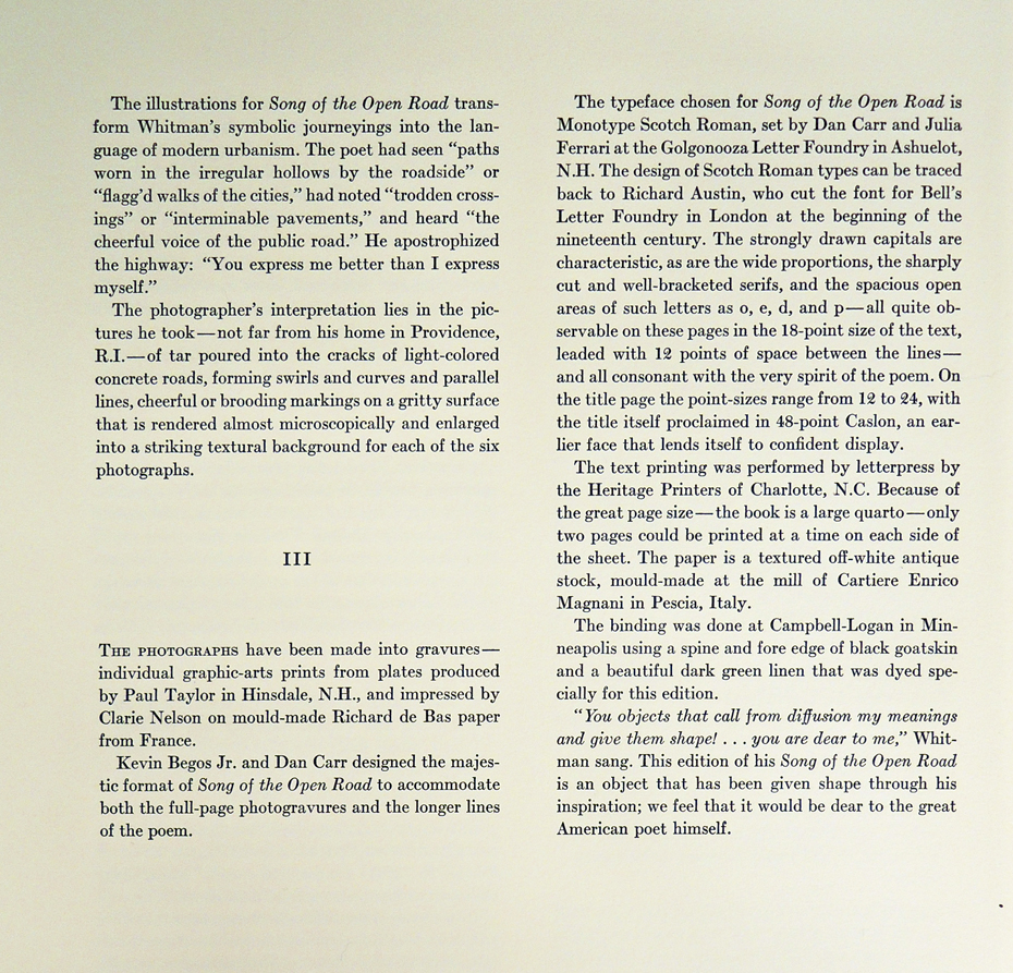
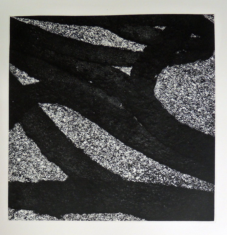
To complete the commission, Siskind walked outside his Providence, Rhode Island home and photographed the tar recently poured into the cracks of the local concrete road. Six of his detailed negatives were transferred to copper plates by Paul Taylor and printed as intaglio prints by Clary Nelson to Renaissance Press.

siskind6
siskind5
siskind3
Walt Whitman (1819-1892) and Aaron Siskind (1903-1991), Song of the Open Road (New York: Limited Editions Club; printed by Paul Taylor, 1990). Letterpress with six photogravures. Designed by Kevin Begos Jr. and Dan Carr. Setin English Monotype Scotch at Golgonooza Letter Foundry by Julia Ferrari and Dan Carr. The text was printed by Heritage Printers on a paper made at Carterie Enrico Magnani. Edition: 89/550. Graphic Arts Collection 2016- in process

Song of the Open Road
By Walt Whitman

3. You air that serves me with breath to speak!
You objects that call from diffusion my meanings and give them shape!
You light that wraps me and all things in delicate equable showers!
You paths worn in the irregular hollows by the roadsides!
I believe you are latent with unseen existences, you are so dear to me.

You flagg’d walks of the cities! you strong curbs at the edges!
You ferries! you planks and posts of wharves! you timber-lined sides! you distant ships!

You rows of houses! you window-pierc’d façades! you roofs!
You porches and entrances! you copings and iron guards!
You windows whose transparent shells might expose so much!
You doors and ascending steps! you arches!
You gray stones of interminable pavements! you trodden crossings!
From all that has touch’d you I believe you have imparted to yourselves, and now would impart the same secretly to me,
From the living and the dead you have peopled your impassive surfaces, and the spirits thereof would be evident and amicable with me.

“Les minutes de sable mémorial”

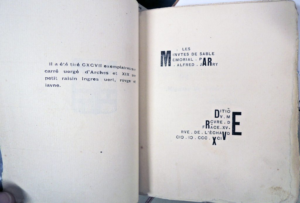
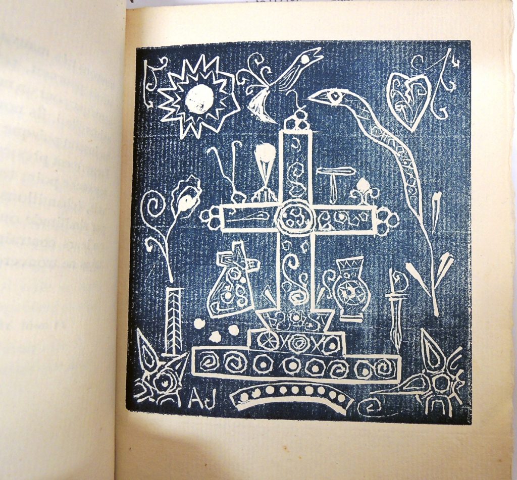
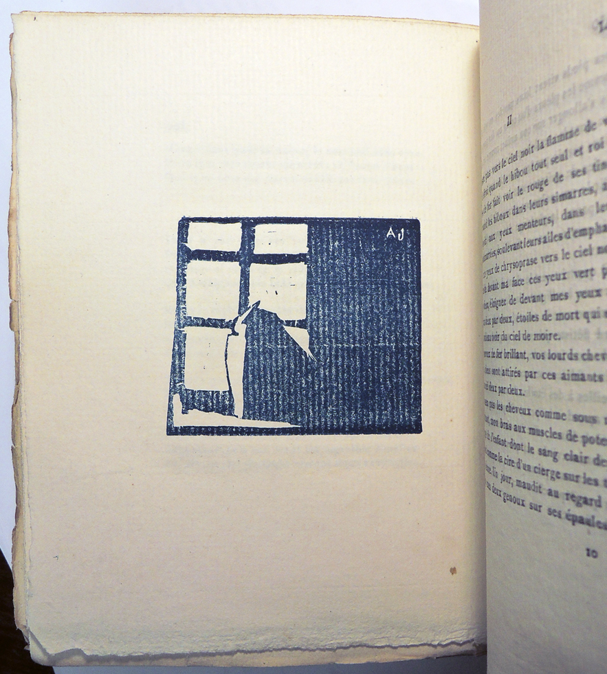
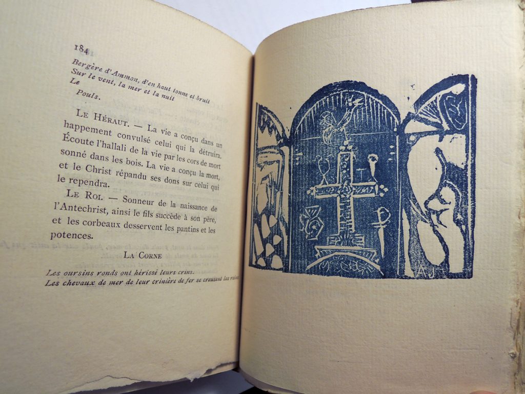
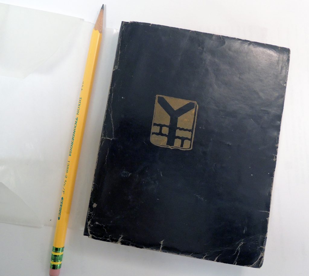
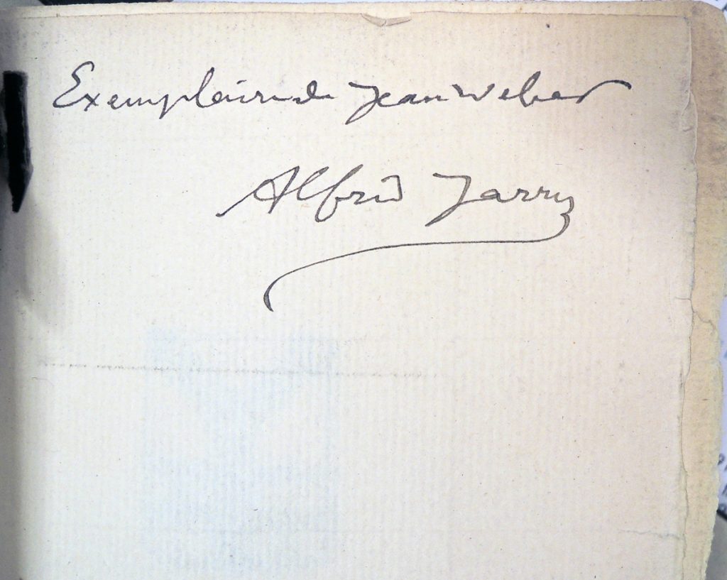
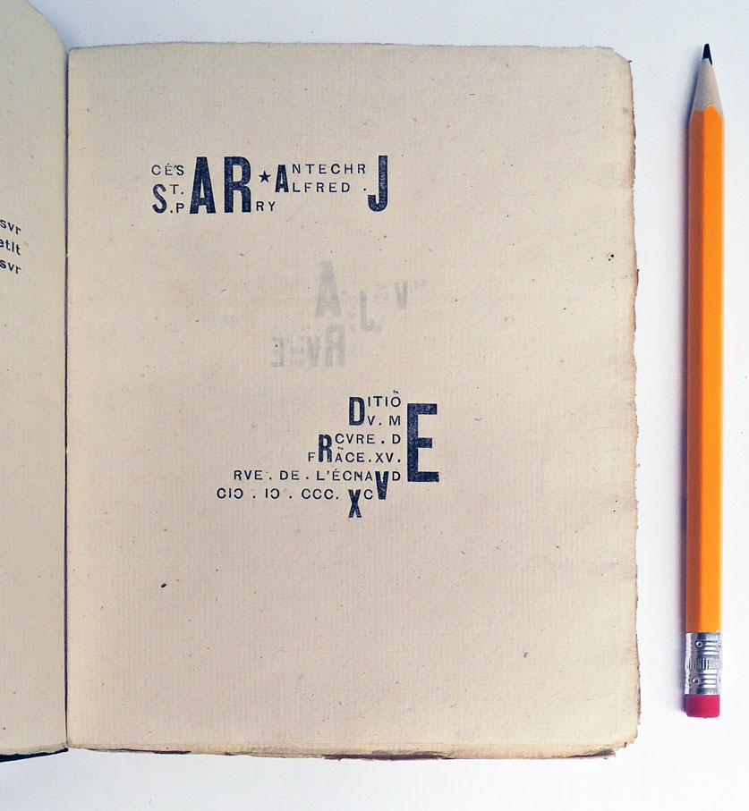
jarry4Alfred Jarry (1873-1907), Les minutes de sable mémorial ([Paris]: Editio[n] du Mercure de Fra[n]ce, C. Renaudie, 1894). One of 216 copies printed. Seven woodcuts carved and printed by Jarry, two printed from earlier woodblocks. Graphic Arts Collection GAX 2016- in process.


Alfred Jarry published his first book of prints and poems, Les minutes de sable mémorial in September 1894 at the age of twenty-one. He paid the cost himself working with the printers at Mercure de France where many Symbolists were publishing.

The design of the volume, repeated the following year in his second book César antichrist, includes astonishingly modern typography, which predates that of Un Coup de Dés Jamais N’Abolira Le Hasard (A Throw of the Dice will Never Abolish Chance) by Stéphane Mallarmé in 1897. Jarry’s book should be considered an early artists’ book although it never appears in such studies
jarry3

According to Keith Beaumont, “…the prestigious and highly influential Echo de Paris had held a monthly literary competition which offered to aspiring young writers the prospect of four valuable and much coveted prizes of 100 francs each … and a guarantee of publication in the paper’s weekly illustrated literary supplement. Between February and August 1893, Jarry was to win outright or to share five such prizes, with poems or prose texts, which would be republished the following year in his first book, Les Minutes de sable mémorial.” (Keith Beaumont, Alfred Jarry. St. Martin’s Press, 1984)

jarry9

Jarry liked multiple meanings for a single text, exemplified in his title: Les minutes de sable mémorial. Beaumont notes, “Sable refers both to the sand of the sablier or hourglass, which marks the passage of time, and which recurs in the title of the last poem in the volume, and to the term for the colour black in heraldry; and memorial has the meaning of both ‘in memory of’ and ‘of the memory’. The title as a whole therefore refers simultaneously to the passage of time whose ‘minutes’ are here recorded; to the movement of memory; and to the committal to paper of a series of moments of creative activity (‘sable’ referring to the ink-blackened pages) which memory has inspired or, alternatively and simultaneously, which are reproduced here as a ‘memorial’.”


jarry8

jarry6

In November 1894, Jarry cut his long hair and enlisted in the 101st Infantry Regiment in Laval.
jarry5


See also Alfred Jarry (1873-1907), Cesar antechrjst ([Paris]: Mercure de France, 1895). One of 7 large-paper copies on vergé Ingres de carnation. Rare Books (Ex) 3260.33.323 1895 [below]jarry


Depero the Futurist

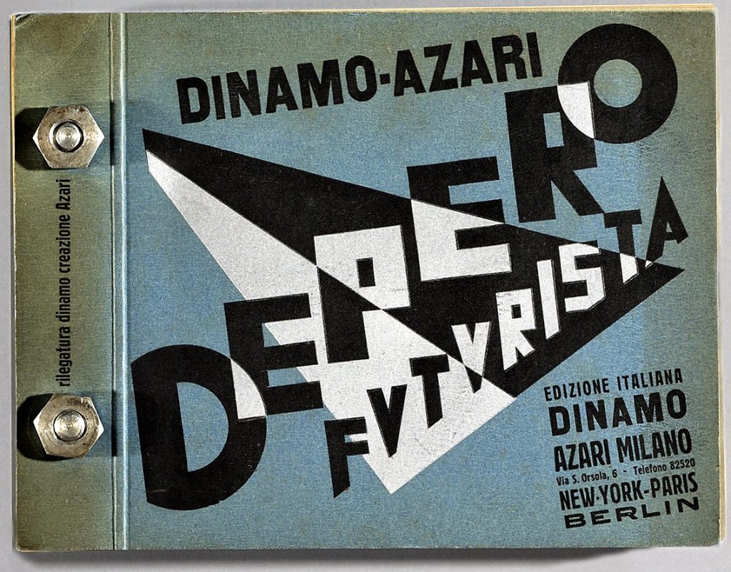
depero-bolted-book-128-front-2Join the waiting list to become a bibliopegist; that is, a collector of rare and remarkable book bindings. On October 18, Kickstarter will offer the opportunity to support the publication of a facsimile edition of the celebrated Futurist classic Depero Futurista (Depero the Futurist). http://www.boltedbook.com/fact-sheet/

Although Depero’s book has beautiful typography and a modernist emphasis on commercial advertising, it is the unusual binding that attracts most collectors. Dinamo-Azari bound the pages in printed pliant blue boards drilled and fastened with two 1.6-cm. aluminum bolts with nuts secured by cotter pins, with legend “rilegatura dinamo creazione Azari” printed between them on upper board. We call it the libro bullonato or the bolt book.

The 1927 edition was planned to be 1,000 copies published simultaneously in New York, Paris, Berlin, and Milan. Not a particularly limited edition. Princeton University’s Marquand Library holds copy no. 369, signed: Fortunato Depero 1928 (SAX NX600.F8 D47 1927q).

The proposed facsimile edition is thanks to a partnership with The Center for Italian Modern Art in New York, the Mart, Museum of modern and contemporary art of Trento and Rovereto, Italy (which houses the Depero archives), and Designers & Books (New York). They have also posted digital images of the entire volume: http://www.boltedbook.com/page-by-page/

The Kickstarter website will launch on October 18, 2016, but you can join a mailing list at www.boltedbook.com now to receive early information on the project.

This video was mounted in 2014 in conjunction with the exhibition Fortunato Depero at the Center for Italian Modern Art. Raffaele Bedarida introduces Depero Futurista and places it into context of the art and design movement we now call Futurism.

Fortunato Depero (1892-1960), Depero Futurista (Milano; New York; Paris; Berlin: Edizione italiana Dinamo Azari, [1927]). Also called Depero futurista 1913-1927. Illustrated throughout with typographical compositions and reproductions of paintings, drawings and photos; includes sections “Cuscini Depero” and “Pubblicità Depero,” with original relief prints, e.g. advertisements for the liqueur Campari. Marquand SAX NX 600.F8 D47 1927Q

Austin Lee’s New Shoes

http://www.postmastersart.com/archive/lee15/images/newshoes.gif

20160916_202900_resized

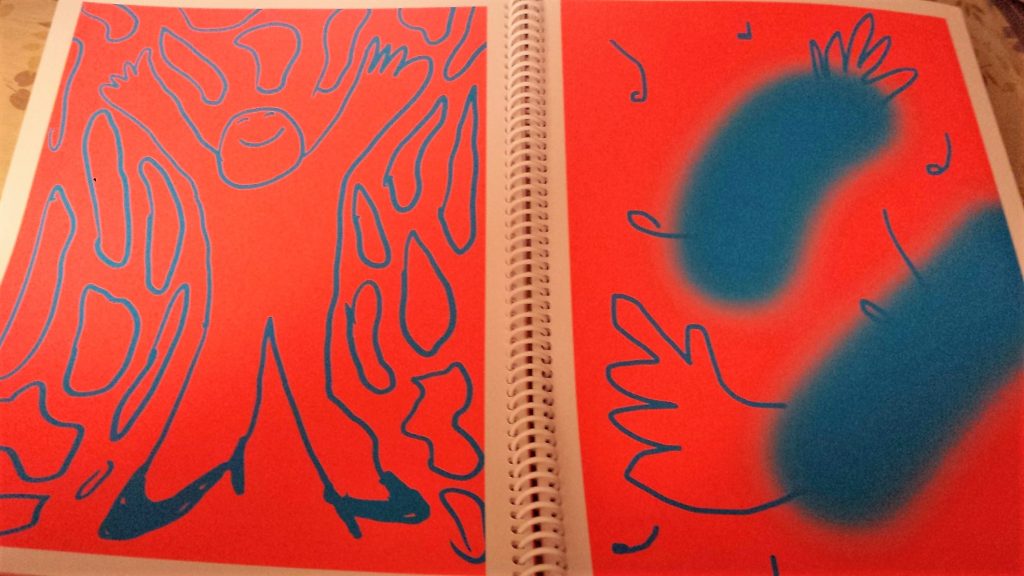
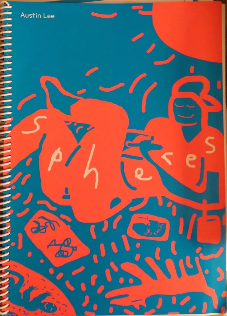
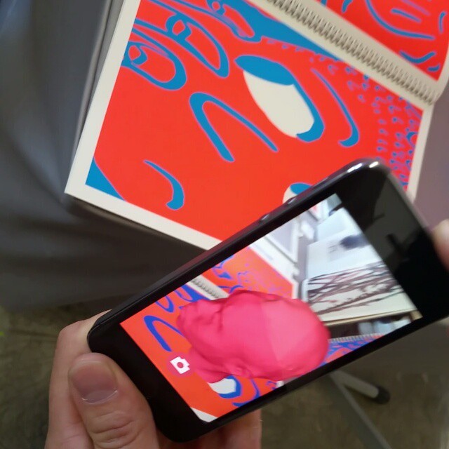
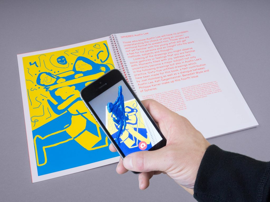
20160916_192412_resizedAustin Lee, Spheres. Designed by Philippe Karrer, printed by Musumeci SpA (Basel: Spheres, 2015). Essay by Joel Holmberg, as well as the transcript of a conversation between Austin Lee, Kati Gegenheimer, Benedikt Wyss, and Philippe Karrer. A free augmented reality app animates Lee’s images. Graphic Arts Collection GAX 2016- in process

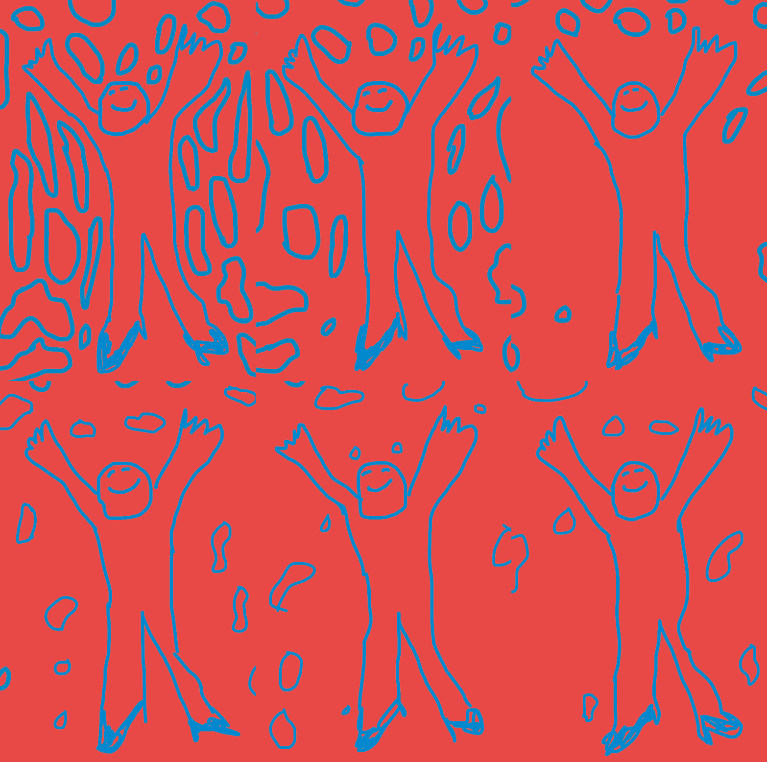
“Spheres is an artists’ book series developed in a year-long, close collaboration between one young artist and Swiss graphic designer Philippe Karrer. As a result, each book takes on a radically different form from the one that preceded it. The latest in the Spheres series, by painter Austin Lee, features Lee’s cartoonish, neon-colored iPad drawings and integrates an augmented reality app. Viewing the pages of the book through the app reveals digital animations and 3-D elements—a fun, if highly mediated book experience.”

an-augmented-reality-app-in-conjunction-with-a-book-publication-by-austinlee-from-spherespublicationSample spread with app view of Austin Lee, Spheres. Courtesy of Spheres Publication.

al__0002_iphone

al_2

Printed with Axle Grease over Caviar

news mews

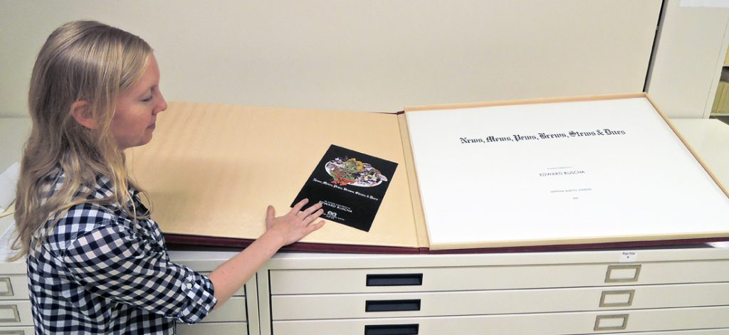
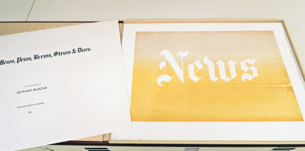
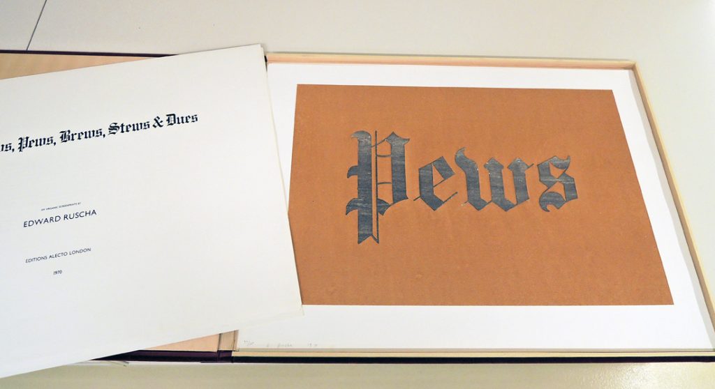
Princeton University Library holds one copy of every book created by the contemporary artist Ed Ruscha. Moving some books require extra help because of their size, such as Ruscha’s News, Mews, Pews, Brews, Stews, & Dues (London: Editions Alecto, 1970). Graphic Arts Collection. Copy 77 of 125, plus 25 AP.

Each of the six organic screen prints in this portfolio is 23 x 31 inches (58.4 x 78.7 cm), housed in a red velvet-covered box 24 5/8 x 33 1/4 inches (62.6 x 84.1 cm). To open on the table, it needs six feet of clear space. Thank you to Brianna Cregle for her help with it.


news mews2


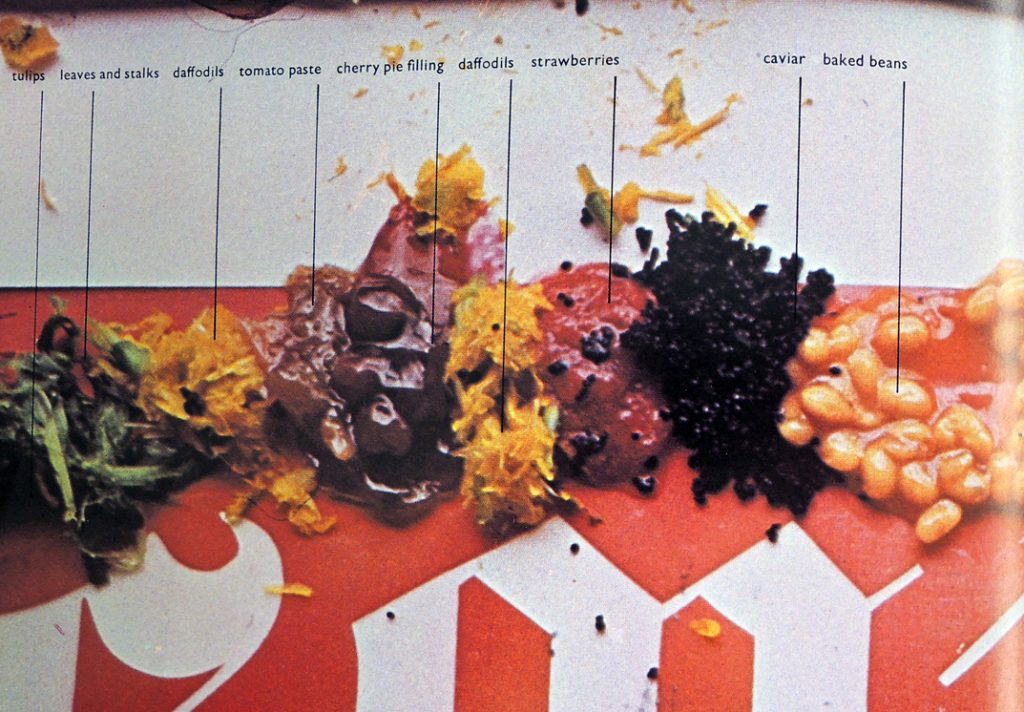
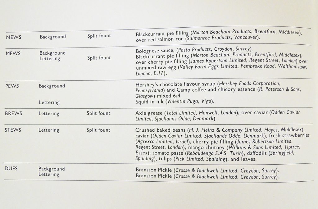
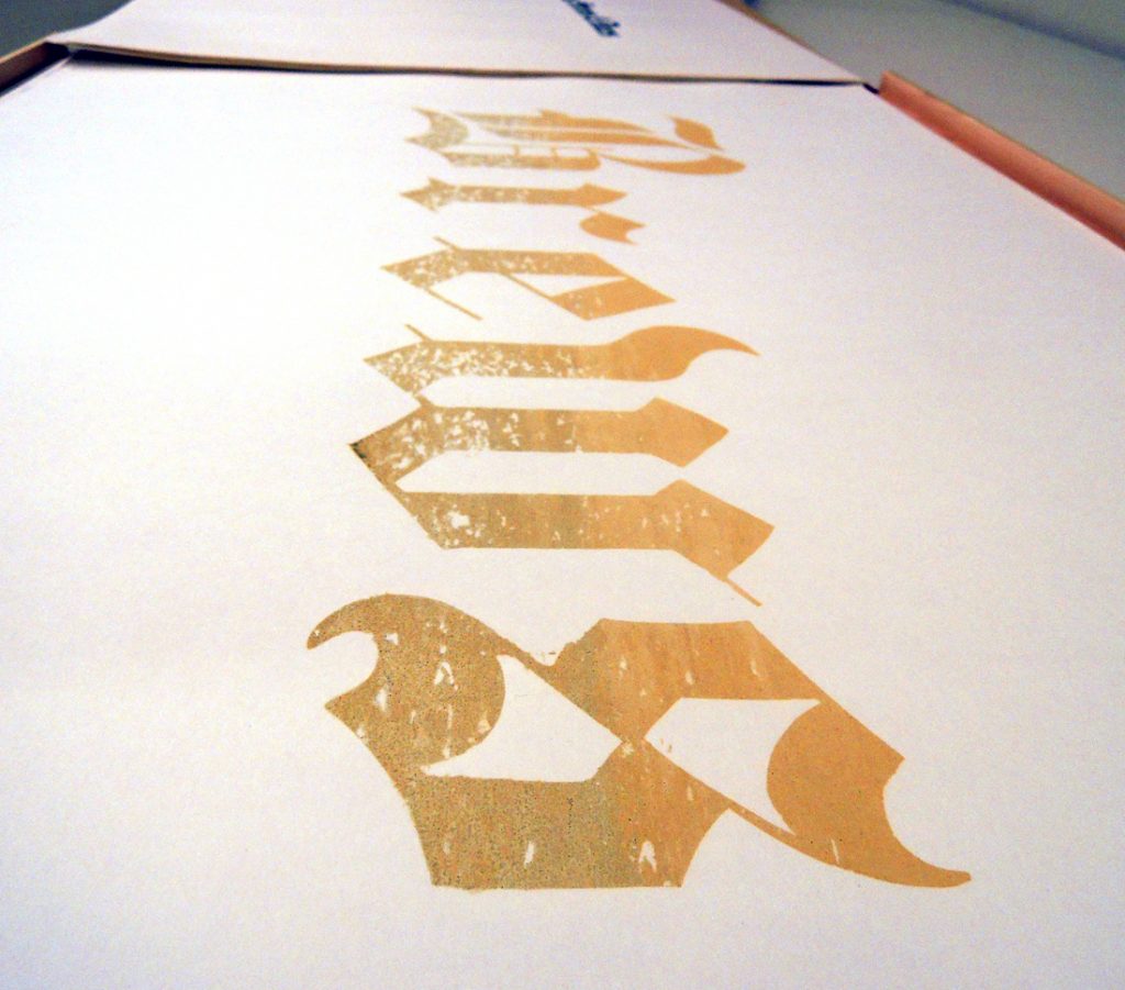
Each print is made with different and unexpected organic materials, such as News, which was printed with blackcurrant pie filling over red salmon roe. In a 1970 interview included in this volume, Ruscha said he liked the incongruous elements. “The pleasure of it is both in the wit and the absurdity of the combination. I mean the idea of combining axle grease and caviar!” He went on to say “New mediums encourage me. I still paint in oil paint. But what I’m interested in is illustrating ‘ideas’.”


news mews5

The illustration above shows the various organic materials used in making this portfolio. Below are the recipes for each individual print. The pseudo-Gothic font was, for Ruscha, an expression of English culture and the words a reaction to his enjoyment with actual London mews while living there.


news mews6
news mews4Axle grease over caviar.


news mews3Hershey’s chocolate flavor syrup and Camp coffee and chicory essence. Squid in the ink.


Picasso and Iliazd

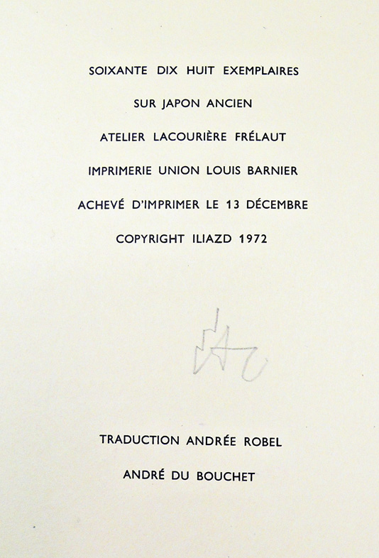
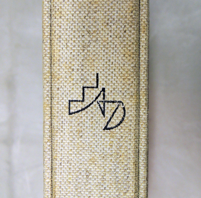
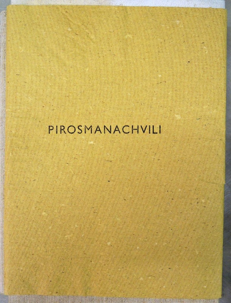
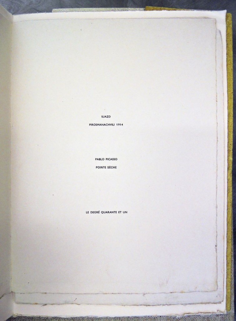
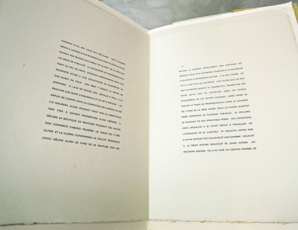
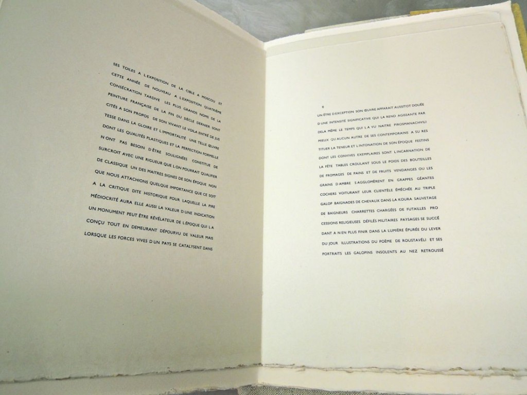
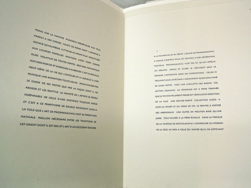
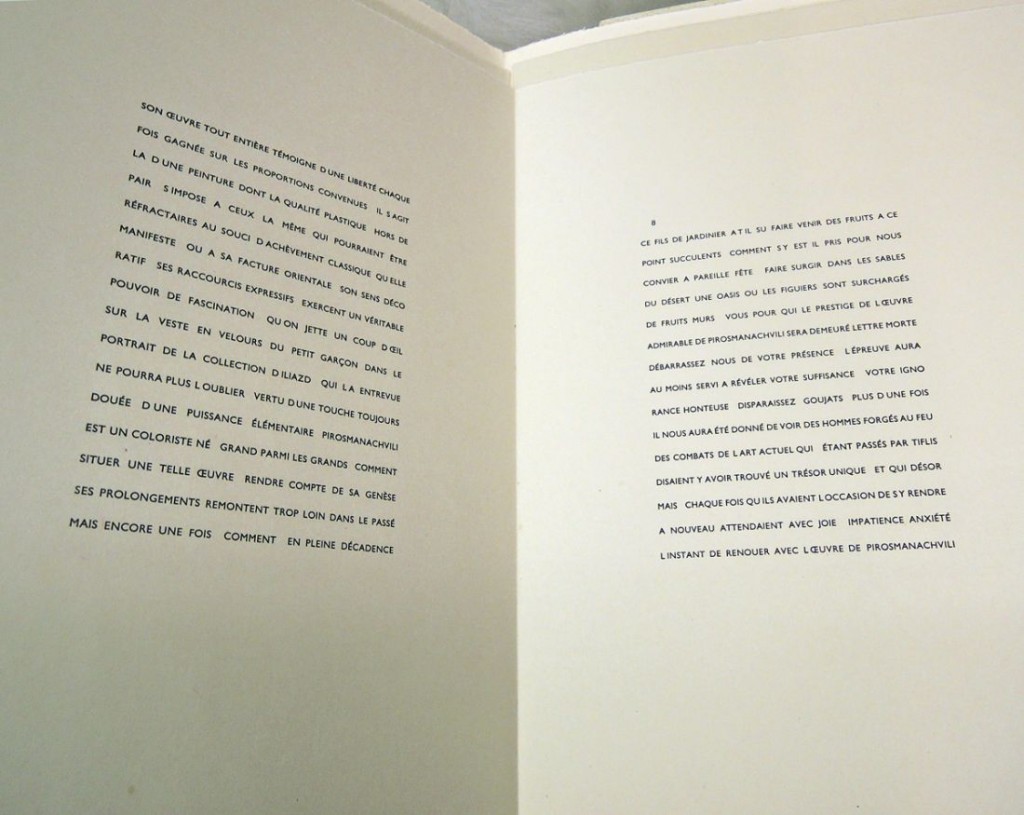
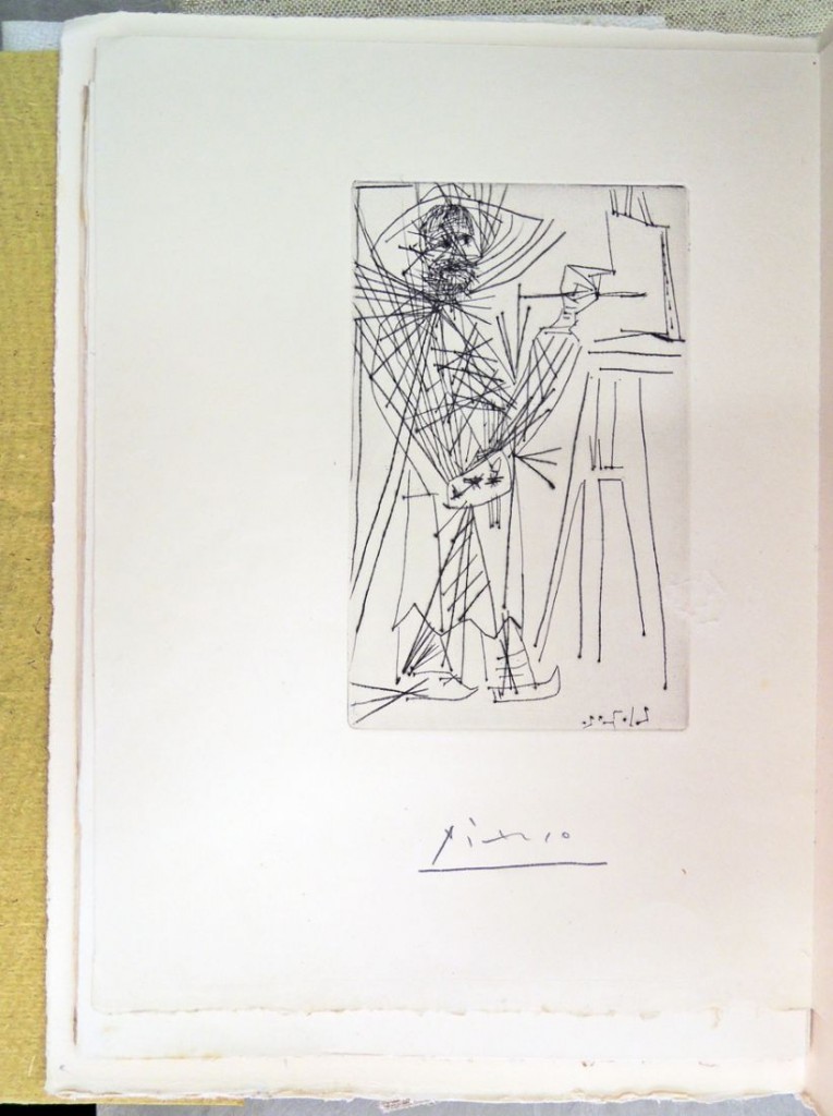
picasso13Iliazd (Ilya Zdanevich, 1894-1975), Pirosmanachvili 1914 (Paris: Le Degré 41, 1972). Original vellum binding, with yellow dust-wrapper and preserved in publisher’s beige cloth chemise and slipcase. Presentation copy from Iliazd’s last wife to Chota Takaishvili. One of 78 copies printed on Japon ancien paper, signed in red pencil on the colophon by Iliazd and with the original etching signed by Picasso, printed by Atelier Lacourière Frélaut. Graphic Arts Collection GAX in process
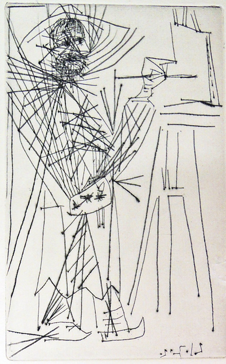
picasso11“It was something of a secret after World War II that one of the most rewarding people in Paris was a man who liked to be addressed simply as Iliazd,” wrote John Russell for the New York Times. “He was known—when known at all—as the architect, designer and publisher of illustrated books in which, one after another, the great surviving names of the School of Paris played a part.” Russell goes on to assert that Iliazd excelled “as poet, geographer, book designer, mountain climber, printer, publisher, fabric designer for Sonia Delaunay and Coco Chanel, pioneer dismantler of language, idiosyncratic stage performer and organizer in the early 1920’s of some of the last of the great classic artists’ balls.” All true.
picasso

picasso3

picasso2Born Ilia Zdanevitch in Tiflis, Georgia, Iliazd (1894-1975) was a founding member of the Russian Futurists. Like many of his contemporaries, the artist eventually made his way to Paris where he designed and published extraordinary livres d’artistes, including several with his own prose and poetry under the imprint Le Degré 41 (41 degrees refers to the latitude of his hometown, the alcoholic content of brandy, and the Celsius measure of the point at which fever leads to delirium).

From 1940 to 1974, Iliazd produced 20 extraordinary books, including 9 with Pablo Picasso (1881-1973). None have been collected by Princeton University until now.
picasso10

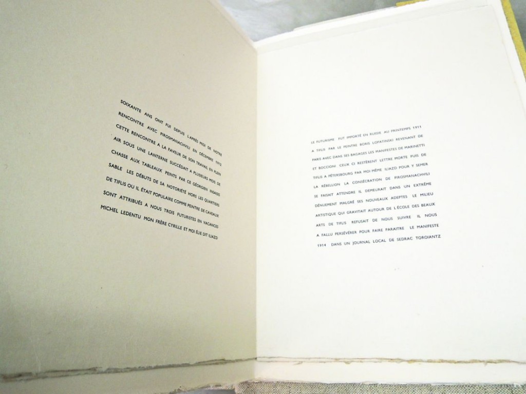
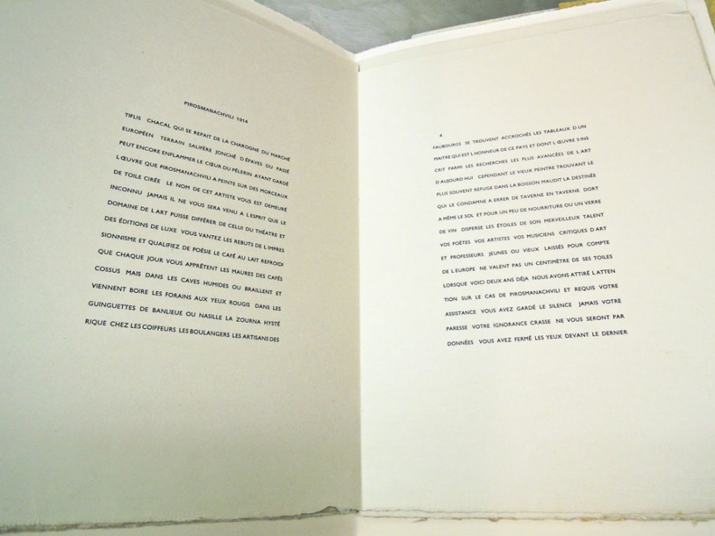
According to Bookvica, a rare book shop from Iliazd’s hometown of Tiflis, “Iliazd returned to his homeland in 1912 and with his brother, artist Kirill Zdanevitch, he met Georgian painter Niko Pirosmani (1862-1918). They became very enthusiastic about him.

Iliazd was alarmed by the difficult economic straits that the painter was in and wrote a manifesto to promote his art; it was published in a local paper Zakavkazskaya Rech’ in 1913 under the title “Khudozhnik-samorodok” (A natural-born artist). It was Iliazd’s first publication. In June 1914 the journal Vostok published his article “Niko Pirosmani,” in which he mythologized the biography of the older artist, linking him with the Silver Age and the Russian avant-garde.”
picasso9

picasso8In the summer of 1971, Iliazd decided to reprint the article and to help promote it, he asked Picasso to etch the frontispiece. His friend agreed and produced a beautiful drypoint, which was printed at the Atelier Lacourière Frélaut (originally the studio of Roger Lacourière, who passed it on to his collaborator and successor Jacques Frélaut in 1957).

The edition of 78 was completed and signed by December 1972, four months before Picasso’s death. Although this was also intended to be Iliazd’s last book, technical difficulties on another project, Courtisan Grotesque (which had been finished in 1974), caused it to be printed after Pirosmanachvili.
picasso7

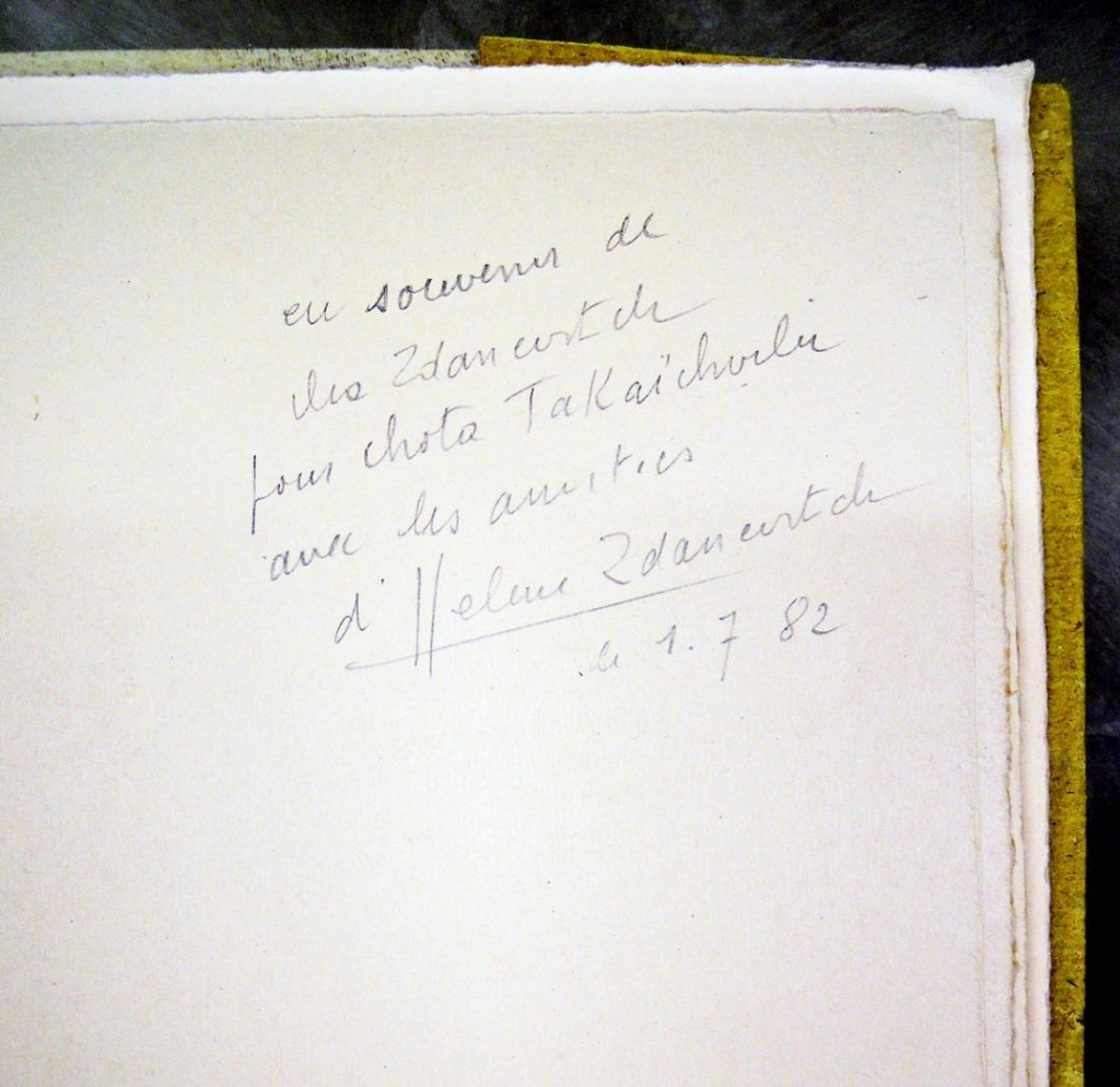
picasso6The copy now in the Princeton University Library comes from the collection of Damian Alaniya. This collector once erased the owner’s stamp of the previous owner to whom this copy was presented by the Iliazd’s wife with signature on the front endpaper: “Eu souvenir de Ms Zdanevitch pour Chota Takaishvili avec les amitiés Ms Helene Zdanevitch. 1.7.82.”
picasso5

picasso12

picasso4

Johanna Drucker writes, “Drawing to the end of his energies, Iliazd had evidently wished this book to perform a double closure: as the end of the cycle of large books, and as the close of the full cycle of his life’s work. There was a mirroring effect between the beginning and the end, a deliberate, marked recognition of the self-consciousness which had dictated the construction of the oeuvre as a whole.” “Iliazd and the Book as a Form of Art,” The Journal of Decorative and Propaganda Arts 7 (Winter 1988): 36-51.
Norske Grafikere

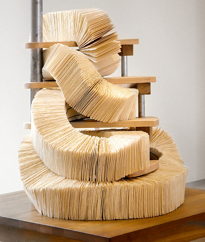
webbilde-bokThe Association of Norwegian Printmakers has a new exhibition of book arts in their Oslo gallery, called Innbundet / Ubundet, Bok-Trykk-Skulptur = Bound / Unbound, Letterpress Sculpture. On view during the month of April are works by Simon Faithfull, Jan Freuchen, Sarah Jost, Imi Maufe, rebeliCa angeCCa, Randi Nygård, Ellen Marie Blakstad Paus, Samoa Rémy and Randi Strand. http://www.norske-grafikere.no/utstilling

The exhibition presents artist books from the printmaker’s perspective, with a focus on the book as a unique object. The artists are working with, against, and across textual communication, while also dealing with the properties of the physical books as a visual sculptures and tactile objects.

The Association of Norwegian Printmakers was founded in 1919 by, among others, Erik Werenskiold, Edvard Munch and Harald Sohlberg. Situated in the center of Oslo, the organization has at any time more than 4000 prints represented by more than 300 artists, making the gallery Norway’s principal venue for contemporary prints.Teknikker-Banner

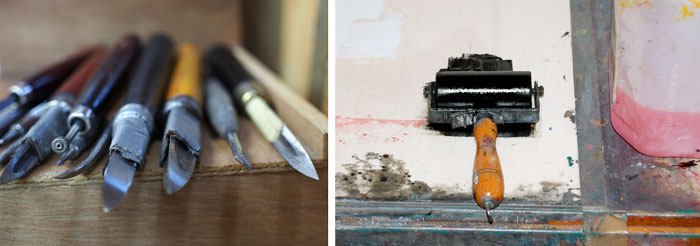
Their website states that the purpose of their organization is to make printmaking recognized as an independent art form and to improve the artists’ situation. Since its establishment, the Association has worked continuously to maintain high professional and ethical standards. Their artists use traditional and contemporary techniques, including digital printing as well as classical intaglio and relief techniques, lithography and screen printing, among many others.

Pense-Bête

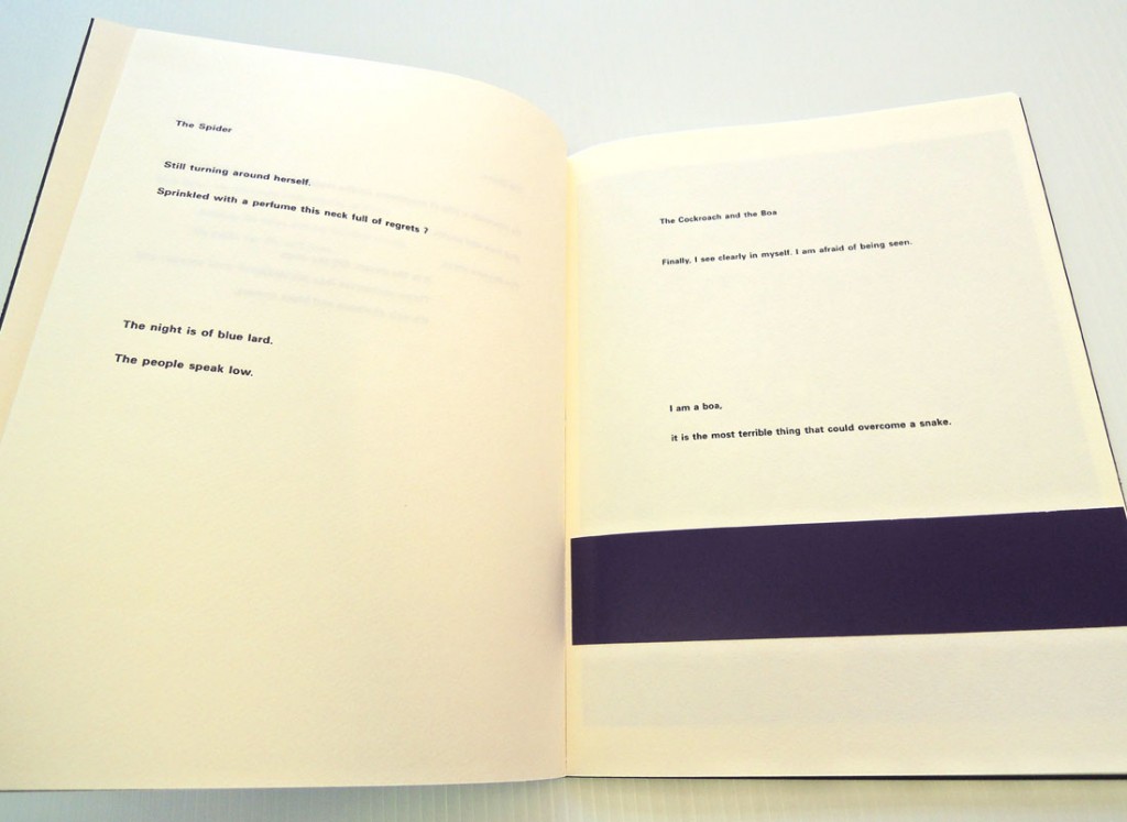
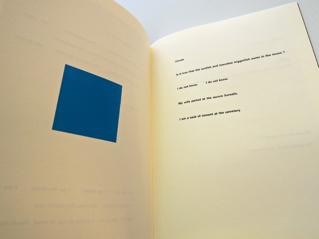
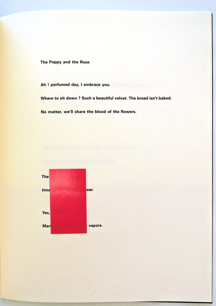
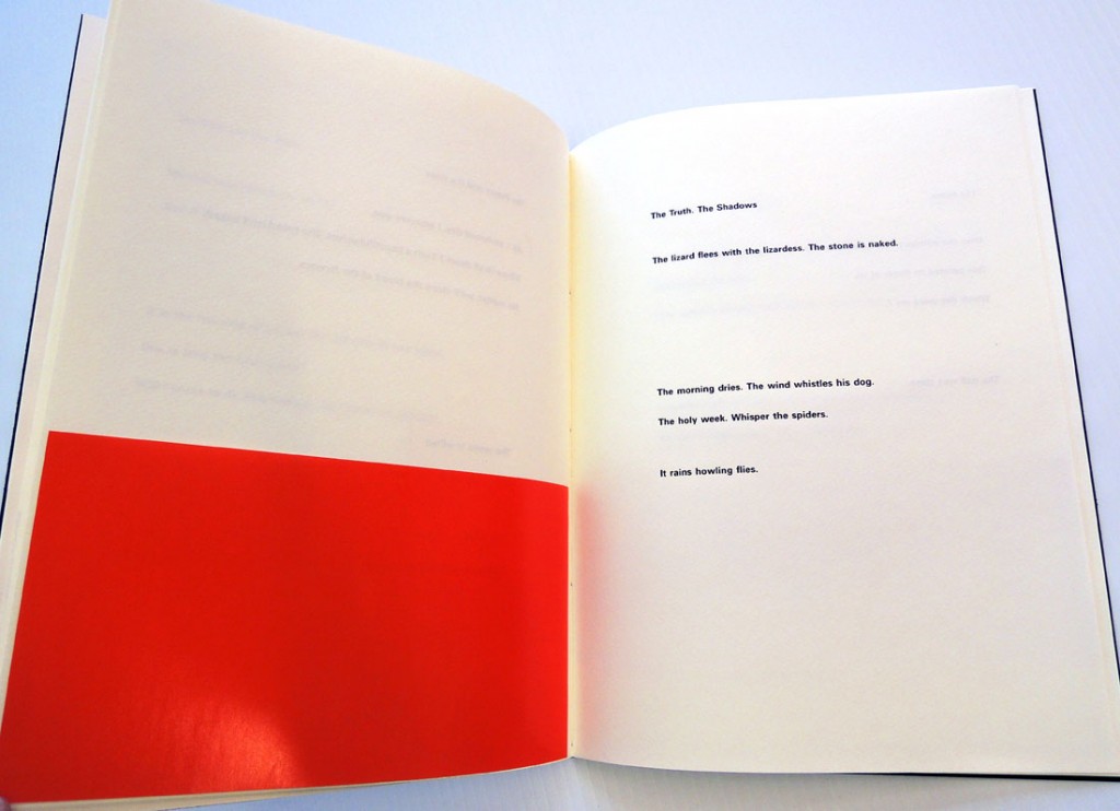
broodthards9

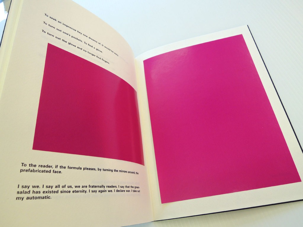
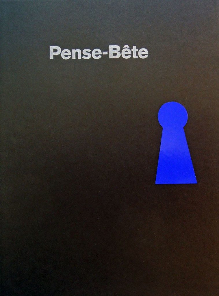
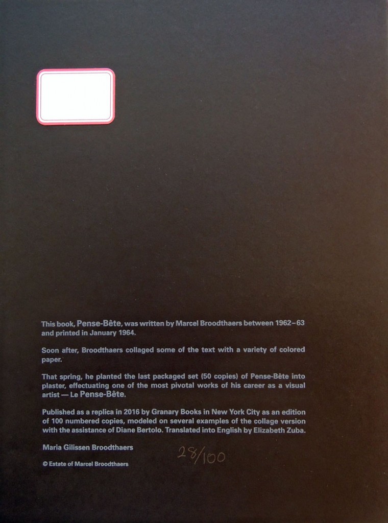
broodthardsThe Graphic Arts Collection is fortunate to have acquired copy 28 of the 100 newly published facsimiles of Marcel Broodthaers’s classic Pense-Bête. The Granary Books publication is modeled on several examples of the original collaged edition. Elizabeth Zuba translated the poems into English with Maria Gilissen Broodthaers. The edition was produced by Steve Clay and Diane Bertolo, it was printed letterpress by Philip Gallo at The Hermetic Press, and hand-bound by Judith Ivry.

broodthards8
broodthards7
broodthards6
Quoted from Granary Books website: “Pense-Bête is the fourth book of poetry by Marcel Broodthaers (1924-1976). It was written 1962-63 and printed in an edition of 100 in December 1963–January 1964. Its title is a French term for a memory aid or visual reminder, such as a string tied around one’s finger, yet when pronounced it translates literally to “think beast” or “think stupid” and signals the frolicsome bestiary of poems within, a group of poems that play with the shared condition of humanity and the animal kingdom.

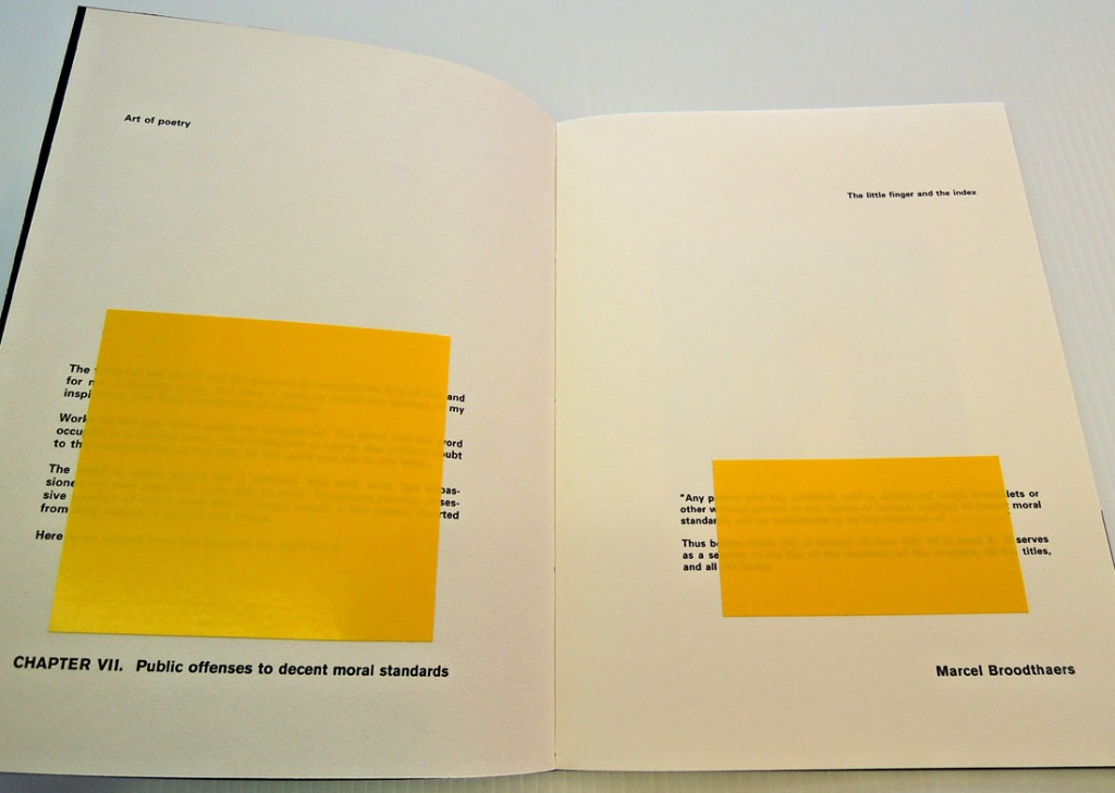
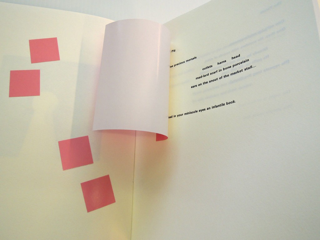
After selling a number of copies of Pense-Bête, Broodthaers decided to collage some of the book’s texts with a variety of rectangles and squares of colored paper. In some cases, the paper obstructs part of the poem and in others, one may lift the paper to read the text underneath.

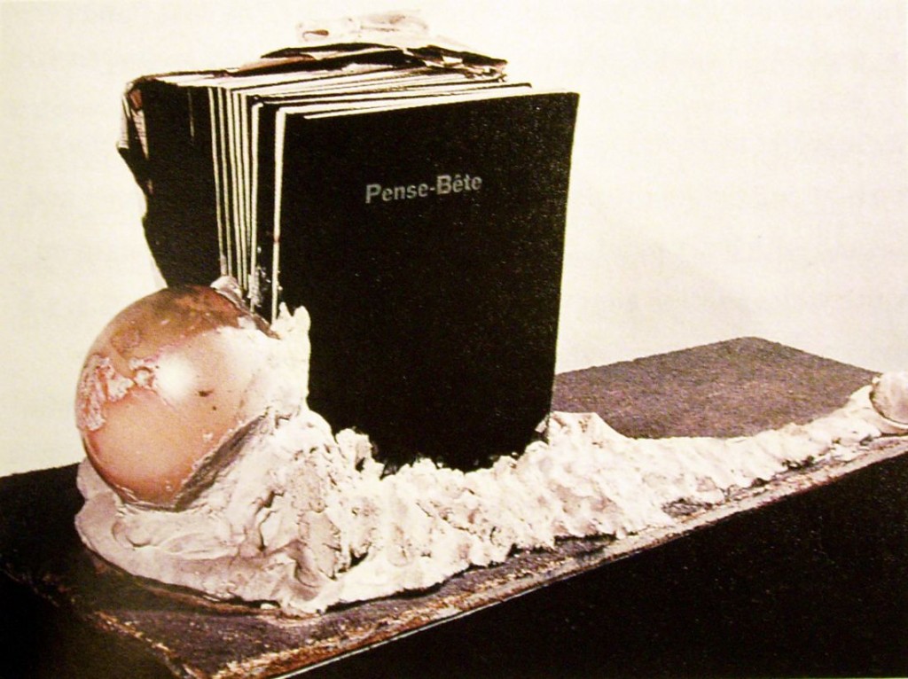
In the spring of 1964, furthering his effort to physicalize the language of this book, Broodthaers set the last packet (50 copies) of Pense-Bête into plaster and in the process created one of the most important and influential works of his career, a decisive turn toward the concretization of language through the “plastic” or visual arts.”

http://www.granarybooks.com/book/1184/Marcel_Broodthaers+PenseBete/

broodthards5
broodthards4
broodthards3
broodthards2

This facsimile was produced to coincide with the exhibition Marcel Broodthaers: A Retrospective at the Museum of Modern Art in New York City.

Also coinciding with the exhibition are activities organized by Joe Scanlan, Director and Professor of Visual Arts at the Lewis Center for the Arts: http://www.broodthaers.us/index.php?id=142

How to pronounce Broodthaers: http://forvo.com/word/broodthaers/

BroodthaersSet in plaster