Category Archives: fine press editions

fine press editions

Maurice-Georges-Elie Lalau


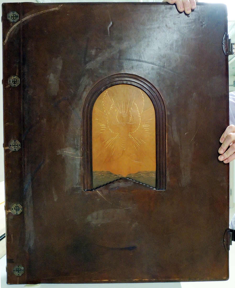
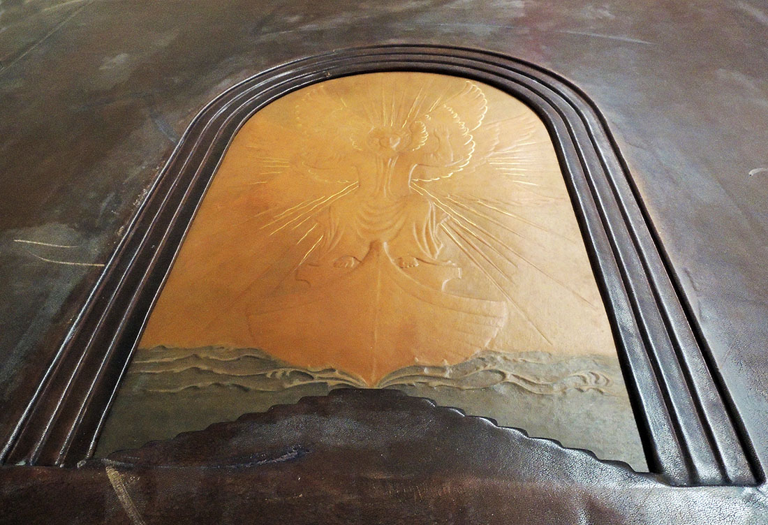
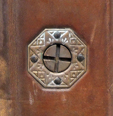
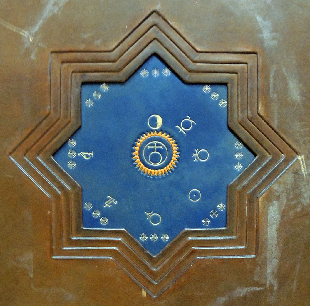
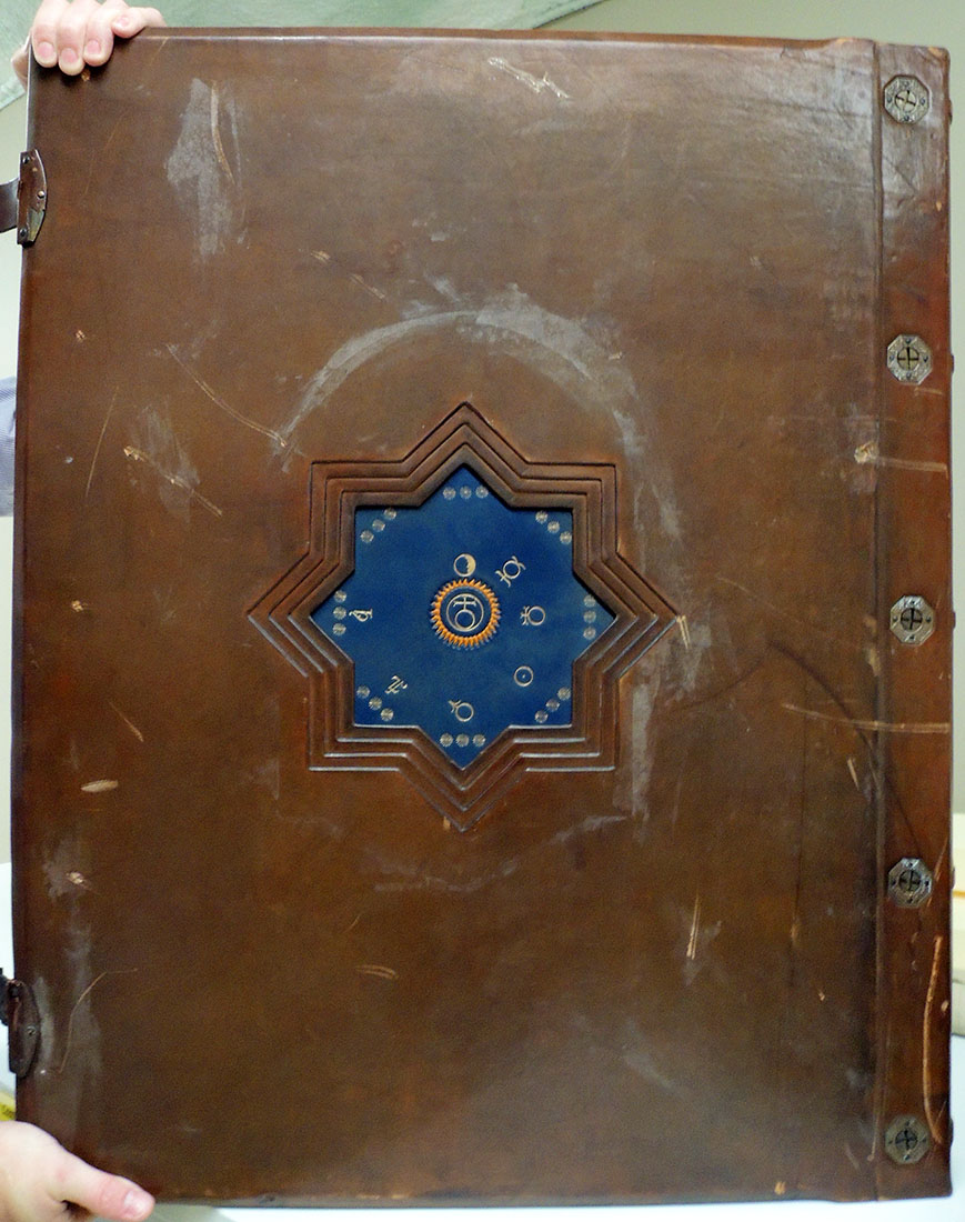
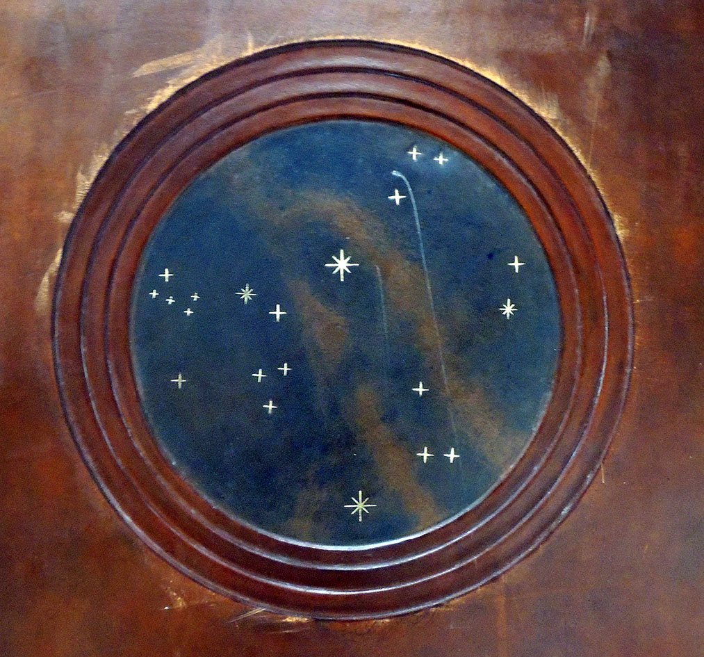
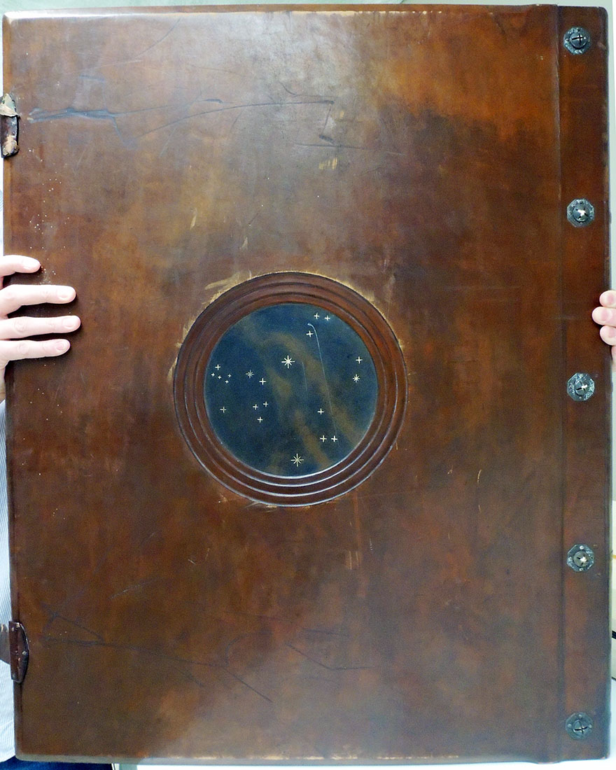
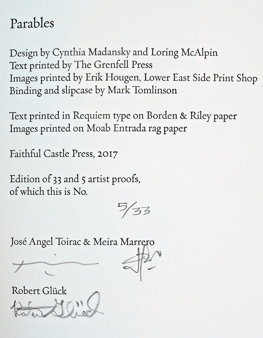
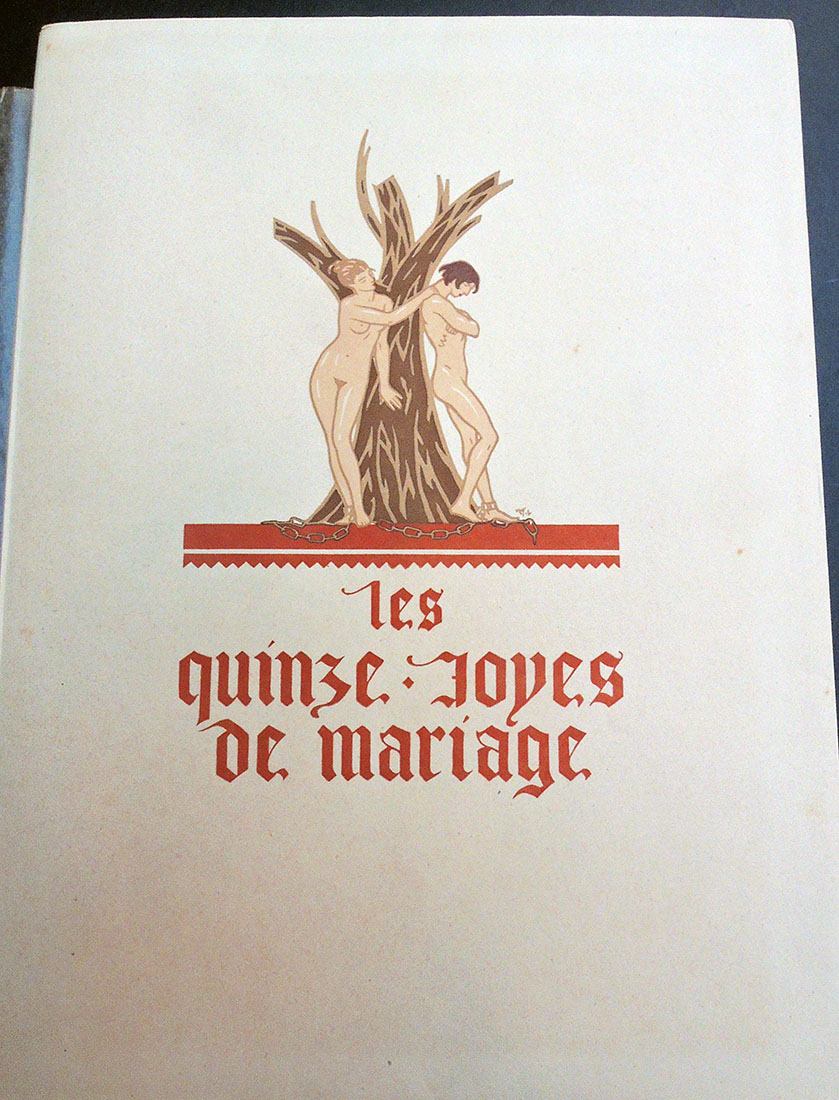
Maurice-Georges-Elie Lalau (1881-1961), Les quinze joyes de mariage … Edition conforme au manuscript de la Bibliothèque de Rouen avec un glossaire publié par Jules Meynial… (Paris, 1928). Copy 45 of 150. Graphic Arts Collection GAX 2018- in process

       
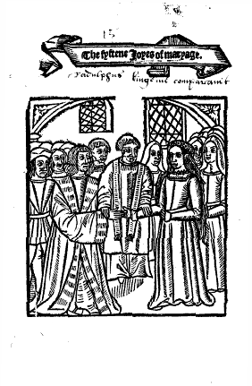
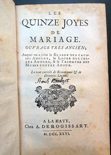
[left] Antoine de La Sale (born 1388?), The Fyftene Joyes of Maryage [Quinze joyes de mariage] ([London: Wynkyn de Worde, 1509]). [right] Les quinze joyes de mariage: ouvrage tres̀ ancien, auquel on a joint le Blason des fausses amours, le Loyer des folles amours, & le Triomphe des muses contre amour. Le tout enrichi de remarques & de diverses leçons (A La Haye: Chez A. De Rogissart, 1726). Rare Books 2004-0836N

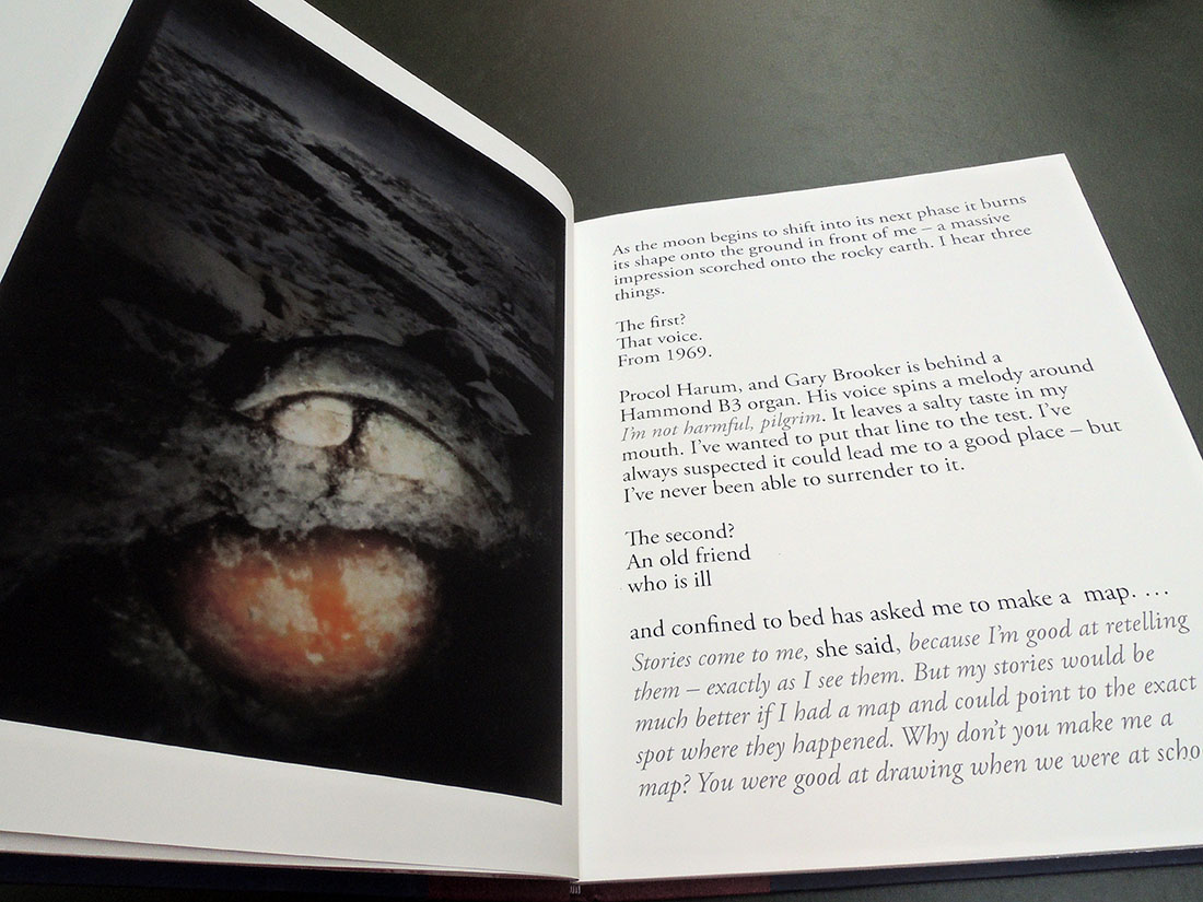
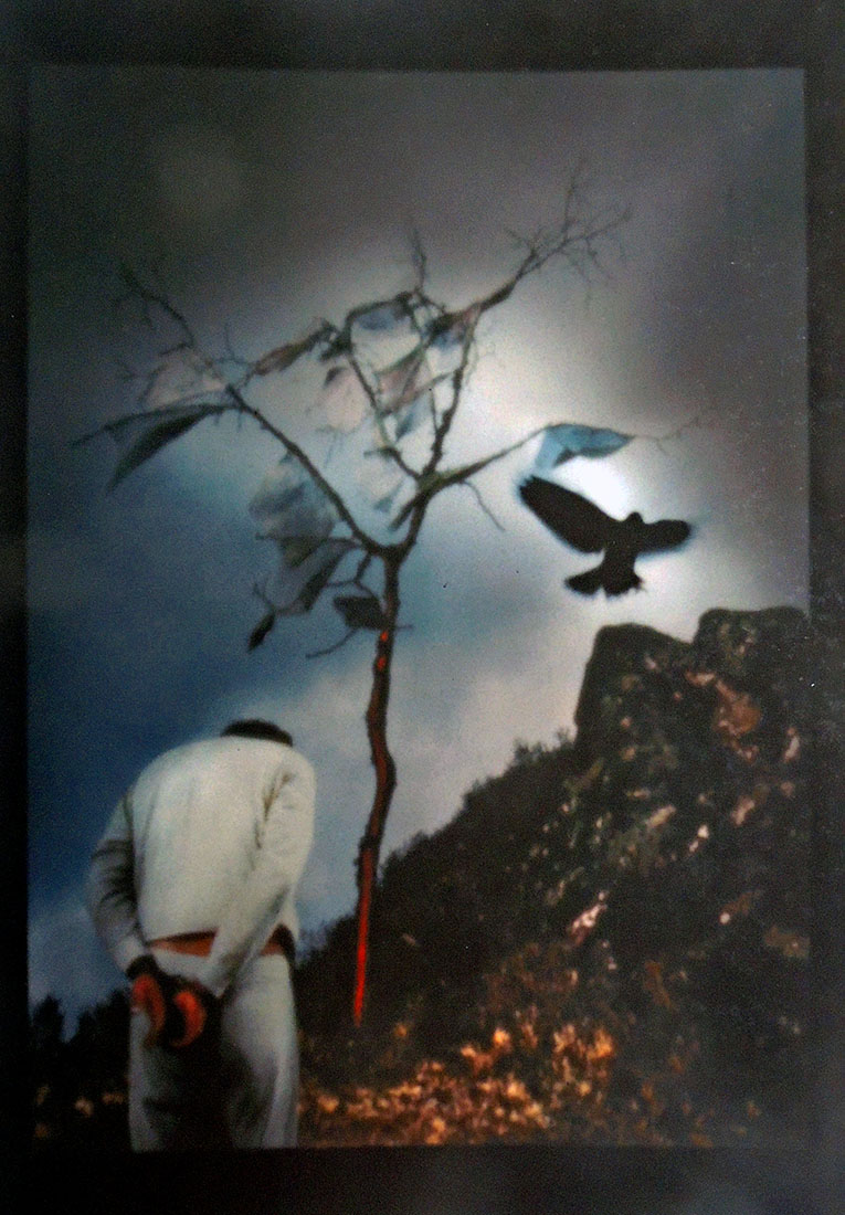
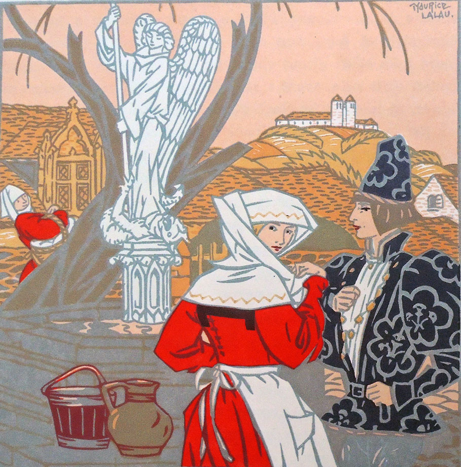
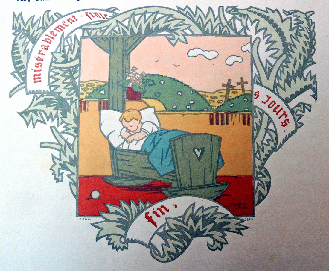
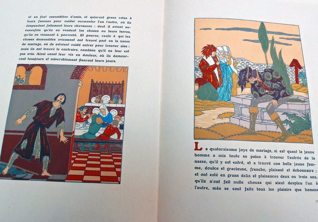
In 1926, Maurice Lalau and the bibliophile/publisher Jules Meynial formed a partnership to create a deluxe edition using innovative printing techniques. For their text, they chose Les quinze joyes, a Medieval satire on the tricks wives play on their husbands, sexual and otherwise.

A 1726 edition [above] has notes by le Duchat, who describes it as a favorite of ‘jeunes Courtisans François’ of the mid-fifteenth century. The work has been attributed to Antoine de la Sale and various dates have been suggested for its composition; le Duchat comes down in favor of the late fourteenth century. Wynkyn de Worde published a translation in English verse, The Fyftene Joyes of Maryage, at least as early as 1507, a fragment of that survives and a single complete copy of a 1509 reprint. STC 15257.5-15258

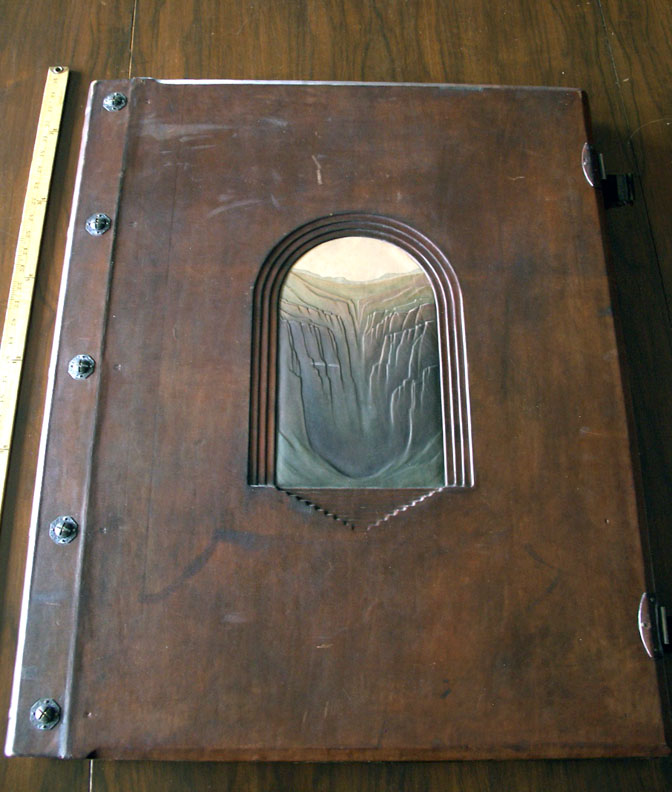
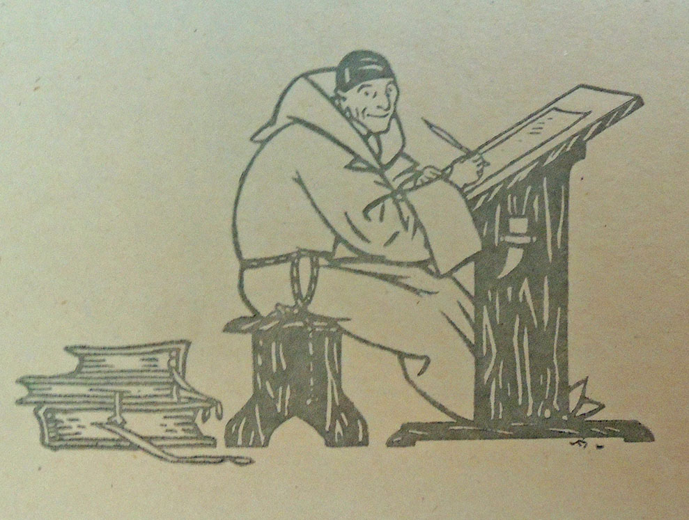
Lalau called his printing process, first seen with this volume, Graphichromie: “un moyen nouveau d’impression des illustrations en couleurs.” He designed and printed the edition of 150 copies, each with 37 plates, which means hand-printing 5,550 multi-color plates. The project took Lalau two years to complete. In addition, this copy has 37 single leaves, reproducing the illustrations in grey ink only (the initial color in the process).


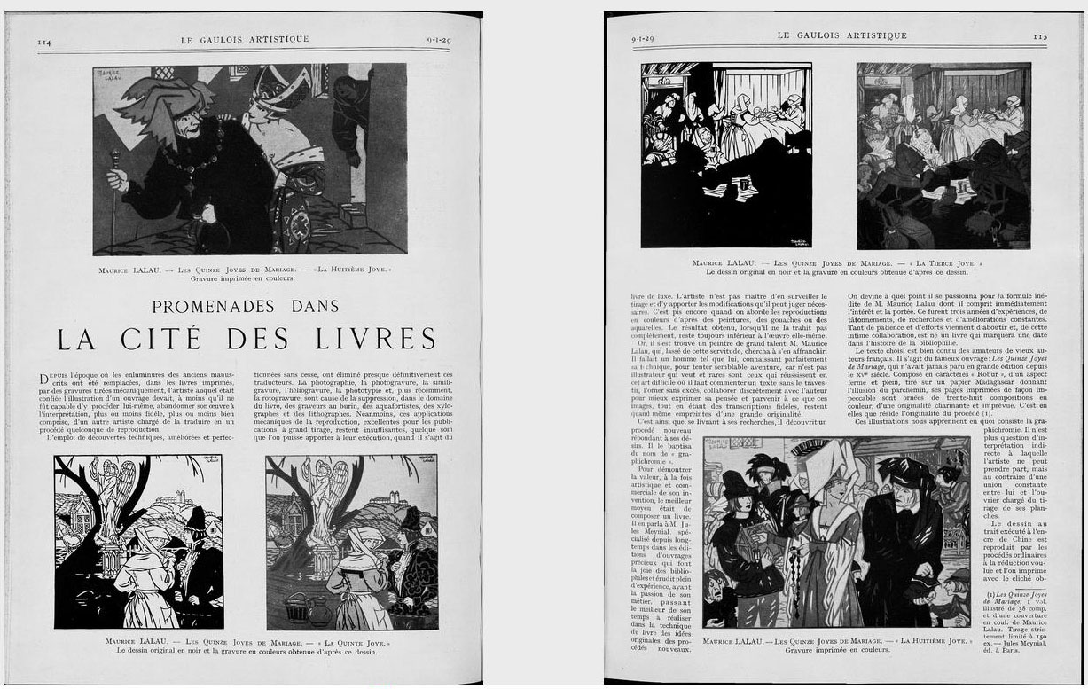
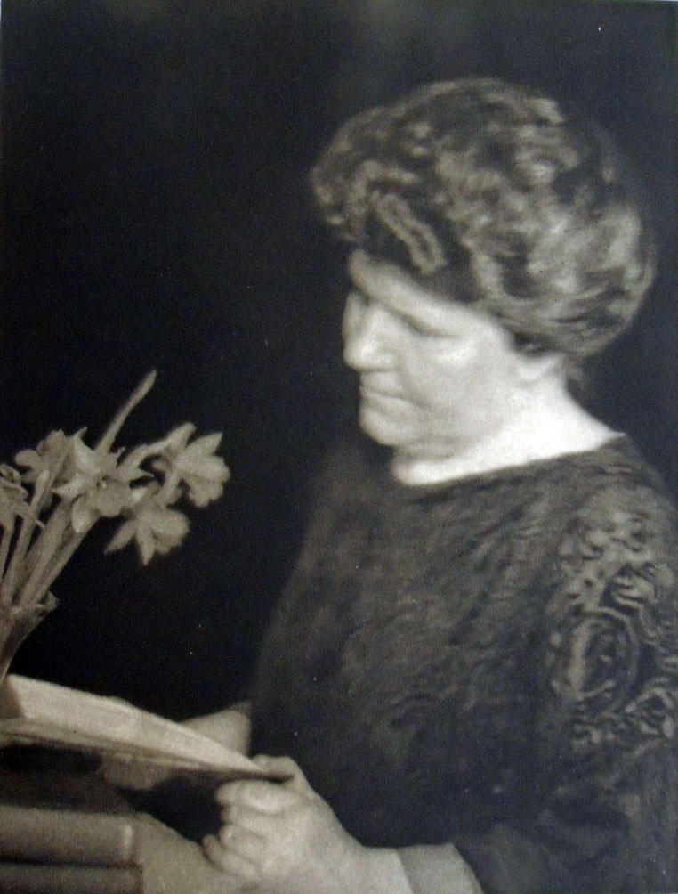
Their book was the subject of an article in the January 1929 issue of Le Gaulois artistique, [above and left] in which the author laments the suppression of traditional illustration processes in favor of newer mechanical techniques:

“L’emploi de découvertes techniques, améliorées et perfectionées sans cesse, ont éliminé presque définitivement ces traducteurs. La photographie, la photogravure, la similigravure, l’héliogravure, la phototype et, plus récemment, la rotogravure, sont cause de la suppression, dans la domaine du livre, des graveurs au burin, des aquafortistes, des xylographes et des lithographes.

Néanmoins, ces applications mécaniques de la reproduction, excellentes pour les publications à grand tirage, resente insuffisantes, quelque soin que l’on puisse apporter à leur execution, quand il s’agit du livre du luxe.”

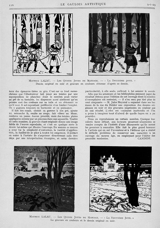
Although the author disdains mechanical processes, in general, he praises Lalau’s technique for its insistence on intimacy between artist and workman:
“Il n’est plus question d’interprétation indirecte à laquelle l’artiste ne peut prendre part, mais au contraire d’une union constante entre lui et l’ouvrier chargé du tirage de ses planches.”

In addition, he compliments Lalau’s ability to convey the spirit of the Middle Ages through modern mechanical means: “Elle fait le plus grand honneur à l’artiste qui en est l’inventeur et à l’éditeur qui a réalisé le difficile problème de conserver son caractère à un ouvrage du moyen âge, en employant pour l’éditer des proceeds modernes.”


How Big is a Limited Edition?

Beginning today the New York Public Library is offering a Special Limited Edition library card that reads: Knowledge Is Power, available only for a limited time (or while supplies last). The edition is 70,000. “Apply in person at your local NYPL branch, or sign up online and visit your local branch quickly to validate and pick up your Special Edition card before they run out. Knowledge Is Power cards are free for new cardholders. Library card applicants must show proof that you live, work, attend school, or pay property taxes in New York State.”


This led to the question of just how big an edition can be and still be defined as a special limited edition? In 1896, Martha Finley’s Elsie Dinsmore was published by Grosset & Dunlap in New York, in a special limited edition of 100,000 copies. Today, it is also possible to read it online, with unlimited access to the special limited edition.

According to library records Monbusho’s Kankyo shogaku tokuhon maki 1 (Primary reader, vol. 1) was published in 1873 in an edition “Limited to 5,000,000 copies.” (Cotsen Children’s Library Pams / NR / Japanese / Box 135 65143). This is not a typo.

Ed Templeton and Deanna Templeton’s modern photobook Contemporary Suburbium (2017) was released in a “Limited edition of 2,000 copies” (Marquand Library N7433.4.T47 C68 2017). Alfredo Jaar’s homage to John Cage on the occasion of the Cage centennial, entitled Otros piensan = outros pensam, was limited to 1,000 copies, as was Victor Hugo’s Poems (New York: F. DeFau & Co., 1888), available on open shelves or through interlibrary loan. Charles Kingsley’s Alton Locke, Tailor and Poet (New York, J. F. Taylor and Company, 1899) was a “Limited edition of 1,000 copies” although dozens of other editions were also available at the time (PR4842 .xA4 1899). You can undoubtedly think of many other examples.

Christian Marclay’s film The Clock was produced in a limited edition of six copies and two artist’s proofs. Five are in public institutions although it can only be played at one location at a time. “When I first started on this project, I thought it would become a public art piece,” Marclay told a New Yorker writer. “I thought, What a great thing, to be in a train station waiting for a train and being able to watch a movie. It would inform you what time it was, and at the same time entertain you. But I realized it was impossible—there’s lighting issues, sound issues, you have to hear the public-address system.”

Very few rare book glossaries include a mention of  “Limited edition.” The International League of Antiquarian Booksellers notes:

“Book intended to have a finite number of copies, usually intended as a collectible or artificial “rarity.” Often each volume in the edition is supplied with a specific number, and can be signed by the author, artist, binder, etc. Most limited editions have a limitation statement that elaborates on the wonderment of the volume in question. Some less than scrupulous publisher’s will issue editions limited to the number of copies that they can sell, with the limitation proclaimed, but the number not specified.

America is not alone. See also:

French: Tirage limité
German: Limitierte Ausgabe
Dutch: Beperkte oplage
Danish: Begrænset oplag
Italian: Tiratura limitata
Spanish: Tiraje limitado
Swedish: Begränsad upplaga

https://www.nypl.org/blog/2018/10/29/knowledgeispower-library-card

Nationally loved writer tossed out by Princeton residents

Late in the fall of 1936, the celebrated author Dashiell Hammett (1894-1961) moved to Princeton, New Jersey, where he rented a mansion [his word] at 90 Cleveland Lane from James Renwick Sloane (1881-1955). He moved in with his Black chauffeur/valet and two dogs named Baby and Pal (sadly Baby died while in Princeton).

Hammett was immediately invited to address the local elite at the Nassau Club but rather than write a talk, he simply answered questions concerning everything from “Shakespeare to his experiences in Hollywood.” On Christmas day, the sequel After the Thin Man was released to popular acclaim and Hammett was called America’s best-loved writer. Not wanting to continue with the series, in February 1937 Hammett sold M-G-M all rights to The Thin Man title and characters for $40,000.

Later that month he agreed to act as a judge for the Princeton Community Players playwriting contest but on the day the entries were due, Hammett left town. According to his biographer, Richard Layman, he was asked to leave Princeton by his neighbors due to his loud parties, overnight female guests, and drunken students (his recent membership in the Communist Party was not mentioned). Renwick Sloane sued Hammett for damages made to the house, which was soon after torn down and replaced with a new nine-bedroom home in 1940.

In the November 11, 1936, issue of the Daily Princetonian, Henry Dan Piper, class of 1939, wrote an article titled “Dashiell Hammett Flees Night Club Round Succumbing to Rustication in New Jersey”:

Wearied of New York’s sophisticated clatter, the tall, prematurely greying Dashiell Hammett, author of “The Thin Man” and “The Glass Key,” has escaped to the privacy of a rambling, white clapboard farmhouse perched on a hillside outside of Princeton. “This is the life” he sighed, seated in his armchair before a roaring fire, and succumbing to the inquisition of a Princetonian interviewer. “You can get fed plenty cooped up in a three room apartment, making the same rounds every night—Stork Club, 21, Dempsey’s—seeing the same old faces and hearing the same damned chatter. Nuts.” “There isn’t much to tell about me,” he said. “Baltimore as a kid. . . school for a coupla years. . . stevedore . . . newsboy. . . Golly, I’ve seen lots of things, but I never seemed to stick long at ’em. When the Armistice came along, all I could boast was a pair of weak lungs contracted in the Ambulance Corps.”

“I did some private detective work for Pinkerton’s, but all the time I was getting sicker, and found myself shortly in a California hospital. Then it was a case of turning to something to keep the butcher away from the door while I tried to bluff along the baker. So I rented a second-hand typewriter and pounded out my first novel. It was just a case of lucky breaks after that. Yes, I’m working on a book here, but it’s not a mystery, and it’s not about Princeton. I really don’t like detective stories, anyway. I get too tangled up in the plots. This one is just about a family of a dozen children out on an island. You see, all I do in a story is just get some characters together, and then let them get in each other’s way. And let me tell you, 12 kids can sure get in each other’s way!”

Asked if he were indulging in any more stories about the liquor-swilling, sophisticated pent house dwellers of “The Thin Man,” Hammett wrinkled his brow and exclaimed, “I can’t understand why people get the idea all I ever write is artificial, with tinseled-and-ginned up characters. They’re just like lots of people I know neurotics and what have you. “You know, ideas float around that New York and Hollywood people are all nuts. I’ve just come back from working on a new Powell-Loy film and I admit lots of those guys out there are screwy. But, hell, they’ve got tons of money to be screwy with. And anyhow, they’re no more bats than a lot of over-stuffed” executives I’ve had the misfortune to meet. “Yes, it’s going to be like the others,” he said, returning to the new movie. “They say they’re going to call it ‘After the Thin Man.’ Heaven only knows why. Before Hollywood started monkeying with the plot it was something like ‘The Thin Man,’ but its own mother wouldn’t recognize it now.”


In 1983 Arion Press published a limited-edition Maltese Falcon, illustrated with 46 period photographs of sites in the novel, along with contemporary views by Edmund Shea. The photographs were found mainly in old newspaper morgues and library archives, taken in the late 1920s, of the actual streets and buildings where Sam Spade solved the mystery. The Graphic Arts Collection holds only the trade edition, published by North Point Press the following year.

See: Dashiell Hammett, “From the Memoirs of a Private Detective,” Smart Set March 1923, p. 88.
https://babel.hathitrust.org/cgi/pt?q1=%22dashiell%20hammett%22;id=uc1.b3874453;view=image;seq=444;start=1;sz=10;page=search

Dashiell Hammett (1894-1961), The Maltese Falcon (San Francisco: North Point Press, 1984). “This edition … is reproduced from the limited edition of 400 copies printed and published by the Arion Press, San Francisco, in 1983”–Colophon. Graphic Arts Collection PS3515.A4347 M3x 1984

Dashiell Hammett (1894-1961), The Maltese Falcon (New York: A.A. Knopf, [c1930]). Rare Books 3769.56.359 1930


What the Moon Let Me See


Peter Lyssiotis, What The Moon Let Me See (Melbourne: Masterthief, 2017). Copy 3 of 10. Graphic Arts Collection GAX 2018- in process

Colophon: “What the Moon Let Me See has been made from what I recall of my father, my love affair with Federico Garcia Lorca, and a recollection of hearing for the first time, the Neville Brothers singing ‘Yellow Moon’. The book was commissioned by Deakin University and completed in 2017. My original photomontages were adapted by Doug Spowart and Victoria Cooper using a pin hole camera. Rod Davies did the pre press work and contributed to the layout of the book. The book has been printed by Momento Pro on Cotton Rag paper. The binding in quarter leather is by SB Libris.”


“The image of the author, on the way home, aged 70 five years after first being posted as the inaugural ‘Sold the Dummy’ visual essay. The images and text are intended to sway the mind of visitors. The following images were processed with a pin hole camera, the most primitive, analogue form of technological imagery. Photographic paper sits at the back of a black box. Light pierces the pinhole. The image reproduced appears upside down. The edges blur easily. The promise often lies in the visitor refocusing …

When the first cherries appear make sure you pop one into the mouth, then close your eyes. This is how to best understand the taste of the cherry. It seems odd. Only when we close the eyes can we begin to understand more. And as the the moon begins to shift towards its next phase it burns a shape onto the ground in front of the visitor, leaving a massive impression on the rocky ground.”–Peter Lyssiotis http://www.soldthedummy.com/aquapolis/what-the-moon-let-me-see/

Nattini bindings

Volume 3 front cover
The question yesterday was, What is on the back of the Nattini binding?

As first posted in 2011, the Graphic Arts Collection is fortunate to hold one complete bound set of Dante’s Divine Comedy imagined by the artist Amos Nattini (1892-1985), along with one partially unbound set. At 82 cm long and perhaps 20 pound each, these do not move from the shelf often.

Dante Alighieri (1265-1321), La Divina Commedia, Imagini di Amos Nattini (Milano: Istituto nazionale dantesco, [1923-1941]). GAX Oversize PQ4302 .F23e. Three volumes; 82 cm. each. 100 color lithographs by Amos Nattini (1892-1985). https://www.princeton.edu/~graphicarts/2011/07/amos_nattini.html

In 1921, on the occasion of the 600th anniversary of Dante Alighieri’s death, the Istituto nazionale dantesco in Milan commissioned a new, illustrated edition of the poet’s Divine Comedy. The artist chosen for the project was Amos Nattini, who was charged with creating one plate for each canto. For the next twenty years, Nattini worked on his Dante, releasing each of the three volumes are they were completed in 1928, 1936, and finally 1941.

Perhaps because of the length of time between volumes, the first and second are bound with similar designs while the third volume has its own design. Here are the front and back, along with this lovely design for the screws. The books are now heading to conservation for a good cleaning.

Detail of volume 3 back cover.

Volume 3

We are extra fortunate in Princeton, since both the Princeton Theological Seminary and the Institute for Advanced Study Library are listed as also having sets of Nattini’s Dante. This has not been confirmed in person.

Detail of volume 1 back cover.

Volume 1 back cover

Volume 1 front cover


Special thanks go to Mike Siravo who helped to lift volumes.

José Angel Toirac’s “Parables”

Parables, with Cuban artist José Angel Toirac and writer Robert Glück, is an extension of Toirac’s life project of examining how the Cuban State has used press imagery to manufacture consent and sell the Revolution which Fidel lead in 1959,” writes Loring McAlpin, ’83. “It’s a sumptuous book meant to be a scripture for Fidel and the Cuban Revolution.”

You may have missed the evening last spring at The David Rockefeller Center for Latin American Studies (DRCLAS), Harvard University, where Toirac, Glück, and McAlpin present their limited edition, fine press book gathering photographs from magazines and newspapers like Granma, the mouthpiece of the Communist Party, and re-purposing the Cuban Revolution as a Gospel, a new religion with a new scripture.

But you can still catch them if you happen to be in Washington D.C. in October 2018, when artists Meira Marrero, Loring McAlpin, and José Angel Toirac will join in a conversation about Parables with Michelle Bird at National Gallery of Art. https://www.nga.gov/calendar/lectures/lectures-signings/parables-the-conversation.html


They note:

Parables (the project/exhibition) by Meira Marrero and José Angel Toirac is a collection of 33 photographs of Cuban life published by the official Cuban press. Sources range from magazines and newspapers like Granma, the mouthpiece of the Communist Party, to books on the history of the revolution. These photographs constitute a narrative of the Cuban Revolution as well as a retelling of the Gospels, with Fidel Castro performing the life of Christ from his childhood in Nazareth to his ascension into Heaven. Just as Christianity appropriated pagan festivals, the Cuban state has incorporated biblical stories into its narrative of the Revolution. Christian expressions have been fashioned into official slogans such as “these are the days to unite.”

In Parables the religious roots of this idolatry are exposed. Poet, fiction writer, editor, and New Narrative theorist Robert Glück was invited to write the “scripture” accompanying these images, as if compelled by the faith they conveyed, without mention of either Fidel or Jesus. Parables (the book) is a limited-edition artist book of 33 parables, each with a corresponding image, designed by Cynthia Madansky and Loring McAlpin.

In Fidel’s Shadow: Cuban History (and Futures), One Year On


José Angel Toirac, Meira Marrero, and Robert Glück, Parables, design by Cynthia Madansky and Loring McAlpin ([New York?]: Faithful Castle Press, 2017). Graphic Arts Collection 2018 in process.


Fraternity

“The most influential printmaker of the first half of the century.” This is how Michael Brenson described Stanley William Hayter (1901-1988) in the New York Times, May 6, 1988.

Hayter was only 26-years-old when he established the printmaking studio Atelier 17 in Paris, where it flourished until 1940. When the Nazis invaded in September 1939, he was forced to pack what he was able and move the shop to New York City. According to Brenson, when Hayter left France, he left “behind 100 copper plates and a press, which were confiscated by the Vichy Government.”

Both a school and a commercial press, it is hard to think of a major artist of that period who did not pass through Hayter’s workshop at one time or another.

Early in 1939, Hayter conceived of a publication that could be sold to raise money for children left orphan during the war in Spain. He asked the British poet Stephen Spender (1909-1995) for a poem, who sent “The Fall of the City” and then, arranged for Aragon (1897-1982) to translate the poem into French, “Chute d’une cite.”

Next, he convinced eight artists to come to the studio and produce an etching or engraving for the project, in addition to his own contribution. The international group included Joseph Hecht (French, born in Poland, 1891–1951); Dalla Husband (Canadian, 1899–1945); Wassily Kandinsky (Russian, 1866–1944); Roderick Mead (American, 1900–1972); Joan Miró (Spanish, 1893–1983); Dolf Rieser (South African, active in England, 1893–1983); Luis Vargas Rosas (Chilean, 1897-1977); and John Buckland Wright (New Zealander, 1897–1954). I add this here intentionally since many databases, like Princeton’s, have thrown out artists’ nationality as an element for recording and searching.

A reference inquiry led to the pulling and counting of the prints in this portfolio. The etchings and letterpress text were issued unbound in a wrapper with the title Fraternity embedded in one of Hayter’s designs. Since then, many prints have been removed from various copies and sold separately, Kandinsky and Miró in particular, but happily, Princeton’s copy is complete as issued.


Fraternity ([Paris: Atelier 17], 1939). Poem by Stephen Spender, translated by Aragon. Printed at Atelier 17 in an edition of 113 copies. Etchings by John Buckland-Wright, Stanley William Hayter, Josef Hecht, Dalla Husband, Wassily Kandinsky, Roderick Mead, Joan Miro, Dolf Rieser and Luis Vargas. Sylvia Beach Collection 3938.965.336

Robert Delaunay and Vicente Huidobro

Vicente Huidobro (1893-1948) and Robert Delaunay (1885-1941), Tour Eiffel. Poème par Vincente Huidobro; peintures par Robert Delaunay (Madrid: privately printed, 1918). Graphic Arts Collection GAX 2018- in process


In 1908, the painters Robert Delaunay (1885-1941) and Sonia Terk (1885-1979) met and fell in love but had to wait a year for her divorce to come through before they could marry. To celebrate their new life together Delaunay painted the Eiffel Tower, the first of thirty canvases depicting that  symbol of French modernity.

For the next few years the Eiffel Tower became he primary focus, just as Claude Monet painted dozens of haystacks a generation earlier. Through these paintings, he developed a personal style of Cubist fragmentation, interweaving various perspectives with the light and color from different times of the day.

When the series was finally exhibited in Paris, their friend Guillaume Apollinaire (1880-1918) proclaimed Delaunay “an artist who has a monumental vision of the world.” Apollinaire wrote a visual poem or Calligram in honor of Delaunay’s towers and coined the term Orphism to describe the painter’s style.

In 1913, Sonia Delaunay-Terk collaborated with the Swiss-born poet Frédéric-Louis Sauser (1887-1961), better known as Blaise Cendrars, on an epic narrative, La prose du Transsibérien et de la Petite Jehanne de France, describing a Trans-Siberian railway journey concluding at the Eiffel Tower.

Deborah Wye wrote, “Comprised of brightly colored arabesques, concentric circles, triangles, and rectangles, Delaunay-Terk’s pochoir illustrations for Blaise Cendrars’s poem and its radical format have made this a landmark in the history of the modern book. . . . Calling their creation “the first simultaneous book,” Delaunay-Terk and Cendrars drew on the artistic theory of simultaneity, espoused by the artist’s husband, the painter Robert Delaunay, and modern poets.”–Artists and Prints: Masterworks from The Museum of Modern Art (2004).


When war was declared, the Delaunays left Paris and in 1918 moved to Madrid, where they opened Casa Sonia to sell Delaunay-Terk’s designs for interior decoration and fashion. That summer, Robert collaborated with the Chilean concrete poet Vicente Huidobro (1893-1948) on another simultaneous book, Tour Eiffel. Huidobro’s visual poem, dedicated to Delaunay, was letterpress printed on multi-colored papers bound with a silken cord.

They used one section of a poem published the year before in the journal Nord-Sud (named for the metro line that linked Montmartre to Montparnasse). As a nod this, Delaunay added these directional terms to his cover design: a brightly stenciled (pochoir) Eiffel Tower embedded in colorful rings, as if picking up where La prose du Transsibérien left off

The Graphic Arts Collection has finally acquired a copy of this important volume for Princeton.


After the war, they returned to Paris and Delaunay went back to the Eiffel Tower as subject matter, further exploring his colorful Orphism. Delaunay-Terk expanded her textile design business, creating fashions for individual clients and for theatrical performances.


Robert Delaunay, “Eiffel Tower,” 1924. Oil on Canvas, 161.6 cm x 96.8 cm. Saint Louis Art Museum, Saint Louis.

Clinker Press

The Graphic Arts Collection recently acquired a selection of fine press editions from Clinker Press in Pasadena, California. Andre Chaves runs this a private letterpress studio, with an emphasis on material relating to the Arts and Crafts Movement. He writes, “Within this focus I print subjects relating to art and literature. Although I do not do job printing, some special projects would be considered upon their own merits, as long as it falls within these parameters.” For a complete list of books still in print, see: https://www.clinkerpress.com/

“Clinker Press was started in 1996,” Chaves continues, “urged by Peter Hay, Carl Heinz and Helen Driscoll. Peter owned Book Alley, an antiquarian bookstore, and is an Oxford graduate who allowed me to use a small Kelsey press. Helen owned a paper store and now runs a very successful company called Invitesite. Carl teaches the History of design. We printed together and I provided the “garage” in a Greene and Greene house surrounded by ‘clinker bricks’. I first invested in a Chandler and Price platen and we started printing. Peter was the first to drop off, followed by Helen and then by Carl, although Carl continues to print on his own and Helen’s business is also about printing.”

Here are a few examples.

American Editors

Edna Woolman Chase (1877–1957), editor-in-chief of Vogue magazine from 1914 to 1952. Detail from Doris Ulmann’s A Portrait Gallery of American Editors, full page below.


In 1924, when Doris Ulmann (1882-1934) began photographing the leading magazine and newspaper editors in the United States, she made 43 portraits; 41 were men and 2 were women.

Many of the sitters Ulmann met through The Art Center on 56th Street, incorporated in 1921 to bring together seven organizations: Art Alliance of America, Art Director’s Club, American Institute of Graphic Arts, New York Society of Craftsmen, Pictorial Photographers of America, Society of Illustrators, and the Stowaways.

Elmer Adler (1884-1962), founder of Princeton’s Graphic Arts Collection and a member of AIG and the Stowaways, was the original owner of our book.

A student of the Clarence White School, Ulmann published three volumes of portraits printed in photogravure between 1919 and 1925: The Faculty of the College of Physicians & Surgeons, Columbia University in the City of New York: Twenty-Four Portraits (1919), A Book of Portraits of the Faculty of the Medical Department of the Johns Hopkins University, Baltimore (1922), and A Portrait Gallery of American Editors (1925).

With each, she collaborated with a small circle of friends from the White School and The Art Center, including the Center’s president, Frederic W. Goudy (1865-1947). Goudy designed and arranged the type for her books and Bertha M. Goudy (1869-1935) set the type at their Village Press, which had recently moved from Queens to Marlborough-on-Hudson. The photogravures were engraved and printed from her negatives by Harry M. Phillips at his Manhattan Photogravure Company, 142 W. 27th Street.

At an Art Center meeting, Goudy introduced the typeface he used:

“Members were gratified and reassured to see our ex-president, F. W. Goudy, at the March 22 meeting, the first public affair he had attended since his operation and convalescence. Many compliments were heard that evening, and since, concerning Mr. Goudy’s new typeface, “Garamont,” a classic interpretation of the face used by Geoffrey Tory’s pupil. In further celebration of Mr. Goudy’s return to health and productivity, the Committee on Publications in April distributed to members, as one of their “keepsakes,” Clarence White’s portrait study of Mr. Goudy, reproduced in gravure by Harry M. Phillips of Manhattan Photogravure Company.”–Bulletin of The Art Center May 1923 [Keepsake: Graphic Arts Collection GAX 2010-0022F].

Their friend Ralph Steiner (1899-1986) also worked for Phillips at Manhattan Photogravure during the early 1920s when they producing the photogravures of Robert Joseph Flaherty’s negatives for Revillon Frères. It is likely that Steiner also worked on Ulmann’s books. https://graphicarts.princeton.edu/2018/01/09/revillon-freres-portfolios/ . Steiner went on to become photographer for Adler’s Pynson Printers, https://www.princeton.edu/~graphicarts/2009/02/adlers_pynson_printers_photogr.html.

Note: Each of the sitters was asked to write a short statement about themselves and their work. All except one was published. Why is there no text along with the portrait of Elizabeth Cutting (1871-1946)? Did she not write one or was it considered unacceptable and not printed?

Cutting’s 1947 obituary in New York History notes that she received a B.A. from Vassar College and an M.A. from Columbia University. She joined the editorial staff of Harper’s Bazaar in 1907 before moving to The North American Review in 1910, serving as managing editor from 1921 to 1927. She was among the founders of the Cosmopolitan Club in New York and made a Chevalier of the Legion of Honor by the French government. It is too bad her statement, if there was one, does not appear.


Doris Ulmann (1882-1934), A Portrait Gallery of American Editors, Being a Group of XLIII Likenesses by Doris Ulmann; with critical essays by the editors and an introduction by Louis Evan Shipman (New York: W.E. Rudge, 1925). Copy 193 of 375. “The types, designed and arranged by Frederic W. Goudy, have been set by Bertha M. Goudy at the Village Press, Marlborough-on-Hudson, New York. Presswork by William Edwin Rudge, Mt. Vernon, New York.” Graphic Arts Collection GAX Oversize 2006-0205F

See also: Elizabeth Brown Cutting, Old Taverns and Posting Inns (London: G.P. Putnam, 1898).