Category Archives: fine press editions

fine press editions

Gladstone in his Temple of Peace


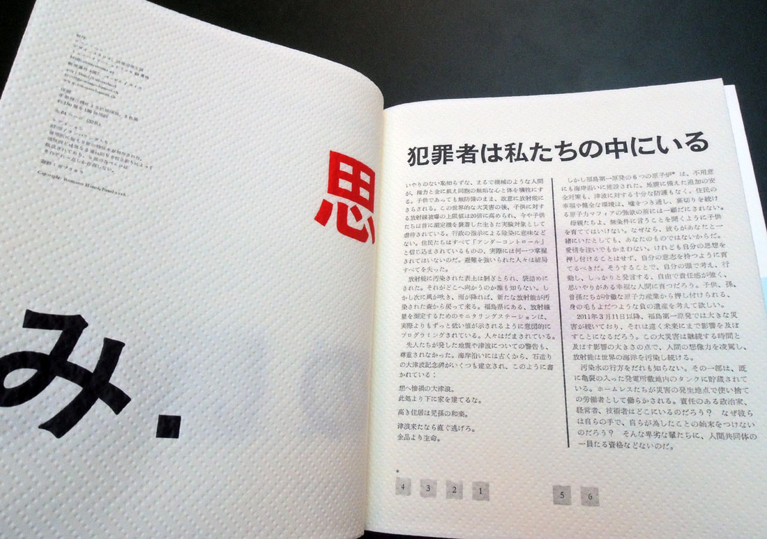
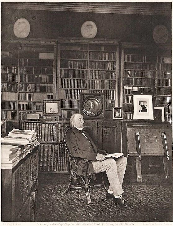
Joseph Parkin Mayall (1839-1906), William Ewart Gladstone, 1883. Photogravure. Published in Artists at Home, edited by Frederick George Stephens (London: Sampson Low, Marston, Searle and Rivington, 1884). Graphic Arts Collection GAX Oversize 2007-0028F

Joe Mayall was forty-three when he left work in the family business established by his father, daguerreotypist John Jabez Edwin Mayall (1813–1901), and opened his own photography studio at 548 Oxford Street, near the Marble Arch in 1882.

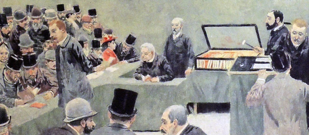
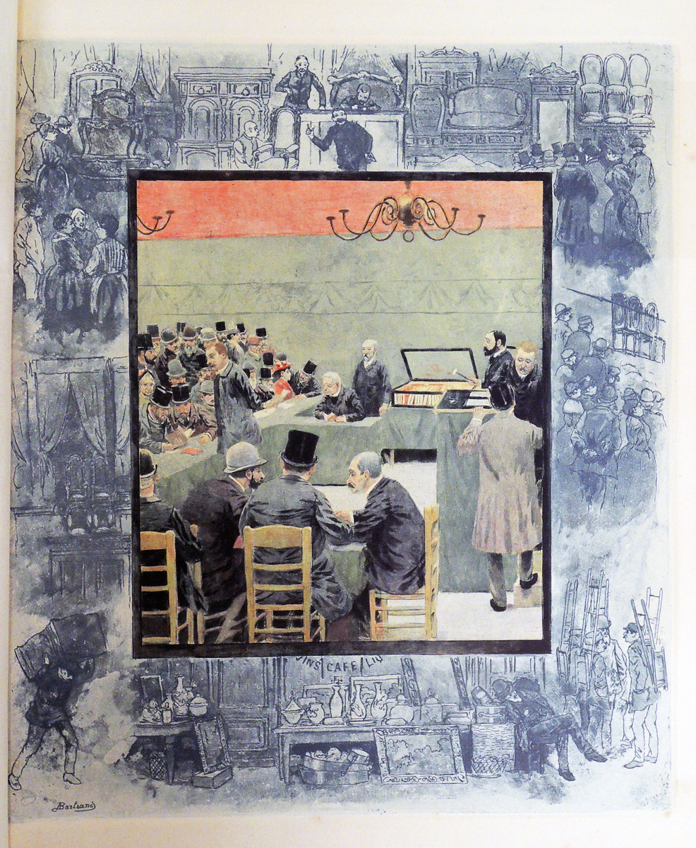
The following year, the firm Sampson Low, Marston, Searle, and Rivington proposed a series of luxury prints depicting prominent artists of the day in their homes, surrounded by their work. Equal weight was to be given to the men and the interiors, featuring “pictures, sculptures, and other objects of art which characterise those places,” according to the prospectus. Since Sampson Low had already retired from the firm, credit for the project might go to Edward Marston (1825-1914), who continued to publish luxury volumes.

Art critic George Stephens (1828-1907) was hired to write the biographies and Mayall secured the commission to make the portraits. Forty-eight men were photographed but only twenty-five appear in the final publication, issued monthly from March to August 1884. Each part cost five shillings, with the final bound volume priced at 42 shillings (£2.40). Mayall’s assistant Frank Dudman (1855-1918) filed his own name to the copyright on many of the negatives.

From the beginning, the portraits were planned as photogravures, advertised in the prospectus as the “entirely new and unquestionably permanent process of photoengraving.” When the book was later reviewed, it was called a “marvels of skill and workmanship.” Thanks to the exhibition at Emery College, we learn that “the first set of photogravures was printed in Paris, but something went awry with one of the plates, and although the March 1st publication date had been confidently announced for weeks, that initial installment was embarrassingly delayed.” Chiswick Press printed the rest of the volume but there is no information on the engraver who made and printed of the plates.

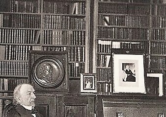
The book is dedicated to Frederic Leighton (1830-1896) [below] but he was pushed aside at the last minute to feature Prime Minister William Ewart Gladstone (1809-1898) as the frontispiece. Although not a painter, he was an Honorary Professor of Ancient History at the Royal Academy. Photographed in his library at Hawarden Castle, Gladstone later became the subject of an article Mayall published describing the two days spent photographing; “Mr. Gladstone at Home. The Whole-Hearted Homage of a Hero-Worshipper,” Pall Mall Gazette no. 7600 (July 27, 1889).

“I packed up my apparatus and started off with my assistant on January 15, 1883, by the 5:15 A.M. train, from Euston. We arrived at Broughton Hall in due course, distant about two miles from Hawarden Castle, which was visible from the railway station. We drove over in a trap. The day was dull and unpromising for photography.”

“Now came the technical and other difficulties to be surmounted in taking a photograph of Mr. Gladstone in his sitting-room [known as the] ‘Temple of Peace.’ . . . Mrs. Gladstone suggested to me that if I found the books in the way they could be removed. I said, ‘No! madam, don’t touch them. I am somewhat of a bookworm myself, and am jealous of any one disturbing my books. I will bring that much-treasured bookcase in view when I photograph Mr. Gladstone,’ which I afterwards did.”

“…All the preparations being made and ready, the camera in site, double slides charged, and a good solid head-rest placed behind the chair, Mr. Gladstone was seated and I exposed the plate 120 seconds. Mrs. Gladstone and her son, who were in the library at the time, thought that I had exposed the plate five minutes, the time seemed so long. I said no, I had counted 120 long seconds, so Mr. Gladstone very good naturedly said, “Photographic seconds,” which I explained must be lengthened out if possible, as every photographer dreads under- exposure.”

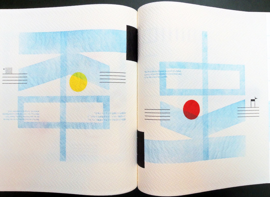
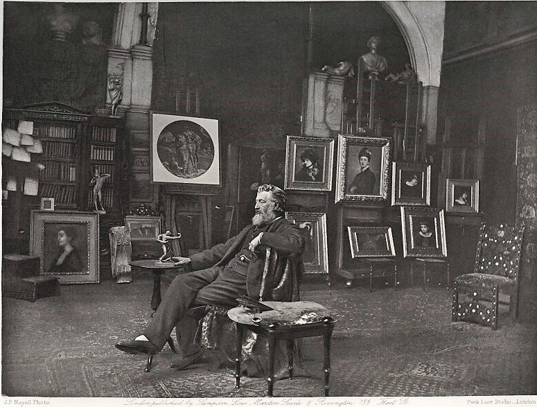
Joseph Parkin Mayall (1839-1906), Frederic Leighton, Baron Leighton, ca. 1883. Photogravure. Published in Artists at Home, edited by Frederick George Stephens (London: Sampson Low, Marston, Searle and Rivington, 1884). Graphic Arts Collection GAX Oversize 2007-0028F

Joel Shapiro and Hart Crane

In 1916, Hamilton Easter Field (1872-1922) expanded the Ardsley School of Graphic Arts to include three buildings, 106-110 Columbia Heights, at the base of the Brooklyn Bridge. Many artists and writers were invited to stay with the Fields over the years and even when Hamilton died suddenly in 1922, many of the rooms continued to be used for temporary housing. Hart Crane (1899-1932) stayed there in the 1920s and was inspired by his view of the bridge. The rest is history. https://graphicarts.princeton.edu/2017/01/16/ardsley-studios/

Now eighty-seven years after Crane’s poem “The Bridge” was first published, Arion Press released a new edition with seven woodblock prints by sculptor Joel Shapiro. The Graphic Arts Collection received its copy today. It is an ambitious and innovative project, so I will quote from their prospectus, which can be read in full here: http://www.arionpress.com/catalog/images/110/Bridge-Prospectus.pdf

The edition also includes a specially commissioned essay on the poem by Langdon Hammer, Niel Gray, Jr. Professor of English & Department Chair, Yale University, in a separate bound volume. An article adapted from this essay can be read in The New York Review of Books: http://www.nybooks.com/daily/2017/11/24/hart-cranes-view-from-the-bridge/

The publisher, Andrew Hoyem, conceived of a scroll format for “The Bridge” while he and senior editor Diana Ketcham were on a two-week tour of China in April 2017 organized by the Grolier Club, an association of bibliophiles in New York City. The theme of the trip was the history of paper, type, printing, binding, and the collecting of books, both private and institutional, in China.

During the first week they visited the Red Star Paper Company in Wuxi, Anhui Province. The Chinese government has recently sought to revive and support traditional crafts. Red Star is the fore-most producer of handmade paper in the nation, using ancient methods and many plant fibers in exacting proportions to make sheets of beautiful thin paper, used mainly for calligraphy and ink and watercolor painting.

In Beijing they visited the most important book collector in China, who showed them an unmounted scroll from the eighth century. Hoyem was inspired to order handmade paper from the mill and to make “The Bridge” in a single-spool scroll format. The book is 13½ inches tall and over 50 feet long, made up of joined sheets measuring 13½ by 25 inches.

Our book is no. 117 of 300. It is interesting to note that Hoyem handset the long poem himself because typesetters on staff were busy with other projects.

“The type he chose is French Elzevir, 16-point for the text, 24-point for titles, and 10-point for subsidiary material. It is based on a modernized French oldstyle, cast by American Typefounders in the early twentieth century, purchased by the San Francisco printer John Henry Nash as new, and then acquired by the Grabhorn Press in the 1930s when Nash went out of business, then inherited by Hoyem in 1973.”

Hart Crane (1899-1923), The Bridge. Woodblock prints by Joel Shapiro, essay by Langdon Hammer, photographs by Michael Kenna (San Francisco: The Arion Press, 2017). “Scroll format, 13-1/2″ x 50′, set by hand and printed by letterpress in black on handmade Chinese paper, with 7 images bound in, presented in a box along with a separate volume containing the introduction.”–Publisher’s website. Graphic Arts Collection GAX 2017- in process

Es ist bitter, die Heimat zu verlassen

Romano Hänni, Es ist bitter, die Heimat zu verlassen [It is Bitter to Leave Your Home] (Basel: Hänni, 2017). Number 21 of 87 copies of the standard edition. Text in German, English, and Japanese. Graphic Arts Collection GAX 2017- in process


Swiss artist Romano Hänni has spoken passionately about the devastating effects of contamination from nuclear facilities. His new book Es is bitter die Heimat zu verlassen concerns the disaster at Japan’s Fukushima Daiichi nuclear power plant that occurred on March 11, 2011, as well as the ongoing impact of radioactive contamination.

Hänni writes that claims made by nuclear scientists “that no health consequences are to be expected from contamination are unscientific, immoral, and criminal.” He further states that “there is no peaceful use for nuclear energy. It is repressive, criminal and deadly. Only nuclear plants that have not been built can offer absolutely safety.”

His newest book is printed in five colors on paper towels, a technique the artist perfected with an earlier work: Typo bilder buch: von Hand gesetzt und auf der Handabziehpress gedruckt. Graphic Arts RCPXG-7350409. Small selections of text are juxtaposed with letters, images, and symbols to communicate the event and its aftermath. 

The artist writes “Work on this book began in December 2013, was interrupted by some commissioned work, and lasted until June 2017. The page format was determined by the paper: paper towels, maxi roll . . . The printing forms were composed from individual parts and printed on the hand proofing press. The Japanese text was [cast] and composed in the type foundry Sasaki Katsuji in Tokyo and delivered to Basel. For most of the pages several printing forms and printing runs are needed. The body of the book was bound by hand with thread. Overall production time was approximately 1400 hours.”

http://www.romano-haenni.ch/assets/21_it_is_bitter_to_leave_your_home_standard-edition-2017.pdf

Minnesota Center for the Book: “Educated at the Basel School of Design, [Romano] Hänni returns to the core values of traditional printing technique and modernist European design. The strict limitations of hand typesetting are his cornerstone, everything composed from the incremental units of type and spacing available in the type shop. Hänni’s work encompasses a wide range of fields in visual communication, from books, magazines, catalogs and newspapers to drawings, photography and journalism about design and everyday culture.”


The book is accompanied by a glossy 12-page color pamphlet with 108 photographs documenting the production process for this publication.


Birds from Byzantium


Peter Lyssiotis, Birds from Byzantium = Pouliá tou Vyzantíou (Melbourne, Vic.: Masterthief, 2010). Text was written in 2009 at the Monastery of Mavrovouni in the Larnaca district of Cyprus. Greek translation by Andreas Psilides and Lefteris Olympios. Images by Peter Lyssiotis. Binding by Wayne Stock. Copy 17 of 18. Graphic Arts Collection GAX 2017- in process

The artist writes “Birds from Byzantium has been made in an edition of [18] and has been printed duotone on Mohawk Superfine paper. The text has been set in columns, justified to both left and right with no regard to word breaks as this was one of the design elements of the earliest hand scripted Bibles. Sure it makes the text difficult to read but it also traps the eye and gives a nod to tradition.

The images are collages. As a backdrop they have a Bible commentary in Greek. The collages have been made so the text has a place to rest. On some pages there are drawings in ink by Lefteris Olympios. The binding is by Wayne Stock and has used aspects of Byzantine book design and place them in a contemporary setting: for example, the use of circles, the X, the use of gold, the [choice] of burgundy for the colour of the cloth and the bands on the spine.”

Peter Lyssiotis: http://www.australianphotographers.org/artists/peter-lyssiotis


See also:
Leonie Sandercock, Cosmopolis II: mongrel cities in the 21st century. Images by Peter Lyssiotis (London; New York : Continuum, 2003). Firestone Library (F) HT166 .S219 2003

Silent scream: political and social comment in books by artists: an exhibition, 26th September-26th November 2011, Monash University Rare Books Library within the Sir Louis Matheson Library curated and catalogue commentaries by Monica Oppen and Peter Lyssiotis (Sydney, Australia: Bibliotheca Librorum apud Artificem; Melbourne: Monash University Rare Books Library, 2011). Marquand Library (SA) N7433.3 .S545 2011

Greek Poetry

The Graphic Arts Collection recently acquired a number of fine press editions of Greek poetry, thanks to matching funds provided by the Program in Hellenic Studies with the support of the Stanley J. Seeger Hellenic Fund. Thank you to Dimitri H. Gondicas, Executive Director, Program in Hellenic Studies. Lecturer in Classics and Hellenic Studies. Stanley J. Seeger ’52 Director, Center for Hellenic Studies; and to David T. Jenkins, Librarian for Classics, Hellenic Studies and Linguistics.

Here are two:

Giannēs Ritsos (1909-1990), Persephone; English translation by Nikos Stangos; with two woodcuts by Joe Tilson = Persephonē / Giannēs Ritsos ; me dyo xylographies toy Tzo Tilson (Verona: Edizioni Ampersand, 1990). Printed on a 1854 Stanhope handpress by Alessandro Zanella (1955-2012). Graphic Arts in process


Constantine Cavafy (1863-1933), The Splendour of a Morning: Early Poems of C.P. Cavafy = Hē ena prōi tēs pheggero : proima poiēmata tou K.P. Kavaphē; translated from the Greek by David Smulders; Greek text edited by Anthony Hirst; with five wood engravings by Peter Lazarov (Mission, British Columbia: Barbarian Press, MMXVI [2016]). “Greek text reprinted … from The Collected Poems with parallel Greek text … edited by Anthony Hirst (Oxford University Press, 2007)”–Title page verso. Graphic Arts in process


There is limited information on the printmaker Peter Lazarov and so, I’m including this terrific article from the magazine of the Fine Press Book Association: Willem Keizer, “Peter Lazarov and his Pepel Press,” in Parenthesis no.12 (November 2006). Preservation Z119 .P373

A (new) Modest Proposal


Jonathan Swift, Gerald Scarfe, and Fintan O’Toole, A Modest Proposal, 2017. Graphic Arts Collection GAX 2017- in process


To celebrate the 350th anniversary of the birth of Jonathan Swift (1667-1745), Stoney Road Press has published a limited, boxed edition of the satirical essay A Modest Proposal, illustrated with three etchings by satirical cartoonist Gerald Scarfe and an introduction by Fintan O’Toole, The Irish Times literary editor and Princeton University Visiting Lecturer in Theater; Acting Chair, Fund for Irish Studies (Spring 2018).

A launch party was held June 17 at the Dalkey Book Festival, hosted by O’Toole, His remarks were followed by a reading of Swift’s essay by actor Nick Dunning.

It was noted that  Dunning got further than Peter O’Toole did in 1984. As Fintan O’Toole wrote, “When the Gaiety Theatre held a gala performance to mark its reopening after refurbishment, Peter O’Toole was invited to do the opening turn. Presumably, the expectation was that he would do a bit of Shakespeare, perhaps, or a Yeats poem. He decided to read, slowly and deliberately, Jonathan Swift’s A Modest Proposal, with its suggestion that the children of the Irish poor be sold as food for their landlords, ‘who, as they have already devoured most of the parents, seem to have the best title to the children.’ Some members of the dress-suited audience began to heckle; others walked out. RTÉ, which was broadcasting the show live, cut O’Toole off in the middle of the reading and went to an ad break.“ –Fintan O’Toole, “The Genius of Creative Destruction,” New York Review of Books, December 19, 2013


Jonathan Swift (1667-1745), A Modest Proposal for Preventing the Children of Poor People from being a Burthen to Their Parents or the Country: and for Making Them Beneficial to the Publick ([London]: Dublin, printed, and reprinted at London, for Weaver Bickerton, in Devereux-Court near the Middle-Temple, 1730). Rare Books (RB) RHT 18th-587


“In the large body of stories about him in the collections of the Irish Folklore Commission,” O’Toole continued, “Swift is almost always ‘the Dean’ or, in popular pronunciation, ‘the Dane’. The name shows immediate awareness that he was a high functionary of the established, Protestant, Church of Ireland—an institution unpopular with the oppressed Catholic majority. Yet he transcends these sectarian divisions. He was revered by middle-class Protestants, who named inns and ships after him and built bonfires to celebrate his birthday. Catholics, meanwhile, attached to ‘the Dean’ many of the common trickster stories that circulated around Europe. Swift and his servant, usually called Jack, form a comic double act.”

Five Dials

http://dataspace.princeton.edu/jspui/handle/88435/dsp01zp38wg21x

Hamish Hamilton is one of London’s oldest publishing houses, founded by Jamie Hamilton in 1931. Home to authors such as J.D. Salinger, Jean-Paul Sartre, Albert Camus, W.G. Sebald and Truman Capote, their aim remains to publish the very best literary writers from around the world, from Alain de Botton to Zadie Smith.

They also publish the online literary magazine Five Dials, available directly to your email free of charge. To make the publication searchable and easily available to our students, the dspace (read digital) team and especially Kim Leaman, Special Collections Assistant V, is uploading the run into our catalogue. You can also use the permanent URL:
http://arks.princeton.edu/ark:/88435/dsp010z709004v

Literary magazine is named after the old red-light area Five Dials in London—-notably the area Hamish Hamilton’s offices on 80 Strand overlook. In his Letter from the Editor, Craig Taylor writes “we’re hoping Five Dials will be a repository for the new, a chance to focus on ideas that might not work elsewhere, a place to witness writers testing new muscles, producing essays, extracts and unexplainables.” –Five Dials, no. 1, http://fivedials.com/

Each issue has a separate title and theme, such as no. 30: A Stranger Again (The Camus Issue) or no. 10, Celebrating the life and work of David Foster Wallace 1962-2008. The upload should be complete next week.

The Kalevala

The Graphic Arts Collection recently acquired a small volume that probably should have been on our shelves many years earlier. First published in 1835, the Kalevala is complete in 22,795 verses, divided into fifty songs of Finnish folklore, compiled thanks to Elias Lönnrot (1802-1884).

This contemporary presentation of one section was printed in 1992 by the Maine artist David C. Wolfe, “arranged for oral presentation” by Anne Witten. The book has only 15 pages but they are beautifully printed letterpress with original woodcuts by Wolfe, bound in handmade cream and brown Lokta paper over boards.

This project was published at Wolfe Editions in the Bakery Studios on Pleasant Street in Portland, Maine. The building is also home to White Dog Arts, Peregrine Press, Art House Picture Frames, and 16 studio spaces making it a center for artistic activity in the city.

Many fine press books in our collection were printed by Wolfe, through his association with Anthoensen Press, Shagbark Press, Stinehour Press, and finally Wolfe Editions. Wolfe teaches letterpress printing from his own studio and the Haystack Mountain School of Crafts, an international craft school located in Deer Isle, Maine.

The Kalevala: a Creation Myth ([Portland, Maine]: David Wolfe, 1992). Copy 12 of 25. Graphic Arts Collection GAX 2017- in process

http://wolfeeditions.com/

22 Kupferstiche

Born in 1943, the Germany printmaker Baldwin Zettl studied from 1964 to 1969 at the Hochschule für Grafik und Buchkunst Leipzig (The Academy of Fine Arts Leipzig), one of the oldest art colleges in Germany.

Zettl’s limited edition portfolio of engravings inspired by Richard Wagner’s Ring cycle was recently moved from the Mendel Music Library to the Graphic Arts Collection. This, as with most of Zettl’s work, is designed entirely in black and white.

Richard Wagner (1813-1883), Richard Wagner, Der Ring des Nibelungen: 22 Originalkupferstiche; mit einem Text des Künstlers und einem Geleitwort von Wolfgang Wagner (Leipzig: Sisyphos-Presse, 2001). Limited edition of 100 copies, printed at Elmar Faber’s Sisyphos Press in Leipzig. Graphic Arts Collection GAX 2017- in process


See Zettl’s work also in: Volker Braun (1939- ), Das Mittagsmahl; mit Kupferstichen von Baldwin Zettl (Frankfurt am Main: Insel Verlag, 2007). Firestone Library (F) PT2662.R34 .M58 2007

Walks in Paris, 1894

The Graphic Arts Collection recently acquired this lovely fin de siècle volume with color ornamentation by Alexandre Lunois (1863-1916), a lithographic framing of floral motifs on each page, a cover by Eugène Delâtre (1864-1938), and four etchings in colors by Albert Bertrand (born ca. 1855). It is one of only 180 copies, all on tinted vellum, and printed for the Société des bibliophiles contemporains, led by Octave Uzanne.

-in Luxembourg Gardens
-in Hôtel Drouot

Note this rare look at a 19th-century book auction at the Hôtel Drouot. This might be the 1894 sale of rare and precious books, manuscripts, and printed matter from the library of the late Raoul Leonor Lignerolles (1817-1893).

Established on June 1, 1852, Hôtel Drouot, 9, rue Drouot, is one of the oldest organizations for public auction house sales. Known for fine art, antiques, and antiquities, the Hôtel Drouot consists of 16 halls hosting 70 independent firms, which operate under the umbrella grouping of Drouot. The firm’s main location, called Drouot-Richelieu, is on a site once occupied by the Paris Opera’s Salle Le Peletier.


-At the nightclub, Moulin de la Galette


Balades dans Paris (Walks in Paris)
: Au Moulin de la Galette–À l’hotel Drouot–Sur les quais–Au Luxembourg. Texts by Paul Eudel (1837-1911), Bernard Henri Gausseron (1845-1913), and Adolphe Retté (1863-1930). (Paris: Academie des beaux-livres, Imprimé pour les “Bibliophiles contemporains”, 1894) Decorative borders. The plates consist of colored and black-and-white states of 4 illustrations. Graphic Arts Collection GAX 2017- in process