Category Archives: Books

books

A Tragic Almanac

tragic2

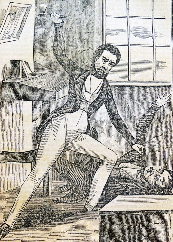
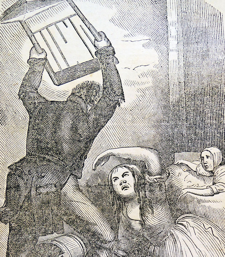
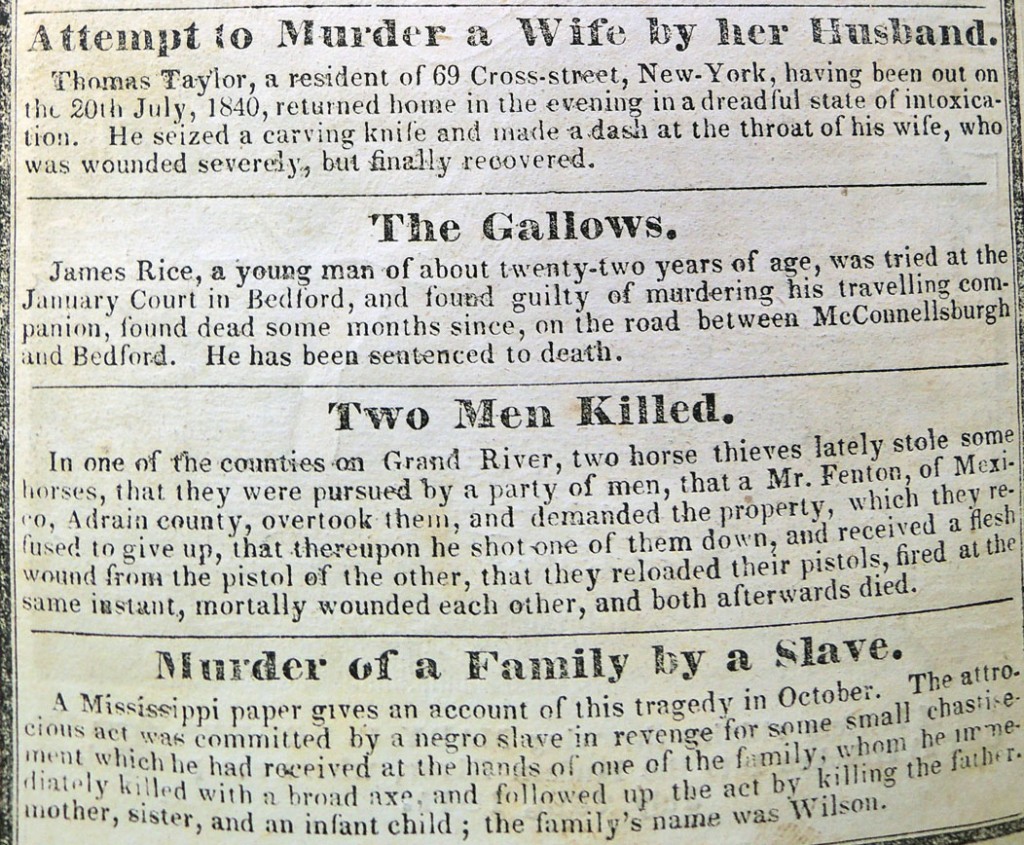
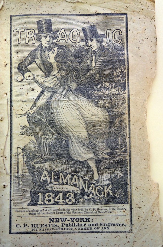
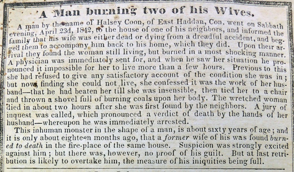
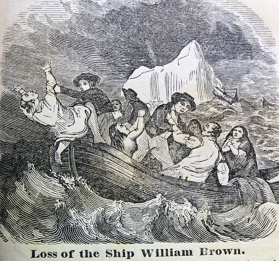
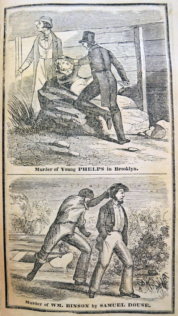
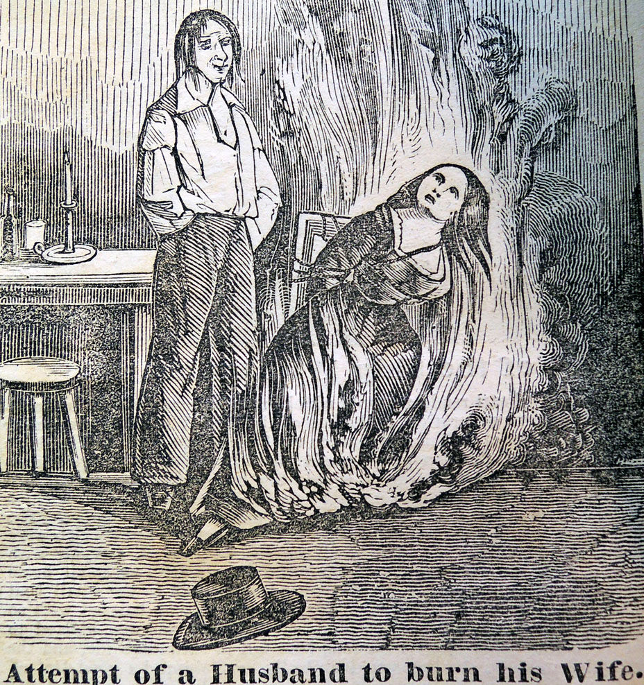
tragic1In the 1840s, a unique genre originated in lower Manhattan known as the tragic almanac. Meant as a complement to the popular comic almanacs, the tragic annuals offered stories of murders, shipwrecks, disasters, fires, and various other events of death and destruction. Surprisingly, they did not sell well and were soon discontinued.

It was Robert Henry Elton (1806-1850?) who may have been the first engraver and publisher of a comic almanac in New York City. The Graphic Arts Collection holds Elton’s Comic All-My-Nack, 1838 ([New York]: Elton & Harrison 134 Division 68 Chatham Sts. New York., [c1837?]). Graphic Arts Off-Site Storage RCPXG-6866954.
tragic8

Elton eventually moved to 90 Nassau in late 1830s, continuing to produce a variety of almanacs and in the early 1840s, his competitor, engraver Charles P. Huestis, opened a shop at 104 Nassau just across of Ann Street from Elton’s firm. Huestis also published comic publications but had the idea to fill the public’s interest in the opposite side of the market.

tragic7

In 1842, Huestis published The Tragic Almanac from the offices of the New York Sun at the corner of Nassau and Fulton, later publishing from his own shop a few doors away. The issues include a number of lurid wood engravings depicting scenes of horrible murders. Graphic Arts Collection holds an issue for 1843 (Hamilton SS 557). It is unclear whether this lasted more than two issues.

Thanks to Richard West’s biography of Thomas W. Strong (1817-1892) we know that Strong worked for Elton as a teenager (Ephemera News, summer 2009) through 1840, when Elton merged his firm with John McLoughlin to form Elton and Company.
tragic6

When Strong left Elton to established his own shop at 98 Nassau Street, he decided to publish a tragic almanac, continuing the series begun the year before by Huestis. Strong’s annuals lasted until 1850. Unfortunately, Princeton doesn’t yet hold any of Strong’s rare tragic almanacs.
tragic3The Graphic Arts Collection does hold many comic editions, including Boy’s Own Book of Fun / with two hundred engravings by Old Comic Elton (New York : T. W. Strong, 1847). Graphic Arts Collection (GAX) Hamilton 1005s; The Crystal Palace Comic Almanac, 1854 (New York : T.W. Strong, [1853?]). Graphic Arts Collection (GAX) Hamilton 1835; and Young America’s Comic Almanac for … (New York : T.W. Strong, 1855). Graphic Arts Collection (GAX) Oversize Hamilton 1842q.

tragic5


tragic4

Illustrated with 72 original watercolors by Blanche Odin

lemaitre11
lemaitre14
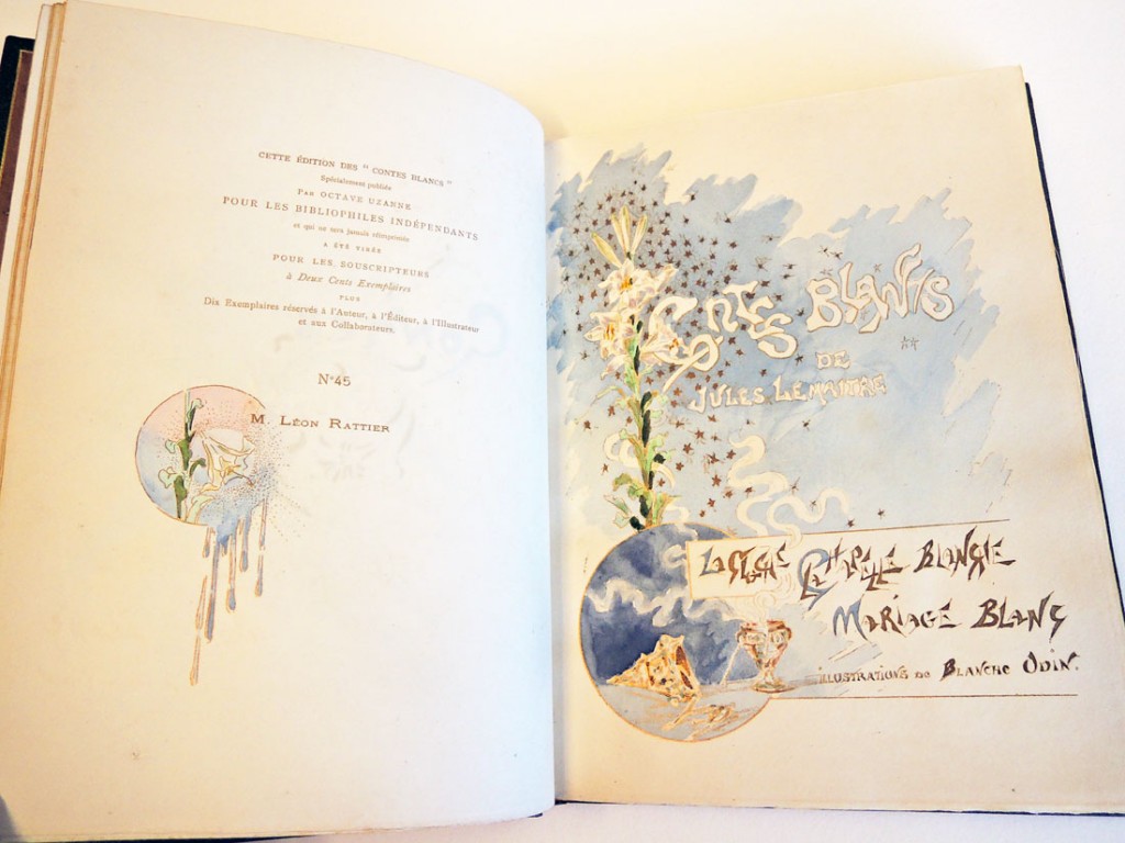
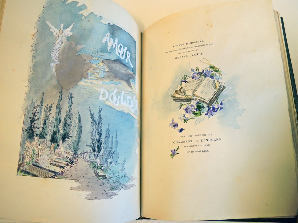
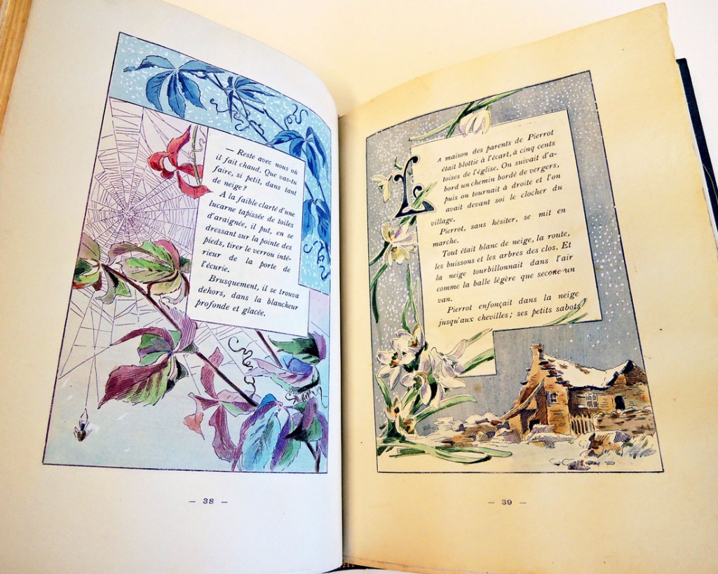
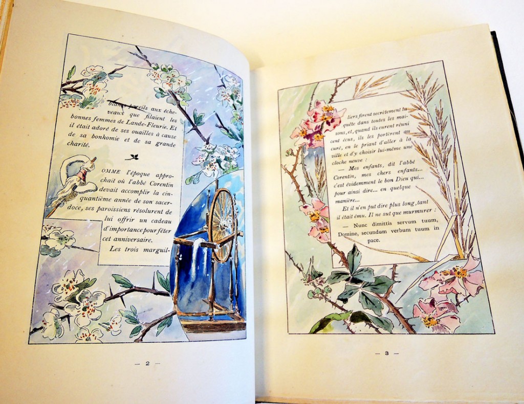
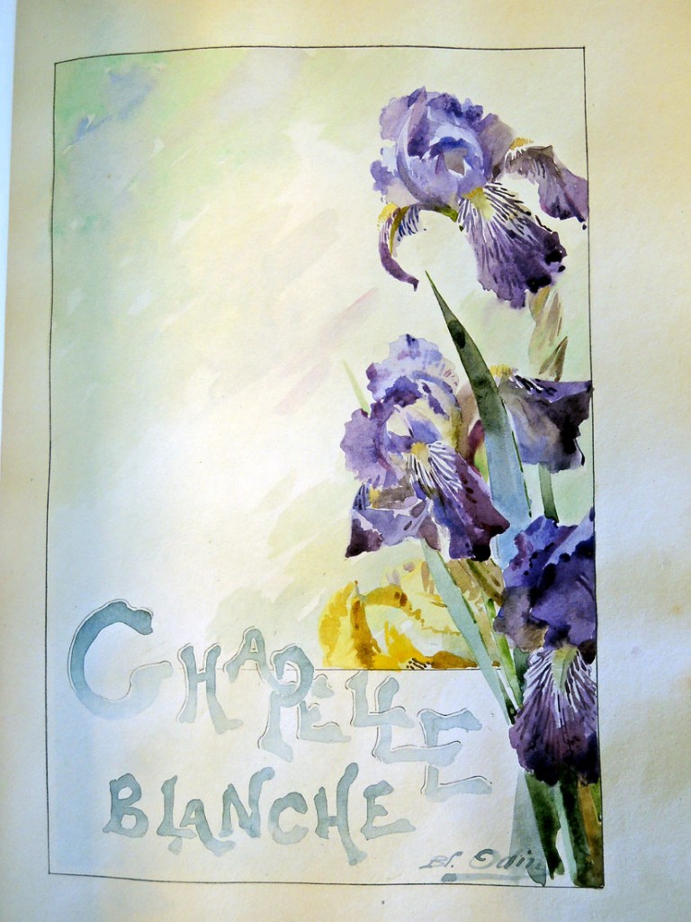
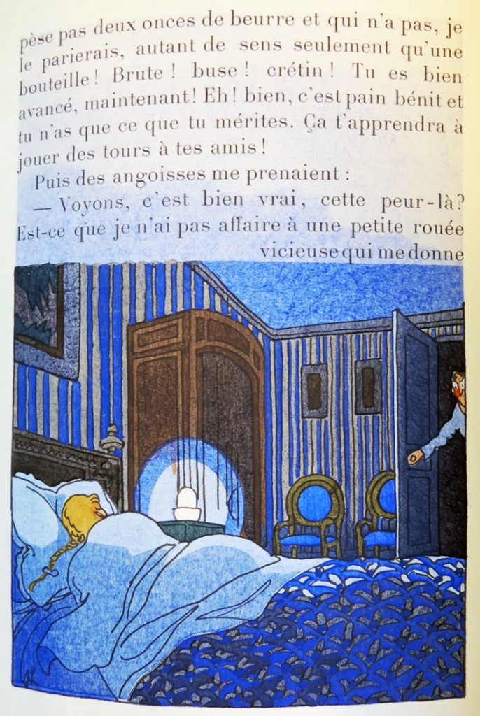
Jules Lemaître (1853-1914), Contes blancs, illus. à l’aquarelle de Mlle. Blanche Odin (Paris: A. Durel, 1900). With an extra suite of uncolored illustrations. Copy no. 45 of 210 copies, for Leon Rattier, with his name printed below the limitation statement and his leather bookplate. Graphic Arts collection GAX in process
lemaitre13
lemaitre12
Lemaître’s short stories are illustrated with 72 original watercolors by Blanche Odin (1865-1957). In his prospectus for the book, Octave Uzanne writes:

“Ces Contes Blancs de Jules Lemaître au nombre de trois sont intitulés : La Cloche, la Chapelle blanche et Mariage blanc. Ce sont trois exquises et tendres petites nouvelles qui valent par leur grâce ingénue, par la douce pitié qui s’en dégage et par la saveur de style délicieusement simplifié qu’y employa le maître écrivain. Pour illustrer ces trois contes pleins de candeur, il fallait un talent naturel, instinctif éclos dans le recueillement, mûri par l’observation directe, un talent délicat et fleuri de jeune femme n’exprimant rien du chiqué des écoles, mais tirant tout son charme de l’étude consciencieuse de la nature. – Mlle Blanche Odin, une jeune artiste qui développa ses qualités innées de dessin dans les solitudes de la campagne, semblait désignée mieux que personne pour décorer page à page ces jolis contes de Jules Lemaître, pour interpréter et même paraphraser ces textes d’essentielle poésie.”

lemaitre15
[Jules Lemaitre’s Whites Tales are three in number, entitled: The Bell, the White Chapel and White Wedding. These are three exquisite and tender short stories that speak with ingenuous grace, through gentle pity that emerges with the master writer’s delightfully simplified style. To illustrate these three tales full of candor, he had a natural talent, instinctive hatched in recollection, matured by direct observation, a delicate flowery talented young woman expressing no false academics but drawing its charm from the conscientious study of nature. — Miss Blanche Odin, a young artist who developed here innate qualities of drawing in the solitude of the countryside, seemed better than anyone designated to decorate page to page these pretty tales of Jules Lemaitre, to interpret and even paraphrase these essential poetic texts.]

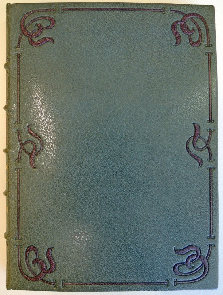
lemaitre1The volume is bound in a contemporary binding by Marius Michel (1821-1890), signed in gilt on front doublure, of gray goatskin, the covers with a border of onlaid strips of purple goatskin. The spine divided into six panels, lettered in gilt in the second and third, the others with onlaid strips of purple goatskin, light brown goatskin doublures tooled with a repeated impression of a gilt flower with gray goatskin onlaid petals, textured light blue silk endleaves, marbled paper flyleaves, original covers bound in.


Boubouroche Madelon Margot

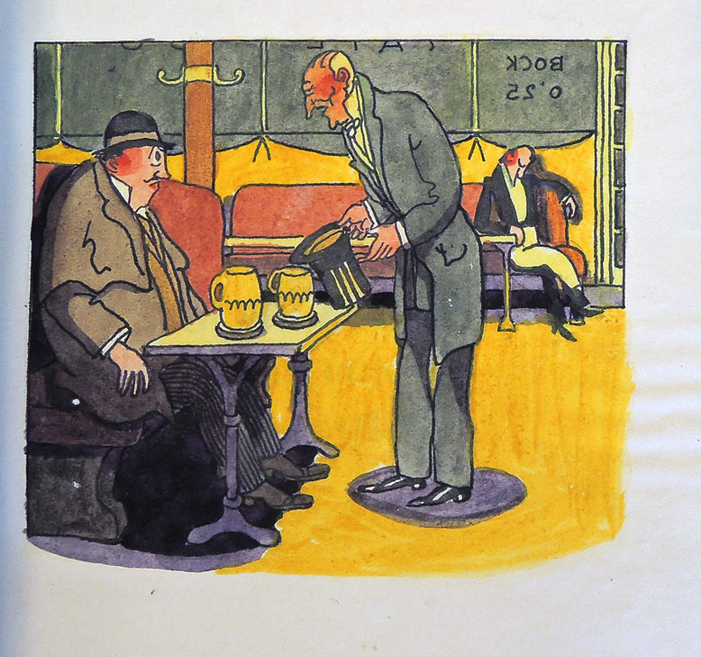
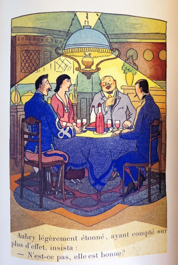
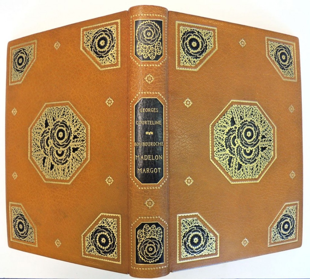
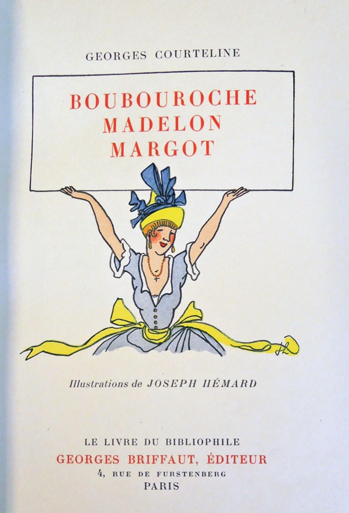
courteline4Georges Courteline (pseudonym for Georges Moinaux), Boubouroche Madelon Margot.  Pochoir and hand colored illustrations by Joseph Hémard (Paris: Georges Briffaut, [1927]). Copy no. 10 of 50. Graphic Arts Collection GAX in process

courteline3

courteline2

courteline1
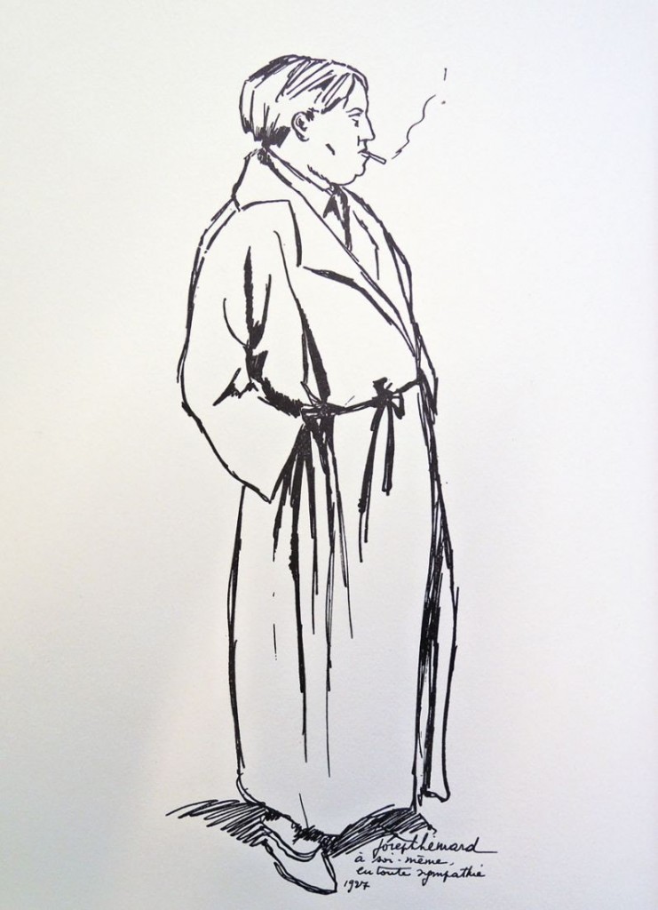
During the 1920s, the French artist Joseph Hémard (1880-1961) was in demand for his humorous book and magazine illustrations with bright pochoir color. He became so well-known that he published an autobiography in 1928, including a self-portrait as a frontispiece [see below. Joseph Hémard (1880-1961), Joseph Hémard (Paris: H. Babou, 1928). Graphic Arts Collection (GAX) NC248 .H44]
courteline5

In addition to Hémard’s plates, the Graphic Arts Collection’s new copy of Boubouroche Madelon Margot has a contemporary binding by René Kieffer (1875-1963). It is signed in gilt on the front turn-in and with his label in tan goatskin.

The covers have a black goatskin onlay in each corner and a larger octagonal onlay in the center blocked in gilt to a floral design and outlined in gilt with six gilt roundels around the sides.

A smooth spine is lettered in gilt on a black label at the center and a black onlay blocked in gilt at the head and foot and two gilt roundels. The turn-ins and matching inside joints are tooled with two gilt fillets and a quatrelobe, silver and black woven textile doublures and endleaves.
lemaitre8

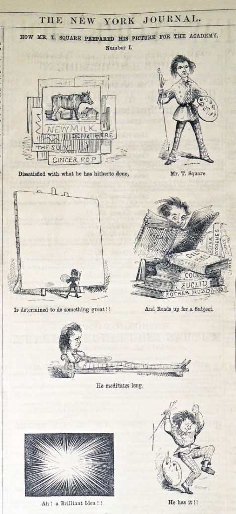
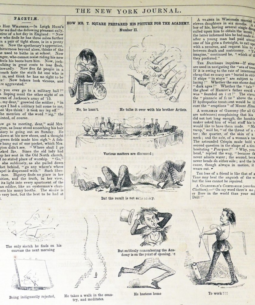
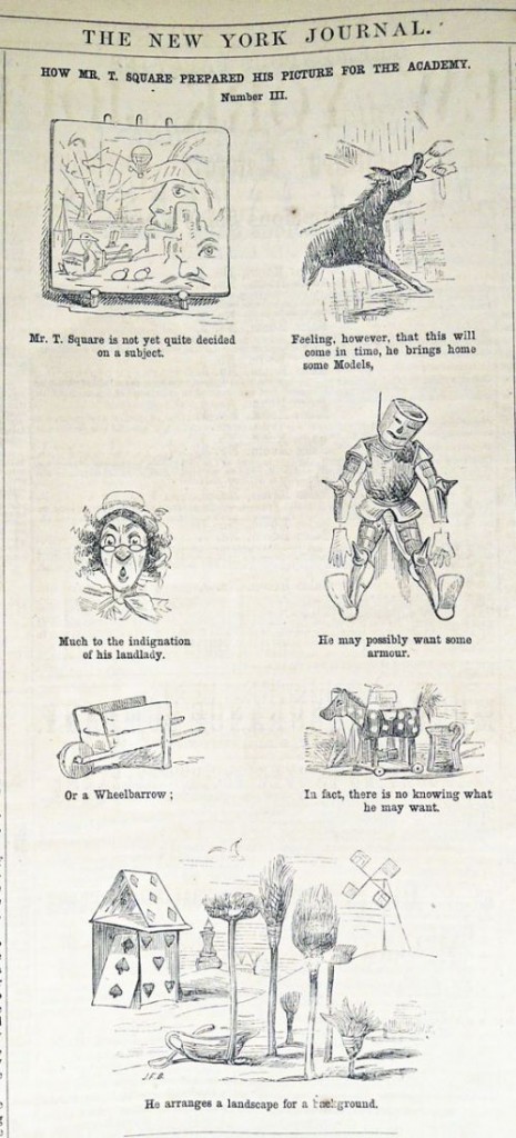
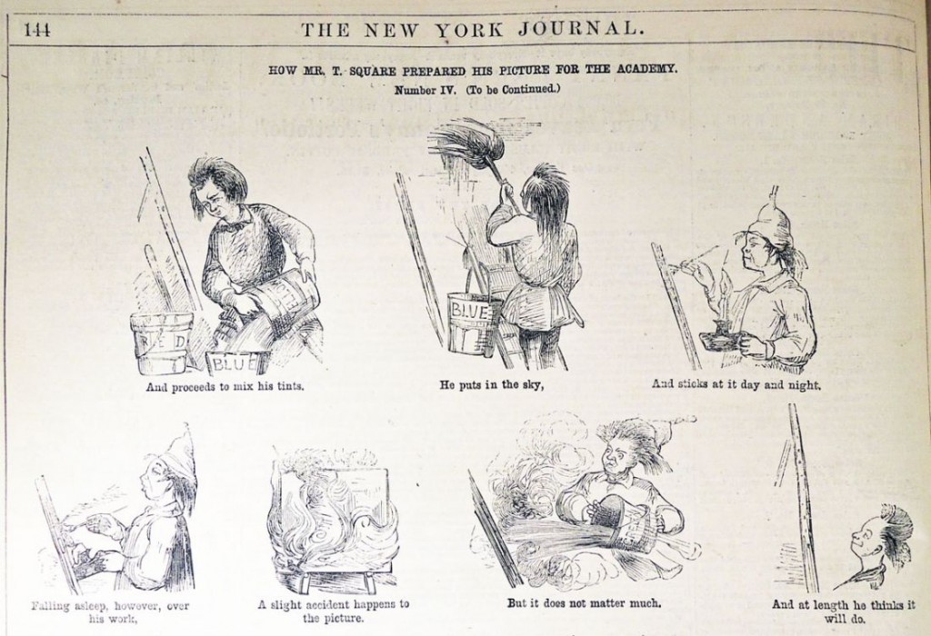
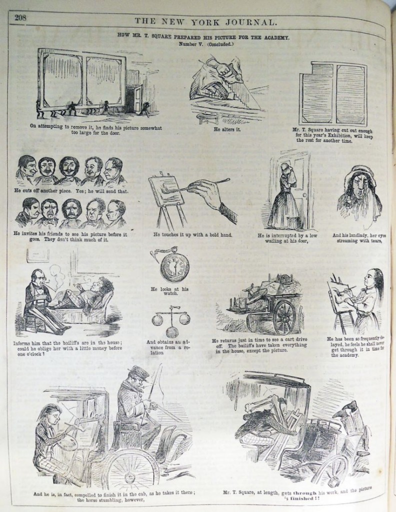
How Mr. T Square Prepared His Picture for the Academy

t square1

t square2

t square3

t square4

t square5a

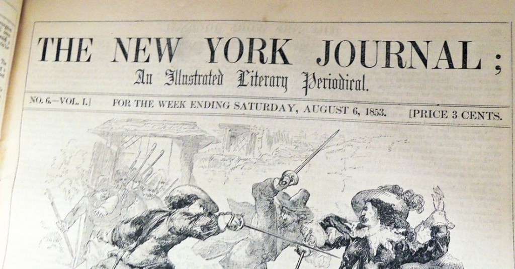
t squareAttributed to John McLenan (1827-1865), “How Mr. T Square Prepared His Picture for the Academy,” The New York Journal: An Illustrated Literary Periodical, Volume 1 (August-December 1853)


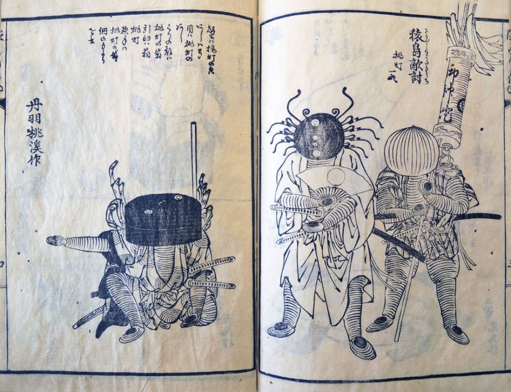
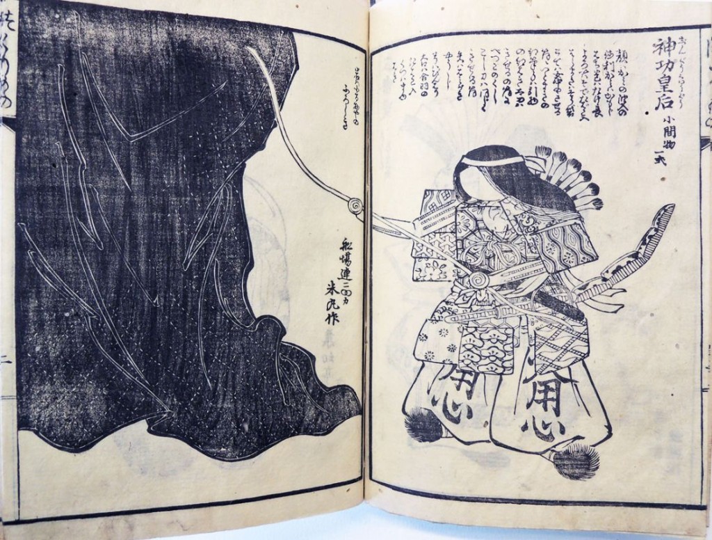
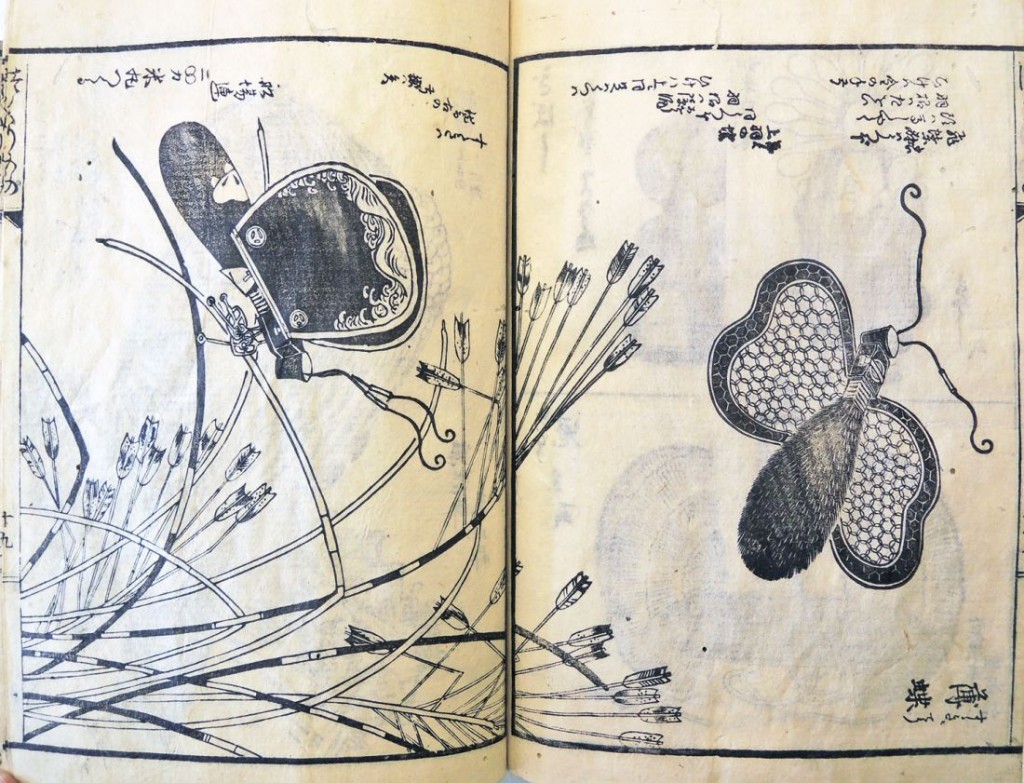
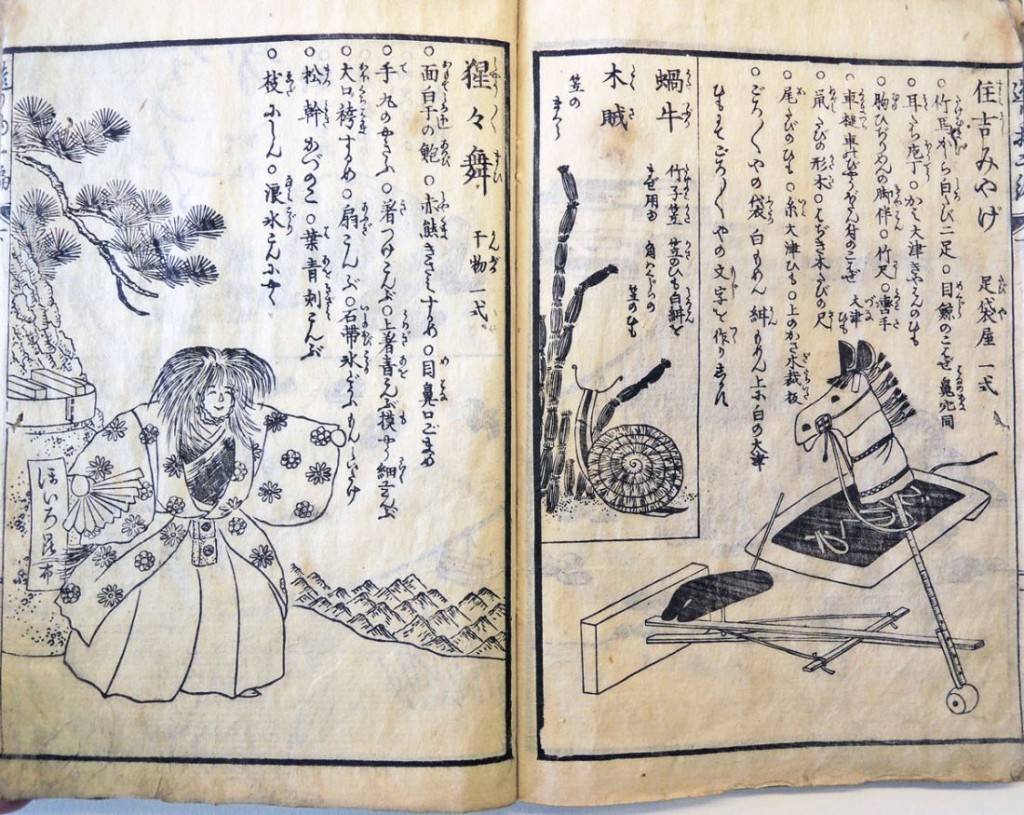
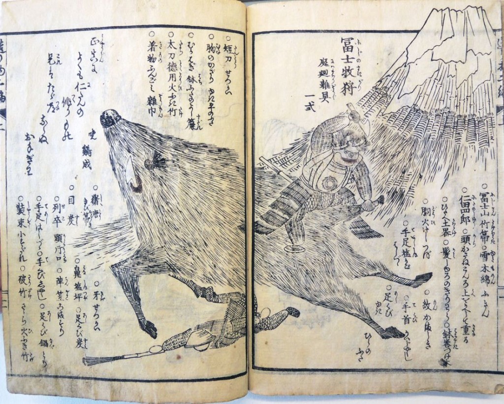
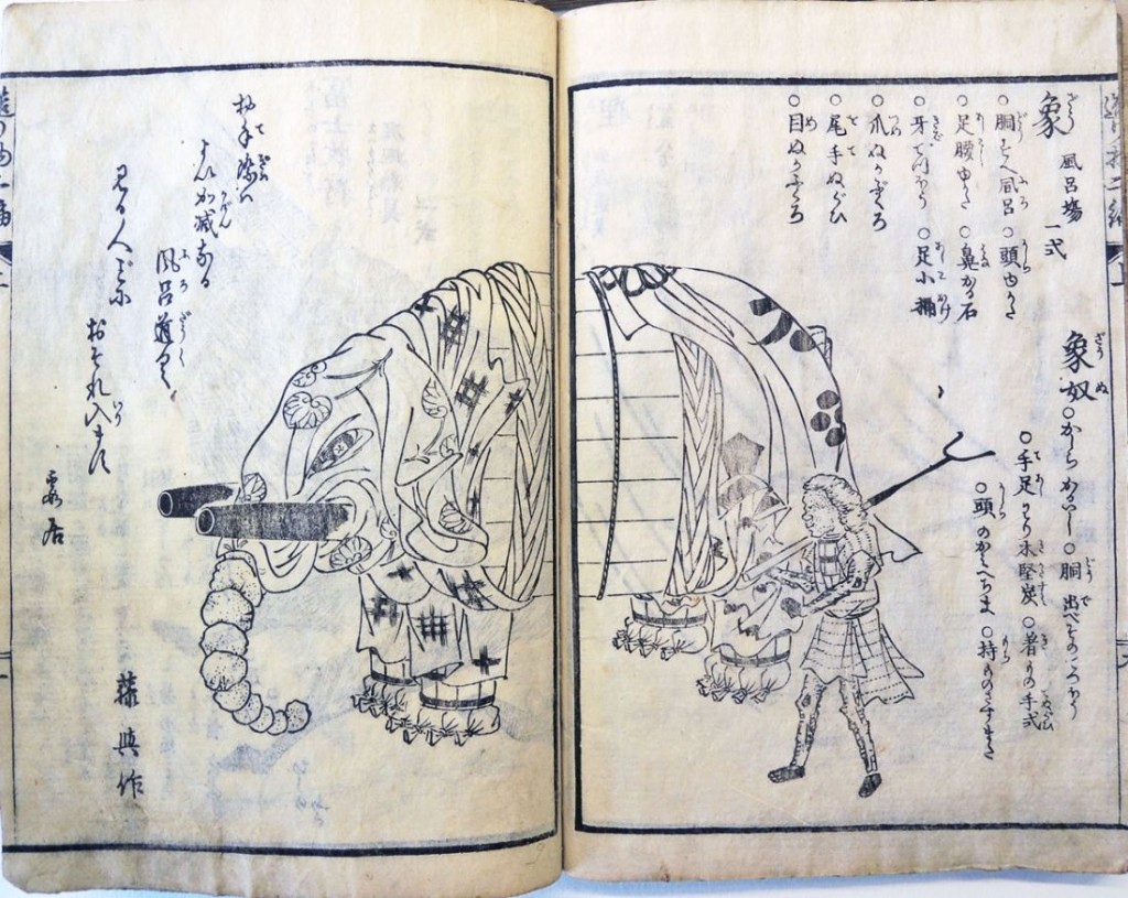
Tsukurimono shukō no tane

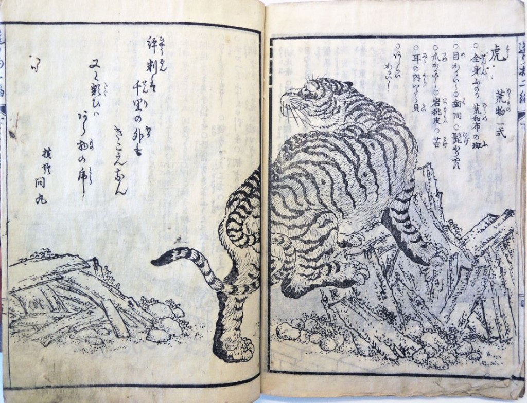
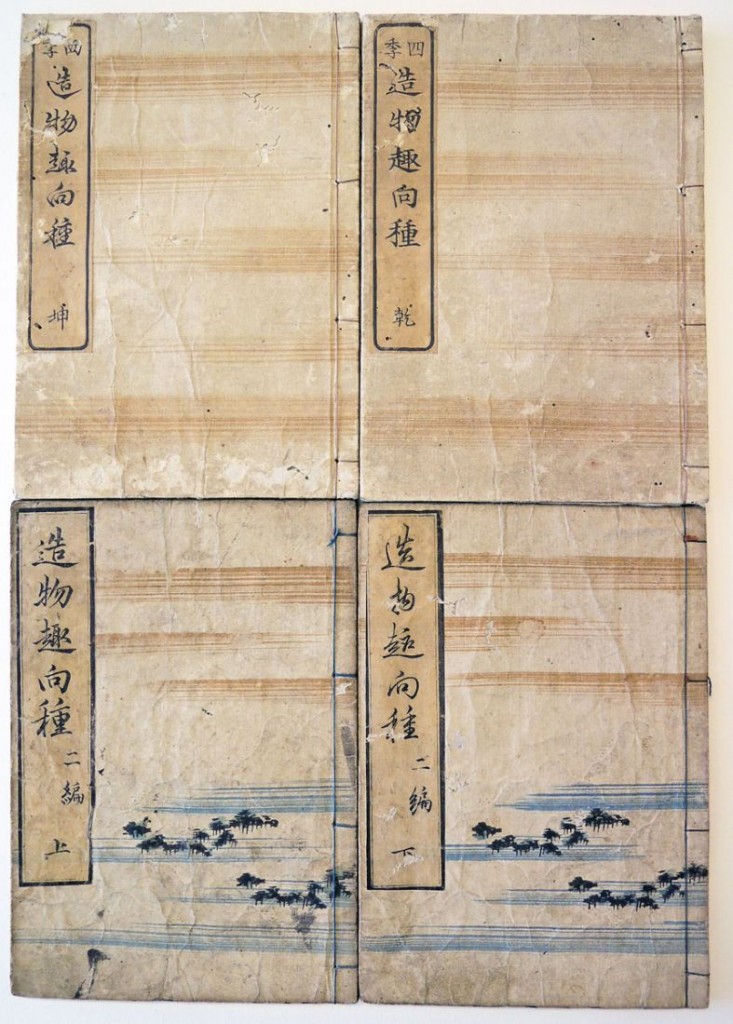
tsukurimono4Title: Tsukurimono shukō no tane
Authors: Kanenari Akatsuki, 1793 or 1794-1861 and Rikimaru Kirotei, active 1830s
Artist: Matsukawa Hanzan, 1818-1882
Period: Edo period (1615–1868) Osaka. 1837.
Set of two woodblock printed books in four parts
Graphic Arts Collection GAX in process

tsukurimono1

OCLC connects the Japanese illustrator Matsukawa Hanzan with 161 books, demonstrating the magnitude of this artist’s contribution to Ukiyo-e book publishing. This particular volume, however, is extremely rare and unusual among the artist’s work.

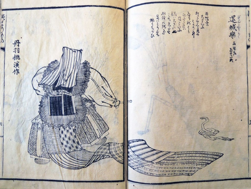
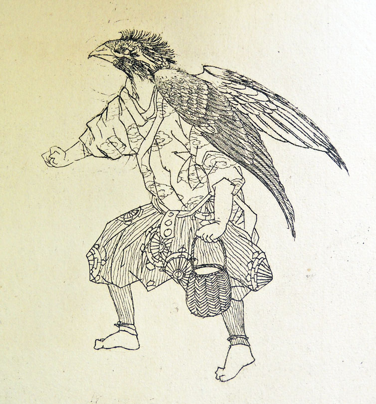
“Tsukurimono” is a type of folklore art of Japan which are made by ceramic, metal, vegetables or flowers. Matsukawa has created a variety of objects for theatrical props or other displays, but he does so by assembling mundane, everyday objects. Fish are built out of dried foods and an insect is made out of a broom and other cleaning tools. See if you can decipher not only the subject of the plate but also the materials that went into the making of each one.

For those who can read the Japanese you will understand that for each prop, there is an explanation of the materials employed along with a kyoka poem critiquing the object, each signed by various poets.
tsukurimono9
tsukurimono8
tsukurimono7
tsukurimono6
tsukurimono5
tsukurimono3
tsukurimono2

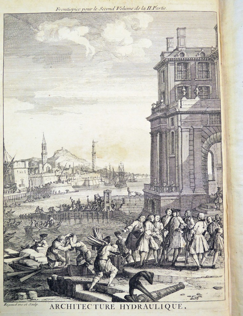
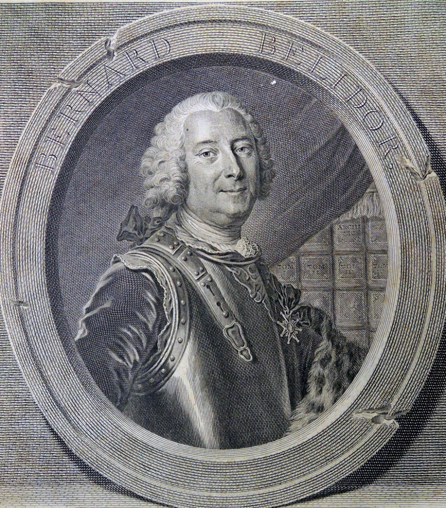
Architecture hydraulique

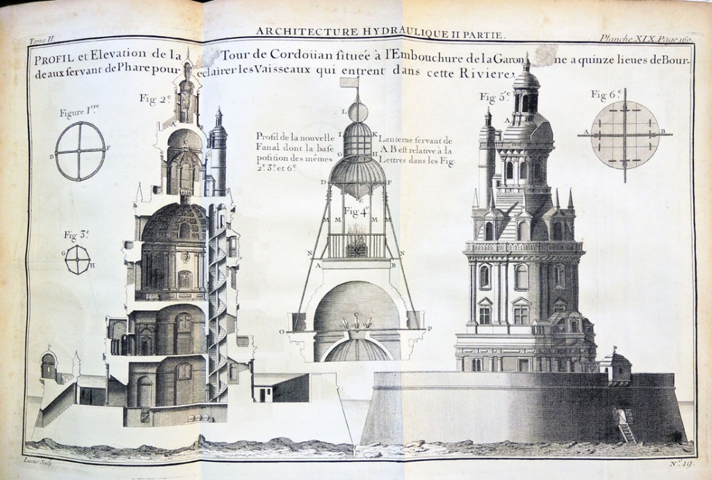
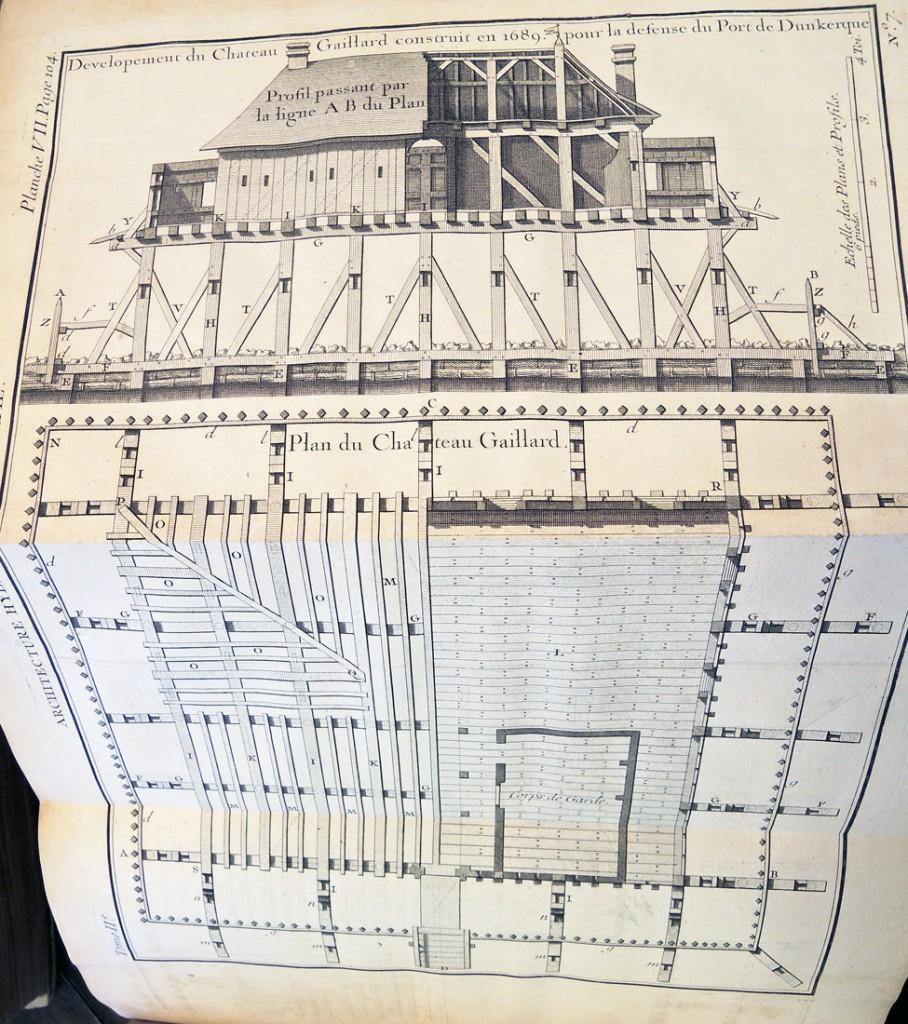
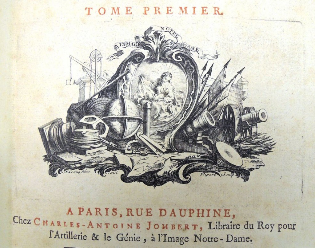
hydroliqueBernard Forest de Bélidor (1698-1761), Architecture hydraulique, ou l’Art de conduire, d’elever, et de menager les eaux pour les differens besoins de la vie … ([Paris]: C.A. Jombert, 1737-1753). Graphic Arts Collection recap in process

A check of the open stacks recently brought this 18th-century engineering textbook to our attention. Written by Bernard Forest de Bélidor (1698-1761) and published by Charles-Antoine Jombert (1712-1784), under his royal imprint “libraire du Roi pour l’artillerie et le génie,” the four volumes contain over 200 plates by some of the best French engravers of the period, including Antoine Hérisset (1685-1769), Robert François Bonnart (active 1726-1759), Jacques Rigaud (1681-1754), and many others. The books have been moved to our secure department holdings.
hydrolique4

hydrolique3

hydrolique2

hydrolique5

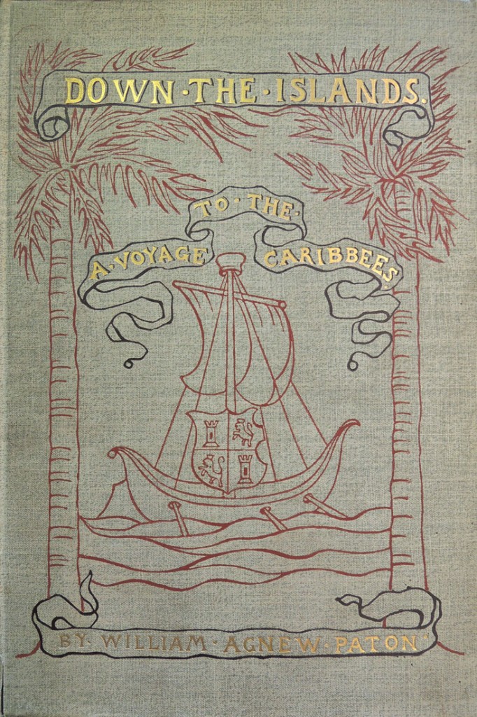
Down the Islands

down the islands2William Agnew Paton (1848-1918), Down the Islands, a Voyage to the Caribbees, with illustrations from drawings by M. J. Burns (New York: C. Scribner’s Sons, 1887). Graphic Arts Collection (GAX) 2003-0365N
down the islands6

William Agnew Paton (1848-1918) worked as publisher of the New York World from 1877 to 1881; served as trustee of the National Republican from 1881 to 1885; and finally, the first business manager of Scribner’s Magazine from 1885 to 1887.

When he left work for health reasons Paton made an extended trip to the Caribbean and on his return, published Down the Islands, a narrative of his travels. Paton commissioned Milton J. Burns (1853-1933) to illustrate the book, an artist who not only worked for St. Nicholas Magazine, Scribner’s, and Harpers but had also served on fishing vessels and was known for his seascapes.

In 1911, Paton gave Princeton University Library his ‘Paton Spanish War Collection’ of newspapers and magazines. After his death, his brother David Paton, Class of 1874 (1854-1925), donated the entire Paton Library to Princeton in honor of William Agnew Paton.

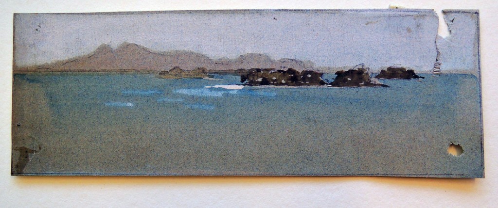
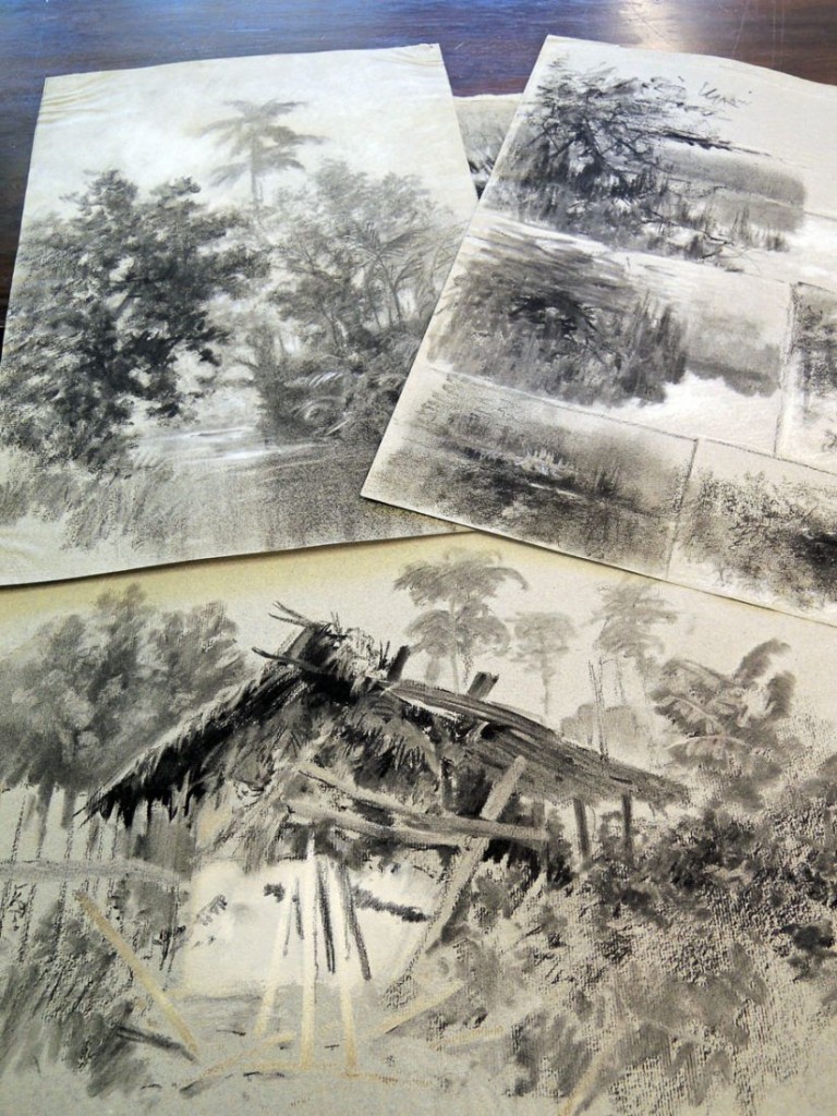
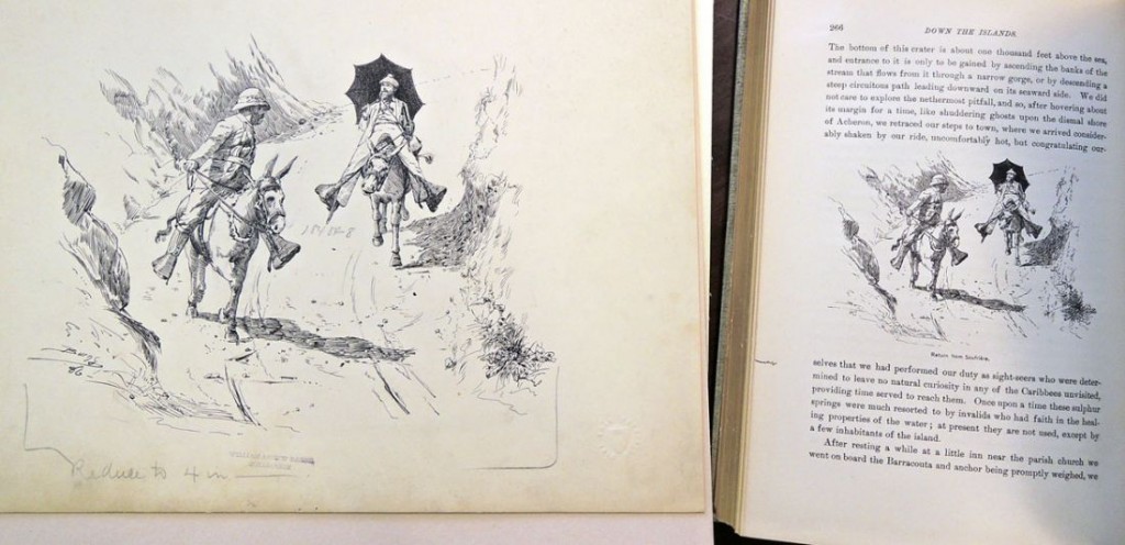
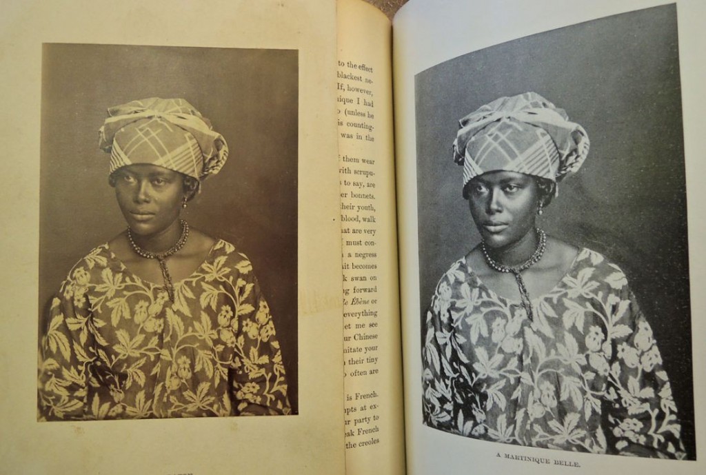
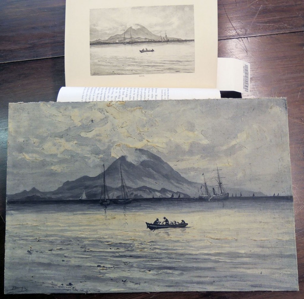
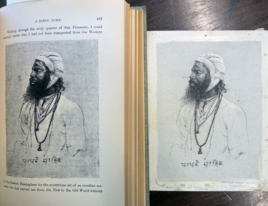
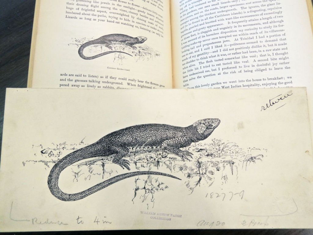
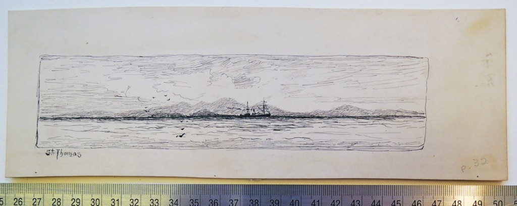
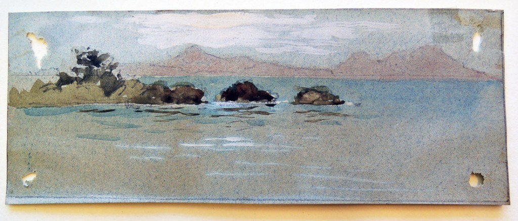
We also received the entire collection of Milton Burns’s paintings, drawings, and photographs for Down the Islands. It is particularly interesting to see the variety of mediums Burns used, from pen and ink to watercolor to charcoal, in order to accomplish the right artwork for each section of the book. Here are a few examples.

down the islands13Milton J. Burns collection of drawings, [1880s]. 5 linear ft. (1 solander box). Consists of approximately 75 drawings and sketches, as well as several small oil paintings by Burns that were used as illustrations in William Agnew Paton’s Down the Islands (New York, 1887). Graphic Arts Collection GC093
down the islands12
down the islands11
down the islands9
down the islands8
down the islands7
down the islands1
down the islands4

Illustrations to the Epitome of the Ancient History of Japan

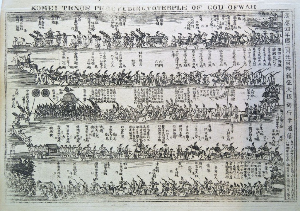
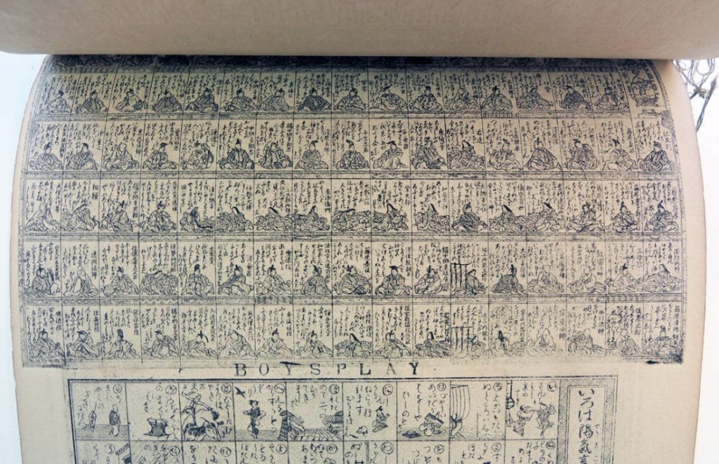
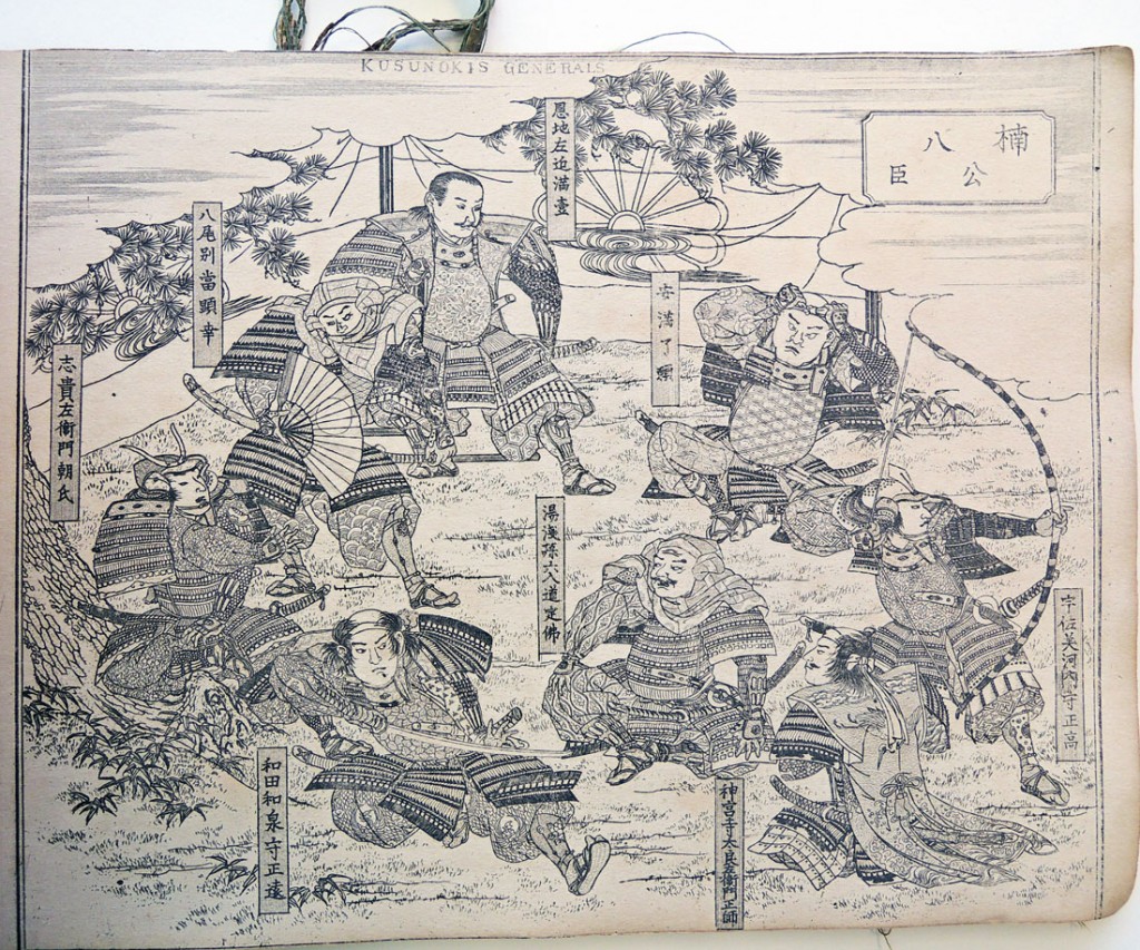
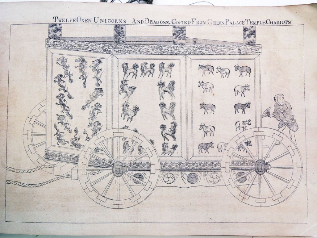
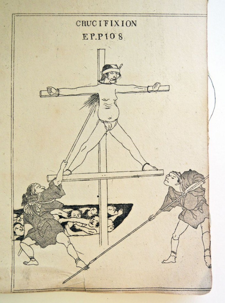
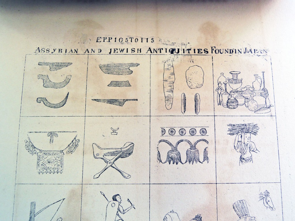
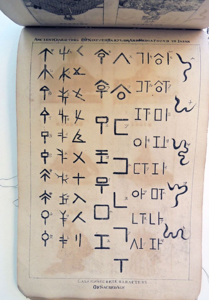
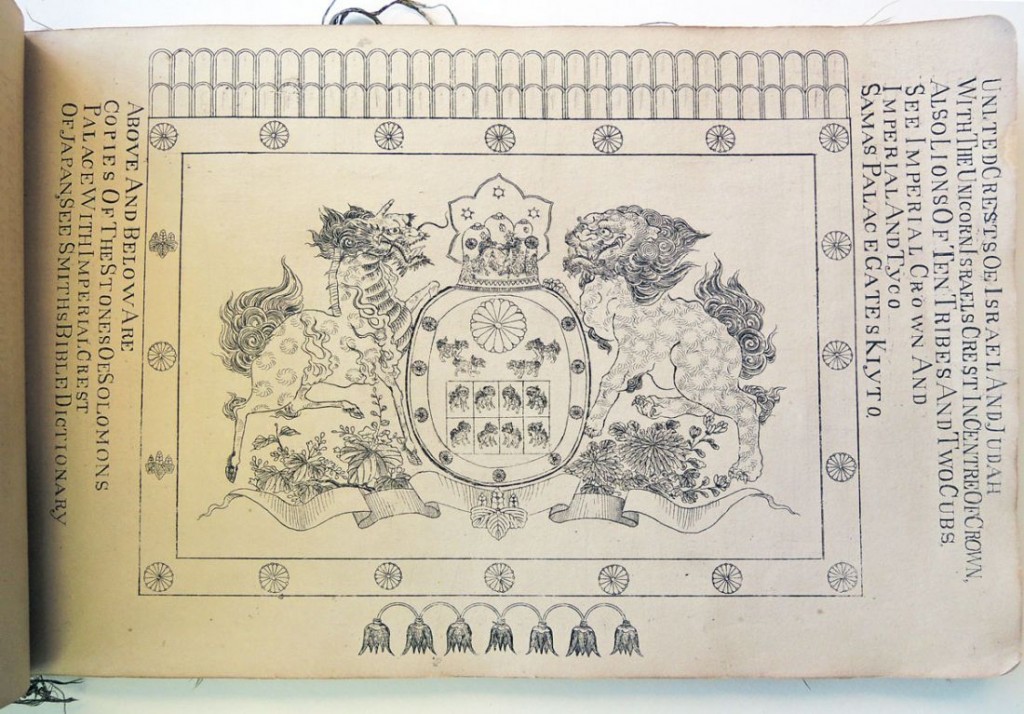
mcleod7Illustrations to the Epitome of the Ancient History of Japan, including Illustrations to Guide Book, collected and arranged by N. [Nicholas] McLeod (Kiyoto, 1877). “The illustrations include specimens of the ethnology of the different races in Japan, and their special belongings, Shinto and Buddhist pictures, legends and illustrated proofs of the descent of part of the Japanese race from lost Israel.” Graphic Arts Collection GAX in process. Gift of Edith and Emmet Gowin.


mcleod11According to the acquisition note posted by the National Library of Scotland (http://www.nls.uk/) “This is, by any standards, a strange book.” Thanks to the generous donation of Edith and Emmet Gowin, Princeton University Library researchers can also puzzle over the first illustrated edition of Nicholas McLeod’s odd volume.

The NLS entry goes on to attempt a description: “It was published . . . to accompany the author’s Epitome of the Ancient History of Japan. . . . Central to the Epitome is McLeod’s belief that the Shindai or holy class of Japan are descended from the Lost Tribes of Israel. He also calls attention to the fact that the first known king of Japan was Osee, who came to the throne in 730 B.C. and that the last king of Israel was, the similarly named Hosea who died in 722 B.C.

In the preface McLeod mentions that ‘the engravings are the workmanship of the best Japanese artists, but as they have had as yet so little experience of foreign letters, the execution is imperfect’. There are engravings of kings, temples as well as some relating to the author’s thesis such as ‘supposed order of march of Israelites to Japan’.”

mcleod10

mcleod9

mcleod8

mcleod6

mcleod5

mcleod4

mcleod3

mcleod2

Emblems Engraved on Wood

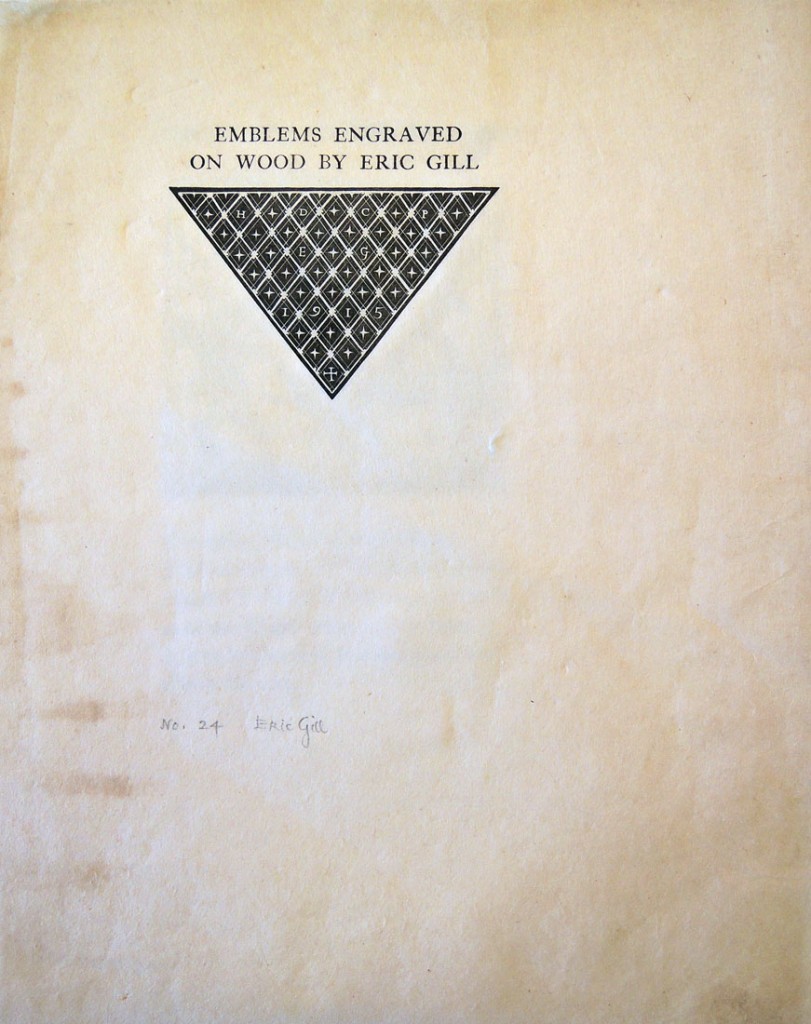
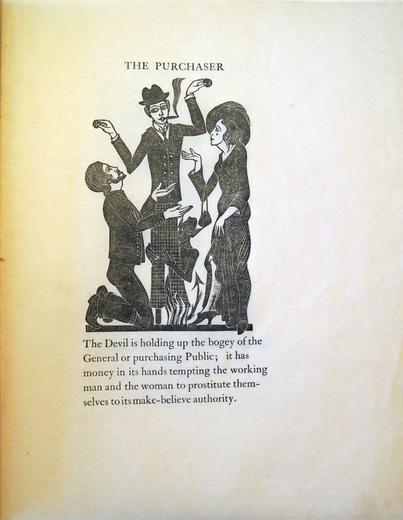
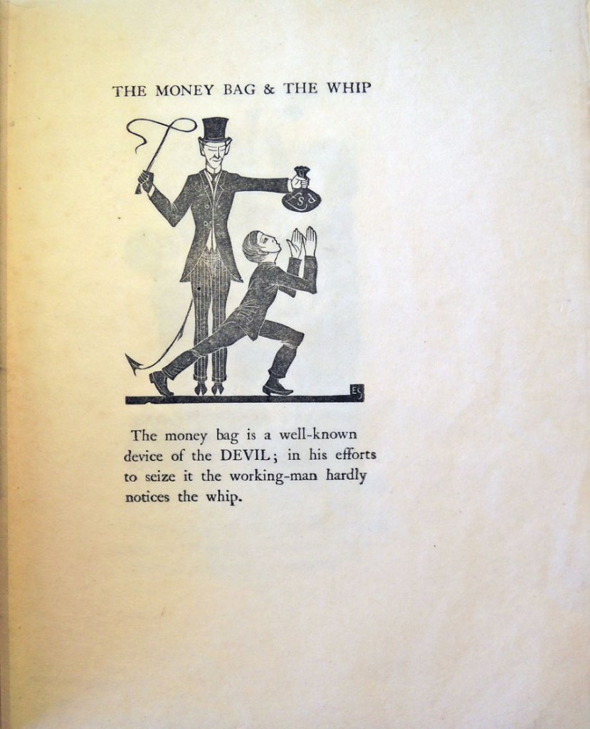
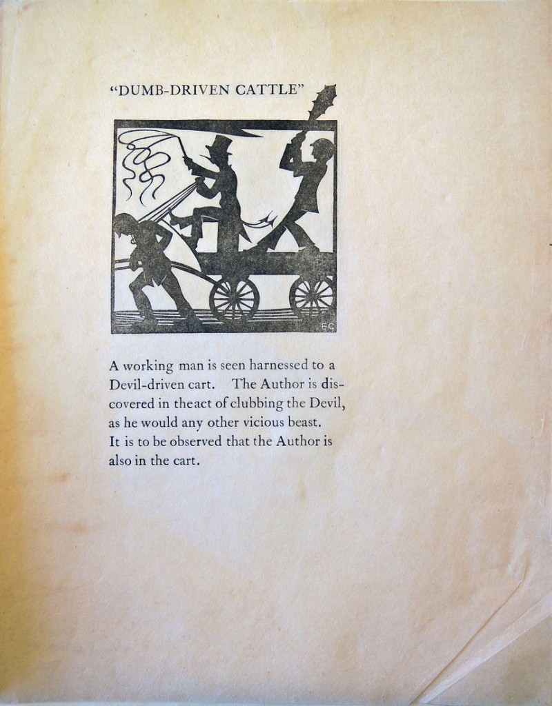
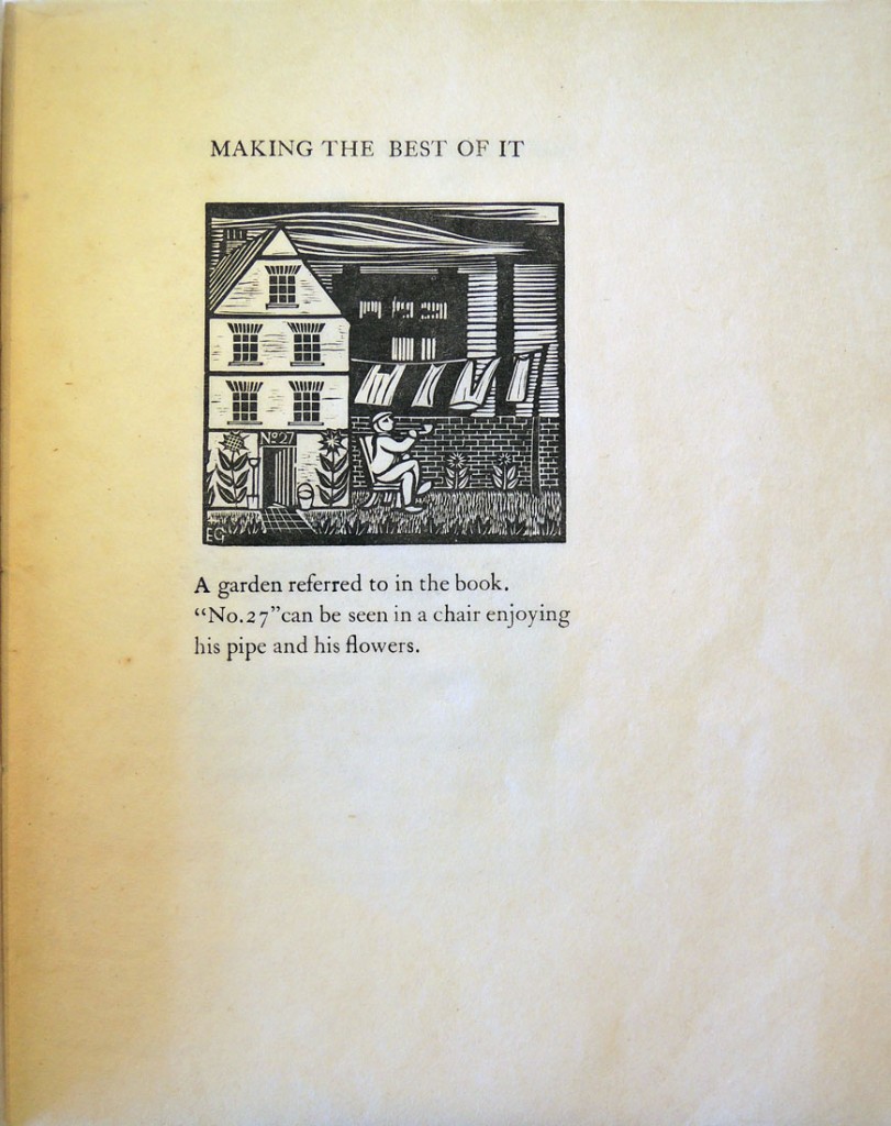
gill2In 1915, Eric Gill (1882-1940) designed and cut illustrations for Hilary Douglas Clarke Pepler’s The Devil’s Devices, or, Control Versus Service (London: Hampshire House Workshops). The following February 2, in honor of the Feast of the Purification of the Blessed Virgin Mary, Gill and Pepler printed fifteen copies of the wood engravings and published them as Emblems Engraved on Wood.

The small keepsake was such a success that Gill printed another run of 33 copies. The Graphic Arts Collection recently acquired a copy of the second edition, without the wrapper but signed by Gill in pencil. Here are a few pages.gill5

Eric Gill (1882-1940), Emblems Engraved on Wood. 2nd ed. (Ditchling, Sussex: D. Pepler and E. Gill, 1916). Copy 24 of 33. Graphic Arts Collection in process
gill4
gill1
gill3

What is a Dallastype?

dallastype2

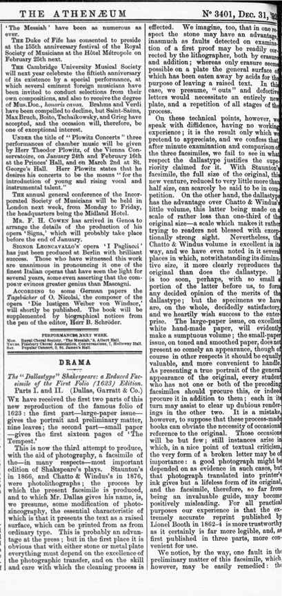
“Although one of the earliest processes for the production of a printing block by means of photography,” begins an advertisement in the August 27, 1897 issue of The Photographic News, “one but rarely nowadays hears the name of ‘Dallastype’ mentioned in connection with photo-process work, and yet the results achieved by it are remarkably fine, and in the early days of mechanics engraving were much admired.”
dallastype13The piece continues “Mr. Dallas has been quietly working at his process for many years, and improving and developing its capabilities, and has now decided to make it public, for which purpose he intends to open the ‘Dallastype and Dallastint School of Photographic Engraving,’ were he will give [instruction] to students in the art of producing pictures by his methods, which are free from the messy and cumbrous operations that characterise the zinco process. . . . Prospectus, with all particulars as to terms, &c., will be posted on application by letter to Mr. Duncan C. Dallas, 5, Furnival Street, Holborn, E.C.”


Duncan Campbell Dallas (ca. 1830-ca. 1890) had indeed been perfecting and publishing images with his Dallastype process for at least forty years. Depending on which history you read, he was either a crook or an unheralded talent.

dallastype5

In 1854, Paul Pretsch (1808-1873) patented photogalvanography (sometimes called photoelectrotype) and together with Roger Fenton (1819-1869) went on to establish the Photogalvanographic Company. Dallas was hired as the company manager.

To their surprise, Dallas was granted provisional protection for his own patent in June of 1856 on “Improvements in chemical preparations applicable to the photographic and photogalvanographic processes.” Pretsch and Fenton asked him to leave the company and many years of litigation followed.

In the September 11, 1863 issue of The Photographic News, Dallas published the abstract “Photo-Electric Engraving and Observations Upon Sundry Processes of Photographic Engraving.” Although the paper was submitted to the British Association for the Advancement of Science, it was ultimately deemed inadmissible by the Chairman and never presented to the organization. http://tinyurl.com/gsomaujdallastype8

Dallas filed for another patent in May of 1866 and was again refused but moved ahead with his own company, advertising the Dallastype and Dallastint as ”cheap first class engraving, one shilling per square inch. A reliable substitute for wood engraving, faithfully reproducing in any size the artist’s or other original specimens for six stamps.”

Dallas wrote a letter to the British Journal of Photography, published in the March 5, 1875 issue, to protest Pretsch’s claim of developing the photogalvanography. “I had been the founder and organiser of the Photogalvanographic Company,” he claimed, “and had been robbed— I used the word deliberately—of the fruits of ray brain and hand labour by Mr. Paul Pretsch.”

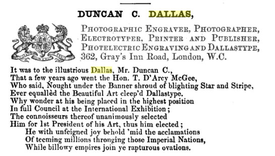
dallastype14Duncan C. Dallas, The … Londoniad: giving a full description [in verse] of the principal establishments, together with the most honourable and substantial business men, in the capital. The new, or twentieth Londoniad, 1876. p. 66-68

Later that year, in need of money, he tried to sell the process, publishing Proposal for Divulging the Dallastype Process of Photographic Engraving to Five Hundred Subscribers, or more, at £20 each ([London]: Duncan Campbell Dallas, 1875).

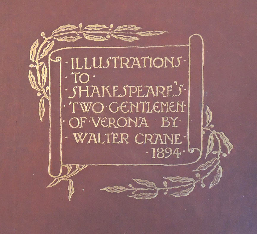
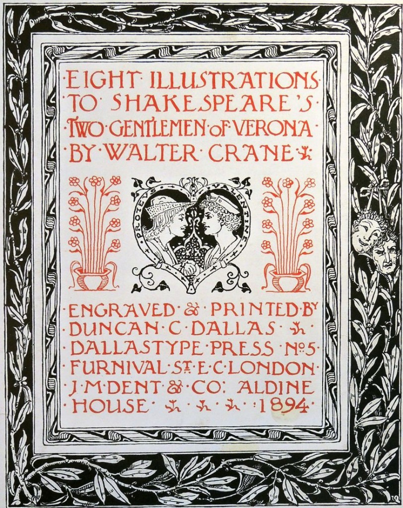
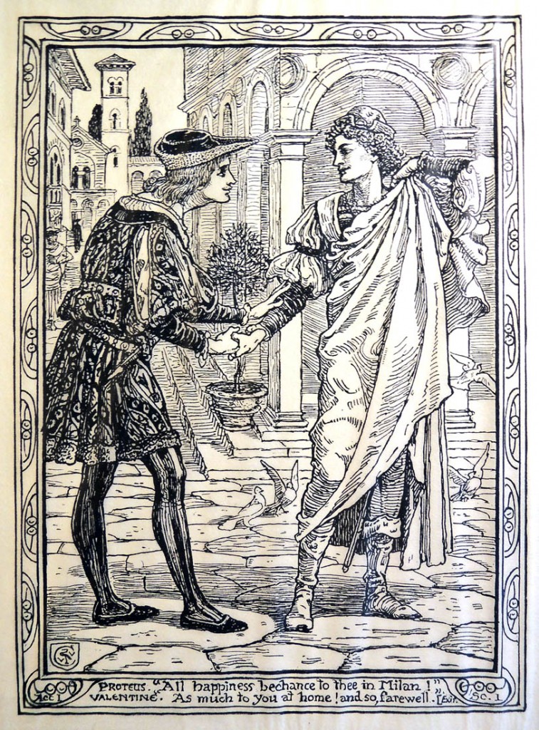
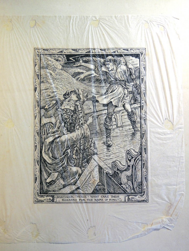
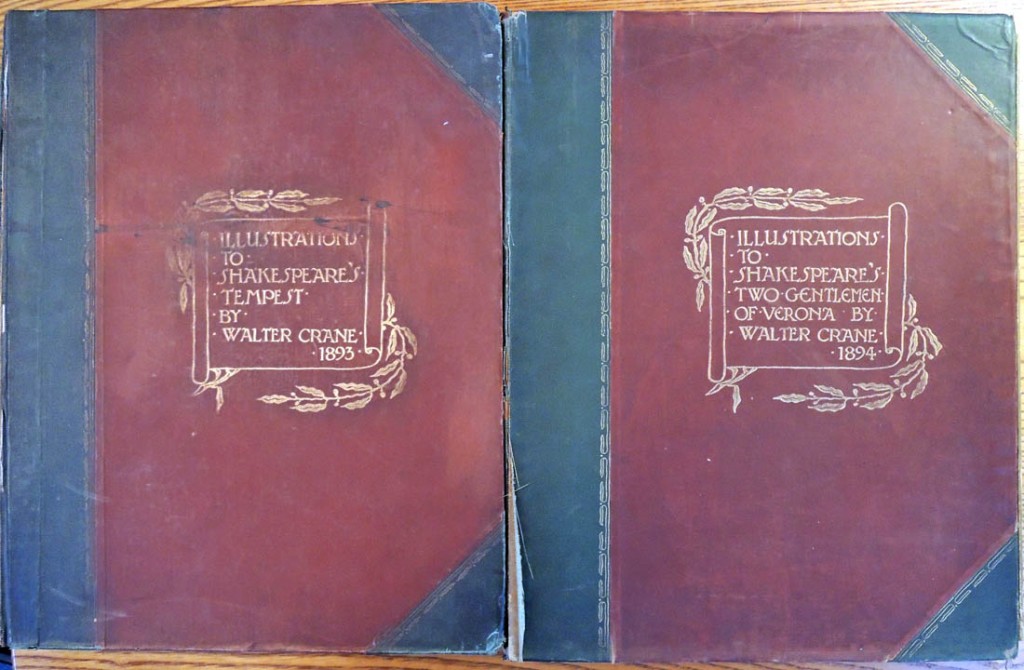
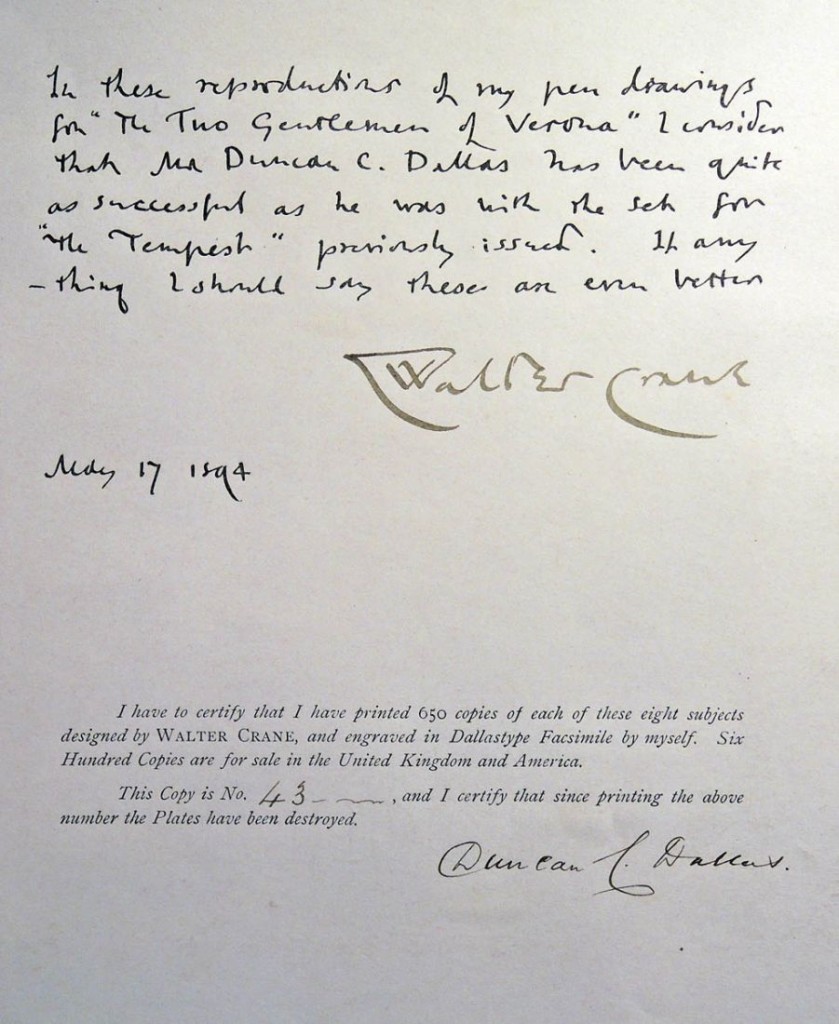
Dallas went on to publish a facsimile of the 1623 Shakespeare First Folio and then, several portfolios of Walter Crane’s illustrations for individual plays. Princeton University Library holds three of these volumes, illustrated with Dallastypes.
dallastype3

Walter Crane (1845-1915), Eight Illustrations to Shakespeare’s Two Gentlemen of Verona; engraved & printed by Duncan C. Dallas (London: J.M. Dent, 1894). No. 43 of 650 copies; signed by Walter Crane and Duncan C. Dallas. Rare Books (Ex) Oversize 3925.633q

Walter Crane (1845-1915), Shakespeare’s Comedy of the Merry Wives of Windsor / presented in eight pen designs by Walter Crane; engraved & printed by Duncan Dallas (London: G. Allen, 1894). No. 165 of 650 copies. Rare Books (Ex) Oversize ND497.C85 A34q

Walter Crane (1845-1915), Eight Illustrations to Shakespeare’s Tempest, designed by Walter Crane; engraved & printed by Duncan C. Dallas (London: J.M. Dent, 1893). Graphic Arts Collection (GAX) Oversize 2007-0246Q

dallastype7

dallastype12