Category Archives: Medium

mediums

Mrs. Hamilton’s lithograph of Bonaparte’s monkey

Mrs. Hamilton (1800s) after Stephen Taylor (active 1817-1849), Bonaparte’s Monkey, February 18, ca. 1830. Lithograph. Graphic Arts Collection GA 2005.00490.


The text reads:

“The above is a faithful portrait of a monkey belonging to Bonaparte during his residence at Longwood House, St. Helena. After Bonaparte’s death it was purchased by Captain Thompson, of the Abundance, and given by him, on his return to Spithead, to Mr. Stephen Taylor, the artist, then residing at Winchester. The monkey was very mischievous, and upon one occasion, made his way into a dressing closet, broke a glass, opened the dressing case, and was viewing himself in the looking glass, when discovered by Mr. Taylor, who made a sketch at the time, from which he afterwards painted a fine picture, and from which this print is taken. The monkey died after being in Mr. Taylor’s possession two years, and was buried in his garden at Winchester.”

Getty’s ULAN database lists Stephen Taylor as a British painter, active 1817-1849, who specialized in dogs, portraits, and dead game. This is certainly the Taylor connected with this lithograph. He painted several canvases transferred to lithographs by an artist named Hamilton, sold at the shop of William Soffe on the Strand in London. The superscript letters that precede the name Hamilton have been read as M.R.G. Hamilton and as Mrs Hamilton, the latter being the best guess.

Stamped at the bottom of this sheet “Published Feb J. 18 by W. Soffe. 288 Strand Corner of Southampton St.” The shop sold animal prints and other popular images. There is no information to back up the story that Napoleon Bonaparte (1769-1821) had a monkey, or that the painter Taylor purchased him from Captain Thompson. On the other hand, there’s no reason not to believe the story either.

“Be Healthy.” The Ethics of Medical Advertising.

Public Health Institute. Be Healthy. Chicago, 1937. Color enamel silkscreen on metal. Graphic Arts Collection GAX 2020- in process


The Public Health Institute (PHI) was established in downtown Chicago in 1919 to cheaply diagnose and treat the epidemic of venereal disease. By 1929, the PHI was serving 1500-2000 patients a day at its three branches, including a south side location opened under pressure from black civic leaders.

Patients remained anonymous and no one was denied service because of inability to pay. Its profits were reinvested in other venereal disease programs, including direct support for the Illinois Social Hygiene League (ISHL) and a $100,000 renovation of Provident Hospital, the first African-American owned and operated hospital in the United States. The PHI’s relationship with ISHL and its director, Dr. Louis Schmidt, brought it notoriety when Schmidt was expelled from the Chicago Medical Society (CMS) for violating its ban on advertising.

“According to its own reports, the PHI not only advertised in daily newspapers but placed 25,000 posters in public toilets, factories, and streetcars. The CMS’s unanimous action against Schmidt and the Institute—based on how PHI’s advertising challenged the social and economic power of their monopoly—was publicly ridiculed, since it punished a charity that had healed thousands. The case brought attention to the increasing cost of medicine and inadequate health care for the lower classes, initiating a conversation about a universal right to health care that continues to this day.”


Read more at: “The Case Of Dr. Louis E. Schmidt: Medical Rights In The Early 20th Century” by Robert Glover, Northern Illinois University and at https://catalog.hathitrust.org/Record/010599614


“The whole issue was clearly focused in the case of Dr. Louis E. Schmidt, who as head of the Public Health Institute in Cook County, Illinois, had given medical service at about one-third less than customary cost to considerable numbers of people of the lower income groups. Dr. Schmidt was ousted from the Chicago Medical Society and was about to be dropped from the American Medical Association.

He thus defended his activities: “We cannot make all doctors rich by forming a trade union…. Ours is a profession, not a trade…. The time will come when both the profession and the public will be better served. If we organize to bring the cost of hospital, laboratory, and medical care within the purse of all that great majority of our people known as the middle classes, all reputable, capable physicians will prosper greatly.

Such a plan will take the business of meeting the health problems of these people with small incomes away from the quacks, charlatans, and patent medicine vendors, who now prey upon a public which has no other place to turn.” —https://brocku.ca/MeadProject/Young/1930/1930_14.html

Coloured or Uncoloured

During our WinterSession class this morning, “Don’t Touch the Money,” one of the things we noticed about the mid-19th-century change packets, used in Great Britain to give a customer their change, was the description of “Coloured Tea” or “Uncoloured Green Tea.” The Oxford English Dictionary has many definitions of ‘coloured,’ but at the very bottom is an obsolete usage:
“Of a wrong act or intention: misrepresented so as to appear favourable or acceptable; disguised; glossed over. Obsolete.
1537 J. Husee Let. 24 May in Lisle Papers (P.R.O.: SP 3/5/65) f. 90 M. Owdall shall..at lenght haue lytyll thankes and lesse honesty for his coloryd doinges.
1557 Bible (Whittingham) 1 Thess. ii. 5 Nether dyd we any thing in coulored couetousnes.
1570 J. Foxe Actes & Monumentes (rev. ed.) II. xi. 2052/2 Of that your execrable periury, and his coloured and to shamefully suffered adultery.”

The closest we could come in contemporary New Jersey language was “My opinion was colored by the fact that I didn’t like him.”

According to the history posted by the London Horniman Tea company,
“Until 1826, only loose leaf teas had been sold, allowing unscrupulous traders to increase profits by adding other items such as hedge clippings or dust. Horniman revolutionised the tea trade by using mechanical devices to speed the process of filling pre-sealed packages, thereby reducing his cost of production and hence improving the quality for the end customer. This caused some consternation amongst his competitors, but by 1891 Horniman’s was the largest tea trading business in the world.”

In Erika Rappaport’s book, The Making of the Consumer, she notes:

In 1826 the Quaker, abolitionist and parliamentary reformer John Horniman began selling tea in pre-weighed and sealed packages. … When it was first introduced, however, Horniman’s innovation at once created and responded to the idea that the Chinese drink was not a luxury to be sought, but a poison to be avoided. John Horniman packaged his tea to distinguish it from the competition and as a reaction to widespread anxieties about the purity of Chinese productions. Between the 1820s and the 1870s merchants such as Horniman, scientists, journalists and politicians warned British consumers that Chinese manufacturing methods were dirty and fraudulent, the most dangerous practice being the colouring of tea, especially green tea, with unwholesome and even poisonous materials.”

So at this time when packaging was developed as a “cash carry system” and as packaging for the secure sale of products, the word that was coined to describe pure products was “Uncoloured.” The Princeton collection of change packets offers us a wonderful history of advertising in the 1860s, 1870s, and 1880s, with the emphasis on health and trust in a manufacturer. Although we tried to find a connection with other definitions of the word that had to do with race, there doesn’t see to be a direct connection.

When we can travel again, we should all visit the Horniman Museum and Gardens, with their famous walrus.

Collection des cinquante-deux fresques du Vatican

Tableaux de la Sainte Bible ou Loges de Raphaël: collection des cinquante-deux fresques du Vatican, représentant les principaux sujets de l’Ancien & du Nouveau Testament, peintes par Raphaël, dessinées et lithographiées par MM. Barathier,… [et al.]. Sous la direction de Mr Hippolyte de Courval. Avec les textes extraits des livres sacrés. Dédiés à son altesse royale, monseigneur le duc de Bordeaux = Paintings from the Holy Bible or Raphael’s Lodges: A Collection of Fifty-Two Vatican Frescoes, representing the main subjects of the Old & New Testaments, painted by Raphael, drawn and lithographed by MM. Barathier,… [et al.]. Under the direction of Mr Hippolyte de Courval. With texts taken from sacred books. Dedicated to His Royal Highness, Monsignor the Duke of Bordeaux. (Paris: Chez Prodhomme et Cie, librairies, boulevard des Capucines N° 1. 1825). Graphic Arts Collection GAX 2020- in process

Under the direction of Hippolyte de Courval, the frescos of Raphaël (1483-1520), were drawn by Barathier; A. Barincou;; Bouillon; Chrétien; Charles Achille d’Hardiviller (1795-18??); Antoine François Gelée (1796-1860); Henri-Joseph Hesse (1781-1849); Julien Vallou de Villeneuve (1795-1866); Paul Claude Michel Le Carpentier (1787-1877); and Weber; then lithographed by Godefroy Engelmann (1788-1839) .

This is one of many attempts to reproduce the frescoes. Volume 2 of Le bibliophile belge (Bruxelles, 1845-1850) (Firestone Z1007 .B5354) has a “bibliographie des loges,” which begins as early as 1607. The very long list is abbreviated below to show how far down this lithographic presentation comes.


1. Historia del Testamento Vecchio, depinta in Roma nel Vaticano da Rafaelle di Urbino , et intagliata in rame da Ş. BADALOCCHIO ( Sisto Rosa) et 610. LANFRANCHI , Parmigiani. Al Sig. Annibale Caracci. Roma, appresso Giov. Orlandi, 1607….
2. Historia….. Urbino. Al Mto illo Sig. D. Giuseppe Bernagi Giov. Orlandi D. D. D. – BALDASS. Alois Bon. fe.- Si stampa in Roma appresso Giov. Orlandi, 1613.; Titre et cinquante feuilles avec un texte tiré de la Bible. H. 5 p. 5 1. L. 6p. 81. La première et la seconde planche sont en contre-partie comme dans la seconde édition du n° 1.
3. Les 52 sujets grávés par ORAZIO BORGIANT, de différente dimension, in-40 allongé et in-8′ H. B. 1615….
4. La Sacra Genesi figurata da Rufaele d’Urbino, intagliata da FRANCESCO VILLAMENA, dedicata al…. Card. Aldobrandino. Ronia appresso gli heredi del do Villamena, 1826. Dans la dédicace, la veuve de Villamena dit que son mari, qui avait dessiné toutes les loges de Raphaël, avait été interrompu par la mort tandis qu’il s’appliquait à les graver. …

10. Picturae Perystiti Vaticani Avec une dédicace au pape Pie VI par Montagnani. — Venit Romae apud Petrum Paulum Montagnani, 1790. 53 seuilles. H. 8 p. 81. L. 10 p. avec encadrement. Dessiné par LUIGI AGRICOLA , gravé par Luigi CuNEGO, Gio. PETRINI, GIROL. CARATTONI, G. MORGHEN, MOCHETTI , Pozzi, Cochini, Bossi , etc. ….
11. Loggie di Rafaele , gravé par J. VOLPATO et J. OTTAVIANI , d’après les dessins de C. Savorelli et P, Camporesi. Roma presso Marco Pagliarini, 1782, 43 feuilles, grand in-folio royal, publiées en 3 livraisons. La seconde porte ce titre : Seconda parte delle Loggie di Rafaele nel Vaticano che contiene XIII volte e i loro rispettivi quaddri, pubblicata in Roma, l’anno 1774, gravé par J. OTTAVIANI. Volpato avait pour objet spécial de représenter les arabesques, les stucs et les plafonds des loges.
12. Les loges du Vatican peintes par Raphaël, contenant 52 sujets avec le texte explicatif de la Bible, in-40, chez David, graveur (à Paris) et chez Treuttel et Wurtz (Journal général de la littérature de France, 1808, p. 60).

13. Collection des 52 fresques du Vatican, connues sous le nom de Loges de Raphaël, et représentant les principaux sujets de la Bible (lith. par Engelman), publiée par H. CASTEL DE COURVAL. Paris, 1825, in-fol. obl. Lithographies très-médiocres, copiées sur Chapron, et accompagnées des textes de la Bible correspondants à chaque sujet.

14. Au trait, in-8°, dans le Musée de peinture et de sculpture, dessiné et gravé à l’eau forte par Réveil, avec des notices descript., critiques et hist. par DoCHESNE aîné, in-8°.

Pamětní spis


Born in Prague, capital of what used to be Czechoslovakia, Alois Senefelder (1771-1834) was educated in Germany where he invented a printing process–lithography–to help publish his play.

According to OCLC, only one book has been published on lithographic printing in Czechoslovakia and only three United States collections hold a copy. Now there are four. The Graphic Arts Collection recently acquired Pamětní spis vydaný na oslavu sté ročnice vynálezu litografie / uspořádali a vydali zástupci Pražských sdružení litografických; redakci vedl V. Koranda = A Commemorative Volume Issued to Celebrate the Centenary of the Invention of Lithography / organized and published by representatives of the Prague Lithographic Associations; the editorial staff was led by V. Koranda (Prague: Pražská odborová sdružení litografická, 1899).

Written to honor Alois Senefelder, the book includes a biographical essay along with approximately 18 plates illustrating lithographic printing techniques and a chart outlining the development of graphic works of art in guilds = Nastin vyvoje grafickych praci umeleckých v cechach. Presses, tools, paper, inks, and other aspects of the process are discussed.

Watercolors by poet Archie Ammons

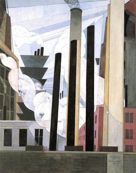
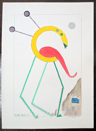
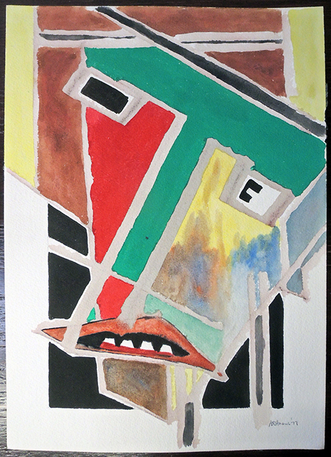
A.R. Ammons (1926-2001), Sagan Moonikin, ca. 1977. Signed by the artist. Graphic Arts Collection 2020- in process.

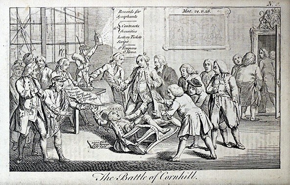
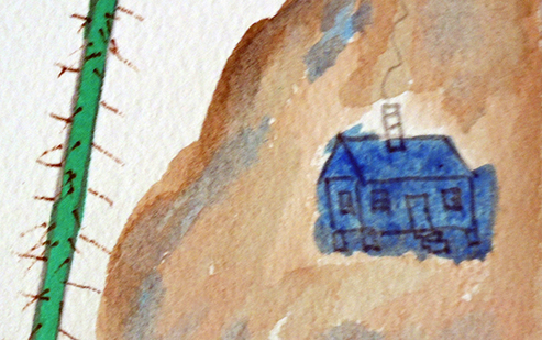
Ammons’ friend Emily Wilson noted, “This is one of a few pictures that Ammons titled: Sagan Moonikin. It was made in a period in which Carl Sagan (1934-1996) had joined the Cornell faculty and was very much in the news of the scientific community. Ammons includes in this modernist watercolor the image of a small farmhouse, which he uses in a number of pictures as a reference to his North Carolina home [not Sagan’s], but he sets it in the granite landscape of Ithaca. Sagan moved to his house on the gorge after Ammons had made this picture and that requires more discussion and research.”

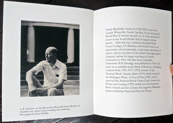
A.R. “Archie” Ammons (1926–2001) was among the first recipients of the MacArthur Fellows Program, unofficially known as the “Genius Grant,” when it was established in 1981. The poet, who taught at Cornell University from 1964 to 1998, received many awards for his writing, among them two National Books Awards, a National Book Critics Circle Award, the Library of Congress’s Rebekah Johnson Bobbitt National Prize for Poetry, and the Bollingen Prize for Poetry. Less known or celebrated were Ammons visual arts, including the six watercolors recently acquired by Princeton’s Graphic Arts Collection.


Our continuing thanks to Susan Stewart, Avalon Foundation University Professor in the Humanities and Professor of English at Princeton University and to Emily Herring Wilson, longtime friend of Ammons, for their help with this acquisition. In her remembrance of the poet, Wilson noted the year he took up painting with a vengeance:

“Moving back into their house on Hanshaw Road, Archie set up a table in the upstairs bedroom looking out into the backyard he loved so much and had written about so often, and he began painting water-colors. In 1977 he was painting as many as six or eight hours a day. In 1981, he described the process in one of the most revealing statements he ever made about the sources of his creativity:

‘The is a poetics of tears, of smiles, of ecstasy (sensual joy and the harsh inspirations of the religious heights): there is a poetics of quietude and deep study, a poetics of fear—and a poetics of anger. During Christmas vacation in 1976, I got the notion which I had had passingly but often before, to try watercolors. I’m sure I was attracted to the possibility of bringing together in one visual consideration the arbitrariness of pure coincidence with the necessity of the essential, the moving form the free, as the work of art begins, through the decisions of pattern and possibility, and into and through the demands of the necessary, the unavoidable, the inevitable. This “change” is in another from the oldest of journeys, that from exile to community.

Having had dozens of tries at real pictures, I began to feel what events on the paper “meant”—that is, I began to learn the joining of what happened on the paper to its emotional counterpart, the feelings generated and expressed by the events. I discovered that I was stirred by the thin, loud, and bright, the utterly blatant effect like a smack in the face, the anger felt, expressed, reacted to. And then I thought that not a very nice thing to be into. But I was angry, sizzlingly angry for whatever reasons, and I found myself, when I could endure the emotions at all, released by letting the anger go and become the splatters and the sheer control of the paint. And then I thought that since we must after all at times be angry, how fortunate we are that art allows us to transform blistering feelings int the brilliance, the sweep and curve, the dash and astonishment (along with the cool definition, judgment, and knowledge) of still completed things.’” –Emily Herring Wilson, When I go back to my home country: a remembrance of Archie Ammons (Fountain, NC: R.A. Fountain, 2019).

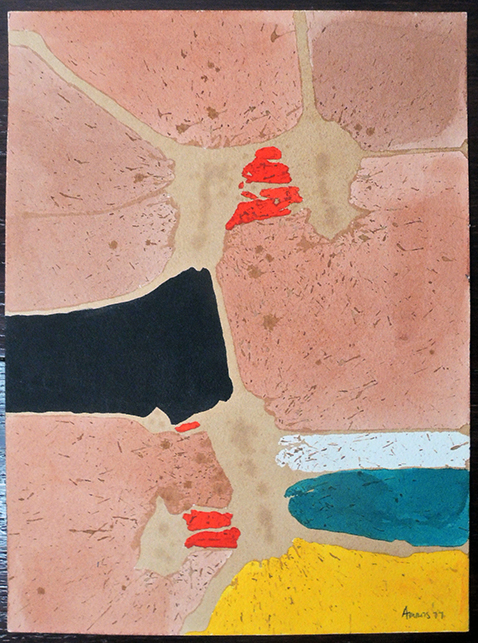
A.R. Ammons, Untitled [Abstraction in sections with pink, red, green, and yellow], ca. 1977. 9 x 12 inches. Signed by Ammons. Graphic Arts Collection 2020- in process.

Note from Wilson “I love this. Because it seems to me to be the North Carolina landscape we have near black lakes in eastern NC and lots of red/pink clay used by potters. Also sandy coasts and sunshine and lots of creeks. For me he has his sizzling anger under control with the beautiful reds.”

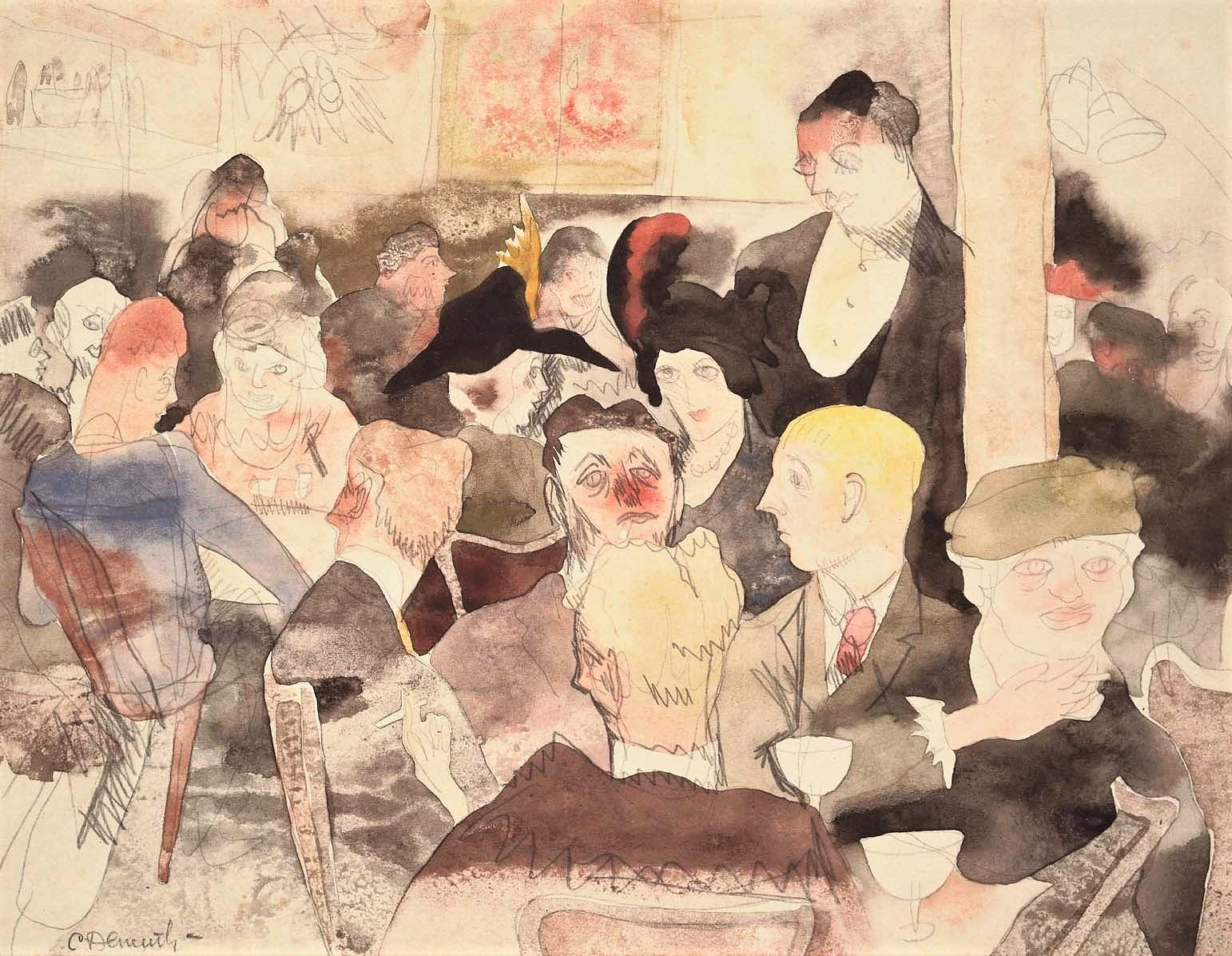
See also: Literary Vision. November 1988, A.R. Ammons, John Ashbery, William Blake, William Burroughs, E.E. Cummings, Robert Duncan, Allen Ginsberg, Brion Gysin, D.H. Lawrence, Henri Michaux, Henry Miller, Kenneth Patchen, and Kenneth Rexroth (New York: Jack Tilton Gallery, 1988).


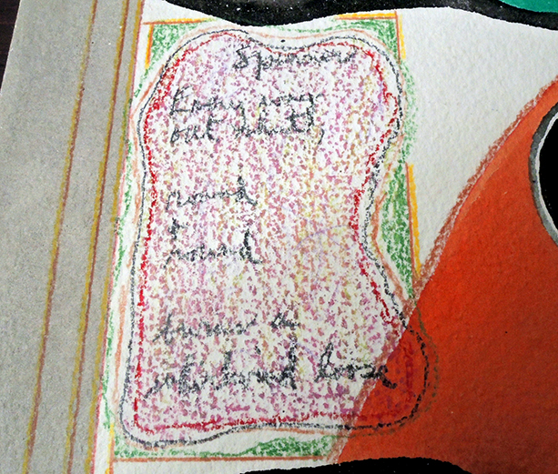
A.R. Ammons, Untitled [Abstraction with verse], 1977. Signed and dated by Ammons. Graphic Arts Collection 2020- in process.

“Over a forty-five year span, A. R. Ammons gained readers, recognition, financial reward, and international acclaim for his verbal creations, not his visual ones. Although longtime subscribers to EPOCH may re member that one of his watercolors graced the 1986–87 cover of the magazine (35:3), most readers of Ammons’s twenty-five poetry collections remain unaware that he also painted more than one thousand watercolors. He did not hide that pursuit; in fact he was proud of his paintings, and from time to time, he promoted them.

From 1977 until 1993, he entered his work in twelve separate exhibits at sites from the Johnson Art Museum at Cornell to the Jack Tilton Gallery in New York City, where four of his paintings appeared in the show “Literary Vision,” along with [others]. He also exhibited his paintings in North Carolina, at the Reynolda Museum of American Art in Winston-Salem and at the University of North Carolina’s Morehead Gallery in Chapel Hill. More recently, in October 2002, The Charlotte and Philip Hanes Art Gallery at Wake Forest University, Ammons’s alma mater, presented an exhibit of fifty of the poet’s paintings; watercolors from that show subsequently appeared on the March and August 2003 covers of Poetry.” — Elizabeth M. Mills, “An Image for Longing,” Epoch 52 no.3 (2003).


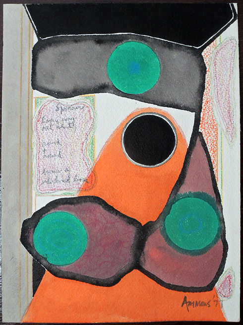
A.R. Ammons, Untitled [Self-portrait, abstract], 1977. Signed and dated by Ammons. Graphic Arts Collection 2020- in process.
Wilson notes “Ammons painted a number of these faces, which seem to be self-portraits but require more study to have a clearer understanding.”

See also: Jonathan Dembo, A.R. Ammons’s poetry and art : a documentary exhibit : exhibit catalog (Greenville, N.C. : J.Y. Joyner Library, East Carolina University, 2008).
and
Donald Friedman and John Wronoski, The writer’s brush : an exhibition of artwork by writers (New York, NY : Anita Shapolsky Art Foundation, 2014)

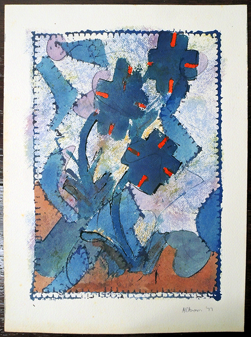
A.R. Ammons, Untitled [Abstraction with nature in blue, red, and brown], 1977. Signed by Ammons. Graphic Arts Collection 2020- in process.
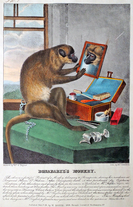
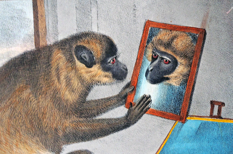
 

Please help put the pieces together


Thanks to Dickson Q. Brown ’1895, the Graphic Arts Collection holds this 18th-century engraving titled The Office Loungers, once published in a London magazine as the left side of a complete print. You can see the unfinished line at the top and bottom. It is not uncommon when clipping images over the years to mix them up and/or loose the matching plate. Individual copper plates were also reissued with new titles. Such is the case here. Do you know the complete scene?

A few similar questions have been solved, such as this print The Devil to Pay, which is one side of a set of engravings reproducing Samuel Collings (died 1795), Magnetic Dispensary, 1790, an oil on canvas owned by the Library Company of Philadelphia. The full engraving was printed by John Barlow after Collings in 1790 and published in The Attic Miscellany, 1791, vol. I, pictured on p. 121. Yale holds the original drawing by Collings and the Library of Congress has the complete engraving. Princeton holds the right side.


A few sheets were part of triptychs, such as this engraving on the left that was once published in the Carlton House Magazine as “Sunday Work which ought to be prohibited.” The individual engraving, retitled The Bakers Sunday Triumph, 1794, shows bakers rejoicing while the steam-powered Albion Mills burns (referenced in William Blake’s ”dark satanic mills”) and George III passes an act forbidding the baking of bread on Sundays.

The British Museum is fortunate to own this broadside [below] published 1791, after the Albion Mills burnt down. Their website notes “On 2 March 1791, the entire building burnt down. It was a dry night and a low tide, so it was difficult to access water to extinguish the flames. The east wind that night would have blown smoke towards the house of William Blake in Lambeth. A large crowd gathered to watch the fire, a scuffle broke out, and the insurer’s fire brigade tuned their hoses on the crowd rather than the building. Arson was strongly suspected, but nobody was prosecuted. The building remained derelict until it was pulled down in 1809.”

Art history involves detective work. Can anyone help us put the pieces together with our Office Loungers? Thanks very much.


Wind power rejected, 1767

Dickson Q. Brown, Princeton University Class of 1895, liked to collect (clip?) prints from the British journal Town and Country Magazine; or, Universal Repository of Knowledge, Instruction, and Entertainment. Approximately 75 of these plates were donated to the Princeton University Library. A surprising number offer scenes that take place in London taverns, such as the engraving titled The Battle of Cornhill, originally published in Town and Country, issue 1, March 1769, facing page 137, with story 137-38.


Charles Dingley (1711-1769) built a wind-powered sawmill in 1767 at Limehouse and in May of that year it was pulled down by “A large body of sawyers … on pretence [sic] that it deprived many workmen of employment.” On March 8, 1769, a number of London merchants were invited to the King’s Arms tavern in Cornhill to sign an address to the King. They were already unhappy, being charged one shilling to enter the room (to keep out the riffraff). Dingley punched John Reynolds (John Wilkes’ attorney) so hard he fell out of his chair and a fight ensued. Some of the others on site were Reverend John Horne, Peter Muilman, and Samuel Vaughan. Several satirical prints were quickly engraved and published, including The Addressers address’ …, The Inchanted Castle, or Kings Arms in an Uproar, and The Battle of Cornhill.

Note on the wall the reference to Matthew 24, v.28: “For wherever the carcass is, there the eagles will be gathered together,” (modern translation: “Wherever the corpse is, the vultures will gather”).  Also on the wall is the announcement being highlighted: “Rewards for Sycophants / G.t Contracts, Securities / Lottery Tickets / Script / O Tempora O Mores.” (“Oh the times! Oh the customs!”, first recorded to have been spoken by Cicero–wikipedia). Several gentlemen ran out the back door as soon as the battle began. Through the window, you see a broken windmill (although Limehouse is miles away to the east).

Dingley died eight months later and was buried at St Helen’s Bishopsgate on 20th November 1769.


Artist unidentified, The Battle of Cornhill, March 1769. Engraving. Originally published facing p. 137 of The Town and Country Magazine. Graphic Arts Collection GA 2012.01799

Holiday Cards

As the trees come down and ornaments go back in their boxes, many of us carefully archive the beautiful works on paper created by artists and writers under the auspices of holiday cards. One of the masters of paper architecture is Werner Pfeiffer. Those fortunate few who receive his miracles of construction and design, editioned from 160 to 180, look forward each December to the small white envelope that brings his latest creation. Always colorful, each year is different and each card is unique. Here are a few recent gifts.

A brief biographical sketch:
Born in 1937 in Stuttgart, Werner Pfeiffer studied at the Akademie der Bildenden Künste in his home town. In 1961 he emigrated to the United States and had a career as a designer and art director, receiving awards from The New York Art Directors Club, The New York Type Directors Club, the New York Society of Illustrators, and the American Institute of Graphic Arts, among others. In 1969 he was appointed Professor of Art at Pratt Institute in New York and at the same time established the imprint Pratt Adlib Press. He currently lives and continues to publish from Red Hook, New York.

A part of Vassar’s lovely video portrait:

Centenary of “Arrangements of the American Landscape Forms”

End of the Parade, Coatesville, Pa., 1920. Tempera and pencil. The collection of Deborah and Ed Shein.


One hundred years ago at the Charles Daniel Gallery, the premier New York City venue for American modernism, Charles Demuth (1883-1935) exhibited his “Arrangements of the American Landscape Forms,” which included twelve tempera and gouache paintings: Pennsylvania now called In the Providence, After Sir Christopher Wren, New England, Waiting, Pennsylvania, The Merry-Go-Round, For W. Carlos W. now called Machinery, New England, The End of the Parade—Coatesville, Pa., New England now called Lancaster, Chimnies [sic], Ventilators or Whatever, now called Masts, and New England.

Charles Demuth self-portrait with Marcel Duchamp entitled The Purple Pup, about 1918. Watercolor over graphite. Museum of Fine Arts Boston.

With this leap forward, Demuth replaced traditional American landscape painting with industrial architecture, as seen in his hometown of Lancaster, Pennsylvania. The reference to William Carlos William (1883-1963), Demuth’s friend since their college days, with the title of Machinery was an inside joke since Demuth knew Williams would object to the perceived teapot imagery, rather than letting the forms and colors speak for themselves.

Machinery, 1920. Tempera and pencil. Metropolitan Museum of Art, Alfred Stieglitz Collection.


Williams complimented his friend by purchasing End of the Parade [above], which in turn inspired his poem: “The End of the Parade / The sentence undulates, / raising no song; / it is too old, the / words of it are falling / apart. Only percussion / notes continue / with weakening emphasis what was once / all honeyed sounds / full of sweet breath.” –Collected Poems, 1921–1931 (Objectivist Press, 1934. https://babel.hathitrust.org/cgi/pt?id=mdp.39015066064604)

Ohio collector Ferdinand Howald snapped up The Tower [above], which was later donated to The Columbus Museum of Art (not to be confused with After Sir Christopher Wren, given to the Metropolitan Museum of Art, New York, by Scofield Thayer). Walter Arensberg bought one of several works listed as New England, which he later gave to the Philadelphia Museum of Art under the title Lancaster.

After Sir Christopher Wren, 1920. Watercolor and gouache. Metropolitan Museum of Art, Bequest of Scofield Thayer.


In the backroom, Charles Daniel continued (as he had since 1916) to show trusted friends Demuth’s watercolors after Émile Zola’s 1880 novel Nana. The critic Henry McBride wrote “Mr. Daniel . . . showed us all, surreptitiously, some figure drawings. They were not precisely shocking, but one or two of the drawings illustrated points in Zola’s Nana and just before the war we were still sufficiently Victorian to shudder at the thought of exposing pictures of reprehensible Nana on the walls of the public gallery.” –(“Water Colors by Charles Demuth,” Creative Arts September 1929).

Another critic, Forbes Watson noted that “whoever enjoys a whimsical imagination will revel in Mr. Demuth’s illustrations of Zola’s Nana… The man who obtains this group of illustrations will be a lucky man.”—(“At the Galleries,” Arts and Decoration, January 1921). One year later, Albert Barnes purchased eight of the twelve Nana watercolors [three seen here] for what is now the Barnes Foundation, where a total of forty-four Demuth paintings hang.


Demuth’s now lost “Merry-Go-Round” is presumed to be inspired by Richard Oswald’s 1920 silent film The Merry-Go-Round (Der Reigen – Ein Werdegang), with a story similar to Nana and Frank Wedekind’s Lulu plays, also illustrated by Demuth.

Demuth was introduced to The Daniel Gallery by Daniel’s protégé, another gay modernist painter Preston Dickinson (1891–1930), also in Paris during 1910, renting a room on the same street as Demuth. Together with Thomas Hart Benton, Louis Bouché, and Marguerite Thompson (Zorach), the Americans returned to New York where they all found a welcome home for their work with The Daniel Gallery at 2 West 47th Street (Katherine Dreier rented rooms across 5th Avenue and shared exhibitions with Daniel). Daniel celebrated his good fortune by arranging eight one-person shows for the young Demuth and included his paintings in thirty-one group exhibitions, more than any other artist.

Lancaster, 1920. Tempera and gouache. Philadelphia Museum of Art, Arensberg Collection.

Why go further? One might conceivably rectify the rhythm, study all out and arrive at the perfection of a tiger lily or a china doorknob. One might lift all out of the ruck, be a worthy successor to—the man in the moon. Instead of breaking the back of a willing phrase why not try to follow the wheel through—approach death at a walk, take in all the scenery. There’s as much reason one way as the other and then—one never knows—perhaps we’ll bring back Eurydice—this time! –William Carlos Williams, Kora in Hell: Improvisations (1920. Section 2).


In the Province, 1920. Gouache and pencil. Museum of Fine Arts, Boston.