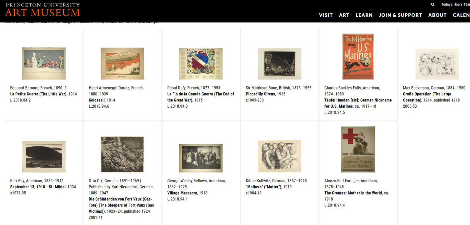
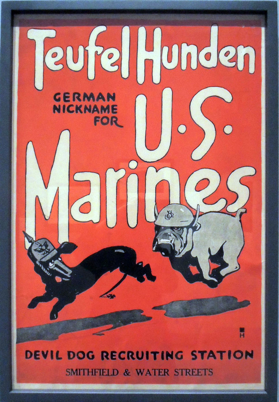
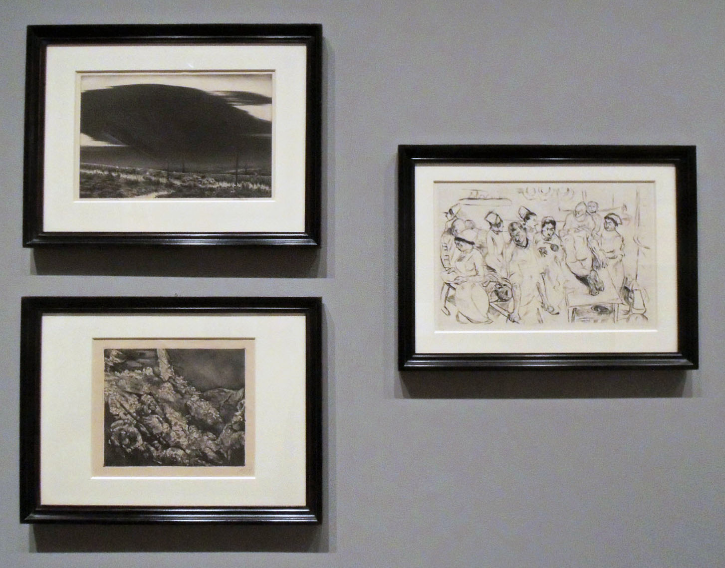
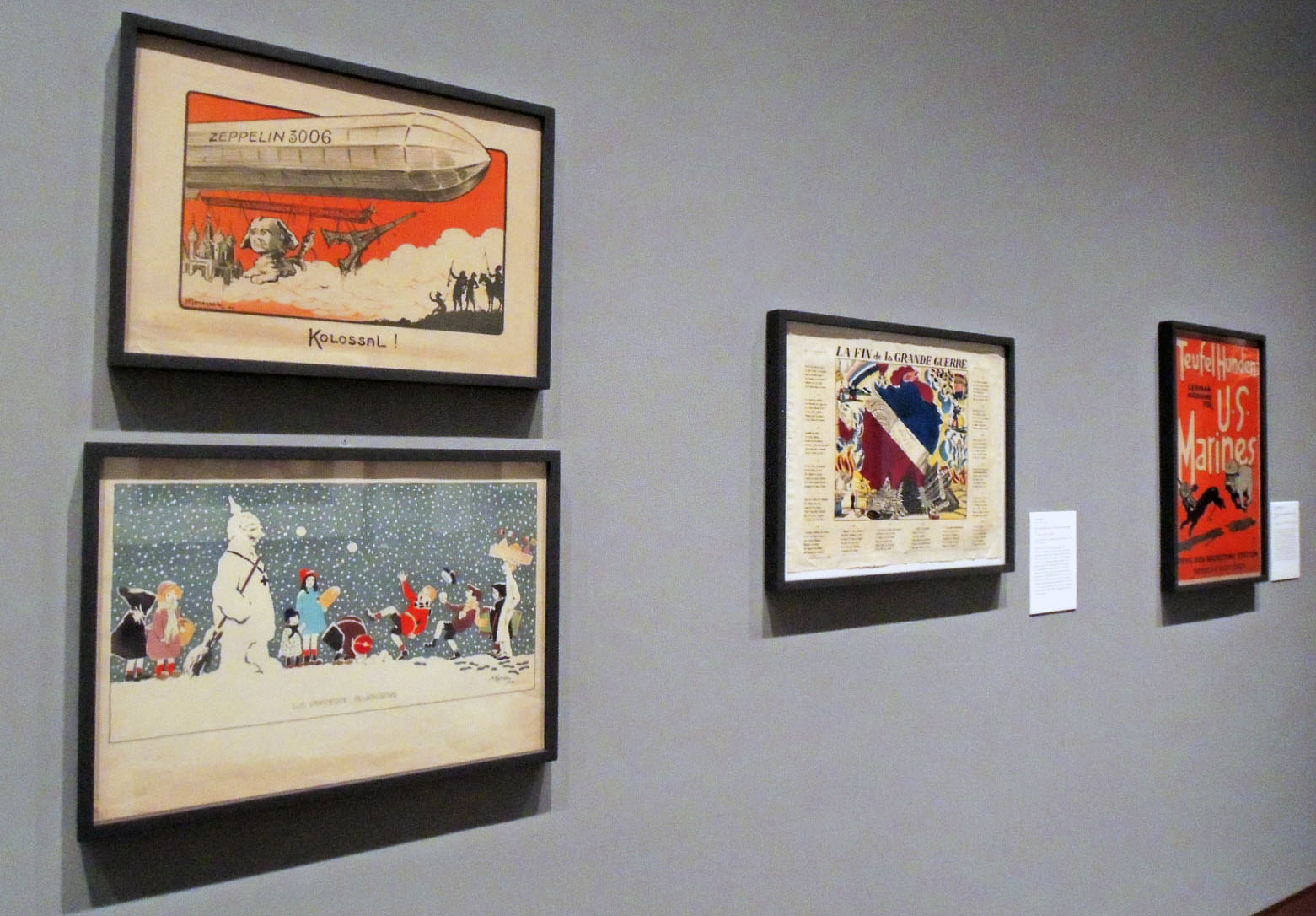
If you are on campus this weekend, do go to the Princeton University Art Museum where Laura Giles, Heather and Paul G. Haaga Jr., Class of 1970, Curator of Prints and Drawings, mounted a group of prints and posters to commemorate the end of World War I. She kindly included several items from the Graphic Arts Collection and it looks wonderful.
The title is “Lasting Impressions: World War I and the Graphic Arts” with the epigram: “These prints were made from the indelible impressions of war. They are not imaginary. I saw them.”–—Kerr Eby, 1934
Their text panel reads in part,
“November 11, 2018, marks the one-hundredth anniversary of the signing of the armistice that ended World War I. Detonated in the summer of 1914, this prolonged global conflict took a devastating toll on millions of soldiers and civilians while setting the stage for widespread political and social upheaval that would have lasting consequences. Although photography and film played an important role in chronicling what was soon called the “Great War,” the graphic arts also had a visual impact on large audiences, by means of inexpensive print portfolios and mass-produced posters—facilitated by the same modern technology that fueled the military’s weapons of mass destruction.”
Laura notes, “This selection of works on paper reveals a wide spectrum of responses to the war—stemming from actual battlefield experiences and home front reactions—created by artists from France, Germany, Great Britain, and the United States who employed a rich variety of printmaking techniques.”
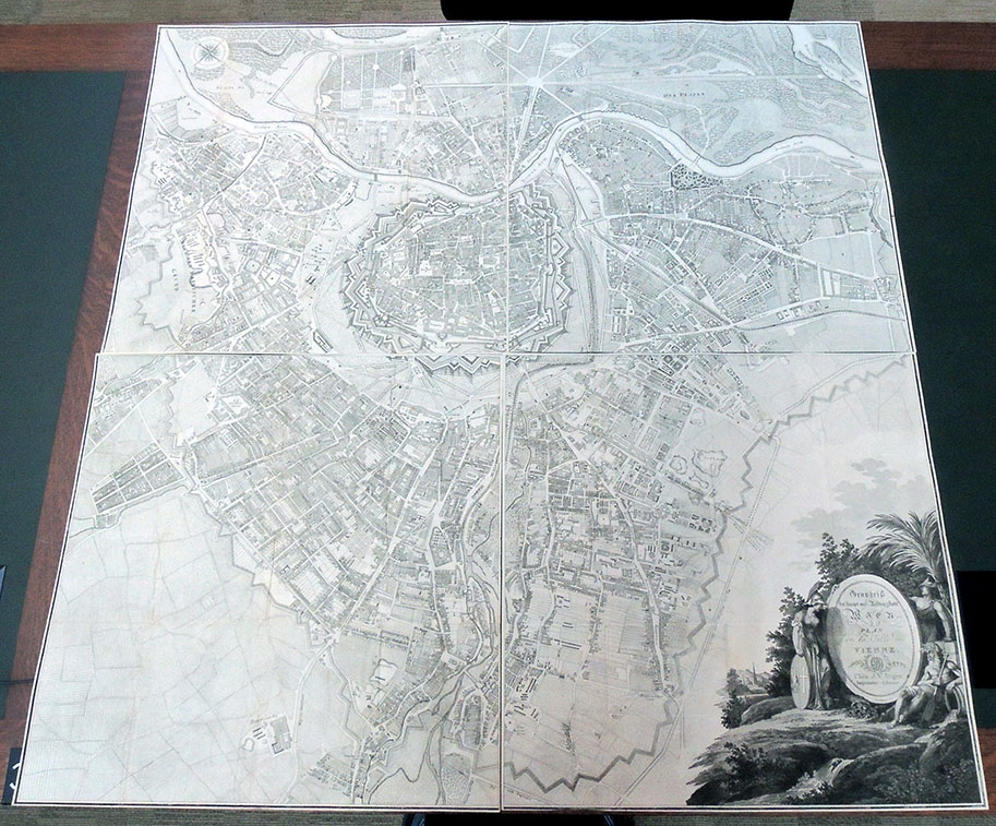
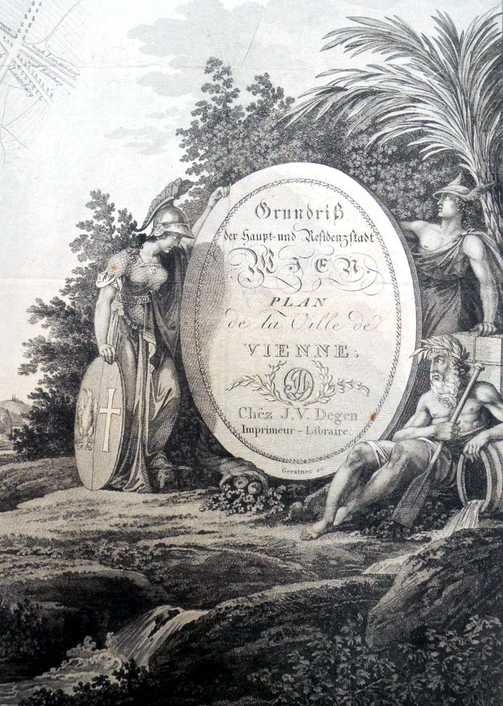
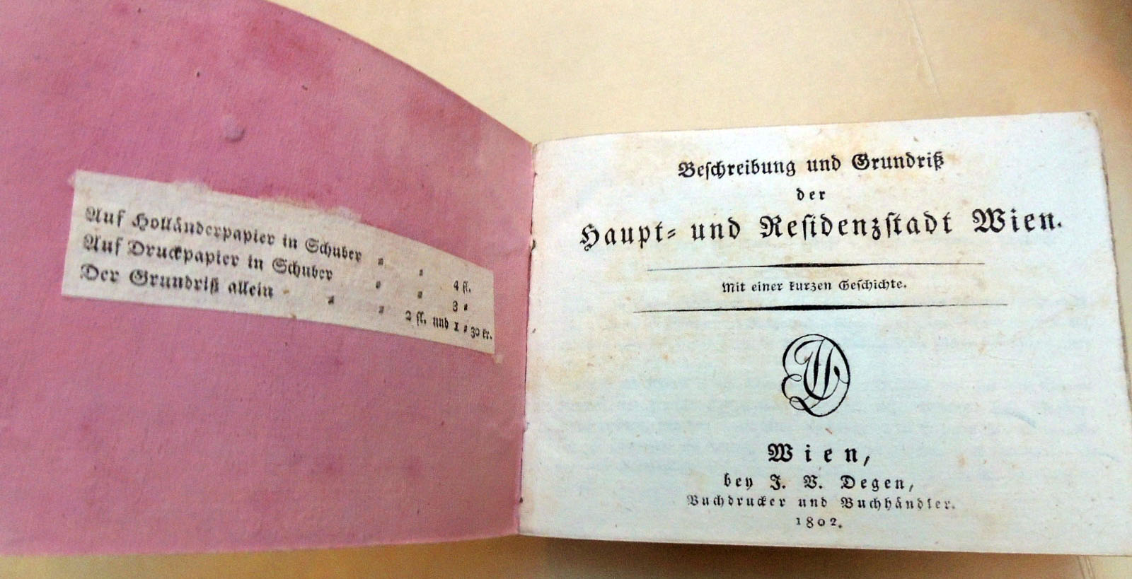
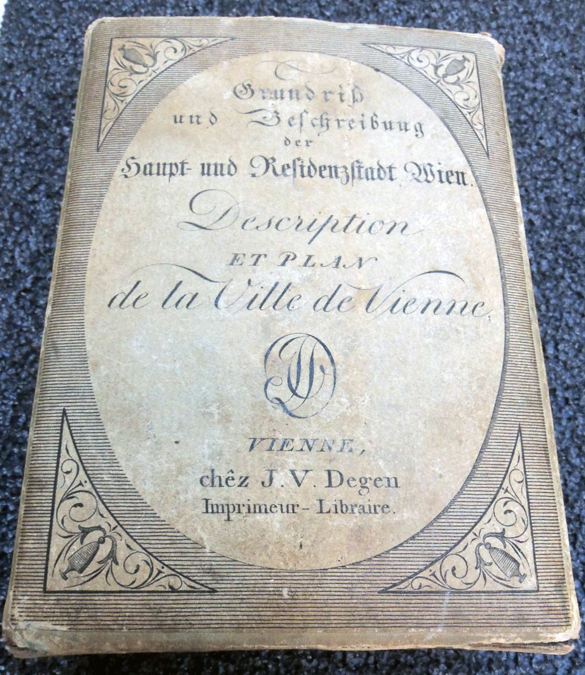
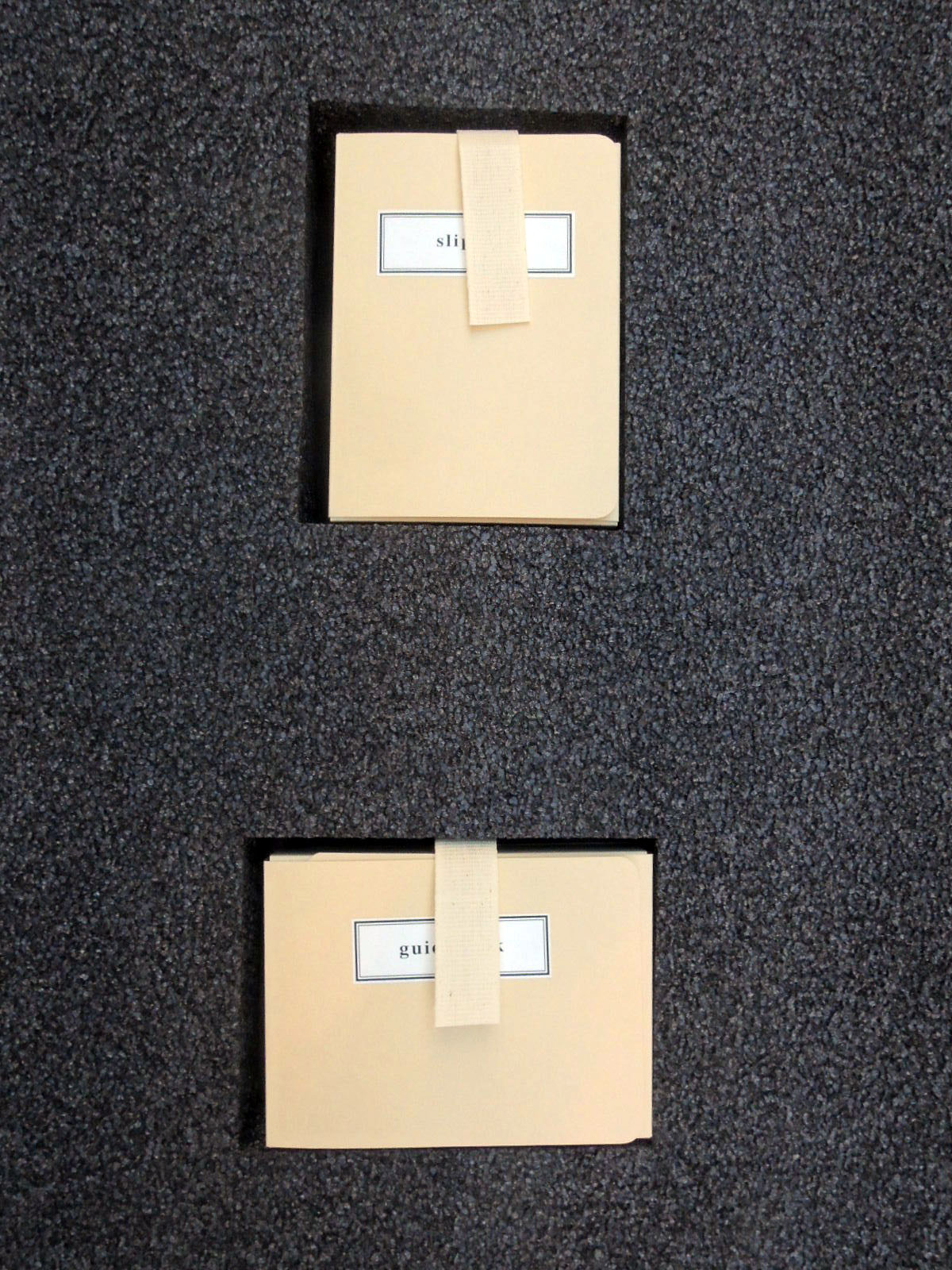
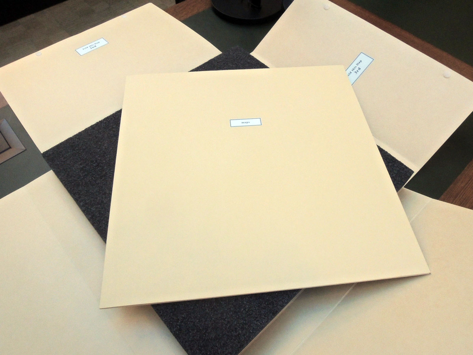
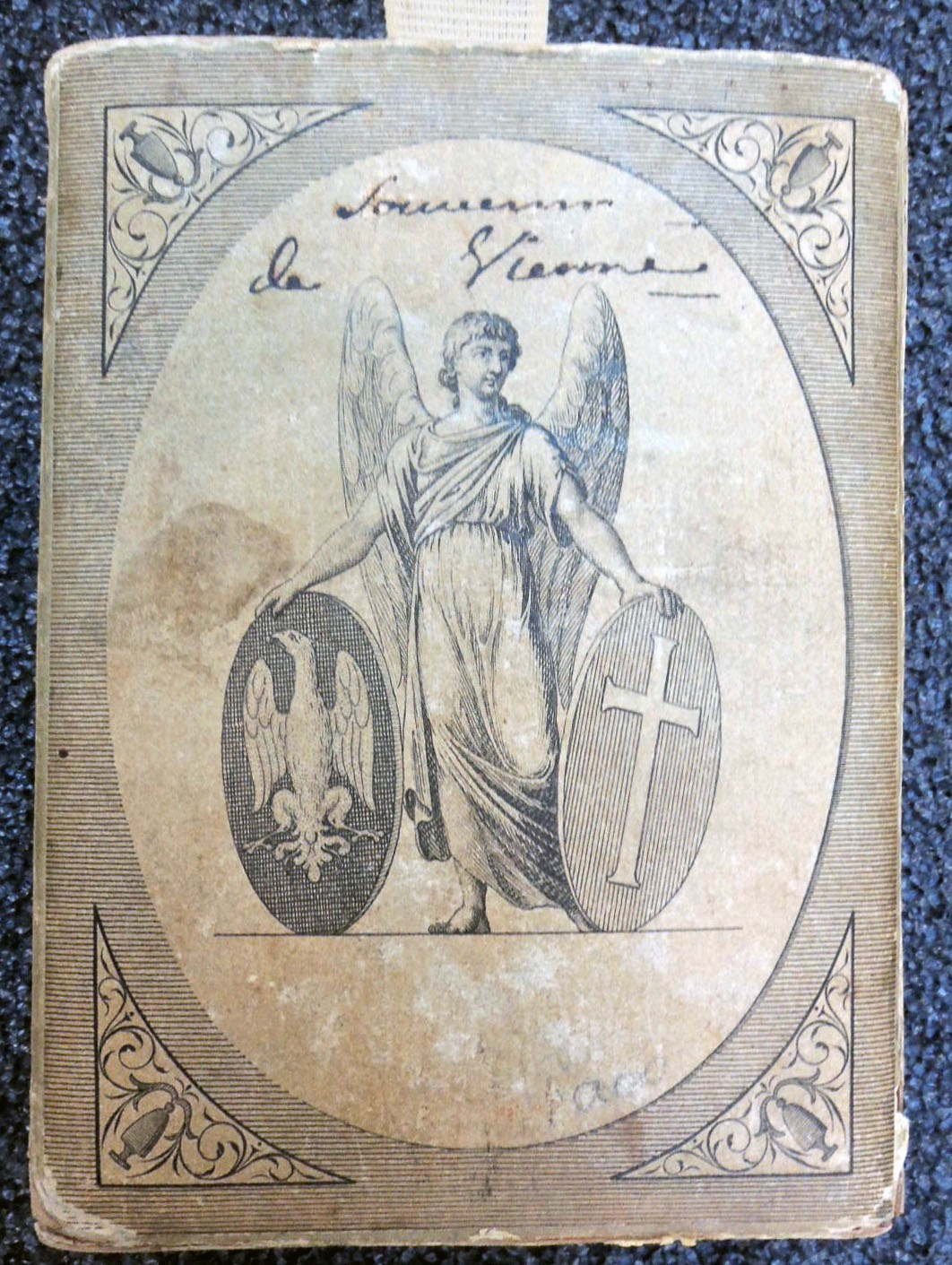
Joseph Vincenz Degen [Johann Pezzl], Grundriss und Beschreibung der Haupt- und Residenzstadt Wien. [Floor plan and description of the capital and residence city of Vienna] = Description et plan de la Ville de Vienne [Description and plan of the City of Vienna] (Vienna: bey J.V. Degen, 1802). Map, guidebook, and slipcase. Graphic Arts Collection GAX 2018- in process
When we first received this enormous four-part map of Vienna, engraved by Joseph Gerstner (1768-1813), it was folded into tiny chunks and stuffed inside the original paper slipcase (120 x 85 x 40 mm), together with the palm-size guidebook. Once its various parts were separated, rare book conservator Mick LeTourneaux decided not to return them to the original format but flatten the maps and conserve the slipcase individually.
A foam insert was prepared for the book and slipcase, exactly the size of the maps so that the whole object could be housed together in a light-weight four-flap folder. In this way, the material is protected but also available to researchers for daily use.
The four sheets of Gerstner’s plan of Vienna fit together to form a map approximately three feet square. His detailed plan was based upon Maximilian von Grimm’s monumental map to the Greater Vienna and the first scientific survey of the city, published in 1799. Gerstner includes the old city ‘Innere Stadt’ within the castellated medieval walls and the fast-growing suburbs that surrounded the center in all directions. Every street is precisely delineated and labeled.
The text for this first edition was written by Johann Pezzl (1756-1823), who frequented the Greinerschen Salon, in the circle around Caroline Pichler. The guidebook became so popular that it was re-issued many times up until 1809. After this date, the elaborate parts of this publication were discontinued and only the plan was published.
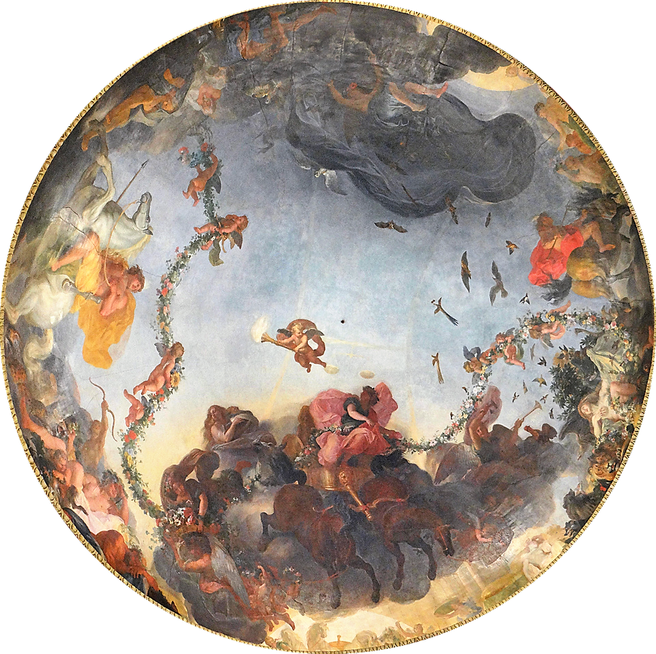
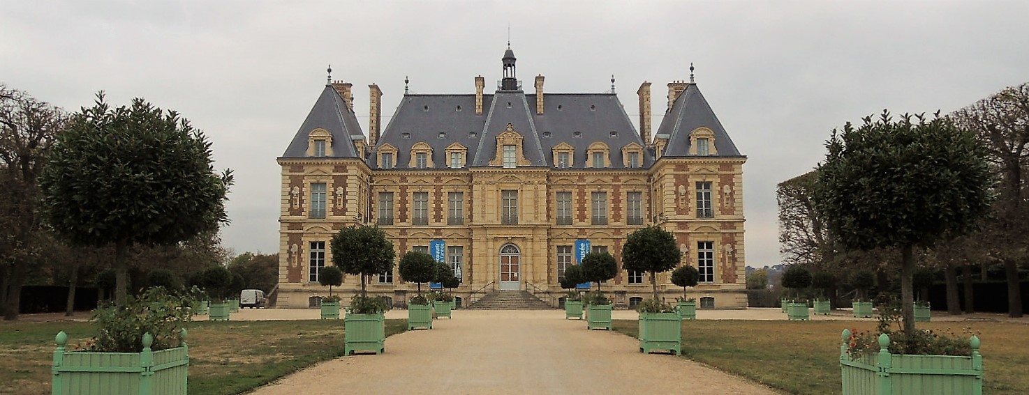
A trip to Jean Baptiste Colbert’s estate at Sceaux, south of Paris, helped to clarify the two illusionistic ceiling designs created in 1674 by Charles Le Brun for Colbert. One fresco was completed for the dome of Colbert’s chapel and a second was painted on the ceiling of the Pavilion of the Dawn (Pavillon de l’Aurore). While we can visit the Pavilion today [seen above] and appreciate Le Brun’s amazing design, the original castle and chapel were destroyed in 1803 along with that second work by Le Brun.
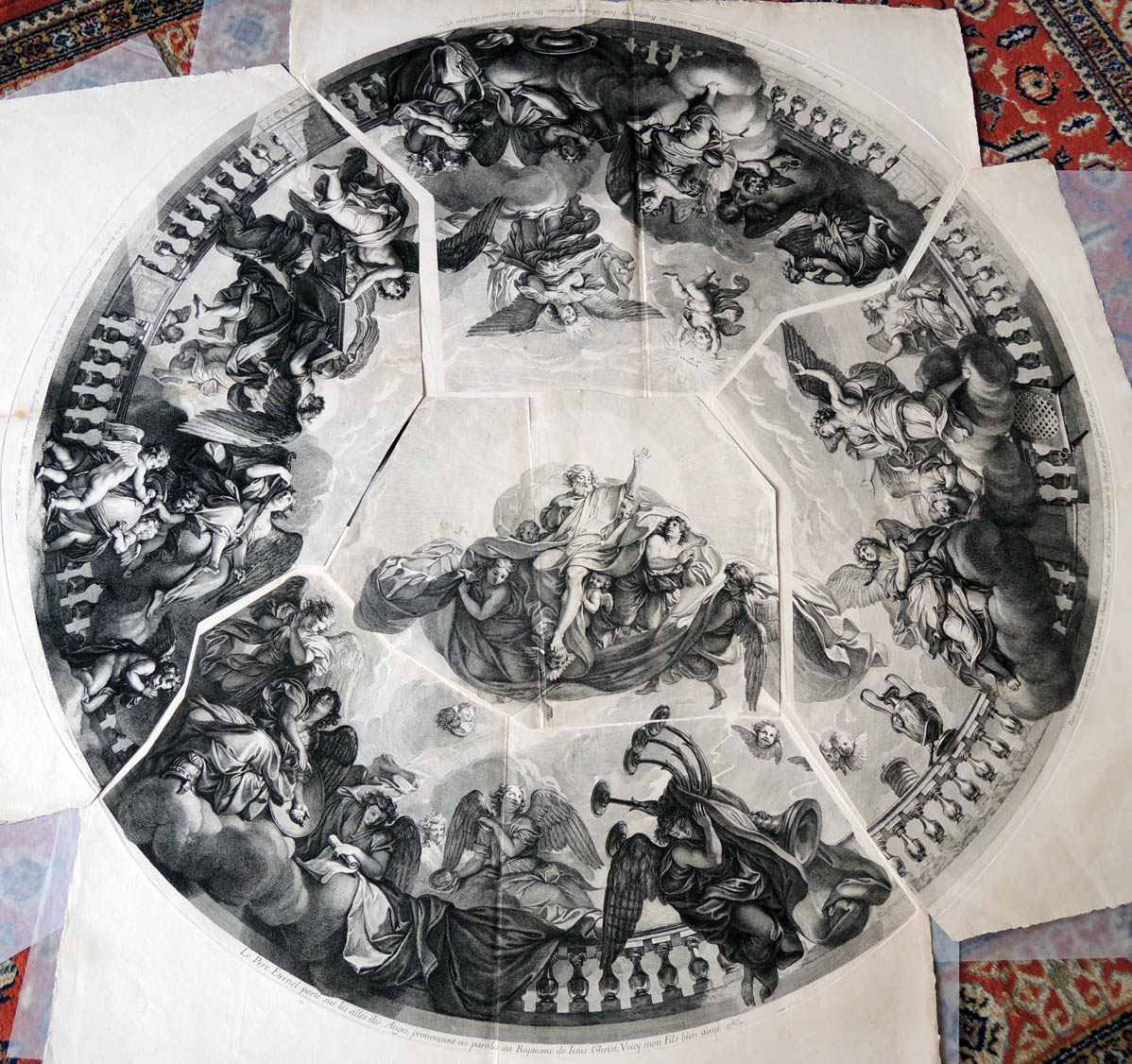
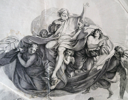
Happily, the chapel design, known as the Triumph of the New Testament, may be studied thanks to a painted copy by Le Brun’s assistant François Verdier [below], as well as the set of five engravings by Gérard Audran, held in the Graphic Arts Collection.
Gérard Audran (1640-1703) after Charles Le Brun (1619-1690), [Set of five plates, known as Triumph of the New Testament over the Old Testament], 1681. Etching and engraving. GA 2012.01256-01260.
1. “Car. Le Brun Regis Pictor primarius, udo tectorio pinxit in Capella Castelli vulgo de Seaux, Girardus Audran aeri incidit, 1681.” Depicts angels bearing the Ark of the Covenant.
2. “Le Pere Eternel porte sur les ailes des Anges, prononeant ces paroles au baptesme de Iesus Christ, voicy mon fils bien aime &c.” Depicts God the Father on the wings of angels.
3. “Peint a fraisque dans la voute de la Chapelle du Chasteaux de Sceaux.” Depicts the adoring angels.
4. “Pater Aeternus sedens super pennas Angelorum, haec verba in Baptismate Iesu Christi proferens, Hic est Filius meus dilectus &c.” Depicts the baptism of Jesus Christ.
5. Untitled [center section was perhaps not meant to be cut apart]
Above is the fresco in the Pavilion of the Dawn, described below in the estate’s official website:
“The Pavillon de l’Aurore houses one of the most remarkable compositions by Charles Le Brun, after Vaux-le-Vicomte and before the great sets of Versailles. Jean-Baptiste Colbert, Baron of Sceaux, Superintendent of Buildings, Arts and Manufactures, in 1664, built in the early 1670s, this elegant garden pavilion, an expression of his taste for an architecture called classical. It was the setting for a remarkable pictorial composition on the theme of Dawn, preceding the sunrise, work of Charles Le Brun, first painter of King Louis XIV.
This famous cupola, elaborated before the large sets of Versailles, dominates a living room rotunda framed by two quadrangular cabinets. In 1677, before the members of the French Academy, Colbert read a long description in verse, composed by Philippe Quinault, commenting on the decor of this “Cabinet of Dawn”. Later, the sovereign and the court admired the building at a big party ordered by Jean-Baptiste Colbert, Marquis of Seignelay, son of the previous, in 1685.
In the years 1714 and 1715, Louise-Bénédicte de Bourbon, duchess Maine chooses this graceful building for the scenography of its festivals, “The Great Nights of Seals”. The west facade of the Pavillon de l’Aurore presents a balanced game of lines and an elegant harmony of curves formed by the basin and the fountain, a kind of water buffet, the two steps of access to the perron, the front-body , the dome and the balustrades. A restoration of architecture and interior decoration was carried out in the last two decades of the twentieth century.”
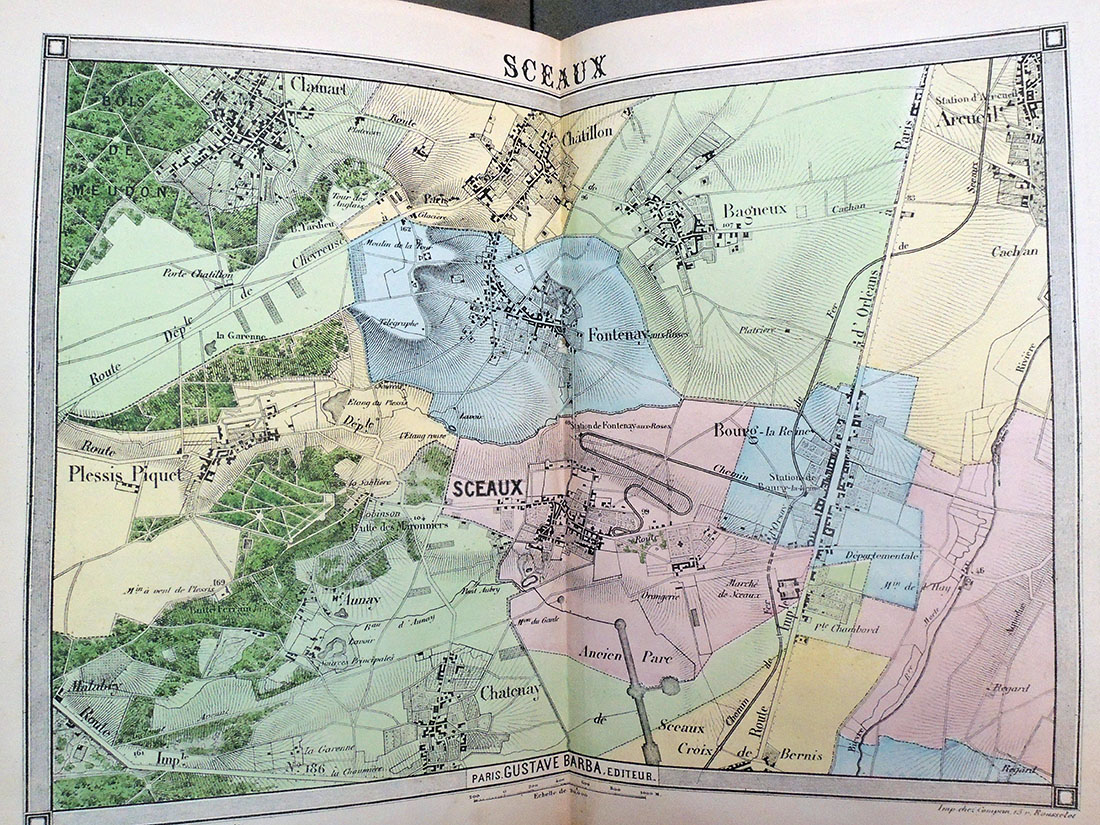
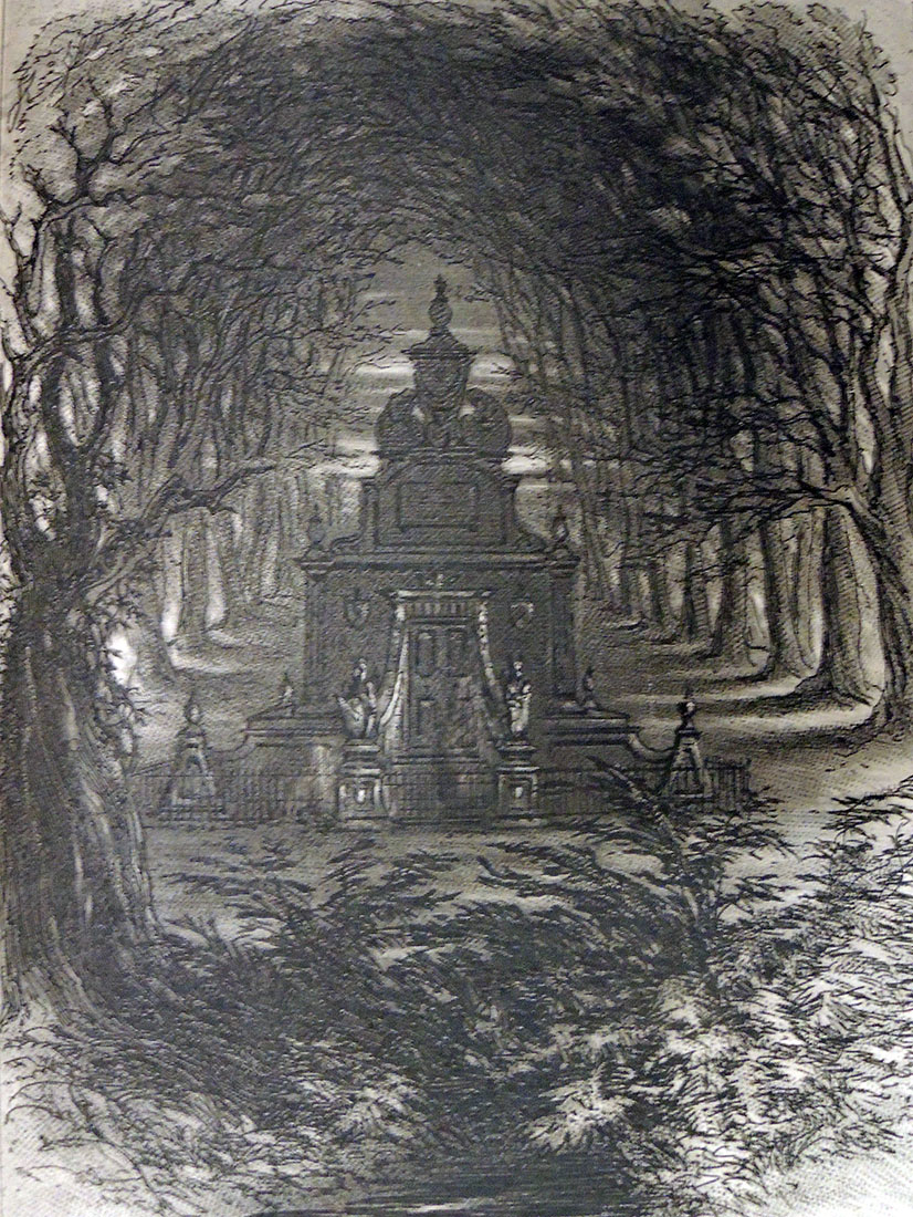
Emile de La Bédollière (1812-1883), Histoire des environs du nouveau Paris; illustrations de Gustave Doré; cartes topographiques dessinées et gravées par Ehrard (Paris: G. Barba, 8, rue Cassette, 8, [1861?]) ReCAP – Rare Books 1514.552
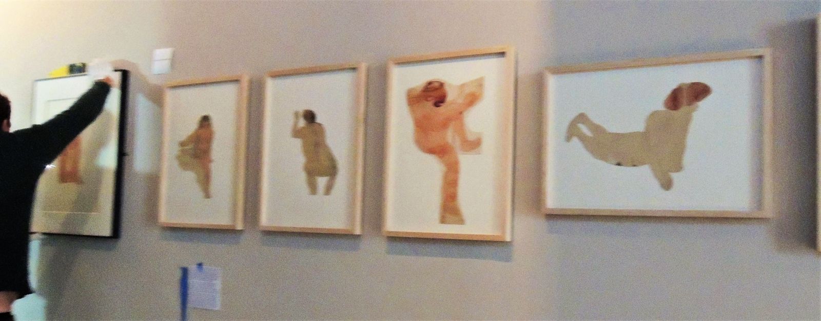
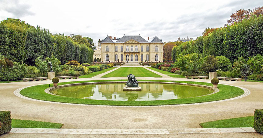
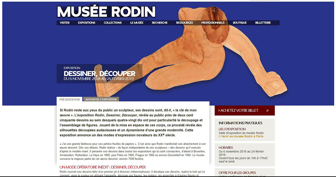
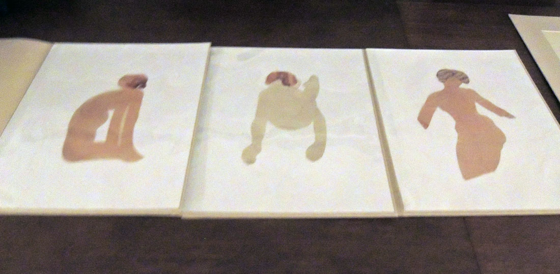
It is a great privilege to have work from the Graphic Arts Collection included in an exhibition at the Musée Rodin in Paris. Opening November 6, 2018, and running through February 24, 2019, the show entitled Rodin, Dessiner, Découper, includes nearly 250 drawings by Auguste Rodin (1840-1917), of which 90 are his rare and often surprising cut and assembled figures, 6 loaned by Princeton University’s Graphic Arts Collection. “Jouant de la mise en espace de ces corps,” writes curator Sophie Biass-Fabiani, “ce procédé révèle des silhouettes découpées audacieuses et un dynamisme d’une grande modernité. Cette exposition annonce un des modes d’expression novateurs du XXe siècle.”
The museum’s site goes on to quote Rodin, who said,
“‘I have a great weakness for these little sheets of paper.’ This is how Rodin showed his attachment to his drawn work. From his beginnings, Rodin realized–independently of his sculptures–drawings that he executed according to the living model. He presents his drawings in all exhibitions devoted to him, first in Brussels, Amsterdam, Rotterdam, The Hague in 1899, then Paris in 1900, Prague in 1902 or Düsseldorf in 1904. The museum retains most of this drawn work, about 7500 leaves.
An unprecedented mode of operation: drawing, cutting. Rodin submits his drawings made from a first throw to various metamorphoses. He decodes his drawings, identifies the line that suits him, sets the color using watercolor, cuts out his figures, puts them back, assembles them to other figures and gradually builds an unexpected device. In his early years, Rodin cut drawings and sketches that he pasted into albums. Between 1900 and 1910, he cut a hundred drawings of watercolor nudes which are the heart of this exhibition. By cutting them out, Rodin likes to manipulate them, to situate them in space in multiple ways, to cut them off voluntarily.”
(c) Musée Rodin
More information on how Rodin’s work made it to Princeton can be found here: https://graphicarts.princeton.edu/2018/03/10/auguste-rodin-cutouts/. Hanging and lighting will be completed this week and their beautiful exhibition catalogue with full color images will be available at Princeton next Monday.
“He plays with the small figures of paper which are the equivalent of his plaster figures. By relating these carvings to the three-dimensional character of the sculpture, the carved figures appear as a new “object” between the two-dimensional design and the sculpture. In another series, Rodin executes from his cut-out figures real assemblages that he fixes himself on a new support, interweaving the bodies in a new composition. Drawn and cut, these drawings are not mere technical accessories: they have conquered their status as full-fledged works. The dynamism of the silhouettes announces the modernity of Matisse.” –Sophie Biass-Fabiani, curator
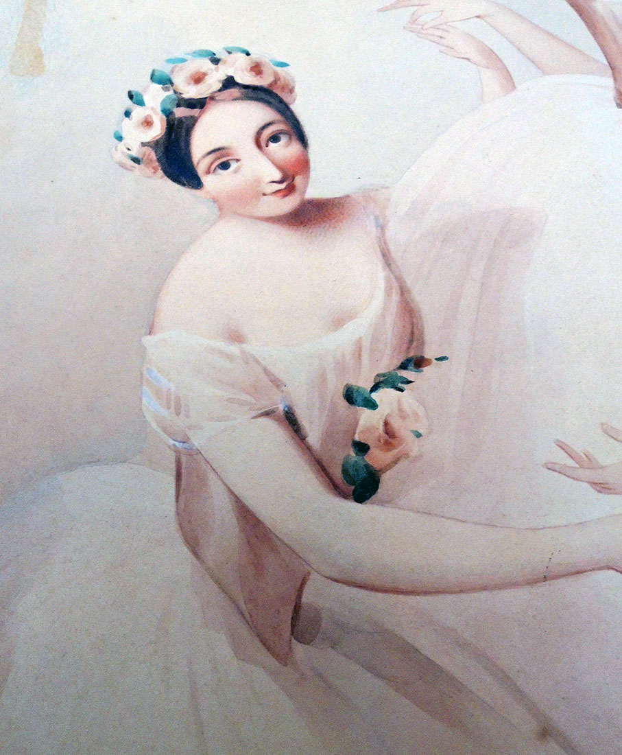
We were asked recently about the watercolor attributed to Alfred Edward Chalon (1780-1860) of the four leading ballerinas of the 1840s, Fanny Cerrito, Lucile Grahn, Carlotta Grisi, and Marie Taglioni, in the Pas de Quatre, composed by Jules Perrot and danced on July 12, 1845. This painting was the source for a popular lithograph by Thomas Herbert Maguire (1821-1895), widely circulated.
According to commentary by the Victoria and Albert Museum,
“There were no men in the ballet–the ballerina was now the public’s favourite and the male dancer’s role was reduced to lifting and supporting her. In the coming years, his position declined even further, until he was all but banished from the stage and male roles were performed by girls in men’s clothing. By this time a recognisable ‘ballet’ costume had evolved, which still forms the basis of many ballet costumes today. It was originally based on fashionable dress of the period, but gradually crystallised into a low-cut pointed bodice and a bell-shaped, knee-length skirt formed of tiers of tarlatan with a diaphanous top layer.”
Our watercolor was a gift of Allison Delarue, of whom Mary Ann Jensen, former Curator of the William Seymour Theatre Collection, wrote,
“Allison Delarue, Class of 1928, is a graduate of the Peddie School who received both his Bachelor of Arts and Master of Arts degrees from Princeton University. While continuing graduate studies at Oxford University he became fascinated with the renaissance of ballet in England; he studied dance with the Hon. Martin-Haney and bought his first ballet print at Cyril Beaumont’s famous London bookshop in Charing Cross Road.
Returning to the United States, he pursued his interest in the ballet while on the staff of the Cooper Union Museum in New York City. A talented photographer as well as a collector and writer, for many years Mr. Delarue was on the staff of the McCarter Theatre in Princeton. His professional memberships have included the Theatre Library Association and the American Society for Theatre Research.”
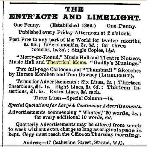
This post was directed to our friends in Great Britain who were asked to answer the question: “What are mems?” Happily, the answer came in minutes from Simon Beattie, citing the OED:
mem, v.
Pronunciation:
Brit. /mɛm/
U.S. /mɛm/
Frequency (in current use):
Origin: Formed within English, by conversion. Etymon: mem. n.1
Etymology: < mem. n.1
nonce-word.
transitive. To note or write down as a memorandum.
1915 W. J. Locke Jaffery v. 61 Once having ‘mem-ed’ an unpleasant thing in my diary, the matter is over.
The term appears in such book titles as: A Paper, of Tobacco: Treating of The Rise, Progress, Pleasures, and Advantages of Smoking: With Anecdotes of Distinguished Smokers, Mems on Pipes and Tobacco-Boxes, and a Tritical Essay on Snuff (London 1839)
Pickwick In America! . . . : and the Sayings, Doings, and Mems of the Facetious Sam Weller (London 1839)
Mems of America, and Reminiscences At Home and Abroad (London 1839)
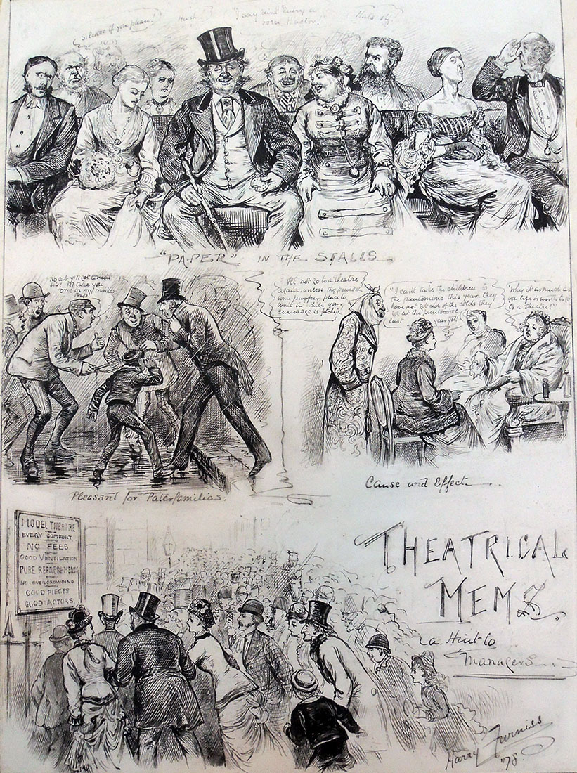
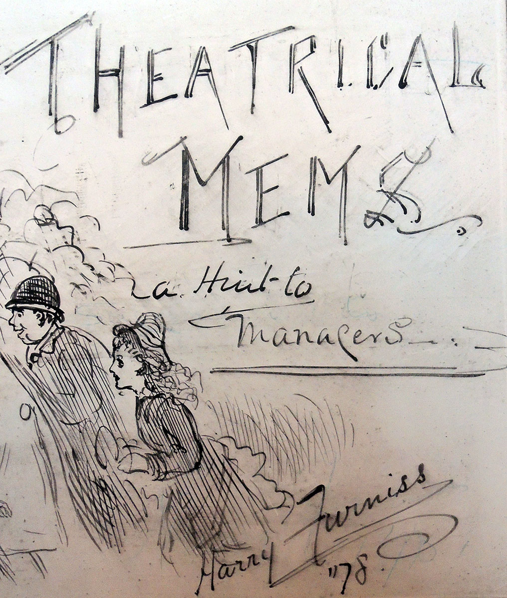
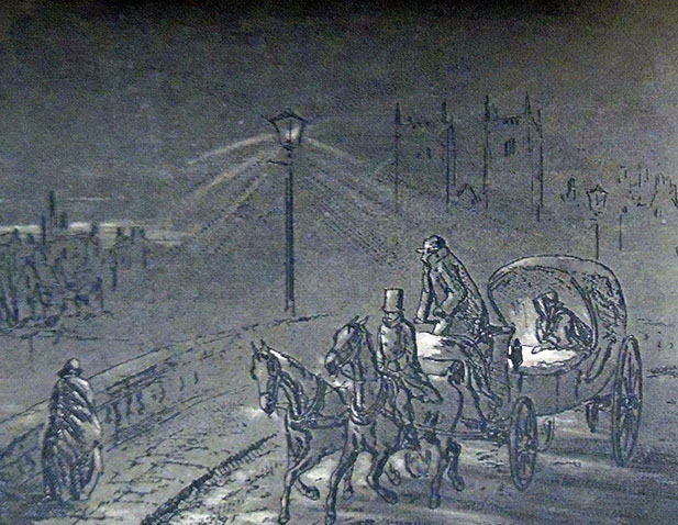
This advertisement [above] in Willings Press Guide includes Theatrical mems, as does the print at the top from The Illustrated Sporting and Dramatic News, April 6, 1878.
Harry Furniss (1854-1925) was an artist, whose first job as an illustrator was for the Illustrated Sporting and Dramatic News, and later for The Illustrated London News and The Graphic. His most famous humorous drawings were published in Punch, for which he started working in 1880.
Furniss moved to New Jersey where he worked for Thomas Edison making animated cartoons.
Interesting but no mention of mems:
Harry Furniss (1854-1925), My Bohemian Days, with illustrations by the author (New York: Stokes, [1919]). ReCAP 30104.372
Harry Furniss (1854-1925), Harry Furniss At Home (London: T. F. Unwin, 1904). Forrestal Annex NC1320 .F98
Harry Furniss (1854-1925), The Confessions of a Caricaturist (New York: Harper and brothers, 1902). Graphic Arts Off-Site Storage RCPXG-6703038
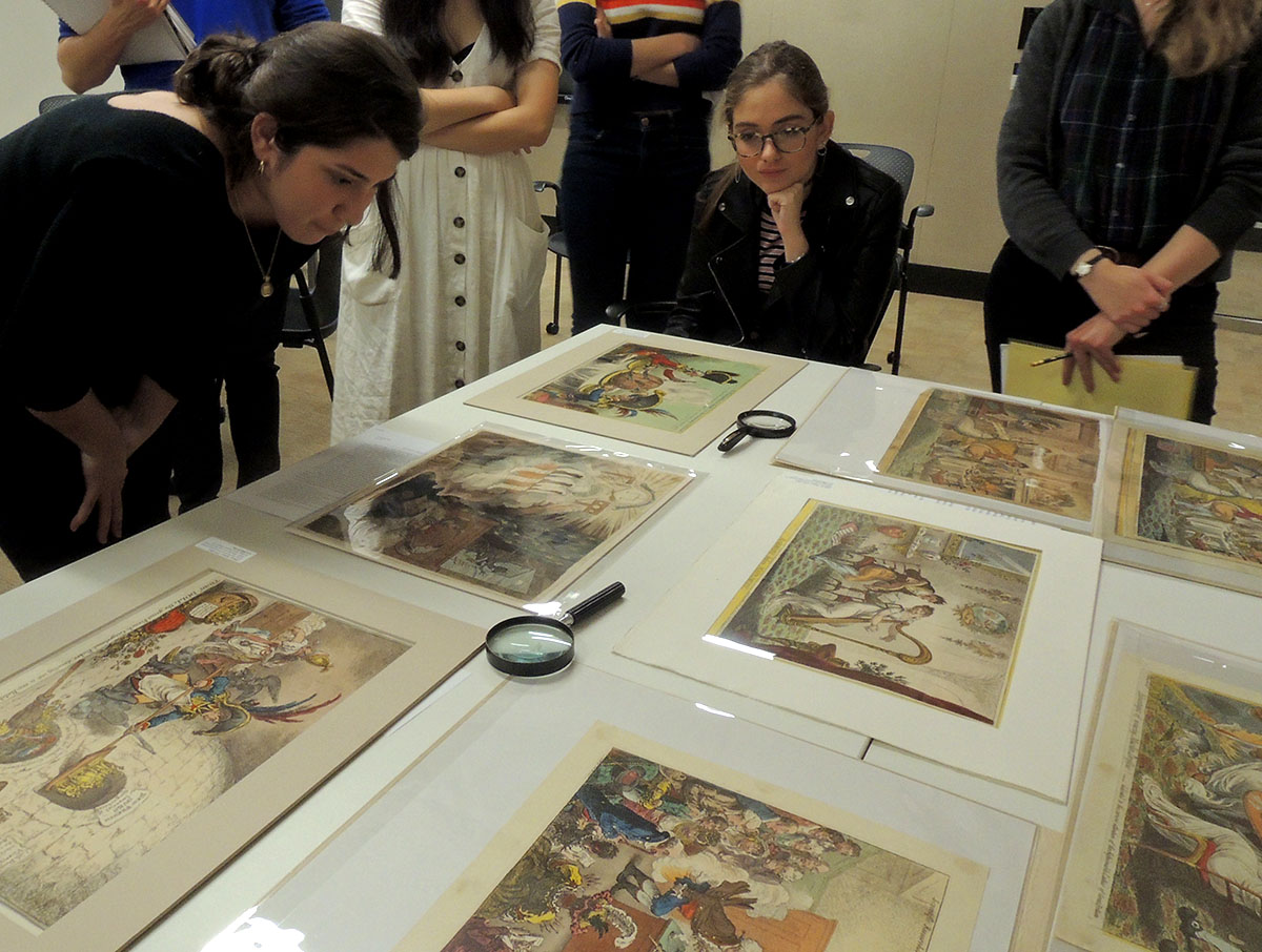
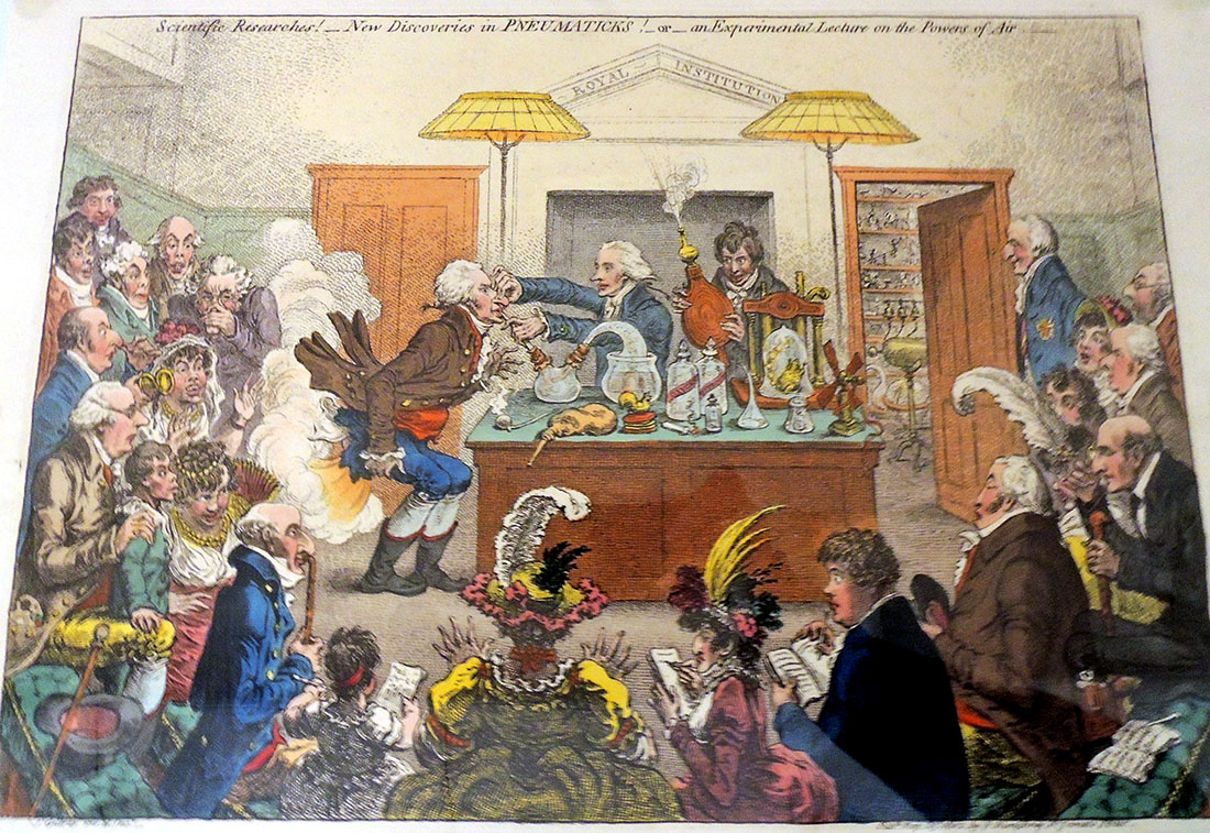
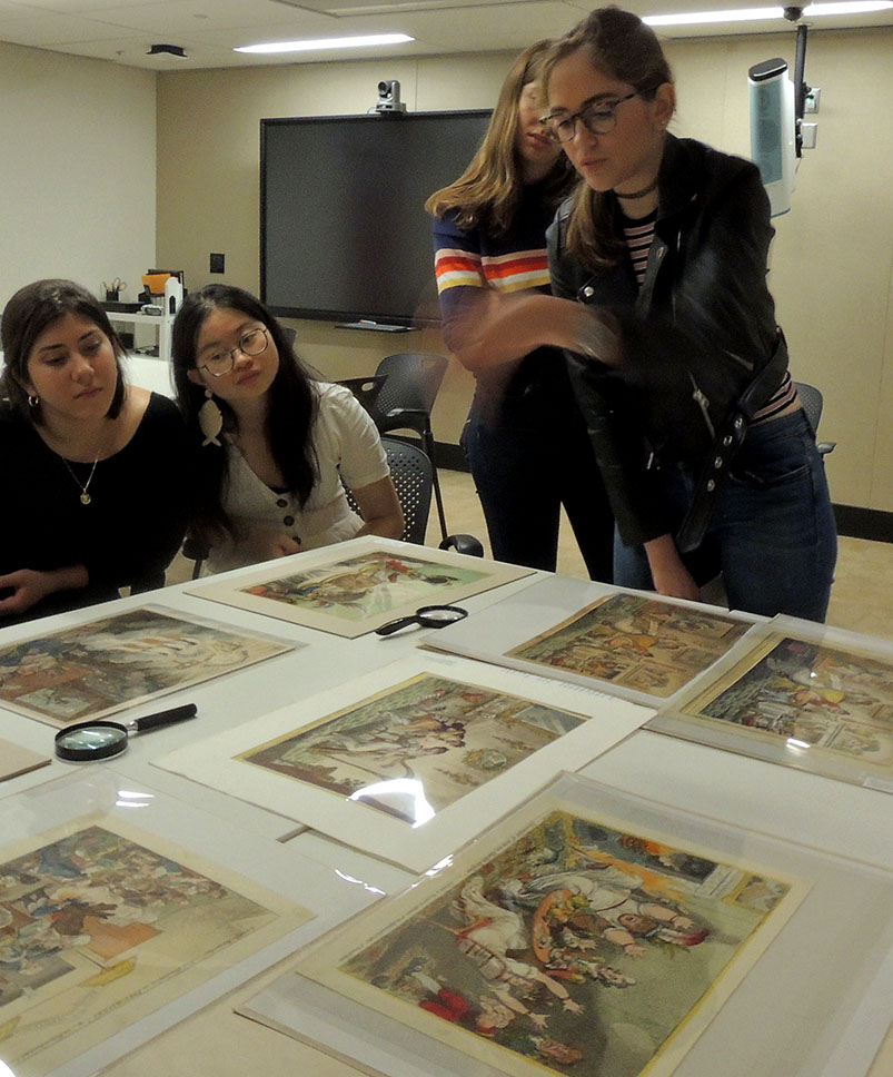
Princeton University class “Caricature and Modernity: 1776-1914” (ART 453/ECS 453) visited the Graphic Arts Collection this week to view prints and watercolors by James Gillray, Thomas Rowlandson, and other British caricaturists.
With frequent bursts of laughter, the class looked primarily at the collection of Dickson Q. Brown, Class of 1895, who donated several thousand prints, drawings, and illustrated books to the Princeton University Library.
“Caricature, based on the distortion of the human face for comic effect, challenged the ideally beautiful,” reads the class description, “and the academic art training that developed in Western Europe after the Renaissance. This course will examine the explosion of caricatural prints and comic illustrated books in France, Great Britain, and the United States from the revolutions of 1776 and 1789 to World War I. Topics will include the political role of satire in the newly defined public sphere; the influence of physiognomy and racial theories on caricatural depictions; the invention of the comic strip; and the origins of Dada and Cubism in comic illustration.”
The invention of laughing gas is celebrated below:
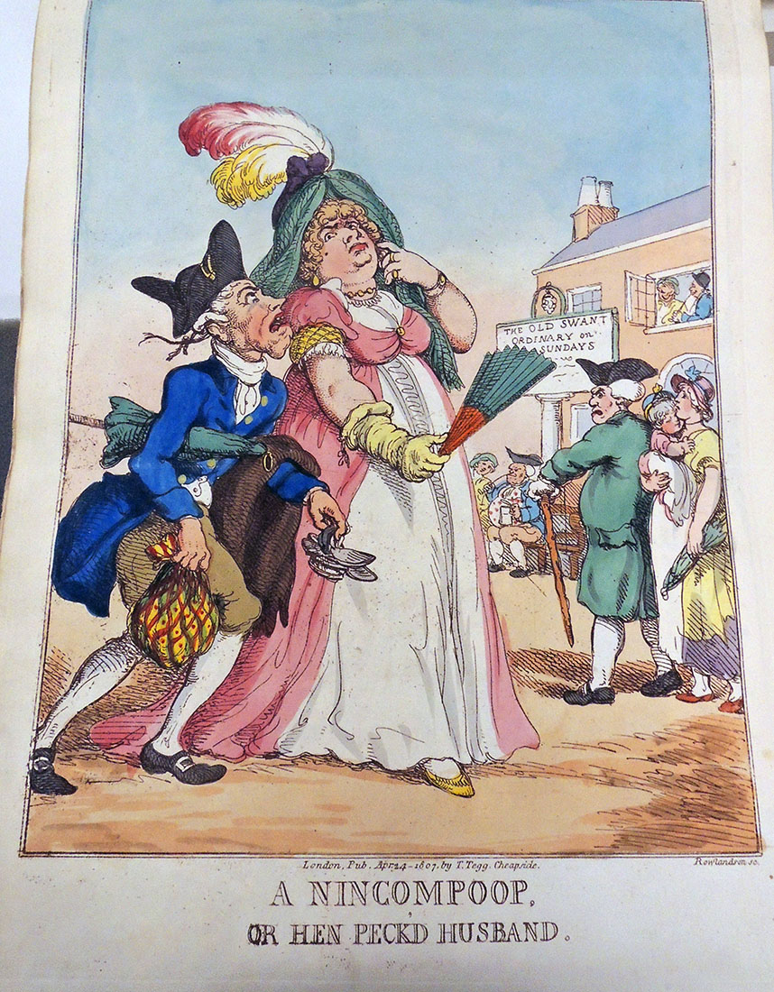
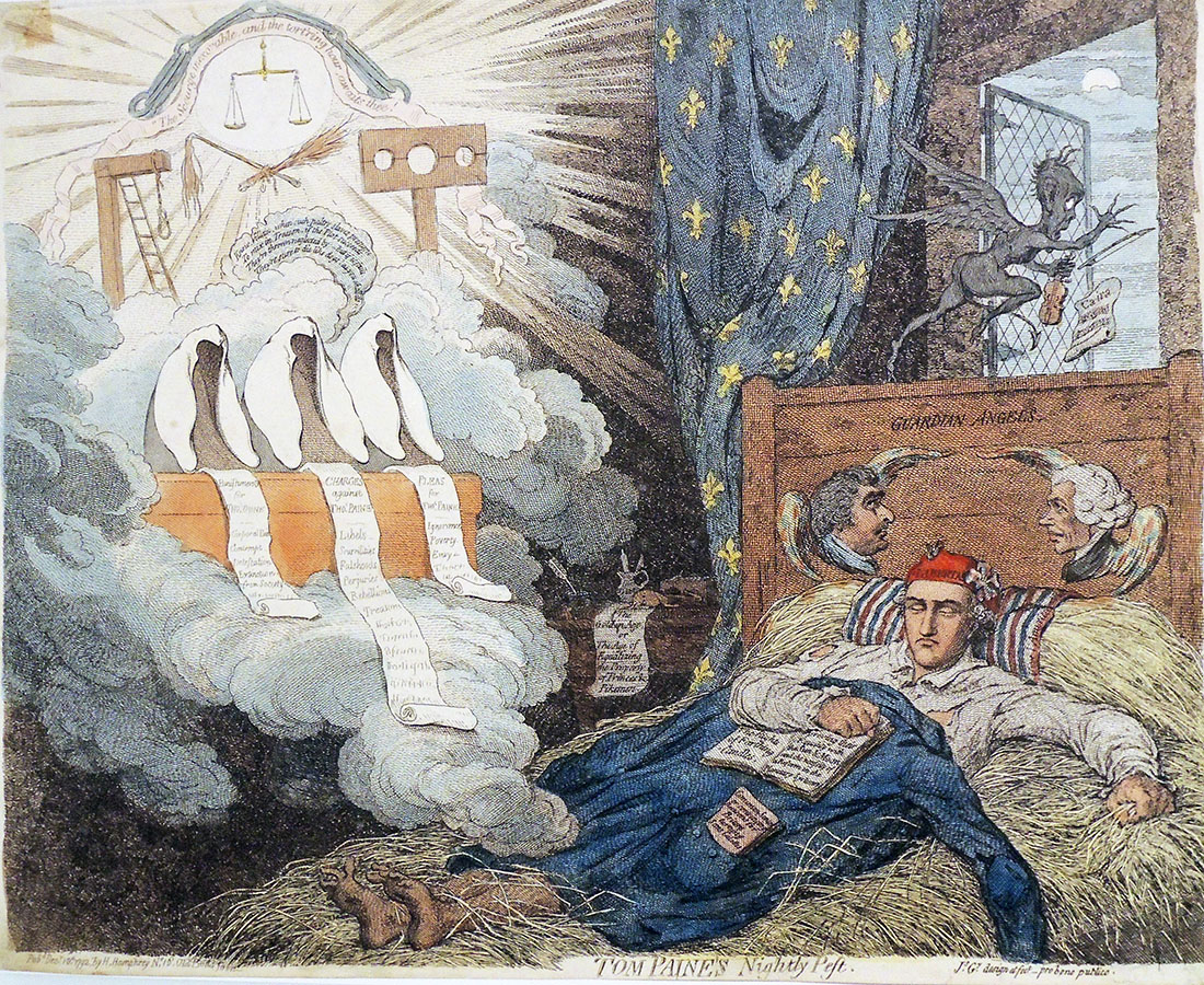
Reports were prepared on Gillray’s Tom Paine’s Nightly Pest (1792); King of Brobdingnag and Gulliver (1803); Matrimonial Harmonics (1805); and Advantages of Wearing Muslin Dresses! (1818). In addition, they studied Rowlandson’s Drawing from Life at the Royal Academy, Somerset House (1808); A Nincompoop or Henpecked Husband (1807); The Anatomist (1811); and Breaking up the Bluestocking Club (1815), among many others.
Next week they move on to Paris and Charles Philipon’s La Caricature with Daumier, Grandville, and other French caricaturists.
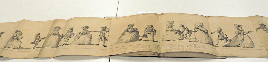
Attributed to Henry William Bunbury (1750–1811), The Long Minuet as Danced at Bath (after 1787).
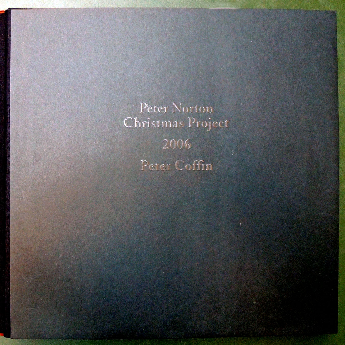
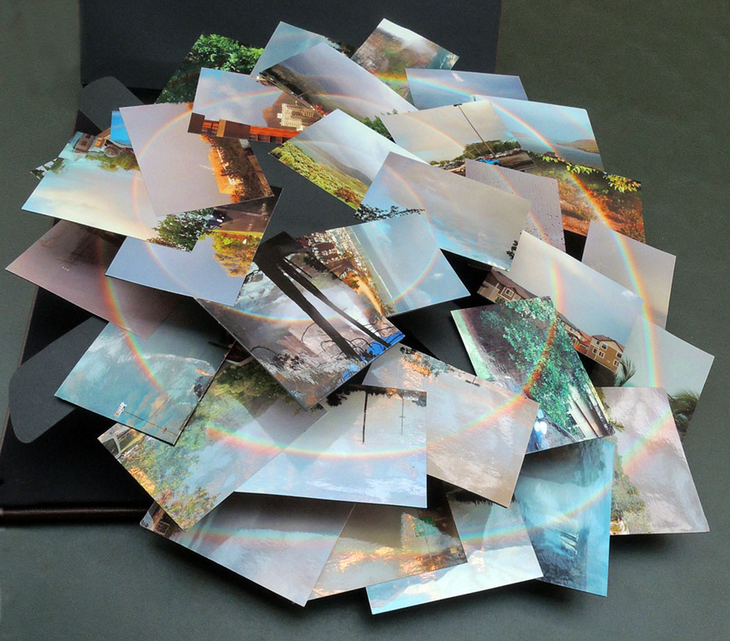
The spiral as a conceptual archetype is a recurring theme in the work of the American artist Peter Coffin, such as in his 2006 commission for Peter Norton’s annual Christmas gifts. Taking the format of a common photograph album, Coffin organized a series of postcards depicting rainbows into a three-dimensional spiral forming one enormous rainbow. As you open this volume, the constellation of cards expands in an upward swirl of color and form.
The artist commented, “There is a tendency to clutter things up, to try and make sure people know something is art, when all that’s necessary is to present it, to leave it alone. I think the hardest thing to do is to present an idea in the most straightforward way. I think it was Jasper Johns who said that, “[It’s] sometimes necessary to state the obvious.” Still, how to proceed is always the mystery. I remember at one point thinking that someday I would figure out how to do this, how you do art — like “What’s the procedure here, folks?” — and then it wouldn’t be such a struggle anymore. Later I realized I would never have a specific process; I would have to re-invent it, over and over again.”
The Coffin project is the gift of James Welling, Lecturer with the rank of Professor in the Visual Arts program in the Lewis Center for the Arts at Princeton University. In turn, it was the gift of the Peter Norton Family, who each year commission a work of art to celebrate the holiday season.
Peter Coffin (born 1972), Norton Family Christmas Project ([Santa Monica, Calif.]: [Peter Norton Family], [2006]). 1 photograph album. Gift of James Welling. Graphic Arts Collection in process.
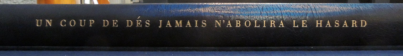
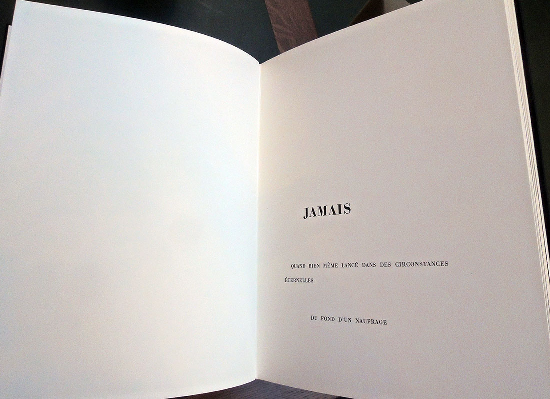
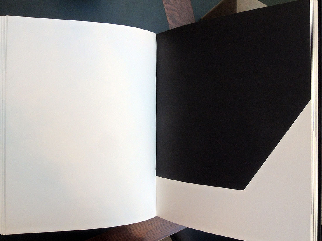
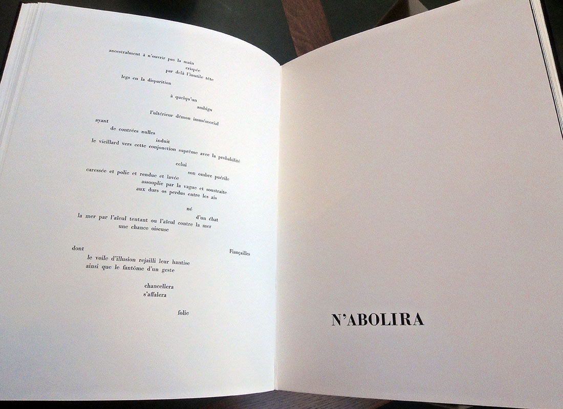
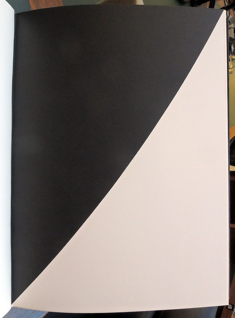
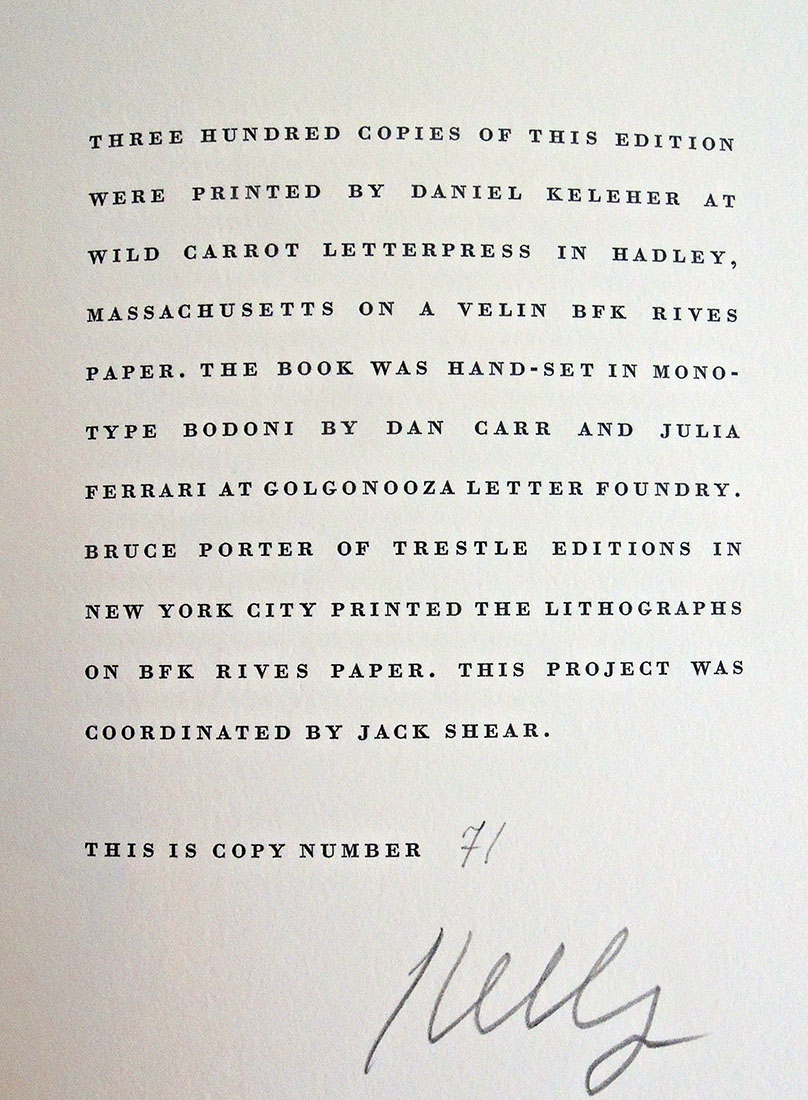
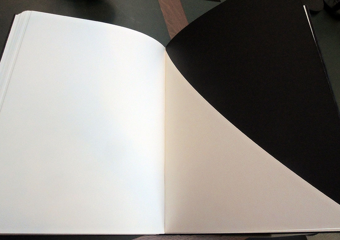
When publisher Sidney Shiff commissioned Ellsworth Kelly to select a text and create prints for a Limited Editions Club book, Kelly chose to match his black and white lithographs with Un coup de dés by Stéphane Mallarmé, one of the most famous poems of the 19th century. In its 63rd year, the Club was publishing only three or four titles each year in editions of 300, unlike the earlier runs of 2,000 under George Macy. This allowed Shiff to work with outstanding artists and create some of the most beautiful books of the late 20th and early 21st century.
Published in the original French and the original page design, Kelly integrated his eleven lithographs with the text, accentuating the open white space of both text and images. A separate booklet with Daisy Aldan’s English language translation is included: mallarme
“A throw of the dice never even when cast in eternal circumstances at the heart of a shipwreck let it be that the Abyss whitened slack raging under an incline desperately soars by its own wing…”
Stéphane Mallarmé (1842-1898) and Ellsworth Kelly (1923-2015), Un coup de dés jamais n’abolira le hasard ([New York]: Limited Editions Club, 1992). Text printed at Wild Carrot Letterpress and lithographs printed at Trestle Editions. Copy 71 of 300. Original black goatskin, in black solander box. Graphic Arts Collection GAX 2018- in process.
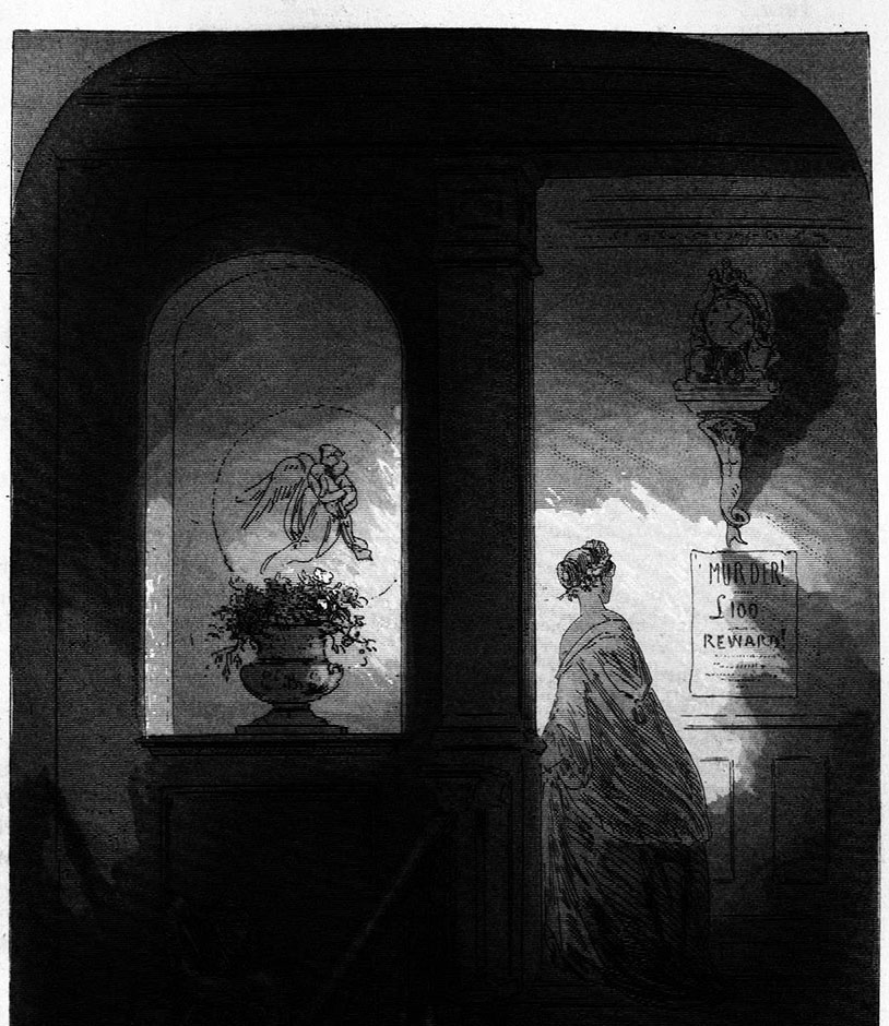
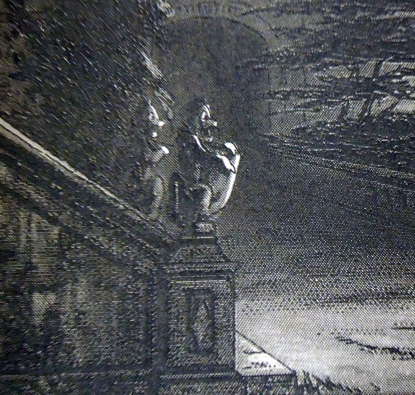
Preparing for a visit from ART 561/ENG 549/FRE 561 “Painting and Literature in Nineteenth-Century France and England,” the prints of Hablot Knight Browne (Phiz) for Charles Dickens’ Bleak House have been pulled. Phiz completed forty plates, etched on steel, for Dickens’ ninth novel published in monthly parts from March 1852 to September 1853.
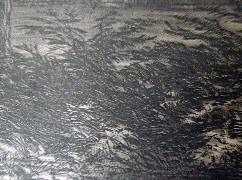
Both for the added mystery and to thwart the lithographers who made copies of Browne’s superb etchings, the artist developed a technique for what we refer to as the ‘dark plates.’
In ten of the forty illustrations, Browne merged the meticulous engraved lines made by an engraving- or ruling-machine with the hand drawn lines of his etching needle to create the look of a mezzotint with the detail and freedom of a drypoint.
Engraving on steel had only recently been perfected. In 1895, C. W. Dickinson wrote an easy to understand description of “Copper, steel and bank-note engraving,” quoted here:
“Previous to the year 1830 only copper plate was used by engravers, because up to that time it was not thought possible to make steel soft enough to cut easily and smoothly. The first plate produced—that could be used—was called “silver steel.” Later there was manufactured the “Prussian steel” plate, which was a slight improvement in fineness of grain. Other and greater improvements followed, until now steel has almost entirely superseded copper.
Decarbonated cast steel is used for general engraving purposes and must be of very fine grain, and very soft as compared with natural cast steel. The plates are rolled out from bars of steel in its natural state, then decarbonated and cut to about the size desired, leaving enough margin to square the edges, which are finished with a wide bevel. After the plate has been cut to size, it is flattened by laying it upon a copper anvil and hammering with a wooden mallet until it is as flat as is possible to get it by that process. A uniform thickness and perfectly flat surface are then given to the plate by grinding—sometimes by hand, usually by machine—the latter process being the better, as it is the more perfect in its results.” https://en.wikisource.org/wiki/Popular_Science_Monthly/Volume_46/March_1895/Copper,_Steel,_and_Bank-Note_Engraving
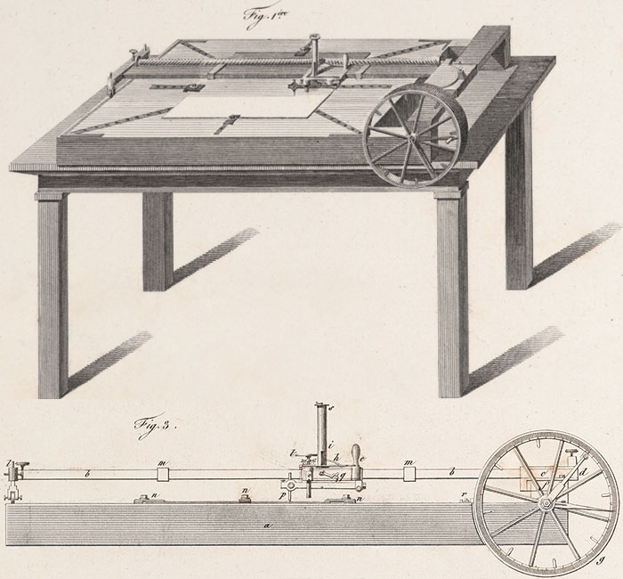
Also in the early 19th-century ruling machines for engravers were being up-graded, in particular to accommodate enormous publishing project such as Napoleon’s Description de l’Égypte. As improved and enhanced by Nicolas Conté, the French engraving machine was invaluable for the thousands of lines incorporated into the skies and landscapes within his designs. Here’s an image: https://napoleon.lindahall.org/engraving.shtml
A diamond was often used as the stylist on the engraving machines, hard enough to cut but thin enough to draw the slender marks that left the impression of a tint or tone rather than line. Here are a few close ups that make it easier to see the hundreds of tiny straight lines behind Browne’s linear picture.