Category Archives: Medium

mediums

Conserving Sarduy Paintings

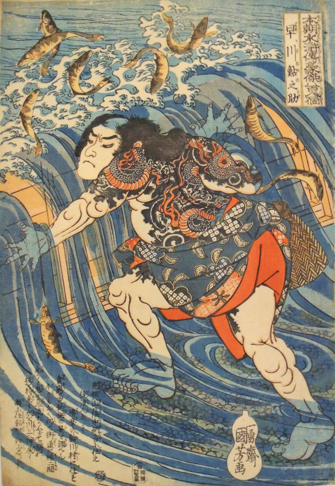
In James Kirkup’s 1993 obituary for the French/Cuban artist and writer Severo Sarduy (1937-1993), he writes:

“When Castro came to power, Sarduy wangled a grant to study art in Paris. His talent as a painter and designer was to accompany his writing throughout his life, and at the time of his death he was planning a vast retrospective of his paintings and drawings in Madrid. He never returned to Cuba, though he always felt anguished nostalgic longings to do so. At 23, he at once felt at home in the city that has welcomed so many Spanish and Latin American refugees from Fascist and Communist butchery. He never considered himself an exile or an immigrant: ‘I am a Cuban through and through, who just happens to live in Paris.’ Nevertheless, he became a French citizen in the Seventies.”

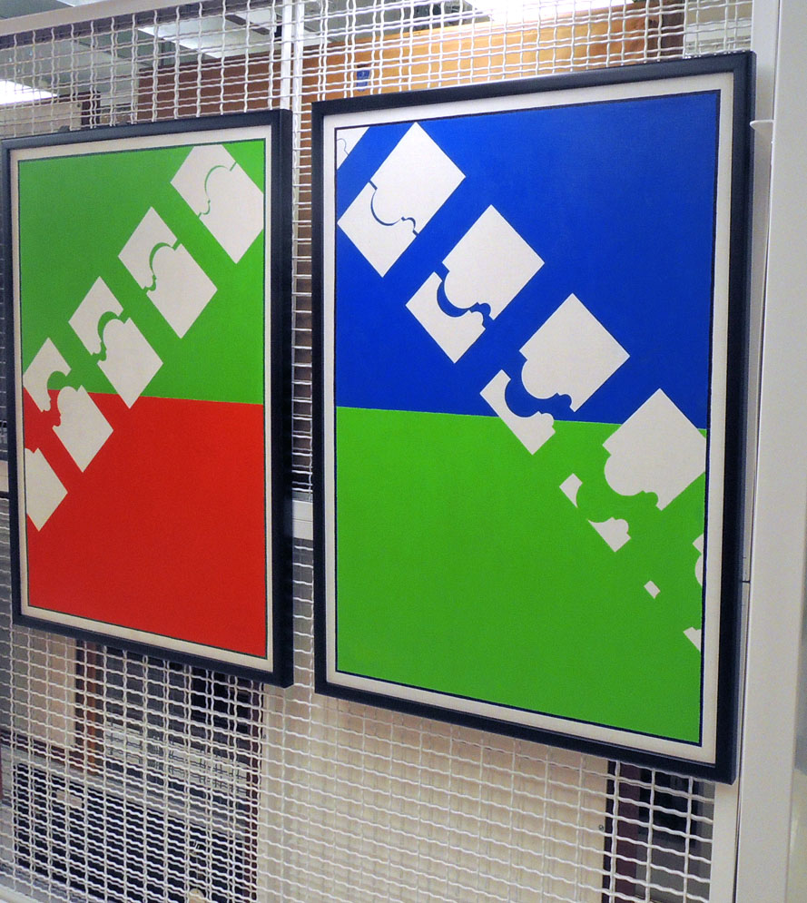
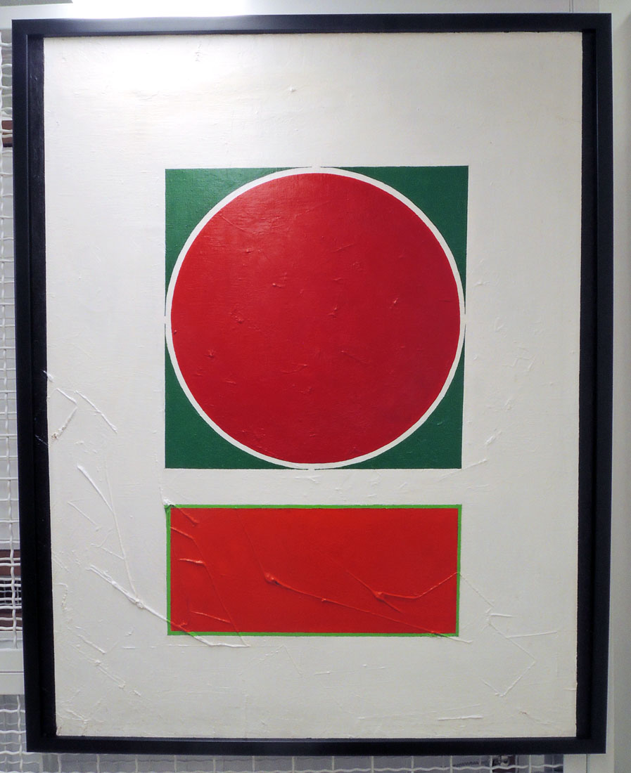
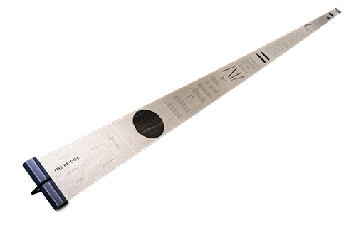
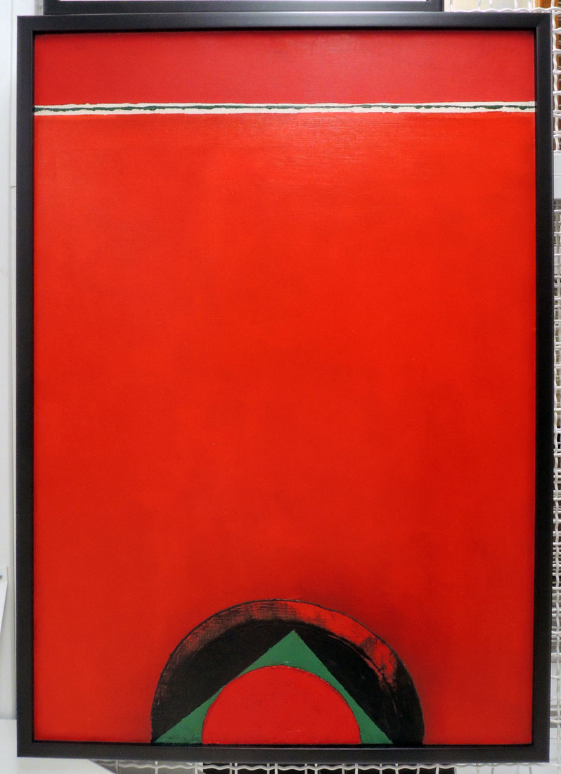
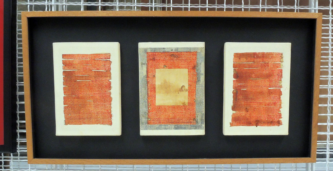
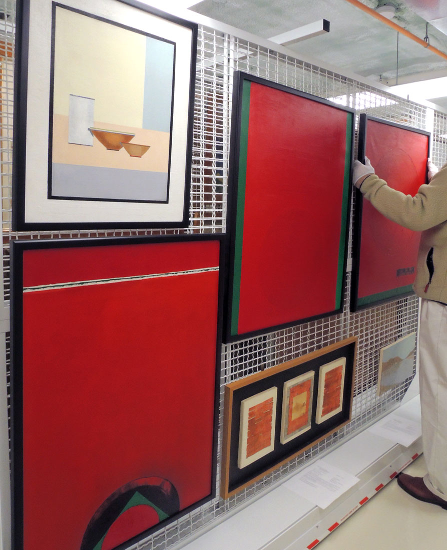
Thanks to Sarduy’s partner François Wahl (1925-2014), a small group of Sarduy’s canvases and works on paper are held in the Graphic Arts Collection. Created with unusual mediums including coffee and fingernail polish, many were in need to conservation and repair. Thanks to the Gratz Gallery & Conservation Studio, ten works have been conserved, re-framed, and are now once again, available for researchers here in Firestone Library.

When first in Paris, Sarduy attended Roland Barthes’ seminars on language at the College de France, and his collection included works on paper by Barthes, now also at Princeton University.


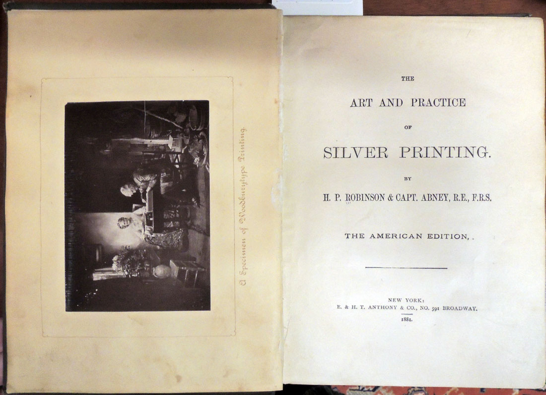
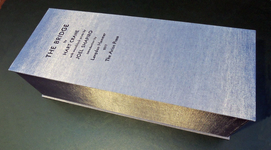
His last book, Christ on the Rue Jacob; translated by Suzanne Jill Levine and Carol Maier (Firestone Library PQ7390.S28 C713 1995) was reviewed in Publisher’s Weekly:

This truly beautiful book is the last by the Cuban-born, Paris-nurtured writer who died in 1993 of AIDS. In a collection of brief, even minute, essays, he offers maps to the passage of time. The first such map is his body, on which ‘epiphanies’ are marked by scars-beginning with the navel, the first wound. The second map is Sarduy’s mind, filled with sharp impressions of places (Cafe de Flore, Benares) and people (Roland Barthes, Italo Calvino). It can make for lonely reading, in part because many friends (Barthes and Calvino among them) are dead.

In ‘The Tibetan Book of the Dead,’ Sarduy recounts the changes in his address book as death threatens to turn it into a ‘novel, or biographical fiction.’ But, facing his own death, Sarduy refuses to remove the name of a dead friend because ‘it would be like eradicating him all over again, as if I were an accomplice of the void, subjecting him to another death within death’.

Gladstone in his Temple of Peace


Joseph Parkin Mayall (1839-1906), William Ewart Gladstone, 1883. Photogravure. Published in Artists at Home, edited by Frederick George Stephens (London: Sampson Low, Marston, Searle and Rivington, 1884). Graphic Arts Collection GAX Oversize 2007-0028F

Joe Mayall was forty-three when he left work in the family business established by his father, daguerreotypist John Jabez Edwin Mayall (1813–1901), and opened his own photography studio at 548 Oxford Street, near the Marble Arch in 1882.

The following year, the firm Sampson Low, Marston, Searle, and Rivington proposed a series of luxury prints depicting prominent artists of the day in their homes, surrounded by their work. Equal weight was to be given to the men and the interiors, featuring “pictures, sculptures, and other objects of art which characterise those places,” according to the prospectus. Since Sampson Low had already retired from the firm, credit for the project might go to Edward Marston (1825-1914), who continued to publish luxury volumes.

Art critic George Stephens (1828-1907) was hired to write the biographies and Mayall secured the commission to make the portraits. Forty-eight men were photographed but only twenty-five appear in the final publication, issued monthly from March to August 1884. Each part cost five shillings, with the final bound volume priced at 42 shillings (£2.40). Mayall’s assistant Frank Dudman (1855-1918) filed his own name to the copyright on many of the negatives.

From the beginning, the portraits were planned as photogravures, advertised in the prospectus as the “entirely new and unquestionably permanent process of photoengraving.” When the book was later reviewed, it was called a “marvels of skill and workmanship.” Thanks to the exhibition at Emery College, we learn that “the first set of photogravures was printed in Paris, but something went awry with one of the plates, and although the March 1st publication date had been confidently announced for weeks, that initial installment was embarrassingly delayed.” Chiswick Press printed the rest of the volume but there is no information on the engraver who made and printed of the plates.

The book is dedicated to Frederic Leighton (1830-1896) [below] but he was pushed aside at the last minute to feature Prime Minister William Ewart Gladstone (1809-1898) as the frontispiece. Although not a painter, he was an Honorary Professor of Ancient History at the Royal Academy. Photographed in his library at Hawarden Castle, Gladstone later became the subject of an article Mayall published describing the two days spent photographing; “Mr. Gladstone at Home. The Whole-Hearted Homage of a Hero-Worshipper,” Pall Mall Gazette no. 7600 (July 27, 1889).

“I packed up my apparatus and started off with my assistant on January 15, 1883, by the 5:15 A.M. train, from Euston. We arrived at Broughton Hall in due course, distant about two miles from Hawarden Castle, which was visible from the railway station. We drove over in a trap. The day was dull and unpromising for photography.”

“Now came the technical and other difficulties to be surmounted in taking a photograph of Mr. Gladstone in his sitting-room [known as the] ‘Temple of Peace.’ . . . Mrs. Gladstone suggested to me that if I found the books in the way they could be removed. I said, ‘No! madam, don’t touch them. I am somewhat of a bookworm myself, and am jealous of any one disturbing my books. I will bring that much-treasured bookcase in view when I photograph Mr. Gladstone,’ which I afterwards did.”

“…All the preparations being made and ready, the camera in site, double slides charged, and a good solid head-rest placed behind the chair, Mr. Gladstone was seated and I exposed the plate 120 seconds. Mrs. Gladstone and her son, who were in the library at the time, thought that I had exposed the plate five minutes, the time seemed so long. I said no, I had counted 120 long seconds, so Mr. Gladstone very good naturedly said, “Photographic seconds,” which I explained must be lengthened out if possible, as every photographer dreads under- exposure.”

Joseph Parkin Mayall (1839-1906), Frederic Leighton, Baron Leighton, ca. 1883. Photogravure. Published in Artists at Home, edited by Frederick George Stephens (London: Sampson Low, Marston, Searle and Rivington, 1884). Graphic Arts Collection GAX Oversize 2007-0028F

How permanent are permanent photographs?

For the frontispiece of their photography manual, The Art and Practice of Silver Printing, the authors H.P. Robinson and William Abney used a woodburytype rather than a silver print as an example of a permanent photograph.

The invention of the woodburytype process is credited to both Walter Bentley Woodbury (1834–1885) and Sir Joseph Wilson Swan (1828–1914). First called photo-mezzotint when Swan conceived of the idea, when Woodbury beat Swan to the patent in 1864 he gave the process his own name, woodburytype. They fought over this in print and in the courts for many years. To read the entire discourse, see Bill Jay’s essay.

The same thing happened in 1879 with Thomas Edison (1847–1931) claiming a patent for the electric light bulb, which Swan had already invented. Happily, this time Swan publicly demonstrated his light bulb to a crowd of 700 and then installed electric lights in his own house [seen above] long before Edison’s claim. Swan won this fight and was offered a partnership in Edison’s company. He went on to receive 70 patents in photography, electricity, engineering, and physics.

Woodbury and Swan were after the same thing in 1864, a permanent photographic image that would not fade or darken. Unfortunately, over 150 years later, we now know that the stability of the gelatin binder may easily be compromised with changes in temperature and humidity.


Many of these so called permanent prints are not aging well. Edges may begin to lift and separate from the paper support, causing a cracking of the image surface. Since woodburytypes were often used in book illustrations, it is a good idea to open up the volumes once in a while and check on your prints.

Read more in the Getty’s free publication: Woodburytype, The Atlas of Analytical Signatures of Photographic Processes by Dusan C. Stulik and Art Kaplan (2013)

H. P. Robinson (1830-1901) and William de Wiveleslie Abney (1843-1920), The art and practice of silver printing (New York: E. & H.T. Anthony & Co., 1881). Graphic Arts Collection 2003-0904N.

Re-creating Delaunay’s “La Prose du Transsibérien”

In 2008, the Beinecke Rare Book and Manuscript Library published a facsimile of La Prose du Transsibérien (Prose on the Trans-Siberian Railway) by Blaise Cendrars and Sonia Delaunay. The full-size color reproduction was even folded like the original. The only problem was it couldn’t represent the pochoir (stencil) printing of the original.

Now, Kitty Maryatt, Director Emerita of the Scripps College Press, has re-created La Prose in the same size, same color, same folding, but this time with the original letterpress text and hand-painted pochoir color.

Maryatt and her assistant Chris Yuengling-Niles finished the first copies in France, where they spent almost two months working daily with Christine Menguy at Atelier Coloris to fine-tuned their skills in the pochoir process. The edition of 150 copies is published by Two Hands Press and the Graphic Arts Collection recently acquired a copy.

All the specifications can be found at http://laprosepochoir.blogspot.com but here are some details.

The type for the book was printed in June of 2017 by printer Richard Siebert in San Francisco. Two Hands Press licensed a high-resolution scan of La Prose from The Palace of the Legion of Honor in San Francisco. Richard removed the surrounding pochoir colors from the Blaise Cendrars poem and then went through the whole text for weeks, cleaning up nearly every letter. Sixteen photo-polymer plates were needed to print the four 16 x 23 inch pages, with each one printed in four colors: orange, ruby red, green and blue. Each of the 1000 sheets was printed four times on his Heidelberg letterpress.

The gouache color for Delaunay’s imagery is hand-applied using thin metal stencils. There are about 25 aluminum stencils for each of the four sheets, totaling 100 in all. The 50 or so colors have been selected with great care to match the originals.

La Prose was first produced in Paris in 1913 and published by Cendrars’s own self-financed publishing house, Éditions des Hommes Nouveaux (New Man Publishing). The text and artwork were printed onto the same sheet, which was folded accordion-style to form the twenty-two panels. Unfolded the book is approximately 199 x 36 cm.

Listen to an audio recording of the text approved by Blaise Cendrars, read by Jacques-Henry Levesque with score by Frederic Ramsey Jr. (Folkways Records, 1967) thanks to the Museum of Modern Art’s Inventing Abstraction website: https://www.moma.org/explore/multimedia/audios/341/4333

Cendrars’s story describes a railway trip taken by a poet and a young girl named after Joan of Arc, from Moscow to Paris, via China and the North Pole.

First American rotogravure section December 1912

For a special Christmas treat in December 1912, Adolph S. Ochs (1858-1935), owner of The New York Times, presented his readers with the first complete pictorial newspaper section printed in rotogravure. Earlier that year, Ochs had purchased two modern German rotary presses and hired Julius Herman to train an American staff of printers to run them. These presses mechanically inked and wiped the circular metal plates, printing up to 3,500 pages from a continuous roll of paper each hour.

By 1914, at least six American newspapers offered regular rotogravure picture magazines or sections, usually on Wednesdays and Sundays. Besides The New York Times, the Boston Sun Herald, the Philadelphia Public Ledger, the Chicago Tribune, the Cleveland Plain Dealer, the St. Louis Post-Dispatch and the Kansas City Star each featured a rotogravure section, which all became the most widely read section of the papers.


These picture sections even inspired Irving Berlin (1888-1989) to mention rotogravure into his song Easter Parade:

In your Easter bonnet, with all the frills upon it,
You’ll be the grandest lady in the Easter parade.
I’ll be all in clover and when they look you over,
I’ll be the proudest fellow in the Easter parade.

On the avenue, Fifth Avenue, the photographers will snap us,
And you’ll find that you’re in the rotogravure.
Oh, I could write a sonnet about your Easter bonnet,
And of the girl I’m taking to the Easter parade.


Initially developed by Karl Klič (also spelled Klietsch 1841-1926) for reproducing photographic images on rotary or cylinder presses, the first daily newspaper to publish both letterpress and rotogravure images together was the Freiburger Zeitung [Freiburg, Germany] in 1910.

To emphasize the connection with fine art intaglio printing, various commercial printing companies named themselves after famous engravers, such as the Rembrandt Intaglio Printing Company.

In his exposé “The Truth about Rotogravure,” Josephus Higgenbothem wrote,

“The rotogravure process has invaded the field of the graphic arts so noiselessly that few now realize the prominent place it has already attained. To many of our readers, who associate rotogravure only with the Sunday papers, it may be news to learn that this process is now extensively employed by mail-order catalogues, display advertising, and general direct-advertising literature.”


For many years, noted Higgenbothem, details of the process was kept secret.

“Instead of printing from type, stereotypes, or electrotypes, it was whispered that enormous cylinders of gleaming copper would be employed. Instead of impressing half-tone dots upon the paper, the new process promised to give the full tonal values heretofore to be seen in only the expensive hand-printed photogravures or still more costly mezzotints.

Make ready was to be entirely eliminated; the treacherous composition ink rollers were to be discarded. Of still greater moment was the fact that coated paper, always recognized as a makeshift at best, would no longer be required. Lastly, and most important of all, was the information that presswork infinitely superior to the best that could be achieved on a flatbed press would be done at magazine rotary speed.

. . . The success of this innovation was so sudden and dramatic that it constitutes the theme for one of the most exciting stories in American journalism. The increase is circulation was phenomenal.” –Higgenbothem “The Truth About Rotogravure” The Printing Art 38 (1922)


See: The New York Times Typographical Standards; Regulations Governing Typography of Advertising Classification In The New York Times, With Information Regarding the Preparation and Treatment of Illustrations and Cuts For Newspaper Advertisements. Also, Some Notes on the Treatment of Copy for Rotogravure Advertisements … 3rd ed. (New York, New York Times Company, 1927). Recap 070 N4956 and GAX 2004-2919N

Portfolio of the European War: Rotogravure Etchings / selected from the Mid-week Pictorial of the New York Times (New York: New York Times, 1917). (XL) D522. P678 1917f

One of the rarest festival books of the 16th century

Detail

Hanns Wagner (1522-1590). Kurtze doch gegründte beschreibung des Durchleuchtigen… Fürsten… Wilhalmen Pfaltzgraven bey Rhein Hertzogen inn Obern und Nidern Bairen Und derselben geliebsten Gemahel der… Fürstin… Renata gebornne Hertzogin zu Lottringen… gehalten Hochzeitlichen Ehren Fests… Auch welcher gestalt die darauff geladnen Potentaten und Fürsten Personlich oder durch ire abgesandte Potschafften erschinen. Und dann was für Herrliche Ritterspil zu Ross und Fuess mit Thurnieren Rennen und Stechen. Neben andern vil ehrlichen kurtzweilen mit grossen freuden Triumph und kostlichkait in der Fürstlichen Haubtstat München gehalten worden sein den zwenundzwaintzigisten und nachvolgende tag Februarii Im 1568 Jar 1568. Munich: Adam Berg, 1568. Purchased with funds provided by the Rare Books Division, Marquand Art and Archeology, and the Graphic Arts Collection. Rare Books (EX) 2017- in process


This remarkable Bavarian fête book, considered to be one of the rarest, most significant, and most lavish festival books of the sixteenth-century, has been acquired by Rare Books and Special Collection at Princeton University Library.

The fourteen hand-colored engravings were designed by Nicolaus Solis (1542-1584), most signed with his monogram. “Il paraît certains que l’N et l’S entrelacés donnent le monogramme, non pas de Nicolas Schinagel, comme quelques-uns le croient, mais de Nicolas Solis, frère [sic] de célèbre Virgile Solis; et ce qui semble le confirmer, c’est que cet artiste travaillait à la cour de Guillaume V de Bavière” (Vinet 705). The artist was only twenty-six when he undertook the commission.

A facsimile of the beginning folding plate is included with this volume. Only five copies in the world have that engraving and it has been noted that finding a complete copy is near impossible: “C’est un des plus rares, et l’un de ceux qui peuvent le mieux servir à vous donner l’idée des coutumes et des plaisirs de Allemagne princière au XVIe Siècle” (Vinet 705). Three of the tournament engravings were supplied from another copy.

Solis’s enormous folding plates record festival scenes at the Court of Wilhelm V, Duke of Bavaria (1548-1626) staged for his marriage to Renée, Duchess of Lorraine (1544-1602) in February 1568. The celebration lasted eighteen days with performances, games, and tournaments said to include approximately 5,000 riders. Music was composed by Orlande de Lassus. The book was completed with remarkable speed, finished before the end of the year.

Detail


Provenance: “Georgius Wager, Consiliarigae Secretarig. Ag. 1675” inscribed in brown ink at foot of title; Pierre Berès, his sale, Paris; Pierre Bergé, 16 December 2005, lot 263.

References: Lipperheide 2553. Ruggieri 933-4. Vinet 705. Cicognara 1380 (“Questo è il più raro epiù prezioso libro che conosciamo, specialmente in quel secolo, in material di feste” in 1821). Andresen II, 90-94, No. 31-45.

Hayakawa Ayunosuke

Detail of Hayakawa Ayunosuke’s tattooed back and arms

Utagawa Kuniyoshi 歌川国芳 (1797-1861), Hayakawa Ayunosuke 早川鮎之助 from the series Honcho Suikoden goyu happyakunin no hitori 本朝水滸傳豪傑八百人一個 (One of the Eight Hundred Heroes of the Water Margin of Japan), 1830-32. Color woodblock print. Oban tate-e. Graphic Arts Collection GAX 2017- in process

According to Sarah Thompson’s new book Tattoos in Japanese Prints, “the first Japanese translation of Water Margin (known as Suikoden) was published in parts from 1757 to 1790 and inspired several versions of the story set in Japan. Kuniyoshi’s prints of the late 1820s, however, were based on a more recent work, a new translation by the best-selling writer Kyotutei Bakin (1767-1849).” [Princeton has Suiko gaden (Tōkyō: Yūhōdō, Taishō 6 [1917]). Annex A, Forrestal J5880/4790 v.103-106.]

Utagawa Kuniyoshi added to the four heroes described in the book with tattoos and created eleven additional tattooed heroes. Thompson notes “The great success of Kuniyoshi’s first Water Margin series not only inspired tattoo artists but also made the genre of warrior prints, formerly a minor theme, one of the major categories of subject matter for print designers.”

One of these heroes is Hayakawa Ayunosuke, seen here damming the Ayukawa River in order to catch fish. He was one of the Ten Brave Retainers of Amago, who worked to restore the fortunes of the Amago clan after the civil wars of the 16th century.

This is an early edition of the print, with the seal of Kagaya Kichibei of Ryōgoku at the bottom, left of center. Popular demand led to many later editions.

Sarah Thompson is the assistant curator of Japanese prints at the Museum of Fine Arts, Boston.

Save the date for Thompson’s visit to Princeton University on Friday afternoon, April 6, 2018, when she will deliver the second Gillett G. Griffin Memorial Lecture.

Joel Shapiro and Hart Crane

In 1916, Hamilton Easter Field (1872-1922) expanded the Ardsley School of Graphic Arts to include three buildings, 106-110 Columbia Heights, at the base of the Brooklyn Bridge. Many artists and writers were invited to stay with the Fields over the years and even when Hamilton died suddenly in 1922, many of the rooms continued to be used for temporary housing. Hart Crane (1899-1932) stayed there in the 1920s and was inspired by his view of the bridge. The rest is history. https://graphicarts.princeton.edu/2017/01/16/ardsley-studios/

Now eighty-seven years after Crane’s poem “The Bridge” was first published, Arion Press released a new edition with seven woodblock prints by sculptor Joel Shapiro. The Graphic Arts Collection received its copy today. It is an ambitious and innovative project, so I will quote from their prospectus, which can be read in full here: http://www.arionpress.com/catalog/images/110/Bridge-Prospectus.pdf

The edition also includes a specially commissioned essay on the poem by Langdon Hammer, Niel Gray, Jr. Professor of English & Department Chair, Yale University, in a separate bound volume. An article adapted from this essay can be read in The New York Review of Books: http://www.nybooks.com/daily/2017/11/24/hart-cranes-view-from-the-bridge/

The publisher, Andrew Hoyem, conceived of a scroll format for “The Bridge” while he and senior editor Diana Ketcham were on a two-week tour of China in April 2017 organized by the Grolier Club, an association of bibliophiles in New York City. The theme of the trip was the history of paper, type, printing, binding, and the collecting of books, both private and institutional, in China.

During the first week they visited the Red Star Paper Company in Wuxi, Anhui Province. The Chinese government has recently sought to revive and support traditional crafts. Red Star is the fore-most producer of handmade paper in the nation, using ancient methods and many plant fibers in exacting proportions to make sheets of beautiful thin paper, used mainly for calligraphy and ink and watercolor painting.

In Beijing they visited the most important book collector in China, who showed them an unmounted scroll from the eighth century. Hoyem was inspired to order handmade paper from the mill and to make “The Bridge” in a single-spool scroll format. The book is 13½ inches tall and over 50 feet long, made up of joined sheets measuring 13½ by 25 inches.

Our book is no. 117 of 300. It is interesting to note that Hoyem handset the long poem himself because typesetters on staff were busy with other projects.

“The type he chose is French Elzevir, 16-point for the text, 24-point for titles, and 10-point for subsidiary material. It is based on a modernized French oldstyle, cast by American Typefounders in the early twentieth century, purchased by the San Francisco printer John Henry Nash as new, and then acquired by the Grabhorn Press in the 1930s when Nash went out of business, then inherited by Hoyem in 1973.”

Hart Crane (1899-1923), The Bridge. Woodblock prints by Joel Shapiro, essay by Langdon Hammer, photographs by Michael Kenna (San Francisco: The Arion Press, 2017). “Scroll format, 13-1/2″ x 50′, set by hand and printed by letterpress in black on handmade Chinese paper, with 7 images bound in, presented in a box along with a separate volume containing the introduction.”–Publisher’s website. Graphic Arts Collection GAX 2017- in process

Isadora Duncan

Margaretta Mitchell, Dance for Life: Isadora Duncan and Her California Dance Legacy at the Temple of Wings (Berkeley, Calif.: Elysian Editions, 1985). Copy 23 of 50. Rare Books: Theatre Collection (ThX) Oversize GV1785.D8 M57f


This limited edition portfolio includes an illustrated essay along with twelve photogravures of dancers inspired by and preserving the legacy of Isadora Duncan (1878-1927). Highlighted is the 1985 Oakland Museum exhibit “Dance For Life: The Bay Area Legacy of Isadora Duncan.” Mitchell’s negative were transferred to copper plates and printed by Jon Goodman in Massachusetts (see also https://graphicarts.princeton.edu/2015/04/09/).

Over many years, Mitchell photographed “women and children dancing in the style of Isadora Duncan at Berkeley’s Temple of Wings. Duncan’s influence is apparent in the flowing costume, the classical open-air setting and the graceful, expressive gestures.

Dance teacher Sulgwynn Boynton Quitzow is the daughter of Duncan’s childhood friend, Florence Treadwell Boynton who shared Duncan’s vision of life lived in harmony with nature and who dedicated the Temple of Wings in 1914 to the ‘democracy and freedom of women.’”


See also: Dorothea Lange, To a cabin [by] Dorothea Lange [and] Margaretta K. Mitchell (New York: Grossman Publishers, 1973). Marquand Library TR654 .L26 1973. Photography of children.

Grids, using straight lines, not-straight lines & broken lines in all their possible combinations

With sincere thanks to the Laura P. Hall Memorial Fund and the Hall Fund committee through the Department of Art & Archaeology, the Graphic Arts Collection has acquired this rare bound collection of etchings by Sol LeWitt (1928-2007).

The Museum of Modern Art digitized the entire volume here,  but the beauty of the ink on paper can really only be appreciated with the original. We anticipate this volume will be on exhibit in the Princeton University Art Museum during 2018. More information on that coming.


Sol LeWitt, Grids, Using Straight, Not-Straight, and Broken Lines in All Vertical & Horizontal Combinations (New York: Parasol Press, 1973). 28 etchings, bound as a book, with slipcase. Image Size:10⅝ x 10⅝ inches (27.0 x 27.0 cm); Paper Size:11 x 11 inches (28.0 x 28.0 cm). Edition of 25. Printed by Kathan Brown at Crown Point Press, Oakland, California. Catalogue raisonné 1973.03. Purchased with funds provided by the Hall Fund. Graphic Arts Collection GAX 2017- in process.
1. Straight/Straight
2. Straight/Not-straight
3. Straight/Broken
4. Straight/Straight, Not-straight
5. Straight/Straight, Broken
6. Straight/Not-straight, Broken
7. Straight/Straight, Not-straight, Broken
8. Not-straight/Not-straight
9. Not-straight/Broken
10. Not-straight/Straight, Not-straight
11. Not-straight/Straight, Broken
12. Not-straight/Not-straight, Broken
13. Not-straight/Straight, Not-straight, Broken
14. Broken/Broken
15. Broken/Straight, Not-straight
16. Broken/Straight, Broken
17. Broken/Not Straight, Broken
18. Broken/Straight, Not-straight, Broken
19. Straight, Not-straight/Straight, Not-straight
20. Straight, Not-straight/Straight, Broken
21. Straight, Not-straight/Not-straight, Broken
22. Straight, Not-straight/Straight, Not-straight, Broken
23. Straight, Broken/Straight, Broken
24. Straight, Broken/Not-straight, Broken
25. Straight, Broken/Straight, Not-straight, Broken
26. Not-straight, Broken/Not-straight, Broken
27. Not-straight, Broken/Straight, Not-straight, Broken
28. Straight, Not-straight, Broken/Straight, Not-straight, Broken