“Here is one who from personal emotion can construct a house of beauty wherein his mind and soul may dwell and wherein his friends may find refreshment. A garden of phantasy where the flowers are never plucked.”—”Donald Corley,” The Arts, 1921.
Emery College graduate Donald Corley (1886-1955) completed advanced training as an architecture in Europe before returning to New York City in 1909. Working with McKim, Mead, and White, he assisted with the construction of Pennsylvania Station and contributed to the design of the central post office now called The James A. Farley Building.
During the summer of 1916 Corley joined other artists and writers gathering in Provincetown, MA, where he spent most of his time building sets for the Provincetown Players and acting in their plays. His first role was “a Norwegian” [Corley was born in Georgia] in Eugene O’Neill’s Bound East for Cardiff, performing alongside Bror J.O. Nordfeldt, Harry Kemp, and O’Neill himself, who played the second mate. That fall, they brought the company back to New York City, where Corley was instrumental in the design and construction of their theater.
With the war in Europe intensifying, many of the original members of the company left, including Jack Reed and Louise Bryant. Corley remained active with the Provincetown Players for several years as a writer, artist, and actor along with Charles Demuth, Susan Glaspell, Alfred Kreymborg, Harry Kemp, O’Neill, Mary Heaton Vorse, Marguerite and William Zorach, among others. The company survived, in part, thanks to the art collector Dr. A.C. Barnes who enjoyed their plays and handed them a check for $1,000.
Through his friendships with Demuth, Nordfeldt, and Marsden Hartley, Corley was introduced to the Whitney Studio Club and received a show of his pen and ink drawings in March 1921.
“Donald Corley . . . protests against two things,” wrote one reviewer, “architectural limitations and the lack of precision in art—against both, because he has been an architect (for eight years with McKim, Mead & White), and because he is an artist. He has designed the scenery for the movie production of “Thaïs” and for the present production at the Greenwich Theatre. He has also written fairy tales. He shows delightful drawings in ink with color applied with a ruling pen. Mr. Corley has a keen sense of rhythmic design and the daintiest of imaginations.”
 This resulted in the publication of his first book, 22 Drawings in Black and White (Marquand Library Oversize NE539.C7 A3f, seen below right), reviewed in The Arts magazine:
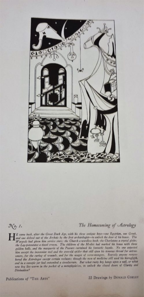
“Here is a world of phantasy and paradox and ironic humor, where disillusion has not extinguished hope; where, in a spirit of unbelief, eager curiosity explored the universe of ideas; where life is full of wonder but possibly not worth while. Worth while only in abstractions and impersonal sublimations and wonderful only in delicate personalities that vanish in expression. Wherefore the symbolic form, symbols which are in some strange way the things they symbolize.
…Those there are who ask, “Why is it considered good form to make a tower look as if it would fall over sideways?” or this or that. Such questions amaze; they seem to have no connection with the real issue. Here always it is the idea that is the chief concern. Its expression is two-fold, the drawing and the text. Which is the more intricate and elusive is hard to decide. To Mr. Corley they are of equal importance and are as the words and music of a song. Apart or together they are as direct and emotional an expression of the idea as the music which might be written for them. This is the modern spirit.”
Corley’s ink drawings also appeared regularly in the little Greenwich Village magazine, The Quill, where he was listed as a contributing editor, and in The Dial. Eventually, he gave up architecture completely in favor of writing and illustrating.
When The New York Times published a brief obituary on December 14, 1955, they failed to mention any of his work with theater or film, commenting only that he “wrote The House of Lost Identity, published in 1927. The Fifth Son of the Shoemaker his best-known work, came out two years later. He also wrote The Haunted Jester and illustrated many magazine articles and books.”
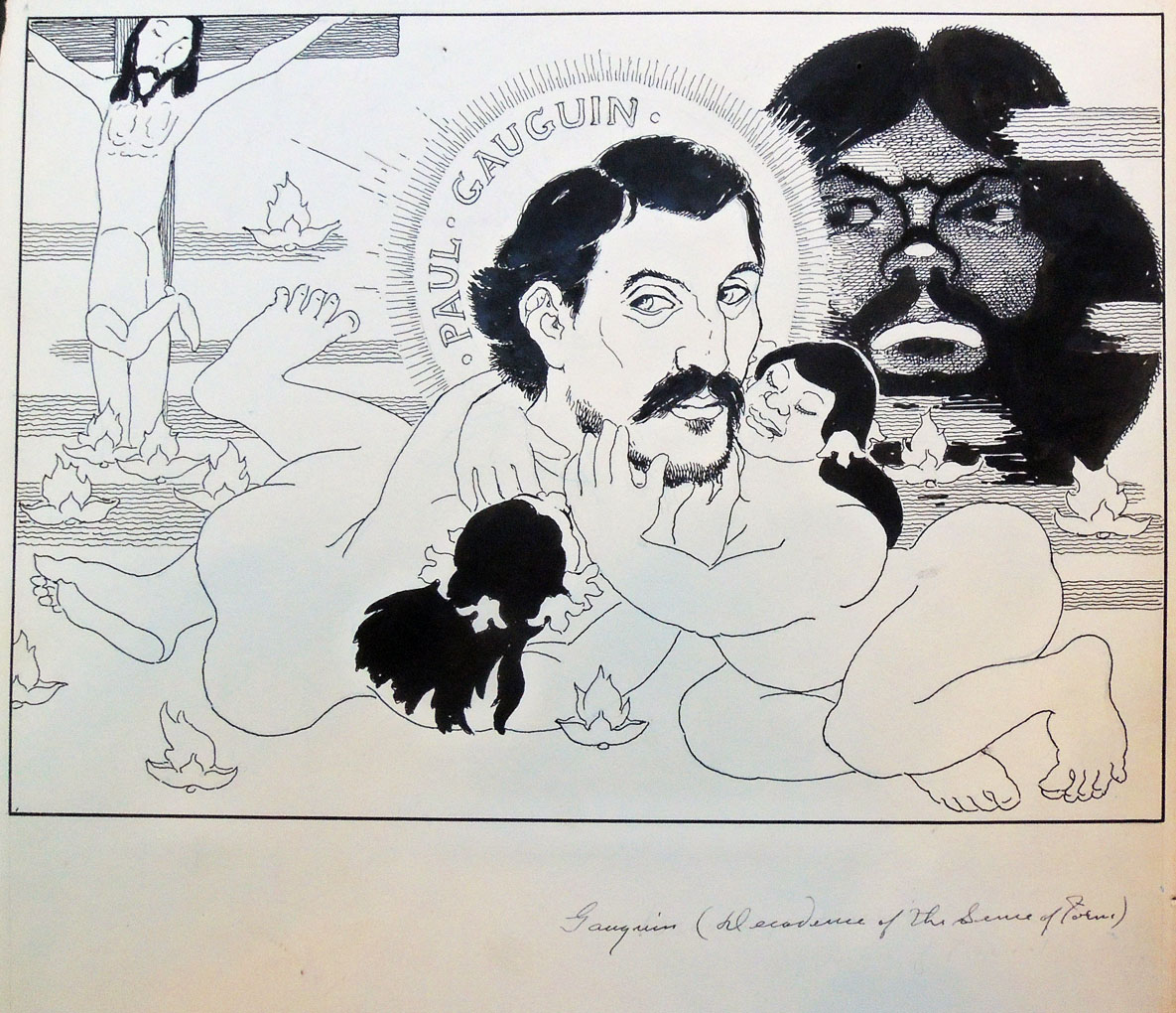
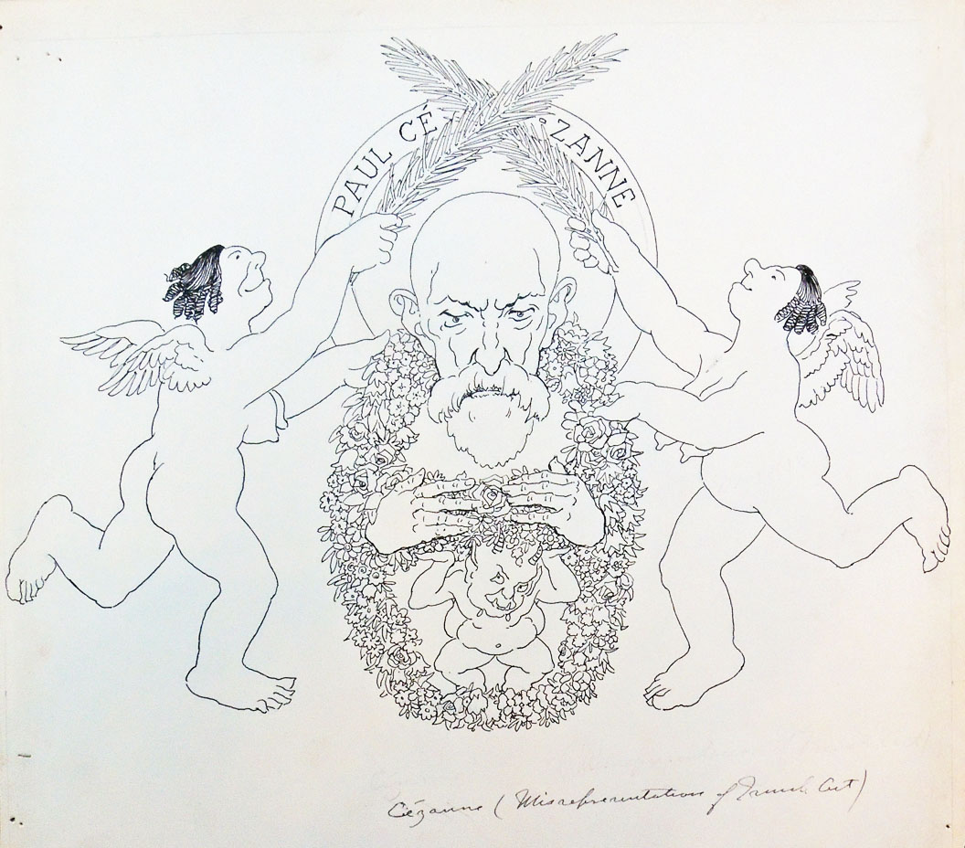
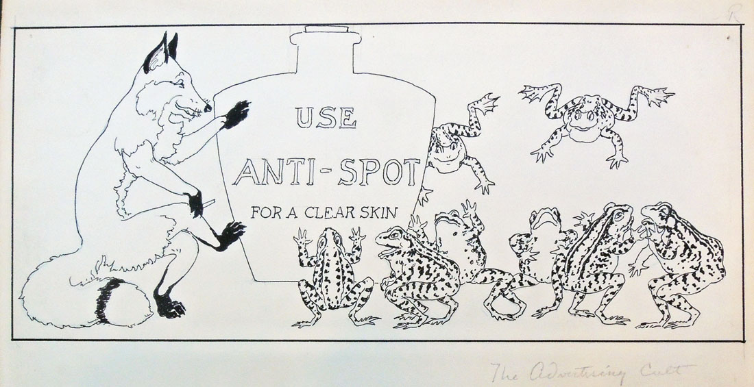
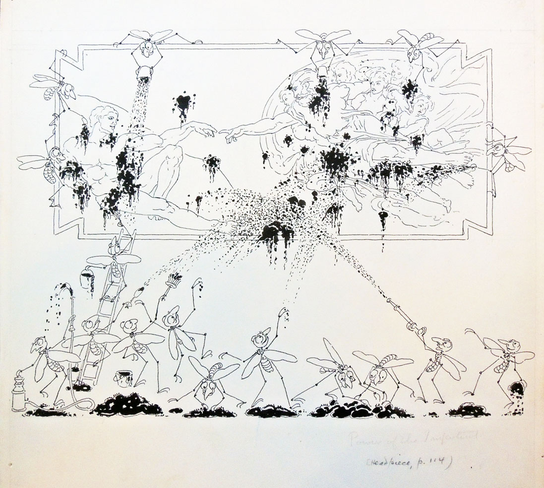
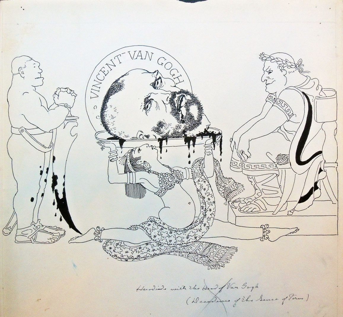
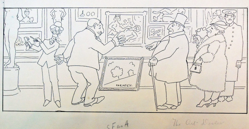
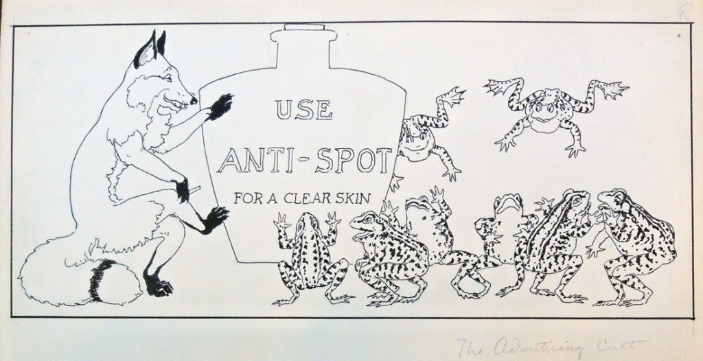
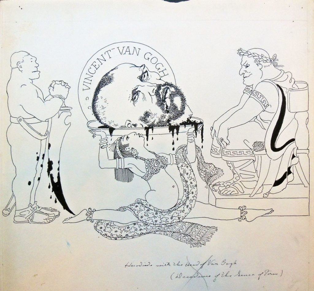
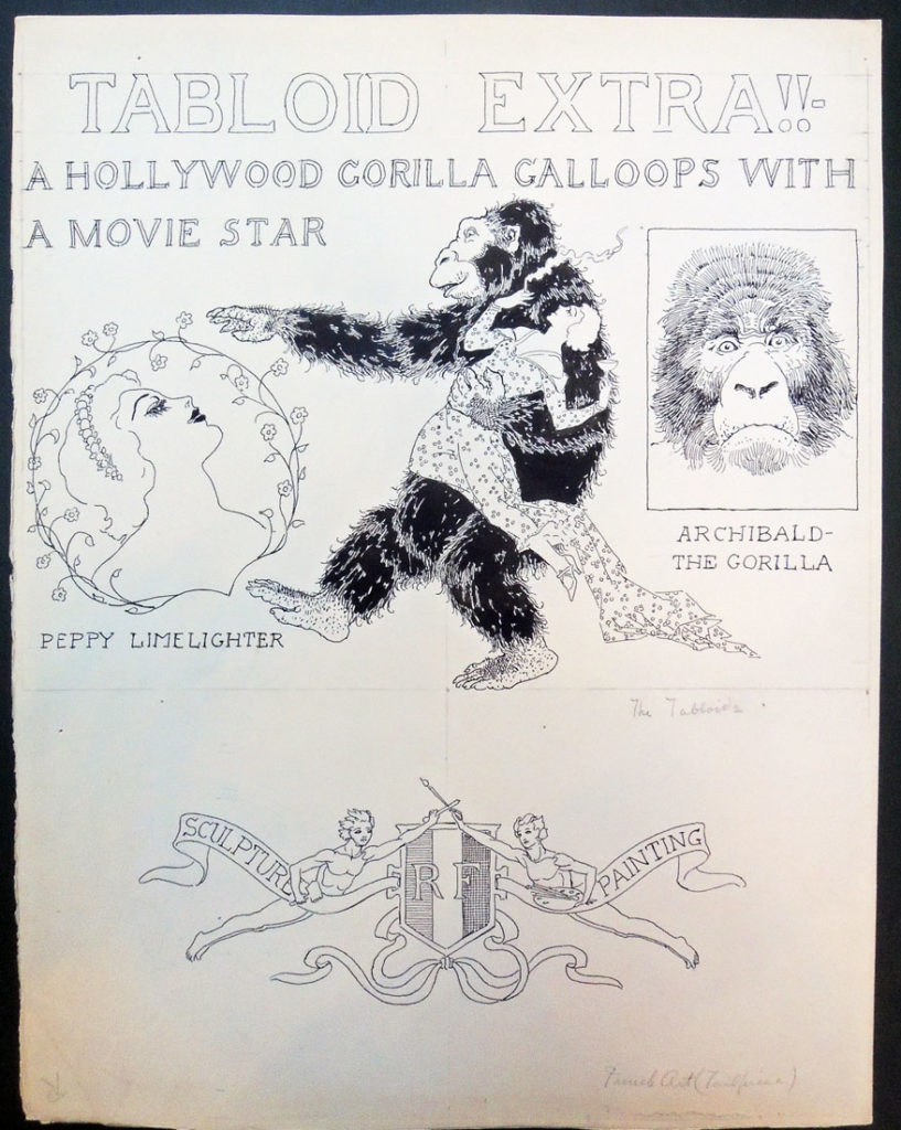 The Graphic Arts Collection recently acquired 28 pen and ink drawings attributed to Donald Corley, ca. 1921. These are not signed and we haven’t yet found them reproduced in a published book or magazine. Here are a few samples.


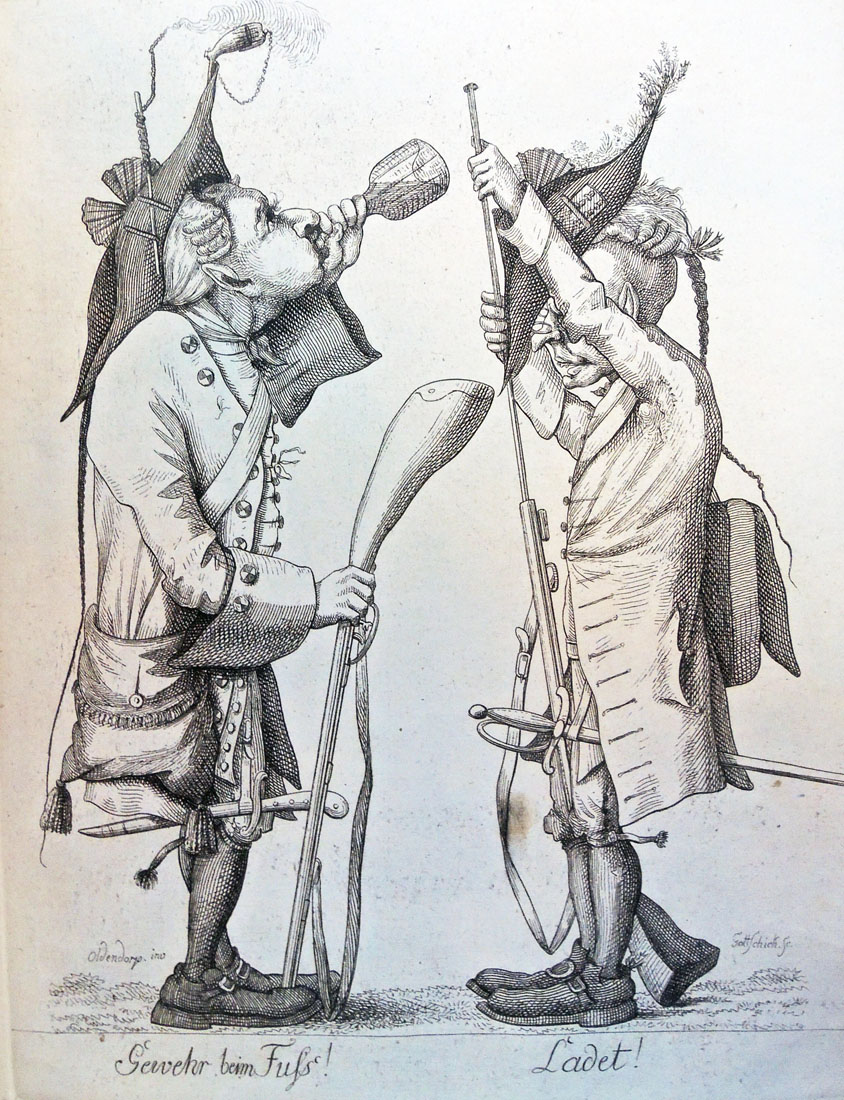
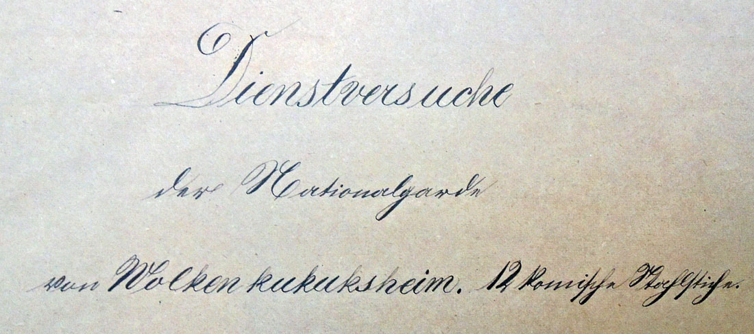
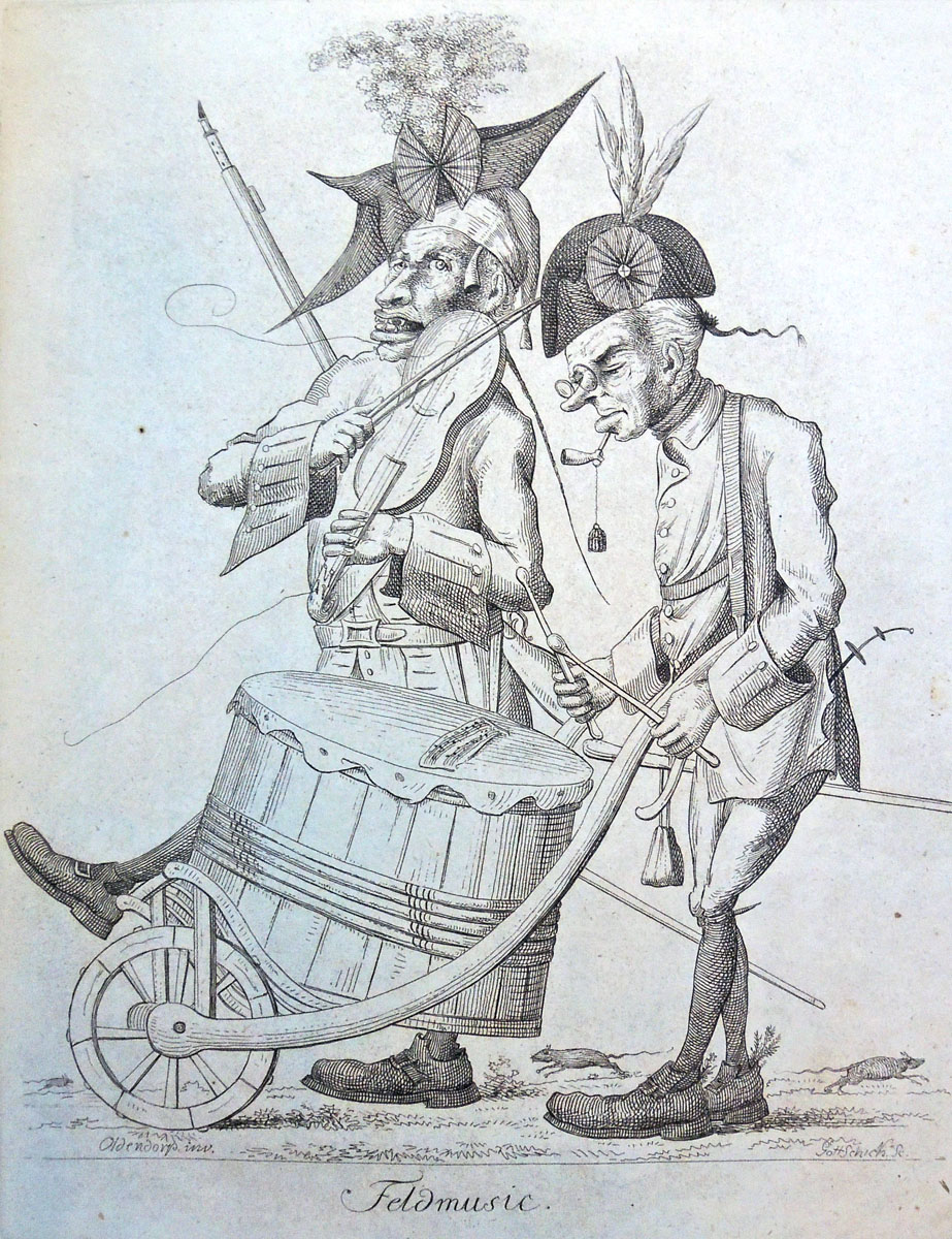
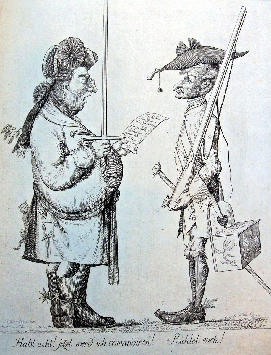
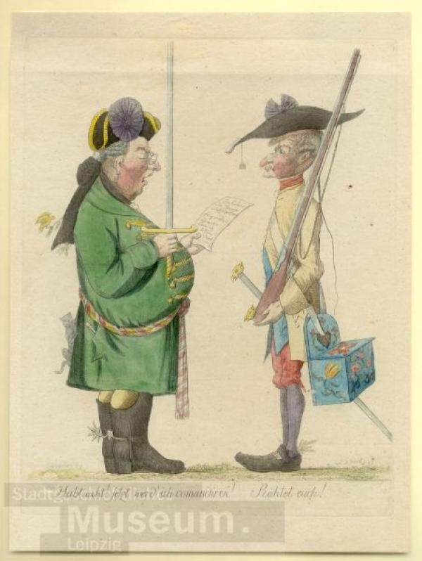
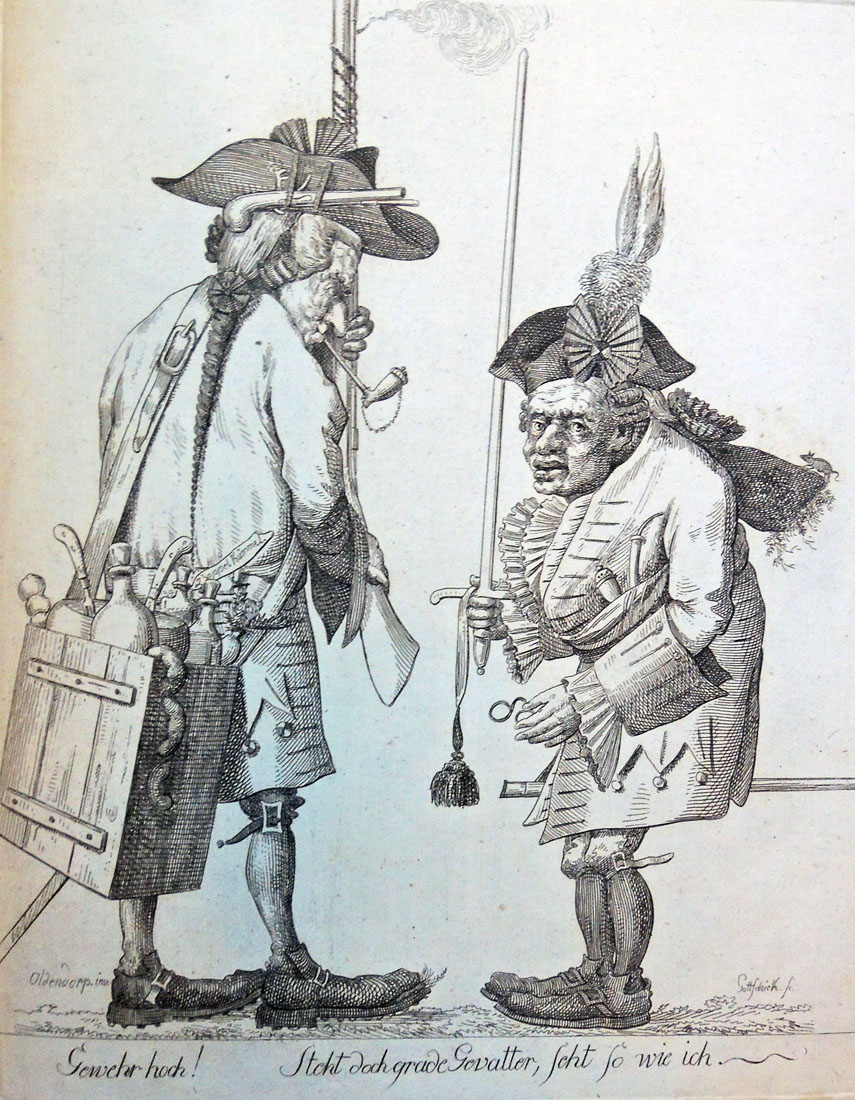
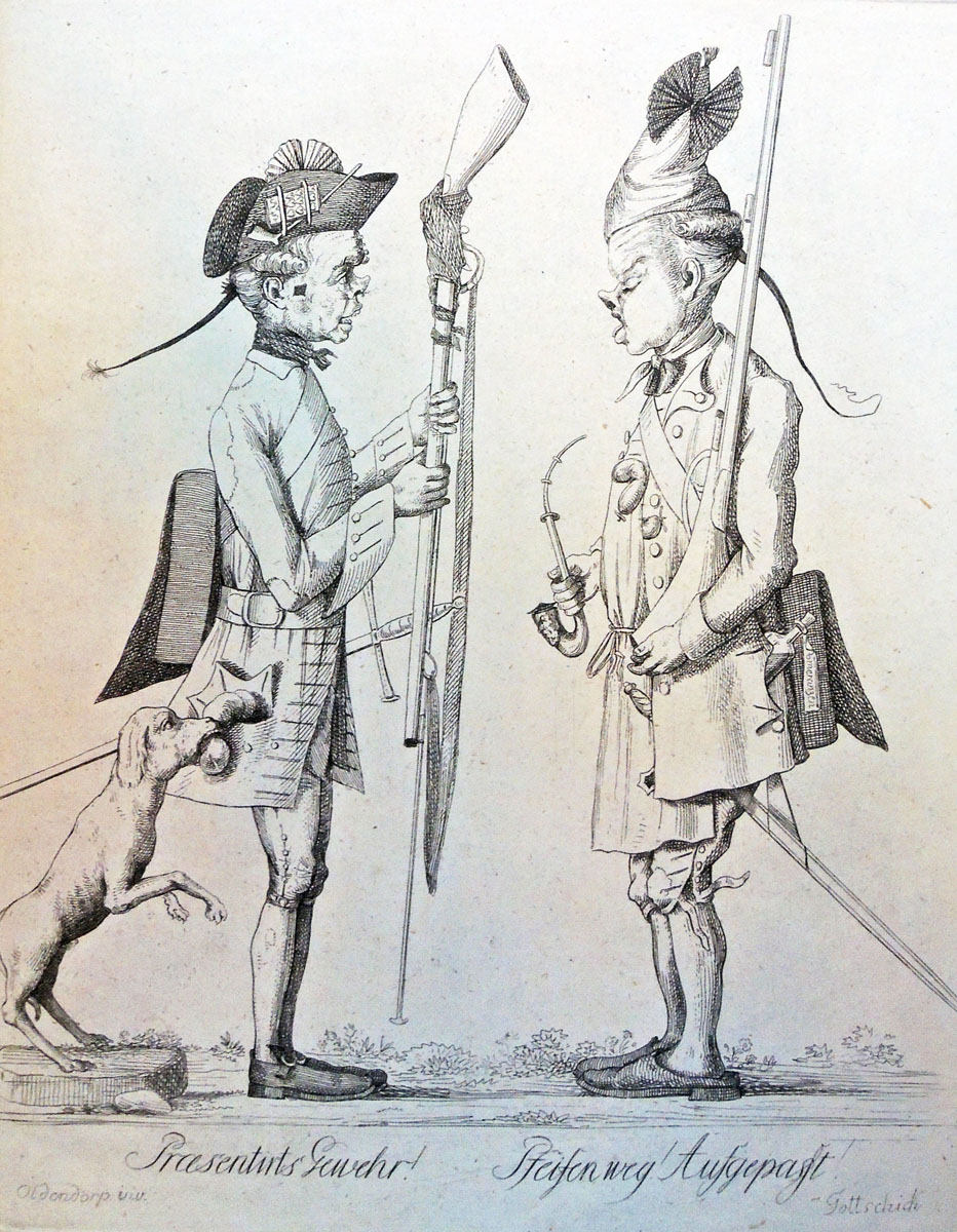
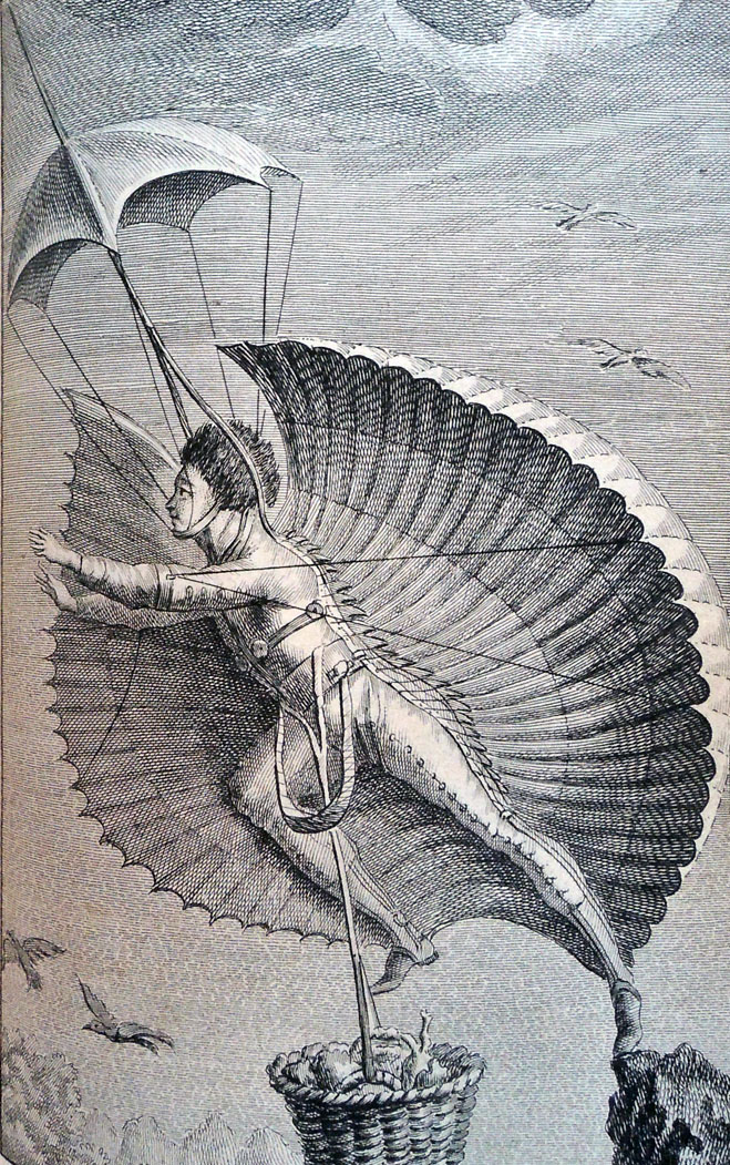
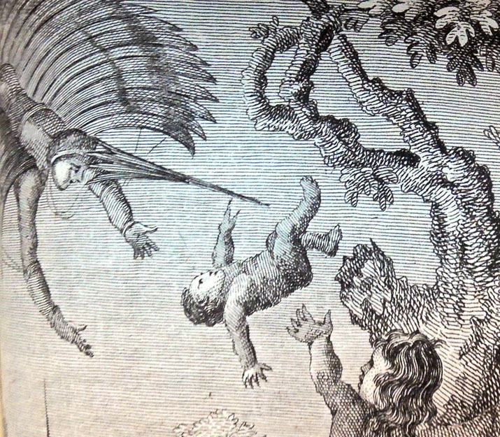
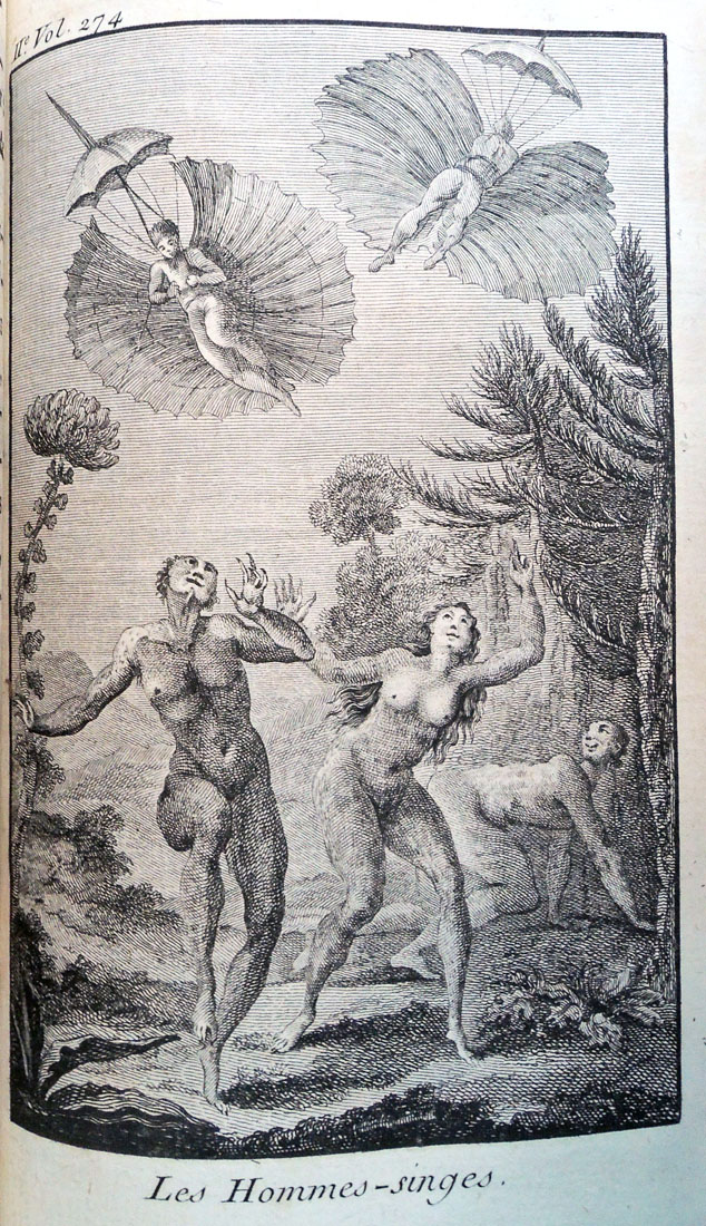
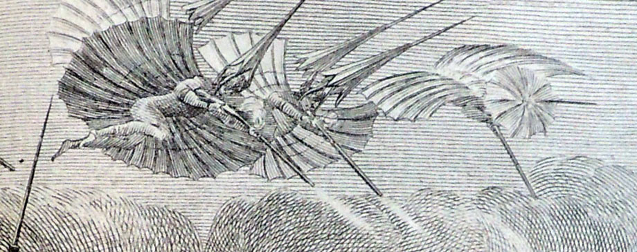
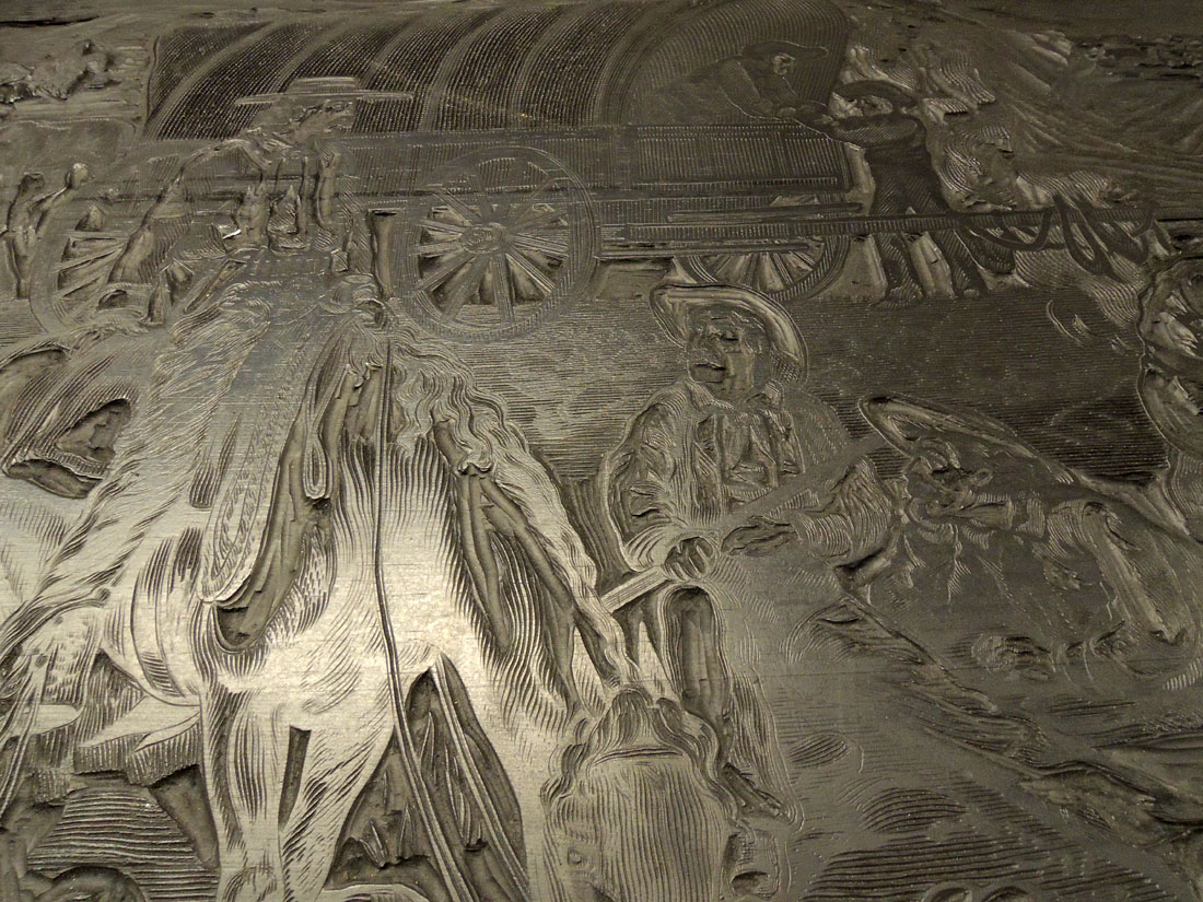
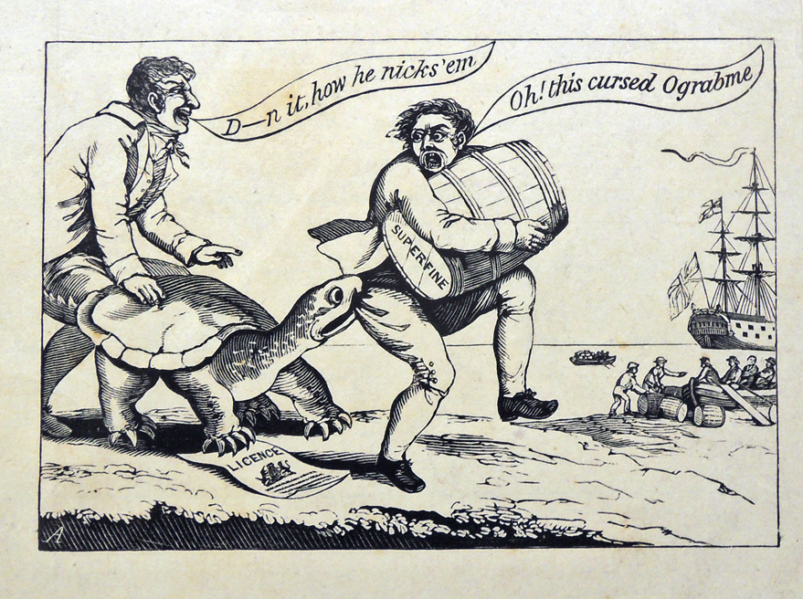
 The Graphic Arts Collection recently acquired a very rare set of twelve etchings and engravings with the manuscript title, Dienstversuche der Nationalgarde von Wolkenkukuksheim = Attempted Service by the National Guard of Cloud Cuckoo Land, printed by Johann Christian Benjamin Gottschick (1776-1844) after drawings by Christian Georg Andreas Oldendorp (1721-1787).