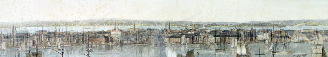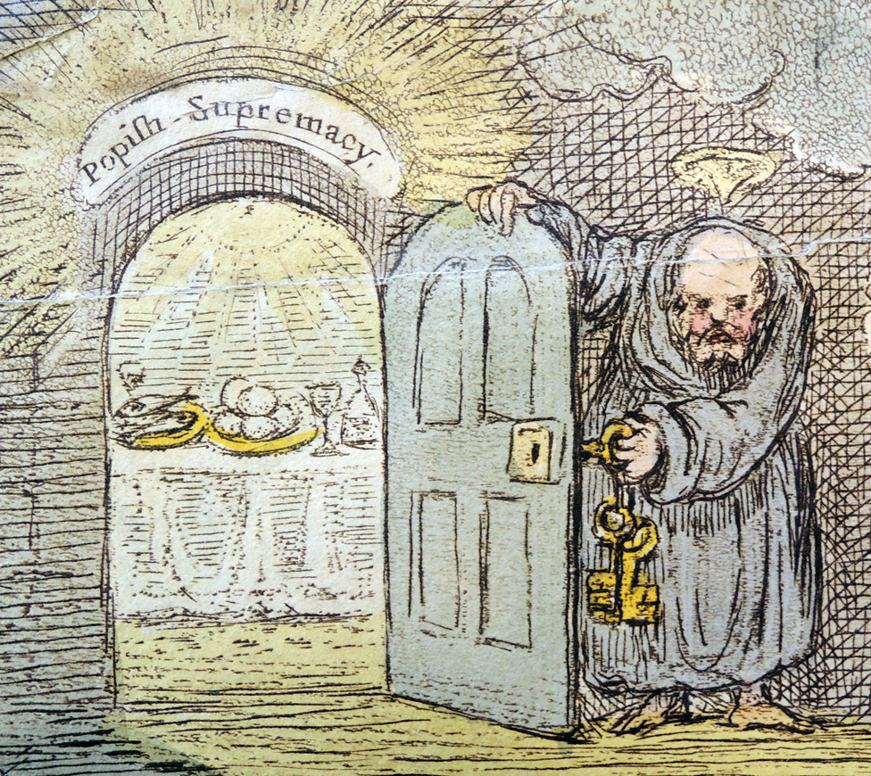
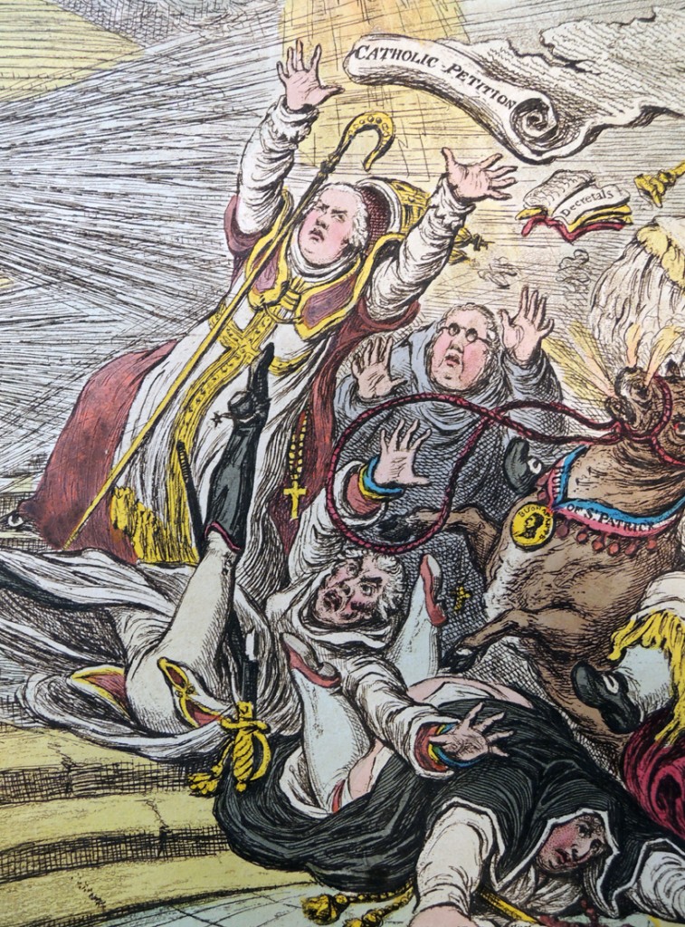
At the top left of James Gillray’s caricature, St. Peter opens a small door of ‘Popish Supremacy’ where wine, loaves of bread, and fishes are seen waiting. As the petitioners (Grenville, Buckingham, Fox, and others) ascend the stair to this room, they are stopped by three blasts of wind coming from Pitt, Hawkesbury, and Sidmouth.
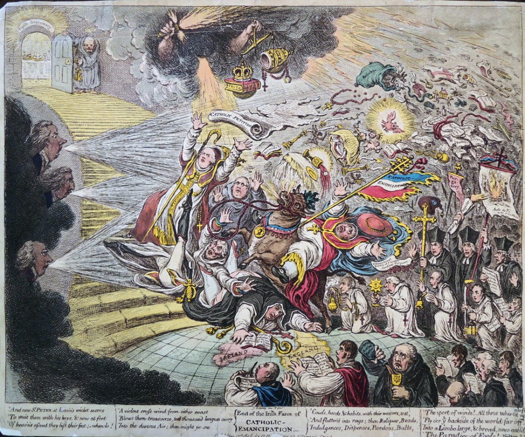
James Gillray (1757-1815), End of the Irish Farce of Catholic Emancipation, May 17, 1805. Etching with hand color. Graphic Arts Collection GAX 2013- in process
Dorothy George points out that the Irish petition for Catholic Emancipation was introduced in the House of Lords by Grenville on 10 May 1805 and in the House of Commons by Fox on 13 May 1805. Motions for a Committee to consider it were defeated in the Lords by 178 to 49, and in the Commons by 336 to 124.
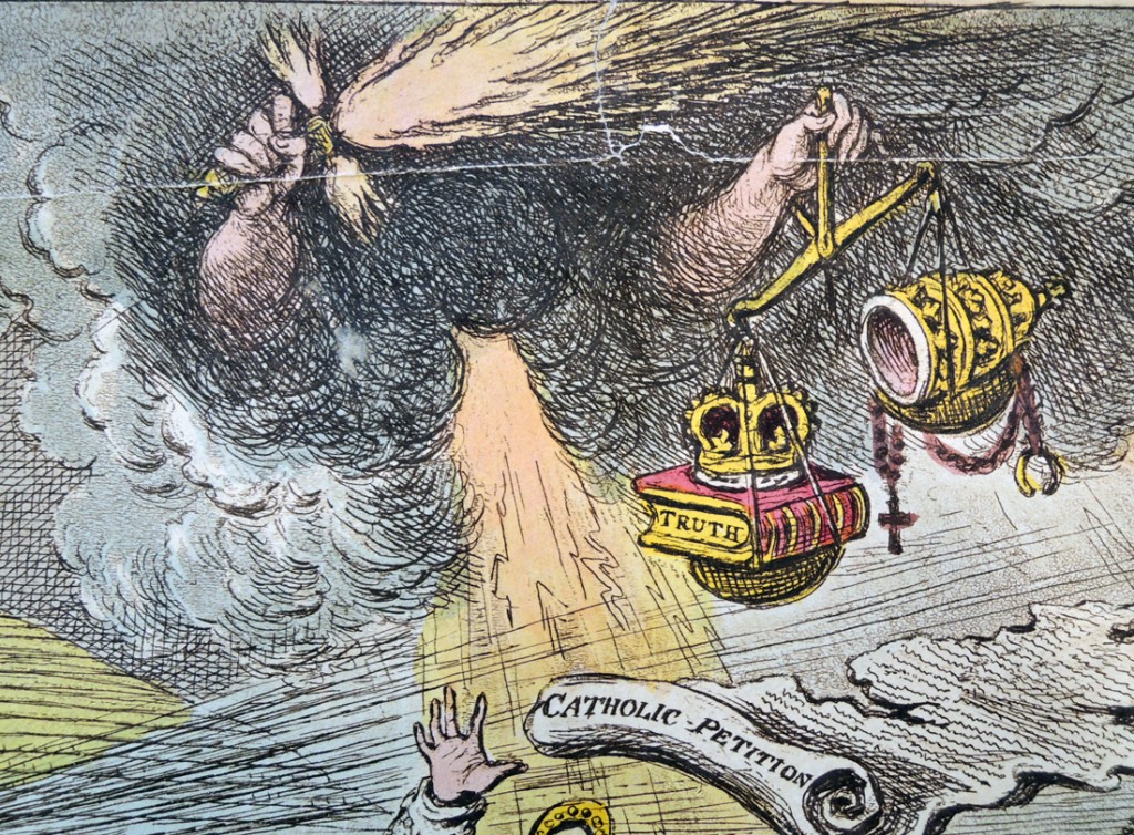
The all-powerful sword and crown indicates the opposition of George III, making the petition a farce since it was brought forward in the knowledge that it would not be accepted.
Verses from Paradise Lost etched below:
And now St Peter at heav’n’s wicket seems
To wait them with his keys, & now at foot
Of heav’ns ascent they lift their feet: – when lo!
A violent cross-wind from either coast
Blows them transverse, ten thousand leagues awry
Into the devious Air: then might ye see
Cowls, hoods, & habits, with their wearers, tost,
And flutter’d into rags; then Reliques, Beads,
Indulgences, Dispenses, Pardons, Bulls,
The sport of winds! – All these whirl’d up aloft
Fly o’er ye backside of the world far off
Into a Limbo large, & broad, since call’d
The Paradise of Fools!
–Milton B. 3d’ [ II. 484-96. Correctly quoted, except ‘whirl’d up’ for ‘upwhirled’.]
The British Museum has posted an extended description of each element in this complicated burlesque of Milton’s lines here: http://www.britishmuseum.org/research/collection_online/collection_object_details.aspx?objectId=1644396&partId=1&searchText=gillray+end+of+the+irish+farce+of+catholic&page=1

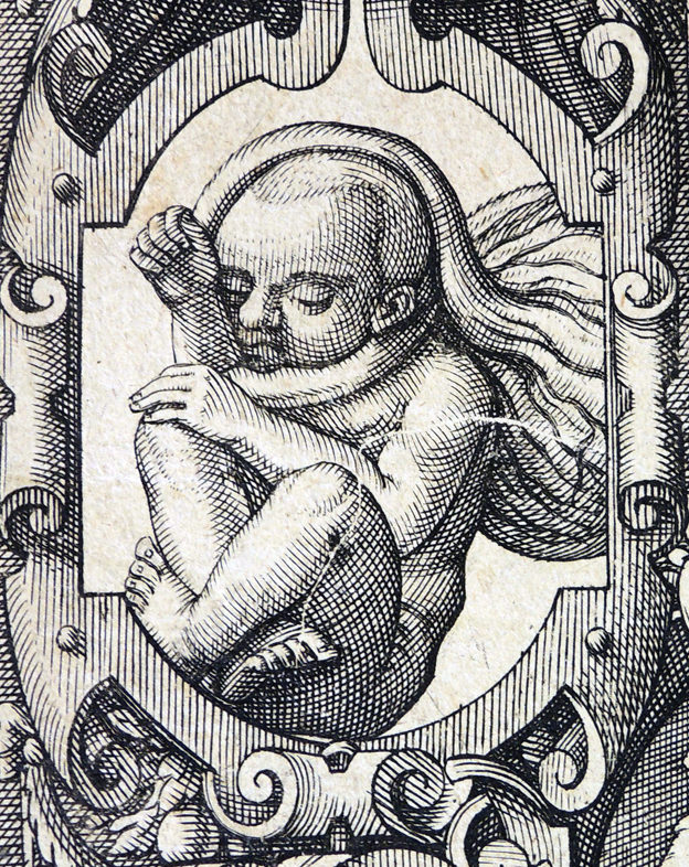
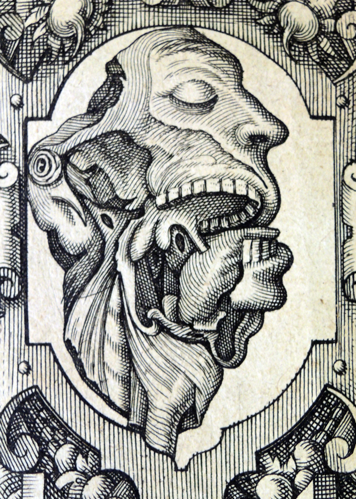
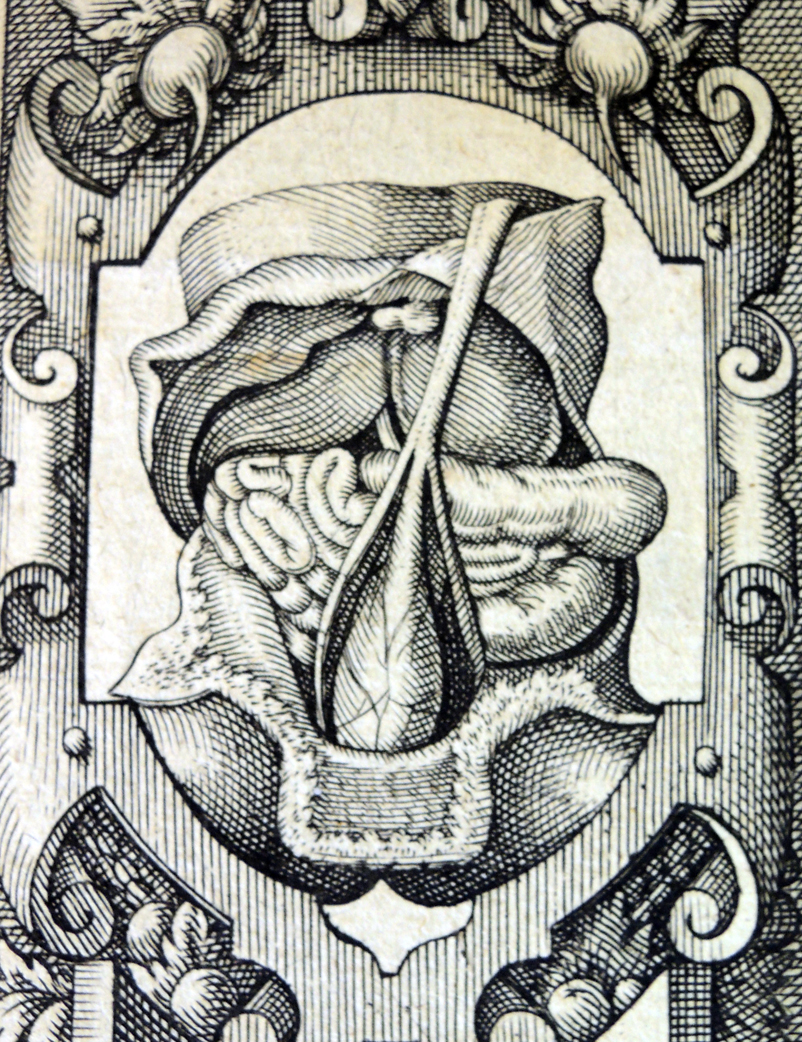
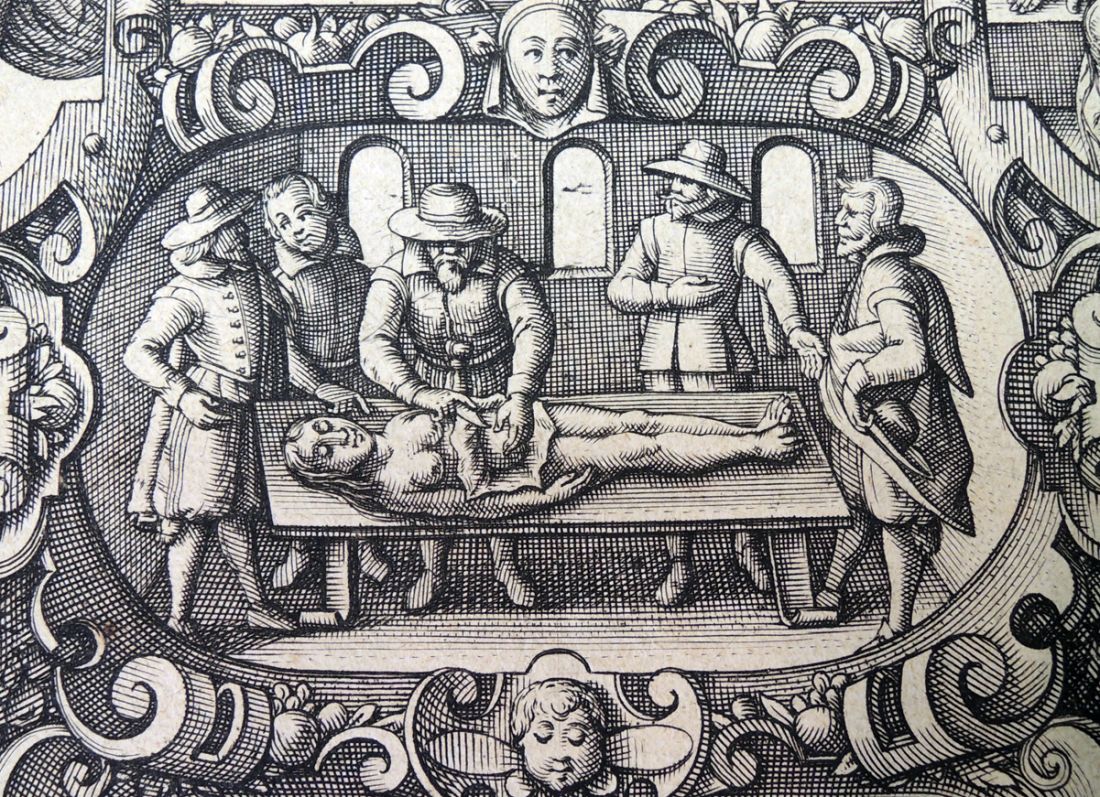 Known as the father of embryology, Girolamo Fabrizi or Fabricius revolutionized the teaching of anatomy. Although the Princeton University Library does not own any of his seventeenth-century medical texts, except in facsimile, this title page recently turned up.
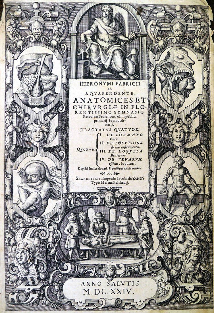 Fabricius, ab Aquapendente (approximately 1533-1619), Hieronymi Fabricii ab Aquapendente, anatomices et chirurgiae in florentissimo Gymnasio Patauino professoris olim publici primarij supraordinarij (Francofurti [i.e. Frankfurt am Main, Germany]: Impensis Iacobi de Zetter; typis Hartm. Palthenij, 1624)