W.I. Swain’s Jesse James

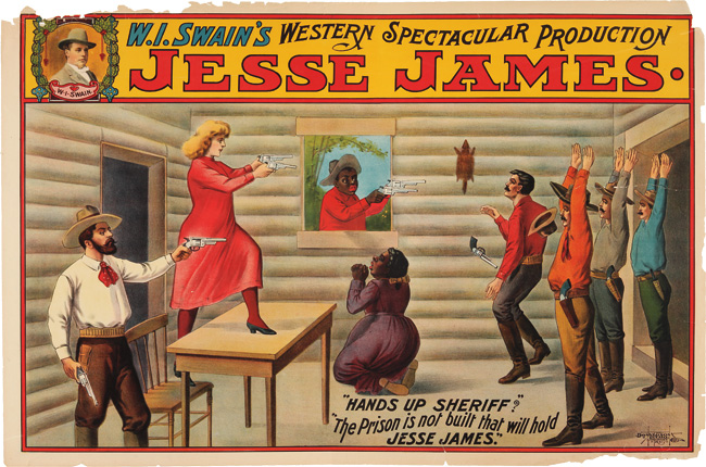
The American outlaw Jesse James (1847-1882) robbed banks, stagecoaches, and trains until he was shot in 1882 by Robert Ford. Like Buffalo Bill Cody and Annie Oakley, James was celebrated as a legendary figure of the Wild West with multiple productions that traveled throughout the United States.

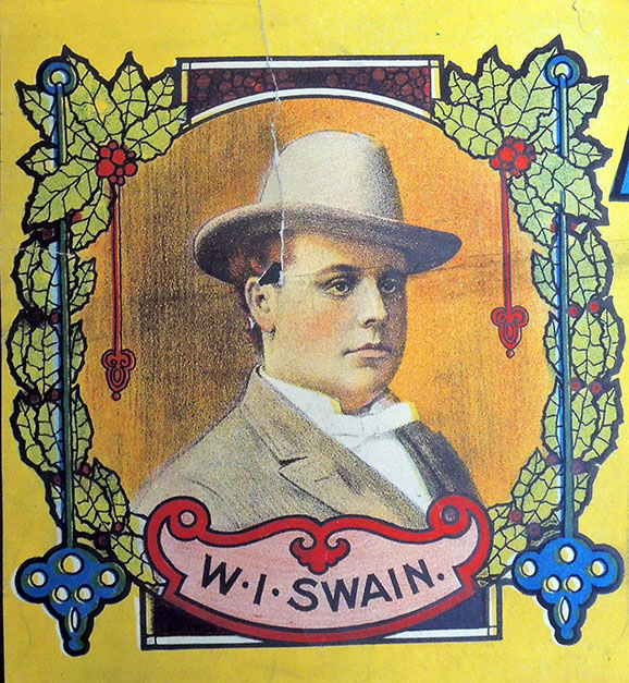
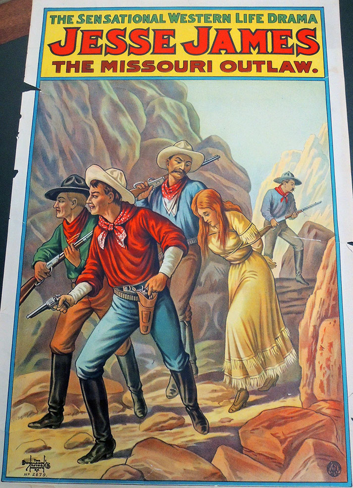
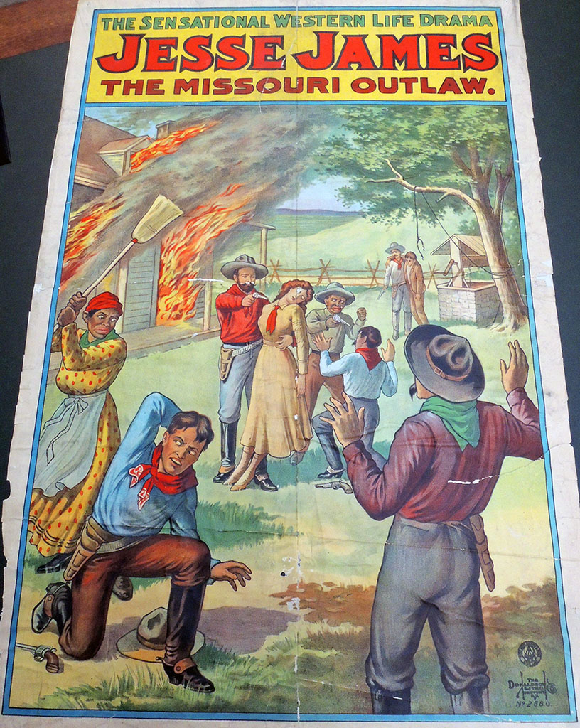
The W. I. Swain Jesse James show was one of the largest productions and at their height in the first decade of the 20th century. A recent reading room request brought out several lithographic posters held in the Graphic Arts Collection, announcing the variety of stories included in Swain’s three-hour production.

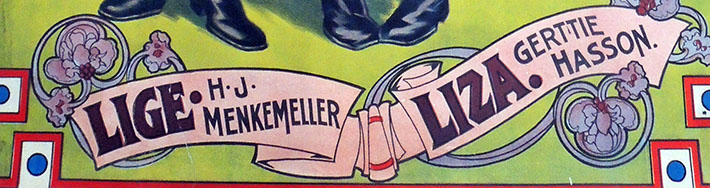
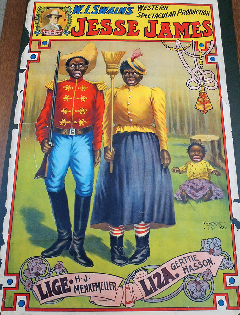
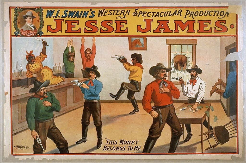
It is surprising to see black and white actors, male and female, together as members of the James gang, as well as Native Americans, Mexican Americans, Asian Americans, professional cowboys, ranchers, and clowns in the company. No race or occupation was exempt from exaggerated caricature and burlesque.


**Note, some of the images are openly racist and offensive.**


Similar stories ran in local newspapers to advertise Swain’s “one night only” productions, such as:

“JESSE JAMES. The Little Rock (Ark) Daily Democrat has this to say about the W.I. Swain Jesse James show that is to appear here Wednesday, April 10 [1906]: The citizens of Little Rock were royally entertained with a new form of amusement last night. The W.I. Swain Jesse James company presented a three hour show last night and it is safe to say that never in the history of Little Rock did so many people gather together to see a show except to the biggest of the big circuses. The entertainment was of the western character, portraying the James boys during their famous career covering the time from the war to the death of Jesse.

The show was moral, and of a much different character than one is led to believe before seeing the show. Instead of all shooting and dime novel play, it teaches a grand lesson, showing the hardships and deprivations of the outlaw and the sufferings of a man after becoming an outcast. Perhaps the happiest character in the production is Lige, the old negro, who follows “Marse Jesse” through thick and thin. However, the sleeping Indian caused Lige no little concern, until she succeeded in dispatching Mr. Injun to his happy hunting ground with the [ever] trusty razor. The tent, which is a huge one, was tested to its utmost capacity, many being turned away. The Swain company gives a good show and if they ever return to Little Rock they will be greeted by a big crowd.”

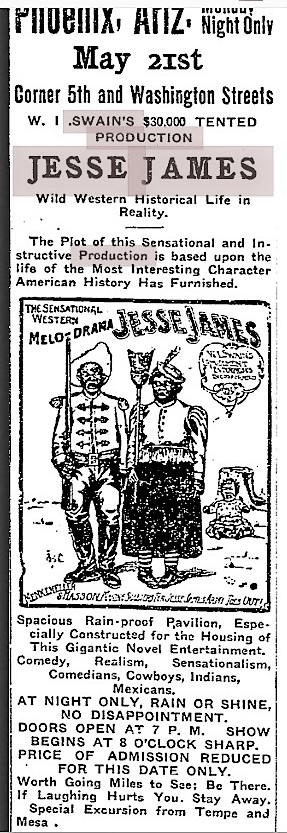
    “The Plot of this Sensational and Instructive Production is based upon the life of the Most Interesting Character American History has Furnished.”

(c) Library of Congress


Rare London Cries

John Leighton [pseudonym Luke Limner] (1822–1912), London Cries & Public Edifices (London: Grant and Griffith, successors to Newberry and Marris, [1847]). Graphic Arts Collection GAX 2018- in process

Writing for the DNB, Edmund M. B. King notes “Leighton created over 400 cover designs in the 1850s and 1860s, some of which were for serial publications, though the majority of his work was for monographs. For The Keepsake his cover design was first used in 1849. It was repeated each year until 1857. He made different upper cover vignettes for each year of the Court Album from 1850 to 1855.

He carried out much work for two publishers in these years: for Griffith and Farran he made over forty designs; for Routledge he created over eighty. The series Routledge’s British Poets provides an early example of the reuse of vignette design by Leighton for many of the individual volumes published in the 1850s.

…Distinguishable by his sheer proficiency as well as by his artistic talent, Leighton’s work as a book illustrator also showed him capable of providing a rich vein of comic art in the 1840s and 1850s. He also created more studied work in the 1850s and 1860s, often within the prevailing fashion for gothic design and motifs. He designed covers for a wide range of subject material, including religion, engineering, history, natural history, and particularly imaginative literature. His commissions from a few publishers spanned many years. His cover and spine designs are frequently a marvel of intricate line within a confined space. Above all, Leighton provided designs that the publishers wanted, often incorporating deft touches of humour with a flourish.”

First published at the end of 1847, Leighton’s Cries was issued in three different formats, plain at 2s 6d; tinted at 5s; and hand colored at 7s 6d, which is the format the Graphic Arts Collection recently acquired. Beall E51; Hiler p. 536; Gumuchian 3700; and Lipperheide Gcb 19.

The Cries of London and Public Edifices [lithographic plate list]
The Tinker and the Tower of London
The East India House and Rhubarb
The Bank of England and Matches
The Royal Exchange and Oranges, Sweet St. Michael Oranges
The Mansion House and Buy a Cage . . .
Old College of Physicians and Old chairs to Mend . . .
Smithfield & Cat’s Meat! — Dog’s Meat!
St. Johns Gate, Clerkenwell, and Dust Oh!
Temple Bar & Pity the Poor Blind!
Somerset House & Umbrellas to Mend!
Covent Garden Theatre and the Costard-Monger
Trafalgar Square — Images! Buy Images
Charing Cross — Baked Potatoes, All Hot!
White Hall — Bow Pots!
Burlington House — Wild Duck, Rabbit, or Fowl!
St. George’s, Hanover Square — New Mackarel!
St. James’ Palace — Old Clothes!
Westminster Abbey — Milk Below!
Lambeth Palace — Water Cresses
New Hall, Lincolns Inn — Knifes and Scissors to Grind!
The Foundling Hospital — Sweep! — Soot Oh!
The North-Western Railway — Muffins! — Crumpets!
The Coliseum — Buy a Broom!


The First Photography Book

https://www.nypl.org/events/exhibitions/blue-prints-pioneering-photographs-anna-atkins

On the occasion of the exhibition Blue Prints: the Pioneering Photographs of Anna Atkins (1799-1871), The New York Public Library invited distinguished scholars in the fields of photography, conservation, natural history, and rare books to discuss her photography and its resonance. During today’s symposium panelists and speakers discussed the broader context in which she created her momentous production, as well as characteristics unique to Atkins’s pioneering work.

Participants included Joshua Chuang, Miriam & Ira D. Wallach Associate Director for Art, Prints and Photographs, and The Robert B. Menschel Senior Curator of Photography, NYPL; Rose Teanby, Independent historian, Associate of the Royal Photographic Society; Richard Ovenden, Bodley’s Librarian, Bodleian Library, Oxford; Steffen Siegel, Professor, Folkwang University of Arts, Essen; Jessica McDonald, Curator of Photography, Harry Ransom Center; Mary Oey, Head of Conservation and Collections Care, NYPL; Jessica Keister, Associate Conservator for Photographs, NYPL; Kenneth Karol, Curator, Cullman Program for Molecular Systematics, New York Botanical Garden; Normand Trudel, Librarian for Rare Books, University of Montreal; Alice Lemaire, Conservator, Muséum national d’histoire naturelle, Paris; Nancy Barr, Curator of Photographs, Detroit Institute of Arts; and Julia Van Haaften, founding Curator, Photography Collection, NYPL.


https://digitalcollections.nypl.org/collections/photographs-of-british-algae-cyanotype-impressions?keywords=#/?tab=navigation Few institutions hold either parts or a complete set of Photographs of British Algae and so, we are all grateful that NYPL has digitized their copy.

Speakers all agreed that Anna Atkins’ role in the narrative of early photography has been acknowledged only within the last 40 years. Since the publication of Larry J. Schaaf’s Sun Gardens: Victorian Photograms by Anna Atkins, [Marquand Oversize TR688 .S32q] scholars have built on this groundbreaking research and fortified the larger context of her work.

Although now famous for being the first book produced with photographic illustrations, Photographs of British Algae: Cyanotype Impressions has been viewed as an artwork, a scientific document, a rare book, and more.

We now call Atkins the first female photographer. Although women were not allowed to join The Royal Society of London, Atkins contributed three volumes to the Society containing 433 photographic images in 1843, preceding William Henry Fox Talbot’s Pencil of Nature, published in 1844.

One of many interesting observations made today was the presences of blue dyed paper as a support for photographs throughout the 19th century, including work by Julia Margaret Cameron [left]. Ovenden noted the trouble with impurities in papers that could be easily concealed under the blue coloring.


Atkins’ photographic images were created as an accompaniment to William Henry Harvey’s 1841 guide entitled British Algae [Recap 8753.436], which had no illustrations. The two volumes are meant to be read side–by-side, Atkins’ images faithfully corresponding with Harvey’s survey.

Lasting Impressions

http://artmuseum.princeton.edu/object-package/lasting-impressions-world-war-i-and-graphic-arts/147257


If you are on campus this weekend, do go to the Princeton University Art Museum where Laura Giles, Heather and Paul G. Haaga Jr., Class of 1970, Curator of Prints and Drawings, mounted a group of prints and posters to commemorate the end of World War I. She kindly included several items from the Graphic Arts Collection and it looks wonderful.

The title is “Lasting Impressions: World War I and the Graphic Arts” with the epigram: “These prints were made from the indelible impressions of war. They are not imaginary. I saw them.”–—Kerr Eby, 1934


Their text panel reads in part,

“November 11, 2018, marks the one-hundredth anniversary of the signing of the armistice that ended World War I. Detonated in the summer of 1914, this prolonged global conflict took a devastating toll on millions of soldiers and civilians while setting the stage for widespread political and social upheaval that would have lasting consequences. Although photography and film played an important role in chronicling what was soon called the “Great War,” the graphic arts also had a visual impact on large audiences, by means of inexpensive print portfolios and mass-produced posters—facilitated by the same modern technology that fueled the military’s weapons of mass destruction.”


Laura notes, “This selection of works on paper reveals a wide spectrum of responses to the war—stemming from actual battlefield experiences and home front reactions—created by artists from France, Germany, Great Britain, and the United States who employed a rich variety of printmaking techniques.”

It is just one of many great shows currently on view: http://artmuseum.princeton.edu/art/exhibitions

Chronology of Queens and Kings

Chronology of the Sovereigns of England ([England], 1814). 16 circular discs, printed on both sides with portraits of the Kings and Queens from William the Conqueror to George III. Formerly attached on a ribbon, they are housed in a bronze metal case, 47 mm, embossed with the head of the Prince Regent, George III, on one side and the title on the other. Along with the portrait, each disc includes the date of the sovereigns’ death, their age, and the length of their reign.

One source describes the commemorative medallion, box and prints, as produced for the centenary of the House of Hanover in 1814. It was reissued in 1820 for Prince George’s accession to the throne and again in 1822 to commemorate George IV’s trip to Scotland.

The Graphic Arts Collection also includes a deluxe set of aquatints in a commemorative medallion of The Battles of the British Army in Portugal, Spain and France from the Year 1808-1814, edited, published, and sold by Edward Orme in 1815.

Vues d’optique with a third layer

“Le Peintre la Nature et l’Atelier”

Thanks to the generosity of Bruce Willsie, Class of 1986, the Graphic Arts Collection has eleven new French vues d’optique mounted on wooden frames to be viewed in a polyorama panoptique. Not only are they different sizes and different views from anything currently in the collection, but several have a mysterious third layer so that when they are held up to light, or viewed in a closed box, a new print is visible in silhouette. These are called protean views.

Here are a few samples. Note the performers on stage below and the congregation at the midnight mass at the bottom.

“Salle de l’Opera à Paris”


“Taverne de l’Angle à Londres”


“La Messe de Minuit”

Gerstner’s Vienna

Joseph Vincenz Degen [Johann Pezzl], Grundriss und Beschreibung der Haupt- und Residenzstadt Wien. [Floor plan and description of the capital and residence city of Vienna] = Description et plan de la Ville de Vienne [Description and plan of the City of Vienna] (Vienna: bey J.V. Degen, 1802). Map, guidebook, and slipcase. Graphic Arts Collection GAX 2018- in process


When we first received this enormous four-part map of Vienna, engraved by Joseph Gerstner (1768-1813), it was folded into tiny chunks and stuffed inside the original paper slipcase (120 x 85 x 40 mm), together with the palm-size guidebook. Once its various parts were separated, rare book conservator Mick LeTourneaux decided not to return them to the original format but flatten the maps and conserve the slipcase individually.

A foam insert was prepared for the book and slipcase, exactly the size of the maps so that the whole object could be housed together in a light-weight four-flap folder. In this way, the material is protected but also available to researchers for daily use.


The four sheets of Gerstner’s plan of Vienna fit together to form a map approximately three feet square. His detailed plan was based upon Maximilian von Grimm’s monumental map to the Greater Vienna and the first scientific survey of the city, published in 1799. Gerstner includes the old city ‘Innere Stadt’ within the castellated medieval walls and the fast-growing suburbs that surrounded the center in all directions. Every street is precisely delineated and labeled.

The text for this first edition was written by Johann Pezzl (1756-1823), who frequented the Greinerschen Salon, in the circle around Caroline Pichler.  The guidebook became so popular that it was re-issued many times up until 1809. After this date, the elaborate parts of this publication were discontinued and only the plan was published.

Maurice-Georges-Elie Lalau


Maurice-Georges-Elie Lalau (1881-1961), Les quinze joyes de mariage … Edition conforme au manuscript de la Bibliothèque de Rouen avec un glossaire publié par Jules Meynial… (Paris, 1928). Copy 45 of 150. Graphic Arts Collection GAX 2018- in process

       
[left] Antoine de La Sale (born 1388?), The Fyftene Joyes of Maryage [Quinze joyes de mariage] ([London: Wynkyn de Worde, 1509]). [right] Les quinze joyes de mariage: ouvrage tres̀ ancien, auquel on a joint le Blason des fausses amours, le Loyer des folles amours, & le Triomphe des muses contre amour. Le tout enrichi de remarques & de diverses leçons (A La Haye: Chez A. De Rogissart, 1726). Rare Books 2004-0836N

In 1926, Maurice Lalau and the bibliophile/publisher Jules Meynial formed a partnership to create a deluxe edition using innovative printing techniques. For their text, they chose Les quinze joyes, a Medieval satire on the tricks wives play on their husbands, sexual and otherwise.

A 1726 edition [above] has notes by le Duchat, who describes it as a favorite of ‘jeunes Courtisans François’ of the mid-fifteenth century. The work has been attributed to Antoine de la Sale and various dates have been suggested for its composition; le Duchat comes down in favor of the late fourteenth century. Wynkyn de Worde published a translation in English verse, The Fyftene Joyes of Maryage, at least as early as 1507, a fragment of that survives and a single complete copy of a 1509 reprint. STC 15257.5-15258

Lalau called his printing process, first seen with this volume, Graphichromie: “un moyen nouveau d’impression des illustrations en couleurs.” He designed and printed the edition of 150 copies, each with 37 plates, which means hand-printing 5,550 multi-color plates. The project took Lalau two years to complete. In addition, this copy has 37 single leaves, reproducing the illustrations in grey ink only (the initial color in the process).


Their book was the subject of an article in the January 1929 issue of Le Gaulois artistique, [above and left] in which the author laments the suppression of traditional illustration processes in favor of newer mechanical techniques:

“L’emploi de découvertes techniques, améliorées et perfectionées sans cesse, ont éliminé presque définitivement ces traducteurs. La photographie, la photogravure, la similigravure, l’héliogravure, la phototype et, plus récemment, la rotogravure, sont cause de la suppression, dans la domaine du livre, des graveurs au burin, des aquafortistes, des xylographes et des lithographes.

Néanmoins, ces applications mécaniques de la reproduction, excellentes pour les publications à grand tirage, resente insuffisantes, quelque soin que l’on puisse apporter à leur execution, quand il s’agit du livre du luxe.”

Although the author disdains mechanical processes, in general, he praises Lalau’s technique for its insistence on intimacy between artist and workman:
“Il n’est plus question d’interprétation indirecte à laquelle l’artiste ne peut prendre part, mais au contraire d’une union constante entre lui et l’ouvrier chargé du tirage de ses planches.”

In addition, he compliments Lalau’s ability to convey the spirit of the Middle Ages through modern mechanical means: “Elle fait le plus grand honneur à l’artiste qui en est l’inventeur et à l’éditeur qui a réalisé le difficile problème de conserver son caractère à un ouvrage du moyen âge, en employant pour l’éditer des proceeds modernes.”


How Big is a Limited Edition?

Beginning today the New York Public Library is offering a Special Limited Edition library card that reads: Knowledge Is Power, available only for a limited time (or while supplies last). The edition is 70,000. “Apply in person at your local NYPL branch, or sign up online and visit your local branch quickly to validate and pick up your Special Edition card before they run out. Knowledge Is Power cards are free for new cardholders. Library card applicants must show proof that you live, work, attend school, or pay property taxes in New York State.”


This led to the question of just how big an edition can be and still be defined as a special limited edition? In 1896, Martha Finley’s Elsie Dinsmore was published by Grosset & Dunlap in New York, in a special limited edition of 100,000 copies. Today, it is also possible to read it online, with unlimited access to the special limited edition.

According to library records Monbusho’s Kankyo shogaku tokuhon maki 1 (Primary reader, vol. 1) was published in 1873 in an edition “Limited to 5,000,000 copies.” (Cotsen Children’s Library Pams / NR / Japanese / Box 135 65143). This is not a typo.

Ed Templeton and Deanna Templeton’s modern photobook Contemporary Suburbium (2017) was released in a “Limited edition of 2,000 copies” (Marquand Library N7433.4.T47 C68 2017). Alfredo Jaar’s homage to John Cage on the occasion of the Cage centennial, entitled Otros piensan = outros pensam, was limited to 1,000 copies, as was Victor Hugo’s Poems (New York: F. DeFau & Co., 1888), available on open shelves or through interlibrary loan. Charles Kingsley’s Alton Locke, Tailor and Poet (New York, J. F. Taylor and Company, 1899) was a “Limited edition of 1,000 copies” although dozens of other editions were also available at the time (PR4842 .xA4 1899). You can undoubtedly think of many other examples.

Christian Marclay’s film The Clock was produced in a limited edition of six copies and two artist’s proofs. Five are in public institutions although it can only be played at one location at a time. “When I first started on this project, I thought it would become a public art piece,” Marclay told a New Yorker writer. “I thought, What a great thing, to be in a train station waiting for a train and being able to watch a movie. It would inform you what time it was, and at the same time entertain you. But I realized it was impossible—there’s lighting issues, sound issues, you have to hear the public-address system.”

Very few rare book glossaries include a mention of  “Limited edition.” The International League of Antiquarian Booksellers notes:

“Book intended to have a finite number of copies, usually intended as a collectible or artificial “rarity.” Often each volume in the edition is supplied with a specific number, and can be signed by the author, artist, binder, etc. Most limited editions have a limitation statement that elaborates on the wonderment of the volume in question. Some less than scrupulous publisher’s will issue editions limited to the number of copies that they can sell, with the limitation proclaimed, but the number not specified.

America is not alone. See also:

French: Tirage limité
German: Limitierte Ausgabe
Dutch: Beperkte oplage
Danish: Begrænset oplag
Italian: Tiratura limitata
Spanish: Tiraje limitado
Swedish: Begränsad upplaga

https://www.nypl.org/blog/2018/10/29/knowledgeispower-library-card

Le Pavillon de l’Aurore and Colbert’s Chapel

A trip to Jean Baptiste Colbert’s estate at Sceaux, south of Paris, helped to clarify the two illusionistic ceiling designs created in 1674 by Charles Le Brun for Colbert. One fresco was completed for the dome of Colbert’s chapel and a second was painted on the ceiling of the Pavilion of the Dawn (Pavillon de l’Aurore). While we can visit the Pavilion today [seen above] and appreciate Le Brun’s amazing design, the original castle and chapel were destroyed in 1803 along with that second work by Le Brun.

Happily, the chapel design, known as the Triumph of the New Testament, may be studied thanks to a painted copy by Le Brun’s assistant François Verdier [below], as well as the set of five engravings by Gérard Audran, held in the Graphic Arts Collection.

Gérard Audran (1640-1703) after Charles Le Brun (1619-1690), [Set of five plates, known as Triumph of the New Testament over the Old Testament], 1681. Etching and engraving. GA 2012.01256-01260.
1. “Car. Le Brun Regis Pictor primarius, udo tectorio pinxit in Capella Castelli vulgo de Seaux, Girardus Audran aeri incidit, 1681.” Depicts angels bearing the Ark of the Covenant.
2. “Le Pere Eternel porte sur les ailes des Anges, prononeant ces paroles au baptesme de Iesus Christ, voicy mon fils bien aime &c.” Depicts God the Father on the wings of angels.
3. “Peint a fraisque dans la voute de la Chapelle du Chasteaux de Sceaux.” Depicts the adoring angels.
4. “Pater Aeternus sedens super pennas Angelorum, haec verba in Baptismate Iesu Christi proferens, Hic est Filius meus dilectus &c.” Depicts the baptism of Jesus Christ.
5. Untitled [center section was perhaps not meant to be cut apart]


Above is the fresco in the Pavilion of the Dawn, described below in the estate’s official website:

“The Pavillon de l’Aurore houses one of the most remarkable compositions by Charles Le Brun, after Vaux-le-Vicomte and before the great sets of Versailles. Jean-Baptiste Colbert, Baron of Sceaux, Superintendent of Buildings, Arts and Manufactures, in 1664, built in the early 1670s, this elegant garden pavilion, an expression of his taste for an architecture called classical. It was the setting for a remarkable pictorial composition on the theme of Dawn, preceding the sunrise, work of Charles Le Brun, first painter of King Louis XIV.

This famous cupola, elaborated before the large sets of Versailles, dominates a living room rotunda framed by two quadrangular cabinets. In 1677, before the members of the French Academy, Colbert read a long description in verse, composed by Philippe Quinault, commenting on the decor of this “Cabinet of Dawn”. Later, the sovereign and the court admired the building at a big party ordered by Jean-Baptiste Colbert, Marquis of Seignelay, son of the previous, in 1685.

In the years 1714 and 1715, Louise-Bénédicte de Bourbon, duchess Maine chooses this graceful building for the scenography of its festivals, “The Great Nights of Seals”. The west facade of the Pavillon de l’Aurore presents a balanced game of lines and an elegant harmony of curves formed by the basin and the fountain, a kind of water buffet, the two steps of access to the perron, the front-body , the dome and the balustrades. A restoration of architecture and interior decoration was carried out in the last two decades of the twentieth century.”


Emile de La Bédollière (1812-1883), Histoire des environs du nouveau Paris; illustrations de Gustave Doré; cartes topographiques dessinées et gravées par Ehrard (Paris: G. Barba, 8, rue Cassette, 8, [1861?]) ReCAP – Rare Books 1514.552


http://domaine-de-sceaux.hauts-de-seine.fr/ledomaine/le-pavillon-de-laurore/