“I have a great weakness for these little sheets of paper” -Rodin

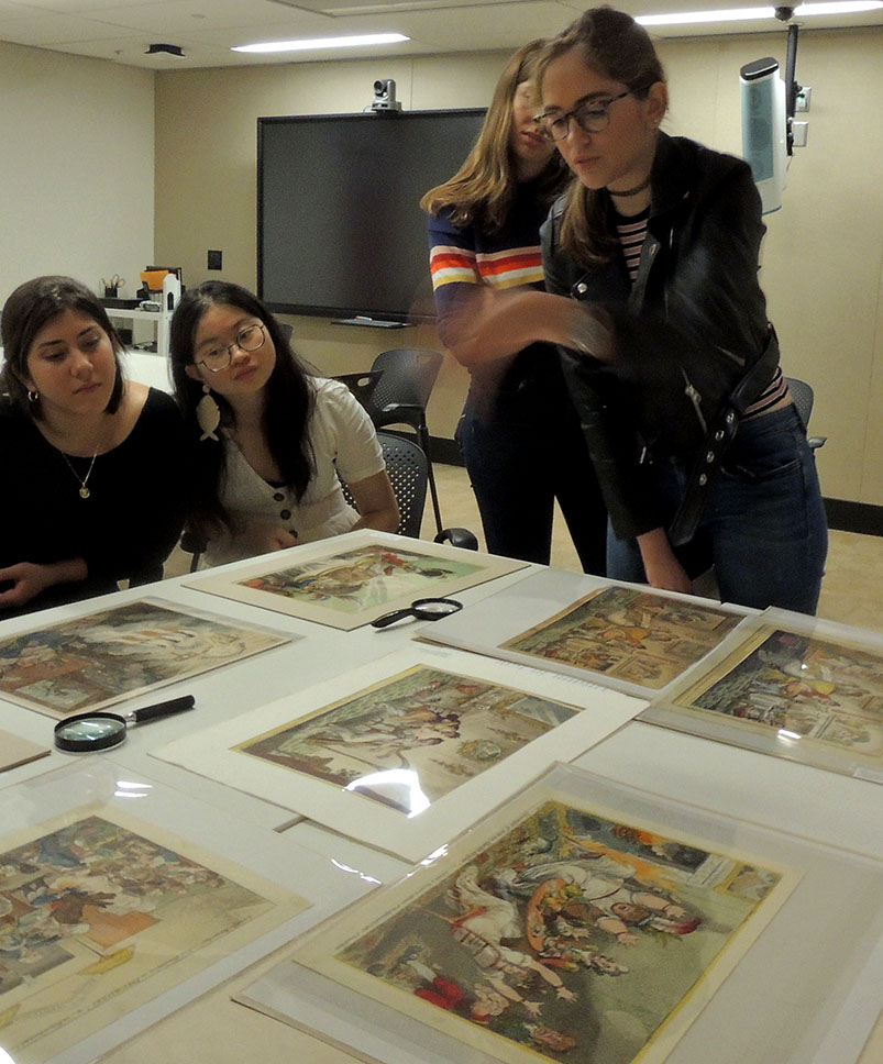
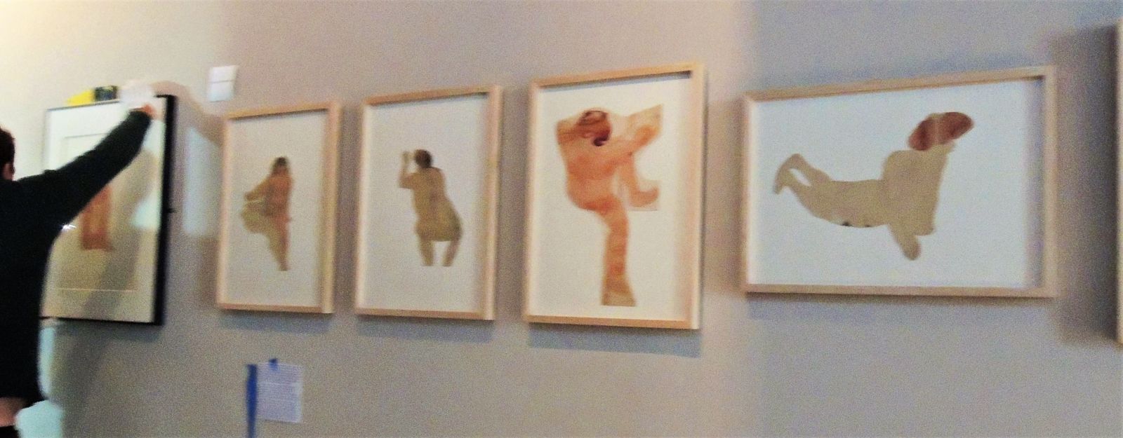
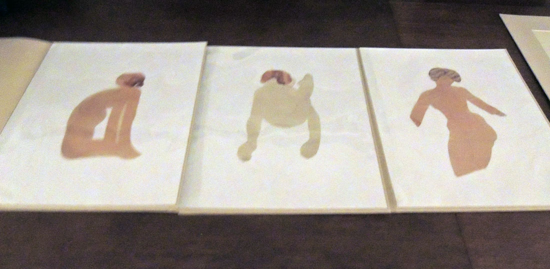
(grainy image due to low light during hanging)

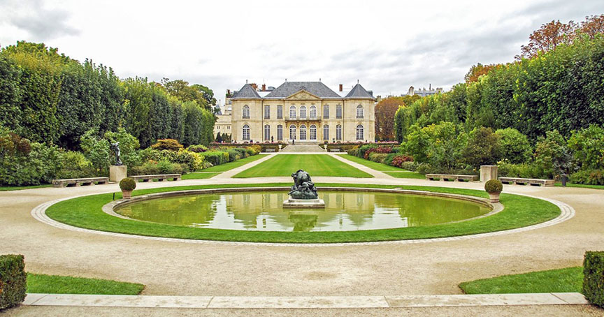
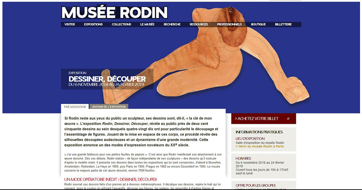
It is a great privilege to have work from the Graphic Arts Collection included in an exhibition at the Musée Rodin in Paris. Opening November 6, 2018, and running through February 24, 2019, the show entitled Rodin, Dessiner, Découper, includes nearly 250 drawings by Auguste Rodin (1840-1917), of which 90 are his rare and often surprising cut and assembled figures, 6 loaned by Princeton University’s Graphic Arts Collection. “Jouant de la mise en espace de ces corps,” writes curator Sophie Biass-Fabiani, “ce procédé révèle des silhouettes découpées audacieuses et un dynamisme d’une grande modernité. Cette exposition annonce un des modes d’expression novateurs du XXe siècle.”

http://musee-rodin.fr/fr/exposition/rodin-dessiner-decouper

The museum’s site goes on to quote Rodin, who said,

“‘I have a great weakness for these little sheets of paper.’ This is how Rodin showed his attachment to his drawn work. From his beginnings, Rodin realized–independently of his sculptures–drawings that he executed according to the living model. He presents his drawings in all exhibitions devoted to him, first in Brussels, Amsterdam, Rotterdam, The Hague in 1899, then Paris in 1900, Prague in 1902 or Düsseldorf in 1904. The museum retains most of this drawn work, about 7500 leaves.

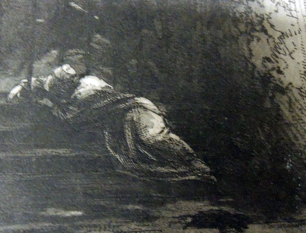
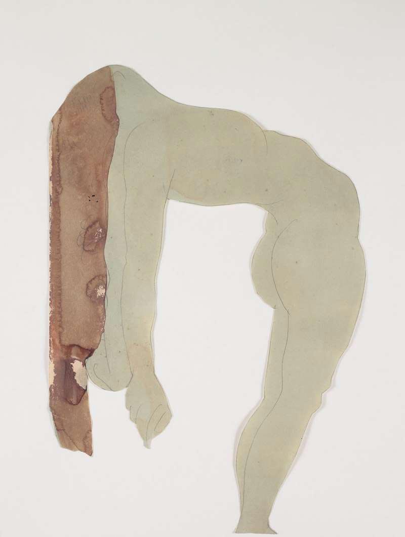
An unprecedented mode of operation: drawing, cutting. Rodin submits his drawings made from a first throw to various metamorphoses. He decodes his drawings, identifies the line that suits him, sets the color using watercolor, cuts out his figures, puts them back, assembles them to other figures and gradually builds an unexpected device. In his early years, Rodin cut drawings and sketches that he pasted into albums. Between 1900 and 1910, he cut a hundred drawings of watercolor nudes which are the heart of this exhibition. By cutting them out, Rodin likes to manipulate them, to situate them in space in multiple ways, to cut them off voluntarily.”

(c) Musée Rodin

More information on how Rodin’s work made it to Princeton can be found here: https://graphicarts.princeton.edu/2018/03/10/auguste-rodin-cutouts/. Hanging and lighting will be completed this week and their beautiful exhibition catalogue with full color images will be available at Princeton next Monday.

“He plays with the small figures of paper which are the equivalent of his plaster figures. By relating these carvings to the three-dimensional character of the sculpture, the carved figures appear as a new “object” between the two-dimensional design and the sculpture. In another series, Rodin executes from his cut-out figures real assemblages that he fixes himself on a new support, interweaving the bodies in a new composition. Drawn and cut, these drawings are not mere technical accessories: they have conquered their status as full-fledged works. The dynamism of the silhouettes announces the modernity of Matisse.” –Sophie Biass-Fabiani, curator

http://www.musee-rodin.fr/fr/visiter/informations-pratiques-paris


The War of the Worlds

In 1904, Henrique Alvim Corrêa (1876-1910), a relatively unknown Brazilian artist living and working in Belgium, took a group of drawings to London and showed them to H.G. Wells (1866-1900). Alvim Corrêa’s work was inspired by the author’s 1897 story entitled “The War of the Worlds” and with no further information or persuasion, Wells commissioned him to illustrate a deluxe, limited edition of the novel. Over the next two years, Alvim Corrêa completed 32 drawing for the book published in 1906. The Graphic Arts Collection recently acquired one of the 500 rare copies of this illustrated book.

“The War of the Worlds” first appeared in Pearson’s Magazine [seen above] serialized from April to December 1897, together with illustrations by Warwick Goble (1862-1943), best known today for his fairy tales and other children’s books. The two versions are quite similar.


Eighty years ago, Orson Welles and the Mercury Theatre radio hour performed a Halloween adaptation of H. G. Wells’ The War of the Worlds, which many listeners took as fact and panicked. A reporter (Orson Welles) told the audience that something had fallen or landed in Grover’s Mill (just east of the Princeton Junction train station) and over the next hour it was discovered that giant Martian war machines were attacking the United States. Today, a carved stone marks the site of the fictional landing.

H. G. Wells (1866-1946), La guerre des mondes. Traduit de l’anglais par Henry-D. Davray. édition illustreé par Alvim-Corrêa (Bruxelles: Vandamme & Co., 1906). Graphic Arts Collection GAX 2018- in process


Nationally loved writer tossed out by Princeton residents

Late in the fall of 1936, the celebrated author Dashiell Hammett (1894-1961) moved to Princeton, New Jersey, where he rented a mansion [his word] at 90 Cleveland Lane from James Renwick Sloane (1881-1955). He moved in with his Black chauffeur/valet and two dogs named Baby and Pal (sadly Baby died while in Princeton).

Hammett was immediately invited to address the local elite at the Nassau Club but rather than write a talk, he simply answered questions concerning everything from “Shakespeare to his experiences in Hollywood.” On Christmas day, the sequel After the Thin Man was released to popular acclaim and Hammett was called America’s best-loved writer. Not wanting to continue with the series, in February 1937 Hammett sold M-G-M all rights to The Thin Man title and characters for $40,000.

Later that month he agreed to act as a judge for the Princeton Community Players playwriting contest but on the day the entries were due, Hammett left town. According to his biographer, Richard Layman, he was asked to leave Princeton by his neighbors due to his loud parties, overnight female guests, and drunken students (his recent membership in the Communist Party was not mentioned). Renwick Sloane sued Hammett for damages made to the house, which was soon after torn down and replaced with a new nine-bedroom home in 1940.

In the November 11, 1936, issue of the Daily Princetonian, Henry Dan Piper, class of 1939, wrote an article titled “Dashiell Hammett Flees Night Club Round Succumbing to Rustication in New Jersey”:

Wearied of New York’s sophisticated clatter, the tall, prematurely greying Dashiell Hammett, author of “The Thin Man” and “The Glass Key,” has escaped to the privacy of a rambling, white clapboard farmhouse perched on a hillside outside of Princeton. “This is the life” he sighed, seated in his armchair before a roaring fire, and succumbing to the inquisition of a Princetonian interviewer. “You can get fed plenty cooped up in a three room apartment, making the same rounds every night—Stork Club, 21, Dempsey’s—seeing the same old faces and hearing the same damned chatter. Nuts.” “There isn’t much to tell about me,” he said. “Baltimore as a kid. . . school for a coupla years. . . stevedore . . . newsboy. . . Golly, I’ve seen lots of things, but I never seemed to stick long at ’em. When the Armistice came along, all I could boast was a pair of weak lungs contracted in the Ambulance Corps.”

“I did some private detective work for Pinkerton’s, but all the time I was getting sicker, and found myself shortly in a California hospital. Then it was a case of turning to something to keep the butcher away from the door while I tried to bluff along the baker. So I rented a second-hand typewriter and pounded out my first novel. It was just a case of lucky breaks after that. Yes, I’m working on a book here, but it’s not a mystery, and it’s not about Princeton. I really don’t like detective stories, anyway. I get too tangled up in the plots. This one is just about a family of a dozen children out on an island. You see, all I do in a story is just get some characters together, and then let them get in each other’s way. And let me tell you, 12 kids can sure get in each other’s way!”

Asked if he were indulging in any more stories about the liquor-swilling, sophisticated pent house dwellers of “The Thin Man,” Hammett wrinkled his brow and exclaimed, “I can’t understand why people get the idea all I ever write is artificial, with tinseled-and-ginned up characters. They’re just like lots of people I know neurotics and what have you. “You know, ideas float around that New York and Hollywood people are all nuts. I’ve just come back from working on a new Powell-Loy film and I admit lots of those guys out there are screwy. But, hell, they’ve got tons of money to be screwy with. And anyhow, they’re no more bats than a lot of over-stuffed” executives I’ve had the misfortune to meet. “Yes, it’s going to be like the others,” he said, returning to the new movie. “They say they’re going to call it ‘After the Thin Man.’ Heaven only knows why. Before Hollywood started monkeying with the plot it was something like ‘The Thin Man,’ but its own mother wouldn’t recognize it now.”


In 1983 Arion Press published a limited-edition Maltese Falcon, illustrated with 46 period photographs of sites in the novel, along with contemporary views by Edmund Shea. The photographs were found mainly in old newspaper morgues and library archives, taken in the late 1920s, of the actual streets and buildings where Sam Spade solved the mystery. The Graphic Arts Collection holds only the trade edition, published by North Point Press the following year.

See: Dashiell Hammett, “From the Memoirs of a Private Detective,” Smart Set March 1923, p. 88.
https://babel.hathitrust.org/cgi/pt?q1=%22dashiell%20hammett%22;id=uc1.b3874453;view=image;seq=444;start=1;sz=10;page=search

Dashiell Hammett (1894-1961), The Maltese Falcon (San Francisco: North Point Press, 1984). “This edition … is reproduced from the limited edition of 400 copies printed and published by the Arion Press, San Francisco, in 1983”–Colophon. Graphic Arts Collection PS3515.A4347 M3x 1984

Dashiell Hammett (1894-1961), The Maltese Falcon (New York: A.A. Knopf, [c1930]). Rare Books 3769.56.359 1930


Pas de quatre

We were asked recently about the watercolor attributed to Alfred Edward Chalon (1780-1860) of the four leading ballerinas of the 1840s, Fanny Cerrito, Lucile Grahn, Carlotta Grisi, and Marie Taglioni, in the Pas de Quatre, composed by Jules Perrot and danced on July 12, 1845. This painting was the source for a popular lithograph by Thomas Herbert Maguire (1821-1895), widely circulated.

According to commentary by the Victoria and Albert Museum,

“There were no men in the ballet–the ballerina was now the public’s favourite and the male dancer’s role was reduced to lifting and supporting her. In the coming years, his position declined even further, until he was all but banished from the stage and male roles were performed by girls in men’s clothing. By this time a recognisable ‘ballet’ costume had evolved, which still forms the basis of many ballet costumes today. It was originally based on fashionable dress of the period, but gradually crystallised into a low-cut pointed bodice and a bell-shaped, knee-length skirt formed of tiers of tarlatan with a diaphanous top layer.”


Our watercolor was a gift of Allison Delarue, of whom Mary Ann Jensen, former Curator of the William Seymour Theatre Collection, wrote,

“Allison Delarue, Class of 1928, is a graduate of the Peddie School who received both his Bachelor of Arts and Master of Arts degrees from Princeton University. While continuing graduate studies at Oxford University he became fascinated with the renaissance of ballet in England; he studied dance with the Hon. Martin-Haney and bought his first ballet print at Cyril Beaumont’s famous London bookshop in Charing Cross Road.

Returning to the United States, he pursued his interest in the ballet while on the staff of the Cooper Union Museum in New York City. A talented photographer as well as a collector and writer, for many years Mr. Delarue was on the staff of the McCarter Theatre in Princeton. His professional memberships have included the Theatre Library Association and the American Society for Theatre Research.”


http://libweb5.princeton.edu/visual_materials/delarue/Htmls/index.html

What are “Mems”?

This post was directed to our friends in Great Britain who were asked to answer the question: “What are mems?” Happily, the answer came in minutes from Simon Beattie, citing the OED:
mem, v.
Pronunciation:
Brit. /mɛm/
U.S. /mɛm/
Frequency (in current use):
Origin: Formed within English, by conversion. Etymon: mem. n.1
Etymology: < mem. n.1
nonce-word.
transitive. To note or write down as a memorandum.
1915 W. J. Locke Jaffery v. 61 Once having ‘mem-ed’ an unpleasant thing in my diary, the matter is over.

The term appears in such book titles as:
A Paper, of Tobacco: Treating of The Rise, Progress, Pleasures, and Advantages of Smoking: With Anecdotes of Distinguished Smokers, Mems on Pipes and Tobacco-Boxes, and a Tritical Essay on Snuff (London 1839)

Pickwick In America! . . . : and the Sayings, Doings, and Mems of the Facetious Sam Weller (London 1839)

Mems of America, and Reminiscences At Home and Abroad (London 1839)

This advertisement [above] in Willings Press Guide includes Theatrical mems, as does the print at the top from The Illustrated Sporting and Dramatic News, April 6, 1878.

Harry Furniss (1854-1925) was an artist, whose first job as an illustrator was for the Illustrated Sporting and Dramatic News, and later for The Illustrated London News and The Graphic. His most famous humorous drawings were published in Punch, for which he started working in 1880.

Furniss moved to New Jersey where he worked for Thomas Edison making animated cartoons.


Interesting but no mention of mems:
Harry Furniss (1854-1925), My Bohemian Days, with illustrations by the author (New York: Stokes, [1919]). ReCAP 30104.372

Harry Furniss (1854-1925), Harry Furniss At Home (London: T. F. Unwin, 1904). Forrestal Annex NC1320 .F98

Harry Furniss (1854-1925), The Confessions of a Caricaturist (New York: Harper and brothers, 1902). Graphic Arts Off-Site Storage RCPXG-6703038

A Nincompoop and Other Prints


Princeton University class “Caricature and Modernity: 1776-1914” (ART 453/ECS 453) visited the Graphic Arts Collection this week to view prints and watercolors by James Gillray, Thomas Rowlandson, and other British caricaturists.

With frequent bursts of laughter, the class looked primarily at the collection of Dickson Q. Brown, Class of 1895, who donated several thousand prints, drawings, and illustrated books to the Princeton University Library.

“Caricature, based on the distortion of the human face for comic effect, challenged the ideally beautiful,” reads the class description, “and the academic art training that developed in Western Europe after the Renaissance. This course will examine the explosion of caricatural prints and comic illustrated books in France, Great Britain, and the United States from the revolutions of 1776 and 1789 to World War I. Topics will include the political role of satire in the newly defined public sphere; the influence of physiognomy and racial theories on caricatural depictions; the invention of the comic strip; and the origins of Dada and Cubism in comic illustration.”

The invention of laughing gas is celebrated below:

Reports were prepared on Gillray’s Tom Paine’s Nightly Pest (1792); King of Brobdingnag and Gulliver (1803); Matrimonial Harmonics (1805); and Advantages of Wearing Muslin Dresses! (1818). In addition, they studied Rowlandson’s Drawing from Life at the Royal Academy, Somerset House (1808); A Nincompoop or Henpecked Husband (1807); The Anatomist (1811); and Breaking up the Bluestocking Club (1815), among many others.

Next week they move on to Paris and Charles Philipon’s La Caricature with Daumier, Grandville, and other French caricaturists.

Attributed to Henry William Bunbury (1750–1811), The Long Minuet as Danced at Bath (after 1787).


Peter Coffin’s Spiral Rainbow


The spiral as a conceptual archetype is a recurring theme in the work of the American artist Peter Coffin, such as in his 2006 commission for Peter Norton’s annual Christmas gifts. Taking the format of a common photograph album, Coffin organized a series of postcards depicting rainbows into a three-dimensional spiral forming one enormous rainbow. As you open this volume, the constellation of cards expands in an upward swirl of color and form.

The artist commented, “There is a tendency to clutter things up, to try and make sure people know something is art, when all that’s necessary is to present it, to leave it alone. I think the hardest thing to do is to present an idea in the most straightforward way. I think it was Jasper Johns who said that, “[It’s] sometimes necessary to state the obvious.” Still, how to proceed is always the mystery. I remember at one point thinking that someday I would figure out how to do this, how you do art — like “What’s the procedure here, folks?” — and then it wouldn’t be such a struggle anymore. Later I realized I would never have a specific process; I would have to re-invent it, over and over again.”

The Coffin project is the gift of James Welling, Lecturer with the rank of Professor in the Visual Arts program in the Lewis Center for the Arts at Princeton University. In turn, it was the gift of the Peter Norton Family, who each year commission a work of art to celebrate the holiday season.

Peter Coffin (born 1972), Norton Family Christmas Project ([Santa Monica, Calif.]: [Peter Norton Family], [2006]). 1 photograph album. Gift of James Welling. Graphic Arts Collection in process.

Ulises Carrión’s Early Books


Guest post by Sarah Hamerman, Poetry Cataloging Specialist

Mexican-born, Amsterdam-based artist, writer and cultural organizer Ulises Carrión (1941-1989) was a key figure in the broadly intercultural development of artists’ books and concrete poetry in the 1970s. Though Carrión achieved early success as a short fiction writer in Mexico, he soon moved away from narrative writing; upon his move to Amsterdam, he adopted a structuralist-inflected interest in linguistic systems and the materiality of the page. The artists’ book would prove an ideal medium for these ideas: in his influential 1975 essay The New Art of Making Books, Carrión champions the book as a “space-time sequence,” rather than a mere container of literary text.


Carrión’s earliest artists’ books, or “bookworks,” explore these ideas by playfully questioning the underlying structures of poetry. His first published artists’ book, Sonnets, consists of 44 variations of an appropriated sonnet by Dante Gabriel Rossetti. Carrión’s often-subtle rewritings of the poem—indicated by titles such as Capital Sonnet, Parenthetic Sonnet, and Echoed Sonnet, highlight the rigorous rhyme scheme and structure dictated by the sonnet form. Self-published on his own mimeograph machine, Sonnets also demonstrates that Carrión’s interest in “making books” was a practical as well as an aesthetic matter.

The approach of Sonnets is further developed in Poesías, an unpublished 1972 typescript which was made available for the first time in a fine 2007 edition by Mexico-based Taller Ditoria. In one poem, Ritmos, Carrión explores rhythm and meter through the repetition of a single syllable, “ta,” and the use of space. This tactic reveals the influence of concrete and sound poetry’s concept of “verbi-voco-visual” expression on Carrión’s work. In another section, Graficas, the stanzas of a poem are conveyed by a graphic representation of their outlines. The author prints five variations of this technique on translucent paper stock, allowing the shapes to overlay and the reader to consider the entire sequence together. While these works adopt a kind of reduced and minimal language, they offer a rich and fascinating approach to the forms through which literature conveys meaning.

Ulises Carrión (1941-1989), Poesías (Ciudad de México: Taller Ditoria, 2007). Graphic Arts RCPXG-5902412

Ulises Carrión (1941-1989), Sonnet(s) (Amsterdam: In-Out Productions, 1972). Carrión’s first artist’s book, dedicated to Raúl Marroquín. Printed in black and white and stapled between clear plastic wraps. Marquand Library PQ7298.13.A73 S65 1972q Oversize

Ellsworth Kelly’s Un Coup de dés


When publisher Sidney Shiff commissioned Ellsworth Kelly to select a text and create prints for a Limited Editions Club book, Kelly chose to match his black and white lithographs with Un coup de dés by Stéphane Mallarmé, one of the most famous poems of the 19th century. In its 63rd year, the Club was publishing only three or four titles each year in editions of 300, unlike the earlier runs of 2,000 under George Macy. This allowed Shiff to work with outstanding artists and create some of the most beautiful books of the late 20th and early 21st century.

Published in the original French and the original page design, Kelly integrated his eleven lithographs with the text, accentuating the open white space of both text and images. A separate booklet with Daisy Aldan’s English language translation is included: mallarme

“A throw of the dice never even when cast in eternal circumstances at the heart of a shipwreck let it be that the Abyss whitened slack raging under an incline desperately soars by its own wing…”


Stéphane Mallarmé (1842-1898) and Ellsworth Kelly (1923-2015), Un coup de dés jamais n’abolira le hasard ([New York]: Limited Editions Club, 1992). Text printed at Wild Carrot Letterpress and lithographs printed at Trestle Editions. Copy 71 of 300. Original black goatskin, in black solander box. Graphic Arts Collection GAX 2018- in process.

The Dark Plates of Phiz

Preparing for a visit from ART 561/ENG 549/FRE 561 “Painting and Literature in Nineteenth-Century France and England,” the prints of Hablot Knight Browne (Phiz) for Charles Dickens’ Bleak House have been pulled. Phiz completed forty plates, etched on steel, for Dickens’ ninth novel published in monthly parts from March 1852 to September 1853.


Both for the added mystery and to thwart the lithographers who made copies of Browne’s superb etchings, the artist developed a technique for what we refer to as the ‘dark plates.’

In ten of the forty illustrations, Browne merged the meticulous engraved lines made by an engraving- or ruling-machine with the hand drawn lines of his etching needle to create the look of a mezzotint with the detail and freedom of a drypoint.
Engraving on steel had only recently been perfected. In 1895, C. W. Dickinson wrote an easy to understand description of “Copper, steel and bank-note engraving,” quoted here:

“Previous to the year 1830 only copper plate was used by engravers, because up to that time it was not thought possible to make steel soft enough to cut easily and smoothly. The first plate produced—that could be used—was called “silver steel.” Later there was manufactured the “Prussian steel” plate, which was a slight improvement in fineness of grain. Other and greater improvements followed, until now steel has almost entirely superseded copper.

Decarbonated cast steel is used for general engraving purposes and must be of very fine grain, and very soft as compared with natural cast steel. The plates are rolled out from bars of steel in its natural state, then decarbonated and cut to about the size desired, leaving enough margin to square the edges, which are finished with a wide bevel. After the plate has been cut to size, it is flattened by laying it upon a copper anvil and hammering with a wooden mallet until it is as flat as is possible to get it by that process. A uniform thickness and perfectly flat surface are then given to the plate by grinding—sometimes by hand, usually by machine—the latter process being the better, as it is the more perfect in its results.”
https://en.wikisource.org/wiki/Popular_Science_Monthly/Volume_46/March_1895/Copper,_Steel,_and_Bank-Note_Engraving

Also in the early 19th-century ruling machines for engravers were being up-graded, in particular to accommodate  enormous publishing project such as Napoleon’s Description de l’Égypte. As improved and enhanced by Nicolas Conté, the French engraving machine was invaluable for the thousands of lines incorporated into the skies and landscapes within his designs. Here’s an image: https://napoleon.lindahall.org/engraving.shtml

A diamond was often used as the stylist on the engraving machines, hard enough to cut but thin enough to draw the slender marks that left the impression of a tint or tone rather than line. Here are a few close ups that make it easier to see the hundreds of tiny straight lines behind Browne’s linear picture.