The debilitated situation of France VS the flourishing condition of the United States, 1836

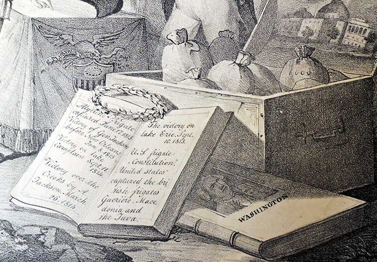
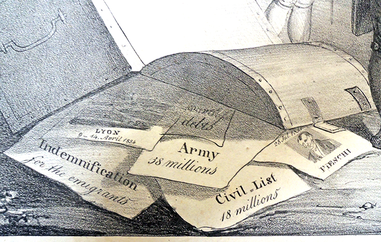
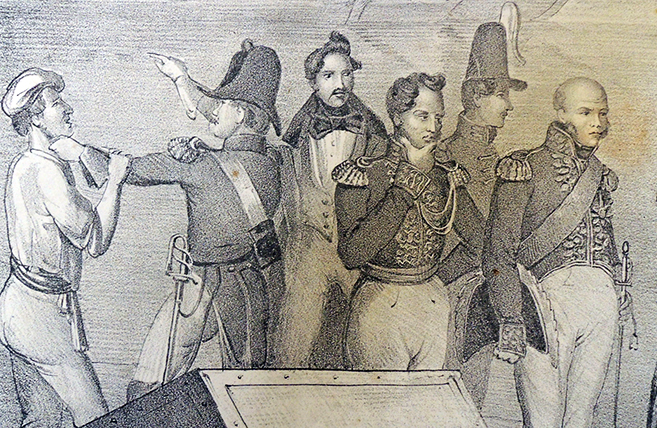
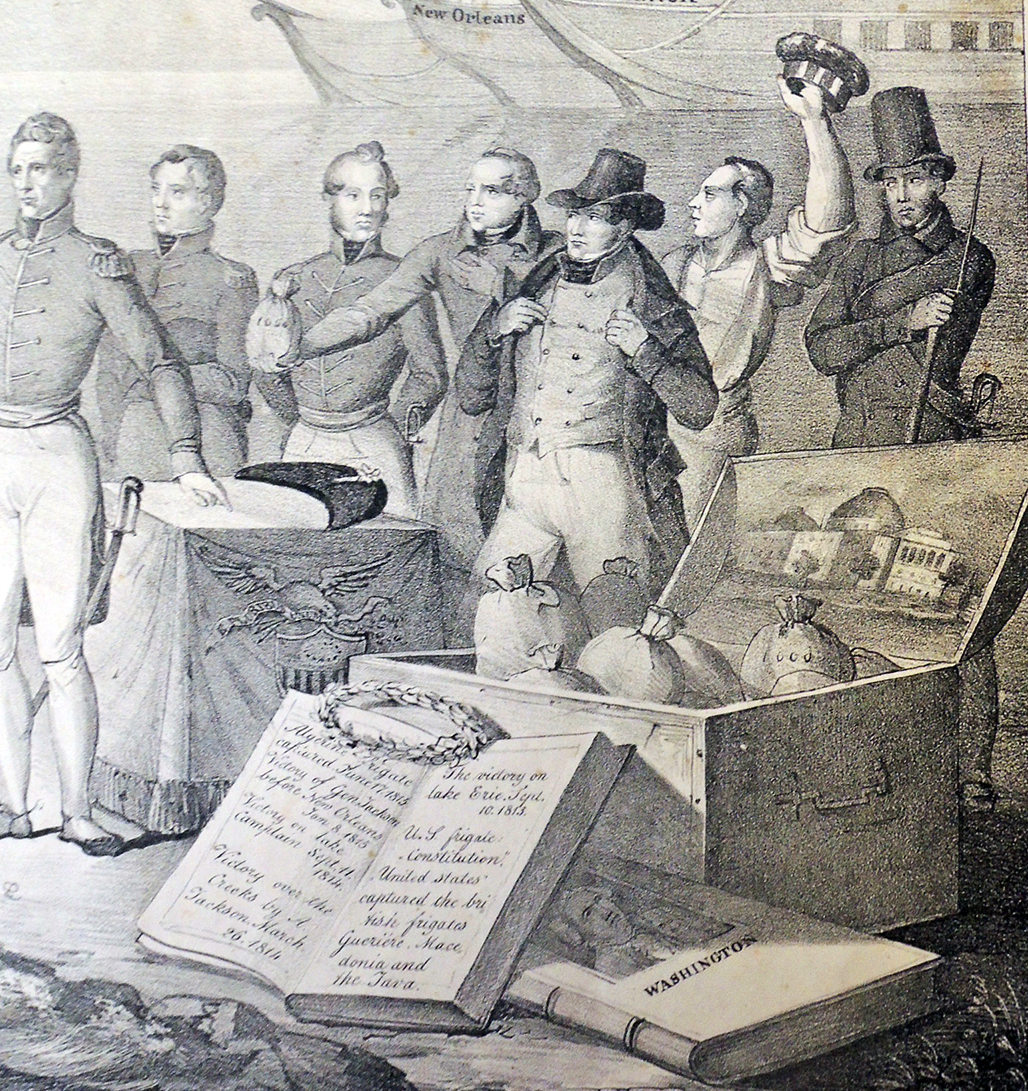
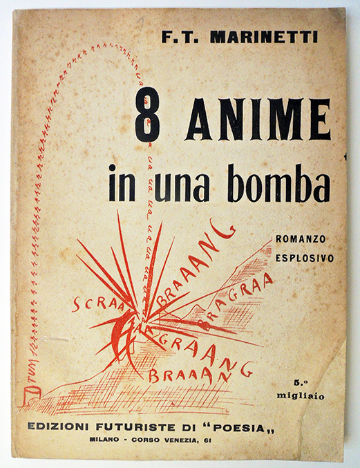
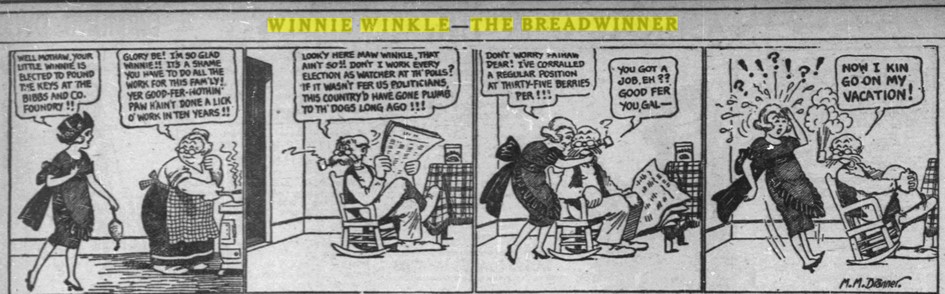
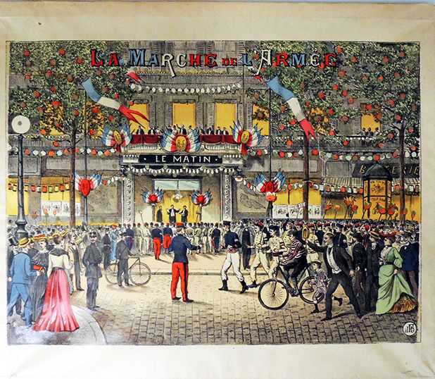
Conflict and contrast form the basis for this lithograph, on deposit with the Graphic Arts Collection thanks to Bruce C. Willsie, ’86. With France on the left and the United States on the right, the print even has two distinct titles, taken from separate captions on the left and right. Beneath King Louis Philippe (1773-1850) is written: “The debilitated situation of a monarchical Government when puffed up by pride and self-importance, whose resources must be wrung from the people’s hands. The difficulties to which such a State must ever be exposed.” Beneath Andrew Jackson (1767-1845) is the text: “The flourishing condition of a well-formed industrious Republic. The willingness displayed by the citizen of a free state to serve his country with his blood and fortune.” The debilitated situation of France VS the flourishing condition of the United States.


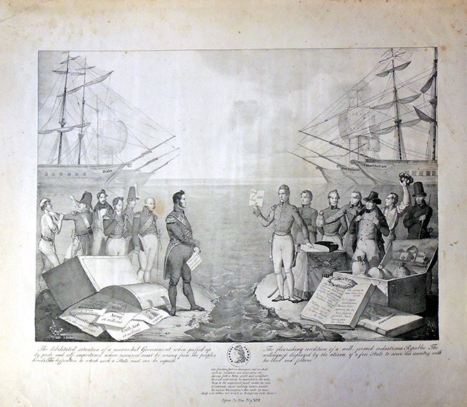
Printed in 1836 by an anonymous artist, possibly in Philadelphia, the scene presents the American superiority following the Treaty of 1831, in which France agreed to pay claims for Napoleonic depredations on American shipping (specifically, France agreed to pay 25 million francs, and in return, the United States paid a small sum to extinguish French claims against the American government and reduced the duties on French wines).

On the American right side a trunk is filled with bags of money while on the left, the French trunk is overturned with bills spilling out on the ground. The officers on the right are proud and sure of themselves while on the French left the men are unsure, fighting amongst themselves. Between them lies an ocean with an equal number of battle ships ready for war.


A center medallion includes lines from Byron’s Childe Harold’s Pilgrimage, slightly altering the beginning:

Can [tyrants but by tyrants conquer’d be,
And] Freedom find no champion and no child
Such as Columbia saw arise when she
Sprung forth a Pallas, arm’d and undefiled?
Or must such minds be nourish’d in the wild,
Deep in the unpruned forest, ‘midst the roar
Of cataracts, where nursing Nature smiled
On infant Washington? Has Earth no more
Such seeds within her breast, or Europe no such shore?
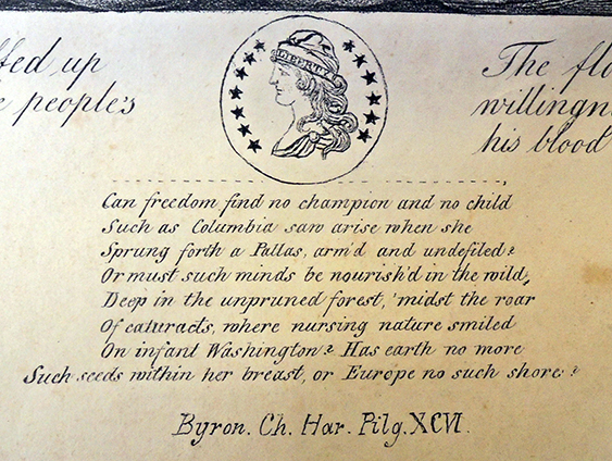
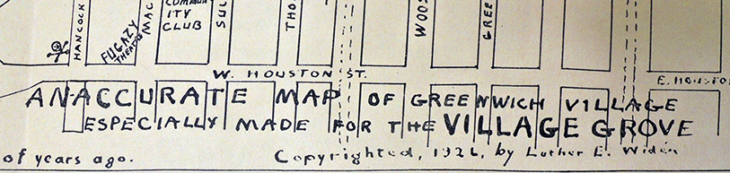
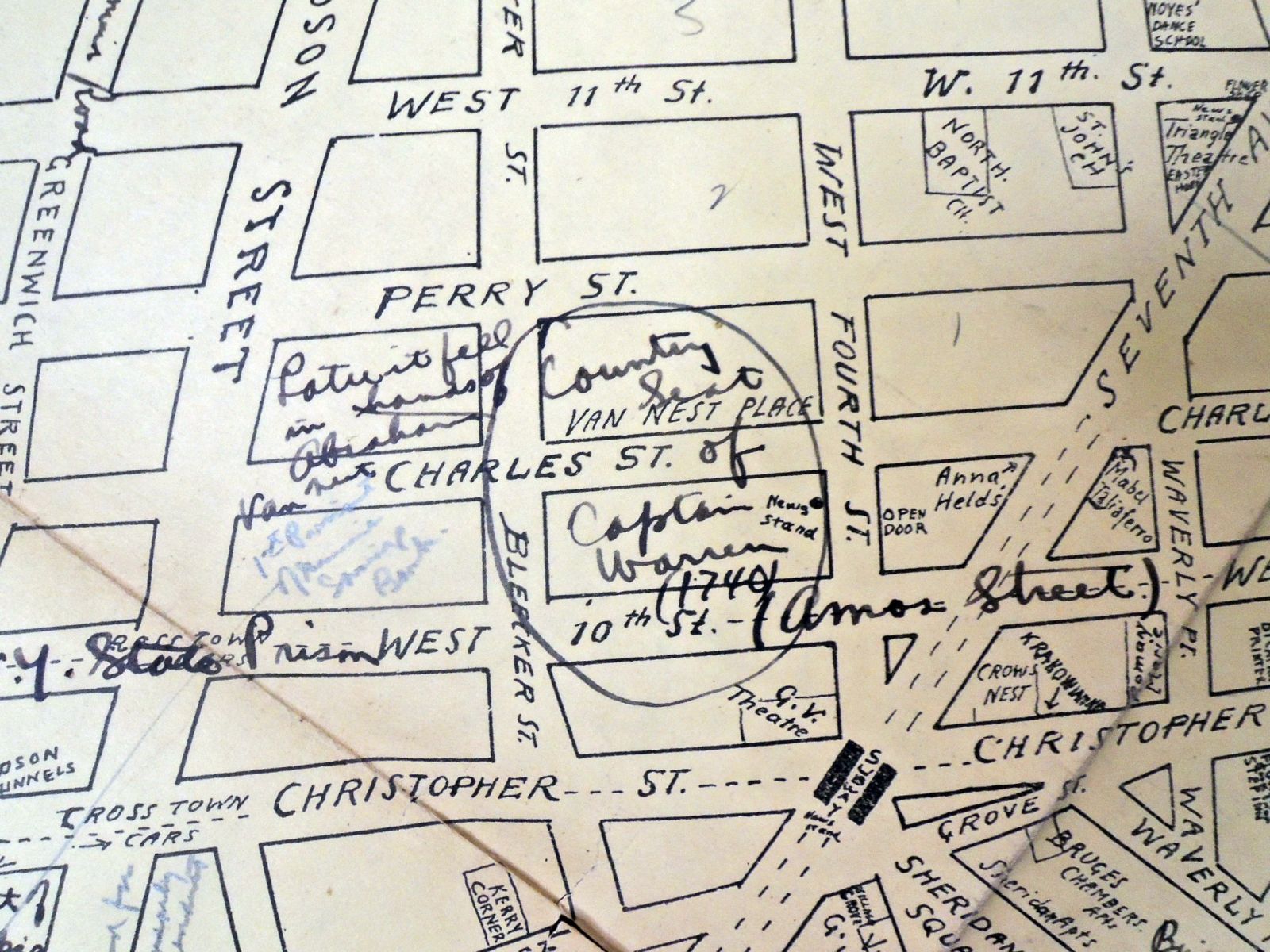
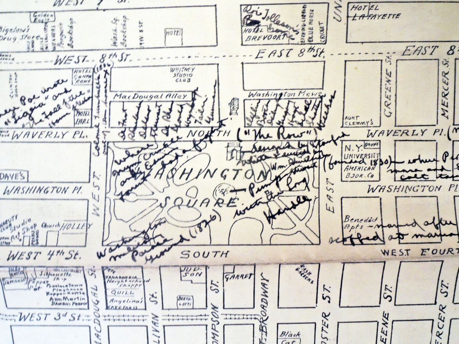
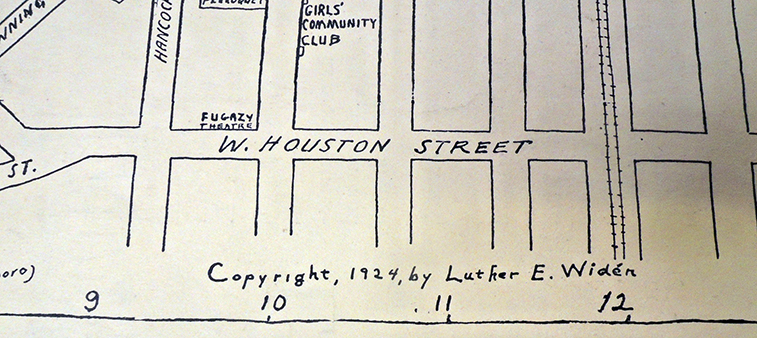
 

A Complete Stranger’s Guide through London


Thanks to a deposit by Bruce C. Willsie ’86, the Graphic Arts Collection now holds 51 of the 88 separate engravings covering 74 London streets published by John Tallis (1818-1876) from 1838 to 1840. Exceptionally rare, these unbound prints were originally published in parts and only later as a bound set. Tallis promised that his directory to the buildings and businesses on each street would be corrected and updated every month. The elaborate title explains it all:

Tallis’s London Street Views, Upwards of One Hundred Buildings in Each Number, Elegantly Engraved on Steel; with a Commercial Directory Corrected Every Month, The Whole Forming a Complete Stranger’s Guide Through London, and by Reference, from the Directory to the Engraving, Will Be Seen All The Public Buildings, Places of Amusement, Tradesmen’s Shops, Name and Trade of Every Occupant, &c. &c. To Which Is Added an Index Map of the Streets, From a New Actual Survey, Now Making, At a Cost of Upwards of One Thousand Pounds; and a Faithful History and Description of Every Object Worthy of Notice, Intended To Assist Strangers Visiting the Metropolis, Through All the Mazes Without a Guide. London: published by John Tallis, 15, St. John’s Lane, St. John’s Gate; and regularity kept by al booksellers and toy shops, in England, Wales, Ireland, and Scotland. Each street may be had separately.

The narrow format made each sheet easy to fold and carry in your pocket for onsite reference, but may also explain their scarcity today. The guides were used so frequently, they eventually fell apart and were discarded.

Each view on two attached sheets, offers both sides of a street, along with one fully engraved and aquatinted building and a map of the area at either end. One typically sold for 1½d. Owners paid extra to have the name of their business engraved over the building or featured at the end of the sheet.


Read more: Alison O’Byrne & Jon Stobart (2017) “Introduction: Roundtable on John Tallis’s London Street Views (1838–1840),” Journal of Victorian Culture, 22:3, 287-296, DOI: 10.1080/13555502.2017.1327196

For a digital view of Tallis’s Streets, see: https://www.romanticlondon.org/tallis-street-views/#14/51.5151/-0.1169. The map here shows the locations of the Street Views depicted; each marker is placed at the center of the appropriate plate. For more on the Street Views, see the Museum of London’s project or the London Topographical Society’s publications on the subject.


Remarks on the Jacobiniad, 1795

“Say who for Larning, ever equalled I?” Slightly photoshopped

Remarks on the Jacobiniad was a ten-part series published in the Boston Federal Orrery between Dec. 8, 1794 and Jan. 22, 1795, satirizing the Democratic-Republican societies in Boston. Disguised as a serious literary review of a fictitious poem, “The Jacobiniad,” the parts were later published in pamphlet form and attributed to John Sylvester John Gardiner (1765–1830), an Episcopal priest and rector at Trinity Church, Boston (DAB).

While not the earliest American political caricatures, the six engraved plates in Remarks on the Jacobiniad are rare examples of 18th-century colonial American satire. Various almanacs of the period also contain plates making fun of political figures, such as “Washington with Federal Constitution and Benjamin Franklin in chariot pulled by thirteen freemen, representing the original thirteen states,” from Bickerstaff’s Boston Almanack, or Federal calendar for 1788. Graphic Arts Collection Oversize Hamilton 44.

John Sylvester John Gardiner (1765-1830).] Remarks on the Jacobiniad: Revised and corrected by the author; and embellished with Carricatures [sic]. Part First. Boston: E. W. Weld and W. Greenough, 1795. 6 engraved plates. Graphic Arts Collection GAX 2021- in process

“Inspired by the political clubs of revolutionary France (the Jacobins being the most famous), American Democratic clubs formed in the early 1790s in most major cities, often boasting among their members some of the most prominent political names of the period (Sam Adams in Boston, the Livingston family in New York). Their increasingly vocal reaction to the Federalist administration prompted a series of mock-epic responses in 1794 and 1795, including Lemuel Hopkins’s The Democratiad, Boston poet John Sylvester John Gardiner’s Remarks on the Jacobiniad, and Democracy: An Epic Poem (Franklin 1970, vi).

In each case, the object of satire is not merely the political views of the Democrats but their preferred mode of discourse, the open “town-meeting”-style forum. Recasting such debates as travesties of the grand debates found in serious epics like The Iliad and Paradise Lost, the Federalist Wits portrayed their Democratic opponents as disorderly buffoons, wholly incapable of governing even their own meetings, much less the nation as a whole.”

–Colin Wells, “Revolutionary Verse,” The Oxford Handbook of Early American Literature Edited by Kevin J. Hayes Mar 2008. DOI: 10.1093/oxfordhb/9780195187274.013.0023

“[George] Washington, disturbed by the strong political disagreements of his era and eager to retire to his home, Mount Vernon, eliminated himself as a candidate in 1796. A vigorous campaign between John Adams and Thomas Jefferson ensued, resulting in the election of Adams. These cartoons are caricatures of Democratic-Republicans from a pamphlet containing the satirical poem Remarks on the Jacobiniad. The Republicans were nicknamed Jacobins after the Parisian radicals, reflecting the Republicans’ general support of the French Revolution. Federalists, on the other hand, upheld Washington’s strict course of neutrality and feared the spread of Jacobinism in the country.”

— Laurel Grunat, Mitchel Grunat, and Robert Goehlert, Presidential Campaigns, a Cartoon history, Indiana University Libraries Bloomington, 1976

Gilbert Stuart (1755-1828), John Sylvester John Gardiner (1765-1830), c. 1810-1820. Oil on panel. Boston Athenaeum.

John Gardiner was born in Wales but spent much of his youth in the West Indies, where his father served for the British government as attorney-general. He was sent to Boston for his education, returning to Britain only at the outbreak of the American Revolution. In 1783, however, he moved permanently to Boston and was eventually named rector of Trinity Church. He was a published author and a founder of the Boston Athenaeum.


His lean left hand he stretched, as if to smite / And, mansir l, groped his breeches with his right.


Goodbye Calibri

Back in 2016, the Metropolitan Museum of Art threw out the letter M, based on a woodcut by Fra Luca Pacioli, as their brand in favor of MET, using two fonts: The Met Sans and The Met Serif. https://www.metmuseum.org/blogs/now-at-the-met/2016/brand-identity


Two weeks ago, on April 28, 2021, the Microsoft Design Team announced they were no longer using Calibri as the default font for Microsoft products. https://www.microsoft.com/en-us/microsoft-365/blog/2021/04/28/beyond-calibri-finding-microsofts-next-default-font/

What is the new default? That is yet to be determined and they are asking us to help. You can vote for the new font from five commissioned fonts (Times Roman is not an option). The five options are: Tenorite, Bierstadt, Skeena, Seaford, and Grandview. All are sans-serif.

“All five families are now available via the cloud across your favorite Microsoft 365 apps and experiences. Go use the fonts starting today, and show us which you love best with feedback and comments on social.” Microsoft continues:

“Calibri has been the default font for all things Microsoft since 2007, when it stepped in to replace Times New Roman across Microsoft Office. It has served us all well, but we believe it’s time to evolve. To help us set a new direction, we’ve commissioned five original, custom fonts to eventually replace Calibri as the default. We’re excited to share these brand-new fonts with you today and would love your input. Head over to social and tell us your favorite. And don’t worry if the font you love best isn’t chosen as the next default; all of them will be available in the font menu, alongside Calibri and your other favorite fonts in your Office apps in Microsoft 365 and beyond.”

Speaking with Wired magazine, Lucas de Groot, the designer of Calibri, was not unhappy. “I designed it in quite a hurry. I had some sketches already, so I adapted those and added these rounded corners to get some design feeling in it.”

TENORITE by Erin McLaughlin and Wei Huang

“Tenorite has the overall look of a traditional workhorse sans serif (a font without a serif, or a stroke at the ends, like Times New Roman), but with a warmer, more friendly style. Elements such as large dots, accents, and punctuation make Tenorite comfortable to read at small sizes onscreen, and crisp-looking shapes and wide characters create a generally open feeling.”

BIERSTADT by Steve Matteson

“Bierstadt is a precise, contemporary sans serif typeface inspired by mid-20th-century Swiss typography. A versatile typeface that expresses simplicity and rationality in a highly readable form, Bierstadt is also notably clear-cut with stroke endings that emphasize order and restraint.”

SKEENA by John Hudson and Paul Hanslow

“Skeena is a “humanist” sans serif based on the shapes of traditional serif text typefaces. Its strokes are modulated, with a noticeable contrast between thick and thin and a distinctive slice applied to the ends of many of the strokes. Skeena is ideal for body text in long documents, as well as in shorter passages often found in presentations, brochures, tables, and reports.”

SEAFORD by Tobias Frere-Jones, Nina Stössinger, and Fred Shallcrass

“Seaford is a sans serif typeface that is rooted in the design of old-style serif text typefaces and evokes their comfortable familiarity. Its gently organic and asymmetric forms help reading by emphasizing the differences between letters, thus creating more recognizable word shapes.”

GRANDVIEW by Aaron Bell

“Grandview is a sans serif typeface derived from classic German road and railway signage, which was designed to be legible at a distance and under poor conditions. Grandview is designed for use in body text but retains the same qualities of high legibility, with subtle adjustments made for long-form reading.”


Remember you can override the default.

8 Souls in One Bomb, an Explosive Novel


Filippo Tommaso Marinetti (1876-1944), 8 Anime in Una Bomba. Romanzo esplosivo [=8 Souls in One Bomb. An Explosive Novel] (Milan: Edizioni Futuriste di “Poesia,” 1919). Graphic Arts Collection GAX 2021- in process


Beginning with F.T. Marinetti’s manifesto in 1909, the male artists and writers of the Italian Futurist movement are the ones who made it into the history books. Often forgotten is an important figure within Futurism in general, and Marinetti’s work in particular, the author Rosa Rosà (born Edyth von Haynau; 1884–1978). The two were introduced during World War I, at which time she changed her name “to express this dual identity and to play with Futurist ideas of movement, while simultaneously punning on the traditional female name, “Rose/Rosa.” During the war, Rosa began to write in Italian for the Futurist journal L’Italia Futurista, where she published a myriad of articles, black and white drawings, short poems, and poetry.” –Lucia Re, “Introduction to A Woman with Three Souls,” California Italian Studies.

In 1917, while recovering in a military hospital, Marinetti wrote an enormously popular and presumably humorous book Come si seducono le donne (How to Seduce Women). The assertive Rosa Rosà responded with a number of articles and then, a short novel, Una donna con tre anime (A Woman with Three Souls, 1918), which critics called a visionary “futurist-fantastic narrative with elements of both realism and science fiction” (re-publishd in 1981 by Edizioni delle donne). Within a matter of months, Marinetti published his own visual and textual presentation of souls entitled: 8 Anime in Una Bomba. Romanzo esplosivo (8 Souls in One Bomb. An Explosive Novel).


1st soul: The war piano
2nd soul: Letter from Bianca, plump virgin and professor of botany, to a futurist
Response of the futurist
3rd soul: The sick cow and the young heroes
4th soul: First quality of rubber: Elasticity-contradiction, Caporetto-Vittorio factory Veneto
Letter from the retreating 3rd Army
5th soul: Lust; Formulas; 4 floors of sensuality in an establishment of bathrooms
Nocturnal dialogue in the Observatory of 8th Bombarde Battery in Zagora
6th soul: The frightening tenderness
7th soul: Genius-revolution ; In prison for interventionism
8th soul: Purity
Mixture of 8 explosive souls
Chorus of the 8 explosive souls
Parable and explosion of the bomb

Each chapter of 8 Souls has different typography and layout, some with the visual poetry reminiscent of Zang Tumb Tumb and earlier futurist narratives. Other chapters are psychological, fictional descriptions of one of the eight identities. Over the years, various names have been given to each section–Heroism, seduction, creativity, aggression, and so on–although Marinetti keeps the titles ambiguous.

In the end, all eight souls unite in an explosive mixture of a 92 kg bomb, directed at “cholera lice moralistic priests spies professors and policemen…”. Although there is no correspondence to link them, at this same time James Joyce was publishing Ulysses in parts from March 1918 to December 1920. Joyce wrote 18 episodes, each chapter with a different literary structure or narrative format.


Another Outlaw Saga


Thanks to a new gift from Bruce Willsie ’86, Princeton now holds four editions of the popular outlaw saga, The History of Adam Bell, Clim of the Clough, and William of Cloudeslie. Note the slight difference in the two lines of verse under each title.

Here’s a good summary of the story: https://englishhistoryauthors.blogspot.com/2018/04/robin-hood-vs-bell-clim-and-cloudesley.html, which is similar to the better known tale of Robin Hood.

Thomas Hahn writes:

“As a lively, self-contained and substantive tale of outlawry, Adam Bell, Clim of the Clough and William of Cloudesley is the only work that rivals stories of Robin Hood in popularity and antiquity. No outlaw ballad, except the pivotal A Gest of Robyn Hod, was printed earlier than Adam Bell; the earliest fragments of the ballad survive form an edition of 1536, and the poem was then reprinted another half-dozen times or more within the next seventy-five years.

Adam Bell is only one-third as long as A Gest of Robyn Hode, but it is twice the length of the earliest unprinted Robin Hood ballads, . . . and six times the length of the many seventeenth-century broadside ballads that celebrate the deeds of Robin Hood. …The narrative was reprinted, presumably in its entirety, perhaps twice, in the 1540s, and again in 1557-8, 1582, 1586, 1594 and several more times in the first decade of the seventeenth century. Its remarkable popularity and commercial success inspired an anaemic sequel, added in 1586 and to most later editions…

…Though allusions to William, Adams, and Clim would no doubt be lost on most modern audiences, the outlaws remained formidable rivals to Robin Hood and his band, in both oral and print culture, through to the end of the seventeenth century.”—Medieval Outlaws: Ten Tales in Modern English, edited by Thomas H. Ohlgren (1998).

What does the name Clim of the Clough mean? “This surname is derived from a geographical locality. ‘at the dough,’ from residence thereby. A clough is a breach in the hillside, a ravine between hills. ‘Boggart Hole Clough’ is well known to Manchester people; v. Clow.” https://forebears.io/surnames/clough#meaning


Mery it was in grene forest,
Amonge the leves grene,
Where that men walke both east and west,
Wyth bowes and arrowes kene,

To ryse the dere out of theyr denne;
Suche sightes as hath ofte bene sene,
As by the yemen of the north countrey,
By them it is as I meane.

The one of them hight Adam Bel,
The other Clym of the Clough,
The thyrd was William of Cloudesly,
An archer good ynough.

They were outlawed for venyson,
These thre yemen everechone;
They swore them brethen upon a day,
To Englysshe wood for to gone.


Thus ends the Lives of these good Men / Send them eternal Bliss; / And all that with Hand-bow shooteth, / Of Heaven may never miss.


Feminist Cartooning: Winnie Winkle, the Breadwinner


Before Working Girl, 9 to 5, The Mary Tyler Moore Show, or even Our Miss Brooks, which each featured single females in the mostly male world of business, there was the groundbreaking Winnie Winkle. She was the iconic working girl of the 20th century, who first appeared on September 20, 1920, in the comic strip Winnie Winkle, the Breadwinner, written and drawn by cartoonist Martin Branner. The 19th amendment granting women the right to vote in the United States had only been ratified a month earlier on August 18.

The comic strip was such a success in Chicago and New York City that the character continued to appear for more than seventy years, with the final strip published July 28, 1996. Needless to say, Winnie changed a great deal over the years, married, had children, lost husbands, ran her own company, and so on. For some, she was at her best in the original 1920s stories, when she worked as a secretary/stenographer for Mr. Bibbs.


At home, Winnie’s mother worked equally hard while her father did all he could to avoid getting a job. He never tired of living off his daughter, just as her many bosses found ways to slack off while at the office. Surprisingly, Winnie was based on Branner’s own wife, “who worked with her husband in the production of the cartoon strip”:

“Winnie Winkle sprang from the pen of Connecticut’s Martin Branner, who drew his inspiration for the comic-strip beauty from his long-time wife Edith Fabbrini. The couple met when Martin was 18 and Edith 15. They married and for 15 years were headliners on the vaudeville circuit as the dance team Martin and Fabbrini. Martin left the theater to serve in World War I in the Chemical Warfare Service. Exhausted by tapping out two and three shows a day on the Keith Orpheum and Pantages vaudeville circuits, Martin (called Mike by his friends) began developing his talent for drawing. The couple hailed from New York, but settled in Waterford, Conn. One of their lasting legacies can be seen in the town’s seal, which the couple designed.”– https://www.newenglandhistoricalsociety.com/girl-power-born-1920-form-winnie-winkle-breadwinner/

 
San Francisco Enquirer 1917


From 1926 to 1928, ten Winnie Winkle the Breadwinner movies were produced, written by Branner and starring Ethelyn Gibson as Winnie, with Billy West as director: Working Winnie (1926); Happy Days (1926); Winnie’s Birthday (1926); Oh! Winnie Behave (1926); Winnie’s Vacation (1927); Winnie Wakes Up (1927); Winnie Steps Out (1927); Winnie Be Good (1927); Winning Winnie (1927); and Winnie’s Winning Ways (1928). Here is a bit from Winnie’s Vacation:

Théâtre des voyages

Théâtre des voyages. Le Tour du monde par un petit français. Grand spectacle en 24 tableaux (Paris: M.-D. [i.e. Mauclair-Dacier] Editeur and J.J.F. [i.e Jeux et Jouets Français]. [1905]. Series: Théâtre des voyages et des actualities. Cotsen Collection (CTSN) Toys 46025


A recent search through our collections of paper theaters led to one particularly rare item in the Cotsen Children’s Library https://blogs.princeton.edu/cotsen/. A multi-media Théâtre des voyages, this home theater comes with a music box for sound to accompany a scrolling 17 foot vertical panorama with 24 lithographic scenes and titles on either end. The narrative takes a young French boy on a world tour from France to New York City, the Rocky Mountains, mining for gold in the Klondike, hunting with indigenous people in the mid-West and Alaska, attending a marriage in Peking, getting arrested in Bangkok, feasting in Benares, crossing the Siberian steppe and on to Moscow, being enslaved and sold by Tuaregs, escaping to ride the rapids of the Oubangi to Brazzaville, traveling through Africa to Algiers, Marseilles, and finally home.

The toy theater was produced and sold by Mauclair-Dacier, who established his own business in 1887, which ran successfully through 1904 when he was taken over by JJF (Jeux et Jouets Français).

While many of the scenes are politically incorrect as might be expected of a 1905 toy, others are surprisingly egalitarian, such as the multi-racial orchestra playing below the proscenium arch throughout the entire show.

The rolling narrative is interrupted by sliding ‘tableaux lumineux’ (hold to light slides) mounted on wooden frames that slide through the top of the box and cover the scroll while it changes scene. Here are a few examples:.


For other Cotsen treasures, see: https://blogs.princeton.edu/cotsen/.

Life Post Quarantine

For those of us who came back to a physical office or work place last year, it can be hard to now share the streets with the rest of the world. New drivers are crazy and even the sidewalks can be dangerous. Be careful out there.


George Cruikshank (1792-1878) after George Moutard Woodward (approximately 1760-1809), The Art of Walking the Streets of London, Plate 1 and 2. January 1, 1818. Etching with hand-coloring. Graphic Arts collection GC022 Cruikshank prints. Gift of Richard W. Meirs, Class of 1888.

The British Museum notes: The title is from Gay’s ‘Trivia’. Woodward died in 1809; the costume of the principal figures has been brought up-to-date. Both plates are said to be from the ‘Caricature Magazine’. Reid, No. 764. Cohn, No. 898.

Mapping Greenwich Village Saturday Night

This aerial photograph of Washington Square Park gives a view of “The Row,” the townhouses of wealthy New Yorkers living along Washington Square Park North (Waverly Place). Below are the names of the residents in 1924/25.

“…the most charming square in all New York: De Forest, Rhinelander, Delano, Stewart, De Rham, Gould, Wynkoop, Tailer, Guinness, Claflin, Booth, Darlington, Gregory, Hoyt, Schell, Shattuck, Weekes,—these, and others are still the names of the residents of Washington Square North. Father Knickerbocker, coming to smoke his pipe here, will be in good company, you perceive!”–Anna Alice Chapin, Greenwich Village. Illustrated by Alan Gilbert Cram (2005)

Map annotated by Lew Ney 1925, given to Princeton University Library.


Lew Ney (born Luther Emanuel Widen, 1886-1963), The Greenwich Village Saturday Night (New York: [Lew New, 1924-1926]. Little Magazines LM GVSN Princeton holdings: Vol.2, no.1 (Nov. 21, 1925); 2 copies- Vol.2, no.3 (April 10, 1926). Gift of Lew Ney.


Beginning with September 20, 1924, the Greenwich Village bohemian Lew Ney (pronounced Looney) distributed his neighborhood newsletter entitled The Greenwich Village Saturday Night, written and hand-printed in his cold water studio at 246 West 14th Street (check the map!). Each issue (except v.2, no. 2) included a large, two-page map of the area below 14th street with his commentary on New York history and current residents. Princeton was given four issues by Lew Ney himself and one of the maps is annotated by him [see above], a later copy including these notes in a cleaner version.


John Sloan (1871-1951), Sixth Avenue, Greenwich Village, 1923. Etching.


1924

1925

1926

A few details: