North Drive Press

Founded by Matt Keegan and Lizzy Lee in 2003, the North Drive Press published its 5th and final issue in 2010. All except one of the annual publications are out-of-print and so, it was a wonderful surprise when #3 and #5 were donated to the Graphic Arts Collection by James Welling. Both issues include work by current and former Princeton University instructors.

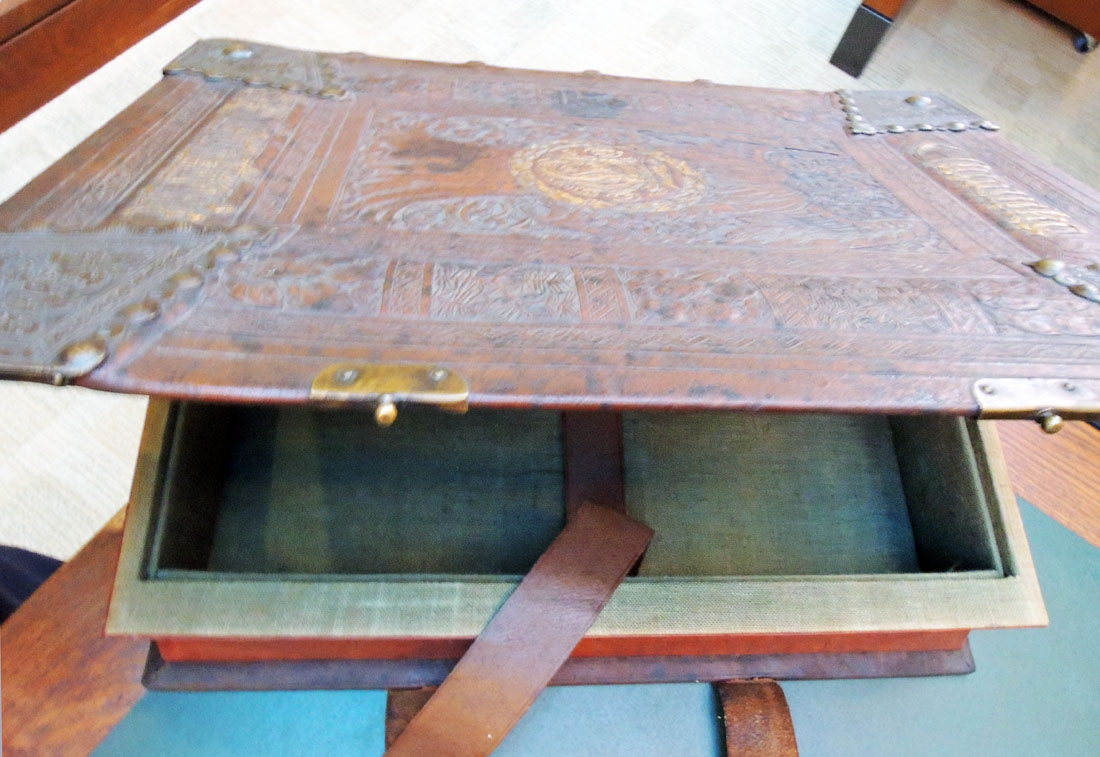
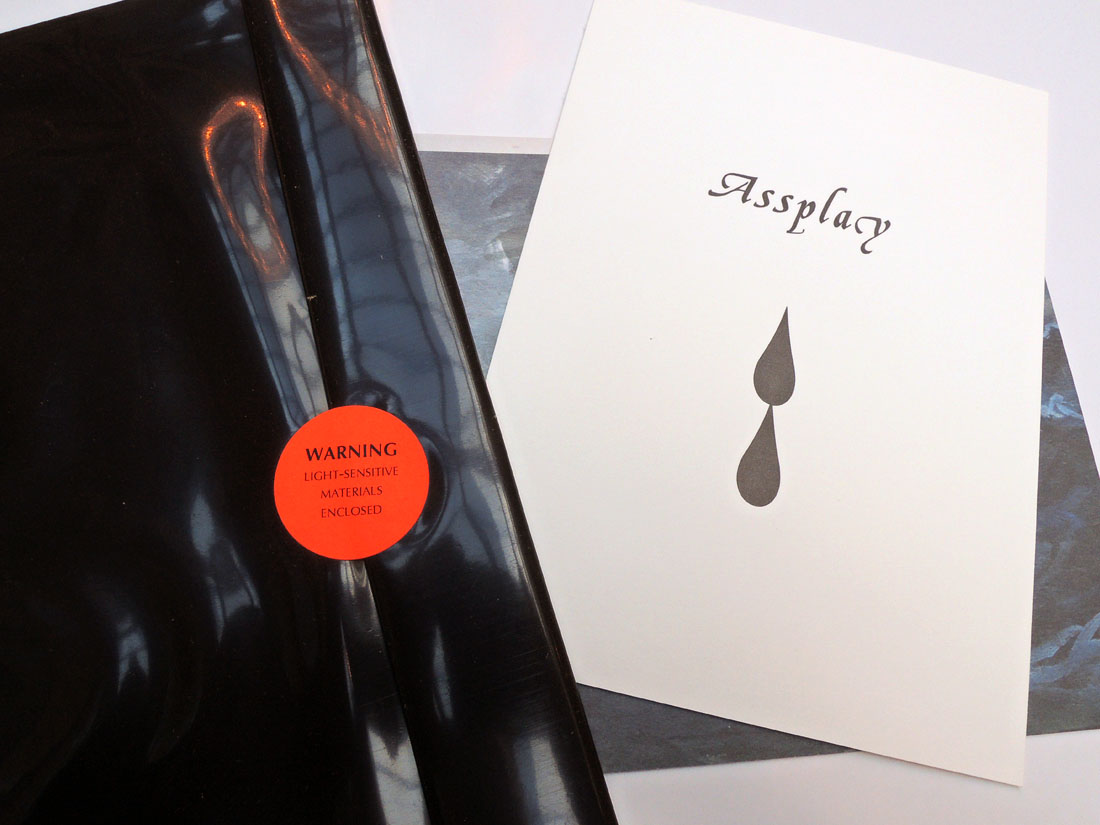
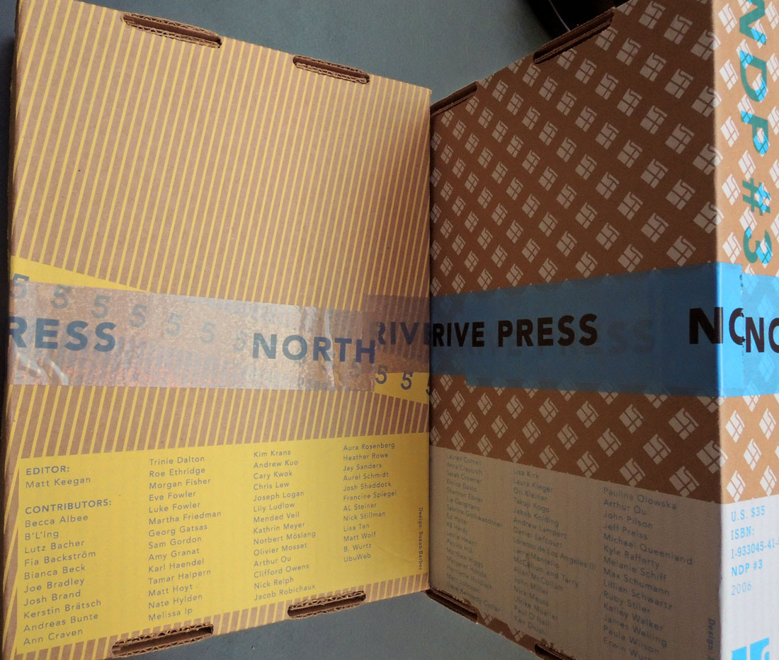
The first issue was distributed in a brown vinyl sleeve but when Susan Barber joined the team, the container was switched to a cardboard box. Many texts are now also available online at: http://www.northdrivepress.com/home.html

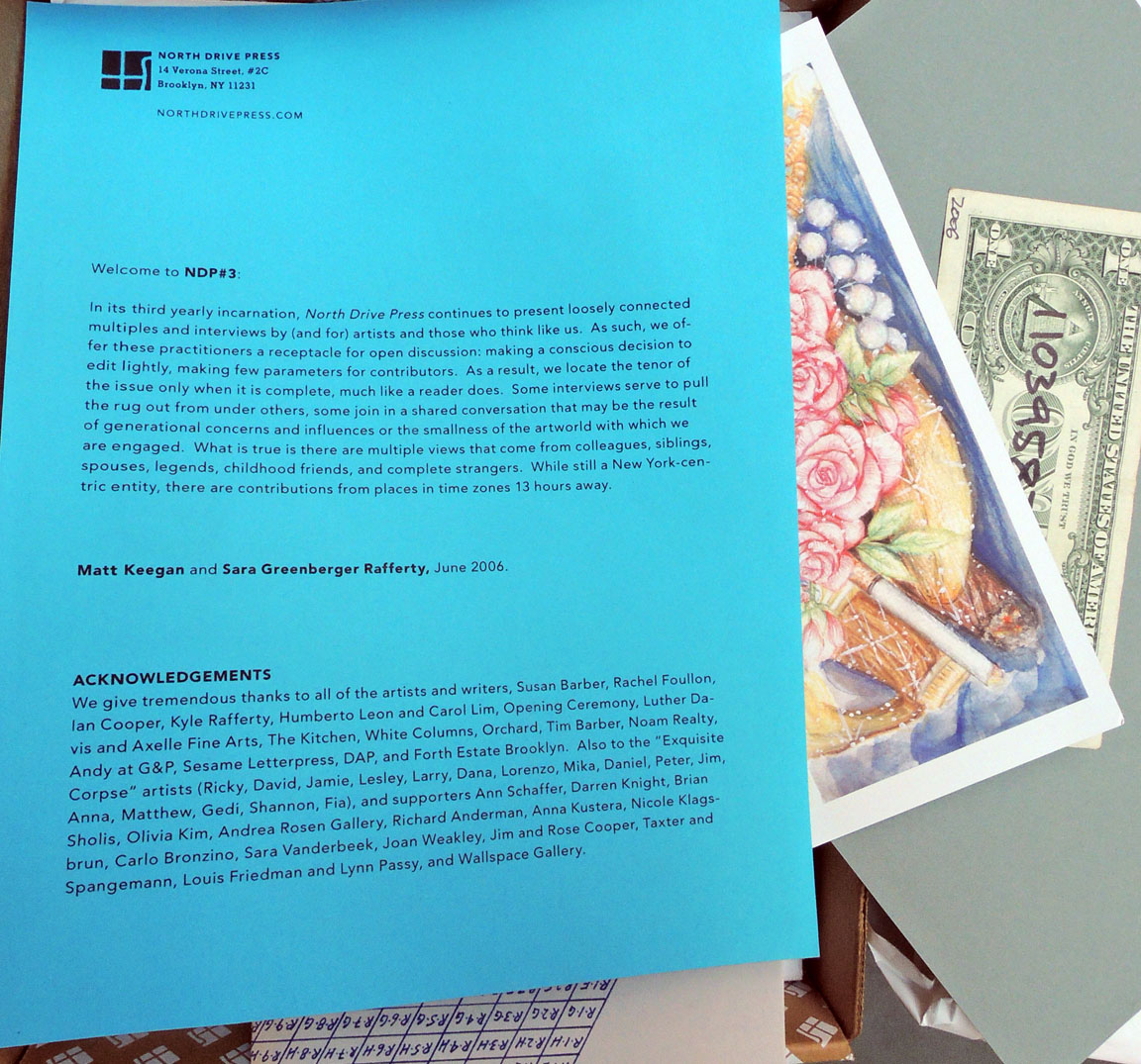
“…North Drive Press has provided hundreds of artists and arts practitioners with the opportunity to produce and cheaply distribute new works in multiple form. The annual publication has included 7″ records, posters, books, ready-mades, soap, temporary tattoos, photographs, perfume, and more. Interviews and texts—a core part of the project—are conversational, experimental, and available on our website for free download.

For NDP#3 and NDP#4, Sara Greenberger Rafferty, another artist committed to collaboration and artist-produced publications, joined North Drive Press as co-editor. Sara and Matt expanded North Drive Press to include exhibition and print publishing programs—separate from but complementary to the annual NDP publication.

They organized an evening at New York’s performance venue The Kitchen, published a suite of Exquisite Corpse prints, and exhibited at NADA and various other venues.

NDP #5 is a great note to end on: we’ve helped produce a dynamic assortment of artists’ multiples, from temporary tatoos to custom-made soap; and published a varied and compelling collection of interviews, panel discussions, and texts. We hope North Drive Press has added to the long, rich history of innovative, artist-made publications, and we hope our readers will be inspired to continue to investigate the exciting possibilities that non-traditional formats have to offer.”

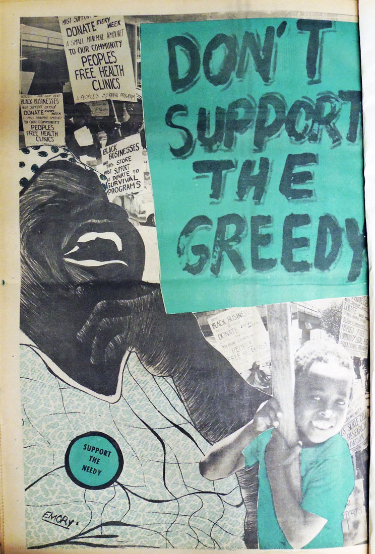
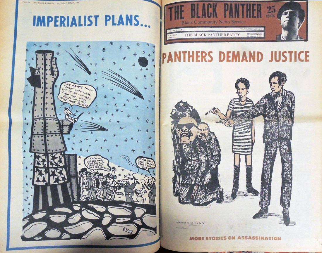
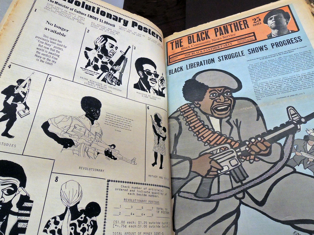
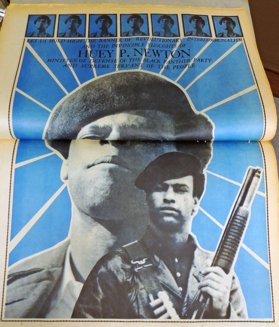
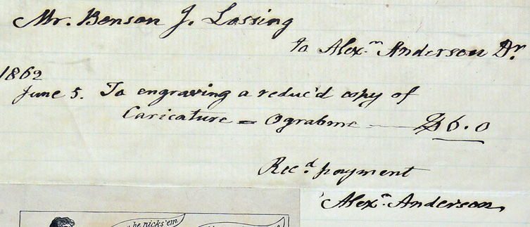
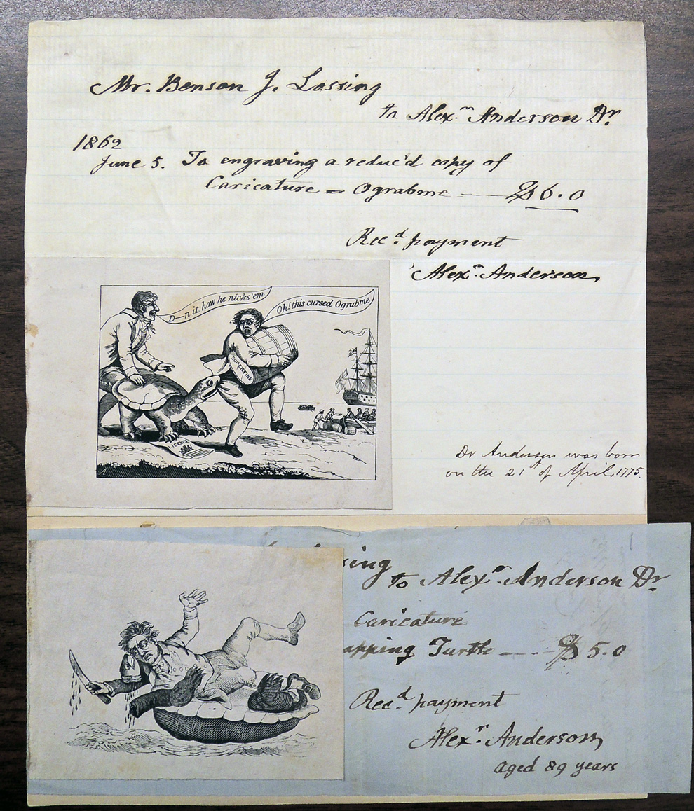
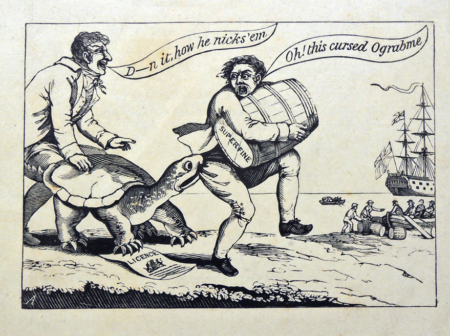
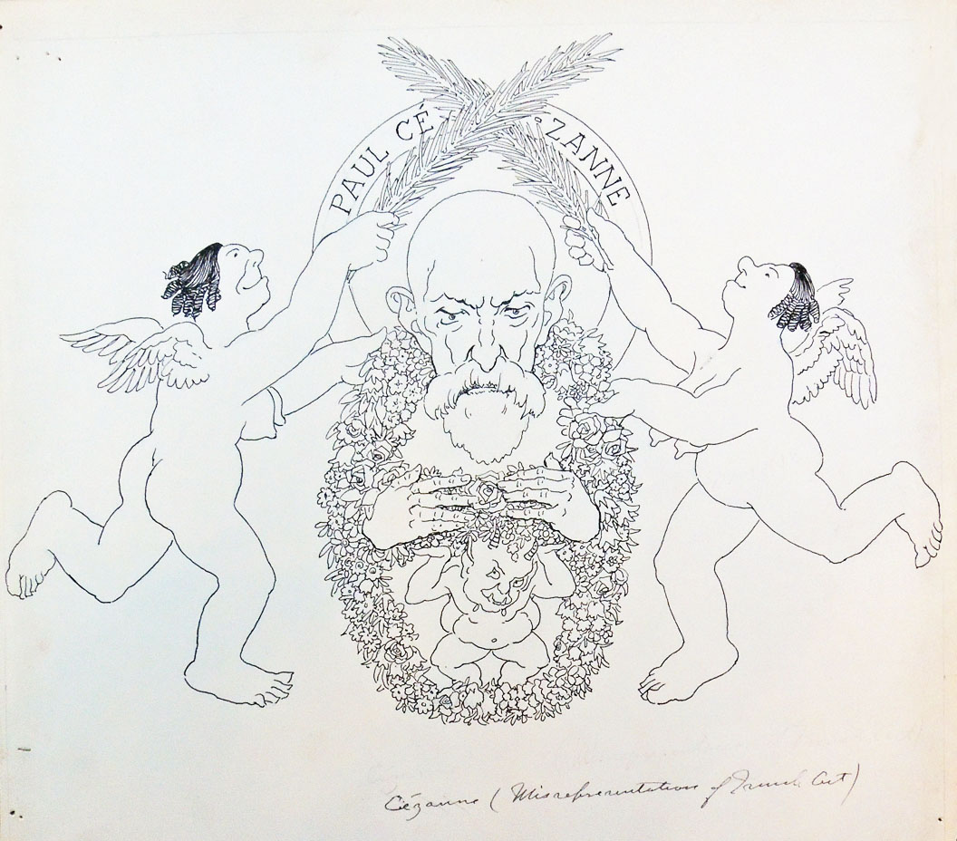
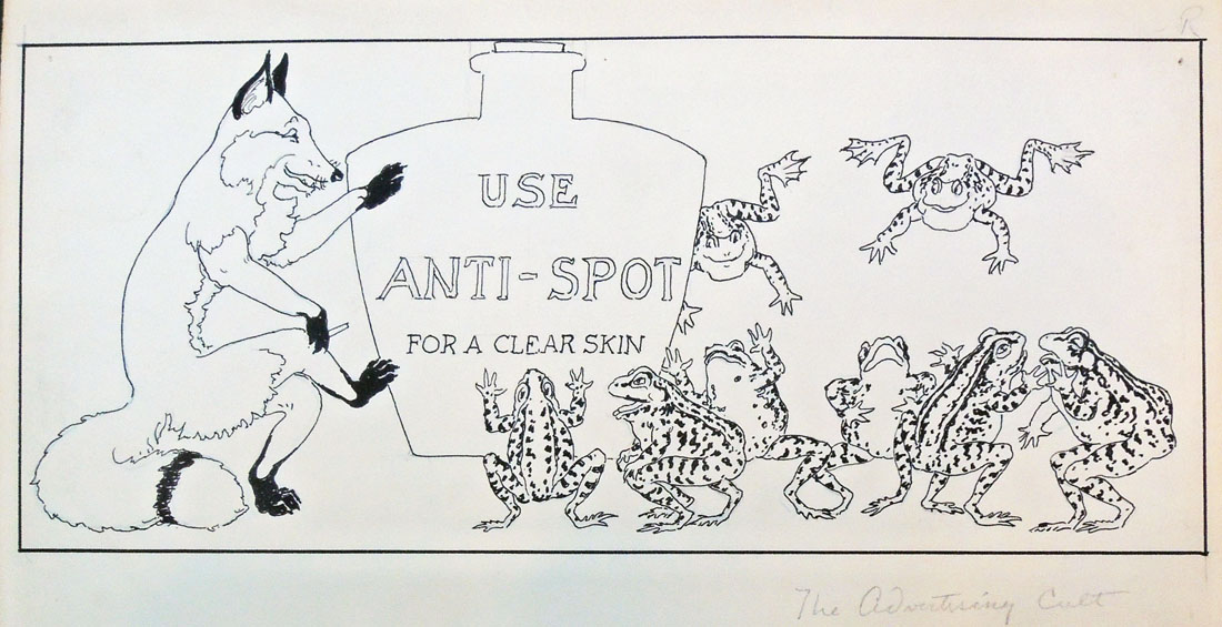
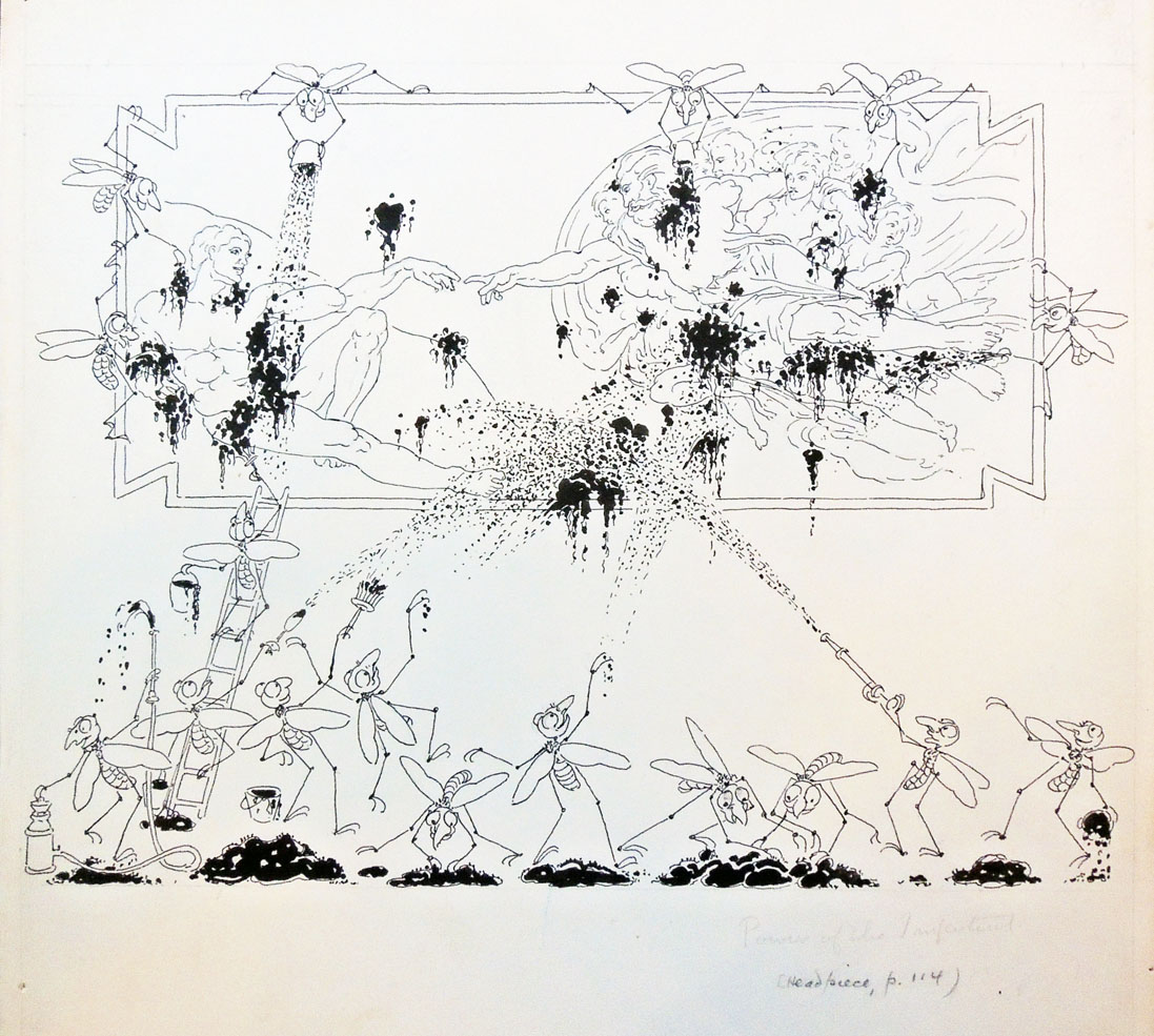
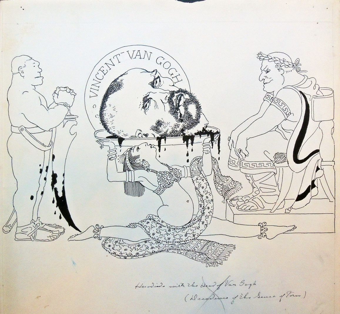
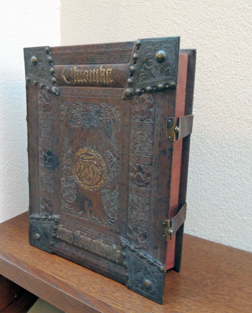
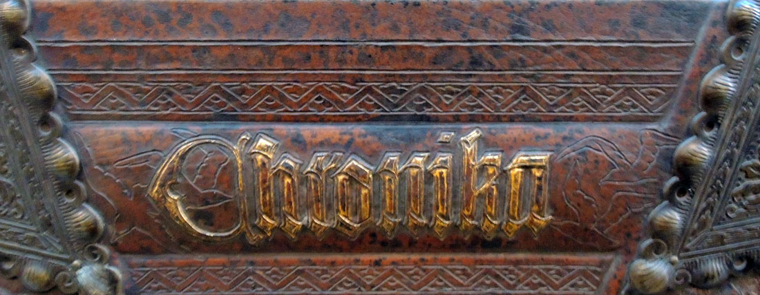
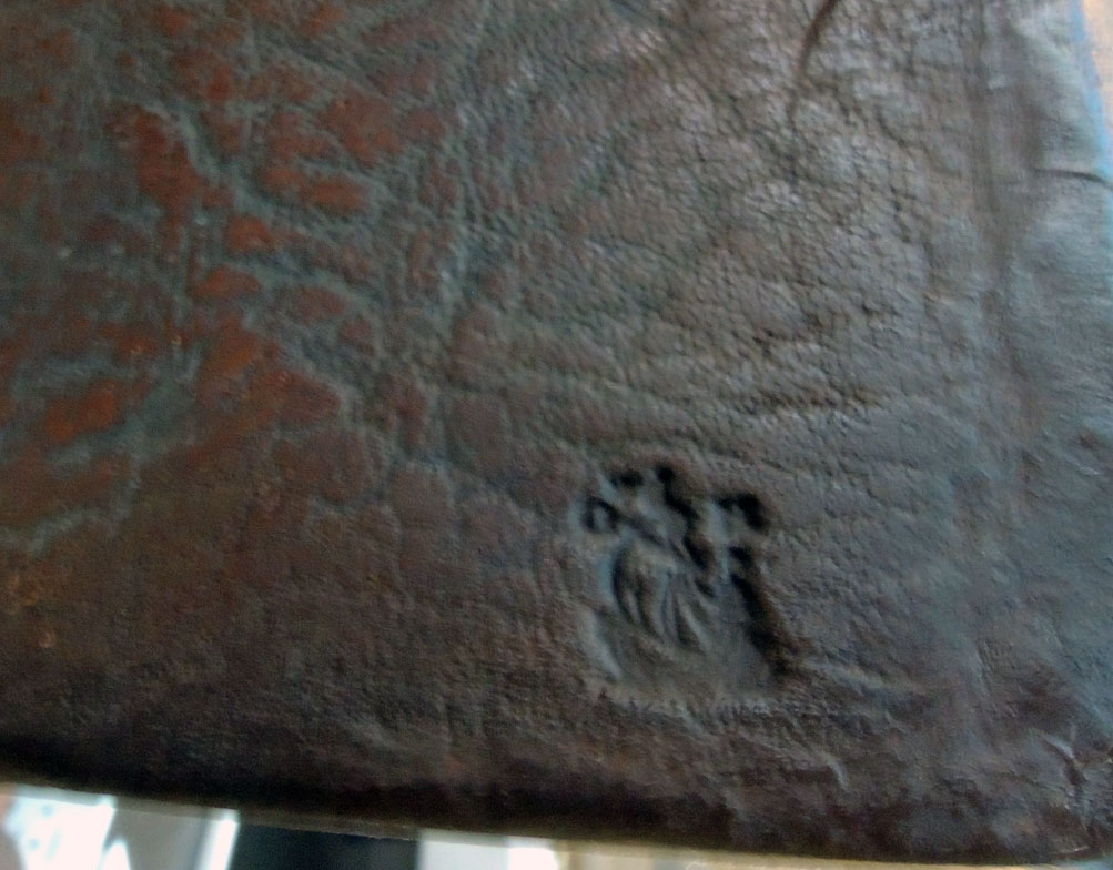
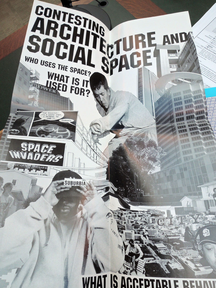
North Drive Press #3. Work by Matt Keegan; Sara Greenberger Rafferty; Su Barber; Domenick Ammirati; Leslie Hewitt; Fia Backström; Kelley Walker; Frank Benson; Matt Johnson; Walead Beshty; James Welling; AA Bronson; Paul O’Neill; Pablo Bronstein; Anna Craycroft; Champion Fine Art; Lauren Cornell; Lillian Schwartz; Sarah Crowner; Paulina Olowska; Shannon Ebner; Arthur Ou; Lia Gangitano; Lisa Kirk; Sabrina Gschwandtner; Dara Birnbaum; Rebecca Cleman; Ed Halter ([Brooklyn]: North Drive Press, 2006). Gift of James Welling. Graphic Arts Collection GAX 2018-in process

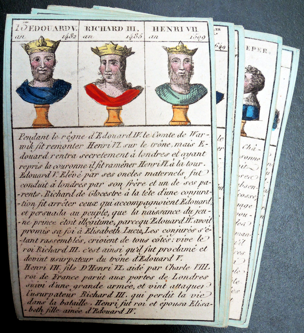
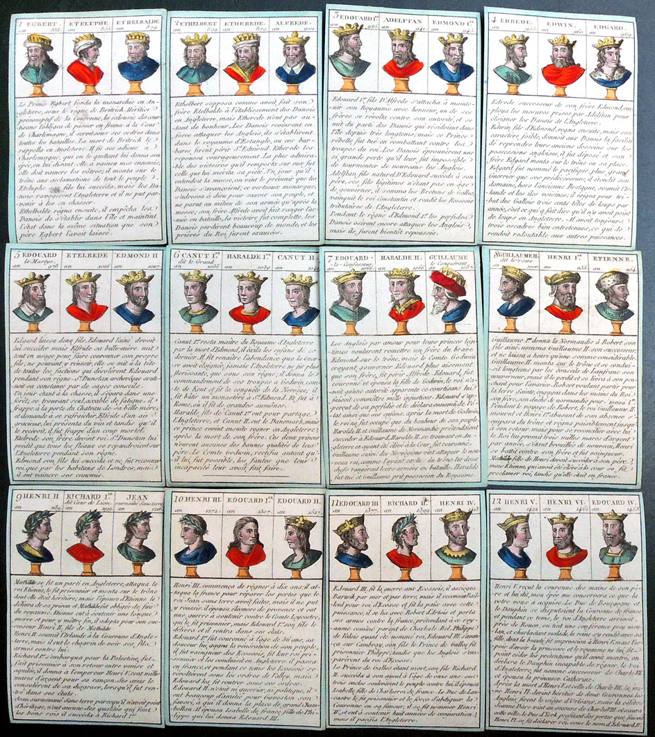
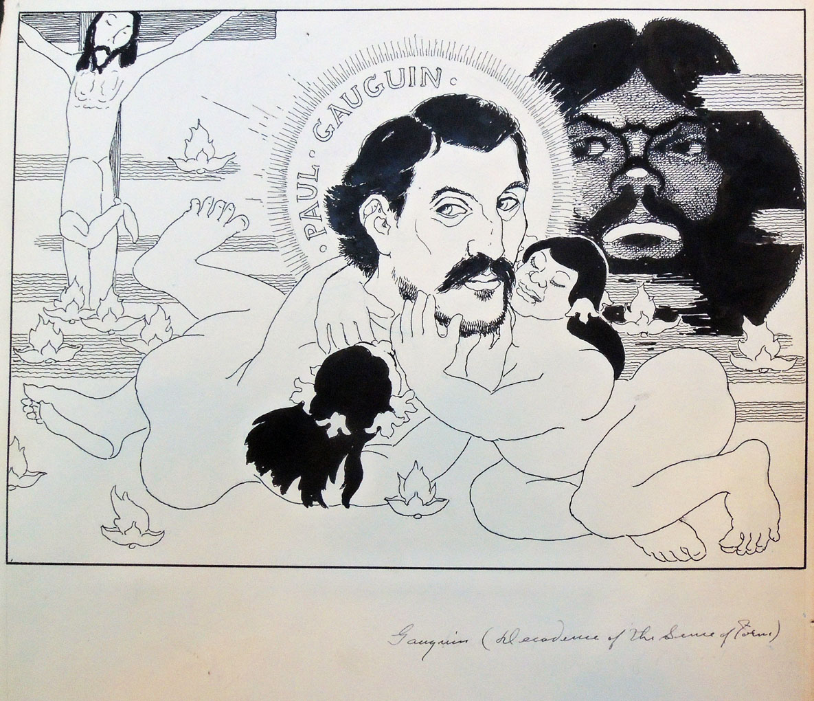
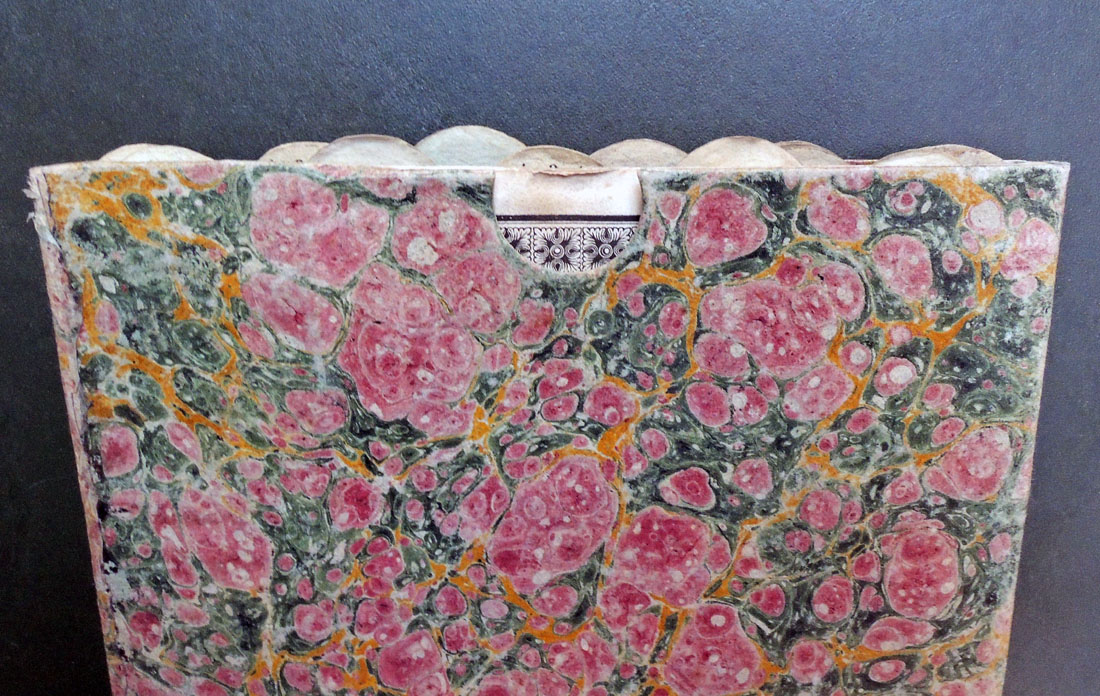
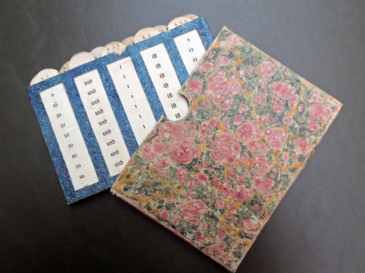
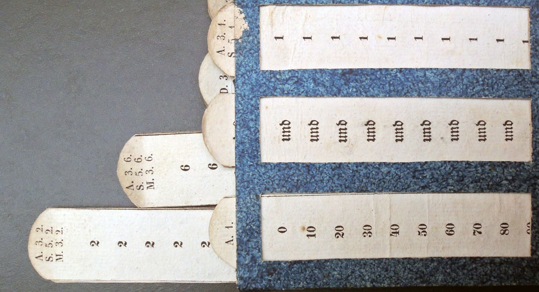
North Drive Press #5. Work by B’L’ing; Kenneth Goldsmith; Fia Backström; Joseph Logan; Kathrin Meyer; Andreas Bunte; Ann Craven; Amy Granat; Trinie Dalton; Francine Spiegel; Roe Ethridge; Eve Fowler; A.L. Steiner; Luke Fowler; Matt Wolf; Martha Friedman; Heather Rowe; Georg Gatsas; Norbert Möslang; Sam Gordon; B. Wurtz; Matt Hoyt; Jay Sanders; Melissa Ip; Cary Kwok; Matt Kegan; Su Barber ([Brooklyn}; North Drive Press, 2010). Gift of James Welling. Graphic Arts Collection GAX 2018- in process

Quaestio Theologica


Pièrre-Etienne Maillard, respondens. Quaestio Theologica. Quis fecit hominem ad imaginem suam? Paris: Printed by Hecquet for the Sorbonne, 1768. Large double-sheet engraved broadside, upper sheet with engraving, lower sheet with engraved cartouche containing letterpress text. Graphic Arts Collection GAX 2018- in process

The Graphic Arts Collection recently acquired two spectacular, previously unrecorded Sorbonne thesis broadsides, one from 1768 and the other 1769. Both are published by Robert Hecquet (1693-1775) announcing the defense of two doctoral dissertations at the Faculty of Theology of the Sorbonne. These monumental engravings would have been posted on the walls of the school to announce the pubic defense of the student’s thesis.

For each, two large sheets have been pasted together with the individual plate marks approximately 53 x 68 cm at the top and 54 x 70 cm at the bottom. The top print features an allegorical scene and the bottom the text of the thesis, so the size varies according the the length of the text.

The first from 1768 was created for Pièrre-Etienne Maillard, responding to the question: “Quaestio theologica: Quis fecit hominem ad imaginem suam? Gen. c. 1. v. 27 “So God created man in His own image; in the image of God He created him; male and female He created them”. The second from 1769 lists Augustin Maillard as the respondent, with his subject “Quis de tenebris nos vocavit in admirabile lumen suum? from Peter c. 2.v. 9 “But ye are a chosen generation, a royal priesthood, a holy nation, a peculiar people”.


We are fortunate to have the name of the artists responsible for the second engraving inscribed: “Boucher pinx,” and “Hecquet excudit,” at the bottom of the top sheet. This refers to the extraordinarily talented painter and printmaker François Boucher (1703-1770), who was to the end of his illustrious career. Only four years earlier, he had been appointed to the two highest positions in the French arts establishment: first painter to the king and director of the Royal Academy.

Unfortunately, the inscription on the 1768 engraving is cut-off: “à Paris chez Hecquet place de Cambray à l’Image St. Maur.” One might assume it is also the work of Boucher, but there is no proof.


In her paper “Disputatio and Dedication: Seventeenth-century thesis prints in the southern Low Countries,” Gwendoline de Mûelenaere writes,

“In early modern institutions of higher education, academic dissertations to be defended
in public were published in the form of decorated broadsheets summarising the student’s conclusions. The aim of these engraved posters was mainly to advertise the disputation and to introduce the theses in question. They also presented a visual programme of its unfolding, and could be collected as a souvenir after the ceremony. This practice was common mostly in Catholic countries: Italy, France, the Southern Netherlands, Germany and Austria. From the early seventeenth century onwards, thesis prints developed into abundantly illustrated documents accompanied by a dedication, and they were meant to affirm the laureates’ position in society and to glorify their patrons. Artists created elaborate communicational devices to convey scientific as well as rhetorical messages to the spectators of the defence and to subsequent readers of the poster.”

François Boucher (1703-1770), artist. Augustin Maillard, respondents. Quaestio Theologica. Quis de tenebris nos vocavit in admirabile lumen suum? Paris: Printed by Robert Hecquet for the Sorbonne, 1769. Large double-sheet engraved broadside, upper sheet with engraving, lower sheet with engraved cartouche containing letterpress text. Graphic Arts Collection GAX 2018- in process


Grand jeu de l’histoire

No publisher is credited with this or any of the other sets of French playing cards featuring twenty-five monarchs or literary scenes or fairy tale characters. Princeton’s newly acquired set features English royalty from Egbert (771/775–839), King of Wessex to George III (1738–1820), King of the United Kingdom of Great Britain and Ireland. Three historical figures are engraved on each card with biographical details and stencil coloring.

Other known titles within the same series include
Grand jeu des Aventures de Robinson avec figures coloriées (1810)
Grand jeu des Aventures de Gil Blas avec figures coloriées (1800)
Grand jeu des Aventures de Don Quichotte avec figures coloriées (1800s)
Grand jeu des fables choisies avec figures coloriées (1810)
Grand jeu des Fables D’Ésope avec figures coloriées (1809)
Grand jeu des Fables de la Fontaine avec figures coloriées (1810)
Grand jeu de l’Histoire de Paul et Virginie: avec figures coloriées (1815)
Grand jeu de La petite cendrillon avec figures coloriées (1800s)

Grand jeu de l’histoire d’Angleterre depuis Egbert jusqu’à George III = Great Game in the History of England from Egbert to George III ([Paris?, ca. 1810]). Graphic Arts Collection GAX 2018


The Black Panther, not the movie

“The initial idea behind the paper was to inform and to enlighten and to educate people about the basic issues in the community and to tell our story from our own perspective. We had an X-acto blade, some white sheets of paper, and we would typeset [the pages] on the typewriter with the ball. We couldn’t hardly afford but one color ink and so it was black with one other color. . . To get that bold, broad look, I began to mimic woodcuts with markers and pens, playing with shadows . . . We were creating a culture, a culture of resistance … [and] I became the minister of culture.”–Emory Douglas.


A request came recently to see what graphics we had by Emory Douglas (born 1943), minister of culture for the Black Panther Party from 1967 to 1980. The Princeton University Library holds an incomplete run of The Black Panther newspaper, founded by Huey P. Newton (1942-1989) and Bobby Seale (born 1936) in 1967.

Happily, the issues are not faded or damaged, but filled with bold graphics designed by Douglas, many reproduced as posters and fliers after they appeared in the paper.

Printed by Howard Quinn Printers in San Francisco, The Black Panther Intercommunal News Service came out on Wednesday evening and at its height, 100,000 copies were sold weekly in 30 cities across the country [subscription numbers vary widely]. During the 1970s, one issue cost 25 cents.

Jonina Abron, who served as the editor of the paper from 1978 until September 1980 when it closed, stated that “the newspaper staff met weekly to discuss the content of the paper and sought to communicate visually the message contained in the printed articles.”


In 2015, Douglas was recognized with the American Institute of Graphic Arts Medal “for his fearless and powerful use of graphic design in the Black Panther party’s struggle for civil rights and against racism, oppression, and social injustice.”  To read more about this event, see: https://www.aiga.org/medalist-emory-douglas-2015.

Retrospective exhibitions of Douglas’s graphic art were held at the Museum of Contemporary Art, Los Angeles from 2007 to 2008 and a second at the New Museum in New York the following year.


Black Panther Party. Ministry of Information, The Black Panther (Oakland, Calif.: Black Panther Party for Self Defense San Francisco, CA : The Black Panther Party, Ministry of Information, 1967-1980). Began with volume 1, number 1 (April 25, 1967); ceased with v. 20, no. 9 (Sept. 1980). Annex A 0921.183F


Tattoos in Japanese Prints

Please join us on April 6, 2018, for this event co-sponsored by the P. Y. and Kinmay W. Tang Center for East Asian Art.

Auguste Rodin Cutouts

While in his sixties, Auguste Rodin (1840-1917) made hundreds of sketches from female models, added watercolor in one or two strokes and then, loosely cutout the forms. When he ran out of paper, an assistant was sent over to the local boucherie (butcher shop) for more.

These silhouettes were combined in various groupings, the artist arranging and rearranging them to form compositions of female forms. Six examples of Rodin’s cutouts can be found in the Graphic Arts Collection thanks to the students of René Chéruy, Rodin’s secretary from this period.


In “Glimpses of Rodin” in the Princeton University Library Chronicle 27, no. 1 (Autumn 1965), Howard C. Rice, Jr. writes

“Material about the French sculptor Auguste Rodin (1840-1917), including several letters, notes, and sketches in his autograph, has recently been added to the Library’s collection of modern manuscripts. This small but attractive group of mementoes, which had been preserved by René Chéruy, one time secretary of Rodin, who subsequently resided in the United States as a teacher of French at the Loomis School in Windsor, Connecticut, has been presented to the Princeton University Library in Mr. Chéruy’s memory by a group of his former students, including Jewett T. Flagg, James Parton, and William H. Scheide. Several pencil and watercolor drawings by Rodin, as well as examples of his dry points…, which also belonged to Mr. Chéruy, have been added to the initial gift by Thomas S. Brush. The souvenirs, now at Princeton evoke mainly the years 1902-1908, when Chéruy, then in his twenties, was performing numerous secretarial chores for “the Master,” who was in his sixties and at the peak of his contemporary fame.”


The cutouts, sketches, lithographs, and other works on paper at Princeton were recently reviewed for an upcoming exhibition of Rodin’s cutouts at the Musée Rodin in Paris next fall. Like 50% of the sketches attributed to Rodin in collections around the world, many of the holdings have questionable artistic provenance but one pencil sketch with watercolor [above] was a beautiful surprise. Unquestionably from the hand of the master, this sheet has light damage from over-exposure but otherwise is a clear example of his late work.

We also solved the mystery of why one of the cutouts had such strange endings at the arms and legs. When the figure was turned slightly, it became obvious the form was drawn at the bottom corner of the sheet to produce a female languidly relaxing rather than standing upright.

“An idea came to me suddenly and enlightened me,” wrote Rodin, “this is art, this is the revelation of the great mystery, how to express movement in something that is at rest.” –quoted in Rodin’s Art : The Rodin Collection of Iris & B. Gerald Cantor Center of Visual Arts at Stanford University (2003). Marquand library SA NB553.R7 E473 2003

How much did a wood engraving cost in 1862?

In 1862, when Benson John Lossing (1813-1891) wanted a small image for one of his illustrated American history books, he got in touch with the leading printmaker of the day, Alexander Anderson (1775-1870). Here is a receipt for Anderson’s political caricature Ograbme, or the American Snapping Turtle, originally published in 1807 in response to Thomas Jefferson’s Embargo Act on American merchants (Ograbme is embargo spelled backwards).

The Sinclair Hamilton Collection holds several receipts that give us wonderful information about the business of printmaking and book publishing during the early 19th century. One reduced size print–meaning the picture had to be completely re-cut–cost Lossing $6 and another $5.

The second order is for Anderson’s To the Grave Go Sham Protectors of Free Trade and Sailors’ Rights–And All The People Say ‘Amen’ (1814). The caricature comments on James Madison (1751-1836) who cuts the head off Ograbme (the Embargo Act) but is bitten anyway.


Pen and Ink Drawings by Donald Corley

“Here is one who from personal emotion can construct a house of beauty wherein his mind and soul may dwell and wherein his friends may find refreshment. A garden of phantasy where the flowers are never plucked.”—”Donald Corley,” The Arts, 1921.

Emery College graduate Donald Corley (1886-1955) completed advanced training as an architecture in Europe before returning to New York City in 1909. Working with McKim, Mead, and White, he assisted with the construction of Pennsylvania Station and contributed to the design of the central post office now called The James A. Farley Building.

During the summer of 1916 Corley joined other artists and writers gathering in Provincetown, MA, where he spent most of his time building sets for the Provincetown Players and acting in their plays. His first role was “a Norwegian” [Corley was born in Georgia] in Eugene O’Neill’s Bound East for Cardiff, performing alongside Bror J.O. Nordfeldt, Harry Kemp, and O’Neill himself, who played the second mate. That fall, they brought the company back to New York City, where Corley was instrumental in the design and construction of their theater.

With the war in Europe intensifying, many of the original members of the company left, including Jack Reed and Louise Bryant. Corley remained active with the Provincetown Players for several years as a writer, artist, and actor along with Charles Demuth, Susan Glaspell, Alfred Kreymborg, Harry Kemp, O’Neill, Mary Heaton Vorse, Marguerite and William Zorach, among others. The company survived, in part, thanks to the art collector Dr. A.C. Barnes who enjoyed their plays and handed them a check for $1,000.

Through his friendships with Demuth, Nordfeldt, and Marsden Hartley, Corley was introduced to the Whitney Studio Club and received a show of his pen and ink drawings in March 1921.

“Donald Corley . . . protests against two things,” wrote one reviewer, “architectural limitations and the lack of precision in art—against both, because he has been an architect (for eight years with McKim, Mead & White), and because he is an artist. He has designed the scenery for the movie production of “Thaïs” and for the present production at the Greenwich Theatre. He has also written fairy tales. He shows delightful drawings in ink with color applied with a ruling pen. Mr. Corley has a keen sense of rhythmic design and the daintiest of imaginations.”

This resulted in the publication of his first book, 22 Drawings in Black and White (Marquand Library Oversize NE539.C7 A3f,  seen below right), reviewed in The Arts magazine:

“Here is a world of phantasy and paradox and ironic humor, where disillusion has not extinguished hope; where, in a spirit of unbelief, eager curiosity explored the universe of ideas; where life is full of wonder but possibly not worth while. Worth while only in abstractions and impersonal sublimations and wonderful only in delicate personalities that vanish in expression. Wherefore the symbolic form, symbols which are in some strange way the things they symbolize.

…Those there are who ask, “Why is it considered good form to make a tower look as if it would fall over sideways?” or this or that. Such questions amaze; they seem to have no connection with the real issue. Here always it is the idea that is the chief concern. Its expression is two-fold, the drawing and the text. Which is the more intricate and elusive is hard to decide. To Mr. Corley they are of equal importance and are as the words and music of a song. Apart or together they are as direct and emotional an expression of the idea as the music which might be written for them. This is the modern spirit.”

Corley’s ink drawings also appeared regularly in the little Greenwich Village magazine, The Quill, where he was listed as a contributing editor, and in The Dial. Eventually, he gave up architecture completely in favor of writing and illustrating.

When The New York Times published a brief obituary on December 14, 1955, they failed to mention any of his work with theater or film, commenting only that he “wrote The House of Lost Identity, published in 1927. The Fifth Son of the Shoemaker his best-known work, came out two years later. He also wrote The Haunted Jester and illustrated many magazine articles and books.”

The Graphic Arts Collection recently acquired 28 pen and ink drawings attributed to Donald Corley, ca. 1921. These are not signed and we haven’t yet found them reproduced in a published book or magazine. Here are a few samples.

Georg Hulbe, leather artisan

Georg Hulbe (1851-1918), Chronika Haus Heimatfreude [Cover words, Chronicle House Homeland]. Book-shaped box with embossed leather decor ([Hamburg], circa 1890/95). 33 x 42 x 10 cm. Graphic Arts Collection GAX 2018- in process

We all know there are many objects that look like books but aren’t books thanks to Mindy Dubansky’s 2016 Grolier exhibition and catalogue. Here is another. It is a box with an elaborately tooled leather cover by the Art Nouveau craftsman George Hulbe (1851-1918).

If you go to Hamburg today, you will certainly visit the Hulbe-Haus on Mönckebergstraße. The jewel-like building was designed in 1910 by Henry Grell for Hulbe, to serve as his studio, gallery and shop. This was the culmination of a long series of workshops run by Hulbe, beginning in 1884 and growing into one of the largest firms in the country, employing more than two hundred workers.


We know this piece is the work of Hulbe by the two stamps worked into the leather: the first are the words “Georg Hulbe / Hamburg Berlin” on the lower front edge and on the back cover is the artist’s chop mark on the lower right.

The leather cover is beautifully worked with the central figure of an angel holding a crown bearing the initials H and J  gilded with a brush. Two clasps open to reveal a simple box with a leather strap and green linen covering.


Hulbe’s workshop designed and sold embossed leather furniture, wall treatments, bookbindings, and many other decorative arts products. His fame was so great that he was chosen to create the “Golden book of the city” as well as the leather wall coverings in the Hamburg town hall. Today, Hulbe designs can found at the Reichstag in Berlin, the Victoria and Albert Museum in London, and the Metropolitan Museum of Art in New York City. And now, Princeton University Library.

A Paper Calculator

Peter Bleich, Anweisung zum Gebrauche der allgemeinen Rechentafel, wodurch die vier Rechnungsarten auf vierfache Weise fest und sicher erlernet werden (Vienna: Mayer, 1838). [issued with]: A calculator consisting of 34 tables printed on thick paper strips & kept in a “calculating” box of blue paste-paper measuring 119 x 184 mm., with five cut-out panels for the calculations, preserved in the orig. marbled paper slipcase. Graphic Arts Collection GAX 2018- in process


“Napier’s bones” was a manually-operated calculating device created in 1617 by the Scottish mathematician John Napier of Merchiston (1550-1617). His numbered rods–made of ivory, wood, metal, or heavy cardboard–could perform all types of mathematics. During the 18th and 19th centuries, many variations of Napier’s invention were tried, leading up to 1838 when Peter Bleich (1798-1871) published his own paper ‘bones.’

Bleich’s device was used by hundreds of young students to add, subtract, multiply, and divide in the classroom. The paper calculator had thirty-four movable strips or bones that fit into five panels with vertical windows to read the calculation. Princeton’s device is housed in the original marbled paper slipcase.


From 1831 until his death, Bleich lectured and taught at the Zollersche main school of Vienna, which is described in the 1851 essay Die Michael von Zoller and Franz Aloys Bernard’sche Hauptschule. His most noted publication was the 1846 educational booklet Nur Ruhe! (Silence), in which he gives 300 suggestions and hints to help keep children calm in the classroom without resorting to spanking. Unfortunately, there is no copy of Nur Ruhe! in any American library.


See also: Peter Bleach (1798-1871), Nur Ruhe! oder 300 einfache Mittel, die Ruhe in der Schule zu erhalten : ein Noth- und Hülfsbüchlein für angehende Schulmänner, denen es darum zu thun ist, die Ruhe in der Schule auf zweckmäßige Weise, ohne irgend einer Strenge, herzustellen (Wien: Meyer & Companie, 1846).

Peter Bleach (1798-1871), Die Michael v. Zoller- und Franz Aloys Bernard’sche Hauptschule im Bezirke Neubau in Wien; eine geschichtliche Darstellung dieser Lehranstalt von ihrem Entstehen im Jahre 1743, bis zum jetzigen Bestande im Jahre 1851 (Wien: Gedruckt bey L. Grund, 1851).

Peter Bleach (1798-1871), Tagesordnung eines Kindes : oder: Anleitung, wie sich ein Kind vom frühen Morgen bis in die Nacht zu verhalten hat (Wien: Mechitharisten-Congregations-Buchhandlung, 1862)