Visiting Woodside Press


Davin Kuntze kindly offered our small group a tour of Woodside Press, where Steven Spielberg filmed several scenes for his movie The Post last year. Founded in Woodside, Queens, in 1993, the Press was relocated to the Brooklyn Navy Yard in 1998 where it continues to operate today.

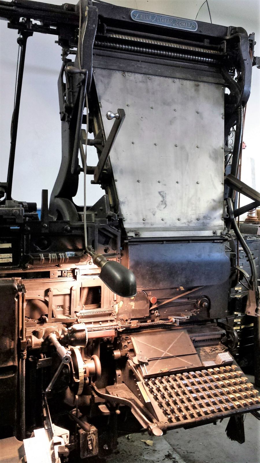
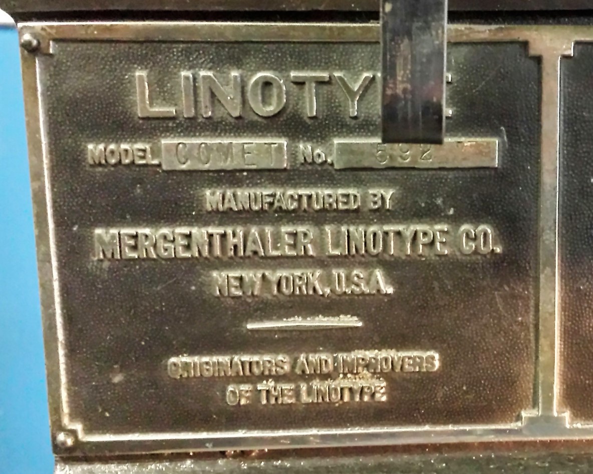
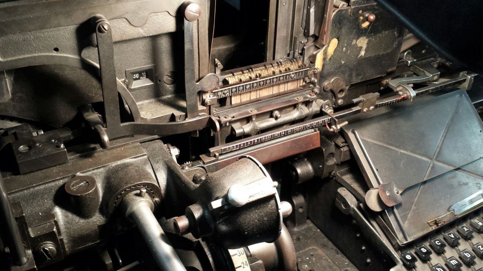
Not only do they offer letterpress printing and binding, the shop has two fully operational Linotype machines with over 200 magazines loaded with Linotype matrices including faces designed by Hermann Zapf, Frederick Goudy, and Rudolph Ruzicka, among others.

These are the machines featured at the end of movie, when Katharine Graham gives the order to print the Pentagon Papers in The Washington Post and the cameras follow the production of the newspaper from editing to distribution. They shot the composing rooms scenes at Woodside Press, just down the street from Steiner Studios.

The New York Tribune was the first newspaper to use the Linotype machine, introduced with the July 3, 1886, issue. The first book printed by Linotype, was also begun that year and finished early 1887.

Henry Hall, editor, The Tribune Book of Open-Air Sports. Prepared by the New York tribune with the aid of acknowledged experts (New York: The Tribune Association, 1887). Formerly owned by Elmer Adler. Graphic Arts Collection GAX 2004-1385N


Verso t.p.: “This book is printed without type, being the first product in book form of the Mergenthaler Machine which wholly supersedes the use of movable type.”

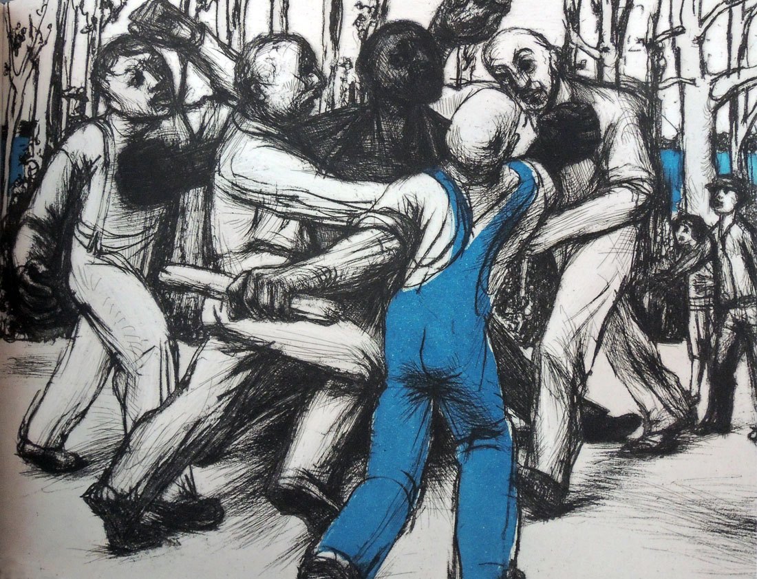
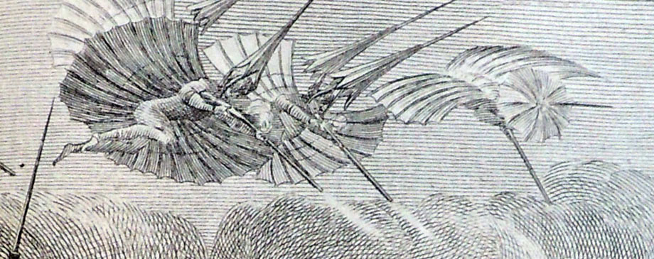
One of the books with type set on the Linotype machine at Woodside Press was: Shel Silverstein, Where the Sidewalk Ends (New York; Evanston; San Francisco; London: Harper and Row, c1974). Cotsen Children’s Library Eng 20 16941. Above is a plate from an updated edition.


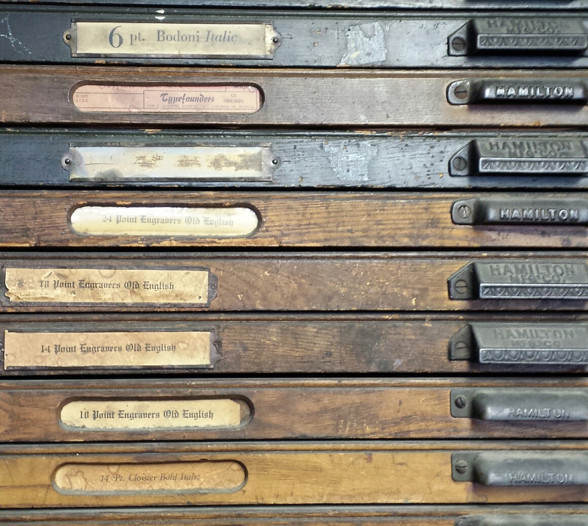
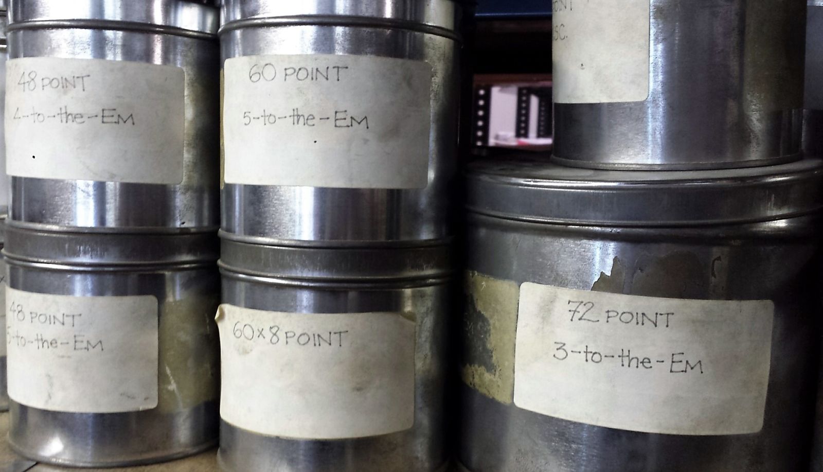
Shelves with dozens of EMs (empty spaces) housed by point size. Below cases of metal type.

Down By The Riverside

Richard Wright (1908-1960) and John Wilson (1922-2015), Down by the Riverside, with four etchings by John Wilson (New York: The Limited Editions Club, [2001]). “The etchings have been editioned at the Center Street Studio by James Stroud.”–Colophon. Copy 88 of 300. Graphic Arts Collection GAX 2018- in process

[left] Richard Wright (1909-1960), Uncle Tom’s Children, Four Novellas (New York, London: Harper & Brothers, 1938). PS3545.R815 U535 1938


Roxbury-born artist John Wilson (1922-2015) first read Richard Wright in 1945, responding to his words with a lithograph entitled “Native Son.” When the Limited Editions Club commissioned a suite of prints inspired by Wright’s short story Down by the Riverside, Wilson not only produced the prints but wrote the afterword for the volume.

“Growing up in Boston during the late 1920’s and 30’s,” he notes, “I saw gruesome pictures of southern lynchings in the black press. I understood that simply being black was the most important reality affecting my entire life. In New England the attitude was that this was a southern thing because there was no legal discrimination ‘up north.’ Of course everyone in my community understood the difference between rhetoric and reality.”

“In the early forties, I read Richard Wright’s Uncle Tom’s Children. Those powerful, trenchant short stories put me in the middle of ‘that southern thing,’ I felt a strong sense of brotherhood, identifying with his characters struggling to survive with dignity. I understood more clearly the role of terror and uncompromising violence.”

“. . . I chose to illustrate this story because of Wright’s vivid dramatic setting. Etching techniques like aquatint and spit biting were ideal to interpret the dark brooding, murky atmosphere. Above all, the river with its powerful currents and its violent energy . . . seemed to symbolize basic forces of nature. I wanted the blue translucent shapes and flowing rhythms of the water to carry the figures from one episode to the next.”–John Wilson, 2001.

“Down by the Riverside” (previously unpublished), the second short story in the 1938 and 1940 editions of Uncle Tom’s Children, dramatizes the tragic death of a black man, Brother Mann, who uses a stolen boat during a Mississippi flood to take his pregnant wife to a hospital for the child’s delivery. On the way to the hospital, Mann is discovered by the owner of the boat, a white man, who tries to shoot him, but Mann, in self-defense, kills the owner. When Mann reaches the hospital, he finds his wife dead. Later he is drafted by the military men in charge of rescuing flood victims.

The first house to which he is sent, with a black companion, both of them on another boat, happens to be that of the owner of the stolen boat, whose family recognizes Mann. Although he considers killing them, their house suddenly tilts, the axe in his hand does not fall over their heads, and he ends up rescuing them. Once the boat safely reaches the hill, they tell the authorities that Mann is a murderer. As he flees down the riverside, he is shot to death.”–The Mississippi Quarterly, Spring 1993, by Yoshinobu Hakutani


Library Dreams (after Magritte’s Time Transfixed)

Lothar Osterburg, Library Dreams (after Magritte’s Time Transfixed), 2011. Photogravure with scraping and aquatint with Gampi chine colle on Somerset White. No. 6/8. Graphic Arts Collection GAX2018- in process

Lothar Osterburg’s “Library Dreams” series began during a residency at the Bogliasco Foundation in Liguria, Italy in 2011. While there, he collaborated with the composer/thereminist Elizabeth Brown on a video, entitled “A Bookmobile for Dreamers.” Ten years after launching his soap library series, Osterburg has come full circle. All his libraries are recreations of imagined places, and in this new series, the books themselves become building materials, while the books’ content spills out to inspire new worlds.

“Conjuring up monumental phenomena by minimal means,” writes Grace Glueck, “Lothar Osterburg presents picturesque events like a zeppelin over Timbuktu, a glider over the Gowanus Canal, a beached cargo ship at Montauk on Long Island, and an approach to a celestial body by a landing craft. But they are all contrived in his studio, using mundane materials like twigs, toothpicks, peanut butter and wee electrical parts, and photographed through a magnifying glass or a macro lens.”–New York Times, September 19, 2003.

The Graphic Arts Collection has acquired Osterburg’s beautiful photogravure “Library Dreams (after Magritte’s Tim Transfixed)”. This is one of several works recently acquired in anticipation of a 2019 exhibition to be entitled “Turning Light Into Darkness,” focusing on the history and development of copperplate photogravure from 1850 to the present.

A member of the faculty at Bard College, Osterburg is known as one of the foremost photogravure artists in the country. The recipient of an Academy Award in Art from the American Academy of Arts and Letters, he has also been awarded two New York Foundation for the Arts grants for printmaking, a grant from the AEV Foundation, and residencies at MacDowell Colony and the Liguria Studies Center of the Bogliasco Foundation in Italy. An exhibition of his new work will be held next fall at the Lesley Heller Gallery in New York City.

René Magritte (1898–1967), Time Transfixed, 1938. Oil on canvas. Art Institute of Chicago. 1970.426

Gustave Doré’s Raven


Edgar Allan Poe (1809-1849), The Raven (New York: Harper & Brothers, 1884). Steel engraving after drawings by Gustave Doré (1832-1883). Graphic Arts Collection Oversize 2004-0014F and Oversize 2004-0015F

I was asked today what the original cost was for Gustave Doré’s The Raven, poem by Edgar Allen Poe. The volume is being studied by ART 564 “Seminar in 19th-Century Art–Word and Image.”

This was Doré’s last project, completed weeks before his death on January 23, 1883. His drawings were turned over to Harper & Brothers in New York City, where fourteen master engravers were hired to rush the volume to press. Few of the artists are known today except by last names: H. Claudius; R. A. Muller; W. Zimmerman; Frederick Juengling; G. F. Buechner; R. G. Tietze; F. S. King; T. Johnson; R. Standenbaur; Frank French; R. Schelling; George Kruell; Victor Bernstrom; and Robert Hoskin.

The plates had to be cut in steel rather than copper because of the size of the edition: 10,000 copies with 26 engravings each, requiring at least 260,000 full-page sheets to be printed, collated, and bound.

First mentions of a Doré Raven began appearing almost immediately, such as the “Literary Note” in the Detroit Free Press February 4, 1883, that read,

“A few months before his death, Gustave Dore completed a series of illustrations to Edgar Allan Poe’s ‘The Raven.’ The sketches–between twenty and thirty in number–are now the property of Messrs. Harper & Brothers. They will be engraved in this country and published with the text of ‘The Raven,’ as a companion volume to Messrs. Harper & Brothers’ sumptuous edition of ‘The Ancient Mariner,’ illustrated by Dore.”

By October, the title was advertised as one of Harper & Brothers Christmas gift books at a cost of $10 (equivalent to $244 today). Sales were heavy and Doré’s work received critical praise, unlike the poor reception Édouard Manet’s lithographs for The Raven (Le Corbeau) received in 1875.

The quality of the plates varies widely, according to the skill of the individual engraver. The steel plate added coldness and flatness of the images. However, when they succeed, the result is striking.

Ah, distinctly I remember it was in the bleak December;
And each separate dying ember wrought its ghost upon the floor.
Eagerly I wished the morrow;—vainly I had sought to borrow
From my books surcease of sorrow—sorrow for the lost Lenore—
For the rare and radiant maiden whom the angels name Lenore—
Nameless here for evermore.


Robert Delaunay and Vicente Huidobro

Vicente Huidobro (1893-1948) and Robert Delaunay (1885-1941), Tour Eiffel. Poème par Vincente Huidobro; peintures par Robert Delaunay (Madrid: privately printed, 1918). Graphic Arts Collection GAX 2018- in process


In 1908, the painters Robert Delaunay (1885-1941) and Sonia Terk (1885-1979) met and fell in love but had to wait a year for her divorce to come through before they could marry. To celebrate their new life together Delaunay painted the Eiffel Tower, the first of thirty canvases depicting that  symbol of French modernity.

For the next few years the Eiffel Tower became he primary focus, just as Claude Monet painted dozens of haystacks a generation earlier. Through these paintings, he developed a personal style of Cubist fragmentation, interweaving various perspectives with the light and color from different times of the day.

When the series was finally exhibited in Paris, their friend Guillaume Apollinaire (1880-1918) proclaimed Delaunay “an artist who has a monumental vision of the world.” Apollinaire wrote a visual poem or Calligram in honor of Delaunay’s towers and coined the term Orphism to describe the painter’s style.

In 1913, Sonia Delaunay-Terk collaborated with the Swiss-born poet Frédéric-Louis Sauser (1887-1961), better known as Blaise Cendrars, on an epic narrative, La prose du Transsibérien et de la Petite Jehanne de France, describing a Trans-Siberian railway journey concluding at the Eiffel Tower.

Deborah Wye wrote, “Comprised of brightly colored arabesques, concentric circles, triangles, and rectangles, Delaunay-Terk’s pochoir illustrations for Blaise Cendrars’s poem and its radical format have made this a landmark in the history of the modern book. . . . Calling their creation “the first simultaneous book,” Delaunay-Terk and Cendrars drew on the artistic theory of simultaneity, espoused by the artist’s husband, the painter Robert Delaunay, and modern poets.”–Artists and Prints: Masterworks from The Museum of Modern Art (2004).


When war was declared, the Delaunays left Paris and in 1918 moved to Madrid, where they opened Casa Sonia to sell Delaunay-Terk’s designs for interior decoration and fashion. That summer, Robert collaborated with the Chilean concrete poet Vicente Huidobro (1893-1948) on another simultaneous book, Tour Eiffel. Huidobro’s visual poem, dedicated to Delaunay, was letterpress printed on multi-colored papers bound with a silken cord.

They used one section of a poem published the year before in the journal Nord-Sud (named for the metro line that linked Montmartre to Montparnasse). As a nod this, Delaunay added these directional terms to his cover design: a brightly stenciled (pochoir) Eiffel Tower embedded in colorful rings, as if picking up where La prose du Transsibérien left off

The Graphic Arts Collection has finally acquired a copy of this important volume for Princeton.


After the war, they returned to Paris and Delaunay went back to the Eiffel Tower as subject matter, further exploring his colorful Orphism. Delaunay-Terk expanded her textile design business, creating fashions for individual clients and for theatrical performances.


Robert Delaunay, “Eiffel Tower,” 1924. Oil on Canvas, 161.6 cm x 96.8 cm. Saint Louis Art Museum, Saint Louis.

The Army of Cloud Cuckoo Land


The Graphic Arts Collection recently acquired a very rare set of twelve etchings and engravings with the manuscript title, Dienstversuche der Nationalgarde von Wolkenkukuksheim = Attempted Service by the National Guard of Cloud Cuckoo Land, printed by Johann Christian Benjamin Gottschick (1776-1844) after drawings by Christian Georg Andreas Oldendorp (1721-1787).

Each comic member of the guard is attempting to perform military drills. The soldier seen below carries a medicine cabinet with drawers marked with potions for battered nerves, bear fat, and a potion for pregnant women, among other medicines. His dog carries the enema syringe.

Both Gottschick and Oldendorp were based in Dresden and listed in this directory of Germany and Swiss artists, along with the set of etchings: Johann Georg Meusel, Teutsches Künstlerlexikon; oder, Verzeichniss der jetztlebenden Teutschen Künstler (Lemgo: Meyerschen Buchhandlung, 1808-1814). Marquand Rare Books N6887 .M57

Several individual sheets are held in European collections, including this hand colored etching [below] at the Stadtgeschichtliches Museum Leipzig.


Johann Christian Benjamin Gottschick (1776-1844) after drawings by Christian Georg Andreas Oldendorp (1721-1787), Dienstversuche der Nationalgarde von Wolkenkukuksheim [Attempted Service by the National Guard of Cloud Cuckoo Land] ([Dresden, for Rittnersche Kunsthandlung, 1806]). Set of 12 etchings and engravings. Graphic Arts Collection GAX 2018- in process

La découverte australe par un homme

Eighteenth-century artists, writers, and engineers shared a fascinating with travel, faster and further than humans had gone before. In 1781, James Watt perfected his Watt steam engine; William Herschel discovered a seventh planet, Uranus; and the balloonist Jean-Pierre Blanchard built an unsuccessful flying machine with four wings for the pilot to flap using levers and foot pedals. Also that year Rstif de La Bretonne (1734-1806) published La découverte australe par un homme. Michael Lynn writes,

“Numerous authors speculated about the possibility of human flight in the period before the Montgolfier brothers demonstrated their invention [1783]. These include flight as a peripheral notion in a larger work as well as books in which flight provided a convenient device for travelling to distant lands (or even the starts, moons, and planets). Cyrano de Bergerac, for example, attached bottles of dew to himself; when heated, he claimed, the dew would vaporize and rise up… Such fanciful descriptions abounded in the eighteenth century including Voltaire’s Micromégas and less well-known books such as Joseph Galien’s L’Art de naviguer dans les airs or Donimgo Gonsales’s The Man in the Moone. …Jean-Jacques Rousseau, in Le Nouveau Dédale, suggested the use of compressed air, judiciously released, would, along with a rudder, allow someone to fly through the air. Restif de la Bretonne goes back to the idea of human wings in his book, La Découverte australe. –Michael Lynn, The Sublime Invention: Ballooning in Europe, 1783–1820 (2015).

Rstif de La Bretonne (1734-1806), La découverte australe par un homme-volant, ou, Le Dédale français: nouvelle très-philosophique: suivie de la Lettre d’un singe, &ca. …. [Southern Discovery by a flying man or the French Daedalus; Very philosophical news: Followed by the Letter of a Monkey] preface by Jacques Lacarrière (Paris: Leïpsick, [1781]). Provenance: M. Lemoyne.

For many, it is the engravings by Louis Binet (1744-ca.1800), the official illustrator of Rétif, that make this tale of fantasy and fiction so appealing. Princeton has finally acquired a first edition with Binet’s wonderful plates, depictions the hero Victorin as he sweeps his beloved, Christine, up into his arms and flies her away to a place where their romance is not forbidden.

Together, they found the utopian society of Megapatagonia, where language is backwards French (the capital is Sirap) and clothes are topsy-truvy (note the shoe-hats posted further down). There are frogmen, sheepmen, hairymen, elephantmen, dogmen, snakemen, and even a few odd women. Their motto: everyone is equal. The inter-marriage between their children and various animals is reminiscent of Guillermo del Toro’s recent film The Shape of Water (2017).

Here are a few more plates designed by Binet in his Paris studio at rue Aubry le Boucher 34.


See also: https://translate.google.com/translate?hl=en&sl=fr&u=http://gallica.bnf.fr/ark:/12148/btv1b22000982&prev=search

The Visitation


There are many works of art that depict Luke 1:39-40, roughly translated “At that time Mary got ready and hurried to a town in the hill country of Judea, where she entered Zechariah’s home and greeted Elizabeth.” Peter Paul Rubens (1577-1640) painted this scene several times, including an oil sketch now at the Národní Galerie in Prague and a vertical panel that makes up one half of a triptych in the Cathedral of Antwerp.

Both versions have been translated into single sheet engravings and bookplates. The Metropolitan Museum of Art holds an engraving of The Visitation by Pieter de Jode II (1606–ca. 1674) after Rubens, printed somewhere between 1625 and 1674 [below]. The British Museum also has a copy, along with other variations engraved by J Hébert (flourished 1842-1846); Gillis Hendricx (flourished 1640-1677); Schelte Adamsz. Bolswert (ca.1586-1659); and one by Valentine Green (1739-1813).

The Antwerp publisher Cornelius de Boudt (active 1600s) is responsible for yet another engraving, executed by Cornelius Galle I (1576-1650) after Rubens. De Boudt spent time in Rome but returned to Antwerp, where he collaborated with the painter on several projects for the Plantin Press (the printing company founded by Christophe Plantin).

Pieter de Jode II (1606–ca. 1674) after Peter Paul Rubens (1577–1640), The Visitation, 1625–74. Metropolitan Museum of Art

Unlike other copies, Princeton University Library’s engraving has no scene below the stairs or added text. Someone has written Rubens’s name in brown ink at the bottom left, in case viewers did not recognize the scene. It is conceivable that the Plantin Moretus Museum of Antwerp continued to reproduce this engraving long after the copper plate was first made.

To the left is an engraving of The Visitation from a series of 130 engravings (plus title-page) forming a Picture Bible, ca. 1652, unfortunately not included in one of Princeton University Library’s copies. Our print may be an earlier or later copy after this publication.

Calhoun Steam Printing Company

On November 3, 1852, an advertisement ran in the Hartford Daily Courant announcing the opening of the Calhoun Brothers Printing House, which operated “one double medium Adams’ press for book printing; one double medium Hoe’s cylinder press for newspapers [and] mammoth posters; one Super-Royal Taylor’s cylinder press for programs, hand bills, [and] labels; one Magic cylinder press for printing endless paper; and one Card and Bill Head press for every variety of cards, bill heads, circulars.”

What the Calhoun Brothers (later Calhoun Steam Printing Company) excelled at were mammoth theatrical billboards and panoramic scenes for Buffalo Bill Cody’s Wild West Shows. When Calhoun died the firm was taken over by William H. Higgs, Cody’s brother-in-law who rode a white mustang around the streets of Hartford.

We recently matched this 40 inch woodblock with a multi-color Calhoun print depicting a leisurely scene of cowboys resting around a fire, with their horses feeding near a covered wagon. This enormous block is cut to print the black areas, while others would have printed blue, yellow, and red.


Welcome to the American Historical Print Collectors Society

Welcome to members of the American Historical Print Collectors Society who paid a visit to the Graphic Arts Collection on Friday 3/16/18. The group spent the morning enjoying 17th-, 18th-, and 19th-century books, broadsides, prints, and ephemera from our collections.

The American Historical Print Collectors Society (AHPCS) is a non-profit group that encourages the collection, preservation, study, and exhibition of original historical American prints that are 100 or more years old. In their third decade, AHPCS has over 450 members including individual collectors, print dealers, and educational and other institutions.

Besides the finished prints, we looked at various tools and materials, including a portable map making kit, a paintbox to take with you into the wilderness, Thomas Edison’s first mimeograph machine, and S.M. Spencer’s $25.00 Stencil Outfit complete with all the tools, dies, and brass and German silver sheet stock to make small stencils. AHPCS members were allowed to read the Confidential Pamphlet, Containing an Essay on Canvassing, Instructions in Stencil Cutting, Ink Receipts, Etc., Etc. (1870).

Although few mezzotints were made in the United States, we looked at The Death of Lincoln painted and printed by the Scottish/American artist Alexander Hay Richie (1822-1895) around 1875 for the tenth anniversary of Lincoln’s murder. It was sold by subscription, with an accompanying booklet. “The scene is of the back room in Peterson’s boarding house, where Lincoln was taken the evening of April 14, 1865 after receiving the fatal shot in Ford’s Theater across the street. Doctors, Robert Lincoln, and Cabinet members such as Charles Sumner, Gideon Welles, and Edward Stanton are shown keeping their vigil by Lincoln’s bedside during the night. The image is somber and dark, except for a glow of light focused on the dying President. The detail and accuracy of the image are most impressive, with the mourners easily recognizable, and even details as to the pictures hanging in the room being carefully and correctly delineated.”

Read: Imprint: Journal of the American Historical Print Collectors Society (Westport, Conn.: American Historical Print Collectors Society, Vol. 1, no. 1 (Feb. 1976)- Marquand Library NE505 .I48