Author Archives: Julie Mellby

Tupigrafia. The history of typography in Brazil and elsewhere.

Tupigrafia (SP [i.e. São Paulo]: Editora Bookmakers, 2000- ). Graphic Arts Collection 2020- in process   https://www.tupigrafia.com.br/


Tupigrafia é uma revista editada desde 2000 que funciona como catalisadora do processo de recuperação da história da tipografia no Brasil, e também como estimulante na perda de pudor tipográfico, por desconhecimento de causa. A riqueza da cultura visual brasileira que gerou e continua gerando projetos tipográficos é enorme, deixando claro que existe muita coisa para ser vista e lida abaixo do Equador. Estamos vivendo a história e, portanto, fazendo História..!

Tupigrafia is a magazine published since 2000 that acts as a catalyst for the process of recovering the history of typography in Brazil, and also as a stimulant in the loss of typographic modesty, due to the lack of cause. The richness of the Brazilian visual culture that has generated and continues to generate typographic projects is enormous, making it clear that there is much to be seen and read below Ecuador. We are living history and, therefore, making History ..!


A produção tipográfica e caligráfica brasileira – e suas manifestações no design gráfico – são temas centrais da publicação, complementados por artigos ligados ao cenário tipográfico internacional.

Brazilian typographic and calligraphic production—and its manifestations in graphic design—are central themes of the publication, complemented by articles related to the international typographic scene.

Tupigrafia é referência em design editorial no Brasil e no exterior, por seu projeto inovador. Seus editores tem participado de eventos internacionais de tipografia desde 2005, como ATypI, Typecon, TypoBerlin e Biblioteca St. Bride. A revista foi exposta na Brazil Contemporary, do Museu de Fotografia de Roterdã, Holanda; na Magazine Library, em Tóquio e na exposição Design Brasileiro Hoje – Fronteiras no MAM, em São Paulo. Apareceu também nas páginas da revista alemã Novum, edição 08/2012.

Tupigrafia is a reference in editorial design in Brazil and abroad, for its innovative project. Its editors have participated in international typography events since 2005, such as ATypI, Typecon, TypoBerlin and St. Bride Library. The magazine was exhibited at Brazil Contemporary, of the Photography Museum of Rotterdam, Holland; at the Magazine Library, in Tokyo and at the exhibition Design Brasileiro Hoje – Fronteiras at MAM, in São Paulo. It also appeared on the pages of the German magazine Novum, issue 08/2012.


Tupigrafia is edited by Claudio Rocha and Tony de Marco. Both act as editors, diagrammers, art directors, type designers, graphic producers and distributors. Tupigrafia is published by OTSP – Oficina Tipográfica São Paulo, an NGO created to preserve graphic culture in Brazil, directed by Claudio Rocha and Marcos Mello. www.oficinatipografica.com.br


How many Voltaires does it take…?


Gustave Desnoirest, Iconographie voltairienne. Histoire et description de ce qui a été publié sur Voltaire par l’art contemporain (Paris: Didier, 1879). One volume expanded into two. Graphic Arts Collection GAX 2020- in process


This unique, extra-illustrated copy of Gustave Desnoiresterres’s, Iconographie voltairienne. Histoire et description de ce qui a été publié sur Voltaire par l’art contemporain (Paris: Didier, 1879) has been expanded from one volume to two with 151 etchings, engravings, and sketches of François-Marie Arouet (1694-1778), known as Voltaire.

Presumably from the late nineteenth century, the anonymous collector who gathered the portraits assembled them without additional captions or references.


One of the highlights of this collection is a proof before letters of the color etching by Pierre Michel Alix (1762-1817) after a painting by Jean-François Garneray (1755-1837), prepared for the Collection des Grands Hommes. The Graphic Arts Collection also holds separate portraits of Charles Linne, Jean Racine, Moliere, Montaigne, and Voltaire from this same series.

The iconography of Voltaire includes prints by Augustin de Saint-Aubin (1736–1807) after Jean Antoine Houdon (1741–1828), François Louis Couché (1782-1849), and even a few presumably designed by Voltaire himself. All ages of the writer’s life are depicted. Listed by our dealer as a must for “assiduous Voltairians,” here are a few examples.


The Osgood Sisters and Waldstein Press

Agnes Haswell Osgood in her Waldstein Press

Samuel Osgood, Letters to the Evening Post Written at Home and Abroad (New York: [Waldstein Press], 1890). Copy 13 of 25. Presentation copy inscribed by the author’s daughter: “Miss Graham from her friend Agnes H. Osgood New York March 9th 1891.” Graphic Arts Collection GAX 2020-  in process


“… these days the new library was a household magnet that made up for many other changes,” wrote Mabel Osgood Wright in her autobiography My New York (Macmillan, 1926). “Even Gatha [Agnes], who resented innovation and change of any sort, took pleasure in arranging the books evenly, neatly, as they were wont to be shifted and pushed back at random.”

Agnes Haswell Osgood (1844-1929), Bertha Stevens Osgood Miller (1847-1917), and Mabel Osgood Wright (1859-1934) were the daughters of Ellen Haswell Osgood (1820-1906) and Reverend Samuel Osgood (1812-1880), pastor of the Second Congregational (Unitarian) Church in New York, better known as the Church of the Messiah. While the sisters were not allowed to attend Harvard College, as their father had, they were well educated at a private finishing school for ladies, where Agnes excelled at music, Bertha chose to paint, and Mabel, who wanted to be a doctor, settled for a career as a writer. Their New York home was frequented by actors, musicians, and politicians throughout the winter, while summers were spent at Waldstein (later called Mosswood), the family’s country estate in Fairfield, Connecticut.


In 1866, their father oversaw the design of a new church on Park and 34th Street, where a cornerstone was laid containing a copy of the Declaration of Independence, the United States Constitution, the Emancipation Proclamation, a piece of the Trans-Atlantic cable, coins, medals and photographs. But as the congregation grew increasingly liberal, Osgood chose to resign, joining the Episcopal Church, where he was ordained as a priest in 1870. Samuel spent the majority of his later years writing essays for newspapers and magazines, including the New York Evening Post, where Mabel also published her first poem at the age of 16.


left: Mabel Osgood Wright at Waldstein

Most nights, the Osgood family gathered in their upstairs library, where bookshelves had been built across the entire length of the wall. Mabel wrote, “The new love of books, which not only for their contents, but for the shape, size, feel and type, enthralled me and still does, was born of the dainty well-bound, well-printed volumes from which Clarence Cook had read to us at his literature class at Number One Fifth Avenue. His Chaucer and Shakespeare, in English editions, by their form seemed to give more meaning and importance to the text. His Tennyson also, in tree-calf covers, printed on heavy paper in clear text, was such a contrast to the odd volumes of our own copies, “pirated” editions and printed cheaply, like so much of the work of overseas authors before the honor of publishers and the law of international copyright prevailed.”

When Rev. Osgood died unexpectedly in 1880, Bertha had already married and was living apart. In 1884, Mabel married James Osborne Wright (1851-1920), a British art and rare book dealer, moving with her new husband to London. Agnes remained with her mother, living primarily at Waldstein, where she set up a small proofing press and taught herself to set type. By 1889, she had finished printing 25 copies of a two volume set of her father’s essays, entitled Letters to the Evening Post Written at Home and Abroad. She called her operation Waldstein Press, after the family estate, and although she may having continued to print, no other books were ever released with that imprint.

The Graphic Arts Collection recently acquired copy 13 of this set, inscribed “Miss Graham from her friend Agnes H. Osgood New York March 9th 1891.” For the frontispiece of volume one, Agnes chose a portrait of her father and for volume two, she used a photograph of herself with her modest press.

Not long after this, Mabel and James returned to Waldstein, where she continued writing for the New York Evening Post, and then, for Macmillan Press, which published Friendship of Nature (1894), Birdcraft (1895), and Flowers and Ferns in Their Haunts (1901) among others.


Poésie pour pouvoir

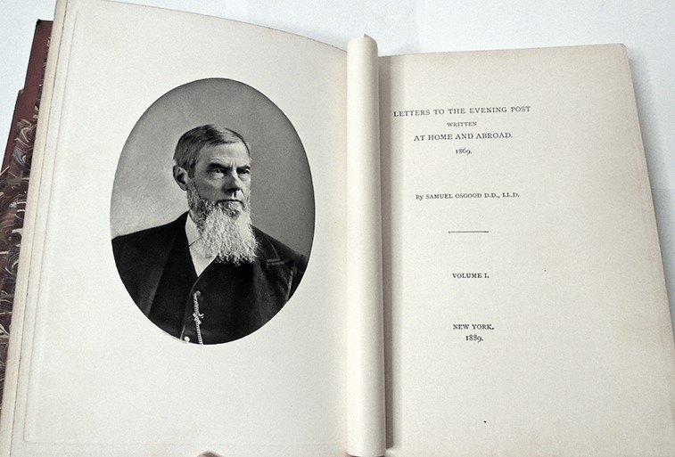
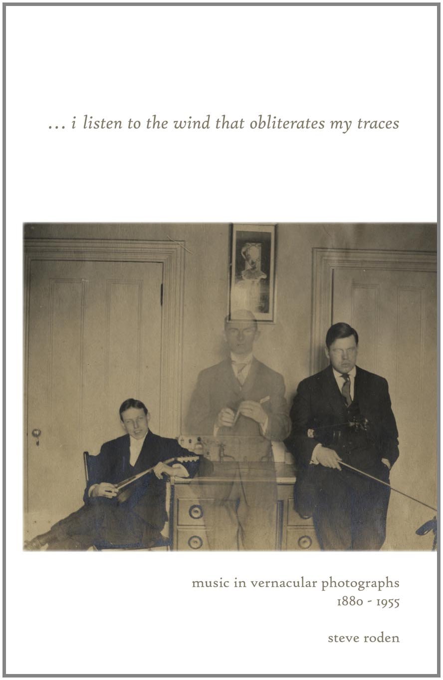
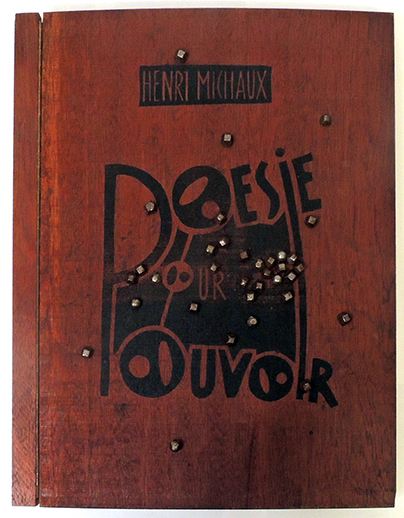
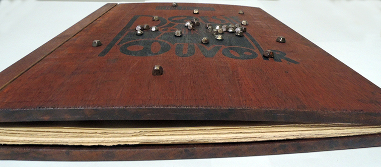
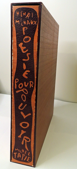
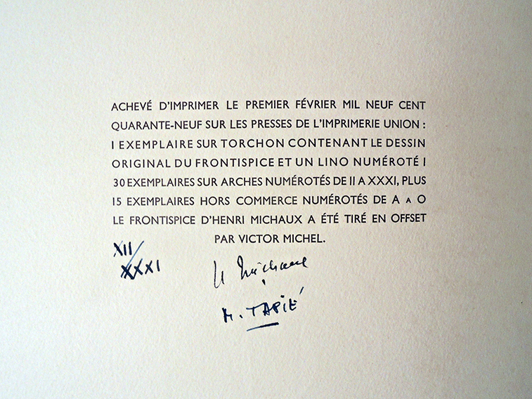
Henri Michaux (1899-1984), Poésie pour pouvoir. Text and frontispiece by Michaux. Design and linocuts by Michel Tapié (Paris: René Drouin, 1949). Copy XII of 46, signed by Henri Michaux et Michel Tapié. Teak wood portfolio printed with the title and fitted with 34 steel nails. Graphic Arts Collection GAX 2020- in process. Provenance: Collection of Geneviève and Jean Paul Kahn.

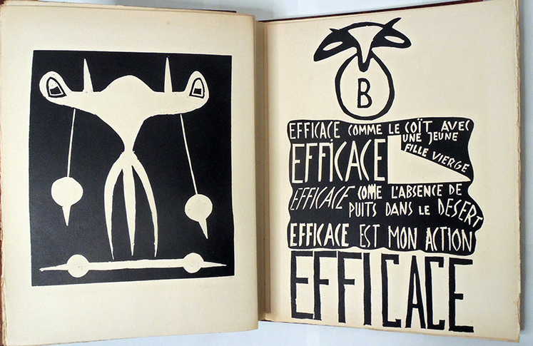
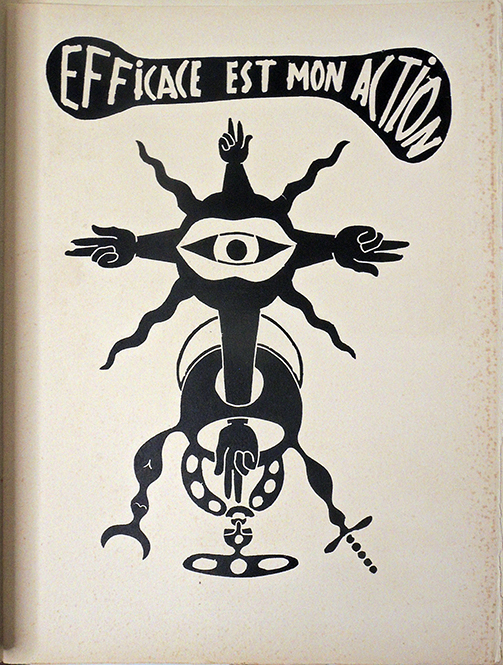
Is there a way to release the magic of poetry stagnating within conventional printed literature? Can you make a book with the power to exorcise a condition or complaint? These are some of the questions that led to Poésie pour pouvoir, with poetry by Henri Michaux (1899-1984) integrated into pictorial linocuts by Michel Tapié (1909-1987) and published in February 1949 by Galerie René Drouin in Paris.

Only a handful of copies of this singular “book-object” as Michaux and Tapié conceived it with the nailed wood cover were completed, in fact only two others can be found in North America besides the one now held in the Graphic Arts Collection at Princeton University.

A seminal work of post-war Paris, the story of Poésie pour pouvoir’s production is also magical. It began in the late 1930s with Michel Tapié’s involvement in “Les Réverbères,” a neo-Dada group, which led to his collaboration with Aline Gagnaire on the hand-printed publications Le Cheval de 4 and Deda L-E. Tapié eventually joined René Drouin’s gallery as artistic advisor, focusing on the promotion of a wide circle of artists that included Henri Michaux.


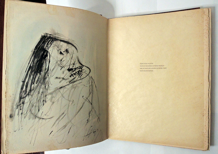
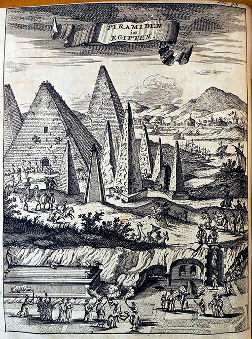
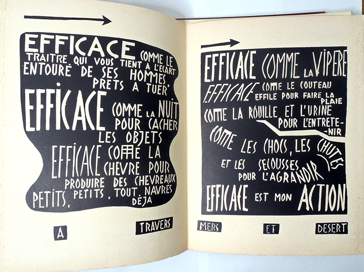
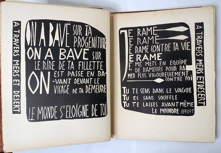
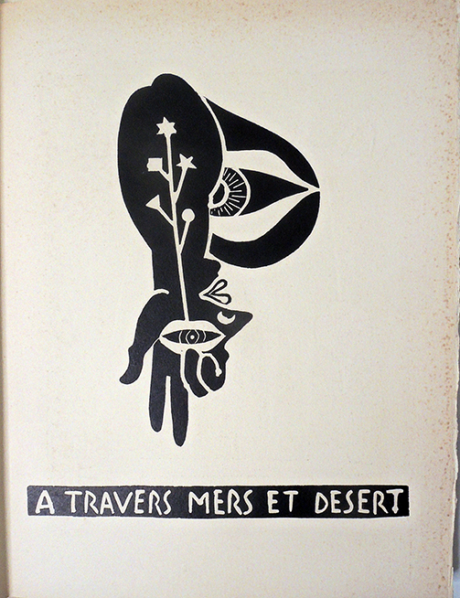
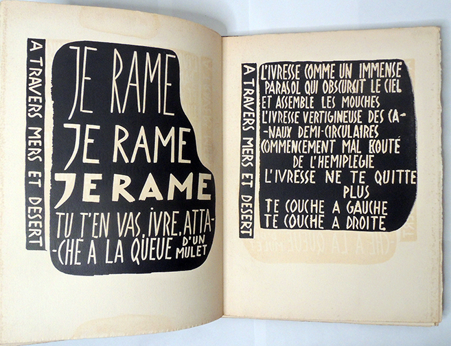
In 1947, Henri Michaux and his wife traveled to Egypt, where the magical power of hieroglyphics inspired the poems, “Je rame” and “À travers mers et desert.” These texts went unpublished until Tapié proposed to “put them into a space in the form of a book-object.”

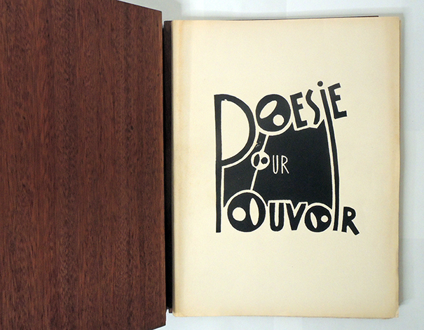
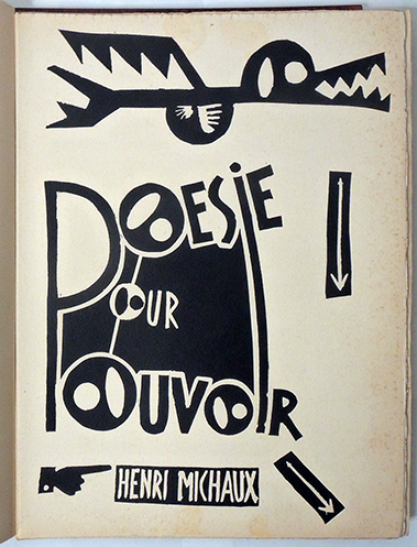
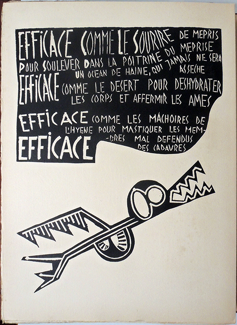
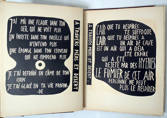
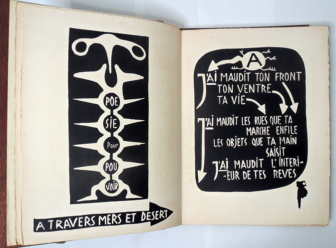
Using the crisp, quick black and white technology of linoleum block printing that Tapié perfected while working with the Réverbères, he designed and cut Michaux’s words so they fluctuated between white text on black shapes and black text on white pages incorporated with his own abstract figures. The majority of the 46 copies were produced with only a paper cover.


A full recounting of the year leading up to February 1949, when the final work was exhibited at Drouin’s gallery, can be found in Tapié essay “Commentary on an exorcism,” Les Cahiers de la pléiade 1950.

“…. Mon projet de départ était de graver ce texte sur lino, le lino étant la technique la plus brutale et la plus directe des violentes oppositions de noir et de blanc, et de présenter l’ensemble des tirages dans une couverture de bois clouté, l’ensemble du travail étant jour par jour suivi et approuvé par Henri Michaux; L’esprit d’aventure qui préside aux activités de René Drouin poussa celui-ci à accepter le risque d’édition avec enthousiasme, et il mit l’équipe de sa galerie à notre disposition pour une rapide réalisation. Rapide en effet il le fallait; Michaux nous avait bien prévenus: si nous n’allions pas vite, le poème, lui, irait plus vite que nous et se retournerait contre nous… je pus assez vite graver tous les éléments n nécessaires à l’édification de la maquette complète.

The book’s construction took place at the Drouin family farm, under the daily supervision of Michaux. René Drouin (1905-1979) chose the arrangement of the nails on the covers, Aline Gagnaire (Tapié’s former collaborator) pieced together the wooden cover, and Drouin’s son, Jean-Claude, cut the nails to be hammered into the cover (originally plywood and only later teak wood).

Tapié was almost done with his share of the printing when he became ill and could not finish, leaving it to Gagnaire to complete the book. So many things went wrong, they called it was a cursed project, fueling the myth of a magical book.


As for his part, Michaux wrote:

 “La force exceptionnellement opératoire de ce poème, jointe au fait de son élection unique, centrant justement sur ce texte toutes les intentions d’intervention-de pouvoir-de l’auteur, me donna une furieuse envie d’en faire une édition où je tenterais de forcer les usages du livre dans le même rapport d’échelle qu’Henri Michaux l’avait fait ici par rapport non pas seulement à la poésie, mais même, comme je ne le sentis d’ailleurs que bien plus tard, à l’usage, par rapport à ses plus efficients exorcismes. Le problème consistait à fabriquer un objet receleur de force supportant ce texte de sorte que sa vue, son contact, tant épidermique que musculaire provoque au maximum l’expansion effective de cette force, puisque magie il y avait.


It is a tragedy that OCLC no longer allows local notes. To find copies that include the rare nailed wood cover, a reader must log into every library in the world individually. Otherwise they would not know, for instance, that Houghton Library has copy no. V with “unbound sheets, as issued, laid into original printed paper covers; in original hinged wooden boards, with title printed on cover, decorated with metal studs. In burlap-covered board slipcase.”

It was Tapié’s idea to pound nails into the wooden binding using the same aggressive energy as Michaux’s incantatory texts. The action references the practices of the Romans, who manufactured defixion or curse tablets, as well as African practices of incorporating nails into power figures called nkisi nkondi. The physical hammering of the nails into Poesie pour pouvoir was meant to embed magical powers into the book, just as Tapié’s pictographs unleashed the power in Michaux’s words.


Galerie René Drouin closed in 1950 (later revived in a different format), Michel Tapié went on to promote Art informel, from which Michaux distanced himself, continuing to draw and write in his own personal style. No other magic book-objects were attempted.


For more on this and other works by Michaux, see Raymond Bellour’s Henri Michaux Ouvres Complete (Gallimard, “Bibliothèque de la Pléiade”, 1998), https://babel.hathitrust.org/cgi/pt?id=uva.x004550124&view=1up&seq=1276&q1=%22poesie%20pour%20pouvoir%22

Henri Michaux (1899-1984), Commentaire d’un exorcisme ([Paris: Librairie Gallimard, 1950?]). Beach 3269.96.325. Presentation copy to Sylvia Beach with inscription by Henri Michaux.

 Le Cheval de 4 (Paris: M. Tapié, A. Gagnaire, J. Jausion, H. Bernard, 1940). Graphic Arts Collection Q-000727. Issued in 4 fascicles. Each has a separate title: [no. 1] “Le Cheval de 4” (“tirage limité à 26 ex. hors commerce et 6 ex. de luxe”) ; [no. 2] “Dédal-e” (“Tirage limité à 28 ex. hors commerce et 3 ex. de luxe”) ; [no. 3] “Huit poèmes pour Cécile / Noël Arnaud” (tiré à 150 ex. environ dont 35 de luxe) ; [no. 4] “Expédition Tapié” (tiré à 27 ex.).


Also designed by Michel Tapié while at Galerie René Drouin: Francis Picabia (1879-1953), 491 (Paris, René Drouin, 4 mars 1949). Marquand Oversize ND553.P58 T36 1949e. “50 ans de plaisirs” par Michel Tapié. Catalog in newspaper format issued Mar. 4, 1949 for Picabia exhibition of 136 works dated 1897-1949.


A section of Poetry for Power in translation:
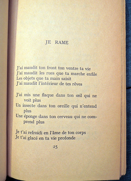
I row
I have cursed your brow your belly your life
I have cursed the streets your steps pursue
The objects your hand grasps
I have cursed the inside of your dreams

I have put a puddle in your eye and it no longer sees
An insect in your ear and it no longer hears
A sponge in your brain and it no longer understands

I have chilled you in the soul of your body
I have frozen you in the depth of your life
The air that you breathe suffocates you
The air that you breathe has an air of cellars
Is an air that has already been exhaled that hyenas have expelled

The dung of this air no one can breathe any longer

Your skin is moist all over
Your skin sweats the sweat of the great fear
Your armpits exhale from afar an odor of crypts
The animals halt when you pass
The dogs howl in the night their heads raised toward your house
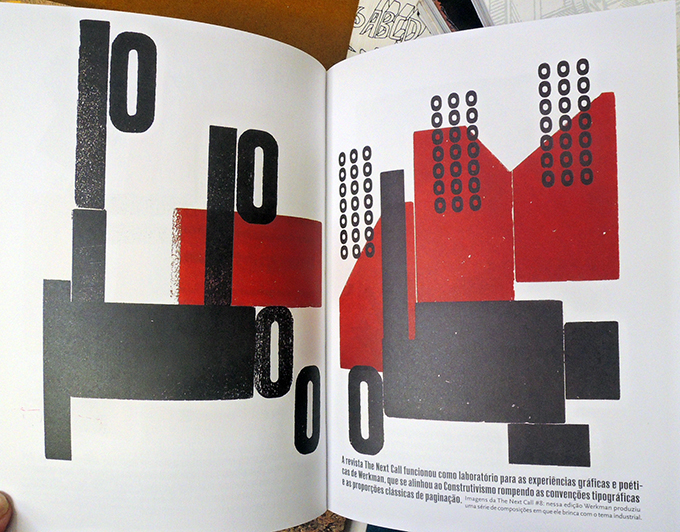
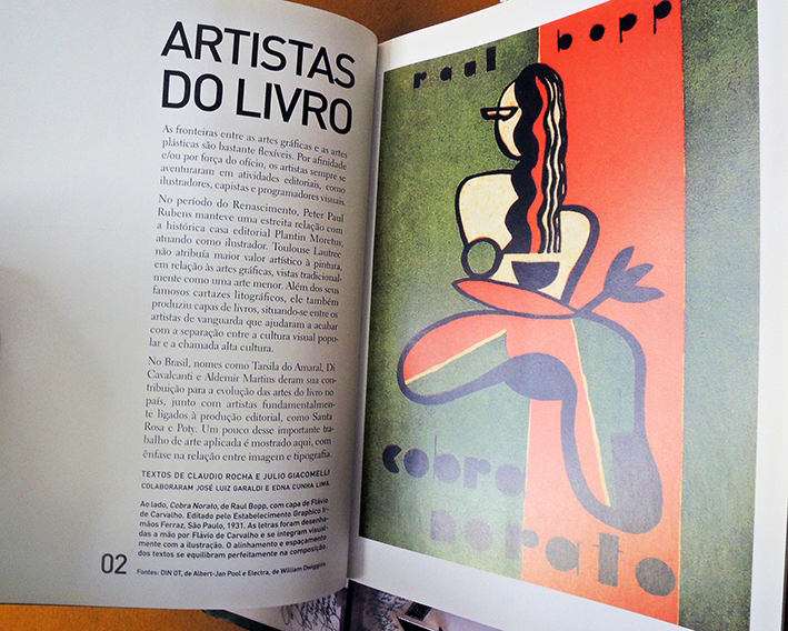
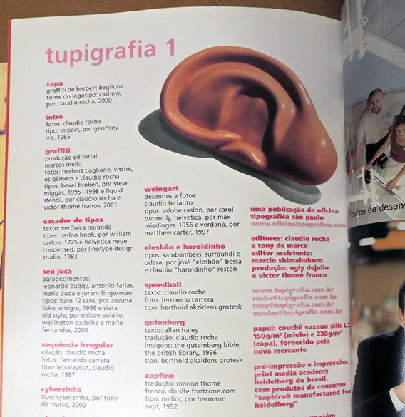
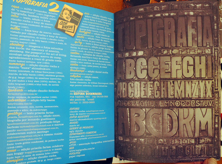
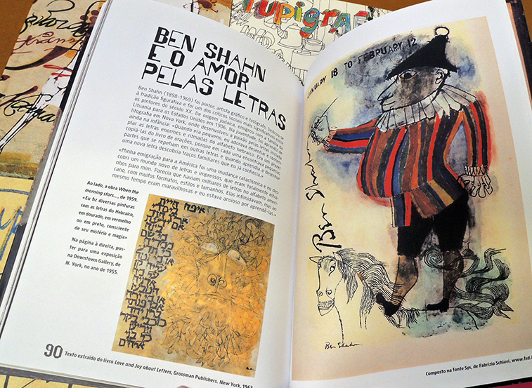
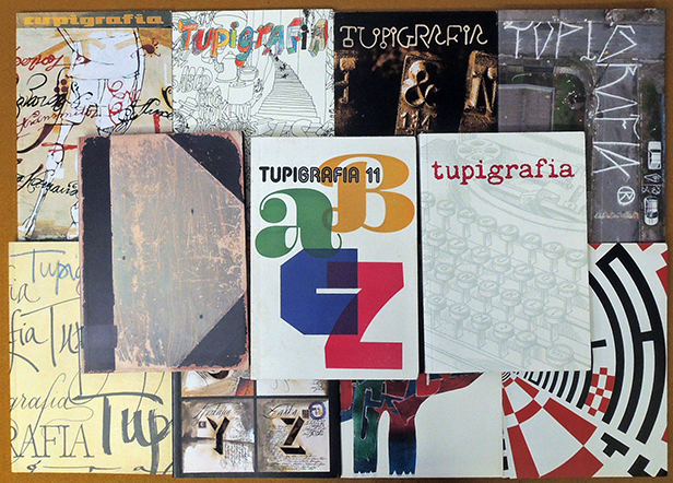


Musical Families

The Hurtt Family, taken in Detroit, Michigan


This is the third in a series of three posts introducing our new collection of vernacular portrait photographs of American musicians. Originally owned by Pasadena visual and sound artist Steve Roden, some images were published in his book I Listen to the Wind that Obliterates My Traces …, and others are seen by the general public for the first time here. These are all part of a collection of approximately 330 photographs now in the Graphic Arts Collection.

Additional images from the collection can be seen at: https://graphicarts.princeton.edu/2020/10/26/american-musicians/

Highlights include close to a hundred images of women musicians, from soloists to women’s bands and cabaret acts; images of musical ‘special personalities’, e.g. a one-armed musician, albino musicians, and an African-American dwarf troubadour, Lynn Lewis White; child musicians, including vaudeville performer L. Wade Ray, “The Boy Wonder Youngest Violin Player in U.S.A.;” a number of examples depicting one-man bands; and unidentified African-American musicians.

Seen here are a few of the family bands popular in the United States at the end of the 19th century.

Mitchell’s Concert Band, taken in Lavalle, Wisconsin


A member of the Shippen Family Band, taken in Lebanon, Kansas


The Noss Family Band, of New Brighton, Pennsylvania


The Celebrated Female Band, now with the Burr Robbins


Brother and sister?


Steve Roden, I Listen to the Wind that Obliterates My Traces: Music in Vernacular Photographs, 1880-1955 (Atlanta, Ga.: Dust to Digital, 2011). Mendel ML87 .R654 2011

One Person Bands


This is the second of three posts introducing our new collection of vernacular portrait photographs of American musicians. Originally owned by Pasadena visual and sound artist Steve Roden, some images were published in his book I Listen to the Wind that Obliterates My Traces …, and others are seen by the general public for the first time here.

Sitters include the popular showman Professor McCrea [below], an Ontario-born one man band, along with several other polymuses seen here. These are all part of a collection of approximately 330 photographs now in the Graphic Arts Collection.

Additional images from the collection can be seen at: https://graphicarts.princeton.edu/2020/10/26/american-musicians/

Highlights include close to a hundred images of women musicians, from soloists to women’s bands and cabaret acts; images of musical ‘special personalities’, e.g. a one-armed musician, albino musicians, and an African-American dwarf troubadour, Lynn Lewis White; child musicians, including vaudeville performer L. Wade Ray, “The Boy Wonder Youngest Violin Player in U.S.A.;” a number of examples depicting one-man bands; and unidentified African-American musicians.


Steve Roden, I Listen to the Wind that Obliterates My Traces: Music in Vernacular Photographs, 1880-1955 (Atlanta, Ga.: Dust to Digital, 2011). Mendel ML87 .R654 2011

American Musicians

Back in 2011, Pasadena visual and sound artist Steve Roden published a collection of vernacular photographs together with several compilation CDs entitled I Listen to the Wind that Obliterates My Traces …, which presented music and musicians we might not otherwise know or appreciate. Derived mainly from flea market cabinet cards and photographic postcards 1860-1930, the images capture musicians old and young; country and city; classically trained and self-taught; costumed and barefooted.

Popular showmen such as Professor McCrae, a Canadian one man band, are presented but the majority of the collection are unidentified next-door neighbors you may have seen at the local town square gazebo or fairgrounds. Some portraits were taken at commercial studios, possibly the one formal photograph someone may have had made. Still others reveal a bed sheet quickly tacked up on the porch to serve as a homemade backdrop. Either way, someone cared enough to print each of these photographs onto a penny postcard or paper mount, to be mailed or shared with others.

Roden organized the images “to create what he calls ‘his specifically timed experience. There are these pauses where there are photos with no people, and a quote from a literary text. The whole thing is about slowing down.’ And, in an odd way, the visual aspect of the book is also an ode to silence. ‘There something very absurd about collecting images of something that’s not present in the photograph — which is the sound,’ says Roden. ‘There’s something perverse about that.’”–Randall Roberts, LA Times


The Graphic Arts Collection recently acquired approximately 330 photographs, 1880s to 1930s, originally owned by Steve Roden, some published in his 2011 book I listen to the wind… and others never before seen by the general public. The contents have been variously listed as blind musicians, family bands, poised soloists, women’s social clubs, sibling groups, drinking buddies, and all kinds of instruments (one-man bands, glass harps, bassoons, banjos, violas, drum kits, trumpets, and clarinets, et al.). This group is specifically American portraits.

Highlights include close to a hundred images of women musicians, from soloists to women’s bands and cabaret acts; images of musical ‘special personalities’, e.g. a one-armed musician, albino musicians, and an African-American dwarf troubadour, Lynn Lewis White; child musicians, including vaudeville performer L. Wade Ray, “The Boy Wonder Youngest Violin Player in U.S.A.;” a number of examples depicting one-man bands; and unidentified African-American musicians.


This is the first of three posts offering a taste of our wonderful new collection. The next post will feature one-person-bands and the third, musical families.


Major Lynn Lewis White, 21 years old


Steve Roden, I Listen to the Wind that Obliterates My Traces: Music in Vernacular Photographs, 1880-1955 (Atlanta, Ga.: Dust to Digital, 2011). Mendel ML87 .R654 2011

Print Scam or Good Business?

In the summer of 1860, the Philadelphia lithographers and partners Edward Herline (1825-1902) and Daniel Hensel (1830-1919) came up with a marketing scheme to sell a fine art print, supposedly an edition of 75,000 engravings, after “one of the most celebrated artists that ever lived.” No picture was shown. Today, no copy of this print has yet to be found in an institutional collection.

Did they get away with something? Thanks to a recent request for information, a broadside announcing the sale was found in the Graphic Arts Collection, and many American newspapers carried their advertisements. A close reading of these sources reveals many inconsistencies, beginning with the name of the original artist: Ruben, not Rubens.

The print being offered by Herline & Hensel (630 Chestnut Street) in August 1860 was a lithograph after Christian Ruben (1805-1875), variously titled: Columbus, First sight of the new world, 1839, currently hanging at the National Gallery in Prague. While you might enjoy this German artist’s work, he is not the most celebrated artist that ever lived. And an engraving is not a lithograph.

Columbus, New World, 1492, The First Sight of the New World (Columbus discovering America). Found in Bridgeman’s Collection and in Worldcat

Christian Ruben (1805-1875), Columbus, First sight of the new world, 1839. Oil on canvas. National Gallery in Prague.

The broadside begins:

P.S. Herline & Co. having just published over 75,000 copies of the magnificent engraving of Christopher Columbus and his crew on board the ship Santa Maria . . . are now prepared to offer extraordinary inducements to private individuals, not only by selling a single copy at the publishers’ lowest wholesale price, but by distributing a portion of the profits of the sale among the purchasers.

This beautiful engraving and extraordinary work of art was designed by the world-renowned Rubens [sic], one of the most celebrated artists that ever lived; the cost of the original design and plate being over $80000. The artist has done great credit not only to himself but to the picture, in the extraordinary manner in which he has portrayed upon the countenances of all on board, the various emotions and feelings felt at the moment land was discovered. Some are reaching forth their hands, as if they would embrace the distant land; others …

Any persons enclosing in a letter $1.00 for the engraving (and fifteen cents to pay for postage and roller to send engraving on). And forwarding the same to us by mail shall receive by return of mail this magnificent engraving and also, immediately after the 30th day of Aug 1860 one of the following valuable Gifts will be sent to each and every subscriber. Schedule of gifts: Everybody who buys an engraving gets a gift! Remember in sending orders to us you are dealing with an honorable firm – men of wealth, who are not only able but willing to do all they agree to: whose place of business is on the most fashionable thoroughfare in the city of Philadelphia.

From Wikipedia: Christian Ruben. Born in Trier, Ruben studied in Düsseldorf under Peter von Cornelius from 1823, and in 1826 settled in Munich, where he worked on the designs for the new stained glass windows for the Regensburg Cathedral and for a church in Auer. In 1836 he worked on designs for the decoration of Hohenschwangau Castle, and produced oil paintings as well. In 1841 he was appointed director at the Academy of Fine Arts in Prague, where he decorated the belvedere with wall paintings. He also painted a hall for the Prince of Salm and three altarpieces for the church in Turnau (modern-day Turnov, Czech Republic). From 1852 to 1872 he was director at the Academy of Fine Arts Vienna, where he died in 1875. One of his sons, Franz Ruben, was also a painter.

Rockland County Messenger, Volume XV, Number 13, 17 May 1860:

Magnificent engraving of Christopher Columbus and his crew. This Beautiful Engraving was designed by Rubens, one of the most celebrated artists that ever lived; the cost of the original design and plate being over $8000, size 22 by 29 inches. The Philadelphia Daily News, says, “the mere nominal sum asked for the engraving is a sufficient inducement for persons to purchase without the additions Gift.” Schedule of gifts. To be given to the purchasers. For full particulars, send for a Bill. Together with a great variety of other valuable gifts, varying in value from 50 cts to $25. Any person enclosing in s letter $1 and five 3 cent Postage stamps (to pay for postage and Roller) shall receive, by return of mail, this magnificent engraving of Christopher Columbus, (and one of these valuable gifts as per Bill.)


Besides ebay, are there any copies of this print in permanent collections and did anyone win the $5,000?

Miss traveling? Unusual histories and wonderful experiences commenced in the year 1660

Eduward Meltons, Engelsch Edelmans, Zeldzaame en gedenkwaardige zee- en land-reizen: door Egypten, West-Indien, Perzien, Turkyen, Oost-Indien, en d’aangrenzende gewesten; behelzende een zeer naauwkeurige beschrijving der genoemde landen, benevens der zelber jnwoonderen gods-dienst, regeering, zeden en gewoonten, mitsgaders veele zeer vreemde voorvallen, ongemeene geschiedenissen, en wonderlijke wedervaringen. Aangevangen in den jaare 1660. en geeindigd in den jaare 1677. Vertaald uit d’eigene aanteekeningen en brieven van den gedagten heer Melton, en met verscheidene schoone kopere figuuren versierd...(Amsterdam. 1702). Second edition. Nine of the plates, including the added engraved title page, were engraved by Jan Luiken (1649-1712); others engraved by Jacob Harrewijn (1660-1727). Graphic Arts GAX 2020- in process

= Eduward Meltons, English noblemen, Rare and memorable sea and land journeys: through Egypt, West-Als, Persians, Turkyen, East-Als, and neighboring regions; comprising a very accurate description of the countries mentioned, in addition to the self-inhabiting religion, government, morals and customs, as well as many very strange occurrences, unusual histories, and wonderful experiences. Commenced in the year 1660 and ended in the year 1677. Translated from the notes and letters of Mr. Melton’s own notes and letters, and adorned with several beautiful copper figures

With an added engraved title page with title Eduward Meltons Zee en land reizen door verscheide gewesten des werelds = Eduward Melton’s Sea and Land travel through various parts of the world.

The Graphic Arts Collection acquired this compilation of travel accounts from various sources by the fictitious Eduward Melton, attributed to Godofridus van Broekhuizen.

The part relating to Egypt has been identified as a translation of Johann Michael Wansleben’s Nouvelle relation en forme de iournal, d’un voyage fait en Egypte (Paris, 1677; London, 1678). Rare Books 2272.68958.332.6. No plates

The part relating to New Netherland is thought to be an abridgement of Adriaen van der Donck’s Beschrijvinge van Nieuw-Nederlant (Amsterdam, 1655). Rare Books EXKA Americana 1655 Donck; With the introduction to that part being taken from Arnoldos Montanus’s De nieuwe en onbekende weereld (Amsterdam, 1671). Rare Books Oversize 1075.651q


The part relating to the West Indies is in part taken from Alexandre Olivier Exquemelin’s De Americaensche zee-rooveres (Amsterdam, 1678). Rare Books EXKA Americana 1678 Exquemelin. See more at the John Carter Brown Library: https://jcblibrary.org/collection/engelsch-edelmans-zeldzaame-en-gedenkwaardige-zee-en-land-reizen

Jan Luyken or Luiken or Luijken (Dutch, 1649-1712) studied under the painter Martinus Saeghmolen. He married Marie de Oude on 5 March 1672 and had five children, all of whom died young, except for Caspar, the eldest. Shortly after 1673, having been enthralled by the religious teachings of Jacob Böhme, he became a fanatical Pietist. Jan Luyken was a member of the Haarlem guild in 1699 and returned to Amsterdam in 1705. His large output of engravings totalled some 3,275, and he was also an author.–Benezit Dictionary of Artists

Detail of Slave Market

A New Asiatic Melo Drame, Called The Africans or, The Desolate Island

Perhaps the earliest and most charming image of Richardson’s Theatre at the Bartholomew Fair appeared in Rudolph Ackermann’s Microcosm of London (1808-10), etched and aquatinted by Thomas Rowlandson and Augustus Pugin. (Graphic Arts Collection Oversize Rowlandson 1808.02f).

Led by John Richardson (1767-1827), the outdoor productions at Bartholomew and Greenwich Fairs were said to rivaled those of the London theaters. “Richardson first opened his theatrical production at Bartholomew Fair in 1798 using scenery from Drury Lane. The performances took place in a narrow booth (100 feet by 30 feet), colourful and brightly lit. The show toured, in the London area, to such fairs as Southwark, Brook Green and Greenwich. Over time, Richardson’s booth expanded, and he ran several performances simultaneously, and he could stage over a dozen burlesques and melodramas each day. By 1828, the price of admission was sixpence, and refreshments were another profit source for the troupe. The young Edmund Kean learned his craft here, before moving on to a more respectable theatrical environment. After Richardson’s death, the show was continued until 1853 by Nelson Lee.—Victoria & Albert collection database

According to the British Library, “Bartholomew Fair was under almost constant attack from City authorities during the 18th and 19th centuries for the immorality and drunkenness that was often witnessed there. The salacious theatre productions on show were of particular concern to moral reformers, as was the ability of the fair to keep the working population from their daily employment. Theatrical shows were eventually banned from the site in the 1840s following several public disturbances, and the fair itself was prohibited entirely by the City of London authorities in 1855.”

Thomas Rowlandson, Greenwich Fair with Richardson’s booth [detail]. Pen and brown and grey ink, with grey wash and watercolour. 1811-1816. British Museum. ‘Richardson’s Show’ (part of this composition) was etched by the artist and published in ‘Rowlandson’s World in Miniature’, 1816, pl. 14. Graphic Arts Collection Rowlandson 1816.5

“Richardson’s platform was lined with green baize, festooned with crimson curtains, and lighted with fifteen hundred variegated lamps. His money takers sat in Gothic seats. He had a band of ten beefeaters, and a parade of his dramatic force.”


Thomas Rowlandson, People watching Richardson’s Travelling Theatre on stage. Etching, 1816. Welcome Institute.


”In 1825 William Hone described [Richardson’s] theatre at Bartholomew Fair. Its frontage was a hundred feet wide and thirty feet tall, with a spacious elevated platform, or ‘walk-up’, in front. This was decorated in green baize with fringed crimson curtains and contained two Gothic arches into the theatre behind, where the money takers sat. Fifteen hundred lamps in chandeliers, clusters and festoons illumined the walk-up, where a band of ten played and actors in costume paraded or danced in sets. Charles Dickens described “the company now promenading outside in all the dignity of wigs, spangles, red-ochre, and whitening. See with what a ferocious air the gentlemen who personates the Mexican chief paces up and down and with what an eye of calm dignity the principal tragedian gazes on the crowd below, or converses confidentially with the harlequin!” — Robert Leach, An Illustrated History of British Theatre and Performance (2018).


The Africans or, The Desolate Island [broadside] (London: Hughes, 1800). Graphic Arts Collection GAX 2020- in process

The broadside states: “J. Richardson feels happy that the revolving time gives him an opportunity of once more expressing his heartfelt gratitude to his generous patrons for their former kindness, and assure them, from the close of last season to the present period, his every exertion has been used to render this year’s entertainments worthy that support they have on all occasions honored him with, and which his attention to their convenience and amusements will, he hopes, convince them of, an addition of Twenty New Scenes, by the first artists in London, and a daily change of performances, entirely novel, will still continue him that success is shall at all times be his pride and study to deserve, when will be performed a new Asiatic melo Drame, called The Africans or, The Desolate Island.”