Author Archives: Julie Mellby

Aubrey Beardsley’s “Die Götterdämmerung”


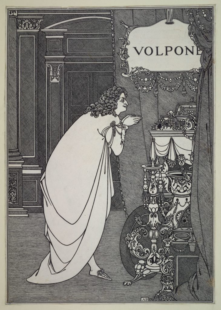
Ten drawings from Princeton University Library’s Aubrey Beardsley Collection, C0056, will be traveling to the exhibition Aubrey Beardsley on view at Tate Britain, London, from 4 March-25 May 2020. Among these are [above]: Aubrey Beardsley (1872-1898), Volpone Adoring His Treasure, pen and ink drawing, 1898. Published posthumously in Ben Jonson His Volpone, 1898. [Oversize » NE642.B363 J63, and four others]

Volpone was first brought out at the Globe Theatre in 1605, printed in quarto in 1607,  and was republished by Jonson in 1616 without alterations or additions.

“Beardsley appears to have been truly taken with Jonson’s play, writing F.H. Evans on 11 december: I am making pictures for Ben Jonson’s adorable and astonishing Volpone.” On the same day he informed Pollitt: “I carry Volpone about with me from dawn to dawn, and dream of nothing else.”The artist’s enthusiasm for the comedy is equally evident in his notes for the Volpone prospectus. “Daring and forcible in conception, brilliant and faultless in execution.” He writes, “It is undoubtedly the finest comedy in the English language outside the works of Shakespeare.” James G. Nelson, Publisher to the Decadents: Leonard Smithers in the Careers of Beardsley, Wilde, and Dowson (2010).

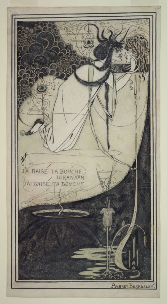
Also traveling to London will be [above] Aubrey Beardsley (1872-1898), Salomé with the Head of St. John the Baptist, ca. 1894. Pen and ink drawing. Although this was drawn to illustrate Oscar Wilde’s Salomé, it was not used. Aubrey Beardsley Collection, C0056, Department of Special Collections, Princeton University Library.

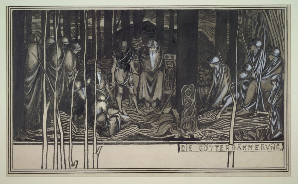
And most exciting: [below] Aubrey Beardsley (1872-1898), Die Götterdämmerung, 1892. Pen and ink, wash, and Chinese white. 12 1/8 x 20 1/4. Reproduced in A Second Book of Fifty Drawings by Aubrey Beardsley, London, 1899, p. [53]. From the collection of Robert Ross. [Gallatin 223] No. 17.

Götterdämmerung (Twilight of the Gods), is the last in Richard Wagner’s cycle of four music dramas titled Der Ring des Nibelungen (The Ring of the Nibelung, or The Ring for short). It received its premiere at the Bayreuth Festspielhaus on 17 August 1876, as part of the first complete performance of the Ring.

Die Götterdämmerung,” notes Emma Sutton in Aubrey Beardsley and British Wagnerism in the 1890s (2002), “Beardsley’s only drawing of the concluding part of the Ring cycle, was probably prompted by the first performance for a decade of the Ring in London in June and July 1892. It is extremely likely that he attended a performance of the drama; he certainly attended Siegfried, and produced drawings on Siegfried and Götterdämmerung, and of the principle singers, in this year.

No interpretation of the drawing has, to my knowledge, ever been offered, perhaps because its stylistics might suggest that it is an incomplete or experimental, Impressionistic work. The drawing is, however, an intricate and highly knowledgeable representation of Wagner’s work, demonstrating Beardsley’s comprehensive knowledge of Die Götterdämmerung (and, indeed, of the whole cycle) from the very start of the decade. Beardsley presents the gods shrouded in long drapes in a bleak forest setting; with their elongated limbs and enveloping robes they appear androgynous figures, listless and melancholy, entrapped by the sharp bare stems that rise from the border and ground around them.

Despite the undulating lines of the landscape, Die Gotterdammerung is a scene of desolate stasis, bleakly portraying Wagner’s Twilight of the Gods. A compression of several scenes from Wagner’s drama, the drawing is, I would suggest, an extraordinarily innovative and ambitious attempt to evoke concisely the narrative events and cumulative tone of the entire drama.”
–Emma Sutton, Aubrey Beardsley and British Wagnerism in the 1890s (2002)

Tate Britain calls this the largest exhibition of Beardsley drawings for 50 years. “Aubrey Beardsley shocked and delighted late-Victorian London with his sinuous black and white drawings. He explored the erotic and the elegant, the humorous and grotesque, winning admirers around the world with his distinctive style. Spanning seven years, this exhibition will cover Beardsley’s intense and prolific career as a draughtsman and illustrator, cut short by his untimely death from tuberculosis, aged 25. Beardsley’s charismatic, enigmatic persona played a part in the phenomenon that he and his art generated, so much so that Max Beerbohm dubbed the 1890s the ‘Beardsley Period’.” https://www.tate.org.uk/whats-on/tate-britain/exhibition/aubrey-beardsley

Ned Buntline: shot and revived, hung and survived, abstained and died


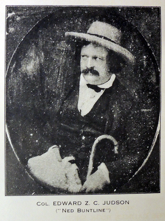
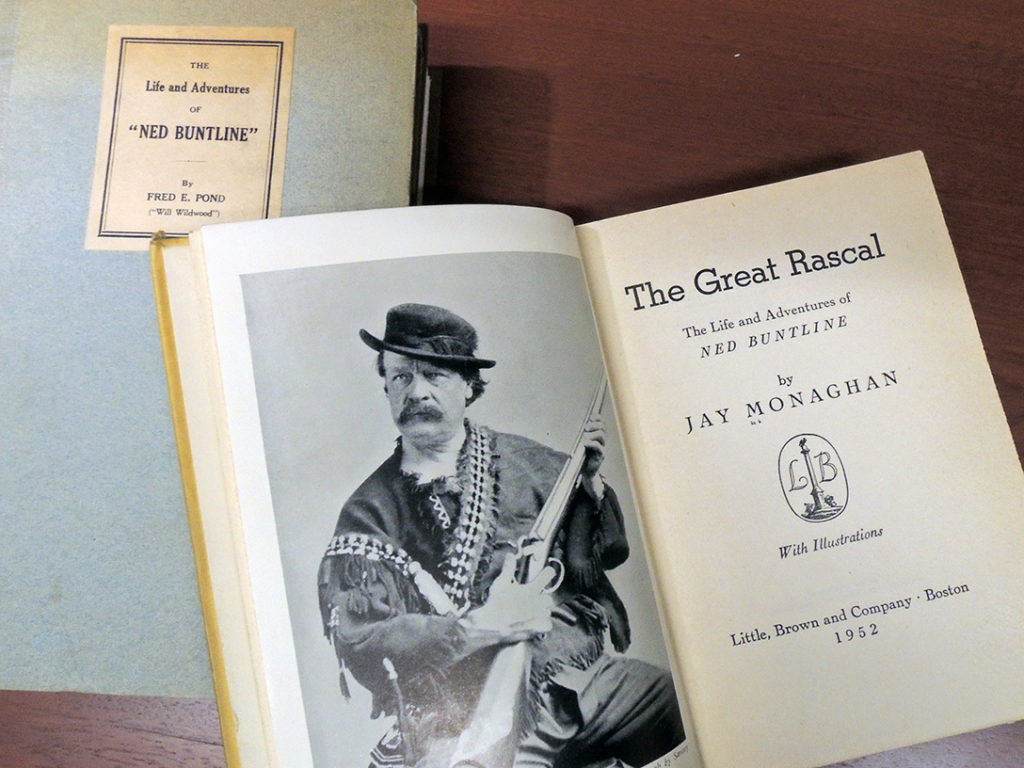
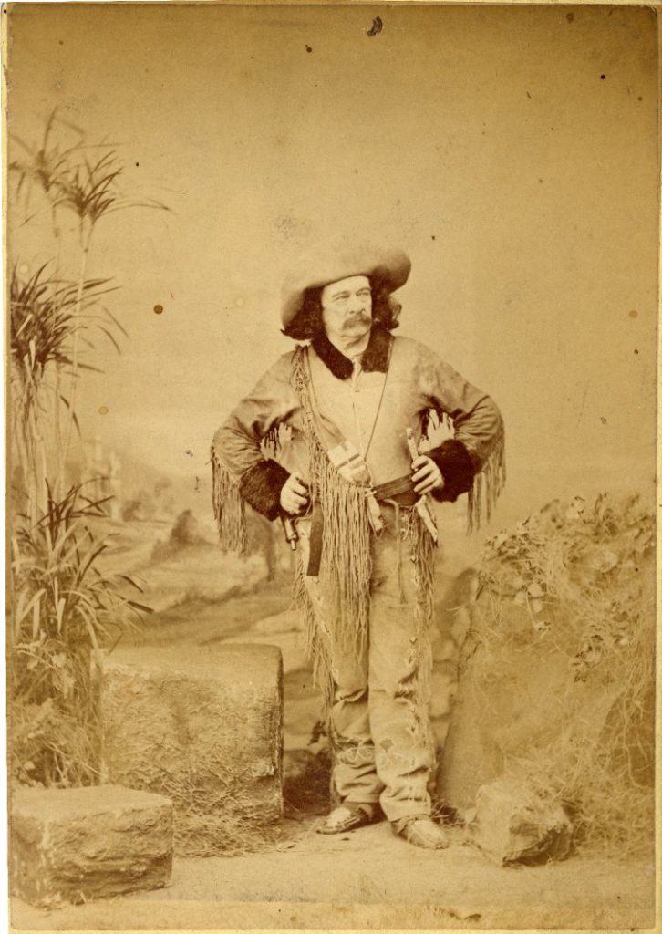
Edward Zane Carroll Judson served with the U.S. Navy from 1839 to 1842 during the Second Seminole War in Florida. While still in service, he began publishing short fiction under the pen name Ned Buntline (a buntline is one of the ropes attached to the foot of a square sail).

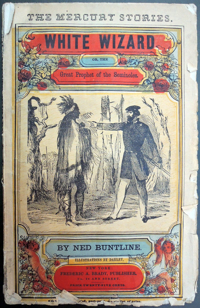
Although he is best-known for stories about the American West, many of Buntline’s early pieces relied on his personal experiences in Florida, including Matanzas, or, A Brother’s Revenge: a Tale of Florida (1848); The Red Revenger, or, The Pirate King of the Floridas. A Tale of the Gulf and its Islands (1848); and most notably, The White Wizard. Or, The Great Prophet of the Seminoles. A Tale of Strange Mystery in the South and North (Graphic Arts Collection. Oversize Hamilton 657q).

White Wizard originally appeared in the New York Mercury in 1858, later published as Beadle’s Sixpenny Tales in 1862 and American Talks in 1869.

Not only did Judson have a spectacular life but he was the best paid of all 19th-century American authors, reportedly earning ~$20,000/year in the 1860s. His stories number at least 400, but only 7 are held in the Sinclair Hamilton Collection of American Illustrated Books.

Of the many anecdotes told about Judson, perhaps the most sensational is the factual account of his hanging, from which he survived. As reported in the Washington Post, July 25, 1886, here is a section:

“Acting Mayor S.V.D. Stout and John D. Gass, who were Jail Commissioners, went to consult Louis Horn, jailer. When the mob rushed into the jail, they knocked Horn out of a rocking chair and secured the keys, when he said, “For God’s sake, don’t let all the prisoners out.” Three of the mob entered Buntline’s cell. While one caught him by a leg, another seized him by the collar. A third, placing his foot on Buntline’s neck, was about to fire, when the jailer pleaded with them not to kill him there.

Buntline was then dragged pell-mell into the street. He was then permitted to say his prayers and on finishing pulled a ring from his finger, handed it to a minister to be sent to his father at Pittsburgh, Pa. The crowd then hallooed, “Take him on,” and they did so.

They first attempted to hang him to a sign, but the rope having been too short, he was dragged to a lamp-post. When they began to pull him up, acting Mayor Stout cut the rope and the form of Buntline dropped to the earth. The utmost silence prevailed at this critical moment, when a man named Ashbrook cried out: “It’s a d—n shame to treat a human being in such a brutal manner and if John Porterfield is a gentleman, he will have the wretch turned loose!” At this Porterfield came out and said: “Take him back to jail” and Buntline was returned to his cell.

Dr. Stout said he had received severe internal injuries and that while attending him Buntline boasted that if he saw that a man was going to shoot him he could dodge the bullet. When Buntline had recovered and was about to be sent down the river, still another mob gathered at the upper wharf to lynch him; but the crowd was left standing when the boat started with no Buntline on board. The sheriff alluded the angry assemblage by taking Buntline to the lower wharf where he was put on a steamer and that was the last seen of Buntline in Nashville. “

In one obituary, possibly written by Judson himself before his actual death in 1886, it is noted that “Ned Buntline probably carried more wounds on this body than any other living American.”

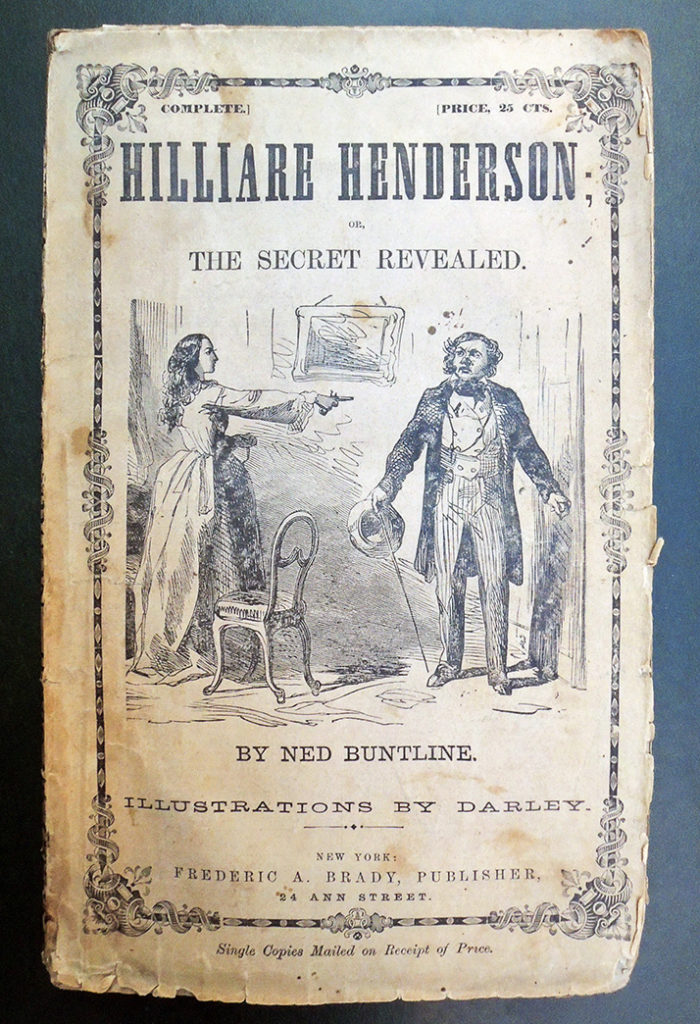
Ned Buntline (pseudonym for E.Z.C. Judson, 1822 or 1823-1886), The White Wizard. Or, The great prophet of the Seminoles. A tale of strange mystery in the South and North; illustrations by Darley. Original, chromoxylographed paper wrappers (New York: F.A. Brady [1862]). Graphic Arts Collection. Oversize Hamilton 657q

Buntline’s heroes were not always the white men.

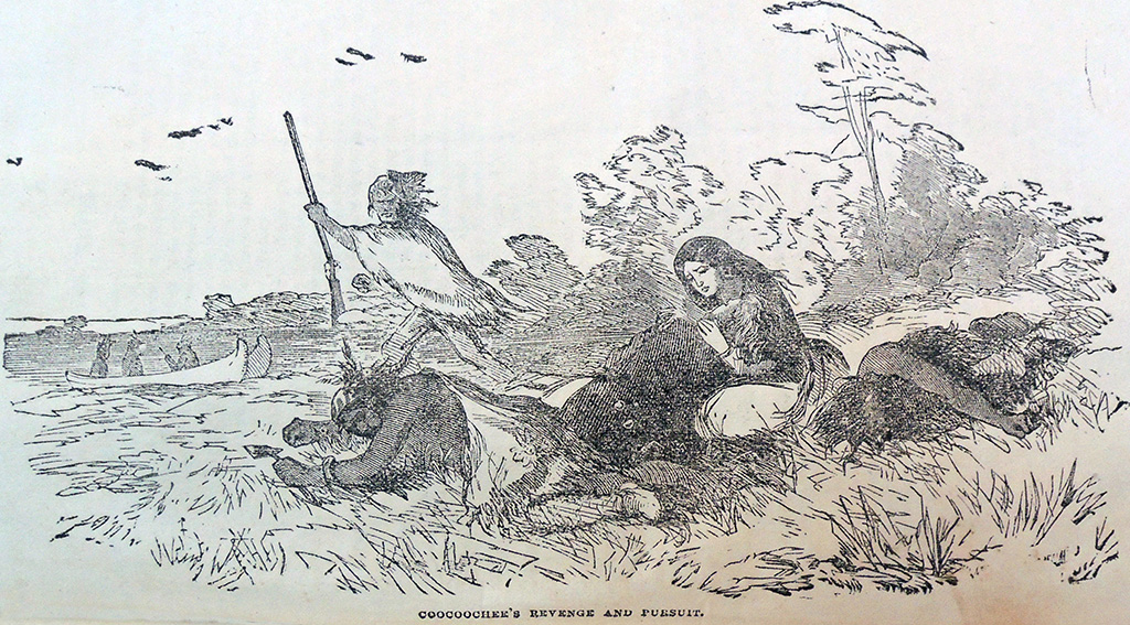
“…Coocoochee, a Mohawk prophetess. Though she was not a member of any of the tribes—Shawnee, Miami, and Delaware—that predominated numerically at the Glaize, Coocoochee nevertheless was treated as a revered member of the intertribal village community. Her respected position was based on her reputation as a medicine woman who conversed with numerous spirits and accurately forecast the results of raids.”

Also see Helen Hombeck Tanner, “Coocoochee: Mohawk Medicine Woman,” American Indian Culture and Research Journal 3(3) (1979): 24-25, 28. The Ohio Iroquois, known as Mmgoes, began migrating into Ohio in the 1740s and 1750s; Coocoochee’s family relocated to Ohio sometime after 1768, the year in which the first Treaty of Fort Stanwix supposedly made the Ohio River a permanent boundary and acknowledged that the country north of the River belonged solely to the Indians.

Another good read:

Read more: https://www.sun-sentinel.com/news/fl-xpm-1992-01-12-9201030022-story.html

To The Moon

*play this full screen

In case you missed “To The Moon” last summer 2019 at the Museum of Natural History, you have a brief opportunity to catch it as part of the Under the Radar festival this month. Created by Laurie Anderson, Visiting Lecturer in the Princeton Atelier, and Hsin-Chien Huang, the virtual reality experience flies you through constellations built from molecular equations and alphabets forming DNA skeletons that merge science, literature, and graphic art. Commissioned by the Louisiana Museum of Modern Art, Humlebæk, Denmark; The National Culture and Arts Foundation, Taipei, Taiwan; and National Taiwan Normal University, it is 15 minutes of lunar phantasmagoria. Unlike our pre-cinema collection of optical devices, this might be considered post-cinema.

The theater cautions: This production is not recommended for people with serious medical conditions including heart ailments. Pregnant women, the elderly, or anyone who risks serious injury from falling and people with epilepsy, or who are prone to seizures, dizziness, vertigo, fainting or motion sickness are not encouraged to participate in this production. As sensitivities vary from person to person, if you have specific questions regarding content, please call us at 212.967.7555.

Together with Arto Lindsay, Anderson has been teaching ATL 499, Spatial Sound, in which students “explore wave field synthesis including the dynamics of short stories, parades, suspended grammar, psychic states, animal consciousness, and depth of field in sound and film. Special attention will be paid to experimental forms of sound installation, use of different spatial techniques in live concerts, and spatial theater.” Final projects were presented on Friday, January 10, at Princeton University. https://arts.princeton.edu/events/spatial-sound-story-and-image/

A library for our times, cash only

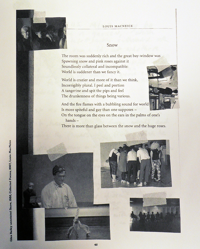
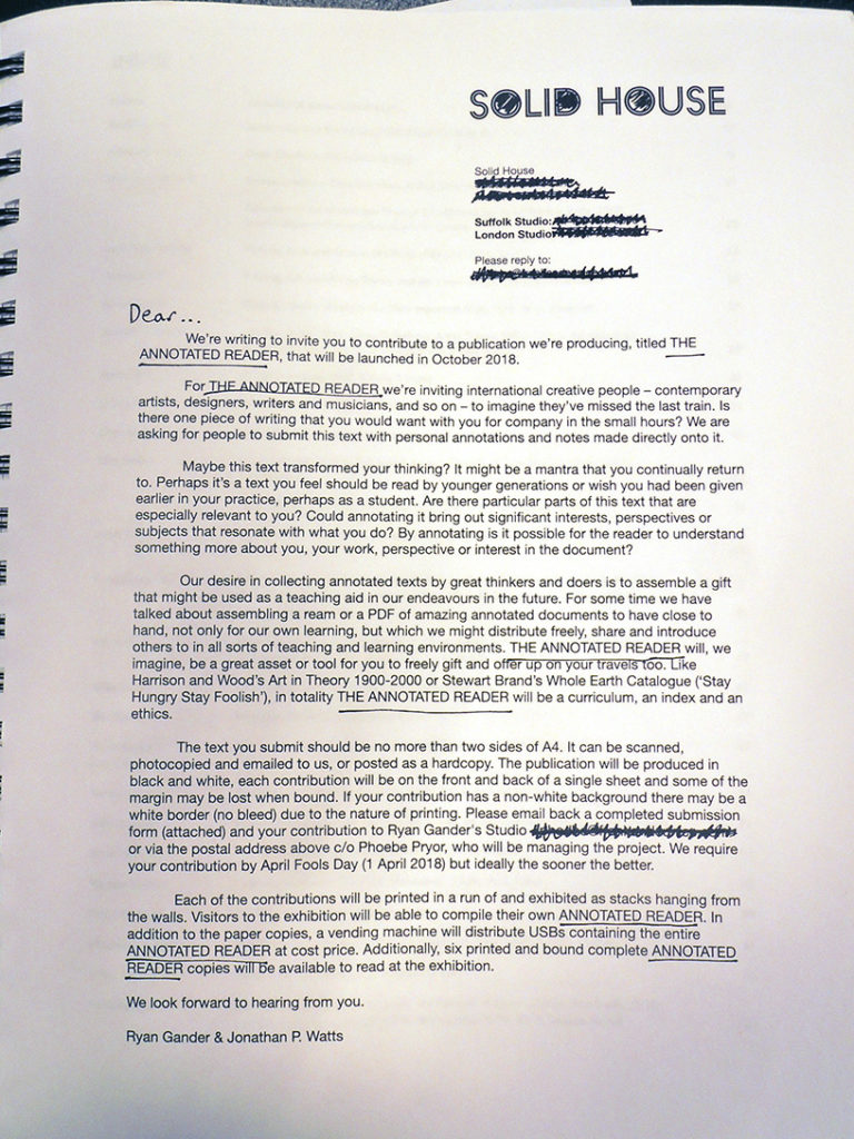
From now until February 28, 2020, the lounge at 185 Nassau Street, Lewis Center for the Arts, has “slipped into a reading lounge. Sitting next to the existing vending machine with snacks is its fraternal partner, 2019-20 Hodder Fellow Ryan Gander’s vending machine containing USB sticks of over 300 annotated essays. Collected together to form a library for our times, The Annotated Reader project includes texts of almost 300 contributors including the Faculty in Visual Arts. Is there one piece of writing that you would want with you for company in the small hours? All are welcome to come sit and read.”
https://arts.princeton.edu/events/the-annotated-reader/

Unlike his art vending machine that dispensed random artworks for a £500 fee during the London Frieze arts fair last fall, the Princeton vending machine only costs $1.00 for a complete book. The art machine contained a total of 125 items, including stones that Gander has collected with his children, as well as cast versions of some of the most widely used and affordable digital watches.

“The rest of the installation [at Frieze] includes paintings and a book, which is a version If on a Winter’s Night a Traveler, a 1979 novel by Italian writer Italo Calvino, that Gander has re-typed using a typeface of his own invention that no one can read, in which the letters are replaced by shapes of stones–the same stones that can be obtained from the vending machine. The paintings are enlarged pages from the book, printed using the illegible stone typeface, then annotated over by the artist with black ink. ‘I repeated the annotations over them with a large calligraphy brush. They become a form of censorship, it makes them illegible in a way. But through that process they become an abstract, expressionist motif of what art is,’ he said. ‘The book is published. We will distribute these unreadable books in hospitals, prisons, hotels, lighthouses — places that have time abundance and attention abundance,’ he continued, adding that he’s replaced the bible in the hotel room up for grabs with a copy of the book.—Jacopo Prisco, CNN

Gander currently lives and creates in London and Suffolk, visiting Princeton periodically during his fellowship year. His work encompasses graphic design, installation, performance, and more, and he has garnered international attention as he challenges notions of knowledge, language, and understanding. He is drawn to the contradictions in paradoxes and the ambiguity of life. His work often unites the mundane and commonplace with the aberrant and extraordinary.

His recent solo shows include exhibitions at Esther Schipper in Berlin, The National Museum of Art in Osaka, Hyundai Gallery in Seoul, Contemporary Art Gallery in Vancouver, and Manchester Art Gallery in Manchester. His most recent publications include The Boy That Always Looked Up, Picasso and I, and the monograph Culturefield. He has been presented with the 2007 Paul Hamlyn Award for Visual Arts, the 2006 ABN AMRO prize of the Netherlands and the 2009 Zürich Art Prize.

Gander studied at Manchester Metropolitan in the U.K., Rijksakademie van Beeldende Kunsten and the Jan van Eyck Akademie, both in the Netherlands. He has been a visiting lecturer at a number of European art schools throughout the continent. He was also awarded Doctor of Arts of the Manchester Metropolitan University and Honoris Causa for his efforts in academia.—https://arts.princeton.edu/news/2019/11/screening-of-me-my-selfie-and-i-followed-by-talk-with-artist-ryan-gander-presented-by-lewis-center-for-the-arts-program-in-visual-arts/

21,552 portraits in a treen

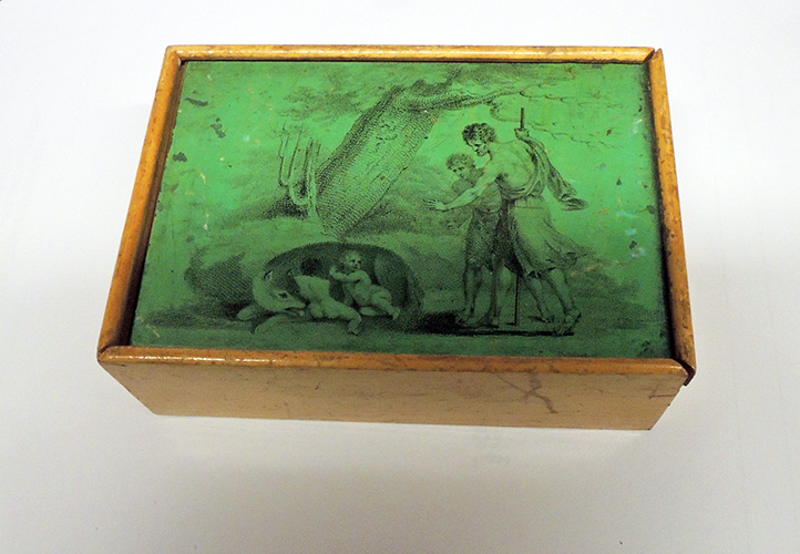
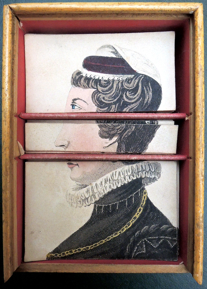
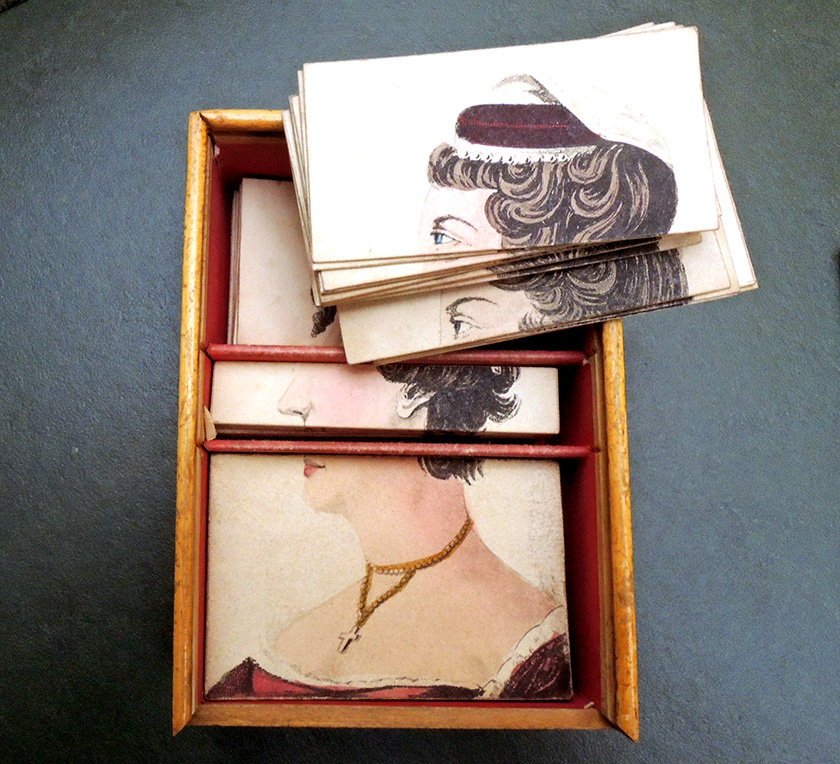
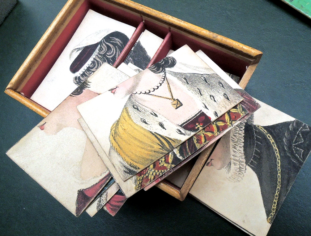
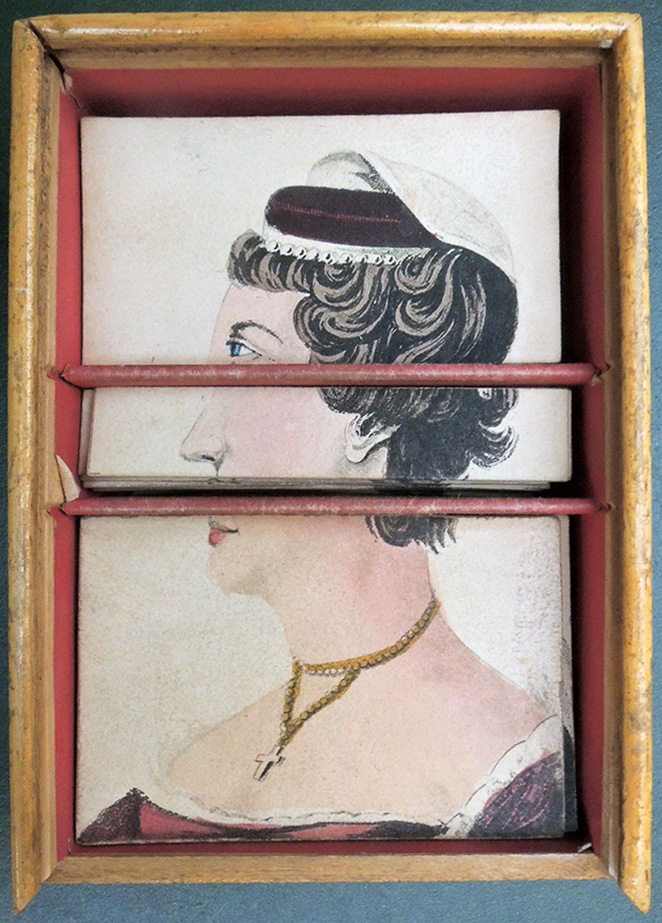
Changeable Portraits of Ladies (London: R. Ackermann, Jan. 1, 1819). Graphic Arts Collection GAX 2020- in process

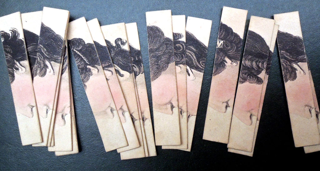
Followed rapidly by ‘Chageable Ladies’ (1819), the Changeable Gentleman’ novelty was introduced by Rudolph Ackermann in London in 1818. It consisted of a set of caricature-profile cards … in which each picture is horizontally cut into three divisions corresponding, roughly, to hair, forehead, and eyes in the top portion; nose and ear in the narrower middle part; and mouth, chin, and neck in the lower part. The divisions allow productions of an infinite variety of faces. The cards are presented in wooden slide-top boxes … each having wooden dividers to separate upper, middle, and lower sections.–Michael Twyman, Encyclopedia of Ephemera

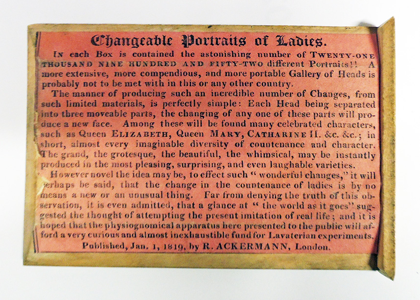
This clever variation on a transformation or metamorphosis game involves a series of 28 hand colored aquatint portraits, each cut into three sections arranged in a treen or a small wooden box with three compartments and a sliding lid. According to the instructions (under the lid) this toy permits the possibility of twenty-one thousand nine hundred and fifty-two different permutations.

“Each Head being separated into three moveable parts, the changing of any one of these parts will produce a new face including many celebrated characters, such as Queen Elizabeth, Queen Mary, Catherine II, &c. &c.; in short, almost every imaginable diversity of countenance and character. the grand, the grotesque, the beautiful, the whimsical, may be instantly produced in the most pleasing, surprising, and even laughable varieties.”


The instructions further note “it is hoped that the physiognomical apparatus here presented to the public will afford a very curious and almost inexhaustible fund for Lavaterian experiment.”

See also: John Ford, Rudolf Ackermann and the Regency World, 2018, p. 21.
See also: https://graphicarts.princeton.edu/2016/03/11/physogs/
and
https://graphicarts.princeton.edu/2019/03/08/jeu-dovide/

Bourne’s Views of New York 1831

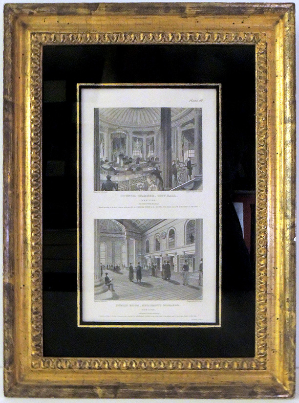
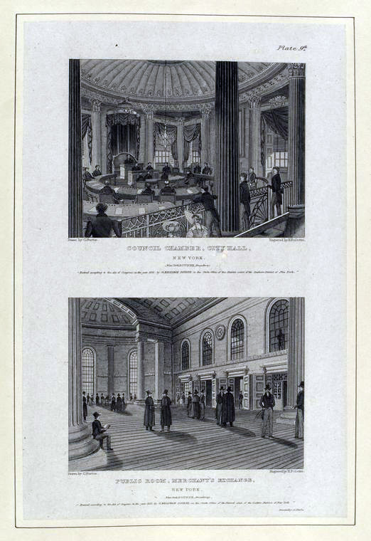
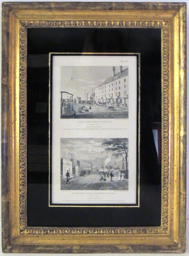
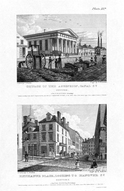
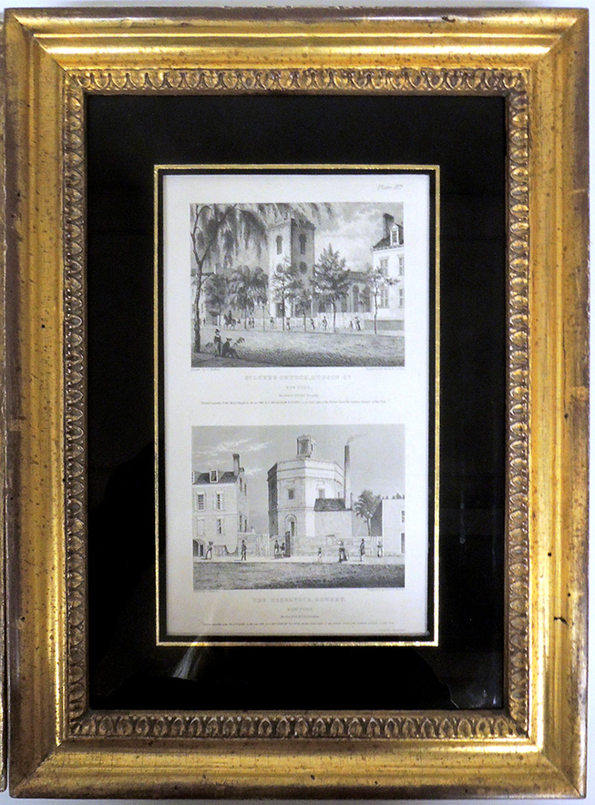
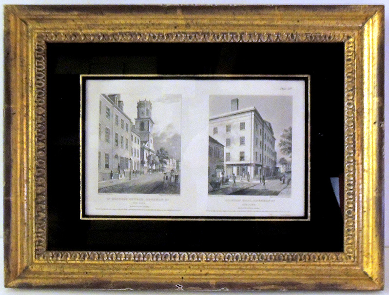
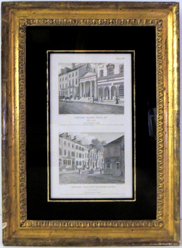
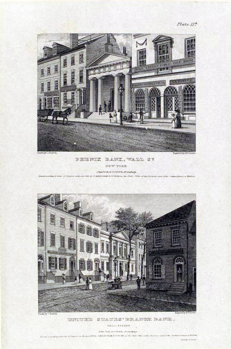
Thanks to the generous gift of Stuart P. Feld, Class of 1957, and Mrs. Feld, the Graphic Arts Collection now holds 14 engravings on 7 sheets, framed, after Charles Burton from the series Bourne’s Views of New York, first printing. The drawings were made for George Melksham Bourne, who issued the series of New York views in 1831, engraved by J. Smillie, Archer, Gimber, H. Fossette, and others, then printed by John Neale. This first issue of the Bourne plates can be distinguished by Bourne’s imprint and copyright notice, which are removed from later issues of plates published by Disturnell. The views now at Princeton are as follows:

Plate 9: Council Chamber, City Hall [with] Public Room, Merchant’s Exchange

Plate 11: Phenix Bank, Wall St. [with] United States’ Branch Bank

Plate 12: Brooklyn Ferry, Fulton St. [with] Steam Boat Wharf, Whitehall Street

Plate 14: St. George’s Church, Beekman St. [with] Clinton Hall, Beekman St.

Plate 15: Church of the Ascension, Canal St. [with] Exchange Place Looking to Hanover St.

Plate 17: St. Luke’s Church, Hudson Street, New York [with] The Reservoir, Bowery, New York.

Plate 18: St. Patrick’s Cathedral, Mott St. [with] St. Peter’s Church, Barclay St.


According to Gloria Deak, in her Picturing America 1497-1899 “The set of engravings the George Melksham Bourne issued from his shop on Broadway near Franklin Street in 1831 is generally considered the most beautifully executed sequence of small New York views.” [Graphic Arts 2014-0771Q, p. 262]


Carl Browne’s Vote Maker [for the People’s Party] 1892

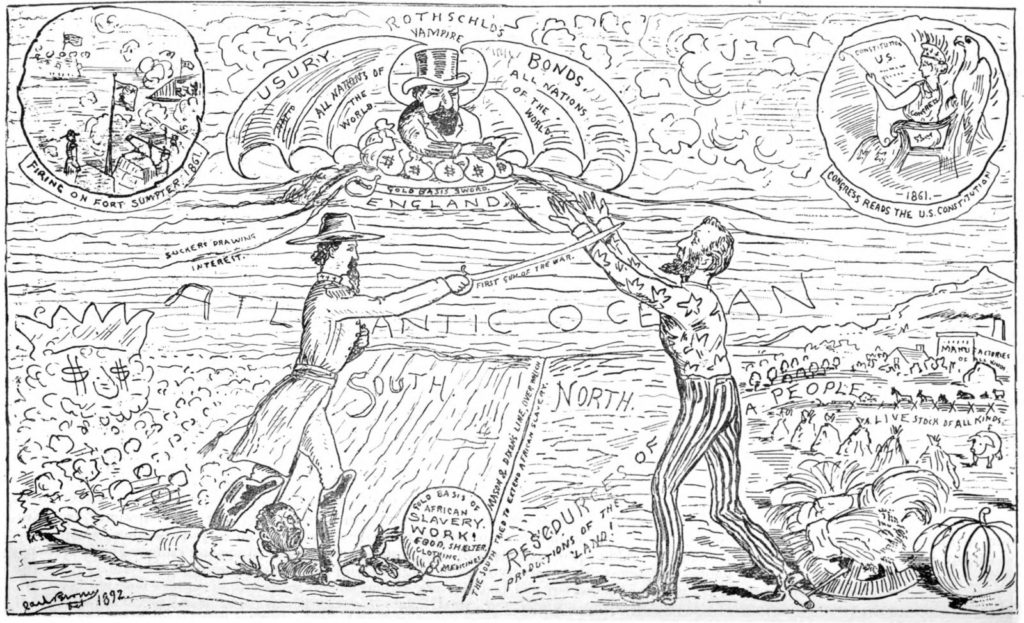
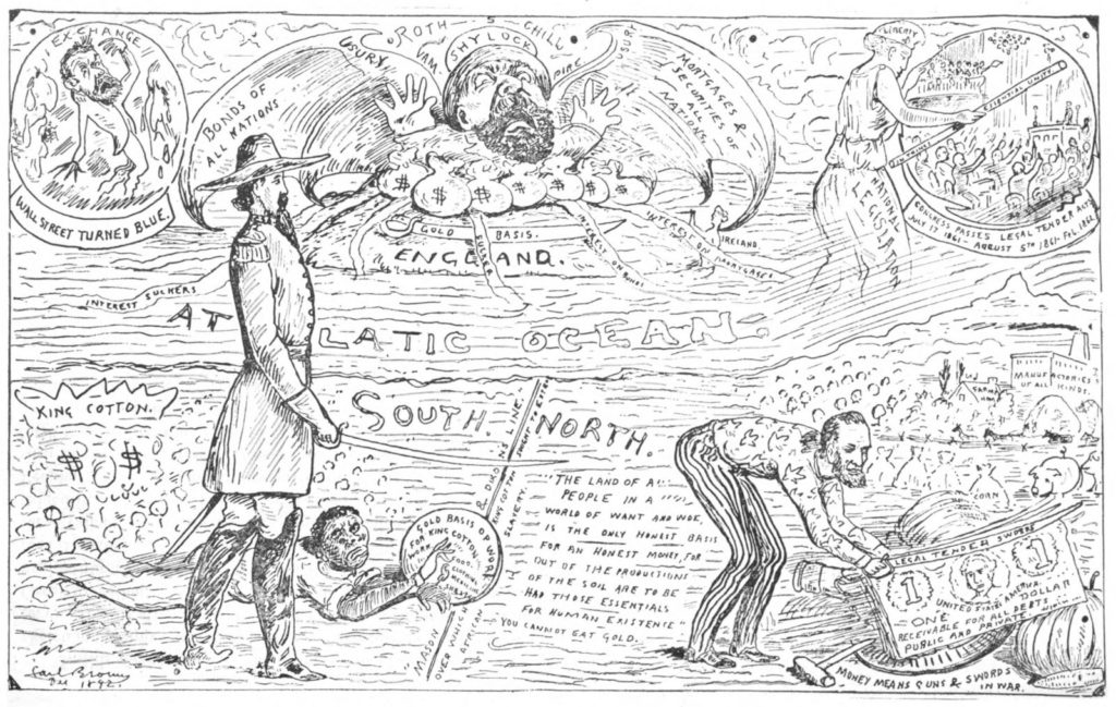
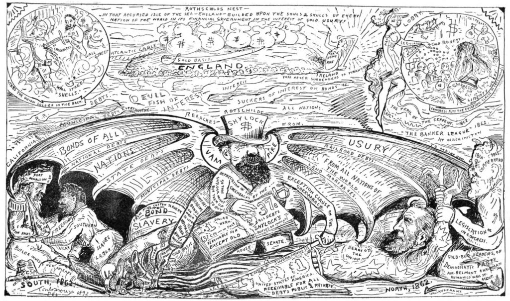
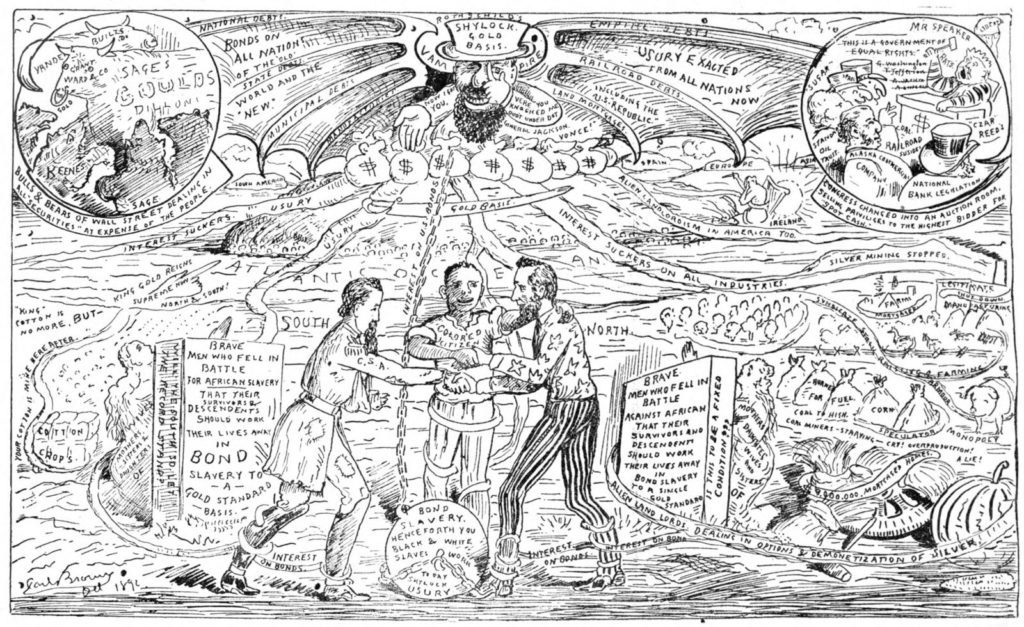
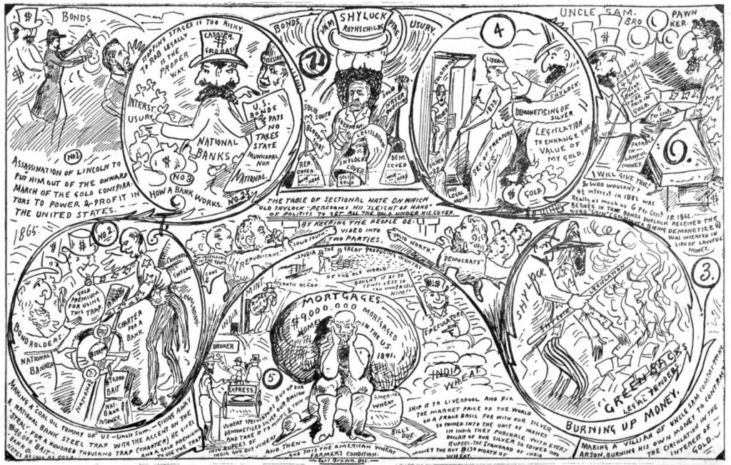
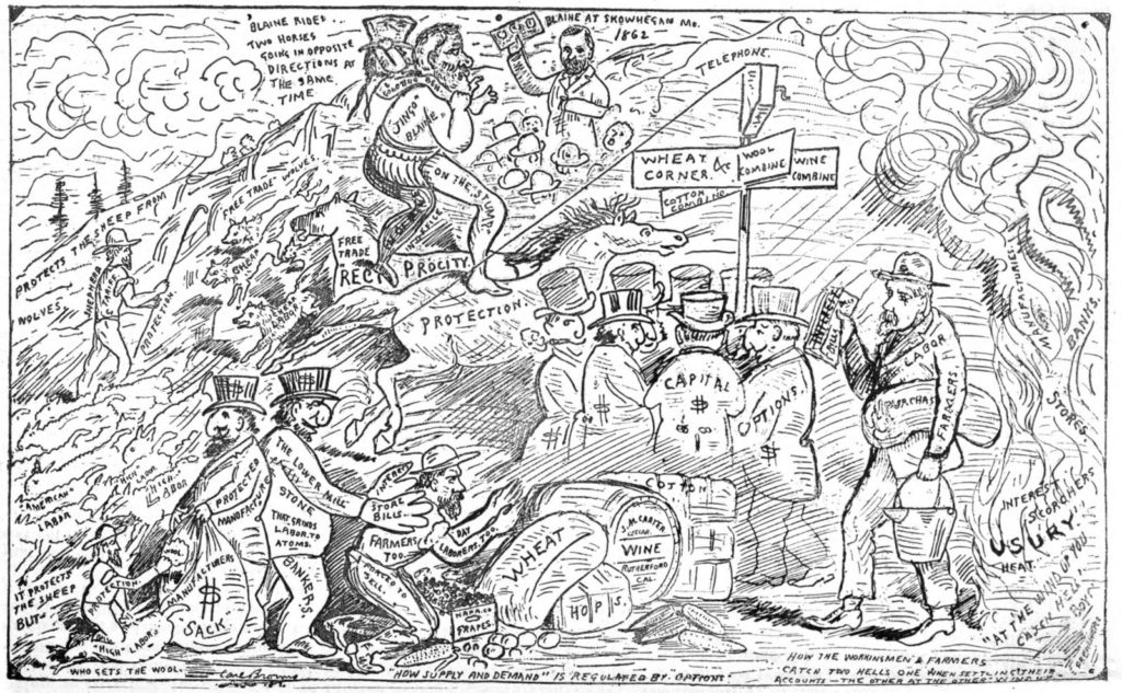
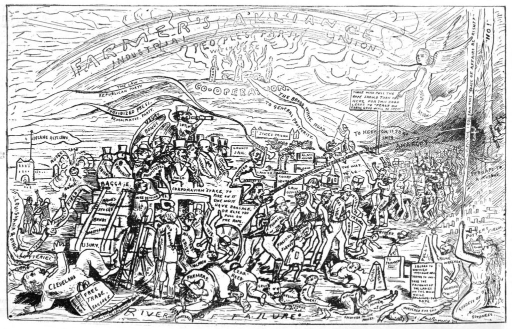
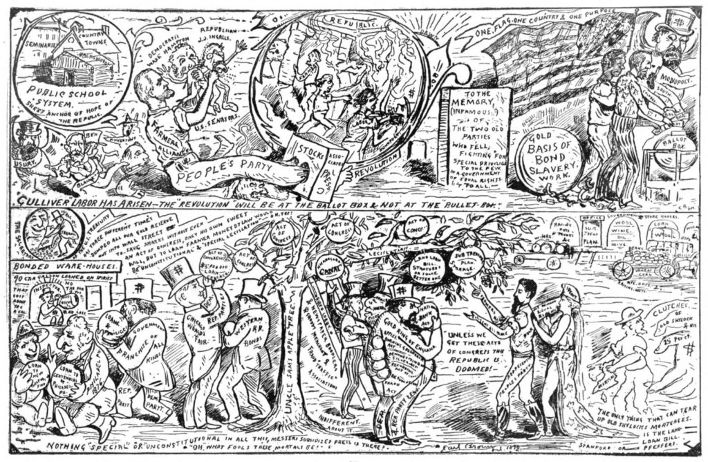
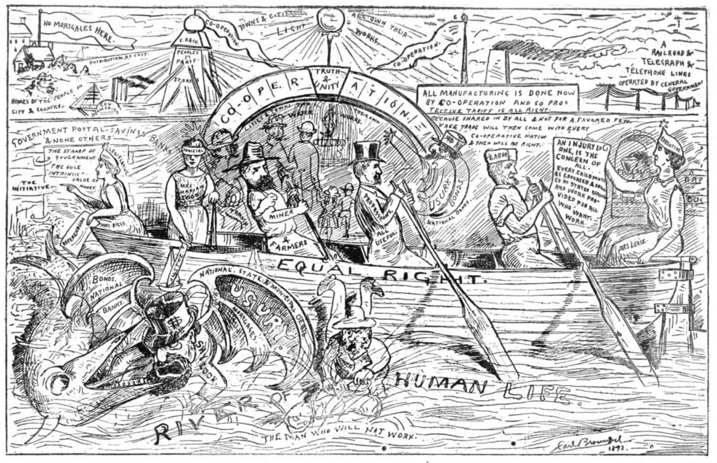
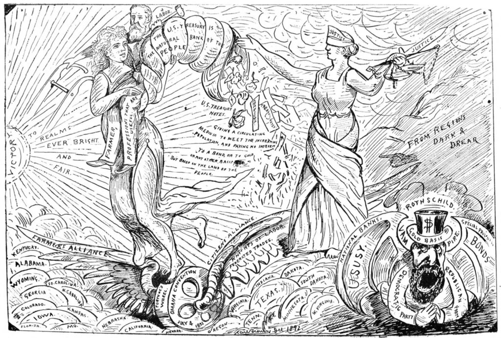
Trained as a commercial house painter, Calisthenes “Carl” Dryden Browne (1849-1914) adapted his skill with a paintbrush to produce gigantic oil paintings on popular themes, beginning in 1869 with The Lord’s Supper, followed by Yosemite Valley, the Franco-Prussian War, and other spectacles. For six months in 1886, Browne rented a San Francisco theater not far from Market Square where he exhibited a panorama entitled Battle of Gettysburg, charging a small admission fee. Although no images survive, it has been described as a series of panels that formed a circle around the audience. On various nights Browne appeared alongside the paintings to entertaining the pubic with oratory that was part history, part religion, and part his own personal mythology.

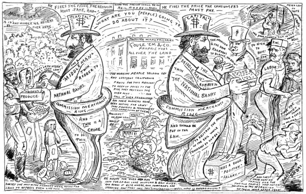
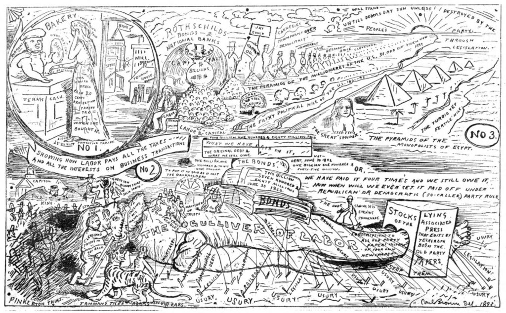
Not surprisingly, the charismatic speaker became active in politics, working for the United States Labor Party, the Workingmen’s Party, and in the spring of 1892, elected a delegate to the People’s Party convention in Omaha, Nebraska. In preparation, Browne painted 14 gigantic scenes, 7 ¼ x 14 feet each, on canvas that could be rolled and transported to the July convention where he spoke for three hours alongside his paintings, “prepared as object lessons to inform those who have not devoted time and thought to this movement of the people … the causes, aspirations and hopes of this people’s party.”

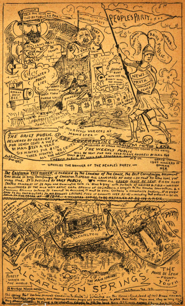
Browne was such a hit, the paintings became known as Carl Brown’s [sic] Vote Maker, and the state committee of Nebraska arranged with him to campaign throughout the state for the People’s Party ticket of James B. Weaver and James G. Field (which won the national vote in four states). The artist also made quick miniature sketches [seen here] of the paintings to be published along with his commentary. Only three copies exist today but thanks to the University of California and Hathi Trust, a digital version can be read at: https://babel.hathitrust.org/cgi/pt?id=uc1.31175035166548&view=thumb&seq=36

I will not attempt to summarize the three hour commentary but Browne ended with a brief quote from Lester C. Hubbard’s recently published The Coming Climax in the Destinies of America: “It shall be that plain of Armageddon dimly seen by ancient seers, where the brute nature and immortal soul of man close in a final contest, which shall herald the dawning of the era of love and tenderness when nations shall know the fatherhood of God and live the brotherhood of man. This was the prayer made by Him of many sorrows when dying on Calvary’s cross, and at last it shall come true, for the everlasting God hath so ordained it.”

Imagine these 14 feet long and brightly painted.

How to color a hyacinth


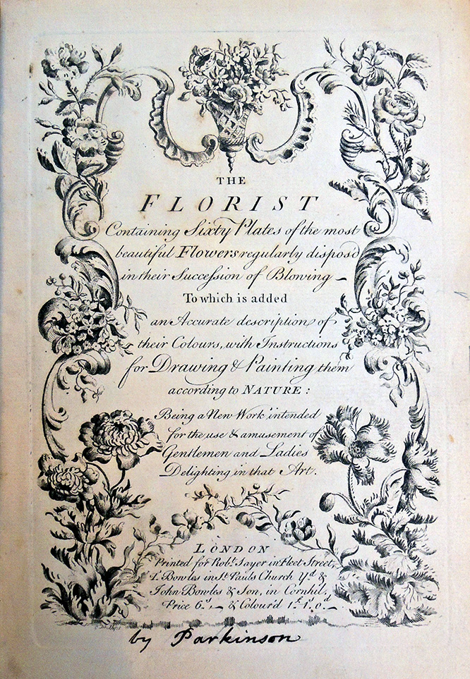
The Florist. Containing Sixty Plates of the Most Beautiful Flowers Regularly Dispos’d in Their Succession of Blowing to Which Is Added an Accurate Description of Their Colours, with Instructions for Drawing & Painting Them According to Nature: Being a New Work Intended for the Use & Amusement of Gentlemen and Ladies Delighting in That Art (London: Robert Sayer and Thomas Bowles, ca. 1760). Graphic Arts Collection GAX 2019- in process.

Provenance: Thomas Baskerfeild (1752-1816), a wealthy artist from Bedforshire who lived on the profits his father made as a drysalter (“a dealer in chemical products, dyes, etc. or, formerly, in dried or salted foods”) in partnership with Sir Richard Glyn in Hatton Garden. His library was sold by Sotheby’s in a sale that lasted seven days beginning November 13, 1817, and raised a total of £1426.


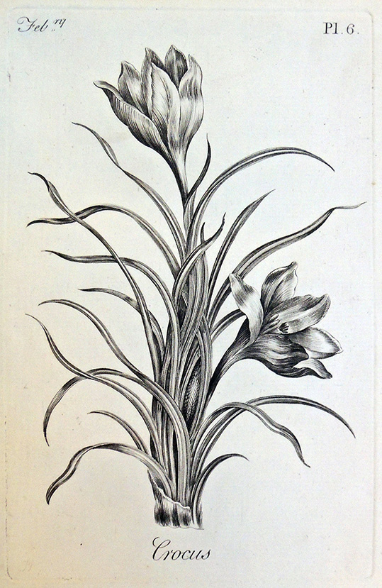
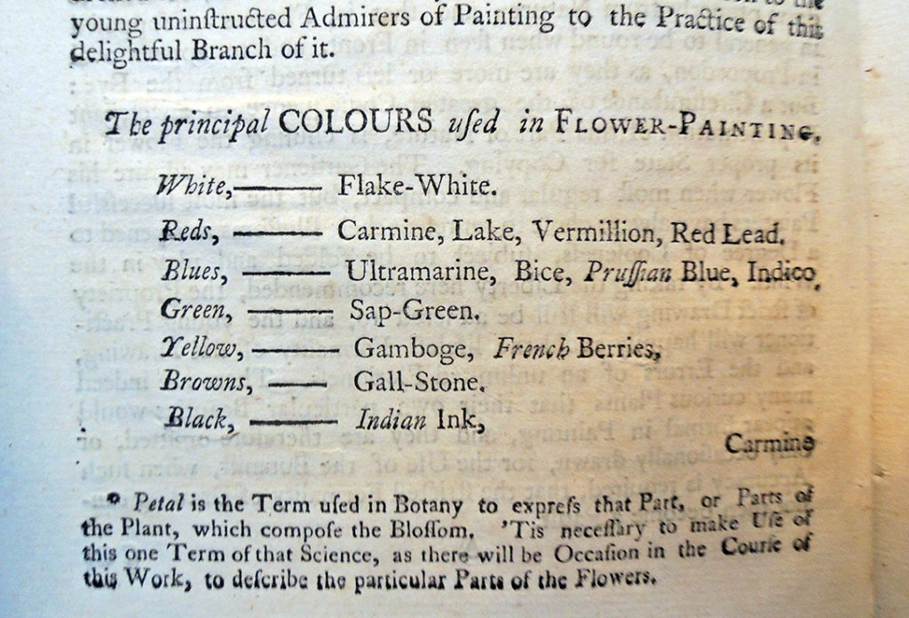
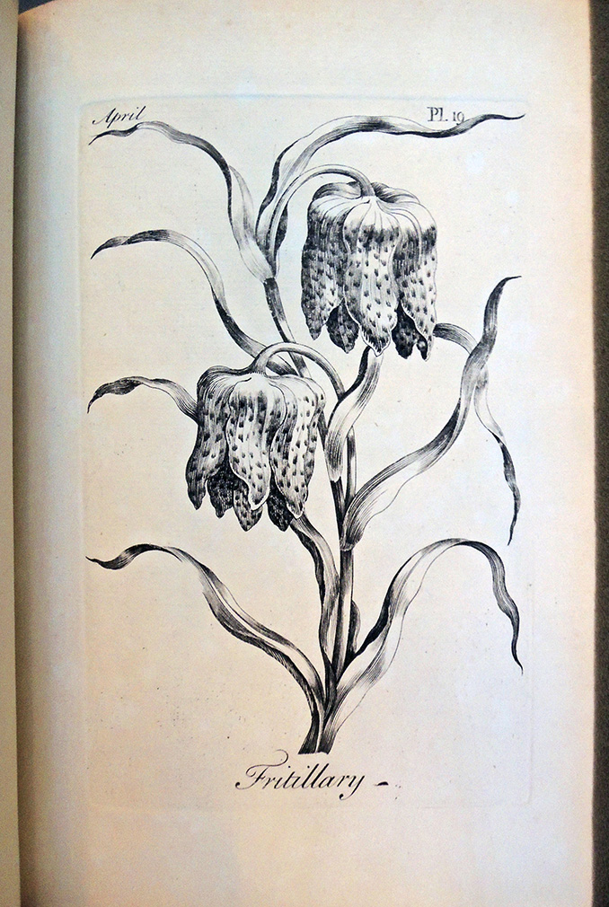
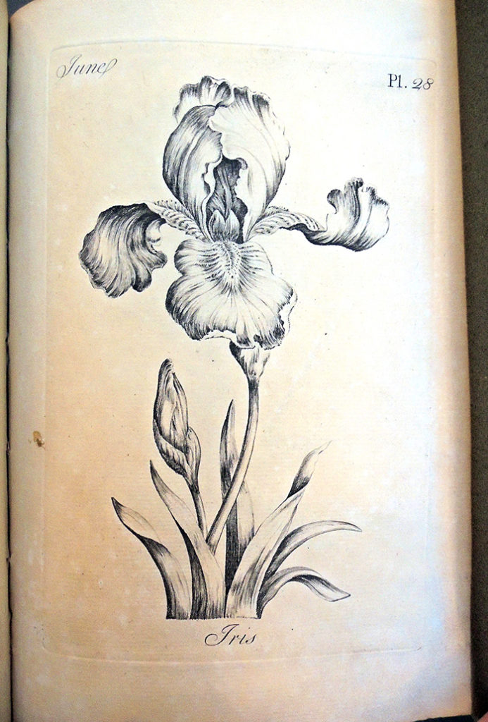
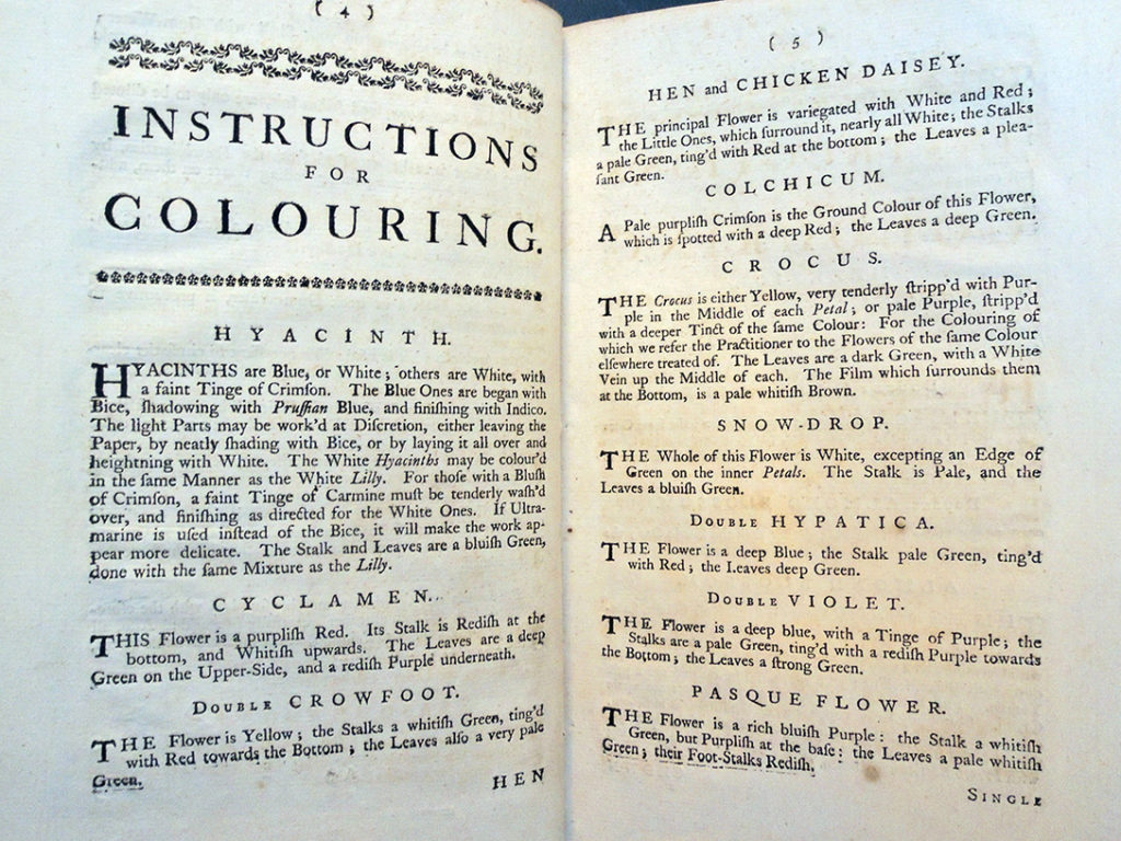
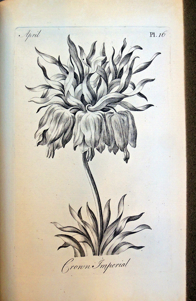
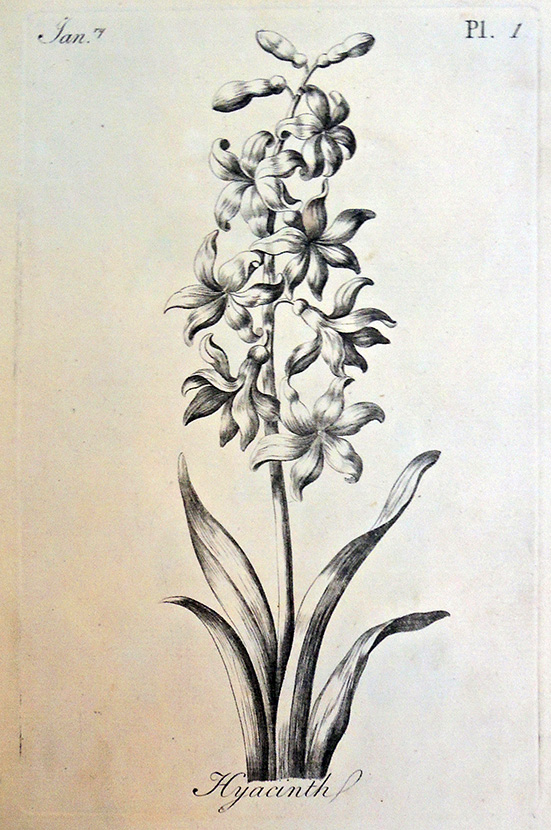
The Graphic Arts Collection has a spectacular new botanical drawing book, one of the first painting manuals designed for adult use. Published by Robert Sayer (1725-1794) in collaboration with Thomas, Robert,  and Carington Bowles, the work includes a suite of 60 plates depicting specific flowers, together with detailed instructions on how to color each one. The principal colors are listed in the introductory text [above], all of which could be obtained from the publisher: “Ladies and Gentlemen may be supply’d with the aforemention’d Colours, and all other, carefully prepar’d: Also, all Materials for Drawing and Painting, at the most reasonable Rates, by the Publisher of this Work” (p. 3). Specific instructions for coloring each flower are then given, with information on the particular recommended colors.


This edition is dated to ca. 1760 because of the “John Bowles and Son” in the imprint, since the family worked under this name from 1753 until 1764. In Blanche Henrey’s British botanical and horticultural literature before 1800 (Reference Collection Z5352 .H45), he notes three editions using the same plates and title-page, with the major difference between the first two being the numbering of the text section as pp. 61-76 rather than pp. [1]-16, as here. Henrey’s third edition includes the name of Jonathan Bennett in the imprint. Both text and plates were later copied and published under the title Bowles’ Florist. Henrey notes only seeing one copy of each of the editions mentioned, two copies black and white and the copy noted for the present edition being the only colored one (at CKC). “The compiler has, so far, seen only one copy of this edition [no. 709, the Bennett edition] of The Florist. It is in the Lindley Library, R.H.S. and the plates are uncoloured. According to a statement on the title-page coloured copies were also obtainable.” As shown here, Princeton’s book is uncolored.


Another edition not mentioned in Henrey has the imprint “Sold by I. Smith, at Hogarth’s Head, Cheapside, London” (OCLC lists Wellcome only). As well as the entries in OCLC and ESTC, Yale Center for British Art has two copies, one of which is colored, and Virginia’s Oak Spring Garden Library also has a copy.


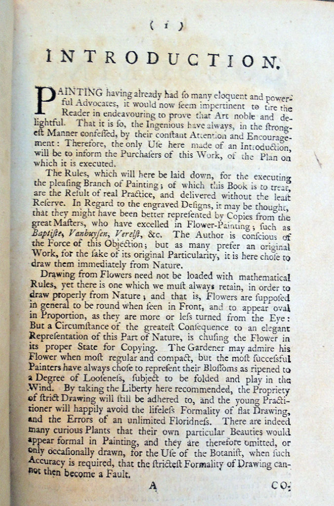
“Painting having already had so many eloquent and powerful advocates, it would now seem impertinent to tire the Reader in endeavouring to prove that Art noble and delightful. That it is so, the ingenious have always in the strongest manner confessed by their constant attention and encouragement: therefore, the only use here made of an introduction will be to inform the purchasers of this work, of the plan on which it is executed.”

Mélodies illustrées 1892-1893

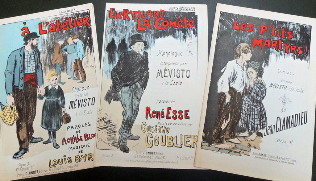
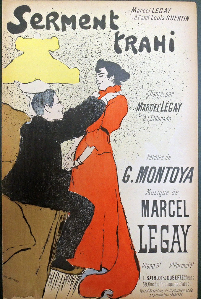
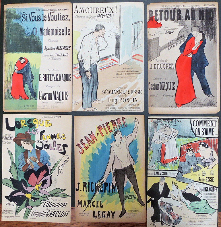
Henri Gabriel Ibels (1867-1936); Théophile Alexandre Steinlen (1859-1923); Georges De Feure (1868-1928); Adolphe Willette (1857-1926); and Georges Auriol (1863-ca.1938), Mélodies Illustrées. 1892-1893. Lithographic and gillotage illustrated sheet music. Graphic Arts Collection GAX 2019- in process.

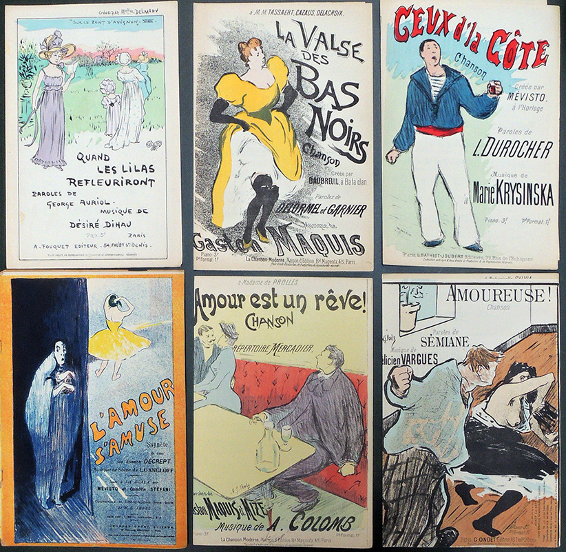
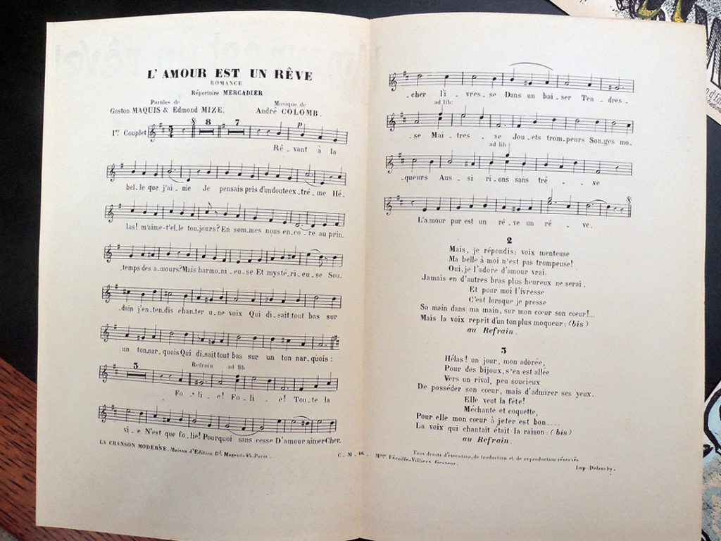
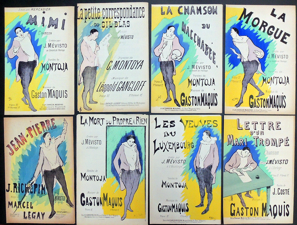
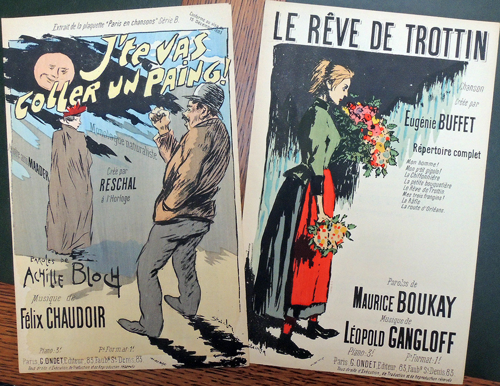
A spectacular collection of French illustrated sheet music is now available in the Graphic Arts Collection: 46 with covers designed by H. G Ibels (43 in color and 3 in black and white); 33 by T. A. Steinlen (25 in color and 8 black and white); 4 in black and white by or after Adolphe Willette; 2 in color by G. De Feure, and 1 with a color cover after G. Auriol. Some covers are reproduced by lithography and some by gillotage (a relief process made by transferring a lithographic image to a metal plate).


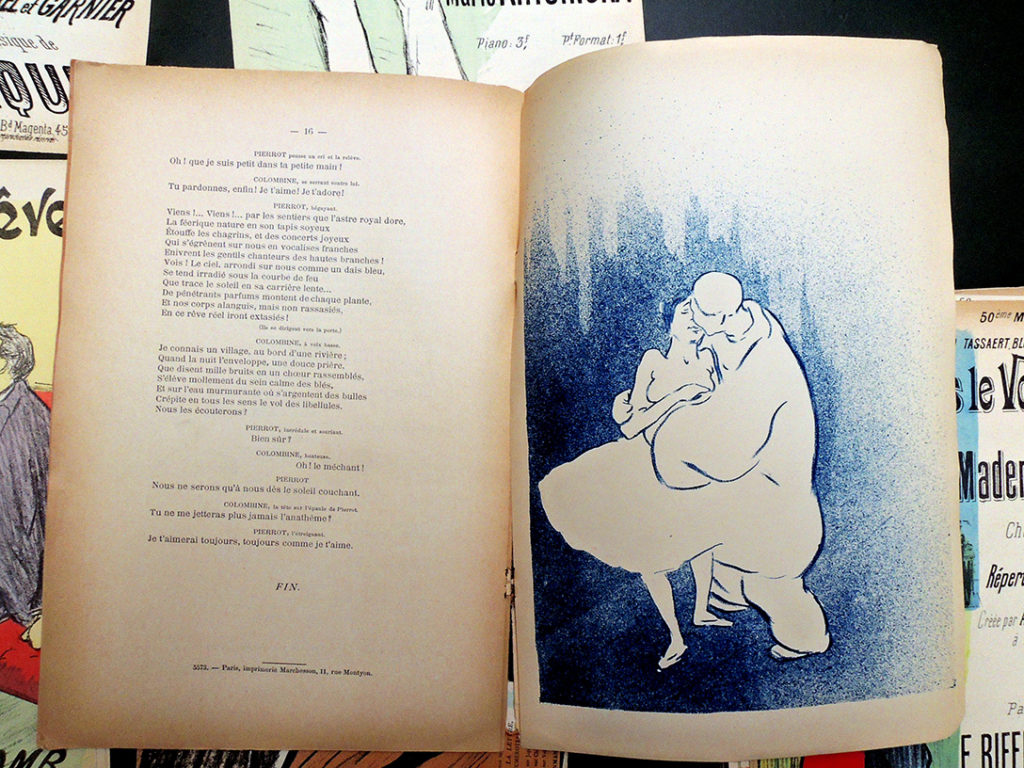
In addition, this group includes the play L’amour S’amuse by Etienne Decrept (sayings in verse performed at La Scala by Mévisto & Camille Stéfani) illustrated by Ibels with five color lithographs and published by Georges Ondet in 1892 [above].

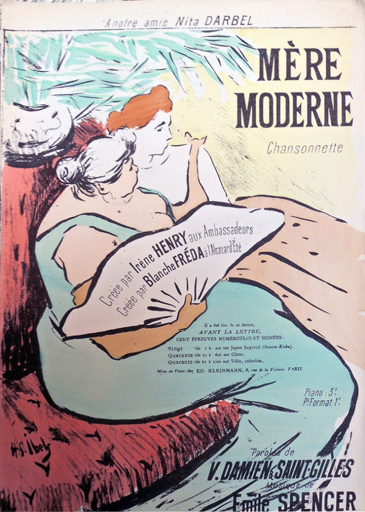
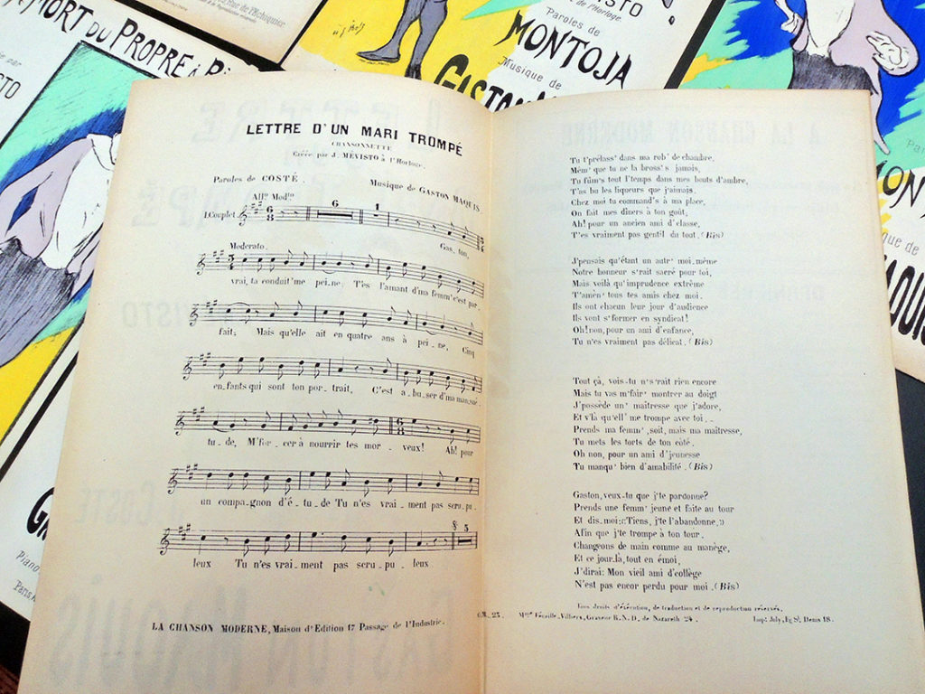
Parisian theater programs, posters, and sheet music designed by leading French artists were preserved by a limited audience of collectors and aficionados, making these fragile sheets rare in libraries and archives today. While Graphic Arts collects them for the cover, listing them by artist, they also preserve the popular music and lyrics of the period so important to the café-concert culture. A good example is [below] the sheet music for Mère moderne by V. Damiens, Saint-Gilles, and Emile Spencer, performed by Irène Henry and Blanche Fréda (with a cover by Ibels).


Particularly interesting is a series of French songs performed by Julies Mévisto (Mevisto the Elder, 1857-1918), many written by Montojay and Gaston Maquis, designed by Ibels with a Pierrot character on the cover.

Ibels’ first public success came from his 1892 poster of the popular singer Jules Mévisto, for whom he also lithographed his first sheet-music covers, published by Ondet in the early 1895. Mévisto was one of a growing number of singers who interpreted the repertoire of the Montmartre chansonnier-poètes in both the cabarets and in the more lucrative café-concerts. Mévisto had a distinctive stage personality; he dramatized the lyrics he sang with the exaggerated gestures of pantomime and affected different “voices” for the various characters in his songs. Hence, many of Ibels’ cover illustrations for Mévisto focus on the image of the singer himself rather than on the lyrics.–Gale B. Murray, “Music illustration in the circle of Bonnard,” Prints Abound, Paris in the 1890s (National Gallery of Art, 2000). Marquand Library Oversize NE649.P3 C37 2000q


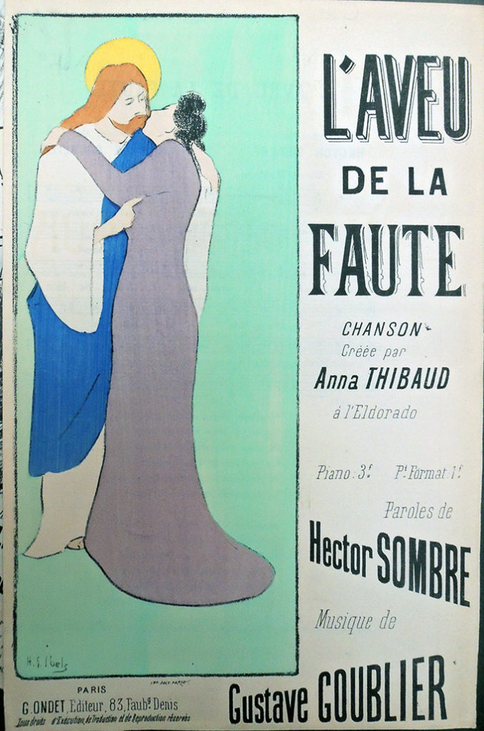
Confession of a Mistake sung by Anna Thibaud (1861-1948) , words by Hector Sombre (died 1894), music by Gustave Goublier (pseudonym for Gustave Conin 1856-1926).

Titles by cover artist:
Georges Auriol, Quand Les Lilas Refleuriront.

Georges De Feure, Ménage D’artiste; and Lorsque Les Femmes Sont Jolies.

H.G. Ibels, L’amour Est Un Rêve; Ceux D’la Côte; Jean-Pierre; Retour Au Nid; La Valse Des Bas Noirs; Si Vous Le Vouliez, O Mademoiselle; Amoureuse!; Serment Trahi; Amoureux!; Aubade À La Lune; Comment On S’aime…; Cœur Meurtri; Elle, Cantique D’amour Dit Par J. Mévisto À L’horloge; Femme Honnête; La Chanson Du Macchabée; La Fin D’une Bordée; La Morgue; La Mort Du Propre À Rien; La Petite Correspondance Du Gil-Blas; La Valse Des Cotillons; L’aveu De La Faute; La Rose Et Pierrot; Restons Chez Nous; Pierrot Médecin; Pauvres Hommes, Si L’on Voulait!; Mimi, Chanson Créée Par J. Mévisto; Mes Moutons; Mère Moderne; Mensonges, Romance Répertoire Mercadier; Lettre D’amour; Lettre D’un Mari Trompé, Chanson Créée Par J. Mévisto; Les Veuves Du Luxembourg, Créée Par J. Mévisto; Les Pousse-Caillou; Les Petites Mères; Les Mal Tournés, Chanson Créée Par Mévisto; Les Malchanceux, Créée Par Mévisto; Les Culs-Terreux, Poésie De René Esse; Les Camarades; Les Bibis; Le Pitre; Le Pardon; Le 27, Poésie De René Esse; La Mort Des Gueux; La Danse Des Ventres; and La Chanson Du Rouet.

T.A. Steinlen: Chanson Des Conscrits, Créée Par Caudieux; Boul’vard Des Capucines; Au Quartier Bréda; Du Mouron Pour Les P’tits Oiseaux; A L’atelier; J’te Vas Coller Un Paing!; Et Voilà Pourquoi Madeleine…; En R’filant La Comète; Député!; L’heureux Dragon; L’aiguilleur; La Chanson De La Vie; La Toussaint Héroïque; La Râfle; La Pécheresse; Mon Homme!; Mon Tra Déri Tra; Maman, Conte Pour Noël; Lettre D’un Gréviste; Les Suiveurs; Les P’tits Martyrs!; Les Omnibus; Le Rêve De Trottin; Le Bataillon De Cythère; Le Bouton De Chemise; Les Rouleux; Quand Tu Feras Un Gosse; Regrets À Ninon; Sur L’eau; Vierge À Vendre, Monologue De Ch. Aubert; L’aveu De La Faute; La Marche De La Garde; and La Joueuse D’orgue.

A. Willette: Le Baiser; Tout Simplement…; Ohé ! Les Mœurs.. ; and Les Enfants & Les Mères.


Henry Martin’s Spots

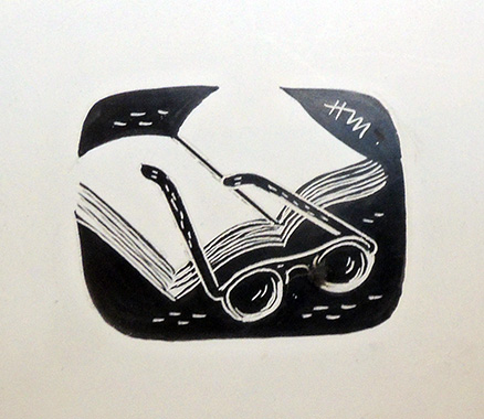
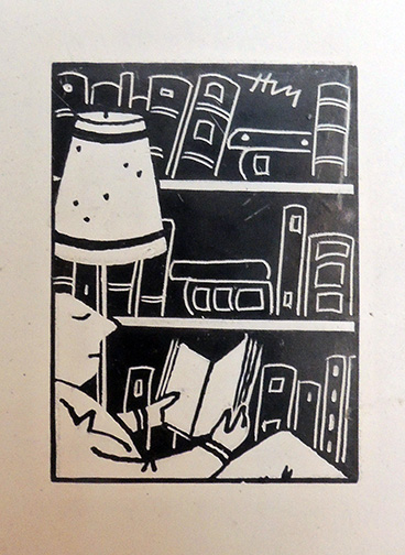
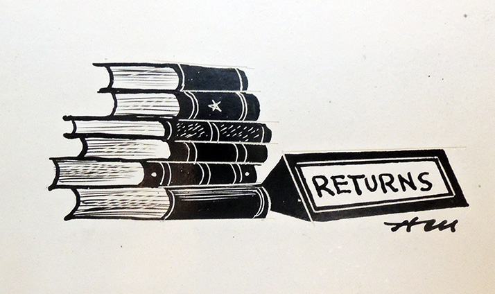
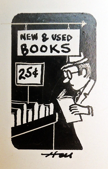
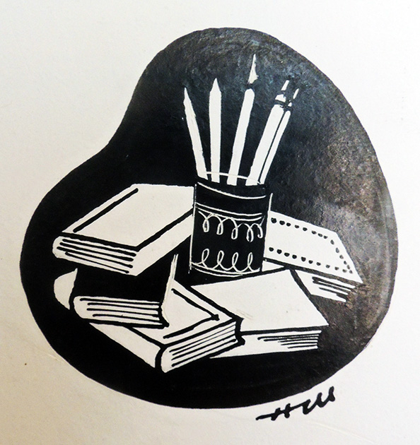
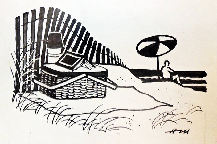
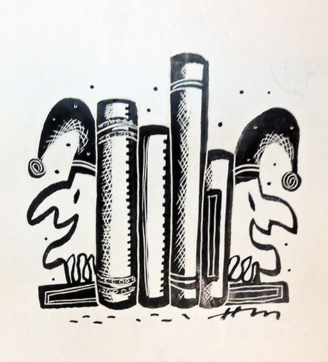
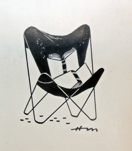
What do you picture when you hear the word “book”? Henry Martin pictured hundreds of iconic images, which he delivered weekly to the offices of the New Yorker over dozens of years.


As various archives are making big news this week, our archive of Henry Martin’s drawings sits quietly in the vault, no salacious letters to uncover or celebrity photos. Martin, class of 1948, worked as a cartoonist and illustrator for more than forty-five years, publishing in the New Yorker, Ladies’ Home Journal, Saturday Evening Post, and many other magazines. He also had a single-panel comic strip, “Good News/Bad News,” which was nationally syndicated.

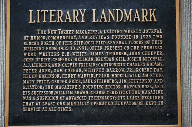
Martin had his first drawing accepted at the New Yorker in April 1950, ten years before his first cartoon was accepted. The drawing was a “spot,” one of the tiny iconographic images that appear throughout the magazine. Many artists began this way, including his colleague Peter Arno, whose biography notes: “The first ever New Yorker spot drawing appeared on page three of the first issue—the template for one kind of spot that continued to appear in the magazine until 2005. The drawing, a rectangle at the bottom of the middle column on the Talk of the Town page, was unsigned and had the appearance of a woodcarving.”–Michael Maslin, Peter Arno (2016).

See Martin listed, alphabetically, with other celebrated cartoonists.


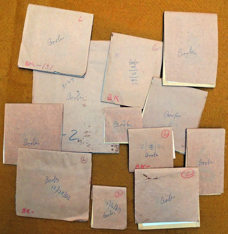
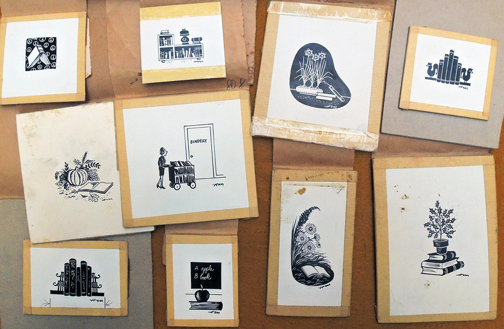
It is these drawings or “spots,” for which Martin is best represented in the magazine. A search of the New Yorker’s cartoon database reveals 188 cartoons while our archive of Martin’s drawings shows he made over 1,000 spots. “Books” is just one set from a series of boxes and envelopes. Unlike today’s New Yorker spots, there is no running gag or theme, just pure image. Here are a few more samples. Happy New Year.