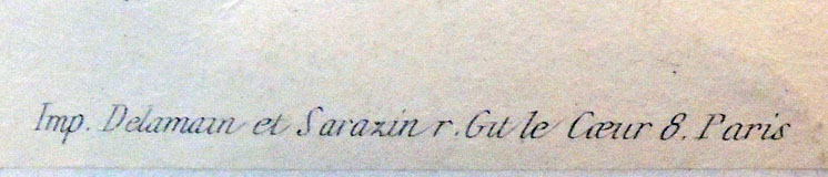
Engravings after Romeyn de Hooghe (1645-1708) and commentary by M. de Chertablon, La Manière de se bien préparer à la mort par des considérations sur la Cène, la Passion et la Mort de Jésus-Christ, (How to Prepare Oneself Well for Death by Contemplating the Last Supper, the Passion and the Death of Christ), avec de très belles estampes emblématiques, expliquées par M. de Chertablon (Anvers [probably Amsterdam]: George Gallet, 1700). Graphic Arts Collection GAX 2018- in process

In 1673, a series of engravings were commissioned from Romeyn de Hooghe for David de la Vigne’s Miroir de la bonne mort. Since then various editions have been published with extended and translated commentaries, and in some cases, new plates re-engraved by unidentified artists. We know the engravings for the 1700 volume, recently acquired by the Graphic Arts Collection, are after de Hooghe and not by him, since they are laterally reversed from the original.
 These plates are not as crisp and clear as Hooghe’s originals. Even so, it is the edition that is in most collections and so, known to most readers.
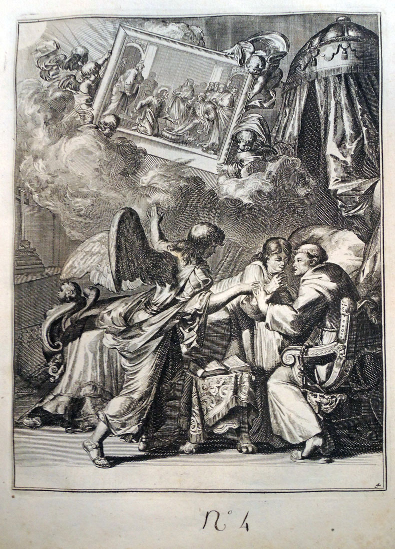
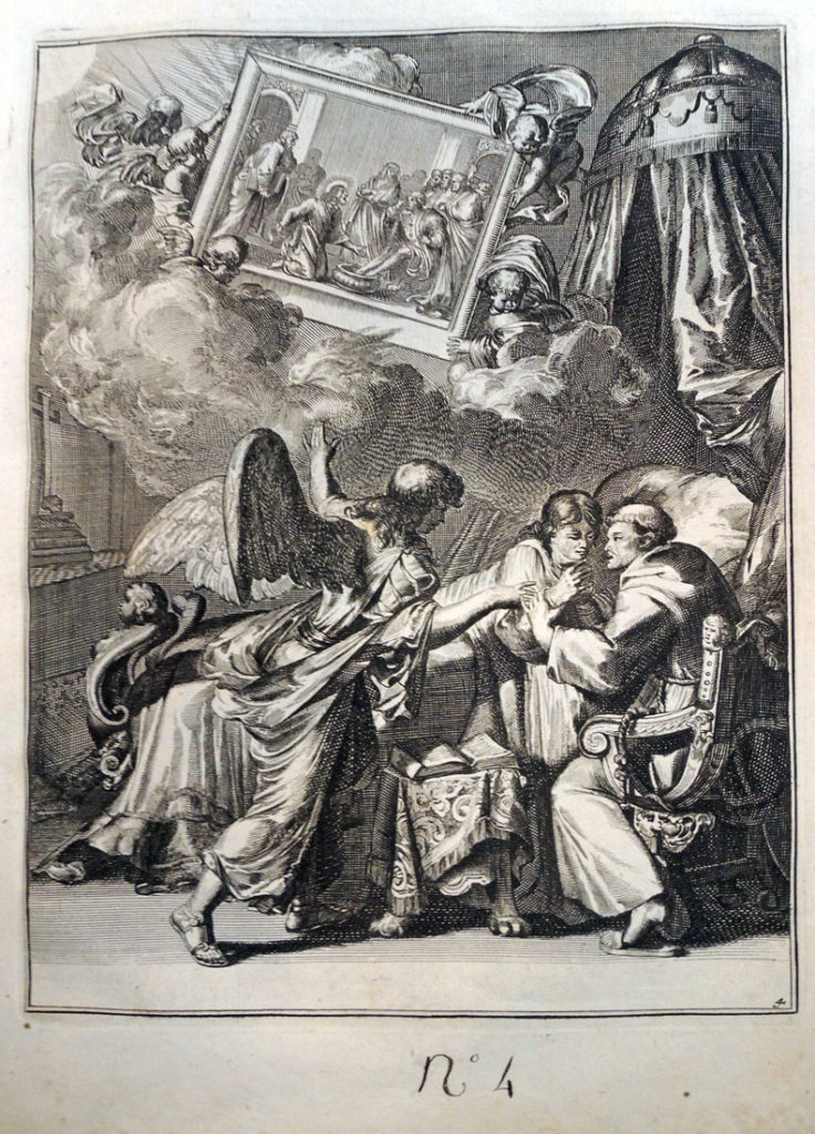
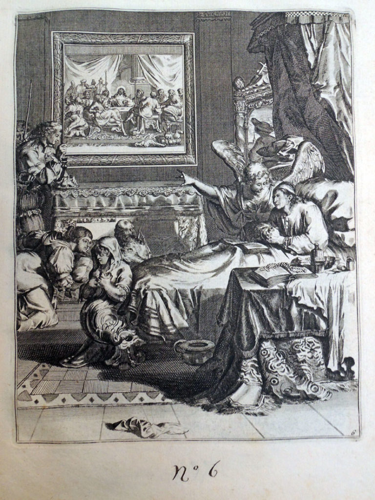
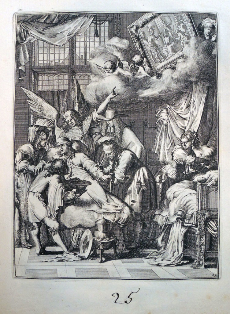
In each scene, a man is dying. An angel appears with a depiction of a biblical passage, encouraging the man to prepare for death in a Christian manner. If you look closely, you might also find a devil in the shadows, tempting the man away from the Christian path.
“In the tradition of ars moriendi that began in the sixteenth century,” writes Yuri Long at the National Gallery of Art, “this book shows the path to a good death through a series of meditations on the Last Supper, the Passion, and the death of Christ. Each print depicts a man contemplating a religious image accompanied by an appropriate verse of scripture and textual commentary. Though de Hooghe was a Protestant, this work is aimed at a Catholic audience and demonstrates his willingness to take commissions regardless of his own political or religious beliefs.” — www.nga.gov/content/ngaweb/exhibitions/2014/romeyn-de-hooghe.html
A detailed interpretation of each plate in the 1700 edition can be found at the Melbourne Prints website, where Benita Champion notes,
“Five images depict the angel accompanying the man while a devil tempts him . . . . This motif is common in ars moriendi works dating from the famous fifteenth century ars moriendi block-book, c.1414-1418. . . . The fight for the soul occurs at the moment of death (Ariès, 1981, pp. 206-208). In the above example (p. 44) the devil tempts the person to despair by showing him his sins. The angel’s response is Matthew 9:2 ‘take heart, son: your sins are forgiven.’”
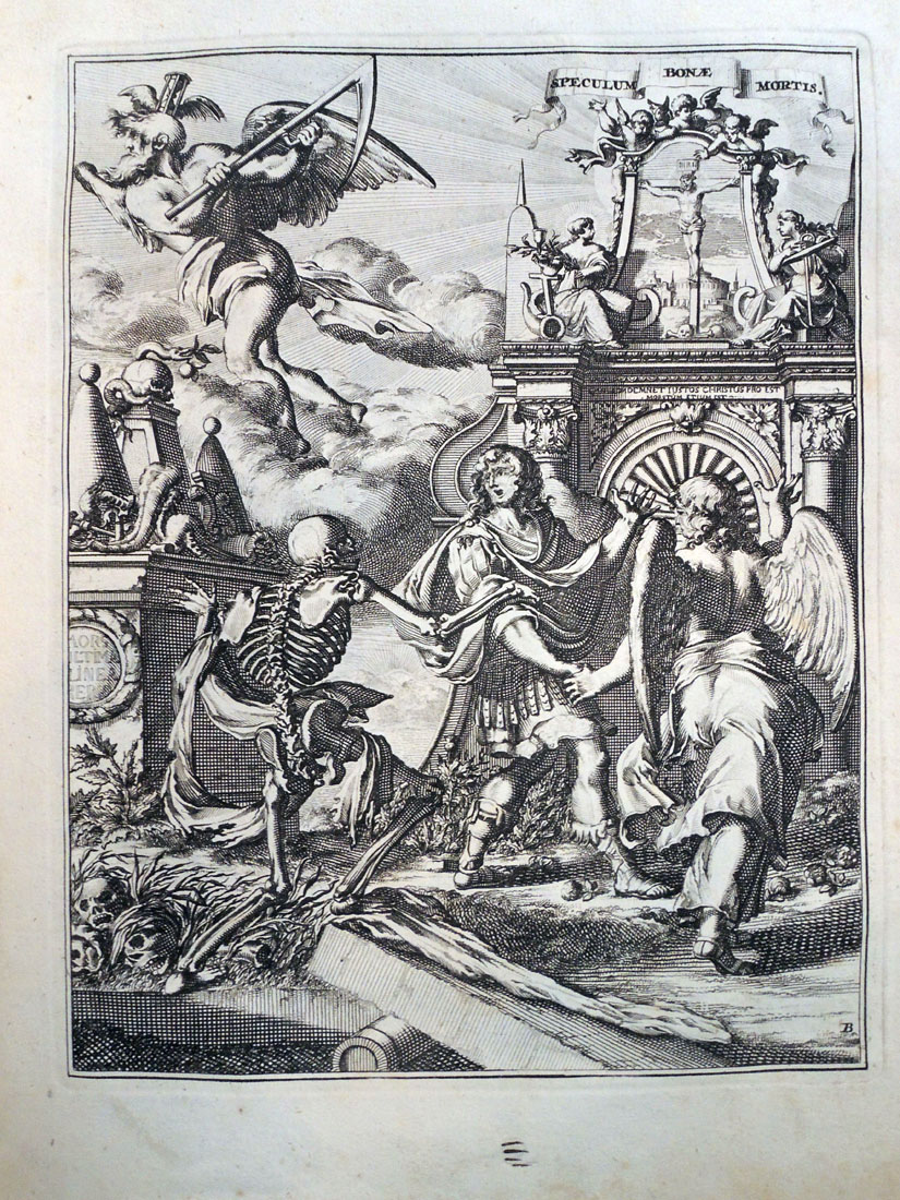
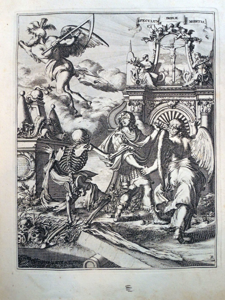
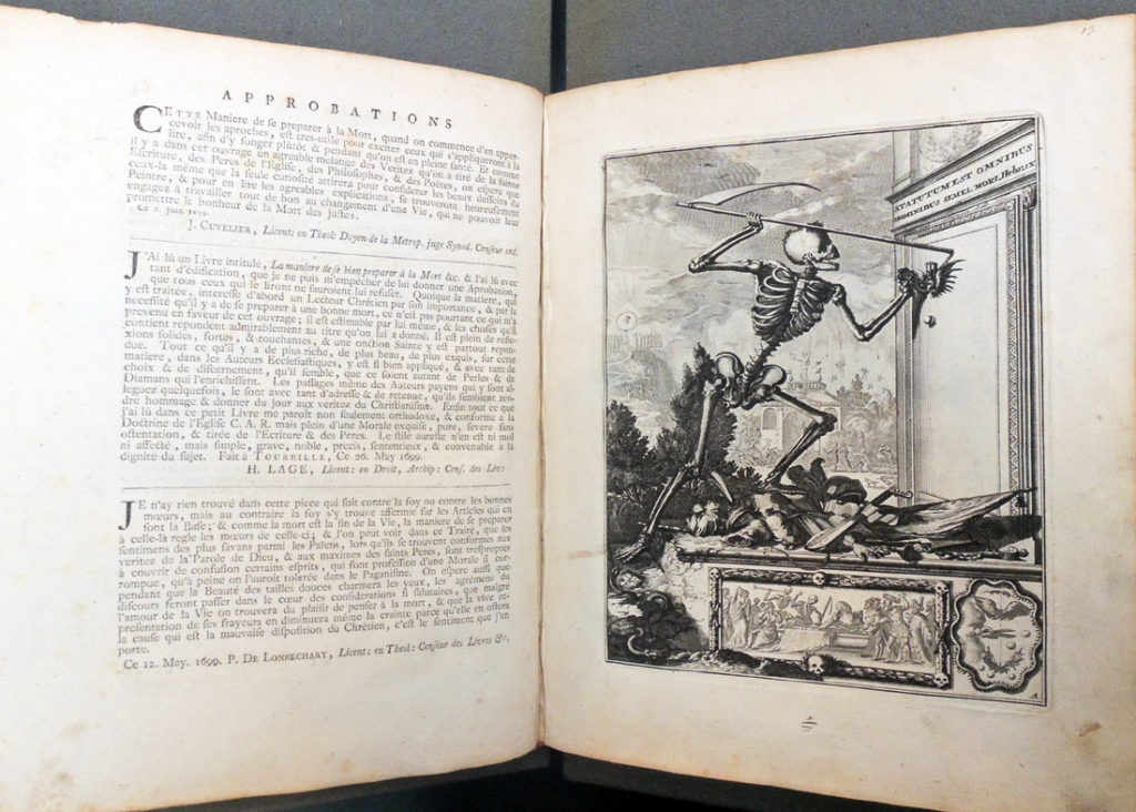
The frontispieces are more programmatic and individual. The first shows a skeleton (death) knocking at a door, holding an hourglass and scythe. Above the door is written ‘statutum est omnibus hominibus semel mori’ (‘it is appointed unto men once to die’) (Hebrews 9:27). Courtly activity fills the middle ground. To the left a man carries a cross up the hill, towards a ‘radiant pyramid’ with a serpent devouring itself (Scherer, 1973, p.8).
Below the skeleton is an entombment, with skeletons. This scene in fictive relief is framed by conventional foliage and ribbons, but also by skulls, crossbones and a decorative border in the form of vertebrae. Signs of decay abound in skulls and snakes. The road is placed behind this inevitable death. Superficially death conquers all, but the courtiers, if they follow Jesus and the cross, will come to the pyramid, signifying the ‘infinite holiness of the triune God’, with death, now rendered powerless, eating itself (Scherer, 1973, p. 8).”
See also:
Ariès, P. The Hour of our Death, trans. H Weaver, New York: Knopf, 1981.
Coppens, C. Een Ars moriendi met etsen van Romeyn de Hooghe: Verhaal van een boekillustratie, Verhandelingen van de Koninklijke Academie voor Wetenschappen, Letteren en Schone Kunsten van België, Klasse der Schone Kunsten. Brussels: AWLSK, 1995.
Landwehr, J. Romeyn De Hooghe (1645-1708) as Book Illustrator; a Bibliography. Amsterdam: Van Gendt, 1970.
Landwehr, J. Romeyn De Hooghe the Etcher; Contemporary Portrayal of Europe 1662-1707. Leiden: A. Swijthoff, 1973.
Reinis, A. “Reforming the Art of Dying: The Ars Moriendi in the German Reformation (1519-1528),” St Andrews Studies in Reformation History. Aldershot: Ashgate, 2007.
Roth, F. “Pater Abraham a Sancta Clara, 1644-1709.” Monatshefte für deutschen Unterricht 36, no. 6 (1944): 288-303.
Scherer, W. F. “Through the Looking Glass of Abraham à Sancta Clara.” MLN 85, no. 3 (1970): 374-80.

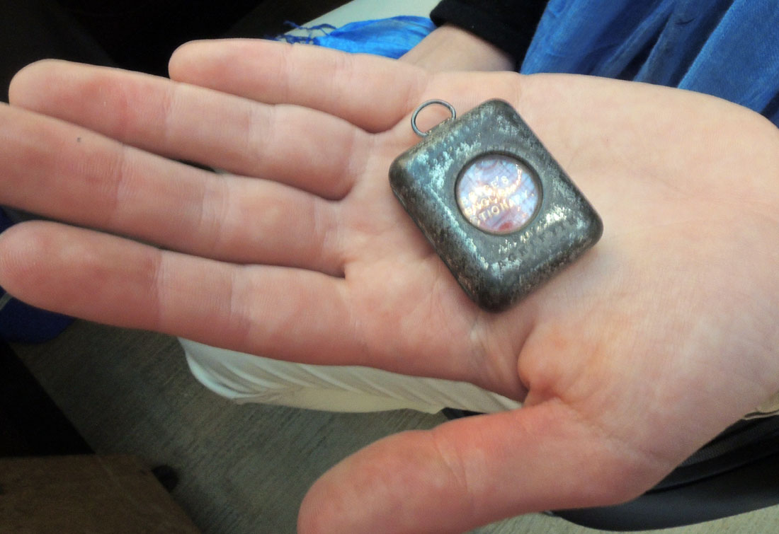 Thanks to the generous gift of Robert J. Milevski, the Graphic Arts Collection now holds “The Smallest English Dictionary in the World” (Glasgow: David Bryce and Sons, [1900]). This is an estimated date of issue, no printed date can be found in the volume.
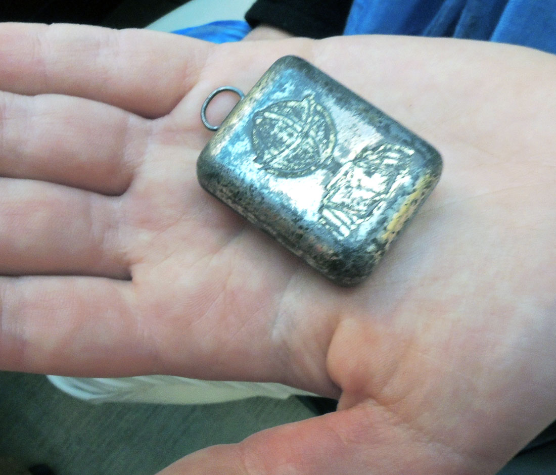
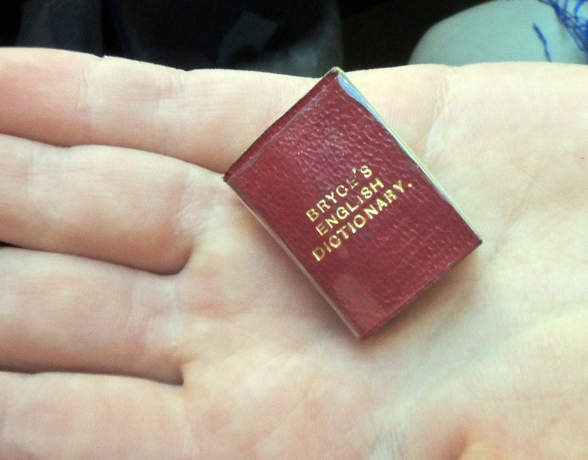
 Bryce’s English Dictionary [cover title], The smallest English dictionary in the world: comprising besides the ordinary and newest words in the language short explanations of a large number of scientific, philosophical, literary and technical terms (Glasgow: David Bryce and Sons, 1900). 384 pages; 27 mm. References: Welsh, D.V. Miniature books; no. 2408; Bondy, L.W. Miniature books; p. 106-107. Gift of Robert J. Milevski. Graphic Arts Collection GAX 2018- in process.