Author Archives: Julie Mellby

Cadet Theatricals

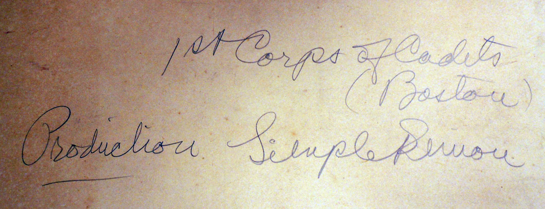
Boston’s 1st Corps of Cadets, also known as the Company of Gentlemen Cadets, was chartered in 1741 (history: http://www.afcc1741.org/). In the 1890s, William Gibbons Preston (1842-1910) was commissioned to build them an armory at the corner of Arlington Street and Columbus Avenue, financed through the Cadet Theatricals, musical performances with all-male casts.

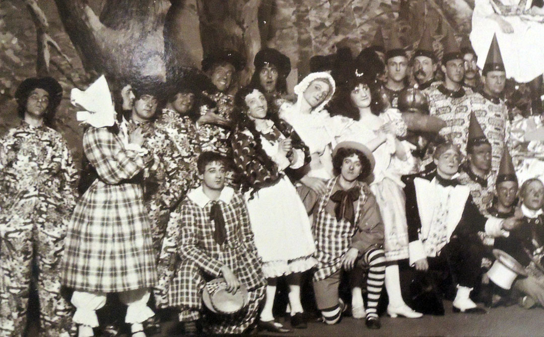
The 1897 production at the Tremont Theater was called Simple Simon, with a score by George Lowell Tracy (1855-1921) and Alfred Baldwin Sloane (1872-1926). The Boston Globe noted on January 19, 1897 that high premiums were paid for tickets.

“Society itself . . . was out in force at the Tremont theater yesterday afternoon at 1.30, when the auction sale of seats for “Simple Simon,” this year’s Cadet theatricals, opened for the first two performances . . . . There were fully 300 people in attendance, including many of the best-known professional and business men of Boston, together with a goodly sprinkling of the cadets themselves, a dozen or more speculators and quite a number of “proxies.” …The sale lasted from 1.30 o’clock to 5, when, according to the figures of manager Seymour and his associates, a total of nearly $4000 was represented for the opening night alone.”


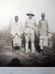
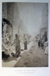
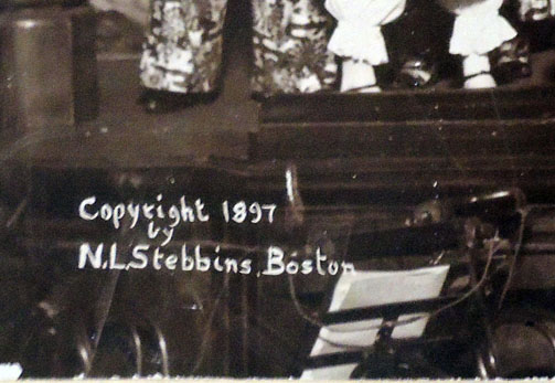
This photograph was taken by Nathaniel Livermore Stebbins (1847-1922), a member of the Boston Yacht Club and author of several books on sailing, including American and English Yachts. Illustrated by the photogravure process, plates from the Press of Lithotype Printing and Publishing Company, Gardner, Mass. (New York: Scribner’s Sons, 1887).

“Norman White, who had been active in the Pi Eta shows while at Harvard, played the lead role, making his entrance on a bicycle in a costume so loud that the orchestra cannot be heard when he has it on, and so bright that the electric lights can be turned off and no one notice it.”– Anne Alison Barnet, Extravaganza King: Robert Barnet and Boston Musical Theatre (2004).


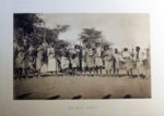
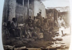
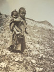
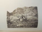
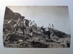
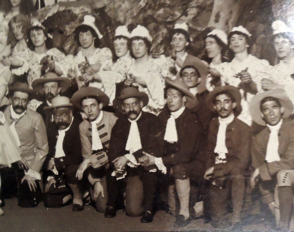
Nathaniel Livermore Stebbins (1847-1922), Simple Simon, 1897. Gelatin silver print. GA 2013.00503.
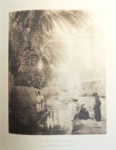
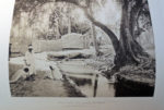
Image courtesy of the Library of Congress, Detroit Publishing Company Collection.


Testament


The Graphic Arts Collection recently acquired copy 42 of Testament, with text by Colm Tóibín and images by Rachel Whiteread, one of a limited edition of 75 published by Galleria Lorcan O’Neill in Rome. They note: “Testament is the only printed reproduction of Tóibín’s original one-woman play written for Marie Mullen and the 2011 Dublin Theatre Festival. The book’s ten unique photographs by Whiteread were made by the artist expressly for this project.”


Writing for The New York Times 11/2012, Mary Gordon called Tóibín’s play “a beautiful and daring work. Originally performed as a one-woman show in Dublin, it takes its power from the surprises of its language, its almost shocking characterization, its austere refusal of consolation. The source of this mother’s grief is as much the nature of humankind as the cruel fate of her own son. Her prayers are directed not to Yahweh but to Artemis, Greek not Jewish, chaste goddess of the hunt and of fertility, but no one’s mother. Mary’s final word on her son’s life and death is the bleak declaration: ‘It was not worth it.’”


From 2009 to 2011 Tóibín taught at Princeton University as the Leonard L. Milberg ’53 Visiting Lecturer in English and Creative Writing in the Lewis Center for the Arts. He is currently Mellon Professor in the Department of English and Comparative Literature at Columbia University and Chancellor of Liverpool University.

Rachel Whiteread: see Tate review

Colm Tóibín and Rachel Whiteread, Testament (Rome: Galleria Lorcan O’Neill, 2015). 45 pages, including 10 leaves of plates. Plates printed on double leaves. The accompanying untitled print (“an edition for Testament“), dated 2014, has been signed and numbered in pencil by Rachel Whiteread and inserted into printed folded leaf. “Designed by Peter Willberg, London; photography by Mike Bruce, London; coordinated by Laura Chiari, Susanna Greeves and Lorcan O’Neill. Images printed by Pureprint, Uckfield; binding and letterpress printing by BookWorks, London; set in Plan Grotesque and printed on Naturalis Absolute Matt”–Colophon. Graphic Arts Collection GAX 2017- in process


Photogravure of Monotype

Houses on Battery Park, 1905.

Monotypes are almost never seen in books since each individual print is unique, painted and printed directly from one wet plate. A way of getting around that is to take a photograph of the monotype and transfer it to another copperplate, which is etched and printed as a photogravure. This is what Charles Mielatz chose to do when the Society of Iconophiles requested a series of downtown Manhattan buildings for their October 1908 portfolio.

St. John’s Chapel, Varick Street, 1904.

Richard H. Lawrence, Iconophiles treasurer wrote to subscribers:

“Our process of reproduction of the monotypes is the photogravure process, but we have made plates for each separate color, some of the subjects requiring five plates, and then printed by the superimposed method. The difficulty of getting a perfect register by this method (we are obliged to wet the paper before each printing) has been so great as to make it almost impossible heretofore even with two plates, but we have succeeded with five plates and the plate mark, which really makes six separate printings for some of the subjects.

Color printing from photogravures is usually done from one plate, and the printer fills in the color on the plate, using colored inks, and then pulling one impression. But prints generally require retouching with water color, and are not, strictly speaking, entire prints, as is the work we have done for you. It seemed to us that this method would make the most perfect reproductions of your subjects, and enable us to use paper similar in character to that used in your monotypes, and we are happy to say we have met with success.”

Oyster market on West Street, 1903.

Van Cortland Manor House, 1901.


Society of Iconophiles, Picturesque New York: twelve photogravures from monotypes by C.F.W. Mielatz (New York: Society of Iconophiles, 1908). “Edition limited to one hundred sets. Published in October, 1908.” Graphic Arts RECAP-91157352

Paul Dujardin (1843-1913)

Princeton University students and researchers are fortunate to have Bernard Picart’s celebrated engravings for the nine-volume set, Ceremonies et coutumes religieuses de tous les peuples du monde, published between 1728 and 1739, freely available for study and pleasure (Ex Oversize 5017.247.11F).

Not everyone is so lucky and so in 1884, the French publisher Alfred Durlacher commissioned Paul Dujardin (1843-1913), one of the leading photomechanical printers in Paris, to make facsimile reprints of sixteen Picart engraving and released the limited edition portfolio as Scènes de la vie juive or Scenes of Jewish Life.

Dujardin used his own secret variation of heliogravure (French for photogravure) to transfer each paper print to a new copper printing plate, which was then etched and printed. Usually we think of photogravure with rich, continuous tone images and so, it is surprising to see how often it was used to reproduce line engravings.

The plates depict the life of the Portuguese and Spanish Jewish community in Amsterdam during Picart’s lifetime. The subjects are listed as: 1, Cérémonie du Schofar; 2. Office de Yom-Kippour; 3. Fête de Souccoth; 4. Procession des Palmes; 5. Office de Simhat Torah; 6. On reconduit le hatan-torah et le hatan-bereschit; 7. La recherche du levain; 8. Le Séder; 9. Cérémonie nuptiale, rite allemand; 10. Cérémonie nuptiale; 11. La circoncision; 12. Le rachat du premier né; 13. Les Iltkafoth autour du cercueil; 14. La dernière pelletée de terre; 15. Exposition de la loi; 16. Bénédiction des Cohanim.


Bernard Picart (1673-1733). Scènes de la vie juive. Dessinés d’après nature par Bernard Picart, 1663 [i.e. 1673]-1733 [Scenes of Jewish Life Drawn from Nature, by Bernard Picart, 1673-1733] (Paris: A. Durlacher, 1884). 1 portfolio ([16] plates). Graphic Arts Collection (GAX) Oversize 2007-0013E.

A Collection of Grimaces

No 38. L’Enfance no 2 [Childhood, no. 2].

Like many international print collections, Graphic Arts held a couple satirical prints after the French painter Louis-Léopold Boilly, acquired here and there over the years. One was even used at the top of this blog for a while. We have now acquired the original complete bound set of Boilly’s lithographs known as A Collection of Grimaces, including a title page and 95 prints published between 1823 and 1828.

In the Infinite Jest exhibition catalogue, Nadine Orenstein wrote:

“Long active as a genre painter and portraitist, late in his career Boilly began a series entitled Recueil de Grimaces that comprised ninety-six lithographs showing tight clusters of heads set against blank back-grounds. The first few prints were mainly studies of expression, but he soon extended the images into representations of social types ranging from beggars to art connoisseurs. These extremely successful social satires served as important sources for caricaturists of the following decades, including Honoré Daumier.” —Infinite Jest: Caricature and Satire from Leonardo to Levine (2011)

Here are a few samples:
No 39. Les Moustaches no 2 [The Whiskers, no. 2].

No 43. La Sortie d’une maison de jeu [Leaving a Gambling House].

No 84. Les Bossus [The Hunchbacks].

No 82. Les Nez longs [The Long Noses].

No 81. Les Nez ronds [The Round Noses].

No 73. Les Chantres [The Singers].

No 65. Les Cornes [The Horns].

No 61. Les Aveugles [The Blind].

No 49. Les Petits ramoneurs [The Little Chimney Sweeps].


Louis Léopold Boilly (1761–1845), Recueil de grimaces [Collection of Grimaces] (Paris: Chez Delpech, Quai Voltaire no. 23, [1823-1828]). 95 lithographs with gouache highlights. Graphic Arts Collection GAX 2017- in process. Printed and published at the shop of François-Séraphin Delpech (1778-1825).

See also: https://www.princeton.edu/~graphicarts/2007/11/the_print_shop_of_f_delpech.html

Spirited and Appropriate Illustrations by F.M. Howarth

The Graphic Arts Collection recently acquired the temperance novel Broken Fetters (1888) along with a four-page prospectus for the book. Publishers Weekly wrote, “A valuable work for those interested in temperance reform movements will be Broken Fetters, by Charles Morris, with numerous realistic and appropriate illustrations by F. M. Howarth…”–September 22, 1888. The title page called them “spirited and appropriate illustrations.”

Franklin Morris Howarth (1864–1908) was in fact not a realistic or appropriate artist but an American cartoonist, best remembered for his comic strips The Love of Lulu and Leander and Mr. E.Z. Mark.

The artist was only twenty-four when he was commissioned to illustration Morris’s temperance novel. He was not especially well-known at the time and it is odd that the illustrations of many artists are included but Howarth was the only one singled out on the title page and in the advertising. Three years later Howarth joined Puck magazine, where he gained national recognition and remained for ten years before he was persuaded to join the staff of The New York World.

An obituary for Howarth ran on September 23, 1908 in Philadelphia’s The Geneva Daily Times:

Frank M. Howarth, a widely known cartoonist, died yesterday morning at his home, 308 High street, Germantown, a suburb of this city, after suffering two weeks from double pneumonia. He was 44 [sic; he was five days short of turning 44] years old. During his early newspaper career Mr. Howarth was connected with the “Call” and “Item”, of this city. Recently he had drawn cartoons for the Chicago Tribune and had engaged in humorius [sic] colored syndicate work, his most noted series being those of “Mr. E.Z. Mark, and “Lulu and Leander.” He was the first artist who ever drew a free hand sketch of the scene of a murder for a newspaper.

Charles Morris (1833-1922), Broken Fetters. The Light of Ages on Intoxication. A Historical View of the Drinking Habits of Mankind, from the Earliest Times to the Present. Especially Devoted to the Various Temperance Reform Movements in the United States … Numerous Spirited and Appropriate Illustrations Drawn Expressly for This Work by the Celebrated Artist F. M. Howarth and Many Others… (Richmond, Va.: H.E. Grosh & Co., 1888). Graphic Arts Collection GAX 2017- in process

567 choreographed printers

For anyone who has had a printer jam just as a paper copy of something is due, you need to watch the video for OK Go’s “Obsession,” which makes use of 567 choreographed printers. The band is known for their innovative music videos and this one takes place in front of two walls of printers. An introductory note assures viewers that all paper was recycled and the proceeds given to Greenpeace.

The technical team included Daito Manabe and Rhizomatiks Research, and choreography was by Mikiko and Elevenplay. The creative agency was Six.

Last Chance to See Thomas Rowlandson Drawings

All good things must come to an end. Sooner than later if this young wife succeeds in pushing her old husband into his grave.

This is the last weekend to see our collection of Rowlandson drawings, donated in the early twentieth century by Dickson Q. Brown, Class of 1895. Brown also donated nearly two thousand Rowlandson prints and all of the artist’s illustrated books to Princeton University Library. Several books from the collection are also on view, most important The Miseries of Human Life by James Beresford (1764-1840), around which Rowlandson drew many satirical plates.

Thanks to the Princeton University Art Museum for hosting our collection through the fall: http://artmuseum.princeton.edu/object-package/miseries-human-life-and-other-amusements-drawings-thomas-rowlandson/112600


The Miseries of Human Life and Other Amusements: Drawings by Thomas Rowlandson

Africa in photogravure

Sir Alfred Edward Pease (1857-1939), Travel and Sport in Africa (London: Arthur L. Humphreys, 1902). Rare Books Off-Site Storage DT12 .P35 1902q

Princeton owns a beautiful three-volume set of Pease’s illustrated journals titled Travel and Adventure in Africa, with his personal photographs along with some by the French photographer Emile Frechon (1848-1921), the English aristocrat Sir Edmund Giles Loder, 2nd Baronet (1849-1920), and the environmentalist Edward North Buxton (1840-1924). Arthur Humphreys arranged to have several dozen printed in photogravure, providing a spectacular record of Somaliland in particular, along with other African locations. The group shown above is only a small selection. Surprisingly few document of killing of animals and focus instead on the people he and his wife met along the way.

“Pease was adventurous,” wrote his editor Peter Hathaway Capstick. “Between 1891 and 1912, he visited Asia Minor, Algeria, Tunisia and the Sahara, Somaliland, Abyssinia, Kenya, and Uganda, hunting wherever he could. He was Resident Magistrate of the Transvaal in Komatipoort, next to present-day Mozambique, from 1903 to 1905, and he worked in the Allied Remount service from 1914 to 1918. A keen explorer and hunter, Sir Alfred also sketched. He went on to write thirteen books embracing subjects as varied as wildlife, a dictionary on the North Riding dialect, and oases in Algeria!”—Editor’s note, The Book of the Lion (1911).

Pease’s epigram on the title page comes from the Latin:

Pone me pigris ubi nulla campis
Arbor a stiva recreatur aura,
Quod latus mundi nebulae, malusque
Jupiter urget.
Pone, sub curru minium propinqui
Solis in terra dominibus negata;
Dulce rideutem. Lalagen amabo,
Dulce loquentem.

Place me where never summer breeze
Unbinds the glebe, or warms the trees;
Whereever lowering clouds appear,
And angry Jove deforms th’ inclement year.
Place me beneath the burning ray,
Where rolls the rapid car of day;
Love and the nymph shall charm my toils,
The nymph who sweetly speaks, and
sweetly smiles.

Façade

Louise Nevelson (1899-1988), Façade: Twelve original serigraphs in Homage to Edith Sitwell (New York: Abrams; in collaboration with the Pace Gallery, [1966]). Copy 36 of 150. Graphic Arts Collection (GAX) Oversize 2008-0019E

Only one serigraph from Louise Nevelson’s portfolio, Façade, Twelve Original Serigraphs in Homage to Edith Sitwell, can be found in the Graphic Arts Collection. It’s called “The Drum” after the Sitwell poem it accompanies. Arne Glimcher financed the elephant folio and arranged for Nevelson to work at Chiron Press with master printer Steve Poleskie and his studio assistant Brice Marden.

“Nevelson was enthusiastic about making the silkscreen prints,” writes Laurie Wilson, “and showed up daily for several months in the winter of 1965-66, producing Façade. Poleskie remembered Nevelson as being ‘easy to work with and very calm, almost mellow.’ He said that though she didn’t talk about Edith Sitwell, whose poetry and person had ostensibly been the inspiration for the prints, ‘she dressed like Sitwell in big hats and a fur coat. She talked a lot with her lyrical voice and seemed to enjoy herself working on the prints.’”

“Nevelson’s modus operandi at Chiron may have started out like other artists, using silkscreen to quickly produce multiple images that would sell quickly [but] after reproducing the silk screens of five photographs from her 1964 show . . . she felt they looked too flat and began to cut them up and collage the parts together into new images. She and Poleskie [seen above] experimented until they figured out how to construct the collaged images on acetate, and then they photographed the result into what would be the final screen from which the twelve different original prints for the portfolio would be made.” —Louise Nevelson: Light and Shadow (2016).