Category Archives: Acquisitions

new acquisitions

A Portable Phenakistoscope Theater


One of the problems with the original phenakistoscope, pictured above as it was invented around 1833, was that you needed to provide your own mirror. Looking through the slots in the circular print while it turned, a moving image appeared like magic in the reflection. Unfortunately, many 19th-century rooms (similar to our classrooms) were completely lacking in mirrors.

Within a few years, this toy evolved into the zoetrope and then the praxinoscope, devices that were all-inclusive moving image suppliers. Émile Reynaud further designed a portable praxinoscope theater [on the left] around 1879, which included all the parts needed to have a mini motion picture theater in your home.

Not to be left behind, someone also developed a portable phenakistoscope theater, complete with the circular prints, the turning handle, and the mirror. Most customers had already moved on to more elaborate devices and this model never caught on, making it rare in pre-cinema collections. Happily, we now have an example of this optical theater in the Graphic Arts Collection. Take a look.


Thanks to Nicholas Gallop who made this thumbnail gif

It Has Always Been About Voting

Robert J. Brand, It Has Always Been About Voting: A portfolio of photographs taken in Mississippi during the James Meredith March Against Fear (1966). Signed limited edition. Philadelphia: Hartfield Editions, 2012. Copy 9 of 40. Graphic Arts Collection GAX 2020- in process.

When the photographer Robert J. Brand was 20-years-old, he participated in the James Meredith March Against Fear (June, 1966). The event was initiated by Meredith, the first black student admitted to the University of Mississippi in 1962, who set out to walk the 220 miles from the northernmost part of Mississippi to Jackson, the state capitol, in order to encourage voter registration. Despite the promise of State Highway Police protection, a white sniper shot and wounded Meredith on the second day of his peaceful walk.

Various Civil Rights organizations, including those of Martin Luther King, Jr., and Stokely Carmichael, rallied to carry on the march for him. Eventually 10,000 people would participate in the march to Jackson, with 4,000 registering to vote in the counties along the way, and a total of 15,000 entering the city on June 26, twenty days after Meredith first set out.


“Brand participate in almost the entire 3-week venture, taking photographs along the way. Those present here show a march vastly more diverse than Meredith’s original call to black men exclusively to join him on his march, with men, women, and children of all races present in the crowds. Photographs depict scenes of both celebration and prayer while also displaying the darker side of the event, with numerous shots of groups of white male onlookers, one provocatively dressed in a Confederate flag-themed shirt while his friend gives the marchers the finger.”

Music’s Family Tree

Alexandre Denéréaz (1875-1947), L’évolution de l’art musical, Depuis les origines jusqu’à l’époque moderne. Arbre généalogique [The Evolution of Music from Its Origins to Modern Times. A Family Tree] (Lausanne: Georges Bridel et Cie [1916]). Graphic Arts Collection GAX 2020- in process

In just over 11 feet, this chromolithographed timeline tracks the musical arts from their roots (labeled Instinct for Self-Preservation) to the various branches of the early twentieth century. OCLC lists several editions of Alexandre Denéréaz’s wall chart from 1916 to 1923, meant to supplement his “La musique et la vie interieure” (https://archive.org/stream/lamusiqueetlavie00bour#page/n5/mode/2up) written with Lucien Bourguès and also first issued in 1916. Later Denéréaz published Cours d’Harmonie, Rythmes cosmiques et rythmes humains and La gamme, ce problème cosmique.


Denéréaz signed the sheet, as though he were also responsible for the lithography. There is no mention of the Swiss musician doing any other drawings or printing, so perhaps he autographed the chart for someone.

Johann Wilhelm Klein’s 1807 Printing Device for the Blind


Johann Wilhelm Klein (1765-1848) was a pioneer of education for blind people. According to online sources, “on 13 May 1804 Klein began to teach a young blind man, James Brown, at home, with government support. Thus arose the first blind institute in Germany. Klein’s mission in life was now the care of the blind, the education and career guidance to make it in the world of work. in 1807 Klein presented his Stachelschrift, a printing device with which he could type the upper-case letters of the Latin script and create marks in dotted form in the paper. For the blind this writing was not easy to read and to write by hand was hard even for the sighted. Klein rejected Braille because of their dissimilarity from the script of the sighted.”

In 1819 he wrote a Textbook for Instruction of the Blind, see: Johann Wilhelm Klein (1765-1848) Lehrbuch zum Unterrichte der Blinden: um ihnen ihren Zustand zu erleichtern, sie nützlich zu beschäftigen und sie zur bürgerlichen Brauchbarkeit zu bilden (Wien : Gedruckt bey Anton Strauss, 1819). Ex 2008-1453N Gift; History of Education Collection in honor of Harold T. Shapiro’s Cabinet, 1988-2001

http://blogs.bbk.ac.uk/touchingthebook/explore/objects-21-22/: Here is the entry on another Klein box from the exhibition “Touching the Book.”

Our box, a gift from Bruce Willsie ’86, has a hinged slatted lid over a felt ‘writing’ pad over a small paper drawer with an adjacent compartment for storing the printing blocks. There are 25 smaller printing blocks (lacking ‘X’), a stop block, a spacing block, and 21 larger printing blocks (lacking ‘E’, ‘H’, ‘I’, ‘V’, ‘W’, & ‘X’, with and additional ‘M’). The box is 33 x 34 x 10 cm.


I have not checked this bibliography but it might be helpful:

Friedrich Benesch (1977), “Klein, Johann Wilhelm”, Neue Deutsche Biographie (NDB) (in German), 11, Berlin: Duncker & Humblot, pp. 742–743

August Hirsch (1882), “Klein, Johann Wilhelm”, Allgemeine Deutsche Biographie (ADB) (in German), 16, Leipzig: Duncker & Humblot, pp. 97–98

“Klein Johann Wilhelm”. In: Österreichisches Biographisches Lexikon 1815–1950 (ÖBL). Vol. 3, Austrian Academy of Sciences, Vienna 1965, p. 382.

Klein, Johann Wilhelm in Constant of Wurzbach, Biographical Encyclopedia of the Empire, Austria, volume 12, page 51, Vienna, Imperial Court and State Printing 1864

Karl Heinz Scheible: Johann Wilhelm Klein . In: Wulf-Dietrich Kavasch, Günter Lemke and Albert Schlagbauer (eds): 2002, ISBN 3-923373-54-6, pp. 313–357


Louis XIV Performs Apollo


Giacomo Torelli (1608-1678), Scene e machine preparate alle Nozze di Teti, balletto reale representato nella sala del piccolo Borbone (Paris, 1654). Bound with: Giacomo Torelli (1608-1678) and Giulio Strozzi (1583-1652), Feste theatrali per la Finta Pazza drama del Sig. Giulio Strozzi. Rappresentate nel piccolo Borbone in Parigi quest’anno 1645 (Paris, 1645). Text in French and Italian. Provenance: From the library of the late-eighteenth-century Milanese engineer Giacomo Antonio Besana. Graphic Arts Collection GAX 2020- in process

Together with the Marquand Art and Archaeology Library, the Graphic Arts Collection acquired a first edition of this royal ballet, staged for Cardinal Mazzarino (1602-1661) with the participation of Louis XIV (1638-1715, King of France 1643-1715). Detailed plans for the inventive staging are by Giacomo Torelli (1608-1678), one of the most talented Baroque theater designers. This variant B edition in an early vellum binding retains two additional leaves with Torelli’s verses “Per la ricreazione e fuoco di Gioia,” engraved title page, plus the five folding double plates. Many pages are uncut.


Copying the dealer’s note in full:

In 1645, Torelli arrived in Paris and directed the refurbishment of the Palais Royal, the theatre built by Cardinal Richelieu. There he staged several appreciated performances, winning over not only the title of “Grand Sorcier”, but also the patronage of Cardinal Mazzarino. This famous “Noces de Pèlee et de Thétis” were staged by Torrelli in 1645, at the Petit Bourbon, with King Louis XIV dancing the role of Apollo. The libretto was composed by Francesco Buti, the music by Carlo Caproli and the ballets by Isaac de Benserade. The lavish scenographic apparati are thoroughly documented in this book, which contains the preparatory plans attributed directly to Torelli by Bjustrom. The opening verses and the following eight descriptions were penned by the Friuli librettist Giovanni Battista Amalteo, active in Vienna. The remarkably neat engravings were made by Silvestre Israël (1621-1691) after François Francart (1622-1672).

The acclaimed performance remained memorable as one of the first in Paris to exploit such complex machinery, insomuch that this edition was commissioned to eternalise this very aspect of the play. The copy also retains Torrelli’s large and inventive plates related to Finta Pazza, another work staged at the Petit Bourbon in 1645. The play had already been hailed as a great success at the premiere in Venice on 14 February 1641, with music composed by Francesco Sacrati. One can find here the title-page and the plates of the first edition of Finta Pazza, which circulated independently from the libretto, as was the case of the copies recorded by Vinet. Likewise, Gourary’s copy is with no text and intriguingly bound together with the Nozze di Teti, also without text, and other 13 suites of French and Italian theatrical, architectural and garden ornament.

This acquisition can be studied in the Firestone Library Special Collections reading room, when it reopens.


18th-century British vue d’optique

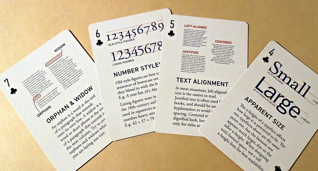
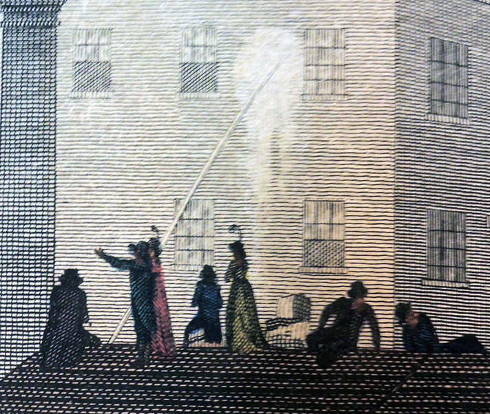
A view in Covent Garden showing St Paul’s Church on fire, as people watch from a roof nearby. “As it appeared on Fire, at eight O’Clock on Thursday Evening, 17th Sepr. 1795.”

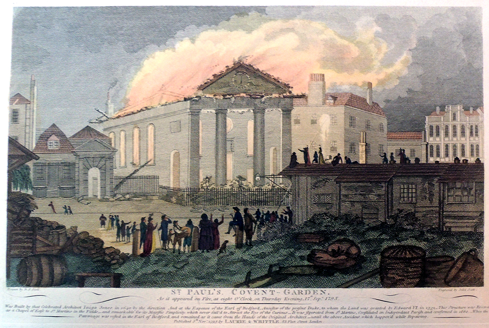
John Scott (1774-1828) after a drawing by B.F. Scott, St. Paul’s Covent-Garden… 1795. Hand-colored engraving. Graphic Arts Collection GAX 2020- . Gift of Bruce Willsie ’86. Engraved text:

Was Built by that Celebrated Architect Inigo Jones, in 1640 by the direction And at the Expence of the Earl of Bedford, Ancestor of the present Duke, to whom the Land was granted by Edward VI in {1552 – This Structure was Erected} as a Chapel of Ease to St Martins in the Fields – and remarkable for its Majestic Simplicity, which never fail’d to Attract the Eye of the Curious – It was seperated from St Martins, Constituted an Independent P{arish, and confirmed in 1660 – When the Patronage was vested in the Earl of Bedford, and remained as it came from the Hands of the Original Architect – until the above Accident, which happen’d while Repairing

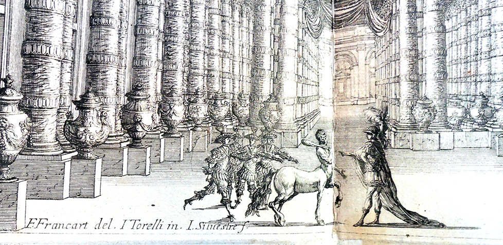
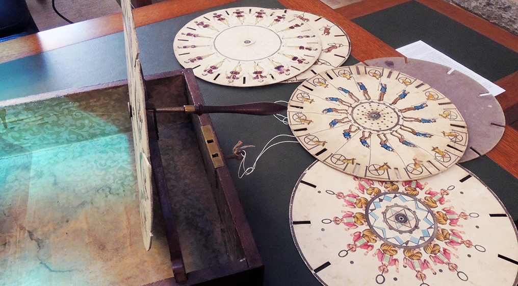
Thank to a generous donation by Bruce Willsie ’86, the Graphic Arts Collection has eleven new hand-colored vue d’optique, primarily from the 18th century. Here are a few scenes.

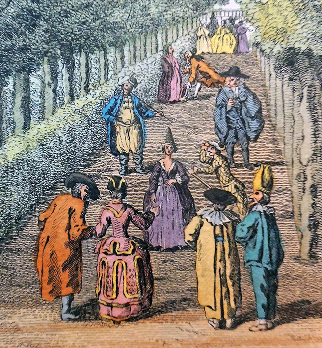
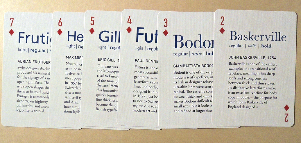
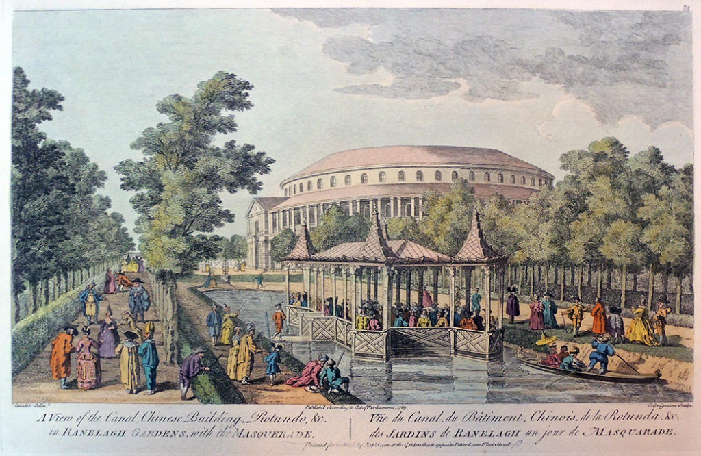
Charles Grignon, the Elder (1721-1810) after Giovanni Antonio Canal, known as Canaletto (1697-1768), A View of the Canal, Chinese Building, Rotundo, &c. in Ranelagh Gardens, with the Masquerade.Vue du Canal, du Batiment, Chinois, de la Rotunda, &c, des Jardins de Ranelagh un jour de Masquarade, 28 February 1752. Hand colored engraving. Printed for and sold by Robt Sayer at the Golden Buck opposite Fetter Lane Fleet Street. Also lettered in French: Vue du Canal, du Batiment, Chinois, de la Rotunda, &c. des Jardins de Ranelagh un jour de Masquarade. Graphic Arts Collection GAX 2020- . Gift of Bruce Willsie ’86

“Pleasure gardens were the great melting pots of 18th-century society and centres for public entertainment. First opened in 1746, Ranelagh Gardens in Chelsea boasted acres of formal gardens and tree-lined promenades. Visitors came to admire the Chinese Pavilion, watch the fountain of mirrors and attend musical concerts held in the great 200-foot-wide Rotunda. Originally designed to appeal to wealthier tastes, pleasure gardens soon became the haunt of the rich and poor alike, where both aristocrats and tradesmen enjoyed spectacles side by side.”-British Library

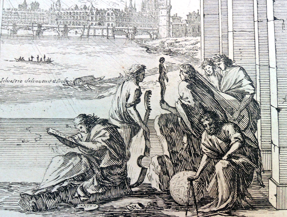
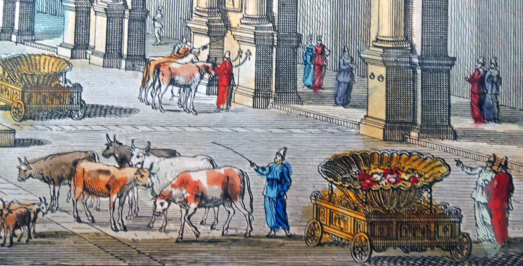
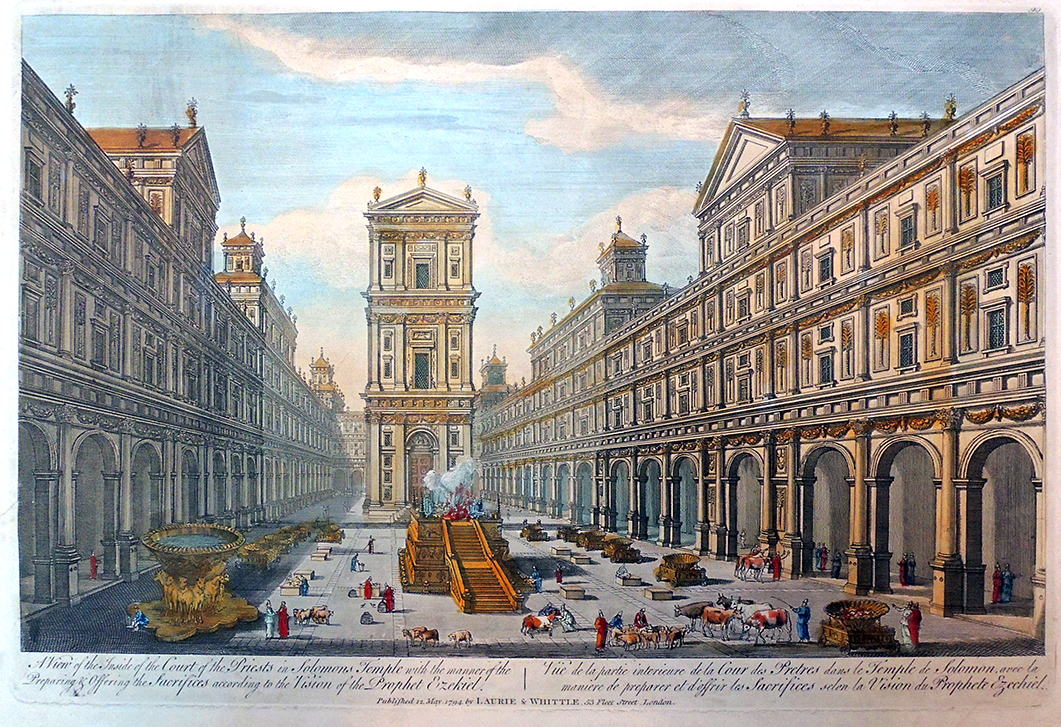
View of the Inside of the Courts of the Priests in Solomon’s Temple, with the manner of the Preparing & Offering the Sacrifices according to the Vision of the Prophet Ezekiel, May 12, 1794. Printed for Rob.t Sayer at the Golden Buck opposite Fetter Lane Fleet-street, London. Hand colored engraving. Graphic Arts Collection GAX 2020- . Gift of Bruce Willsie ’86.

Note the large basin on the left: Brazen Sea by Morris Jastrow, Jr., Ira Maurice Price, Marcus Jastrow, and Louis Ginzberg, “The brazen laver of the Mosaic ritual; made by Solomon out of bronze captured by David at Tibhath and Chun, cities of Hadarezer (I Chron. xviii. 8). It served the same purpose for the officiating priests of Solomon’s Temple as did the layer for those officers at the tabernacle. The dimensions of the sea (I Kings vii. 23-26) were as follows: height, 5 cubits; circumference, 30 cubits (consequently it was about 10 cubits in diameter); and a handbreadth in thickness. It was capable of holding 2,000 “baths”; on the smallest calculation, about 17,000 gallons. “Under the brim of it round about there were knops which did compass it, for ten cubits compassing the sea round about; the knops were in two rows, cast when it was cast” (ib. 24). This great brazen vessel was set on the backs of twelve brazen oxen; three of them facing each cardinal point, and all of them facing outward…”–http://www.jewishencyclopedia.com/articles/3659-brazen-sea


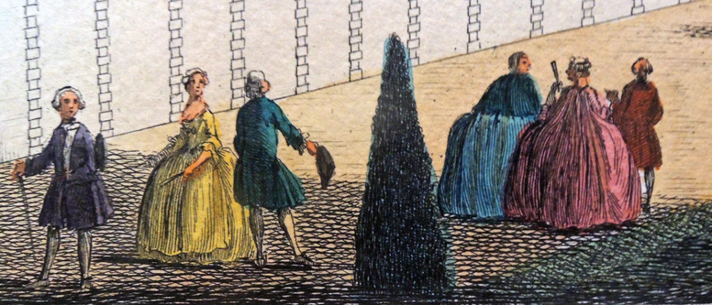
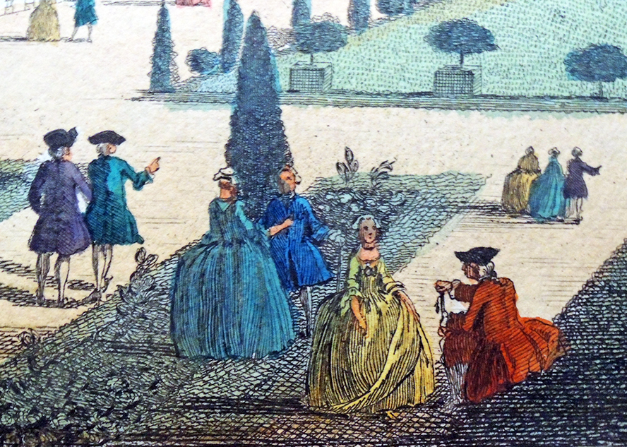
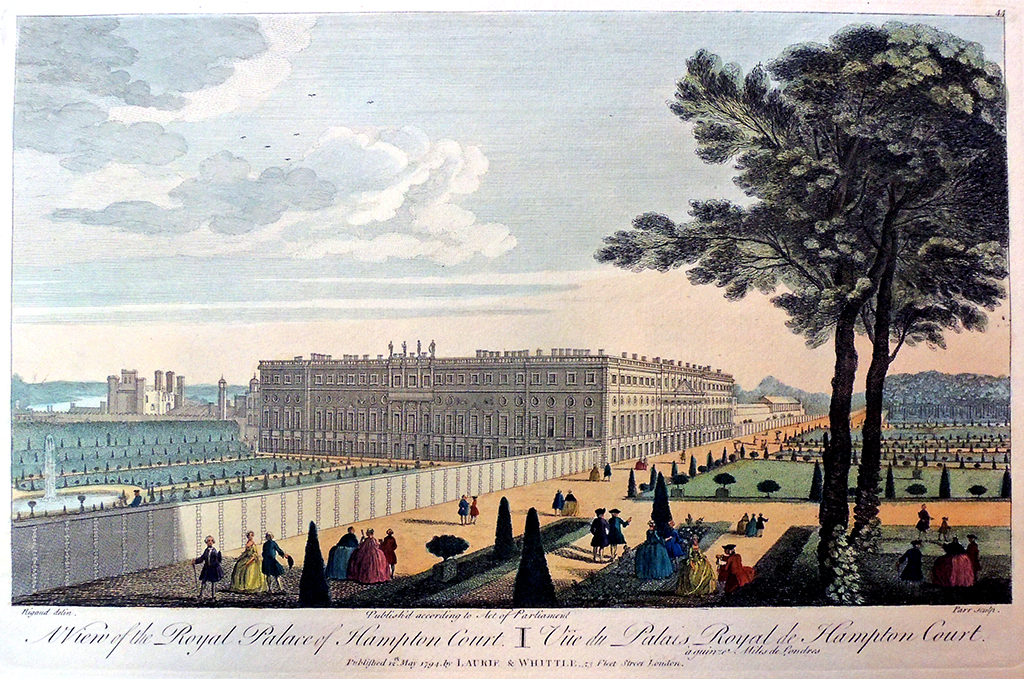
Jacques Rigaud (ca.1681-1754), A View of the Royal Palace of Hampton Court. Vüe du Palais Royal de Hampton Court, ca. 1760-1765. Hand colored engraving. Printed for & Sold by Rob.t Sayer at the Golden Buck Opposite Fetter Lane Fleet Street. Graphic Arts Collection GAX 2020- Gift of Bruce Willsie, ‘86.

“…The reliable witness George Vertue tells us that Queen Caroline’s designer Charles Bridgeman commissioned Rigaud to come to England in early 1733, to draw and engrave four views of royal domains at Greenwich, St. James’s Palace, and Hampton Court Palace (and Rigaud did publish these in Paris, 1736).” –Read more in Richard Quaintance’s “Unnamed Celebrities in Eighteenth-Century Gardens: Jacques Rigaud’s Topographical Prints” —http://revel.unice.fr/cycnos/index.html?id=1370


Typography playing cards

Back in 2018, the Canadian designer Ben Barrett-Forrest ran a successful kickstarter campaign to produce The Font Deck, playing cards packed with information about typography so you can practice identifying fonts while playing solitaire. 720 backers pledged $ 26,626 to help bring this project to life. Can’t go to rare book school? Get out the cards and start shuffling. https://www.kickstarter.com/projects/benbf/the-design-deck-graphic-design-playing-cards

Thanks to a recent donor, the Graphic Arts Collection has a Font Deck ready, whenever the students return. Each of the 52 faces contains a mini-lesson, complete with a beautiful visual example. Old-timers will also enjoy the history, quotations, and other type minutia among the diamonds and clubs.


Barrett-Forrest is also the author of this history of typography video:


Solingen = The City of Blades

41 electroplated printing blocks ([Solingen, Germany?: n.p., ca.1920s]). Graphic Arts Collection GAX 2020-in process

Graphic Arts acquired a small collection of 41 electroplated printing blocks depicting dental and surgical instruments presumably for a trade catalogue, ca. 1920?.  Some of the blocks present sets of tools and some represent individual knives, scalpels, or scissors. These are not fresh samples, all the blocks have been inked and used. All have the remains of glue and paper on the underside of the block, indicative of patching or ‘bringing up’ the block to sit level inside the chase, reading for printing.

The dealer found a faint stamp on the side of the wood, which was read as Lauterjung & Hautzel … fabrik u. galvanoplastik, Solingen. Known as “the city of blades,” Solingen is located in the North Rhine-Westphalia, Germany.

“For many centuries the name Solingen was [the] embodiment of high quality knives, cutlery and more. It is not surprising, that many companies try to make use of this name by selling their goods as “Made in Solingen”, although they have not been produced in this city. In order to fight this fraud, Solingen became the only city in the world whose name is a registered trademark. The so called “Solingenverordnung” regulates the use of the brand “Solingen” since 1938.”

The archive of Nordrhein-Westphal makes reference to a Lauterjung & Hautzel of Solingen in 1926, describing them as ‘Lieferant von Holzschnitten und Galvanos’ (suppliers of woodcuts and electroplating), suggesting that they were responsible for producing the blocks. In 1941, to celebrate the 50 anniversary of S. Lauterjung Söhne, Metallwarenfabrik [metal goods factory] in Solingen, a catalogue was prepared by Kurt Hartwig, which may have some relationship to our blocks.


One other possible connection to the blocks might be Carl Martin GMBH, also founded in Solingen in 1916. “Carl Martin have concentrated on manufacturing and distributing high-grade instruments for dentistry. Our more than 95 years of experience in raw materials, development processing and the requirements for daily use in hospitals, practices and laboratories have made us one of the world´s leading manufacturers of dental instruments.”


Louis Léopold Boilly (1761–1845), Le Baume d’Acier [The Balm of Steel], in Recueil de Grimaces, 1823. Lithograph. Graphic Arts Collection


Borderbus by Juan Felipe Herrera


Borderbus. Poem by Juan Felipe Herrera. Prints by Felicia Rice. Introduction by Carmen Giménez Smith (Santa Cruz, CA: Moving Parts Press, 2019). Letterpress printed using Garamond, Meridien, and Ultra types from photopolymer plates on Rives BFK paper. Binding by Craig Jensen of BookLab II. 8 x 13 inches (extends to 17 feet). Graphic Arts Collection GAX 2020- in process


Thanks to the assistance of our colleagues in Latin American Studies, the Graphic Arts Collection is proud to acquire a limited edition artists’ book by Juan Felipe Herrera and Felicia Rice.

Borderbus is a rendering of one long poem by Juan Felipe Herrera. The poem takes place on a U.S. Department of Homeland Security Immigration and Customs Enforcement (ICE) bus. Two women have been detained while trying to cross the U.S.-Mexico border, and are being transported to a detention center. They speak in English and Spanish, whispering to avoid the attention of the guard. The text is embedded in prints by the artist/publisher and interpreted in audio recordings of the poem.

One interesting element with the volume is a usb drive included with Borderbus contains two audio versions of the poem, Borderbus. The first is a moving reading of the poem in two voices, by Marisol Baca and Gabriela D. Encinas, directed by Juan Felipe Herrera and recorded by Curtis Messer. The second is a recording of Herrera reading the poem.


Felicia Rice is a book and performance artist, typographer and letterpress printer, printmaker, publisher, and educator. A student of the history of the book and printing, she also utilizes digital technology to produce limited edition artists books. Rice has collaborated with visual artists, performance artists, and writers under the Moving Parts Press imprint since 1977. Work from the Press has been included in exhibitions from New York to Mexico DF to Japan. Her books are held in library and museum collections worldwide and she has been the recipient of many awards and grants, from the NEA to the French Ministry of Culture.


Critic Stephen Burt praised Herrera in the New York Times as one of the first poets to successfully create “a new hybrid art, part oral, part written, part English, part something else: an art grounded in ethnic identity, fueled by collective pride, yet irreducibly individual too.”

In 2012, Herrera was named California’s poet laureate, and the U.S. poet laureate in 2015. He has won the Hungry Mind Award of Distinction, the Focal Award, two Latino Hall of Fame Poetry Awards, and a PEN West Poetry Award. His honors include the UC Berkeley Regent’s Fellowship as well as fellowships from the National Endowment for the Arts, the Bread Loaf Writers’ Conference, and the Stanford Chicano Fellows. He has also received several grants from the California Arts Council.

“In a 2004 interview at CSU-Fresno, Herrera noted the influences of three distinct Californias—the small agricultural towns of the San Joaquin Valley he knew as a child, San Diego’s Logan Heights, and San Francisco’s Mission District—on his work: “all these landscapes became stories, and all those languages became voices in my writing, all those visuals became colors and shapes, which made me more human and gave me a wide panorama to work from.” Influenced by Allen Ginsberg, Herrera’s poetry brims with simultaneity and exuberance, and often takes shape in mural-like, rather than narrative, frames.”


Borderbus [selection] by Juan Felipe Herrera
A dónde vamos where are we going
Speak in English or the guard is going to come
A dónde vamos where are we going
Speak in English or the guard is gonna get us hermana
Pero qué hicimos but what did we do
Speak in English come on
Nomás sé unas pocas palabras I just know a few words

You better figure it out hermana the guard is right there
See the bus driver

Tantos días y ni sabíamos para donde íbamos
So many days and we didn’t even know where we were headed

I know where we’re going
Where we always go
To some detention center to some fingerprinting hall or cube
Some warehouse warehouse after warehouse

Pero ya nos investigaron ya cruzamos ya nos cacharon
Los federales del bordo qué más quieren
But they already questioned us we already crossed over they
already grabbed us the Border Patrol what more do they want

We are on the bus now
that is all
https://www.poetryfoundation.org/poems/91751/borderbus

Secret Journal of a Self-Observer


Johann Caspar Lavater (1741-1801), Secret Journal of a Self-Observer;or, Confessions and familiar Letters of the Rev. J. C. Lavater… Translated from the German Original, by the Rev. Peter Will, Minister of the Reformed German Chapel in the Savoy… (London: Printed for T. Cadell, Jun. andW. Davies (Successors to Mr. Cadell)… [1795]). Early ownership inscriptions, in ink and pencil, of Henrietta Siffken and with pencil notes throughout; with an original pen-and-ink drawing of Lavater bound in as a frontispiece, “given by his Son to Mrs C. Beazley.” Graphic Arts Collection GAX 2020- in process.


The first English translation of: Johann Caspar Lavater (1741-1801), Geheimes tagebuch von einem beobachter seiner selbst (Leipzig: Weidmanns erben und Reich, 1771-73) is notable for the pen and ink drawing on the frontispiece attributed to Johan Heinrich Lips (1758-1817) as well as for the text never meant to be widely circulated.

Preface of the translator:

“The present Translation, which originally was intended to be circulated only in manuscript, among some admirers of Mr. Lavater, would certainly never have been intruded on the Public, if the Translator were not fully persuaded, that its great utility will overbalance its many defects, and contribute to propagate piety and Religious prudence, for which purpose he recommends the perusal of it particularly to his congregation, who always have displayed the most laudable desire to improve in Christian knowledge and virtue. . .”

“…Mr. Lavater’s manner of expressing his ideas, being as extraordinary as his manner of thinking, those who are not intimately acquainted with the writings of this eccentric, but truly venerable man, will easily be induced to mistake for a foreign idiom what, in reality, is an idiom of the Author, and could not be exchanged for a genuine English one, as it is the peculiar characteristic which distinguishes his way of thinking.”

The Swiss minister Johann Caspar Lavater (1741-1801) was convinced that the science of physiognomy made it possible to know about a person’s interior self from their exterior body. This included both the physical skull itself and the visual representation of it. He published his beliefs in three major editions, Physiognomische fragmente (1775-78) RBSC Oversize 6453.568.15q, Essai sur la Physiognomonie (1781-1803), and Essays on Physiognomy (1788-99) GAX Oversize 2007-0002Q. Johan Heinrich Lips (1758-1817) was the principal engraver of the plates, working from his own drawings and after drawings by Georg Friedrich Schmoll. Lavater’s close friend Henry Fuseli (1741-1825) added a few illustrations and brought in the young William Blake (1757-1827) to complete a few additional plates.

William Blake, Johann Caspar Lavater, 1800. Engraving and etching. Graphic Arts Collection